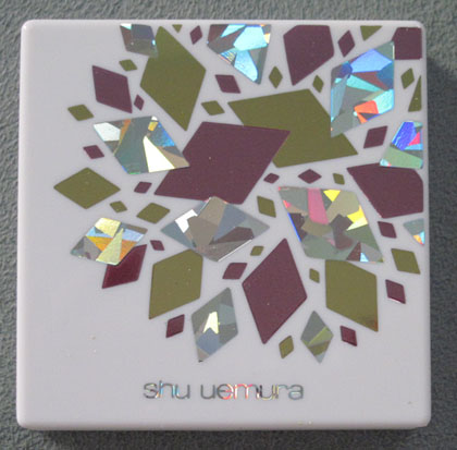
The second I heard "Gem Glam" I immediately thought of the '80s cartoon Jem (yes, I'm showing my age.) What's really funny is that it Jem was in a band, Jem and the Holograms, and the diamond shapes are slightly holographic.
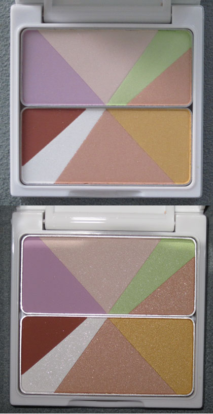
All silly '80s nostalgia aside, here is the powder itself, in natural light and with flash:
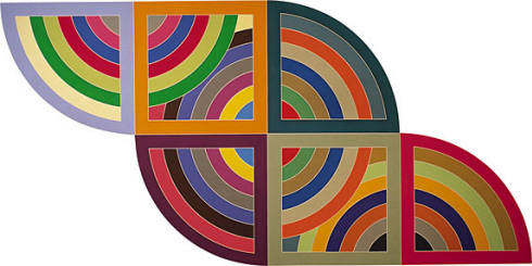
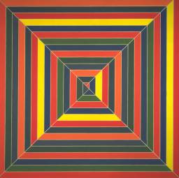
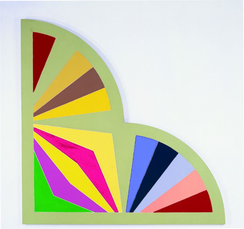
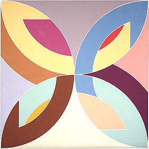
Maybe it's just me, but the pattern, with its tidy geometric division of bright colors, seem to give off a Frank Stella-ish vibe. I was fortunate enough to see some of his work when I visited Philip Johnson's Glass House and his nearby painting gallery, and this palette really reminds me of his paintings.
Harran II, 1967:
Hyena Stomp, 1962:
Sabra, 1967:
Flin Flon, 1970:
The issue I have with this palette from a design perspective is that the exterior doesn't really go with the interior. The outside diamonds look like shiny children's stickers, while the inside is more high art. It's an odd juxtaposition and I'm not sure it all comes together. Plus this palette was released for summer and it doesn't seem all that summery to me save for the vibrance of the colors. Still, I do admire the company for at least trying to come up with a compelling design, both inside and out. Can't wait to see what Shu has on tap for fall!
