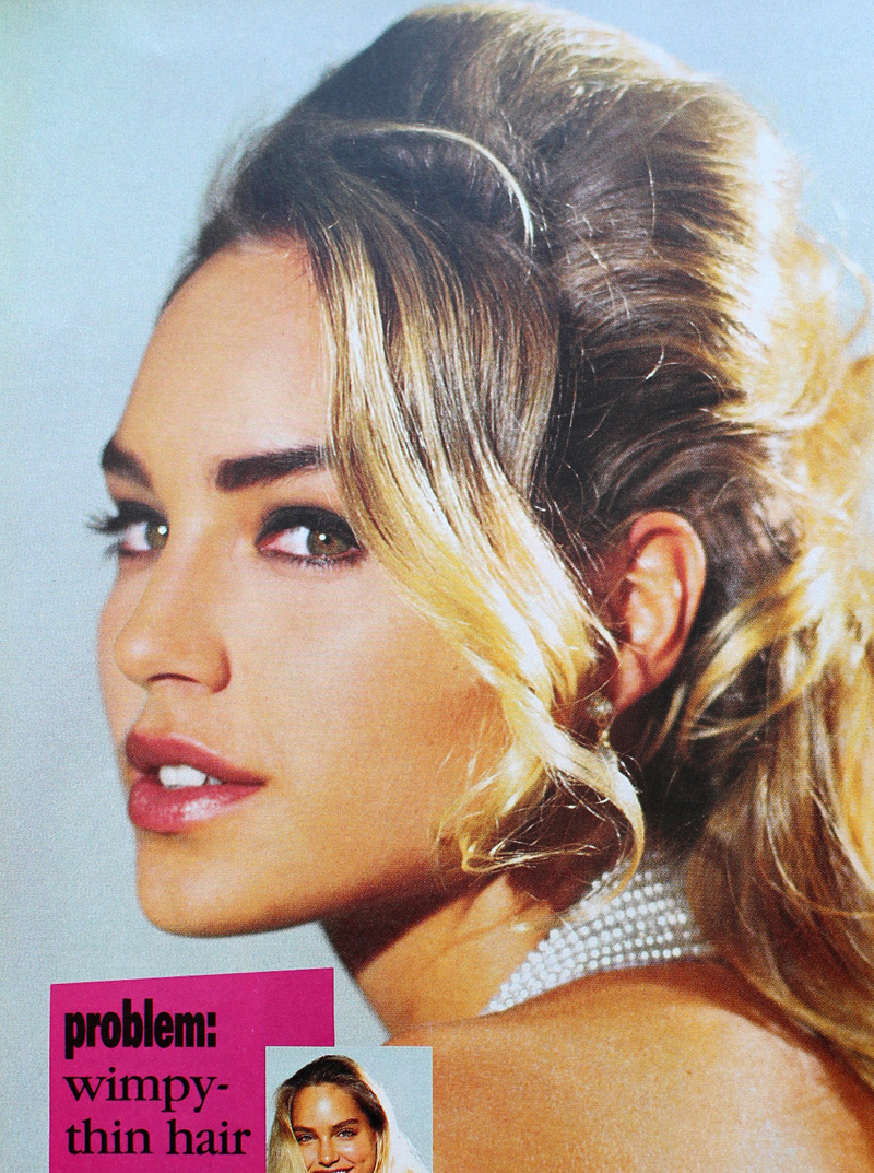
I really enjoyed the shorter bits of history that appeared between chapters in Lisa Eldridge's Face Paint. I liked the idea so much, in fact, that I decided to steal it and use it for my '90s makeup history book. Prom makeup is just one of the many featurettes I want to include. And I realize that prom season has come and gone by this point, but I'm still thinking how crazy it is that I graduated high school and attended my senior prom 25 years ago this spring! So with that, let's see what pop culture and magazine editorials were recommending in terms of prom makeup. Obviously this isn't meant to be an exhaustive list of every '90s prom look ever and how they compare to today's styles, nor is it a philosophical examination of prom and its greater cultural or social significance, especially for teenage girls.  This post is really more of a nostalgic snapshot, especially since sources were hard to find. There are tons of vintage prom photos online but the makeup is barely visible, either because analog photos rarely translate well to digital images or because they were taken at a distance. Very few clear, closeup images of old prom makeup exist, so I had to rely mostly on magazines, movies and TV episodes and they weren't great quality either. Also, I credited where I could, but not all information was available for every photo.

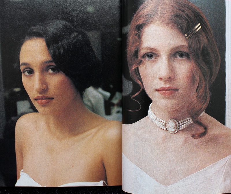
Overall, the decade followed the general makeup trends of the time. As a sort of backlash to the bright colors and general excess of the '80s, from about 1990-1994 the majority of prom looks featured minimal, barely perceptible makeup.
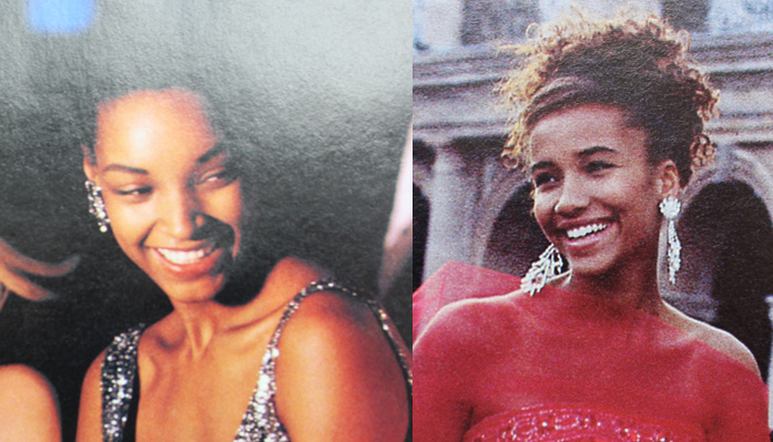
Minimal prom looks from Seventeen Magazine, 1992 and 1991

Minimal prom looks from Seventeen Magazine, 1992 (left) and 1991 (right). Credits for 1992: Hair – Hubert Cartier and Gili. Makeup: Timothy Metz. Photography: Wayne Stambler. Credits for 1991: Hair – Rodney Groves; Makeup – Timothy Metz; Photography – Tierney Gearon.
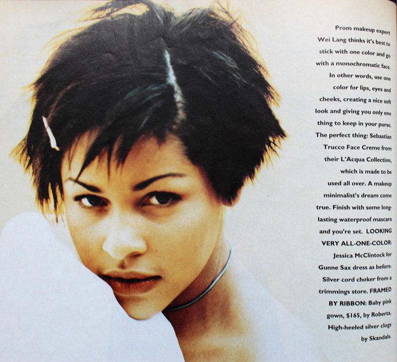
Monochromatic minimal makeup, Sassy magazine, 1993

Sassy Magazine, 1993. Hair – Daniel Howell; Makeup – Wei Lang; Photography – David Jensen

Are these girls even wearing makeup?! I guess they are since the credits list a makeup artist, but it's nearly invisible.

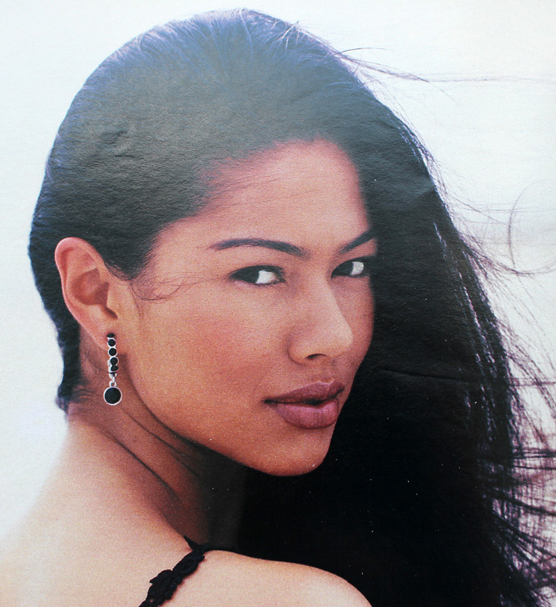
YM Magazine prom edition, 1994

YM Magazine prom edition, 1994. Credits for top photos: Hair – Christopher Lockhart for Sarah Laird; Makeup – Christy Coleman for Jed Root, Inc. Credits for bottom photos: Hair – Brent Lavent for Celestine; Makeup – Laura Jadro for Visage; Photography – Carlo Dalla Chiesa
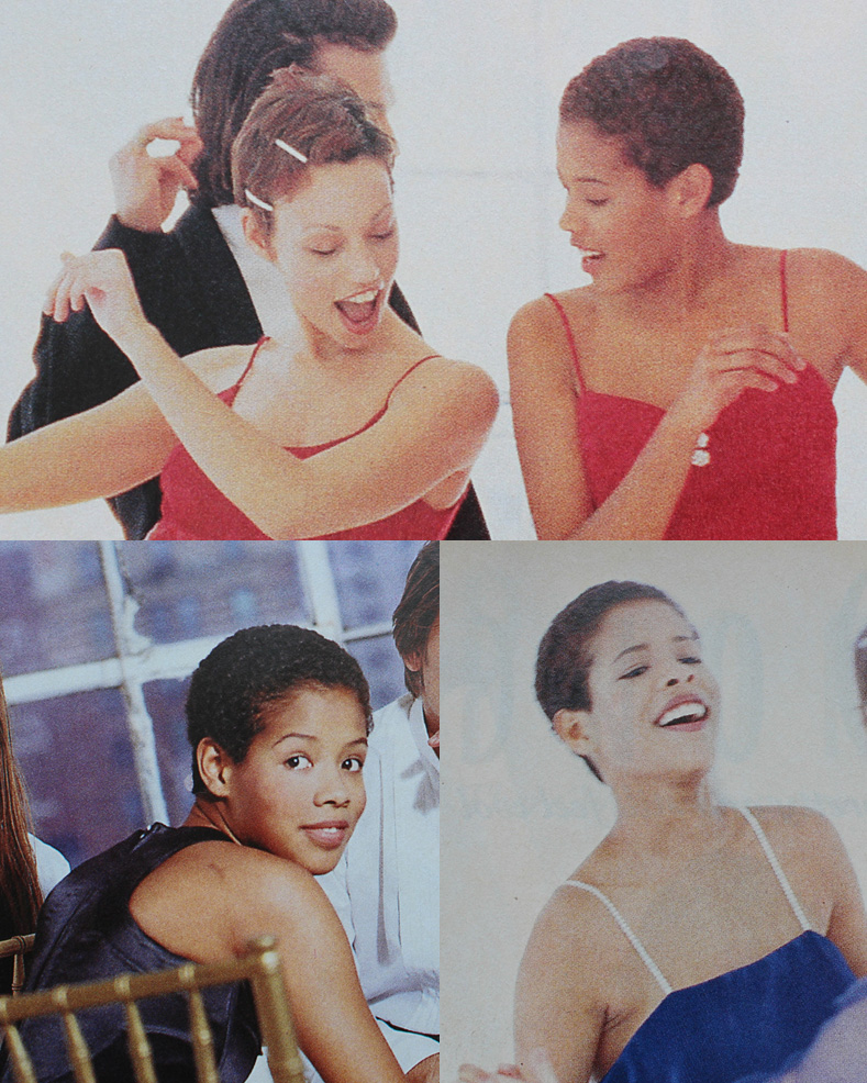
YM Magazine prom edition, 1994

YM Magazine prom edition, 1994. Hair – Christopher Lockhart for Sarah Laird; Makeup – Mathew Sky for Vartali Salon. Makeup by Maybelline.
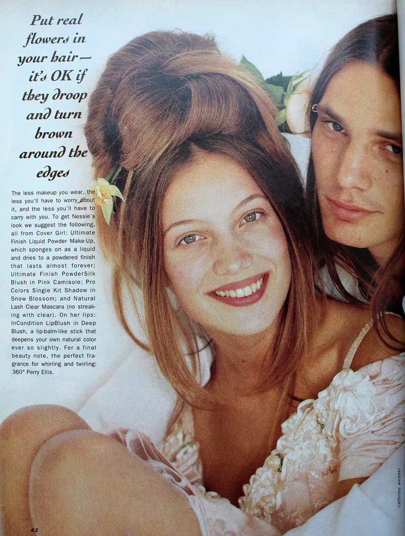
Sassy Magazine, March 1994

Sassy Magazine, March 1994. Hair – Daniel Howell for Oribe; Makeup – Regina Harris; Photography – Cathrine Wessel

Julia Stiles's character in 1999's 10 Things I Hate About You opted for a minimal look for prom, but this might have been more of a stylistic choice to go match her personality rather than a reflection of late '90s trends. Kat Stratford would never go for the glitter, frost and pastel colors that were popular towards the end of the decade.
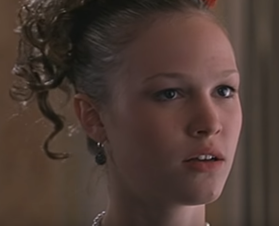
10 Things I Hate About You prom makeup

Julia Stiles as Kat Stratford in 10 Things I Hate About You, 1999. Makeup artist: Martin 'Vinnie' Hagood

Another trend early on was a return to old school glam. Red matte lips, with or without a winged liner but always keeping the rest of the face neutral, was a popular choice.
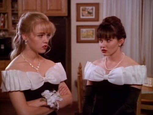
Kelly and Brenda in Beverly Hills, 90210

Kelly (Jennie Garth) and Brenda (Shannen Doherty) in Beverly Hills, 90210 "Spring Dance" episode, 1990. Key makeup artist – Sheree Morgan; makeup artist – Alex Proctor.
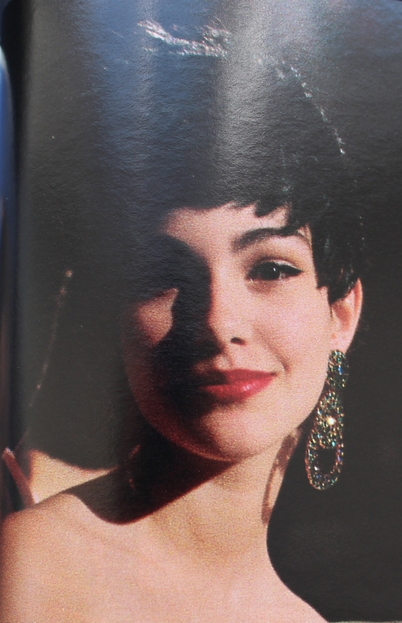
Seventeen Magazine, March 1991

Seventeen Magazine, March 1991. Hair – Gabriel Saba for John Sahag Salon; Makeup – Jacqui Lefton; Photographer – Dewey Nicks; Model – Limor Luss
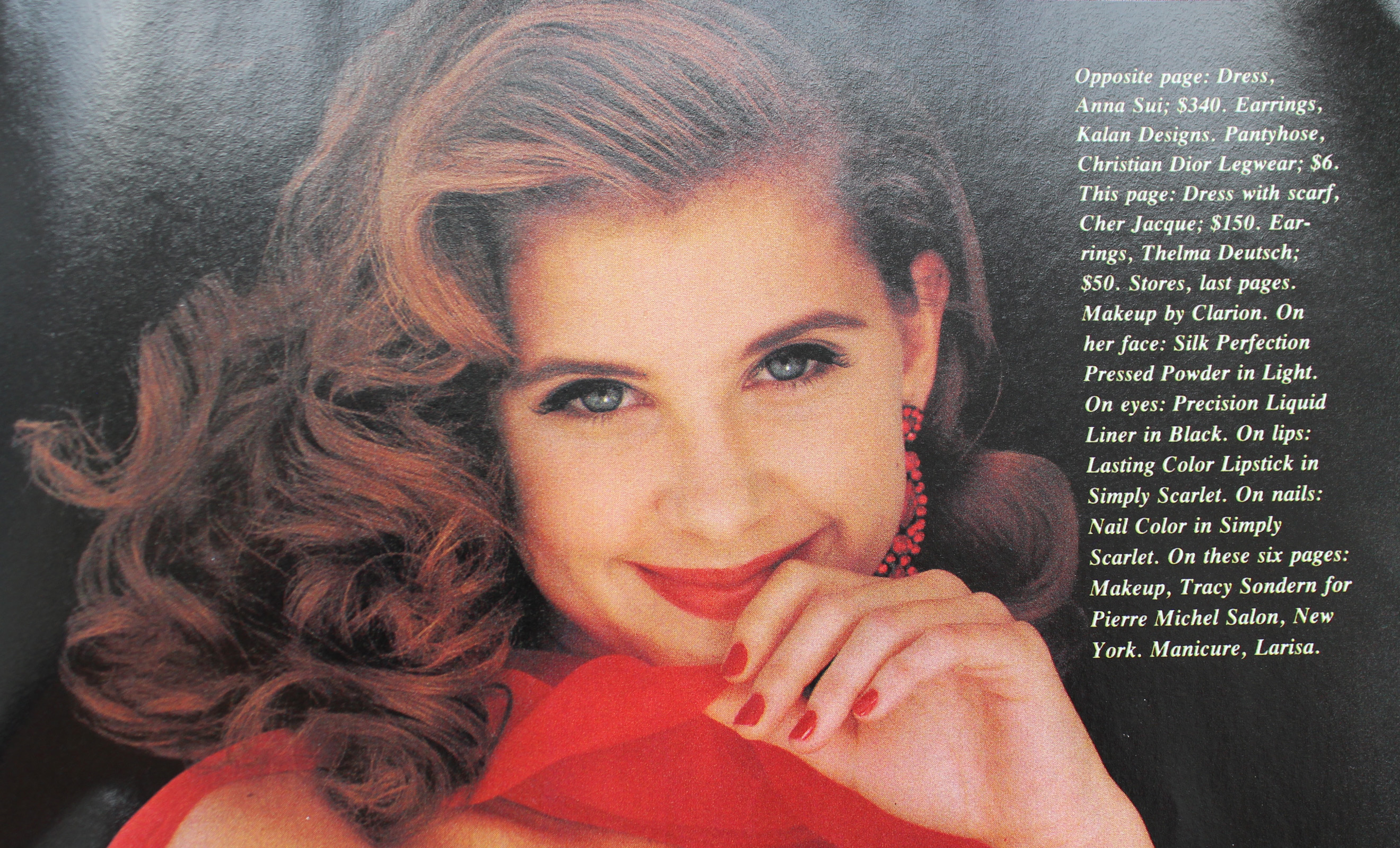
Kellie Martin in Seventeen Magazine, March 1992

Kellie Martin in Seventeen Magazine, March 1992. Hair – Patrick Melville for MCM Salon; Makeup – Tracy Sondern; Photography – Bico Stupakoff
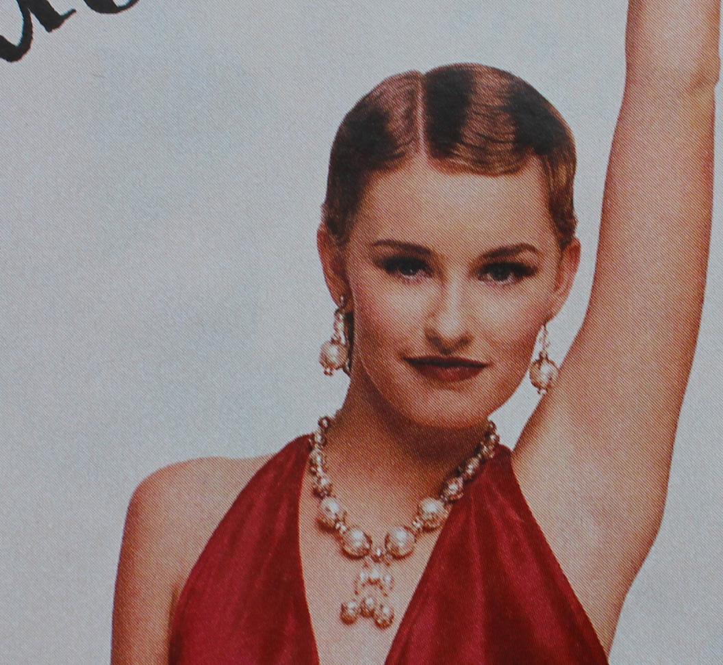
Sassy Magazine, March 1995

Sassy Magazine, March 1995. Hair – Diane Wiedenmann; Makeup – Sharon Gault for Cloutier

Again, as with 10 Things I Hate About You's Kat, I think Heather's (Mena Suvari) red lip more a stylistic choice to better suit the character rather than part of a real-world trend. (Sorry about the lack of quality in this photo, I couldn't find a decent shot anywhere. Also, no fewer than 7 makeup artists for American Pie are listed at IMDB so it's not clear who chose her look.)

American Pie prom

Just based on these candids from YM's prom issues, it seems like a lot of girls opted for a red lip or the minimal look for prom for 1993 and 1994.
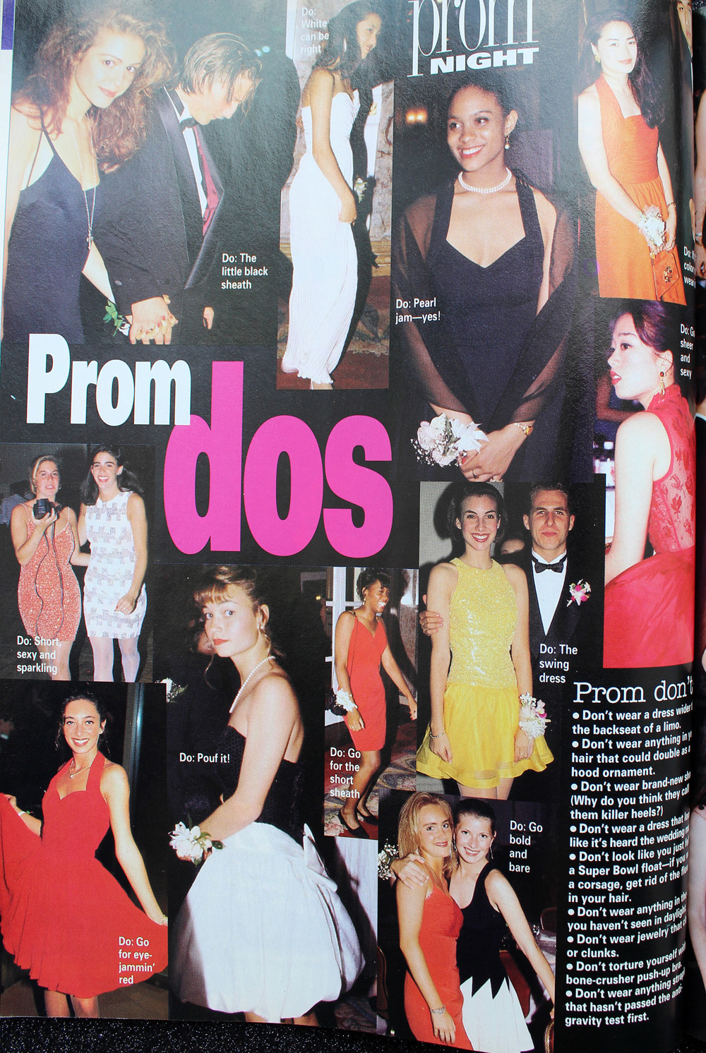
YM Magazine prom edition, 1993
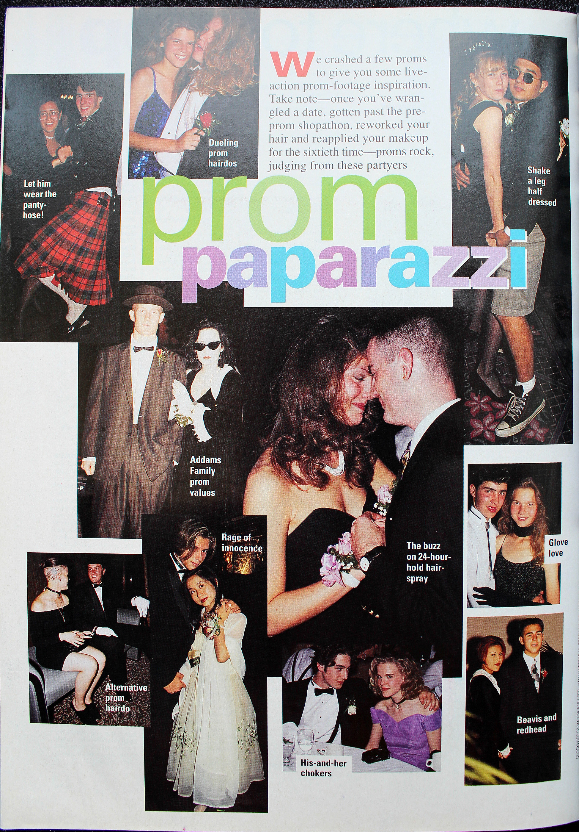
YM Magazine prom edition, 1993
YM Magazine prom edition, 1994

YM Magazine prom edition, 1994

There was also a somewhat odd combination of soft smoky matte grey or brown shadow and a desaturated but noticeable lip color. I don't really remember this look, probably because I can't say that the early '90s take on a smoky eye is a look I enjoy. It just looks flat and muddy, plus very amateur despite the professional application. It's like someone dipped their fingers into shadow, swiped them across their lids, added a touch of mascara and declared their eye makeup finished. Which would be fine with different textures and shades, but matte shadow in these colors requires some definition.
Seventeen Magazine, March 1992

Seventeen Magazine, March 1992
YM Magazine prom edition 1993

YM Magazine prom edition 1993

My opinion is that it suits nobody, not even Heidi Klum.
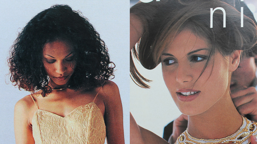
YM Magazine prom edition 1994

YM Magazine prom edition 1994. Credits for left photo: Gerald DeCock for Louis Licari Color Group; Makeup – Christy Coleman for Jed Root, Inc. Credits for right photo: Hair – Lawrence DePalma for Pierre Michel Salon; Makeup – Christy Coleman for Jed Root, Inc. Model: Heidi Klum

A monochromatic face is surprisingly artistic and flattering if there's variation in textures and finishes between eyes, cheeks and lips. Matte brown shadow with seemingly no other eye makeup besides a hint of mascara and paired with a warm, orange-brown lip isn't great on most people. Case in point: these prom looks from the March 1994 issue of Seventeen. I know they were really meant to show the hairstyle, but they are so boring! Plus it looks awful on the skin tone of the particular model that was chosen – the poor thing looks like the life got sucked out of her. This combination only works on very specific coloring.
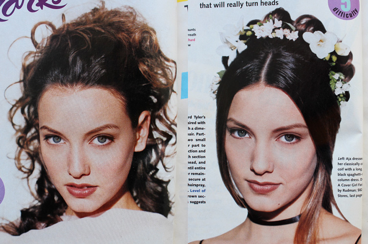
Seventeen Magazine, March 1994.

Seventeen Magazine, March 1994. Hair – Mara Schiavetti; Makeup – Cindy Joseph

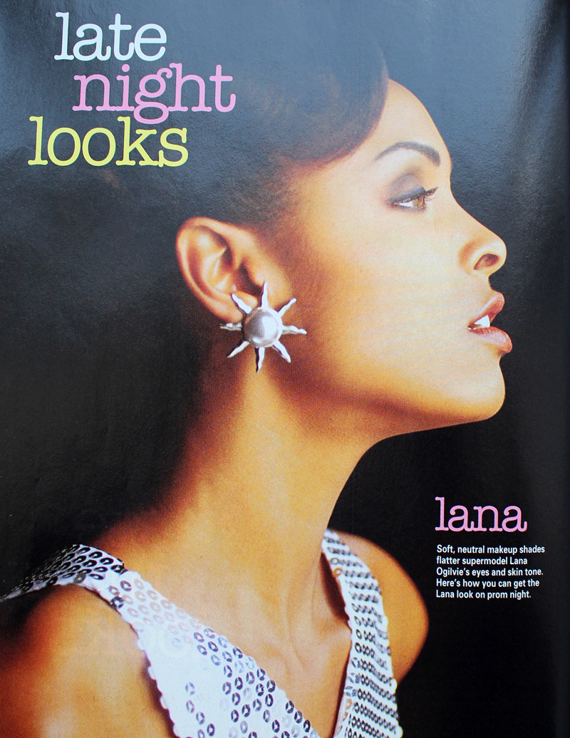
Matte, one-dimensional shadow works if the eyeliner is noticeably darker and there is a contrast in tone for the lip color, as in YM's 1993 prom editorial.

YM Magazine prom edition, 1993

YM Magazine prom edition, 1993. Model: Lana Ogilvie. Makeup Artist: Craig Gadson for Cover Girl.
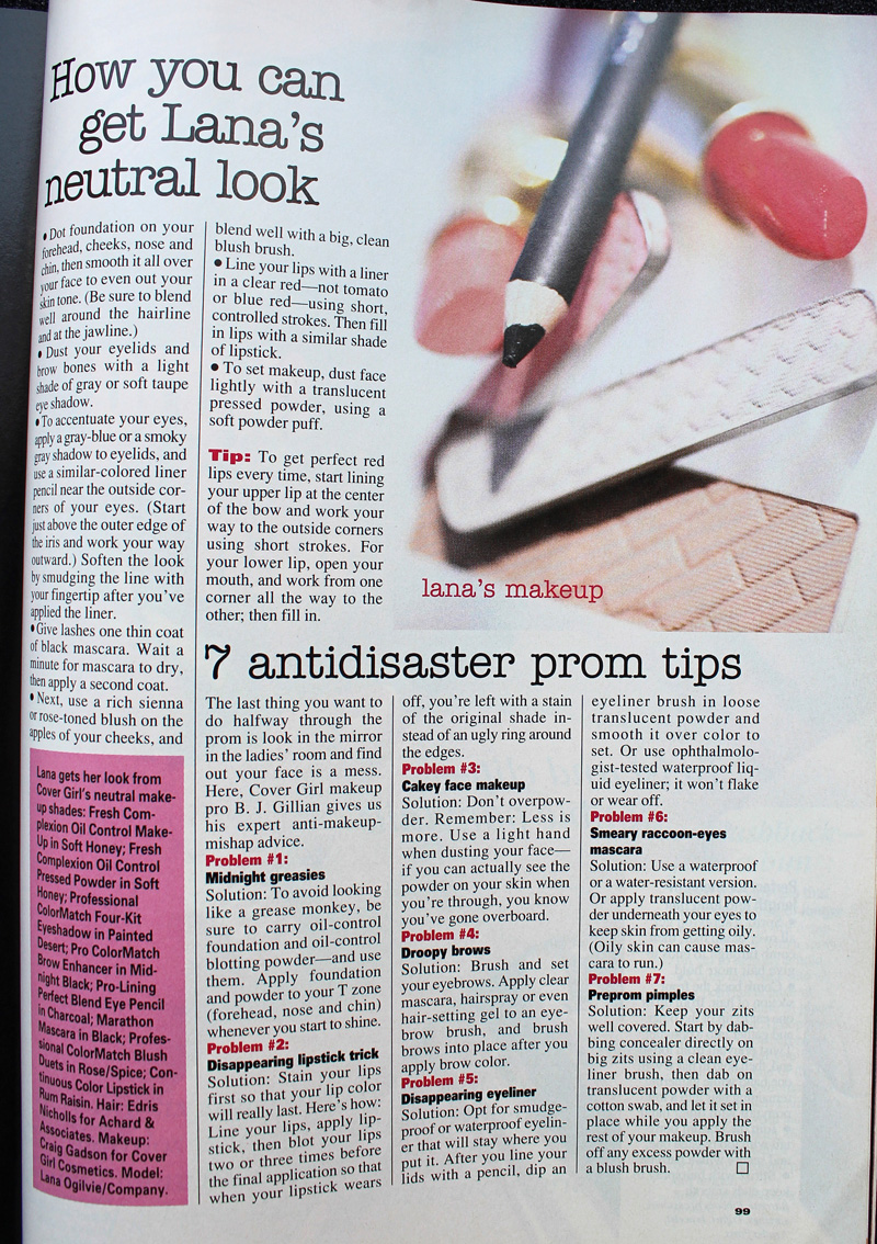
YM Magazine prom edition, 1993

But there is hope. Around 1996 is when we start to see a move away from matte textures and neutral shades. Bring on the metallics, the frost, the GLITTER!!
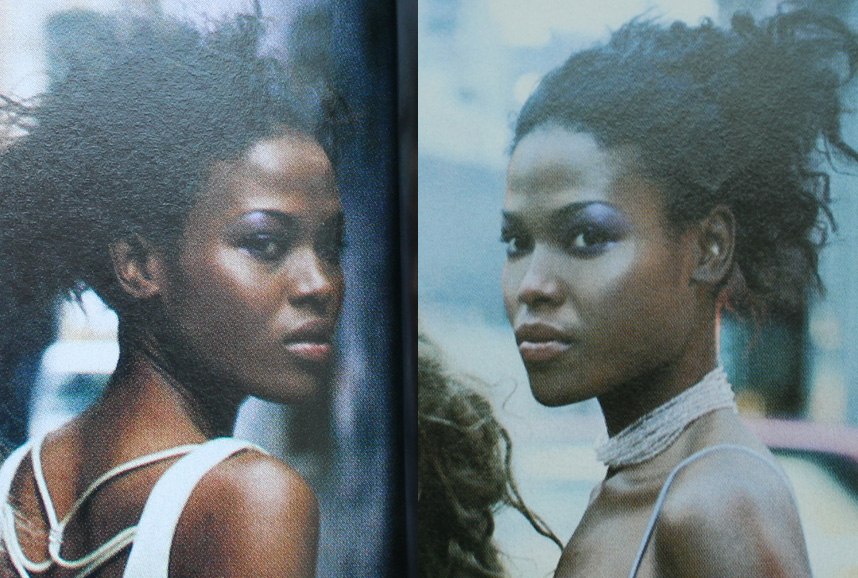
Seventeen Magazine, March 1997

Seventeen Magazine, March 1997. Hair – Dennis DeVoy for Garren New York; Makeup – Kiyoshi for Oribe Salon; Photography – Iris Brosch
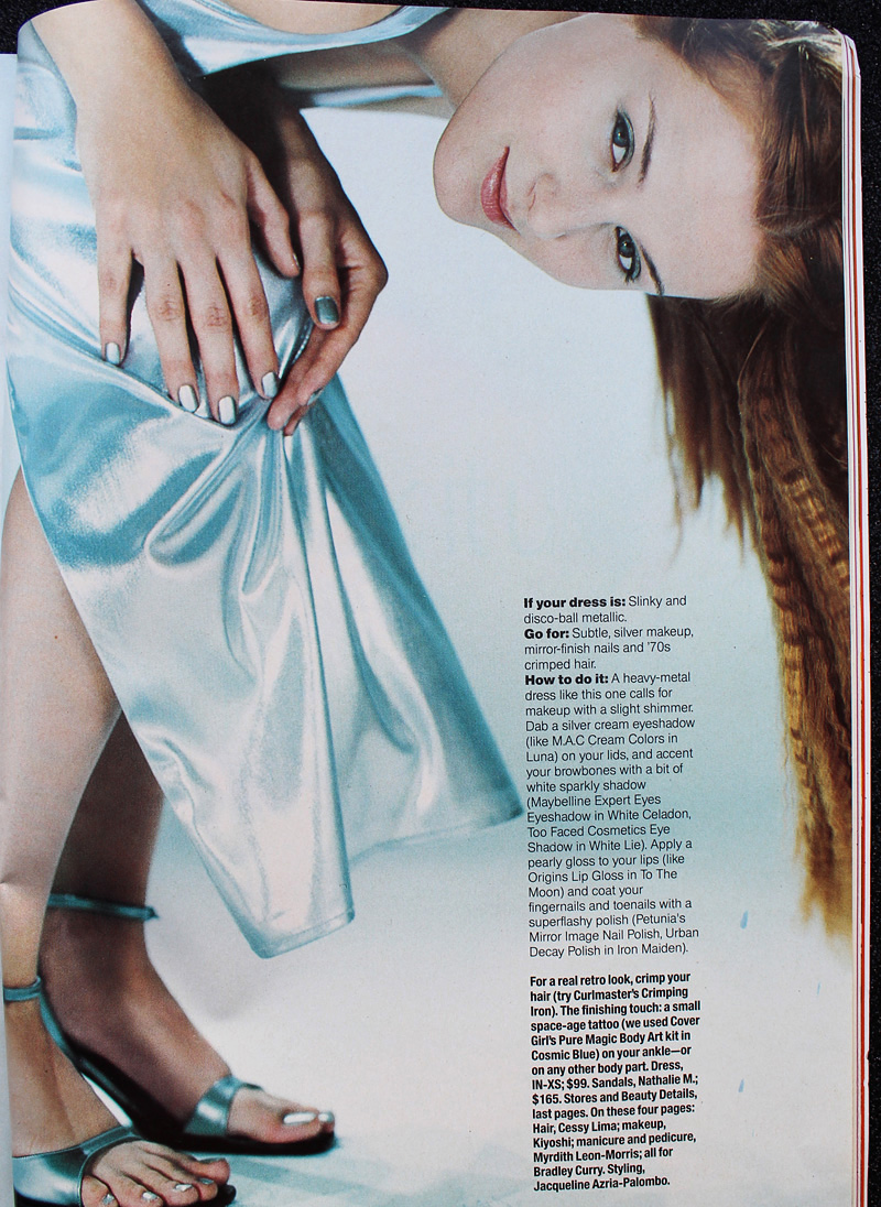
Seventeen Magazine, March 1999
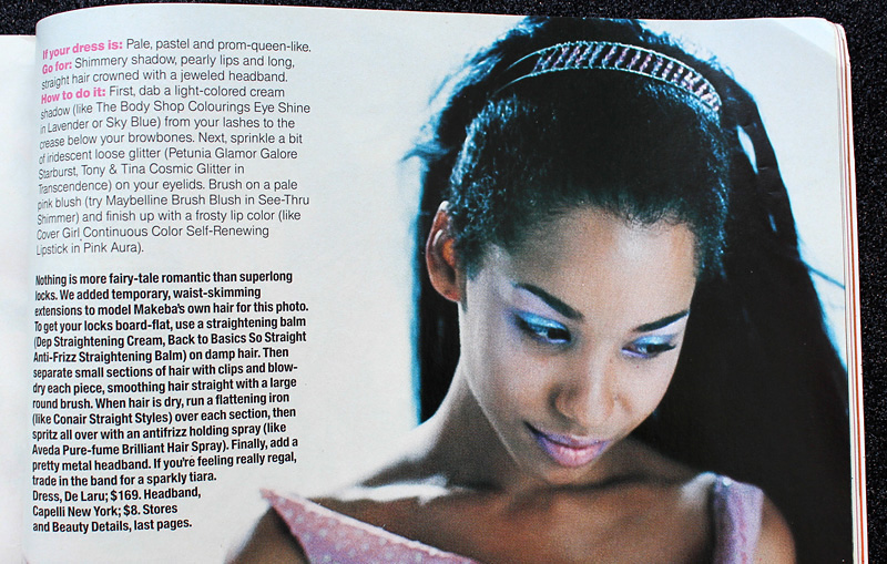
Seventeen Magazine, March 1999
Seventeen Magazine, March 1999

Seventeen Magazine, March 1999
Seventeen Magazine, March 1997

Seventeen Magazine, March 1997. Hair – Matthew Williams; Makeup – Virginia Carde; Still life photos – Aimeé Herring; Model photos – Olivia Graham

There were literally dozens of makeup artists who worked on Buffy the Vampire Slayer, so I'm not sure who was responsible for Buffy's prom makeup, which consisted of a soft silvery grey eyeshadow and pearly pink gloss.
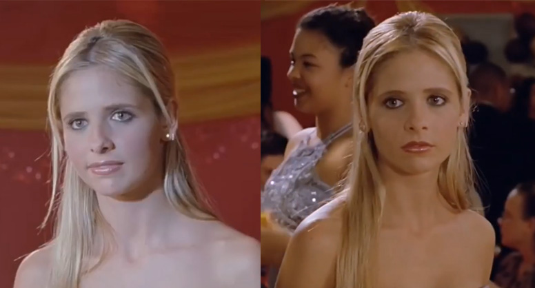
Buffy the Vampire Slayer prom scene, 1999

Sarah Michelle Gellar in "The Prom" episode of Buffy the Vampire Slayer, 1999

Complexion-wise, foundation was less heavy and flat. Even though the early '90s embraced the minimal look, skin still looked a bit dull. There were also few glossy lips to be found. The later part of the decade witnessed a shift towards fresher-looking skin (perhaps more blush added to this effect) and the rise of super shiny lips, which would continue into the early 2000s.
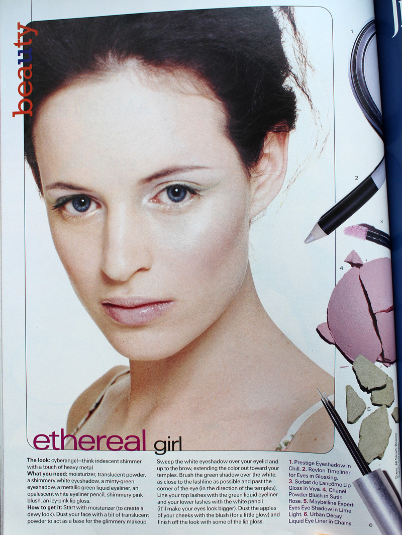
Seventeen Magazine, March 1997

Seventeen Magazine, March 1997. Hair – Matthew Williams; Makeup – Virginia Carde; Still life photos – Aimeé Herring; Model photos – Olivia Graham

Also, there was interest in color again – no longer was the palette limited mostly to red, pink, grey and brown. Blue, peach, yellow, violet and green peeked their eager little faces out for the first time in what seemed like ages.
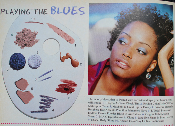
Sassy Magazine, March 1996
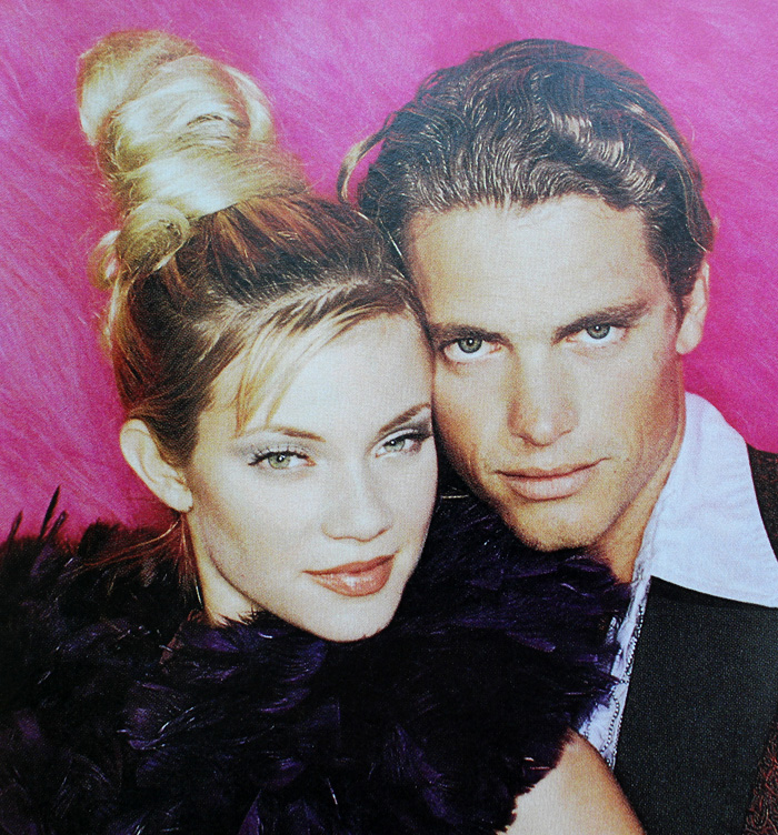
Sassy Magazine, March 1996
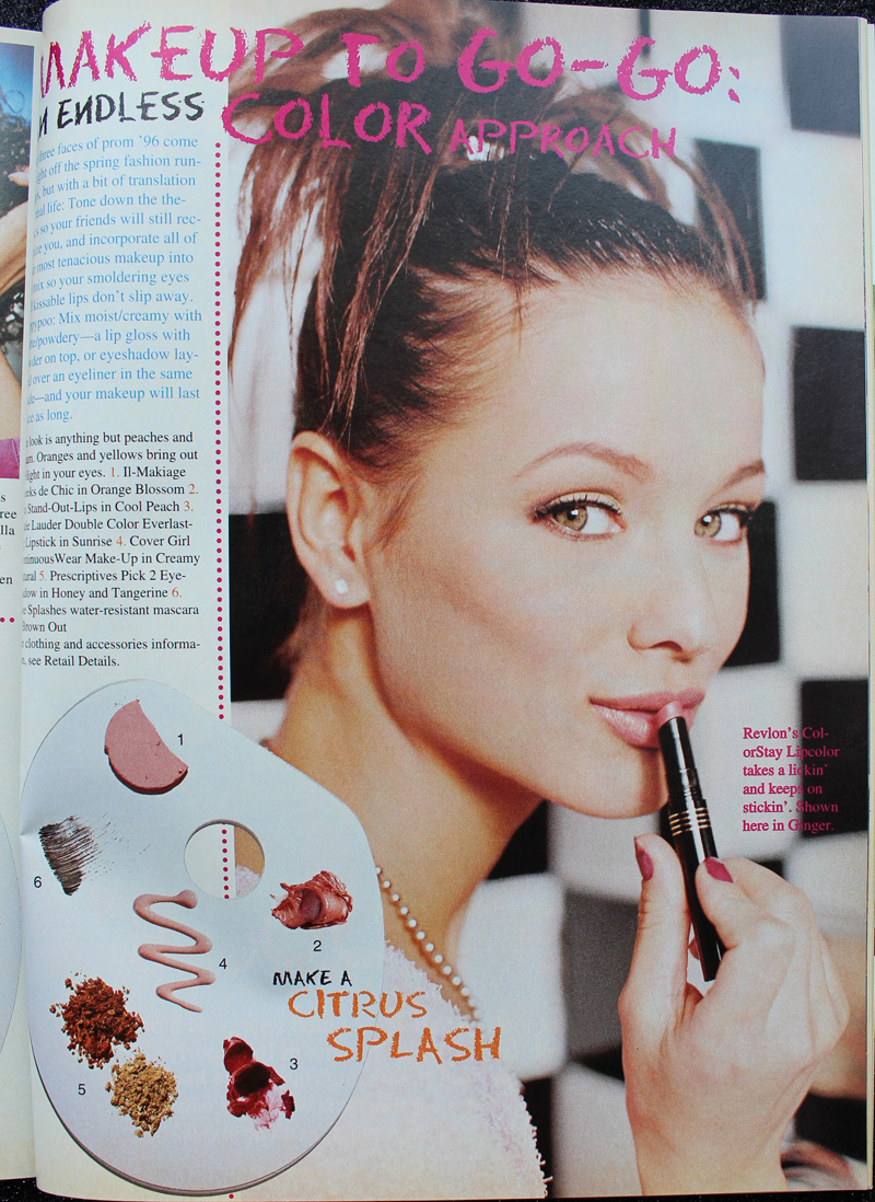
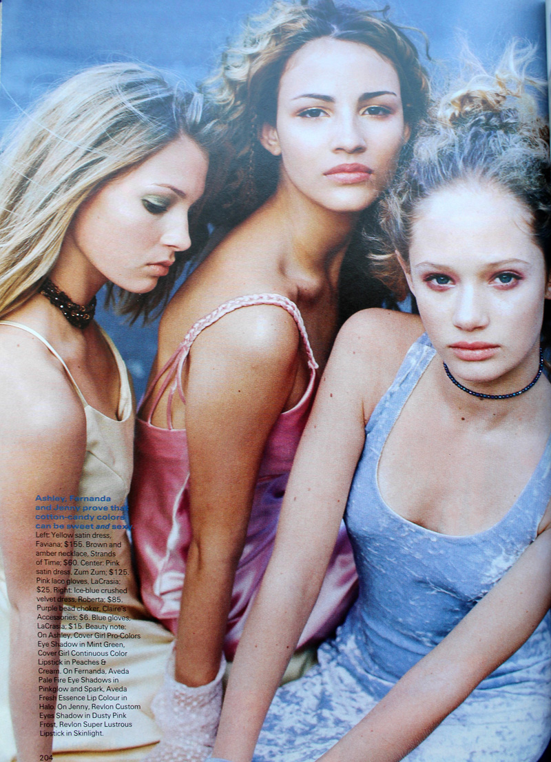
Sassy Magazine, March 1996

Sassy Magazine, March 1996
Seventeen Magazine, March 1997

Seventeen Magazine, March 1997. Hair – Dennis DeVoy for Garren New York; Makeup – Kiyoshi for Oribe Salon; Photography – Iris Brosch
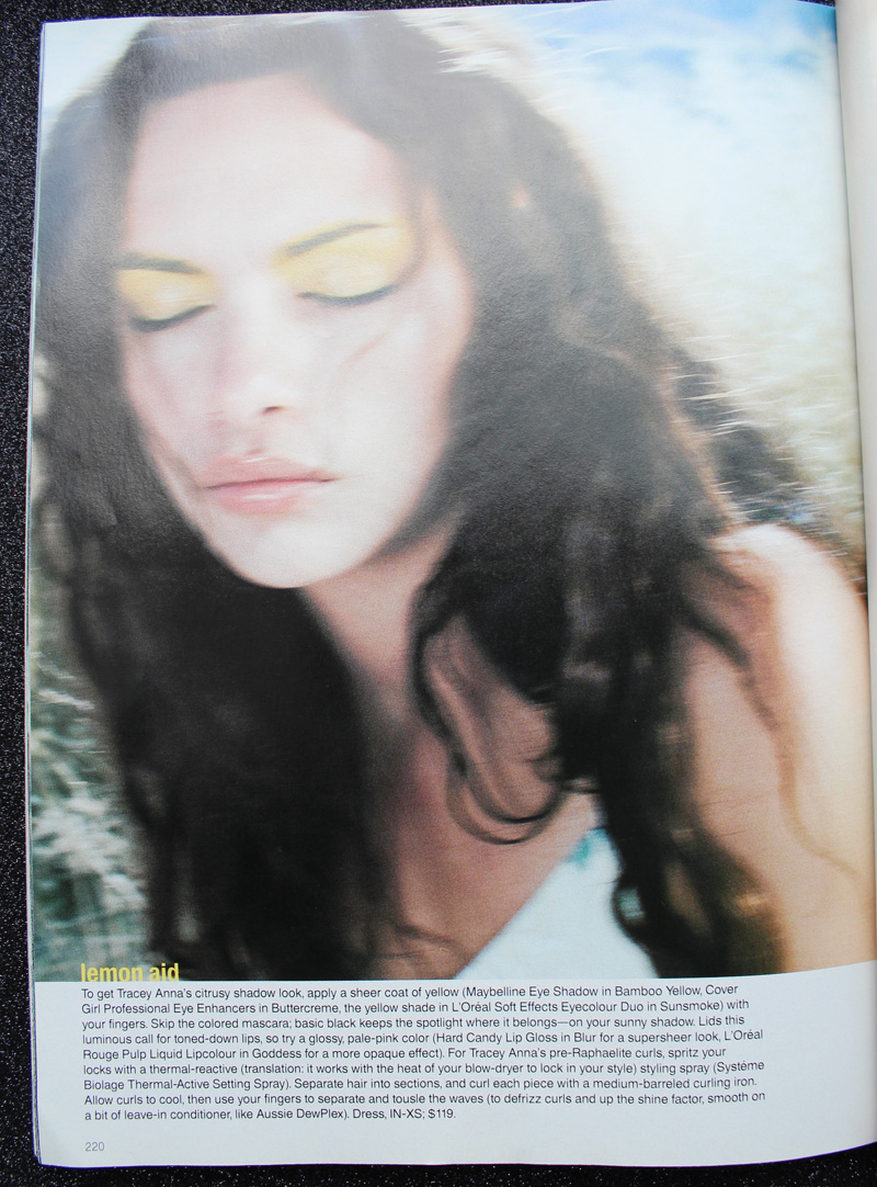
Seventeen Magazine, March 1998

Seventeen Magazine, March 1998. Hair – Kevin Woon; Makeup – Kiyoshi; Photography – Marc Baptiste
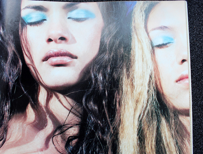
Seventeen Magazine, March 1998

Seventeen Magazine, March 1998. Hair – Kevin Woon; Makeup – Kiyoshi; Photography – Marc Baptiste

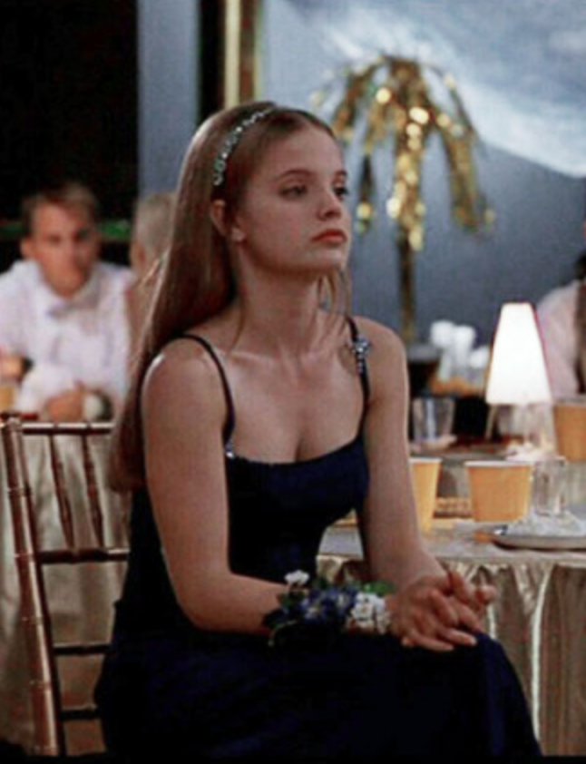
I really wish I could have found better photos of the makeup in prom scenes from movies and TV. (Seriously though, what was up with all the prom sequences in films from 1999? It seems nearly every teen movie made that year had one.) In these stills that I screenshotted and tried to brighten from She's All That you can sort of make out Laney's violet eyeshadow and browbone highlight.
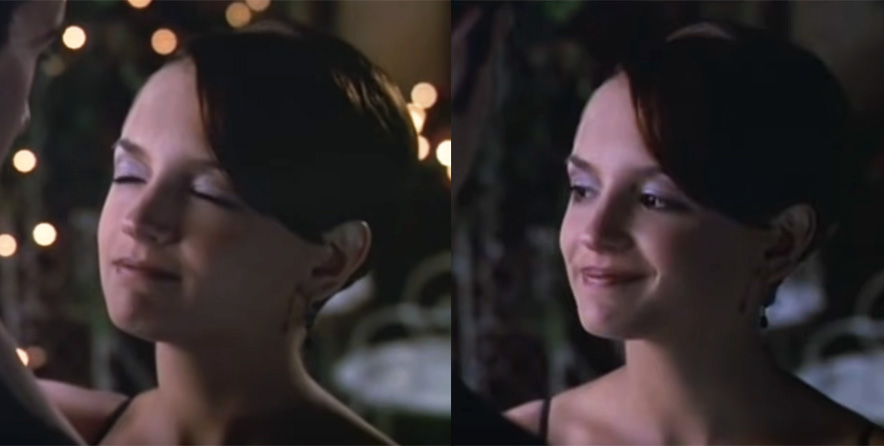
She's All That prom makeup, 1999

She's All That prom makeup, 1999

Rachel Leigh Cook as Laney Boggs in She's All That, 1999. Head makeup artist – Felicity Bowring; Makeup artists – Raqueli Dahan, Jane Galli and Lisa Layman

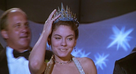
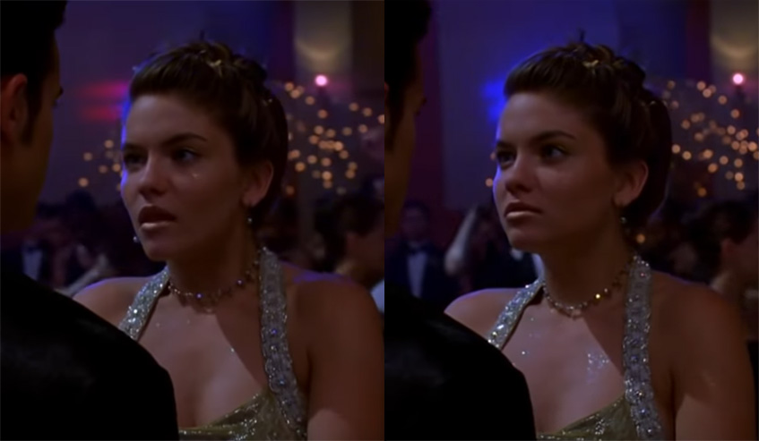
Meanwhile, mean girl Taylor Vaughan (Jodi Lyn O'Keefe) rocked a monochromatic gold look, complete with face and body glitter. Peak '90s!

She's All That, 1999

She's All That, 1999

And let's not forget Courtney's epic frosty blue eyeshadow in 1999's Jawbreaker. Once again there was a huge makeup department so whose idea it was I'm not sure.

Rose McGowan in Jawbreaker, 1999

Now there were some trends that appeared in various iterations throughout the whole decade rather than being confined to  certain years. Pink reigned supreme for prom makeup in the '90s. Whether it was full-on bubblegum or a more natural, "romantic" look, rosy hues were a staple.

YM Magazine prom edition 1992

YM Magazine prom edition 1992. Hair – Brian Devine, Oribe at Elizabeth Arden; Makeup – Melissa Rogers
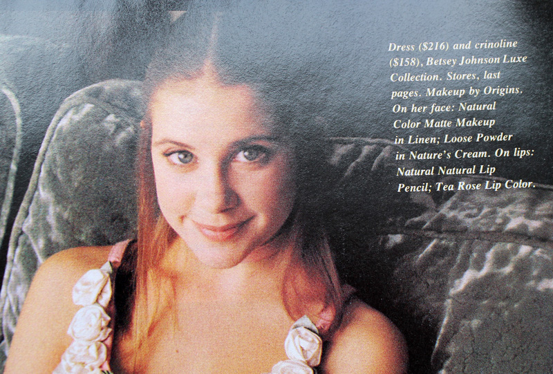
Kellie Martin in YM Magazine prom edition, 1992

Kellie Martin in Seventeen Magazine, March 1992. Hair – Patrick Melville for MCM Salon; Makeup – Tracy Sondern; Photography – Bico Stupakoff
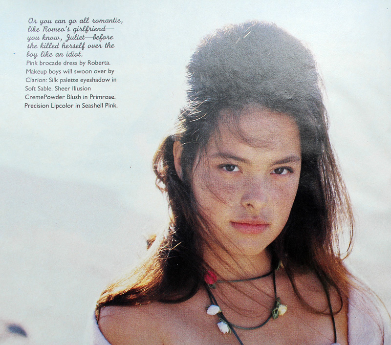
Sassy Magazine, March 1992

Sassy Magazine, March 1992. Hair – Colleen Creighton for Pierre Michel; Makeup – Lutz; Photography – Steven Miller
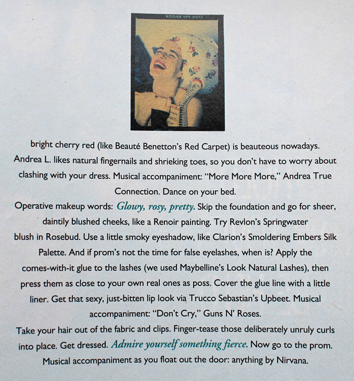
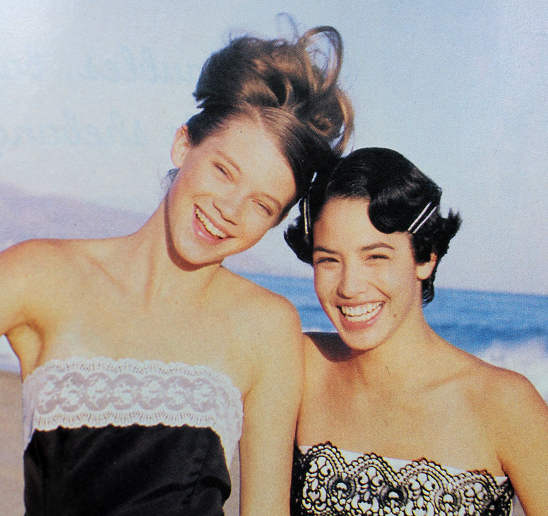
Sassy Magazine, March 1992

Sassy Magazine, March 1992

Sassy Magazine, March 1992. Hair – Colleen Creighton for Pierre Michel; Makeup – Lutz; Photography – Steven Miller
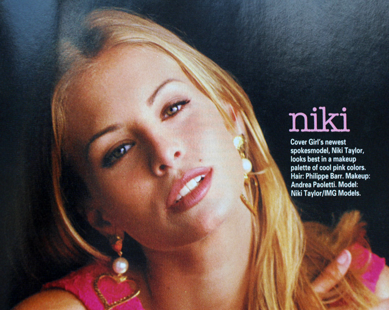
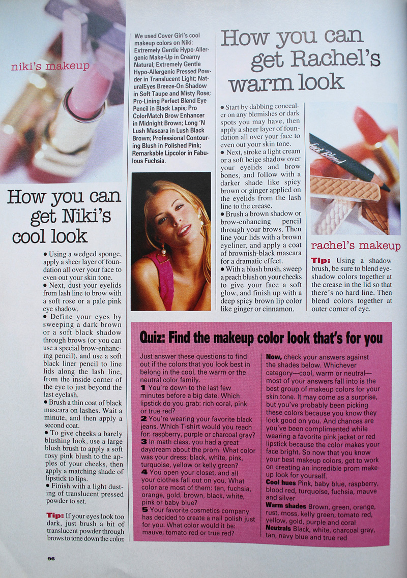
YM Magazine prom edition, 1993

YM Magazine prom edition, 1993

Sassy Magazine, March 1994

Sassy Magazine, March 1994. Hair – Daniel Howell for Oribe; Makeup – Regina Harris; Photography – Cathrine Wessel
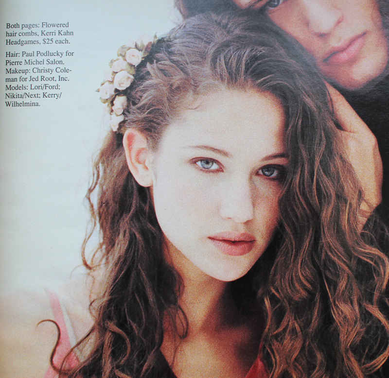
YM Magazine prom edition, 1994

YM Magazine prom edition, 1994

YM Magazine prom edition, 1994. Hair – Gerald DeCock for Louis Licari Color Group; Makeup – Mara Schiavetti for Jean Owen
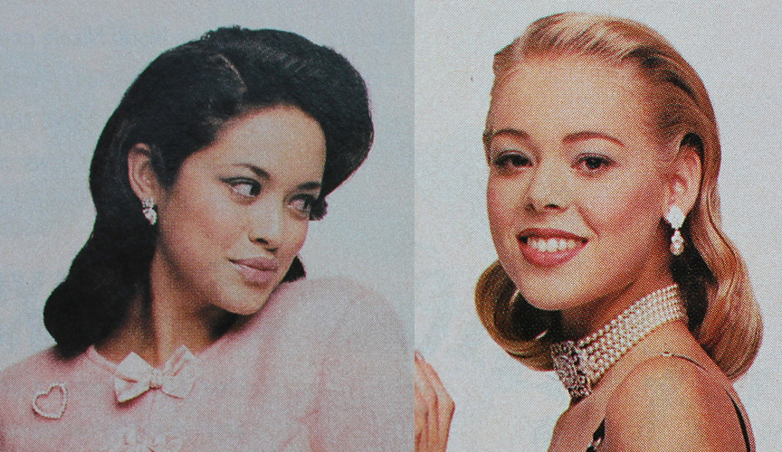
Sassy Magazine, March 1995

Sassy Magazine, March 1995. Hair – Diane Wiedenmann; Makeup – Sharon Gault for Cloutier
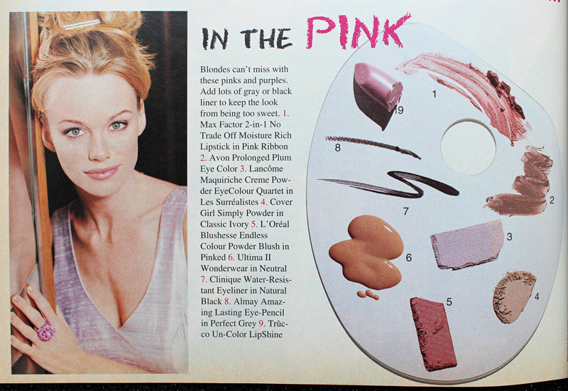
Sassy Magazine, March 1996
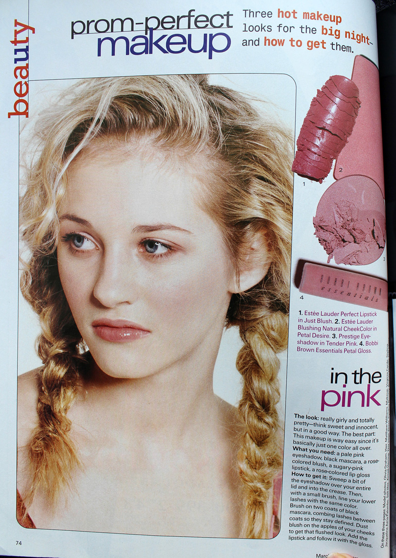
Sassy Magazine, March 1996
Seventeen Magazine, March 1997

Seventeen Magazine, March 1997. Hair – Matthew Williams; Makeup – Virginia Carde; Still life photos – Aimeé Herring; Model photos – Olivia Graham
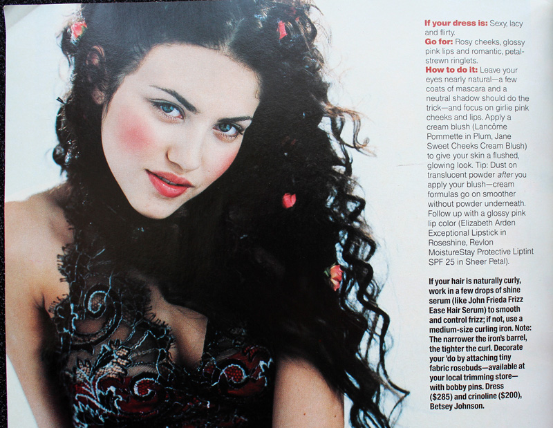
Seventeen Magazine, March 1999

Seventeen Magazine, March 1999

Sixties-inspired makeup also seemed to be a popular pick in both the early and later parts of the decade.
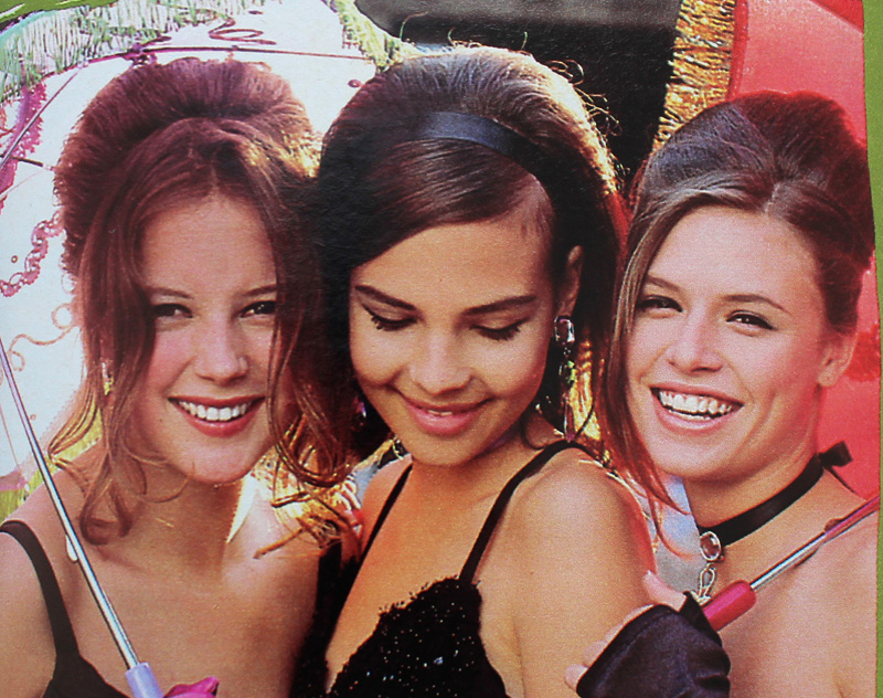
Seventeen Magazine, March 1991

Seventeen Magazine, March 1991. Credits: Hair – Rodney Groves; Makeup – Timothy Metz; Photography – Tierney Gearon
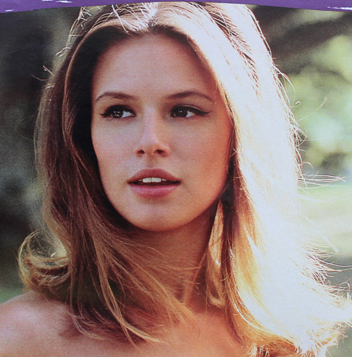
Seventeen Magazine, March 1991

Seventeen Magazine, March 1991. Credits: Hair – Rodney Groves; Makeup – Timothy Metz; Photography – Tierney Gearon
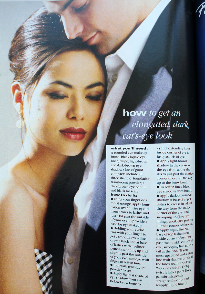
YM Magazine prom edition 1992
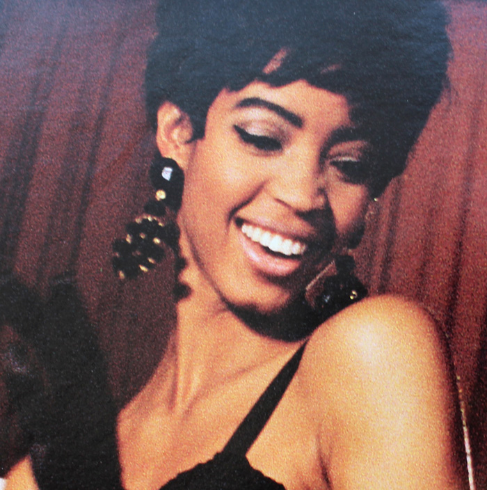
YM Magazine prom edition 1992
Seventeen Magazine, March 1991

Seventeen Magazine, March 1991. Hair – Gabriel Saba for John Sahag Salon; Makeup – Jacqui Lefton; Photographer – Dewey Nicks
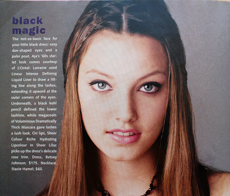
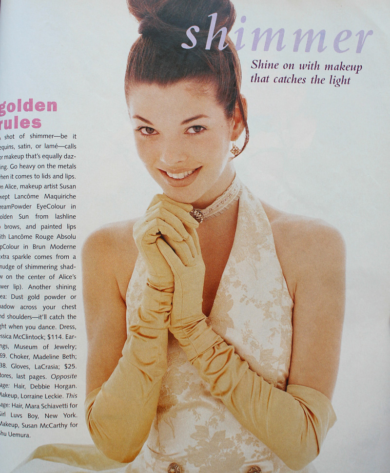
Seventeen Magazine, March 1994

Seventeen Magazine, March 1994.  Hair – Debbie Horgan; Makeup – Lorraine Leckie; Photography – Troy House
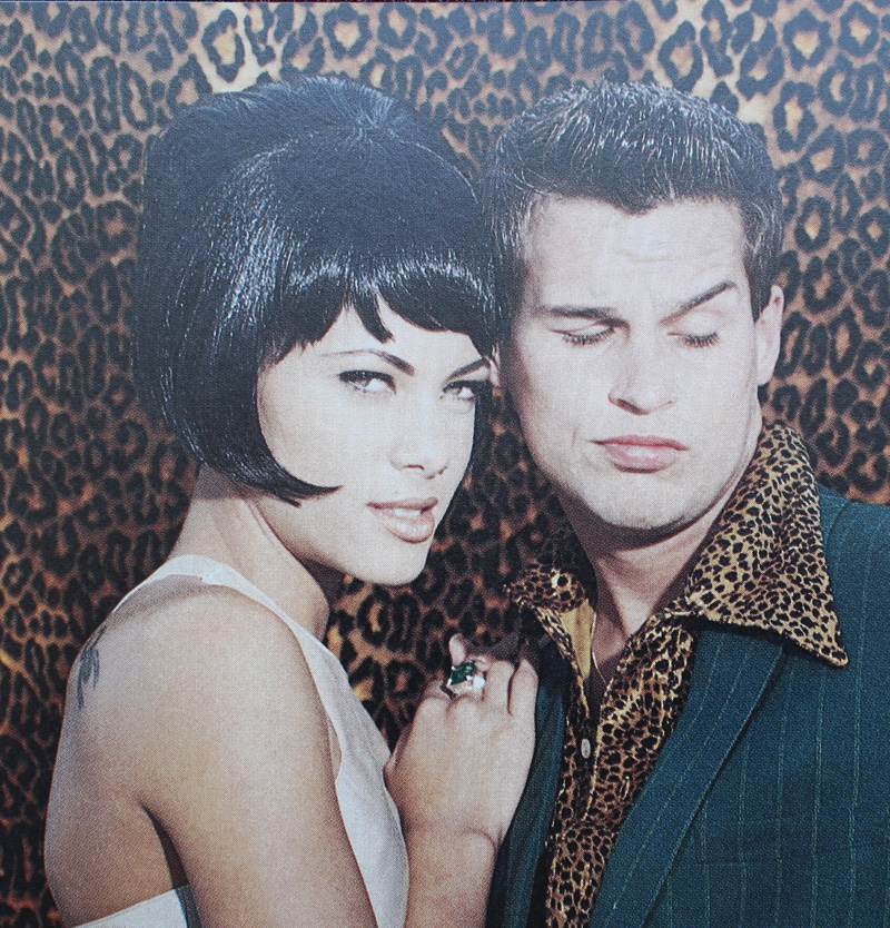
Sassy Magazine, March 1996

The most outrageous example is possibly from 1999's Never Been Kissed. It's like '60s mod meets Evening Gown Barbie, Disco Barbie and Malibu Barbie, respectively (at least, according to the characters).
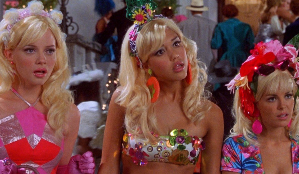
Never Been Kissed, 1999

Never Been Kissed, 1999 with Kristin (Marley Shelton), Kirsten (Jessica Alba) and Gibby (Jordan Ladd). Makeup dept. head – Kimberly Greene; Makeup artists: Joni Powell and Lyssa Wittlin Baumert

Yours truly opted for the more subtle look. Yup, that's the Curator at age 17, doing her best impression of Audrey Hepburn in Breakfast at Tiffany's for her senior prom. I eschewed my usual dark plum lip in favor of Holly Golightly's pale pink, and though you can't make it out in this old picture, I also had some pretty serious feline eyeliner. (I actually am a disaster at winged liner; my sister's friend did my makeup). Too bad I had to ruin my updo by adding the ever-present '90s tendril…then again, the bangs were already atrocious.  But I loved my makeup, gloves, jewelry (shout-out to Y necklaces!), and dress. I really regret getting rid of those last two.
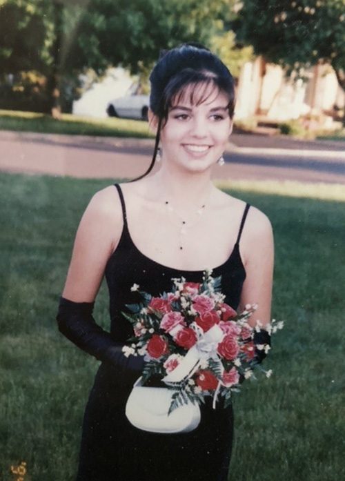
1996 prom

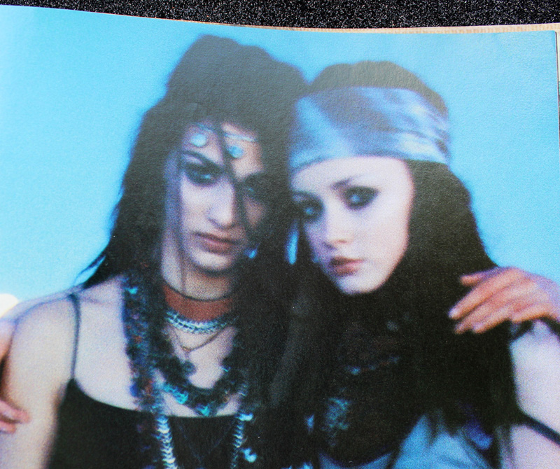
Finally, grunge, goth and punk influences occasionally emerged from subculture status on a decade-wide basis.
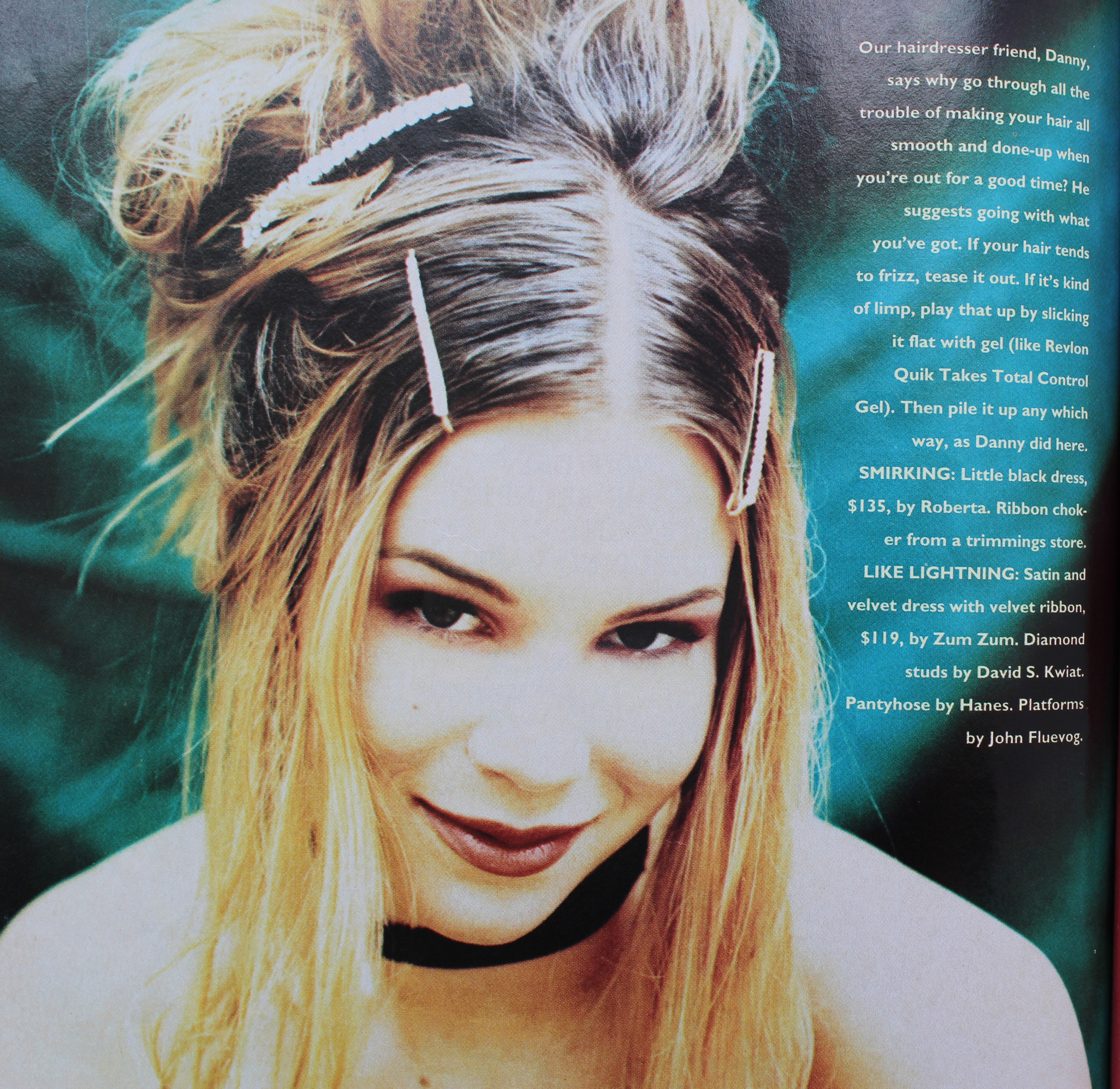
Sassy Magazine, March 1993.

Sassy Magazine, March 1993. Hair – Daniel Howell. Makeup – Wei Lang. Photography – David Jensen
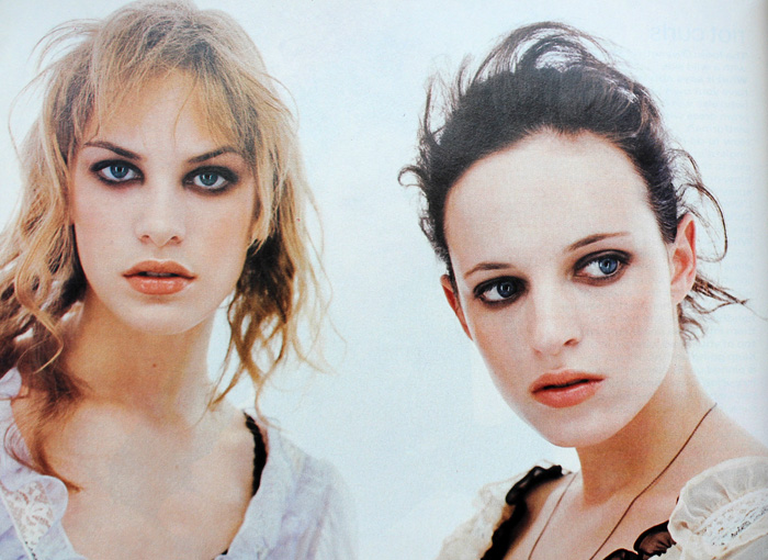
Seventeen Magazine, March 1997

Seventeen Magazine, March 1997. Hair – Pasquale Ferrante; Makeup – Susan McCarthy for Shu Uemura; Photography – Grey Zisser

The models aren't named in these next two photos but I'm almost positive I spy Alexis Bledel.

Seventeen Magazine, March 1998

Seventeen Magazine, March 1998. Hair – Kevin Woon; Makeup – Kiyoshi; Photography – Marc Baptiste
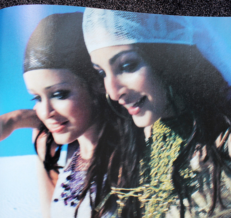
Seventeen Magazine, March 1998

Seventeen Magazine, March 1998. Hair – Kevin Woon; Makeup – Kiyoshi; Photography – Marc Baptiste

There were a handful of exceptions to all the usual looks. In one feature from YM's 1993 prom edition, a red lip was paired with a pale gold shadow rather than brown or grey and it actually looks like some blush was applied. I would absolutely wear this today (minus the skinny brows, of course.)
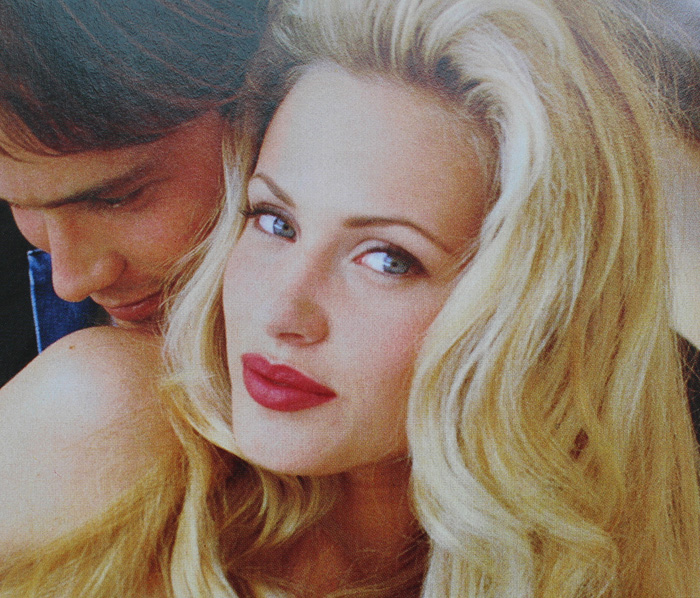
YM Magazine prom edition, 1993

Hair – Howard Barr for Celestine; Makeup – Wendy Osmundson for Cloutier; Model – Melissa Billingsly.

These next two looks had some appealing contrast between eyes and lips. While the eyebrow shapes are firmly '90s, the mix of either cool purple or silver shadow with a satin-finish plum or pink lip falls outside the usual trends from the era.
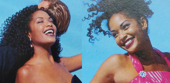
YM Magazine prom edition, 1993

YM Magazine prom edition, 1993. Hair – Phillippe Barr for Salon Ziba; Makeup – Kelly Quan for Sarah Laird.
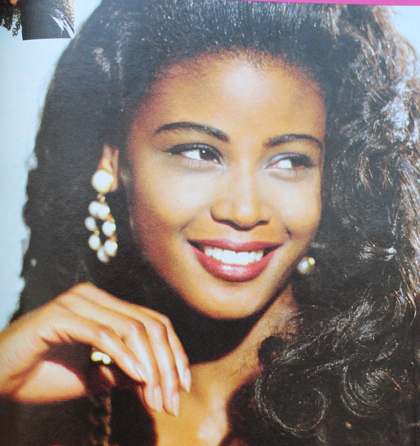
YM Magazine prom edition, 1992

YM Magazine prom edition 1992. Hair – Brian Devine, Oribe at Elizabeth Arden; Makeup – Melissa Rogers

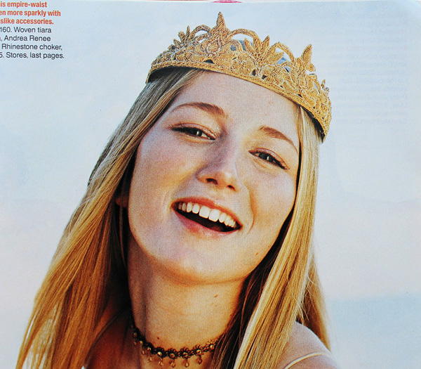
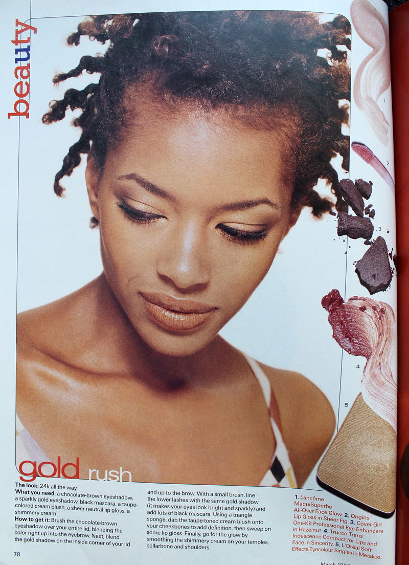
And here's another monochromatic gold look, but it's several years ahead of its time.

Seventeen Magazine, March 1994

Seventeen Magazine, March 1994

But there weren't really many outliers. Overall, prom makeup in the '90s seemed very much a microcosm of the larger trends of the decade. It was a little disappointing not to uncover any totally atypical looks (although I do think the late '90s was way more fun than the start of the decade). But I'm guessing the big magazines and movie studios/TV shows weren't going to push much unconventional prom makeup or feature anyone who wore it, and those who would opt for more daring looks on a regular basis probably weren't going to prom. Fortunately, mainstream media has somewhat caught on to a new aesthetic. The styles are very safe in most magazine covers and online content. The looks are nice and definitely updated from the '90s, but they are, shall we say, basic, or mimicking "Instagram" style makeup. However, a closer look suggests there is experimental, Euphoria-type makeup being recommended, such as the incorporation of embellishments (flowers, gems, etc.), graphic liner in a bright color, or creative use of glitter. For example, compare several of Seventeen's recent prom covers with their online recommendations, or the fairly unremarkable cover look on Teen Vogue's 2014 prom issue with the far more interesting editorial inside. (Diversity in terms of race and body shape/size still needs work.)

Seventeen Magazine prom editon covers

Seventeen Magazine prom edition – 2015, 2016 and 2019 covers
Seventeen Magazine prom looks, 2020

Seventeen Magazine prom looks featured online, 2020

(images from seventeen.com)

Teen Vogue April 2014

Teen Vogue April 2014

Teen Vogue 2014 prom editorial

Teen Vogue 2014 prom editorial

Teen Vogue 2014 prom editorial. Hair – Rutger using Oribe; Makeup – Ralph Siciliano using Lancome; Photography – Greg Harris

(images from streeters.com)

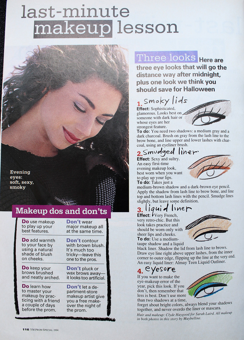
I was very relieved to see these looks, as I was horrified at the possibility of Gen Z'ers receiving the same advice that me and my fellow Gen X'ers did, i.e., to play it safe. In my day prom was akin to one's wedding in terms of makeup (which is another whole disturbing can of worms that I don't want to open right now.) The most common tips for both occasions were to play up one feature only, stay away from using multiple colors, and don't deviate much from your everyday look, along with a bunch of tricks to help one's makeup last longer. Ho-hum.

Boring prom makeup tips from YM Magazine prom edition 1994

Not surprised by Bobbi advocating for safe makeup.
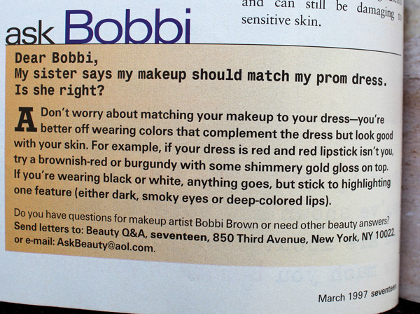
Safe makeup tips from Bobbi Brown, Seventeen Magazine, March 1997

If simple and natural is your style, or you don't want to try anything too wild for a big occasion, great! But I'd like it if makeup that actually takes risks were as normalized as looks featuring minimal makeup.

While this hasn't been the most insightful post, a glimpse of '90s prom makeup serves as a good refresher on the decade and helps give more context to the trends. Plus as a print junkie, it was insanely fun to flip through old magazines. (The movies did not hold up well..although honestly even at the time they were fairly problematic.) It kind of makes me want to do a whole book or exhibition on prom makeup from all decades. 😉

Any favorite looks here? Did you attend any proms or formals in high school and if so, do you remember your makeup or have any photos you'd be willing to share?

This post has been in the making for literally years. I finally conceded that I couldn't find a complete history of either Benefit's Glamourette compact, released in 2002, or the vintage compact it was based on, House of Platé's Trio-ette (ca. 1944-1947). But I did turn up a few nuggets of information, so figured I'd share the little bit that was readily available.

House of Platé Trio-ette compact (ca. 1944-1947) and Benefit Glamourette compact (ca. 2002-2003)

House of Platé Trio-ette compact (ca. 1944-1947) and Benefit Glamourette compact (ca. 2002-2003)

The House of Platé company was established in 1944 by Robert T. Plate in Detroit. From what I was able to piece together from various archives, it seems Plate was born in 1897 in Lima, Ohio and received a Bachelor's degree in mechanical engineering from the University of Michigan in 1923. Specializing in automobile design, his first job was draftsman for the Willys-Overland Company in Toledo. Beginning in 1932 Plate worked for General Motors, and in 1938 he was doing business as the Plate Manufacturing Company. In 1945 he trademarked the Trio-ette compact under Curly Lox Products.  The biggest mystery for me is why Plate decided to market cosmetics. I'm assuming it was a side hustle to earn a little extra cash, or maybe he thought he could become the next Max Factor. (As a side note, Plate moved quite frequently throughout his life, bouncing around from Ohio to Michigan to New York to LA…if it's the same Robert T. Plate, I'm not sure whether he was trying to help his business take off across the country or moving for engineering jobs.)

Trio-ette trademark registration

The design of the compact was based on a "quaint Victorian rose cameo hand mirror" according to one ad. This one is reproduced in Roselyn Gerson's book Vintage and Vogue Ladies' Compacts (2nd edition).

Trio-ette ad, House and Garden, 1946

It's really fascinating to see how a mechanical engineer who designed cars approached makeup. Compacts with powder, rouge and lipstick had existed for years, but few had the novelty and charm of the Trio-ette's design. (However, one can definitely tell an engineer also thought of the rather unimaginative House of Platé name. I guess Plate thought adding an accent over the "e" would make it sound vaguely French and therefore instantly appealing.) I'm so disappointed that I wasn't able to find patent drawings despite having the serial number. But maybe the trademark is different than patenting the actual design.

Trio-ette compact box

Trio-ette compact

Trio-ette rouge

Trio-ette compact open

Trio-ette compact outer mirror

Trio-ette compact lipstick

The name on the handle is such a sweet little detail.

Trio-ette compact handle

Trio-ette ad in the Californian, October 1946
(image from archive.org)

As the Trio-ette was conceived and launched during WWII, it was made of plastic, specifically tenite, instead of metal. Tenite apparently is the trade name for a cellulosic plastic created by Eastman Chemicals in 1929. (I wish I knew the difference between tenite, bakelite, and celluloid. Alas, I have no clue.) The Trio-ette was also refillable. This snippet from Drug and Cosmetic Industry shows the refill kit, but the really interesting thing about this blurb is that the journal was not falling for the Trio-ette's hype, claiming it was nothing more than a "gadget" and citing the more "streamlined" designs from established big-name brands.  It's true: companies had been making triple compacts for a good 20 years by that point.

Trio-ette - Drug and Cosmetic Industry, January 1945
(image from archive.org)

Whether it was a novelty or a truly handy compact to carry, the Trio-ette seemed popular, or at least, it was readily available across the entire country in department stores as well as drugstores. Plate, though not a businessman by trade, understood the importance of advertising. In late 1945 he hired NY-based firm Norman D. Waters and Associates to oversee a national campaign they would launch early the following year. The Trio-ette allegedly reduced "bag fumbling" and "makeup fatigue".

Advertising Age, February 1946

As with lipstick mirrors, it was considered a social faux pas to be digging through one's purse to look for your makeup, mostly because it was a potential inconvenience for men. Ladies, with the Trio-ette he won't mind waiting for you to touch up since it won't take long at all – all your makeup is in one place so you won't waste his time searching for it. *eyeroll* These ads certainly paint a picture of gender norms, don't they?

Green_Bay_Press_Gazette_Mon__Apr_8__1946_

There were other products from House of Platé, including a double-ended lipstick called the Duo-ette and the Vista, a lipstick with a built-in mirror (again, you can see my post on those.)

House of Platé ad, 1946

The Trio-ette came in a variety of colors as well as black ones with a pink rose or a rhinestone border.  According to collector's guides, the most valuable colors are blue, pink and green. Personally, while I love all the shades, my most-wanted would be the rhinestone version followed by the green and mock tortoiseshell.

Trioettes and Duo-ette lipstick
(image from pinterest)

Trio-ette compact with rhinestones
(image from etsy.com)

The Trio-ette was quite short-lived. I'm not sure why exactly; it could be that Plate had run into a trademark issue with Curly Lox, or maybe after the war a return to metal compacts was all the rage and plastic fell out of favor. Or it could also be that a copycat was released around the same time. In the UK, a company named Jason released a nearly identical compact in late 1947. The only difference I can see besides the name is that the front of the compact is plain instead of bearing a sculpted rose.

Trio-ette by Jason, ca. 1947-1949
(image from antiquesatlas.com)

According to the British Compact Collectors Society, the Jason Trio-ette was also known as a "three-in-one" and available in blue, green, ivory, black and tortoiseshell and could be ordered by mail from Targett Tools Ltd., London. It's not clear what, or even if, there was a relationship between House of Platé and Jason.

Jason Trio-ette, Board of Trade Journal May 1948

What's undeniable is the impact the Trio-ette had on future compact designs for the bigger brands. Volupté launched a compact with powder, lipstick handle and outer mirror in 1951 within its Demitasse line, and by 1953 it was advertised as the "Lollipop".

Volupte Demitasse Lollipop compact, ca. 1951-1954

Volupte Demitasse Lollipop compact, ca. 1951-1954
(images from etsyc.com)

Volupte Lollipop ad, Hartford Courant, June 1954

Around 1952 Coty launched its Parisienne vanity, similar to the Volupté Lollipop, but with no mirror on the outside of the compact.

Coty Parisienne compact, ca. 1952-1959

Coty Parisienne compact, ca. 1952-1959
(images from etsy.com)

Perhaps another reason for the Trio-ette's brevity was simply that Plate couldn't compete with the more well-known brands, who in addition to name recognition, also had a far bigger advantage in terms of marketing savvy. Coty's Parisienne, for example, was somewhat misleadingly advertised as a "4-in-1" even though it actually only contained two products – the mirror and puff were considered the 3rd and 4th items. While some ads describe the design as a miniature hand mirror just like the Trio-ette, some others claim the Parisienne to be a "replica of a Cartier-designed original," which sounds way fancier than a Victorian hand mirror. Maybe if Plate had hired an agency with sneakier copy writers to advertise the compact differently, it might have had some longevity. As I noted earlier, he was educated as a mechanical engineer and not a businessman, so navigating the world of ad agencies and cosmetics marketing was a tricky prospect.

Anyway, House of Platé dropped the accent over the "e" and inexplicably shifted to making plastic toys by mid-1948, which continued through 1951.

House of Plate ad in The Billboard, 1949
(image from archive.org)

Unfortunately Plate was no longer running a legitimate business at that point. According to a 1951 FTC ruling, essentially the House of Plate was mailing people products they did not order and then demanding payment. It's a common scam that persists today in the form of "free trials" of various products. (A few years ago my own mother was the victim of one of these schemes in the form of a trying out a "free" face cream she was sent.) In 1951 the company was officially dissolved. Plate passed away on December 10, 1966 in Athens, Greece.

Now let's investigate Benefit's Glamourette. First, a little background. Founded as a San Francisco boutique called The Face Place by twin sisters Jane and Jean Ford in 1976, the company was renamed to Benefit in 1990 and launched at Henri Bendel in 1991. The cheeky names and retro vibe quickly made their products best-sellers across the country. In 1997 Benefit made its international debut and was acquired by LMVH in 1999. Using vintage mannequins as their mascots and creating packaging inspired by everything from '20s face powders to '70s lip glosses, Benefit was widely recognized as a fun brand that lightheartedly saluted beauty products of yesteryear.

Benefit ad - Vogue, May 2000

Benefit ad - Vogue, May 2000(images from archive.vogue.com)

The company had firmly established its playful kitschy take on cosmetics by the early 2000s, but why they decided to draw on the Trio-ette specifically is unclear. None of their other products seemed to be literal remakes of a particular piece of makeup from earlier times. As with the Trio-ette, I wish I could hunt down the patent drawings for their version of the compact. I also wish I could find anyone who worked for Benefit during that time and see if they have any inside information as to what inspired the company to update the Trio-ette.  We know that the Ford sisters were vintage collectors, so maybe one of them came across a Trio-ette and thought it was the perfect compact to use in their line, but why?

Benefit Glamourette trademark filing

Benefit Glamourette box

Let's compare the Glamourette with the Trio-ette. I would have done a smackdown because they are nearly identical but pitting a spry 20-year-old against a 70+ relic didn't seem like a fair fight.  Obviously the formulas for the makeup itself were updated with newer ingredients.

Benefit Glamourette compact (ca. 2002-2003) and House of Platé Trio-ette compact (ca. 1944-1947)

The lace pattern on the inside of the lid is a nice nod to the pink floral pattern that appears on the insert included with the Trio-ette.

Benefit Glamourette box

Instead of a rose on the lid Benefit used an abstract squiggle design. Also, I don't think the Glamourette was offered in other colors; to my knowledge, only black plastic was available.

Benefit Glamourette

Benefit Glamourette outer mirror

The lipstick mechanism appears to be the same between the two compacts, but Divine's rosy brown hue is unmistakably '90s/early 2000s. Instead of the company's name on the cap there's a sticker saying "lipstick". I would have strongly preferred Benefit's name rather than a totally unnecessary sticker. I know people are dumb but it's pretty obvious it's lipstick…no need for a sticker.

Benefit Glamourette lipstick in Divine

Benefit Glamourette blush in Divine

Interestingly, the powder and blush are reversed from the Trio-ette, i.e. the blush is on the inner part of the compact and the powder is on the outer side. You could also swap out the powder for Fancy Lady cream highlighter.

Glamourette Fascinating Finish face powder

The shade range for the face products had not improved since the 1940s. In fact, I suspect the Glamourette's was even worse. I'm not 100% sure, but it's my understanding from reviews that Fancy Lady didn't come in any other shades besides a pale ivory/champagne. And while I can't make out this tiny photo, it looks like Fascinating Finish powder, appallingly, also only came in one very light shade.*  I know it was 2002, but I was pretty into makeup by then and I distinctly remember just about every line having at least 3 options for face powders and tinted moisturizers by then: light, medium and dark. It's absolutely inexcusable that Benefit didn't offer the bare minimum for face powder shades in the Glamourette compact.

Benefit Glamourette ad
(image from amazon)

Getting back to comparing the two, unlike the Trio-ette, the Glamourette came with a wristlet that could be used as a storage pouch. It's a very sheer piece of organza that I don't think would have been too helpful in terms of preventing wear and tear, but interesting to note.

Benefit Glamourette wristlet

Obviously the advertising for the Glamourette was similar to its 1940s counterpart. Both touted ease of use, refillable products and chic, vintage-inspired packaging. Bag fumbling was still presented as a tedious time waster for the new millennium's busy modern woman. Perhaps as a sort of snooty counterpoint to the golden age of trashy reality TV and super glossy, frosty makeup finishes that appealed more to teens than adults, the Glamourette was also described as "discreet" and something a "real lady" would carry, whatever that means.

Benefit Glamourette ad in the Orlando Sentinel, November 2002

Daily_News_Thu__Aug_8__2002_

The Glamourette was generally well-received. There are a few reviews on Makeupalley gushing over its cuteness and convenience while acknowledging it was a gimmick. One reviewer mentioned she would pass it on to her 11 year-old daughter in a few years, so Benefit helped rekindle the notion of makeup as a keepsake. While most MUA'ers felt the amount of product was a bit stingy for the price point, overall they loved the style and found the compact practical for a night out. Several reviews also pointed out the similarity to the black plastic packaging of Anna Sui's line. 

Speaking of product amounts, I don't have the exact numbers for the Trio-ette, but if they were the same as the Glamourette, the latter was actually a better deal. The Trio-ette retailed for $5.50 in 1946, and according to an inflation calculator it would have cost about $51 in 2002 when the Glamourette was being sold. Glamourette's retail was $38 ($55 CAD and £32.50 in the UK). I also find it amusing that the reviews commented on how streamlined and tiny the compact was when Glamourette is actually a smidge larger than the Trio-ette, which was described as "bulky" in the Drug and Cosmetic Industry article. As we know, makeup packaging gradually got bigger over the years, so the Glamourette demonstrates how both design and consumer expectations changed. 

Benefit Glamourette compact (ca. 2002-2003) and House of Platé Trio-ette compact (ca. 1944-1947)

Despite the amount of press and good reviews, the Glamourette was a limited edition item that did not return to the market after its brief two-year stint. Even against the backdrop of '90s/early aughts' nostalgia for mid-century styles (see also Too-Faced's Quickie Chronicles) maybe the Glamourette was too retro for most customers. I know when I laid eyes on it I thought it was cute but overly vintage-looking for my taste. It could also have been the type of products included. While there absolutely was and will always be a demand among those sticking to simple polished looks and makeup classics in neutral tones, in the early 2000s traditional lipstick, face powder and blush weren't the most wanted product categories among the younger crowd. Says one Makeupalley reviewer, "It has powder and blush which I never use to touch-up, so I'd never carry this with me. And it also has lipstick, and I'm not a fan of lipstick. If they replaced it with concealer, bronzer, and lipgloss, I'd sell my soul for it!!"  Perhaps a tiny sifter of body glitter may also have been more palatable for a Y2k audience. Finally, the lack of shades for anyone whose skin was deeper than mayonnaise obviously eliminated a good portion of the market.

Benefit Glamourette compact (ca. 2002-2003) and House of Platé Trio-ette compact (ca. 1944-1947)

I still can't wrap my head around why Benefit chose this exact compact. I'm just spitballing here, but maybe it's precisely because House of Platé wasn't a well-known brand that's still sold today. Perhaps Benefit didn't want to risk running into copyright issues that may have occurred if they chose to release an updated version of, say, Revlon's Futurama cases. The patents for those designs may have expired, but the companies are still around and significantly larger than Benefit was – although it was owned by LMVH by that point, Benefit's rivals had the potential to take legal action if the company tried to update an iconic product from their archives.

Even though there's a 55 year age gap between the Trio-ette and the Glamourette, their advertising and reception were remarkably similar. So much had changed between 1947 and 2002, yet the design appealed to totally different audiences. As Drug and Cosmetic Industry noted with the Trio-ette, people love a novelty product even if the underlying concept – in this instance, having three makeup products in one attention-getting case – has been done before. It got me thinking about how a third iteration of the compact would be marketed and received today. The small sizes and refills would be attractive to today's makeup consumers, but the compact would have to be made out of sustainable packaging; plastic won't play well. Maybe the products could be even smaller to make space for brushes rather than puffs. There would probably have to be some kind of emphasis on "wellness" and "self-care" or at the very least, "clean" (sigh), vegan and ethically-sourced ingredients. Most importantly, the shades would need to accommodate all skintones. One parting thought: I'd also be curious to see what would happen if a company released it not today but 55 years after the Glamourette. I wonder how makeup customers in 2057 would react.

House of Platé Trio-ette compact (ca. 1944-1947) and Benefit Glamourette compact (ca. 2002-2003)

What do you think of the designs of these compacts? Do you have a preference for one or the other? And do you like having your makeup all in one place? I could see using something like this for touch-ups, but it would still fall short. Until a product is developed that combines concealer, powder, blotting sheets and lip color all in one, I'm destined to dig around in my bag.


*There was an article in Global Cosmetic Industry from 2002 that lists the following colors for Glamourette blush and lipstick refills. It doesn't make any mention of multiple shades being available for the highlighter and powder. "Rouges in Divine, Fickle and Coy, Fascinating Finish Translucent Powder and Fancy Lady Highlighting Creme are priced at $11.00 each. The line offers Lip shades priced at $9.00 each in Keen (champagne pearl), Vain (vibrant red), Divine (rich plum), Swell (dusty rose), Prim (pink-cocoa pearl), and Coy (mocha apricot) varieties." I cannot for the life of me locate the article now but I know it existed!

In an effort to condense a few posts I'm doing some quick reviews of recent additions to the Museum's library. Hopefully they'll be of use…I mean, they can't be any worse than my usual long-form reviews, right?

Up first is historian Cheryl Woodruff-Brooks's biography of Sara Spencer Washington, who established the Apex News and Hair Company in 1919. Over the years the company expanded to include 11 Apex Beauty Colleges in the U.S. (including one right here in Baltimore – more on that later!) and abroad, Apex Laboratories to manufacture hair care, cosmetics and even household goods, and Apex News, which produced publications for her estheticians and sales agents. The Apex empire, as it came to be known, employed roughly 45,000 sales agents at its peak. Madame Washington wasn’t just a savvy entrepreneur; she regularly gave back to the Black community by offering scholarships to Apex schools, establishing a golf course that welcomed people of all races and economic status, and even founded a nursing home, Apex Rest.  Golden Beauty Boss: The Story of Madame Sara Spencer-Washington and the Apex Empire is relatively short but incredibly informative.  I can only imagine how many hours the author spent digging through various archives.
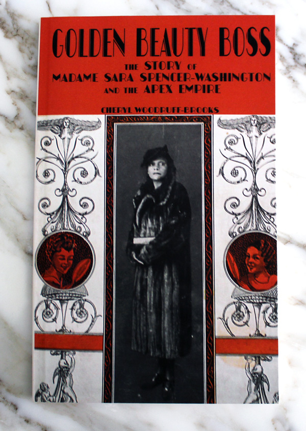
Golden Beauty Boss by Cheryl Woodruff-Brooks

Quality research and an intriguing story about one of the most successful Black entrepreneurs in history is a must-have for well, anyone! You can buy it here.

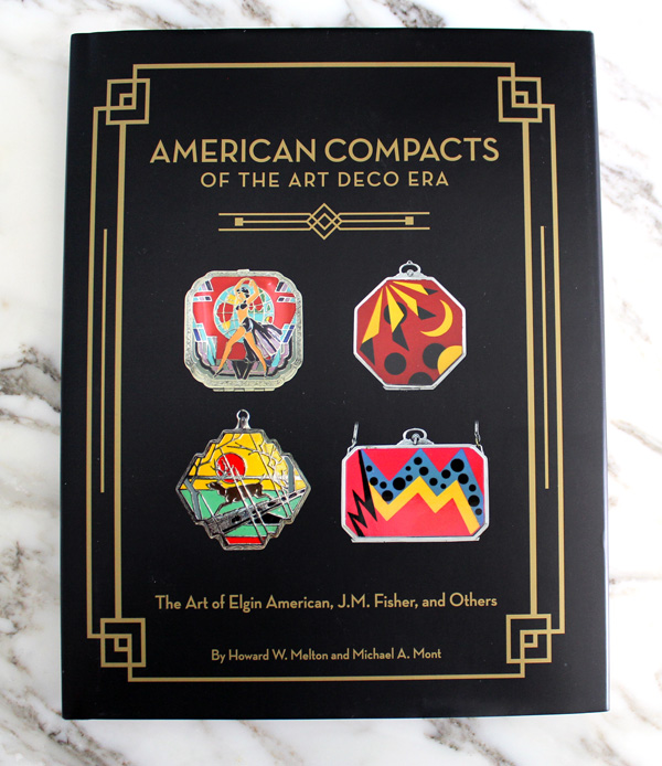
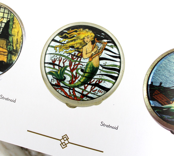
Next we have Howard Melton's and Michael Mont's American Compacts of the Art Deco Era: The Art of Elgin American, J.M. Fisher, and Others. This isn't a collector's guide; it's more along the lines of Jean-Marie Martin Hattemberg's tomes on powder boxes and lipsticks in that there are many images of beautiful objects to drool over with some wonderful history along the way. It also includes a good amount of ads, which are very helpful in identifying compacts – of course, you can also see some Elgin compact catalogs over at the Elgin History Museum archives

American Compacts of the Art Deco Era

American Compacts of the Art Deco Era

What I love about American Compacts is that it focuses on the compacts of a particular era and country so it's not overwhelming, yet still provides useful information throughout. The story of Elgin's Bird in Hand compact is a particularly great highlight.  Overall, American Compacts is a necessity for the vintage makeup collector or anyone with an interest in Art Deco design. As for purchasing, you remember my interview with Andra of Lady-A Antiques, right? Well, she's offering this book at a reduced price at her store, so be sure to buy it there!

Moving along, I read Color Stories: Behind the Scenes of America's Billion Dollar Beauty Industry by journalist Mary Lisa Gavenas. It's a bit dated at this point since it was published in 2002, but still a good read as it provides a very fascinating behind-the-scenes, soup-to-nuts description of how makeup color stories were selected and marketed each season during the 1990s and early 2000s – essentially a full, unbiased story of the process. 
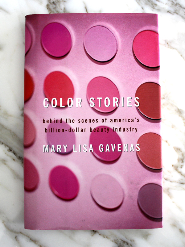
Color Stories by Mary Lisa Gavenas

It's very useful for anyone looking for cosmetic marketing history as well as '90s makeup history (ahem), but I think it would also be interesting for fashion or business historians more generally.  I would dearly love to see an update for the age of social media, Millennials/Gen Z'ers and the increased demand for diversity and inclusion among beauty consumers. So much has changed in 20 years!

Next up is another drool-worthy book I found on ebay. It's in Japanese so I can't actually read any of the text, but the photos are more than worth it. You'll find lots of vintage Shiseido and other Japanese brands along with a sprinkling of Western lines such as L.T. Piver packaged for the Japanese market. While powder boxes, skincare and perfume comprise most of the objects, there's also personal hygiene products like deodorant and tooth powder.
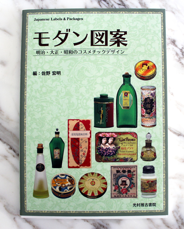
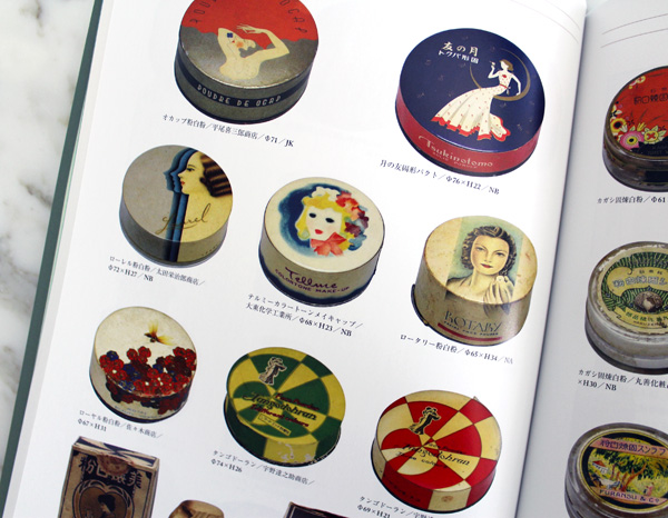
Japanese labels and packaging book

Japanese labels and packaging book

If you love vintage powder boxes, vintage design and typography, or Japanese culture in general, this belongs on your book shelf. I'm keeping my fingers crossed for an English version so I can read the history behind some of the brands that are covered.

Finally, there's Lucky Lips: Stories About Lipstick, written by René Koch (a.k.a. the founder of the Lipstick Museum.) When I purchased the book I mistakenly thought it had English text alongside the German. Oops. Still, it's a nice supplement to Jean-Marie Martin-Hattemberg's Lips of Luxury as it contains different vintage lipsticks, some of which I hadn't seen before.
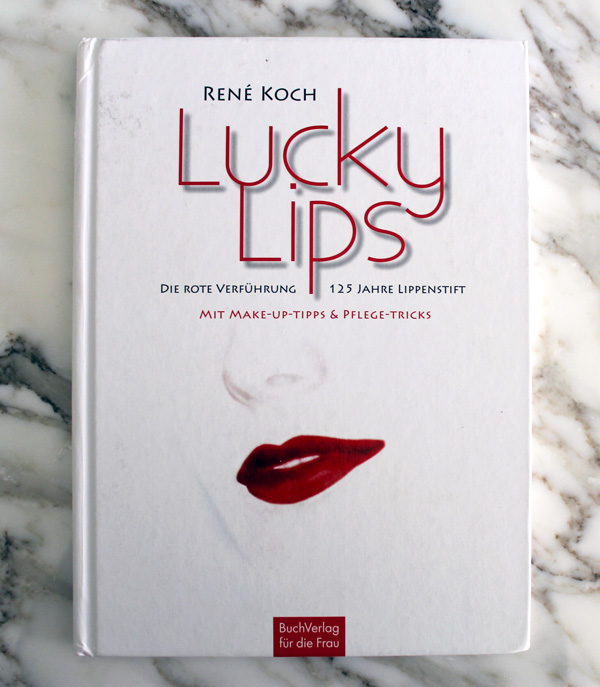
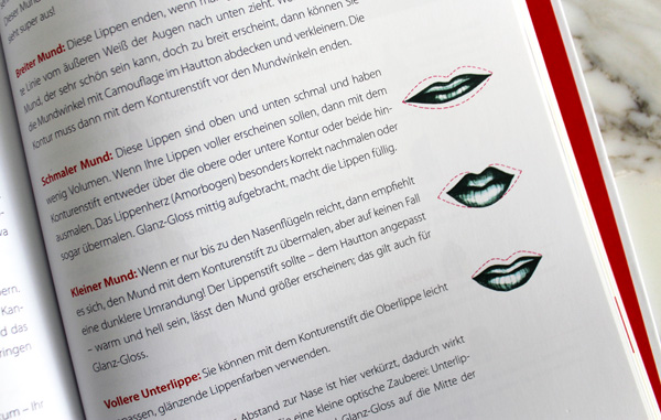
Lucky Lips book by Rene Koch

Lucky Lips book by Rene Koch

I wish I could compare the information offered in both books, but at the very least I can tell that Lucky Lips has some tips on lipstick application and 20th century lipstick history organized by decade. Overall, it's good to have on hand and a quality addition to the vintage makeup collector's library, especially if you can read German. (I've said this before, but if I could have any superpower it would be fluency in all languages within a matter of minutes.) If you had to choose between this one and Lips of Luxury, however, I'd go with the latter as it's a bit more extensive.

Are you interested in any of these? What books, beauty-related or otherwise, have you finished recently?

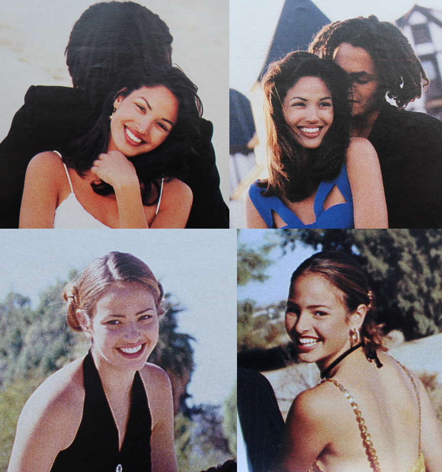
From 1947-1949, the Dorothy Gray brand ran a series of ads featuring portraits of "fascinating women".  I don't know why I'm covering them given that they're all white, upper-crust socialites who for the most part didn't do much besides existing while rich, but I guess my insatiable curiosity about vintage advertising got the better of me. I was determined to find out more about these ladies and the artists who painted their portraits in the hopes of figuring out why Dorothy Gray embarked on this campaign. So with that, here are brief bios of 6 of the women and the artists, along with a couple of examples of their other work. Stay tuned for part 2 to see the other five women featured and some theories about the campaign.

We'll start with the ladies that I couldn't find much info on. First up is Mrs. John P. Labouisse (1911-1984).  Near as I can figure, Mrs. Labouisse's maiden name was Olive May Moore. Both she and her husband came from prominent New Orleans families.  They had one child in 1935, who passed away in 2005.  I'm not sure if it's intentional, but I find it interesting that the ad copy mentions that the packaging can accommodate "the most regal boudoirs," while Olive is portrayed what appears to be a fancy peignoir or dressing gown, more suitable for the bedroom than daytime wear. Then again, I'm no fashion historian so I might be completely off base.

1947 Dorothy Gray ad featuring portrait of Mrs. John P. Labouisse (Olive May Moore)


Alexander BrookAlexander Brook (1898-1980) was a New York-based Realist painter known for his portraits and landscapes.  While recovering from a bout of polio at the age of 12, he became interested in art. A few years later he enrolled at the Art Students League, and by the 1920s he was exhibiting at what would become the Whitney Museum.  Brook was one of the most highly renowned American painters of his time, having multiple solo exhibitions across the country.  Personally, I can't say I'm fond of his work. There's a sadness about his subjects that I'm not sure comes from the way he chose to paint them or if they were melancholy on their own. 

In any case, Brook would often paint his first impression of his sitters to capture a truer likeness. "When I do a portrait, whether it is one of my own choice or a requested commission of someone I hardly know, I find that my first impression of the proposed sitter is usually the one I strive to paint…whenever I hold closely to  my original, instantaneous observation or try to emphasize even more the qualities I saw in my first conception, I paint with greater ease and the result is more satisfactory to me. To be able to retain and paint the spirit of what was seen in my first glance gives me a freer rein to achieve a more individual result than would a careful analytical conclusion." (quoted in the Daily Oklahoman, May 29, 1949)

Alexander Brook, Southern Belle, 1946
(image from pinterest)

But perhaps what I'm interpreting as sadness is actually "sensitive character study and introspective mood," according to a 1981 re-evaluation of Brook's work in the New York Times. The article also notes that the once tremendously popular genre of World War I figurative portraits had gone out of style once abstract expression rolled in after the second World War, but made a comeback in the late 1970s and early '80s as a result of the rekindled interest in realism. Hence Brook's oeuvre being re-examined then.  To my knowledge there has not been a third massive exploration of his work since the early '80s. 

Alexander Brook, Morning Light, 1936
(image from whitney.org)

Alexander Brook, Portrait of Emily Wilson, 1954
(image from americanart.si.edu)

I really don't care what the Times or other critics say, these murals in the Clinton Federal Building are objectively somber due to both Brook's style and the subject matter.  In 1939 Brook was commissioned to paint several murals under one of the New Deal art programs. These are titled "Writing the Family Letter" and "Reading the Family Letter," which depict families who were separated due to relief efforts in the Great Depression and who depended on letters to keep them emotionally connected.

Alexander Brook, Writing the Family Letter, 1939

Alexander Brook, Reading the Family Letter, 1939
(images from gsa.gov)

Overall, while I appreciate the no-frills approach and quiet dignity with which he painted all his subjects, I didn't find Brook's style all that enthralling. But if you're so inclined you can buy his monograph.

Next we have Mrs. Stanley G. Chamberlain, formerly known as Esther Carolyn Nice.  Esther was born around 1906, so that would make her about 43 in 1949 when the ad was released. I'm amused by the fact that Dorothy Gray not so subtly paired an over-40 woman with ad copy discussing how one could maintain the "precious bloom of youth" in her 40s by using their products. I wish I had some details on Esther's life besides the fact that she and Stanley had three children.  Esther passed away suddenly on November 23, 1968.

1949 Dorothy Gray ad featuring portrait of Mrs. Stanley G. Chamberlain (Esther Nice)

There was plenty of information on the artist behind Mrs. Chamberlain's portrait, however. William Coffield Fields, III was a highly successful portrait artist, consistently painting and exhibiting his work from the early 1940s until the 1990s, when he increased his focus on local history and genealogy. A native of Fayetteville, North Carolina, Fields graduated from the fine arts program at the University of North Carolina in 1938 and later studied at the Museum of Fine Art in Boston – probably how he got the attention of the Boston-based Chamberlains. But for most of his career he divided his time between New York City and Fayetteville.  In 1951 he spent 7 months in Italy, painting portraits of Pope Pius XII, Prince Ludovico Chigi, and the Prime Minister during World War I, Vittorio Orlando.

Fields-The_News_and_Observer_Sun__Nov_30__1952_

Fields believed that a good portrait didn't necessarily require technical skill; a rapport with the sitter was more important in conveying their personality. "A portrait should be an encounter. You should know something about that person when you look at it," he stated in 1980. Though he painted many well-to-do women and other notable people throughout his career, Bill seemed fairly down to earth, teaching regularly and volunteering for a number of local arts organizations. He thought being referred to as an artist was pretentious, and preferred to be called a portrait painter. Plenty of middle-upper class families commissioned him for portraits, which makes me think he charged more affordable rates than his peers or worked on a sliding scale. Coupled with the fact that there were no mentions of Esther in the society pages, I'm guessing the Chamberlains kept a low profile or perhaps were not as astronomically wealthy as some of the other ladies in this series given their choice of artist. Fields passed away in 2007, having left a vast body of historical work on Cumberland County, NC as well as his portraits (none of which I could find online, alas.)

Next we have Brooklyn-born Gertrude Gretsch Astor (1923-1999), who married multimillionaire John Jacob Astor in September 1944.  While she was technically a debutante, having made her debut at a grand party in 1941, she was also described as "non-social".  

1949 Dorothy Gray ad featuring portrait of Mrs. John Jacob Astor (Gertrude Gretsch)
(image from periodpaper.com)

Bridal photo of Gertrude Gretsch, 1944

After 6 years of marriage to Astor and one child, a nasty and drawn-out divorce ensued, with Gertrude citing Astor's "innumerable and shameful associations with a variety of women" as the impetus for divorce proceedings. It was, as you could imagine, quite scandalous at the time. But don't feel too bad for Ms. Gretsch, as ultimately she was provided with $3,000 (or $28,000 in 2021) per month in alimony.  She eventually got remarried to Italian director/playwright Sonio Coletti in 1968. Gertrude passed away on January 16, 1999.

Walter-klettWalter Charles Klett (1897-1966) was primarily known not for portraits but for his figurative paintings and commercial work for magazines such as Collier's, including this racist gem of a cover. Born in St. Louis, he attended the School of Fine Arts there before heading to Chicago in 1925.  Three years later he and his wife moved to New York, where he remained until his death in 1966. 

Klett published a very well-received guide to figurative paintings in 1948.  Said one critic, "The artist declares he is a painter of women, and he definitely prefers glamorous women, and this predilection, he believes, damns him in the eyes of contemporary painters whose brushes are moved by anything but beauty."  Klett's women are indeed glamorous, but there's also a sensuality about them that borders on classic pin-up style.


Walter Klett, illustration for Collier's magazine, 1947
(image from amazon.ca)

Walter Klett, illustration for Collier's magazine, 1947
(image from ebluejay.com)

Walter Klett, Sono Osato, 1946
(image from amazon.co.uk)

Turns out, Klett did illustrate a pin-up for Esquire.

Walter Klett, illustration for Esquire magazine, 1947
(image from thejumpingfrog.com)

Later in his career Klett experimented with pastels and watercolors, lending a softer, airier feel.  This 1959 painting reminds me a bit of Matisse.

Walter Klett, Composition #60, Butterflies, 1959
(image from invaluable.com)

Up next is Mrs. John A. Morris, formerly known as Edna Brokaw.  Edna, a statuesque (she was 5'10"!) beauty with a wicked tennis game, made her debut in 1928 and married John, a Harvard graduate/stockbroker on May 27, 1942.  The wealthy Morris family was known for thoroughbred horse-racing and breeding, with their all-scarlet racing silks dating back to 1840. Dorothy Gray used Edna's portrait to advertise a fairly simplified, no-nonsense skincare routine, which seems fitting for her. And the mention of "grooming" makes me think they were possibly referencing the grooming and care of the Morris' horses, which was a priority in their lives – the family actually established an equine research library at the University of Kentucky.

1947 Dorothy Gray ad featuring portrait of Mrs. John Morris (Edna Brokaw)

While she certainly enjoyed the perks of being rich, such as growing up in a mansion on 5th Avenue in New York, Edna was not interested in the socialite lifestyle.  "I didn't want to be a deb. I wanted to go to college so much, but for girls like me it just wasn't done. My mother would have none of it," she said in a 1985 interview. I know, I know, let's break out the world's smallest violin, but for someone like me who, for the most part, abhors social gatherings, being forced to attend them daily as a career of sorts is my idea of hell. Before she got married, Edna worked as a nurse's aide and attended secretarial school. She refused to marry John until she had secured a job, as she needed to prove she could be self-sufficient.  She was also consistently active in fundraising efforts for Girl Scouts from the 1950s until her death in January 1997 at the age of 88. I enjoy this photo from the 1985 interview in which she's wearing the same pearl necklace from her portrait nearly 40 years prior.

Edna Brokaw in 1985

Jerry Farnsworth (1895-1983) was born of meager means in northern Georgia. Growing up he didn't have any real exposure to art until the age of twenty, when he attended an art exhibition for the first time. From that point on he knew he wanted to be an artist.  He married Helen Sawyer in 1925 when both were art students under Charles W. Hawthorne, founder of the Cape Cod School of Art.  In looking at both of their work I can definitely see the influence.

Jerry Farnsworth, Portrait of Lucia Seated in a Green Room(image from christies.com)

Jerry Farnsworth, My Cousin
(image from invaluable.com)

Like his contemporary Alexander Brook, Farnsworth was best known for his portraits and his style didn't change much over time.  One of his personal favorites was his portrait of Martha Truman, mother of the 33rd President of the United States, Harry Truman. 

Jerry Farnsworth, Portrait of Martha E. Truman, ca. 1944-45
(image from trumanlibrary.gov)

Farnsworth was also recognized for his magazine covers such as this depiction of Hitler with a dog, which appeared on the cover of the March 13, 1933 issue of Time magazine

Jerry Farnsworth, Adolf Hitler, 1933
(image from npg.si.edu)

While I think his style is a bit livelier than Brook's, Farnsworth is not my favorite of this bunch. Still, I admire his dedication to arts education – he taught at many colleges, and he and his wife set up a summer art school in Massachusetts.

Coming in at portrait no. 5, here's Mrs. Farrell Steele, formerly known as Helen Fairfax Farrell.  Helen was a textbook example of a Southern belle/debutante, coming from extreme wealth on both sides of her Nashville-based family. 

1947 Dorothy Gray ad featuring portrait of Mrs. Farrell Steele (Helen Fairfax Farrell)

Just to give you an idea of the kind of money we're talking about, Helen was the heiress to the Maxwell House coffee fortune.  In 1925 her father purchased an English Tudor house situated on a 2,000 acre estate and named it Crieve Hall after his family's home in Northern Ireland. The family also had their own box at horse shows, and in 1940 Helen had $2,800 worth (or $52,600 in today's currency) of jewelry stolen from the family's summer home.  I'm still trying to wrap my head around having that kind of cash.  

photo of Helen Fairfax Farrell, 1944

Anyway, on October 7, 1944 at Crieve Hall, Helen married George S. Steele, a Yale graduate who worked for the Foreign Economic Administration in Washington DC.  Exactly a year after their wedding day, the couple had a daughter. But the marriage would not last; just a few months later, in February 1946, Helen filed for divorce, citing "mental cruelty." While initially I had zero sympathy towards Helen and her family, I do feel bad that she was shipped off to boarding schools far away from her family growing up and then had to endure a marriage, however brief, to a possibly abusive husband. As you know, divorce back then was fairly stigmatized, especially among the wealthy whose every move was recorded by the press. I'm guessing many of the marriages between rich families were business mergers more than anything else, and they probably saw it as important to keep the money in the family for future generations. The fact that Helen got out of there so quickly and the official reason makes me think George was not a nice person.  Of course, this is pure speculation and I hope that wasn't the case, and it's not my intent to go spouting baseless accusations. But something seemed off.  Fortunately Helen got re-married to Theodore Mentis in 1971 and remained married to him until his death in 1982. Helen passed away in 2006.

Channing ("Uncle Bunny") Weir Hare was a noted society painter shuttling between his home base in Ogunquit, Maine and Palm Beach, Florida, so it stands to reason he captured Helen's likeness. Described as the "crown prince of society portrait artists," charging $3,000-$10,000 per portrait (or $44,000 – $146,000) as well as "flamboyant," Hare was known as much for holding elaborate parties for other artists and top socialites as he was for his art. Hare was also gay, though not legally out of the closet for most of his life – he separated from his wife, whom he married in 1929, but never divorced her, remaining married (on paper, anyway) until her death in 1966.

Channing Hare, Self-Portrait

Hare bristled at being called a society painter, though society portraits allowed him to make a good enough living to eventually purchase a grand Mallorcan palace with a butler, chef and 16 servants.  As Palm Beach portrait artist Richard Banks remarked in 1990, "Channing Hare could be vicious and cruel, but he was also a terribly funny guy who would just woo those ladies. He had bought a place in Majorca and when he knocked off a portrait, he'd say, 'Well, there's another bathroom for the house.'" He was also somewhat picky about who he chose to portray.  "Please don't call me [a society painter], because when they call you that, they don't take your work seriously. Besides, I'm in too many good museums…often I paint people who just interest me," he noted in 1970.

Channing Hare, Friend of Dorothy
(images from americangallery20th.wordpress.com)

Like Fields, Hare painted many people of note, including members of European royalty and the Vanderbilts in the U.S.  He also did not work from photos unless it was absolutely necessary, preferring to paint from the memory of his experience meeting the sitter. Perhaps the reason he was able to command such renown was the fact that he often embellished the attractiveness of his sitters, painting them in the most flattering way even if it meant stretching reality a bit.  "Channing's gift was to make people look their very best…he was very elegant himself, and a teensy bit snobbish. He was a portraitist, but he once told me, 'I don't like people, but I like some people'…with Channing, you never knew if he was telling the truth," reminisced former Palm Beach art dealer James Hunt Barker in 1997.

Portrait of Princess Eugenie of Greece, Boston Globe, 1955

While portraits were his focus, Hare occasionally dabbled in still-life and Surrealism.

Channing Hare, Surrealist Portrait of a Woman

Channing Hare, Peggy Thomas, Model, 1948
(image from christies.com)

Channing Hare, Ringmasters Dressing Room, 1944
(image from invaluable.com)

Hare passed away on February 12, 1976, leaving behind his adopted son Stephen "Stevie" Hare, who also became a painter.

Last one for today! Speaking of flamboyant, I wonder if Dorothy Gray chose to feature their "Flamboyant" shade to complement the bold red dress and lip color worn by Mrs. John W. Eiman, formerly known as Daisy Biddle.

1949 Dorothy Gray ad featuring portrait of Mrs. John W. Eiman (Daisy Biddle)

On June 4, 1948, Daisy married John, a doctor (pathologist) who graduated from Princeton. Having grown up near Philly I can tell you the Biddles are very old money, and the places mentioned in the news coverage on Daisy (Bryn Mawr, Haverford, etc.) are part of what's known as the Main Line, a.k.a. one of the wealthiest areas in the U.S.  But Daisy was not just your average rich socialite. She attended the prestigious Moore College of Art and Design, and later in life had her paintings included in several local exhibitions. I'm so disappointed I couldn't locate any photos of her work! While she hasn't updated her Facebook page since 2014, I couldn't find an obituary so I'm hoping she's actually still alive, enjoying her retirement in Vero Beach, Florida. 🙂

Daisy Biddle Eiman

Born in Chicago in 1899, Roy Spreter arrived in the Philadelphia area in 1926 and remained there until his death in July 1967. While he was largely recognized for commercial illustration, later in life his talent as a portraitist was better acknowledged. Spreter created heartwarming, family-oriented ads and covers for the likes of Log Cabin syrup and the Woman's Home Companion, very much in the Norman Rockwell vein of illustration.

Roy Spreter, cover for Woman's Home Companion, 1933
(image from atticpaper.com)

Roy Spreter, Children on Christmas Morning
(image from americangallery20th.wordpress.com)

Roy Spreter, Log Cabin syrup ad, 1931
(image from monroestreetbooks.com)

Roy Spreter, ad for Wyeth, 1944
(image from Life Magazine, 1944)

Spreter's likenesses of women by themselves, I think, are much more skillful and sophisticated than the domestic scenes he created for brands.

Roy Spreter, Ladies' Home Journal cover, 1934
(image from pinterest)

Roy Spreter, Smiling Woman's Head, 1949
(image from artnet.com)

Interestingly, here's a 1927 portrait of Joel O. Cheek, grandfather of Helen Fairfax Farrell.

Roy Spreter, Portrait of Joel Cheek, 1927

While I find Spreter's portraits to be much less saccharine and more visually appealing than his commercial work, I think it would have been very interesting to have Daisy paint a self-portrait and use that for the Dorothy Gray ad. 

There are 5 ladies left which I will feature eventually. Right now I'll continue pondering why Dorothy Gray launched this campaign, how they chose the women they did, why they didn't use Hollywood starlets like other brands, etc. Obviously Dorothy Gray was trying to appeal to upper class customers and define good taste by linking their products with fine art and well-to-do ladies, but there must be more to it than that. 

Here are some questions for you: which woman of these 6 would you liked to have lunch with, if any? And which artist would you commission to paint your portrait? While I think the vast wealth gap would make it impossible to befriend any of these women, I like to think I'd get along with Daisy since we could talk about art. And while I enjoy Hare's portrait style the most, I'd hire Bill Fields since he seemed the nicest.  🙂
Stay tuned for part 2, when I'll discuss the rest of the ladies' portraits and some lingering questions about the series.

Les Merveilleuses Ladurée holiday 2019, vintage swan down puff, Tetlow swan down powder

I'm thinking there has to be a vintage makeup fan among Les Merveilleuses Ladurée's design and marketing team, since their holiday 2019 collection carries on the tradition of yet another popular motif for beauty packaging:  the swan.  This graceful bird also ties into the company's commitment to infusing their line with the style introduced by the Merveilleuses.  Let's look at the collection and all its downy soft details. 

Can I just say how much I love the color scheme?  The blue is so perfect – not too bright, not too aqua, not too dark – and plays amazingly well against the pink and white of the makeup shades and swan imagery.  First we have the brightening powder.  The outer case depicts a swan holding a rose in its beak, while the powder itself is embossed with a white swan swimming in a pastel-colored lake.

LM Ladurée pressed powder, holiday 2019

LM Ladurée pressed powder, holiday 2019

Next is this beautiful set containing a double swan-embossed blush and lipstick, housed in a blue embroidered pouch with a tiny silver swan for the zipper pull.

LM Ladurée holiday 2019 makeup set

LM Ladurée holiday 2019 blush

LM Ladurée holiday 2019 makeup pouch

Lastly is the star of the collection, a white swan-shaped jar filled with blush "roses".   LM Ladurée is famous for their blush resembling rose petals, but these are next level.

LM Ladurée holiday 2019 swan blush jar

LM Ladurée holiday 2019 swan blush jar

I couldn't bear to open the blush itself, but it looks like this.

Les Merveilleuses Ladurée swan rose blush
(image from bonboncosmetics.com)

Even the box is gorgeously printed with pristine white swan feathers.

LM Ladurée holiday 2019 swan blush box

So how do swans relate to the Merveilleuses?  Prior to becoming Empress in 1804, Josephine was one of the most revered Merveilleuses, possibly even more so than Madame Recamier.  While the more over-the-top Merveilleuse trends generally died down after Napoleon rose to power, Josephine was still considered a top arbiter of style.  During her time as Empress she also adopted the swan as her signature motif.  According to the Met:  "At the approach of danger, with feathers puffed up and anxiously hissing, these birds protect their young within the wall of their white wings. Napoleon's consort, Josephine, and her children were frequently compared to a swan and its cygnets.  The swan was chosen as her symbol by Claude, wife of Francis I, the French Renaissance king whom Napoleon greatly admired."  Thus the reason for the abundance of swan decor at her and Napoleon's residence, the Château de Malmaison.   

Chateau de Malmaison - bed of Empress Josephine
(image from wikimedia.org)

Chateau de Malmaison, carpet in Josephine's room

Chateau de Malmaison, fresco in Josephine's room
(images from ssa.paris.online.fr)

Chateau de Malmaison - swan chair made for Josephine's bedroom
(image from the National Gallery of Victoria)

Washstand, ca. 1800-1814
(image from metmuseum.org)

The Empress even had black swans imported from Australia and kept them as pets, along with emus and kangaroos. Sadly the swans outlived her.  :(  Anyway, while the swan motif correlated more to the aesthetic of a post-Directoire era Josephine, its incorporation into LM Ladurée's holiday collection is a subtle nod to one of the original Merveilleuses. 

In addition to serving as one of the Empress's emblems, swans have a long history in the world of cosmetics, most likely since they are one of the symbols associated with Aphrodite/Venus, goddess of love and beauty.1  Vintage compacts with images of swans abound.2

Stratton swan compact and lipstick set

Stratton marcasite and enamel swan compact, ca. 1940s
(image from pinterest) 

This one has a really interesting history behind it, the Etsy seller dug up some great information on it.

Krank swan compact, ca. early 1930s
(image from etsy)

Kigu swan compact, ca. 1960s
(image from etsy)

Vintage Evans swan compact, ca. 1940s
(image from ebay)

Coty's "Golden Swan" sets were perennial holiday favorites from about 1950-1955.  I stumbled across some newspaper ads for them, and lo and behold this great blog on Coty's history had an actual photo.

Ad for Coty Golden Swans set, November 1953

Ad for Coty Golden Swans set, ca. 1950s
(images from newspapers.com and cotyperfumes.blogspot.com)

I couldn't find a real-life photo of this swan lipstick bouquet but it's fantastic.  I'm guessing they're copying and expanding on the concept of Max Factor's popular flower pot lipstick set, which debuted in 1969.

Ad for Loveland swan lipstick bouquet, November 1972_

I couldn't resist picking up a few vintage swan items for the Museum, including these adorable lipstick hankerchiefs  (ca. 1940s-50s) and a lipstick case (ca. 1980s).

Lamis King swan lipstick case, ca. 1980s

Lamis King swan lipstick case, ca. 1980s

I think this vintage powder jar may have been LM Ladurée's inspiration.  They came in a variety of colors, and the little niche created by the swans' wings was intended to store a lipstick.

Vintage swan powder jar

All of these are lovely, but Tetlow's Swan Down face powder and accompanying ads are my favorite vintage swan-themed pieces…and they don't even depict swans on the outer packaging!  Tetlow's Swan Down powder was introduced in 1875 and sold through the early 1930s. Collecting Vintage Compacts has a very thorough history of Henry Tetlow if you'd like to read more. 

I was so pleased to get this one in good condition for the Museum along with an original ad.

Tetlow Swan Down powder box, ca. 1910-1920

Tetlow Swan Down ad, 1917

While the one I have is in good shape, I'd love to own one of these boxes that still has the swan insert!

Vintage Tetlow Swan Down powder

Vintage Tetlow Swan Down powder
(image from cosmeticsandskin.com)

As was the case for many goods in the late 1800s and early 1900s, Tetlow's used small trading cards to advertise Swan Down. The portraits depict various stage actresses and other fashionable ladies of the time.  The fan shape is a nice touch.

Tetlow Swan Down powder trading cards, ca. 1880s-1900s

Tetlow Swan Down powder trading cards, ca. 1880s-1900s(images from worthpoint.com)

Another item I've become rather enamored of are vintage swan's down puffs.  Before the dawn of synthetic brushes and puffs, in the Western world swan's down was one of the most common materials to apply powder in addition to silk and lambswool. The swan's down really is incredibly soft! (I forgot to take a picture of the vintage puff I bought…stay tuned for an update.)

I would love to try it out and compare it to my softest squirrel hair brushes but it's so fragile I'm afraid it would get ruined.  And as I learned, vintage swan's down puffs are not cheap, especially the ones with sterling silver handles (drool).

Vintage swans down puff
(image from rubylane.com)

Fast-forward to the 21st century, when some more swan-themed items joined their vintage counterparts.  Here's what I'm sure is an incomplete group.  Also, I guess I should give an honorary mention to Etude House's 2015 Dreaming Swan collection, which oddly enough did not feature any swans on the packaging.

Swan themed makeup

  1. Who can forget the frenzy over the makeup for the 2010 film Black Swan? This kit contained each element of the look. 
  2. Monica Rich Kosann designed the Swan Dreams powder compact for Estée Lauder's holiday 2018 collection. 
  3.  Too-Faced's holiday 2018 Dream Queen set also featured swans.
  4. One can never have enough novelty lip glosses.
  5.  Sugar Cosmetics chose a swan for their clarifying sheet mask packaging.

Finally, here are the other contemporary swan treasures in the Museum's collection:  a Paul and Joe eyeshadow from their fall 2010 collection and Guerlain's spring 2018 Blanc de Perle compact, which was a collaboration with Ros Lee.

Guerlain Blanc de Perle and Paul & Joe eyeshadow

So that about wraps it up!  What do you think of the swan motif both for Empire-era decor and makeup?  Which piece here is your favorite?


1Swans are also associated with Apollo and music so that explains their inclusion in LM Ladurée's holiday 2017 collection, which shows them with a lyre.

2Tons of other vintage non-makeup beauty items use swans in their advertising and packaging, including Dior Miss Dior perfume, Cashmere Bouquet soap, Swan soap, and J. Lesquendieu face cream.  Obviously I want to keep the focus on makeup but they were worth a mention.

Welcome to the 2019 edition of Curator's Picks and Pans!  It's been a bad year for me and the Museum, but at least there was some great makeup!  And some not so great too but again, they were a welcome distraction. 

First up are my picks, i.e. the items with what I thought had the best concepts and design.

1.  Mikimoto holiday 2019 collection:  I haven't even written about this one yet – I hope to get a post up early in the new year – but as with last year's holiday collection as soon as I laid eyes on it I ordered without batting an eye.  This year Mikimoto partnered with artist/illustrator Brecht Evens, who created even more mermaid-laden and fantastical underwater scenes than last year's collection.

Mikimoto holiday 2019 makeup
(image from mikimoto-cosme.com)

2. Paul and Joe x Doraemon:  I must admit I was totally unfamiliar with Doraemon, a wildly popular manga character from Japan, when I first heard about this collection.  It was a perfect fit for Paul & Joe given the founder's love of cats as well as her penchant for quirky, playful prints and collaborations (see the 2016 Warner Bros. collaboration.)  I hope to write about it sometime in 2020.

Paul & Joe x Doraemon
(image from blog.ulifestyle.com)

3.  Chanel Eiffel Tower Illluminating Powder:  I don't have much to say about this other than it was released in honor of the opening of Chanel's first beauty-only boutique in Paris.  The embossing was so lovely and intricate, and the exclusivity made it impossible for me to resist – it was only available at Chanel boutiques in France and and the French website (I acquired it through ebay).  Plus it's a fabulous piece to have if I ever want to revisit the Museum's fall 2015 Paris/French-themed exhibition.

Chanel Paris highlighter

As the Museum continues to expand its vintage holdings, for the first time I'm including my top vintage acquisitions. 

1.  Stila paint cans:  The picture shows the Museum's entire collection since I was too lazy to weed out exactly which ones I got this year, but back in February I bought 20 rare vintage (okay, maybe not quite vintage yet but very close) paint cans on ebay from a former collector who didn't have room.  I was sad for her but glad I could give them a good home.  Plus they really added something extra to the Stila girl exhibition.

Stila paint cans

2.  Volupté Petite Boudoir:  among my many weaknesses are novelty compacts and palettes.  I had been coveting this adorable vanity-shaped compact for ages, so when I saw one in excellent condition at a great price I pounced. For photography purposes (and because I love miniatures) I purchased some mini makeup items as accessories.

Volupté Petite Boudoir compact

Volupté Petite Boudoir compact

Here's an ad for it from one of my collector's guides, in case you're curious.

Volupté Petit Boudoir compact ad, 1950

3.  Yardley Glimmerick eyeshadow set:  Another I haven't gotten around to sharing, but I was so pleased to get this one in fantastic shape and still with with the insert.  

Yardley Glimmerick paint box

Yardley Glimmerick paint box

And now for the more lackluster releases this year.

1.  Madonna by Too-Faced:  A hugely successful brand collaborating with a pop culture icon seems like a surefire hit, but dear lord was this unimaginative.  I'm truly shocked at how boring this was.  Between the flamboyance of Jerrod Blandino and Madge's propensity to push boundaries, I expected way more not just in packaging but the entire concept.

Madonna by Too-Faced

Madonna by Too-Faced
(images from shop.madonna.com)

2.  Revlon x Mrs. Maisel:  Another squandered opportunity, and much like the Estée Lauder Mad Men collaborations, a good idea but poor execution.  You would think The Marvelous Mrs. Maisel would be a goldmine for inspiration.  Midge worked at the Revlon makeup counter so the brand makes sense, but why the packaging didn't get a fabulous retro/vintage treatment I'll never know. 

Revlon x Marvelous Mrs. Maisel
(image from ew.com)

3.  Guerlain Rouge G Wild Glam case:  Maybe it's sour grapes because I can't afford it, but I wasn't a fan of this one.  It's a cool design, but not $290 cool!  I honestly have no idea what Guerlain was thinking.

Guerlain Rouge G Wild Glam case
(image from neimanmarcus.com)

If I'm going to pay 300 bones for a lipstick case (and I've done it before, embarrassingly enough) it better at least have some sort of handmade element or utilize precious materials.  As far as I can tell, neither of those things came into play here.  It's just plain old rhinestones (not even Swarovski – I mean COME ON) and a silver-toned case, not real silver plating.  And it wasn't handmade by a jeweler, just designed by one.  It does say the rhinestones were "hand-set", but I'm skeptical.  Plus this other rhinestone-encrusted case is within a normal price range, costing a mere $36.  Finally, I'm confused by the snake motif, as it doesn't have any significance for Guerlain that I'm aware of.  It felt like a very uninspired piece overall.

And those are some makeup highlights and lowlights of 2019.  (I was going to do picks and pans for the past decade but immediately got overwhelmed, so I'm keeping it simple.)  What do you think of these choices?  Please visit the archives and let me know!

The Makeup Museum’s collection contains over 2,500 objects from the late 19th century through the present year, and eventually will incorporate artifacts dating prior to the 1800s.  From renowned and iconic vintage objects to unique contemporary pieces, the Museum is home to an eclectic, one-of-a-kind collection that spans all categories of makeup and related memorabilia from all over the globe.
Makeup Museum Collection
Digitization of the Museum’s collection is ongoing.  In the meantime a PDF of the inventory is available for viewing and download.

Download MM inventory

Mm.inventory.4.20.21

Collection Highlights

Makeup Museum - powder boxes

A selection of powder boxes, 1920-1930s
Makeup Museum collection - Chantecaille Butterfly eyeshadows

Chantecaille Butterfly eyeshadows, spring 2006
Makeup Museum collection - Stratton mermaid compact

Stratton mermaid compact, ca. 1940s
Makeup Museum collection - Guerlain Cherry Blossom lipsticks

Guerlain Cherry Blossom lipstick and cases, spring 2020
Makeup Museum collection - Faberge lashes

Faberge false eyelashes, mid to late 1960s
Makeup Museum collection - Shu Uemura cleansing oils

Shu Uemura cleansing oils, 2004-2018
Makeup Museum collection - Overton's

Overton’s face powder boxes from the 1920s through the early 60s
Makeup Museum collection - Florasis Miao palette

Florasis Miao palette, fall 2020