Took a while, but I'm pleased to finally talk about Mikimoto's gorgeous collection from holiday 2020. As with the holiday 2018 and 2019 collections, the company enlisted an artist to create the packaging. For the Twinkle Pearls lineup, Mikimoto collaborated with London-based illustrator (and southpaw!) Fee Greening.
Greening illustrated a charming zodiac theme using her signature dip pen, ink and watercolor process.


As with the 2018 collection, the moisturizer is housed in a luminous, iridescent sphere that imitates the brilliance of genuine pearls.


Strands of pearls border the zodiac design on the palette, while the blush is delicately embossed with stars and an oyster shell opened to reveal a shiny pearl.


Gemstones surround a rather regal goddess wearing an elaborate crown made of pearl strands affixed to an oyster shell in the center. The star motif and wave-like clouds in the background fuse the celestial and oceanic atmospheres.

The interior of the box depicts a disembodied hand festooned with pearl strands, while the goddess perches on a lion escorting her through the heavens.


Both the makeup pouch and travel case display more of the lovely illustrations as well as a quote. I'm assuming the latter is from Mikimoto.


Fee Greening (b. 1990) always wanted to draw. Seeing famous paintings in galleries on travels with her parents, she would try to replicate them at home, with much frustration. But she found the right medium when she received a dip pen and ink as a gift. "I used to go to galleries in London with my family and try to recreate oil paintings unsuccessfully with my crayons at home and get very frustrated," she says. "When I was around ten, someone in my family gave me a Murano glass dip pen from Venice. It took a long time to get used to it. For the first few years it was hard to get the ink to run off smoothly and it would often drip. Now I have developed a muscle memory of what angle to hold my pen and it no longer happens."

(image from feegreening.co.uk)
As evidenced by the above photo of Greening, intricate dip pen illustrations require a lot of time and attention to detail. The finished product is well worth it, however, for both artist and client. "It is a very slow process, the pen can only draw 1/2cm before you need to re-dip it. I also have to wait for it to dry for couple of minutes so I don’t smudge or drag my long hair across the wet ink. Although there are many wonderful aspects of living in a digital age, it has given us very short attention spans. I think we crave traditional analogue outlets to balance out our scrolling culture. A detailed drawing is not only precious because of its beauty but also because of the time dedicated to making it," she says.
Thematically, since childhood Greening has been fascinated by the common narratives within medieval, Renaissance and Gothic art. "I always had a flair for the dramatic as a child, and loved storytelling. I think that’s where my interest in Renaissance and Gothic art came from…There are so many great heroines and doomed love affairs depicted in those artistic eras that I was really drawn to. I think, even though I didn’t know it then, I was very interested in fate and divine will. Characters fated to unavoidable doomed love like Tristan and Iseult, characters answering a calling like Joan of Arc or characters whose decisions had so many repercussions like Pandora and Eve. Maybe it was something to do with coming of age." This interest is expressed through the fairy tale quality in Greening's work. Take, for example, the story she created for Gucci's Acqua di Fiori fragrance in 2018, which depicts half-human, half-flower girls "blossoming" into women. Greening explains, "I explored the perfume’s themes of female coming of age, friendship and metamorphosis, I wanted the girls to literally blossom into women. I looked specifically at mandrakes in medieval illuminated manuscripts. Mandrakes were said to be half human half plant and when pulled from the soil let out a high pitch scream. I wanted to create an idyllic floral world for the budding mandrakes to frolic in and transform into women. I’ve known my closest female friends since my late teens. Drawing these reminded me of our early years of friendship, lazing around barefoot in a sunny garden surrounded by flowers." The inclusion of butterflies completes the theme of transformation.

 (images from acquadifiori.gucci.com)
What's wonderful about Greening's Instagram feed, in addition to seeing work that's not on her website, is that it occasionally includes the artworks that inspire her. Here are some illustrations of mandrakes from medieval books, along with a detail of the mythical Daphne turning into a tree.

, ca. 1774")
(image from @museelouvre)
Indeed, the concepts of transformation and magic through the lens of medieval and Renaissance art – whether earthly pursuits such as astronomy and botany or mythical like mandrakes and alchemy – figure prominently in Greening's work. While she delights in the fanciful side ("if money was no object I would happily just draw demons and angels," she notes), ultimately her work centers on revealing the magic of natural processes and phenomena. "I enjoy looking for something hallowed and fantastical in every day life." A good example is the triptych Greening created for Martin Brudnizki's Linnaean spa project. The spa's namesake comes from Carl Linnaeus, a Swedish naturalist who developed a "flower clock" in 1748* by planting certain blooms that opened and closed at specific times of day. The center panel of Greening's triptych combines a joyful rendition of an original flower clock illustration with surrounding flora and fauna arranged symmetrically, reminiscent of those found in medieval manuscripts. While the flower clock is based on various scientific principles, Greening uncovers the wonder of this concept and reminds us of the magic hidden in nature. Who would ever think one could use flowers to tell time?! That sounds quite fantastical to me, like something from Alice in Wonderland.

(image from feegreening.co.uk)

(image from pinterest)
The same periods in Western art history also influenced Greening's style. "I think my fascination with medieval and gothic styles comes from visiting churches and museums in Italy with my family when I was young," she says. After graduating from London's famed Central St. Martin's in 2012, she received a Master's degree in illustration from the Royal Academy of Arts in 2014. It was at the Academy that she further developed her aesthetic, diving into the plentiful examples of medieval manuscripts and alchemical drawings offered there. "There was such an extensive section [on them] in the library. I was already drawing similar themes and using dip pens, so the more research I did on the era the more it reinforced my style. I tend to use the same straight on perspective, heavily detailed borders, hand written text, natural color palette, botanical specimens and symbology. Alchemical drawings are detailed but laid out in very simple, ordered compositions which is something I try to emulate in my own work." These influences are especially apparent in Greening's capitalized letters, which emulate a modern, light-hearted spirit while distinctly retaining their medieval origins.

These plants fused with jewels and a print entitled "forget-me-not" embody the strange, somewhat surreal nature of alchemical drawings. Seemingly disparate elements floating in the ether – flowers, gems, insects, hands – are merged with text to form a dreamlike yet orderly space.


(images from @feegreening)
I chose a few images from alchemical texts that looked similar in terms of composition, text arrangement and motifs.
 (image from archive.org)

(image from wellcomecollection.org)
It's unclear how Mikimoto's partnership with Greening came about, but it's not surprising given her previous collaborations including beauty illustrations for Sisley. Perhaps the company observed Greening's love of pearls, shells and coral. Additionally, Mikimoto may have spoken to the artist's interests: pearls can be considered a symbol of metamorphosis or alchemy, as sand is transformed by oysters into a precious and beautiful material.


(images from @feegreening)
Once again, it's great to observe the images that rattle around in the artist's brain as she conceives of her drawings. Here are a few pearly details from Greening's IG page.
, ca. 1480-1485")
(image from conceptualfinearts.com)

(image from artvee.com)
This one did not appear on her IG but I can see where her fascination with pearl borders comes from!

(image from themorgan.org)
The selection of a zodiac theme is a bit unexpected for Mikimoto. Something that looked out towards the sea rather than skyward may have been more appropriate. However, it's obvious how much Greening enjoys illustrating the zodiac and other celestial motifs. It looks as though she slightly modified her Celestial design for Mikimoto to make it more fitting.

I love how she pays homage to and re-imagines some of the details from various 17th century illustrations in the collection for Mikimoto, such as the scrolls, stars and fine line work.


(image from wellcomecollection.org)

(image from design-is-fine.org)
These next two zodiac designs from the 1600s have not popped up in Greening's Instagram feed, but I would be surprised if she hadn't looked to them for inspiration. I'm also certain she owns a copy of this book.

(image from mythicalcreatures.edwardworthlibrary.ie)
 (image from library.cornell.edu)
My only complaint about Greening's design is that mermaids were strangely absent. Given that the artist has incorporated them into previous commissions and even chose bathroom tiles with a mermaid pattern for her home, I'm a bit disappointed not to see them on the Mikimoto packaging. Plus, they would have aligned nicely with the mer-folk on Mikimoto's previous holiday collections. These invitations and the mermaids therein are inspired by medieval and Renaissance maps…

…especially the ladies in the invitation on the right below.

") (images from @feegreening and columbia.edu)
(images from @feegreening and columbia.edu)
Absolutely adore these tiles. The mermaid comes from a volume called Solidonius Philosophus, published around 1710 (there appear to be a couple different versions.) The mermaid is depicted with the 4 elements.

(image from @feegreening)
 (images from collections.library.yale.edu and oraedes.fr)
Overall, while it wasn't a perfect match in my eyes, Greening did an excellent job for Mikimoto. I wish the company had come up with any sort of narrative as they did with the previous two holiday collections. While they weren't the most coherent – I think something was getting lost in translation – Mikimoto at least tried to tell a story invoking the magic of the holiday season and tying it back to pearls. Greening is a skilled storyteller so her talents were somewhat wasted in that regard. Nevertheless, it's a visually beautiful collection, and my inner art history geek greatly admires Greening's style and influences.
What do you think of this collection and Greening's work? If she ever makes a mermaid print I'm buying every single item!
*Linnaeus recorded the year he developed the clock as 1748 in his notes, which he published as the Philosophia Botanica in 1751.
Normally I’d wait a whole year and do a Ghosts of Christmas Makeup Past post to be more seasonally appropriate, but I simply couldn’t in the case of the amazing (mer-mazing?) Mikimoto holiday collection. As with the 2018 collection, the historic Japanese pearl and jewelry purveyor teamed up with an artist to create some incredibly whimsical underwater-themed packaging. Belgian artist and illustrator Brecht Evens had the honor of being Mikimoto’s second artist collaboration. I must admit I think I like his concept even more than the one by Emmanuel Pierre in 2018. If imagery of celebratory mermaids and assorted mer-critters having the ultimate holiday party doesn’t do anything for you, I question your humanity.

We’ll start with the palettes. The details on everything are staggeringly clever. And while the mishmash of characters and objects may initially seem haphazard, Evens’ messiness is actually entirely intentional. “When I draw the jumble of the city or I draw nature…errors, spots and little incongruities make it more realistic. Because when you’re in a space and you start to look around, you don’t take in the whole. You can’t. You don’t see the world around you like you see a postcard; it’s not organized that way. We’re moving, others are moving, and the eye makes constant choices, it decides what to interpret and what to identify. So at any given moment, there’s a lot of mess in there and, for me, this kind of mess has to stay in. It’s controlled; it’s never like I’m creating randomness. It’s just that incongruities seem to catch the eye better. They’re more natural and they latch onto the eye more realistically. Maybe I do play with a lot of stuff. But I only do it when it serves my narrative. It’s all part of calibrating things. When I use a lot of detail, it’s very calculated – I’m making sure it doesn’t obstruct anything essential.” The dozens of scenes may still be overwhelming for some, but I personally enjoyed picking apart all the individual vignettes and then seeing how they came together as a whole.


This is a particularly amusing exchange between two mer-folk and a nosy little fish. The addition of text is representative of Evens’ background in illustrated books and comics. The humor reminds me a little bit of Danny Sangra, the artist who designed Burberry’s spring 2018 palette.

I’m obsessed with this mer-kitty.

The scenes for the eyeshadow palette are equally spectacular. Sting rays take mer-children for a ride, while a sea elf peeks out from some seaweed to admire a blue-haired mermaid.

On the outer box a school of fish help another mermaid primp for a holiday party. She checks out her reflection in a seashell mirror held by two crabs.


I think the imagery on the sides of the skincare set was my favorite.


The set includes what appears to be a very fancy moisturizer (I didn’t want to open the sealed plastic) and what I believe are packets of face serum. Each one tells a snippet of the “First Snow of Pearls” tale. Unfortunately I couldn’t seem to locate the story at the Mikimoto website as I did last year, so I’m not really sure what it’s supposed to be about.


I love that the images are totally bizarre but also make perfect sense. The concept of a sea-dwelling Santa is absurd, but if one exists, of course his sleigh team would be seahorses instead of reindeer and his bag of presents shaped like a seashell. Ditto for the mermaid taking a ride on the jellyfish “bus”, pulling on its tentacles to signal her stop. While the underwater realm Evens created for Mikimoto is entirely imaginary, the usual rules still apply. As he puts it: “I do think I use visuals that might be dreamlike, or psychedelic, but I don’t think I use dream logic…you have to believe in the world you’re creating.”


There was also a lip gloss, the box for which shared the same illustrations as the skincare set.

Some lovely extras were included as gifts, like this silver toned box topped with a manta ray, a gold seashell cardholder and two cosmetic pouches. I noticed the powder brush was a bit scratchy, but 1. it was free and 2. I don’t intend on using it anyway.


Let’s learn a little more about the artist behind these fantastical scenes. The Belgian-born, Paris-based Brecht Evens (b.1986) studied illustration at Sint-Lucas Gent in Ghent, Belgium. Building on his country’s tradition and notoriety for comics, he focuses on these and illustrated books, but has also completed murals in Brussels and Antwerp, created fabrics for Cotélac, and collaborated with Louis Vuitton on a Paris travel book.

(image from cotelac.fr)
Stylistically, Evens is influenced by his mentors, illustrator Goele Dewanckel and cartoonist Randall Casaer. You can also see glimpses of Pieter Bruegel the Elder, M.C. Escher and Picasso. Take, for example, the resemblance between the artwork Evens created for French publisher Actes Sud and Bruegel’s Fight Between Carnival and Lent (1559). Both utilize a bird’s eye perspective and include dozens of different vignettes.
 (image from brechtevens.com)
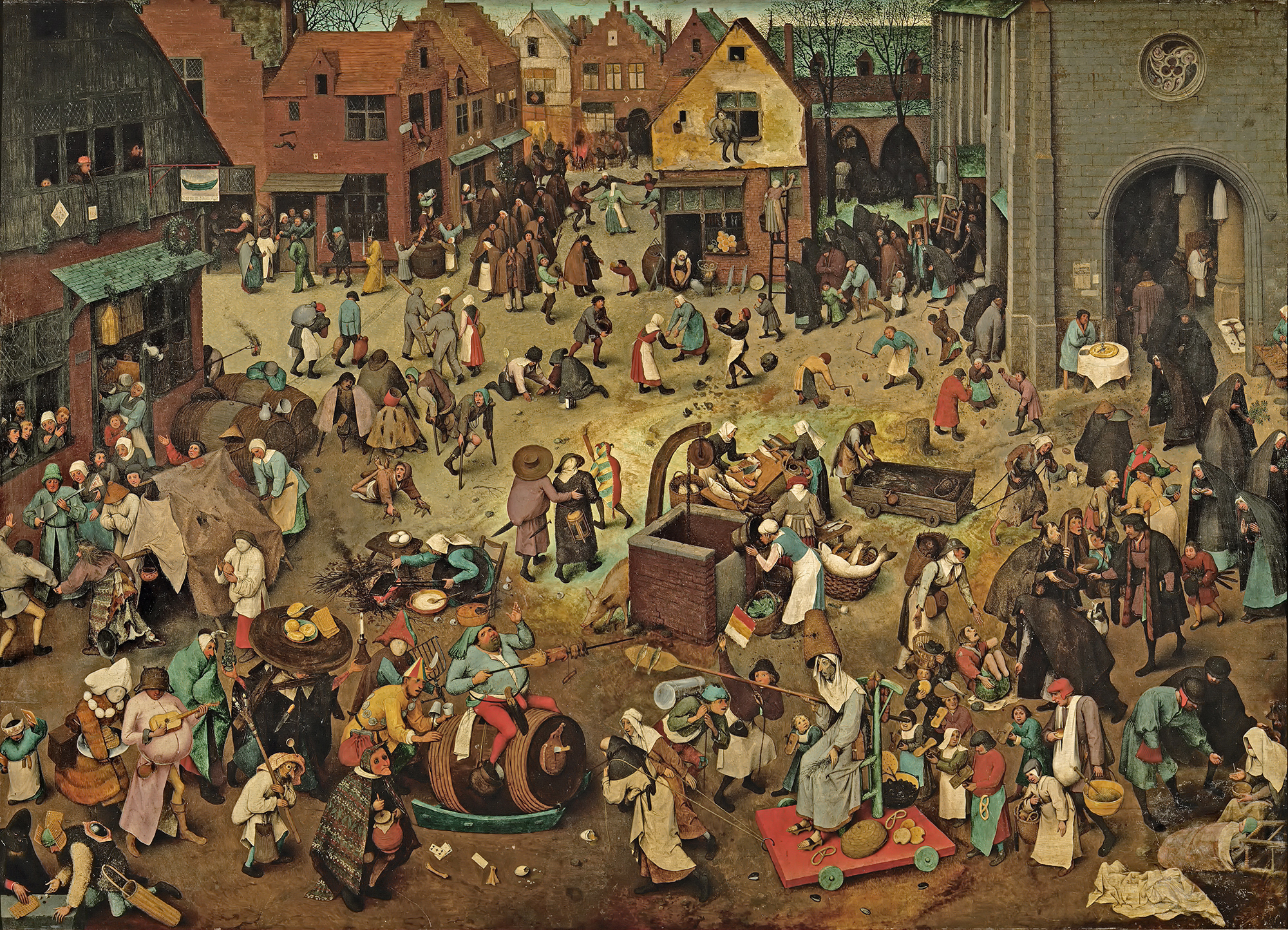
(image from commons.wikimedia.org; image is in public domain)
While Evens published several award-winning books early in his career, he is best known for more recent works Panther (2014) and The City of Belgium (Dutch and French versions released 2018; forthcoming editions in English in 2020). In terms of content, most of Evens’ narratives tend to be a little dark. Panther is about a young girl named Christine whose cat dies. Her mother also threatens suicide, drives away and never comes back. Panther arrives seemingly to be Christine’s friend and help her cope, but ends up being far more malicious than he appears. One reader called it a “apologism of pedophilia, zoophilia and incest”. Yikes.

The City of Belgium (titled Les Rigoles for its French audience and Het Amusement for Belgium) is actually part of the same universe as Evens’s 2009 work The Wrong Place, and the various versions of the book are meant to be connected. “I wanted something like a paperback copy of Balzac, a whole world that would be portable. But, instead of just one city, I wanted to make it a kind of European amalgam…the fun result would be for everyone to think it’s their city.”
 (image from lefigaro.fr)
The City of Belgium also reflects Evens’ struggle with bi-polar disorder and gradual recovery from a particularly bad episode. While not as unsettling as Panther, the book follows three characters having parallel urban adventures throughout a single evening, one of whom suffers from depression. Evens discusses how the book came to be and acknowledges the “heavy” themes alongside the humor. “The germ was just me coming back to life. A state of depression never carries any potential or interest. Then, once the interest starts returning – bit by bit – it’s like you’re back at zero. At that point, it’s just lines in old sketchbooks, dreams you have, something you happen to see sitting on a terrace. Because it’s so surprising to have ideas again, you notice every little thought and you get them down in a sketchbook…[in 2013 and 2014] things were so messed up; I couldn’t ever have considered such a massive project. The book is a product of peace having descended…the themes may be heavy, but I hope the treatment is light. Don’t forget to mention it’s full of gags and jokes!”
 (image from brechtevens.com)
Evens appropriately chose a more lighthearted story for the Mikimoto collection while maintaining the concept of connected times and spaces. The characters and scenes appear disparate at first, but as you look more closely you can see that they’re all part of the same underwater universe – preparing for the holiday season and the First Snow of Pearls. If anyone is going to create a fanciful mermaid-laden paracosm or “expanded reality” as one reviewer put it, Evens is the perfect choice, as he had been making these sorts of “imaginary worlds” since he was a child. “Practically all I did was try to make imaginary worlds come to life, which meant: visible to other people, in comics, designs for buildings, fantasy world maps, board and card games, cassette tapes… No teaching, no explaining, no argument, just a portable world, bound together, with maybe a dust jacket around it or even some leather,” he says. He also did a fantastic job incorporating the pearls, which appear throughout all the scenes. My favorites are the fish helping construct a pearl garland and telling the lazy sea dog to wake up because it’s snowing pearls.


The illustrations were incredibly fun on their own, but the addition of Evens’ signature text provided another layer of humor.


“A lot of people, when they write dialogue, just go ‘A, B’, ‘A, B’, ‘A, B.’ They’ll have the characters neatly wait their turn. Whereas I don’t think our brains really work that way. In reality, it’s more of a constant traffic jam – even when we like each other and we’re interacting well. When we’re interacting less well, it’s more extreme,” he says. You can see the more realistic dialogue (at least, as “realistic” as this mermaid world can be) Evens was aiming for in this scene depicting crabs and fish wrapping holiday presents.

I have no information on how the Mikimoto collaboration came about. I summoned my courage and emailed Evens to see if he could shed any light. He politely declined to be interviewed, but I’m guessing that Mikimoto approached him as he indicated he does not know much about cosmetics. I believe these are new illustrations Evens created especially for the brand, but I find it odd he hasn’t included the collab on his website or IG page. I’m also assuming they were done using his usual handmade techniques. For The City of Belgium, he explains: “All the drawings were done on paper and I write by hand. So the creative parts are all computer-less. Where the computer comes in is for research; when I want things to be ‘right’ or inspired by actual stuff, then I’ll look something up… Ecoline [ink] dominates, but I use a mix. Now I have some different inks and, with the same brush, I’ll also pick up gouache to make it what I want. Or, I’ll mix it with real aquarelle. It all depends on what I’m searching for, what opacity or transparency I need to have. There will also be some pastels and, often, markers.” In looking closely at the lines and the way the colors overlap, it appears Evens did indeed draw everything by hand using a mix of markers and pastels on white paper.
So that about wraps it up. What do you think about this collection? What’s your favorite scene or character? I’d party any time with these mer-folks!