I'm not sure where I was from May through September of 2011, but I totally missed the news about an exhibition on the history of makeup at the Couven Museum in Germany. Sponsored by Babor, the exhibition displayed cosmetic items from antiquity through today, with an emphasis on the late 20th century. From the website: "This exhibition takes a tour through the history of seductive cosmetics from antiquity to the present day. In cooperation with Babor Cosmetics, an internationally operating Aachen family business, a selection of objects and paintings relating to the culture of cosmetics will be on show. Visitors will also get an insight in the fast-moving yet highly characteristic trends of fashionable beauty and cosmetics from the 1950s to the present day."

(image from couven-museum.de)
I tried to translate as much as I could from the brochure. It seems like it was a bit light on the historical aspects and a little heavy on the business/advertising side – there seemed to be a LOT of guest speakers from Babor for the various panels and Babor representatives hosting tours and workshops for an additional fee – but the topics were pretty interesting: body care in ancient Greece, Cleopatra's bathing routine, and an exploration of beauty ideals through the centuries.
I'm not sure whether I would have made the effort to travel internationally to see it, since it does sound more commercial than educational and it seemed to be relatively small-scale (I have the sense it only took up one or two rooms), but it's at least nice to know there was another cosmetics-related museum exhibition.
I'm working away on various exhibitions of my own so I hope to have more in-depth content soon. In the meantime, have you ever been to Germany? I need to go, if only just to experience the Lipstick Museum in Berlin…but that's a post for another time. 😉
As with lipstick holders and tissues, another piece of makeup ephemera has seem to gone nearly extinct: the built-in lipstick mirror. Sure, there are still some run-of-the-mill fabric and leather lipstick cases with mirrors inside, and some contemporary companies have recycled the basic designs, but no current lipstick mirrors are as novel as their vintage counterparts. Today I’ll take a look (haha) at the various vintage contraptions and mechanisms that allowed for a quick lipstick touch-up. As usual this exploration is not intended to be a comprehensive history of lipstick mirrors, but a brief overview and theories as to why they have mostly disappeared from the beauty milieu as well as the reasons they were even produced in the first place.
The simplest design consisted of a mirrored tube, favored by the likes of Avon and Flame-Glo.

(image from etsy.com)

The second most basic and inexpensive option was the humble lipstick clip, which attached directly to the lipstick tube. The adjustable design meant that it could fit virtually any tube and was easily removable.


 (image from ebay.com)

I purchased a couple of these clips for the Museum’s collection. Here we have the “Looky” mirror, which was patented in 1957, and Compliments, which most likely dates to around the same time.


The only design flaw with these types of mirrored tubes and clip-on mirrors was that they would be easily smudged since the mirror was exposed. Enter the folding lipstick mirror and clip! Elizabeth Arden’s Rolling Mirror lipstick debuted in 1959, and while I couldn’t find an exact date for Stratton LipViews, they probably were released around the same time and continued to be sold until the early ’90s.


(images from etsy.com)
Avon also made a far less elegant plastic version.

The mirror could also be protected from smudges and scratches via a sliding mechanism instead of a folding one, as shown in this fan-shaped Stratton lipstick holder.


These next few will put a spring in your step. Spring-loaded, sliding cases in which the mirror popped up when the lipstick was opened were also quite popular. Shown here is Volupté’s Lip Look, which dates to 1949-1950. Elgin, Elizabeth Arden and Kotler and Kolpit offered similar cases.


Given how many came up in my search for lipstick mirrors at Ebay and Etsy, it appears that the most widely available model of the spring-loaded variety of lipstick mirrors was a silver carved case accented by gemstones. They’re unmarked, meaning no particular company patented the design and choice of metal. I believe they were mostly sold in department and jewelry stores.


(images from etsy.com)
Despite the silver cases’ ubiquity, I’d say the most recognized name-brand spring-loaded lipstick mirror was Max Factor’s Hi-Society, which was heavily advertised from their debut in 1958 through approximately 1965.

You might remember I featured these in the Museum’s holiday 2016 exhibition. I’m still hunting down all the designs, which actually isn’t difficult given how many the company produced.


Next up is a more complex version of the folding mirror. Instead of a tube clip, this was an entire folding hand mirror with the lipstick hidden within the handle. Here’s an unmarked, super blingy version. Stratton also made a bunch.


Here are some rather dainty petit point and floral versions by Schildkraut.


(images from ebay.com)

(images from ebay.com)
Schildkraut’s represent possibly the earliest form of lipstick mirrors, judging from the patent.

The folding model’s popularity continued well into the 1960s, as evidenced by Kigu’s “Flipette”.


(images from etsy.com)

(image from vintage-compacts.com)
Finally, there are the handle inserts. This item from Revlon would appear to be a regular hand mirror, but the lipstick is cleverly hidden in the handle. It was introduced in 1950 as the “biggest news in lipsticks since swivels were born”. How very exciting.


Of course, Max Factor upped the design ante with their “Doll Set” lipsticks, which were introduced in 1967.


(images from pinterest)
Now that we have a good sense of the types of mirrors that were available, let’s spend a little time thinking about why they were made, or at least, why the advertising claimed they were the greatest things since sliced bread. The first reason built-in lipstick mirrors were a necessity – again, according to the advertising at the time – was the ease provided by a fused lipstick and mirror. Presumably women who wore lipstick also would have also carried around mirrored powder compacts, which could be used for lipstick touch-ups. Fumbling around in your purse for a mirrored compact when you just needed to touch up your lips and not your face powder, apparently, was too difficult to handle on a regular basis. As this 1935 newspaper blurb states, “Keeping lipstick and mirror together is the biggest trouble.” Oh, the horror! (Bonus points for the blatant racism at the beginning of the piece.)

Such a “harrowing experience” to not be able to find a mirror!

The second reason was that the lack of digging around for a mirror meant lipstick could be applied more discreetly, you know, for “when you want to sneak a look while the boyfriend’s back is turned.” (More bonus points for the weight/food shaming piece below the lipstick article.) Much like lipstick tissues, lipstick mirrors were meant to be used to avoid an etiquette faux pas.

This 1940 column takes the idea of discretion a step further. As we’ve seen time and time again, a woman’s makeup habits are dictated by what men think. “We suspect that the bold-face manner of applying lipstick is due for a set-back as a table pastime. Recently we heard more than one rumor that men are expressing a dislike for the practice. And it is a smeary, messy looking operation for a beloved with his own dreams about a natural beauty. Better keep him, if not guessing, then not too much in-the-know about your coloring source.” Heaven forbid a man actually see a woman mend her lipstick! Ladies, please keep your silly frivolous face painting to yourself so as not to ruin TEH MENZ’ unrealistic expectations of so-called natural beauty. I can’t roll my eyes hard enough.

Thirdly, one can’t be seen with a beat-up compact. Women should always present the prettiest possible cosmetic cases when in public. Seriously though, at least this 1956 clip is straightforward in proclaiming that a lipstick mirror is merely aesthetically pleasing instead of a necessary accessory in the battles against flaunting your makeup application and a messy purse in which no separate mirror can be easily unearthed. Just a little dose of “extra glamour”.

And of course, let’s not forget that as part of their goal of making a healthy profit, beauty companies are forever trying to invent another superfluous gadget or product and declaring it the next must-have. Perhaps lipstick mirrors were the mid-century version of vibrating mascaras. In any case, despite the lack of popularity for the built-in lipstick mirror as well as the cynicism of modern-day makeup wearers like myself, several brands forged ahead with attempting to resurrect the lipstick mirror over the past 20 years or so.
In late 1999, with much fanfare, Givenchy introduced their Rouge Miroir lipstick designed by by sculptor Pablo Reinoso. Reinoso became Givenchy’s Artistic Director for their fragrance and beauty line shortly after the lipsticks’ release. The March 2000 issue of Vibe magazine proclaimed the sleek, futuristic design to be the height of convenience: “No more knives or rearview mirrors”. Wait, who uses a knife to apply lipstick?!

(image from amazon.com)
A year or two later, Estée Lauder launched their Pure Color lipstick line. I believe these mirrored cases came out in the mid-2000s when Pure Color lipsticks were at their height.

(image from amazon.com)
Some more recent examples I found include this mirrored tube from Kailijumei, a brand best known for their “flower jelly” lipsticks.

(image from kailijumei.com)
Guerlain’s Rouge G series was introduced in the spring of 2018 and comes in a variety of collectible cases (and, duh, I’m working on acquiring them all). The mechanism is similar to Stratton’s in that they won’t close unless there’s a lipstick bullet inside. While practical, it makes for quite the hassle to take photos of the cases only as they keep popping open. I have to tape them closed, which is a less expensive option than buying lipstick bullets to go in each case.


Finally, I spotted this folding lipstick mirror from J-beauty brand Creer Beaute, which was included in their 2018 Sailor Moon-themed collection.


(images from alphabeauty.net)
Still, these designs are not nearly as common as their predecessors from the early-mid 20th century. Why did the popularity of the built-in lipstick mirror fade over time? One theory is that lipstick packaging with built-in mirrors is more expensive than non-mirrored packaging, and therefore, not as appealing to consumers. Guerlain’s Rouge Gs, for example, cost $55 ($33 for the bullet and $22 for case) while their KissKiss lipsticks are priced at $37. Going further back in time, Elgin’s spring-loaded mirrored case by itself was $5.50, while the price of an average lipstick was $1.10. Why pay for a mirrored lipstick case if you (most likely) already have another mirror available? Yes, you might have to dig around in your purse a bit, but at least it won’t be lighter for having spent money on a lipstick/mirror combo. This theory could also explain why clip-on mirrors were seemingly everywhere, as they were the cheaper route to fusing lipstick and mirror.
Another theory for the continuing disinterest in built-in lipstick mirrors could be that for the last 5-10 years there’s been increasing demand for less, or at least recyclable, packaging. While some higher-end brands are refillable, most lipsticks sold with a built-in mirror don’t appear to have a refill option, and consumers may be less likely to buy a mirrored lipstick tube knowing yet another packaging component will eventually end up in the ocean. Plus, while the new designs are relatively slim, they’re still bulkier than lipsticks without built-in mirrors. The majority of beauty consumers, myself included, don’t want anything taking up more room in their purse or makeup bag.
Finally, I believe beauty consumers are savvier than they were in the early days of the industry and are less susceptible to marketing and gadgets. A built-in lipstick mirror may have been considered revolutionary in the ’40s because swivel tube lipstick had been invented just a few decades prior, but by the ’70s these mirrors may have seemed old hat. So certainly by the 21st century we know these designs are not truly a breakthrough, nor are they anything that would be considered a necessity. I featured no fewer than 6 Kailijumei lipsticks in the Museum’s spring 2017 rainbow-themed exhibition, and just now noticed there were mirrors on the tubes. The fact that the mirror didn’t even register with me, a person who enjoys re-applying her makeup and has spent countless hours poring over product packaging, until now when I’m actually discussing lipstick mirrors shows just how unnecessary a built-in lipstick mirror is. And again, the majority of beauty consumers is likely to be carrying a compact mirror anyway, rendering a lipstick with a built-in mirror redundant. We also know that makeup companies update older designs and market them differently to see what sticks. To cite Guerlain’s Rouge G, the description at the website highlights how the user can select both the color and case to suit their individual taste. “Every woman is unique…choose your lipstick from a wide range of shades to match your look: from the most nude to the most extravagant. Choose your case from an array of styles – from the most timeless to the most trendy”. Rouge G has the same basic mechanism as the spring-loaded lipsticks of yore – it’s especially similar to Max Factor’s Hi-Society with the array of designs – but the marketing focuses on the customizable aspects (a concept that has spiked in popularity over the last two or so years…I’ve been meaning to write something about the craze for name engraving/customization) rather than the newness and convenience of a dedicated lipstick mirror.
What do you think of the built-in lipstick mirror? Would you consider it a must-have? While I certainly appreciate the aesthetics, it’s nowhere near a necessity for me.
As you know, from time to time I receive email inquiries from people with cosmetics objects they've stumbled across and would like to know more about. I'm always flattered that people think that I know what I'm talking about and can help them, especially since most of the time I have no idea about the item in question, but sometimes I get irritated when the inquirer's sole objective is to determine how much money they can make off an object they found. At first it seemed this way when the original owner of this very rare compact approached me, asking for more information and how much it might be worth. As we'll see, he turned out to actually have an interest in the compact's history and wasn't after profit.
This was an epic find indeed, easily one of the rarest and most valuable in the Museum's collection. I now present the Ramses powder compact, which debuted in 1923. The design shows an Egyptian woman in profile, holding a perfume bottle in one hand and a flower in the other, which she brings to her nose to enjoy its scent. The pyramids of Giza are just barely visible in the background, while lotus flowers on each side towards the lower third of the compact bloom into an arc of leaves.

I'm not sure if the woman is supposed to be anyone in particular – perhaps Cleopatra – but given that the design is most likely not historically accurate, I'm not going to dwell on it too much.

While there are other ads for the powder that show the compact, which we'll see in a second, I wasn't able to locate any originals. I did, however, find this ad in a French publication from February 1920.


I was hoping to find some good information about the compact for the person who contacted me, and of course, the ever-thorough Collecting Vintage Compacts blog had an excellent post on the history of the Ramses perfume company so I directed the inquirer over there. I don't wish to regurgitate all of the author's hard work on Ramses' backstory – I highly encourage you to check out the post for yourself – but I will provide the abridged version. The Ramses brand was founded in 1919 in Paris and selected Le Blume Import Company to distribute the line in the U.S. in 1921. By 1923 ads for the powder boxes and compacts were appearing in Vogue magazine. As Collecting Vintage Compacts points out, the ad copy is pure nonsense: neither the perfumes nor the powders were produced in Egypt and their formulas certainly did not date back to 1683. How the company even arrived at that arbitrary date is beyond me. However, with the discovery of King Tutankhamun's tomb in November 1922, the Ramses moniker turned out to be quite fortuitous given the ensuing craze for anything Egyptian – clearly the ads wanted to milk the fad for all it was worth. The world was now swept up in the latest wave of Egyptian Revival, a style that incorporated various elements of Egyptian art and culture and encompassed design, fashion and beauty (see this compact depicting Theda Bara as Cleopatra and this ad as examples).


Egypt's influence on Western beauty from the Renaissance to today is a subject I'm looking to cover more thoroughly this year, either in a blog series or an exhibition (or both!) so stay tuned. As viewed through 21st century eyes, it was clearly unabashed cultural appropriation, a white person's fantasy of "exotic", far-off lands and artifacts. However, Egyptian inspired-beauty is such a rich topic that I can't bear not to fully explore it…especially now that I have this gorgeous piece in my hot little hands. Anyway, Collecting Vintage Compacts notes that the Ramses powder case was made by the Bristol, CT-based Zinn Corporation, a company that produced some of the earliest and most memorable compacts in the U.S. I find it interesting that while the powder was scented with the "Secret du Sphinx" fragrance, the compact itself shows a woman rather than the mythical creature. Collecting Vintage Compacts speculates, as I did, that the woman could be Cleopatra, but offered the additional option of Ramses' wife Nefertari. I agree with his conclusion that it really doesn't matter who she is – just a vague Egyptian theme was more than enough to get the point across.

Another version of the compact sported silver edging, a beautiful contrast to the warmth of the brass.

(images from Collecting Vintage Compacts and Ruby Lane)
I also spotted some ads in newspapers. They're not as visually striking as the Vogue ads so I'm not including them here, but they did come in handy for indicating the original retail price of the compact, which was $1.00. The latest ads I could find were from 1925 and both the perfumes and powder were heavily discounted, which indicates Ramses was a flash in the pan.
But why? You would think given the era's craze for Egyptian-inspired design, combined with the slight French flavor (another huge selling point – this was a time when companies actively tried to give their lines and products authentic French or at least French-sounding names) the Ramses company would be able to get more a little more mileage out of their products. Collecting Vintage Compacts unraveled the mystery. As it turns out, the perfumer behind the Ramses brand, one Léon de Bertalot, had begun quite a shady scheme to sell another one of his fragrances. In 1914, 5 years before he launched Ramses, de Bertalot named one of his fragrances Origan. As we know, Coty's L'Origan (launched in 1909) was wildly popular, pulling in roughly $3 million in sales in 1921 alone. De Bertalot decided to capitalize on the company's success and began using the Coty name to sell his own Origan, essentially passing it off as a real Coty product. Coty, rightfully so, cracked down on this very quickly. On May 15th, 1923 a French court found de Bertalot guilty of "unfair competition", and a few days later the U.S. Treasury mandated that any inauthentic products bearing the Coty name were unable to be imported unless they specifically spelled out that they were not affiliated with Coty in any way. Since the Ramses brand had nothing to do with Coty I don't know if the Treasury's mandate applied to Ramses as well, but I'm sure the 6-month jail sentence and fine of 100,000 Francs handed to de Bertolot essentially meant the Ramses brand was out of business. Hence the price markdown of their products by 1925 – I'm guessing stores in the U.S. were trying to offload any leftover stock that was originally imported two years prior. The Le Blume Import Company, in turn, was no longer allowed to distribute any perfumes from any company whatsoever. However, it did import dusting powder tins and glass jars using the Ramses name in the late 1920s.


(images from Vanity Treasures and Etsy)
Getting back to the original inquiry that was the impetus for this post, here's the story of how the compact got into my hands from the person who emailed me originally (we'll call him C.) He had found it for $10 in a thrift store (!) but given the unique design, figured it was worth more. After looking through all my collector's guides and not turning up anything, I directed C. to Collecting Vintage Compacts and asked him to please let me know when/if he decided to put it on the market. Obviously I also indicated my great interest in obtaining the compact, but lamented that it was most likely out of my price range. Well, don't you know C. actually wrote back telling me that he was going to put it up for sale on Ebay, but said that while he'd like to get a good price for it (that's only fair, who wouldn't?), he believed that the Museum was the rightful place for the compact, given its rarity and my passion for lovingly researching and preserving these sorts of items. Thus he kindly offered to sell it to me directly and negotiate on price. In the end I think we both got a great deal – he got way more than what he had originally purchased it for and roughly the amount he would have gotten for it if he had put it up for public sale, and I got an amazing find at a fair price for which I was able to avoid an ugly bidding war.

After reading the Ramses history at Collecting Vintage Compacts and browsing the Museum's site, C. seemed genuinely interested in the compact and in the Museum's mission, so I was very happy to see he wasn't just in it for profit and was willing to work with me to ensure the compact went to a great home instead of merely to the highest bidder. :) I really appreciated it, as so many people who ask about value just want to know how much they can get for an item and have absolutely no consideration for the object's history or the Museum, which, as a reminder, is funded entirely out of my own pocket. Not that anyone is obligated to donate rare and valuable items, of course, but they could follow C.'s example and be open to selling their item to me at a price that works for both of us. I know if I came across an object I have no interest in but that other collectors might – say, a rare Barbie Doll – I'd seek out someone who would truly treasure it and give them first dibs.

What do you think? And yay or nay on a series/exhibition on Egyptian-inspired beauty?
 As usual, I forget exactly what I was searching for at newspapers.com when, about a month ago, I stumbled across a very interesting article from 1938. I know the search term must have included Richard Hudnut’s name, but beyond that I can’t remember. In any case I was delighted to uncover a profile of a rather remarkable man. Thomas R. “Tommy” Lewis apparently designed many of the compact cases for perfumer Richard Hudnut from possibly the mid-1920s through at least the ’30s. Both Collecting Vintage Compacts and Cosmetics and Skin have excellent histories of the brand, so you can check them out there. I, however, will be focusing on Lewis and some of the compacts he may have created. The reason why I felt such a compelling need to share his story is a matter of race: Lewis was one of very few American Black jewelers in his day, and one who overcame both racism and poverty to establish his own very successful jewelry firm. In honor of Black History Month I thought it would be appropriate to share as much information as I was able to find on Lewis, and hopefully I can do it without whitesplaining or tokenizing. I offer my sincere apologies in advance if I offend! (Constructive criticism is welcome; mean comments are not).
According to another article written in 1935 that I found online, Lewis was born into an impoverished family in Providence, Rhode Island. Undaunted by his circumstances and without the support of his parents or siblings, he attended RISD with the hopes of becoming a jeweler, earning a scholarship in the process. After graduating he worked for a leading jewelry manufacturer in Providence for several years, then struck out on his own.
I was unable to find the date he started his company or much other information besides what was in these two articles. The 1935 online article says that he started his business 27 years prior, so I’m assuming he established it in 1908; however, the 1938 article says that he had been in business for 26 years, so maybe it was 1912. And there’s no information on his relationship with Hudnut other than what was in that article, so when he started making compacts for them is unclear. The only (rather patronizing) mention is as follows:1 “Visit the cosmetics department in any first class store, ask the clerk to show you a Richard Hudnut powder compact and then surprise him by telling him that he is looking at the work of a [Black] man. Everyone of those compacts was designed and produced here in a plant at 19 Calendar Street, the home of the Lewis Jewelry Manufacturing Firm. The same is true of their perfume bottles, for Mr. Lewis works on glass as well as platinum, gold, silver or any other metal from which jewelry or ornaments can be made. The Richard Hudnut people are among his biggest customers, but not his most consistent. That honor is reserved for other jewelry manufacturers who regularly send in their commissions for original designs in bracelets, watch chains and other novelty jewelry.” So it seems that while Hudnut was not the biggest source of business for Lewis’s company, we know that he was designing all of their compacts by 1938, and presumably earlier. When I purchased these compacts for the Museum I made sure to select ones that I could get specific dates for, i.e. compacts that were plausibly produced by Lewis given the approximate timeline, and also ones that seemed to be the most jewelry-inspired.

First up is the original “twin” compact, which was introduced in late 1922. I didn’t realize this until after I bought it, but this double case was designed by a man named Ralph Wilson in 1921 and patented in early 1922. Wilson was the New York representative for Theodore W. Foster and Bro. Company, a prominent compact and jewelry manufacturer. Foster, like Lewis, was also based in Providence, so maybe there might be some connection between this company and Lewis’s – perhaps this is the company Lewis worked for after graduating from RISD? In any case, we have proof that the twin compact was created by a company other than Lewis’s, so this is not his work. I still like to think, though, that Lewis may have apprenticed with Foster, grew familiar with Hudnut’s aesthetic and went on to earn the company’s favor over Foster.


How cool is this? You flip over the blush and there’s powder on the other side. Genius.

Hudnut’s Deauville fragrance was introduced in 1924. Again, no telling whether this was done by Lewis, but probably not given that it’s basically the same interior mechanism as the earlier twin compact.


Le Début, a fragrance available in 5 different variants that were color-coordinated to their bottles and powder compacts, well, debuted in 1927. I was fortunate enough to track down an original ad for these beauties. They’re actually pretty common – I was able to find all the colors shown in the ad – but in the end I thought the black one was the most elegant. (Okay, I really love the silver one too!)


In the 1938 photo below it states that Lewis designed the “famous Richard Hudnut compact”, but I really have no idea which one they’re referring to. It could be Le Début, or it could be the “triple vanity” compacts designed in the mid ’30s.

This enameled, oh-so-Deco case came out in 1936, according to the newspaper ads I found, and the last mention of it was in 1938. Again, it’s funny how certain objects call to you. This one was also available in a variety of colors, but I just knew the red belonged in the Museum.

The triple vanities had three compartments for powder, blush and lipstick.

The ad also mentions jewelry several times, so I’m hopeful it was made by Lewis’s hand.

Lastly, I picked up this stunner, which dates to about 1939. Evidently between this one, the Three Flowers compact and the silver Evans compacts I have a thing for sunburst patterns, probably because they remind me of glorious sunny days.

How exquisite is this jewel detail? And in such impeccable shape for a nearly 80 year-old compact – it’s mind-boggling that none of the stones are missing.


To give you a sense of how dainty and small these triple vanities are, here they are with one of NARS’ highlighting trios.

Getting back to Lewis, I can’t say for sure whether his company was responsible for any of these compacts; I can only hope at least some of these jewelry-inspired designs were his. The fact that the 1935 article doesn’t specifically mention Richard Hudnut makes me think that perhaps Lewis wasn’t designing compacts for Hudnut until somewhere between 1936-1938. But it’s also entirely possible he had been producing compacts for them for years. In any case, I want to highlight just how difficult it was for a Black man in the 1900s to not only get out of poverty, but graduate from one of the top design schools in the country AND start his own business that eventually employed up to 60 workers in the busy seasons. As the 1935 profile states: “But jeweler, designer, silversmith? What chance would he have? Where could he work? Who ever heard of a [Black] man, a designer, a master craftsman in the jewelry trade of all trades! One can imagine what would have been Lewis’s fate if his ambitions had been left in the hands of some of the so-called vocational guidance counselors who are at the present time shaping the lifework of many [Black] students in the public schools of our large cities. According to the formula which they use, there are no [Black] jewelers now in existence, hence no future; it would be impossible for a [Black] silversmith to get a job since he cannot belong to the union, and the white jewelers would not employ him anyhow.” Through incredibly hard work and innate talent, Lewis persevered, not only becoming a success himself but also helping others do the same. Most of his employees were Black, and Lewis provided them with better wages than other jewelry firms in Providence as well as training.


I just wish I could have found more information and photos to make for a somewhat complete biography. Searching online for Lewis’s company yielded nothing, as did basic searches for Lewis himself. I ended up contacting the Rhode Island Historical Society and they kindly provided census records indicating his year of birth (1880), but said they didn’t have any business records related to Lewis’s company, which I think is bizarre. If it was as prolific as the articles claim it was, and if it really did provide hundreds of thousands of pieces of costume jewelry to the likes of Saks and Woolworth’s and compacts for Hudnut, I find it very strange that there are absolutely zero traces of his company left save for these two profiles. Especially since the 1938 article even gives the address of his workshop – with that specific type of information there should be historic maps or architectural records listing it. He also apparently had over 200 patents to his name, none of which I was able to find. I guess the saddest part is that there are tons of other stories like Lewis’s, and we simply don’t hear about them. So many histories for non-white people are erased or buried, and I really wanted to bring Lewis’s story to the surface because it was truly outstanding (and not only because it’s Black History Month…I just so happened to find the newspaper article around a month ago and thought the timing worked out nicely). I really hope this post didn’t come across as patronizing or me highlighting a “token” Black person.2 I find Lewis’s story impressive not because I can’t believe a Black man could ever be creative and intelligent enough to start a jewelry firm, but because of all he had to overcome to achieve his goals. “Perhaps it is the memory of a [Black] boy with a dream to become a jeweler, a silversmith, a designer, a [Black] boy who kept his dream despite the doubts of his family from within and racial prejudice from without. For Thomas Lewis is an artist and so he believes in young men and young women with dreams.”
Thoughts?
Update, 11/24/2022: One of the Museum’s Instagram followers alerted me to a video made by a vintage compact collector who mentioned Tommy Lewis while showing some of her Hudnut collection. It got me thinking whether anything else on Lewis had been discovered and lo and behold, two students from Rhode Island College were able to unearth some more information, including a map showing where his store and factory were! While it didn’t shed any light on Lewis’s relationship with the Hudnut company, their article surely adds more to this important piece of history. Lewis was born on April 5, 1880 and graduated from RISD in 1902. In 1925 a lacquer explosion caused a fire at Lewis’s shop located at 171 Eddy Street, which damaged much of the building. I’m wondering if some of the early business records were lost in that fire. Throughout his life, in addition to providing training and employment for Black workers, he was a philanthropist and active in the YMCA and other community organizations. Lewis passed away in 1958. I can only hope someone writes a full biography of this exceptionally talented man, but in the meantime sure to check out the article at rhodetour.org. Oh, and they even included the Makeup Museum’s original article as a “related resource”. I’m so honored!
1 I spent several hours googling whether it was acceptable to type the word “c*lored” if I was quoting from an old newspaper article. In the end I realized I personally didn’t feel comfortable using it even if it was a quote, so I replaced it with “black”.
2 I rarely, if ever, highlight makeup histories featuring people of color, i.e. Madam C.J. Walker, Annie Turnbo Malone, etc. because I’m not sure whether it’s okay for a white person to do that – while I think their stories absolutely need to be heard and recorded, once again I fear that it would come off as whitesplaining or tokenizing if I attempted to write about them. In the case of Tommy Lewis, there was such scant information available I’d figure I’d make an exception in order to at least introduce him and his work.
Save
Save
Save
Save
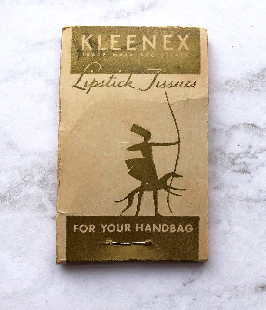
The life of a makeup museum curator is insanely glamorous. For example, a lot of people go out on Friday nights, but not me – I have way more thrilling plans. I usually browse for vintage makeup at Ebay and Etsy on my phone while in bed and am completely passed out by 8pm. EXCITING. It was during one of these Friday night escapades that I came across a fabulous box of vintage lipstick pads and naturally, that sent me down quite the rabbit hole. Today I’m discussing a cosmetics accessory that has gone the way of the dodo: lipstick tissues. This is by no means a comprehensive history, but I’ve put together a few interesting findings. I just wish I had access to more than my local library (which doesn’t have much), a free trial subscription to newspapers.com and the general interwebz, as anyone could do that meager level of “research”. I would love to be able to dig deeper and have more specific information, but in lieu of that, I do hope you enjoy what I was able to throw together.
The earliest mention of lipstick tissues that I found was January 1932. It makes sense, as several patents were filed for the same design that year.


(images from google)
While they might have existed in the 1920s, I’m guessing lipstick tissues didn’t become mainstream until the early 30s, as this December 1932 clipping refers to them as new, while another columnist in December 1932 says she just recently discovered them (and they are so mind-blowing they were clearly invented by a woman, since “no mere man could be so ingenious”.)

In addition to the tear-off, matchbook-like packages, lipstick tissues also came rolled in a slim case.

This lovely Art Deco design by Richard Hudnut debuted in 1932 and was in production at least up until 1934. I couldn’t resist buying it.


By 1935, restaurants and hotels had gotten wind of lipstick tissues’ practicality for their businesses, while beauty and etiquette columnists sang their praises. Indeed, using linens or towels to remove one’s lipstick was quickly becoming quite the social blunder by the late 30s.


Kleenex was invented in 1924, but it wasn’t until 1937, when the company had the grand idea to insert tissues specifically for lipstick removal into a matchbook like package, that these little wonders really took off. You might remember these from my post on the Smithsonian’s collection of beauty and hygiene items. The warrior/huntress design was used throughout 1937 and 1938.
Kleenex started upping the ante by 1938, selling special cases for their lipstick tissues and launching campaigns like these “true confessions”, which appeared in Life magazine (and which I’m sure were neither true nor confessions.) With these ads, Kleenex built upon the existing notion that using towels/linens to remove lipstick was the ultimate etiquette faux pas, and one that could only be avoided by using their lipstick tissues.

These ads really gave the hard sell, making it seem as though one was clearly raised by wolves if they didn’t use lipstick tissues. Or any tissues, for that matter. Heaven forbid – you’ll be a social pariah!


Look, you can even use these tissues to cheat on your girlfriend! (insert eyeroll here)

(images from books.google.com)
Not only that, Kleenex saw the opportunity to collaborate with a range of companies as a way to advertise both the companies’ own goods/services and the tissues themselves. By the early ’40s it was difficult to find a business that didn’t offer these gratis with purchase, or at least, according to this 1945 article, “national manufacturers of goods women buy.” And by 1946, it was predicted that women would be expecting free tissue packets to accompany most of their purchases.

Needless to say, most of them consisted of food (lots of baked goods, since apparently women were tethered to their ovens), and other domestic-related items and services, like hosiery, hangers and dry cleaning.
 (images from ebay.com)
 (images from ebay and etsy.com)
 (images from ebay.com)

(image from ebay.com)
Naturally I had to buy a few of these examples for the Museum’s collection. Generally speaking, they’re pretty inexpensive and plentiful. The only one I shelled out more than $5 for was the Hudnut package since that one was a little more rare and in such excellent condition. Interestingly, these have a very different texture than what we know today as tissues. Using contemporary Kleenex to blot lipstick only results in getting little fuzzy bits stuck to your lips, but these vintage tissues have more of a blotting paper feel, perhaps just a touch thicker and ever so slightly less papery. It could be due to old age – paper’s texture definitely changes over time – but I think these were designed differently than regular tissues you’d use for a cold.

Anyway, Museum staff encouraged me to buy the cookie one. 😉

I took this picture so you could get a sense of the size. It seems the official Kleenex ones were a little bigger than their predecessors.

Wouldn’t it be cool to go to a restaurant and see one of these at the table? It would definitely make the experience seem more luxurious. I certainly wouldn’t feel pressure to use them for fear of committing a social sin, I just think it would be fun.

(image from etsy.com)

(image from mshhistoc.org)
I figured having a restaurant/hotel tissue packet would be a worthy addition to the Museum’s collection, since it’s another good representation of the types of businesses that offered them. I’d love to see a hotel offer these as free souvenirs.

Here’s an example that doesn’t fit neatly into the baked goods/cleaning/hotel categories.
 (image from ebay.com)
This one is also interesting. Encouraging women to be fiscally responsible is obviously more progressive than advertising dry cleaning and corn nut muffins, but it’s important to remember that at the time these were being offered by Bank of America (ca. 1963), a woman could have checking and savings accounts yet still was unable to take out a loan or credit card in her own name. One step forward, 5 steps back.
 (image from ebay.com)
Of course, cosmetics companies also made their own lipstick tissues.
 (image from etsy.com)
I was very close to buying these given how cute the graphics are, but didn’t want to spend $20. (I think they’re now reduced to $12.99, if you’d like to treat yourself.)
 (image from ebay.com)
Plus, I already have these DuBarry tissues in the collection.

Funny side note: I actually found a newspaper ad for these very same tissues! It was dated July 27, 1948, which means the approximate dates I included in my DuBarry post were accurate.

By the late ’40s, lipstick tissues had transcended handbags and became popular favors for various social occasions, appearing at country club dinner tables to weddings and everything in between. I’m guessing this is due to the fact that custom colors and monogramming were now available to individual customers rather than being limited to businesses.


“Bride-elect”? Seriously?

While the matchbook-sized lipstick tissues are certainly quaint, if you wanted something even fancier to remove your lipstick, lipstick pads were the way to go. These are much larger and thicker than Kleenex and came imprinted with lovely designs and sturdy outer box. This was the item that made me investigate lipstick tissues. I mean, look at those letters! I was powerless against their charm.

I couldn’t find anything on House of Dickinson, but boy did they make some luxe lipstick pads.


This design is so wonderful, I’d almost feel bad using these. If I were alive back then I’d probably go digging through my purse to find the standard Kleenex ones.

I also couldn’t really date these too well. There’s a nearly identical box by House of Dickinson on Ebay and the description for that dates them to the ’60s, which makes sense given the illustration of the woman’s face and the rounded lipstick bullet – both look early ’60s to my eye.

However, the use of “Milady” and the beveled shape of the lipstick bullet, both of which were more common in the ’30s and ’40s, make me think the ones I have are earlier.
By the mid-late ’60s, it seems lipstick tissues had gone out of favor. The latest reference I found in newspapers dates to November 1963, and incidentally, in cartoon form.

I’m not sure what caused lipstick tissues to fall by the wayside. It could be that there were more lightweight lipstick formulas on the market at that point, which may not have stained linens and towels as easily as their “indelible” predecessors – these lipsticks managed to easily transfer from the lips but still remained difficult to remove from cloth. Along those lines, the downfall of lipstick tissues could also be attributed to the rise of sheer, shiny lip glosses that didn’t leave much pigment behind.
While these make the most sense, some deeper, more political and economic reasons may be considered as well. Perhaps lipstick tissues came to be viewed as too stuffy and hoity-toity for most and started to lose their appeal. My mother pointed out that lipstick tissues seemed to be a rich people’s (or at least, an upper-middle class) thing – the type of woman who needed to carry these in her handbag on the reg was clearly attending a lot of fancy soirees, posh restaurants and country club dinners. This priceless clipping from 1940 also hints at the idea of lipstick tissues as a sort of wealth indicator, what with the mention of antique table tops and maids.

Lipstick tissues were possibly directed mostly at older, well-to-do “ladies who lunch”, and a younger generation couldn’t afford to or simply wasn’t interested in engaging in such formal social practices as removing one’s lipstick on special tissues. Plus, I’m guessing the companies that used lipstick tissues to advertise labored under the impression that most women were able to stay home and not work. With a husband to provide financially, women could devote their full attention to the household so advertising bread recipes and dry cleaning made sense. This train of thought leads me, naturally, to feminism: as with the waning popularity of ornate lipstick holders, perhaps the liberated woman perceived lipstick tissues as too fussy – a working woman needed to pare down her beauty routine and maybe didn’t even wear lipstick at all. Lipstick tissues are objectively superfluous no matter what brainwashing Kleenex was attempting to achieve through their marketing, so streamlining one’s makeup regimen meant skipping items like lipstick tissues. Similarly, after reading Betty Friedan’s 1963 landmark feminist screed The Feminine Mystique, perhaps many women stopped buying lipstick tissues when they realized they had bigger fish to fry than worrying about ruining their linens. Then again, one could be concerned about women’s role in society AND be mindful of lipstick stains; the two aren’t mutually exclusive. And the beauty industry continued to flourish throughout feminism’s second wave and is still thriving today, lipstick tissues or not, so I guess feminism was not a key reason behind the end of the tissues’ reign. I really don’t have a good answer as to why lipstick tissues disappeared while equally needless beauty items stuck around or continue to be invented (looking at you, brush cleansers). And I’m not sure how extra lipstick tissues really are, as many makeup artists still recommend blotting one’s lipstick to remove any excess to help it last longer and prevent feathering or transferring to your teeth.
In any case, I kind of wish lipstick tissue booklets were still produced, especially if they came in pretty designs. Sure, makeup remover wipes get the job done, but they’re so…inelegant compared to what we’ve seen. One hack is to use regular facial blotting sheets, since texture-wise they’re better for blotting than tissues and some even have nice packaging, so they’re sort of comparable to old-school lipstick tissues. Still, there’s something very appealing about using a highly specific, if unnecessary cosmetics accessory. I’m not saying we should bring back advertising tie-ins to domestic chores or the social stigma attached to not “properly” removing one’s lipstick on tissues, but I do like the idea of sheets made just for blotting lipstick, solely for the enjoyment of it. I view it like I do scented setting sprays – while I don’t think they do much for my makeup’s longevity, there’s something very pleasing about something, like, say, MAC Fruity Juicy spray, which is coconut scented and comes in a bottle decorated with a cheerful tropical fruit arrangement. As I always say, it’s the little things. They might be frivolous and short-lived, but any makeup-related item that gives me even a little bit of joy is worth it. I could see a company like Lipstick Queen or Bite Beauty partnering with an artist to create interesting lipstick tissue packets. Indeed, this post has left me wondering why no companies are seizing on this opportunity for profit.
Should lipstick tissues be revived or should they stay in the past? Why do you think they’re not made anymore? Would you use them? I mean just for fun, of course – completely ignore the outdated notion that one is a boorish degenerate with no manners if they choose to wipe their lips on a towel, as those Kleenex ads would have you believe. 😉
Save
Well well well, what have we here?

To be honest, I really have no idea. All I know is that when I searched for vintage Shiseido on Ebay, I came up with a spate of white porcelain animal figurines. Some other things: 1. they represent the animals from the Chinese zodiac; 2. there were a few different designs of each animal; 3. I went into a frenzy trying to collect all of them (unsuccessfully), and; 4. they were produced, or at least sourced, by a company named the Connor Group for Shiseido. What I'm struggling with is why they were made and for whom they were intended. I'm also not certain about the exact dates of the various versions, since some of the sellers listed them as being from the '70s, others from the '80s, and still more were made in the '90s, according to accompanying paperwork.
I'll go in the order of the zodiac, starting with the rat. Cute, no? Given the shiny finish (more on that soon) I'm assuming it's from 1972 or 1984, but it's impossible to say.


Next is the ox, from either 1973 or 1985.


Here's a different version of the ox, which I think might be from the '90s. I was able to save this image from the Ebay listing but unfortunately someone snatched up the figurine itself a while ago.

(image from ebay.com)
Tigers! This one came with a fold-out that made things even more confusing.


The style of the figurine is consistent with ones that are from the '90s, which we'll see later in this post, but the paper it came with clearly indicates it's from 1974. Plus, there's no mention of Shiseido anywhere, not in the letter or even on the figurine – the other ones with the shiny finish have "Shiseido Japan" printed on them. The seller also included the original shipping box it came in to the U.S. from Japan, but there were no clues there either.

Here's a different tiger.


This rabbit could be from 1975 or 1987. According to this Etsy seller who had one listed for sale previously, it's from the '80s, but without anything else to go on the date is uncertain.


My favorite is the dragon, again most likely from 1976 or 1988.


The snakes are pretty cool too, unfortunately I couldn't track them down.

(image from hautejuice.wordpress.com)
The horse is also tricky. This one could be from 1978, given that this Ebay seller has another style. (I have one of them on the way to me). I got so desperate for answers I actually asked the seller if they had any other information. No answer yet.


This goat (or ram) is from 1991, according to the foldout it came with. But it's in a similar style to the tiger that's allegedly from 1974, and also has the same non-shiny finish and no Shiseido name printed on it. See why I'm frustrated?!

Poor little guy has a tiny chip on his nose.


Another version of the goat/ram, which was also sold before I could get my hands on it…no clue as to when it's from.

The monkey is also perplexing. This one is apparently from 1992.


And here's a different version, from the same Etsy seller who had the rabbit for sale, so maybe this one is from 1980?


(images from etsy.com)
Here's this year's critter, which I also missed out on.


(images from worthpoint.com)
This cute little akita was another that got away. I'm assuming this one is also from the '80s.


(images from etsy.com)
And finally, a little piggy, ostensibly from 1995.


Sadly, I don't think I'll ever solve the mystery behind these figurines. I emailed both Shiseido and the Connor Group for more insight and was quite disappointed at not hearing a word from Shiseido. You would think a company that is so committed to preserving their history would be interested in hearing from someone who is equally passionate about it and get back to me. I don't think it's a matter of them not having any information either – again, since they have a whole museum and are clearly dedicated to recording all aspects of the company, I just know someone there knows something about these figurines! I bet all the paperwork related to them is sitting in a basement in Shiseido's headquarters, but no one can be bothered to do a little digging. I did get a reply from the Connor Group but they had no idea what these were and asked for more information. So I sent pictures of both the figurines and letter that came with the tiger and never heard back. Sigh. My best guess is that these were either gifts to employees or gifts for Camellia Club members – in researching the rainbow powders, I learned that the latter group had access to exclusive Shiseido items (um, how awesome are these Erté dishes?!) However, most of the Camellia Club gifts are labeled as such, whereas there is no such notation on the figurines or the papers they came with. Shiseido also seems to collaborate with companies for other non-makeup items, like this anniversary plate produced by Noritake, so maybe the figurines were just some random item they had for sale. Still, it drives me crazy that I don't have a definitive answer.
At least the plushies are enjoying playing with their new friends!


Do you have any idea as to why Shiseido made these figurines? And which one was your favorite?
Save
No posts for this week and no Curator’s Corner today, but I’m pleased to announce that Ada Calhoun, one of the authors behind the awesome 90swoman.com blog, asked me to write a piece on 90s womanhood!! I was so honored. Naturally my thoughts went to makeup and 90s beauty trends. And also naturally, I was extremely long-winded so the piece was edited ever so slightly so as not to bore readers. However, I have no issue with boring my own readers (all 2 of them, ha), so here it is in its entirety. Enjoy! And do check out 90swoman.com, even if you’re not of that generation – it’s truly a fascinating look at the era. 🙂 Thanks again, Ada!
Matte brown lipstick. Heroin chic. White eye shadow. The grunge look. These were the major beauty trends of the 90s. And they’ve been earning the attention of the fashion and beauty world in the past year or so. In January 2010 Selfridges staged an in-store exhibition devoted to the 90s, complete with a vintage M.A.C. Cosmetics face chart showcasing their (at the time) wildly popular brown lip liner named, appropriately enough, Twig. Fashion and beauty bloggers have also been covering the revival of the decade’s trends. “Messy plaids, patchwork and the overall look of 90’s grunge is back for Fall 2010, and we aren’t just talking about the fashion. The beauty industry is taking its cue from the Courtney Love days of dark, red lipstick paired with overdone, smoky eye make-up…A disheveled plaid tee layered under a floral dress and dirty boots are the perfect balance with a dramatic ‘I don’t care’ make-up look,” wrote Jessica Ciarla at The Fashion Spot. Last summer beauty blog Lovelyish provided a nostalgic look at 90s makeup trends. This year, fashion blog Refinery29 reports that the “sleeper hit” of summer 2011 is 90s grunge lip color: “Even though summer is currently awash in happy, vivid corals and pinks, there’s another lip trend we’ve been tracking, too: A modern version of grunge-inspired lips. Mixing deep magenta-red with a little shimmer, they’re like the love child of a ’90s era Drew Barrymore and Married with Children‘s Kelly Bundy… pair your tribute-to-the-nineties lip with extra dark brows and matte skin. So angst-y!” Finally, retailer Urban Outfitters named Cher from 1995’s Clueless their latest beauty icon.
Fashion trends, and by extension, beauty trends, are cyclical – usually about 20 years after the initial phenomenon began, it becomes in vogue once again and is slightly updated. So it’s not surprising that the 90s are making a comeback now.
But the point I want to make isn’t that the 90s are back fashion and makeup-wise. Rather, I want to take a look at the transformation the beauty industry underwent in the 90s as a direct response to the new notions women had about makeup. In 1995, the L.A. Times quoted a beauty newsletter editor as saying, “The creativity the department stores had 10 years ago doesn’t exist today…the top five brands control 75% of the makeup business.” Something had to give to meet the beauty needs of the 90s woman, and it did.
Between the influence of “lipstick feminism”*, Naomi Wolf’s The Beauty Myth, Riot Grrrl (and “girl power”, its co-opted, commercialized, mainstream offshoot made popular by the Spice Girls), and the smeared red lipstick of grunge poster child Courtney Love, more and more 90s women began wearing makeup not with the simplistic goal of looking pretty, but rather as a means of self-expression and empowerment. They also didn’t want to feel as though they were being brainwashed by cosmetic companies telling them that they wouldn’t be beautiful without makeup – wearing it had to be their decision alone, and they would wear it (or not) on their own terms. This outlook represented a huge shift in thinking about cosmetics, and beauty and business gurus pounced on it.
In 1994 makeup artist Jeannine Lobell created a makeup line called Stila. The name coming from the Italian word “stilare”, which means “to pen”, Lobell believed every woman’s makeup should be as unique as her signature. The cardboard containers (this environmentally-friendly packaging was a breakthrough at the time) also displayed quotes from famous women that could be seen as empowering: Elizabeth Cady Stanton’s “The best protection any woman can have is courage,” and “Failure is impossible” by Susan B. Anthony are just a few of the quotes that made an appearance on Stila’s eye shadows. These marketing strategies encouraged the idea that women could let their individuality shine through their makeup, and that it could even make them feel powerful.
1995 and 1996 saw the introduction of “alternative” makeup lines Hard Candy and Urban Decay, respectively. Both got their start by introducing non-traditional nail polish colors that the founders first mixed themselves – Sky, a pastel blue, in the case of Hard Candy, and a purple color from Urban Decay. And both were revolutionizing the beauty industry and filling in the gaps left by mainstream cosmetic companies by offering non-traditional hues. From the Urban Decay website: “Heaven forbid you wanted purple or green nails, because you’d either have to whip out a marker, or risk life and limb with that back alley drugstore junk…The first magazine ad [for Urban Decay] queried ‘Does Pink Make You Puke?,’ fueling the revolution as cosmetics industry executives scrambled to keep up.”
A 1998 New York Times profile of Hard Candy founder Dineh Mohajer, states that she was a leader in providing the modern teenage girl with the daring makeup she wanted to use to express herself. “Ms. Mohajer’s timing couldn’t have been better: young women were ready for hard-edged, ‘ugly’ colors, which were a departure from the powdery, harmless pinks that once accompanied every American girl’s journey to womanhood. Suddenly, blue lips, blue hair and blue fingernails became a statement about independence — even if independence might make you look as if you were suffering from frostbite.” Still, in the article Mohajer insists that ”I didn’t make that first batch of blue nail polish so I could stand up to men or be outrageous…or so I could make some sort of stand for women.” She continues: “[what] it’s really about is self-esteem, women being able to do whatever they want and look stylish and attractive and cute at the same time.” Mohajer, who was all of 22 when she founded Hard Candy, clearly represented the new way in which women were viewing makeup.
The decade culminated in the 1999 release of celebrity makeup artist Kevyn Aucoin’s iconic book Making Faces. The book offered details of makeovers performed on “real” women, and provided step-by-step instructions to create a myriad of looks. Women could essentially try on personalities like “The Diva” or “The Siren” through makeup. Aucoin writes in the introduction, “…it is my hope that you will find yourself, or rather, your selves inside.” His book was illustrative of the sweeping change that took hold in both the general population’s notion of cosmetics and the beauty industry.
Where does all of this leave us now? I’m of the opinion that if you asked teenagers and women today, most would say they don’t wear makeup for anyone but themselves. Personally I wear it because it makes me happy and because I think it’s fun to play with color, not because I feel as though I have put on my “face” before going out in public. While I can’t know for sure what other women think, I have a feeling most of my generation and younger generations share this perspective. That is one of the indisputable legacies of the 90s.
So, girls and women of today, bear in mind that your perception of cosmetics is in some way descended from ground-breaking beauty philosophies that were set in motion some 20 years ago. The notions that makeup can be a creative outlet and a way to express your individuality were forged back then. And if you’re a true 90s woman, relish the current comeback of makeup trends from your decade…everything except the matte brown lipstick.
*The debate between lipstick feminists and second-wave feminists is far too broad to discuss in this post. I’m leaving out the argument as to whether women should or shouldn’t be participating in beauty rituals; I’m only mentioning lipstick feminism as one of the many reasons for the change in women’s perception of wearing makeup in the 90s.