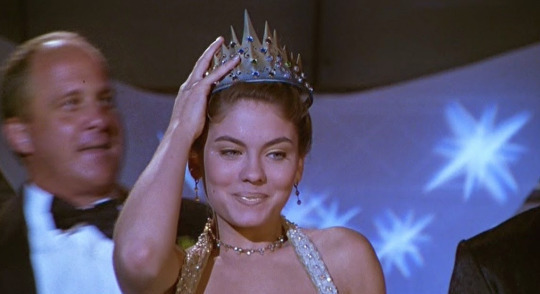
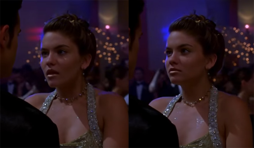
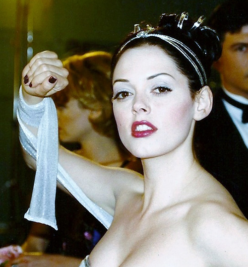
 Links for the lovely long days of June.
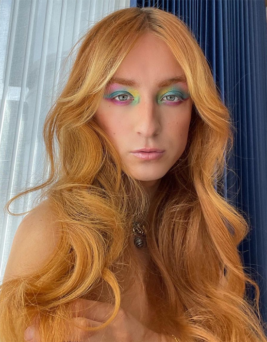
– Unlike most other digital makeup, this actually seems fun.
– Move over, rainbow makeup. Here's a little piece on the importance of glitter for the LGBTQ+ community.
– In makeup history, L'Officiel had a fairly accurate, concise history of contouring.
– The acne positivity movement is gaining traction.
– Two predictions I made earlier are coming true: lipstick sales (and cosmetics sales in general) are taking off as the pandemic eases and makeup experimentation is continuing to rise.
– Do you remember the woman who got Gorilla Glue stuck to her scalp? I'm pleased to report she found a way to monetize the incident. With what she went through I'm glad she's making some money off it.
– Estée Lauder is getting into the men's makeup game.
This is why I don't trust the bulk of online reviews.
– Talk about a multi-use product.
The random:
– My former favorite band released yet another bad album. Admittedly I only listened to two songs from it, but that was more than enough for me. I feel so lost without them. 🙁
– On a happier note, how adorable was the winner of the Westminster Kennel Club show? Wasabi is a Pekingnese, not a pug, but still precious.
– Loved this roundup of vintage mermaid illustrations.
– Not traveling any time soon, but if I were it would be to New York to see this exhibition of sparkly jewelry animals and to London to see a show on Bridget Riley.
– I asked Museum staff to make a rainbow for Pride Month in exchange for some cookies. They were pretty happy to oblige, especially since I made their favorite summery cookies: lime sea-salt chocolate chunk.

How's your summer going?
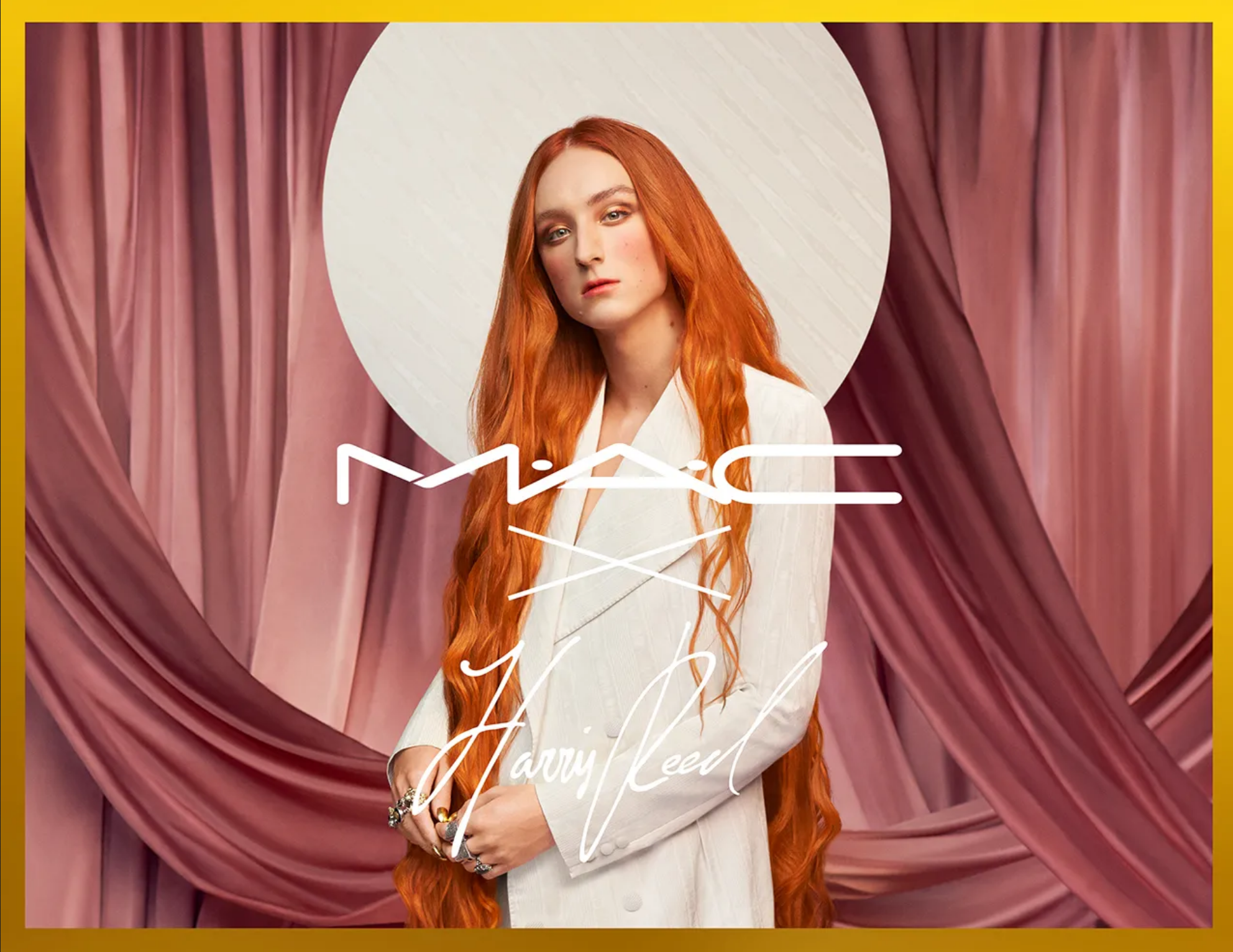
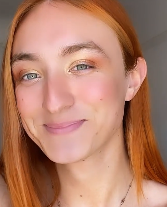
The MAC x Harris Reed collection was released in February this year, but I wanted to wait until June to write about it in honor of Pride Month. For brevity's sake – I read through dozens upon dozens of interviews with Reed – and because I'm not a gender studies or fashion expert I will try to keep this as brief as possible.
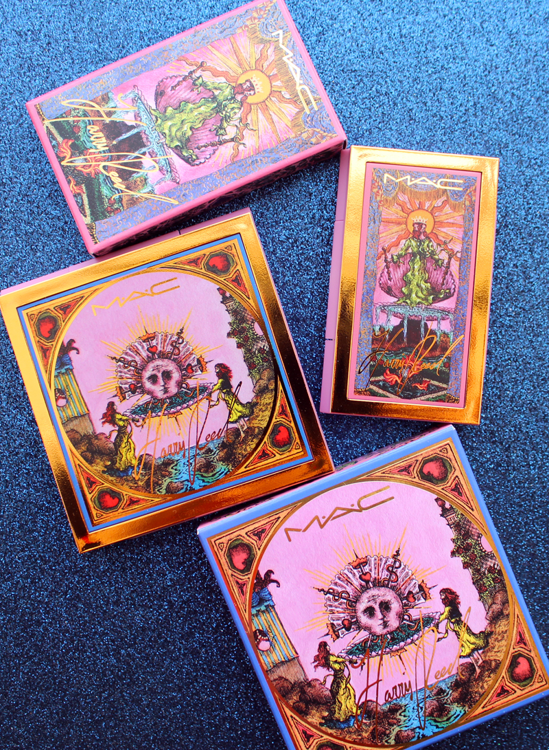
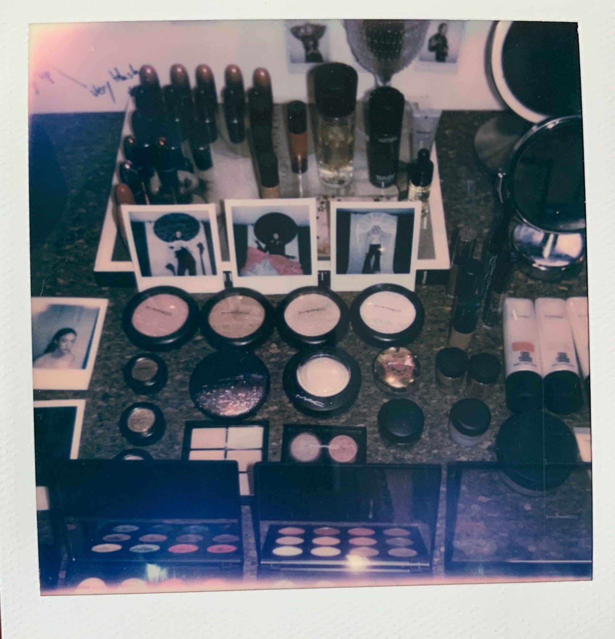
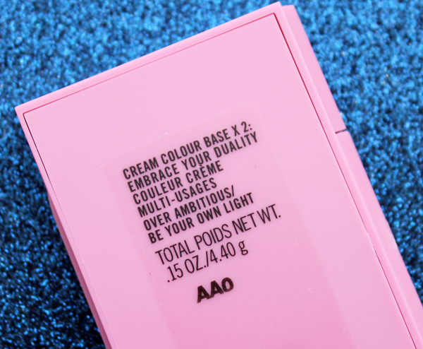
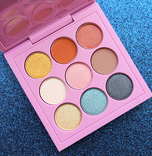
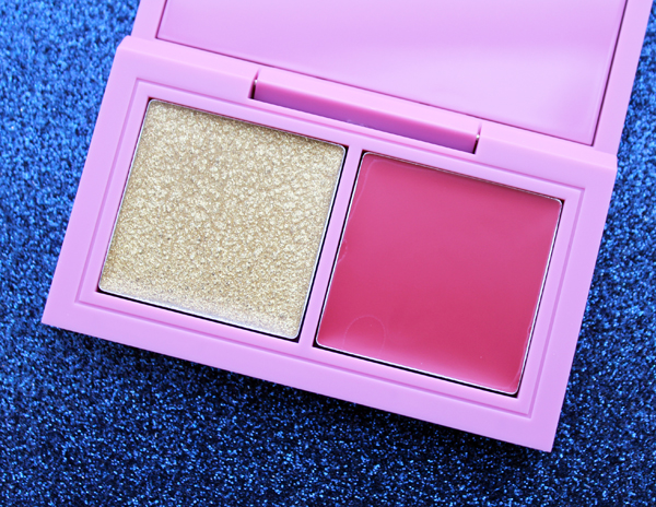
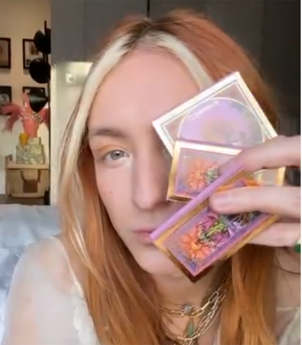
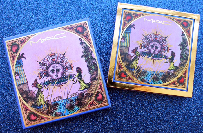
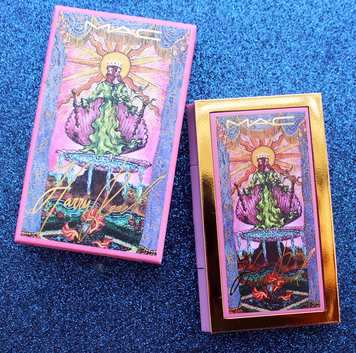
The collection was manageable, consisting of an eyeshadow palette, a gold kohl pencil, Cream Color Base compact and a palette of three lip colors. I juts picked up the eyeshadow palette and the Cream Color Base as the packaging for that one was the same for that of the lip palette.

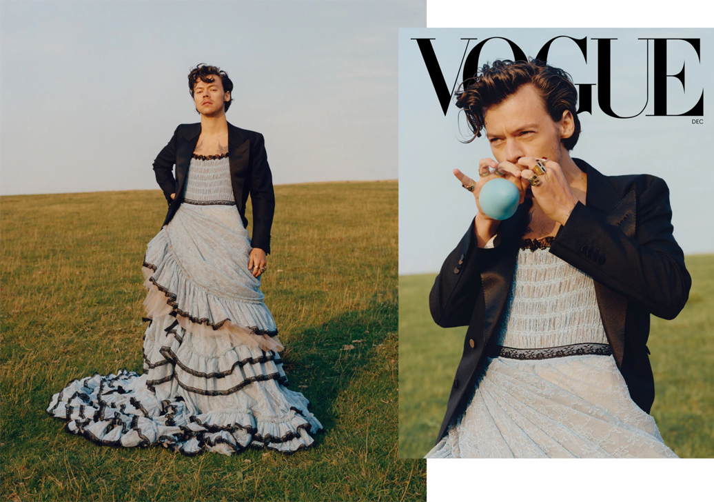
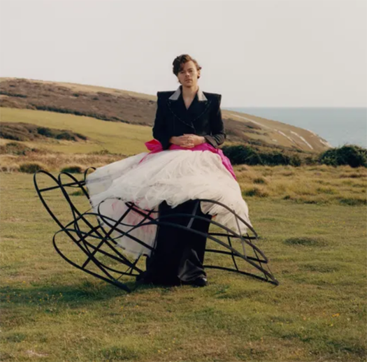
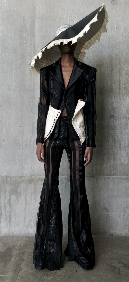
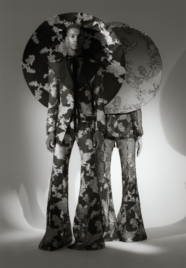
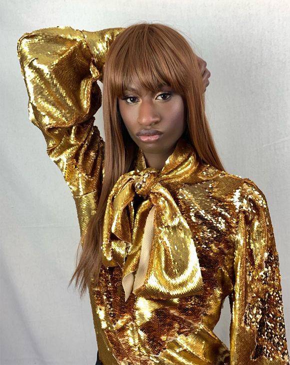
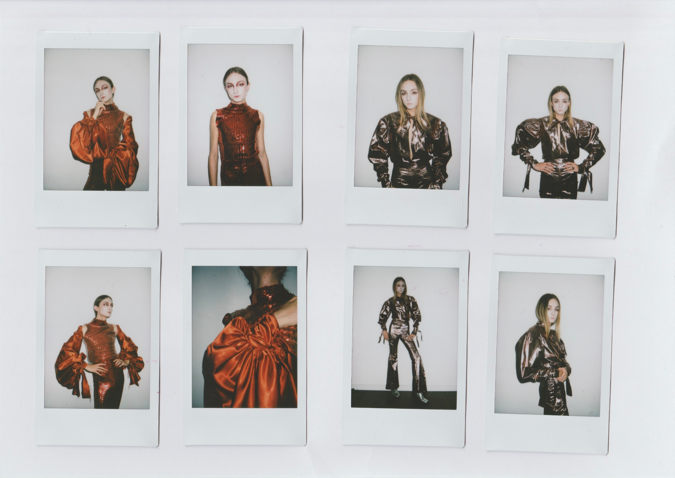
Who is Harris Reed? Unless you've been living under a rock, you'll recognize them as the 25-year old wonder who's been taking the fashion world by storm. Reed came to my attention when Harry Styles wore several of their fabulous flouncy frocks in the December 2020 issue of Vogue.


(images from vogue.com)
Committed to gender-fluid fashion, Reed creates clothing that makes a statement yet doesn't take itself too seriously. "I don’t just make clothes. If you want pretty clothes, you need to go to someone else. I fight for the beauty of fluidity. I fight for a more opulent and accepting world. That is really important to me…there always has to be a message. I wouldn’t pretend that doing some crazy avant-garde outfit is going to change the world, but I like to think that it could start a conversation."

Reed's aesthetic is heavily influenced by the free-spirited atmosphere of the '70s, particularly the androgyny of glam rock and Studio 54's dazzling evenings. The wide pants legs and lapels, bold patterns and extensive use of embellishments (feathers, sequins, etc). reference the era but are modernized so as not to veer into full-on costume territory. Reed explains their fascination with glam rock to Fashionista: "I've always loved glam rock. I’ve always said we need more people like David Bowie. At a time like right now, a lot of things can either look very the same, or brands are doing things—or musicians are doing things—that sometimes don't feel authentic. I love glam rock because there’s a level of grit and more importantly a level of authenticity that I think shines through all the glitter and the glam and the flares and the ruffles. I look at all those things, the flares, the ruffles, as points of reference of someone expressing themselves at the most heightened, most authentic, most outrageous part of themselves. So I think for me, glam rock, it's almost like fluidity. Obviously it’s different, but they go hand in hand because it's your most extreme version of yourself. You are expressing who you are in the most heightened, over the top, fabulous way…I really try to be modern in my designs, but I still try to keep that nuance and push it to the limit. Be the person who doesn't fit the mold. Be the person that doesn't fit the box. That’s where I see glam rock coming back into what we do and our daily lives and within fashion—being referenced more as a way of being than just a specific style."

I can't say Reed's designs are wearable for the average person (or at least, not an entire ensemble), and they acknowledge that their latest collection is more about artistic vision than whether it would sell. I'd also argue that their clothes were made with a certain body type in mind, i.e. skinny and tall – I see zero diversity in terms of size. But Reed's dedication to creating flamboyant yet expertly tailored clothing for all genders is definitely something we can all support. Their statement about breaking free of slogans and logomania represents a thoroughly Gen Z outlook and is a refreshing new direction in fashion. "I’m ambiguous about my gender and have never understood why something is made for a man or made for a woman. I think if a piece makes someone feel invincible or unstoppable, that’s all that matters. At the centre of my work is a drive to break down any preconceived idea of what gender is. I love that fashion has an obligation to trigger debate. But at the same time, it has to be in the most fun, playful way. It’s not about slogans, it’s about fantasy, and letting someone live that fantasy through clothes. Fashion is about self-expression – dressing in a way that makes you feel the happiest you’ve ever felt. Life’s too short to try and box yourself in to something normal, so why not have as much fun as possible with what you’re wearing? For me, that means flares and flouncy blouses – the more performative, the better. I’d describe my style as glam-rock Victoriana."

(images from harrisreed.com)
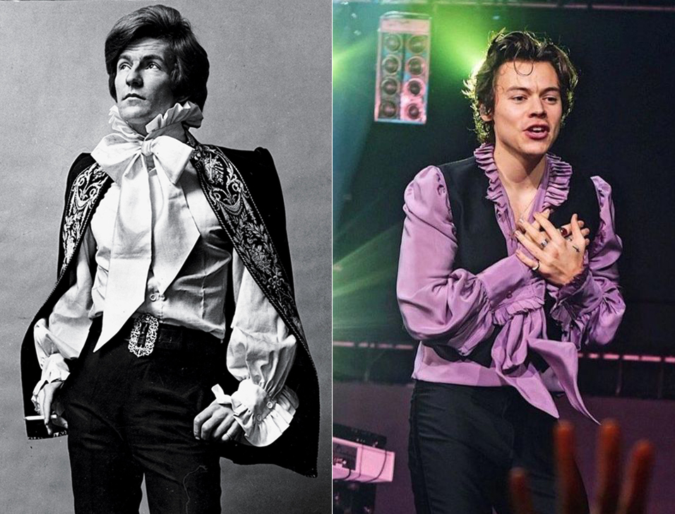
Anywhere is fair game for frills and ruffles; whether they adorn the front of a blouse, the end of a sleeve or a skirt hem, they add an exuberance and joy not regularly seen in high fashion. In looking at their work, I would posit that Reed is an aficionado of the late '60s as well. Take, for example, a blouse from the showy "peacock revolution" ushered in by Michael Fish next to one Reed designed for Harry Styles.
 (images from nytimes.com and instagram)
Reed also cites "old-world" classic European art as inspiration, especially the Rococo movement. Again, while there are some literal references to that period, the clothing exudes the overall vibe of the era: dramatic, over-the-top and ornate.

(image from harrisreed.com)
Though born in Los Angeles, Reed traveled extensively growing up. "My mom is very much a free spirit and artist. She was a model in the '80s, she would go to Studio 54, she is just an incredibly creative and soulful woman and then she became a candle maker and a perfumer. With my father being in Entertainment, Los Angeles, he remained there and me, my mom and my sister went off gallivanting around America, moving to different cities and different places," they tell Purple. Reed came out as gay to their parents at the age of 9, and was grateful to have their full acceptance – they encouraged his creativity and stood up for their son when teachers called to say some parents didn't want their children in class with a gay kid. "I was bullied for being gay and for being different…my mother would often find me dancing in bedsheets and shower curtains – and she and my father nurtured and supported that side of me." (I'm relieved to hear that Reed's parents supported them, but still aghast at how recent this was. Reed is so young – when they were 9 it was 2005. I honestly did not think that kind of casual, blatant bigotry was still happening to children in the 21st century.)

Reed was a creative child, but fashion design didn't occur to them until later. It was clothing's transformative power and ability to express a different aspects of one's personality that captured their imagination as a teenager. "Fashion wasn’t part of my background. I think creativity and this yearning for creating was a part of my background – I think for me there was always this idea of creation but it wasn’t until I was in my teens that I realised that clothing was more the artistic venture that I wanted to embark on. Clothing had this intense ability to transcend peoples’ emotions and for people to see each other in different perspectives and through a different lens. Once I took all this creation as a child and used and harnessed it, it was about applying it. I found it through dressing up and experiencing this playful carefree sense of trying on different identities until I found the right one. From there it was even more about building on the identity I already had and making it special to make it shine."

Reed's arrival in London to attend Central Saint Martins – the legendary design school that educated the likes of Alexander McQueen and Stella McCartney – marked another turning point. "I never really sewed a proper piece together until I started at Central Saint Martins – a lot of people don’t know that. Before CSM I was mostly duct-taping, pinning, draping, literally using anything and everything I could get my hands on to create clothes without actually putting a machine to the fabric. As a child, as someone who was very much picked on and who was not someone who fit in whatsoever, I look to Central Saint Martins as the shining beacon of escape. When you looked at McQueen and Galliano and look at Ricardo Tisci, you could see what came out of there and I just remember watching old documentaries and you could see this sense of camaraderie with everyone communally coming together with shaved hair and crazy colours and crazy clothes and it just felt like my version of what outer-space would look like."

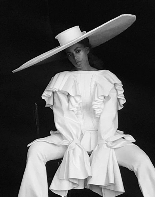
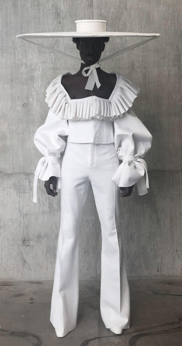
Reed was only in their 2nd year at Central Saint Martins when their "white show" outfit caught the attention of noted stylist Harry Lambert, who in turn introduced Reed's work to celebrities like Solange and Harry Styles. Reed explains: "It all took off with the first show of the BA fashion course, in which students have to make one piece in white. I’d always known who I was, but I didn’t quite know how to express that in terms of clothing and character. Then the White Show happened. There was so much I wanted to articulate in the piece I made – the experience of being bullied, my childhood fantasies, my commitment to making clothes that weren’t just pretty but also sparked conversation. And so I based my piece on those made-up characters from my childhood, this time a boy aristocrat who was kicked out by his parents for being gay and took refuge in an old opera house, putting on white powder every day until all his clothes become white. I made a giant, wide-brimmed, white felt Little-Bo-Peep hat, with a low-cut ruffled bustier jacket with huge puffed sleeves and dramatic white flares. It was neither menswear nor womenswear but genderless. And within about 30 seconds of my posting it on Instagram, Harry Lambert requested the piece for a shoot. Next thing I know, Solange is being photographed by Peter Lindbergh wearing it."

(images from @harris_reed)
"The outfit was, in a way, parallel to my own story. This character was like me coming to London and finding my salvation,” they say. “It was quite emotional because it was the first time that I put myself completely out there in London, my first kind of big full look."

Reed cites the support of their classmates as well as more seasoned designers such as Alessandro Michele, head of Gucci, for whom they interned. "I think first of all collaboration is everything, as someone who is still in school I value the collaboration of my classmates more than anything…If you just sit with something in your own mind, the outcome you have will not be nearly as good as the outcome you have when you have four friends there helping, pushing, challenging you and criticising you to come up with something better…the support of emerging designers is crucial. The world is run by huge companies and we have to support young talent. That’s why brands like Gucci are so extraordinary because I think that’s why Alessandro Michele truly can pick young talent, nurture and collaborate with them. The collaborations he does with young artists, with illustrators, designers, singers, musicians, I think more brands need to be doing things along those lines. Alessandro opened my eyes up to a world that was more colourful, vivacious and more surreal than anything I thought it could be. Those nine months in Rome were the most incredible nine months of my life. It truly gave me a whole new perception on the way that I looked at fashion. He opened my eyes up to the power of texture and colour and embroidery. His narrative lies so deeply within his veins, so deeply within his soul that I think it just pushed me to a deeper level of understanding of creation. It’s massively affecting my work now because I think everything I do has so many more layers to it within the narrative as well as the design. Now there’s a hand-painted print, with embroidery on top, finished with hand-diamanté. Everything becomes so much more multi-faceted and Alessandro instilled that within me. I think he’s a genius." Reed, in a very fitting collaboration with their mom, has since designed a collection of candles for the brand.

(image from allard-fleischl.com)
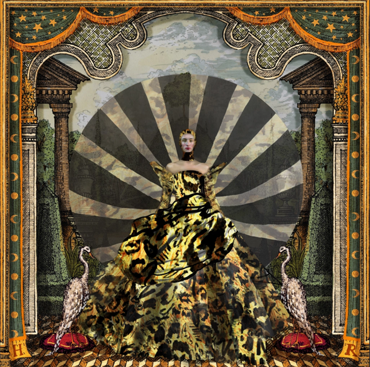
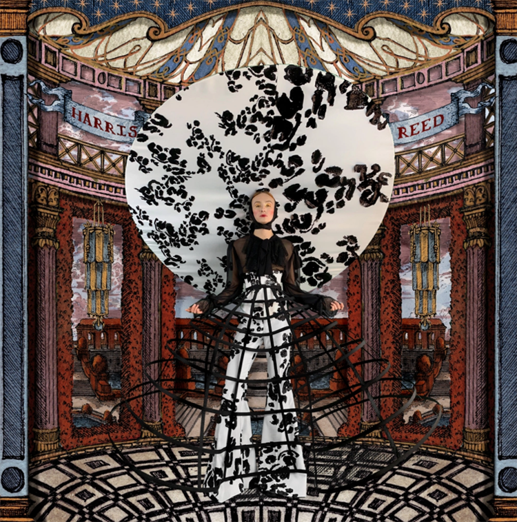
Their designs for their 2020 graduate collection hit a new peak for creativity. With the pandemic making in-person shows all but impossible, Reed and their fellow classmates had to figure out how to exhibit their collections remotely. Reed, with typical flair, teamed up with illustrator and 2020 RISD graduate Lukas Palumbo to make elaborate theater sets for their designs. The finished product is absolutely astonishing – one would never know it was photographed against a green screen in Reed's living room. Reed, of course, modeled their own designs, having previously walked for Gucci. Standing at a very lean 6'4", modeling is certainly another career option for them.

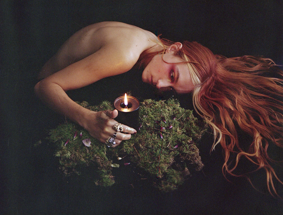
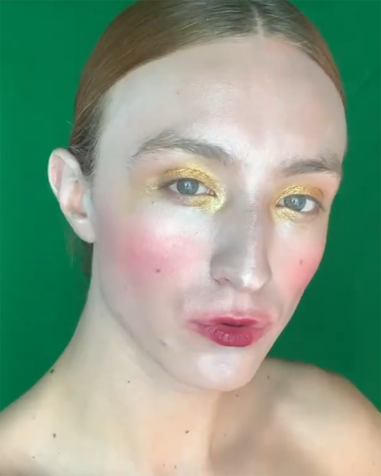
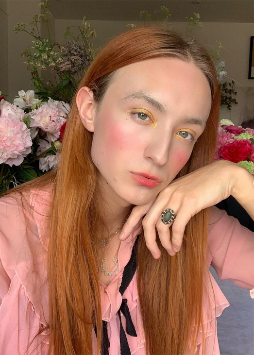
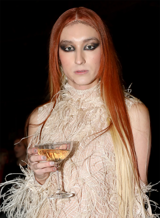
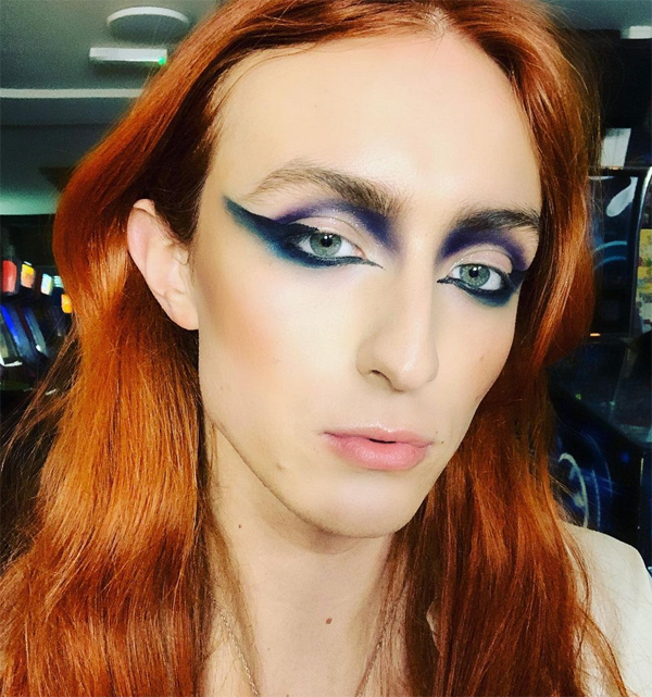
And this is where we start to talk about the makeup! Terry Barber, Director of Makeup Artistry for MAC, was in charge of makeup direction for the show. Barber provided makeup tutorials so Reed could wear the look for the final photo shoot. The summation of the style, according to Barber: "angelic but sordid." Speaking with Dazed Beauty, Reed elaborates. "The looks were quite dramatic and over the top. Terry Barber being a complete and utter beauty genius he was really able to transport and positively move what I was doing in a better direction. I was originally like ‘more gold!’ or even getting a bit more costume-y and Terry just so seamlessly brought it to a place where it was opulent, it was fluid and it was quite majestic. The influence for the make-up really came from the starting points of people like Henry Paget and this idea of theatre make-up. This idea of rosy kissed lips that are slightly smeared because you're trying to hide a secret while you’re wiping your mouth and this gold on your eyes that’s gleaming and shimmering but in a way that’s a bit fucked up because you just woke up with it on from the night before. This idea of stage make-up but then you were just at an amazing party at Studio 54 and you woke up and you slapped it back on to go greet your day and this kind of alter ego fluid manifesto of yourself…We were really just trying to find a good balance between Henry Paget and the New York Dolls. They went heavy with the stage make-up and they went quite crazy but it was that love of theatricality and this idea of men wearing make-up for the performance of it. I love the idea of everyday is the performance. The face, the skin, the lips were very Henry Paget but then the eyes were so New York Dolls to me because even though I wasn’t doing the black intense eyes they were doing, I was using that technique of smudging with my finger, getting in the creases, getting in the cracks really going for this fucked up glam rock vision…It’s a fluid romantic opulent, stable kiss fantasy. it's quite in your face, it's quite loud but then it's almost smeared. This kind of kiss-behind-the-stables, hidden Renaissance."

Adds Barber, "I had worked with Harris a few times before and we’d already connected on things that we loved in beauty like a smacked-on cheek, a rubbed in lip and finger-painted eyeshadow. The idea just came from the story of a slightly surreal, aristocratic, faded glamour, rather than anything too technical. A suggestion rather than a major statement…Harris has collected so many references along the way which not only relate to designing a collection, but also to the story of being gender fluid and how that might manifest itself in terms of styling. Many of those references lent themselves really well to creating a beauty which is at the same time romantic and subversive. We discussed foppish boys in 16th century Flemish paintings, Victorian am-dram, Fellini caricatures, Tilda Swinton in Orlando, and Bowie in his Diamond Dogs period. It was essentially about creating a character rather than a specific design."

(images from dazeddigital.com and @harris_reed)
Given the success of the Barber and Reed partnership, a MAC collection wasn't unexpected. MAC was also a natural choice for Reed as the brand was part of the designer's early makeup memories – they remember going to a MAC store and seeing the artists applying makeup on boys. "My first experiences with make-up were with my friends at a MAC store getting ready for prom and it was the brand that I first saw putting make-up on ‘boys’…for [MAC] to even trust me, and take on my strong-ass message of fighting for fluidity, I have to say, has just felt like the most beautiful partnership…M.A.C has an amazing heritage of fighting for self-expression and inclusivity, so they were so on board and supportive of that vision."

(image from maccosmetics.com)
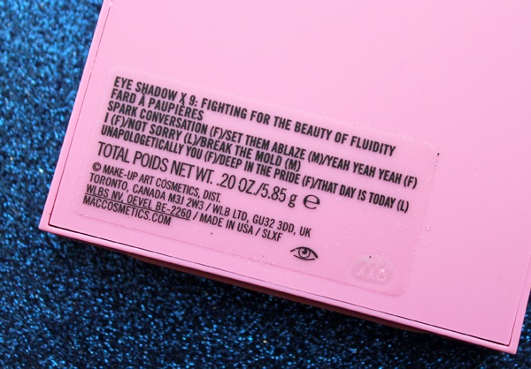
All of the product and shade names are personal for Reed. The monikers in the collection are iterations of their mantras, with the name of the copper shade in the eyeshadow palette being a favorite. "I always just say, 'Yeah, yeah, yeah,' when there's someone in the street saying something homophobic or mean to me," Reed tells Teen Vogue. "If someone doesn’t understand what I’m trying to say or doesn’t get who I am, [that phrase] lets me brush it off, peel it away, and step forward into the light."

"Every single name in the collection is based on daily affirmations I tell myself," Reed says. "Whether it's 'embrace your duality' or 'spark conversation,' I want men, women, non-binary people, and you to be able to pull it out and to put on the best version of themselves. They're putting on an affirmation; they're putting on something that it's really helping them enhance and showcase who they are."

The shades and concept for the MAC collection are more or less an extension of the ones used in Reed's 2020 graduate collection. "The colors tell this soft, poetic story but, at the same time, I wanted to include emerald and black to be able to quickly shift to something more rock ‘n’ roll and messed up…Reference points come from anywhere from Studio 54, the ‘70s—a time of complete androgyny and glam rock and decadence and fabulousness. And then also, looking still within that theme, a completely different world [of] Rococo, more of this idea of androgyny back then. In paintings, it's so effortless and just kind of had this beautiful blending. So very much pulling in this old world, Rococo, men in makeup, really kind of lounge-y fabulousness, and then juxtaposing but also sitting beautifully within Studio 54 and the ‘70s."

The entire collection, of course, is based on Reed's boundary-less approach to fashion and makeup. The goal was to create something that could be worn by anyone for any purpose. "I want anyone and everyone to be able to wear this. This was two years in the making, and when I was creating this, my family was in the room and everyone including my dad, mom and sister agreed they’d try and wear the products I was working on. We don’t just want to normalising the wearing of make-up, but to make it accessible and acceptable to everyone by breaking any preconceived boundaries that people may have with such beauty products." No products are in a tube, and the palettes lack brushes, encouraging users to adopt a more playful, carefree application rather than precision. "The collection for me really embodies this idea of not only fluidity, but complete and utter self-expression. Nothing is in a tube and nothing has a brush. It's really all very much like an artist palette; it's meant for your fingers, it's meant for men, women, non-binary, every individual to feel completely comfortable to be able to play with…What I love about make-up is it doesn't get more hands-on or personal then you putting something on yourself. That's why for me, I'm not really a make-up brush person. You should play, touch, smudge, feel and love with your fingers on your face."

Accessibility also came in the form of the products themselves. Much like Reed's fashion, they're multi-purpose and are intended to create a variety of looks to suit any mood. "Everything and anything goes," Reed tells Allure. "It's just like my approach to fashion. One thing isn't meant to be for a top. This fabric can be for boots, it can be for a hat. This eyeshadow is not for your eyes. This eyeshadow is for your collarbones; this eyeshadow is put up into your hairline and almost making a gold halo around your face." Reed demonstrated the gold halo look at the British Fashion Awards in 2019.

(image from popsugar.com)
Additionally, gold was chosen as a prominent shade not only to align with the sparkly glam-rock/Renaissance aesthetic but because it's flattering on every skin tone. "I want this line to be showcased on people of different genders, races, ethnicities, and gold is such a universal color because it works for everyone," says Reed.

Reed makes the same point I do about artist and fashion collabs with makeup brands, which is that one may not be able to afford an original work by an artist or a couture garment, but they can afford makeup. "Make-up is also incredible because, you know, when I was younger I didn't have the money to have the clothes. But I could go to the drugstore store and buy a great lipstick and that lipstick could be a blush, it could be an eyeshadow, it could be for your lips, it could be for your ears, you could put it in your hairline. Make-up is accessible and it's fun. I think people get scared of it but you have to just own it and use it as a weapon to be who you are. It's such a cheap and inexpensive way to get a message across…we can’t all have a giant gown in our wardrobe but we all can have that one lipstick that changes how we feel about ourselves. And for me, that accessibility is crucial because it lets anyone have a dream, lets anyone feel like they have the power to change and evolve as a human being. This is what I truly love about make-up…I’ve been so incredibly lucky that millions of people have seen the things I’ve worked on and have been a part of, but have maybe until now they’ve not been able to buy into it. This is now something that anyone can get their hands on and be a part of. It doesn’t feel real, it feels crazy."

Makeup is also a handier way of accessorizing for one's mood, with the ability to change any time. "What I love about makeup is the fact that I can't change my clothes throughout the day, but I can change my makeup look with the touch of a finger," Reed says. "It really allows me to almost have different looks, different personas within the day, all literally through something that fits in your pocket…I can start the day with one mood, but change and amplify it by lunchtime. Then, by the evening it’s a full-blown party."

We all wear makeup (or don't) for different reasons, most of which are fairly mundane. But for some, makeup can be a tool for transformation. Reed discusses how their first experience with lipstick made a lasting impression of the power of makeup. “I picked up a random red drugstore lipstick with my mom when I was eight or nine, put it on, and thought, "'Fuck, this is amazing,'” Reed recalls. "Actually, I was young, so I probably didn’t say the F-word, but I remember being so blown away by the transformative power of makeup…this small thing in your hand had [the power] to really show different sides of yourself, show different aspects of your personality, your individuality," Reed tells Allure. "That relationship with makeup is still my approach today with everything I do. It's this idea of putting something on that enhances and brings out a side of yourself. You're not becoming someone else, you're not trying to be someone else, you're literally pulling from within."

Along those lines, Reed is very much a proponent of makeup for self-expression and play rather than as a way to meet conventional beauty standards, and this belief was what they were trying to convey with the MAC collection. "My interpretation of gender fluid make-up is really being what makeup should be—a tool to help not only enhance but communicate a story. Makeup is so beautifully able to transport someone and the way people see that person simply by what you put on your face. It’s similar to how clothing almost serves as armour walking into a daily battle, fighting for what you believe in and being who you are. And makeup goes so beautifully hand in hand with that. Putting on a fabulous red lip on or adding pops of sparkle and glitter to your face is like claiming your identity, facing the world with authenticity and claiming your space…[The collection] is very much about a playfulness and the joy of make-up. As I have pushed this idea of a more fluid space in a more fluid world, I’ve really loved that make-up can always be that gorgeous icing on top. It doesn’t only complete the look but, it also completes the message, acting as that extra ounce of light to help radiate what I stand for. Try and not think of make-up as something that makes you look ‘pretty’ and try and not look at it as something that you use to make yourself better, but to explore and enhance something within you. Use make-up as a tool to be your most authentic self…I really hope this collection is something that can help me break down conventional ideas of what make-up looks like. I hope in 2021 and going forward that ‘glamour’ is going to be about something more than just copying a set-in-stone look from a tutorial. It's about asking 'how does that work for my face, my features and my personality?'"

(images from @harris_reed)
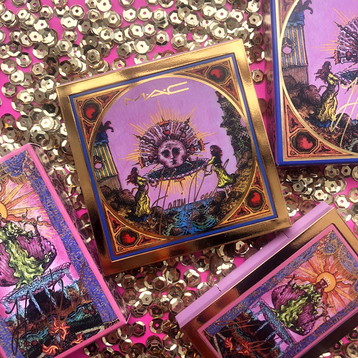
Now let's take a peek at the gorgeous packaging. As soon as I saw it I knew it was Museum-worthy. We'll get to the illustrations in a hot second, but first I want to highlight the use of pink, which Reed is reclaiming from its overtly feminine connotations by combining it with a regal gold to give it an "old-world" feel. "I love the color pink. I like to be a bit tongue in cheek with it, I think that's the English side of me. I like to take something that is so specific and gender-specific and just take it and make it my own. I was like, we're gonna choose the color pink and really just make it this color that is universal and mix that with the old world charm. I've always been so deeply fascinated by history. I think if I didn’t do fashion, besides being a queer activist I'd really maybe be a historian. I think we've learned from the past, we learn from history, and when I was developing the packaging, I wanted to really represent this old world nuance."

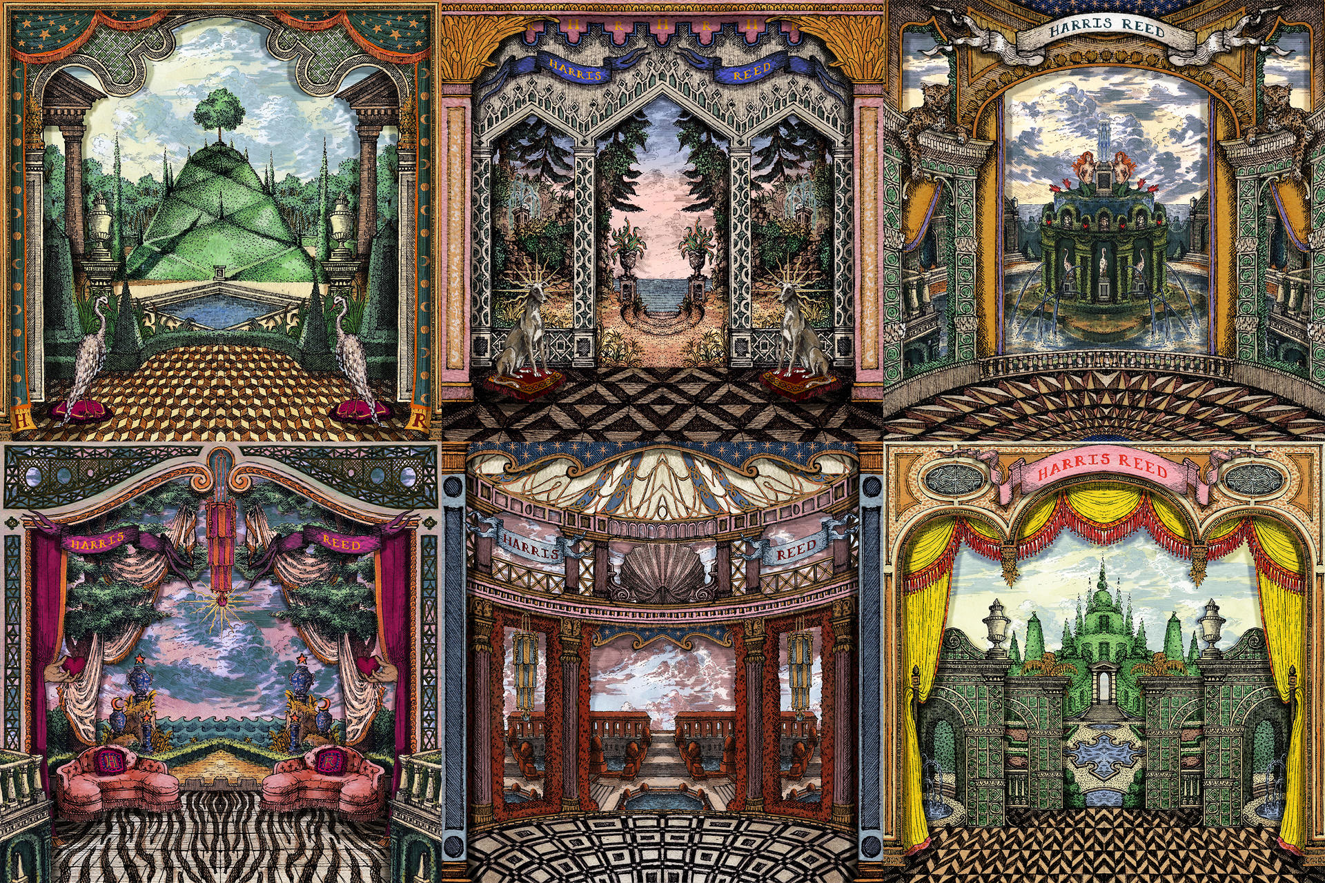
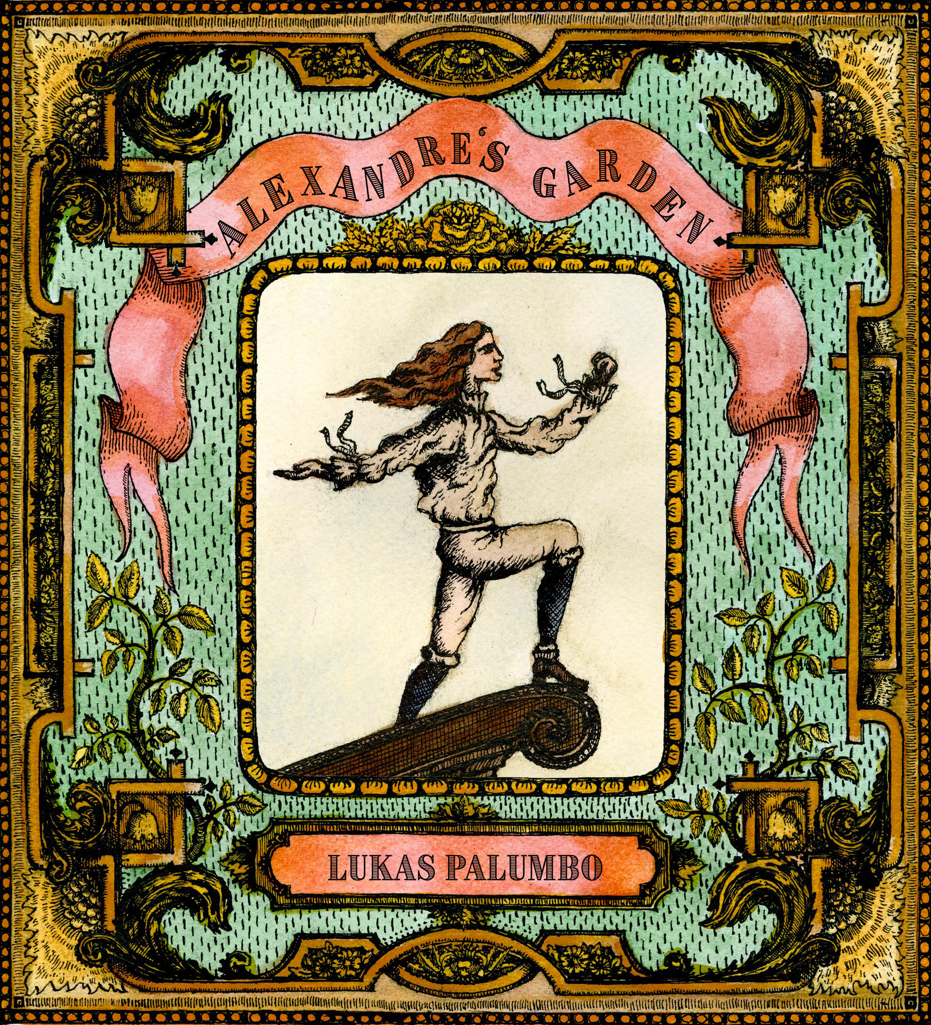
The artwork for the packaging was created by Lukas Palumbo, an illustrator and collaborator of Reed's. A 2020 graduate of RISD, Palumbo began working with Reed in 2020, when he designed the sets for their graduate collection.
 (image from publications.risdmuseum.org)
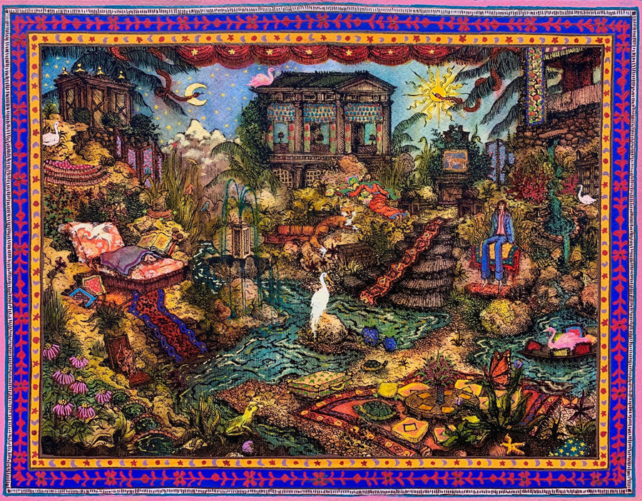
How jaw-dropping are these at full-size as a backdrop for Reed's designs?

I wasn't able to find much information on the individual designs, but this one (with mermaids!) had a tiny bit. "This garden was inspired by a collection of 17th century engravings of a garden that once existed in Belgium. You can also probably tell that on paper, this piece exists only as half of a landscape, as the right half is a digital mirror of the left half. This trick was a necessity in making so much work in so little time, and I found it worked especially well for theatre backdrops," explains Palumbo. And perhaps the double-tailed mermaids were influenced by those in the Fountain of Neptune in Bologna.
 (images from wwd.com)
According to his website, Palumbo is inspired by etchings from the 16th-18th centuries. (I tried to get an interview with him but received no reply to my request, alas.) To my eye, his style also brings to mind both medieval manuscripts and Neoclassical landscapes.


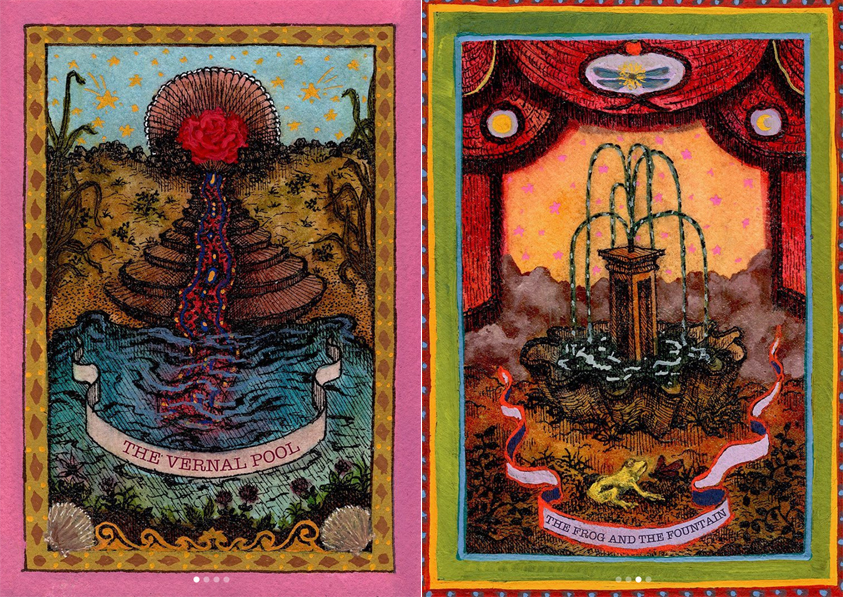
Some of his illustrations remind me a little of the ones Pamela Colman Smith created for the famous Rider-Waite tarot deck.
 (images from lukastheillustrator.com)
Indeed, Palumbo reimagined tarot cards for The Ingenue magazine.


For the MAC collection Palumbo created more of his signature otherworldly dreamscapes. The illustration on the eyeshadow palette shows a pearl with a human face resting in an open seashell, which is held up by two red-headed figures standing at a rocky riverside (seaside?) as if an offering. Rays of sunlight radiate from the shell, while the sharp stakes emanating from the pearl are wrapped by serpents or pierce through crowns and hearts.

The artwork on the Cream Color Base and lipstick palette depict king and queen figures wielding scepters atop a seashell overflowing with water, their heads silhouetted against a bright sun. Says Reed, "It shows a woman and a man combining into one fluid being." The long, flowing robes are one of Reed's creations.

Overall, I think Reed did a great job and accomplished what they set out to do: create a makeup line that could be used by everyone for any purpose, complete with visually appealing packaging. While the designer doesn't see themselves as being the first to release a gender-fluid makeup line, they acknowledge the MAC collection is helping lead the way to normalizing makeup's use for all genders. "It’s amazing that so many brands are jumping on the idea that people don’t have to be so gender-specific but we have a long way to go. I don’t look at myself as the first pioneer, but I’m hopefully one of many to be coming, wanting to stir things up… a lot. This collection is not for men. It’s not for women. It’s for every single person." Hear hear! I really hope we see more makeup from Reed. Perhaps a collab with Gucci Beauty is in order. ;) As for the designer as a person, I can honestly say they seem very nice and genuine. Despite growing up in an artistic household, attending one of the most prestigious design schools in the world, meeting great success at a young age, AND being good-looking, factors that seem like a recipe for pretension and self-aggrandizement, Reed comes across as humble and kind. I think you can get a sense of that in all the interview snippets I've included here. And after following them for a little while on social media, I can safely say this is someone I would love to have a makeup playdate with.
What do you think of this line and gender-fluid makeup in general? I think everyone should approach all makeup as gender-free and not feel as though they can't use it because they're not the "right" gender, but it seems society at large still has a problem with that. Fortunately it seems that more companies, in addition to MAC, are shifting towards collections and products that speak to everyone, regardless of gender, by using gender-neutral language and including gender-fluid models in their advertising (or at the very least, starting to include people who present as men instead of only women models). Now if we could just get more fat models and people over the age of 30 to be represented, we'd really be moving in the right direction.
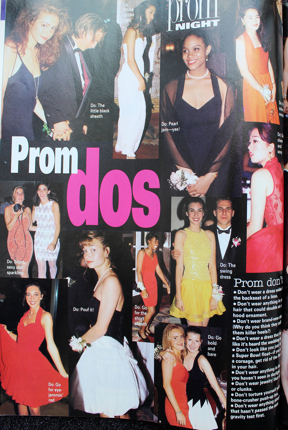
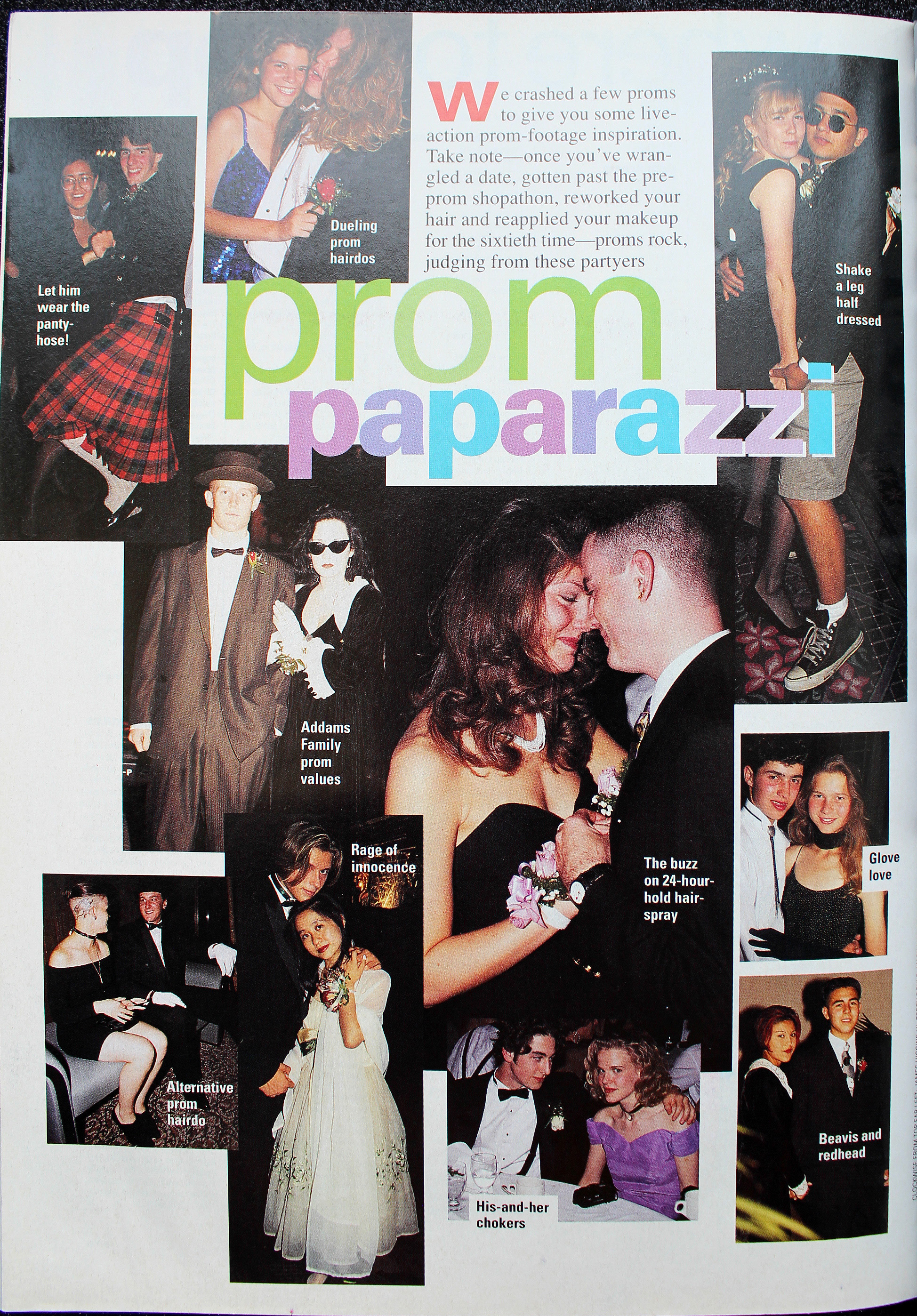
I really enjoyed the shorter bits of history that appeared between chapters in Lisa Eldridge's Face Paint. I liked the idea so much, in fact, that I decided to steal it and use it for my '90s makeup history book. Prom makeup is just one of the many featurettes I want to include. And I realize that prom season has come and gone by this point, but I'm still thinking how crazy it is that I graduated high school and attended my senior prom 25 years ago this spring! So with that, let's see what pop culture and magazine editorials were recommending in terms of prom makeup. Obviously this isn't meant to be an exhaustive list of every '90s prom look ever and how they compare to today's styles, nor is it a philosophical examination of prom and its greater cultural or social significance, especially for teenage girls. This post is really more of a nostalgic snapshot, especially since sources were hard to find. There are tons of vintage prom photos online but the makeup is barely visible, either because analog photos rarely translate well to digital images or because they were taken at a distance. Very few clear, closeup images of old prom makeup exist, so I had to rely mostly on magazines, movies and TV episodes and they weren't great quality either. Also, I credited where I could, but not all information was available for every photo.
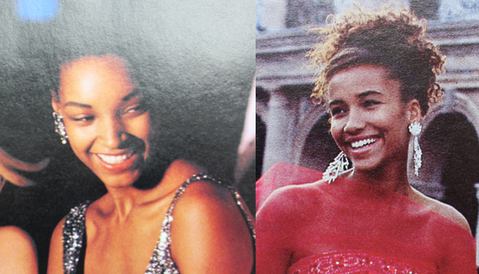
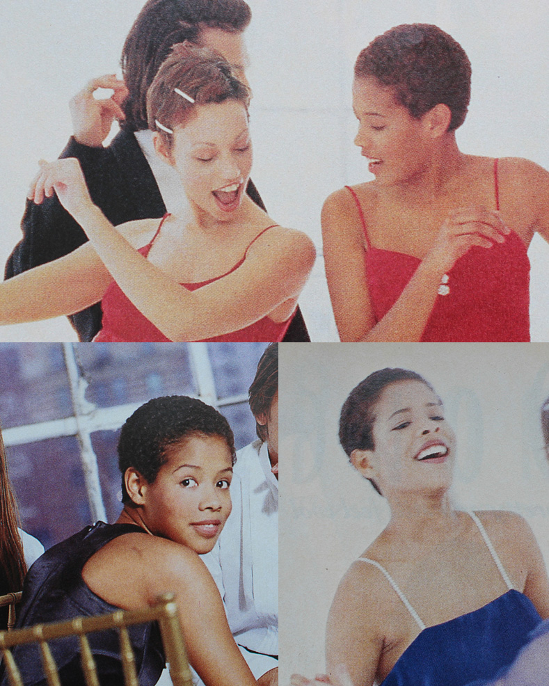
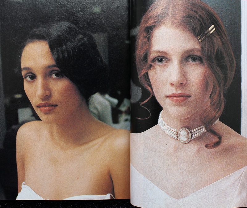
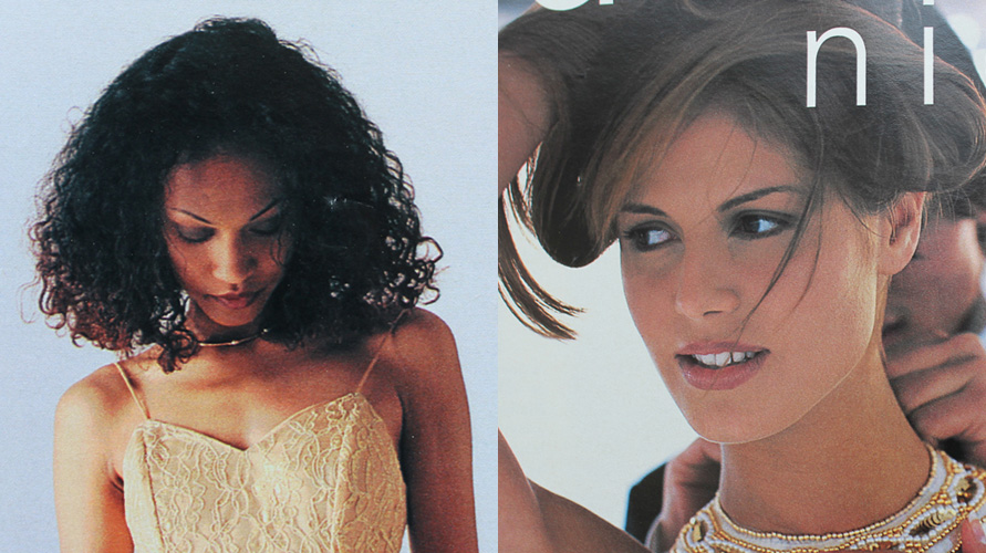
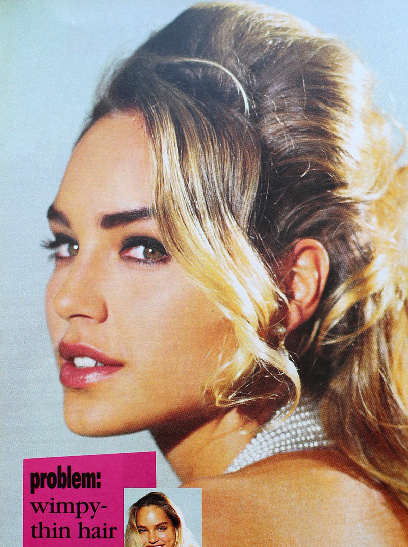
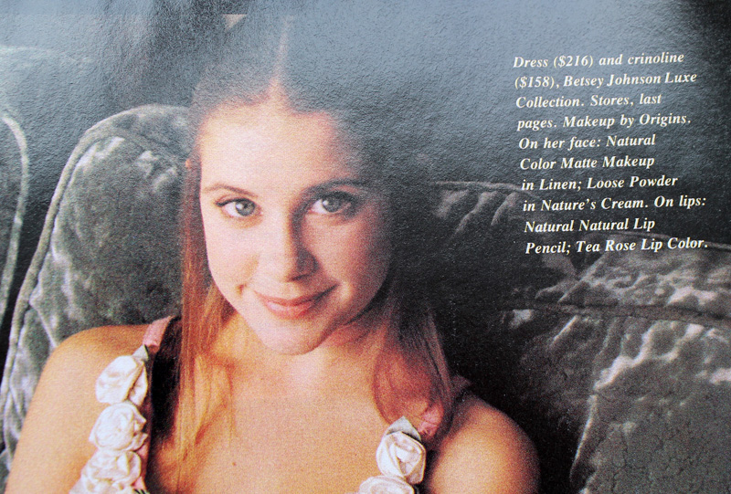
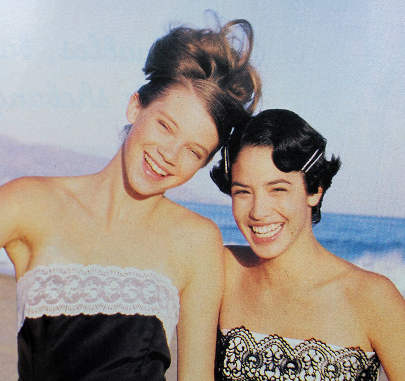
Overall, the decade followed the general makeup trends of the time. As a sort of backlash to the bright colors and general excess of the '80s, from about 1990-1994 the majority of prom looks featured minimal, barely perceptible makeup.

Minimal prom looks from Seventeen Magazine, 1992 (left) and 1991 (right). Credits for 1992: Hair – Hubert Cartier and Gili. Makeup: Timothy Metz. Photography: Wayne Stambler. Credits for 1991: Hair – Rodney Groves; Makeup – Timothy Metz; Photography – Tierney Gearon.

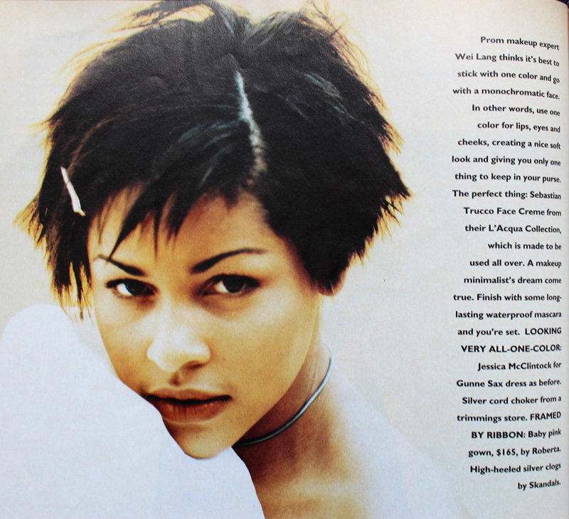
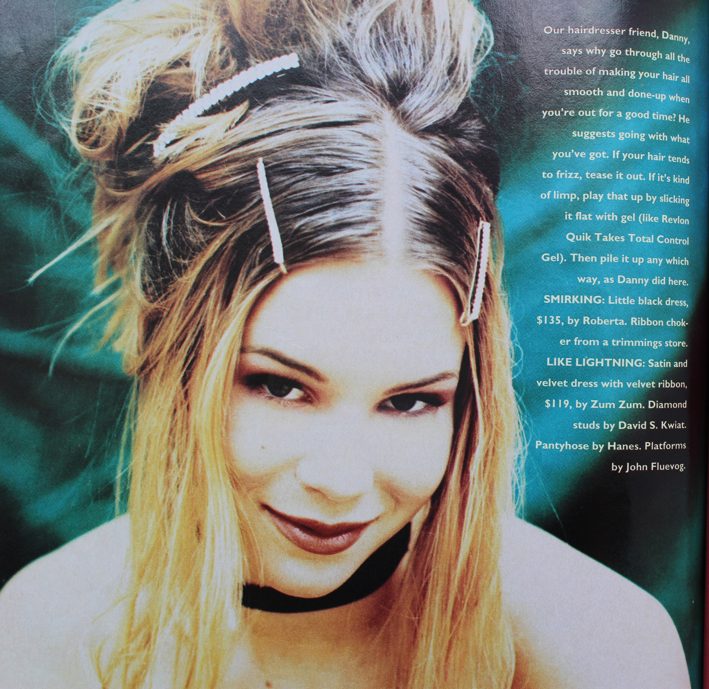
Sassy Magazine, 1993. Hair – Daniel Howell; Makeup – Wei Lang; Photography – David Jensen
Are these girls even wearing makeup?! I guess they are since the credits list a makeup artist, but it's nearly invisible.

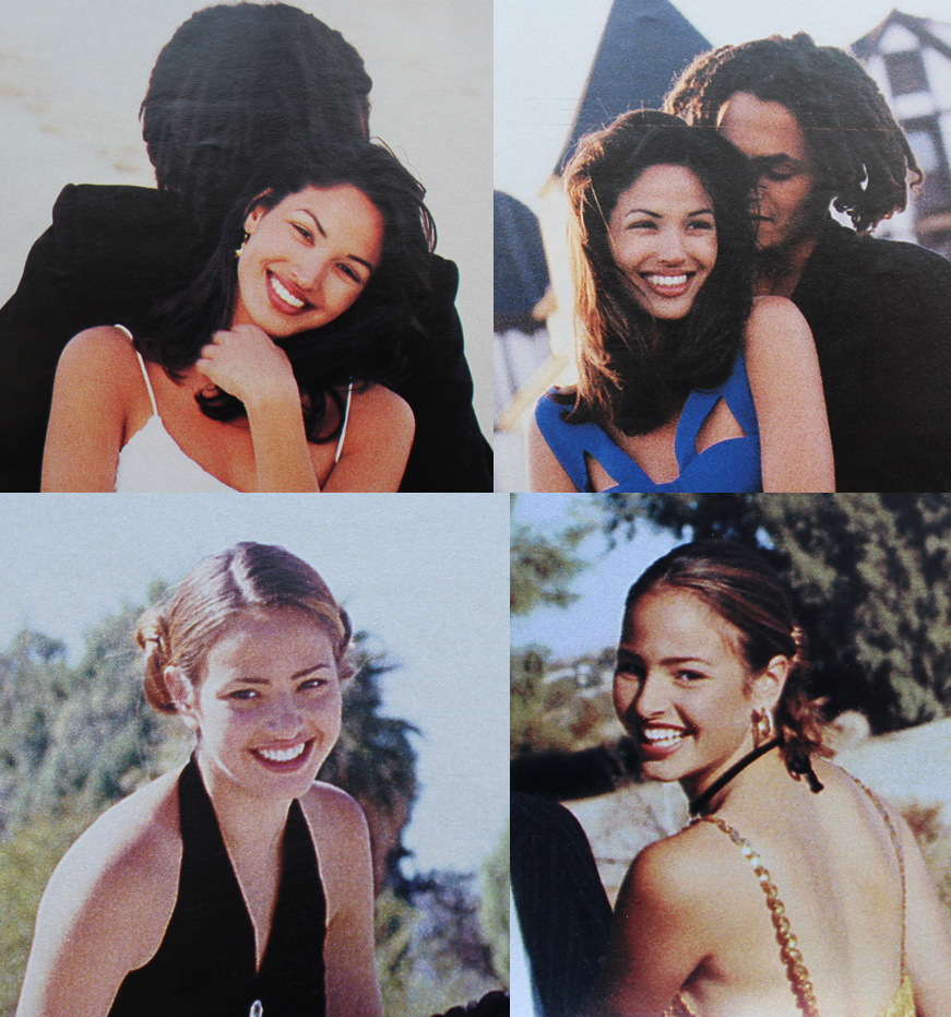
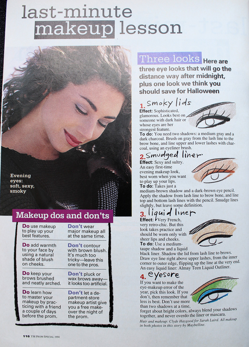
YM Magazine prom edition, 1994. Credits for top photos: Hair – Christopher Lockhart for Sarah Laird; Makeup – Christy Coleman for Jed Root, Inc. Credits for bottom photos: Hair – Brent Lavent for Celestine; Makeup – Laura Jadro for Visage; Photography – Carlo Dalla Chiesa

YM Magazine prom edition, 1994. Hair – Christopher Lockhart for Sarah Laird; Makeup – Mathew Sky for Vartali Salon. Makeup by Maybelline.

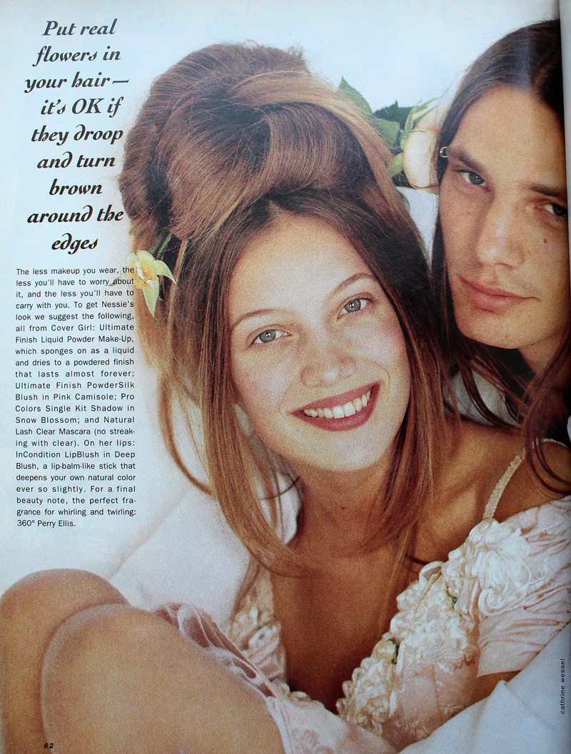
Sassy Magazine, March 1994. Hair – Daniel Howell for Oribe; Makeup – Regina Harris; Photography – Cathrine Wessel
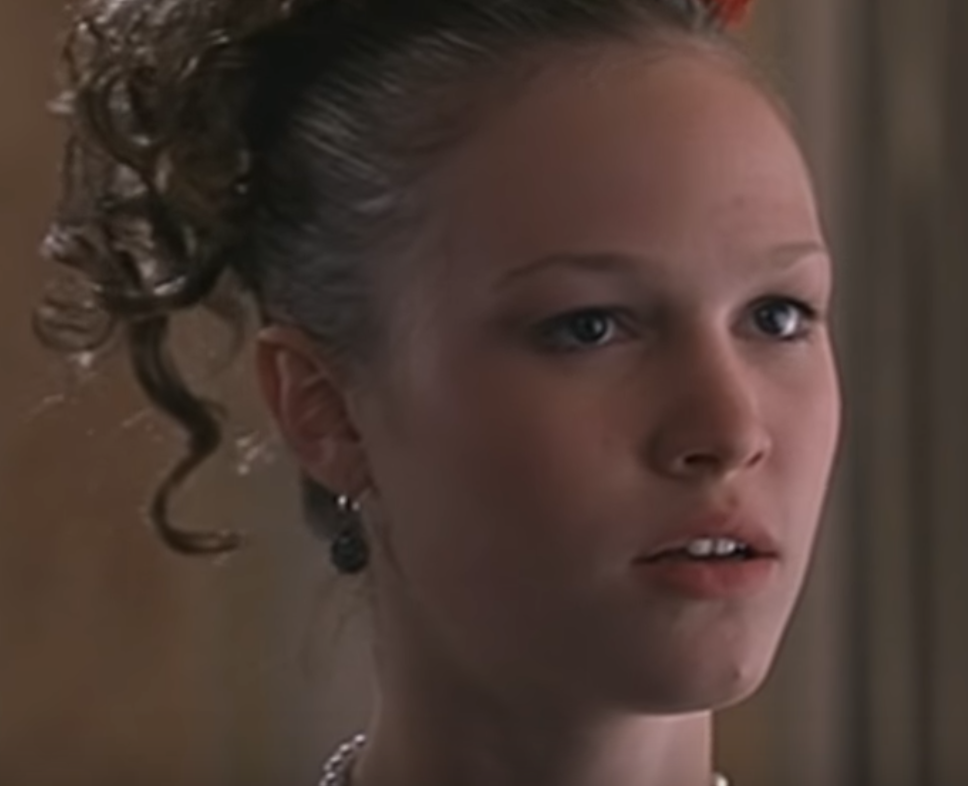
Julia Stiles's character in 1999's 10 Things I Hate About You opted for a minimal look for prom, but this might have been more of a stylistic choice to go match her personality rather than a reflection of late '90s trends. Kat Stratford would never go for the glitter, frost and pastel colors that were popular towards the end of the decade.

Julia Stiles as Kat Stratford in 10 Things I Hate About You, 1999. Makeup artist: Martin 'Vinnie' Hagood
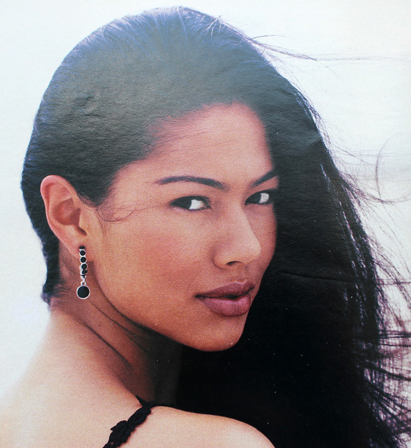
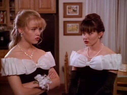
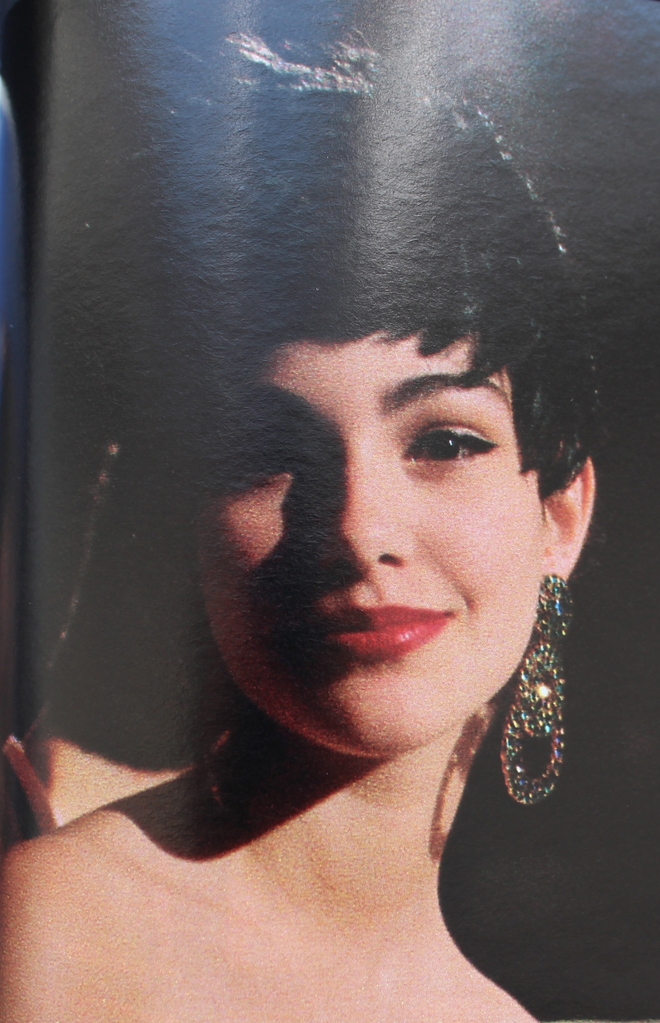
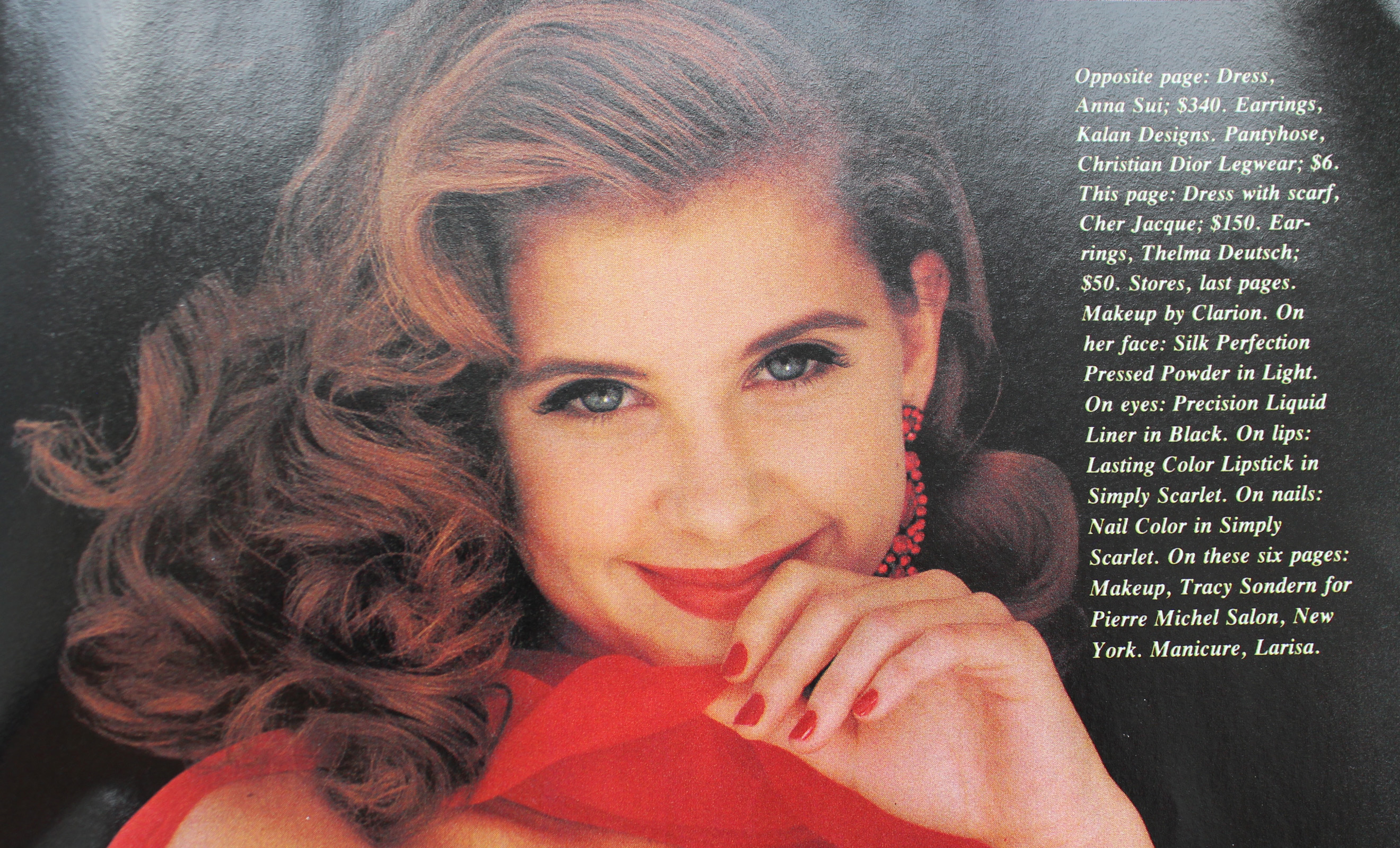
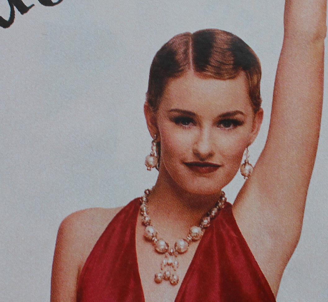
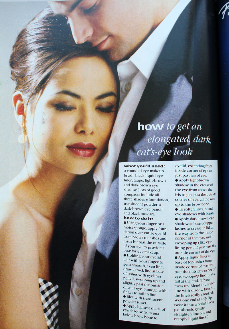
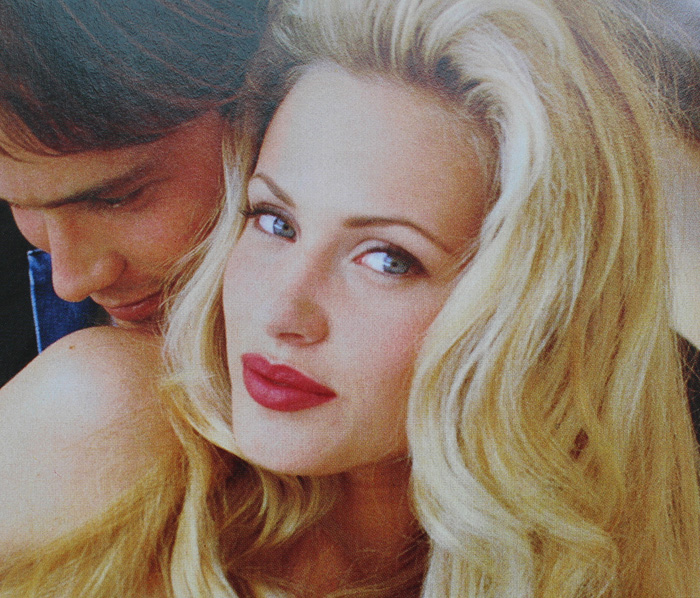
Another trend early on was a return to old school glam. Red matte lips, with or without a winged liner but always keeping the rest of the face neutral, was a popular choice.

Kelly (Jennie Garth) and Brenda (Shannen Doherty) in Beverly Hills, 90210 "Spring Dance" episode, 1990. Key makeup artist – Sheree Morgan; makeup artist – Alex Proctor.

Seventeen Magazine, March 1991. Hair – Gabriel Saba for John Sahag Salon; Makeup – Jacqui Lefton; Photographer – Dewey Nicks; Model – Limor Luss

Kellie Martin in Seventeen Magazine, March 1992. Hair – Patrick Melville for MCM Salon; Makeup – Tracy Sondern; Photography – Bico Stupakoff

Sassy Magazine, March 1995. Hair – Diane Wiedenmann; Makeup – Sharon Gault for Cloutier
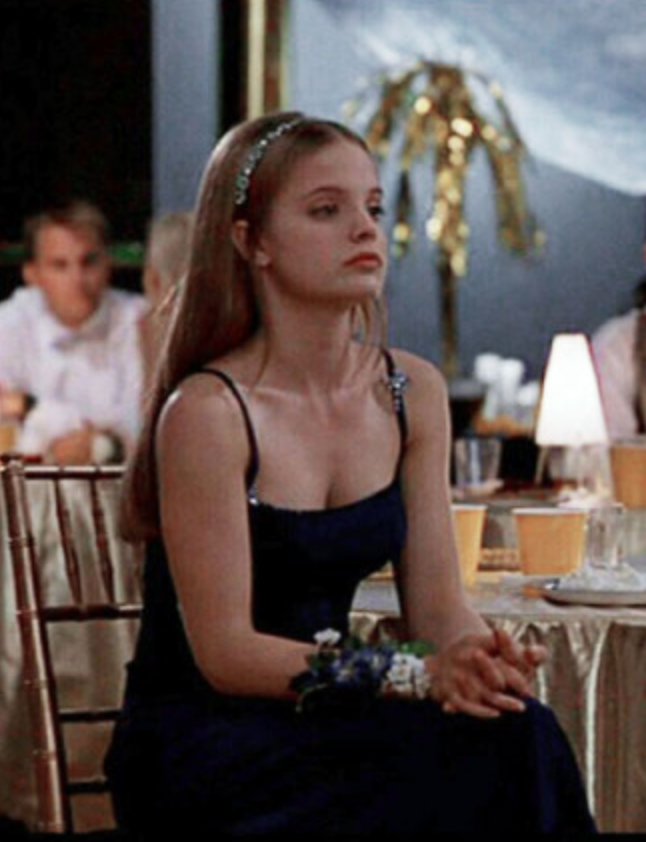
Again, as with 10 Things I Hate About You's Kat, I think Heather's (Mena Suvari) red lip more a stylistic choice to better suit the character rather than part of a real-world trend. (Sorry about the lack of quality in this photo, I couldn't find a decent shot anywhere. Also, no fewer than 7 makeup artists for American Pie are listed at IMDB so it's not clear who chose her look.)

Just based on these candids from YM's prom issues, it seems like a lot of girls opted for a red lip or the minimal look for prom for 1993 and 1994.

YM Magazine prom edition, 1993

YM Magazine prom edition, 1994
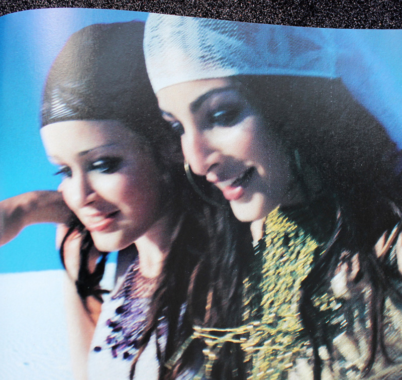
There was also a somewhat odd combination of soft smoky matte grey or brown shadow and a desaturated but noticeable lip color. I don't really remember this look, probably because I can't say that the early '90s take on a smoky eye is a look I enjoy. It just looks flat and muddy, plus very amateur despite the professional application. It's like someone dipped their fingers into shadow, swiped them across their lids, added a touch of mascara and declared their eye makeup finished. Which would be fine with different textures and shades, but matte shadow in these colors requires some definition.

Seventeen Magazine, March 1992

YM Magazine prom edition 1993
My opinion is that it suits nobody, not even Heidi Klum.

YM Magazine prom edition 1994. Credits for left photo: Gerald DeCock for Louis Licari Color Group; Makeup – Christy Coleman for Jed Root, Inc. Credits for right photo: Hair – Lawrence DePalma for Pierre Michel Salon; Makeup – Christy Coleman for Jed Root, Inc. Model: Heidi Klum
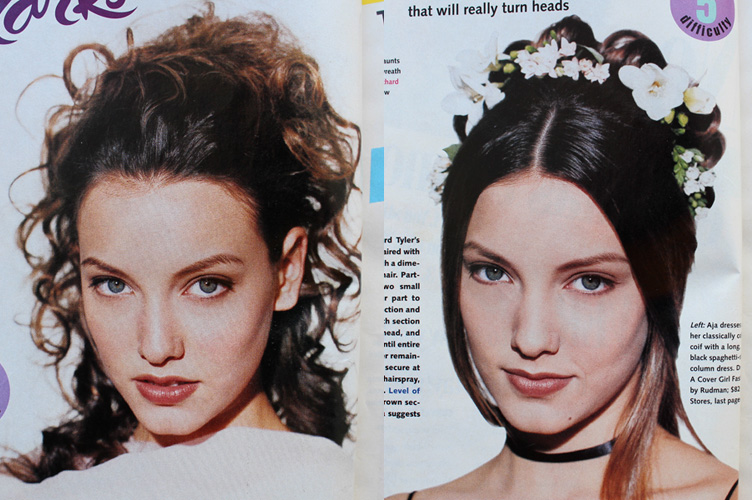
A monochromatic face is surprisingly artistic and flattering if there's variation in textures and finishes between eyes, cheeks and lips. Matte brown shadow with seemingly no other eye makeup besides a hint of mascara and paired with a warm, orange-brown lip isn't great on most people. Case in point: these prom looks from the March 1994 issue of Seventeen. I know they were really meant to show the hairstyle, but they are so boring! Plus it looks awful on the skin tone of the particular model that was chosen – the poor thing looks like the life got sucked out of her. This combination only works on very specific coloring.

Seventeen Magazine, March 1994. Hair – Mara Schiavetti; Makeup – Cindy Joseph
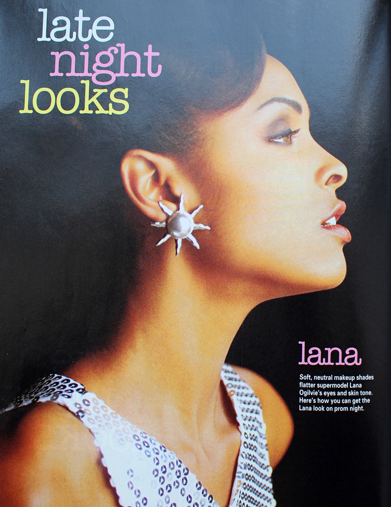
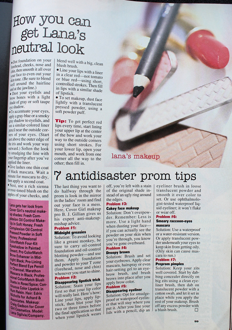
Matte, one-dimensional shadow works if the eyeliner is noticeably darker and there is a contrast in tone for the lip color, as in YM's 1993 prom editorial.

YM Magazine prom edition, 1993. Model: Lana Ogilvie. Makeup Artist: Craig Gadson for Cover Girl.

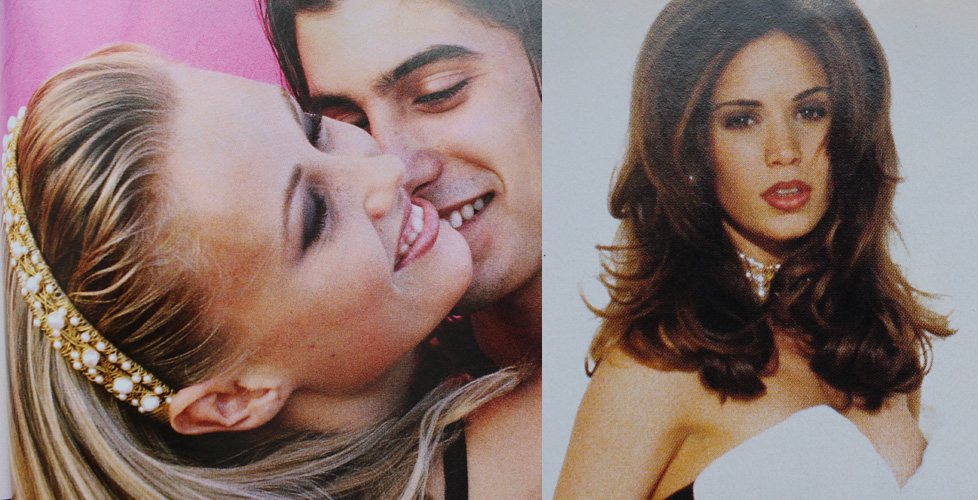
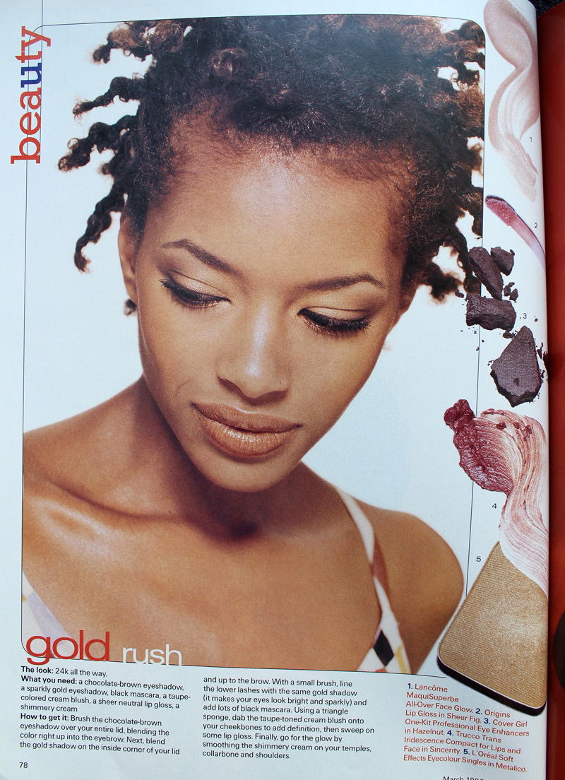
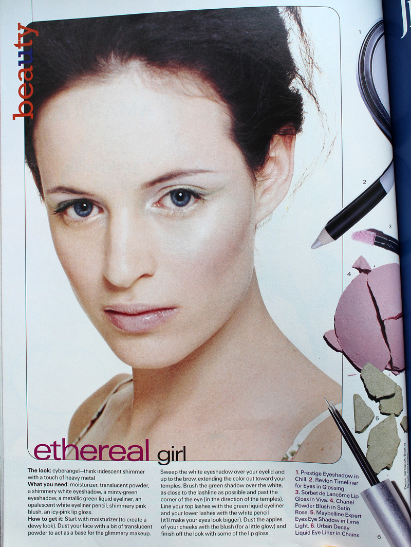
But there is hope. Around 1996 is when we start to see a move away from matte textures and neutral shades. Bring on the metallics, the frost, the GLITTER!!

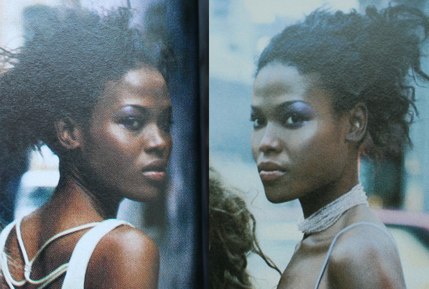
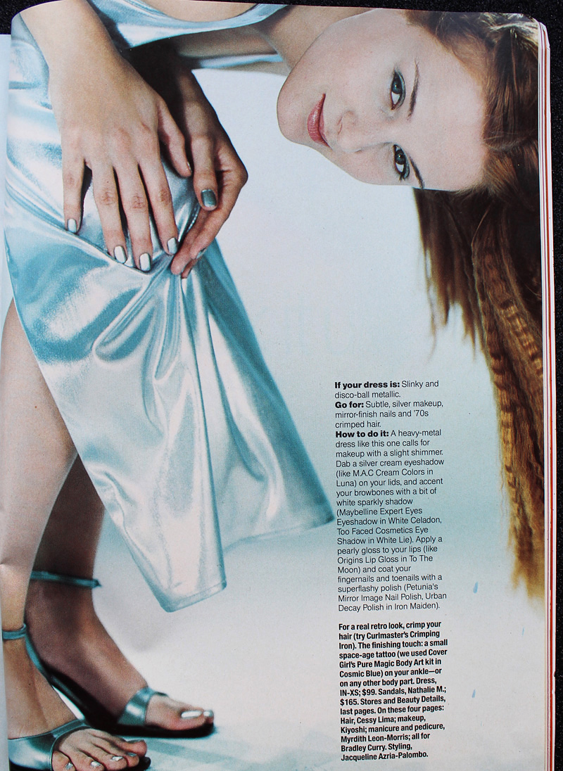
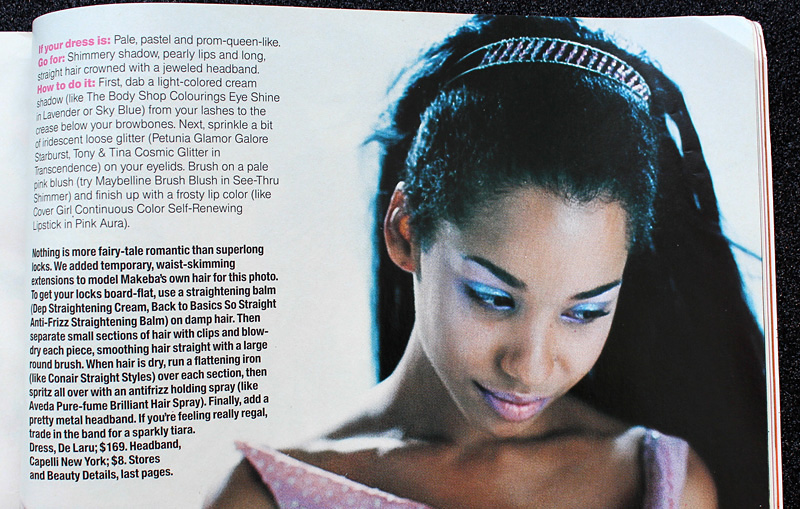
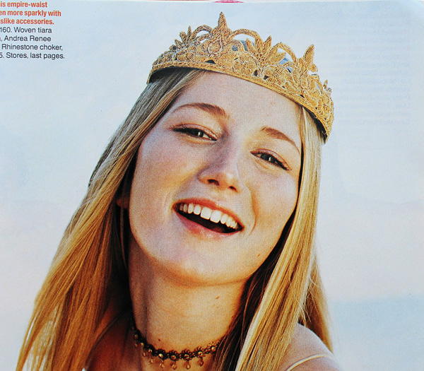
Seventeen Magazine, March 1997. Hair – Dennis DeVoy for Garren New York; Makeup – Kiyoshi for Oribe Salon; Photography – Iris Brosch

Seventeen Magazine, March 1999

Seventeen Magazine, March 1999

Seventeen Magazine, March 1999

Seventeen Magazine, March 1997. Hair – Matthew Williams; Makeup – Virginia Carde; Still life photos – Aimeé Herring; Model photos – Olivia Graham
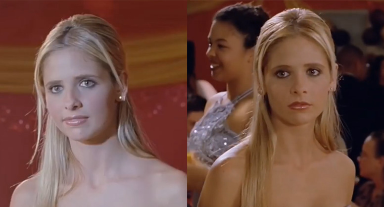
There were literally dozens of makeup artists who worked on Buffy the Vampire Slayer, so I'm not sure who was responsible for Buffy's prom makeup, which consisted of a soft silvery grey eyeshadow and pearly pink gloss.

Sarah Michelle Gellar in "The Prom" episode of Buffy the Vampire Slayer, 1999
Complexion-wise, foundation was less heavy and flat. Even though the early '90s embraced the minimal look, skin still looked a bit dull. There were also few glossy lips to be found. The later part of the decade witnessed a shift towards fresher-looking skin (perhaps more blush added to this effect) and the rise of super shiny lips, which would continue into the early 2000s.

Seventeen Magazine, March 1997. Hair – Matthew Williams; Makeup – Virginia Carde; Still life photos – Aimeé Herring; Model photos – Olivia Graham
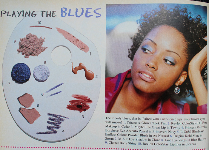
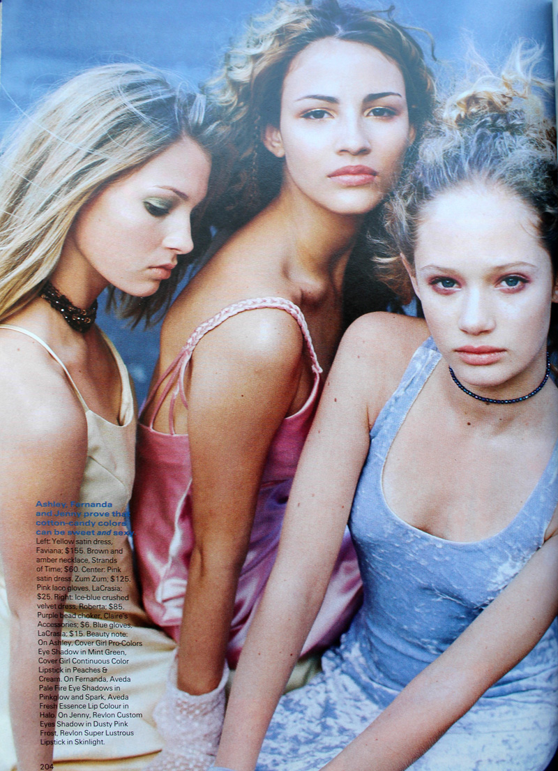
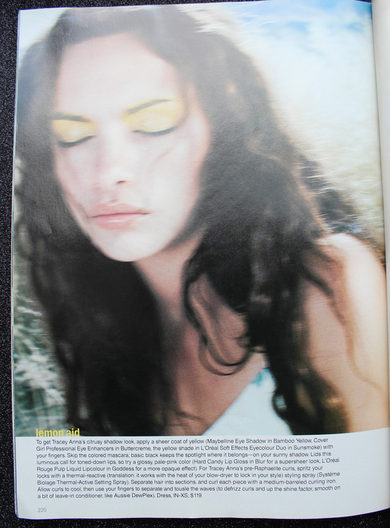
Also, there was interest in color again – no longer was the palette limited mostly to red, pink, grey and brown. Blue, peach, yellow, violet and green peeked their eager little faces out for the first time in what seemed like ages.

Sassy Magazine, March 1996

Sassy Magazine, March 1996

Sassy Magazine, March 1996

Seventeen Magazine, March 1997. Hair – Dennis DeVoy for Garren New York; Makeup – Kiyoshi for Oribe Salon; Photography – Iris Brosch

Seventeen Magazine, March 1998. Hair – Kevin Woon; Makeup – Kiyoshi; Photography – Marc Baptiste

Seventeen Magazine, March 1998. Hair – Kevin Woon; Makeup – Kiyoshi; Photography – Marc Baptiste
I really wish I could have found better photos of the makeup in prom scenes from movies and TV. (Seriously though, what was up with all the prom sequences in films from 1999? It seems nearly every teen movie made that year had one.) In these stills that I screenshotted and tried to brighten from She's All That you can sort of make out Laney's violet eyeshadow and browbone highlight.


Rachel Leigh Cook as Laney Boggs in She's All That, 1999. Head makeup artist – Felicity Bowring; Makeup artists – Raqueli Dahan, Jane Galli and Lisa Layman
Meanwhile, mean girl Taylor Vaughan (Jodi Lyn O'Keefe) rocked a monochromatic gold look, complete with face and body glitter. Peak '90s!


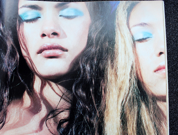
And let's not forget Courtney's epic frosty blue eyeshadow in 1999's Jawbreaker. Once again there was a huge makeup department so whose idea it was I'm not sure.

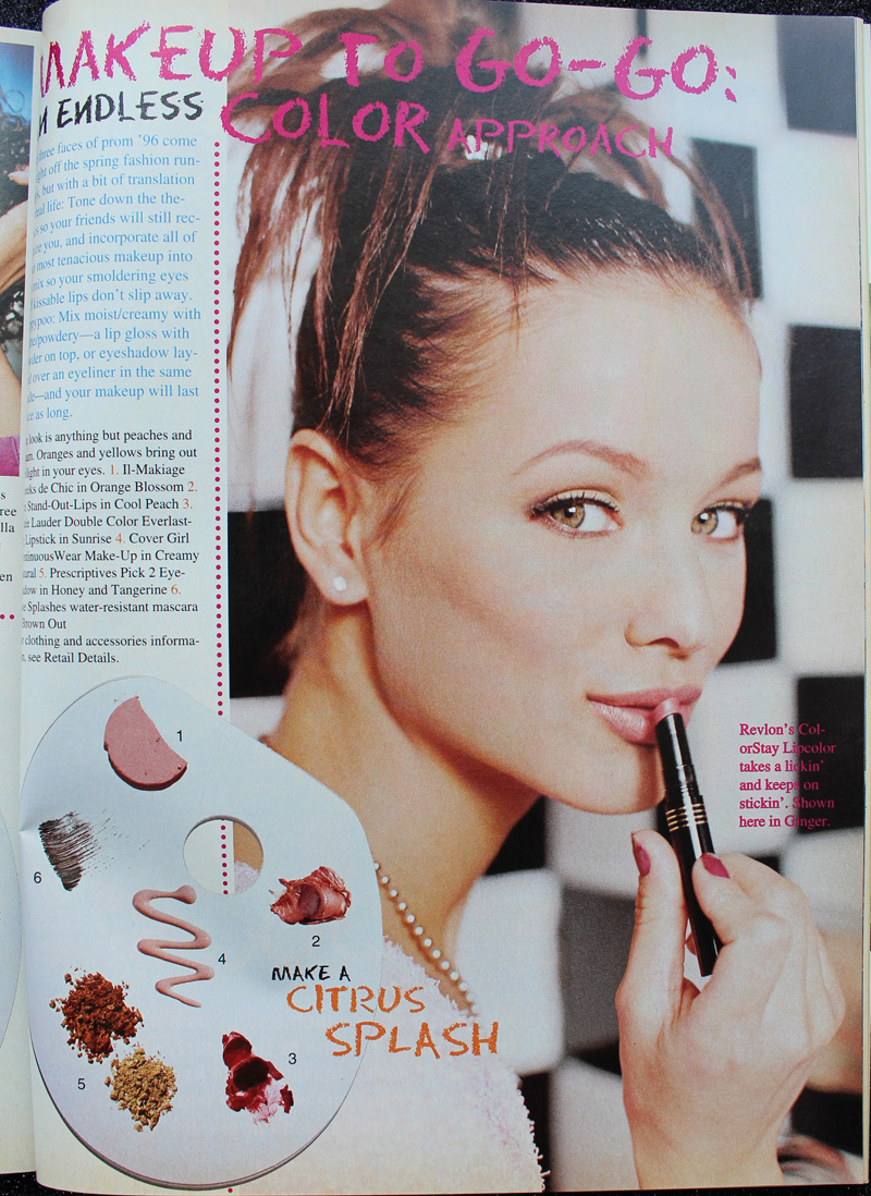
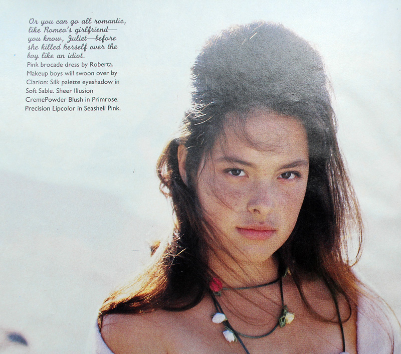
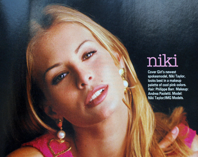
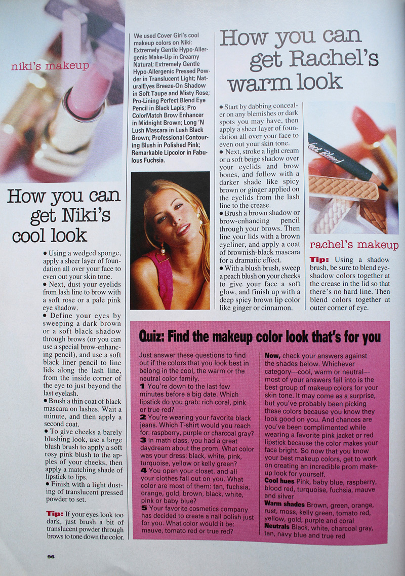
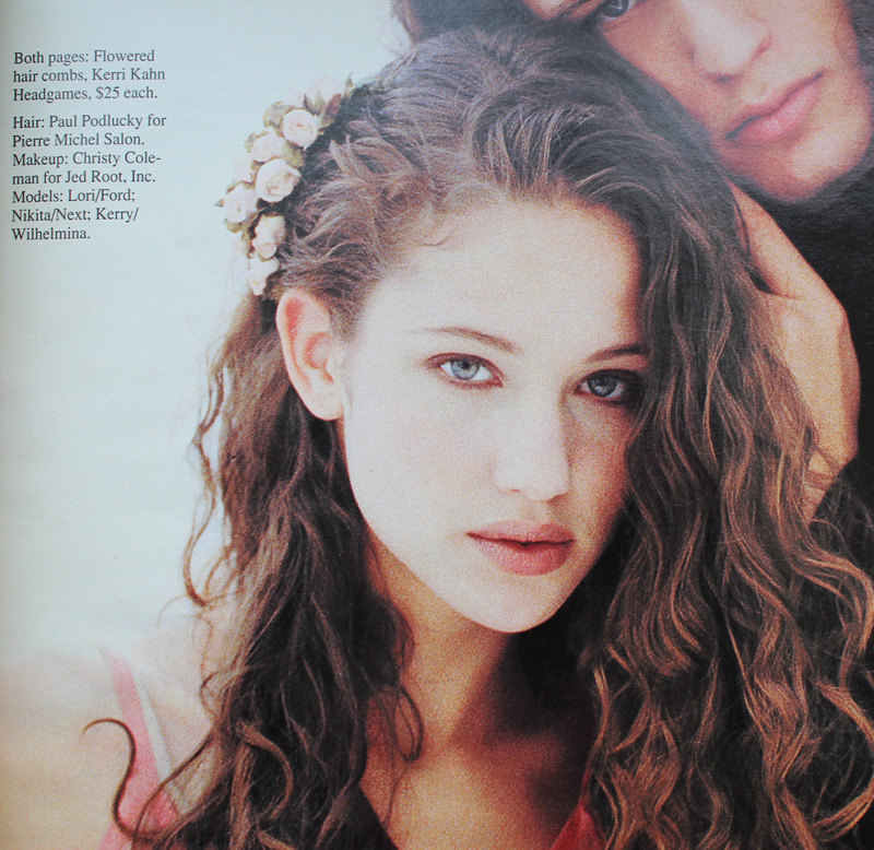
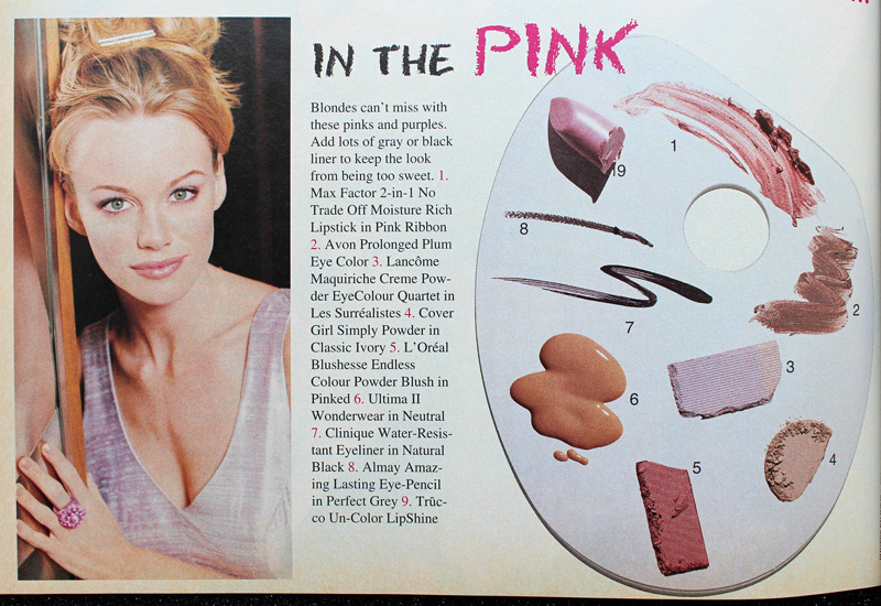
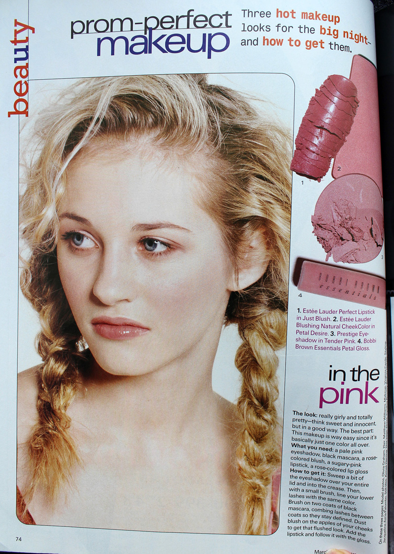
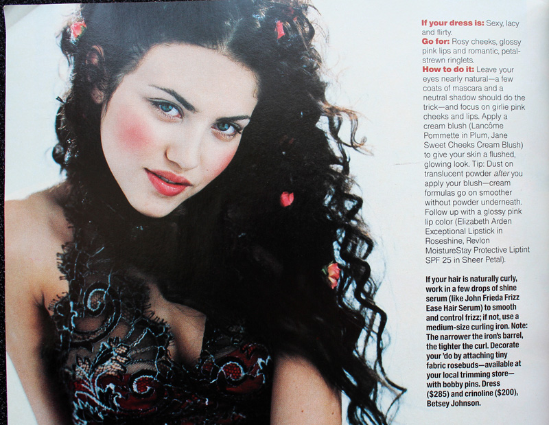
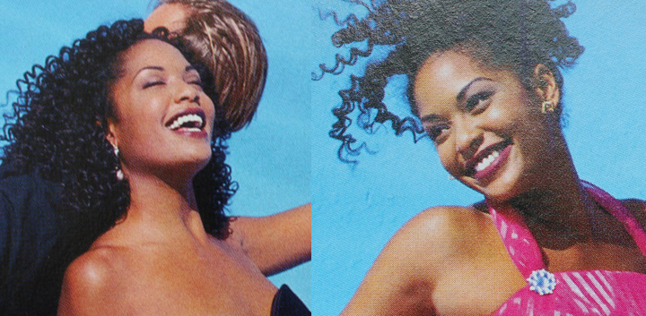
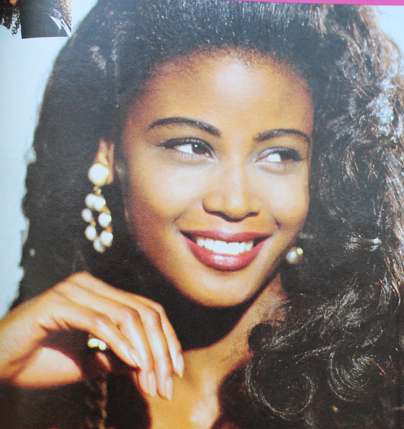
Now there were some trends that appeared in various iterations throughout the whole decade rather than being confined to certain years. Pink reigned supreme for prom makeup in the '90s. Whether it was full-on bubblegum or a more natural, "romantic" look, rosy hues were a staple.

YM Magazine prom edition 1992. Hair – Brian Devine, Oribe at Elizabeth Arden; Makeup – Melissa Rogers

Kellie Martin in Seventeen Magazine, March 1992. Hair – Patrick Melville for MCM Salon; Makeup – Tracy Sondern; Photography – Bico Stupakoff

Sassy Magazine, March 1992. Hair – Colleen Creighton for Pierre Michel; Makeup – Lutz; Photography – Steven Miller


Sassy Magazine, March 1992. Hair – Colleen Creighton for Pierre Michel; Makeup – Lutz; Photography – Steven Miller


Sassy Magazine, March 1994. Hair – Daniel Howell for Oribe; Makeup – Regina Harris; Photography – Cathrine Wessel

YM Magazine prom edition, 1994

YM Magazine prom edition, 1994. Hair – Gerald DeCock for Louis Licari Color Group; Makeup – Mara Schiavetti for Jean Owen

Sassy Magazine, March 1995. Hair – Diane Wiedenmann; Makeup – Sharon Gault for Cloutier

Sassy Magazine, March 1996

Seventeen Magazine, March 1997. Hair – Matthew Williams; Makeup – Virginia Carde; Still life photos – Aimeé Herring; Model photos – Olivia Graham

Seventeen Magazine, March 1999
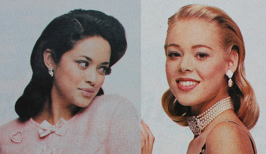
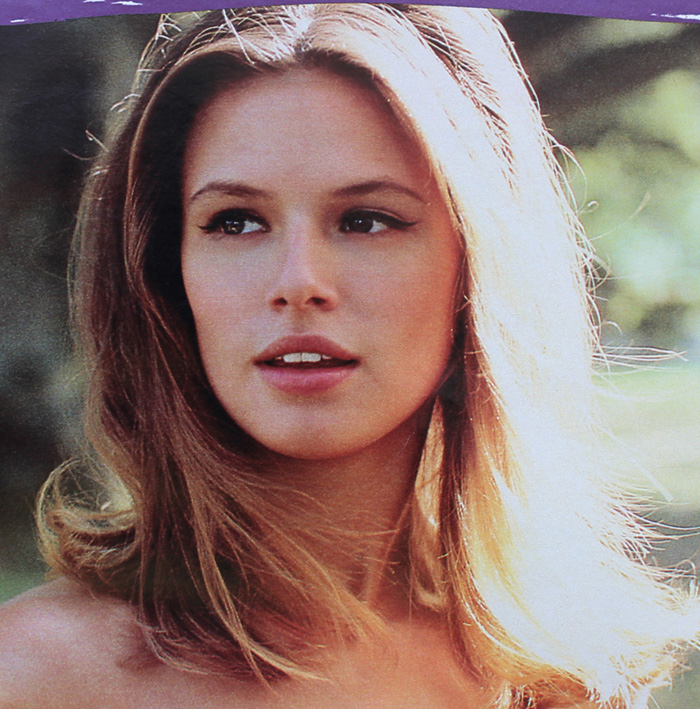
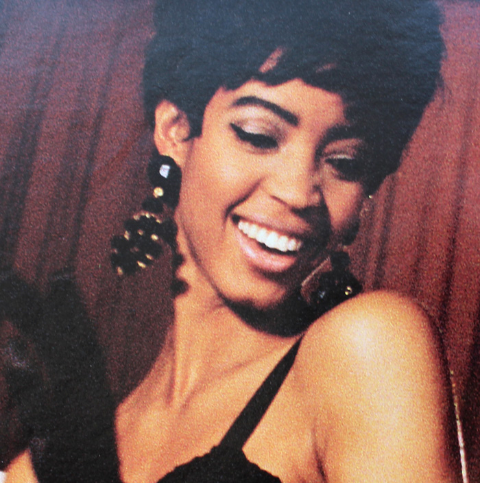
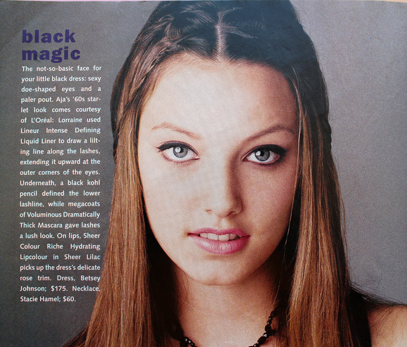
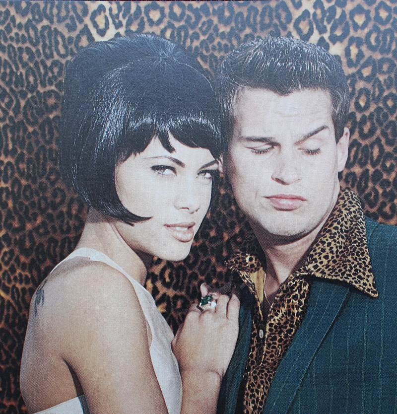
Sixties-inspired makeup also seemed to be a popular pick in both the early and later parts of the decade.

Seventeen Magazine, March 1991. Credits: Hair – Rodney Groves; Makeup – Timothy Metz; Photography – Tierney Gearon

Seventeen Magazine, March 1991. Credits: Hair – Rodney Groves; Makeup – Timothy Metz; Photography – Tierney Gearon

YM Magazine prom edition 1992

Seventeen Magazine, March 1991. Hair – Gabriel Saba for John Sahag Salon; Makeup – Jacqui Lefton; Photographer – Dewey Nicks

Seventeen Magazine, March 1994. Hair – Debbie Horgan; Makeup – Lorraine Leckie; Photography – Troy House

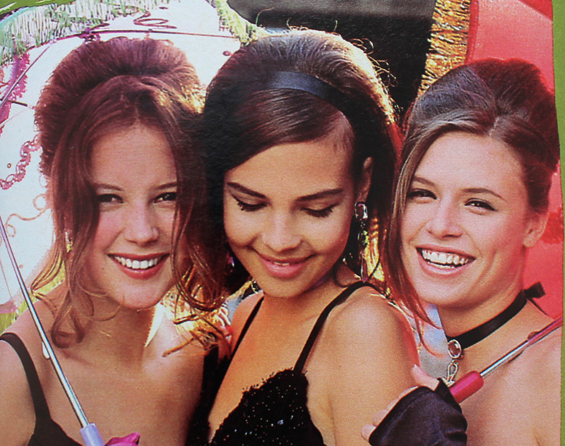
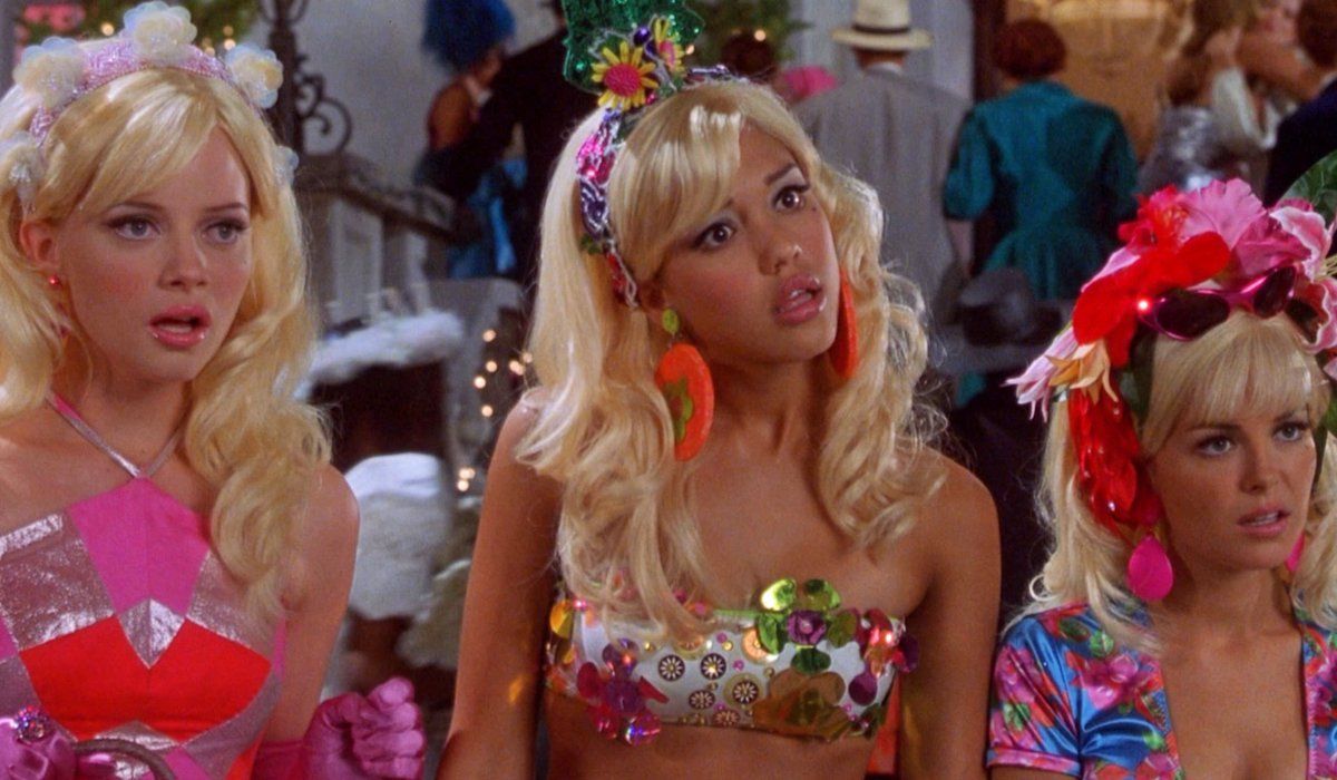
The most outrageous example is possibly from 1999's Never Been Kissed. It's like '60s mod meets Evening Gown Barbie, Disco Barbie and Malibu Barbie, respectively (at least, according to the characters).

Never Been Kissed, 1999 with Kristin (Marley Shelton), Kirsten (Jessica Alba) and Gibby (Jordan Ladd). Makeup dept. head – Kimberly Greene; Makeup artists: Joni Powell and Lyssa Wittlin Baumert
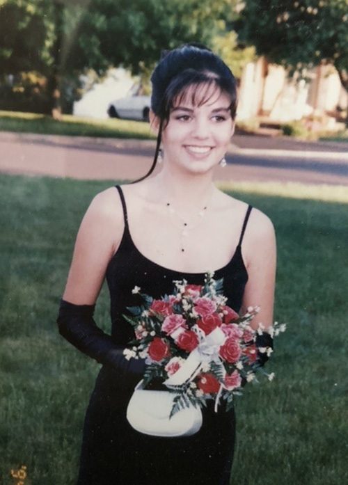
Yours truly opted for the more subtle look. Yup, that's the Curator at age 17, doing her best impression of Audrey Hepburn in Breakfast at Tiffany's for her senior prom. I eschewed my usual dark plum lip in favor of Holly Golightly's pale pink, and though you can't make it out in this old picture, I also had some pretty serious feline eyeliner. (I actually am a disaster at winged liner; my sister's friend did my makeup). Too bad I had to ruin my updo by adding the ever-present '90s tendril…then again, the bangs were already atrocious. But I loved my makeup, gloves, jewelry (shout-out to Y necklaces!), and dress. I really regret getting rid of those last two.

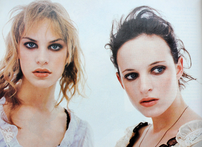
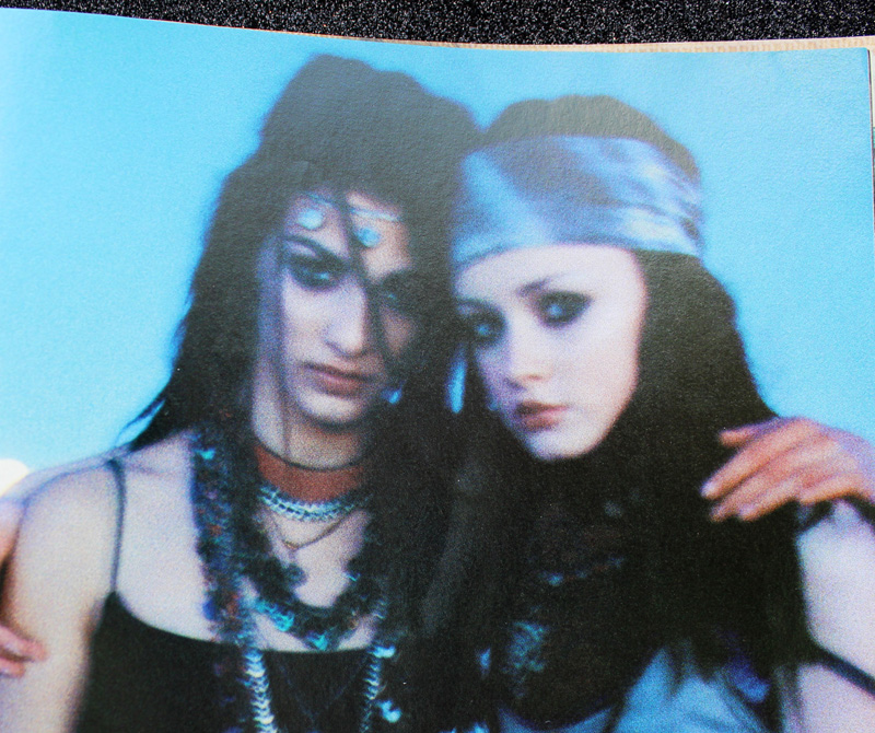
Finally, grunge, goth and punk influences occasionally emerged from subculture status on a decade-wide basis.

Sassy Magazine, March 1993. Hair – Daniel Howell. Makeup – Wei Lang. Photography – David Jensen

Seventeen Magazine, March 1997. Hair – Pasquale Ferrante; Makeup – Susan McCarthy for Shu Uemura; Photography – Grey Zisser
The models aren't named in these next two photos but I'm almost positive I spy Alexis Bledel.

Seventeen Magazine, March 1998. Hair – Kevin Woon; Makeup – Kiyoshi; Photography – Marc Baptiste

Seventeen Magazine, March 1998. Hair – Kevin Woon; Makeup – Kiyoshi; Photography – Marc Baptiste
There were a handful of exceptions to all the usual looks. In one feature from YM's 1993 prom edition, a red lip was paired with a pale gold shadow rather than brown or grey and it actually looks like some blush was applied. I would absolutely wear this today (minus the skinny brows, of course.)

Hair – Howard Barr for Celestine; Makeup – Wendy Osmundson for Cloutier; Model – Melissa Billingsly.
These next two looks had some appealing contrast between eyes and lips. While the eyebrow shapes are firmly '90s, the mix of either cool purple or silver shadow with a satin-finish plum or pink lip falls outside the usual trends from the era.

YM Magazine prom edition, 1993. Hair – Phillippe Barr for Salon Ziba; Makeup – Kelly Quan for Sarah Laird.

YM Magazine prom edition 1992. Hair – Brian Devine, Oribe at Elizabeth Arden; Makeup – Melissa Rogers
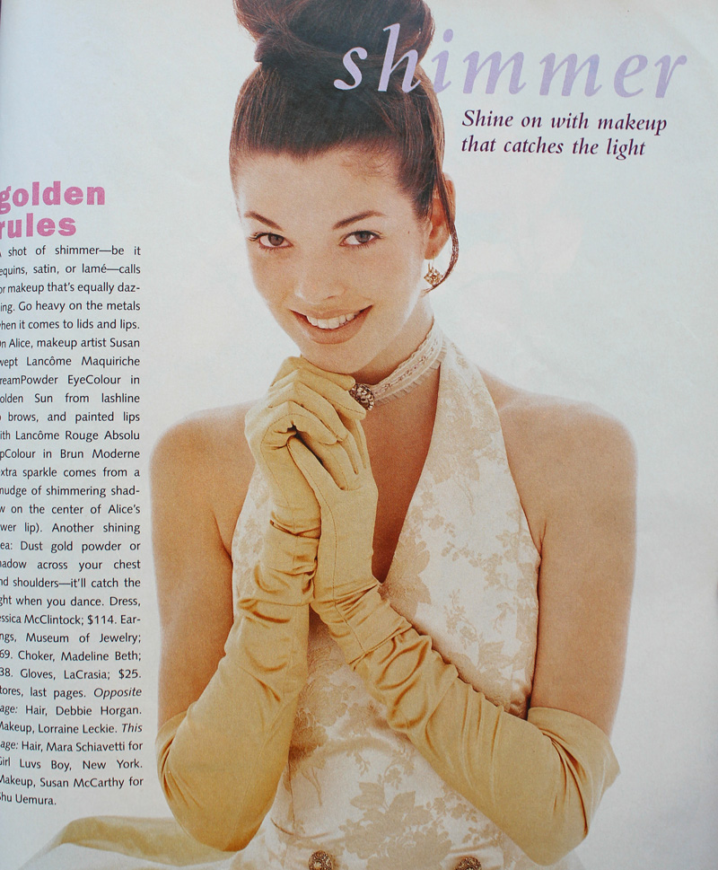
And here's another monochromatic gold look, but it's several years ahead of its time.

Seventeen Magazine, March 1994
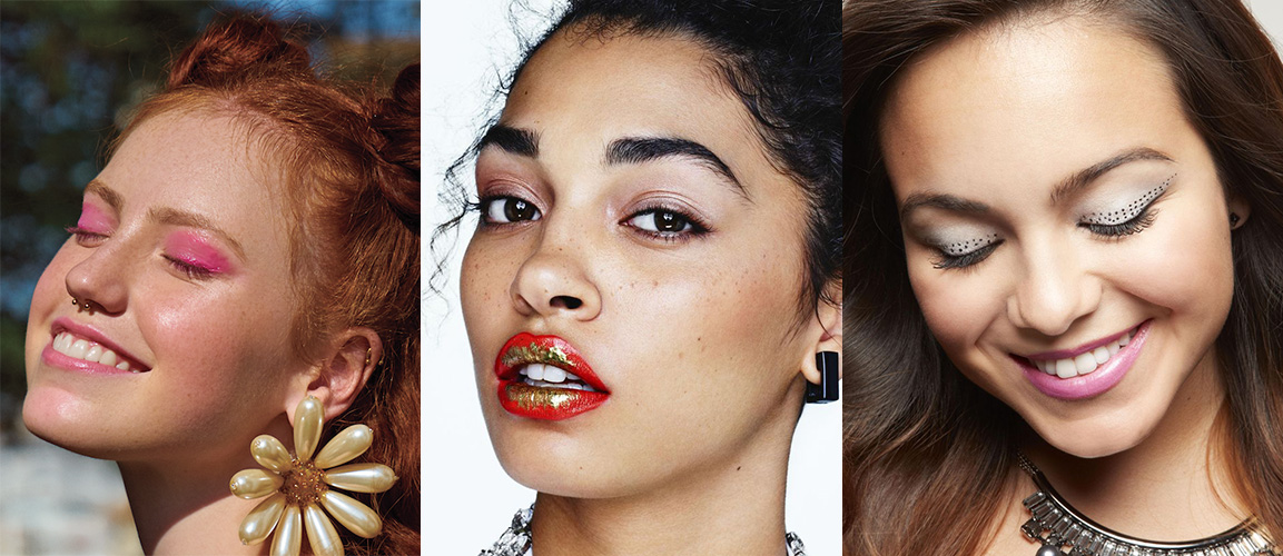
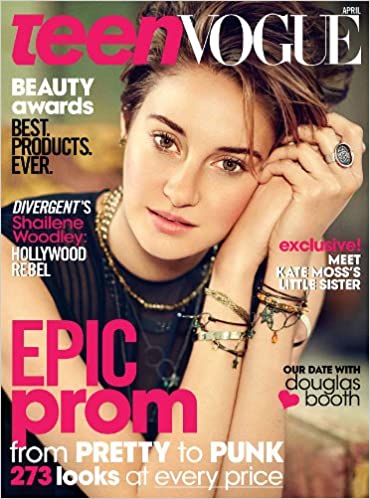
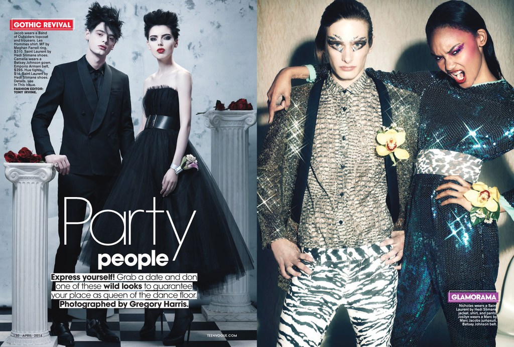
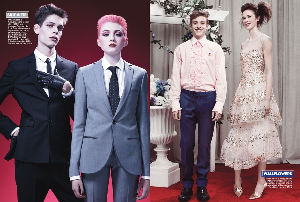
But there weren't really many outliers. Overall, prom makeup in the '90s seemed very much a microcosm of the larger trends of the decade. It was a little disappointing not to uncover any totally atypical looks (although I do think the late '90s was way more fun than the start of the decade). But I'm guessing the big magazines and movie studios/TV shows weren't going to push much unconventional prom makeup or feature anyone who wore it, and those who would opt for more daring looks on a regular basis probably weren't going to prom. Fortunately, mainstream media has somewhat caught on to a new aesthetic. The styles are very safe in most magazine covers and online content. The looks are nice and definitely updated from the '90s, but they are, shall we say, basic, or mimicking "Instagram" style makeup. However, a closer look suggests there is experimental, Euphoria-type makeup being recommended, such as the incorporation of embellishments (flowers, gems, etc.), graphic liner in a bright color, or creative use of glitter. For example, compare several of Seventeen's recent prom covers with their online recommendations, or the fairly unremarkable cover look on Teen Vogue's 2014 prom issue with the far more interesting editorial inside. (Diversity in terms of race and body shape/size still needs work.)

Seventeen Magazine prom edition – 2015, 2016 and 2019 covers

Seventeen Magazine prom looks featured online, 2020
(images from seventeen.com)

Teen Vogue April 2014


Teen Vogue 2014 prom editorial. Hair – Rutger using Oribe; Makeup – Ralph Siciliano using Lancome; Photography – Greg Harris
(images from streeters.com)
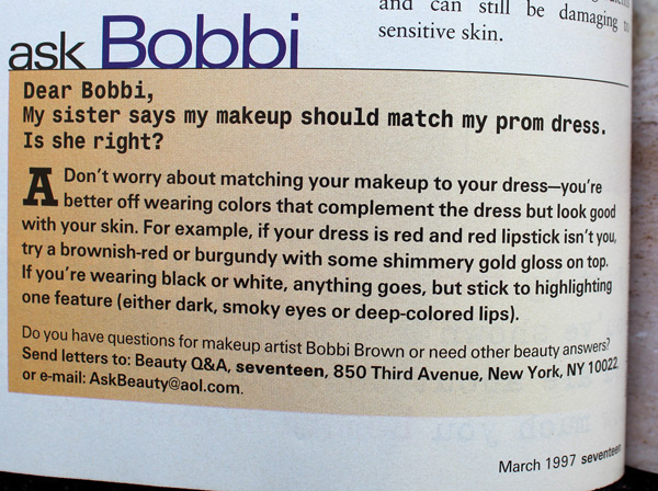
I was very relieved to see these looks, as I was horrified at the possibility of Gen Z'ers receiving the same advice that me and my fellow Gen X'ers did, i.e., to play it safe. In my day prom was akin to one's wedding in terms of makeup (which is another whole disturbing can of worms that I don't want to open right now.) The most common tips for both occasions were to play up one feature only, stay away from using multiple colors, and don't deviate much from your everyday look, along with a bunch of tricks to help one's makeup last longer. Ho-hum.

Not surprised by Bobbi advocating for safe makeup.

If simple and natural is your style, or you don't want to try anything too wild for a big occasion, great! But I'd like it if makeup that actually takes risks were as normalized as looks featuring minimal makeup.
While this hasn't been the most insightful post, a glimpse of '90s prom makeup serves as a good refresher on the decade and helps give more context to the trends. Plus as a print junkie, it was insanely fun to flip through old magazines. (The movies did not hold up well..although honestly even at the time they were fairly problematic.) It kind of makes me want to do a whole book or exhibition on prom makeup from all decades. 😉
Any favorite looks here? Did you attend any proms or formals in high school and if so, do you remember your makeup or have any photos you'd be willing to share?
 Tooting my own horn again, apologies. But I was so excited to be interviewed for an article on the history of blush and its current resurgence (and in which I was referred to as an "expert"!) In case you haven't noticed, blush is back with a vengeance. You can click over to Hypebae for the article, but given how much time I spent answering the journalist's questions I thought I'd post my full answers here. Plus, more Museum photos! Enjoy…and please let me know any and all thoughts on blush in the comments. 🙂
Blush has been used in ancient cultures across Egypt, Greece and more. Can you walk us through the origins of blush and explain how it was used in different areas of the world? (Please feel free to include as much detail as possible.) The ancient Egyptians were most likely the first to use blush as a cosmetic aid. A fresco in Santorini from the Bronze Age depicts women with red cheeks, the rest of their faces unadorned. In China, blush was used as early as the Shang Dynasty (1600-1046 BCE). Later, during the Tang Dynasty reign, imperial concubine Yang Guifei (719-746 AD) regularly wore heavy blush at court. In Greece and Rome, blush was primarily used by upper class women and applied in a subtle way; noticeable check color was frowned upon. Blush also crossed gender lines throughout some early civilizations and up through the 18th Over time, as white supremacy grew ever more powerful, blush became part of an “ideal” complexion that signified wealth and high status – blush was used in part as a way to make pale skin stand out more, which was desirable as white skin represented a life free from toiling outside. At the same time, for the most part blush was supposed to be undetectable. It wasn’t until the 20th century that blush became socially acceptable.

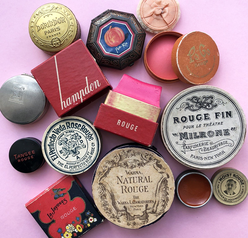
A selection of the Makeup Museum's vintage blushes, ca. 1920s-30s
Why do you think blush has endured as a widely used makeup product?
Blush has endured primarily because it’s a critical element of meeting two long-standing beauty ideals: health and youth. Cheek color signifies vitality; while I don’t think any live person not wearing blush would be mistaken for a corpse, blush heightens one’s natural color, further emphasizing a healthy flow of oxygenated blood (i.e., a literal life force) to the face. Cheek color became associated with markers of health such as physical fitness, good nutrition and rest. Cheek color is also associated with youth, which has been a pillar in beauty standards for millennia and one that persists today. (Note: I can expand on the link between health, youth and beauty but it would take forever as there are quite complex psychological and scientific explanations).

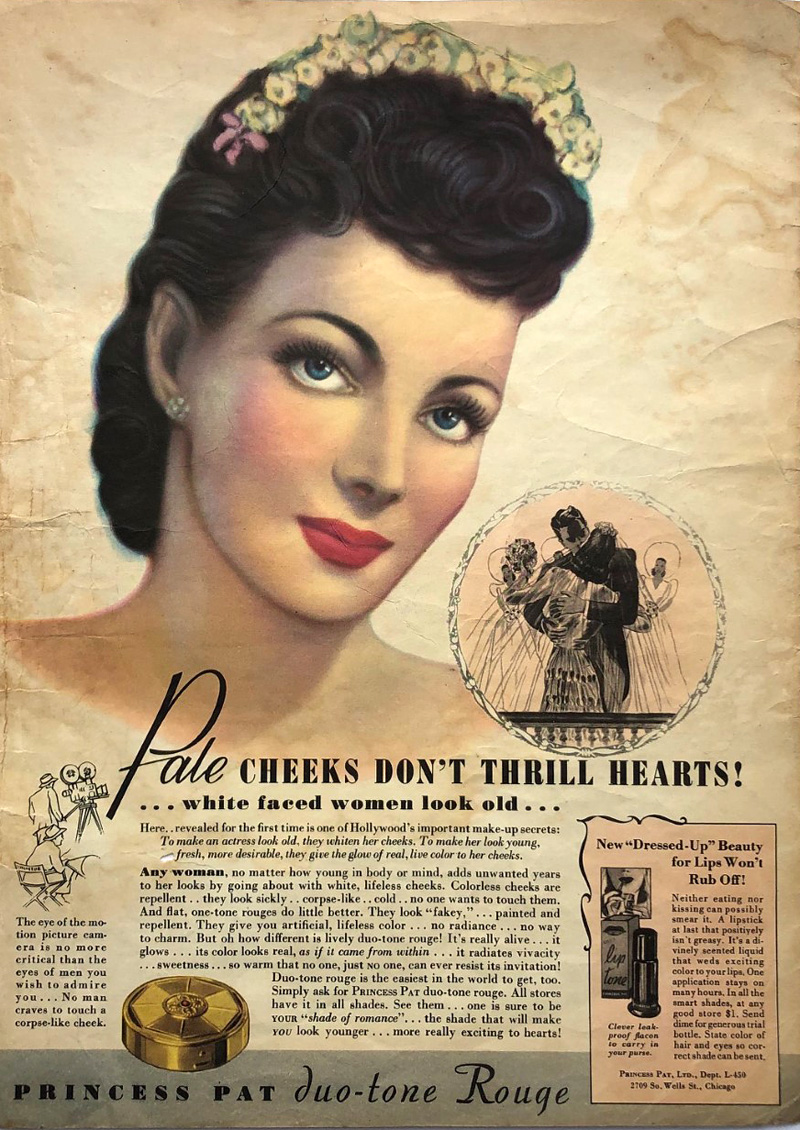
Princess Pat rouge ad, 1940
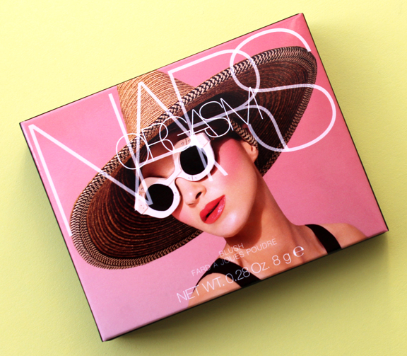
Some historians claim that blush’s universal appeal, much like lip color, is due to its mimicking of sexual arousal or a post-coital flush. While I personally find that theory dubious – I’m just not a fan of the sexualization of makeup – it’s important to remember that the most famous and possibly best-selling blush in modern times is NARS’ Orgasm. Additionally, for centuries in the Western world, with a few exceptions here and there (such as mid-late 18th century France), excessive makeup, including noticeable rouge, was considered the domain of prostitutes, so that’s another connection between blush and sexuality. Along those lines, one could even argue that the traditional virgin-whore dichotomy is a factor in blush’s longevity. Looking flushed could point to embarrassment at the notion of intimate relations, signaling a dainty, demure and virtuous woman, or it could be overtly sexual. Either way, blush’s sexual connotations helped solidify its status as an essential cosmetic. Finally, a simplistic reason for blush enduring through the years was that it was as easy to obtain ingredient-wise as lip color. There were readily available materials across the world. Whether it was the ochre of ancient Egyptians, poisonous cinnabar of the Romans, safflower used in parts of Asia or a basic mixture of berries and water, raw ingredients could be found virtually anywhere.

Blush sales are increasing. In your opinion, what could be contributing to that rise? First, I believe there’s a psychological component involved. Most of us have been privileged enough to work from home, see friends and family via video conference, and were able to adjust our routines, but that all of that has taken a toll on our mental health. Being trapped behind a screen far more than we’re used to, with little in-person contact, struggling to work and interact and essentially function in a completely different way for over a year can lead to feeling drab and lifeless, despite being physically healthy. As noted earlier, cheek color represents vigor and liveliness. This is why every spring fashion and beauty magazines have features on banishing the “winter blahs”, with the number one tip inevitably being the purchase of a new shade of blush to look and feel rejuvenated. Thus, with its promise of restoring a youthful, rested glow, blush may help combat the dullness experienced as a result of having to curtail so many activities that are essential to one’s well-being as well as general pandemic-related exhaustion. As one beauty writer notes, she applied “a generous helping of blush to help me look alive even though on most days I felt dead inside.” I also think that now since the pandemic is on the verge of ending, we are collectively dreaming about fresh starts and enjoying life more fully again. More so than other makeup categories, on a spiritual level the application of blush may help us awaken from the trauma and upheaval unleashed by the pandemic, a way to feel more vibrant and a reminder that our health is relatively intact. On related note, a healthy flush is associated with being outdoors, which many of us haven’t been able to do. If you can’t enjoy a reinvigorating jaunt through nature, you can at least pretend you got the blood flowing with some blush.

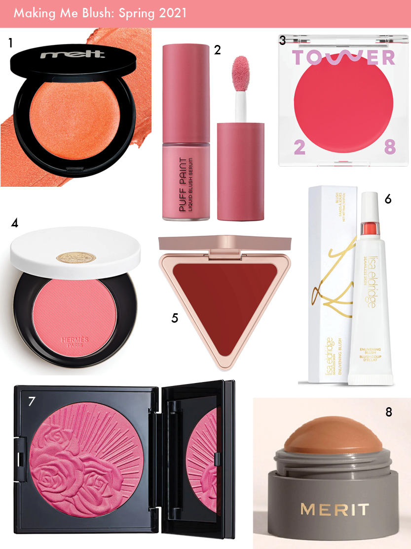
1. Melt Cosmetics Cream Blushlight 2. Natasha Denona Puff Paint liquid blush 3. Tower 28 Beach Please Lip and Cheek Cream 4. Hermes Rose Hermes Silky Blush Powder 5. LYS Beauty cream blush 6. Lisa Eldridge Enlivening Blush 7. Pat McGrath Divine Blush 8. Merit Beauty Flush Balm
Secondly, even though we are optimistically looking towards the end of the age of COVID-19, life has not returned to how it was pre-pandemic for most. Many people are still reconsidering and adjusting all of their makeup, including blush, in light of continuing Zoom calls. Depending on one’s camera and lighting, a person may need to increase the amount of color so as to not appear washed out; in other cases, they’re finding that their regular application is too heavy-handed. Thus, in addition to adapting their current products, they’re seeking either new shades or new formulas that are effortless and “goof-proof” for video.
Finally, I think at the moment the market is so saturated with every other form of makeup – highlighters, (especially!) eye products, lip colors, even base makeup, companies figured it was time to swing the pendulum back to blush. It’s a product category that’s been relatively neglected due to the popularity of contouring and the no-makeup look. But these two trends were already waning, with consumers wanting a simpler approach to cheek color than the skill and time required by contouring as well as a look that was more than the bare minimum of the no-makeup face. Another trend that’s been gaining traction the past few years is the notion of wellness. Consumers are increasingly interested in cosmetic options that might also have benefits for their physical and mental well-being. The pandemic engendered a renewed focus on health, making wellness and self-care more important to consumers than before. It follows that blush, and its long-standing association with health, would be more in demand. In short, a return to blush was brewing for a while and was accelerated by the pandemic, hence the rise in sales now.
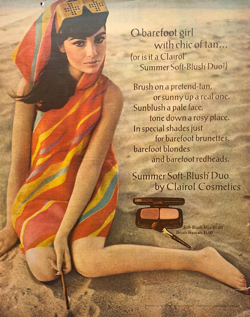
During the 19th century, symptoms of tuberculosis including pale skin and red, feverish cheeks became fashionable, leading women to recreate a sickly appearance using makeup. Can you explain the link between beauty and illness, as well as how that relationship might manifest into the age of coronavirus? The mimicking of TB wasn’t a widespread or long-lasting trend because historically there is a much stronger link between beauty and health than illness. Having said that, what the recreation of tuberculosis did was simply exaggerate the already entrenched notions of beauty – pallid skin and flushed cheeks. No one was feigning smallpox, for example, because the effects of that disease were viewed as ugly and disfiguring. (And as soon as TB began to be associated with the lower classes, it quickly became unfashionable to fake it…but that’s a whole other story.) Today there are some trends such as Igari (the “hangover” look) and Byojaku (“sickly”), but they are intended to achieve a distinct kawaii aesthetic. Again, no one is doing a tutorial on getting the coronavirus look using makeup because the symptoms are viewed as unappealing (plus I’d like to think with so many lives lost people would be a little more sensitive than to pull a stunt like that.) There is a link between beauty and illness, but only so far as the illness’s effects align with current beauty standards. Overall, blush is primarily used to look healthy. For every one “hangover” or other similar trend piece, there are at least 10 articles emphasizing the importance of wearing blush while ill to counteract the symptoms that are perceived as unattractive. Sometimes a warm-toned blush or even bronzer is recommended to distract from redness or other discoloration around the nose and eyes, as that symptom is viewed as aesthetically undesirable.

Clairol blush ad, 1967
Over the past year, have you noticed a shift at all in how people are wearing blush? What I’ve been observing in beauty publications and on social media is that people are perceiving blush as more than an afterthought or a basic necessity in tying a look together. Blush is becoming exciting in its own right again; cheeks are no longer playing third fiddle to eyes and lips or serving just as a canvas for contour and highlight. On a basic level, unlike the lips, at least part of the cheeks is still visible while wearing a mask. Some have adapted the ‘80s trend of taking blush up past the temples, closer to the eyes, so that it’s more noticeable behind a mask – as with eye makeup, the emphasis is on what can still be seen in a mask.
More significantly, how people are wearing blush is just one part of the pandemic’s larger impact on makeup routines more generally. People found their normal beauty routine disrupted, and they’ve been questioning it: why am I wearing makeup, who am I wearing it for, and do I really want to be wearing a full face every day? From my perspective, people seem to have gone in several directions or a combination thereof: some kept up with their usual makeup routine to retain a sense of normalcy, others began experimenting with makeup in ways they wouldn’t normally otherwise, and still others greatly pared down their routine. It’s this last path, I think, that has caused the biggest shift in how people are wearing blush. Many are finding they don’t want or feel the need to do a full face for virtual meetings and staying at home, so they’re embracing a more relaxed approach that includes a quick swipe of blush rather than combining it with contour and highlight. Sculpted cheekbones are being pushed aside in favor of a less “done”, more carefree look that is easily achieved with blush. Whether or not low-maintenance makeup sticks around as quarantine life fades away is anybody’s guess; I think it might, but I also think in some instances people will be piling on the makeup as a way to celebrate the end of the pandemic – now that our faces aren’t obscured we can wear as much as we like without a mask rubbing it off. In fact, while the average makeup wearer may be rediscovering the joys of basic blush application, over the top blush is already trending on the editorial side. If the usual amount of cheek color signifies physical well-being, in the age of COVID-19, perhaps an excessive application will reinforce the notion of health. The super flushed look may end up as an exuberant symbol of survival.

 Once again my schedule got completely off track. There's a lot going on behind the scenes and we'll just have to wait and see if neglecting the blog pays off. Anyway, here are some very late links.
– May was AAPI month, so familiarize yourself with these historic Asian beauty rituals before you partake in them and consider how racism towards Asians plays a part in beauty trends. It's true – I could write an entire book on the fetishization/othering of Asian women and culture in beauty campaigns.
– Allure has a good piece on the lack of fat representation in the beauty industry – a reminder that diversity and inclusion don't refer only to skintone or gender, but size as well. (I also think the industry is still doing a crappy job when it comes to regularly featuring anyone over the age of 35.)
– Now that the pandemic is on its way out (hopefully!), a lot of industry folks are looking into their crystal ball to see what post-COVID beauty trends might look like. Thankfully, it seems that color cosmetics will make a full recovery. This is confirmed by the spate of new brands sprouting up. Fashion aficionados will get both high and low-end fixes for their makeup cravings from Valentino's and Zara's new lines, while film company A24 (the one behind some of the creepiest horror films ever) is developing a line based on the hit show Euphoria. Also, former baseball player Alex Rodriguez debuted a men's makeup line.
– Speaking of which, the lovely Shybiker thoughtfully sent me a hard copy of this New York Times article on men wearing makeup. I can't say I agreed with everything, but it's a good summary of the current men's beauty landscape (manscape?).
– Wish I could see this installation sponsored partially by Chantecaille, who partnered with a UK-based charity to launch a public artwork project called Co-Existence. Over 100 elephant sculptures were made by indigenous communities in Southern India and transported to London, where they will roam throughout the city through the end of July. At the end of the project the elephants will be auctioned off and the proceeds will go local, community-focused conservation and land protection programs in South Asia. Corporate philanthropy is often bullshit, but Chantecaille seems to be doing it right.
– "Blue beauty" sounds about as legitimate as green beauty, but I'm happy to buy anything that is less harmful to mermaids.
– The Museum doesn't cover fragrance, but I do wear and enjoy perfume. One of my all-time favorites turned 20 years old this year. I had nearly forgotten about it since it's long discontinued, but fortunately I Need This Unicorn had the entire history of every Escada summer fragrance ever released. It was such a great trip down memory lane and extremely useful for those researching perfume!
The random:
– Utterly thrilled to see that the spirit of riot grrrl lives on in a new generation.
– In '90s nostalgia, a lock of Kurt Cobain's hair fetched over $14,000 at auction, while Friends finally got around to a reunion.
– The Nation had a thought-provoking exploration of the movement to abolish museums. I'm still confused as to how that would work in real life, but it's an interesting concept regardless.
– In addition to the mermaid obsession, when I was little I also was endlessly fascinated by jellyfish. But I didn't know until now that there's a species can live basically forever.
How was the month of May for you? Are you excited for summer? I'm not because I probably have to go back to the office soon, but at least I got fully vaccinated and was able to hug my parents for the first time in over a year.
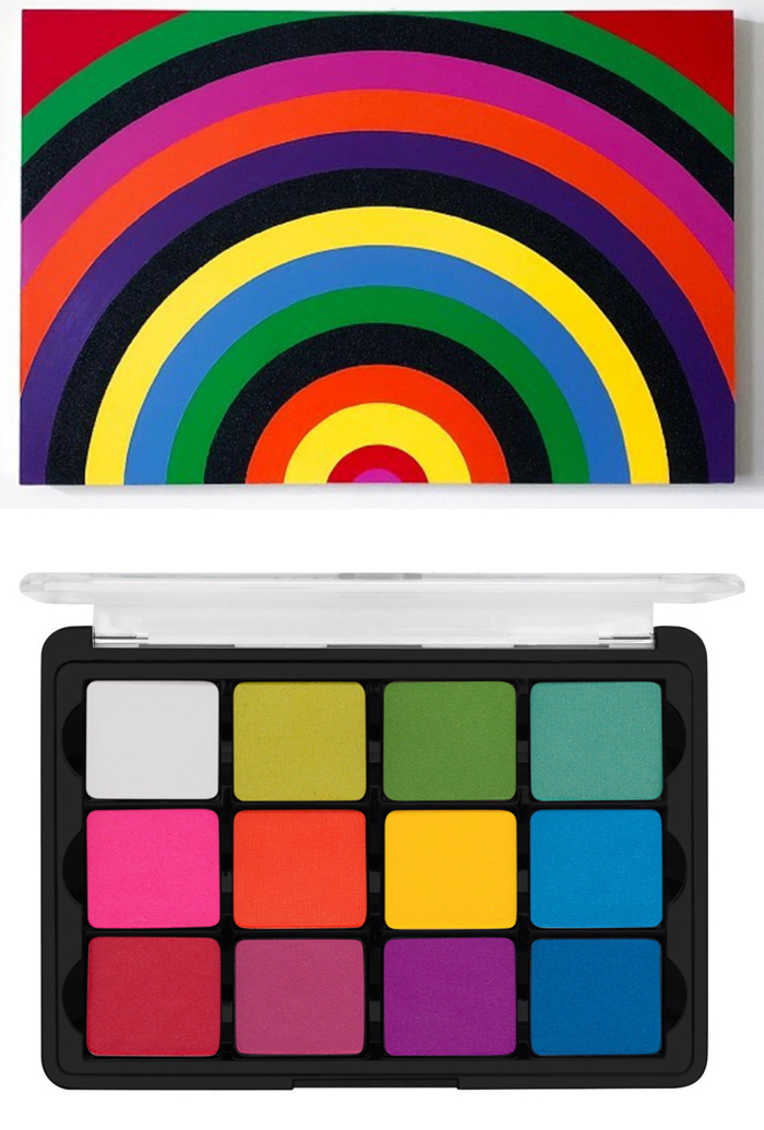
Rico Gatson, Untitled (Rainbow I), 2020
Viseart, Editorial Brights palette, ca. 2015

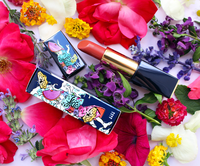
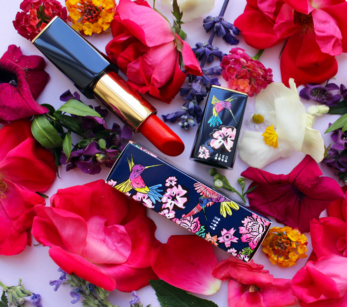
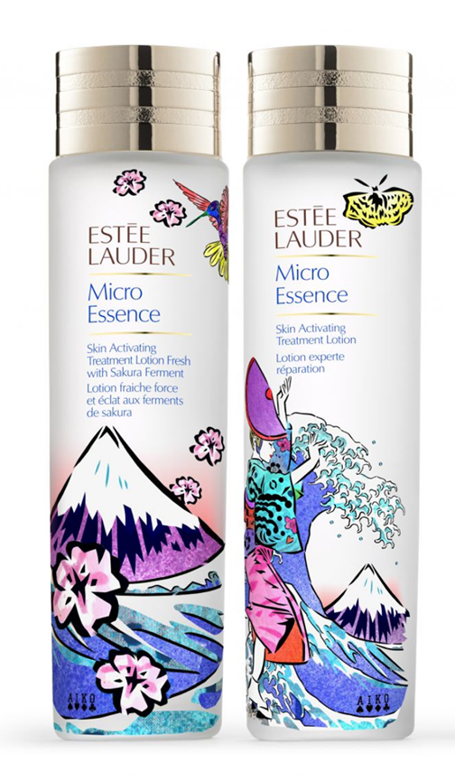
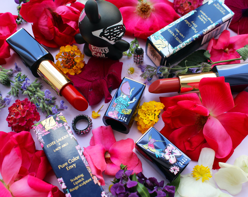
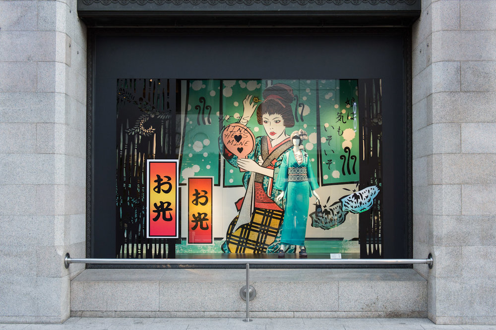
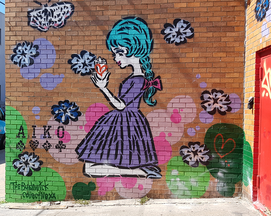
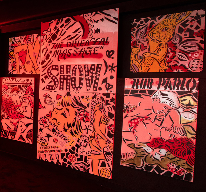
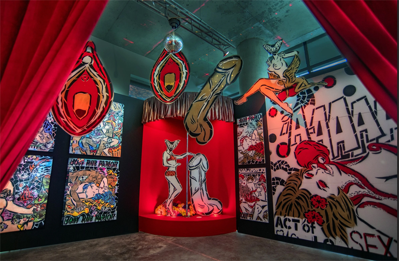
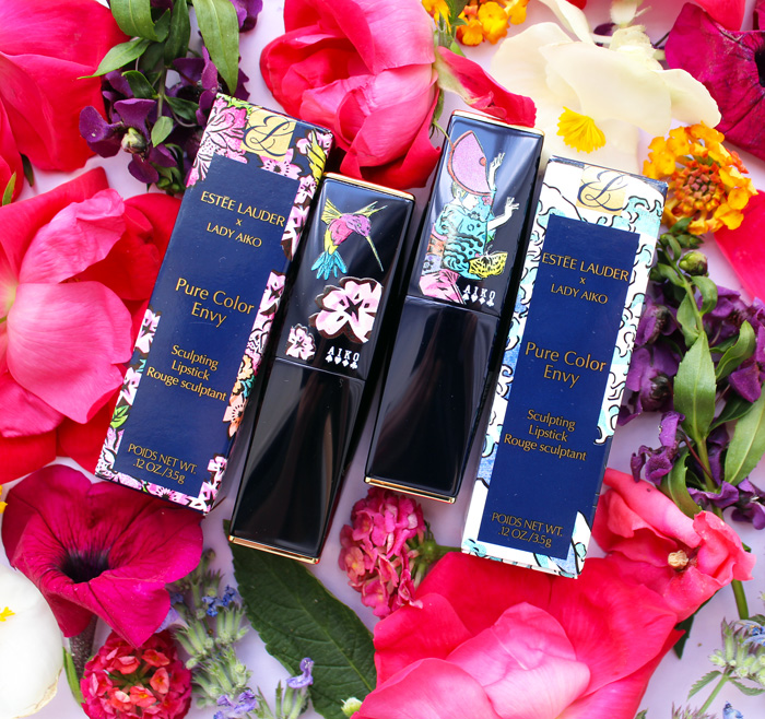
Still so far behind on artist collabs so bear with me as I try to catch up. Last spring Estée Lauder teamed up with Tokyo-born, New York City-based street artist Lady Aiko for a small collection consisting of two lipsticks and two Micro Essences.


As skincare falls outside the Museum's purview and the Micro Essence is not cheap ($120 a pop) I did not purchase them, but I'm sort of wishing I had even though the designs are the same as on the lipsticks. I feel they can be seen a little better on the bottles than the lipsticks.

(image from sg.asiatatler.com)
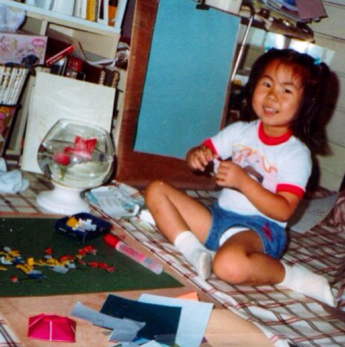
Lady Aiko (Aiko Nakagawa) was born and raised in the bustling Shinjuku area of Tokyo. She was always creating – whether drawings or collages – and also enjoyed painting with an artist who lived in the neighborhood. "[There] was a painter lady who lived on the corner and my mother supported her as an art tutor. So when I was five years old I used to go to her studio and paint with her a lot. That was my favorite thing to do when I was young," she says.

The artist at age 5.
Upon moving to New York City in 1997, she began working for the legendary Takashi Murakami. Aiko knew very little English, and while the Internet existed people weren't connecting online the way they do now. It was Murakami's signature happy flower posted on a flyer that helped get her start. "I found an advertisement in a Japanese supermarket in the East Village. I came to New York alone and I didn’t know anyone, so it was hard to connect with people and it was very expensive to make a phone call to Japan. I was just starting to learn English and I was looking for artist community. So I went into the supermarket and I found an advertisement that said 'Assistant Wanted.' I saw that cute character that Murakami does, and I thought it was something I can try and maybe I can make some friends. So I knocked on the door and said hello. His studio was in Williamsburg, Brooklyn and this was 1998, way before Williamsburg became what Williamsburg is today. I remember it was quite a scary area at that time. The studio itself was very small. It was really intimate before he became a super well known fine artist. I was helping him for about a year and a half, painting and taking care of the studio as he was getting ready for his first solo show, Super Flat, in SoHo. I also documented the production and made a documentary film about the show. It was a small production at this point, but I really liked it because it was the first time I got to see a Japanese artist working in New York City, and it was really inspiring."
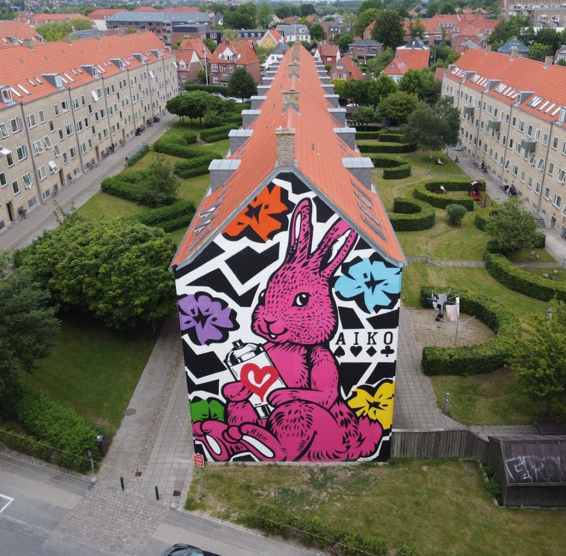
Aiko left Murakami's studio after a year and a half and earned an MFA in Media Studies at The New School. Over the next few years she worked as the founding member of an art collective known as FAILE, where the roots of her signature motifs such as butterflies and flowers began to take hold. In 2006 Aiko established herself as Lady Aiko. The first stencil work she intended for street art was an image of a bunny holding a spray paint can, which she had thought of in 2005 during her time with FAILE. "I remember when I was in London, Banksy said he liked it and I should keep doing it, even though no one got it at the time. So I started stenciling the bunny along with some images of sexy girls, and other romantic images. I have been stenciling that image everywhere from Toyko to Shanghai, Instanbul, Berlin, Rome, Amsterdam, Scandinavia and of course throughout the States…Bunny knows all my missions and we have been spreading little smiles to huge wows in every local neighborhood." The bunny has since become possibly Lady Aiko's most recognizable work, gracing everything from Banksy's bathroom door (her very first painted Bunny) to the sides of buildings like this one in Copenhagen.
 (image from pinterest.com)
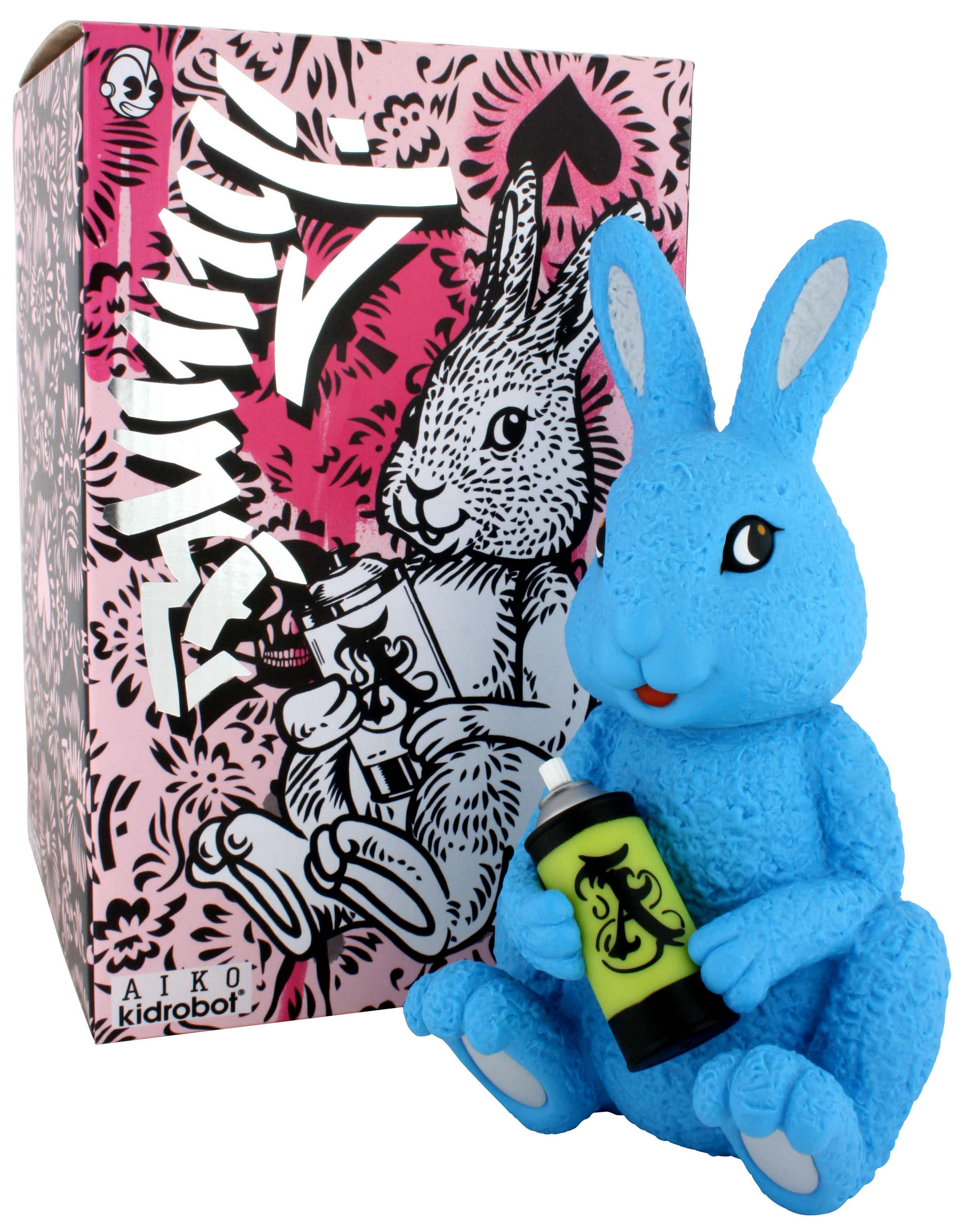
The image was even turned into its own toy in 2008, just three years after Lady Aiko created it.

(image from trampt.com)
I also really like the bunny as a Dunny, which was released in 2010. I picked it up because it worked well as a prop and it's adorable. I especially appreciate the "Girls Can Play" slogan on the back.

As Lady Aiko acclimated to New York's urban environment and expanded her artistic skills, she gradually found street art more appealing than working in a studio. "There was another girl who was working at Murakami’s studio, and her boyfriend Cer was a graffiti writer, so he introduced me to graffiti while I was working at the studio…When he came to studio and picked her up, he showed me his sketch books and photographs. That was something new and shocking in a good way. I discovered that there was this group of people that were getting together and going to an underground tunnel, or to somewhere abandoned, just to make some art and have a good time. I was a curious young girl, and I thought that’s something more interesting than sitting in a studio all day and making tedious and detailed artwork for a Japanese artist…I wanted to join them and work on crazy art on the street," she recalls.

(image from graffitistreet.com)
The democratic nature of street art and relative anonymity it afforded while still being able to connect with others were also attractive to Lady Aiko. "For me, street art was a way to make friends since I didn't have YouTube or Facebook, Instagram. So it's like leaving my hashtag and my art mark on the street…I didn’t know anyone when I moved to New York, I didn’t even speak English, so street art became my language. I met a lot of artists through painting on the street, and we taught each other and grew together. When I started, painting on the street was illegal. I didn’t want to show who I was, at the risk of being arrested, so no one knew I was a woman. No one knew I was Japanese. They only knew me through my painting. I wanted to be a mysterious monster and let the work speak for itself…I think street art is art for everyone. It’s not for the fancy people, it’s for everyone and everyone can see it."

(image from thebeesknees.art)
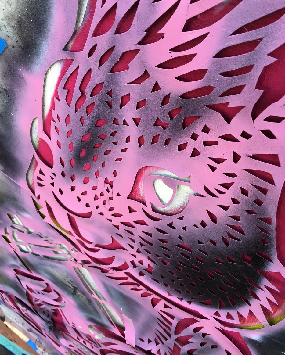
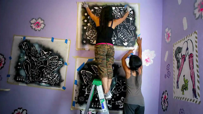
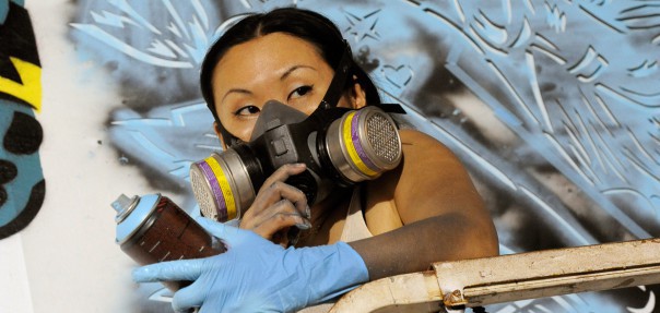
Unlike most other street artists, Lady Aiko utilizes a stencil technique. While stencils appear fairly simple to make at first glance, the amount of work and time involved in hand-cutting the hundreds of stencils necessary to create a large-scale work is no easy feat. Aiko elaborates on the painstaking process: "You have to spend a lot of time before [you] start painting. I normally cut stencil all by my hand it's like my first stage of the production. For this wall [in Eugene, Oregon], I spent two days cutting stencil and sometimes like I spent like months and months just cutting stencil for a big size wall. And after you cut the stencil I need to carry all the pieces of paper to the site. I need an assistant when I do a large scale mural because the size of [the] stencil is also enormous…there really aren’t a lot of stencil artists out there anymore. Nowadays they do a lot of machine cuts, but I do it all by hand." Whew!
But Lady Aiko actually enjoys the process as well as the physical rigor involved in painting on such a large scale. "I think street art is also like an athletic game for me. Like climbing up the ladder, up and down, and up and down, and carrying buckets of paints. It's like, you know, an athletic game."

(image from youtube.com)
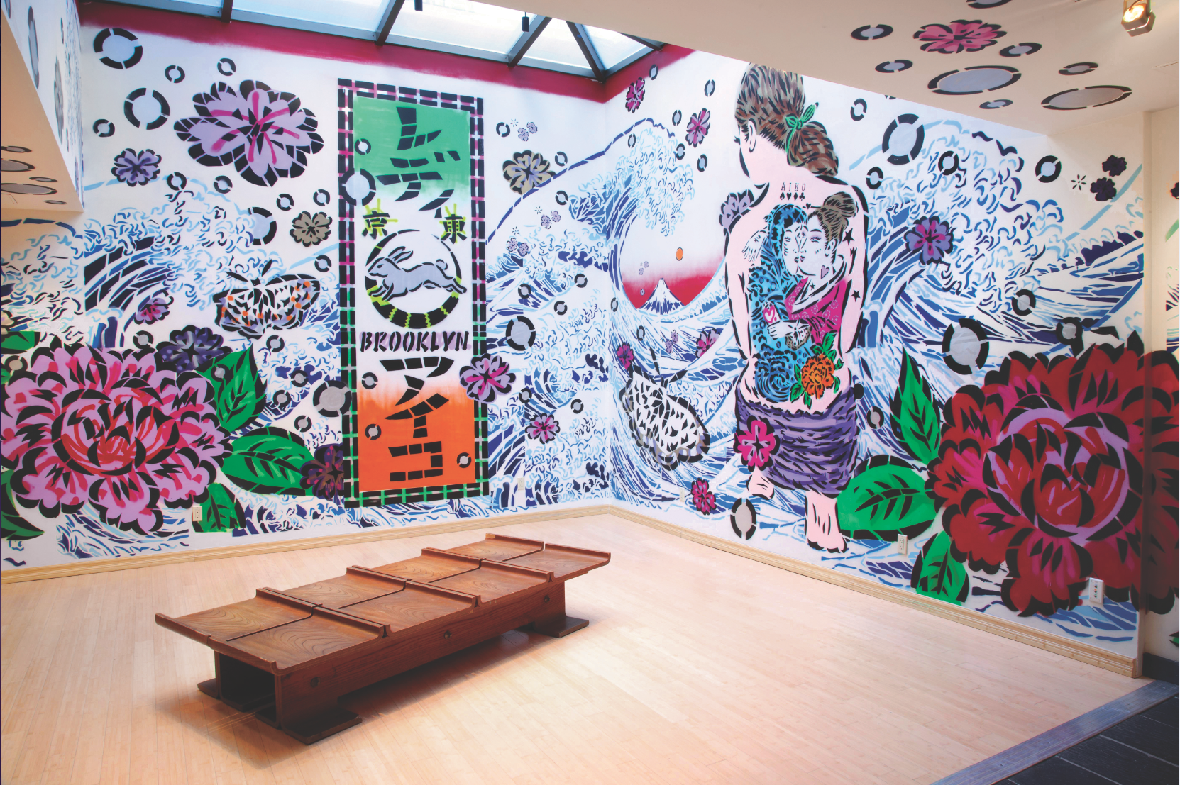
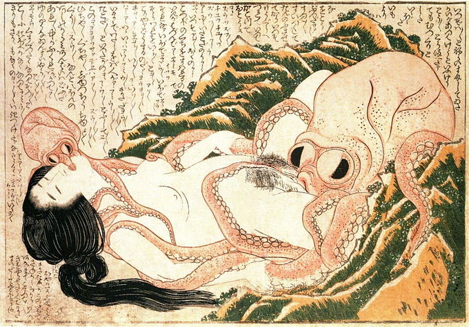
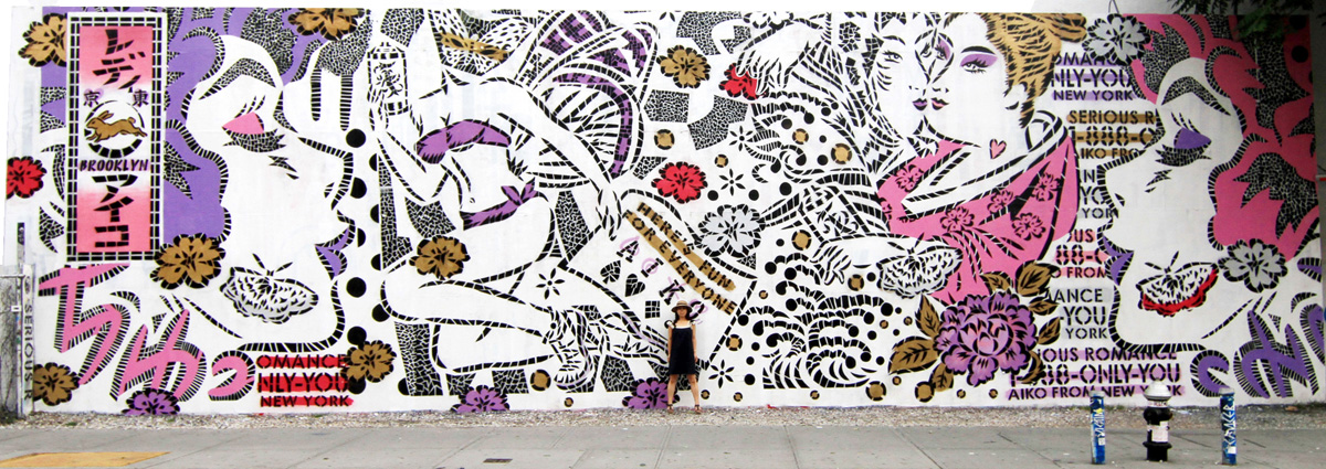
Stylistically Lady Aiko's work differs from that of Yoon Hyup, the Korean-born street artist/muralist who collaborated on Bobbi Brown's spring 2019 collection, but thematically they are similar in that both pay homage to their cultural heritage, fusing traditional influences from their respective native countries with a modern city's energy. For Lady Aiko, distance from Japan helped her learn about and respect Japanese art and history all the more. "The more I stay away from Japan, the more I appreciate my country, culture, traditions. I’ve started to study more about Japanese heritage, because I discovered it’s interesting and super unique, and I am from there. Especially the art, fashion and culture in the Edo period, which was all invented and created by working class people in old Tokyo, we used to call Edo City. We used to have such great art forms and techniques such as Kabuki, tattoo, calligraphy, kimono textiles, wood block prints. These were amazing skillful art forms invented in 17th century. Hokusai and Utumaro were the original ukiyoe print masters, and I love and respect them as great artists. Printing was not just happening in the Warhol times, it was happening all the way back in my country 200 years ago. I thought 'holy shit! I didn’t realized that my great grandfathers were doing such dope stuff.' I also discovered that old Japanese people used to do graffiti. The Japanese word for graffiti is RakuGaki. Raku means drop and Gaki means draw, so they used to make a drawing or a print, and they used to drop it on the street anonymously so that people would pick it up. It could be more for a political purpose and message, but it sounds like street art and sounds fun. We also used to have beautiful sticker culture, in that same time around the 17th century. It’s called Senjafuda (Thousand Shrine Tags), it’s a piece of tiny paper with a small wood block print. They drew their own symbol, name, crew etc. and they used to carry glue in a small pot and a brush, and when we would go to a temple or shrine once we finished praying we would put their stickers on the ceiling so that our soul will remain in the temple to be protected. That was part of their ritual in the samurai time, but I feel I have that similar kind of ritual when I put my sticker on the street where I have visited and spent some time. Before I left Japan, I was young and ignorant, and I thought it was just normal thing. I couldn’t think that deep. I knew, but I didn’t feel Senjafuda as such a special art form and I wouldn’t search out the origin of RakuGaki. Since then I have spent about 15 years living outside of Japan and working on street art, and I discovered all those beautiful Japanese traditions, but some are disappearing and being forgotten, so now I enjoy talking about it and reflecting it into my art very much." One of the many examples of how Lady Aiko incorporates elements of traditional Japanese art was her mural for her mural for the Japan Society's exhibition "Edo Pop: the Graphic Impact of Japanese Prints" in 2013, which was inspired by Japanese wood block prints (ukiyo-e). A modern stenciled version of Hokusai's The Great Wave functions as a backdrop for a mix of cheerful pop art style flowers and butterflies, as well as a woman with a shunga (Japanese erotic art produced from about 1600-1900) inspired tattoo on her back.
 (image from metropolismag.com)
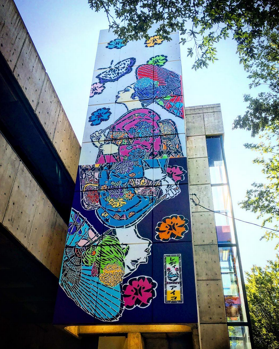
Speaking about the wall she painted for Eugene, Oregon's 20 x 21 mural project, Lady Aiko further explains some of her iconography. "She's a Maiko, it’s an apprentice of geisha, and she's a trainer to be a dancer. And I chose this motif because it's very young energy around her and really festive…My wall is really tall and skinny so I had a little time to think about the execution. I chose this way to express day and night, like flip the girl, and it’s like a playing card. I like the butterfly. It’s an image of transformation and I feel like not only women, but for everyone, like we have the moment of transformation and I really like to keep painting the image of a butterfly in different countries."
 (image from klcc.org)
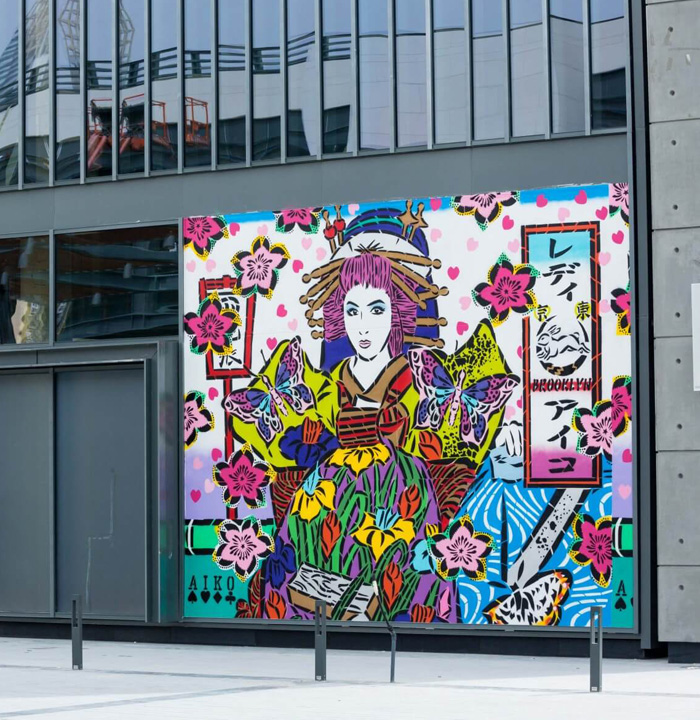
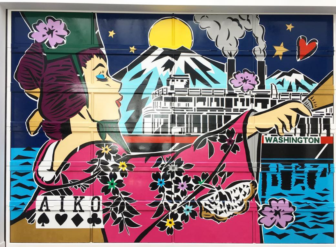
The playing card motif has become Lady Aiko's literal signature. The mural she completed for Opening Ceremony in Seattle shows it particularly well.

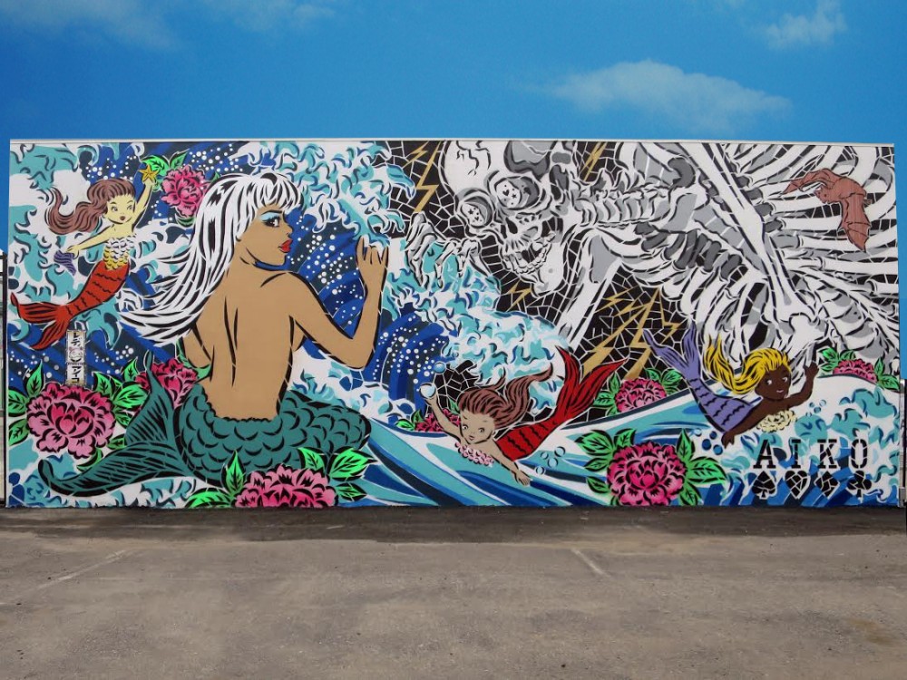
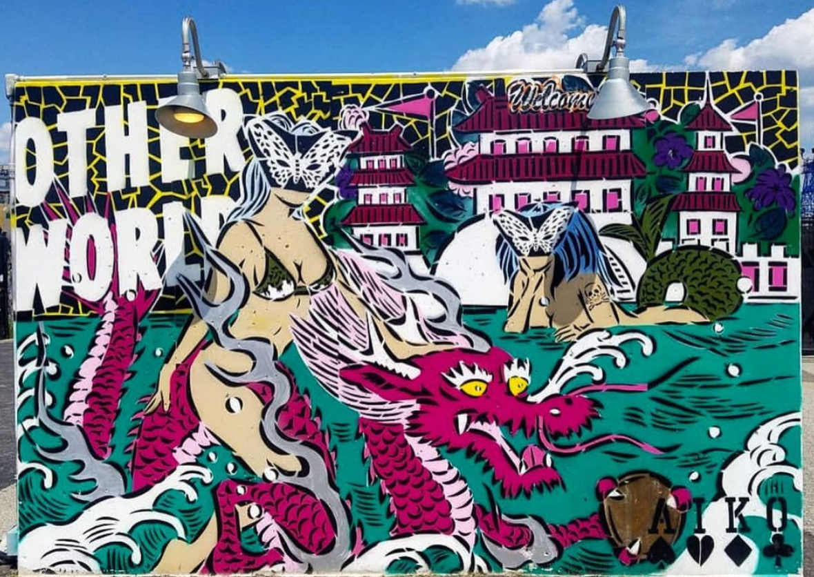
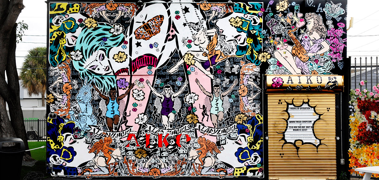
Her style is also inspired by vintage pin-ups, comic books (I'm getting Lichtenstein vibes) and tattoo imagery, which really shine in these gorgeous Coney Art Walls she painted in 2015 and 2017, respectively. Plus, MERMAIDS! I love that she worked in an homage to the famous Coney Island Mermaid Parade.

 (images from ladyaiko.com)
Lady Aiko generally maintains an upbeat outlook in her work, trying to spread positivity and beauty. "I love to create images related to romantic momentos, lovers and kisses. My subjects are pretty much always about romantic stories, lovers and sexy girls in everyday life. My name, Aiko — which is the most common Japanese girl’s name — means love. Love has been my theme throughout my entire life, even from early childhood…I enjoy making something that gives us a good feeling, and creating something beautiful that I can share with everyone. Something that is full of love."
 (image from about-street-art.com)
Occasionally Lady Aiko's representations of love delve into decidedly erotic territory, such as the murals for a 2019 show entitled "Beyond the Streets". Creating a red-light district of sorts, Lady Aiko combined shunga with the seediness of '70s era Times Square. But while the images could be interpreted as degrading depictions of sex workers, they were intended as an unabashed celebration of women's sexuality and pleasure. "People used to draw really sexy stuff in my country, so I'm making this whole section sexual and pornographic. But also it's more about women. You see [in the work] more sexual energy from women than men. My red-light district is more about how women want to have good time. We also want to enjoy some sexuality…Guys can paint sexy ladies that they want to fuck but the female figure is ours; it’s also for us to enjoy. It’s nothing against boys; I’m just celebrating female energy."

The painting on the right is a re-imagined version of another Hokusai work, a shunga print from 1814 entitled The Dream of the Fisherman's Wife.
 (images from northcountrypublicradio.org and beyondthestreets.com)

(image from wikipedia.org)
Between the fairly explicit portrayal of women's sexuality in "Beyond the Streets" and her other equally eye-catching, thoughtful work, Lady Aiko has proven herself a critical player in a new generation of street artists who are changing the way graffiti is perceived in the art world. In the eyes of academics, galleries and museums, for many years street art was snobbishly viewed as nothing more than vandalism (in fact, Aiko was arrested early in her career), but now it's being curated by the likes of gallery owner and art dealer Jeffrey Deitch. Over the past 20 years or so, Deitch and others have set up specific (legal) spaces for street artists to compete for a chance to show their work. One such space is Manhattan's Bowery Wall, which Lady Aiko had the honor of being the first woman to paint. After completing Miami's Wynwood Walls in 2009, Lady Aiko set her sights on the coveted Bowery, but felt she "had to let the boys do it first". Finally in 2012 she was awarded the opportunity. "Wynwood Walls was one of the first big walls that was painted by a woman and that got good attention, and people started to know about me and my serious stencil murals. People started to realize that female artists also can paint a big wall."

(image from thewynwoodwalls.com)
Lady Aiko recognized the importance of women contributing to the Bowery Wall, inviting others to participate in the process. "It made me think, it must be my time? For years, that wall had always gone to guys. I waited to paint it for three years. I got the call, and I called my girlfriends as I wanted to make it a 'female only' wall! I called five of my good girlfriends, from the girl whose does my nails to Martha Cooper (the legendary photographer). There were loads of people watching and I think they really appreciated the fact that there were all these girls working away, it bought a new vibe to the mural scene. We did the wall, I felt honored." The feeling of camaraderie with fellow women made a lasting impression on Lady Aiko's process. "I was really tired of having it be dudes vs. girls. I think I got traumatized. Now when I do my own big wall I always call my girlfriends first. They care more about mementos and enjoying the process, instead of it being 'my idea is this' or 'my idea is that.' I enjoy the work and enjoy the time together."
I'm always so honored to hear from people wanting to know more about the (usually) vintage objects they come across. While the volume of inquiries can be a bit overwhelming sometimes, it's so interesting to see what's out there and I enjoy expanding my knowledge. For this installment of MM Mailbag, I'm looking at a few inquiries that I managed to partially solve. I wish I could have answered with 100% certainty, but at least I found a little information.
First up is a metal clutch containing a multi-use compact. The submitter lives in California and was cleaning out a house of a family member who had passed away when she stumbled across these items. At first glance I thought the compact was physically embedded in the clutch somehow, but they're separate.


The compact was easy to identify. It appears to be one by Mondaine, a compact manufacturer in the 1930s that was better known for their book-shaped compacts. Here's another example of it. (The interior has the same layout and products as the one that was sent to the Museum…I'm just too lazy to add photos.)

(image from worthpoint.com)
The metal clutch, however, was trickier. I couldn't make out the monogram or figure out what the "Mitzah" engraving was, but my best guess is that someone selected a clutch to put the Mondaine compact in, had it engraved and presented it as a gift – maybe for a birthday, or perhaps a wedding anniversary given the June date. Or maybe someone just had an old engraved metal case and decided to put the Mondaine in there to store it. They may be totally unrelated.

So I wasn't able to definitively conclude anything about the metal case. But it's certainly pretty and I wonder what the story was behind it.
Update, 6/4/2021: Some incredibly exciting news! Sarah Jane Downing (yes, THE Sarah Jane Downing who wrote Beauty and Cosmetics, 1550-1950), kindly reached out and provided some information on the mysterious "Mizpah" engraving on the metal clutch. Here's what she had to say:
"During the 19th century the Regency taste for sentimental jewellery developed into an obsession by the Victorian era and there were many pieces (in the UK at least) that bore the inscription 'Mizpah' or 'MIZPAH' which I suspect is the inscription on the clutch. This would substantiate your theory that it was sent as a gift to a loved one. Mizpah was a derivation from a Hebrew word meaning something akin to 'watchtower' which was used in jewellery to mean 'the Lord watch between me and thee', an innocent religious reference used to convey a far greater depth of meaning. This could be used in mourning jewellery to refer to the distance of a loved one sadly departed or as an early form of sweetheart gift for a loved one far away. It was also a wonderfully romantic way to exchange tokens with a secret or forbidden love without fear of accusation or discovery!"
How fascinating is that?! So now I really do wonder whether the clutch was intended as a wedding keepsake. Thank you so much, Sarah, for sharing this amazing bit of history!
Next up is an antique store find. It's a round metal compact featuring a peacock or pheasant perched on a cherry blossom tree. The characters on the front appeared to be Chinese and the submitter seemed to think it was someone's name. The only other marking it had was the word "lovely" (in English) on the powder puff in the compact (no photo of the puff was provided.)

I posted it on Instagram stories because I know a few very supportive Museum friends read and speak Chinese. I must give a huge thanks to Mimi of Makeupwithdrawal and Mina of Citrine's blog for kindly translating the characters for me! As it turns out, the first character means "beautiful" and the second means "peak" or "summit", so they believed the inscription is the name of the company that made the compact. Also, Mimi thought the compact dated to the 1960s or later, as simplified Chinese was standard by the '60s. How the English word "lovely" got on the powder puff I'm not sure, but perhaps it belonged to a different compact.

Unfortunately I don't know of any vintage Chinese compact companies or makeup brands – I'm only familiar with 21st century ones – but it's a pretty design even if we don't know exactly who made it.
Next up we have the opposite problem: the company was identified, but it's a strange find that I'm not entirely convinced is even a cosmetics object. It's made of velvet (unusual for a powder box) and paper (unusual for a compact). After a little digging I learned that it's a box by Tanfani & Bertarelli, who supplied papal jewels and religious accoutrements – basically they were the Vatican's official supplier of decorations starting in 1905. From the few documents I found online (ads and receipts) it appears Tanfani and Bertarelli were at the address listed on the box from at least the 1920s to the early 1960s. The company changed its name in 1967 so we know it dates prior to that. I asked the husband about the font of the company name since he's a graphic designer, but he indicated it's pretty generic so I'm not sure what decade it's from.

I'm questioning if the box was meant to be a compact given that I couldn't locate any examples of this company making cosmetics or toiletries – they seemed to produce papal jewelry/clothing and medals, so I'm wondering if this box held something else. Perhaps it held a gift or souvenir that the public could purchase at their shop. Especially since the writing on the box translates to "objects of devotion memories" whereas other boxes for official papal medals say "sacred objects" – maybe people could go in and buy a souvenir like a rosary or coin or something and this was the gift box. But it's possible it's a compact or was the gift box for a compact since souvenir compacts were popular back then, and the dimensions look similar to a compact, plus it opens the way a standard compact would. I'm not sure if there was an actual powder puff or if what's shown here is just a wad of cotton, or if there was any powder residue. Those details would help identify it as a powder box or compact with more certainty.

Let's take a quick break from compacts with an old lipstick. The submitter had the brand's name on the tip of his tongue but couldn't remember, so he asked me to take a crack at it. The silhouette of the case is rather common and used by a lot of brands so that's not much help, but there's an L on the cap and the fleur de lis motif would suggest a French brand. Based on other vintage lipsticks and ads, I eliminated Luxor, Luzier, Lucien Lelong, Lancome, Louis Phillipe and Lady Esther. I thought L'Oreal was a possibility based on this blush compact as it incorporates the fleur de lis, but the photos of the lipstick indicate it's a metal case, which means it most likely dates to before 1960. To my knowledge L'Oreal did not sell cosmetics (only haircare) in the U.S. until the late '60s.
My best guess is Lentheric, based on this mascara case which has a similar logo of an L and 3 fleur de lis symbols. This logo dates to the early '50s.
Lentheric appeared to have undergone a lot of packaging changes, so it's unclear when the lipstick in question was made. The company had an interesting fold-out case in the late 20s/early 30s, then a black case with a gold ribbon encircling it, then during the war they shifted to plastic. This one could be a variation from the mid 1930s to early 40s…that is, again, if it's actually Lentheric. I also asked the extremely knowledgeable expert at Cosmetics and Skin to take a peek and he thought it could be Lentheric as well. So that's what I came up with but I don't know for sure. Maybe the letter is actually a T and not an L, but that didn't align with any of the brands of the time (Tangee, Tattoo, Tussy, etc.)
Getting back to compacts, here's one someone dug up at an old bottle dump in Western Montana. This was another that at first glimpse I wasn't sure if it was a compact. The shape and depth seemed to indicate that it could be a snuff box.

The submitter thought the EA on the monogram might stand for Elizabeth Arden, but it didn't look like any of the ones from Elizabeth Arden, and as far as I know the company was never referred to as Elizabeth Arden Co. or E.A. Co. After poking around a bit I have come to believe it's the mark of the E.A. Bliss Co., which eventually became Napier Jewelry.

This particular mark, with a bee at the top, was used from about the 1890s through 1917, according to a listing at Ruby Lane. (Other listings indicate the mark was phased out in 1915…either way, this piece is much older than I originally thought!)
As they were a jewelry company that made tons of accessories – everything from hairpins to belt buckles – knowing the brand and the approximate dates didn't really help determine for sure whether it's a powder compact or snuff container. My hunch is that given the depth, relatively plain design and the lack of a mirror is that it is a snuff box. Ladies' powder containers tended to have more decorative details. For comparison's sake, here's a powder compact by the company from the same era. It is fairly plain, but it has a mirror and it's not as deep.

I really can't say for sure what it is, but we know it's over a century old, so it's a true antique. I'm also not certain about the materials. E.A. Bliss was essentially a fashion jewelry company (i.e., not high-end like Tiffany's) so there were a lot of gilt and silverplate accessories. So this one could be all brass or gold-plated brass. While I couldn't completely unravel the mystery of this object, I was pleased at figuring out who made it and the approximate dates. There's a whole book on the history of Napier too, so maybe there are photos or ads of snuff boxes and powder compacts.
The last one for today is one that I think is 99.9% solved. A very nice Museum supporter in Australia emailed to say that sometime in the late '90s she spotted a Stila compact in David Jones, a department store down under. As with my memory of a Stila mermaid, she thought maybe it was a figment of her imagination. "It was circular, with the rounded lid and relief design, and it was obviously for bronzer since it was a copper colour. This is the part that is driving me crazy: I swear it had a Stila girl on the lid! She closely resembled the girl on the Sun Gel tube (with the sun behind her) but the girl on the compact had a loose braid falling on her left shoulder instead of loose hair, and freckles. I have never seen this compact anywhere since. The only bronzer rounded relief compacts I've seen have the sun's rays or the little scattered stars. Did I imagine it?? I would so appreciate if you could please tell me if this compact exists!"
Fortunately I had good news for her. I'm not sure whether the compact in question was available in the U.S., but something nearly identical was sold in Asia and obviously in Australia where she spotted it. This one is very close to what she described, but the design does not appear to be in relief, just printed on the lid. So perhaps there was a slightly different product with the same Stila girl image but with a relief lid.
There were a couple of Stila compact designs with stars and one was relief and one was flat, so it's entirely possible the same thing happened with this design. As we know, just because an image can't be located online doesn't mean an object didn't exist. But the submitter replied to my findings and after thanking me profusely (always appreciated!) she confirmed that this was in fact the compact she had seen – she was quite certain that she was getting it slightly confused with the others that had a relief design.
And that wraps up today's edition of MM Mailbag. I have so many more inquiries to share…recently I tried to organize all of them into several email folders and noticed that the Museum has received over 320 inquiries since 2009! No wonder I feel like I can't keep up. But your queries are always welcome, so if you have an object or topic you'd like to know more about just send it my way. 🙂 And if anyone can help fully solve the makeup mysteries outlined in today's Mailbag, I'm all ears!
 The April 2021 rewind.
– I forgot to include this in the March edition of Curator's Corner, so here's my interview with antique jewelry boutique Lillicoco. I was so honored!
– A Sephora within walking distance is going to be fun but also very bad news for my wallet.
– This year's Oscars marked the first time Black women won the awards for Best Makeup Artist and Hairstyling. Allure unpacks why, despite this victory, more needs to be done when it comes to diversity in Hollywood.
– Attention makeup history fans! "Makeup: A Glamorous History" has aired in the UK and getting very good reviews. I can't wait till we're able to watch it in the States.
– Here are a couple of updates on men in makeup.
– Cover Girl will be featuring my favorite '90s model in an upcoming campaign. I'm so happy to see Niki Taylor's gorgeous face again, I feel like she had quietly faded into obscurity while the other "supers" still had a good amount of visibility.
– Another one bites the dust. Farewell, Rodin Olio Lusso. I will always fondly remember you as the creator of one of the best mermaid makeup collections ever.
– So sweet: an elderly gent learns how to apply makeup for his wife, whose vision is failing. (Remember this lovely man, too?)
– It was National Unicorn Day on April 9, so here's the Museum's current collection of unicorn-themed goodies.

The random:
– Another holiday this past month was Easter, and I'm still scratching my head over Peeps soda.
– I'd love to take a dive into the world's biggest collection of magazines!
– Adored this photo series of Black merfolk.
– New documentary to add to my Netflix queue.
How was April in your neck of the woods?
This post has been in the making for literally years. I finally conceded that I couldn't find a complete history of either Benefit's Glamourette compact, released in 2002, or the vintage compact it was based on, House of Platé's Trio-ette (ca. 1944-1947). But I did turn up a few nuggets of information, so figured I'd share the little bit that was readily available.


The House of Platé company was established in 1944 by Robert T. Plate in Detroit. From what I was able to piece together from various archives, it seems Plate was born in 1897 in Lima, Ohio and received a Bachelor's degree in mechanical engineering from the University of Michigan in 1923. Specializing in automobile design, his first job was draftsman for the Willys-Overland Company in Toledo. Beginning in 1932 Plate worked for General Motors, and in 1938 he was doing business as the Plate Manufacturing Company. In 1945 he trademarked the Trio-ette compact under Curly Lox Products. The biggest mystery for me is why Plate decided to market cosmetics. I'm assuming it was a side hustle to earn a little extra cash, or maybe he thought he could become the next Max Factor. (As a side note, Plate moved quite frequently throughout his life, bouncing around from Ohio to Michigan to New York to LA…if it's the same Robert T. Plate, I'm not sure whether he was trying to help his business take off across the country or moving for engineering jobs.)

The design of the compact was based on a "quaint Victorian rose cameo hand mirror" according to one ad. This one is reproduced in Roselyn Gerson's book Vintage and Vogue Ladies' Compacts (2nd edition).

It's really fascinating to see how a mechanical engineer who designed cars approached makeup. Compacts with powder, rouge and lipstick had existed for years, but few had the novelty and charm of the Trio-ette's design. (However, one can definitely tell an engineer also thought of the rather unimaginative House of Platé name. I guess Plate thought adding an accent over the "e" would make it sound vaguely French and therefore instantly appealing.) I'm so disappointed that I wasn't able to find patent drawings despite having the serial number. But maybe the trademark is different than patenting the actual design.


The name on the handle is such a sweet little detail.


(image from archive.org)
As the Trio-ette was conceived and launched during WWII, it was made of plastic, specifically tenite, instead of metal. Tenite apparently is the trade name for a cellulosic plastic created by Eastman Chemicals in 1929. (I wish I knew the difference between tenite, bakelite, and celluloid. Alas, I have no clue.) The Trio-ette was also refillable. This snippet from Drug and Cosmetic Industry shows the refill kit, but the really interesting thing about this blurb is that the journal was not falling for the Trio-ette's hype, claiming it was nothing more than a "gadget" and citing the more "streamlined" designs from established big-name brands. It's true: companies had been making triple compacts for a good 20 years by that point.

(image from archive.org)
Whether it was a novelty or a truly handy compact to carry, the Trio-ette seemed popular, or at least, it was readily available across the entire country in department stores as well as drugstores. Plate, though not a businessman by trade, understood the importance of advertising. In late 1945 he hired NY-based firm Norman D. Waters and Associates to oversee a national campaign they would launch early the following year. The Trio-ette allegedly reduced "bag fumbling" and "makeup fatigue".

As with lipstick mirrors, it was considered a social faux pas to be digging through one's purse to look for your makeup, mostly because it was a potential inconvenience for men. Ladies, with the Trio-ette he won't mind waiting for you to touch up since it won't take long at all – all your makeup is in one place so you won't waste his time searching for it. *eyeroll* These ads certainly paint a picture of gender norms, don't they?

There were other products from House of Platé, including a double-ended lipstick called the Duo-ette and the Vista, a lipstick with a built-in mirror (again, you can see my post on those.)

The Trio-ette came in a variety of colors as well as black ones with a pink rose or a rhinestone border. According to collector's guides, the most valuable colors are blue, pink and green. Personally, while I love all the shades, my most-wanted would be the rhinestone version followed by the green and mock tortoiseshell.

(image from pinterest)

(image from etsy.com)
The Trio-ette was quite short-lived. I'm not sure why exactly; it could be that Plate had run into a trademark issue with Curly Lox, or maybe after the war a return to metal compacts was all the rage and plastic fell out of favor. Or it could also be that a copycat was released around the same time. In the UK, a company named Jason released a nearly identical compact in late 1947. The only difference I can see besides the name is that the front of the compact is plain instead of bearing a sculpted rose.

(image from antiquesatlas.com)
According to the British Compact Collectors Society, the Jason Trio-ette was also known as a "three-in-one" and available in blue, green, ivory, black and tortoiseshell and could be ordered by mail from Targett Tools Ltd., London. It's not clear what, or even if, there was a relationship between House of Platé and Jason.

What's undeniable is the impact the Trio-ette had on future compact designs for the bigger brands. Volupté launched a compact with powder, lipstick handle and outer mirror in 1951 within its Demitasse line, and by 1953 it was advertised as the "Lollipop".


(images from etsyc.com)

Around 1952 Coty launched its Parisienne vanity, similar to the Volupté Lollipop, but with no mirror on the outside of the compact.


(images from etsy.com)
Perhaps another reason for the Trio-ette's brevity was simply that Plate couldn't compete with the more well-known brands, who in addition to name recognition, also had a far bigger advantage in terms of marketing savvy. Coty's Parisienne, for example, was somewhat misleadingly advertised as a "4-in-1" even though it actually only contained two products – the mirror and puff were considered the 3rd and 4th items. While some ads describe the design as a miniature hand mirror just like the Trio-ette, some others claim the Parisienne to be a "replica of a Cartier-designed original," which sounds way fancier than a Victorian hand mirror. Maybe if Plate had hired an agency with sneakier copy writers to advertise the compact differently, it might have had some longevity. As I noted earlier, he was educated as a mechanical engineer and not a businessman, so navigating the world of ad agencies and cosmetics marketing was a tricky prospect.
Anyway, House of Platé dropped the accent over the "e" and inexplicably shifted to making plastic toys by mid-1948, which continued through 1951.

(image from archive.org)
Unfortunately Plate was no longer running a legitimate business at that point. According to a 1951 FTC ruling, essentially the House of Plate was mailing people products they did not order and then demanding payment. It's a common scam that persists today in the form of "free trials" of various products. (A few years ago my own mother was the victim of one of these schemes in the form of a trying out a "free" face cream she was sent.) In 1951 the company was officially dissolved. Plate passed away on December 10, 1966 in Athens, Greece.
Now let's investigate Benefit's Glamourette. First, a little background. Founded as a San Francisco boutique called The Face Place by twin sisters Jane and Jean Ford in 1976, the company was renamed to Benefit in 1990 and launched at Henri Bendel in 1991. The cheeky names and retro vibe quickly made their products best-sellers across the country. In 1997 Benefit made its international debut and was acquired by LMVH in 1999. Using vintage mannequins as their mascots and creating packaging inspired by everything from '20s face powders to '70s lip glosses, Benefit was widely recognized as a fun brand that lightheartedly saluted beauty products of yesteryear.

 (images from archive.vogue.com)
The company had firmly established its playful kitschy take on cosmetics by the early 2000s, but why they decided to draw on the Trio-ette specifically is unclear. None of their other products seemed to be literal remakes of a particular piece of makeup from earlier times. As with the Trio-ette, I wish I could hunt down the patent drawings for their version of the compact. I also wish I could find anyone who worked for Benefit during that time and see if they have any inside information as to what inspired the company to update the Trio-ette. We know that the Ford sisters were vintage collectors, so maybe one of them came across a Trio-ette and thought it was the perfect compact to use in their line, but why?


Let's compare the Glamourette with the Trio-ette. I would have done a smackdown because they are nearly identical but pitting a spry 20-year-old against a 70+ relic didn't seem like a fair fight. Obviously the formulas for the makeup itself were updated with newer ingredients.

The lace pattern on the inside of the lid is a nice nod to the pink floral pattern that appears on the insert included with the Trio-ette.

Instead of a rose on the lid Benefit used an abstract squiggle design. Also, I don't think the Glamourette was offered in other colors; to my knowledge, only black plastic was available.


The lipstick mechanism appears to be the same between the two compacts, but Divine's rosy brown hue is unmistakably '90s/early 2000s. Instead of the company's name on the cap there's a sticker saying "lipstick". I would have strongly preferred Benefit's name rather than a totally unnecessary sticker. I know people are dumb but it's pretty obvious it's lipstick…no need for a sticker.


Interestingly, the powder and blush are reversed from the Trio-ette, i.e. the blush is on the inner part of the compact and the powder is on the outer side. You could also swap out the powder for Fancy Lady cream highlighter.

The shade range for the face products had not improved since the 1940s. In fact, I suspect the Glamourette's was even worse. I'm not 100% sure, but it's my understanding from reviews that Fancy Lady didn't come in any other shades besides a pale ivory/champagne. And while I can't make out this tiny photo, it looks like Fascinating Finish powder, appallingly, also only came in one very light shade.* I know it was 2002, but I was pretty into makeup by then and I distinctly remember just about every line having at least 3 options for face powders and tinted moisturizers by then: light, medium and dark. It's absolutely inexcusable that Benefit didn't offer the bare minimum for face powder shades in the Glamourette compact.

(image from amazon)
Getting back to comparing the two, unlike the Trio-ette, the Glamourette came with a wristlet that could be used as a storage pouch. It's a very sheer piece of organza that I don't think would have been too helpful in terms of preventing wear and tear, but interesting to note.

Obviously the advertising for the Glamourette was similar to its 1940s counterpart. Both touted ease of use, refillable products and chic, vintage-inspired packaging. Bag fumbling was still presented as a tedious time waster for the new millennium's busy modern woman. Perhaps as a sort of snooty counterpoint to the golden age of trashy reality TV and super glossy, frosty makeup finishes that appealed more to teens than adults, the Glamourette was also described as "discreet" and something a "real lady" would carry, whatever that means.


The Glamourette was generally well-received. There are a few reviews on Makeupalley gushing over its cuteness and convenience while acknowledging it was a gimmick. One reviewer mentioned she would pass it on to her 11 year-old daughter in a few years, so Benefit helped rekindle the notion of makeup as a keepsake. While most MUA'ers felt the amount of product was a bit stingy for the price point, overall they loved the style and found the compact practical for a night out. Several reviews also pointed out the similarity to the black plastic packaging of Anna Sui's line.
Speaking of product amounts, I don't have the exact numbers for the Trio-ette, but if they were the same as the Glamourette, the latter was actually a better deal. The Trio-ette retailed for $5.50 in 1946, and according to an inflation calculator it would have cost about $51 in 2002 when the Glamourette was being sold. Glamourette's retail was $38 ($55 CAD and £32.50 in the UK). I also find it amusing that the reviews commented on how streamlined and tiny the compact was when Glamourette is actually a smidge larger than the Trio-ette, which was described as "bulky" in the Drug and Cosmetic Industry article. As we know, makeup packaging gradually got bigger over the years, so the Glamourette demonstrates how both design and consumer expectations changed.

Despite the amount of press and good reviews, the Glamourette was a limited edition item that did not return to the market after its brief two-year stint. Even against the backdrop of '90s/early aughts' nostalgia for mid-century styles (see also Too-Faced's Quickie Chronicles) maybe the Glamourette was too retro for most customers. I know when I laid eyes on it I thought it was cute but overly vintage-looking for my taste. It could also have been the type of products included. While there absolutely was and will always be a demand among those sticking to simple polished looks and makeup classics in neutral tones, in the early 2000s traditional lipstick, face powder and blush weren't the most wanted product categories among the younger crowd. Says one Makeupalley reviewer, "It has powder and blush which I never use to touch-up, so I'd never carry this with me. And it also has lipstick, and I'm not a fan of lipstick. If they replaced it with concealer, bronzer, and lipgloss, I'd sell my soul for it!!" Perhaps a tiny sifter of body glitter may also have been more palatable for a Y2k audience. Finally, the lack of shades for anyone whose skin was deeper than mayonnaise obviously eliminated a good portion of the market.

I still can't wrap my head around why Benefit chose this exact compact. I'm just spitballing here, but maybe it's precisely because House of Platé wasn't a well-known brand that's still sold today. Perhaps Benefit didn't want to risk running into copyright issues that may have occurred if they chose to release an updated version of, say, Revlon's Futurama cases. The patents for those designs may have expired, but the companies are still around and significantly larger than Benefit was – although it was owned by LMVH by that point, Benefit's rivals had the potential to take legal action if the company tried to update an iconic product from their archives.
Even though there's a 55 year age gap between the Trio-ette and the Glamourette, their advertising and reception were remarkably similar. So much had changed between 1947 and 2002, yet the design appealed to totally different audiences. As Drug and Cosmetic Industry noted with the Trio-ette, people love a novelty product even if the underlying concept – in this instance, having three makeup products in one attention-getting case – has been done before. It got me thinking about how a third iteration of the compact would be marketed and received today. The small sizes and refills would be attractive to today's makeup consumers, but the compact would have to be made out of sustainable packaging; plastic won't play well. Maybe the products could be even smaller to make space for brushes rather than puffs. There would probably have to be some kind of emphasis on "wellness" and "self-care" or at the very least, "clean" (sigh), vegan and ethically-sourced ingredients. Most importantly, the shades would need to accommodate all skintones. One parting thought: I'd also be curious to see what would happen if a company released it not today but 55 years after the Glamourette. I wonder how makeup customers in 2057 would react.

What do you think of the designs of these compacts? Do you have a preference for one or the other? And do you like having your makeup all in one place? I could see using something like this for touch-ups, but it would still fall short. Until a product is developed that combines concealer, powder, blotting sheets and lip color all in one, I'm destined to dig around in my bag.
*There was an article in Global Cosmetic Industry from 2002 that lists the following colors for Glamourette blush and lipstick refills. It doesn't make any mention of multiple shades being available for the highlighter and powder. "Rouges in Divine, Fickle and Coy, Fascinating Finish Translucent Powder and Fancy Lady Highlighting Creme are priced at $11.00 each. The line offers Lip shades priced at $9.00 each in Keen (champagne pearl), Vain (vibrant red), Divine (rich plum), Swell (dusty rose), Prim (pink-cocoa pearl), and Coy (mocha apricot) varieties." I cannot for the life of me locate the article now but I know it existed!
 Links for the lovely long days of June.