 Links for the lovely long days of June.
– Unlike most other digital makeup, this actually seems fun.
– Move over, rainbow makeup. Here's a little piece on the importance of glitter for the LGBTQ+ community.
– In makeup history, L'Officiel had a fairly accurate, concise history of contouring.
– The acne positivity movement is gaining traction.
– Two predictions I made earlier are coming true: lipstick sales (and cosmetics sales in general) are taking off as the pandemic eases and makeup experimentation is continuing to rise.
– Do you remember the woman who got Gorilla Glue stuck to her scalp? I'm pleased to report she found a way to monetize the incident. With what she went through I'm glad she's making some money off it.
– Estée Lauder is getting into the men's makeup game.
This is why I don't trust the bulk of online reviews.
– Talk about a multi-use product.
The random:
– My former favorite band released yet another bad album. Admittedly I only listened to two songs from it, but that was more than enough for me. I feel so lost without them. 🙁
– On a happier note, how adorable was the winner of the Westminster Kennel Club show? Wasabi is a Pekingnese, not a pug, but still precious.
– Loved this roundup of vintage mermaid illustrations.
– Not traveling any time soon, but if I were it would be to New York to see this exhibition of sparkly jewelry animals and to London to see a show on Bridget Riley.
– I asked Museum staff to make a rainbow for Pride Month in exchange for some cookies. They were pretty happy to oblige, especially since I made their favorite summery cookies: lime sea-salt chocolate chunk.

How's your summer going?
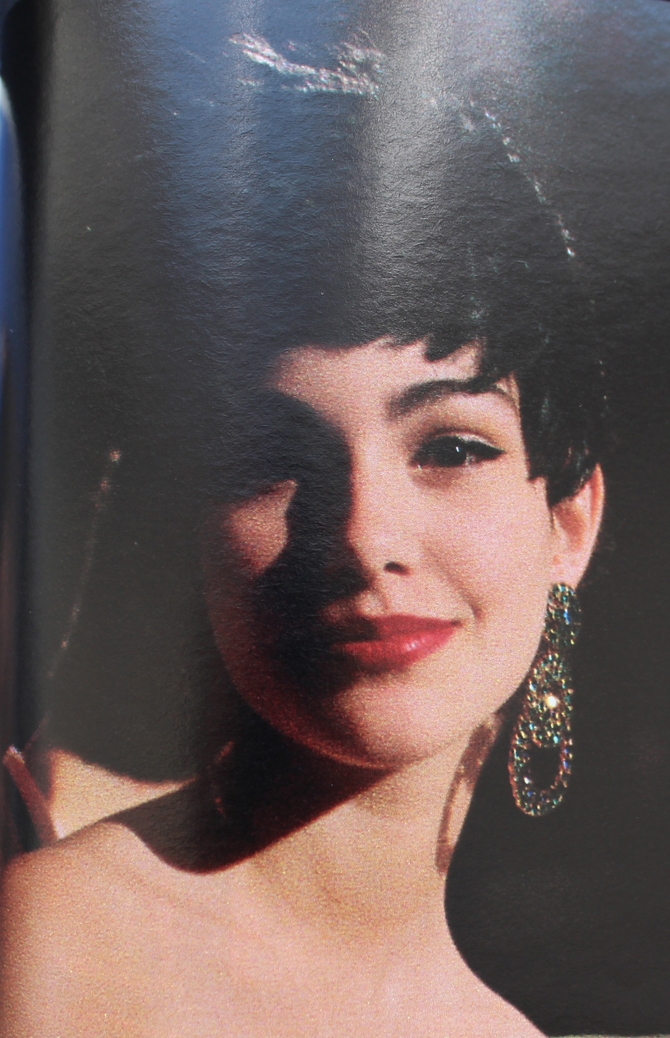
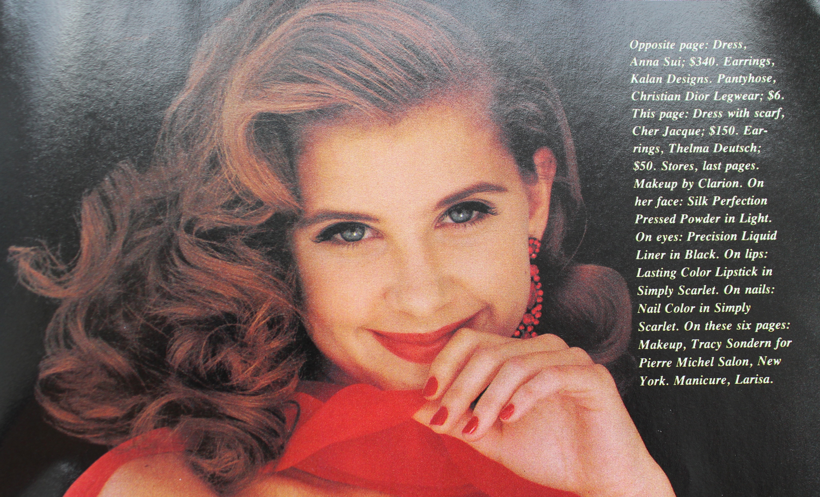
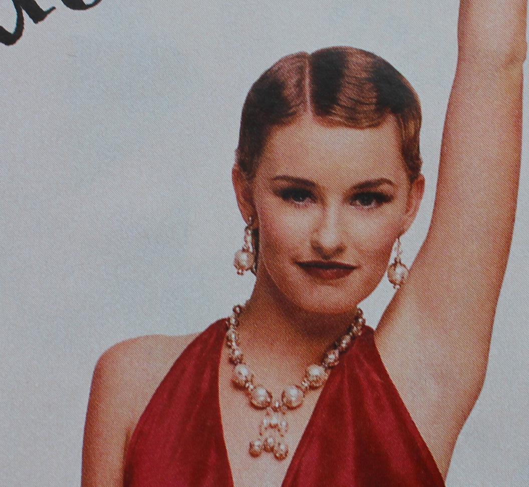
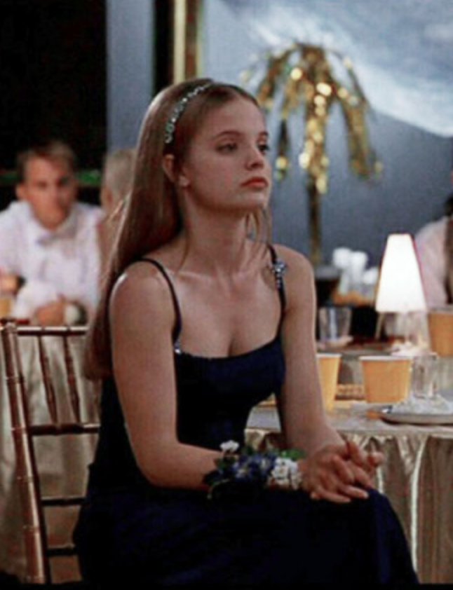
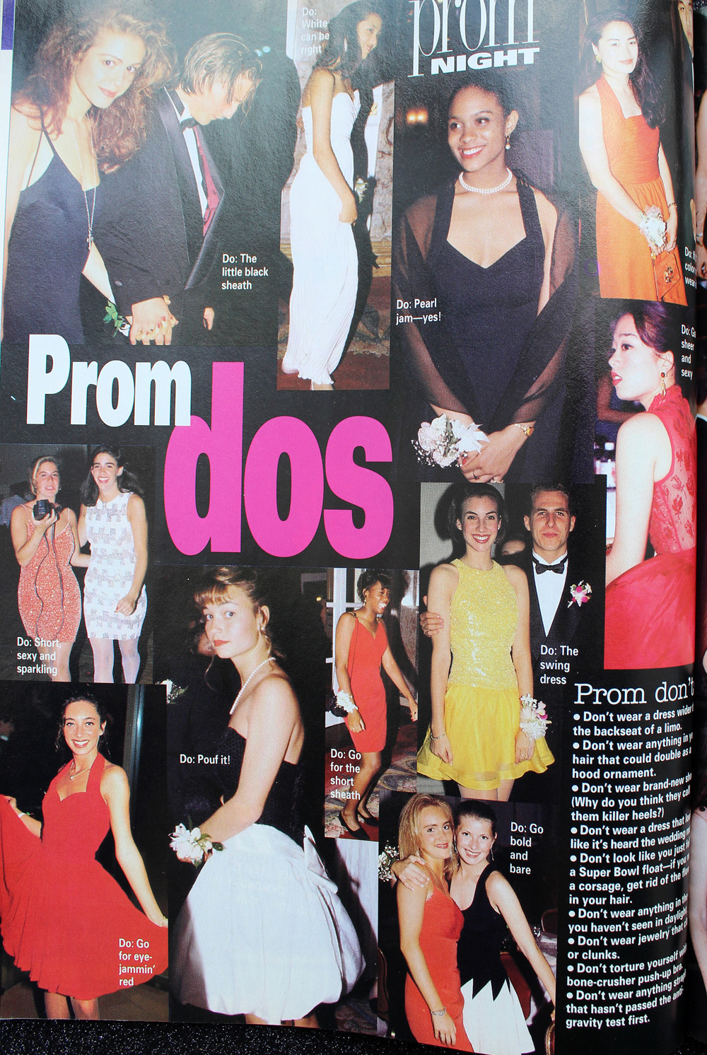
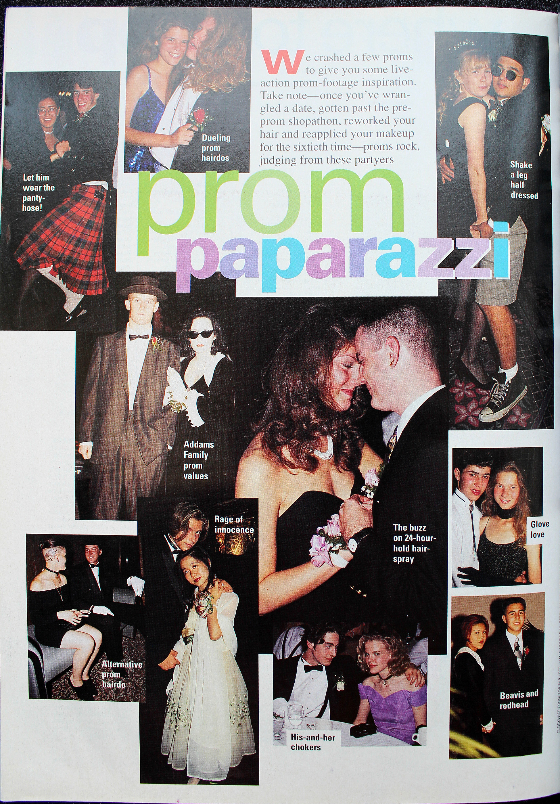
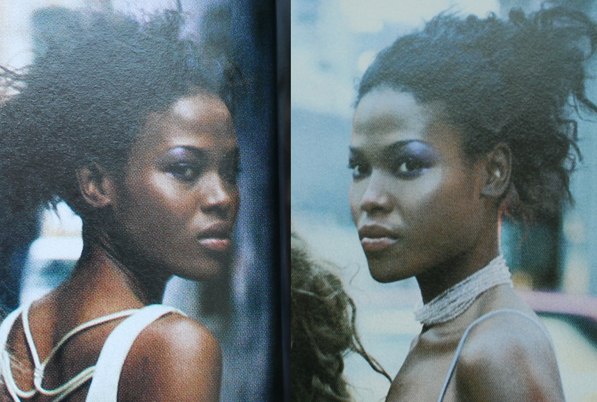
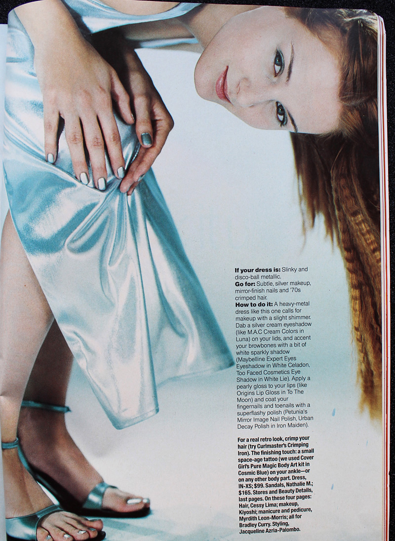
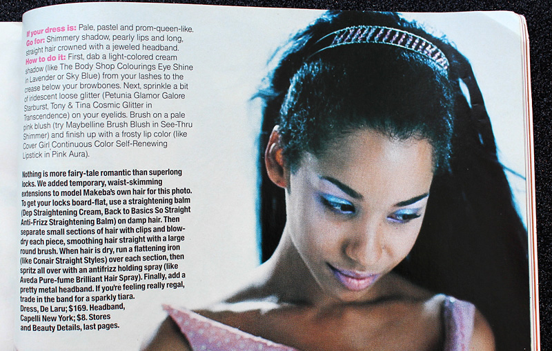
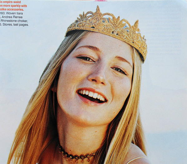
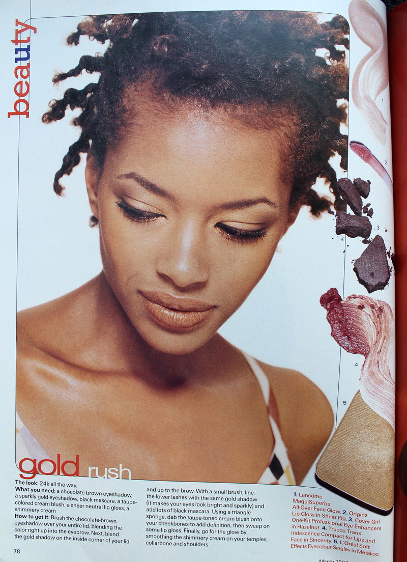
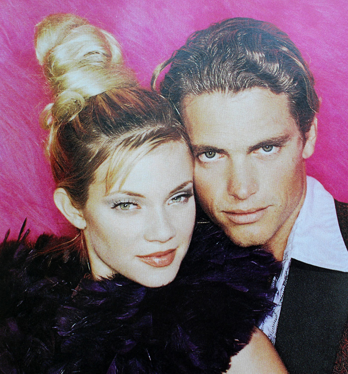
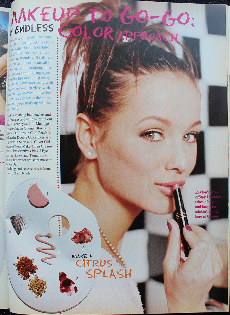
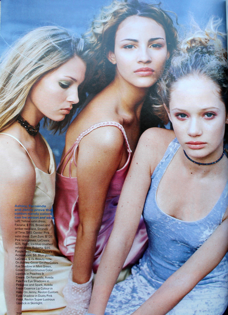
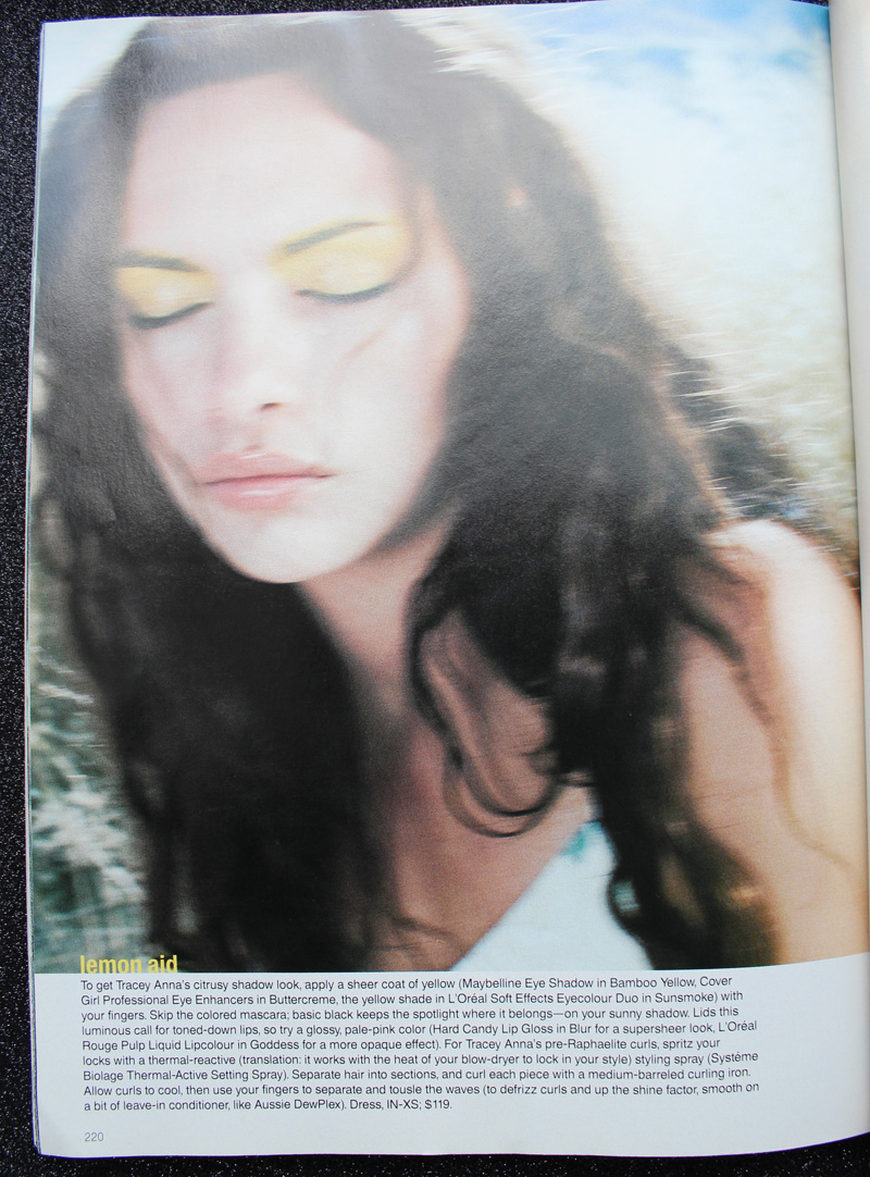
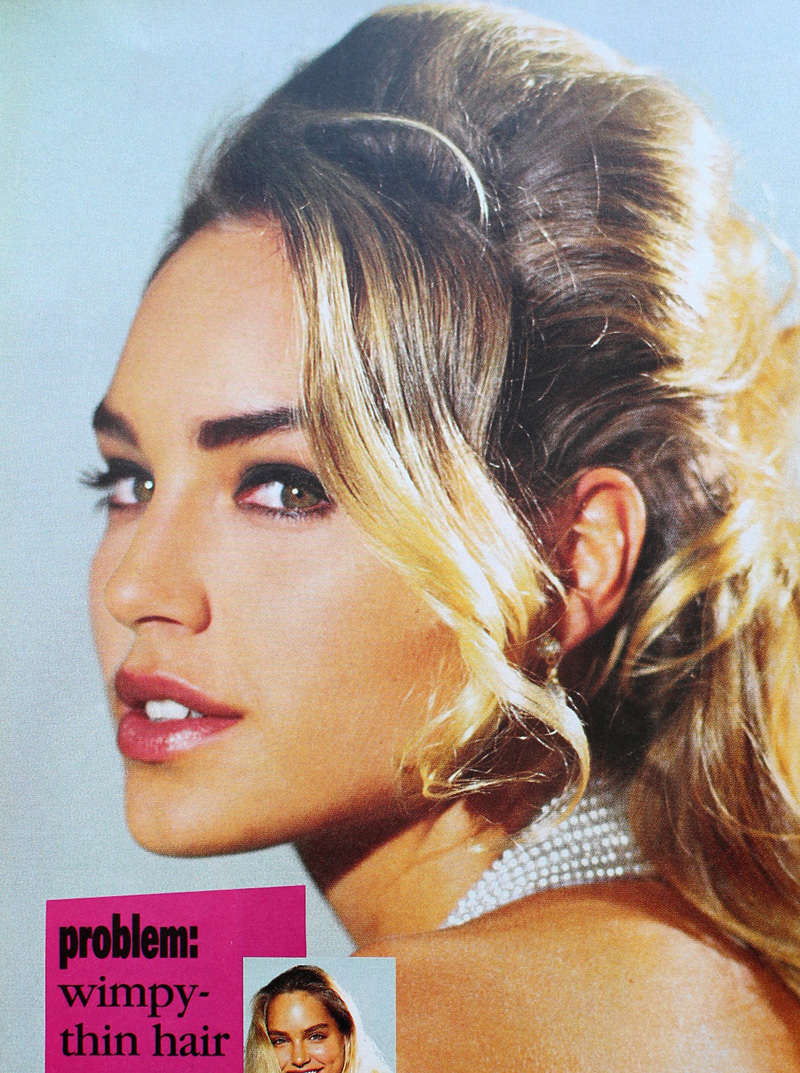
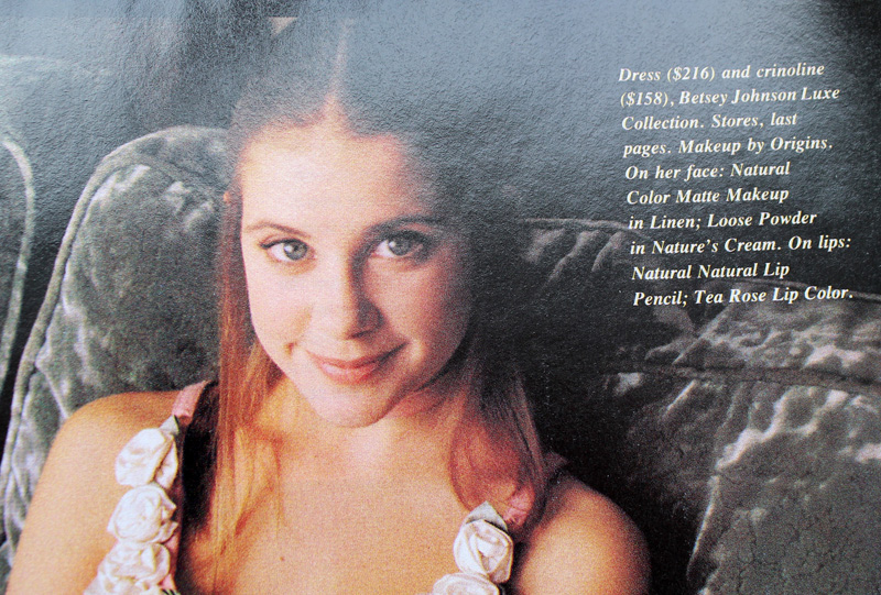
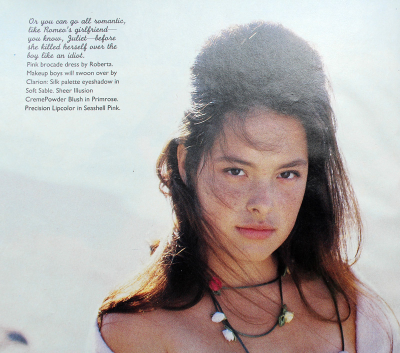
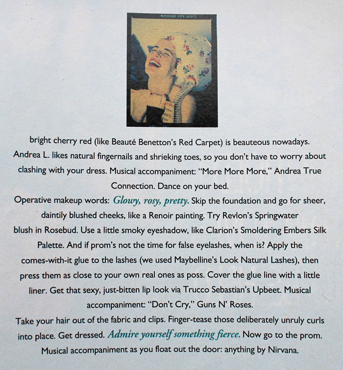
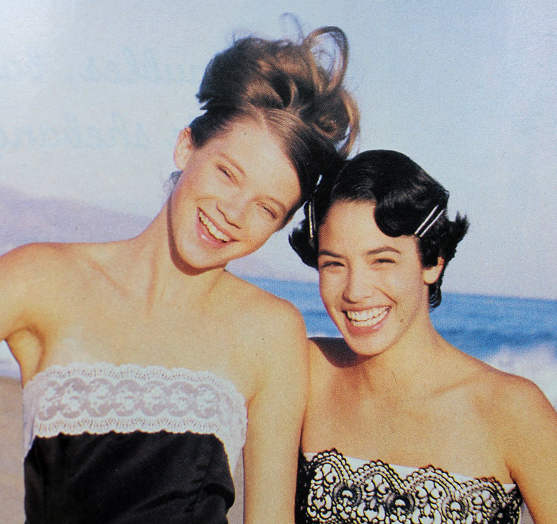
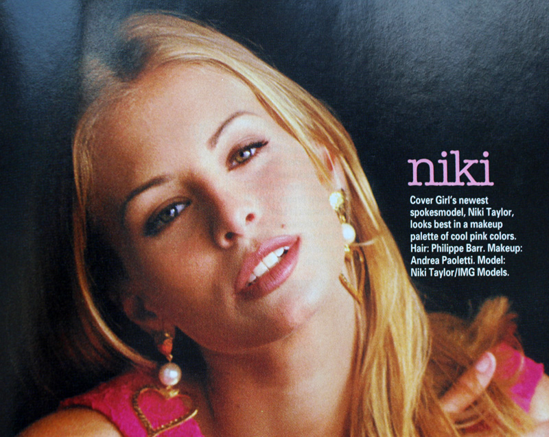
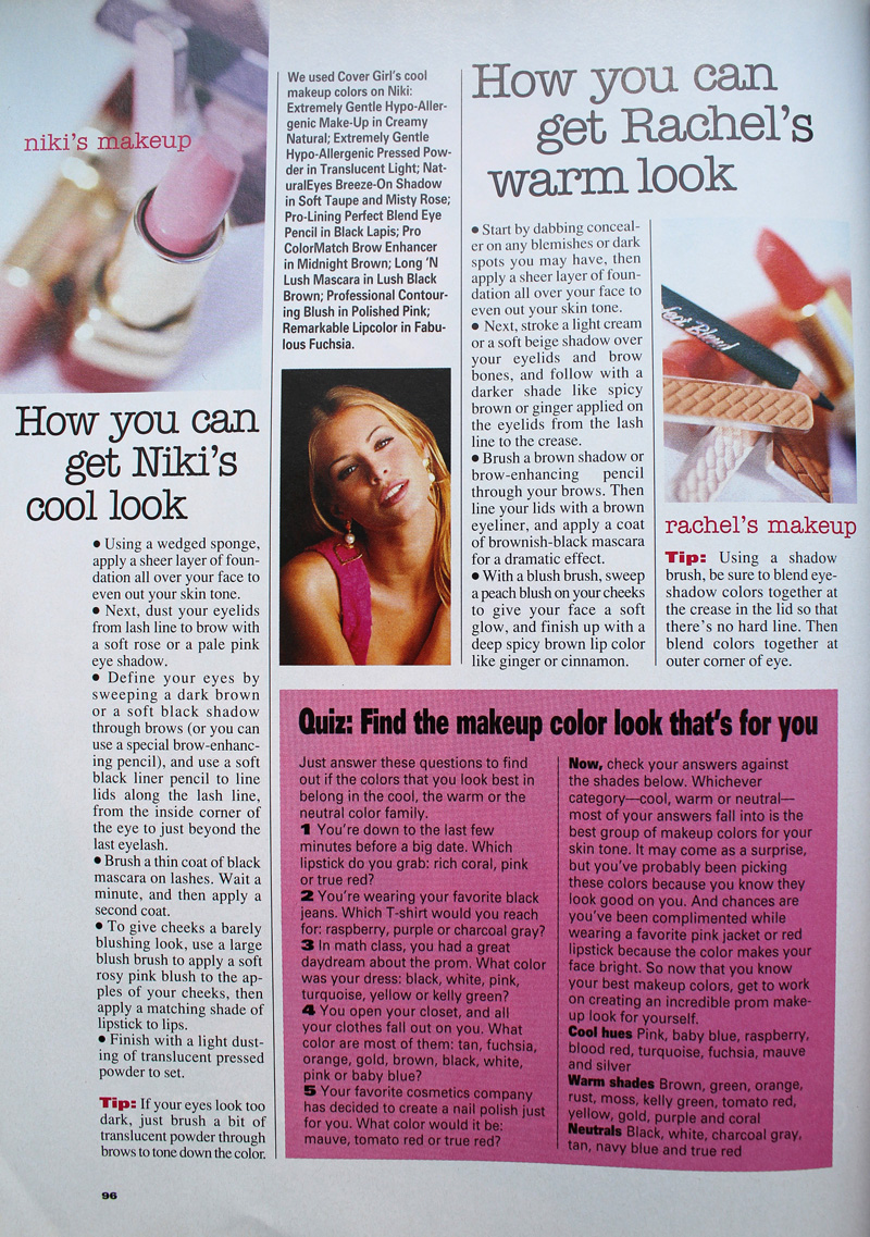
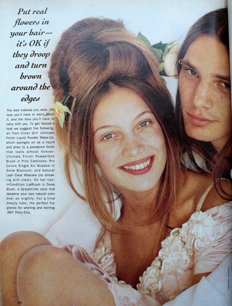
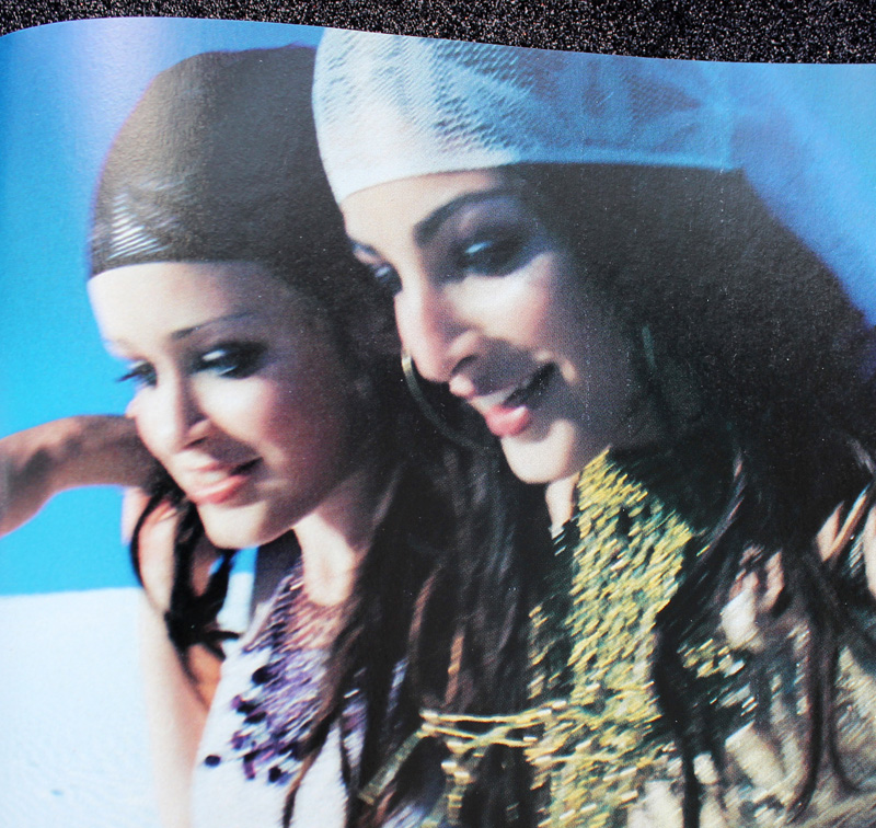
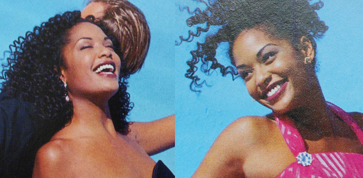
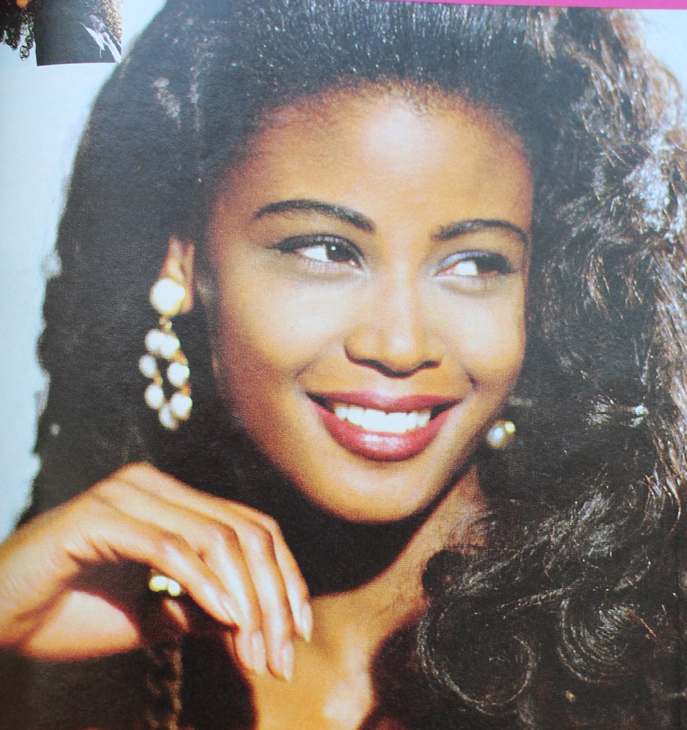
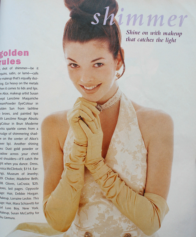
I really enjoyed the shorter bits of history that appeared between chapters in Lisa Eldridge’s Face Paint. I liked the idea so much, in fact, that I decided to steal it and use it for my ’90s makeup history book. Prom makeup is just one of the many featurettes I want to include. And I realize that prom season has come and gone by this point, but I’m still thinking how crazy it is that I graduated high school and attended my senior prom 25 years ago this spring! So with that, let’s see what pop culture and magazine editorials were recommending in terms of prom makeup. Obviously this isn’t meant to be an exhaustive list of every ’90s prom look ever and how they compare to today’s styles, nor is it a philosophical examination of prom and its greater cultural or social significance, especially for teenage girls. This post is really more of a nostalgic snapshot, especially since sources were hard to find. There are tons of vintage prom photos online but the makeup is barely visible, either because analog photos rarely translate well to digital images or because they were taken at a distance. Very few clear, closeup images of old prom makeup exist, so I had to rely mostly on magazines, movies and TV episodes and they weren’t great quality either. Also, I credited where I could, but not all information was available for every photo.
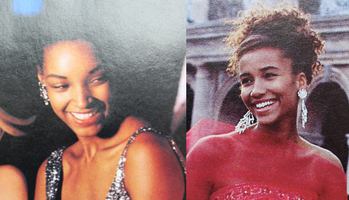
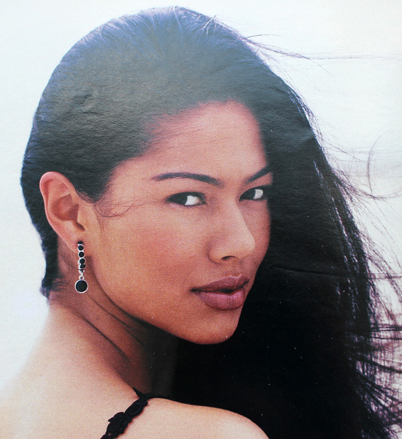
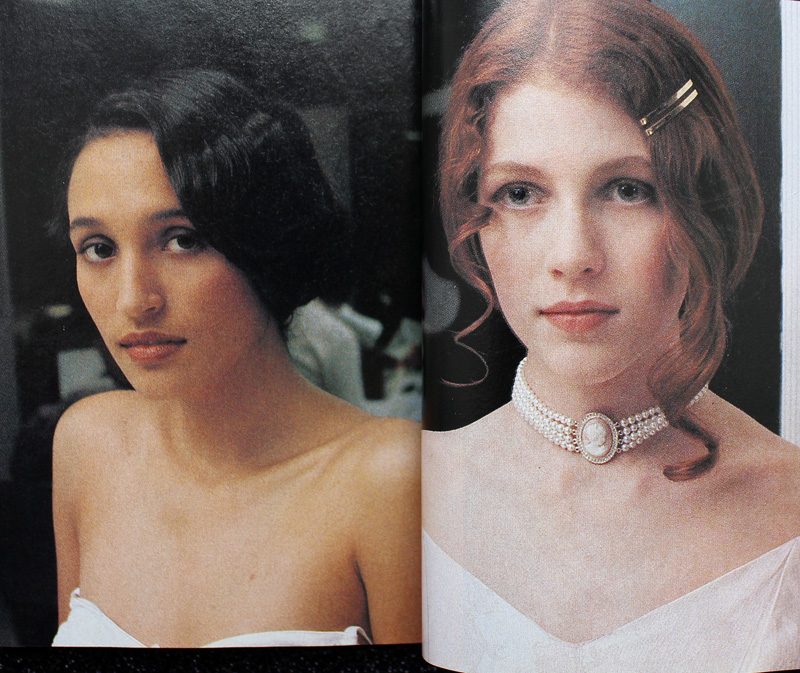
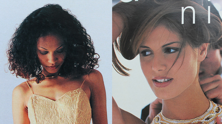
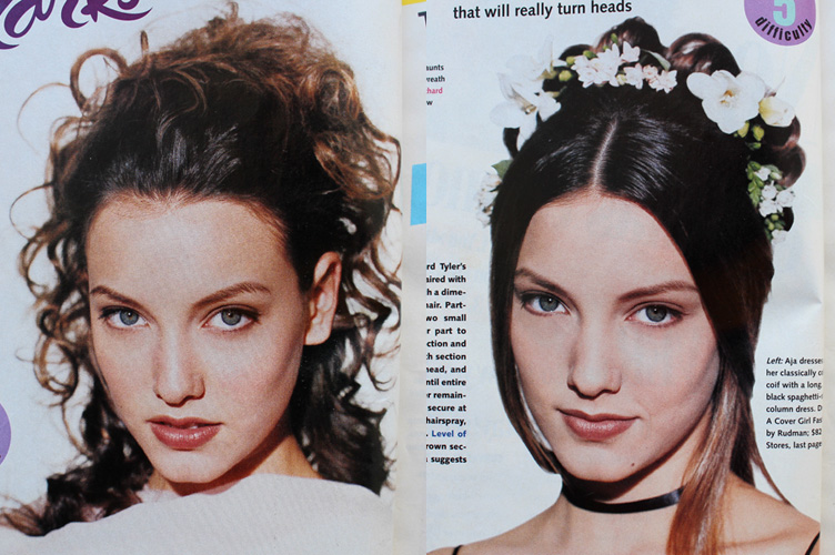
Overall, the decade followed the general makeup trends of the time. As a sort of backlash to the bright colors and general excess of the ’80s, from about 1990-1994 the majority of prom looks featured minimal, barely perceptible makeup.

Minimal prom looks from Seventeen Magazine, 1992 (left) and 1991 (right). Credits for 1992: Hair – Hubert Cartier and Gili. Makeup: Timothy Metz. Photography: Wayne Stambler. Credits for 1991: Hair – Rodney Groves; Makeup – Timothy Metz; Photography – Tierney Gearon.

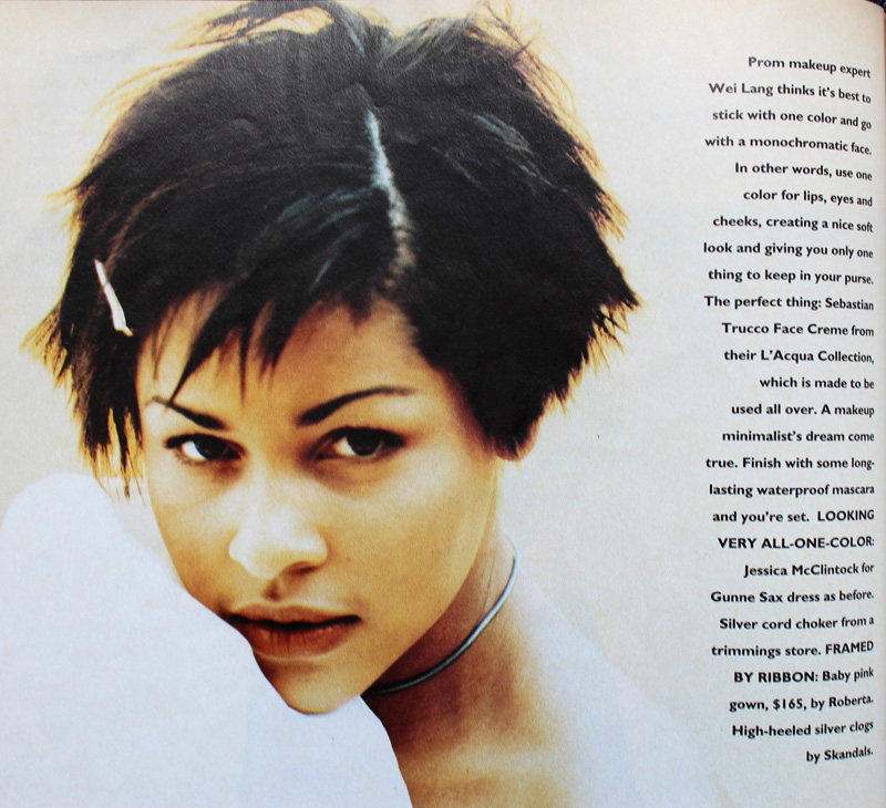
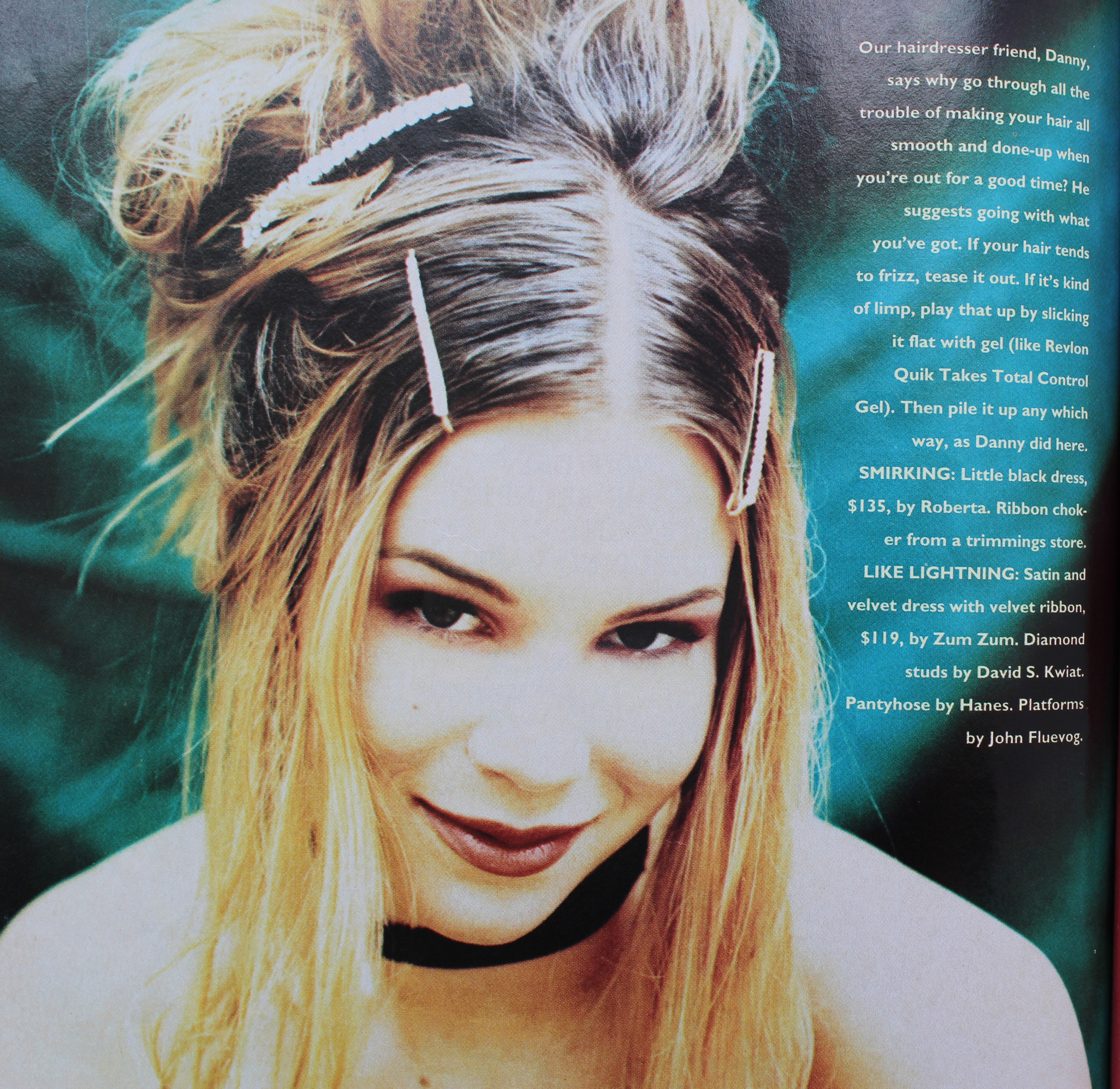
Sassy Magazine, 1993. Hair – Daniel Howell; Makeup – Wei Lang; Photography – David Jensen
Are these girls even wearing makeup?! I guess they are since the credits list a makeup artist, but it’s nearly invisible.

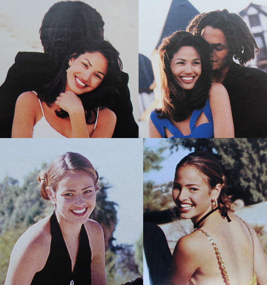
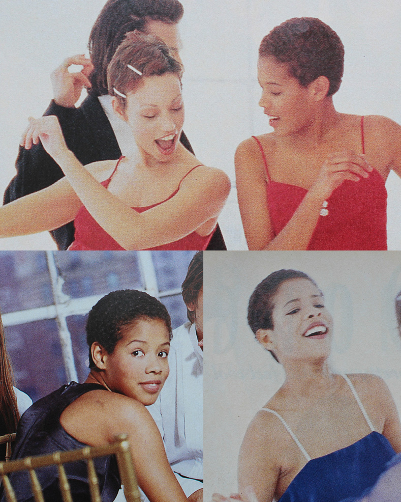
YM Magazine prom edition, 1994. Credits for top photos: Hair – Christopher Lockhart for Sarah Laird; Makeup – Christy Coleman for Jed Root, Inc. Credits for bottom photos: Hair – Brent Lavent for Celestine; Makeup – Laura Jadro for Visage; Photography – Carlo Dalla Chiesa

YM Magazine prom edition, 1994. Hair – Christopher Lockhart for Sarah Laird; Makeup – Mathew Sky for Vartali Salon. Makeup by Maybelline.

Sassy Magazine, March 1994. Hair – Daniel Howell for Oribe; Makeup – Regina Harris; Photography – Cathrine Wessel
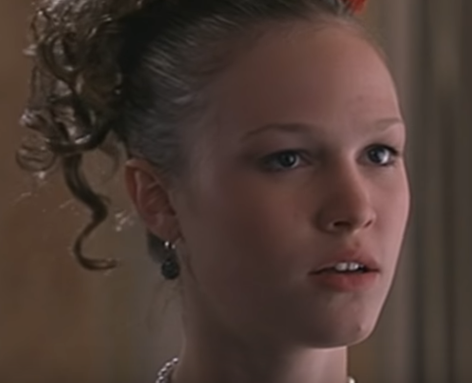
Julia Stiles’s character in 1999’s 10 Things I Hate About You opted for a minimal look for prom, but this might have been more of a stylistic choice to go match her personality rather than a reflection of late ’90s trends. Kat Stratford would never go for the glitter, frost and pastel colors that were popular towards the end of the decade.

Julia Stiles as Kat Stratford in 10 Things I Hate About You, 1999. Makeup artist: Martin ‘Vinnie’ Hagood
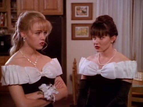
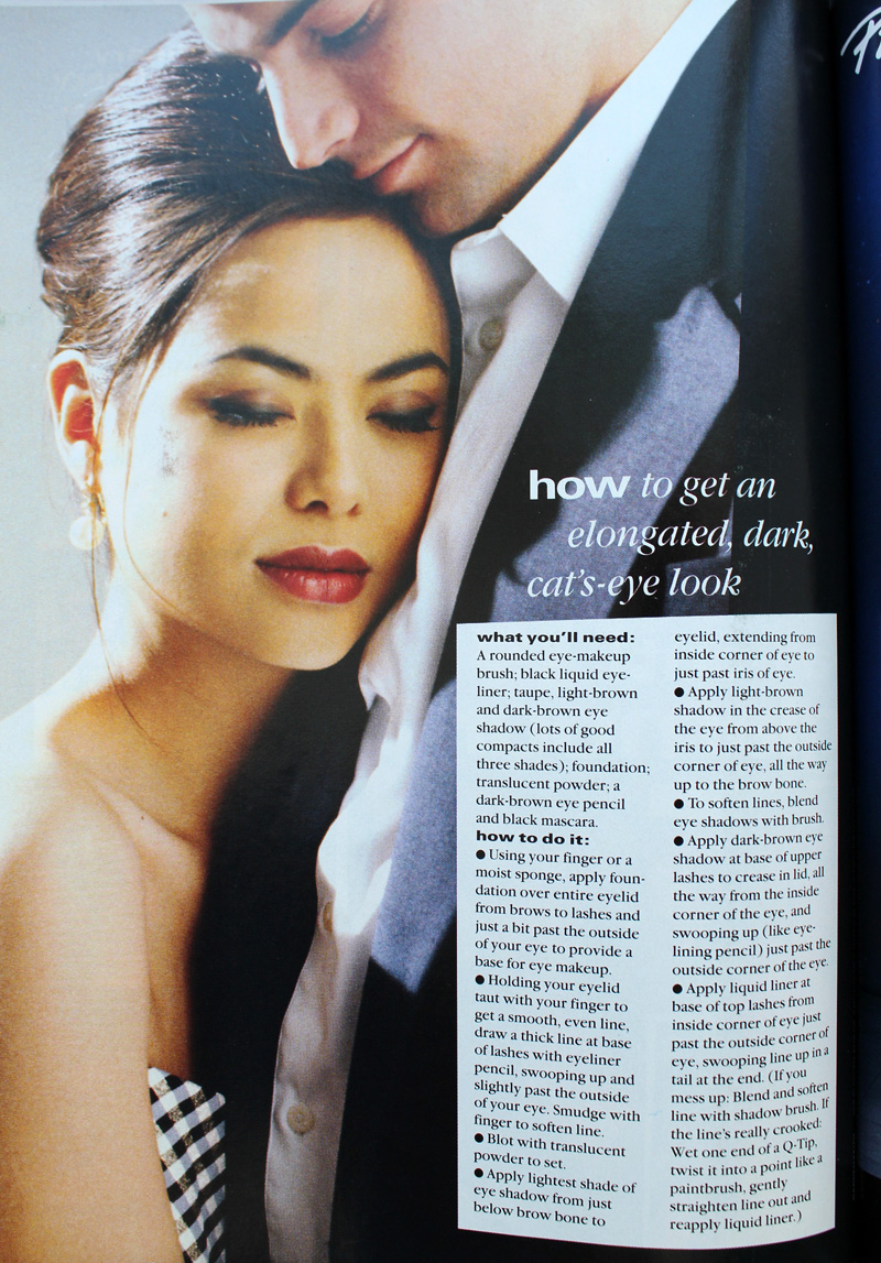
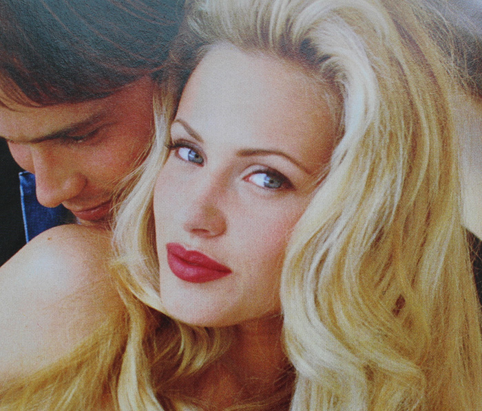
Another trend early on was a return to old school glam. Red matte lips, with or without a winged liner but always keeping the rest of the face neutral, was a popular choice.

Kelly (Jennie Garth) and Brenda (Shannen Doherty) in Beverly Hills, 90210 “Spring Dance” episode, 1990. Key makeup artist – Sheree Morgan; makeup artist – Alex Proctor.

Seventeen Magazine, March 1991. Hair – Gabriel Saba for John Sahag Salon; Makeup – Jacqui Lefton; Photographer – Dewey Nicks; Model – Limor Luss

Kellie Martin in Seventeen Magazine, March 1992. Hair – Patrick Melville for MCM Salon; Makeup – Tracy Sondern; Photography – Bico Stupakoff

Sassy Magazine, March 1995. Hair – Diane Wiedenmann; Makeup – Sharon Gault for Cloutier
Again, as with 10 Things I Hate About You‘s Kat, I think Heather’s (Mena Suvari) red lip more a stylistic choice to better suit the character rather than part of a real-world trend. (Sorry about the lack of quality in this photo, I couldn’t find a decent shot anywhere. Also, no fewer than 7 makeup artists for American Pie are listed at IMDB so it’s not clear who chose her look.)

Just based on these candids from YM’s prom issues, it seems like a lot of girls opted for a red lip or the minimal look for prom for 1993 and 1994.

YM Magazine prom edition, 1993

YM Magazine prom edition, 1994
There was also a somewhat odd combination of soft smoky matte grey or brown shadow and a desaturated but noticeable lip color. I don’t really remember this look, probably because I can’t say that the early ’90s take on a smoky eye is a look I enjoy. It just looks flat and muddy, plus very amateur despite the professional application. It’s like someone dipped their fingers into shadow, swiped them across their lids, added a touch of mascara and declared their eye makeup finished. Which would be fine with different textures and shades, but matte shadow in these colors requires some definition.

Seventeen Magazine, March 1992

YM Magazine prom edition 1993
My opinion is that it suits nobody, not even Heidi Klum.

YM Magazine prom edition 1994. Credits for left photo: Gerald DeCock for Louis Licari Color Group; Makeup – Christy Coleman for Jed Root, Inc. Credits for right photo: Hair – Lawrence DePalma for Pierre Michel Salon; Makeup – Christy Coleman for Jed Root, Inc. Model: Heidi Klum
A monochromatic face is surprisingly artistic and flattering if there’s variation in textures and finishes between eyes, cheeks and lips. Matte brown shadow with seemingly no other eye makeup besides a hint of mascara and paired with a warm, orange-brown lip isn’t great on most people. Case in point: these prom looks from the March 1994 issue of Seventeen. I know they were really meant to show the hairstyle, but they are so boring! Plus it looks awful on the skin tone of the particular model that was chosen – the poor thing looks like the life got sucked out of her. This combination only works on very specific coloring.

Seventeen Magazine, March 1994. Hair – Mara Schiavetti; Makeup – Cindy Joseph
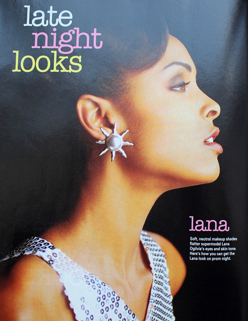
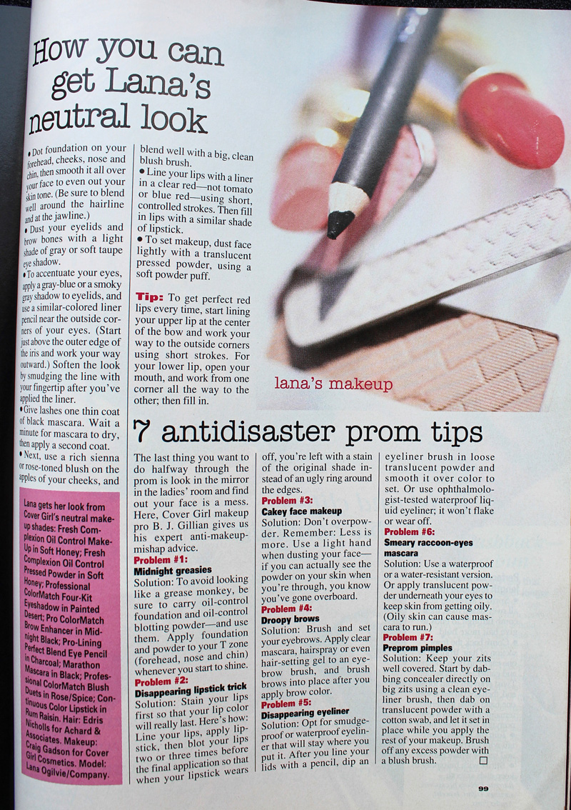
Matte, one-dimensional shadow works if the eyeliner is noticeably darker and there is a contrast in tone for the lip color, as in YM‘s 1993 prom editorial.

YM Magazine prom edition, 1993. Model: Lana Ogilvie. Makeup Artist: Craig Gadson for Cover Girl.

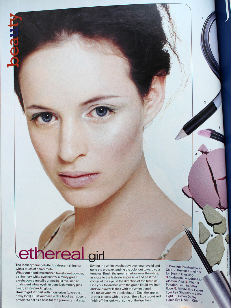
But there is hope. Around 1996 is when we start to see a move away from matte textures and neutral shades. Bring on the metallics, the frost, the GLITTER!!

Seventeen Magazine, March 1997. Hair – Dennis DeVoy for Garren New York; Makeup – Kiyoshi for Oribe Salon; Photography – Iris Brosch

Seventeen Magazine, March 1999

Seventeen Magazine, March 1999

Seventeen Magazine, March 1999

Seventeen Magazine, March 1997. Hair – Matthew Williams; Makeup – Virginia Carde; Still life photos – Aimeé Herring; Model photos – Olivia Graham
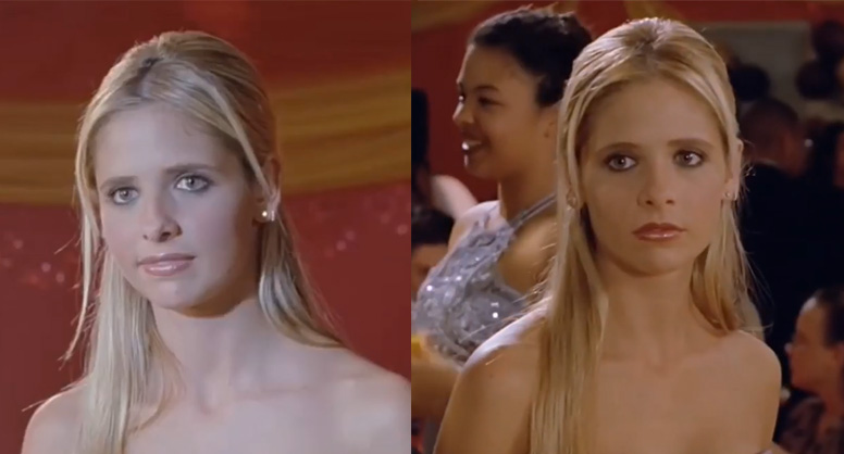
There were literally dozens of makeup artists who worked on Buffy the Vampire Slayer, so I’m not sure who was responsible for Buffy’s prom makeup, which consisted of a soft silvery grey eyeshadow and pearly pink gloss.

Sarah Michelle Gellar in “The Prom” episode of Buffy the Vampire Slayer, 1999
Complexion-wise, foundation was less heavy and flat. Even though the early ’90s embraced the minimal look, skin still looked a bit dull. There were also few glossy lips to be found. The later part of the decade witnessed a shift towards fresher-looking skin (perhaps more blush added to this effect) and the rise of super shiny lips, which would continue into the early 2000s.

Seventeen Magazine, March 1997. Hair – Matthew Williams; Makeup – Virginia Carde; Still life photos – Aimeé Herring; Model photos – Olivia Graham
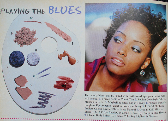
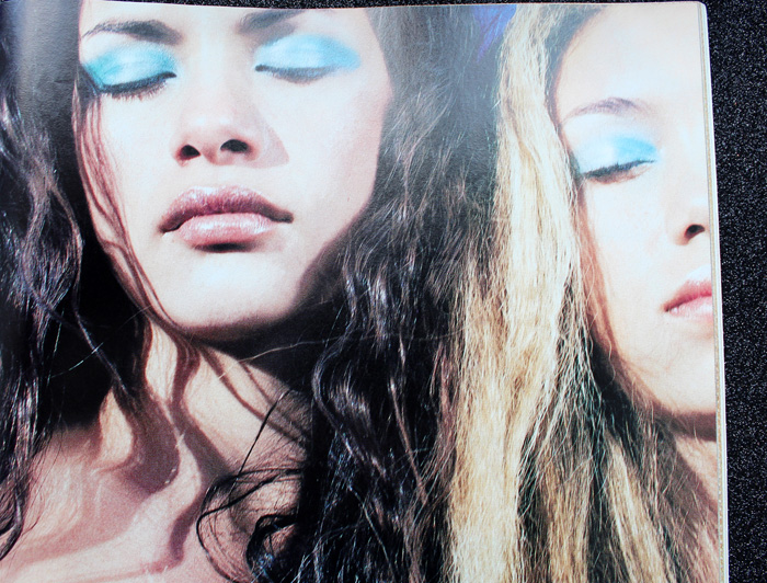
Also, there was interest in color again – no longer was the palette limited mostly to red, pink, grey and brown. Blue, peach, yellow, violet and green peeked their eager little faces out for the first time in what seemed like ages.

Sassy Magazine, March 1996

Sassy Magazine, March 1996

Sassy Magazine, March 1996

Seventeen Magazine, March 1997. Hair – Dennis DeVoy for Garren New York; Makeup – Kiyoshi for Oribe Salon; Photography – Iris Brosch

Seventeen Magazine, March 1998. Hair – Kevin Woon; Makeup – Kiyoshi; Photography – Marc Baptiste

Seventeen Magazine, March 1998. Hair – Kevin Woon; Makeup – Kiyoshi; Photography – Marc Baptiste
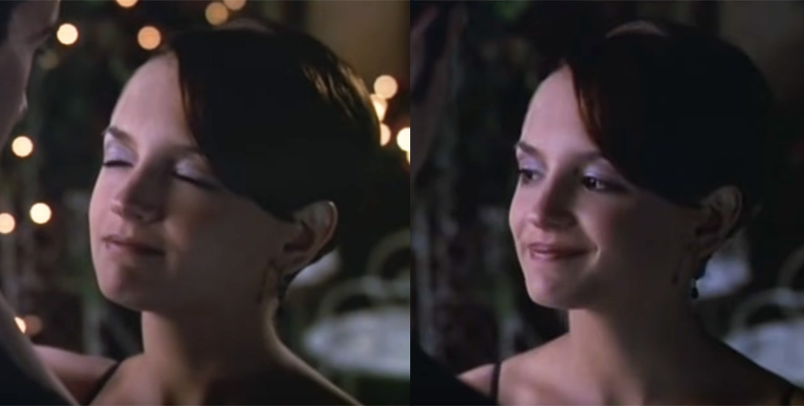
I really wish I could have found better photos of the makeup in prom scenes from movies and TV. (Seriously though, what was up with all the prom sequences in films from 1999? It seems nearly every teen movie made that year had one.) In these stills that I screenshotted and tried to brighten from She’s All That you can sort of make out Laney’s violet eyeshadow and browbone highlight.


Rachel Leigh Cook as Laney Boggs in She’s All That, 1999. Head makeup artist – Felicity Bowring; Makeup artists – Raqueli Dahan, Jane Galli and Lisa Layman
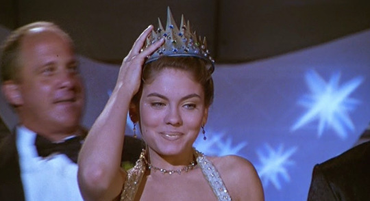
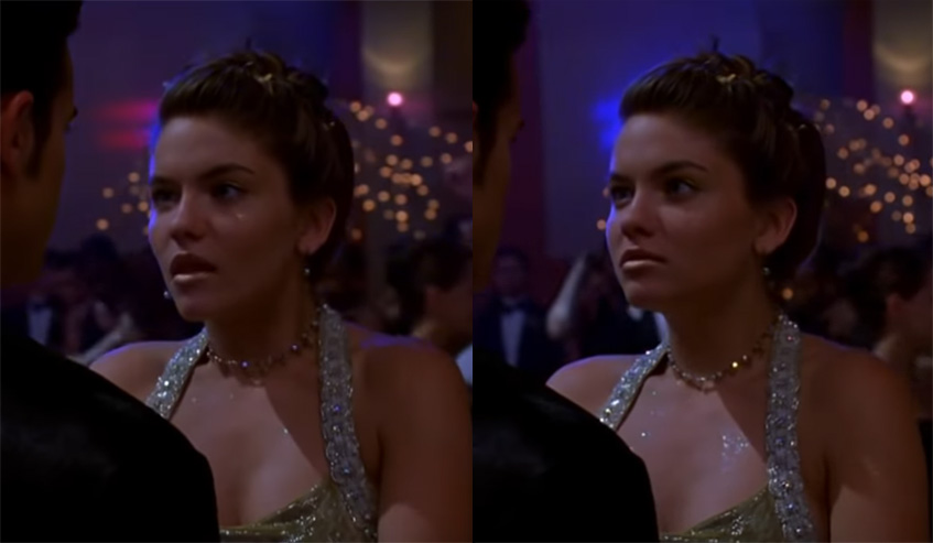
Meanwhile, mean girl Taylor Vaughan (Jodi Lyn O’Keefe) rocked a monochromatic gold look, complete with face and body glitter. Peak ’90s!


And let’s not forget Courtney’s epic frosty blue eyeshadow in 1999’s Jawbreaker. Once again there was a huge makeup department so whose idea it was I’m not sure.
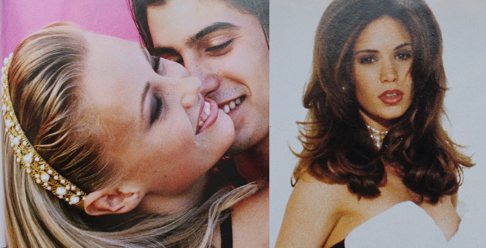
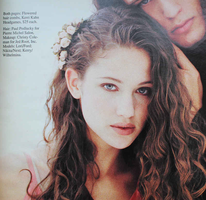
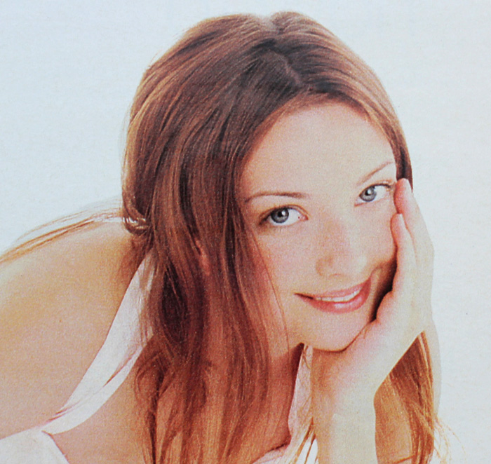
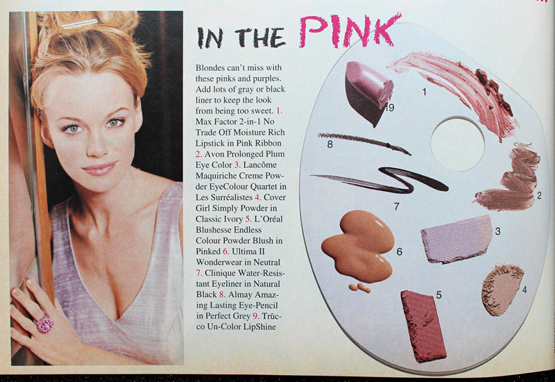
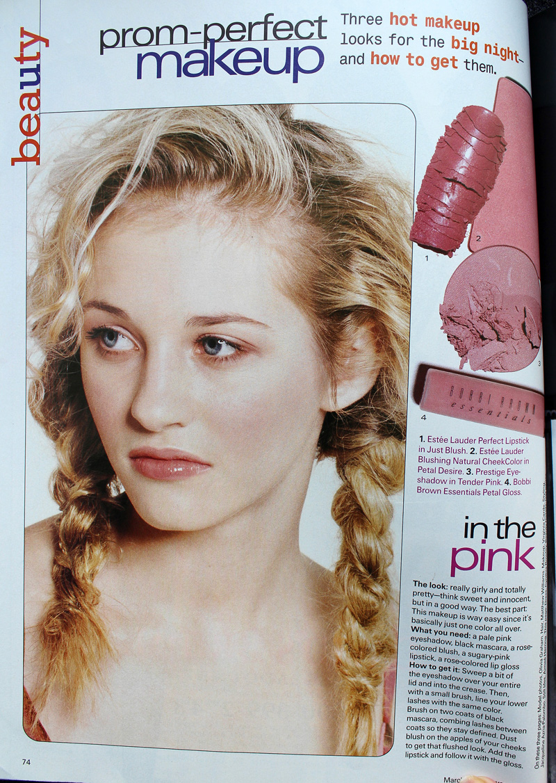
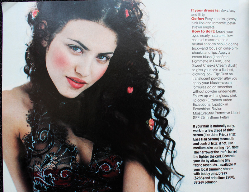
Now there were some trends that appeared in various iterations throughout the whole decade rather than being confined to certain years. Pink reigned supreme for prom makeup in the ’90s. Whether it was full-on bubblegum or a more natural, “romantic” look, rosy hues were a staple.

YM Magazine prom edition 1992. Hair – Brian Devine, Oribe at Elizabeth Arden; Makeup – Melissa Rogers

Kellie Martin in Seventeen Magazine, March 1992. Hair – Patrick Melville for MCM Salon; Makeup – Tracy Sondern; Photography – Bico Stupakoff

Sassy Magazine, March 1992. Hair – Colleen Creighton for Pierre Michel; Makeup – Lutz; Photography – Steven Miller


Sassy Magazine, March 1992. Hair – Colleen Creighton for Pierre Michel; Makeup – Lutz; Photography – Steven Miller


Sassy Magazine, March 1994. Hair – Daniel Howell for Oribe; Makeup – Regina Harris; Photography – Cathrine Wessel

YM Magazine prom edition, 1994

YM Magazine prom edition, 1994. Hair – Gerald DeCock for Louis Licari Color Group; Makeup – Mara Schiavetti for Jean Owen

Sassy Magazine, March 1995. Hair – Diane Wiedenmann; Makeup – Sharon Gault for Cloutier

Sassy Magazine, March 1996

Seventeen Magazine, March 1997. Hair – Matthew Williams; Makeup – Virginia Carde; Still life photos – Aimeé Herring; Model photos – Olivia Graham

Seventeen Magazine, March 1999
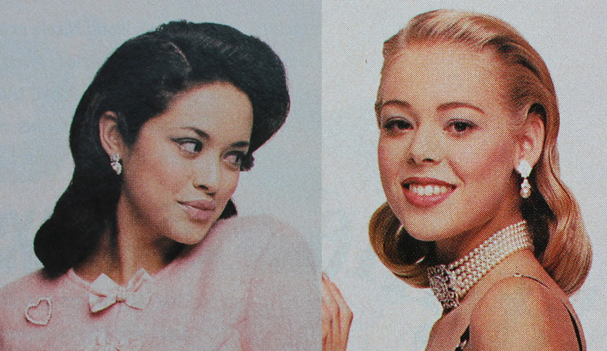
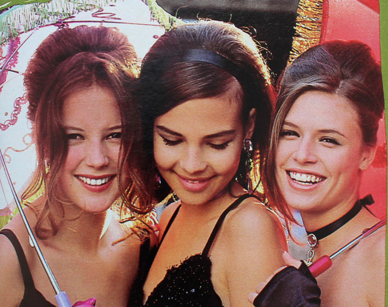
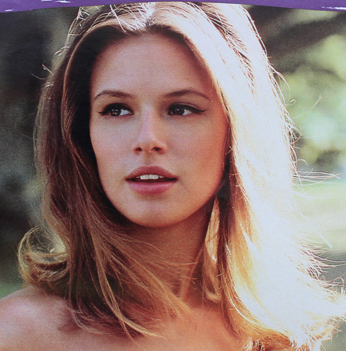
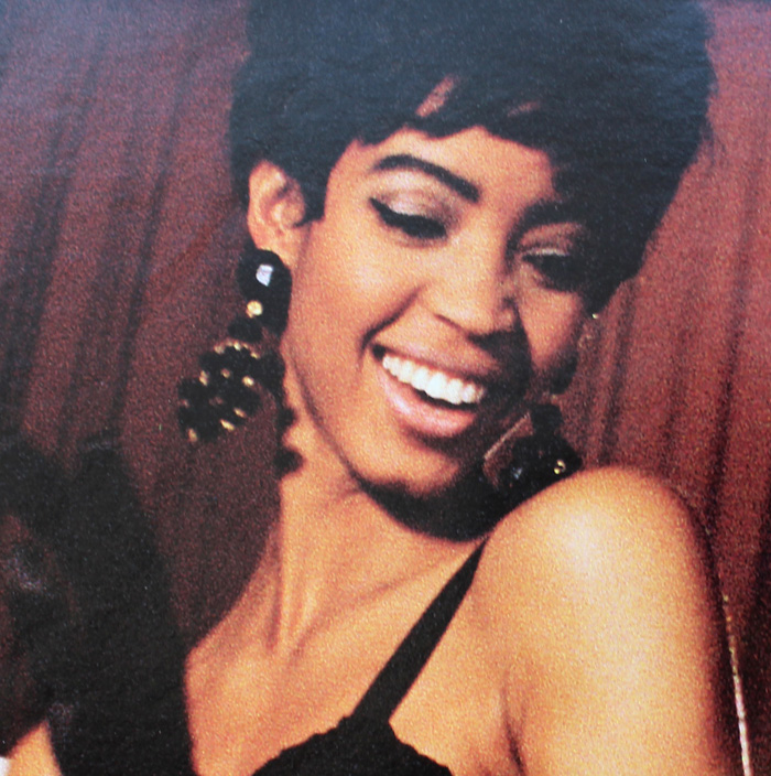
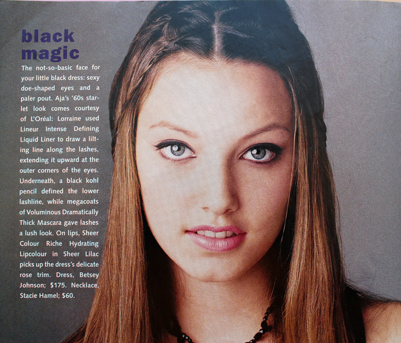
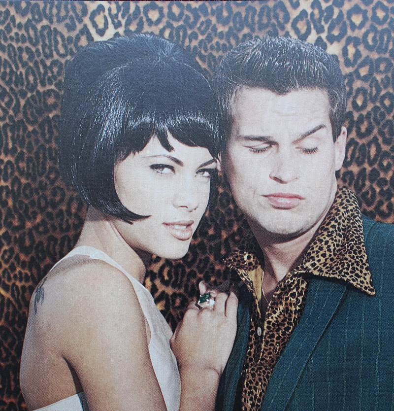
Sixties-inspired makeup also seemed to be a popular pick in both the early and later parts of the decade.

Seventeen Magazine, March 1991. Credits: Hair – Rodney Groves; Makeup – Timothy Metz; Photography – Tierney Gearon

Seventeen Magazine, March 1991. Credits: Hair – Rodney Groves; Makeup – Timothy Metz; Photography – Tierney Gearon

YM Magazine prom edition 1992

Seventeen Magazine, March 1991. Hair – Gabriel Saba for John Sahag Salon; Makeup – Jacqui Lefton; Photographer – Dewey Nicks

Seventeen Magazine, March 1994. Hair – Debbie Horgan; Makeup – Lorraine Leckie; Photography – Troy House

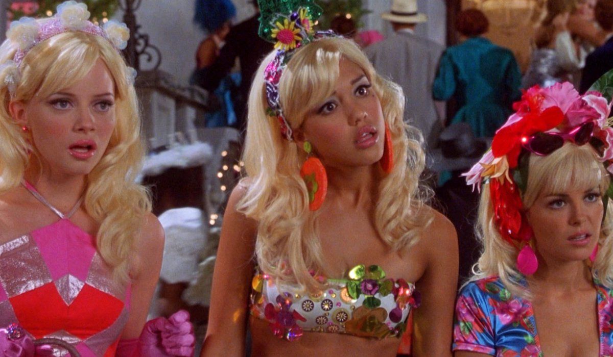
The most outrageous example is possibly from 1999’s Never Been Kissed. It’s like ’60s mod meets Evening Gown Barbie, Disco Barbie and Malibu Barbie, respectively (at least, according to the characters).

Never Been Kissed, 1999 with Kristin (Marley Shelton), Kirsten (Jessica Alba) and Gibby (Jordan Ladd). Makeup dept. head – Kimberly Greene; Makeup artists: Joni Powell and Lyssa Wittlin Baumert
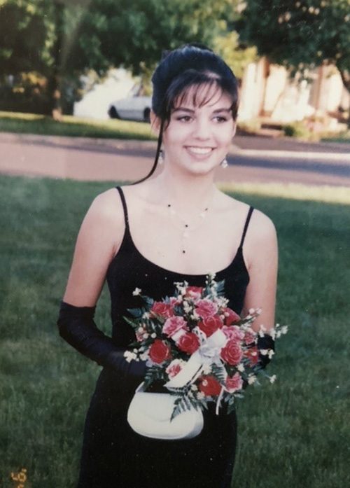
Yours truly opted for the more subtle look. Yup, that’s the Curator at age 17, doing her best impression of Audrey Hepburn in Breakfast at Tiffany’s for her senior prom. I eschewed my usual dark plum lip in favor of Holly Golightly’s pale pink, and though you can’t make it out in this old picture, I also had some pretty serious feline eyeliner. (I actually am a disaster at winged liner; my sister’s friend did my makeup). Too bad I had to ruin my updo by adding the ever-present ’90s tendril…then again, the bangs were already atrocious. But I loved my makeup, gloves, jewelry (shout-out to Y necklaces!), and dress. I really regret getting rid of those last two.

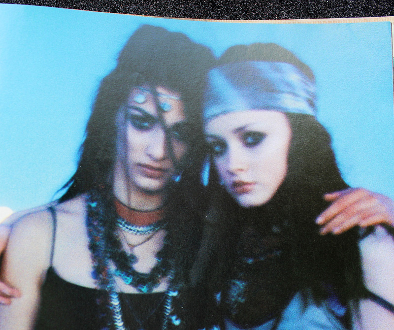
Finally, grunge, goth and punk influences occasionally emerged from subculture status on a decade-wide basis.

Sassy Magazine, March 1993. Hair – Daniel Howell. Makeup – Wei Lang. Photography – David Jensen

Seventeen Magazine, March 1997. Hair – Pasquale Ferrante; Makeup – Susan McCarthy for Shu Uemura; Photography – Grey Zisser
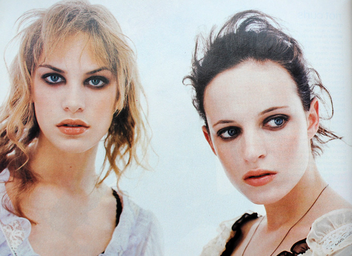
The models aren’t named in these next two photos but I’m almost positive I spy Alexis Bledel.

Seventeen Magazine, March 1998. Hair – Kevin Woon; Makeup – Kiyoshi; Photography – Marc Baptiste

Seventeen Magazine, March 1998. Hair – Kevin Woon; Makeup – Kiyoshi; Photography – Marc Baptiste
There were a handful of exceptions to all the usual looks. In one feature from YM‘s 1993 prom edition, a red lip was paired with a pale gold shadow rather than brown or grey and it actually looks like some blush was applied. I would absolutely wear this today (minus the skinny brows, of course.)

Hair – Howard Barr for Celestine; Makeup – Wendy Osmundson for Cloutier; Model – Melissa Billingsly.
These next two looks had some appealing contrast between eyes and lips. While the eyebrow shapes are firmly ’90s, the mix of either cool purple or silver shadow with a satin-finish plum or pink lip falls outside the usual trends from the era.

YM Magazine prom edition, 1993. Hair – Phillippe Barr for Salon Ziba; Makeup – Kelly Quan for Sarah Laird.

YM Magazine prom edition 1992. Hair – Brian Devine, Oribe at Elizabeth Arden; Makeup – Melissa Rogers
And here’s another monochromatic gold look, but it’s several years ahead of its time.

Seventeen Magazine, March 1994
But there weren’t really many outliers. Overall, prom makeup in the ’90s seemed very much a microcosm of the larger trends of the decade. It was a little disappointing not to uncover any totally atypical looks (although I do think the late ’90s was way more fun than the start of the decade). But I’m guessing the big magazines and movie studios/TV shows weren’t going to push much unconventional prom makeup or feature anyone who wore it, and those who would opt for more daring looks on a regular basis probably weren’t going to prom. Fortunately, mainstream media has somewhat caught on to a new aesthetic. The styles are very safe in most magazine covers and online content. The looks are nice and definitely updated from the ’90s, but they are, shall we say, basic, or mimicking “Instagram” style makeup. However, a closer look suggests there is experimental, Euphoria-type makeup being recommended, such as the incorporation of embellishments (flowers, gems, etc.), graphic liner in a bright color, or creative use of glitter. For example, compare several of Seventeen‘s recent prom covers with their online recommendations, or the fairly unremarkable cover look on Teen Vogue‘s 2014 prom issue with the far more interesting editorial inside. (Diversity in terms of race and body shape/size still needs work.)
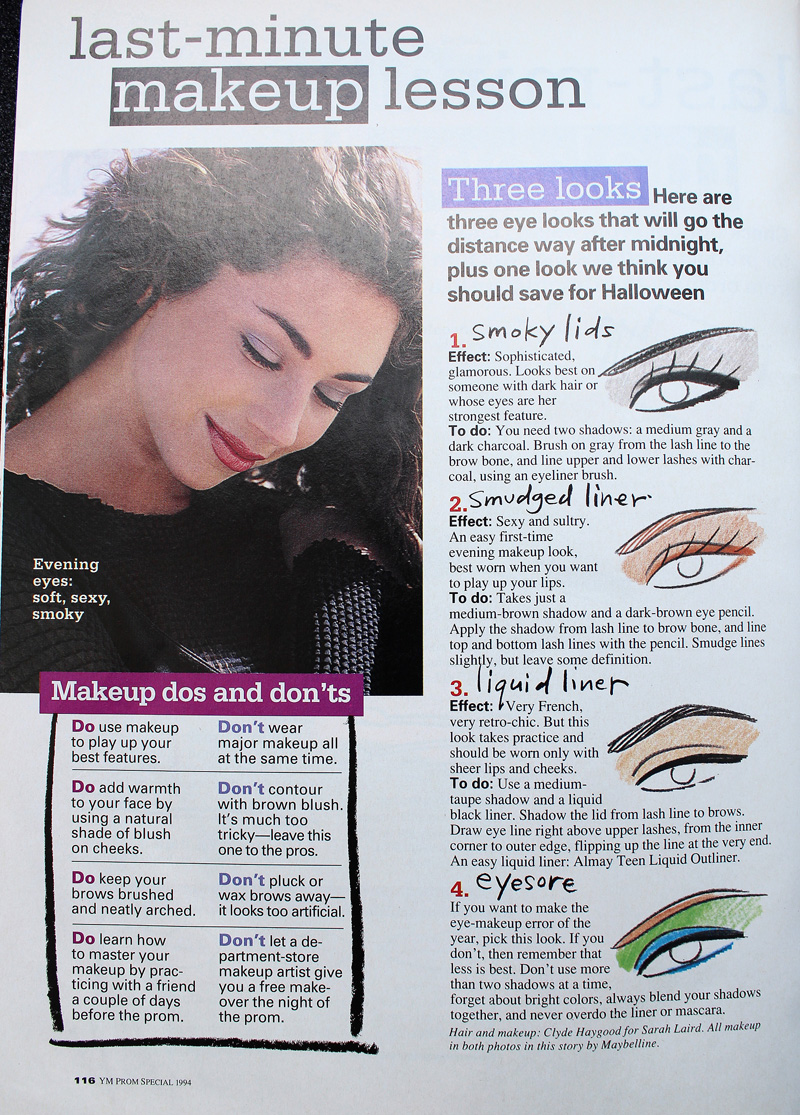
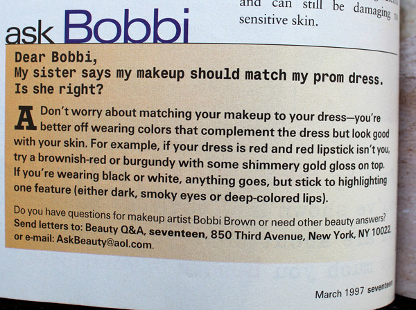
I was very relieved to see these looks, as I was horrified at the possibility of Gen Z’ers receiving the same advice that me and my fellow Gen X’ers did, i.e., to play it safe. In my day prom was akin to one’s wedding in terms of makeup (which is another whole disturbing can of worms that I don’t want to open right now.) The most common tips for both occasions were to play up one feature only, stay away from using multiple colors, and don’t deviate much from your everyday look, along with a bunch of tricks to help one’s makeup last longer. Ho-hum.

Not surprised by Bobbi advocating for safe makeup.

If simple and natural is your style, or you don’t want to try anything too wild for a big occasion, great! But I’d like it if makeup that actually takes risks were as normalized as looks featuring minimal makeup.
While this hasn’t been the most insightful post, a glimpse of ’90s prom makeup serves as a good refresher on the decade and helps give more context to the trends. Plus as a print junkie, it was insanely fun to flip through old magazines. (The movies did not hold up well..although honestly even at the time they were fairly problematic.) It kind of makes me want to do a whole book or exhibition on prom makeup from all decades. 😉
Any favorite looks here? Did you attend any proms or formals in high school and if so, do you remember your makeup or have any photos you’d be willing to share?
 Tooting my own horn again, apologies. But I was so excited to be interviewed for an article on the history of blush and its current resurgence (and in which I was referred to as an "expert"!) In case you haven't noticed, blush is back with a vengeance. You can click over to Hypebae for the article, but given how much time I spent answering the journalist's questions I thought I'd post my full answers here. Plus, more Museum photos! Enjoy…and please let me know any and all thoughts on blush in the comments. 🙂
Blush has been used in ancient cultures across Egypt, Greece and more. Can you walk us through the origins of blush and explain how it was used in different areas of the world? (Please feel free to include as much detail as possible.) The ancient Egyptians were most likely the first to use blush as a cosmetic aid. A fresco in Santorini from the Bronze Age depicts women with red cheeks, the rest of their faces unadorned. In China, blush was used as early as the Shang Dynasty (1600-1046 BCE). Later, during the Tang Dynasty reign, imperial concubine Yang Guifei (719-746 AD) regularly wore heavy blush at court. In Greece and Rome, blush was primarily used by upper class women and applied in a subtle way; noticeable check color was frowned upon. Blush also crossed gender lines throughout some early civilizations and up through the 18th Over time, as white supremacy grew ever more powerful, blush became part of an “ideal” complexion that signified wealth and high status – blush was used in part as a way to make pale skin stand out more, which was desirable as white skin represented a life free from toiling outside. At the same time, for the most part blush was supposed to be undetectable. It wasn’t until the 20th century that blush became socially acceptable.

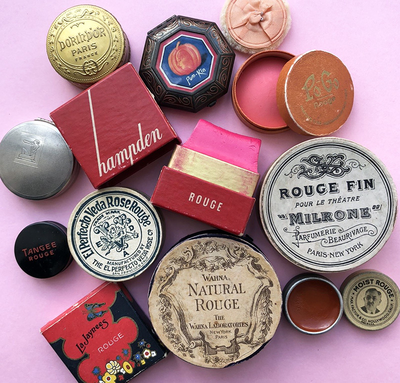
A selection of the Makeup Museum's vintage blushes, ca. 1920s-30s
Why do you think blush has endured as a widely used makeup product?
Blush has endured primarily because it’s a critical element of meeting two long-standing beauty ideals: health and youth. Cheek color signifies vitality; while I don’t think any live person not wearing blush would be mistaken for a corpse, blush heightens one’s natural color, further emphasizing a healthy flow of oxygenated blood (i.e., a literal life force) to the face. Cheek color became associated with markers of health such as physical fitness, good nutrition and rest. Cheek color is also associated with youth, which has been a pillar in beauty standards for millennia and one that persists today. (Note: I can expand on the link between health, youth and beauty but it would take forever as there are quite complex psychological and scientific explanations).

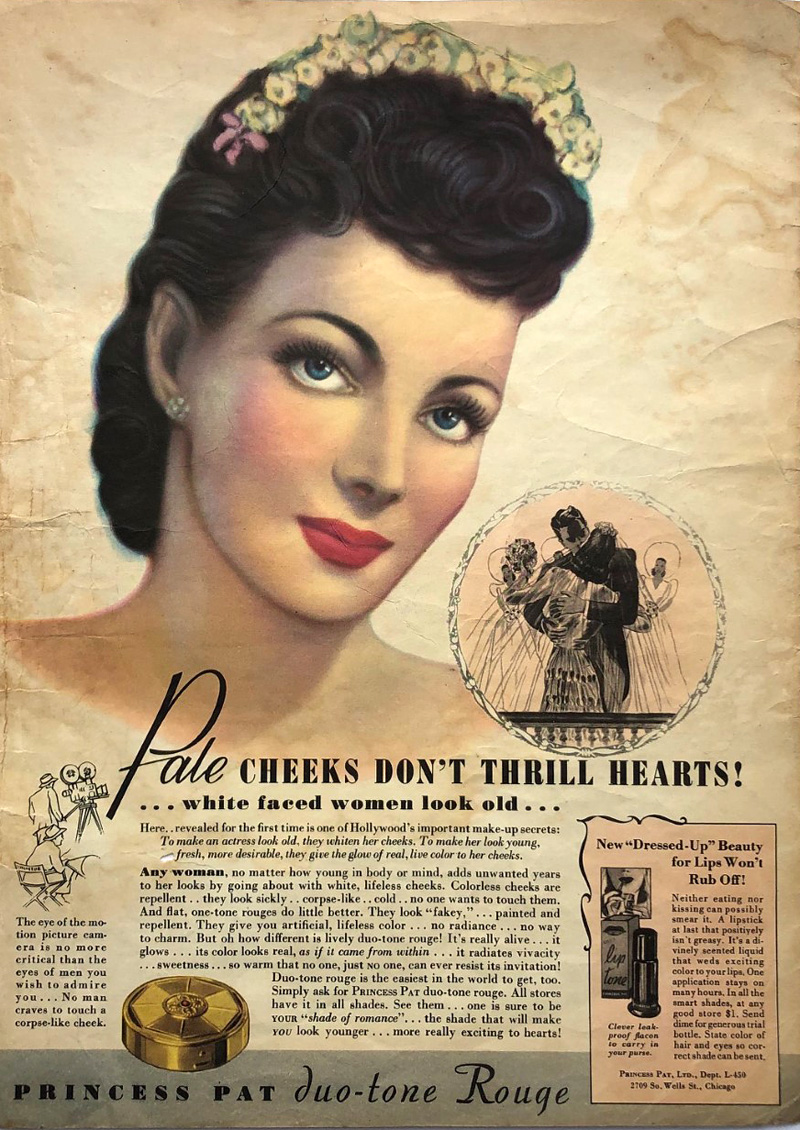
Princess Pat rouge ad, 1940
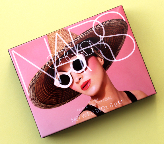
Some historians claim that blush’s universal appeal, much like lip color, is due to its mimicking of sexual arousal or a post-coital flush. While I personally find that theory dubious – I’m just not a fan of the sexualization of makeup – it’s important to remember that the most famous and possibly best-selling blush in modern times is NARS’ Orgasm. Additionally, for centuries in the Western world, with a few exceptions here and there (such as mid-late 18th century France), excessive makeup, including noticeable rouge, was considered the domain of prostitutes, so that’s another connection between blush and sexuality. Along those lines, one could even argue that the traditional virgin-whore dichotomy is a factor in blush’s longevity. Looking flushed could point to embarrassment at the notion of intimate relations, signaling a dainty, demure and virtuous woman, or it could be overtly sexual. Either way, blush’s sexual connotations helped solidify its status as an essential cosmetic. Finally, a simplistic reason for blush enduring through the years was that it was as easy to obtain ingredient-wise as lip color. There were readily available materials across the world. Whether it was the ochre of ancient Egyptians, poisonous cinnabar of the Romans, safflower used in parts of Asia or a basic mixture of berries and water, raw ingredients could be found virtually anywhere.

Blush sales are increasing. In your opinion, what could be contributing to that rise? First, I believe there’s a psychological component involved. Most of us have been privileged enough to work from home, see friends and family via video conference, and were able to adjust our routines, but that all of that has taken a toll on our mental health. Being trapped behind a screen far more than we’re used to, with little in-person contact, struggling to work and interact and essentially function in a completely different way for over a year can lead to feeling drab and lifeless, despite being physically healthy. As noted earlier, cheek color represents vigor and liveliness. This is why every spring fashion and beauty magazines have features on banishing the “winter blahs”, with the number one tip inevitably being the purchase of a new shade of blush to look and feel rejuvenated. Thus, with its promise of restoring a youthful, rested glow, blush may help combat the dullness experienced as a result of having to curtail so many activities that are essential to one’s well-being as well as general pandemic-related exhaustion. As one beauty writer notes, she applied “a generous helping of blush to help me look alive even though on most days I felt dead inside.” I also think that now since the pandemic is on the verge of ending, we are collectively dreaming about fresh starts and enjoying life more fully again. More so than other makeup categories, on a spiritual level the application of blush may help us awaken from the trauma and upheaval unleashed by the pandemic, a way to feel more vibrant and a reminder that our health is relatively intact. On related note, a healthy flush is associated with being outdoors, which many of us haven’t been able to do. If you can’t enjoy a reinvigorating jaunt through nature, you can at least pretend you got the blood flowing with some blush.

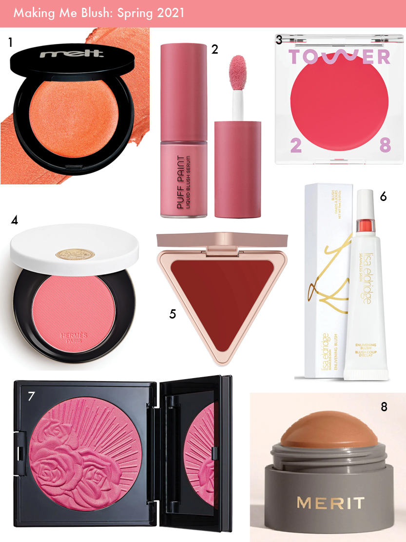
1. Melt Cosmetics Cream Blushlight 2. Natasha Denona Puff Paint liquid blush 3. Tower 28 Beach Please Lip and Cheek Cream 4. Hermes Rose Hermes Silky Blush Powder 5. LYS Beauty cream blush 6. Lisa Eldridge Enlivening Blush 7. Pat McGrath Divine Blush 8. Merit Beauty Flush Balm
Secondly, even though we are optimistically looking towards the end of the age of COVID-19, life has not returned to how it was pre-pandemic for most. Many people are still reconsidering and adjusting all of their makeup, including blush, in light of continuing Zoom calls. Depending on one’s camera and lighting, a person may need to increase the amount of color so as to not appear washed out; in other cases, they’re finding that their regular application is too heavy-handed. Thus, in addition to adapting their current products, they’re seeking either new shades or new formulas that are effortless and “goof-proof” for video.
Finally, I think at the moment the market is so saturated with every other form of makeup – highlighters, (especially!) eye products, lip colors, even base makeup, companies figured it was time to swing the pendulum back to blush. It’s a product category that’s been relatively neglected due to the popularity of contouring and the no-makeup look. But these two trends were already waning, with consumers wanting a simpler approach to cheek color than the skill and time required by contouring as well as a look that was more than the bare minimum of the no-makeup face. Another trend that’s been gaining traction the past few years is the notion of wellness. Consumers are increasingly interested in cosmetic options that might also have benefits for their physical and mental well-being. The pandemic engendered a renewed focus on health, making wellness and self-care more important to consumers than before. It follows that blush, and its long-standing association with health, would be more in demand. In short, a return to blush was brewing for a while and was accelerated by the pandemic, hence the rise in sales now.
During the 19th century, symptoms of tuberculosis including pale skin and red, feverish cheeks became fashionable, leading women to recreate a sickly appearance using makeup. Can you explain the link between beauty and illness, as well as how that relationship might manifest into the age of coronavirus? The mimicking of TB wasn’t a widespread or long-lasting trend because historically there is a much stronger link between beauty and health than illness. Having said that, what the recreation of tuberculosis did was simply exaggerate the already entrenched notions of beauty – pallid skin and flushed cheeks. No one was feigning smallpox, for example, because the effects of that disease were viewed as ugly and disfiguring. (And as soon as TB began to be associated with the lower classes, it quickly became unfashionable to fake it…but that’s a whole other story.) Today there are some trends such as Igari (the “hangover” look) and Byojaku (“sickly”), but they are intended to achieve a distinct kawaii aesthetic. Again, no one is doing a tutorial on getting the coronavirus look using makeup because the symptoms are viewed as unappealing (plus I’d like to think with so many lives lost people would be a little more sensitive than to pull a stunt like that.) There is a link between beauty and illness, but only so far as the illness’s effects align with current beauty standards. Overall, blush is primarily used to look healthy. For every one “hangover” or other similar trend piece, there are at least 10 articles emphasizing the importance of wearing blush while ill to counteract the symptoms that are perceived as unattractive. Sometimes a warm-toned blush or even bronzer is recommended to distract from redness or other discoloration around the nose and eyes, as that symptom is viewed as aesthetically undesirable.

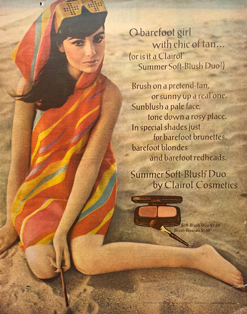
Clairol blush ad, 1967
Over the past year, have you noticed a shift at all in how people are wearing blush? What I’ve been observing in beauty publications and on social media is that people are perceiving blush as more than an afterthought or a basic necessity in tying a look together. Blush is becoming exciting in its own right again; cheeks are no longer playing third fiddle to eyes and lips or serving just as a canvas for contour and highlight. On a basic level, unlike the lips, at least part of the cheeks is still visible while wearing a mask. Some have adapted the ‘80s trend of taking blush up past the temples, closer to the eyes, so that it’s more noticeable behind a mask – as with eye makeup, the emphasis is on what can still be seen in a mask.
More significantly, how people are wearing blush is just one part of the pandemic’s larger impact on makeup routines more generally. People found their normal beauty routine disrupted, and they’ve been questioning it: why am I wearing makeup, who am I wearing it for, and do I really want to be wearing a full face every day? From my perspective, people seem to have gone in several directions or a combination thereof: some kept up with their usual makeup routine to retain a sense of normalcy, others began experimenting with makeup in ways they wouldn’t normally otherwise, and still others greatly pared down their routine. It’s this last path, I think, that has caused the biggest shift in how people are wearing blush. Many are finding they don’t want or feel the need to do a full face for virtual meetings and staying at home, so they’re embracing a more relaxed approach that includes a quick swipe of blush rather than combining it with contour and highlight. Sculpted cheekbones are being pushed aside in favor of a less “done”, more carefree look that is easily achieved with blush. Whether or not low-maintenance makeup sticks around as quarantine life fades away is anybody’s guess; I think it might, but I also think in some instances people will be piling on the makeup as a way to celebrate the end of the pandemic – now that our faces aren’t obscured we can wear as much as we like without a mask rubbing it off. In fact, while the average makeup wearer may be rediscovering the joys of basic blush application, over the top blush is already trending on the editorial side. If the usual amount of cheek color signifies physical well-being, in the age of COVID-19, perhaps an excessive application will reinforce the notion of health. The super flushed look may end up as an exuberant symbol of survival.

 Once again my schedule got completely off track. There's a lot going on behind the scenes and we'll just have to wait and see if neglecting the blog pays off. Anyway, here are some very late links.
– May was AAPI month, so familiarize yourself with these historic Asian beauty rituals before you partake in them and consider how racism towards Asians plays a part in beauty trends. It's true – I could write an entire book on the fetishization/othering of Asian women and culture in beauty campaigns.
– Allure has a good piece on the lack of fat representation in the beauty industry – a reminder that diversity and inclusion don't refer only to skintone or gender, but size as well. (I also think the industry is still doing a crappy job when it comes to regularly featuring anyone over the age of 35.)
– Now that the pandemic is on its way out (hopefully!), a lot of industry folks are looking into their crystal ball to see what post-COVID beauty trends might look like. Thankfully, it seems that color cosmetics will make a full recovery. This is confirmed by the spate of new brands sprouting up. Fashion aficionados will get both high and low-end fixes for their makeup cravings from Valentino's and Zara's new lines, while film company A24 (the one behind some of the creepiest horror films ever) is developing a line based on the hit show Euphoria. Also, former baseball player Alex Rodriguez debuted a men's makeup line.
– Speaking of which, the lovely Shybiker thoughtfully sent me a hard copy of this New York Times article on men wearing makeup. I can't say I agreed with everything, but it's a good summary of the current men's beauty landscape (manscape?).
– Wish I could see this installation sponsored partially by Chantecaille, who partnered with a UK-based charity to launch a public artwork project called Co-Existence. Over 100 elephant sculptures were made by indigenous communities in Southern India and transported to London, where they will roam throughout the city through the end of July. At the end of the project the elephants will be auctioned off and the proceeds will go local, community-focused conservation and land protection programs in South Asia. Corporate philanthropy is often bullshit, but Chantecaille seems to be doing it right.
– "Blue beauty" sounds about as legitimate as green beauty, but I'm happy to buy anything that is less harmful to mermaids.
– The Museum doesn't cover fragrance, but I do wear and enjoy perfume. One of my all-time favorites turned 20 years old this year. I had nearly forgotten about it since it's long discontinued, but fortunately I Need This Unicorn had the entire history of every Escada summer fragrance ever released. It was such a great trip down memory lane and extremely useful for those researching perfume!
The random:
– Utterly thrilled to see that the spirit of riot grrrl lives on in a new generation.
– In '90s nostalgia, a lock of Kurt Cobain's hair fetched over $14,000 at auction, while Friends finally got around to a reunion.
– The Nation had a thought-provoking exploration of the movement to abolish museums. I'm still confused as to how that would work in real life, but it's an interesting concept regardless.
– In addition to the mermaid obsession, when I was little I also was endlessly fascinated by jellyfish. But I didn't know until now that there's a species can live basically forever.
How was the month of May for you? Are you excited for summer? I'm not because I probably have to go back to the office soon, but at least I got fully vaccinated and was able to hug my parents for the first time in over a year.
Makeup Museum (MM) Musings is a series that examines a broad range of museum topics as they relate to the preservation, research and exhibition of cosmetics, along with my vision for a physical Makeup Museum. These posts help me think through how I'd run things if the Museum occupied a physical public space, as well as examine the ways it's currently functioning. I also hope that these posts make everyone see that just because the Makeup Museum does not have a physical space or official nonprofit designation, it is as valid as other museums, and more legitimate than many other profit-driven entities calling themselves "museums".
 Let me just say up front that the timing of this post has nothing to do with the Capitol insurrection that took place a few weeks ago, or the fact that Black History Month starts in two days. This is something that's been in the works for over a year, as it's extremely important to the Museum's mission and to me personally. After giving myself a crash course in diversity and inclusion, I feel as though I'm finally ready to write something a little more in-depth than the thoughts I jotted down back in June 2020. One of the Museum's primary goals is to present makeup and its history differently than what currently exists, and a big part of that is sharing previously undiscovered or underrepresented stories. So many of them concern BIPOC and LGBTQ+ histories, and it's important to tell them not just for diversity's sake but for history more generally.
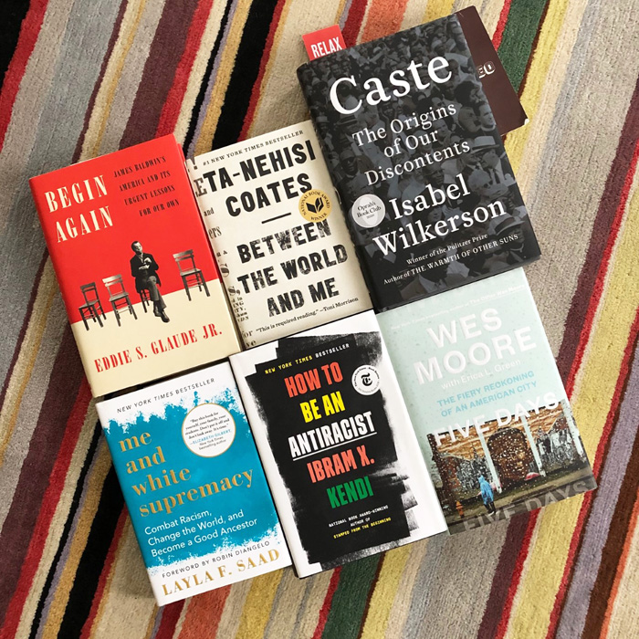
This post will not go into detail regarding the obvious facts that 1. Despite good intentions, all museums are rooted in colonialism; 2. U.S. museums have a critical diversity problem; and 3. Diverse and inclusive museums are better in every way than non-inclusive spaces. Instead, it seeks to answer the following question: How can the Makeup Museum, in its current state, be as diverse and inclusive as possible? I don't have all the answers, but MM Musings are an exercise to think through the heavier issues and ponder how the Museum can be better – more of a journey than an endpoint. To help guide this installment of MM Musings I relied on these two books, along with the anti-racism books I purchased last year. I also looked at all the articles and other resources I could access for free online.


As I noted previously, there are unique challenges for a cosmetics museum to become a diverse and inclusive space. But that doesn't mean there's not room for improvement. If the Museum occupied a physical space and had paid employees (well-paid and with full benefits, of course, and while I hope they would not have a need for a union, they would absolutely be encouraged to form one if they want), it would no doubt have a diverse board and staff at all levels that would be treated as integral to the organization and not tokens, along with the other essentials such as diversity training for docents and consultants to continually evaluate the Museum's efforts and provide recommendations. In its current form, however, the primary focus in terms of diversity and inclusion is on the Museum's content and collection. Since there are no blueprints as to how to run an online cosmetics museum/blog whose existence and finances depend entirely on one person who is also not technically a museum professional, it's tricky to come up with a concrete plan of action for diversity and inclusion. But here's a start.
Diversify the collection.
Collecting Chinese, Japanese and Korean brands are not an issue, nor are ones founded or owned by LGBTQ+ people – there are plenty of those as well as artist/fashion collaborations – but Latinx and Indigenous brands and collabs remain somewhat elusive. I can write about my beloved Pai Pai but they no longer ship to the U.S., and I know of only a handful of other Latinx or Indigenous-owned brands. Contemporary Black-owned brands are easier to find than ever now so I will continue purchasing more from them, but it's still difficult to find many vintage pieces simply because there were so few compared to the big mainstream brands, none of which catered to BIPOC's needs until the 1960s or so (and even then their efforts continued to miss the mark.) I will continue to keep my eyes peeled and buy from BIPOC and LGBTQ+ brands as much as possible.
Diversify blog, IG and exhibition content.
- The Museum's collection may not be diverse enough right now, but that doesn't mean I can't write about objects or other pieces of makeup history related to BIPOC and LGBTQ+ communities, along with topics centered on ageism within the industry and people with disabilities. There are so many that are either have not been fully explored or not mentioned at all. One stumbling block remains: namely, I'm still not sure they're stories appropriate for a white, able-bodied, cis-het woman to tell. This is particularly important when discussing makeup used by Indigenous people, as in some cases it has a spiritual or religious purpose rather than beautification or self-expression. I'm afraid I don't have a solution other than to forge ahead and write about topics that may not be 100% appropriate but that are important. I think as long as I'm treating them in a sensitive manner and open to feedback and constructive criticism, it's better to share these histories even if they're from a non-BIPOC/LGBTQ+ person. One thing I eventually learned last summer was that being totally silent and not even attempting to diversify content is worse than trying and getting it wrong. I only hope I don't inflict any harm, but if I do, then I can always remove the post and do better the next time.
- Search for more BIPOC and LGBTQ+ artists and brands to feature on Instagram and in Color Connections.
- Exhibitions: How are BIPOC and LGBTQ+ represented in exhibitions? If they're not adequately represented, why? The solutions to this would normally be to have an exhibition that thoroughly incorporates diverse objects and voices, or have one focused on BIPOC and LGBTQ+ themes and ensure appropriate curation and oversight, e.g. not hiring someone who doesn't belong to those groups or has little to no knowledge about the topic at hand. This is a hurdle for the Makeup Museum as the founder and sole curator is not from an underrepresented group. The only thing I can do at the moment is choose exhibition topics in which marginalized people have adequate representation and make sure they see themselves in the exhibitions. It must be obvious that they're not niche visitors and that they are essential to the story the exhibition is telling. Theoretically I could explore whether anyone would be interested in co-curating or guest curating an exhibition focused on BIPOC or LGBTQ+, but as the Museum is entirely a labor of love and I'm unable to provide compensation, I'm sure as hell not asking someone from a marginalized group to curate or write for free. That brings me to my next point.
Identify fees for guest writers, curators and consultants and see if they are feasible without drastically cutting the budget for new acquisitions.
Like most of the initiatives I would love to pursue such as overhauling the website ($10-20k), purchasing archival storage containers ($1-2k), establishing a nonprofit (about $2-4k), getting a degree in museum or curatorial studies ($50k minimum) and purchasing and maintaining proper collections management software ($2k per year), I fear I would never be able to afford to hire professionals to work on the Museum with me even if I never bought another object, but it can't hurt to at least ask what their fees are. And who knows, perhaps I could even work out a plan whereby payments are due in installments rather than the full sum up front.
Further develop a community-focused, collaborative mindset.
Since its inception the Museum has operated in a mostly isolated environment. I'm not only a hardcore introvert and lifelong loner, but I always wanted to have my own space, something that I had full control over and without the involvement of anyone else. And that impulse is still quite strong. But I've also always wanted to educate, and though I'm not comfortable with it, being a resource means inviting people to help create it: by the public, for the public. Community for the Museum largely means either makeup aficionados/professionals or the local geographic area. I've always asked blog visitors to respond to my posts, and starting with the Stila girls exhibition in 2019, I began asking visitors to submit memories, photos or anything else they'd like to share to be incorporated into the exhibition. Lately I started investigating how the Museum might be able to collaborate with local museums, schools and historical centers – obviously I've considered pitching a pop-up exhibition at their spaces for over a decade now, but I realized I have to be more mindful of the approach. There's no way an organization is going to agree to host or be involved with an outside museum offering a pop-up exhibition if it has nothing to do with their mission or at least their collections. The goal, it seems, is to match interests. For example, the Maryland Center for History and Culture would be more interested in an exhibition on a history of Baltimore beauty parlors than, say, a display of rose-themed makeup, because their mission and collection have nothing to do with botany or natural history but is focused on the state of MD. I think there are ways in which the Museum can engage with both the makeup and local communities, and become more diverse and inclusive in doing so.
Establish metrics for the Museum's collection and content and share them publicly.
To keep any organization accountable in their diversity and inclusion efforts, it's necessary to track measurable outcomes of said efforts. Museums and Race's report card gave me the idea to develop one for the Museum based on the steps listed above. It would be updated annually each January and indicate the progress or maintenance of goals, which are as follows:
- Increase the number of posts that focus on or incorporate BIPOC and LGBTQ+ makeup and related topics (for example, the "multicultural" makeup of the '90s). Originally I wanted to follow U.S. demographics and keep a strict 60/40 split in which 40% of posts would be BIPOC-focused, with 18% Latinx topics/artists/brands, 15% Black, 6% Asian and 1% Indigenous. Alas, after crunching some numbers I realized that it would be impossible unless I both greatly scaled back the number of Asian-focused posts and hired or collaborated with BIPOC/LGBTQ+, and there's no telling if I will be able to achieve the latter. So for now, I'm going to take stock of what was written in 2020 and plan on more diverse posts in 2021. In terms of Instagram, taking a cue from the 15% pledge, my goal is to ensure at least 15% of IG posts feature Black makeup history, artists, models or Black-owned brands. I've been doing 11% since June (or 1 out of every 9 posts) and it has proved challenging. It's difficult because I don't want to repeat the same brands, models or artists ad nauseam and also want to provide meaningful and unique content, i.e. I don't want to toss up some ad that people have seen a thousand times before, especially without offering any new insight, just because I need to fill a quota that I set. Representation is critical, but can easily veer into tokenism. Having said that, I'd still like for 1 post out of every 6 (or 17%) to have Black-focused content and I'm working on how I can do that without blindly regurgitating things that are readily available and well-known. I'm also going to count other topics towards this goal even if they don't show a Black model or brand. For example, I have a bottle of Revlon's Touch and Glow foundation from the early 1950s in the deepest shade they made up until about 1957. As you may have guessed, it's medium toned at best. This is an example of how mainstream brands simply did not care about the needs of BIPOC customers, especially Black ones. I'm still not sure how to handle other demographics, however; as noted above, Latinx and Indigenous brands, artists and topics are somehow more difficult to find than Black ones. Nevertheless, Instagram makes it easy to track so I will take stock of 2020's posts and work on at least increasing the number of posts involving these groups.
- Increase the number of Museum objects from BIPOC-owned brands. I will keep track of what was acquired each year and work out the proportion of objects that came from BIPOC-owned brands. Then monitor those numbers each year to ensure they increase. For example, I purchased 22 makeup ads in 2020 and 6 of them were from Black-owned brands or featured Black models. So this year, let's say I purchase 22 ads again, 7 or more of them should be from BIPOC-owned brands or feature BIPOC models. The acquisition of objects from white-owned brands will still soundly outpace BIPOC-owned ones, especially for vintage pieces, but the goal is to increase that number and work towards a bigger percentage of BIPOC-owned objects in the collection.
- Track the number of BIPOC and LGBTQ+ people or organizations I reached out or donated to, along with community organizations. While nothing may come of these attempts on my part to collaborate with them, I feel it's important to at least get in touch. And there are plenty of BIPOC and LGBTQ individuals and organizations that can use donations.
- Ensure all exhibitions meaningfully represent BIPOC and LGBTQ+ individuals and brands, and if not, discuss why.
I think this sort of report card is more valuable than some bland diversity statement. Most of the statements I found lacked substance – they were just a bunch of jargon with no actionable steps outlined.
The Museum's diversity efforts are ongoing, of course. And I plan on tackling the related topics of social change and accessibility as future installments of MM Musings. But this is a beginning of a shift towards meaningful action. Thoughts? I'm off to create a report card for 2020 so I will have something to compare 2021 to.
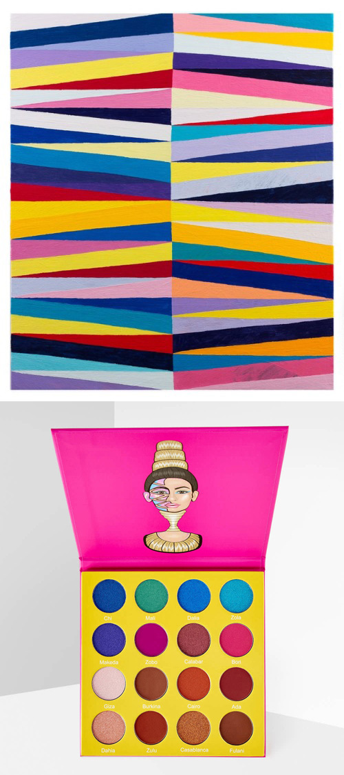
Todd Chilton, Split and Quartered, 2012
Juvia's Place, The Masquerade palette, 2017

It's the time of year where I babble on about things I want to tackle but most likely won't be able to. I reviewed last year's blog post ideas and out of the 30 topics I only managed to accomplish, let's see, 10. One-third of what I was aiming for. Sigh. As for exhibitions, I only did one and it wasn't all that cerebral. Anyway, no point in ruminating over what I should have done so here's a bit of an update.
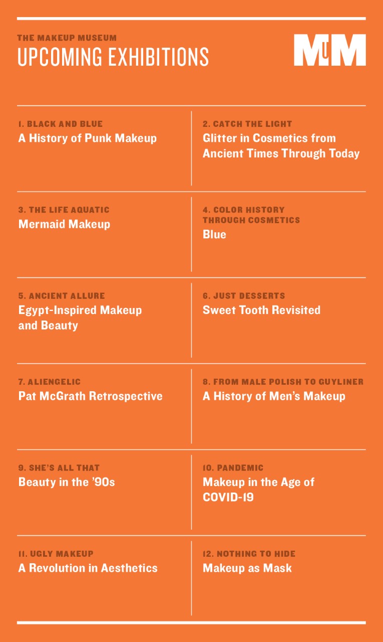
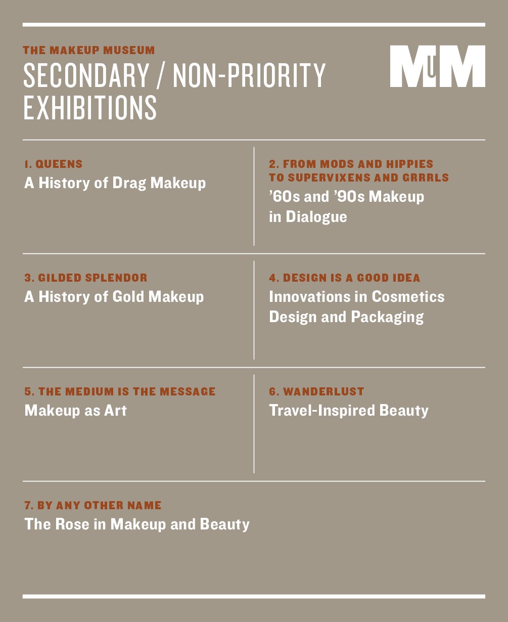
In an effort to sort of narrow down the massive amount of exhibition ideas I have, I came up with a priority list of topics that might be doable in the 1-5 years (if the Museum is still in existence) and a secondary list for, well, I have no idea – eventually. I tweaked some of the descriptions as needed. Also, please keep in mind these are working titles. Hopefully I can think of better ones! Once again the husband came up with handy graphics.
Priority:
- "Black and Blue: A History of Punk Makeup"
- "Catch the Light: Glitter in Cosmetics from Ancient Times Through Today" – Aiming to have this up for holiday 2021, but it's a big one and I will need lots of help that I'm not sure I can get.
- "The Life Aquatic: Mermaid Makeup" – I need to think of a better title soon because I want this to go up in June this year.
- "Color History Through Cosmetics: Blue" – I decided to scrap the gold-themed exhibition in exchange for blue. I discovered so many fascinating things about blue makeup while pulling together some trivia on Instagram, there's definitely enough there for an exhibition.
- "Ancient Allure: Egypt-Inspired Makeup and Beauty" - I did some polling on Twitter and Instagram and this one won as the next exhibition, so the tentative date is March 2021.
- "Just Desserts: Sweet Tooth Revisited" – It might be good to revisit this on its 10-year anniversary in 2023.
- "Aliengelic: Pat McGrath Retrospective" – Still a priority, but again, I will need lots of assistance and would strongly prefer having a makeup artist co-curate with me. Alternate title instead of Aliengelic: "The Mother of Modern Makeup".
- "From Male Polish to Guyliner: A History of Men's Makeup" – I know that a new book on men's makeup will be released in June this year and it would be great to have the author as a co-curator.
- "She's All That: Beauty in the '90s" – Oh, poor little neglected '90s makeup book and exhibition. You know I've been wanting to do a comprehensive exhibition and book since at least 2014, but just never seem to have the time. I do have the chapter outline but I think I need to make deadlines for each chapter and publish the drafts as blog posts, otherwise it's not getting done.
- "Pandemic: Makeup in the Age of COVID-19" – Depressing but historically significant. I'll need to wait until the pandemic is safely behind us, but I am gathering bits of what will surely become history now.
- "Ugly Makeup: A Revolution in Aesthetics" – I am so incredibly inspired by Makeup Brutalism and her other effort Ugly Makeup Revolution, I absolutely need to explore looks that completely shatter our notions of makeup's purpose. The exhibition would be a deep dive into how makeup is going beyond basic artistry and self-expression.
- "Nothing to Hide: Makeup as Mask" – This was the other choice I included in the Twitter and Instagram polls. While respondents chose Egyptian-themed makeup over this one, the mask theme in makeup goes back centuries and would certainly make a rich topic, plus I could do a subsection on mask-wearing's effects on makeup in the pandemic.

Secondary list/things I'm not sure about:
-
- "Queens: A History of Drag Makeup" – Amazing topic but overwhelming. Need much help!
- "From Mods and Hippies to Supervixens and Grrrls: '60s and '90s Makeup in Dialogue" – In my opinion, cultural developments in both the late '60s and mid-1990s radically changed the beauty industry and gave birth to new ideas about how people view and wear makeup; there are many parallels between the two eras. I feel, however, that I'd need to do the '90s exhibition and book first so this would have to wait.
- "Gilded Splendor: A History of Gold Makeup" – This is nice but the more I thought about it the more I didn't think it would be a priority.
- "Design is a Good Idea: Innovations in Cosmetics Design and Packaging" - Another that I still like but not so much as to make it immediate.
- "The Medium is the Message: Makeup as Art" – This will trace how makeup is marketed and conceived of as traditional art mediums, i.e painting and sculpture, and also how art history is incorporated into makeup advertising and collections. Consider it a comprehensive discussion of this post while working in canonical artists whose work has appeared on makeup packaging. My issue with it is that it's overwhelmingly white. The artists used in vintage ads such Lancome's are white and even collections today don't collaborate with many BIPOC artists, especially Black ones.
- "Wanderlust: Travel-Inspired Beauty" - A rich topic and would be timely in light of the pandemic limiting travel for most, but honestly, I'm not that excited about it.
- "By Any Other Name: The Rose in Makeup and Beauty" – I pitched this idea to the FIT Museum as a small add-on to their "Ravishing" exhibition. They weren't interested and now that the exhibition has passed I'm tabling it for now.

And now for blog posts!
MM Musings (2): FINALLY getting up the diversity and inclusion in museums post up this month after a year of working on it, and the other topic to tackle this year will be becoming a nonprofit organization.
Makeup as Muse (3): I managed to get around to covering Gina Beavers last year, but that was it. The artists on my list are Sylvie Fleury, Rachel Lachowitz, Asa Jungnelius and Tomomi Nishizawa.
MM Mailbag (2-3): Once again the MM mailbag overflowed in 2020 and most of the inquiries took a significant amount of time to research and answer. I'll see what might be feasible.
Brief histories (4-5): I still want to go ahead with histories of powder applicators, setting sprays and maybe colored mascara, color-changing cosmetics and how makeup language has evolved (for example, why we typically say "blush" now instead of "rouge" for cheek color.) The author of Cosmetics and Skin kindly suggested an article on copycats, i.e. how companies clearly ripped each other off and continue to do so today in terms of packaging, ad campaigns, etc. which is a great topic. I'm also interested in a history of Day of the Dead makeup.
Trends (1): Makeup brand merchandise and swag – another I didn't cover in 2020 as planned. I'm also very interested in the video game trend in makeup, but I'm hoping this amazing person writes about it instead!
Topics to revisit (1-2): faux freckles, non-traditional lipstick shades, and cultural appropriation in cosmetics advertising. I did not update any of these in 2020 so I hope to do at least one of the three this year. Also, perhaps a deeper dive into surrealism and makeup.
Vintage (6): series of Dorothy Gray ads featuring portraits of well-to-do "society" ladies, '90s prom makeup, and wear-to-work makeup from the 1970s-90s, defunct '90s and early aughts brands (Benetton, Calvin Klein, Tommy Hilfiger, Nina Ricci and Inoui ID to start with), and a slew of other brand histories, especially Black-owned brands like La Jac and Rose Morgan. I'm also itching to write something about Black salespeople and customers in direct sales companies, i.e. Avon, Mary King by Watkins, Fuller, Artistry by Amway, etc. The company I hope to tackle this month if the objects I purchased on Ebay ever arrive will be Holiday Magic…the story is absolutely bonkers.
Artist collabs (5): As in 2020 I'm still trying to catch up on some of last year's holiday releases, including Fee Greening for Mikimoto and Cecilia Carlstedt and Morag Myerscough for Bobbi Brown. There are tons of others from previous years that I'm still thinking about, such as El Seed for MAC, Connor Tingley for NARS, the Shiseido Gallery compacts and lip balms, and a series on the artists whose work appears on Pat McGrath's packaging.
Book reviews (2): In the interest of saving time and also because my reviews tend to be badly written (even for me), I decided to do regular reviews only for some books and speed reviews of others, combining several books in a single post. Most of the ones I'm planning on are in the Beauty Library section of the website.
Dream Teams series (1-2): I did actually start this series last year, albeit without the mockups I had wanted to do. Stay tuned for more fantasy artist/makeup collabs. I especially want to focus on BIPOC artists and flesh out the idea I had back in 2016 for a Rrose Sélavy-themed collection.
Color Connections (5+): I returned to Color Connections last year but only once. They just take so much time. However, I've been toying with the idea of putting them as a dedicated series on Instagram separate from the Museum's regular account. That way it might make me accountable in terms of working on them more regularly.
Finally, there will be lots of other random things popping up, and I have so many people I want to talk to so I hope to nab some interviews and guest posts. 🙂
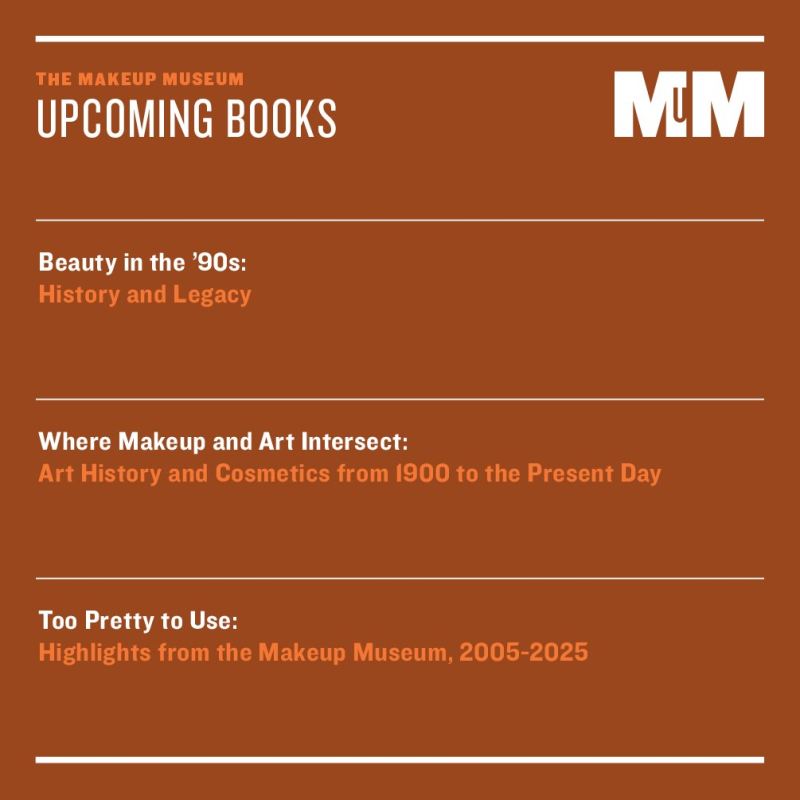
And here we have my book ideas. They're the same as last year. The first one is an alternate title for the '90s exhibition. The second one would basically be the accompanying catalogue for the Makeup as Art exhibition. I still want to do a coffee table book of pretty makeup, but my concern is that it won't be diverse.

Any of these topics interest you? Which ones would you like to read about/see first?
 I was too tired and sad to do a 2020 version of Curator's Picks and Pans, so I'm skipping straight to Curator's Corner for December.
– Mother has become a Dame! Huge congratulations are in order for Pat McGrath, who became the first makeup artist to receive damehood from the queen. I remember when she got the MBE in late 2013, so I was thrilled to see this.
– I was also really pleased to see Allure's digital feature on accessible beauty. Just wish it was in their print version.
– I was not, however, happy to see that the president of Japanese brand DHC is under fire for some racist remarks. The really sad part is that instead of making an attempt at any sort of apology he just shrugged it off, but I guess that's to be expected as he has a history of doing this.
– Interesting piece on beauty and makeup as instruments of political power over at Teen Vogue, the author of which will be releasing a whole book on the subject. I only hope the fable about Elizabeth Arden handing out lipsticks to suffragettes doesn't make it in there, as no one has been able to produce solid proof.
– Wallpaper had an article about the new marketing and branding for Shiseido. How nice that the company they hired gets access to their archives for "guidance" and "inspiration" but researchers like me are repeatedly shut out.
– While I'm being a cranky old lady, I must confess that new tech advances like digital makeup printing and Google's virtual makeup try-on service seem rather stupid. There's also Moi lipstick, which I grudgingly admit sounds somewhat interesting in terms of being able to match basically any color in the world, and I understand the need for reducing makeup packaging waste…but it also reeks of a futuristic dystopia.
– Sad news from happi.com (the irony): Benefit co-founder Jane Ford passed away. I imagine it was tough to go on without her co-founder and twin sister Jean, who died in January 2019. Flori Roberts, founder of her eponymous line that catered to Black women as well as Dermablend, also passed away. More to come on Roberts as I have mixed feelings about her.
– And because I'm lazy and various news outlets have covered them already, I'm linking to some articles on beauty in 2020 and what's in store for 2021. In 2020, the biggest trends I saw were the rise of TikTok, a slew of celebrity lines, an emphasis on skincare, experimental and "ugly" makeup, and video game/makeup and beauty crossovers, whether that meant a collaboration with a video game or beauty brands making an appearance in Animal Crossing and the like. Of course, the impact of Black Lives Matter and other calls for diversity and inclusion in the industry cannot be ignored; however, I refuse to see it as a passing trend that was unique to 2020. Both companies and consumers need to keep up the momentum.
The random:
– I love grey and yellow together, as evidenced by my wedding colors and some beloved Museum staff members, so I'm very in favor of Pantone's picks for 2021.
– "A virtual experience of high quality is not just second prize to being there in person, it may offer fresh revelations." Great piece on why digital museum exhibitions should become standard accompaniments to real-life ones.
– If Reservation Dogs is half as funny as What We Do in the Shadows, it will be hilarious.
– Memes were one of the few things that helped keep me somewhat sane in 2020.
Are you looking forward to the new year? I have to admit I'm not feeling optimistic, not just about the pandemic nightmare but the Museum and my family. It was more of a slow burn of trauma and grief in 2020 rather than the sudden, unexpected events that took place in 2019…and I'm not sure which was worse. I hope 2021 will be better but based on these past two years the outlook is bleak. :(
I am forever grateful for those who approach me with makeup they no longer want or that they feel belongs in the Museum. While 2020 was another hellish year for me personally and the Museum, as well as basically the whole world, I believe a record number of donations were received. Here’s a brief overview of what was graciously bestowed upon the Museum this year.
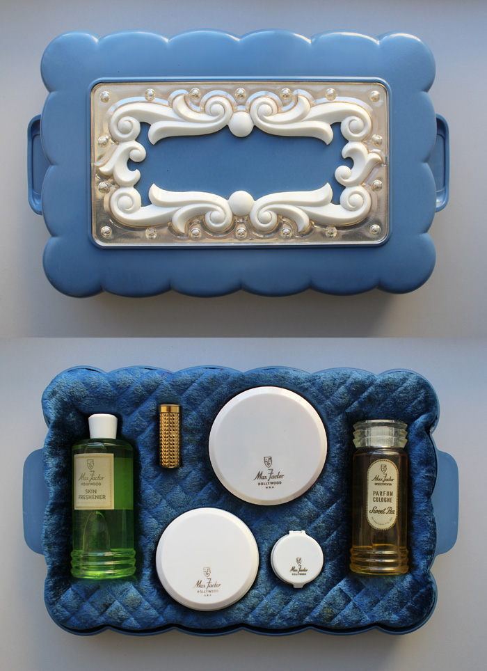
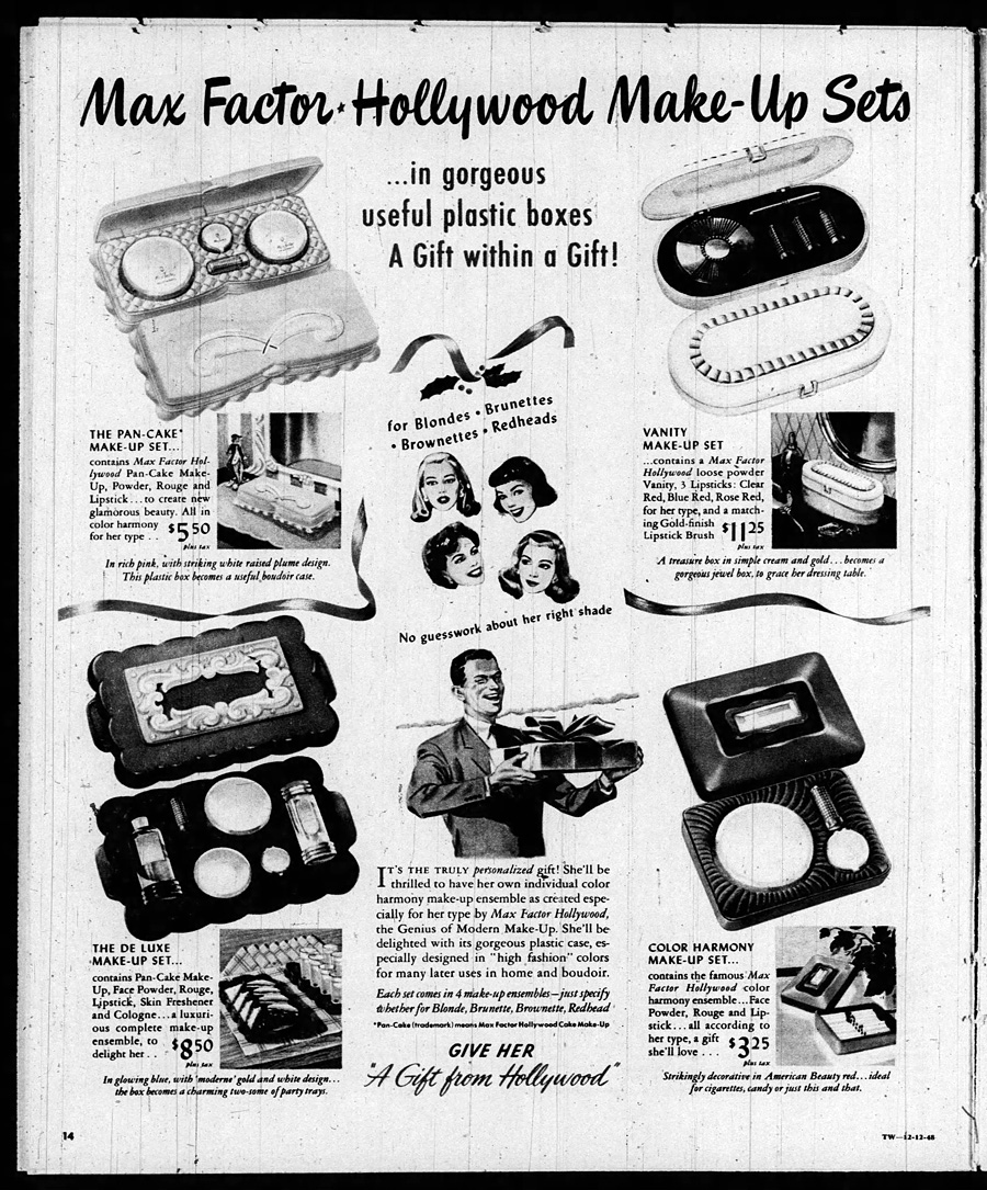
First up is a mint condition Max Factor gift set. A very nice woman in Canada donated it, noting that it was a birthday present from her father to her mother one year. According to newspaper ads it dates to about 1948. I love the suggested use for the box lids as “party trays”!


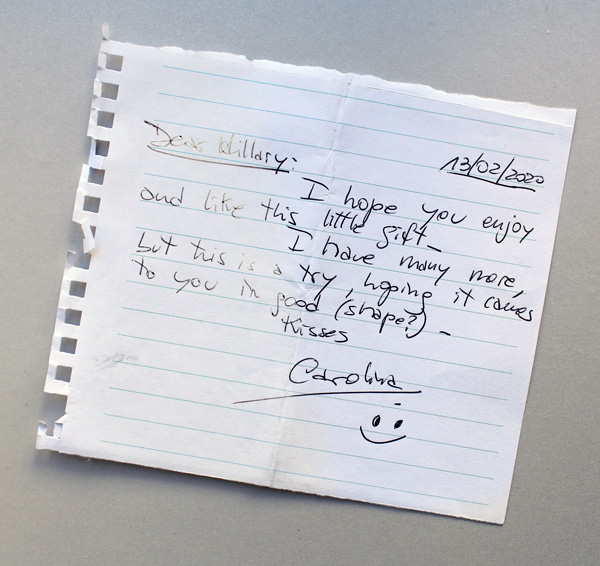
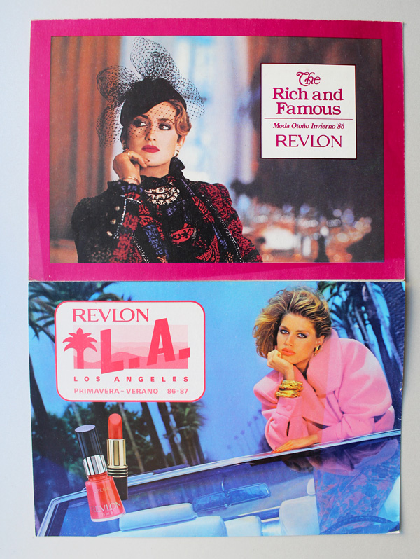
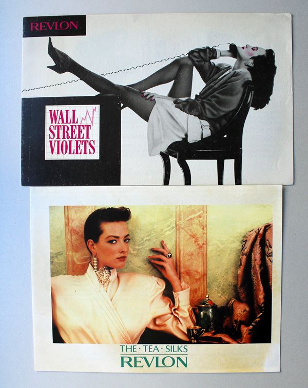
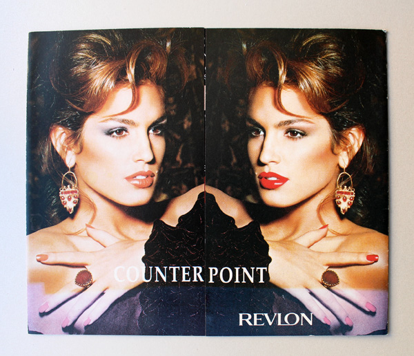
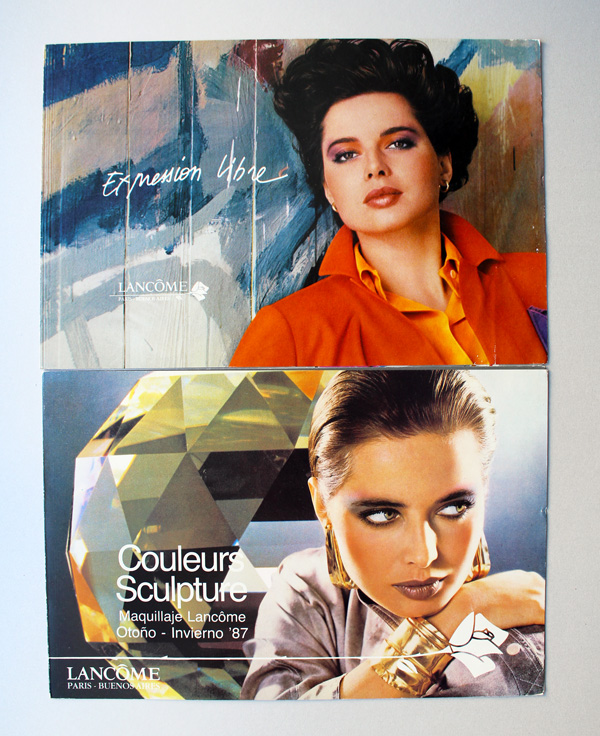
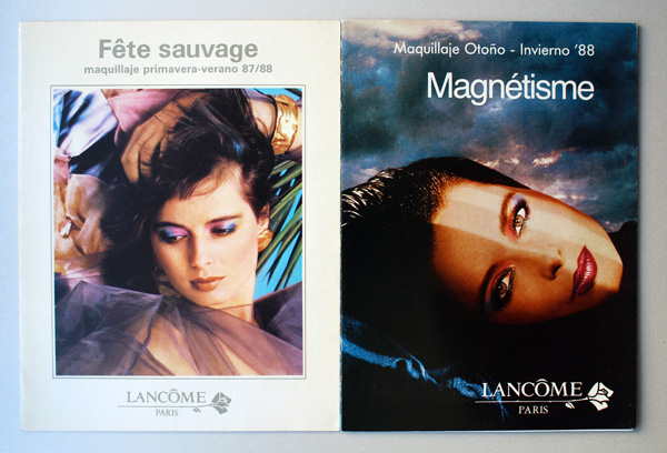
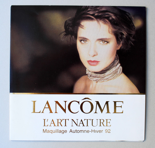
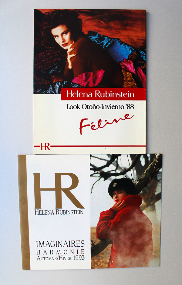
Next up is a slew of awesome ads and postcards from the ’80s and ’90s, donated by an Instagram buddy from Argentina. Such a sweet note too!


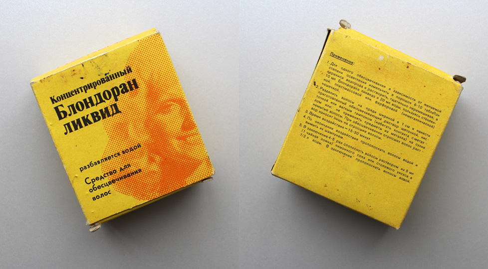
This next one is super interesting. Normally the Museum does not include hair products, but the donor is a fellow collector and very knowledgeable about Russian culture, having lived in Moscow for several years. This vintage hair dye was made in East Germany and exported to the USSR.

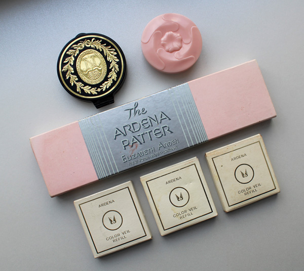
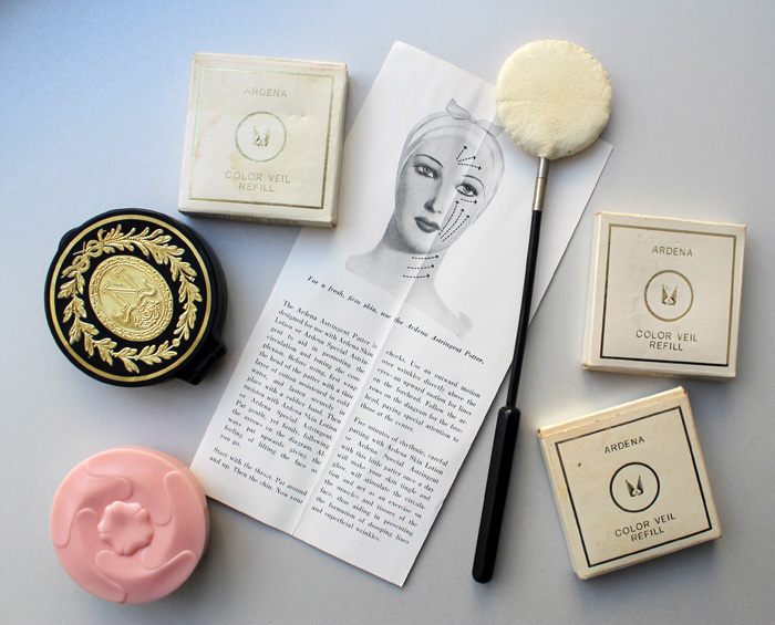
Next up are some lovely Elizabeth Arden objects. These were donated by a woman in California whose mother worked at the Elizabeth Arden counter at a department store. Here we have the Napoleonic compact which was introduced around 1953, Faint Blush, the famous Ardena patter, and some Color Veil (powder blush) refills.

Near as I can figure, the Faint Blush was a sort of foundation primer, but it seems like it could also be worn alone. I love the plastic pink rose packaging, as it’s very much of its era (ca. 1963-1973). I think the patter and the Faint Blush are my favorites from this bunch.

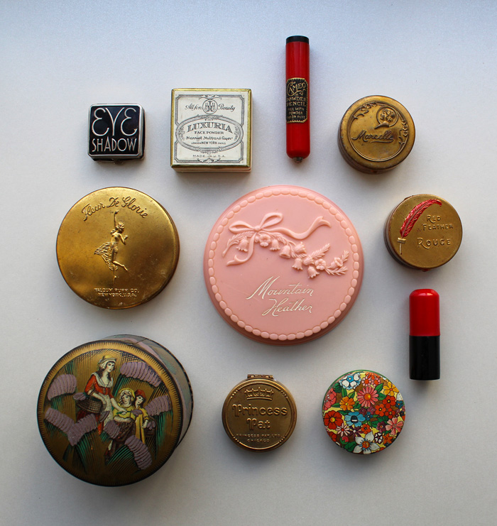
Then, another very kind Instagram friend and fellow collector sent a huge lot of vintage powder boxes and compacts. The Museum did not have any of these…some I hadn’t even heard of and some I had only admired them from afar. I just about died when I opened the package! Clockwise from top left: a 1930s eyeshadow by a company called Quinlan, a 1920s Harriet Hubbard Ayer Luxuria face powder, a powder dispenser by Cameo (probably from around the ’30s), a ’20s Marcelle compact tin, an extremely rare Red Feather Rouge tin (ca. 1919), an unmarked lipstick and floral powder tin, a Princess Pat compact from about 1925, a Yardley English Lavender tin (ca. 1930s) and a Fleur de Glorie face powder compact (ca. 1923-1926). In the middle is an amazing pink plastic 1940s Mountain Heather face powder case, a line manufactured by Daggett and Ramsdell.

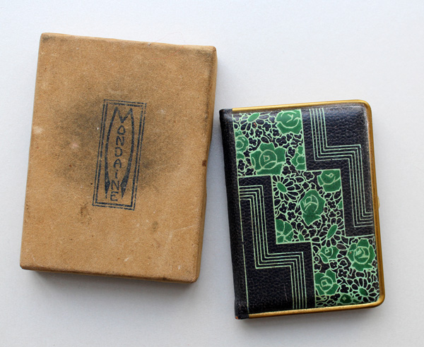
I love each and every piece, but my favorites are the eyeshadow compact, and an adorable Mondaine book compact (with the original box!) that was also included. Bookworm that I am, I want a whole “library” of these designs.

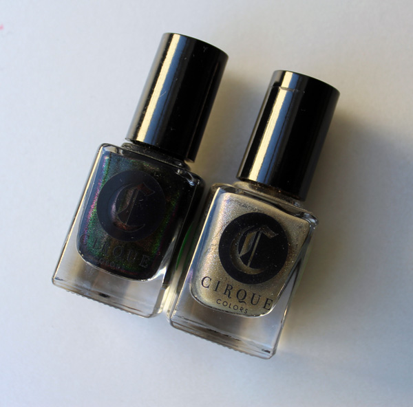
Not all of the donations were vintage. I was so happy to have received these two nail polishes from another IG friend. They were the result of a 2016 collaboration between Cirque Colors and the Met in honor of the latter’s Manus x Machina exhibition.

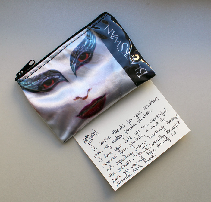
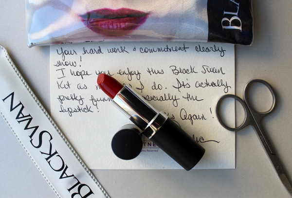
I’m sure you remember the kindness of makeup artist Amelia Durazzo-Cintron, who shared her memories of working for Kevyn Aucoin back in July. For some reason she felt the need to thank ME instead, and did so by donating a really cool Black Swan makeup kit. How nice is her note?!


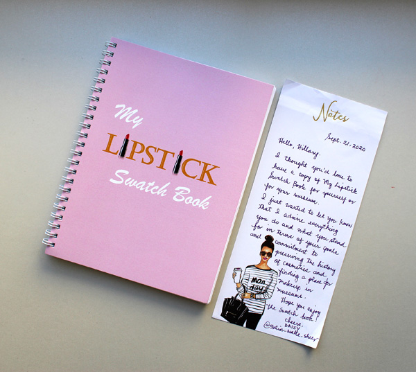
Another Instagram friend and lipstick fanatic has been making lipstick swatch books. These are kind of a new trend and in my opinion, far easier than taking photos of your lipsticks. Once again a sweet note was enclosed.

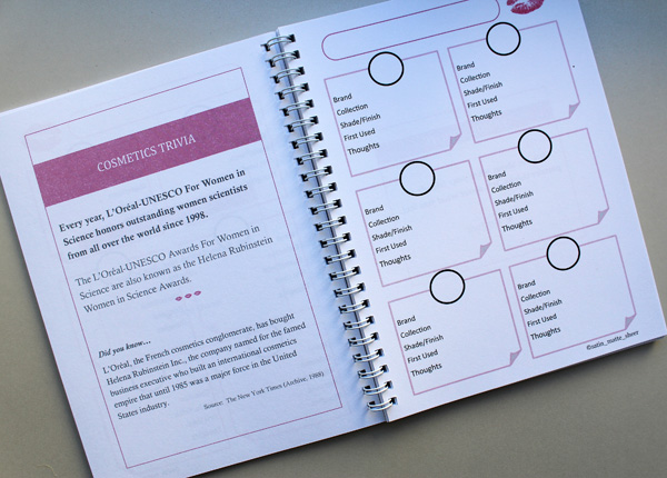
This lipstick swatch book is particularly lovely for its sprinkling of cosmetics trivia and important dates. (It also reminds me that I never started working on my daily makeup history calendar, sigh.) If you want one of your own you can purchase it here.

And that wraps up MM donations in 2020! I’m so incredibly grateful for these kind souls generously helping to build the collection. And while physical objects are amazing, it’s the notes and messages that come with them that mean the most. 🙂 Also, if you have a makeup object you think is historically significant, an object from the Curator’s wishlist, or anything else you’d like to give, please check out the Museum’s support page. I’m always looking for old fashion/women’s magazines too, along with ads and brochures and such…I can never have too much paper memorabilia!
Which one of these is your favorite? What’s the best gift you’ve ever received?
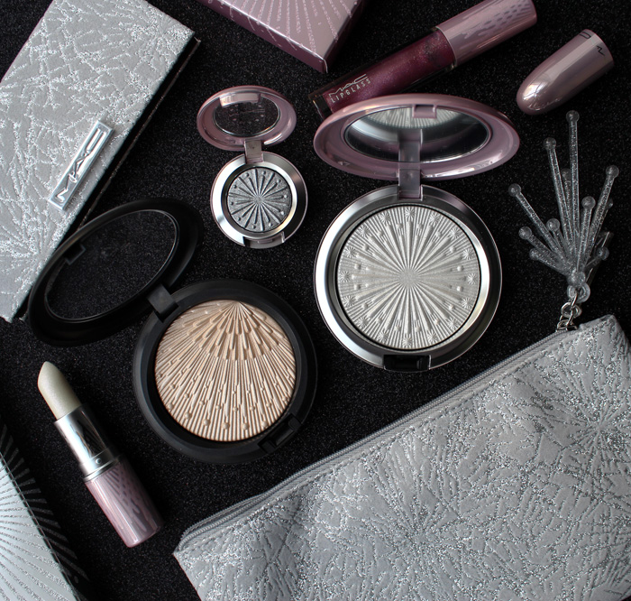
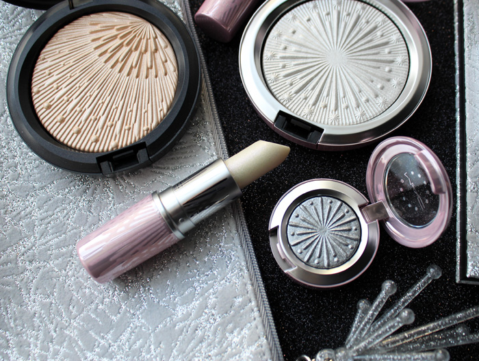
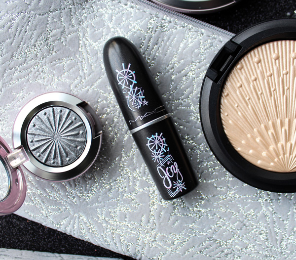
MAC's Frosted Fireworks was already a fun collection, but they managed to sneak in an artist collab in their holiday lineup too. And amazingly, the artist actually responded to my interview request and kindly answered my questions! We'll get to that in a minute, but to see how Bob Jordan's beautiful designs fit in to MAC's holiday collection, we'll take a quick peek at those objects first.
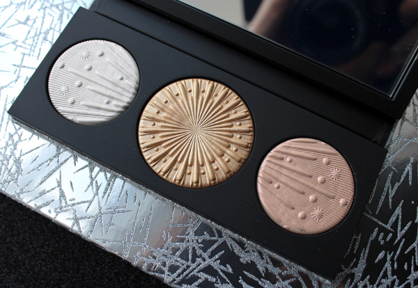
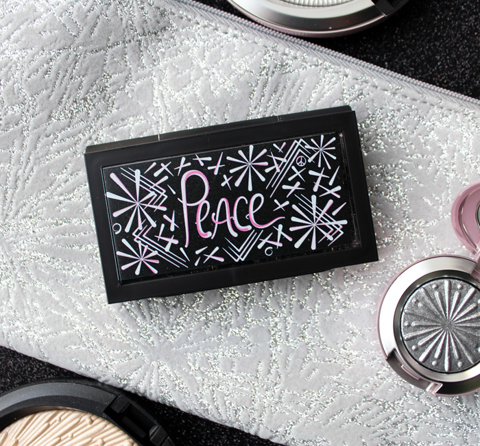
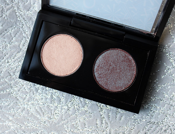
I picked up the eyeshadow in Silver Bells, highlighter in Let It Glow, highlighting palette, lipstick in Once Bitten, Ice Shy, lip gloss in Set Me Off and the Firelit Kit. Maybe it's because I always have the '90s on the brain, but Frosted Fireworks seemed straight out of 1996 or thereabouts to my eye – both the finishes and retro star patterns are reminiscent of the second half of the decade's obsession with frost and penchant for kitschy takes on MCM designs.
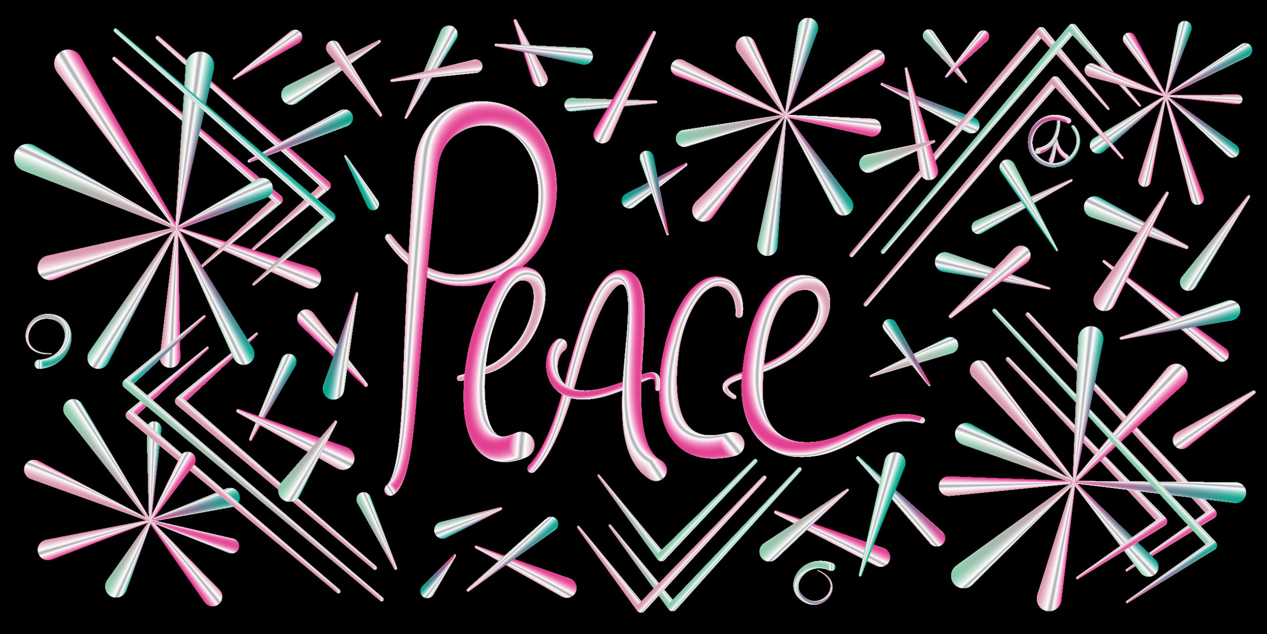
And now for something very special! Here's my interview with Brooklyn-based graphic designer and artist Bob Jordan, who created the bright and exuberant designs for MAC. Bob has a B.F.A. in Graphic Design from Maine College of Art. He founded his design firm, Factory 808 Designs, in 2014. While he had never made cosmetics packaging before, I think he absolutely nailed the MAC collection. I'm so pleased to have some of his work in the Museum and hope to see more makeup creations from him.
MM: Tell me a little bit about your background. Were you always interested in art? How did you end up in graphic design?
Bob: I grew up in my grandfather’s woodshop helping him out. He taught me how to solve problems and think creatively. When I was a teenager, I realized I could draw. Those two things became the foundation for everything I do now. I got into design because it allowed me to be multi-disciplinary in my creative approach. There are a lot of mediums I like to work with and I use them all in my projects. Most importantly, I get to draw. It doesn’t matter what I’m working, everything starts with a pencil and paper.
MM: Who or what influences your work? What other artists and designers do you admire?
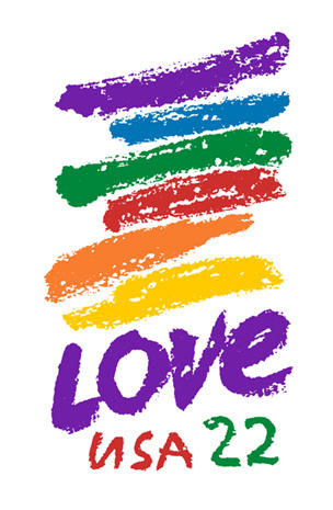
Bob: My first influence -and still favorite- is Chuck Close. I’ve always loved his use of color and shape in his compositions. I admire his resilience and his determination to continue to create his art even as a quadriplegic. I have a lot of respect for his process. I also love Sister Corita Kent. She was a pop art nun who fought for social justice causes and was also a teacher at Immaculate Heart College in Los Angeles. Most people would know her as the LOVE stamp designer from the 1980’s. Her 10 rules for Students and Teachers is timeless.
(image from cbsnews.com)
My other major influence is my home and community in Brooklyn. I am inspired daily just by simply walking outside. You get to see both known and unknown artists' work here. There’s a particular energy that resonates with me. Obviously it's tough to look into the future, but I know that it will always be a huge influence on my work.
MM: How did the collaboration with MAC happen? Did you approach them or vice versa?
Bob: The collaboration with MAC was very organic in its development. The head of digital at MAC as she is constantly on the hunt for collaborating with local NY designers on product and packaging design. Discussions began before COVID and went in the summer. It was some thing that we waited for the right time to do.
MM: What was the process like? Did they give you free reign or any sort of direction?
Bob: This process was a pretty open. There was a some seasonal themes and color ways that it needed to adhere to but there was a considerable amount of freedom. I’ve always found these types projects to be very difficult but the most rewarding.
MM: What inspired you to create the designs you did? What was your vision for the collection?
I was someone would had left the city during COVID and spent 9 months in the woods. It was a humbling experience and it allowed me to focus on some other projects but I was also missing the vibrance of the city. I had to come back and just walk around and soak up all the colors and energy. I would walk around during the day and then draw at night. I did that over and over til I found where I needed to be.
MM: How was the experience designing makeup packaging different than other projects you've worked on?
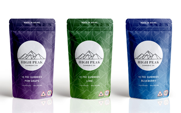
Bob: Designing for makeup packaging is not that different from some of my other work. I design a lot of packaging for cannabis products and there are many similarities. A lot of it is actually makeup packaging that is used so I’m used to working on small products. This was actually a lot easier because I just had to focus on the art and didn’t have to worry about any state regulations.
MM: Would you work with a cosmetics company again?
Bob: This was actually my first experience working with one, the opportunity to work with one just hadn’t come up in the past. I would definitely consider working with a cosmetics company again, but as with any project, I would need to make sure it's the right fit.
MM: Please share any thoughts you might have on makeup packaging or cosmetics in general.
Bob: I really hope that makeup packaging becomes more sustainable and minimalistic. I feel that way about all packaging. Working on cannabis packaging has really opened my eyes about how much packaging waste there is. I love designing packaging and I want to make sure that I’m doing my part. I would love to connect with cosmetics and any other companies whose mission it is to create sustainable products. That's the future. It has to be.
Bob, thank you so much for talking with the Makeup Museum! This was certainly enlightening and so interesting to hear the details behind this collection. And for Museum visitors, which piece is your favorite? I love both but I think the Peace design is my preference.
 Links for the lovely long days of June.