- Digitization – website redesign, professional object photography, and collections management software that allows a searchable database of all objects to be published online;
- DEI initiatives – hiring of BIPOC and LGBTQ+ consultants, writers and historians;
- Research – subscription fees to various archives/trade journals and fees for external researchers (as needed);
- Preservation – purchase of archival storage materials;
- Operating expenses – annual professional membership dues, blog and domain name renewal costs.
 It's nice to return to Curator's Corner, hopefully I can keep it up in 2020.
– Why I'm just discovering this book on Maybelline's history is beyond me, but in any case I'd like to check it out.
– Ditto for this amazing blog. I have no idea how our paths didn't cross sooner, but the author recently reached out to me regarding the Sweet Tooth exhibition, and as it turns out we are nearly identical in how we perceive beauty trends and which ones stand out to us. Saffron has written extensively on food and dessert-themed beauty, but also on cutesy makeup that seems to be intended more for children than adults (see my 2011 Child's Play post) and makeup marketed and packaged as art supplies (a topic I touched on briefly in 2016 and am hoping to unveil an exhibition of later this year). She's also tackled topics I've had in my drafts folder for years, like apothecary-inspired beauty, CBD products, and zodiac-inspired beauty (you know I love vintage zodiac compacts and there are so many more zodiac-themed products nowadays so I've been wanting to do a full roundup!) Plus she's really into design/packaging and vintage makeup too. Her "Highlights" feature is like Curator's Corner, and sometimes we even do the same color trends. I found my beauty twin! So yeah, go add her blog to your bookmarks and feed reader.
– More good content comes from Dazed Beauty, including a piece on the weirdest beauty trends from 2019, a critique of Frida Kahlo-themed tweezers, an article on why we get attached to certain makeup items (or in my case, all makeup items) and a review of a new film called Toxic Beauty, which is just like it sounds – highlighting the harmful ingredients used in cosmetics and the industry's lack of regulation.
– I love yellow so naturally I was feeling this graffiti-inspired look at Dior. I'm less excited about the commodification of mental health care in the name of "wellness" and "self-care" in the beauty industry.
– Sometimes I try to do a trend review at the end of the year, but that clearly wasn't happening in 2019. Instead, please enjoy these links on the biggest trends of 2019 as well as the decade. One "trend", if you can call it that, that I'd like to leave behind is influencer drama. I'm not big on influencers anyway and frankly, I don't care what they're fighting about. It's irritating that it gets press coverage when there are so many other topics that need attention.
– We can't have a trend roundup without looking ahead to the following year, so here are some forecasts. I'll also throw in my prediction that merch will continue to be huge among beauty brands. Along with color-changing cosmetics and the crystal-themed beauty trend, it's yet another topic I want to cover in 2020.
The random:
– The next installment of Makeup Museum Musings will be on either inclusivity or the definition of museums. This piece at Jezebel came in handy for background research for both topics.
– As a Gen-X'er who started having problems sleeping a few years ago, I need to buy this book ASAP. You might also remember the author as the woman behind the long-gone '90swoman.com, where I wrote a guest post on '90s beauty well before the resurgence we're experiencing now.
– Speaking of that magical decade, Alanis Morissette has announced she's touring with Liz Phair and Garbage in honor of Jagged Little Pill's 25th anniversary. Plus, for those of us who still pine away for the days of VHS and Blockbuster, this guy opened a video store in his basement.
– One good thing from 2019 was the arrival of Baby Yoda. Makeup Museum staff is worried that I think he's cuter than they are so I have to make them extra cookies as reassurance.
And here's a summary of the year on the personal front. Usually I try to keep the personal stuff to a minimum, but since the Museum is a one-woman show, my personal life inevitably affects Museum business. In 2019 the following took place:
– My father had a massive stroke in March and has not recovered the way we were hoping. We had no illusions – we knew recovery would not be a straight line and that he wouldn't be the same – but nearly 10 months out he has shown little improvement from the initial episode and is still severely limited physically and cognitively. It was a bad stroke to begin with, but my father had the added misfortune of developing every conceivable complication and setback. He is currently getting a second chance in another acute rehab facility, but if he is not able to do basic movements by the end of his stay (such as transferring himself from bed to wheelchair, etc.) he will require full-time care.
– Speaking of home, my parents no longer have one. My mother was not thinking clearly (obviously seeing your formerly healthy and totally independent partner of over 50 years go downhill so quickly and then not improve is beyond devastating) and over the summer sold the house she and my dad owned for 43 years. This was my childhood home and where I spent every Christmas, even as an adult, so my eyes swelled shut from crying so much on Christmas Eve as we spent it in the hospital rather than the house.
– As a result from a nasty fall and broken arm a week before Christmas of 2018, my mother required surgery in June to repair the damaged nerve as she had lost use of her left hand. We are glad the surgery went well and she has regained full use of her hand, but that fall back in late 2018 was definitely an omen of worse things to come. Plus, having surgery while also taking care of one's spouse who is recovering from a severe stroke is not exactly good timing.
– A few weeks after my mother's surgery my grandmother died. My father did not attend the funeral and it's unclear if he fully understood that his mother passed away.
– This isn't a big deal, but it upset me nonetheless. My favorite band put out a terrible album. Maybe if my dad hadn't had the stroke I wouldn't have taken it so hard, but there seemed to be a parallel between what happened to him and what happened to the band. It's like they've been replaced by an imposter. Sure, we get glimpses of how they used to be, there are some moments where they're recognizable, but for the most part they're shells of their former selves. Every time I look at my dad I think, "That's not him, where is he?" So the same with Sleater-Kinney – it didn't sound anything like the band I knew and loved for so many years. I bought tickets for a DC show before I heard the album and ended up not going. The unique energy and pure magic they made was entirely absent. And now that their drummer left they will never be the same…again, just like how my dad will never be the same.
– Finally, as one last fuck-you from this miserable year, a group of rather unethical entrepreneurs decided it would be a hoot to steal the Museum's name and proclaim to be the "world's first" museum devoted to makeup. And there are a slew of other copycats starting cosmetics museums but all claiming to be the first and only makeup museum, which is obviously ridiculous as even my museum isn't the first! And it certainly isn't the only one either. I found out about most of these entities back in March, literally the day before my father had the stroke – another premonition. Given his health issues I was unable to deal with the situation swiftly which only made it worse. I may elaborate on the whole disaster at another time in a separate post but for now I'm waiting until I get more information from my attorneys. I am also in the process of hiring a PR firm. If anyone knows of a good social media strategist do let me know.
TLDR; the Curator got her ass kicked repeatedly and thoroughly in 2019 and that's why things around the Museum were so quiet. I don't know what's going to happen in 2020, but even though I feel like I've already lost, I know I'm not giving up on the Museum without a fight so I am going to try my best to explore the topics and exhibitions I’ve been wanting to cover. And by the way, if anyone tells me that it could be worse and that I should be grateful for the things I didn't lose in the shitshow that was 2019, they will be met with a forceful punch to the throat. I am grateful and well aware of how much worse things could be – in fact, because I fully recognize this could very well be the year or decade that I lose another close family member, my home, my job, my collection, I'm terrified of what's to come on this dark timeline I can't seem to escape. I'm waiting for the other shoe to drop…and at the same time I’m throwing myself full force into Museum projects while I still have the opportunity.
Please tell me you had a better 2019 than I did! Despite my sad ramblings, I hope you stick around and continue to support the Museum in 2020 and beyond.
Welcome to the 2019 edition of Curator's Picks and Pans! It's been a bad year for me and the Museum, but at least there was some great makeup! And some not so great too but again, they were a welcome distraction.
First up are my picks, i.e. the items with what I thought had the best concepts and design.
1. Mikimoto holiday 2019 collection: I haven't even written about this one yet – I hope to get a post up early in the new year – but as with last year's holiday collection as soon as I laid eyes on it I ordered without batting an eye. This year Mikimoto partnered with artist/illustrator Brecht Evens, who created even more mermaid-laden and fantastical underwater scenes than last year's collection.
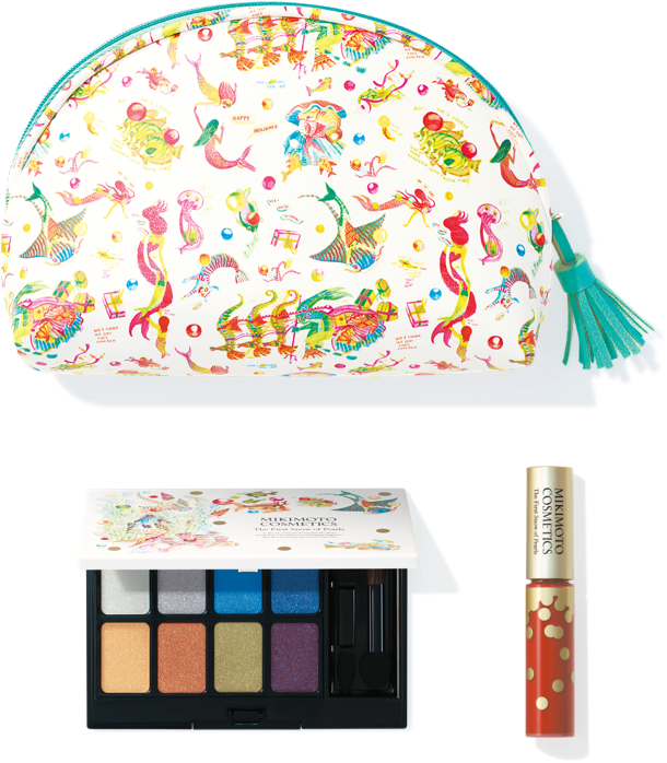
(image from mikimoto-cosme.com)
2. Paul and Joe x Doraemon: I must admit I was totally unfamiliar with Doraemon, a wildly popular manga character from Japan, when I first heard about this collection. It was a perfect fit for Paul & Joe given the founder's love of cats as well as her penchant for quirky, playful prints and collaborations (see the 2016 Warner Bros. collaboration.) I hope to write about it sometime in 2020.
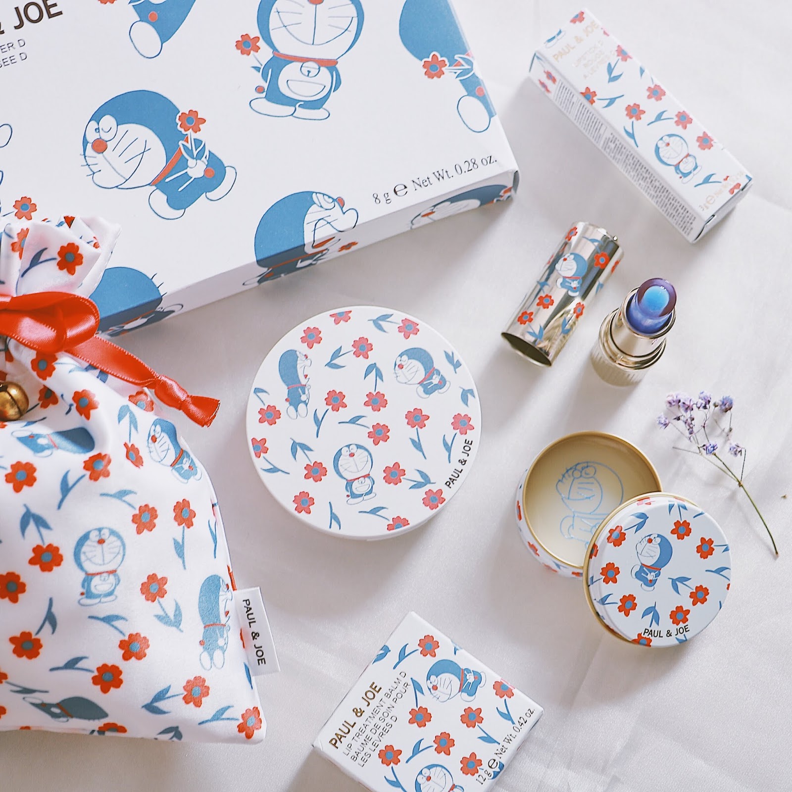
(image from blog.ulifestyle.com)
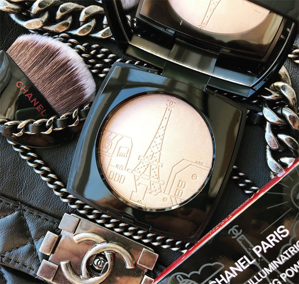
3. Chanel Eiffel Tower Illluminating Powder: I don't have much to say about this other than it was released in honor of the opening of Chanel's first beauty-only boutique in Paris. The embossing was so lovely and intricate, and the exclusivity made it impossible for me to resist – it was only available at Chanel boutiques in France and and the French website (I acquired it through ebay). Plus it's a fabulous piece to have if I ever want to revisit the Museum's fall 2015 Paris/French-themed exhibition.
As the Museum continues to expand its vintage holdings, for the first time I'm including my top vintage acquisitions.
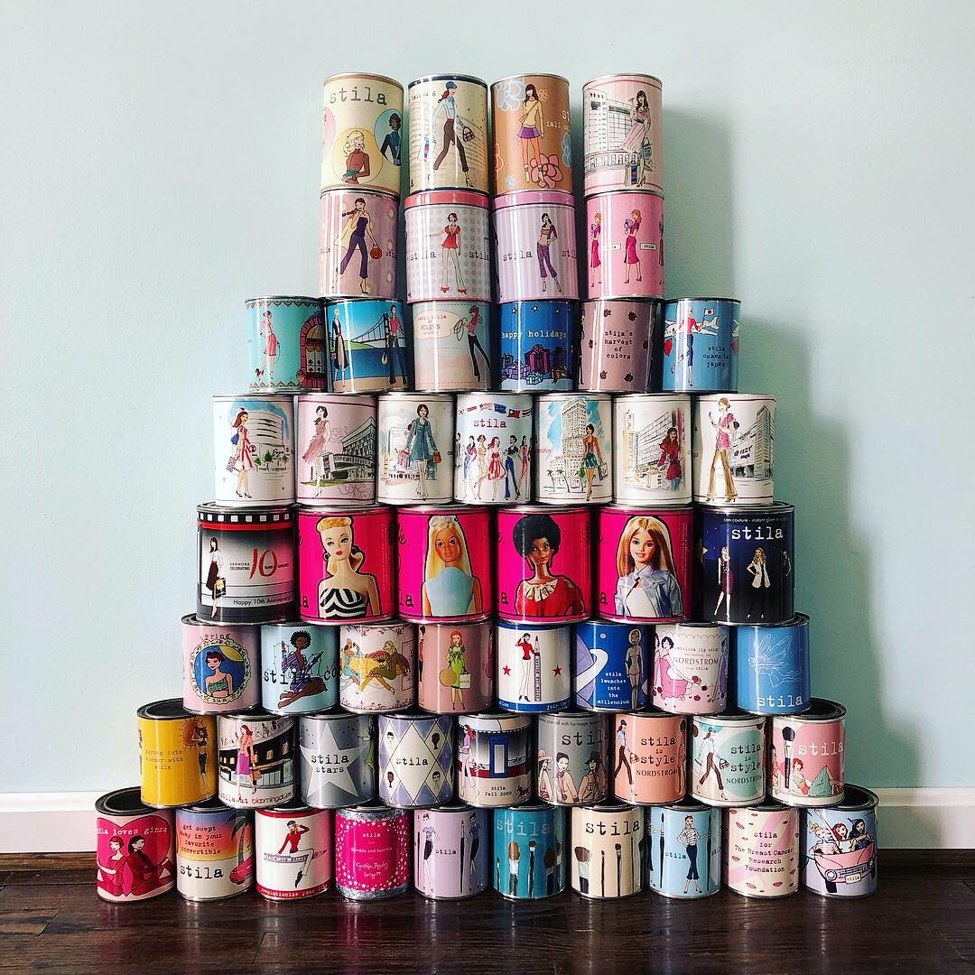
1. Stila paint cans: The picture shows the Museum's entire collection since I was too lazy to weed out exactly which ones I got this year, but back in February I bought 20 rare vintage (okay, maybe not quite vintage yet but very close) paint cans on ebay from a former collector who didn't have room. I was sad for her but glad I could give them a good home. Plus they really added something extra to the Stila girl exhibition.
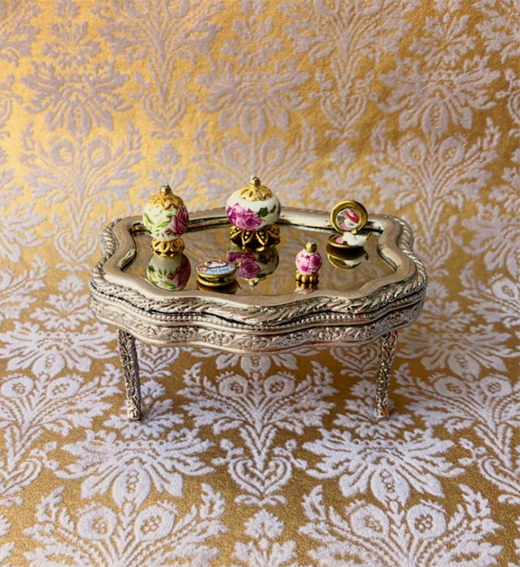
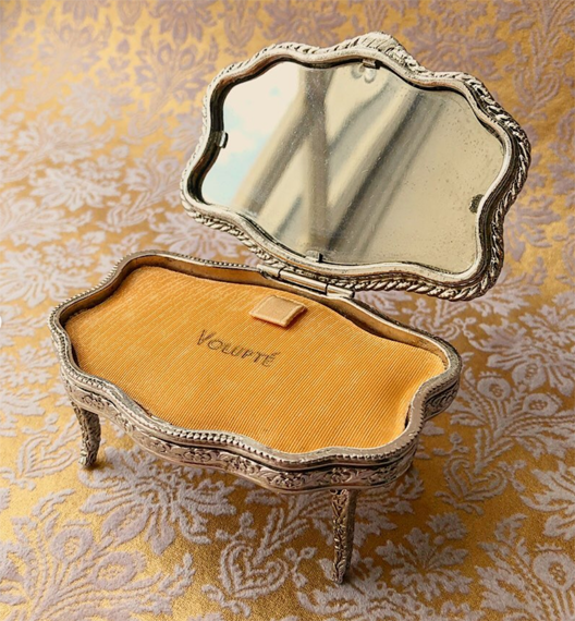
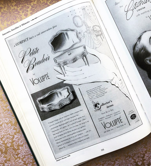
2. Volupté Petite Boudoir: among my many weaknesses are novelty compacts and palettes. I had been coveting this adorable vanity-shaped compact for ages, so when I saw one in excellent condition at a great price I pounced. For photography purposes (and because I love miniatures) I purchased some mini makeup items as accessories.
Here's an ad for it from one of my collector's guides, in case you're curious.
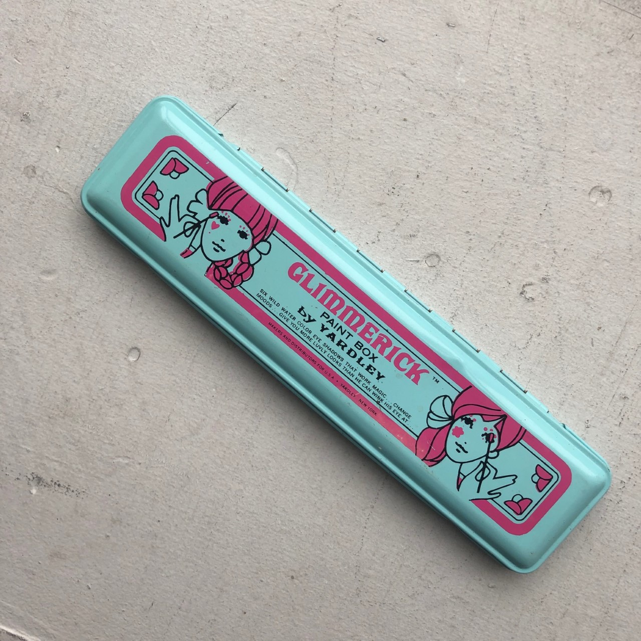
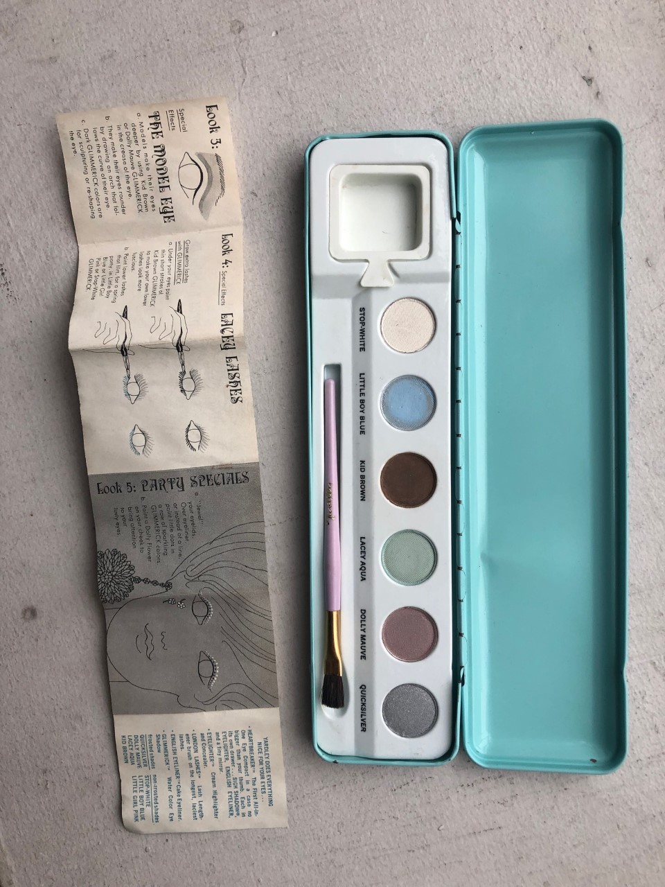
3. Yardley Glimmerick eyeshadow set: Another I haven't gotten around to sharing, but I was so pleased to get this one in fantastic shape and still with with the insert.
And now for the more lackluster releases this year.
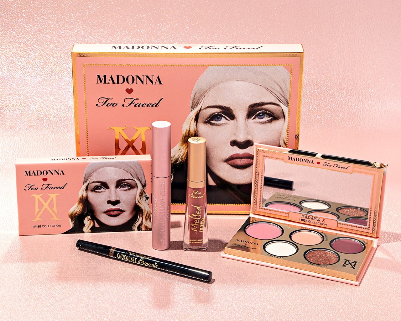
1. Madonna by Too-Faced: A hugely successful brand collaborating with a pop culture icon seems like a surefire hit, but dear lord was this unimaginative. I'm truly shocked at how boring this was. Between the flamboyance of Jerrod Blandino and Madge's propensity to push boundaries, I expected way more not just in packaging but the entire concept.
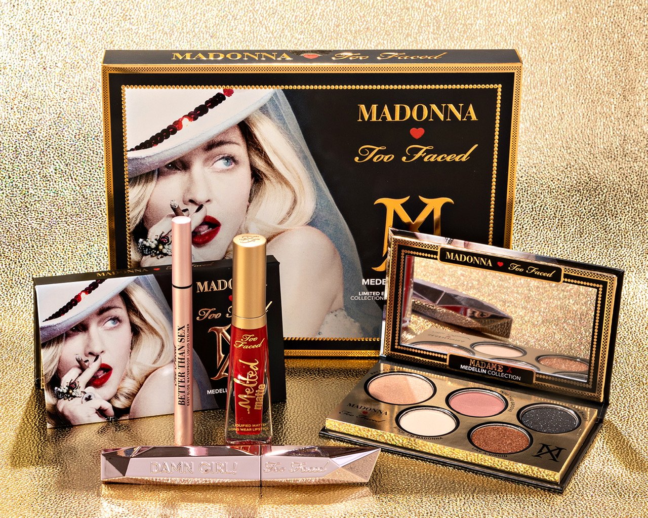
(images from shop.madonna.com)
2. Revlon x Mrs. Maisel: Another squandered opportunity, and much like the Estée Lauder Mad Men collaborations, a good idea but poor execution. You would think The Marvelous Mrs. Maisel would be a goldmine for inspiration. Midge worked at the Revlon makeup counter so the brand makes sense, but why the packaging didn't get a fabulous retro/vintage treatment I'll never know.
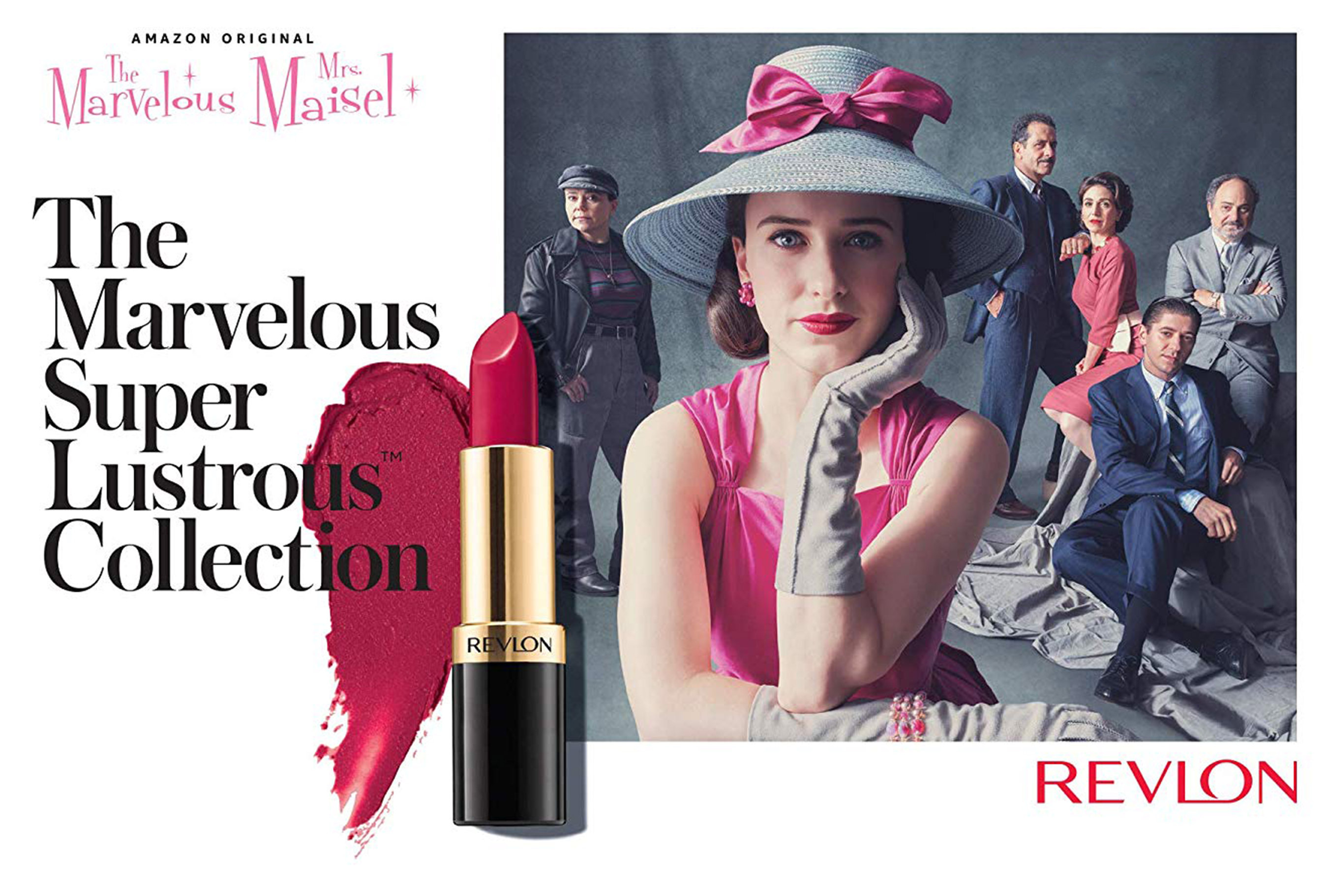
(image from ew.com)
3. Guerlain Rouge G Wild Glam case: Maybe it's sour grapes because I can't afford it, but I wasn't a fan of this one. It's a cool design, but not $290 cool! I honestly have no idea what Guerlain was thinking.
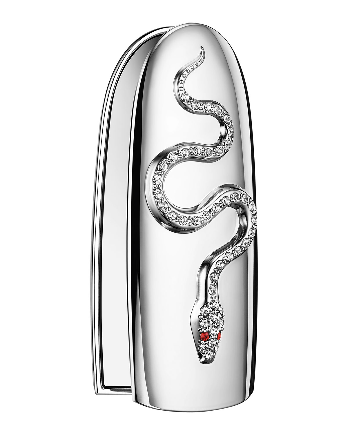
(image from neimanmarcus.com)
If I'm going to pay 300 bones for a lipstick case (and I've done it before, embarrassingly enough) it better at least have some sort of handmade element or utilize precious materials. As far as I can tell, neither of those things came into play here. It's just plain old rhinestones (not even Swarovski – I mean COME ON) and a silver-toned case, not real silver plating. And it wasn't handmade by a jeweler, just designed by one. It does say the rhinestones were "hand-set", but I'm skeptical. Plus this other rhinestone-encrusted case is within a normal price range, costing a mere $36. Finally, I'm confused by the snake motif, as it doesn't have any significance for Guerlain that I'm aware of. It felt like a very uninspired piece overall.
And those are some makeup highlights and lowlights of 2019. (I was going to do picks and pans for the past decade but immediately got overwhelmed, so I'm keeping it simple.) What do you think of these choices? Please visit the archives and let me know!
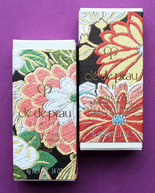
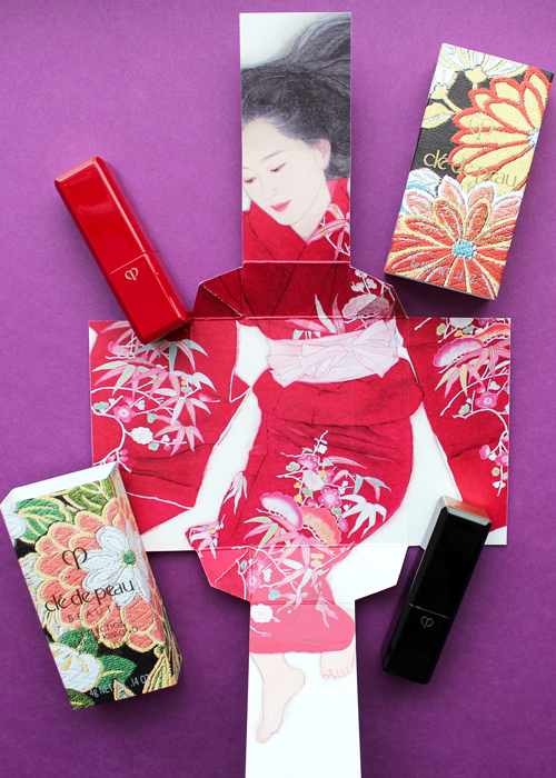
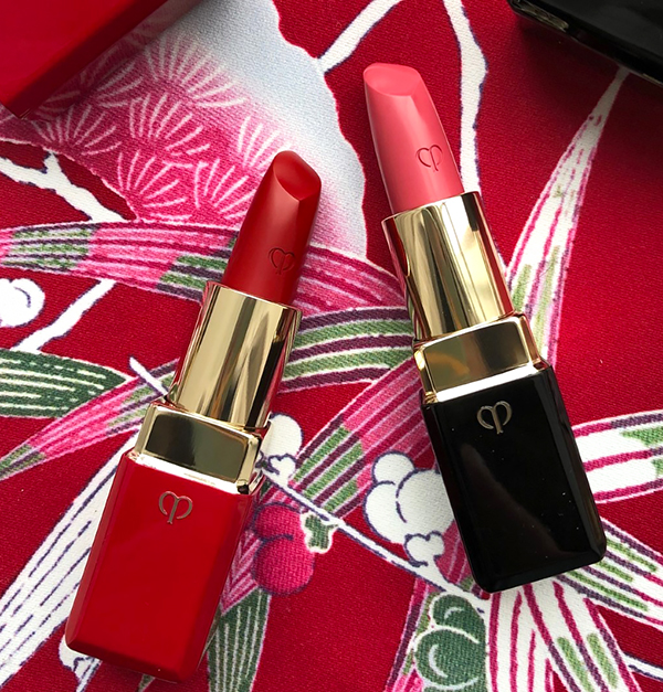
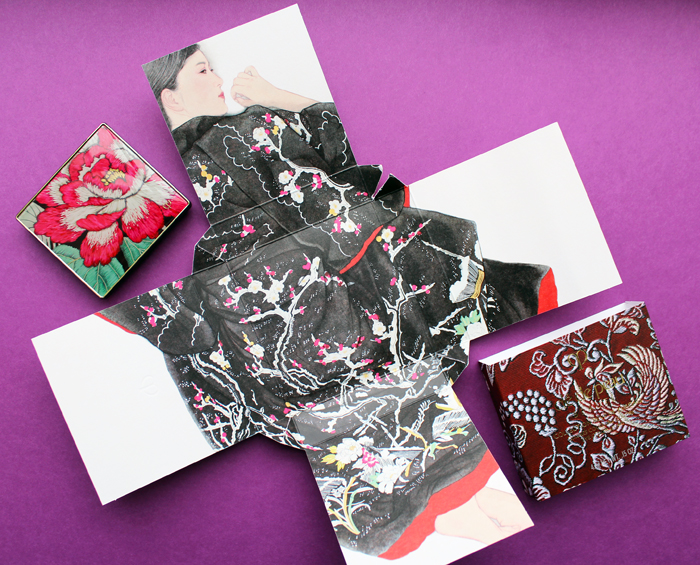
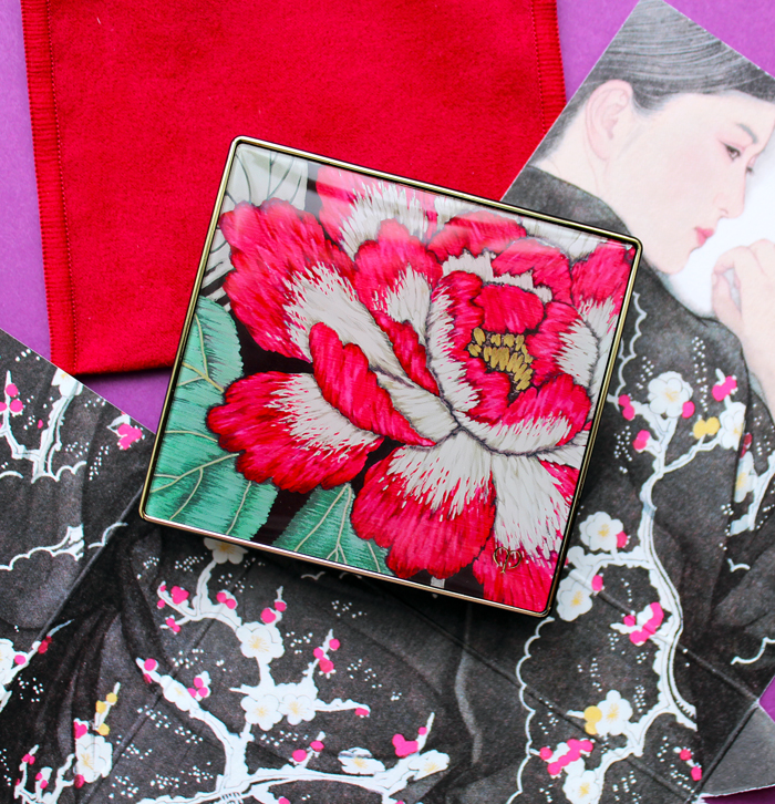
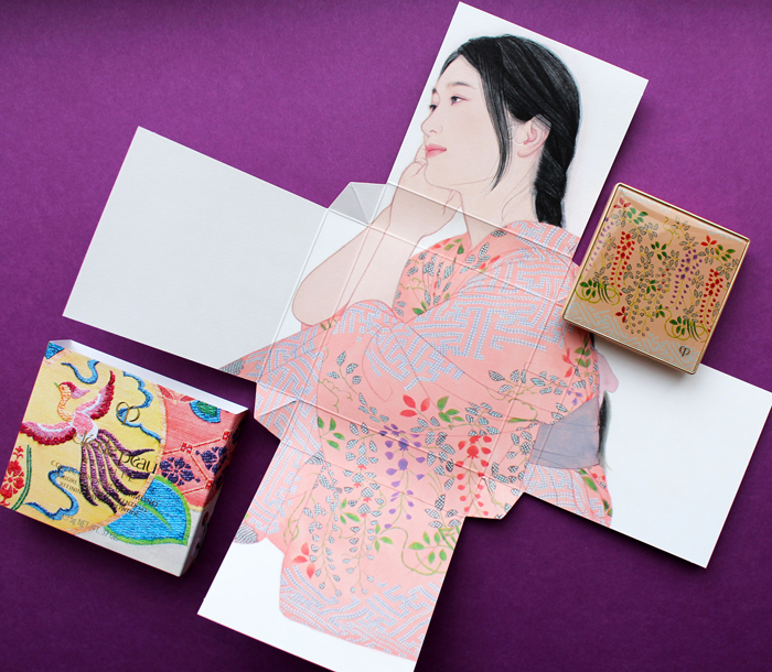
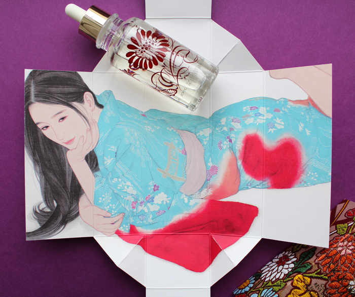
Clé de Peau continues their streak of beautiful and inspired holiday collections. This year's theme, Kimono Dream, is an homage to two venerable Japanese art forms: the kimono and bijin-ga ("pictures of beautiful women"). Obviously a deep dive into the history of both of these is way beyond this blog post, but as usual I'll provide a condensed version. First, let's take a look at the collection itself.
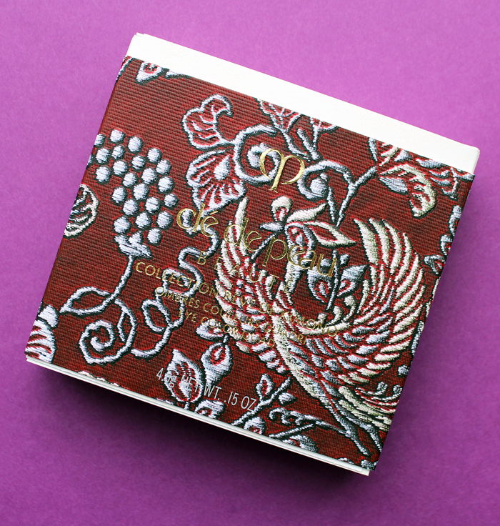
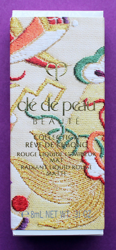
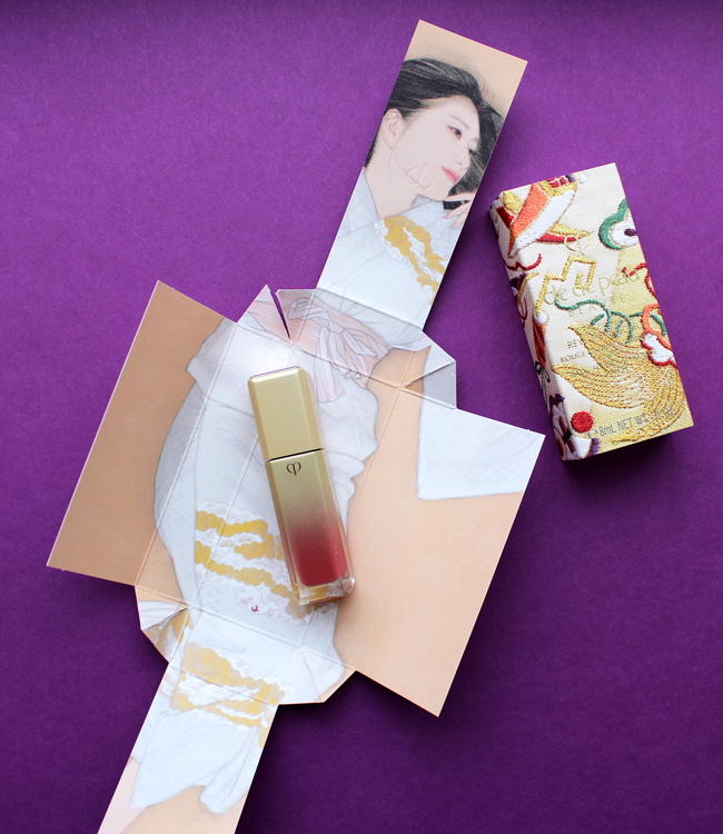
Each piece is packaged in a sturdy paper sleeve. Remove the sleeve, and the package opens to reveal a bijin-ga painting featuring a woman wearing a kimono. The intricate folding is reminiscent of how the traditional kimono is held in place with an obi, the decorative sash worn around the waist, as well as tatou, the folded paper used to wrap and store silk kimonos to protect them from humidity. The patterns on the sleeves are inspired by obi patterns as well. The unfolding aspect of the packaging is gorgeous and highlights traditional Japanese art, but it's also perfect for the theme Clé de Peau wanted to express, which was revealing women's inner beauty. Each painting represents one of four traits: passion, strength, charm and gentleness.
It's a bit contrived, but I appreciate that Clé de Peau took the time to align the products with the traits they wanted to convey and write little descriptions for each. Here's the one for the lipsticks, which symbolize passion. "Intense. Dynamic. Instantly revealing the passion within. Represented by plum, and evergreens pine and bamboo, against bright red silk. Despite your elegant façade, the force of your passion is unmistakable. A signal of powerful emotion that can’t be concealed."
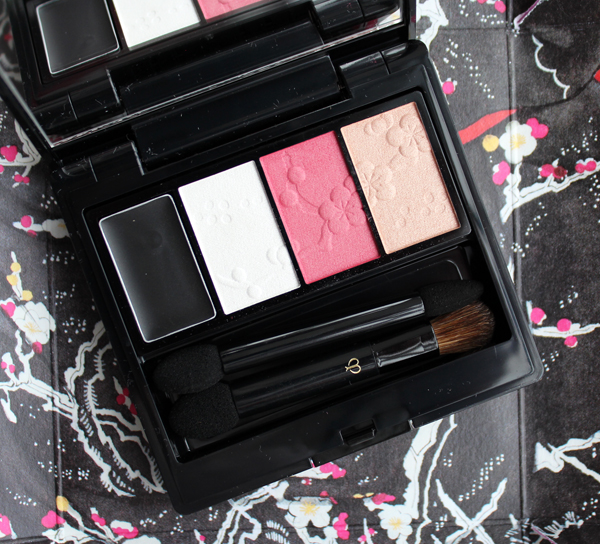
The eyeshadow quad was my favorite piece – I loved the striking black kimono shown on the woman contrasted with the delicate embossing on the shadows. "Strong, essential, with a flash of feminine red. Peonies and daffodils bloom in the snow, showing determination and vitality. A woman at one with her inner strength. Noble, dignified, the plum tree signifies resilience. You look outward at the world, through confident eyes."
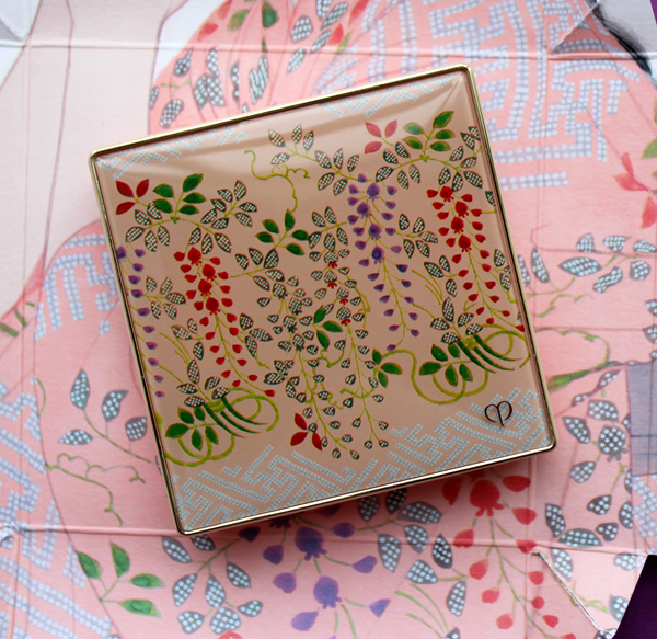
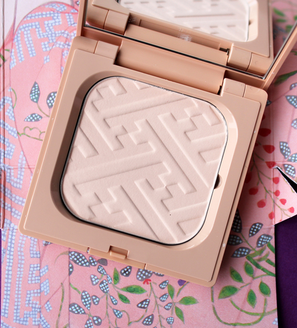
Next is the face powder, signifying charm. "Evoking prettiness and innocence. Symbolized by the peacefulness of wisteria and chrysanthemum against soft salmon-pink. Inspired by the simplicity of flowers, you rest sweetly in softness."
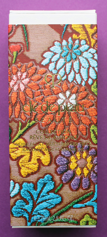
Finally we have the face oil, which embodies gentleness. "Your open, unbounded heart. Fresh blue silk accented with vermillion and soft pink. The serenity of a goldfish in water. Cooling, refreshing, harmonious. Surrounded by gentleness, you are wholly embraced."
There was also a matte liquid lip color, but that didn't seem to be included in the four traits. Nevertheless it is stunning and the packaging was different than the others so I had to include it!
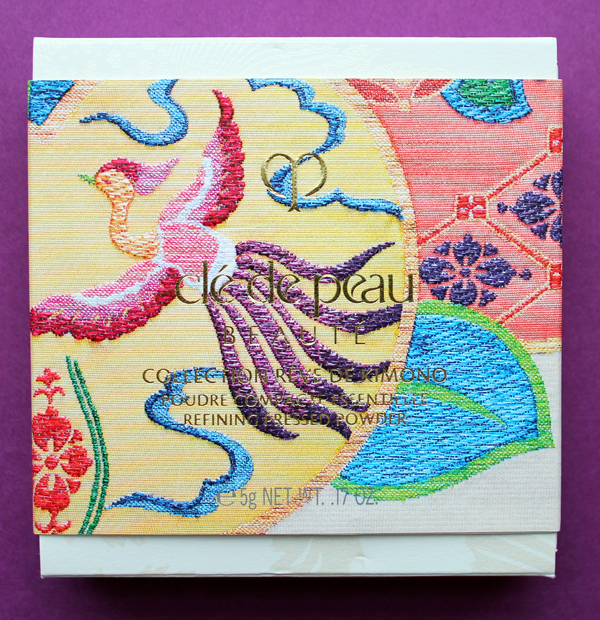
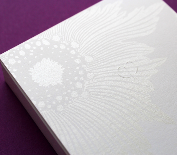
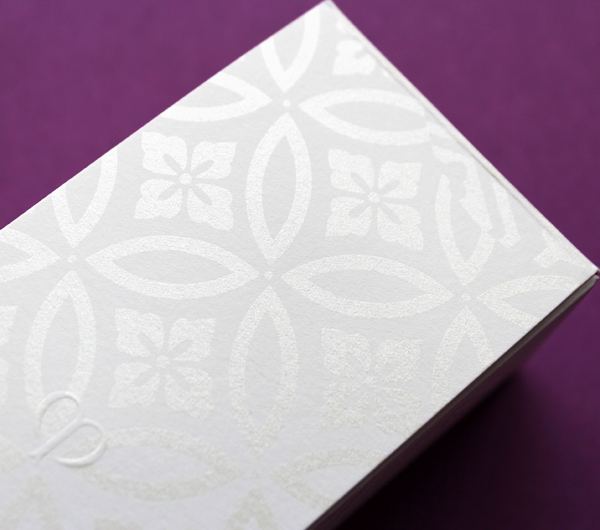
I couldn't resist sharing the embossing on the outer boxes. Such a nice little touch.
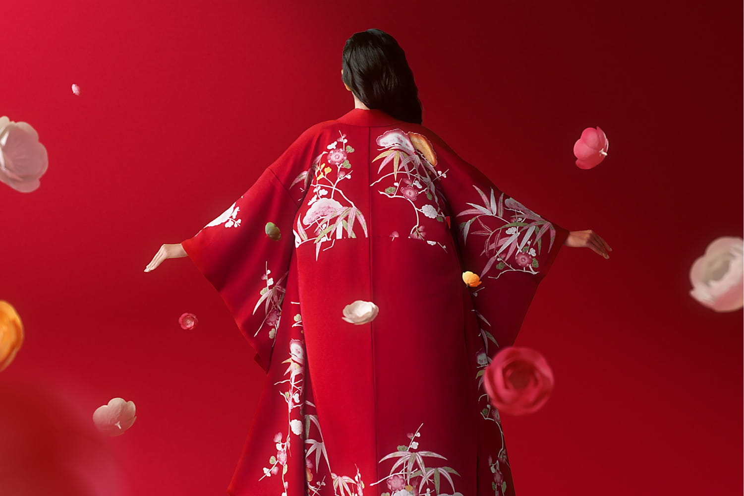
Now here's where the real history and collaborations come in. First up is the kimono Clé de Peau commissioned exclusively for the holiday collection. Fortunately for me (less work, haha!) the company did a fantastic job explaining the partnership and kimono-making process. "The kimono commissioned by Clé de Peau Beauté, created in collaboration with Tachibana, an embroidery and dyeing studio in Kyoto that plays a role in preserving kimono culture.1 Crafted using a valuable dyeing technique called Surigata-Yuzen, which uses dozens of stencils to dye different patterns, layering one color over another. Since Tachibana’s foundation in 1947, its colorful works have been captivating kimono fans. Founder Zenzo Sodesaki (born in 1911) learned the basics of making kimono at Chiso, a traditional Japanese textile producer and one of the oldest yuzen coloring companies in Kyoto. Current representative Yohei Kawai is the third generation, following Zenzo Sodesaki and second generation president, Kenichi Kawai." The red and pink colors were chosen specifically to match Clé de Peau's two holiday lipstick shades.
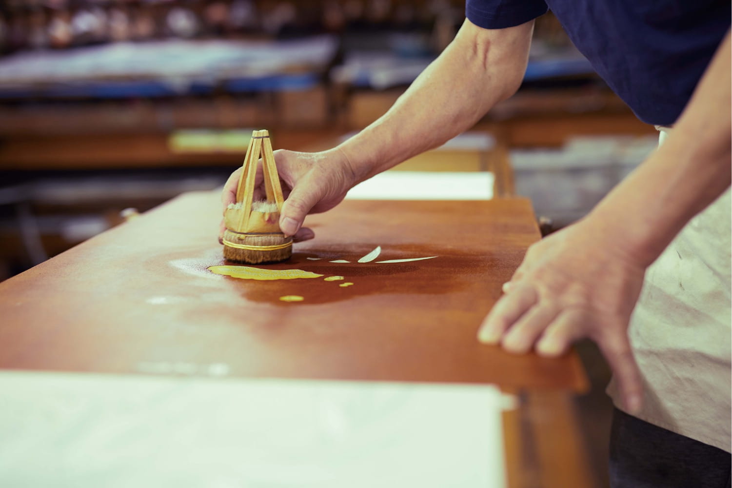
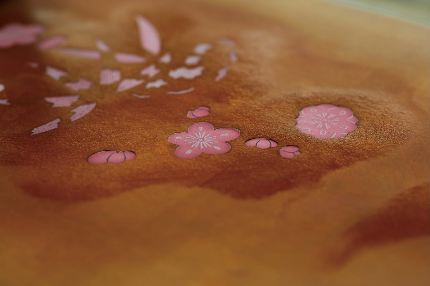
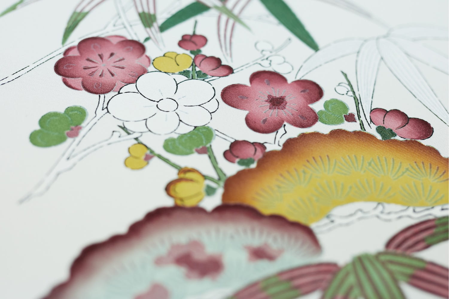
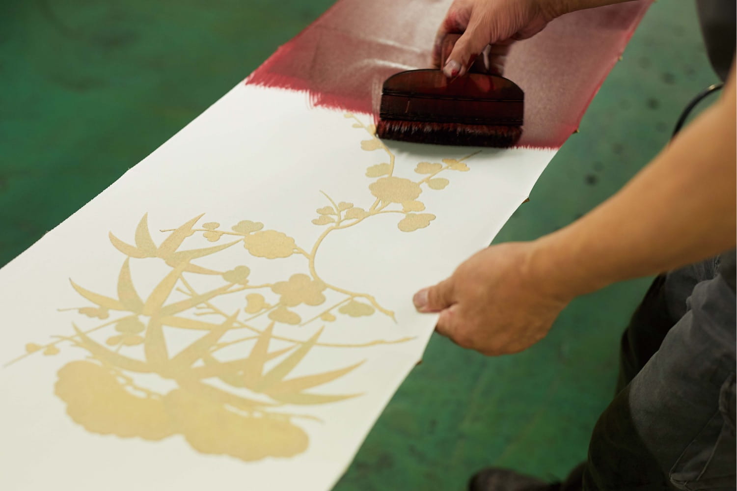
After the pattern is determined and sketched, it's time to stencil. The Clé de Peau kimono used a particular technique called Surigata-Yuzen. I'll let Clé de Peau describe the process in a nutshell. "The Surigata-Yuzen method uses dozens of stencils to dye patterns onto kimono silk, layering one color over another to produce a gradation. Every gradation is done by hand, adding another layer to the painstaking art of the kimono…For each color, dyeing is repeated in different tones, the layers achieving a complex and extraordinary beauty." A whopping 34 stencils were used for Clé de Peau's kimono.
Tachibana's bowtie website provided a little more insight into the process. "Dedicated professionals hand-carve patterns to create the stencils, which were at one time made simply of layered paper but are now mixed with resin to give them strength. Hoshi-awase, the positioning of the stencils, is one of the most important parts of the dyeing process. All of the stencils in a given pattern have small holes called hoshi. By aligning the hoshi of each stencil at the exact same place, dozens of stencils can be positioned on the fabric with great accuracy. Senshoku is the process of dyeing a pattern on fabric using brushes with colors. Various-sized brushes are used according to the size of a pattern. Once part of the fabric is dyed, a stencil is moved to the next place on the fabric. Stencils are accurately aligned using the hoshi holes. Pattern dyeing is followed by a process called noribuse, in which the whole pattern is covered with rice glue before dyeing with ground colors."
To be honest, I'm still confused as to how surigata-yuzen differs from other forms of yuzen techniques. This website seems to insinuate that surigata-yuzen is unique to Kyoto, therefore a subset of kyo-yuzen, but I'm really not sure.
Next, the entire kimono was hand-dyed with a brush via a process called Hikizome. Hikizome is used not just for kimonos but can be applied to all kinds of textiles – pillows, curtains, towels, etc. I believe this is true for yuzen as well, but once again I'm not certain.
The last step is to wait for the dye to dry in its own good time. According to Clé de Peau, "To make a kimono is to live by the laws of nature. So as not to alter the natural drying process, temperature condition is maintained the same throughout the year. The fate of the color finish is in the hands of nature, as the outcome is never the same." This aspect of the process fascinates me, especially for the Clé de Peau collection. The company wanted very specific colors that perfectly matched their two lipstick shades, so given that the drying is left to nature, how could they know for sure the color would turn out the way they wanted?
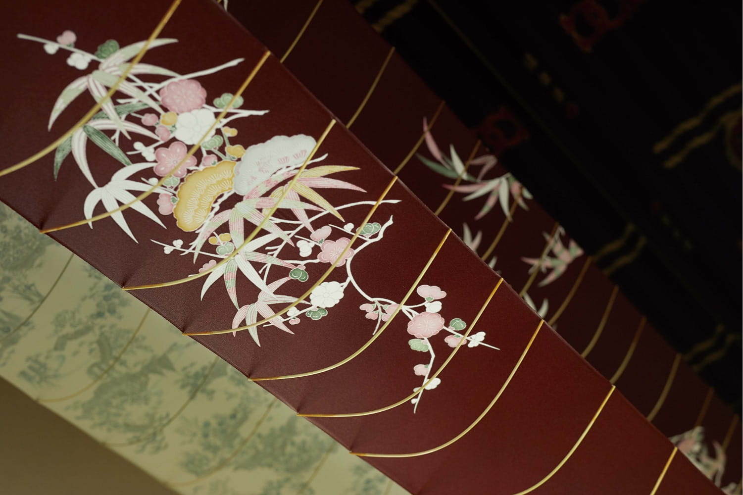 (images from cledepeau-beaute.com)
Obviously it doesn't really matter, but it's interesting to consider that no one can predict the exact color. That makes the control freak in me rather anxious, but I can also appreciate the respect for nature. While I enjoyed reading about the kimono production process, I would have liked to see a little guide on how to fold and secure a kimono and how the obi fits in, as this aspect of the kimono was emphasized in the collection's packaging. Oh well.
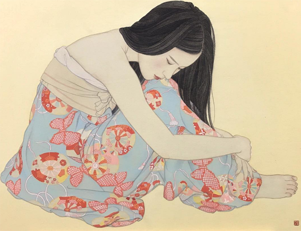
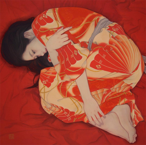
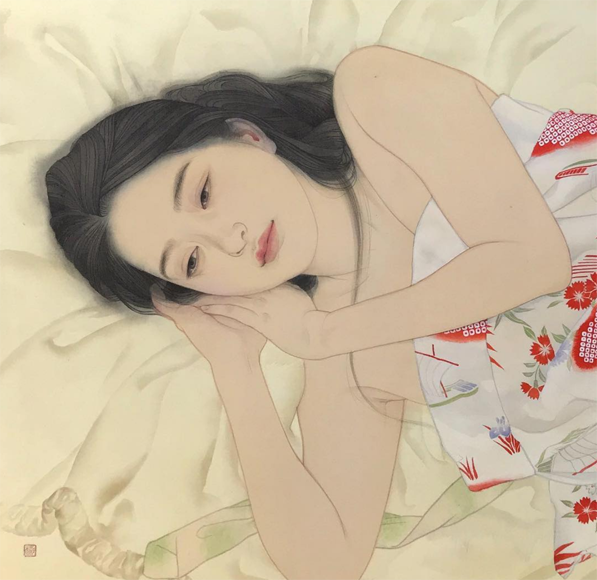
Now let's take a look at the amazing paintings by Ayana Otake, which graced the interiors of the packaging. Again, I didn't have to do much digging to get some information about Otake, for Clé de Peau also provided a brief bio. "Born in Saitama in 1981, Otake-san grew up surrounded by traditional culture and kimono. In 2007, she graduated in the Japanese Painting from the Department of Painting at Tokyo University of the Arts. She has produced works for galleries and department stores in Tokyo, and also practices bookbinding and package design." I would have liked to interview Otake to hear more about the Clé de Peau collaboration – I'm always curious to know how companies and artists find each other – but looking at Otake's other work as well as finding out a little about the tradition of bijin-ga will have to suffice.
Otake specializes in a modern version of bijin-ga. "Ga" means "picture" and "bijin" means "beautiful person", but is nearly always translated to "beautiful woman". Like kimonos, bijin-ga has an incredibly rich and long history. Part of me feels guilty for reducing it to a few paragraphs, but mostly I feel that since I'm not a Japanese art expert, I need to reign it in.
The genre of bijin-ga originated in the late 17th century and was popularized towards the end of the 18th century via ukiyo-e (woodblock prints). The women depicted at the outset were prostitutes, but over time bijin-ga expanded to include women from all walks of life. This website hosted by the Atsumi International Foundation explains the early origins of bijin-ga. "[W]ith the changes in society related to the rise of the merchant class, there was a new interest in depicting daily activities and pleasures of contemporary life. Popular entertainments were used for subject matter in paintings and then an interest developed in the beauty of personal appearance and form of women, including their clothing. Women of the brothels and pleasure quarters were predominately represented, and bijinga became a principal genre of the new *ukiyo-e 浮世絵. Single female figure portraits developed in the Kanbun 寛文 era (1661-73) with the Kanbun beauty *kanbun bijin 寛文美人. Typically, a yuujo 遊女 (courtesan or licensed prostitute) in a standing position was depicted in the bijinga of early ukiyo-e. Bijinga gradually broadened to include tea shop waitresses, the daughters and wives of tradesmen, etc. Nishikawa Sukenobu 西川祐信 (1671-1751) and Suzuki Harunobu 鈴木春信 (1725-70) produced pictures of women of various social classes, in addition to courtesans."2
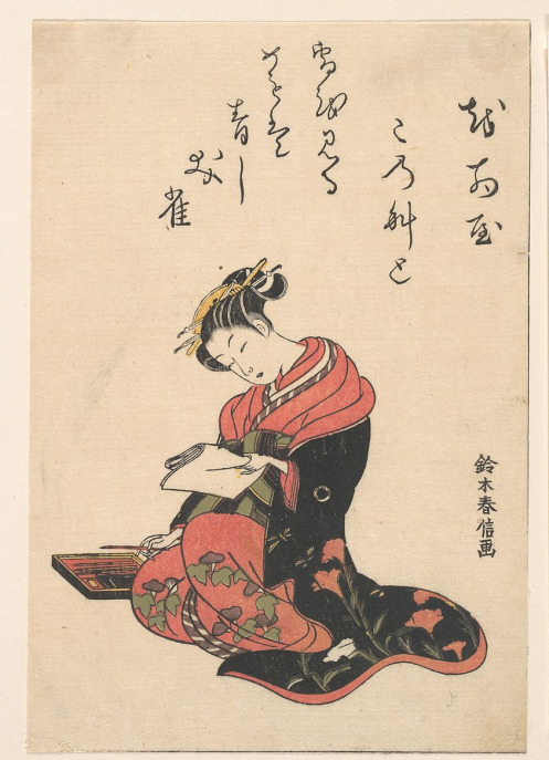
(image from metmuseum.org)
In addition to portraying a variety of women, bijin-ga gradually expanded in the late 19th century to emphasize a woman's inner beauty as well as outer. "During the Meiji Era (1868-1912), portraits of beautiful women — which later became known as bijinga — evolved to focus on not only physical beauty, but also inner beauty. During this time, many artists excelled at bijinga, including Kiyokata Kaburaki (1878-1972), who was acclaimed for emotionally rich portraits; Shinsui Ito (1898-1972), who depicted real women rather than models; and Uemura Shoen (1875-1949), a female artist who brought a sense of dignity and refinement to the women she portrayed." As we'll see, I think Uemura Shoen's work in particular is a precursor to Otake's in that her paintings seek to express not just internal beauty but perhaps an inner monologue. The women in both artists' paintings appear very contemplative – I'd love to know what's going on in their heads. I'd also propose that both artists' perspectives are more feminist than they appear at first glance.
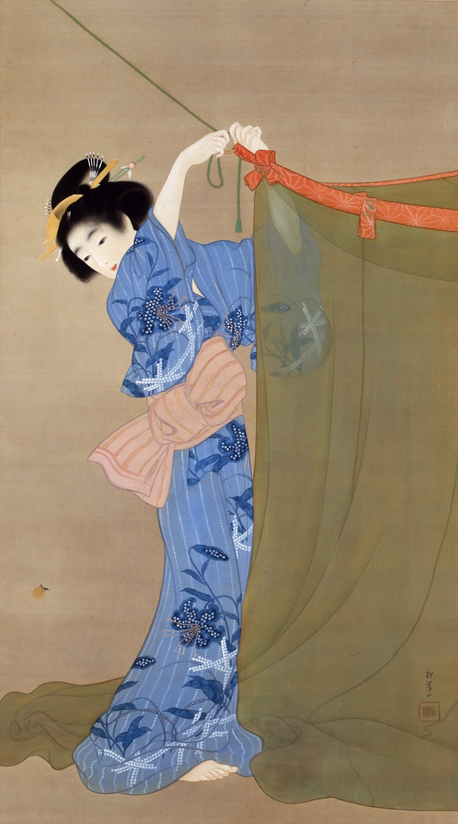
(image from japonica.info)
Anyway, the shin hanga ("new prints") art movement of the early 1900s cultivated further evolution of the bijin-ga genre. As the century progressed, the women portrayed became fully liberated from the earlier negative connotations, and the emphasis on capturing their internal beauty and positive traits became the primary attribute of modern bijin-ga. Otake's work continues the tradition of bijin-ga on a very basic level in that her paintings are of beautiful women; however, they have a thoroughly modern sensibility. Gone are the perfectly coiffed and made-up ladies of the old bijin-ga, as Otake shows women in a more natural, relaxed state – half-dressed with loose hair, lounging in bed or on the floor. There's a greater sense of intimacy and introspection in these scenes, as well as personal agency. These women don't seem to be waiting for anyone, they're simply enjoying some time alone.
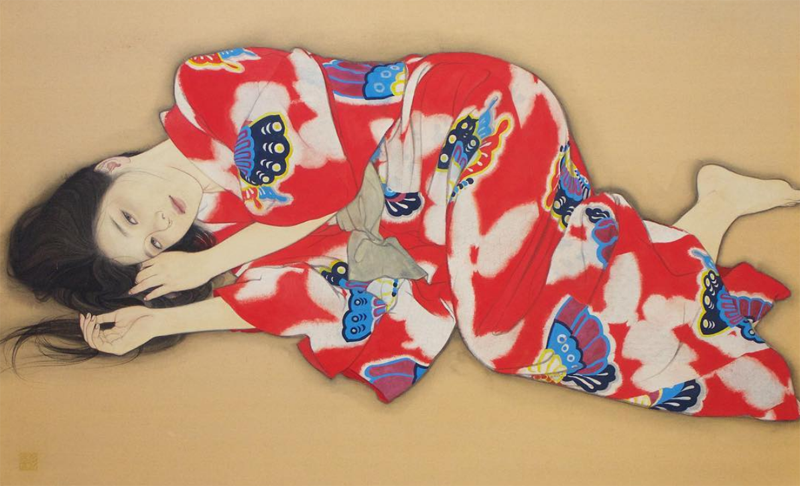 (images from @ayana_otake)
As far as I know Otake created original works for the Clé de Peau collection rather than recycling existing pieces. They tie into the collection not just through the inner beauty aspect but also by Otake's particular process, as her technique mimics one the methods used for kimono production. In the video below, she says: "When I'm not painting I look at greenery and try to be in touch with nature as much as possible…If it isn't sunny or a dry day, I can't work. So I look to the weather. Nothing beats natural drying. And authenticity is not about going against nature, but to live with nature, which I think is important." Otake notes that while sometimes she uses a dryer to speed up the drying time of her paintings, she usually "messes up". Her respect for nature and allowing it to complete her paintings serves as a parallel to letting the kimono dry naturally according to the weather, without any other intervention.
Overall, this is another winner from Clé de Peau. The intricacy of the packaging echoes the labor involved in the traditional kimono-making process, while the paintings serve as an updated version of a centuries-old artistic genre – it's a perfect marriage of old and new. I admired that for this collection, instead of doing a straight-up artist collaboration as in years past, (nothing wrong with those, of course!) they honored waning cultural traditions to raise awareness and educate people, a concept perhaps borrowed from Sulwhasoo's Shine Classic compacts. Finally, I loved all the details: the folding of the packaging, the fact that the paintings were on the inside to represent inner beauty, dyeing the kimono the same colors as the lipsticks, even the embossing on the boxes all came together to form a cohesive collection. I must congratulate the design team, as every last detail served a purpose. They were stunning, sure, but they also weren't superfluous – every single one contributed to the theme. I will say I'm scratching my head as to the whereabouts of Clé de Peau Creative Director Lucia Pieroni, as she doesn't seem to be as involved with this collection as in previous years, but the collection itself turned out beautifully.
What do you think of this collection? Which painting was your favorite?
1For further reading on the history and cultural meanings of the kimono I'd recommend Kimono: A Modern History.
2 This author points out that while they were euphemistically labeled as "courtesans", the prostitutes depicted in early bijin-ga had rather tragic lives. "Often the images were published with the prostitutes' names. Such prints were usually commissioned by high-ranking oiran as a kind of advertising posters. In today's print descriptions by ukiyo-e dealers or auction houses, the women shown on bijin prints are usually named 'courtesans'. The life for these 'courtesans' was not so beautiful. They were kept like slaves in these licensed quarters." Yikes.
I'm so very excited to announce the Makeup Museum's special exhibition in honor of Stila's 25th anniversary! I was too overwhelmed to do a full history of the brand, so I decided to just focus on the famous Stila girl illustrations. If you've been following me for a while you know that the Stila girls were sort of the gateway drug for my interest in collecting makeup and seeing cosmetics packaging as art. For such a milestone anniversary I knew I wanted to pay tribute to them, even though the year is almost over (thankfully – it's been miserable for a number of reasons), especially given that I've been itching to put together a special exhibition for them since at least 2016. I also wanted to try something totally new for the Museum in terms of exhibitions. Technically all of them are online, but instead of putting things on shelves and taking photos, I wanted it to have a more "real" online exhibition feel. I've been doing a lot of thinking the past year or so about how to improve the exhibitions even though I'm so limited in what I can do, and I was really inspired by the Kanebo Compact Museum website, and once the husband showed me Squarespace I was sold. Well that, and the fact that he kindly offered to design the entire exhibition site for me. ;) So I set up a domain there which, if this exhibition is well-received, will serve as the space for the Museum's special exhibitions going forward. The seasonal ones will remain here if I decide to keep going with them. Looking ahead, I think I'd rather focus on more specific topics than general seasonal trends. Not that I can delve too deeply into particular themes given the never-ending lack of resources, but I still want to at least try to do slightly more in-depth exhibitions even though they won't be exactly how I want them. I'm looking at them as a starting point for bigger things.
Enough of my blabbing about the basic stuff, I want to give some more details about the exhibition itself. It came together nicely, or at least, it was the one I worked most on with the possible exception of Sweet Tooth (still want to revisit that one!) I really wanted to get interviews with the key people behind the illustrations, so I put my crippling fear of rejection aside and boldly contacted Jeffrey Fulvimari (Stila's original illustrator), Caitlin Dinkins (illustrator during Stila's early aughts heyday) and Naoko Matsunaga (who took over for Dinkins in 2009). While I was disappointed at not hearing back from two of the three, if only one responded, I was glad it was Jeffrey since I've been following him for a while on Instagram and I love his approach to art and his personality. He is quite the character! It ended up giving me so much confidence I reached out to the grand poobah herself and my curatorship namesake, Jeanine Lobell. Yes, I actually DM'ed the founder of Stila on Instagram and asked if she'd be up for an interview. And…and…are you sitting down?? You really need to. Okay, now that you're sitting and won't have far to fall in case you faint, I can tell you that she agreed to do it!!
Not only that, she actually answered all of my interview questions!! You have no idea how ecstatic I was to finally be heard by a major industry figure. Took over a decade but I finally made contact with a big name! So that was most exciting, easily one of the most exciting things to happen in the Museum's 11-year history. And her answers were really good too, I've incorporated them throughout the exhibition so make sure to read through.
As for the items, I didn't take photos of everything in my collection because again, too overwhelming. The Museum has over 130 Stila items, nearly all of which feature the girls. I mean…
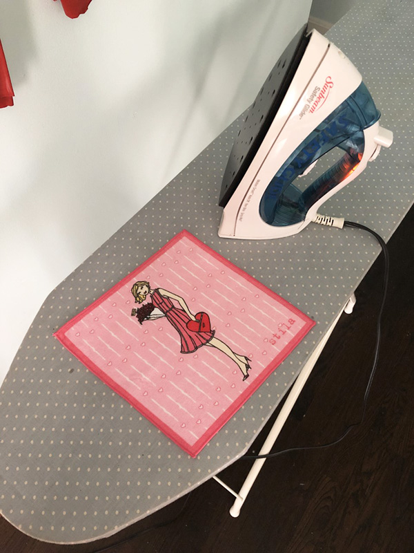
The photos I did take have purposely plain backgrounds because I wanted the emphasis to be on the illustrations. I tried to have a good mix of memorabilia and the makeup itself. I even had to iron a few items.
I also included a couple photos of things that I don't actually own but are important in getting a full picture (haha) of the illustrations. I'm pleased with how the sections are arranged, and I must thank my husband for organizing them so perfectly in addition to designing the whole site. I'm thinking of adding a section called Soundbites, a repository of quotes from the both the beauty community and general public telling me why they like the Stila girls or really anything related to the brand, so be sure to email me or comment here. I really wish I could have an app that would "Stila girl-ize" the user, i.e. you upload a picture of yourself and it would automatically generate a Stila girl style illustration of you, just like this. And of course, if the Museum occupied a physical space I'd definitely hire an artist to do live drawings at the exhibition opening – how fun would that be?
So that about wraps it up! Please take a look and tell me what you think of the new exhibition format!
I'm not sure where I was from May through September of 2011, but I totally missed the news about an exhibition on the history of makeup at the Couven Museum in Germany. Sponsored by Babor, the exhibition displayed cosmetic items from antiquity through today, with an emphasis on the late 20th century. From the website: "This exhibition takes a tour through the history of seductive cosmetics from antiquity to the present day. In cooperation with Babor Cosmetics, an internationally operating Aachen family business, a selection of objects and paintings relating to the culture of cosmetics will be on show. Visitors will also get an insight in the fast-moving yet highly characteristic trends of fashionable beauty and cosmetics from the 1950s to the present day."
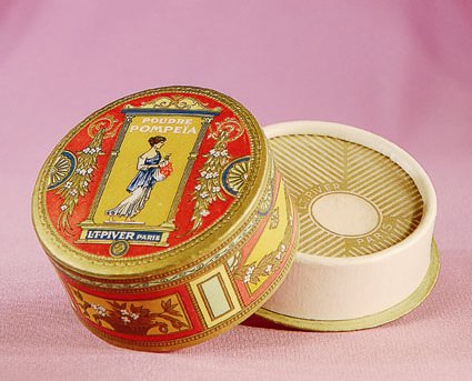
(image from couven-museum.de)
I tried to translate as much as I could from the brochure. It seems like it was a bit light on the historical aspects and a little heavy on the business/advertising side – there seemed to be a LOT of guest speakers from Babor for the various panels and Babor representatives hosting tours and workshops for an additional fee – but the topics were pretty interesting: body care in ancient Greece, Cleopatra's bathing routine, and an exploration of beauty ideals through the centuries.
I'm not sure whether I would have made the effort to travel internationally to see it, since it does sound more commercial than educational and it seemed to be relatively small-scale (I have the sense it only took up one or two rooms), but it's at least nice to know there was another cosmetics-related museum exhibition.
I'm working away on various exhibitions of my own so I hope to have more in-depth content soon. In the meantime, have you ever been to Germany? I need to go, if only just to experience the Lipstick Museum in Berlin…but that's a post for another time. 😉
As with lipstick holders and tissues, another piece of makeup ephemera has seem to gone nearly extinct: the built-in lipstick mirror. Sure, there are still some run-of-the-mill fabric and leather lipstick cases with mirrors inside, and some contemporary companies have recycled the basic designs, but no current lipstick mirrors are as novel as their vintage counterparts. Today I'll take a look (haha) at the various vintage contraptions and mechanisms that allowed for a quick lipstick touch-up. As usual this exploration is not intended to be a comprehensive history of lipstick mirrors, but a brief overview and theories as to why they have mostly disappeared from the beauty milieu as well as the reasons they were even produced in the first place.
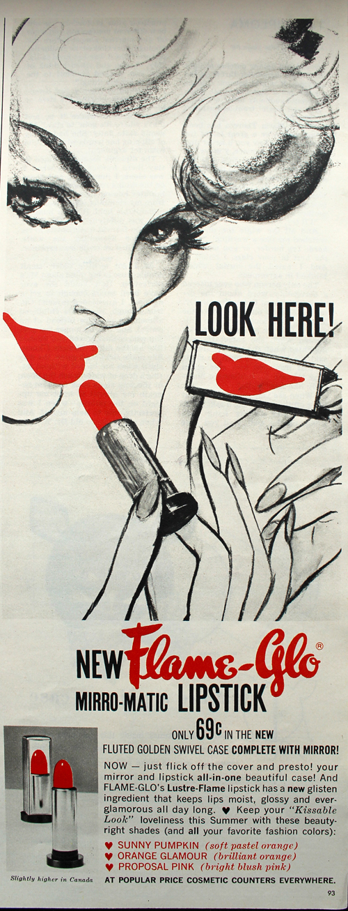
The simplest design consisted of a mirrored tube, favored by the likes of Avon and Flame-Glo.
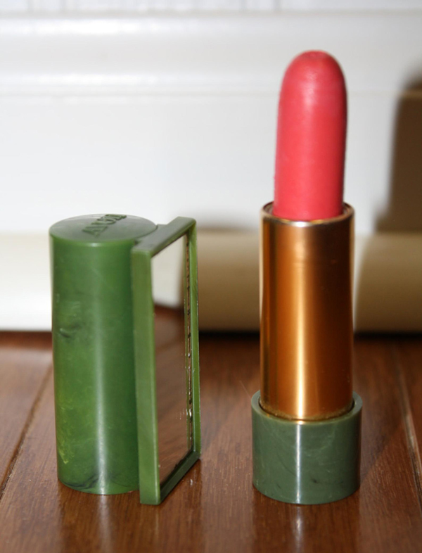
(image from etsy.com)
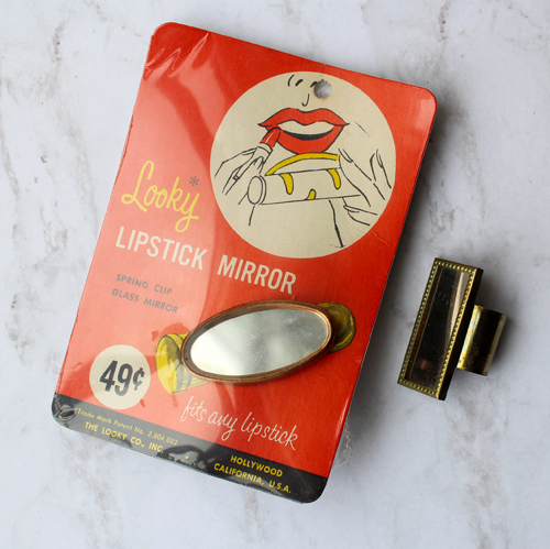
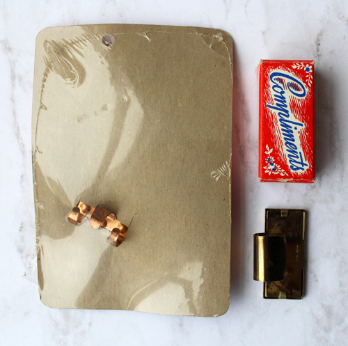
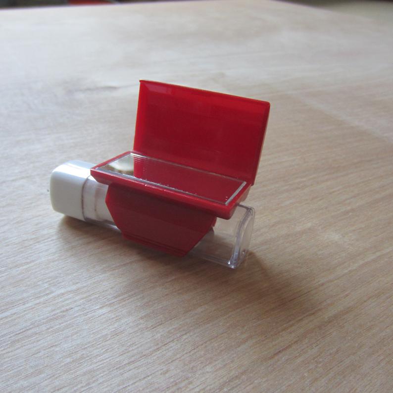
The second most basic and inexpensive option was the humble lipstick clip, which attached directly to the lipstick tube. The adjustable design meant that it could fit virtually any tube and was easily removable.
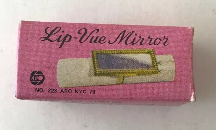 (image from ebay.com)
I purchased a couple of these clips for the Museum's collection. Here we have the "Looky" mirror, which was patented in 1957, and Compliments, which most likely dates to around the same time.
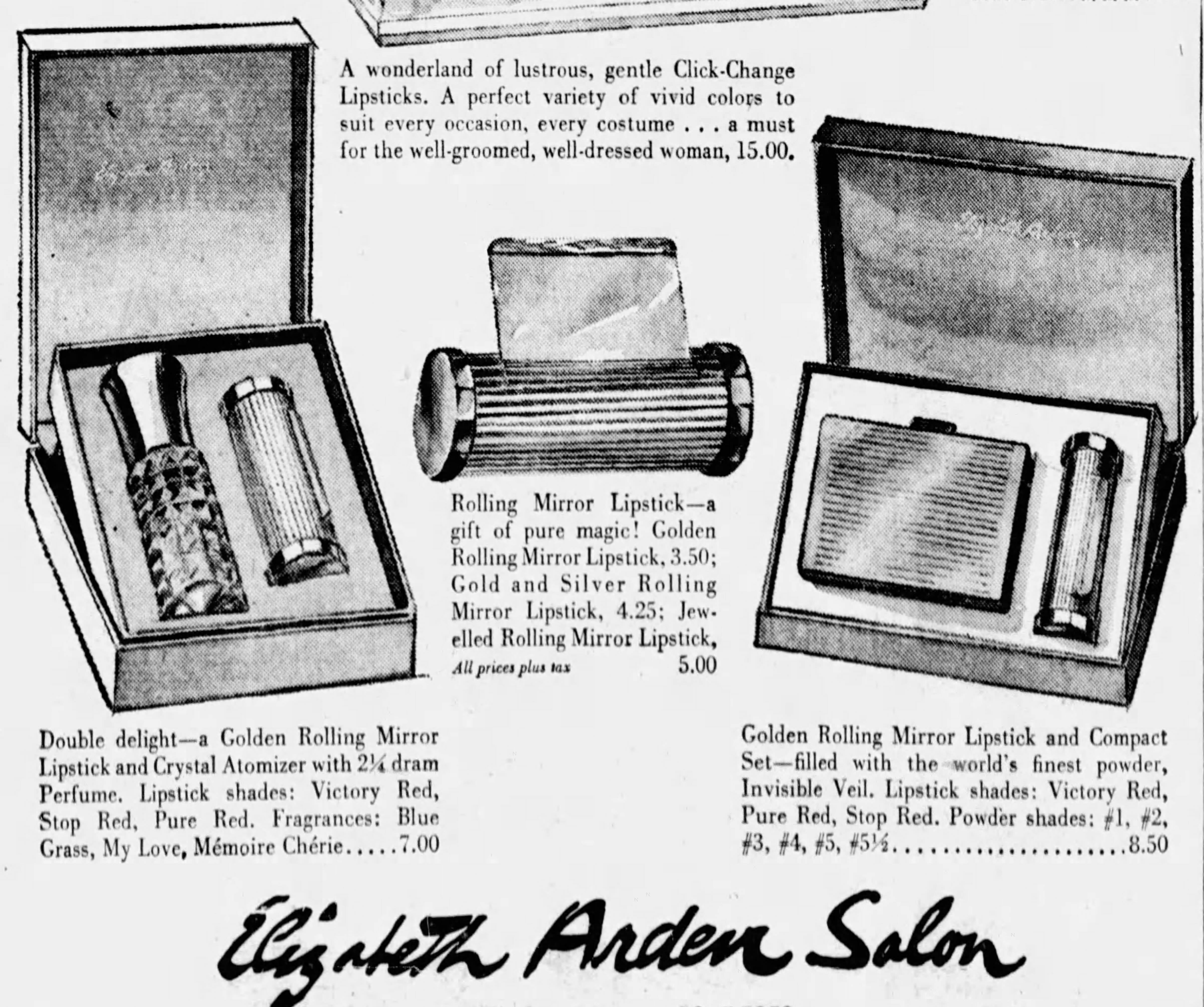
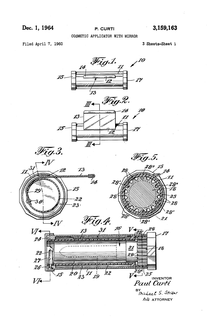
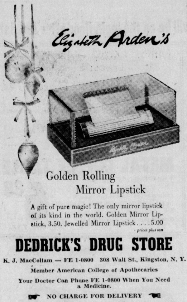
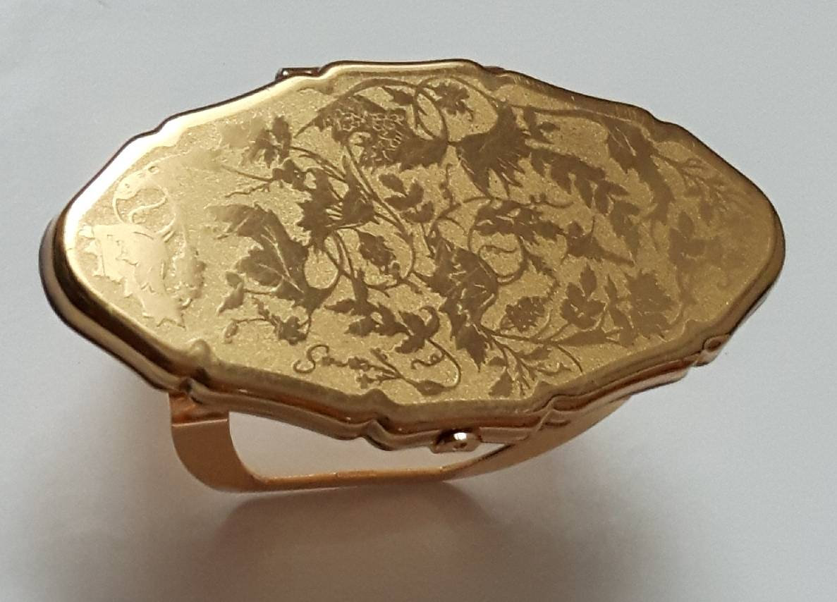
The only design flaw with these types of mirrored tubes and clip-on mirrors was that they would be easily smudged since the mirror was exposed. Enter the folding lipstick mirror and clip! Elizabeth Arden's Rolling Mirror lipstick debuted in 1959, and while I couldn't find an exact date for Stratton LipViews, they probably were released around the same time and continued to be sold until the early '90s.
(images from etsy.com)
Avon also made a far less elegant plastic version.
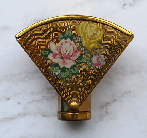
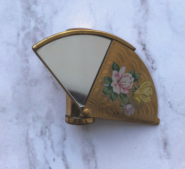
The mirror could also be protected from smudges and scratches via a sliding mechanism instead of a folding one, as shown in this fan-shaped Stratton lipstick holder.
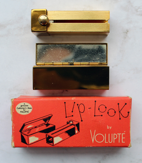
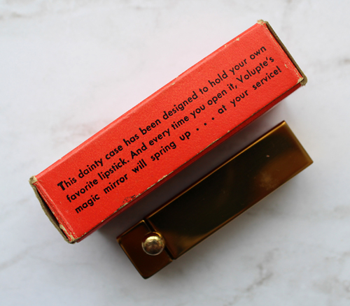
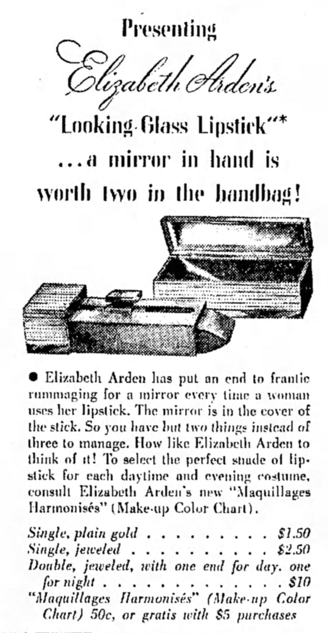
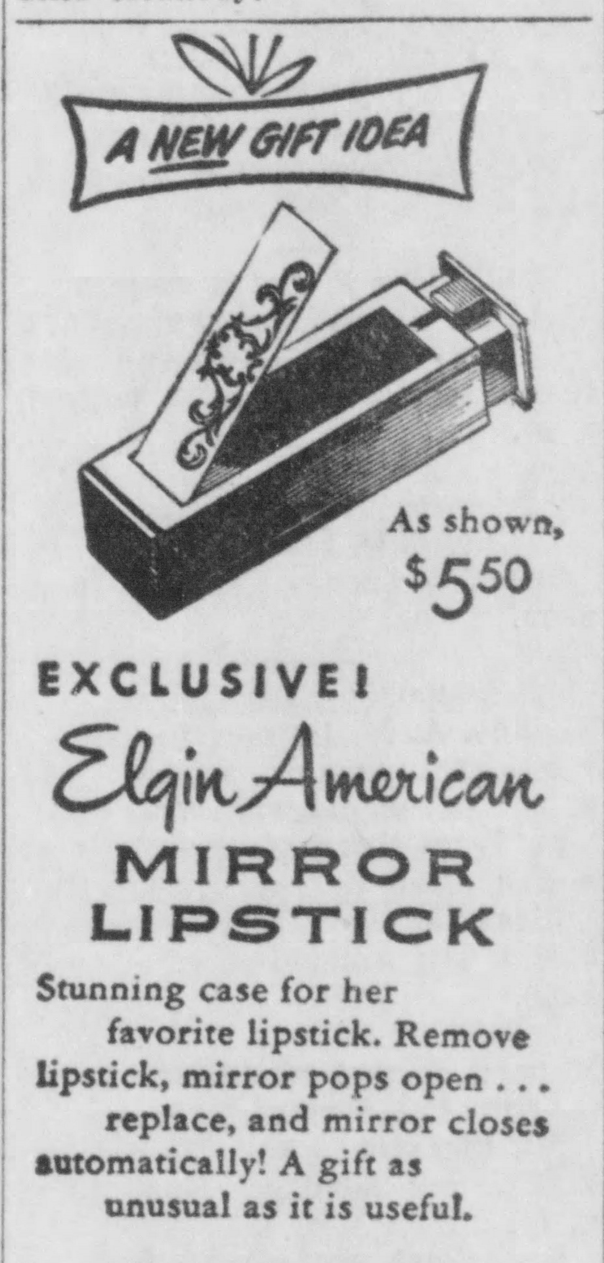
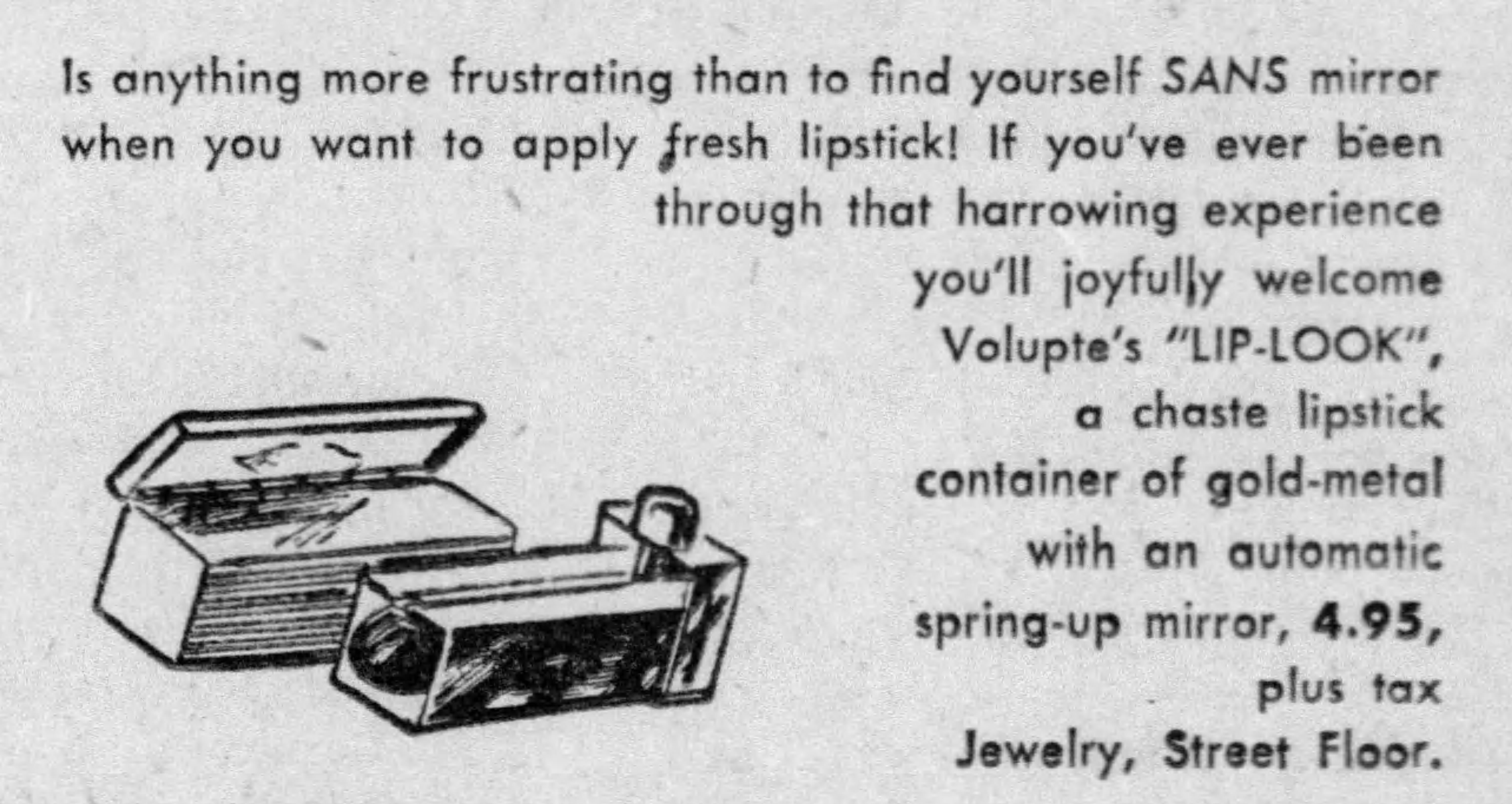
These next few will put a spring in your step. Spring-loaded, sliding cases in which the mirror popped up when the lipstick was opened were also quite popular. Shown here is Volupté's Lip Look, which dates to 1949-1950. Elgin, Elizabeth Arden and Kotler and Kolpit offered similar cases.
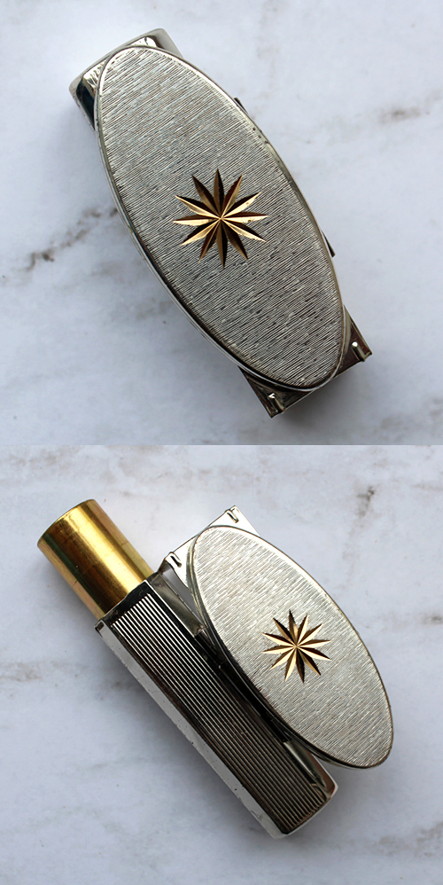
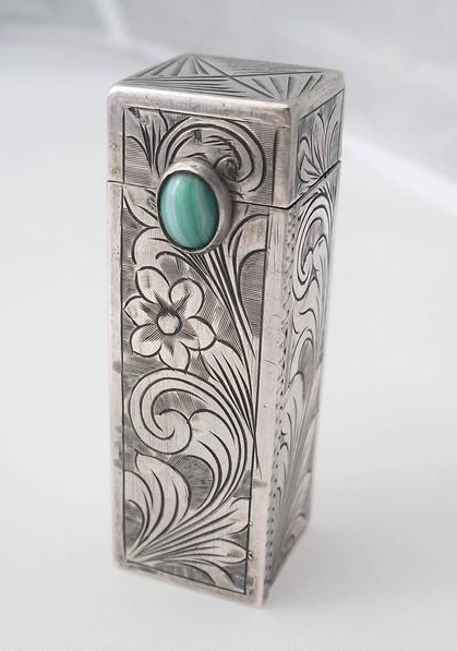
Given how many came up in my search for lipstick mirrors at Ebay and Etsy, it appears that the most widely available model of the spring-loaded variety of lipstick mirrors was a silver carved case accented by gemstones. They're unmarked, meaning no particular company patented the design and choice of metal. I believe they were mostly sold in department and jewelry stores.
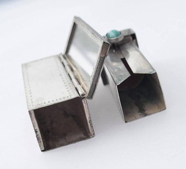
(images from etsy.com)
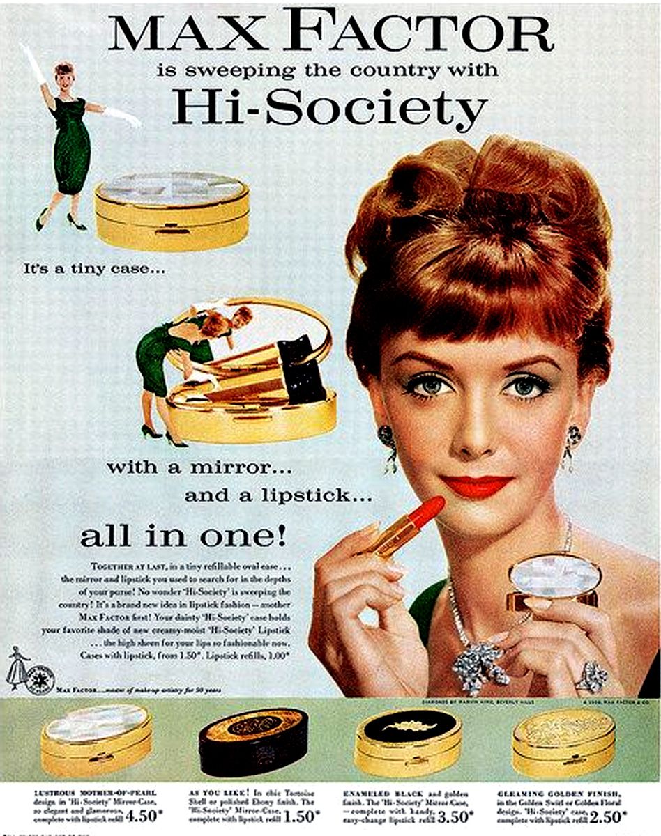
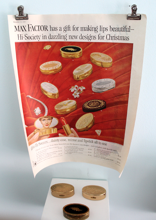
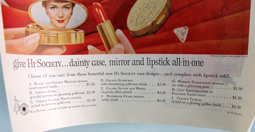
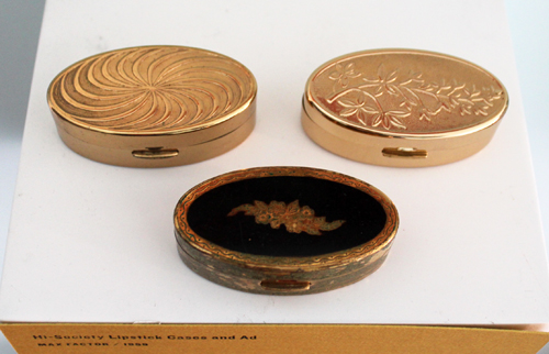
Despite the silver cases' ubiquity, I'd say the most recognized name-brand spring-loaded lipstick mirror was Max Factor's Hi-Society, which was heavily advertised from their debut in 1958 through approximately 1965.
You might remember I featured these in the Museum's holiday 2016 exhibition. I'm still hunting down all the designs, which actually isn't difficult given how many the company produced.
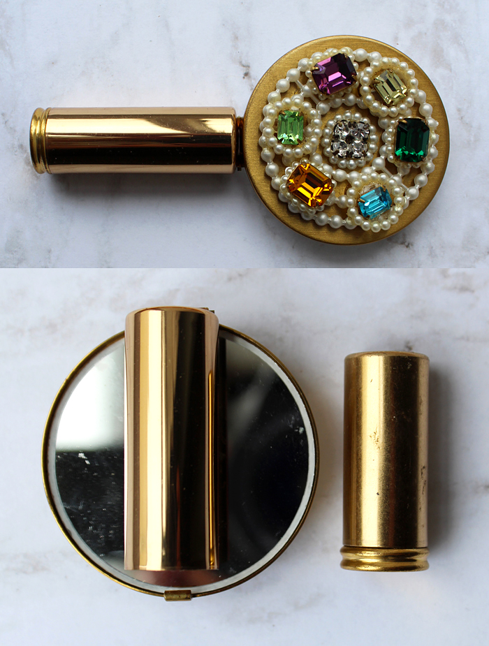
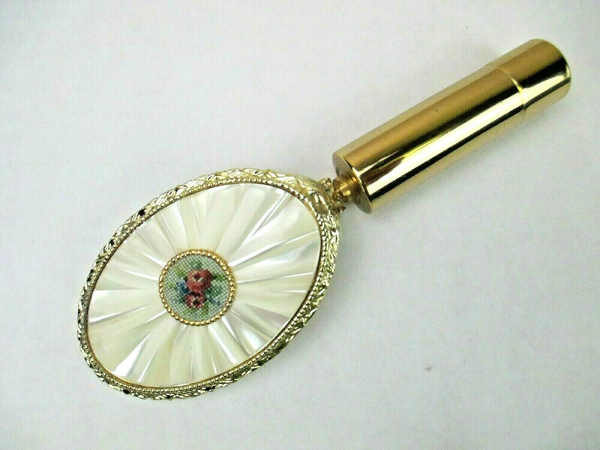
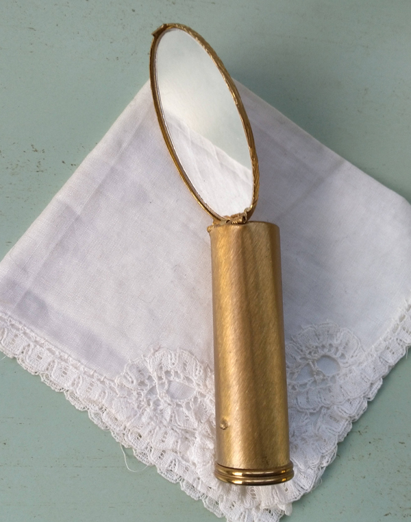
Next up is a more complex version of the folding mirror. Instead of a tube clip, this was an entire folding hand mirror with the lipstick hidden within the handle. Here's an unmarked, super blingy version. Stratton also made a bunch.
Here are some rather dainty petit point and floral versions by Schildkraut.
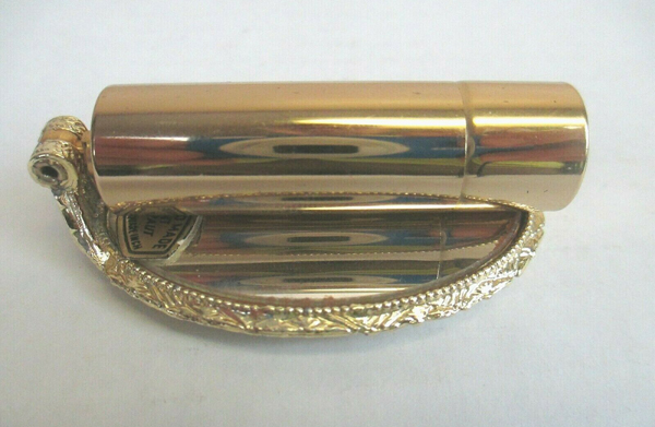
(images from ebay.com)
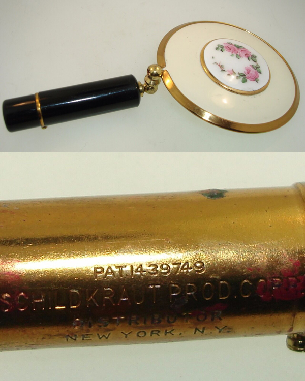
(images from ebay.com)
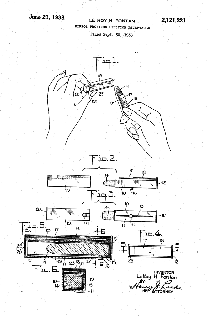
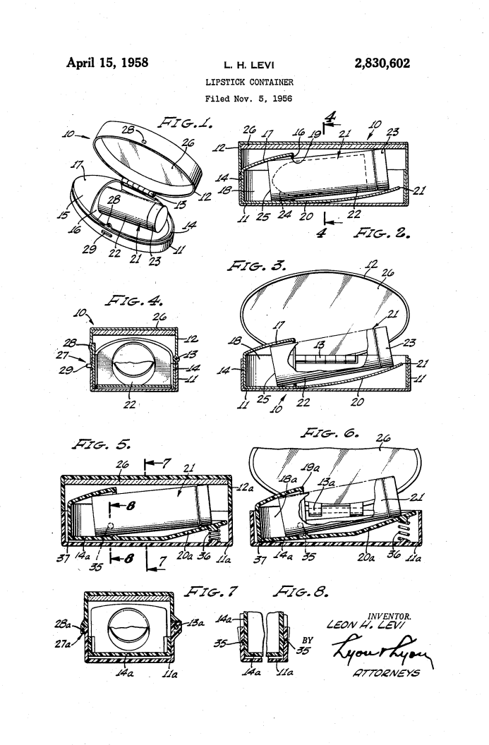
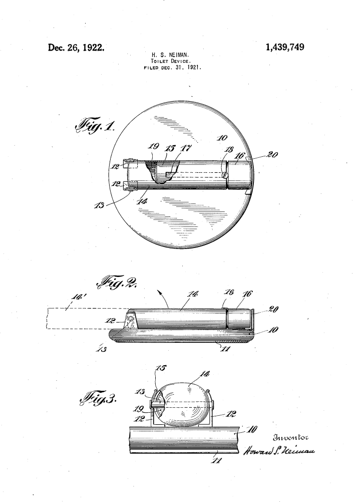
Schildkraut's represent possibly the earliest form of lipstick mirrors, judging from the patent.
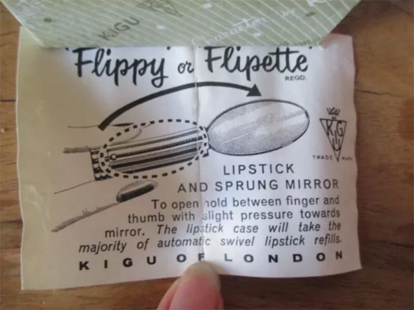
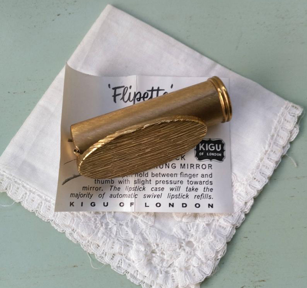
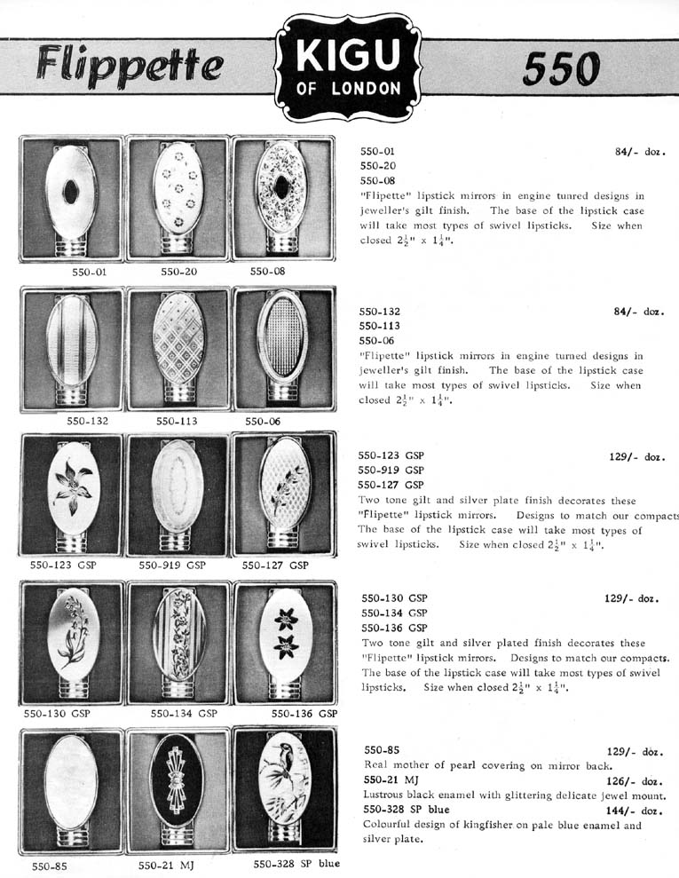
The folding model's popularity continued well into the 1960s, as evidenced by Kigu's "Flipette".
(images from etsy.com)
(image from vintage-compacts.com)
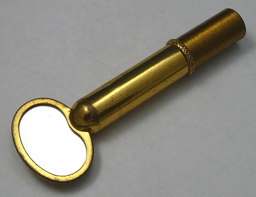
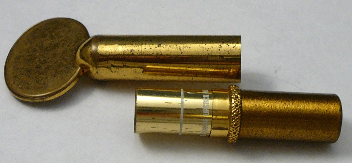
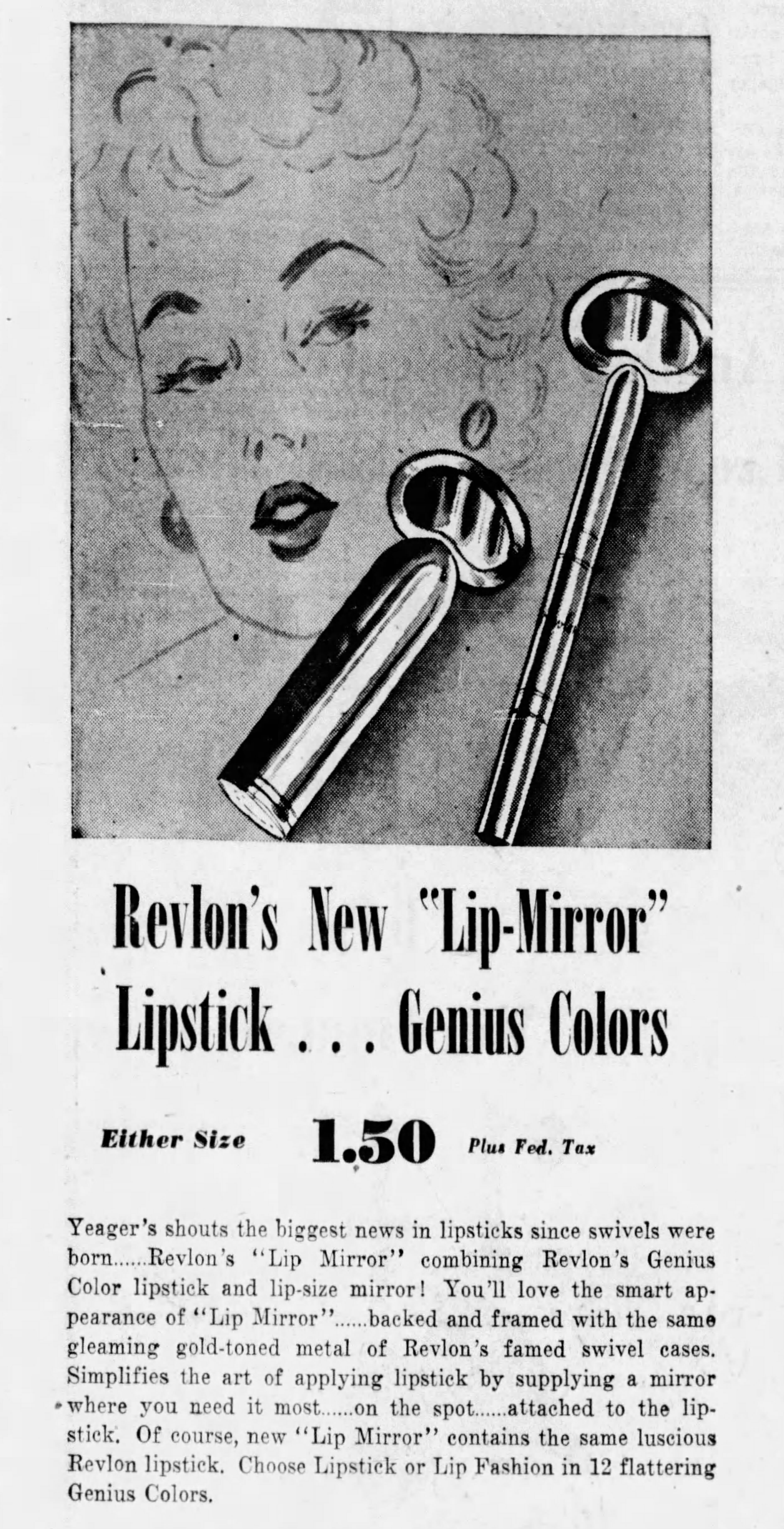
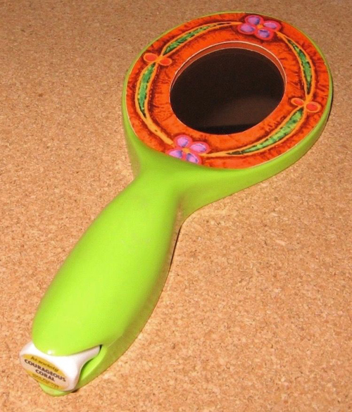
Finally, there are the handle inserts. This item from Revlon would appear to be a regular hand mirror, but the lipstick is cleverly hidden in the handle. It was introduced in 1950 as the "biggest news in lipsticks since swivels were born". How very exciting.
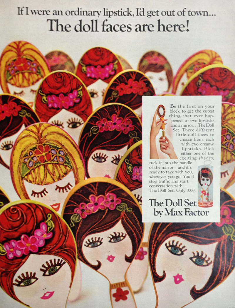
Of course, Max Factor upped the design ante with their "Doll Set" lipsticks, which were introduced in 1967.
(images from pinterest)
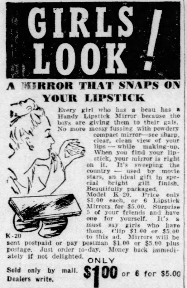
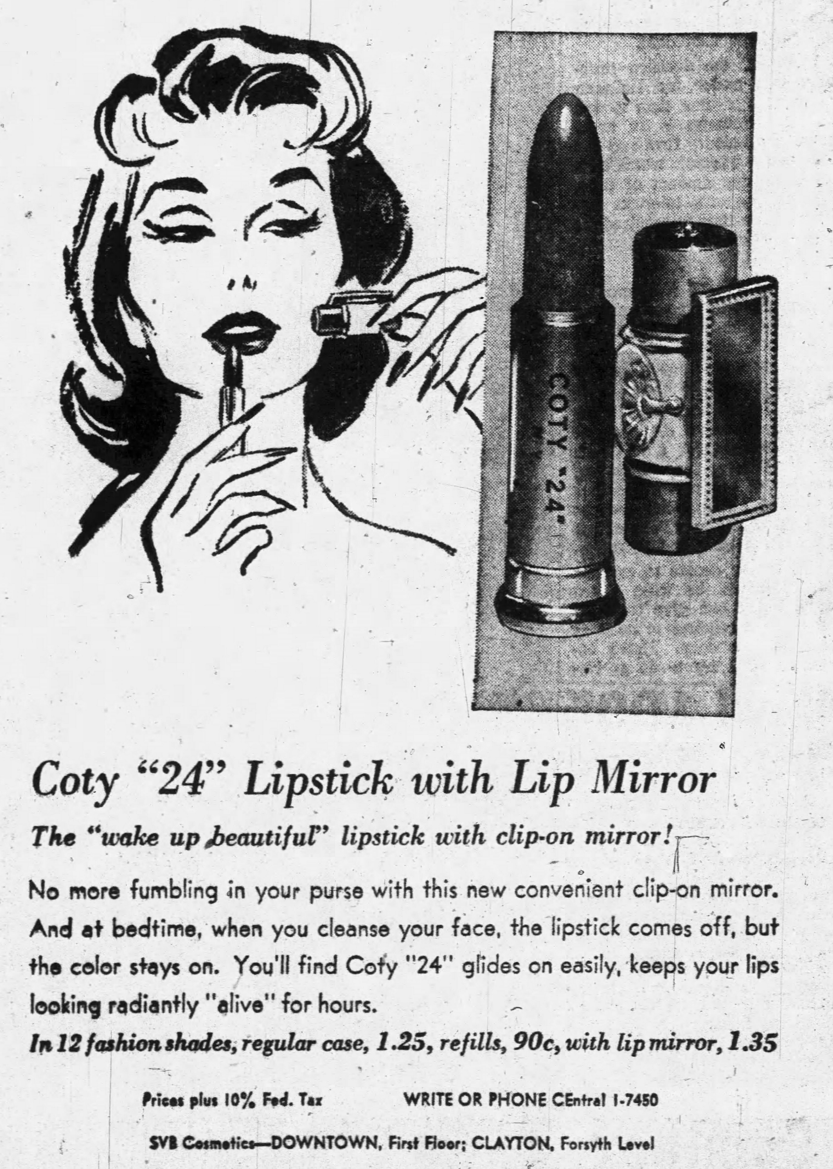
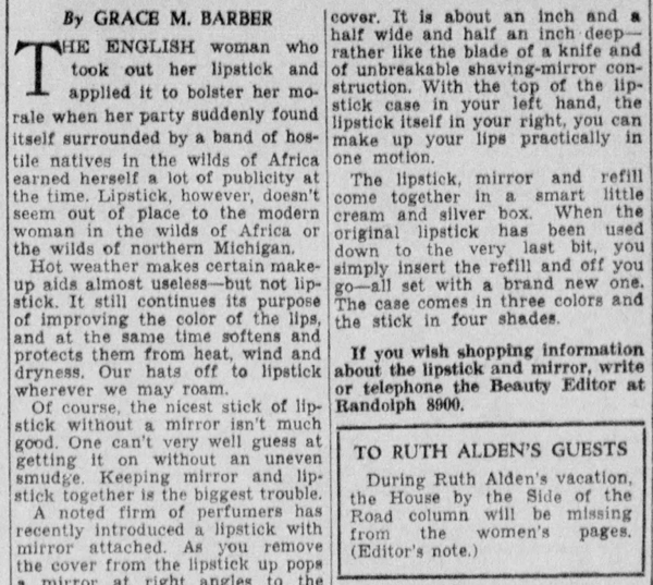
Now that we have a good sense of the types of mirrors that were available, let's spend a little time thinking about why they were made, or at least, why the advertising claimed they were the greatest things since sliced bread. The first reason built-in lipstick mirrors were a necessity – again, according to the advertising at the time – was the ease provided by a fused lipstick and mirror. Presumably women who wore lipstick also would have also carried around mirrored powder compacts, which could be used for lipstick touch-ups. Fumbling around in your purse for a mirrored compact when you just needed to touch up your lips and not your face powder, apparently, was too difficult to handle on a regular basis. As this 1935 newspaper blurb states, "Keeping lipstick and mirror together is the biggest trouble." Oh, the horror! (Bonus points for the blatant racism at the beginning of the piece.)
Such a "harrowing experience" to not be able to find a mirror!
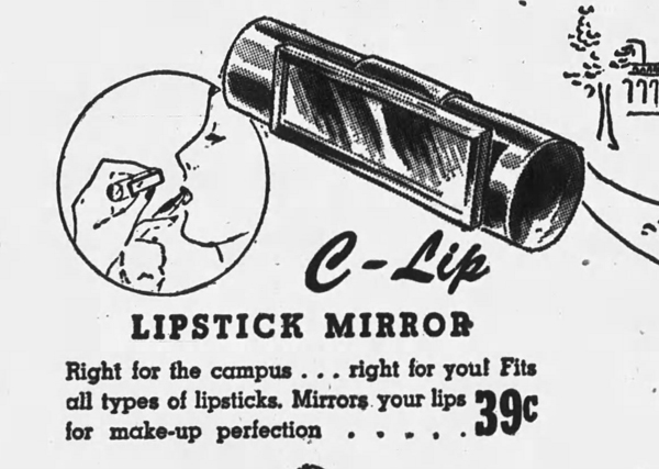
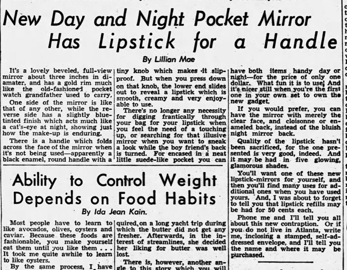
The second reason was that the lack of digging around for a mirror meant lipstick could be applied more discreetly, you know, for "when you want to sneak a look while the boyfriend's back is turned." (More bonus points for the weight/food shaming piece below the lipstick article.) Much like lipstick tissues, lipstick mirrors were meant to be used to avoid an etiquette faux pas.
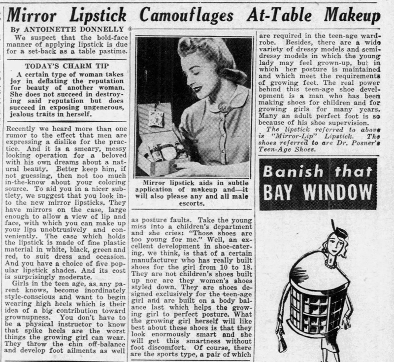
This 1940 column takes the idea of discretion a step further. As we've seen time and time again, a woman's makeup habits are dictated by what men think. "We suspect that the bold-face manner of applying lipstick is due for a set-back as a table pastime. Recently we heard more than one rumor that men are expressing a dislike for the practice. And it is a smeary, messy looking operation for a beloved with his own dreams about a natural beauty. Better keep him, if not guessing, then not too much in-the-know about your coloring source." Heaven forbid a man actually see a woman mend her lipstick! Ladies, please keep your silly frivolous face painting to yourself so as not to ruin TEH MENZ' unrealistic expectations of so-called natural beauty. I can't roll my eyes hard enough.
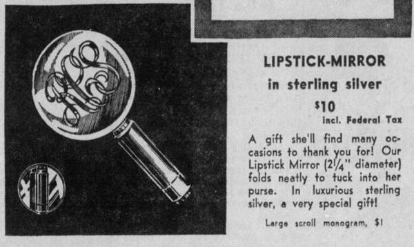
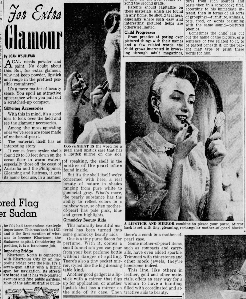
Thirdly, one can't be seen with a beat-up compact. Women should always present the prettiest possible cosmetic cases when in public. Seriously though, at least this 1956 clip is straightforward in proclaiming that a lipstick mirror is merely aesthetically pleasing instead of a necessary accessory in the battles against flaunting your makeup application and a messy purse in which no separate mirror can be easily unearthed. Just a little dose of "extra glamour".
And of course, let's not forget that as part of their goal of making a healthy profit, beauty companies are forever trying to invent another superfluous gadget or product and declaring it the next must-have. Perhaps lipstick mirrors were the mid-century version of vibrating mascaras. In any case, despite the lack of popularity for the built-in lipstick mirror as well as the cynicism of modern-day makeup wearers like myself, several brands forged ahead with attempting to resurrect the lipstick mirror over the past 20 years or so.
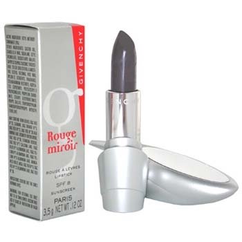
In late 1999, with much fanfare, Givenchy introduced their Rouge Miroir lipstick designed by by sculptor Pablo Reinoso. Reinoso became Givenchy's Artistic Director for their fragrance and beauty line shortly after the lipsticks' release.
The March 2000 issue of Vibe magazine proclaimed the sleek, futuristic design to be the height of convenience: "No more knives or rearview mirrors". Wait, who uses a knife to apply lipstick?!
(image from amazon.com)
A year or two later, Estée Lauder launched their Pure Color lipstick line. I believe these mirrored cases came out in the mid-2000s when Pure Color lipsticks were at their height.
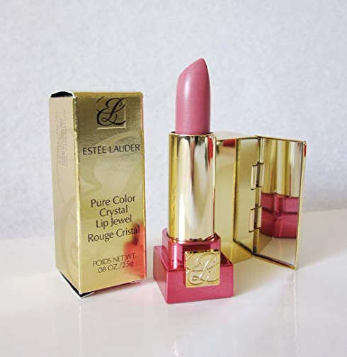
(image from amazon.com)
Some more recent examples I found include this mirrored tube from Kailijumei, a brand best known for their "flower jelly" lipsticks.
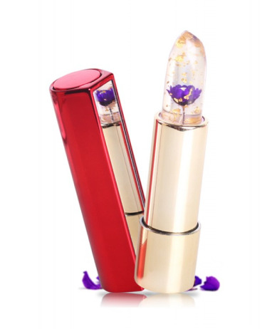
(image from kailijumei.com)
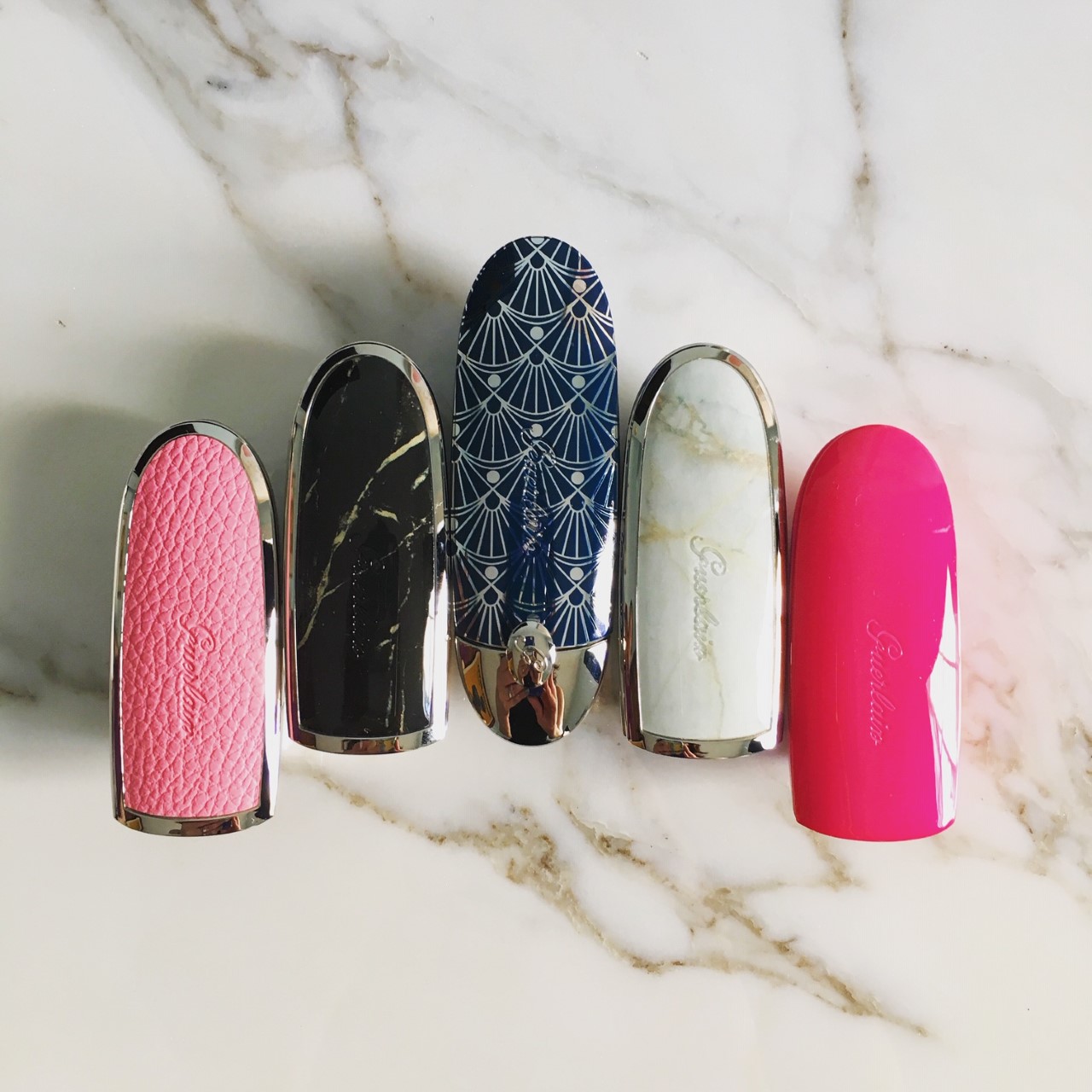
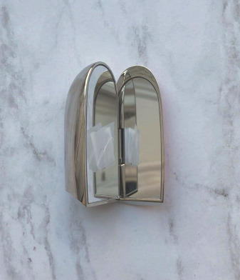
Guerlain's Rouge G series was introduced in the spring of 2018 and comes in a variety of collectible cases (and, duh, I'm working on acquiring them all). The mechanism is similar to Stratton's in that they won't close unless there's a lipstick bullet inside. While practical, it makes for quite the hassle to take photos of the cases only as they keep popping open. I have to tape them closed, which is a less expensive option than buying lipstick bullets to go in each case.
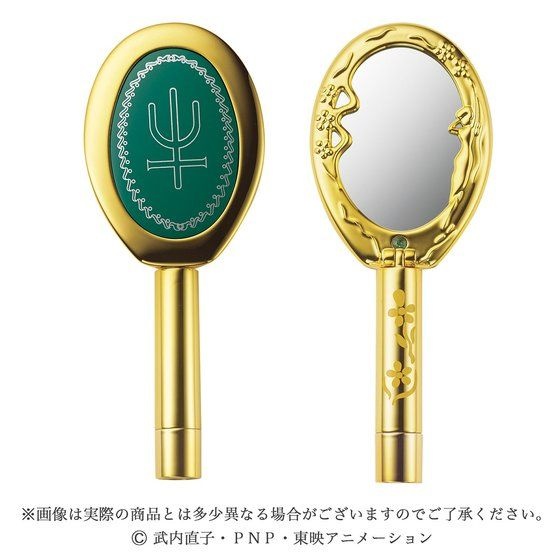
Finally, I spotted this folding lipstick mirror from J-beauty brand Creer Beaute, which was included in their 2018 Sailor Moon-themed collection.
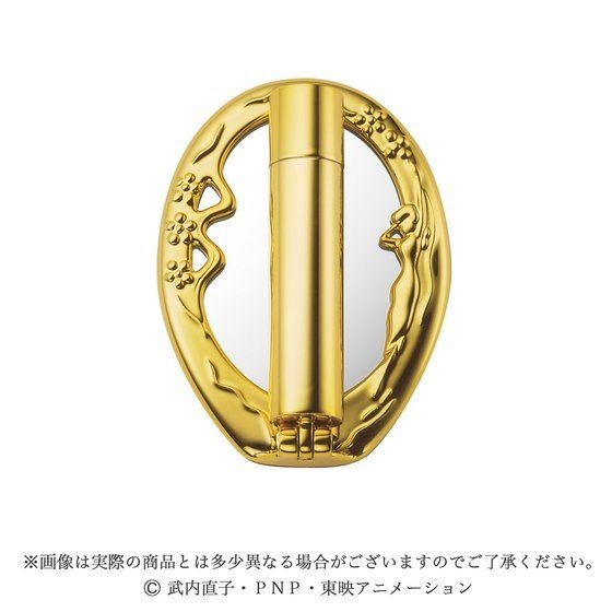
(images from alphabeauty.net)
Still, these designs are not nearly as common as their predecessors from the early-mid 20th century. Why did the popularity of the built-in lipstick mirror fade over time? One theory is that lipstick packaging with built-in mirrors is more expensive than non-mirrored packaging, and therefore, not as appealing to consumers. Guerlain's Rouge Gs, for example, cost $55 ($33 for the bullet and $22 for case) while their KissKiss lipsticks are priced at $37. Going further back in time, Elgin's spring-loaded mirrored case by itself was $5.50, while the price of an average lipstick was $1.10. Why pay for a mirrored lipstick case if you (most likely) already have another mirror available? Yes, you might have to dig around in your purse a bit, but at least it won't be lighter for having spent money on a lipstick/mirror combo. This theory could also explain why clip-on mirrors were seemingly everywhere, as they were the cheaper route to fusing lipstick and mirror.
Another theory for the continuing disinterest in built-in lipstick mirrors could be that for the last 5-10 years there's been increasing demand for less, or at least recyclable, packaging. While some higher-end brands are refillable, most lipsticks sold with a built-in mirror don't appear to have a refill option, and consumers may be less likely to buy a mirrored lipstick tube knowing yet another packaging component will eventually end up in the ocean. Plus, while the new designs are relatively slim, they're still bulkier than lipsticks without built-in mirrors. The majority of beauty consumers, myself included, don't want anything taking up more room in their purse or makeup bag.
Finally, I believe beauty consumers are savvier than they were in the early days of the industry and are less susceptible to marketing and gadgets. A built-in lipstick mirror may have been considered revolutionary in the '40s because swivel tube lipstick had been invented just a few decades prior, but by the '70s these mirrors may have seemed old hat. So certainly by the 21st century we know these designs are not truly a breakthrough, nor are they anything that would be considered a necessity. I featured no fewer than 6 Kailijumei lipsticks in the Museum's spring 2017 rainbow-themed exhibition, and just now noticed there were mirrors on the tubes. The fact that the mirror didn't even register with me, a person who enjoys re-applying her makeup and has spent countless hours poring over product packaging, until now when I'm actually discussing lipstick mirrors shows just how unnecessary a built-in lipstick mirror is. And again, the majority of beauty consumers is likely to be carrying a compact mirror anyway, rendering a lipstick with a built-in mirror redundant. We also know that makeup companies update older designs and market them differently to see what sticks. To cite Guerlain's Rouge G, the description at the website highlights how the user can select both the color and case to suit their individual taste. "Every woman is unique…choose your lipstick from a wide range of shades to match your look: from the most nude to the most extravagant. Choose your case from an array of styles – from the most timeless to the most trendy". Rouge G has the same basic mechanism as the spring-loaded lipsticks of yore – it's especially similar to Max Factor's Hi-Society with the array of designs – but the marketing focuses on the customizable aspects (a concept that has spiked in popularity over the last two or so years…I've been meaning to write something about the craze for name engraving/customization) rather than the newness and convenience of a dedicated lipstick mirror.
What do you think of the built-in lipstick mirror? Would you consider it a must-have? While I certainly appreciate the aesthetics, it's nowhere near a necessity for me.
As you know, from time to time I receive email inquiries from people with cosmetics objects they've stumbled across and would like to know more about. I'm always flattered that people think that I know what I'm talking about and can help them, especially since most of the time I have no idea about the item in question, but sometimes I get irritated when the inquirer's sole objective is to determine how much money they can make off an object they found. At first it seemed this way when the original owner of this very rare compact approached me, asking for more information and how much it might be worth. As we'll see, he turned out to actually have an interest in the compact's history and wasn't after profit.
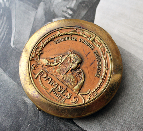
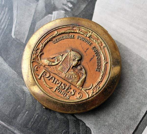
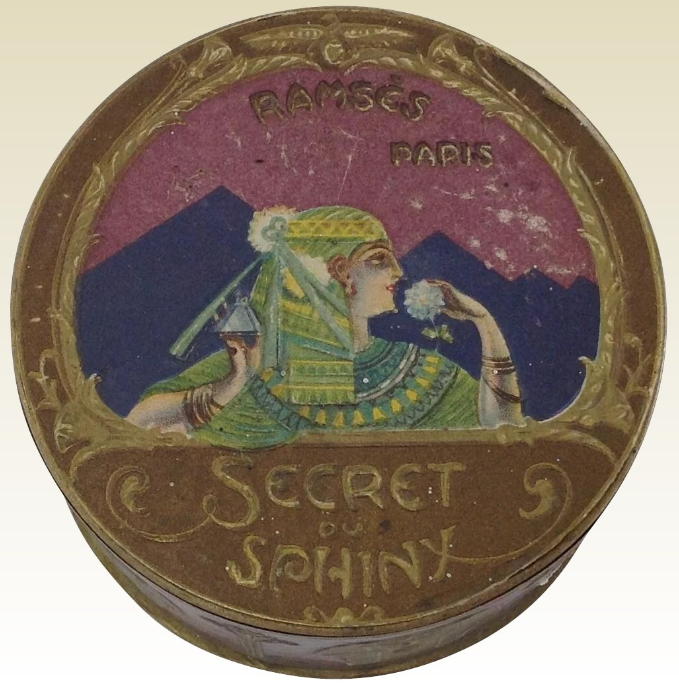
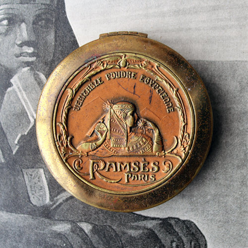
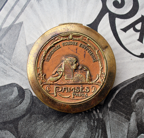
This was an epic find indeed, easily one of the rarest and most valuable in the Museum's collection. I now present the Ramses powder compact, which debuted in 1923. The design shows an Egyptian woman in profile, holding a perfume bottle in one hand and a flower in the other, which she brings to her nose to enjoy its scent. The pyramids of Giza are just barely visible in the background, while lotus flowers on each side towards the lower third of the compact bloom into an arc of leaves.
I'm not sure if the woman is supposed to be anyone in particular – perhaps Cleopatra – but given that the design is most likely not historically accurate, I'm not going to dwell on it too much.
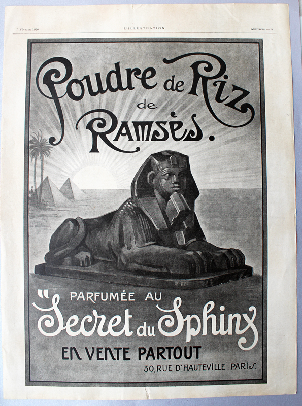
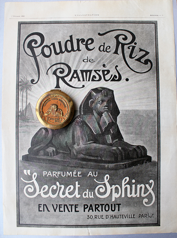
While there are other ads for the powder that show the compact, which we'll see in a second, I wasn't able to locate any originals. I did, however, find this ad in a French publication from February 1920.
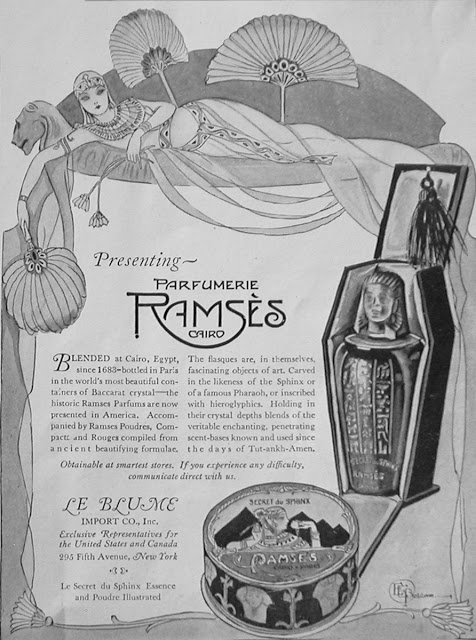
I was hoping to find some good information about the compact for the person who contacted me, and of course, the ever-thorough Collecting Vintage Compacts blog had an excellent post on the history of the Ramses perfume company so I directed the inquirer over there. I don't wish to regurgitate all of the author's hard work on Ramses' backstory – I highly encourage you to check out the post for yourself – but I will provide the abridged version. The Ramses brand was founded in 1919 in Paris and selected Le Blume Import Company to distribute the line in the U.S. in 1921. By 1923 ads for the powder boxes and compacts were appearing in Vogue magazine. As Collecting Vintage Compacts points out, the ad copy is pure nonsense: neither the perfumes nor the powders were produced in Egypt and their formulas certainly did not date back to 1683. How the company even arrived at that arbitrary date is beyond me. However, with the discovery of King Tutankhamun's tomb in November 1922, the Ramses moniker turned out to be quite fortuitous given the ensuing craze for anything Egyptian – clearly the ads wanted to milk the fad for all it was worth. The world was now swept up in the latest wave of Egyptian Revival, a style that incorporated various elements of Egyptian art and culture and encompassed design, fashion and beauty (see this compact depicting Theda Bara as Cleopatra and this ad as examples).
Egypt's influence on Western beauty from the Renaissance to today is a subject I'm looking to cover more thoroughly this year, either in a blog series or an exhibition (or both!) so stay tuned. As viewed through 21st century eyes, it was clearly unabashed cultural appropriation, a white person's fantasy of "exotic", far-off lands and artifacts. However, Egyptian inspired-beauty is such a rich topic that I can't bear not to fully explore it…especially now that I have this gorgeous piece in my hot little hands. Anyway, Collecting Vintage Compacts notes that the Ramses powder case was made by the Bristol, CT-based Zinn Corporation, a company that produced some of the earliest and most memorable compacts in the U.S. I find it interesting that while the powder was scented with the "Secret du Sphinx" fragrance, the compact itself shows a woman rather than the mythical creature. Collecting Vintage Compacts speculates, as I did, that the woman could be Cleopatra, but offered the additional option of Ramses' wife Nefertari. I agree with his conclusion that it really doesn't matter who she is – just a vague Egyptian theme was more than enough to get the point across.
Another version of the compact sported silver edging, a beautiful contrast to the warmth of the brass.
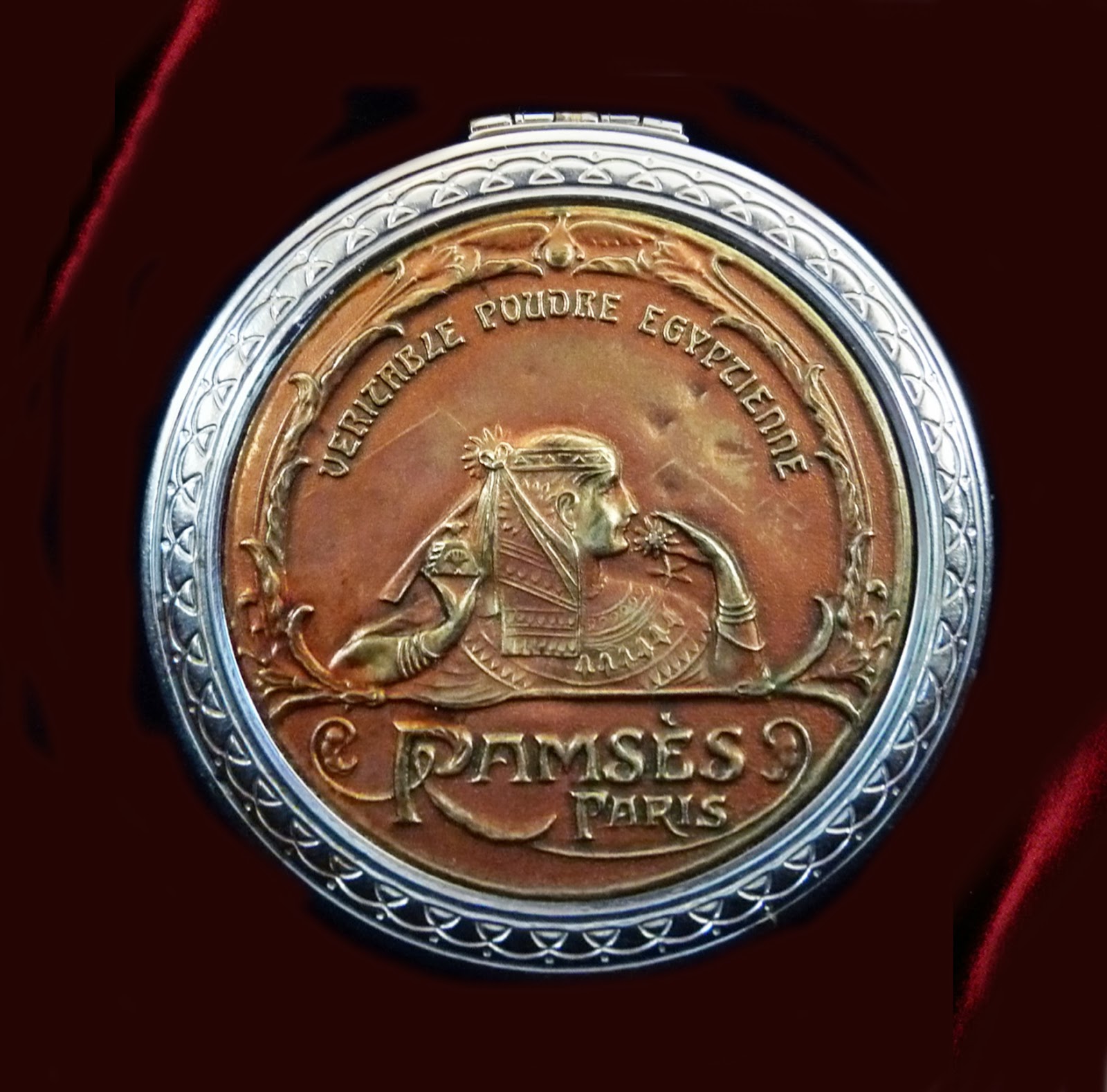
(images from Collecting Vintage Compacts and Ruby Lane)
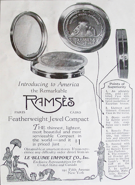
I also spotted some ads in newspapers. They're not as visually striking as the Vogue ads so I'm not including them here, but they did come in handy for indicating the original retail price of the compact, which was $1.00. The latest ads I could find were from 1925 and both the perfumes and powder were heavily discounted, which indicates Ramses was a flash in the pan.
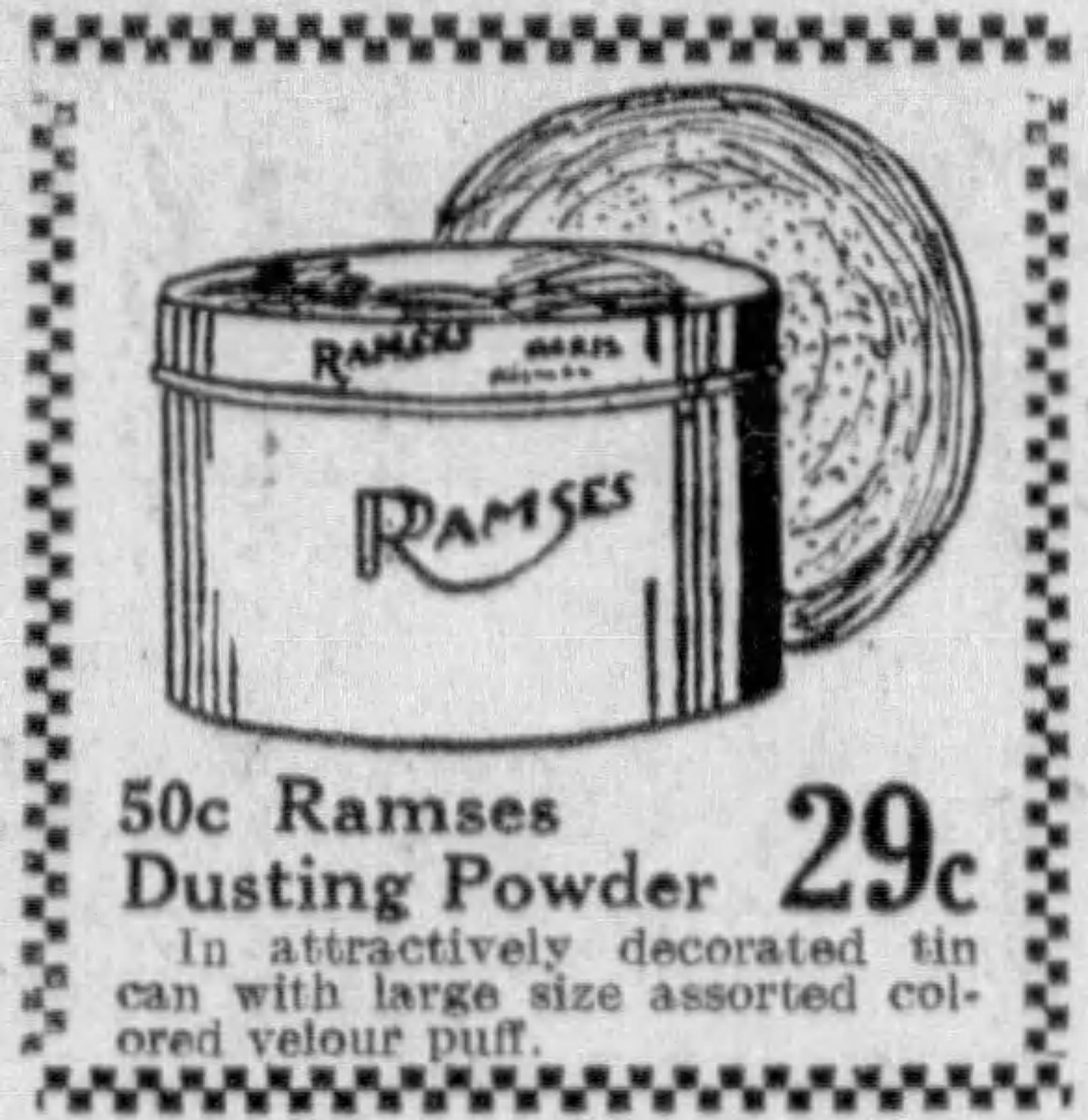
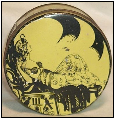
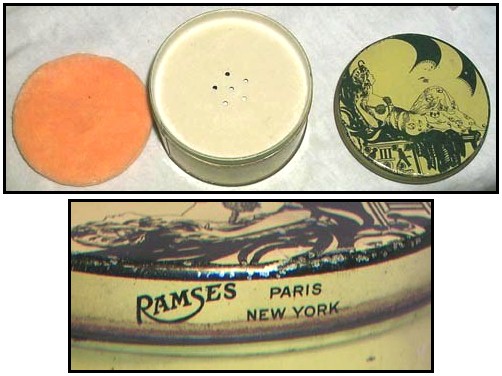
But why? You would think given the era's craze for Egyptian-inspired design, combined with the slight French flavor (another huge selling point – this was a time when companies actively tried to give their lines and products authentic French or at least French-sounding names) the Ramses company would be able to get more a little more mileage out of their products. Collecting Vintage Compacts unraveled the mystery. As it turns out, the perfumer behind the Ramses brand, one Léon de Bertalot, had begun quite a shady scheme to sell another one of his fragrances. In 1914, 5 years before he launched Ramses, de Bertalot named one of his fragrances Origan. As we know, Coty's L'Origan (launched in 1909) was wildly popular, pulling in roughly $3 million in sales in 1921 alone. De Bertalot decided to capitalize on the company's success and began using the Coty name to sell his own Origan, essentially passing it off as a real Coty product. Coty, rightfully so, cracked down on this very quickly. On May 15th, 1923 a French court found de Bertalot guilty of "unfair competition", and a few days later the U.S. Treasury mandated that any inauthentic products bearing the Coty name were unable to be imported unless they specifically spelled out that they were not affiliated with Coty in any way. Since the Ramses brand had nothing to do with Coty I don't know if the Treasury's mandate applied to Ramses as well, but I'm sure the 6-month jail sentence and fine of 100,000 Francs handed to de Bertolot essentially meant the Ramses brand was out of business. Hence the price markdown of their products by 1925 – I'm guessing stores in the U.S. were trying to offload any leftover stock that was originally imported two years prior. The Le Blume Import Company, in turn, was no longer allowed to distribute any perfumes from any company whatsoever. However, it did import dusting powder tins and glass jars using the Ramses name in the late 1920s.
(images from Vanity Treasures and Etsy)
Getting back to the original inquiry that was the impetus for this post, here's the story of how the compact got into my hands from the person who emailed me originally (we'll call him C.) He had found it for $10 in a thrift store (!) but given the unique design, figured it was worth more. After looking through all my collector's guides and not turning up anything, I directed C. to Collecting Vintage Compacts and asked him to please let me know when/if he decided to put it on the market. Obviously I also indicated my great interest in obtaining the compact, but lamented that it was most likely out of my price range. Well, don't you know C. actually wrote back telling me that he was going to put it up for sale on Ebay, but said that while he'd like to get a good price for it (that's only fair, who wouldn't?), he believed that the Museum was the rightful place for the compact, given its rarity and my passion for lovingly researching and preserving these sorts of items. Thus he kindly offered to sell it to me directly and negotiate on price. In the end I think we both got a great deal – he got way more than what he had originally purchased it for and roughly the amount he would have gotten for it if he had put it up for public sale, and I got an amazing find at a fair price for which I was able to avoid an ugly bidding war.
After reading the Ramses history at Collecting Vintage Compacts and browsing the Museum's site, C. seemed genuinely interested in the compact and in the Museum's mission, so I was very happy to see he wasn't just in it for profit and was willing to work with me to ensure the compact went to a great home instead of merely to the highest bidder. :) I really appreciated it, as so many people who ask about value just want to know how much they can get for an item and have absolutely no consideration for the object's history or the Museum, which, as a reminder, is funded entirely out of my own pocket. Not that anyone is obligated to donate rare and valuable items, of course, but they could follow C.'s example and be open to selling their item to me at a price that works for both of us. I know if I came across an object I have no interest in but that other collectors might – say, a rare Barbie Doll – I'd seek out someone who would truly treasure it and give them first dibs.
What do you think? And yay or nay on a series/exhibition on Egyptian-inspired beauty?
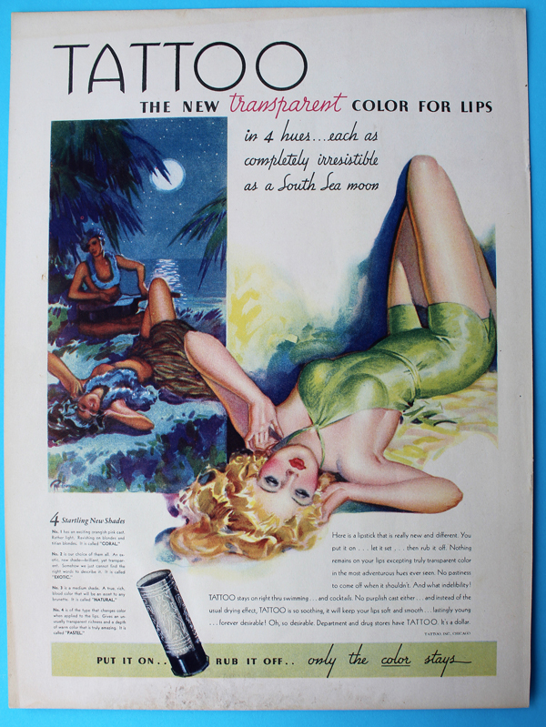
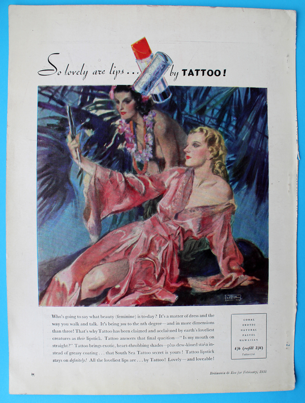
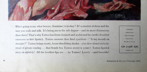
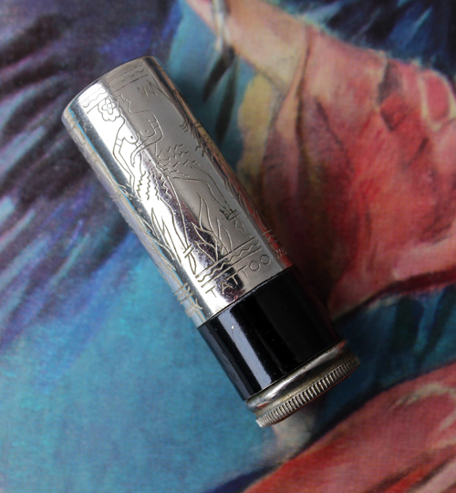
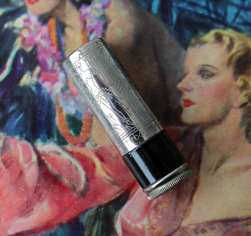
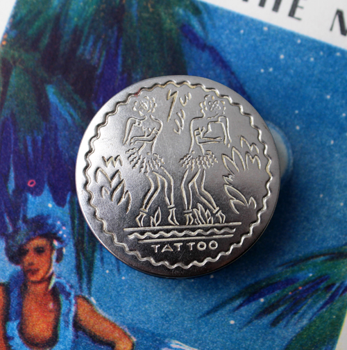
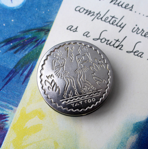
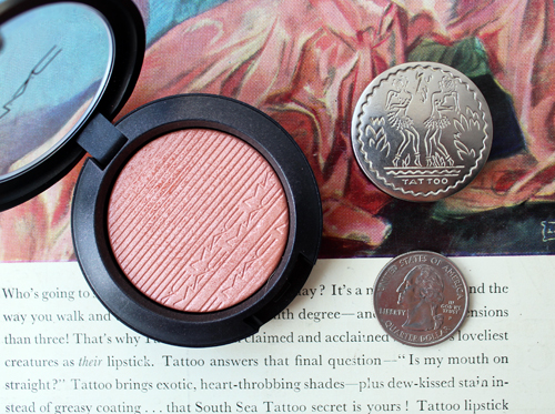
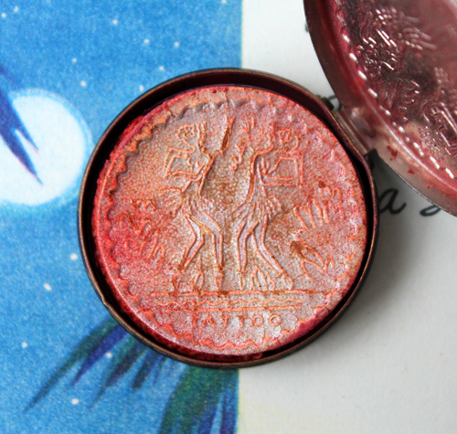
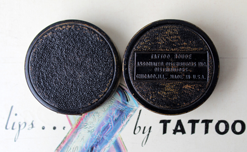
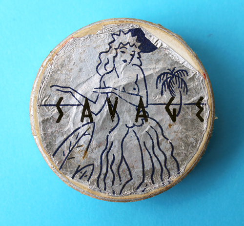
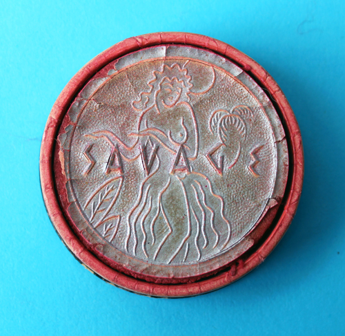
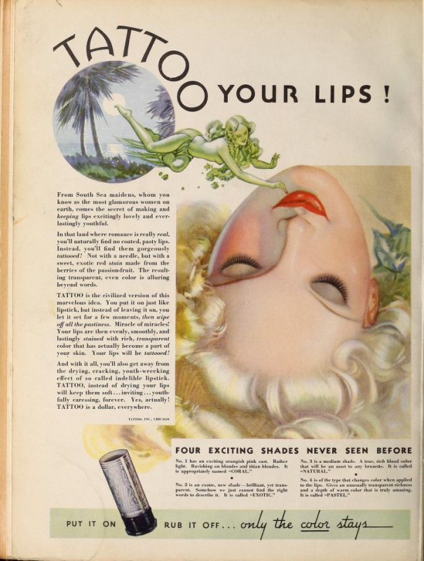
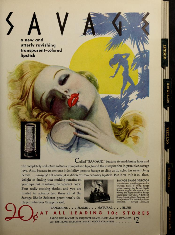
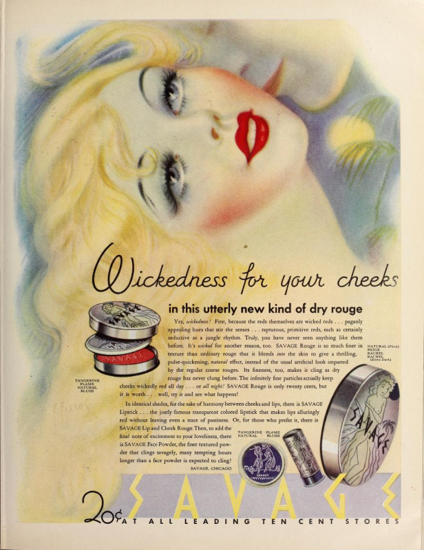
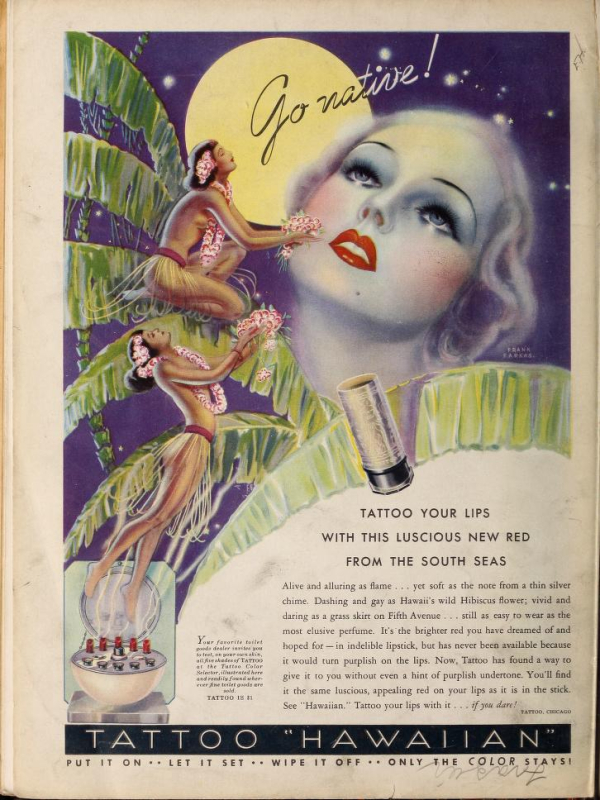
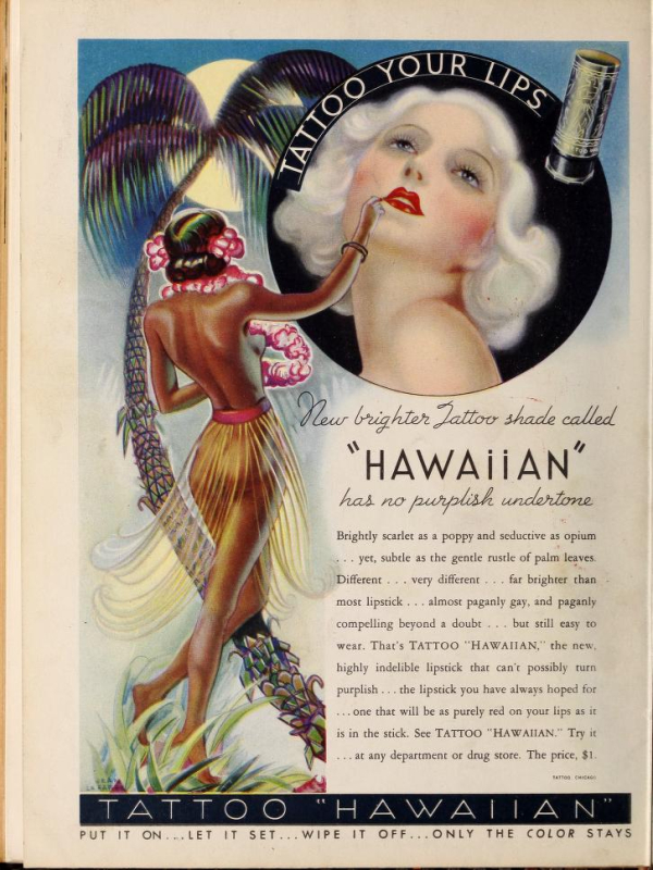
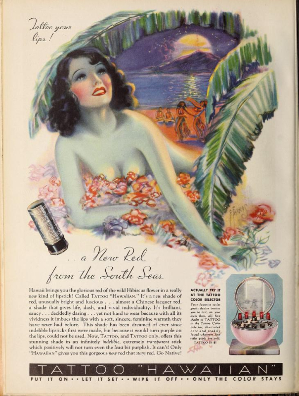
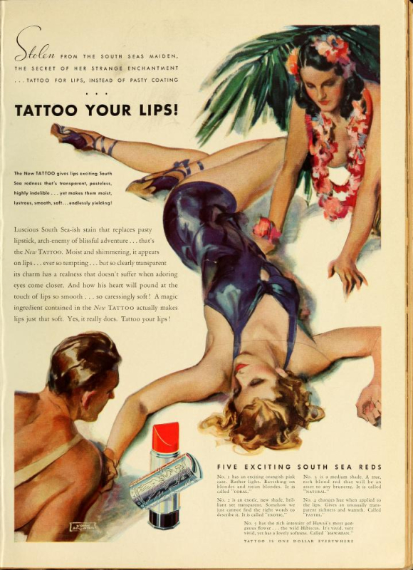
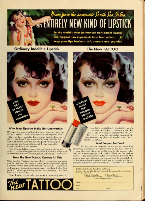
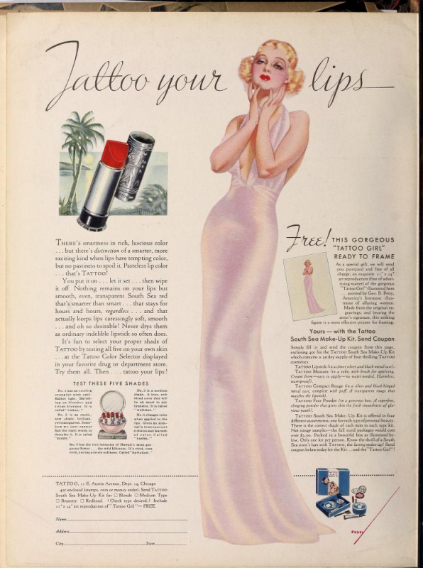
Around this time 2 years ago I got my first tattoos. In honor of that momentous occasion, I thought I'd take a look at a vintage brand that featured some truly wild advertising. I had come across Tattoo years ago, as well as its sister line Savage, and was immediately struck by the images used in their ads and on the products themselves. I managed to snag two of the ads, as well as the lipstick case and rouge container. Given their tropical feel I had originally intended on including them in the summer exhibition, but upon closer inspection I decided against it. Let's see why, shall we?
Sadly I was unable to make out the name of the illustrator who created the imagery on this one. It's something with an R, but beyond that I'm completely lost.
This one is by John LaGatta (1894-1977), and as you can tell by the publication name and spelling of "colour", appeared in a British magazine.
As with Po-go Rouge, the compact is teeny compared to today's blushes.
The puff is imprinted with the same design.
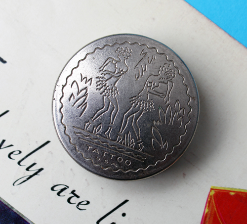
There was another compact with "U.S.A." inscribed beneath the Tattoo name. (Of course, I totally forgot I had this one and ended up with two…I could be wrong, but I don't think the "U.S.A." imprint presents any real significance; I believe it's just a slight change in production.)
There was also a difference in the bottoms of the compacts. The one with U.S.A. on the front doesn't have any inscription on the back. Again, I don't think there's any real significance to this, just a negligible difference in the manufacturing.
What IS an interesting difference, however, is an alternate design on the lipstick and rouge. It appears these were sold around the same time as the more commonly seen design. It may have been a mini version, but I'm not sure.
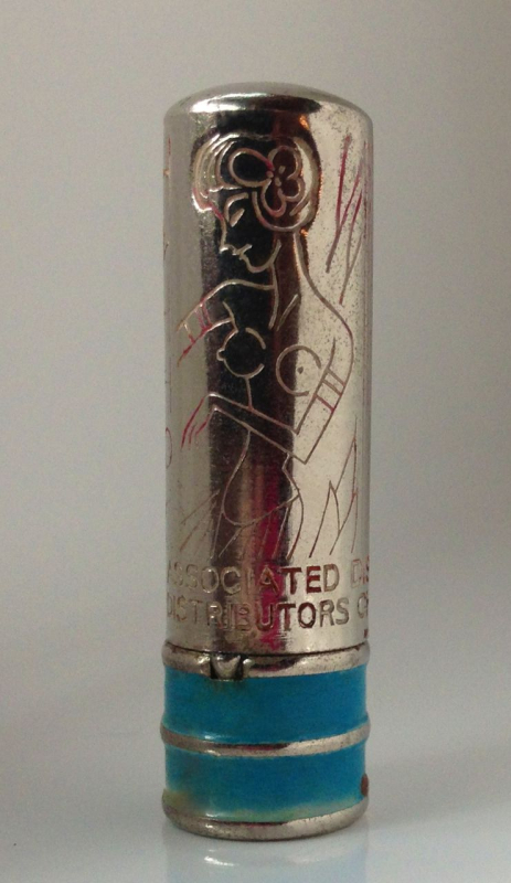
(image from pinterest)
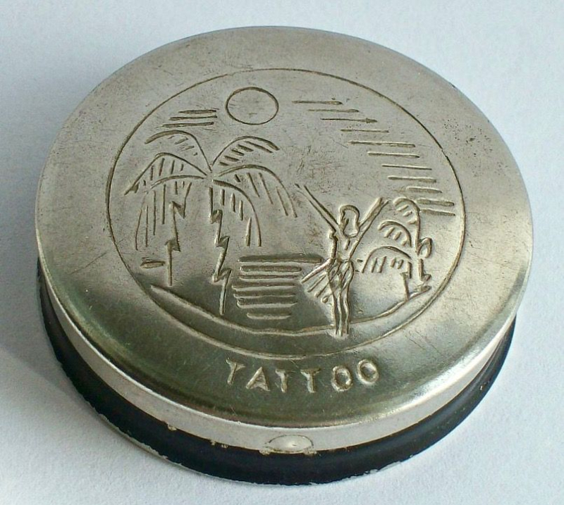 (image from pinterest)
This is the only ad I found in which the alternate design appeared. It's from 1947, so maybe it only showed up towards the end of Tattoo's reign (the latest newspaper ad for Tattoo was from September 1949).
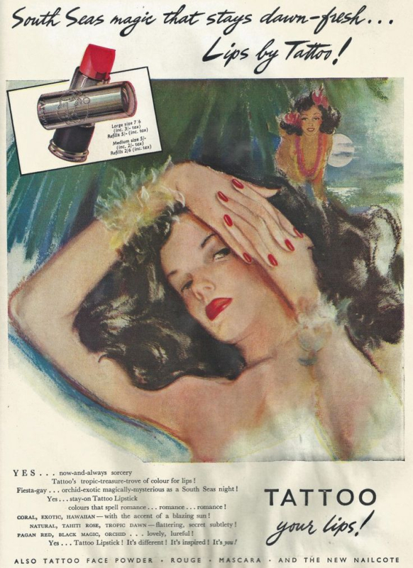 (image from pinterest)
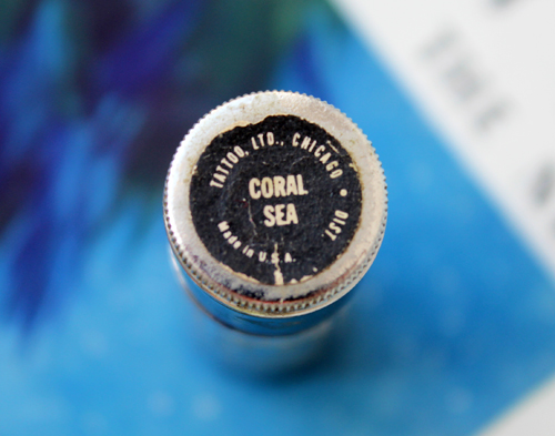
However, the shade I own is Coral Sea, which was trademarked in 1946. So maybe this wasn't new packaging after all.
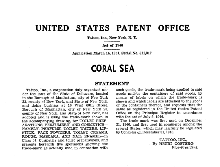
(image from tsdrapi.uspto.gov)
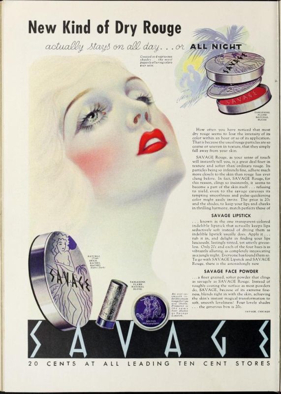
I also own a Savage powder box, which you might remember from this post and then its later appearance in the 2015 summer exhibition. I deeply regret including it now.
I don't have the complete story of Tattoo/Savage, but thanks to Collecting Vintage Compacts and what I was able to cobble together from old newspaper ads, the lines were introduced in the early 1930s by James Leslie Younghusband, a Canadian military/stunt pilot turned Chicago-based businessman. Younghusband was the brains behind another "indelible" lipstick line called Kissproof, which he invented in 1923. Despite its poisonous ingredients, the lipstick was sold until the early 1940s. I'm not sure why Younghusband felt compelled to develop not one but two "permanent" lipstick brands while Kissproof was still being sold, since I've compared the copy from the Tattoo and Savage ads to the Kissproof ones and all touted them as long-wearing lipsticks that were also comfortable to wear – formula-wise, there doesn't seem to be much difference. The author of Collecting Vintage Compacts has promised a second installment about Younghusband and the launch of Tattoo and Savage so I'll update this post with additional information, but in the meantime I wanted to share some thoughts and other questions I have about these lines.
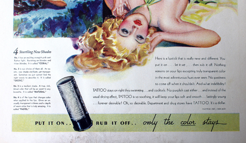
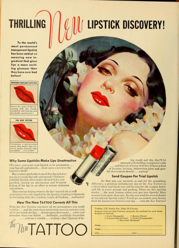
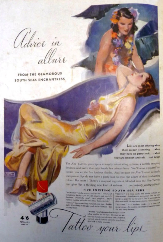
First, I'm not going to dance around the obvious here: there's no way any company could get away with this sort of fetishizing of "exotic" people and cultures today. The ads and product design certainly are eye-catching – who wouldn't want to wear colors inspired by a tropical paradise? - but when you look closely and read the ad copy, you realize how racist they are. Tattoo and Savage represent the pinnacle of white men's fantasies about "native" women's sexuality, which in their minds is completely untamed and animal-like. By wearing lipstick shades appropriated from these "uncivilized" cultures, white ladies can show off their racy side while still adhering to traditional American/European standards of female decorum. Take, for example, the copy in this ad. "From South Sea maidens, whom you know as the most glamorous women on earth, comes the secret of making and keeping lips excitingly lovely and everlastingly youthful. In that land where romance is really real, you'll naturally find no coated, pasty lips. Instead, you'll find them gorgeously tattooed! Not with a needle, but with a sweet, exotic red stain made from the berries of the passion-fruit…Tattoo is the civilized version of this marvelous idea." Yes, it's so very uncivilized to wear a lip stain made of crushed berries – only cavewomen do that!1
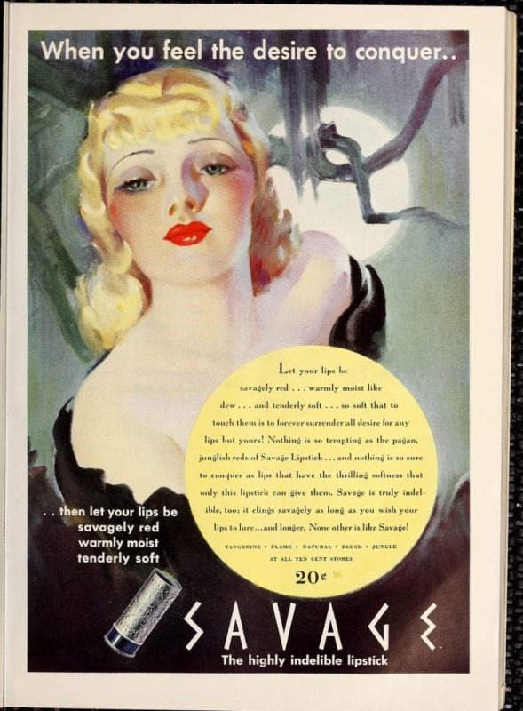
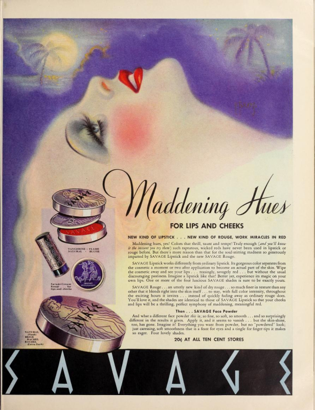
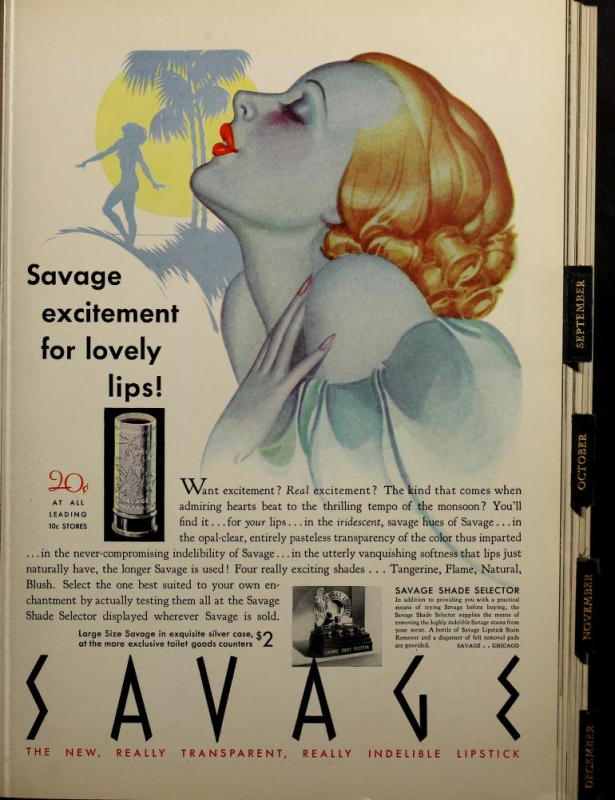
Savage is even more blatantly racist, highlighting the fact that their colors were inspired by "primitive, savage love".
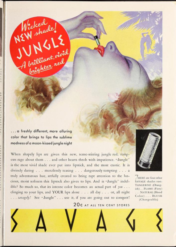
And their reds are "paganly appealing hues that stir the senses…rapturous, primitive reds, each as certainly seductive as a jungle rhythm." Bonus points for this ad linking "wickedness" to indigenous cultures.
The Tattoo ads (including the two I own) feature a variety of tan-skinned women catering to pale white women, imagery that dates back at least to the Renaissance and is still used today in an effort to make a scene appear "historically accurate." You'll notice that these particular women are depicted in stereotypical garb that existed solely in white people's imaginations, i.e. hula skirts and flower necklaces. And just to further the idea of their supposedly insatiable lust, they are also shown topless. Women of color are reduced to othered, highly sexualized props whose only purpose is to serve white women. (Somewhat unrelated, but if you want to take a gander at the lipstick display shown in this ad, you can see it here. I remember one popped up on ebay a couple years ago with an starting bid of a mere $199.99.)
This is another one by LaGatta.
 (image from pinterest)
More proof: the ideal "Tattoo girl" was white and blond.
Savage also threw in a nod to colonization with the use of "conquer".
All of this begs the question of what Younghusband was trying to accomplish with these lines.* Indelible lipstick was all the rage in the '20s and '30s; no doubt Younghusband's company faced stiff competition from the likes of Tangee and others. Perhaps he felt that this manner of cultural appropriation, i.e. creating what was probably the decade's most risqué and raciest makeup line by portraying the indigenous people of the South Pacific as feral and completely unfettered by "civilized" society's code of conduct, and then offering white women a socially acceptable way to channel that imagined freedom via lipstick, was the best way to stand out in a crowded market. The ads repeat words like "thrilling", "maddening", and suggests that the color will last through late-night activity. Sounds very exciting, yes?
(all ad images from lantern.mediahist.org unless otherwise noted)
The other possible reason Younghusband looked towards the South Pacific was the rise of tourism to Hawaii and other islands during the 1930s. As the blog author of Witness to Fashion astutely points out in a post on Tattoo, the increased tourism heralded a cultural love affair with anything tropical. "Tourism to Hawaii, via luxurious cruise ships, increased in the 1930s. The “white ships” of the Matson Line sailed from San Francisco to Hawaii and the South Seas. Quite a few movies with a tropical setting were made in the thirties, including Mutiny on the Bounty (1935), The Hurricane (1937) and Her Jungle Love (1938) — both starring queen-of-the-sarong Dorothy Lamour, Charlie Chan in Honolulu (1938), and Honolulu (1939). Bing Crosby and his movie Waikiki Wedding (1937) popularized the song 'Sweet Leilani,' written in 1934." Sounds plausible.
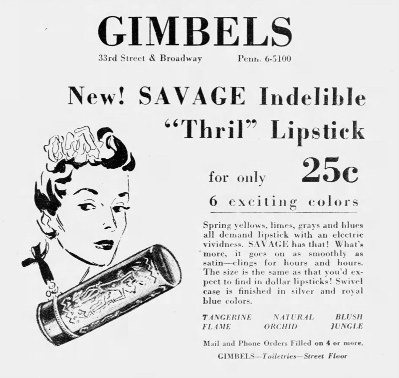
Getting back to my other questions, I'm unclear on the difference between the Tattoo and Savage lines, or why Younghusband would launch both nearly simultaneously. As I noted previously, there doesn't seem to be an appreciable difference between the two, and they were released at approximately the same time – around 1933 for Tattoo and 1934 for Savage. Tattoo lasted till about 1949, while the last newspaper ad I found for Savage dates to October 1941. At first I thought perhaps Savage was a drugstore line, whereas Tattoo was sold only in department stores, since their respective prices were 20 cents and one dollar. This 1939 Gimbel's ad for Savage, however, kills that theory.
Finally, and you may be wondering this as well, why on earth did I knowingly purchase such racist items for the Museum and then choose to blog about them? Unfortunately I can't really answer that myself. It's not like I wasn't familiar with these lines or thought they were okay and then realized they weren't, which has happened before. I also like to consider myself at least somewhat conscious about racial and cultural appropriation issues within the beauty industry. I guess I thought that, distasteful though they are, they're important from a historical perspective. I wanted to have tangible reminders of what was acceptable back then. Items like this also help me remember to be a little more mindful when purchasing contemporary pieces. So while I've made the decision not to feature such items in exhibitions, since it dawned on me that I prefer exhibitions to have more of a celebratory spirit and racist beauty products aren't things I necessarily want to champion, I think a cosmetics museum should have these types of items and open a dialogue about the ugly side of the beauty industry and its history. My main goal for the Museum is for it to serve as a happy, magical place full of wonderful and beautiful things, but sometimes it's necessary to take a good hard look at some of the problematic issues within the world of cosmetics.
Well, that's enough of my blather, except to say that I'm sorry I don't have more concrete information on these lines – hopefully Collecting Vintage Compacts will shed further light on them. Thoughts?
1 While I was poking about at newspapers.com I came across an article from 1934 that serves as historical evidence of how indigenous people were viewed by Americans/Europeans in the '30s. This one tells the tale of one young woman "explorer" (read: colonizer) who attempted to "civilize" the "ferocious Amazonians" in South America by bringing them cosmetics. I literally can't even with this.
2I do really wonder what the hell was wrong with Younghusband. In the news articles I found, his first wife passed away in 1927, and he went on to remarry 4 different women in the span of 13 years, all of whom accused him of adultery. The rough timeline is that he divorced the 2nd wife in 1931, married his third in April 1933 and divorced her in 1935. I'm not sure about the 4th wife, but in November of 1937 he married his fifth. A 1950 article regarding the divorce of his 5th wife states that he went so far as to "spend thousands of dollars on detectives, photographers, wire tappers and gigolos in attempt to frame [his wife] in an embarrassing position in a Florida hotel so he could gather divorce evidence." What a psycho. The same article also claims that during the wedding, Younghusband hit a police reporter in the head after inviting him to cover the wedding. So yeah, something wasn't right with this guy, and it's not just the rampant racism in his company's lipstick lines.
"It never dawned on me not to do something because I was a woman…I thought nothing of approaching men like Vincent Bendix, the airplane manufacturer for whom the transcontinental air race was named, to explain my position: 'I can fly as well as any man entered in that race.' I didn't see it as being boastful so much as speaking the truth. I learned through hard work and hard living that if I didn't speak the truth about myself, no one else would fill in the missing pieces." – Jacqueline Cochran
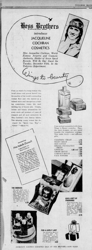
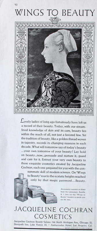
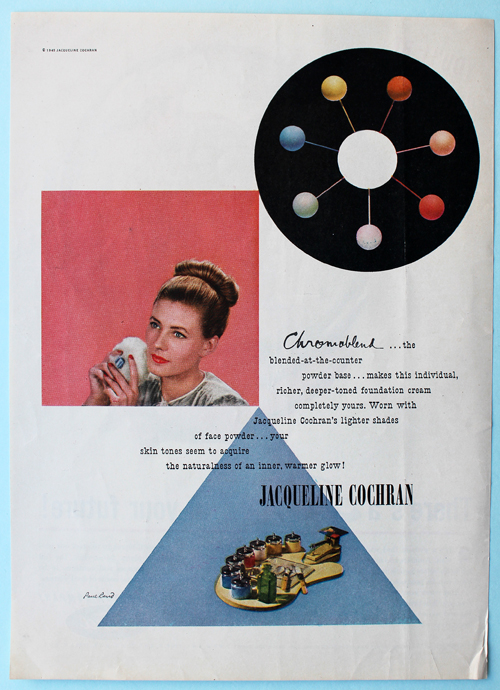
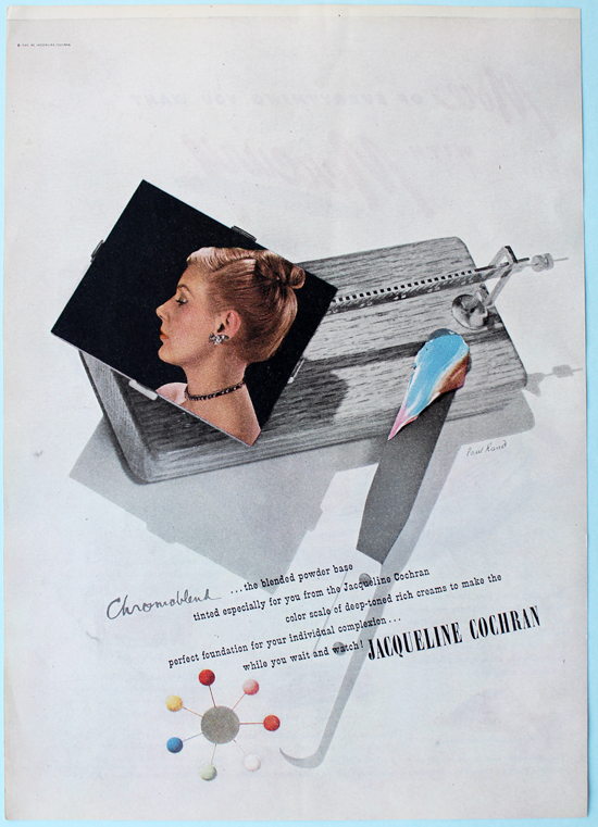
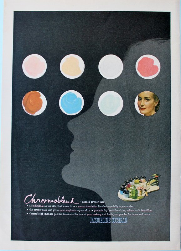
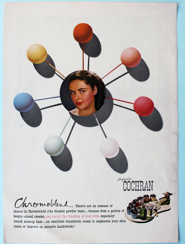
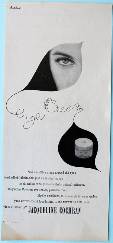
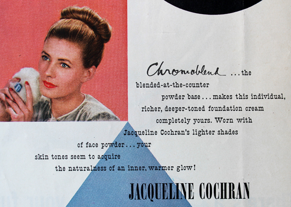
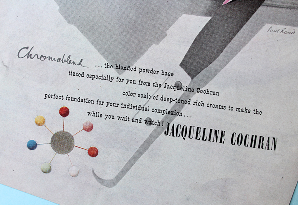
As with Tommy Lewis and Richard Hudnut, I found a very interesting piece of makeup history completely by chance. I was thinking how cool it would be to see some mid-century modern designers' work on makeup packaging, i.e. Alexander Girard, Charley Harper and Paul Rand. On a whim I typed in "Paul Rand makeup" into Google (I think I was under the impression that I could somehow will makeup packaging with his work into being if I just believed hard enough) and lo and behold, a bunch of ads he had designed for a brand called Jacqueline Cochran Cosmetics popped up. I had never heard of it so I searched for just Cochran's name…and was mighty confused by the results.
Jacqueline Cochran (1906?-1980) was a pioneer of aviation in the 20th century, a.k.a. an aviatrix (don't you just love that word?! So bad-ass!) A contemporary of Amelia Earhart, Cochran set world records for flying from the '30s through the '60s, including:
- The first woman to enter the famous Bendrix race in 1935, and the first to win in 1938
- The first woman to fly a bomber across the Atlantic in 1941
- The first woman civilian to earn the Distinguished Service Medal for serving as the director of the Women's Air Force Service Pilots (WASPs) and training women pilots in WWII
- The first woman to break the sound barrier in 1953
- The first living woman to be inducted into the Aviation Hall of Fame in 1971
- Held more speed, distance and altitude records than any pilot in history at the time of her death.
Further along in my search I discovered that this amazing woman was, in fact, the same Jacqueline Cochran as the one behind the cosmetics line. While I don't wish to diminish her accomplishments as a pilot, obviously I'm more interested in telling the story of her makeup company. As we'll see, Cochran may never have gotten into flying if it wasn't for her interest in cosmetics.
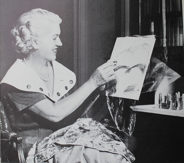
It seems like I'm sharing too much of Cochran's early life, but I promise it's relevant! Jackie Cochran (original name Bessie Lee Pittman1) was born an orphan around 1906 in Florida. The exact year is unknown because she didn't have a birth certificate. Adopted by an impoverished foster family, Cochran worked throughout basically her entire childhood. When I say "impoverished" I don't mean the family couldn't afford multiple cars; I mean they literally didn't know when or if their next meal would come, and the children's clothing consisted of flour sacks stitched together. In 1914 the family relocated to Columbus, Georgia to work at a cotton mill, children included. At the age of 14 she experienced her first foray into the beauty industry by taking on the role of "beauty operator" at a local salon, learning how to operate the perming machines and dyeing clients' hair. A traveling salesman for a perm machine knocked on the door one day and offered her a job as an operator in Montgomery, Alabama, and off she went. (I can't even imagine going to a strange town with not a penny in my pocket and knowing nearly zero people, especially at 15.) One of her regular customers suggested she go to nursing school despite the fact that Cochran only had a third-grade education. After deciding nursing wasn't the career for her, Cochran moved to New York and landed a job at Antoine's, a high-end salon located within Saks department store. I'm astonished at how hard Cochran had to work just to survive, and though sheer grit and fierce will to succeed, she was able to make a slightly better life for herself as a teenager than as a child. (You really need to read her autobiography, which is where I'm getting most of this information2 – the courage and determination she had were mind-blowing, yet she presents it in a very matter-of-fact manner, not in any sort of bragging or "woe is me" way. When a group of school girls asked why she was so ambitious, she straightforwardly replied, "poverty and hunger").
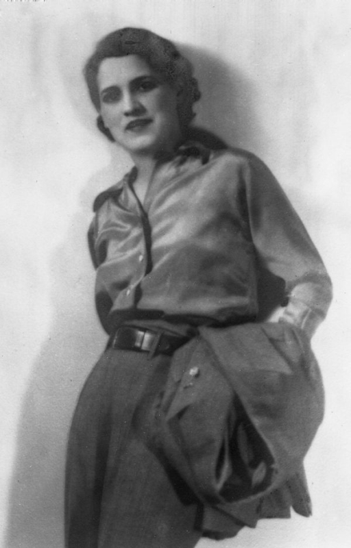 (image from floridamemory.com)
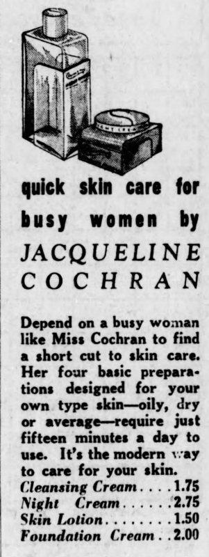
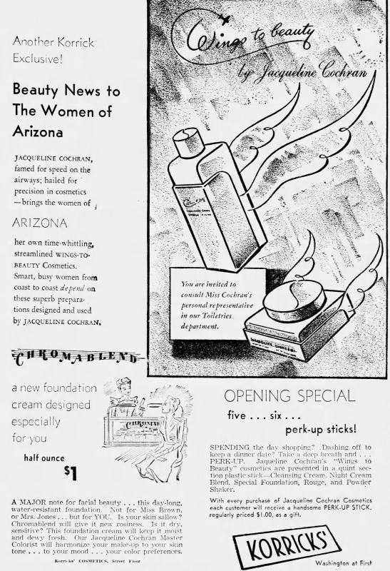
It was at a party in 1932 where she met her future husband, millionaire lawyer and businessman Floyd Odlum. Cochran was completely unaware of his background (and wealth) at the time, but was immediately attracted to him. The party's host introduced them, and during their chat, Cochran mentioned her desire to get out of the salon. "I've been thinking about leaving Antoine's to go on the road selling cosmetics for a manufacturer…the shop can be so confining and the customers so frustrating and what I really love to do is travel. I want to be out in the air." To which Odlum replied, "If you're going to cover the kind of territory you need to cover in order to make money in this kind of economic climate, you'll need wings. Get your pilot's license" (p. 57). And with that, Cochran took flying lessons and earned her pilot's license in a mere 3 weeks – setting records right from the start of her aviation career. In 1935 she officially established her eponymous line, which was meant for a more active woman who wanted to have adventures but also look polished while doing so. (Not that women need to look polished, or even require makeup to look polished, of course.) The brand's use of "wings to beauty" and claim that a full beauty routine takes just a few minutes a day suggest that it was a brand intended for the busy go-getter, perhaps even an early version of athleisure beauty. Indeed, both the ads and Cochran's own words in a 1938 interview demonstrate a no-nonsense, time-saving approach to beauty – ever practical, she skipped blush while flying. Says the article, "Mandarin fingernails and artificial eyelashes are ceiling zero to [Cochran]. 'You get pale at high altitudes,' she explains. So rouge just stands out in one big spot.' Likes an eye cream to 'keep my eyelids from drying'. There's a foundation cream with an oil base. 'Your skin gets dry in high altitudes.' Then lipstick and powder. That's all. In summer, she likes a grease make-up – foundation cream that makes you look all bright and shiny and is worn without any powder. 'Just a touch of paste rouge and your lipstick. It's young-looking and very attractive with sports clothes.'" I think Cochran definitely would be a fan of athleisure makeup today, as she seemed to prefer a minimal, fresh-faced look.
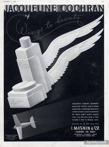
(image from hprints.com)
Some more of her musings on makeup: "I'm feminine but I can't say that I was ever a feminist…I refused to get out of the plane [after a crash in Bucharest] until I had removed my flying suit and used my cosmetics kit. That was feminine and it was natural for me. It gave me the pick-me-up I needed and I wasn't ashamed to do it. I didn't want to be a man. I just wanted to fly" (p. 20). Though she says otherwise, Cochran's actions most definitely paint a feminist picture. I'm seeing her reapplication of makeup following a crash as more of a coping technique and less "I need to look pretty". As we'll see, however, later advertising for the brand took a decidedly ageist turn.3
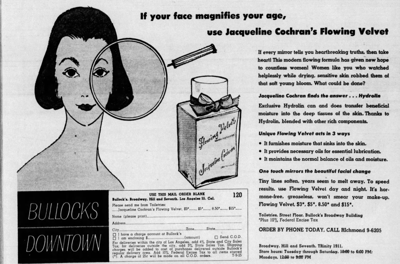
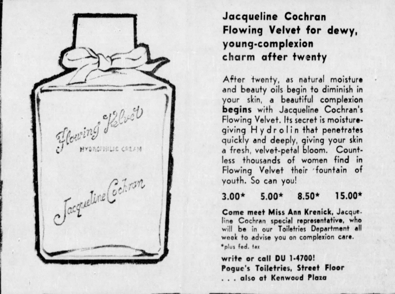
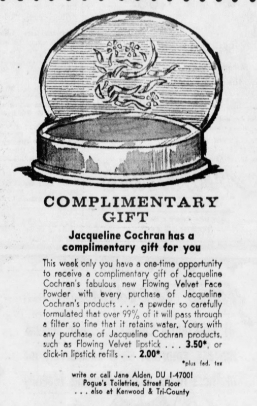
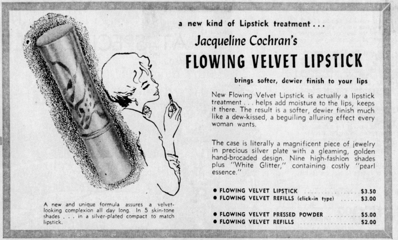
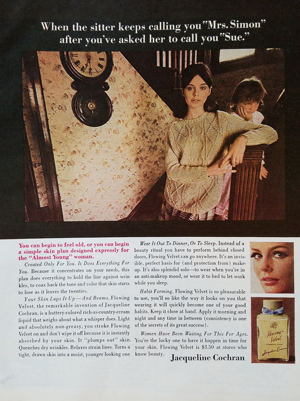
The brand was also a reflection of Cochran's unstoppable determination and desire to innovate. "I wanted no part of other people's products because I was crazy enough then to think I could do better…when I first set about to develop a greaseless night cream, I was told that a greaseless lubricant was clearly impossible. I knew they were wrong and I never recognized the word impossible. My most successful cream, Flowing Velvet, is the result of my stubbornness" (p. 119). Flowing Velvet was possibly the first moisturizer on the market intended to replenish the skin in high altitudes and extreme travel distances – i.e. long flights. It was introduced around 1942 and the line expanded in the '50s to include face powder and lipstick. Sadly, the advertising greatly contradicts Cochran's own words, as it seems to be geared towards ancient ladies over the age of 20 (!) trying to regain their youthful glow.
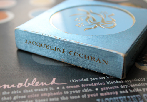
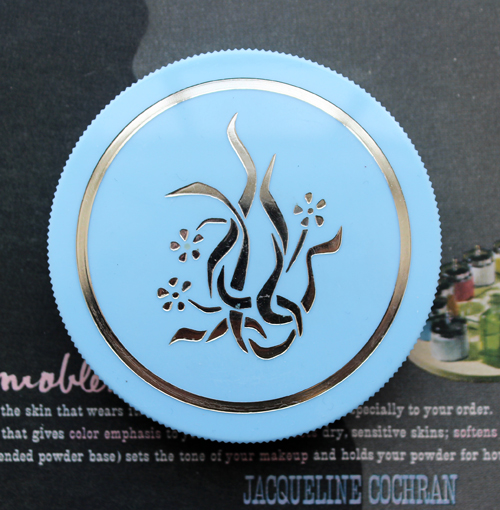
I couldn't locate a jar of the famous cream, but I did scrounge up a powder refill from the early '60s.
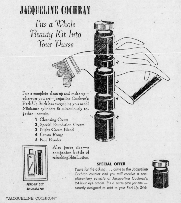
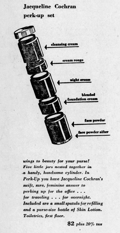
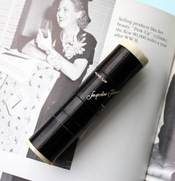
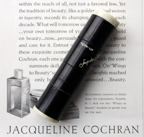
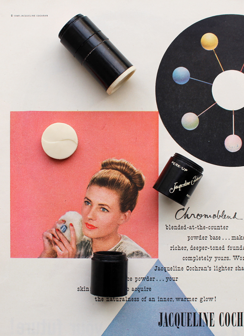
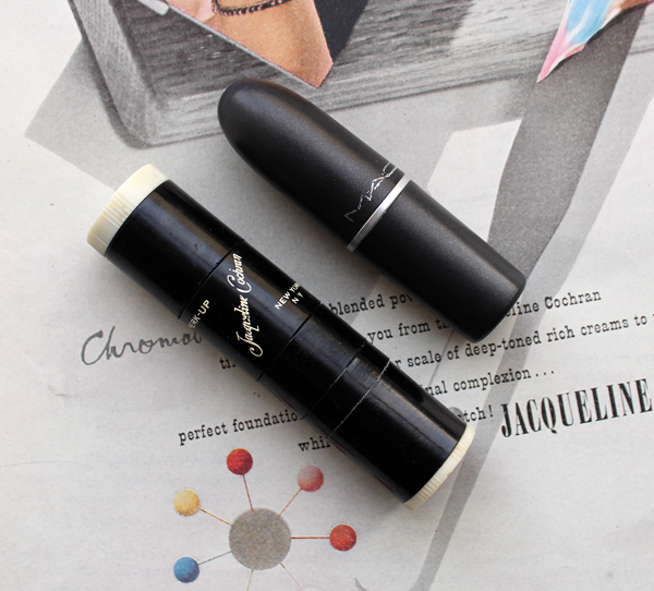
One of the most unique products Cochran came up with was the "perk-up stick", which contained 5 beauty products in a tiny cylinder for on-the-go usage. "I was proud of what we used to the Jacqueline Cochran 'Perk-Up' cylinder. I would take one on all my trips, on all my races. It was a three-and-a-half inch stick that came apart into five separate compartments for weekends or trips. It would fit anywhere and it had everything" (p. 119).
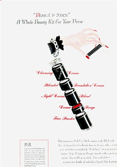
(image from Blue Velvet Vintage)
I was fortunate enough to snag one of these for the Museum.
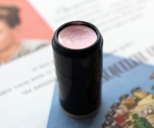
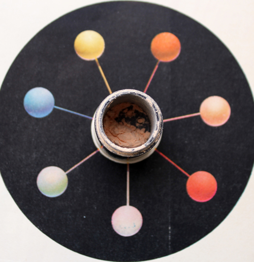
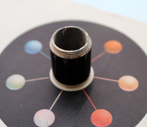
I've taken most of it apart so you can see what it looks like. I couldn't get some of the compartments open and didn't want to break it, but all of the ones I did open still had product left.
At one point it had a sifter for the powder so that it didn't spill out when you opened the compartment.
The Perk-Up Stick also came with a little spatula so you could refill it as needed and hygienically apply everything. While the concept seems genius (seriously, why aren't companies now coming up with things like this?!) one must remember that products in the first half of the 20th century were generally smaller and more streamlined – no big huge honkin' palettes back then. And refillable packaging was way more common. In thinking about the lovely compacts I've collected over the years, I'm remembering that people didn't throw them out, they just popped in a refill. Still, the Perk-Up stick is unlike anything I've seen, contemporary or vintage. As the author of Blue Velvet Vintage notes, the closest thing we have today to the Perk-Up Stick are stackable jars.
I also purchased one more piece from the early '60s. However, the photo below is not mine, for you see, I bought not one but TWO of these compacts, yet ended up with none. I bought one in late February, only for USPS to claim it had been delivered when it had not…and then a few weeks later when it still didn't resurface, I found another floating around on Ebay and bought it to replace the lost one. Despite being from a totally different seller in a completely different part of the country, somehow USPS lost the replacement as well. How they managed to do that I have no idea – perhaps this compact is cursed. There are others available for sale but they're not in as good condition as the ones I purchased, and at this point I'm not willing to invest any more money into it. Nevertheless it would have been a nice piece to have in the collection.
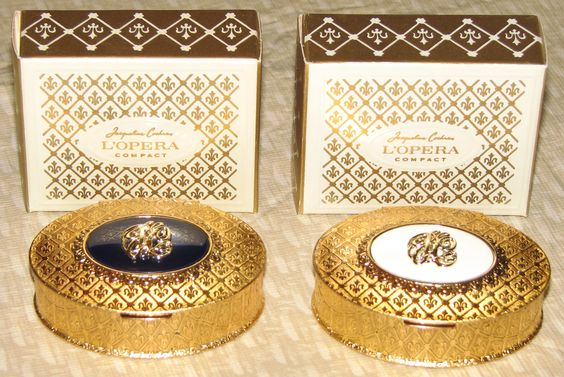 (image from pinterest)
As for the Paul Rand ads, despite reading almost as much as I could find on Cochran, I'm still not clear on how the partnership with Rand started. I do know that I'm in love with the ads.
As this exhibition catalogue shows, I'm missing a few more of his ads, alas.
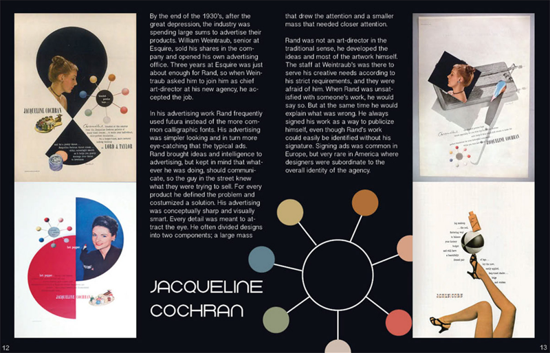 (image from amulhall015.portfolio.com)
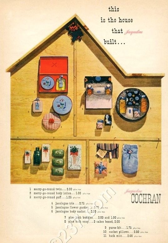 (image from pinterest)
Obviously I'd give my eye teeth for this crazy powder!
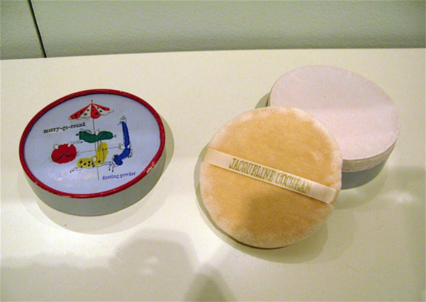 (images from paul-rand.com)
One observation I had in looking at these was that as heavily as the Chromoblend powder was marketed throughout the '40s – given the abundance of ads I'm imagining this was one of the pillars of the line in addition to Flowing Velvet – I couldn't find any jars to actually buy. I'm wondering if custom blend face powder king Charles of the Ritz was too stiff a competition. Did Cochran launch her own custom face powder as a way of thumbing her nose at his company and trying to prove that, once and for all, her product was superior? While it's unclear which Charles she was referring to, Cochran recalls her meeting with him less than fondly. "What an irritating snob of a man Mr. Charles was. I made the interview worse by insisting outright that I was an expert at everything. He didn't believe me. I didn't look old enough to be expert at anything, he said. We were two big egos out to prove who is bigger, better. In fact, I told Charles of the Ritz that not only was I good, I was probably better than he was. That amused him for a minute, but he was not so amused when I wanted fifty percent commission on every customer I had in his salon…it makes me smile to think that the cosmetics company I would found several years later, Jacqueline Cochran Cosmetics, still competes with Charles of the Ritz" (p. 55).
The overall concept of going to a counter and having custom face powder blended is remarkably similar.
The use of the spatula in this ad and the idea of making custom powder "while you wait and watch" is also nearly identical to Charles of the Ritz's ads.
So what happened to Jacqueline Cochran Cosmetics after its heyday in the '40s and '50s? Cochran sold the company in 1963 to American Cyanamid Co. It was then formally acquired by Shulton, a subsidiary of American Cyanamid, in 1965. Unfortunately the ageism continued to run rampant in ads throughout the '60s.
At least they were still touting a speedy beauty routine for women who don't have much time to devote to skincare. Then again, sitting around and drinking tea doesn't exactly scream "busy". Like, they couldn't have shown a woman on her way to work or engaged in a sport of some kind?
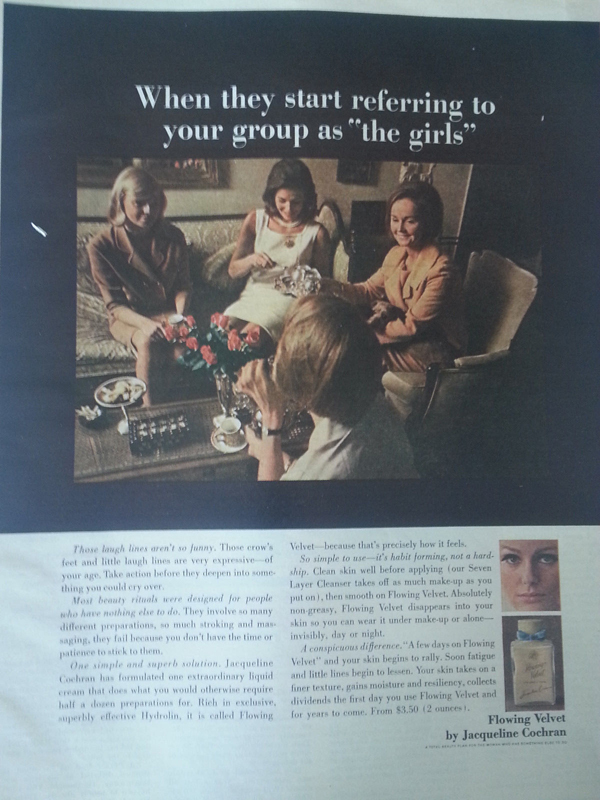 (images from ebay)
But making women terrified of aging must have been effective, since the Flowing Velvet line was popular enough to continue expanding to include eye makeup and lip gloss.
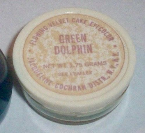
(image from pinterest)
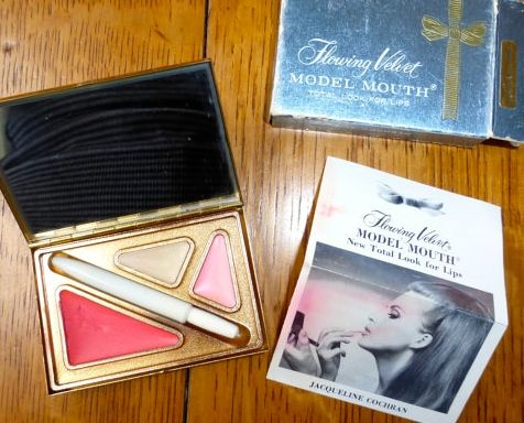
(image from pinterest)
Unfortunately I'm not really sure of the brand's trajectory after the '60s. The timeline below suggests that Jacqueline Cochran Cosmetics is long gone, but also was part of a recent re-branding effort. So maybe there are plans to revive the line?
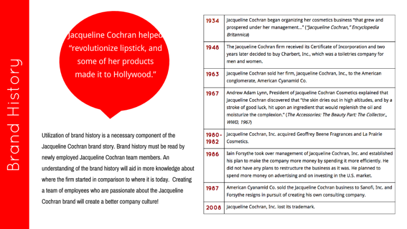 (image from behance.net)
In any case, while the later advertising left something to be desired, you had to give Cochran credit for setting world flying records while simultaneously managing a multi-million dollar cosmetics company that at one point had over 700 employees. She also made good on the originally intended purpose of her pilot's license: after the war ended, Cochran flew an average of 90,000 miles a year to sell her line in various locales. For Cochran, the beauty industry allowed her to both get out of poverty and provide women with a sense of well-being (ageist advertising aside). "In a beauty shop the customers always came in looking for a lift. And unless I really screwed up, they left with that lift. I could give them that. I could give them hope along with a new hairdo. My skills as a beautician had bought me a one-way ticket out of poverty, and I'd never forgotten it. I was always proud of my profession" (pp. 46 and 57).
Had you ever heard of Jacqueline Cochran? What do you think of her and her line? It was pretty eye-opening for me – I think I should Google the other mid-century artists I mentioned and see what rabbit holes I can fall into. 🙂
1 Interestingly, Cochran's autobiography completely leaves out how her got her surname. Apparently she married Robert Cochran in 1920 at the age of 14, had a son a year later (who died at the age of 4 in 1925), and divorced Cochran in 1927. She selected the name Jacqueline on a whim while working at Antoine's. In the book there is no mention of her first husband; instead, she claims she chose the name from a phone book. "I went to the first phone book I could find, ran my finger down a list of names, and decided on Cochran. It had the right ring to it. It sounded like me. My foster family's name wasn't really mine anyway…I wanted to break from them in name. I had my own life, a new one. What better way to begin than with my own name. Cochran. Why the hell not?" (p. 49)
2 In addition to the staggering amount of information online, there are also several official biographies of Cochran. I chose the autobiography because I wanted to hear her story in her own words and get a sense of her personality.
3 It seems highly unlikely that Cochran was directing the ad copy for her line, so I can't fault her too much for that, as distasteful as it is. However, a bit of gossip that appeared in a 1951 newspaper article makes me think that Cochran wasn't the feminist hero we'd like her to be. I've included a few excerpts in which Cochran basically says "no fatties allowed" in the Air Force's women's pilot program. Yikes.
