I'm quite far behind on artist collaborations, so I'm doing some more catching up. Today we have British artist Morag Myerscough for Bobbi Brown, whose collection was released in the spring of 2020. It was a small collection consisting of an eyeshadow palette, highlighter and two lipsticks. I purchased one of the lipsticks and the two other items…and of course I can't seem to find the lipstick. (I'm really hoping to take a full week off of work this summer to properly re-organize the Museum's collection, as things keep going missing or take literally hours to locate. Sigh.)
Born and raised in London, Myerscough came from a family of artists. Her father was a highly sought-after session musician in the 1960s and '70s, while her mother was a textile artist. Myerscough was settled on an artistic career even before she was out of elementary school. After graduating from St. Martin's where she studied graphic design, Myerscough attended the Royal College of Art. In 1993 she established Studio Myerscough, and in 2010 Supergrouplondon, a collaborative studio with fellow artist and partner Luke Morgan, was born. You can read more about her professional background at Eye Magazine.
Myerscough's vibrant color combinations are influenced by her mother as well as several artists, including Josef Albers and '80s collective Memphis (remember them from my Hermès post?) She explains, "[My style of] colour could be from my mother, I think my colour sense comes from being very young and understanding the difference between a dye made from a natural source and one from an artificial source. When I make my big pieces of work I much prefer to paint them as I can get pure pigments and as they are used in spaces it is important how colour responds to light. There is nothing better than to see an amazing colour in the right environment, it can change your whole mood. I like to be brave with colour, at college I was introduced to Albers, and I was very interested in his theories on how colours respond to each other." She adds, "I really hate when people say that colour is exclusive to children, what sad people they must be. Adults need colour in their lives as much or maybe more than children. Colour is so abundant in nature and we need it more in our built environment." Hear hear!
In 2017 Myerscough designed the Artskickers stage for a beloved community hub in Dalton Garden. Over 200 events are held here each year.
Her color choices combined with the tidy, modern geometric patterns reflect both her graphic design background as well as the influence of artists such as Bridget Riley and Dan Flavin. Here are a couple examples so you can see the resemblance.
You know I adore big bold swathes of color, but it's Myerscough's dedication to community engagement and overall approach to art that speak to me the most. Adopting a Chinese proverb as her mantra, "make happy those who are near and those who are far will come," Myerscough aims to instill a sense of belonging among the people using the space she's been commissioned to reimagine. She believes art is a unifying concept that can bring people together and connect them to certain places. A beautiful example is the Burntwood School, where Myerscough designed many of the interior and exterior wall patterns. "I put a narrative in the building, we make places where people feel they belong. I like working collaboratively with architects…we have made some great steps in how schools are used and how the students connect with their schools. The team needs to want the same result and for the project to be successful this involves everybody. The students' grades have increased hugely, I believe this is because they have a building that works for them, that they can be proud of, with teachers that care about them and when you put all the parts together it produces success," she says. I wonder if my anxiety would have been mitigated if I had attended a school with this sort of art everywhere. Probably not, but it's at least nice to look at.
I also love the Vinyl Lounge, a mixed-used space that used to be an office owned by British music company EMI in the '70s. Myerscough carefully researched the history of the buildings to design something that paid homage to their past while accommodating modern needs. The furniture and other decor consisted of vintage eBay buys or made by Luke Morgan with reclaimed materials. The "lounge" itself served as a gathering place. In this way the space incorporates local heritage and engages the community. "I do focus on belonging. I want to find out from people what it means to them. Because it may mean different things to different ages, like for the older ones it might be family, while with young ones it might be friends. I also try to see what part of it makes you feel belonged; is it just your culture or is it about talking with each other? It does not matter that you do not come from the same place but can still belong together."
But I do have some mixed feelings towards other projects. While I admire Myerscough's approach and would be honored to be able to visit one of her works in person, at the same time I'd most likely want to punch it. Perhaps I'm too cynical not about public art in general, but Myerscough's optimistic outlook more specifically. It's a bit too cheerful and positive for my grumpy, pessimistic self, or at least, the text is. If I was confronted by Love At First Sight, for example, I'd roll my eyes and walk right on by. Ditto for the billboards painted in honor of the frontline NHS workers during the early part of the pandemic. It's a really nice thought, but calling them "heroes" is problematic, and frankly a mural comes off as much as an empty gesture as clapping did. Overall, I think her installations work better with no words, because there's no direction then and people can take whatever they want from it. Words create additional meaning and context, so without them there's more freedom of interpretation. However, I don't think Myerscough would be offended if she read this because at least I have some sort of reaction. We share the same belief that art should have some kind of impact on the viewer, whether it's bad or good. She says, "The main aim is that people aren’t indifferent to it. I want people to react. I totally understand some people might hate my work and I would rather have that than just dismiss it with indifference. I want people to have conversations; to experience something they didn’t expect. That’s why I love making work in public spaces, where people might stumble across a piece of work and have it change their thoughts for the day – ideally for the better." I agree that part of art's purpose is making one feel something and not nothing.
Anyway, I wholeheartedly applaud and respect the incredible work she's done for children's hospitals, but I fundamentally disagree with the notion of art in hospitals. The rooms at the Sheffield's Children's Hospital are very welcoming, and at the Royal London Children's Hospital, she used the children's own drawings part of the decor. "In hospitals I really do want to brighten people’s days, to raise their moods, to make them feel positive and hopeful. I want to make spaces that feel like home, which people enjoy being in. And ultimately to help people feel better…when I was commissioned by Vital Arts to design the five dining rooms at the Royal London Children’s hospital, I proposed to work with [poet Lemn Sissay] on the project. He did poetry workshops with the young patients and I ran visual workshops with the words. We then made murals by combining the words with the visuals, so the dining rooms belonged to the young patients – it was their ideas on the walls. I also displayed all the young patients’ original drawings in frames on the walls, so they and their parents could see it and it was clear the patients were at the centre of the artwork. It’s important that young patients and their families feel comfortable in these environments, because often they stay for long periods of time or return regularly as a child grows."
These are wonderful, innovative ideas and Myerscough's style is absolutely perfect for this type of project, but as someone who has spent far too much time in hospitals on account of ailing parents, I can tell you that absolutely zero amount or style of art is going to combat the dread and fear. Hospitals are for the very ill and dying, and despite some spotty evidence of the benefit of art in hospitals, I still think there's no artist in the world whose work can even come close to offsetting that type of negative energy. As both a patient and a visitor I'd honestly prefer it if art wasn't in hospitals and have them remain drab and depressing – it's far more appropriate for the space. Again, this is all just a matter of opinion. (And I certainly support art therapy where the patient creates art themselves.)
Getting back to the Bobbi Brown collab, I'm not sure how or why it came about. Nor do I know why she designed the patterns she did for the collection, or if she had an input on the makeup shades. I did reach out for an interview with the artist but didn't hear back. I will say I think her work translated well to the packaging, which can be tricky for artists who typically work on large-scale designs. But I'd love to hear Myerscough's thoughts on makeup colors, how makeup can help bring people together and why she took on the collaboration. She works primarily on big environmental graphics for community spaces and doesn't have a lot of commercial collabs – the only other thing with her work that you'd find in a store was a collection for Method cleaning products, and even that was part of the larger Sheffield hospital project – so I'm curious to know what attracted her to designing the packaging for a makeup collection. It's a bit inconsistent with Myerscough's usual commissions. Perhaps it's precisely how different it is that piqued her interest. In any case, the Bobbi Brown collection is not even mentioned on her website.
Thoughts on Myerscough's work? What does the makeup community mean to you? Do you feel as though you're part of it?
I was hoping to post about Bobbi Brown's collaboration from this past spring, a partnership with British artist Morag Myerscough, but I realized I never got around to writing about an Asia-exclusive collab from last year so I'm covering that first. In the spring of 2019 the brand teamed up with Korean-born, New York-based artist Yoon Hyup, whose abstract urban landscapes, appropriately enough, have been created and displayed in cities across the globe. For Bobbi Brown's cushion compacts the artist made three designs: New York Skyline (Manhattan), Spread Love (depicting the Brooklyn Bridge) and Band of Light (representing Times Square).
Hyup (b. 1982) was born and raised in Seoul. He began what would become a lifelong love affair with skateboarding and skate culture at the age of 9.
While skateboarding is a key inspiration for his work – his lines and dots represent how he feels when skateboarding (like "flowing water", he says), music remains his primary influence. He studied violin for most of his childhood, getting scolded for improvising during lessons. As a teenager Hyup discovered hip-hop and graffiti magazines at a nearby U.S. naval base, further feeding his appetite for skate culture, music and art. In college he started out studying graphic design as he wanted to design skateboards, but quickly realized he enjoyed painting more. One night at a party a DJ asked him to paint while he spun, and for Hyup, there was no turning back. He has painted to music ever since. "From the early 2000’s, a hip hop party called “Afroking Party” was getting popular in Seoul. I would hang with DJs, MCs, B-Boys, skaters, writers and photographers there. It was the first place where I exhibited my artworks and perform live painting. A DJ crew wanted me to paint live while he performed his set, a mix hip hop, funk, disco, we’d perform all night. That was when I was 23 or 24 years old, and then I met more and more people, they would learn about me and ask me to do more paintings. I started to use lines and dots when I performed live painting, because I wanted to express something quick while DJ Soulscape and DJ Plastic Kid were spinning." Hyup listens to a variety of jazz, hip-hop, funk, soul and disco. To get an idea of what such a mix sounds like, you check out one of his playlists here.
Hyup likens his improvisational process to jazz or rap. For larger projects he sketches the overall structure, but generally does not draw beforehand. "I don’t sketch when I paint. If I need to sketch, I would only put the big structure. Other than this, I only do with free-hands on canvas or wall paintings without sketches. It may be similar to a jazz performance which only has a plan but plays impromptu. It’s similar feeling from listening improvisational music, funk or freestyle rap. When I skate, I feel rhythm and flow…I like to express these feelings with lines and dots."
Hyup's forté is vibrant city life, but he is equally adept at representing more calming scenes, such as tropical vistas and clouds. And while he cites American graffiti artists such as Futura, Lee Quinones and Mark Gonzales, along with Jean-Michel Basquiat and designer Don Pendleton as influences (I'd add Mondrian to the list), Hyup also reinterprets elements of traditional Korean art. Paintings of clouds, along with the use of obangsaek – five colors associated with the cardinal directions – are the artist's way of paying homage to his cultural heritage. "Many traditional Korean forms, such as vine clouds and wind clouds, surface in my paintings. I often paint with the five colors associated with my native country – red, blue, yellow, black and white. This color palette can be found in many things that relate to Korean culture, such as art, dress, and the painting for architecture. I use those colors to pay honor to my roots. I also find other colorways from nature and things around me."
Hyup's work generally consists of cityscapes, but occasionally his playfulness shines through via characters from pop culture. I'm delighted with these portraits of Cookie Monster and the Pillsbury Dough Boy! Fun fact: I was obsessed with the Pillsbury Dough Boy when I was little and have a decent collection of memorabilia. I'd love to see Pills on a shirt, similar to the Mickey Mouse ones Hyup made for Uniqlo.
Also, how precious is this holiday wonderland he created in Shanghai last year?
As for the collab with Bobbi, I'm not sure how it came about or why Hyup decided to partner with the company. (I emailed to request an interview but never heard back, sadly.) "I collaborate when I already know the brand well enough or when it naturally happens. Honestly, I haven't had to think about a brand I want to collaborate with because luckily, clients have always come to me and proposed collaborations. Sometimes I don't do it when I don't understand the brand well enough or it doesn't fit well with my style," he says. A cosmetics collaboration doesn't seem like it would align with the artist's interests, especially given his previous work for sportswear and apparel stores located in urban locations, like Nike's Gangnam headquarters and the Rag and Bone store in Soho.
This mural centers on the number 23, worn by basketball star Michael Jordan.
Hyup also designed the cover art for a CD box set for Ella Fitzgerald in honor of the singer's 1ooth birthday in 2017, which was fitting given jazz's influence on his process.
So makeup seems a little out of left field. I also can't figure out why only the city of New York was featured on the compacts, as these were Asia-exclusive…it would have made a bit more sense to include Seoul as well. Perhaps it's Hyup's love for NYC that propelled the focus on New York. In any case, I believe all three of the designs were new for Bobbi Brown, but there are similarities. Here's Rooftop Jam (2019) and Spread Love (2014) – the latter has the same name as the cushion compact showing the Brooklyn Bridge.
While I'd still like to unravel the mystery of the collaboration's origin, I enjoyed this collection nevertheless. Hyup's improvisational method perfectly captures the frenetic pace of cities, and I don't think his work would have the same effect if he painted without music. And New York is always magical so if they had to focus on any one city I'm glad it was the Big Apple.
What do you think? Which case is your favorite? Mine is Band of Light. I don't like to actually visit Times Square in person, but this image is so vibrant I can practically hear its pulse.
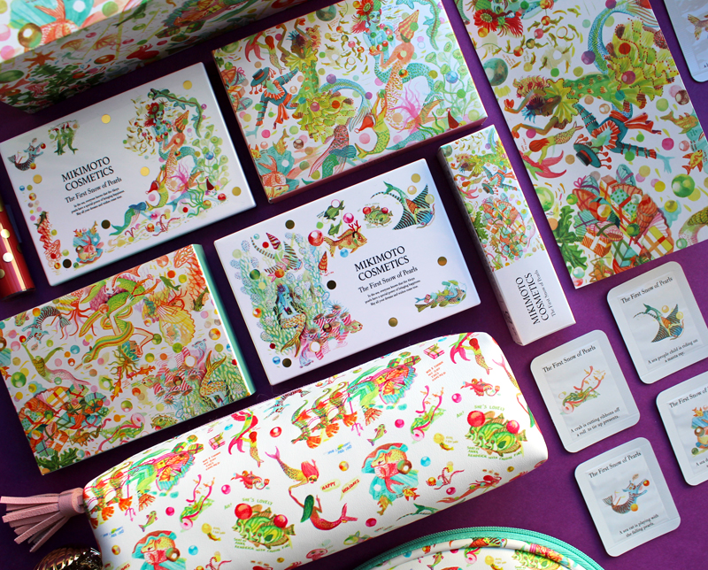
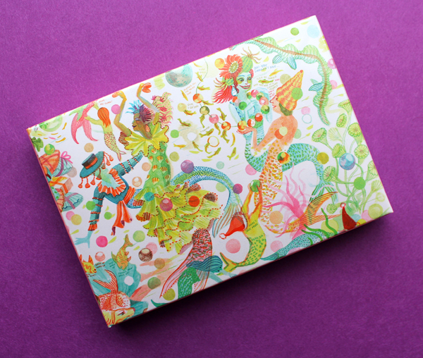
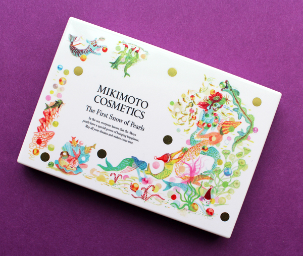
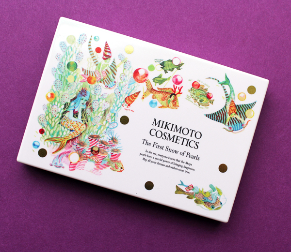
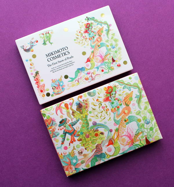
Normally I'd wait a whole year and do a Ghosts of Christmas Makeup Past post to be more seasonally appropriate, but I simply couldn't in the case of the amazing (mer-mazing?) Mikimoto holiday collection. As with the 2018 collection, the historic Japanese pearl and jewelry purveyor teamed up with an artist to create some incredibly whimsical underwater-themed packaging. Belgian artist and illustrator Brecht Evens had the honor of being Mikimoto's second artist collaboration. I must admit I think I like his concept even more than the one by Emmanuel Pierre in 2018. If imagery of celebratory mermaids and assorted mer-critters having the ultimate holiday party doesn't do anything for you, I question your humanity.
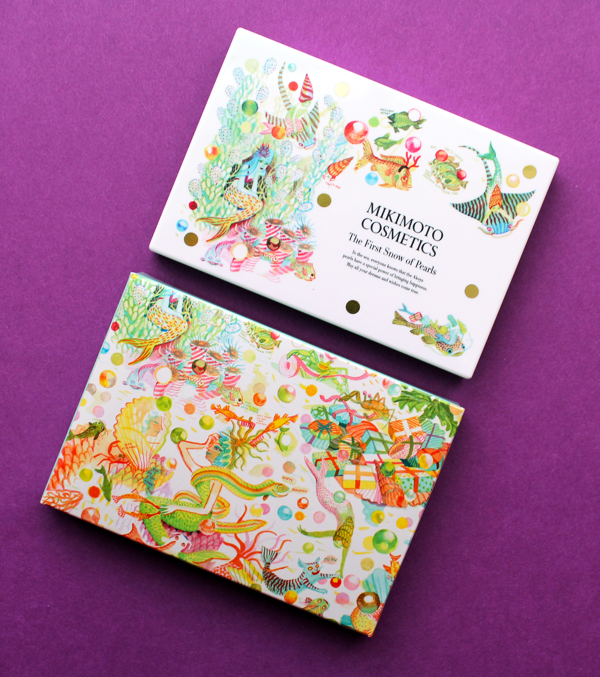
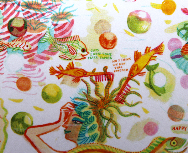
We'll start with the palettes. The details on everything are staggeringly clever. And while the mishmash of characters and objects may initially seem haphazard, Evens' messiness is actually entirely intentional. "When I draw the jumble of the city or I draw nature…errors, spots and little incongruities make it more realistic. Because when you're in a space and you start to look around, you don't take in the whole. You can't. You don't see the world around you like you see a postcard; it's not organized that way. We're moving, others are moving, and the eye makes constant choices, it decides what to interpret and what to identify. So at any given moment, there's a lot of mess in there and, for me, this kind of mess has to stay in. It's controlled; it's never like I'm creating randomness. It's just that incongruities seem to catch the eye better. They're more natural and they latch onto the eye more realistically. Maybe I do play with a lot of stuff. But I only do it when it serves my narrative. It's all part of calibrating things. When I use a lot of detail, it's very calculated – I'm making sure it doesn't obstruct anything essential." The dozens of scenes may still be overwhelming for some, but I personally enjoyed picking apart all the individual vignettes and then seeing how they came together as a whole.
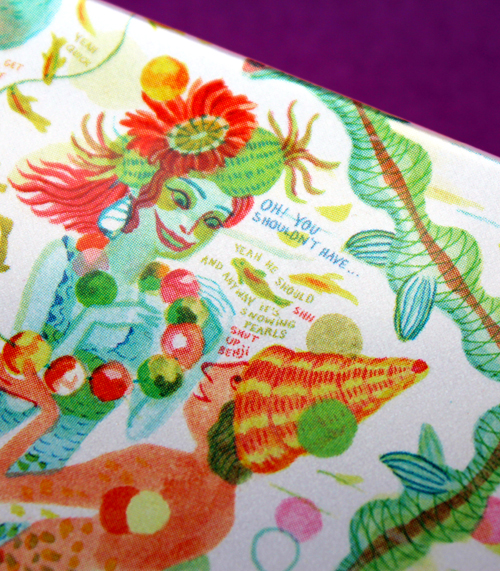
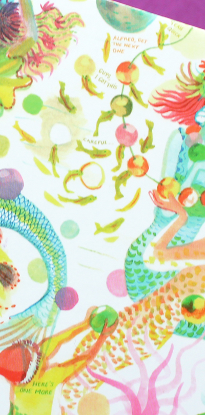
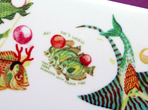
This is a particularly amusing exchange between two mer-folk and a nosy little fish. The addition of text is representative of Evens' background in illustrated books and comics. The humor reminds me a little bit of Danny Sangra, the artist who designed Burberry's spring 2018 palette.
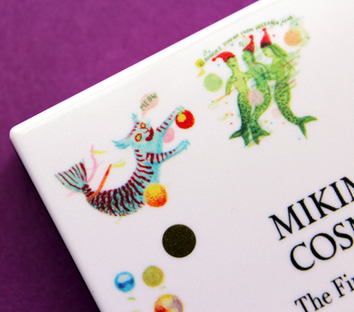
I'm obsessed with this mer-kitty.
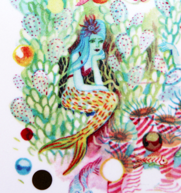
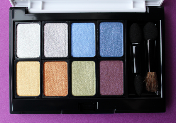
The scenes for the eyeshadow palette are equally spectacular. Sting rays take mer-children for a ride, while a sea elf peeks out from some seaweed to admire a blue-haired mermaid.
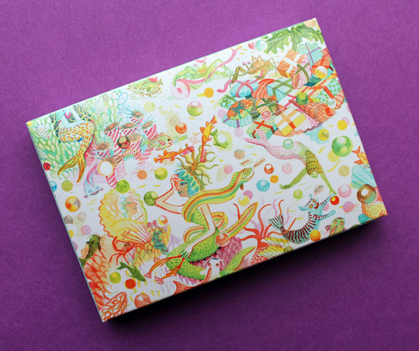
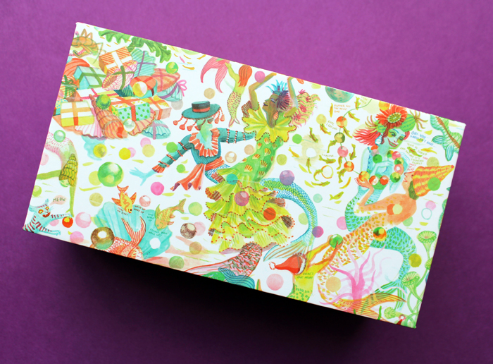
On the outer box a school of fish help another mermaid primp for a holiday party. She checks out her reflection in a seashell mirror held by two crabs.
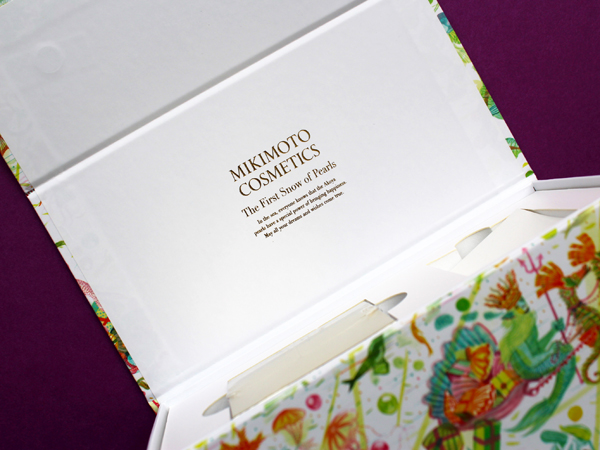
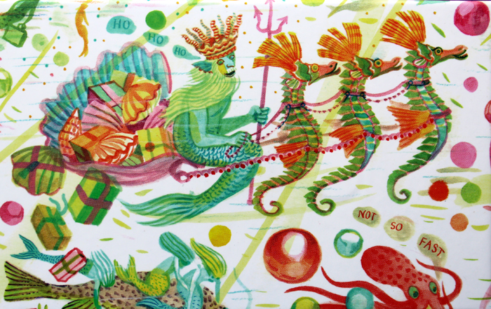
I think the imagery on the sides of the skincare set was my favorite.
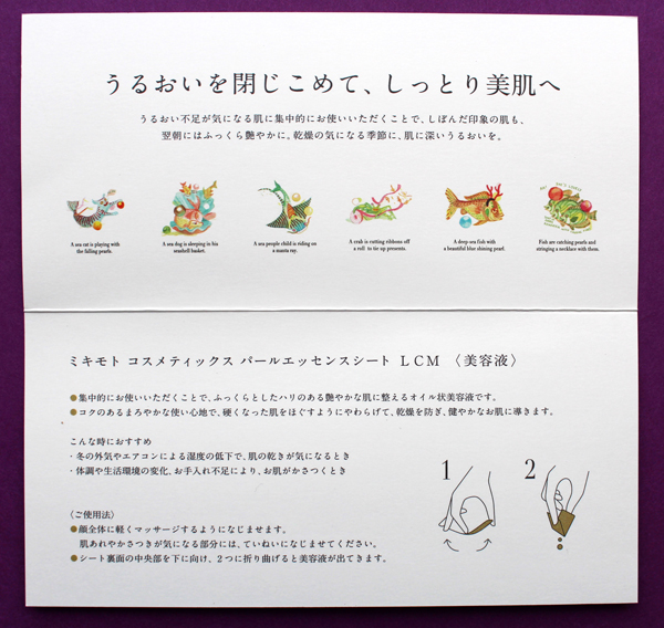
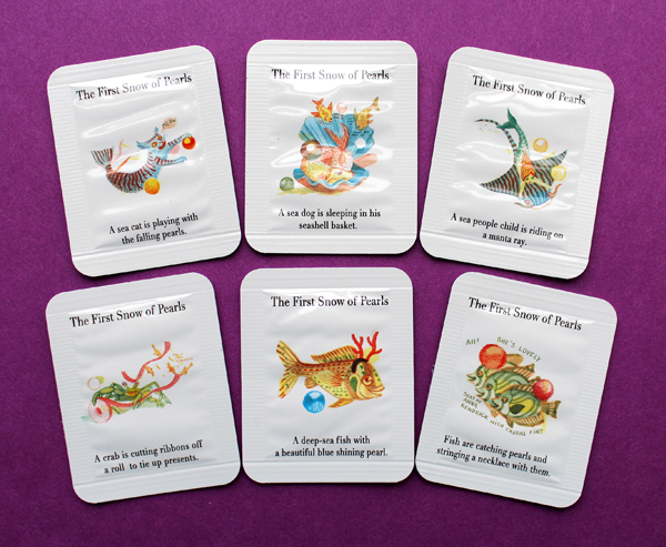
The set includes what appears to be a very fancy moisturizer (I didn't want to open the sealed plastic) and what I believe are packets of face serum. Each one tells a snippet of the "First Snow of Pearls" tale. Unfortunately I couldn't seem to locate the story at the Mikimoto website as I did last year, so I'm not really sure what it's supposed to be about.
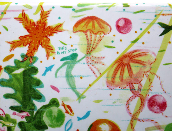
I love that the images are totally bizarre but also make perfect sense. The concept of a sea-dwelling Santa is absurd, but if one exists, of course his sleigh team would be seahorses instead of reindeer and his bag of presents shaped like a seashell. Ditto for the mermaid taking a ride on the jellyfish "bus", pulling on its tentacles to signal her stop. While the underwater realm Evens created for Mikimoto is entirely imaginary, the usual rules still apply. As he puts it: "I do think I use visuals that might be dreamlike, or psychedelic, but I don’t think I use dream logic…you have to believe in the world you're creating."
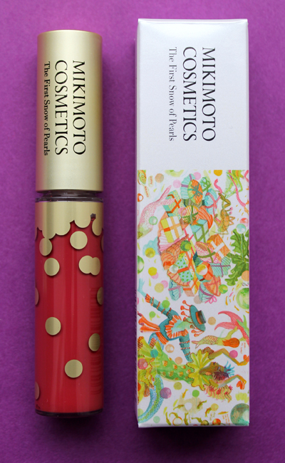
There was also a lip gloss, the box for which shared the same illustrations as the skincare set.
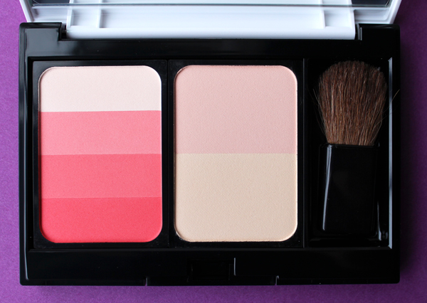
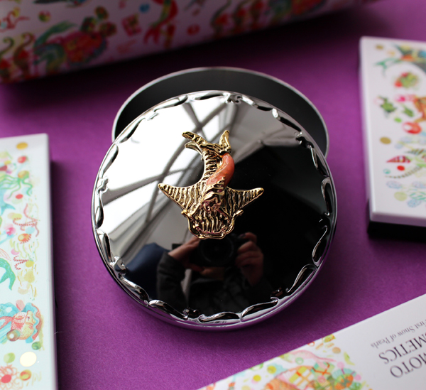
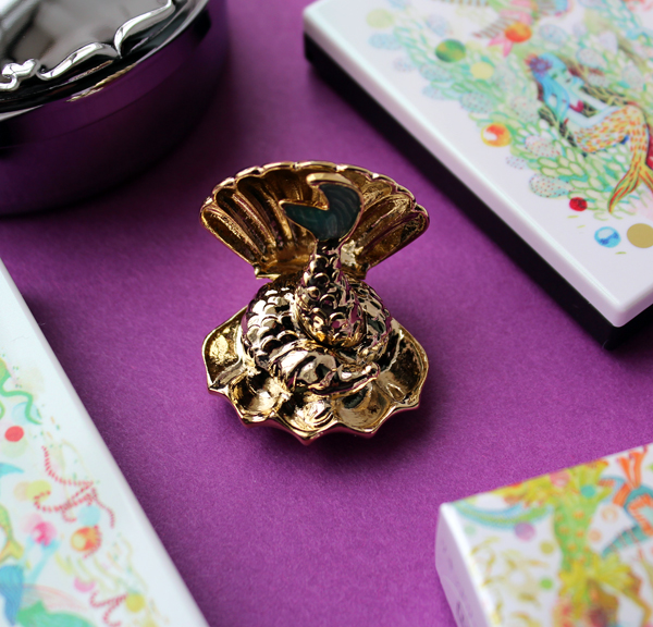
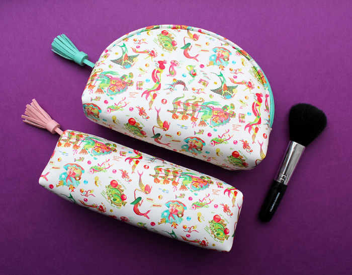
Some lovely extras were included as gifts, like this silver toned box topped with a manta ray, a gold seashell cardholder and two cosmetic pouches. I noticed the powder brush was a bit scratchy, but 1. it was free and 2. I don't intend on using it anyway.
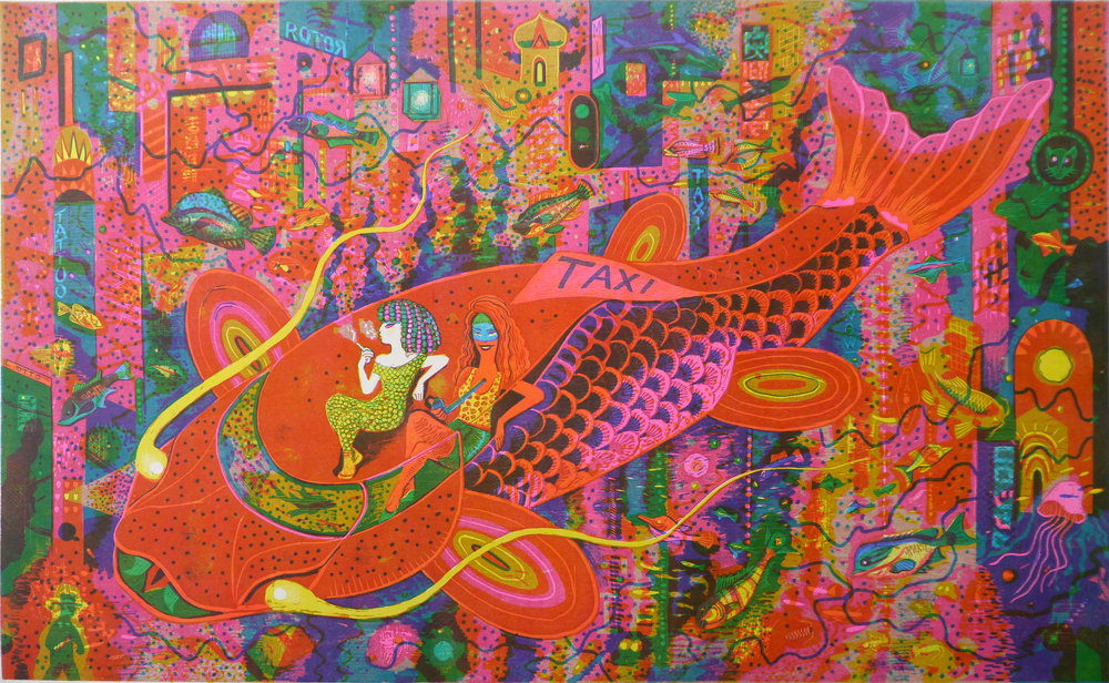
Let's learn a little more about the artist behind these fantastical scenes. The Belgian-born, Paris-based Brecht Evens (b.1986) studied illustration at Sint-Lucas Gent in Ghent, Belgium. Building on his country's tradition and notoriety for comics, he focuses on these and illustrated books, but has also completed murals in Brussels and Antwerp, created fabrics for Cotélac, and collaborated with Louis Vuitton on a Tokyo travel book.
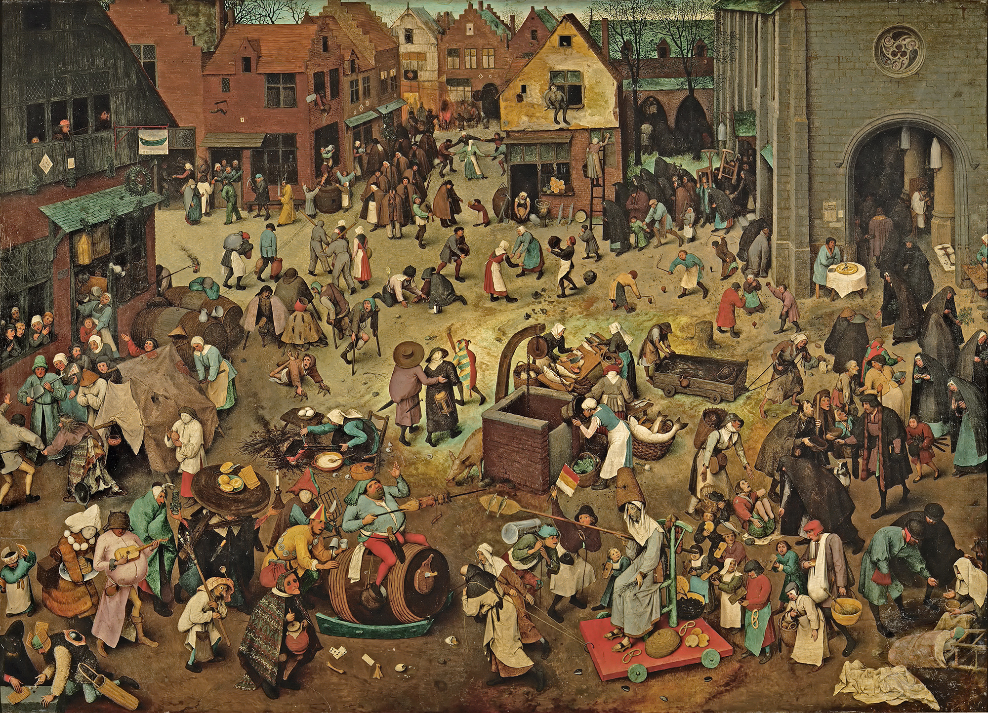
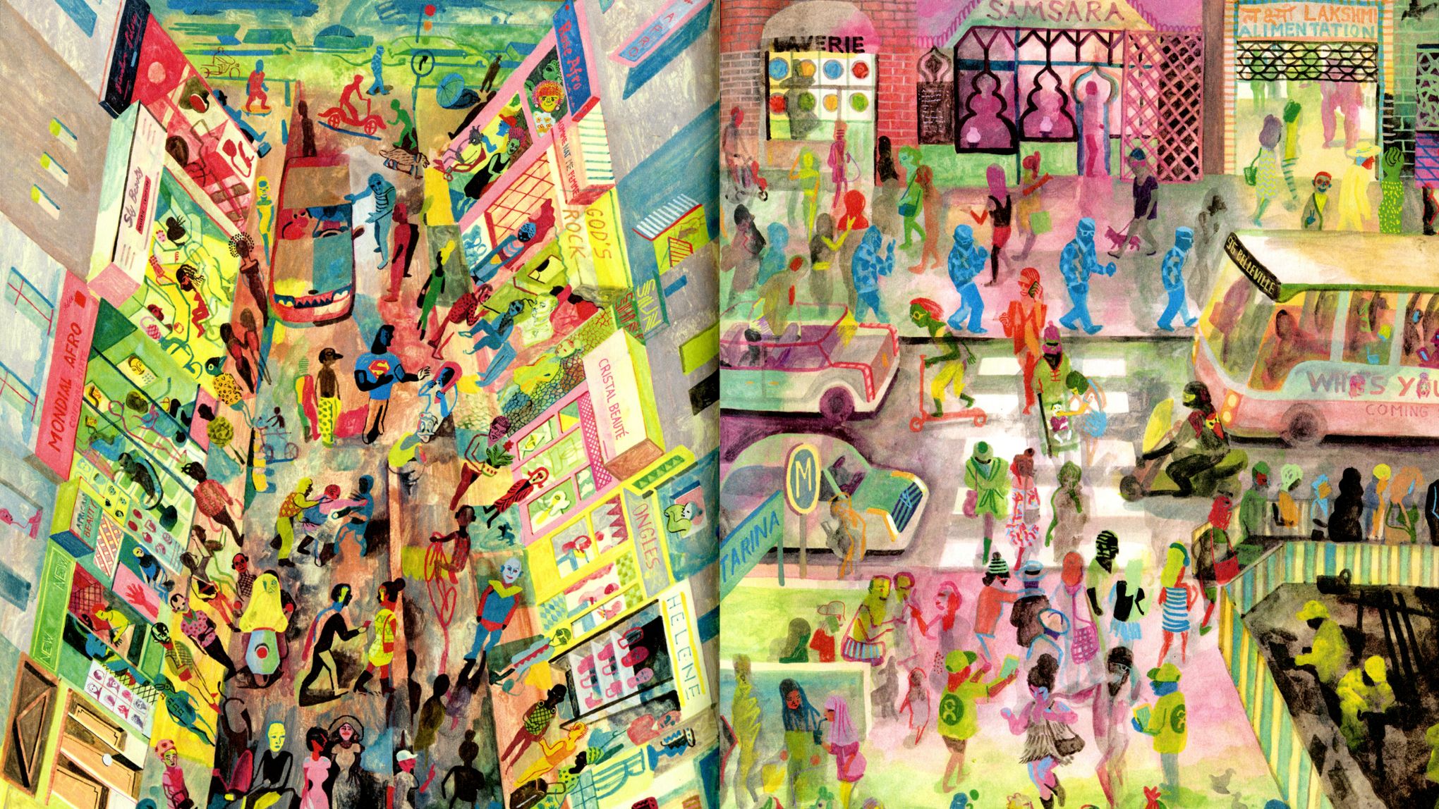
Stylistically, Evens is influenced by his mentors, illustrator Goele Dewanckel and cartoonist Randall Casaer. You can also see glimpses of Pieter Bruegel the Elder, M.C. Escher and Picasso. Take, for example, the resemblance between the artwork Evens created for French publisher Actes Sud and Bruegel's Battle Between Carnival and Lent. Both utilize a bird's eye perspective and include dozens of different vignettes.
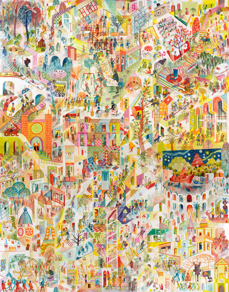
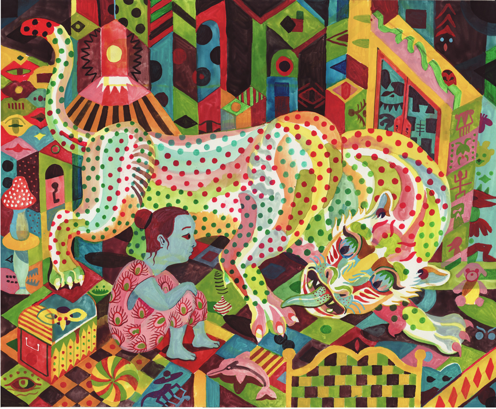
While Evens published several award-winning books early in his career, he is best known for more recent works Panther (2014) and The City of Belgium (Dutch and French versions released 2018; forthcoming editions in English in 2020). In terms of content, most of Evens' narratives tend to be a little dark. Panther is about a young girl named Christine whose cat dies. Her mother also threatens suicide, drives away and never comes back. Panther arrives seemingly to be Christine's friend and help her cope, but ends up being far more malicious than he appears. One reader called it a "apologism of pedophilia, zoophilia and incest". Yikes.
The City of Belgium (titled Les Rigoles for its French audience and Het Amusement for Belgium) is actually part of the same universe as Evens's 2009 work The Wrong Place, and the various versions of the book are meant to be connected. "I wanted something like a paperback copy of Balzac, a whole world that would be portable. But, instead of just one city, I wanted to make it a kind of European amalgam…the fun result would be for everyone to think it's their city."
The City of Belgium also reflects Evens' struggle with bi-polar disorder and gradual recovery from a particularly bad episode. While not as unsettling as Panther, the book follows three characters having parallel urban adventures throughout a single evening, one of whom suffers from depression. Evens discusses how the book came to be and acknowledges the "heavy" themes alongside the humor. "The germ was just me coming back to life. A state of depression never carries any potential or interest. Then, once the interest starts returning – bit by bit – it's like you're back at zero. At that point, it's just lines in old sketchbooks, dreams you have, something you happen to see sitting on a terrace. Because it's so surprising to have ideas again, you notice every little thought and you get them down in a sketchbook…[in 2013 and 2014] things were so messed up; I couldn't ever have considered such a massive project. The book is a product of peace having descended…the themes may be heavy, but I hope the treatment is light. Don't forget to mention it's full of gags and jokes!"
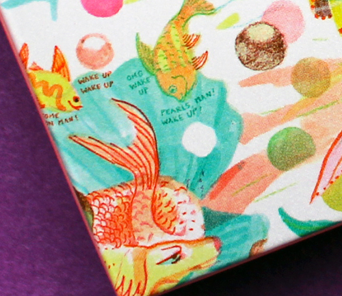
Evens appropriately chose a more lighthearted story for the Mikimoto collection while maintaining the concept of connected times and spaces. The characters and scenes appear disparate at first, but as you look more closely you can see that they're all part of the same underwater universe – preparing for the holiday season and the First Snow of Pearls. If anyone is going to create a fanciful mermaid-laden paracosm or "expanded reality" as one reviewer put it, Evens is the perfect choice, as he had been making these sorts of "imaginary worlds" since he was a child. "Practically all I did was try to make imaginary worlds come to life, which meant: visible to other people, in comics, designs for buildings, fantasy world maps, board and card games, cassette tapes… No teaching, no explaining, no argument, just a portable world, bound together, with maybe a dust jacket around it or even some leather," he says. He also did a fantastic job incorporating the pearls, which appear throughout all the scenes. My favorites are the fish helping construct a pearl garland and telling the lazy sea dog to wake up because it's snowing pearls.
The illustrations were incredibly fun on their own, but the addition of Evens' signature text provided another layer of humor.
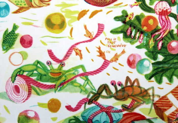
"A lot of people, when they write dialogue, just go 'A, B', 'A, B', 'A, B.' They'll have the characters neatly wait their turn. Whereas I don't think our brains really work that way. In reality, it's more of a constant traffic jam – even when we like each other and we're interacting well. When we're interacting less well, it's more extreme," he says. You can see the more realistic dialogue (at least, as "realistic" as this mermaid world can be) Evens was aiming for in this scene depicting crabs and fish wrapping holiday presents.
I have no information on how the Mikimoto collaboration came about. I summoned my courage and emailed Evens to see if he could shed any light. He politely declined to be interviewed, but I'm guessing that Mikimoto approached him as he indicated he does not know much about cosmetics. I believe these are new illustrations Evens created especially for the brand, but I find it odd he hasn't included the collab on his website or IG page. I'm also assuming they were done using his usual handmade techniques. For The City of Belgium, he explains: "All the drawings were done on paper and I write by hand. So the creative parts are all computer-less. Where the computer comes in is for research; when I want things to be 'right' or inspired by actual stuff, then I'll look something up… Ecoline [ink] dominates, but I use a mix. Now I have some different inks and, with the same brush, I'll also pick up gouache to make it what I want. Or, I'll mix it with real aquarelle. It all depends on what I'm searching for, what opacity or transparency I need to have. There will also be some pastels and, often, markers." In looking closely at the lines and the way the colors overlap, it appears Evens did indeed draw everything by hand using a mix of markers and pastels on white paper.
So that about wraps it up. What do you think about this collection? What's your favorite scene or character? I'd party any time with these mer-folks!
Clé de Peau continues their streak of beautiful and inspired holiday collections. This year's theme, Kimono Dream, is an homage to two venerable Japanese art forms: the kimono and bijin-ga ("pictures of beautiful women"). Obviously a deep dive into the history of both of these is way beyond this blog post, but as usual I'll provide a condensed version. First, let's take a look at the collection itself.
Each piece is packaged in a sturdy paper sleeve. Remove the sleeve, and the package opens to reveal a bijin-ga painting featuring a woman wearing a kimono. The intricate folding is reminiscent of how the traditional kimono is held in place with an obi, the decorative sash worn around the waist, as well as tatou, the folded paper used to wrap and store silk kimonos to protect them from humidity. The patterns on the sleeves are inspired by obi patterns as well. The unfolding aspect of the packaging is gorgeous and highlights traditional Japanese art, but it's also perfect for the theme Clé de Peau wanted to express, which was revealing women's inner beauty. Each painting represents one of four traits: passion, strength, charm and gentleness.
It's a bit contrived, but I appreciate that Clé de Peau took the time to align the products with the traits they wanted to convey and write little descriptions for each. Here's the one for the lipsticks, which symbolize passion. "Intense. Dynamic. Instantly revealing the passion within. Represented by plum, and evergreens pine and bamboo, against bright red silk. Despite your elegant façade, the force of your passion is unmistakable. A signal of powerful emotion that can’t be concealed."
The eyeshadow quad was my favorite piece – I loved the striking black kimono shown on the woman contrasted with the delicate embossing on the shadows. "Strong, essential, with a flash of feminine red. Peonies and daffodils bloom in the snow, showing determination and vitality. A woman at one with her inner strength. Noble, dignified, the plum tree signifies resilience. You look outward at the world, through confident eyes."
Next is the face powder, signifying charm. "Evoking prettiness and innocence. Symbolized by the peacefulness of wisteria and chrysanthemum against soft salmon-pink. Inspired by the simplicity of flowers, you rest sweetly in softness."
Finally we have the face oil, which embodies gentleness. "Your open, unbounded heart. Fresh blue silk accented with vermillion and soft pink. The serenity of a goldfish in water. Cooling, refreshing, harmonious. Surrounded by gentleness, you are wholly embraced."
There was also a matte liquid lip color, but that didn't seem to be included in the four traits. Nevertheless it is stunning and the packaging was different than the others so I had to include it!
I couldn't resist sharing the embossing on the outer boxes. Such a nice little touch.
Now here's where the real history and collaborations come in. First up is the kimono Clé de Peau commissioned exclusively for the holiday collection. Fortunately for me (less work, haha!) the company did a fantastic job explaining the partnership and kimono-making process. "The kimono commissioned by Clé de Peau Beauté, created in collaboration with Tachibana, an embroidery and dyeing studio in Kyoto that plays a role in preserving kimono culture.1 Crafted using a valuable dyeing technique called Surigata-Yuzen, which uses dozens of stencils to dye different patterns, layering one color over another. Since Tachibana’s foundation in 1947, its colorful works have been captivating kimono fans. Founder Zenzo Sodesaki (born in 1911) learned the basics of making kimono at Chiso, a traditional Japanese textile producer and one of the oldest yuzen coloring companies in Kyoto. Current representative Yohei Kawai is the third generation, following Zenzo Sodesaki and second generation president, Kenichi Kawai." The red and pink colors were chosen specifically to match Clé de Peau's two holiday lipstick shades.
After the pattern is determined and sketched, it's time to stencil. The Clé de Peau kimono used a particular technique called Surigata-Yuzen. I'll let Clé de Peau describe the process in a nutshell. "The Surigata-Yuzen method uses dozens of stencils to dye patterns onto kimono silk, layering one color over another to produce a gradation. Every gradation is done by hand, adding another layer to the painstaking art of the kimono…For each color, dyeing is repeated in different tones, the layers achieving a complex and extraordinary beauty." A whopping 34 stencils were used for Clé de Peau's kimono.
Tachibana's bowtie website provided a little more insight into the process. "Dedicated professionals hand-carve patterns to create the stencils, which were at one time made simply of layered paper but are now mixed with resin to give them strength. Hoshi-awase, the positioning of the stencils, is one of the most important parts of the dyeing process. All of the stencils in a given pattern have small holes called hoshi. By aligning the hoshi of each stencil at the exact same place, dozens of stencils can be positioned on the fabric with great accuracy. Senshoku is the process of dyeing a pattern on fabric using brushes with colors. Various-sized brushes are used according to the size of a pattern. Once part of the fabric is dyed, a stencil is moved to the next place on the fabric. Stencils are accurately aligned using the hoshi holes. Pattern dyeing is followed by a process called noribuse, in which the whole pattern is covered with rice glue before dyeing with ground colors."
Next, the entire kimono was hand-dyed with a brush via a process called Hikizome. Hikizome is used not just for kimonos but can be applied to all kinds of textiles – pillows, curtains, towels, etc. I believe this is true for yuzen as well, but once again I'm not certain.
The last step is to wait for the dye to dry in its own good time. According to Clé de Peau, "To make a kimono is to live by the laws of nature. So as not to alter the natural drying process, temperature condition is maintained the same throughout the year. The fate of the color finish is in the hands of nature, as the outcome is never the same." This aspect of the process fascinates me, especially for the Clé de Peau collection. The company wanted very specific colors that perfectly matched their two lipstick shades, so given that the drying is left to nature, how could they know for sure the color would turn out the way they wanted?
Obviously it doesn't really matter, but it's interesting to consider that no one can predict the exact color. That makes the control freak in me rather anxious, but I can also appreciate the respect for nature. While I enjoyed reading about the kimono production process, I would have liked to see a little guide on how to fold and secure a kimono and how the obi fits in, as this aspect of the kimono was emphasized in the collection's packaging. Oh well.
Now let's take a look at the amazing paintings by Ayana Otake, which graced the interiors of the packaging. Again, I didn't have to do much digging to get some information about Otake, for Clé de Peau also provided a brief bio. "Born in Saitama in 1981, Otake-san grew up surrounded by traditional culture and kimono. In 2007, she graduated in the Japanese Painting from the Department of Painting at Tokyo University of the Arts. She has produced works for galleries and department stores in Tokyo, and also practices bookbinding and package design." I would have liked to interview Otake to hear more about the Clé de Peau collaboration – I'm always curious to know how companies and artists find each other – but looking at Otake's other work as well as finding out a little about the tradition of bijin-ga will have to suffice.
Otake specializes in a modern version of bijin-ga. "Ga" means "picture" and "bijin" means "beautiful person", but is nearly always translated to "beautiful woman". Like kimonos, bijin-ga has an incredibly rich and long history. Part of me feels guilty for reducing it to a few paragraphs, but mostly I feel that since I'm not a Japanese art expert, I need to reign it in.
The genre of bijin-ga originated in the late 17th century and was popularized towards the end of the 18th century via ukiyo-e (woodblock prints). The women depicted at the outset were prostitutes, but over time bijin-ga expanded to include women from all walks of life. This website hosted by the Atsumi International Foundation explains the early origins of bijin-ga. "[W]ith the changes in society related to the rise of the merchant class, there was a new interest in depicting daily activities and pleasures of contemporary life. Popular entertainments were used for subject matter in paintings and then an interest developed in the beauty of personal appearance and form of women, including their clothing. Women of the brothels and pleasure quarters were predominately represented, and bijinga became a principal genre of the new *ukiyo-e 浮世絵. Single female figure portraits developed in the Kanbun 寛文 era (1661-73) with the Kanbun beauty *kanbunbijin 寛文美人. Typically, a yuujo 遊女 (courtesan or licensed prostitute) in a standing position was depicted in the bijinga of early ukiyo-e. Bijinga gradually broadened to include tea shop waitresses, the daughters and wives of tradesmen, etc. Nishikawa Sukenobu 西川祐信 (1671-1751) and Suzuki Harunobu 鈴木春信 (1725-70) produced pictures of women of various social classes, in addition to courtesans."2
In addition to portraying a variety of women, bijin-ga gradually expanded in the late 19th century to emphasize a woman's inner beauty as well as outer. "During the Meiji Era (1868-1912), portraits of beautiful women — which later became known as bijinga — evolved to focus on not only physical beauty, but also inner beauty. During this time, many artists excelled at bijinga, including Kiyokata Kaburaki (1878-1972), who was acclaimed for emotionally rich portraits; Shinsui Ito (1898-1972), who depicted real women rather than models; and Uemura Shoen (1875-1949), a female artist who brought a sense of dignity and refinement to the women she portrayed." As we'll see, I think Uemura Shoen's work in particular is a precursor to Otake's in that her paintings seek to express not just internal beauty but perhaps an inner monologue. The women in both artists' paintings appear very contemplative – I'd love to know what's going on in their heads. I'd also propose that both artists' perspectives are more feminist than they appear at first glance.
Anyway, the shin hanga ("new prints") art movement of the early 1900s cultivated further evolution of the bijin-ga genre. As the century progressed, the women portrayed became fully liberated from the earlier negative connotations, and the emphasis on capturing their internal beauty and positive traits became the primary attribute of modern bijin-ga. Otake's work continues the tradition of bijin-ga on a very basic level in that her paintings are of beautiful women; however, they have a thoroughly modern sensibility. Gone are the perfectly coiffed and made-up ladies of the old bijin-ga, as Otake shows women in a more natural, relaxed state – half-dressed with loose hair, lounging in bed or on the floor. There's a greater sense of intimacy and introspection in these scenes, as well as personal agency. These women don't seem to be waiting for anyone, they're simply enjoying some time alone.
As far as I know Otake created original works for the Clé de Peau collection rather than recycling existing pieces. They tie into the collection not just through the inner beauty aspect but also by Otake's particular process, as her technique mimics one the methods used for kimono production. In the video below, she says: "When I'm not painting I look at greenery and try to be in touch with nature as much as possible…If it isn't sunny or a dry day, I can't work. So I look to the weather. Nothing beats natural drying. And authenticity is not about going against nature, but to live with nature, which I think is important." Otake notes that while sometimes she uses a dryer to speed up the drying time of her paintings, she usually "messes up". Her respect for nature and allowing it to complete her paintings serves as a parallel to letting the kimono dry naturally according to the weather, without any other intervention.
Overall, this is another winner from Clé de Peau. The intricacy of the packaging echoes the labor involved in the traditional kimono-making process, while the paintings serve as an updated version of a centuries-old artistic genre – it's a perfect marriage of old and new. I admired that for this collection, instead of doing a straight-up artist collaboration as in years past, (nothing wrong with those, of course!) they honored waning cultural traditions to raise awareness and educate people, a concept perhaps borrowed from Sulwhasoo's Shine Classic compacts. Finally, I loved all the details: the folding of the packaging, the fact that the paintings were on the inside to represent inner beauty, dyeing the kimono the same colors as the lipsticks, even the embossing on the boxes all came together to form a cohesive collection. I must congratulate the design team, as every last detail served a purpose. They were stunning, sure, but they also weren't superfluous – every single one contributed to the theme. I will say I'm scratching my head as to the whereabouts of Clé de Peau Creative Director Lucia Pieroni, as she doesn't seem to be as involved with this collection as in previous years, but the collection itself turned out beautifully.
What do you think of this collection? Which painting was your favorite?
1For further reading on the history and cultural meanings of the kimono I'd recommend Kimono: A Modern History.
2This author points out that while they were euphemistically labeled as "courtesans", the prostitutes depicted in early bijin-ga had rather tragic lives. "Often the images were published with the prostitutes' names. Such prints were usually commissioned by high-ranking oiran as a kind of advertising posters. In today's print descriptions by ukiyo-e dealers or auction houses, the women shown on bijin prints are usually named 'courtesans'. The life for these 'courtesans' was not so beautiful. They were kept like slaves in these licensed quarters." Yikes.