“I want a case that glows with fashion. That has such fashion magic it transmits right through the lipstick and onto the faces of women. Makes them feel the beauty touching their lips.” – Charles Revson, January 13, 1954.
I know, more vintage Revlon lipsticks. But I promise it’s very interesting! There didn’t seem to be a comprehensive history of Revlon’s Futurama line so I thought I’d take a stab at it. Futurama was a collection of refillable lipstick cases designed by famed jewelers Van Cleef and Arpels for Revlon. The line was introduced in 1955 with much fanfare, especially its debut on the popular game show the $64,000 Question. But how did the collaboration between Revlon and Van Cleef happen? Who was responsible for the design? What is Futurama’s significance in makeup history? I can’t say I have answers to all of these questions, but I’ll do my best.
First, a quick background. Refillable lipsticks had been on the market since the 1920s and became more widespread in the ’40s as a way to save metal during wartime. Every last scrap was needed; the country couldn’t afford to have women wasting a used lipstick tube.
The notion of makeup as an additional accessory was reinforced by the fact that many compacts were sold in jewelry stores in addition to the jewelry section at department stores, with custom engraving and monogramming available.
Jewelry designers Ciner and Paul Flato also had their own compact and lipstick combinations in the late ’40s and early ’50s.
By and large, compacts and lipstick cases were already perceived as another item of jewelry thanks to companies like Van Cleef and Arpels leading the way. So what was new and special about Revlon’s Futurama cases?
There were two key factors that Revlon advertised as the differentiators: design and price point. The concept for the design is a fascinating story. As he explains in the book Business Secrets That Changed Our Lives, Revson was inspired by a business trip to Paris. “The candlelit room, the elegant service, the fine furnishings bespoke good taste and an appreciation of beauty. Next to me sat a chic and lovely woman. What interested me most about my dinner partner was not her beauty but a small object she had taken out of her purse. My eyes returned to it again and again, until finally, with an amused smile, she handed it to me saying, ‘I would not have expected an American man to be so interested in a lipstick.’ The beauty of the case, hand-engraved and diamond-bedecked, was one outstanding feature. What really caught my eye, though, was that the lipstick could be removed with a single click-in, click-out action in just one section. And because the lipstick was contained in its own cylinder, removal of it was not only easy, but smudge-proof. My dinner partner’s remark kept goading me-‘I would not have expected an American man to be so interested in a lipstick.’ Of course not! All that an American man ever saw was one of those undistinguished brass bullets!”2 Revson took a similar case back to the U.S. and less than a month later, on January 13, 1954, summoned Earl F. Copp into his office. Copp was Chief Operation Officer for Risdon Manufacturing Company, which had been making Revlon’s cases since 1947. Revson explained what he had in mind: “I want a case, a refillable case. You have to make it different from this one. This is too much like the others, refillable perhaps, but not elegant enough. I want to see luxury, fashion, expensive jewelry. No more bullets. Can you see what I mean? I want a case that glows with fashion. That has such fashion magic it transmits right through the lipstick and onto the faces of women. Makes them feel the beauty touching their lips…I don’t want just one case, but a whole line. So that women will want one for morning, one for evening, one for special occasions-all suitable for refills with whatever different colors they prefer.” While refillable lipsticks existed previously, the way Futurama was advertised suggested a totally new frontier. According to design historian Matthew Bird3, Lurelle Guild (1898-1985), a prominent industrial designer at the time, was brought on board to oversee the aesthetics of the cases. As another design scholar notes, Guild was the ideal choice to design a cutting-edge, futuristic lipstick case, as he had been responsible for other iconic ’50s styles such as Electrolux’s Model G vacuum, which sported “rocket-like fins”.4 While the cases were being advertised in 1955, Guild filed a patent in early 1956. Grace Gilbert van Voorhis, Raymond Wolff and Henrieta Manville are also named on the patents, with Manville’s name on the “utility” patent for the inner mechanism of the case. Based on census records, Manville most likely worked with Earl Copp at Risdon Manufacturing, while Wolff may have worked in Guild’s office. As for Van Cleef’s role, it appears they signed on in name only and let Revlon deal with the designs themselves; this seems especially likely given that none of the cases really resemble anything Van Cleef was making at the time.5
The designs on their own were modern for the time, but another aspect that Revlon claimed as new was the actual refill mechanism. While they weren’t quite the hardship Revlon’s Futurama ads made them out to be, earlier versions of refillable lipsticks could get a little messy and took a minute or two to change as compared to Revlon’s alleged 3 seconds.
Futurama’s “click in, click out” was certainly less involved than wartime lipstick refill instructions!
The second aspect that set Futurama apart from previous lipsticks was that customers were made to feel as though they were getting a luxury item by a brand name at an affordable price. “Like rubies and emeralds, a really luxurious lipstick case has seemed out of reach to most women…though Revlon’s new cases look loftily priced, some are a low $1.75, including lipstick. Besides which, women find Futurama a money-saver since refills only cost 90c.”
The cases themselves were presented as affordable, but Revlon also promoted the idea of the refillable lipstick as a cost-saving measure – once the customer “invested” money in a case, refills would be less expensive in the long term than buying a whole new lipstick.
You would think a company as large as Revlon wouldn’t take a chance with their reputation by participating in price fixing, but in 1958 their shady tactic of setting refill prices was admonished by the FTC, who cracked down on them for conspiracy. The author of the fabulous Cosmetics and Skin website explains: [Futurama] went on sale in 1955 after Revlon acquired the Braselton lipstick patents for lipstick cartridges in 1954. Revlon then entered into an agreement with Helena Rubinstein and Merle Norman – along with a number of container manufacturers, including Scovill and Risdon – to fix the price of lipstick refills, including non-patented lipstick inserts, until they were charged by the U.S. Federal Trade Commission (FTC) with conspiracy.”
Even though it had been advertised previously, the breakout moment came when Revlon featured a commercial for Futurama on the game show The$64,000 Question, which they were sponsoring. (Revlon’s sponsorship of the short-lived quiz show is a fascinating history in and of itself.) It was during this commercial that viewers could witness in real time the ease and tidiness of Futurama lipsticks, making video even more critical than print ads. As Bird notes, “YouTube allows us to watch a vintage television ad and learn that the design separated the lipstick from the case, and saved money by offering refills. The line was marketed to women, but also to husbands and children as an affordable but seemingly luxurious gift. Without this TV advertisement, the design is easy to write off as mere decoration. With this added information, the design transcends mere aesthetics to address user needs, perceived value, material use, marketing, and problem-solving. Seeing the design in action gives it a life and sophistication not evident in the brutality of an elevation view patent drawing or two-dimensional photograph.”6
Overall, Futurama was presented as the wave of, well, the future. The case designs, particularly the elongated styles that were tapered in the middle and wider at the ends, were intended to reflect the modern era rather than mimic shapes of the past. Revson discusses the design selection process. “When the designs started to come in, it was an exciting and stimulating experience. Many shapes were proposed: prisms, octagons, ribbons and bows, pencils, thimbles and countless others. But the most inspired was the hourglass, a shape that four designers suggested independently. We experimented with many surface treatments, too: brocaded gold on silver, silver-plated with a gold spiral, wedding bands en circling the cylinder. With Bert Reibel, our packaging designer, I selected two basic shapes by the end of March, 1954. One group of cases, shaped like hourglasses, would retail at $2.50 or more; the other group, thimble-shaped, would be less expensive. Of all the samples submitted, only one surface treatment resembled that of expensive jewelry. We had to make arrangements with Fifth Avenue jewelers and designers, visit art museums and study color photographs of good-looking jewelry from the archives. Almost every major jewelry shop in Manhattan was visited, to study expensive, hand-designed compacts and cases. But we were still little closer to our goal. During the next eight months, we made up many thousands of designs and some five hundred actual models, each with a different surface or slightly modified shape. Parts were interchange able, so we could produce still different combinations. We invented our own special language: ‘belts,’ ‘skirts,’ ‘balances,’ ‘waistlines.’ Which ‘belt’ looked best with which ‘skirt’? Which ‘waistline’ went best with which ‘collar’? It got to be a joke that I was often awake all night worrying about a dimension of one-sixteenth of an inch. And it was true! The search for new surface treatments inevitably brought us face to face with the limitations of machinery. I had become intrigued by one finish we found on expensive compacts-‘Florentine’ by name-which was a texture of minute, finely etched lines. In 1954 no case manufacturer had the facilities or know how to produce it in volume…[Copp] finally, after long weeks of experimentation, had devised belts and grinding wheels that would simulate the ‘Florentine’ finish. To produce other finishes, he had to dispatch engineers to Switzerland and Italy before he could locate and buy the only turning machines on earth that could do a mass production job.”
You’ll notice there are very few scratches on this black case, which was the result of Revson’s insistence that all the finishes should last at least 2 years before showing significant wear. “Two coats of high-bake vinyl lacquer” did the trick. The longevity of the pavé settings on the tops of some of the cases was also difficult to ensure.
After nearly a year of design work, Revlon began working on the marketing, with Vice President Kay Daly (who had previously came up with the questions for Revlon’s iconic Fire and Ice quiz) leading the way. “Early attempts missed the boat because they emphasized the fashion element, but did not adequately sell the ‘refillable’ idea. The most frustrating task [Daly] undertook was the selection of a name for the cases. Hundreds were suggested, considered and rejected. l could not agree-no one could agree-on any of them. Finally, she hit on Futurama. To my mind, this suitably brought home the newness, the excitement, the fashionableness of the product…A market research organization reported that Futurama ‘is not a good name. It is too masculine. It sounds too much like General Motors.’…In the end, I had to make the decision. There was, of course, only one way to look at it: from the viewpoint of the American woman herself. I decided to rely on my original reaction that the name was good, and that it would appeal to the consumer I knew best.” The name was rumored to be taken from the Futurama exhibition at the 1939 New York World’s Fair and speaks to the post-World War II futurist trend in American design and technology. Additionally, Revlon declared both the economic practicality and new designs to be the most cutting-edge ideas in cosmetics, and any modern woman should want to join the party. “Are you ready for Futurama?” asks this 1958 ad.
If you weren’t on board with Futurama, you were getting left behind; the ads not so subtly implied that women who didn’t purchase Revlon’s latest offering were unfashionable and stuck in the past. According to one commercial, “The days of old-fashioned, un-style-conscious mothers are about as out-moded as old-fashioned brass lipstick…modern mothers may be old-fashioned on the inside, but they want to be the picture of glamour and style on the outside.”
By late 1957 Futurama had expanded to compacts, which were also refillable. While not as notable as the lipsticks, the compacts solidified Futurama as the most recognized line for Revlon at the time. Something that is of note, however, is the fact that Andy Warhol may have been involved in the design of at least one of the compacts. A while ago a private collector sent me some photos and surmised that Warhol might have been responsible for a Revlon Futurama compact featuring his drawing of an early 1900s style shoe. This is what she had to say: “I emailed Van Cleef and Arpels about who exactly designed these lovely creations and I actually got a call from a representative wanting to find out information on a specific compact I have that she called ‘the Warhol Boot’…It was supposedly one of 5 display/prototypes that went missing between 1959 and 1961. It was designed by Andy Warhol but rejected by Revson because it didn’t fit the ‘mood’ of the collection.” If this is true, what an amazing find! Take a gander at the second compact from the left in the second row.
I reached out to another collector whose father worked for Revlon, but she was unable to find any definitive proof that Warhol designed the compact. Still, it resembles his shoe illustrations.
Getting back to the lipsticks, Revlon’s competitors were just as cutthroat as they would be today in that several companies released jewelry-inspired cases of their own. Take, for example, DuBarry’s Showcase. Model Suzy Parker was featured in DuBarry’s ads – an unusual move given her appearance in Futurama ads. What is not surprising that the company doing this is DuBarry, who you might remember would go on to shamelessly rip off Revlon’s Fire & Ice lipstick with their Snowball of Fire shade in 1959.
Cutex was even more blatant in their plagiarism (but at least they used a different model, Sara Thom). In 1958 the company introduced their “designer’s cases” which were apparently similar to something one would find in a “Fifth Avenue jeweler’s window”. The notion of previous lipstick case styles as being “passé” was also copied from Revlon. I’m not sure these were refillable, but they were definitely lower priced than Revlon’s refills.
There was also this Avon clone making a series of “jewel-like” cases at a price “every woman can afford.”
Can you say “knock-off”? Then as now, this sort of plagiarism was rampant in the industry (more on that in another post). To my knowledge none of these brands had partnerships with actual jewelry companies the way Revlon did, but they were definitely capitalizing on the makeup-as-inexpensive-jewelry concept.
As of December 1960 Futurama was still being heavily promoted by Revlon. A vast array of designs had joined the original lineup, while the older styles received elaborate outer packaging to suit any occasion.
Something that I have not been able to confirm is the numbering of the cases. This one is listed in the ad as 9029, but engraved on the bottom is 587. I believe the numbers on the bottoms of the Futurama cases correspond to the lipstick shades, not the case model, but I can’t be certain.
Futurama was phased out by the mid-1960s, but its influence is alive and well today. Many makeup companies have collaborated with jewelry designers either for their permanent collection or limited edition collections. The idea of owning luxurious yet modestly priced jewels via makeup persists. As with the beauty lines of fashion houses or artist collaborations, if one cannot afford vintage jewelry or an original piece by a high-end designer/artist, makeup allows the customer to get a taste of the real deal. Here’s a quick list of some of the more memorable makeup/jewelry collaborations. I’m also keeping my eyes peeled for one of these Cutex lipstick bracelets, which were sold around 1955-1958.
Some high-end lines go the Cutex route by creating makeup that can actually be worn as jewelry. Dior, YSL and Louboutin have all released lip products in pendant form.
Refillable lipsticks with outer cases meant not only to last but also displayed are thriving in 2020, given the increasing demand for sustainable packaging. The most recently unveiled jewelry-inspired line, and probably the one most similar to Futurama besides Guerlain’s Rouge G, comes from fashion designer Carolina Herrera. “We wanted to give women an opportunity to wear their makeup like a piece of fabulous jewelry,” Herrera stated. The entire line is refillable and offers customization options in the form of detachable charms and a variety of case styles.
Would all of these examples have existed without Revlon Futurama? Sure, but Revlon did a lot of the heavy lifting. Despite the exaggerated tone of the ads, Futurama was groundbreaking in that it popularized the notion of attainable luxury within the cosmetics arena and simplified the lipstick refill process. The cases also serve as a prime example of the futuristic flavor of 1950s American design. These factors make Futurama a significant cultural touchstone on par with Revlon’s previous Fire & Ice campaign. At the very least, Futurama represents several key developments in cosmetics advertising and packaging that helped lay the groundwork for today’s beauty trends and shape consumer tastes.
Which Futurama design is your favorite? Would you like to see a history of refillable lipsticks or an exhibition expanding on the makeup-as-jewelry concept? I have to say I’d be curious to see what Revlon would come up with if they did another collab with Van Cleef…it would be awesome if Futurama 2.0 incorporated Van Cleef’s signature Alhambra motif.
1 Give yourself a crash course in learning the lingo for various makeup cases and the differences between them. Noelle Soren’s website is a treasure trove of knowledge!
2Revson elaborates on existing cases. “For a long time it had been bothering me that American women-so alert in many ways-had been content with that old smooth brass cylinder . It had no distinctive shape, color, finish or design. It looked like a cartridge case. They would buy them and discard them when they were used up, and then buy another…A number of cosmetics manufacturers had for years tried to make cases more distinctive. We had played around with the idea at Revlon. But all that any of us ever came up· with was an other version of the cartridge case. For one thing, all case manufacturers, including Risdon, had the same kinds of machines, with the same old limitations.” (“The Matter of Beauty: The Development of the Futurama Lipstick Case” in Business Secrets that Changed Our Lives, edited by Milton Shepard (1964), p. 294.
3 Matthew Bird, “Using Digital Tools to Work Around the Canon” in Design History Beyond the Canon, edited by Jennifer Kaufman-Buhler, Victoria Rose Pass, and Christopher S. Wilson (2018), p.114-117.
4 Through this paper I discovered that there are two folders worth of Revlon correspondence and sketches for lipsticks in the official Lurelle Guild papers, which are housed at Syracuse University. I have requested electronic copies of these but obviously since the library is closed due to the coronavirus I will have to wait to receive them and see if they shed any more light on the Futurama design process. I’m also still trying to figure out whether Van Cleef designed this beautiful jeweled case, as Pinterest is literally the only place I’ve ever seen it.
5 There is an ad in the January 1956 issue of Reader’s Digest that mentions Charles Revson “commissioning” Van Cleef and Arpels to design the Futurama line. Google, however, will not let me see the entire ad, and I’ve purchased 2 copies of that particular edition of Reader’s Digest to no avail – there was no Revlon ad in either of them. Either Google has the date wrong or, as one eBay seller noted, the ads differed between Reader’s Digest even if they were the same exact editions (i.e. same month and year.) If anyone knows how to access Reader’s Digest in full online, please let me know!
6 Matthew Bird, “Using Digital Tools to Work Around the Canon” in Design History Beyond the Canon, edited by Jennifer Kaufman-Buhler, Victoria Rose Pass, and Christopher S. Wilson (2018), p.114.
I have so many other books I'd like to review but so little time, and this tome had been sadly collecting dust on my nightstand for ages, so here's a quick review for a quick read.* Lipstick: A Celebration of the World's Favorite Cosmetic by Jessica Pallingston was released in 1998, just a few months prior to Meg Cohen's Read My Lips: A Cultural History of Lipstick which I reviewed in 2015 and vowed to compare it to Pallingston's book shortly thereafter (in other words, I'm a mere 5 years overdue for that task. Sigh.) Anyway, I found the two books to be more or less the same in terms of content. This isn't necessarily a bad thing, but I think if you were looking for a basic history of lipstick you could choose one or the other and not feel like you're missing out.
The introduction left a bit to be desired, as it placed emphasis on lipstick as a tool to either "empower" women or lure men; there was no mention of playing with color as a means of self-expression. I also think, as I did with Cohen's intro, that the fetishization of lipstick and the overblown description of its alleged power were a bit much. Lipstick can be life-changing, yes, but proclamations like "Lipstick is a primal need" made me roll my eyes.
Like Cohen's book, the first chapter is a brief overview of the cultural significance of lipstick throughout history, starting with ancient times and ending with the 1990s. Not a bad summary, but since I've been doing this a long time there was little earth-shattering news. This isn't the author's fault, however, as the book was released over 20 years ago so this sort of information wasn't as ubiquitous as it is now. Containing the standard tidbits about ancient Greek prostitutes and the patriotic duty lipstick served during World War II, the chapter is a tidy summation of how lipstick was worn through the ages. But the section on the '90s penchant for brown lipstick nearly made my eyes pop out of my head, as I had never come across theories about why brown lipstick (and brown in general) was so popular. This will definitely inform my research for my '90s beauty history book!
Chapter 2 presents no fewer than 14 theories outlining why lipstick wields more impact than other cosmetics. I found them to be slightly lacking, as I believe the "lipstick as phallic object" or "painted lips mimicking sexual arousal" theories rather tired at this point, not to mention sexist. Ditto for the idea that children feel more protected if their mother leaves a lipstick print as they kiss them goodbye before school, lipstick application as oral fixation, or as a rite of passage for teenage girls. There was some truth to the theory about lipstick as a sort of armor or camouflage, but seeing no mention of how lipstick fits into the larger notion of makeup as a means of self-expression was disappointing. And I would have liked to see more about makeup's transformational power, but the only theory about lipstick as metamorphosis came in the form of fairy tales, i.e. one's wildest dreams come true through makeup and one will magically become "pretty" if they wear it: "When I put on lipstick I am as pretty as Cinderella" was one of the quotes included. (Why is the author quoting a literal 5 year-old?)
Chapter 3, appropriately titled Lipstick Freud, delves into pop psychology as Pallingston takes us through the various lipstick shapes that are the result of one's unique wear pattern (which obviously also depends on the shape of one's lips), along with what various application methods say about the user and something called lip reading. Much like astrology and palm reading, they're fun but not necessarily accurate or based on hard scientific data.
Chapter 4 was my favorite, as it provided a list of bite-sized anecdotes about lipstick as well as a lipstick-by-the-numbers section. I miss Allure's by-the-numbers feature tremendously and am dying to include something similar in exhibitions.
Chapter 5 gets into the nitty gritty of lipstick – the complete process of how it's produced and a lengthy list of ingredients, which is good information to have on hand. This chapter also includes sections on colors and names, both of which I believe warrant their own books. (There is actually an entire book on red lipstick, which I hope to review sometime this year.) You can definitely see how times have changed, since black and grey aren't mentioned at all and blue and green are discussed as having solely negative connotations of illness or death. These can be accurate, mind you, but as someone who has now fully embraced non-traditional lipstick colors (especially grey – I own no fewer than 9 shades), I found myself chuckling at the idea that blue or green lip colors used to be mostly associated with bad health. There are incredibly vibrant blue and green shades on the market these days – what could possibly be more a reminder of rebirth and growth than something like Menagerie's Juniper lipstick, for example, or capture the vitality of a hot summer day like MAC's Blue Bang? Anyway, while it was a nice read, it may have been good to include a section on different lipstick finishes and textures. But once again, this is really just part and parcel of this book being released in 1998, when liquid and glitter lipsticks weren't absolutely everywhere.
The naming section was notable for its inclusion of shade names from Renaissance England: apparently Beggar's Grey, Rat and Horseflesh were all listed as lipstick colors.
Chapter 6 gives some tips on how to navigate choosing and buying a lipstick in-store. With the advent of online shopping and swatches, this is largely obsolete and the advice itself was pretty basic. One unusual tip was to try swatching a lipstick on the inner wrist. I'm personally a fan of trying colors on fingertips since they are allegedly closer to your natural lip color, but if you want to find out how the color will look next to your overall facial skintone, the wrist is the place to swatch. Chapter 7 was more of the same, a list of lipstick application and color-coordination techniques that aren't anything you couldn't find online or in any beauty magazine.
Chapter 8 is probably the only chapter that is not in need of a major update, as it provides recipes for making your own lipstick that are still totally doable today. Even as technology and customization options evolve, there will always be a subset of the population who like to DIY their lipstick for various reasons – ingredient preferences, cost, or just because they like experimenting. Chapter 9 continued with recipes, but they were really intended more as a joke to show what people did throughout history to make lipstick. "From the medieval glamour guides, here's a recipe for making lipstick at home: Go outside. Get a root. Dry it. Pulverize it. Add some sheep fat and whiteners to get desired color. If you are upper class, go for a bright pink. If lower class, use a cheaper earth red. If you are having trouble being pale, and have the money to pay for it, get yourself bled. If you're alive during the Crusades, wait for the Crusaders to come back, as they'll bring some glamorous and exotic dyes, ointments and spices, and you'll be able to experience the makeup golden age of the Middle Ages." LOL.
Chapter 10 was a mishmash of suggestions for alternative uses of lipstick and a list of famous art history and pop culture lipstick moments. Most of the suggestions were good ideas, but some, like no. 21, made me cringe. Yikes.
But I did love all the artist references, for they included two I plan on writing about for Makeup as Muse (Rachel Lachowitz and Sylvie Fleury) and Claes Oldenburg's Lipstick (Ascending) on Caterpillar Tracks which I covered back in October. The final chapter (if you can even call it that, as it's only a page and a half) sings the praises of lipstick yet again, and honestly, probably wasn't necessary.
Overall, Lipstick is a nice book for those in need of a primer on lipstick, but if you're in the mood for something more academic or a thorough feminist analysis of lipstick, this is not it. As noted previously, if you're looking to purchase a book on lipstick history I would go with either this or Read My Lips, but I don't think both are necessary for a beauty library (unless you're like me, who obsessively hoards makeup books in addition to makeup itself). Lipstick has sound sources, although by now they are a bit dated and I believe are mostly the same as Cohen's. I will say that the advantage of Cohen's book over Pallington's is the inclusion of photos, which were non-existent in Lipstick. So it just depends on whether you want a glossier tome with more eye candy or one with less visual frills and more anecdotes, as the information in both is basically identical.
Have you read this one? I'm really hoping someone will write an updated cultural history of lipstick, as after reading this I think one is sorely needed.
*Another reason I chose to review this book first instead of the others I have planned is that I was recently interviewed by a journalist who is writing a brand spankin' new cultural history of lipstick, so hopefully in the next year or so we will have an updated version (and hopefully I will be quoted!) Stay tuned. 😉
Normally I’d wait a whole year and do a Ghosts of Christmas Makeup Past post to be more seasonally appropriate, but I simply couldn’t in the case of the amazing (mer-mazing?) Mikimoto holiday collection. As with the 2018 collection, the historic Japanese pearl and jewelry purveyor teamed up with an artist to create some incredibly whimsical underwater-themed packaging. Belgian artist and illustrator Brecht Evens had the honor of being Mikimoto’s second artist collaboration. I must admit I think I like his concept even more than the one by Emmanuel Pierre in 2018. If imagery of celebratory mermaids and assorted mer-critters having the ultimate holiday party doesn’t do anything for you, I question your humanity.
We’ll start with the palettes. The details on everything are staggeringly clever. And while the mishmash of characters and objects may initially seem haphazard, Evens’ messiness is actually entirely intentional. “When I draw the jumble of the city or I draw nature…errors, spots and little incongruities make it more realistic. Because when you’re in a space and you start to look around, you don’t take in the whole. You can’t. You don’t see the world around you like you see a postcard; it’s not organized that way. We’re moving, others are moving, and the eye makes constant choices, it decides what to interpret and what to identify. So at any given moment, there’s a lot of mess in there and, for me, this kind of mess has to stay in. It’s controlled; it’s never like I’m creating randomness. It’s just that incongruities seem to catch the eye better. They’re more natural and they latch onto the eye more realistically. Maybe I do play with a lot of stuff. But I only do it when it serves my narrative. It’s all part of calibrating things. When I use a lot of detail, it’s very calculated – I’m making sure it doesn’t obstruct anything essential.” The dozens of scenes may still be overwhelming for some, but I personally enjoyed picking apart all the individual vignettes and then seeing how they came together as a whole.
This is a particularly amusing exchange between two mer-folk and a nosy little fish. The addition of text is representative of Evens’ background in illustrated books and comics. The humor reminds me a little bit of Danny Sangra, the artist who designed Burberry’s spring 2018 palette.
I’m obsessed with this mer-kitty.
The scenes for the eyeshadow palette are equally spectacular. Sting rays take mer-children for a ride, while a sea elf peeks out from some seaweed to admire a blue-haired mermaid.
On the outer box a school of fish help another mermaid primp for a holiday party. She checks out her reflection in a seashell mirror held by two crabs.
I think the imagery on the sides of the skincare set was my favorite.
The set includes what appears to be a very fancy moisturizer (I didn’t want to open the sealed plastic) and what I believe are packets of face serum. Each one tells a snippet of the “First Snow of Pearls” tale. Unfortunately I couldn’t seem to locate the story at the Mikimoto website as I did last year, so I’m not really sure what it’s supposed to be about.
I love that the images are totally bizarre but also make perfect sense. The concept of a sea-dwelling Santa is absurd, but if one exists, of course his sleigh team would be seahorses instead of reindeer and his bag of presents shaped like a seashell. Ditto for the mermaid taking a ride on the jellyfish “bus”, pulling on its tentacles to signal her stop. While the underwater realm Evens created for Mikimoto is entirely imaginary, the usual rules still apply. As he puts it: “I do think I use visuals that might be dreamlike, or psychedelic, but I don’t think I use dream logic…you have to believe in the world you’re creating.”
There was also a lip gloss, the box for which shared the same illustrations as the skincare set.
Some lovely extras were included as gifts, like this silver toned box topped with a manta ray, a gold seashell cardholder and two cosmetic pouches. I noticed the powder brush was a bit scratchy, but 1. it was free and 2. I don’t intend on using it anyway.
Let’s learn a little more about the artist behind these fantastical scenes. The Belgian-born, Paris-based Brecht Evens (b.1986) studied illustration at Sint-Lucas Gent in Ghent, Belgium. Building on his country’s tradition and notoriety for comics, he focuses on these and illustrated books, but has also completed murals in Brussels and Antwerp, created fabrics for Cotélac, and collaborated with Louis Vuitton on a Paris travel book.
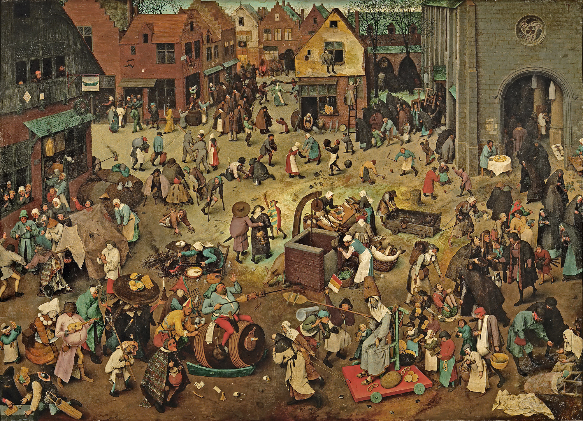
Stylistically, Evens is influenced by his mentors, illustrator Goele Dewanckel and cartoonist Randall Casaer. You can also see glimpses of Pieter Bruegel the Elder, M.C. Escher and Picasso. Take, for example, the resemblance between the artwork Evens created for French publisher Actes Sud and Bruegel’s Fight Between Carnival and Lent (1559). Both utilize a bird’s eye perspective and include dozens of different vignettes.
While Evens published several award-winning books early in his career, he is best known for more recent works Panther (2014) and The City of Belgium (Dutch and French versions released 2018; forthcoming editions in English in 2020). In terms of content, most of Evens’ narratives tend to be a little dark. Panther is about a young girl named Christine whose cat dies. Her mother also threatens suicide, drives away and never comes back. Panther arrives seemingly to be Christine’s friend and help her cope, but ends up being far more malicious than he appears. One reader called it a “apologism of pedophilia, zoophilia and incest”. Yikes.
The City of Belgium (titled Les Rigoles for its French audience and Het Amusement for Belgium) is actually part of the same universe as Evens’s 2009 work The Wrong Place, and the various versions of the book are meant to be connected. “I wanted something like a paperback copy of Balzac, a whole world that would be portable. But, instead of just one city, I wanted to make it a kind of European amalgam…the fun result would be for everyone to think it’s their city.”
The City of Belgium also reflects Evens’ struggle with bi-polar disorder and gradual recovery from a particularly bad episode. While not as unsettling as Panther, the book follows three characters having parallel urban adventures throughout a single evening, one of whom suffers from depression. Evens discusses how the book came to be and acknowledges the “heavy” themes alongside the humor. “The germ was just me coming back to life. A state of depression never carries any potential or interest. Then, once the interest starts returning – bit by bit – it’s like you’re back at zero. At that point, it’s just lines in old sketchbooks, dreams you have, something you happen to see sitting on a terrace. Because it’s so surprising to have ideas again, you notice every little thought and you get them down in a sketchbook…[in 2013 and 2014] things were so messed up; I couldn’t ever have considered such a massive project. The book is a product of peace having descended…the themes may be heavy, but I hope the treatment is light. Don’t forget to mention it’s full of gags and jokes!”
Evens appropriately chose a more lighthearted story for the Mikimoto collection while maintaining the concept of connected times and spaces. The characters and scenes appear disparate at first, but as you look more closely you can see that they’re all part of the same underwater universe – preparing for the holiday season and the First Snow of Pearls. If anyone is going to create a fanciful mermaid-laden paracosm or “expanded reality” as one reviewer put it, Evens is the perfect choice, as he had been making these sorts of “imaginary worlds” since he was a child. “Practically all I did was try to make imaginary worlds come to life, which meant: visible to other people, in comics, designs for buildings, fantasy world maps, board and card games, cassette tapes… No teaching, no explaining, no argument, just a portable world, bound together, with maybe a dust jacket around it or even some leather,” he says. He also did a fantastic job incorporating the pearls, which appear throughout all the scenes. My favorites are the fish helping construct a pearl garland and telling the lazy sea dog to wake up because it’s snowing pearls.
The illustrations were incredibly fun on their own, but the addition of Evens’ signature text provided another layer of humor.
“A lot of people, when they write dialogue, just go ‘A, B’, ‘A, B’, ‘A, B.’ They’ll have the characters neatly wait their turn. Whereas I don’t think our brains really work that way. In reality, it’s more of a constant traffic jam – even when we like each other and we’re interacting well. When we’re interacting less well, it’s more extreme,” he says. You can see the more realistic dialogue (at least, as “realistic” as this mermaid world can be) Evens was aiming for in this scene depicting crabs and fish wrapping holiday presents.
I have no information on how the Mikimoto collaboration came about. I summoned my courage and emailed Evens to see if he could shed any light. He politely declined to be interviewed, but I’m guessing that Mikimoto approached him as he indicated he does not know much about cosmetics. I believe these are new illustrations Evens created especially for the brand, but I find it odd he hasn’t included the collab on his website or IG page. I’m also assuming they were done using his usual handmade techniques. For The City of Belgium, he explains: “All the drawings were done on paper and I write by hand. So the creative parts are all computer-less. Where the computer comes in is for research; when I want things to be ‘right’ or inspired by actual stuff, then I’ll look something up… Ecoline [ink] dominates, but I use a mix. Now I have some different inks and, with the same brush, I’ll also pick up gouache to make it what I want. Or, I’ll mix it with real aquarelle. It all depends on what I’m searching for, what opacity or transparency I need to have. There will also be some pastels and, often, markers.” In looking closely at the lines and the way the colors overlap, it appears Evens did indeed draw everything by hand using a mix of markers and pastels on white paper.
So that about wraps it up. What do you think about this collection? What’s your favorite scene or character? I’d party any time with these mer-folks!
I love when I get an inquiry to which I can actually give a solid response. A gentleman sent in this picture he had of an old lipstick and asked if I could identify it and provide any sense of its monetary value.
I recognized it immediately as one of the Revlon Couturines doll lipsticks released between 1961 and 1963. But which one? The only one I recognize off the top of my head is Liz Taylor as Cleopatra, since it's pretty obvious.
Fortunately the Revlon Couturines appear in Lips of Luxury (which I highly recommend for any beauty aficionado – check out my review here and in-person pics here.) According to the photos in the book it's not Marilyn Monroe.
Or Ava Gardner.
So it must be one of these ladies.
Aha! Looks like it's Jackie Kennedy (last one on the right.)
What's fascinating to me about the submitter's photo is that his doll appears to be wearing a little fur stole around her neck, whereas in the photo from the book she doesn't have one. As for the value, Revlon Couturines can fetch a pretty hefty price. Even though the photo is blurry, the one submitted to me looks to be in excellent condition. And given that she has a stole, which I'm assuming is original (the original Marilyn Monroe figurine has neckwear as well, which isn't shown in the picture in Lips of Luxury), that would probably increase the value. I think a fair asking price would be $150-$250. At the moment I don't even see any Jackie figurines for sale.
What do you think of these? This post reminds me that I really need to track down at least one for the Museum – I can't believe I don't own any. Another one (or 8) to add to the old wishlist.
Update, 2/6/2020: It only took 5.5 years, but I finally procured a few of these lovely ladies for the Museum!
I am sorry to say that I can confirm these are not cruelty-free. As a matter of fact, Revlon made it a point to highlight the "genuine" mink, fox and chinchilla used. How times have changed. I'm also wondering whether all the ones listed for sale over the years as having brown mink are actually fox fur, as indicated in the ad below. Then again, this was the only ad I saw that referenced fox fur, so maybe the brown ones are mink as well.
The white mink one is not in the best shape – there's a little bit of wear on the paint on her lips and discoloration around her "waist" – but she does have the original box. I'm suspecting the black mark is remnants of a belt, as shown here. (Apologies for changing the background in these photos but I was shooting across several days and was too lazy to retrieve the paper I had used originally.)
The chinchilla-clad lady, however, is basically new in the box. One hundred percent museum quality!
From what I was able to piece together from newspaper ads, the ones without animal fur were advertised as "mannequins" and originally released in 1961, while the chinchilla, fox and mink ones were referred to as "girls" and debuted during the holiday season of 1962. Both series fell under the Couturine name.
There were originally 12 designs, according to this ad. Of course, you paid a little more for the Mannequins with hats and jewelry.
Most of them were similar but had a few details switched up. This is especially true for the Girls series. For example, the brown mink/fox one I procured has the same color velvet at the bottom and one pair of rhinestones, but the one in Lips of Luxury has pink velvet and 4 rhinestones. The colors of the velvet and type of fur were also mixed and matched.
But one question remains. I'm wondering where Jean-Marie Martin Hattemberg, whose book Lips of Luxury I referenced earlier, retrieved his information. Obviously I don't think he just made up the idea that each Couturine was intended to be a replica of an actress or other famous woman. But I'm so curious to know how he came to that conclusion since I've never seen them advertised or referred to that way anywhere other than his book. Perhaps he knew someone at Revlon who designed them? Or maybe they were marketed differently outside of the U.S.? In any case, there's no mention of the chinchilla Couturine and several other of the original 12 dolls in Lips of Luxury, so I'm not sure who they're supposed to be. Hopefully one of these days I'll solve another makeup mystery. 😉
Save
Makeup Museum (MM) Musings is a series that examines a broad range of museum topics as they relate to the collecting of cosmetics, along with my vision for a "real", physical Makeup Museum. These posts help me think through how I'd run things if the Museum was an actual organization, as well as examine the ways it's currently functioning. I also hope that these posts make everyone see that the idea of a museum devoted to cosmetics isn't so crazy after all – it can be done!
As I enter the 12th year of managing the Makeup Museum, I want to arrive at sort of conclusion as to its nature. The purpose of this exercise isn't to determine once and for all what a museum is or isn't, but how the various criteria and definitions laid out to date can be applied to the project I've been spending every ounce of spare time on for over a decade. The big question I want to tackle: Is the Makeup Museum a museum? If we examine the previous definitions and also consider what a museum is not, the answer is a resounding yes.
What makes a museum, well, a museum? Let's take a brief look into how various stakeholders across the globe have attempted to define it. The most recent efforts came in July 2019, when the International Council of Museums (ICOM) proposed an updated definition for the one they had established in 2007. The ensuing controversy and media coverage was actually the impetus for this installment of MM Musings. ICOM's previously agreed-upon definition of a museum was as follows:
“A museum is a non-profit, permanent institution in the service of society and its development, open to the public, which acquires, conserves, researches, communicates and exhibits the tangible and intangible heritage of humanity and its environment for the purposes of education, study and enjoyment.”
The new definition emphasized the need for inclusiveness and clarified that museums do not exist primarily to make money.
"Museums are democratizing, inclusive and polyphonic spaces for critical dialogue about the pasts and the futures. Acknowledging and addressing the conflicts and challenges of the present, they hold artifacts and specimens in trust for society, safeguard diverse memories for future generations and guarantee equal rights and equal access to heritage for all people.
Museums are not for profit. They are participatory and transparent, and work in active partnership with and for diverse communities to collect, preserve, research, interpret, exhibit, and enhance understandings of the world, aiming to contribute to human dignity and social justice, global equality and planetary well-being."
ICOM's definition was met with a swift backlash. Many organizations decried it not only for being too "ideological"/"political" rather than a straightforward definition, but also because it didn't distinguish between museums, libraries or cultural centers. (But I don't think the old definition did either? Also, what is a "polyphonic space"? Still scratching my head on that one.) In September, ICOM delayed their vote on the new definition with no new voting date scheduled. If the entire museum world cannot come to a consensus, obviously it's difficult to say how museums are defined. Having said that, I'm not sure why we can't agree on a definition that essentially combines the old and new proposals. Here's an excerpt from Time's coverage of the debacle in which a Danish curator states that it's not an either/or proposition. "'As museums become more and more conscious of the strong social role they play, there’s a need for a more explicit platform of values from which we work,' says [Jette] Sandahl, who is the founding director of the Museum of World Cultures in Sweden and the Women’s Museum of Denmark. 'Saying that museums can only fulfill traditional functions or play these new roles is what I feel we’ve outgrown in the 21st century.' Sandahl wants that 'or' to be replaced with an 'and.' She also firmly rebukes the criticism that the new definition has a 'political' tone: 'When you say that something is political or ideological, well, is it political to work with marginalized communities and women, as many museums are doing now, or is it political not to?'" I'm fully aware of the #MuseumsAreNotNeutral concept, and I think it can be added to the old museum definition. Hell, you can just copy and paste like so:
“A museum is a non-profit, permanent institution in the service of society and its development, open to the public, which acquires, conserves, researches, communicates and exhibits the tangible and intangible heritage of humanity and its environment for the purposes of education, study and enjoyment. Museums are democratizing and inclusive spaces for critical dialogue about the pasts and the futures. Acknowledging and addressing the conflicts and challenges of the present, they hold artifacts and specimens in trust for society, safeguard diverse memories for future generations and guarantee equal rights and equal access to heritage for all people. Museums are participatory and transparent, and work in active partnership with and for diverse communities to enhance our understanding of the world, aiming to contribute to human dignity and social justice, global equality and planetary well-being."
Was that so hard? You're welcome, ICOM. I'm kidding, obviously, but examining my combination of these definitions and seeing how it aligns with the Makeup Museum's activities demonstrates that the Museum meets the criteria outlined above, even if the art world can't be in perfect harmony.
Is the Makeup Museum a "non-profit, permanent institution in the service of society?" Check, check and check. I've never sold anything and have never aspired to make money off the Museum, which is why you've never seen ads here. I might need to pay for Google search ads down the line, but I won't ever have ads on the website. And while I recently experimented with a promoted post on Instagram, it was purely to increase the Museum's visibility in the face of some horribly unethical imitators who are actively trying to erase its presence. Since I don't sell anything or have ads at the website, obviously I don't make any money off of "clicks" (i.e. more website traffic doesn't equal any sort of monetary benefit); I was only trying to raise awareness that there is an existing makeup museum in the U.S. I can't even bring myself to do basic fundraising, and if the Museum occupied a physical space there would be free admission. As for permanence, I've been running this site for over 11 years and collecting for even longer. I don't anticipate stopping either activity soon, unless something really awful happens, so in that sense the Museum is permanent. And while I enjoy collecting for my own sake, the whole point of being online/trying to establish a physical space, which has been a goal since the Museum's inception, obviously means this little space of mine is "in the service of society". The internet is available 24/7 which means the Museum is always "open to the public". The next part of the sentence, "acquires, conserves, researches, communicates and exhibits the tangible and intangible heritage of humanity and its environment for the purposes of education, study and enjoyment" and part of the third sentence, "hold artifacts and specimens in trust for society, safeguard diverse memories for future generations" is essentially the Museum's mission statement:
– Preserve and document contemporary and vintage cosmetic items, both for beauty consumers and the general public.
– Promote these items as legitimate cultural artifacts by examining the history, design, and artistic inspiration behind them.
– Explore the sociological and cultural impact of makeup objects, including their usage and advertising.
– Research and record the history of the beauty industry and the culture therein.
– Educate the public on the artistic, cultural, and historic value of makeup from all eras through exhibitions and publications.
The other salient words in the ICOM definitions, "democratizing", "inclusive", "participatory" and "transparent" may seem a bit empty and meaningless in that sometimes business and politicians throw them around with no real follow-through, but the Makeup Museum strives to be all of these things. I'm very clear about how the Museum functions and where I obtain objects. It's a unpaid gig run by myself (with help from the husband and plushie staff) and everything outside of donations from random people – NOT anyone working for or affiliated with makeup companies – is paid for with my own money. I try to make sure the Museum is as "participatory" and "democratizing" as possible by laying out my ideas and asking the public to weigh in on what topics they'd like to see, and I invite comments on each post and exhibition.1 In fact, for the most recent exhibition I wanted to have a section for people to share their fond memories of Stila – alas, no one participated, but I plan on offering this feature for every exhibition going forward. And I love the idea of visible storage, which is a way of democratizing the collection itself.
Does the Museum work on "acknowledging and addressing the conflicts and challenges of the present?" Through discussing beauty's ugly side and recognizing the areas the industry still needs to work on, I'd say so. Another idea I'd like to implement is including information in posts and exhibition labels on whether a particular brand or object is cruelty-free, or if the company producing it is controversial in some way.2 Does the Museum "work in active partnership with and for diverse communities to enhance our understanding of the world, aiming to contribute to human dignity and social justice, global equality and planetary well-being"? Yup. Whether it's the countless links in Curator's Corner that lead to articles about the struggles of the art/museum/beauty industries with representation and diversity, intersectional feminist critiques of current and past beauty trends, or explorations of an ethical and environmentally-friendly museum, I think the Museum continually checks all these boxes. And as I mentioned in the past, inclusiveness and accessibility are topics to be covered in future MM Musing posts so as to lay out a concrete plan with specific steps to implement it.
Finally, I'd like to highlight that there's nothing in either of ICOM's definitions about a museum requiring paperwork stating it's a nonprofit organization or occupying a physical space. This brings me to another interesting point, which is the impact that online-only museums have. I was informed in December by someone who shall remain nameless that my museum wasn't real because it doesn't have a physical space. I wish I could somehow anonymously send her these articles about the advantages of online museums and how they can, in fact, be "real" experiences. Not only that, they can provide much more in terms of participation, inclusiveness, engagement and customized experiences. They're the wave of the future! Don't get me wrong, I'd still like to have a physical space. If some investor came along and offered to set one up for me entirely for free and without me having to lift a finger I'd do it – ideally the Museum would have both physical and online spaces. But since I have to choose how to spend my time and money, right now I'd rather go the extra mile to make a really amazing online space that would blow any building right out of the water.
Another point to consider is that we might not be able to determine the exact criteria that makes a museum, but we know when one isn't. The consensus among most museum professionals and the average museum visitor alike is that the new profit-driven organizations are not museums even though they have "museum" in their name. I've written before about the "Instagram museum" and why these places aren't really museums, and as this article suggests I acknowledged what little worth they have and considered incorporating more shallow yet fun concepts into a blueprint for a physical makeup museum – I KNOW my idea for a makeup sponge pit sponsored by Beauty Blender would go viral – but at the end of the day, the online space I've set up is more of a museum than not, and it's certainly more of a museum than these entities that are really just businesses in disguise.
So if the Makeup Museum is real, does that make me a real curator? Eh, honestly, I'd have to say the jury is still out. As I surmised in 2014, most people see me nothing more than a collector and blogger. Without a Ph.D. in art/related field or a degree in museum or curatorial studies, I'm not sure I could call myself a curator. Still, if the Makeup Museum is a real museum and museums should have a curator in place to, at the very least, oversee the collection, what does that make me? All I know is that in the 6 years since I discussed being a curator, I'm still considering the local curatorial practice MFA program that I mentioned in that post. Perhaps if I took the plunge and actually got accepted into the program, I might be taken more seriously. But that's a topic for another time.
In conclusion, after looking at various definitions and what a museum is not, I am now proclaiming the Makeup Museum in its current form is an actual museum. With that, here is the new intro for MM Musings:
Makeup Museum (MM) Musings is a series that examines a broad range of museum topics as they relate to the preservation, research and exhibition of cosmetics, along with my vision for a physical Makeup Museum. These posts help me think through how I'd run things if the Museum occupied a physical public space, as well as examine the ways it's currently functioning. I also hope that these posts make everyone see that just because the Makeup Museum does not have a physical space or official nonprofit designation, it is as valid as other museums, and more legitimate than many other profit-driven entities calling themselves "museums".
So what do you think about all this? Is the Makeup Museum a true organization or is it as real as Santa Claus?
1 AAM's most recent issue of Museum magazine had a great article on how curators are trying to engage more actively with their local communities and ask people directly what they'd like to see for wall labels, exhibition topics and the objects included.
As I did back in January of 2016, I feel the need to discuss some ideas I've had rattling about in my head for quite some time. I could basically copy and paste from that post since I didn't make any progress, but perhaps 2020 is the year I actually start tackling some of the bigger Museum projects I've wanted to pursue for so long. Or not. I'm not putting pressure on myself, especially since, as I've noted countless times, the necessary resources – research materials, time and money – are lacking. The point of this post is to simply get down some ideas so that they can temporarily stop taking up so much room in my head and to possibly start prioritizing them.
First, let's talk exhibitions. Four years ago I had ideas for 15 of them. The number hasn't changed, although the topics for some of them have. Here's what I'm thinking about, along with working titles. I'll reiterate the disclaimer I had with the Stila girls exhibition: if/when these are completed, they won't be executed anywhere near how I envisioned, but they will be something to start with.
"Black and Blue: A History of Punk Makeup" – A subject so near and dear to my heart deserves a solo show.
"Catch the Light: A History of Glitter Makeup and Beauty" – I think this would be perfect for a holiday exhibition.
"The Medium is the Message: Makeup as Art" – This will trace how makeup is marketed and conceived of as literal art. Consider it a comprehensive discussion of this post.
"Wanderlust: Travel-Inspired Beauty" - I cannot for the life of me believe how many travel-inspired makeup collections there are. This exhibition would examine those and discuss the idea of makeup intended for travel. Who wants to see some vintage train cases?
"Design is a Good Idea: Innovations in Cosmetics Design and Packaging" - I'm hoping this would be co-curated with two fashion/design scholars that I met on Instagram.
"Taking Flight: Makeup as Metamorphosis" - I'm still a little fuzzy on the details, but I know I want to have a whole section of makeup packaging featuring winged creatures (butterflies, fairies, etc.) and makeup looks inspired by them. Anchoring the exhibition would be an emphasis on the transformative nature of makeup.
"Gilded Splendor: A History of Gold Makeup" – Another good holiday exhibition topic.
"Ancient Allure: Egypt-Inspired Makeup and Beauty" - While I like this topic, it's necessary to be mindful of the rampant cultural appropriation.
"Just Desserts: Sweet Tooth Revisited" – Like a rich dessert, this topic is too good not to have another bite of. I might also expand it to include non-dessert food-themed beauty, and maybe this very talented writer could co-curate with me.
"Aliengelic: Pat McGrath Retrospective" – Oh, how I'd love to do an exhibition devoted to Pat McGrath, with a stunning catalogue that would double as a coffee table book. Alternate title instead of Aliengelic: "The Mother of Modern Makeup".
"By Any Other Name: The Rose in Makeup and Beauty" – I pitched this idea to the FIT Museum as a small add-on to their upcoming "Ravishing" exhibition. They weren't interested but I might just do it anyway.
"From Male Polish to Guyliner: A History of Men's Makeup" – this will be huge. Various writers have discussed it previously, but I want to go really in-depth with it.
"She's All That: Beauty in the '90s" – This is also the subject of the book on '90s beauty I've been wanting to write since at least 2014. Not a great message in the film She's All That, but I would hope the premise of the exhibition/book will explain why I chose it as a title. Or I might rework it to something totally different, I don't know. And while I know I'll run into the same problems I did with trying to launch this exhibition previously, I figured I need to start somewhere.
"From Mods and Hippies to Supervixens and Grrrls: '60s and '90s Makeup in Dialogue" – In my opinion, cultural developments in both the late '60s and mid-1990s radically changed the beauty industry and gave birth to new ideas about how people view and wear makeup.
The last one is rather interesting in that it's the first exhibition topic suggested to me by an independent curator. I don't want to reveal too much since we haven't really talked through it, but I can say it would be incredibly out of the box and involve '80s makeup.
The husband made a super duper handy graphic of my exhibition ideas.
And now for all the other ideas that I'm going to try to get through on the website in 2020. Here's another graphic to help wrap my head around what topics I want to tackle this year. As you can see it gives the general categories and the number of articles in each category.
Some details:
MM Musings (3): Several huge topics, including the definition of a museum, inclusive museums, and an exploration of the process of a private collection going public.
Makeup as Muse (3): the next artists on my list are Sylvie Fleury, Rachel Lachowitz and Gina Beavers.
MM Mailbag (2-3): Too many inquiries to list! I'm still only at about 50% "solved" rate…good thing I'm not a real detective. But there were some really interesting questions in the past year or so, including ones about the history of Corn Silk powder and a travel set by Madam C.J. Walker.
Brief histories (4): zodiac-themed beauty, crystal-inspired beauty, makeup setting sprays, and how drag makeup techniques became mainstream and/or co-opted. Possibly something on colored mascara.
Vintage (5): Feature on Revlon Futurama lipstick cases, research on a series of Dorothy Gray ads featuring portraits of well-to-do "society" ladies, a roundup of ads depicting women looking at their reflections (sort of a follow-up to my lipstick mirror post), a comparison of Benefit's Glamourette and Platé's Trio-ette compacts, and a history of face powder applicators.
Artist collabs (5): Only 5 so far but I'm sure there will be more! Currently I'm trying to catch up on some of last year's releases, including Brecht Evens for Mikimoto, Connor Tingley for NARS, Yoon Hyup for Bobbi Brown, and a staggering amount of Shiseido Gallery compacts and lip balms (there are 12, yes, 12 artists in all so I will have to combine several of them in one post.) Oh, and I want to start a series on the artists whose work appears on Pat McGrath's packaging.
New series (3): I've been thinking about this for years, ever since I did my fantasy Broad City makeup collection. This would be a series discussing artists whose work I want to see on makeup packaging, complete with mock-ups. The reason I haven't done it yet is because I lack the technical skills to make said mock-ups, but hopefully I'll figure out a work-around.
Color Connections (?): I'd love to return to Color Connections. It's such a fun, albeit time-consuming series.
I'm sure there will be some surprises along the way – I think some guest posts and interviews will make an appearance here.
Finally, my book ideas. These are not new…I do hope to find some time to start writing all three. I have outlines and chapters for each but that's about it. The first one is an alternate title for the '90s exhibition. The second one you can find a description of in this post. And the last one, well, I still want to do the damn coffee table book of pretty makeup. We're going on 14 years that I've been wanting to publish it!
So those are all the ideas I have swirling about in my brain at the moment. They are subject to change as I'm sure I'll think of more but at least I've laid out the current ones. Please let me know in the comments which exhibitions and topics you want to see first! And if you'd like to help with any definitely let me know. Book-writing tips are especially needed. 😉
It’s nice to return to Curator’s Corner, hopefully I can keep it up in 2020.
– Why I’m just discovering this book on Maybelline’s history is beyond me, but in any case I’d like to check it out.
– Sometimes I try to do a trend review at the end of the year, but that clearly wasn’t happening in 2019. Instead, please enjoy these links on the biggesttrends of 2019as well asthedecade. One “trend”, if you can call it that, that I’d like to leave behind is influencer drama. I’m not big on influencers anyway and frankly, I don’t care what they’re fighting about. It’s irritating that it gets press coverage when there are so many other topics that need attention.
– We can’t have a trend roundup without looking ahead to the following year, so here aresomeforecasts. I’ll also throw in my prediction that merch will continue to be huge among beauty brands. Along with color-changing cosmetics and the crystal-themed beauty trend, it’s yet another topic I want to cover in 2020.
The random:
– The next installment of Makeup Museum Musings will be on either inclusivity or the definition of museums. This piece at Jezebel came in handy for background research for both topics.
– As a Gen-X’er who started having problems sleeping a few years ago, I need to buy this book ASAP. You might also remember the author as the woman behind the long-gone ’90swoman.com, where I wrote a guest post on ’90s beauty well before the resurgence we’re experiencing now.
– One good thing from 2019 was the arrival of Baby Yoda. Makeup Museum staff is worried that I think he’s cuter than they are so I have to make them extra cookies as reassurance.
And here’s a summary of the year on the personal front. Usually I try to keep the personal stuff to a minimum, but since the Museum is a one-woman show, my personal life inevitably affects Museum business. In 2019 the following took place:
– My father had a massive stroke in March and has not recovered the way we were hoping. We had no illusions – we knew recovery would not be a straight line and that he wouldn’t be the same – but nearly 10 months out he has shown little improvement from the initial episode and is still severely limited physically and cognitively. It was a bad stroke to begin with, but my father had the added misfortune of developing every conceivable complication and setback. He is currently getting a second chance in another acute rehab facility, but if he is not able to do basic movements by the end of his stay (such as transferring himself from bed to wheelchair, etc.) he will require full-time care.
– Speaking of home, my parents no longer have one. My mother was not thinking clearly (obviously seeing your formerly healthy and totally independent partner of over 50 years go downhill so quickly and then not improve is beyond devastating) and over the summer sold the house she and my dad owned for 43 years. This was my childhood home and where I spent every Christmas, even as an adult, so my eyes swelled shut from crying so much on Christmas Eve as we spent it in the hospital rather than the house.
– As a result from a nasty fall and broken arm a week before Christmas of 2018, my mother required surgery in June to repair the damaged nerve as she had lost use of her left hand. We are glad the surgery went well and she has regained full use of her hand, but that fall back in late 2018 was definitely an omen of worse things to come. Plus, having surgery while also taking care of one’s spouse who is recovering from a severe stroke is not exactly good timing.
– A few weeks after my mother’s surgery my grandmother died. My father did not attend the funeral and it’s unclear if he fully understood that his mother passed away.
– This isn’t a big deal, but it upset me nonetheless. My favorite band put out a terrible album. Maybe if my dad hadn’t had the stroke I wouldn’t have taken it so hard, but there seemed to be a parallel between what happened to him and what happened to the band. It’s like they’ve been replaced by an imposter. Sure, we get glimpses of how they used to be, there are some moments where they’re recognizable, but for the most part they’re shells of their former selves. Every time I look at my dad I think, “That’s not him, where is he?” So the same with Sleater-Kinney – it didn’t sound anything like the band I knew and loved for so many years. I bought tickets for a DC show before I heard the album and ended up not going. The unique energy and pure magic they made was entirely absent. And now that their drummer left they will never be the same…again, just like how my dad will never be the same.
– Finally, as one last fuck-you from this miserable year, a group of rather unethical entrepreneurs decided it would be a hoot to use the Museum’s name and proclaim to be the “world’s first” museum devoted to makeup. And there are a slew of other copycats starting cosmetics museums but all claiming to be the first and only makeup museum, which is obviously ridiculous as even my museum isn’t the first! And it certainly isn’t the only one either. I found out about most of these entities back in March, literally the day before my father had the stroke – another premonition. Given his health issues I was unable to deal with the situation swiftly which only made it worse. I may elaborate on the whole disaster at another time in a separate post but for now I’m waiting until I get more information from my attorneys. I am also in the process of hiring a PR firm. If anyone knows of a good social media strategist do let me know.
TLDR; the Curator got her ass kicked repeatedly and thoroughly in 2019 and that’s why things around the Museum were so quiet. I don’t know what’s going to happen in 2020, but even though I feel like I’ve already lost, I know I’m not giving up on the Museum without a fight so I am going to try my best to explore the topics and exhibitions I’ve been wanting to cover. And by the way, if anyone tells me that it could be worse and that I should be grateful for the things I didn’t lose in the shitshow that was 2019, they will be met with a forceful punch to the throat. I am grateful and well aware of how much worse things could be – in fact, because I fully recognize this could very well be the year or decade that I lose another close family member, my home, my job, my collection, I’m terrified of what’s to come on this dark timeline I can’t seem to escape. I’m waiting for the other shoe to drop…and at the same time I’m throwing myself full force into Museum projects while I still have the opportunity.
Please tell me you had a better 2019 than I did! Despite my sad ramblings, I hope you stick around and continue to support the Museum in 2020 and beyond.
Clé de Peau continues their streak of beautiful and inspired holiday collections. This year's theme, Kimono Dream, is an homage to two venerable Japanese art forms: the kimono and bijin-ga ("pictures of beautiful women"). Obviously a deep dive into the history of both of these is way beyond this blog post, but as usual I'll provide a condensed version. First, let's take a look at the collection itself.
Each piece is packaged in a sturdy paper sleeve. Remove the sleeve, and the package opens to reveal a bijin-ga painting featuring a woman wearing a kimono. The intricate folding is reminiscent of how the traditional kimono is held in place with an obi, the decorative sash worn around the waist, as well as tatou, the folded paper used to wrap and store silk kimonos to protect them from humidity. The patterns on the sleeves are inspired by obi patterns as well. The unfolding aspect of the packaging is gorgeous and highlights traditional Japanese art, but it's also perfect for the theme Clé de Peau wanted to express, which was revealing women's inner beauty. Each painting represents one of four traits: passion, strength, charm and gentleness.
It's a bit contrived, but I appreciate that Clé de Peau took the time to align the products with the traits they wanted to convey and write little descriptions for each. Here's the one for the lipsticks, which symbolize passion. "Intense. Dynamic. Instantly revealing the passion within. Represented by plum, and evergreens pine and bamboo, against bright red silk. Despite your elegant façade, the force of your passion is unmistakable. A signal of powerful emotion that can’t be concealed."
The eyeshadow quad was my favorite piece – I loved the striking black kimono shown on the woman contrasted with the delicate embossing on the shadows. "Strong, essential, with a flash of feminine red. Peonies and daffodils bloom in the snow, showing determination and vitality. A woman at one with her inner strength. Noble, dignified, the plum tree signifies resilience. You look outward at the world, through confident eyes."
Next is the face powder, signifying charm. "Evoking prettiness and innocence. Symbolized by the peacefulness of wisteria and chrysanthemum against soft salmon-pink. Inspired by the simplicity of flowers, you rest sweetly in softness."
Finally we have the face oil, which embodies gentleness. "Your open, unbounded heart. Fresh blue silk accented with vermillion and soft pink. The serenity of a goldfish in water. Cooling, refreshing, harmonious. Surrounded by gentleness, you are wholly embraced."
There was also a matte liquid lip color, but that didn't seem to be included in the four traits. Nevertheless it is stunning and the packaging was different than the others so I had to include it!
I couldn't resist sharing the embossing on the outer boxes. Such a nice little touch.
Now here's where the real history and collaborations come in. First up is the kimono Clé de Peau commissioned exclusively for the holiday collection. Fortunately for me (less work, haha!) the company did a fantastic job explaining the partnership and kimono-making process. "The kimono commissioned by Clé de Peau Beauté, created in collaboration with Tachibana, an embroidery and dyeing studio in Kyoto that plays a role in preserving kimono culture.1 Crafted using a valuable dyeing technique called Surigata-Yuzen, which uses dozens of stencils to dye different patterns, layering one color over another. Since Tachibana’s foundation in 1947, its colorful works have been captivating kimono fans. Founder Zenzo Sodesaki (born in 1911) learned the basics of making kimono at Chiso, a traditional Japanese textile producer and one of the oldest yuzen coloring companies in Kyoto. Current representative Yohei Kawai is the third generation, following Zenzo Sodesaki and second generation president, Kenichi Kawai." The red and pink colors were chosen specifically to match Clé de Peau's two holiday lipstick shades.
After the pattern is determined and sketched, it's time to stencil. The Clé de Peau kimono used a particular technique called Surigata-Yuzen. I'll let Clé de Peau describe the process in a nutshell. "The Surigata-Yuzen method uses dozens of stencils to dye patterns onto kimono silk, layering one color over another to produce a gradation. Every gradation is done by hand, adding another layer to the painstaking art of the kimono…For each color, dyeing is repeated in different tones, the layers achieving a complex and extraordinary beauty." A whopping 34 stencils were used for Clé de Peau's kimono.
Tachibana's bowtie website provided a little more insight into the process. "Dedicated professionals hand-carve patterns to create the stencils, which were at one time made simply of layered paper but are now mixed with resin to give them strength. Hoshi-awase, the positioning of the stencils, is one of the most important parts of the dyeing process. All of the stencils in a given pattern have small holes called hoshi. By aligning the hoshi of each stencil at the exact same place, dozens of stencils can be positioned on the fabric with great accuracy. Senshoku is the process of dyeing a pattern on fabric using brushes with colors. Various-sized brushes are used according to the size of a pattern. Once part of the fabric is dyed, a stencil is moved to the next place on the fabric. Stencils are accurately aligned using the hoshi holes. Pattern dyeing is followed by a process called noribuse, in which the whole pattern is covered with rice glue before dyeing with ground colors."
Next, the entire kimono was hand-dyed with a brush via a process called Hikizome. Hikizome is used not just for kimonos but can be applied to all kinds of textiles – pillows, curtains, towels, etc. I believe this is true for yuzen as well, but once again I'm not certain.
The last step is to wait for the dye to dry in its own good time. According to Clé de Peau, "To make a kimono is to live by the laws of nature. So as not to alter the natural drying process, temperature condition is maintained the same throughout the year. The fate of the color finish is in the hands of nature, as the outcome is never the same." This aspect of the process fascinates me, especially for the Clé de Peau collection. The company wanted very specific colors that perfectly matched their two lipstick shades, so given that the drying is left to nature, how could they know for sure the color would turn out the way they wanted?
Obviously it doesn't really matter, but it's interesting to consider that no one can predict the exact color. That makes the control freak in me rather anxious, but I can also appreciate the respect for nature. While I enjoyed reading about the kimono production process, I would have liked to see a little guide on how to fold and secure a kimono and how the obi fits in, as this aspect of the kimono was emphasized in the collection's packaging. Oh well.
Now let's take a look at the amazing paintings by Ayana Otake, which graced the interiors of the packaging. Again, I didn't have to do much digging to get some information about Otake, for Clé de Peau also provided a brief bio. "Born in Saitama in 1981, Otake-san grew up surrounded by traditional culture and kimono. In 2007, she graduated in the Japanese Painting from the Department of Painting at Tokyo University of the Arts. She has produced works for galleries and department stores in Tokyo, and also practices bookbinding and package design." I would have liked to interview Otake to hear more about the Clé de Peau collaboration – I'm always curious to know how companies and artists find each other – but looking at Otake's other work as well as finding out a little about the tradition of bijin-ga will have to suffice.
Otake specializes in a modern version of bijin-ga. "Ga" means "picture" and "bijin" means "beautiful person", but is nearly always translated to "beautiful woman". Like kimonos, bijin-ga has an incredibly rich and long history. Part of me feels guilty for reducing it to a few paragraphs, but mostly I feel that since I'm not a Japanese art expert, I need to reign it in.
The genre of bijin-ga originated in the late 17th century and was popularized towards the end of the 18th century via ukiyo-e (woodblock prints). The women depicted at the outset were prostitutes, but over time bijin-ga expanded to include women from all walks of life. This website hosted by the Atsumi International Foundation explains the early origins of bijin-ga. "[W]ith the changes in society related to the rise of the merchant class, there was a new interest in depicting daily activities and pleasures of contemporary life. Popular entertainments were used for subject matter in paintings and then an interest developed in the beauty of personal appearance and form of women, including their clothing. Women of the brothels and pleasure quarters were predominately represented, and bijinga became a principal genre of the new *ukiyo-e 浮世絵. Single female figure portraits developed in the Kanbun 寛文 era (1661-73) with the Kanbun beauty *kanbunbijin 寛文美人. Typically, a yuujo 遊女 (courtesan or licensed prostitute) in a standing position was depicted in the bijinga of early ukiyo-e. Bijinga gradually broadened to include tea shop waitresses, the daughters and wives of tradesmen, etc. Nishikawa Sukenobu 西川祐信 (1671-1751) and Suzuki Harunobu 鈴木春信 (1725-70) produced pictures of women of various social classes, in addition to courtesans."2
In addition to portraying a variety of women, bijin-ga gradually expanded in the late 19th century to emphasize a woman's inner beauty as well as outer. "During the Meiji Era (1868-1912), portraits of beautiful women — which later became known as bijinga — evolved to focus on not only physical beauty, but also inner beauty. During this time, many artists excelled at bijinga, including Kiyokata Kaburaki (1878-1972), who was acclaimed for emotionally rich portraits; Shinsui Ito (1898-1972), who depicted real women rather than models; and Uemura Shoen (1875-1949), a female artist who brought a sense of dignity and refinement to the women she portrayed." As we'll see, I think Uemura Shoen's work in particular is a precursor to Otake's in that her paintings seek to express not just internal beauty but perhaps an inner monologue. The women in both artists' paintings appear very contemplative – I'd love to know what's going on in their heads. I'd also propose that both artists' perspectives are more feminist than they appear at first glance.
Anyway, the shin hanga ("new prints") art movement of the early 1900s cultivated further evolution of the bijin-ga genre. As the century progressed, the women portrayed became fully liberated from the earlier negative connotations, and the emphasis on capturing their internal beauty and positive traits became the primary attribute of modern bijin-ga. Otake's work continues the tradition of bijin-ga on a very basic level in that her paintings are of beautiful women; however, they have a thoroughly modern sensibility. Gone are the perfectly coiffed and made-up ladies of the old bijin-ga, as Otake shows women in a more natural, relaxed state – half-dressed with loose hair, lounging in bed or on the floor. There's a greater sense of intimacy and introspection in these scenes, as well as personal agency. These women don't seem to be waiting for anyone, they're simply enjoying some time alone.
As far as I know Otake created original works for the Clé de Peau collection rather than recycling existing pieces. They tie into the collection not just through the inner beauty aspect but also by Otake's particular process, as her technique mimics one the methods used for kimono production. In the video below, she says: "When I'm not painting I look at greenery and try to be in touch with nature as much as possible…If it isn't sunny or a dry day, I can't work. So I look to the weather. Nothing beats natural drying. And authenticity is not about going against nature, but to live with nature, which I think is important." Otake notes that while sometimes she uses a dryer to speed up the drying time of her paintings, she usually "messes up". Her respect for nature and allowing it to complete her paintings serves as a parallel to letting the kimono dry naturally according to the weather, without any other intervention.
Overall, this is another winner from Clé de Peau. The intricacy of the packaging echoes the labor involved in the traditional kimono-making process, while the paintings serve as an updated version of a centuries-old artistic genre – it's a perfect marriage of old and new. I admired that for this collection, instead of doing a straight-up artist collaboration as in years past, (nothing wrong with those, of course!) they honored waning cultural traditions to raise awareness and educate people, a concept perhaps borrowed from Sulwhasoo's Shine Classic compacts. Finally, I loved all the details: the folding of the packaging, the fact that the paintings were on the inside to represent inner beauty, dyeing the kimono the same colors as the lipsticks, even the embossing on the boxes all came together to form a cohesive collection. I must congratulate the design team, as every last detail served a purpose. They were stunning, sure, but they also weren't superfluous – every single one contributed to the theme. I will say I'm scratching my head as to the whereabouts of Clé de Peau Creative Director Lucia Pieroni, as she doesn't seem to be as involved with this collection as in previous years, but the collection itself turned out beautifully.
What do you think of this collection? Which painting was your favorite?
1For further reading on the history and cultural meanings of the kimono I'd recommend Kimono: A Modern History.
2This author points out that while they were euphemistically labeled as "courtesans", the prostitutes depicted in early bijin-ga had rather tragic lives. "Often the images were published with the prostitutes' names. Such prints were usually commissioned by high-ranking oiran as a kind of advertising posters. In today's print descriptions by ukiyo-e dealers or auction houses, the women shown on bijin prints are usually named 'courtesans'. The life for these 'courtesans' was not so beautiful. They were kept like slaves in these licensed quarters." Yikes.
I'm so very excited to announce the Makeup Museum's special exhibition in honor of Stila's 25th anniversary! I was too overwhelmed to do a full history of the brand, so I decided to just focus on the famous Stila girl illustrations. If you've been following me for a while you know that the Stila girls were sort of the gateway drug for my interest in collecting makeup and seeing cosmetics packaging as art. For such a milestone anniversary I knew I wanted to pay tribute to them, even though the year is almost over (thankfully – it's been miserable for a number of reasons), especially given that I've been itching to put together a special exhibition for them since at least 2016. I also wanted to try something totally new for the Museum in terms of exhibitions. Technically all of them are online, but instead of putting things on shelves and taking photos, I wanted it to have a more "real" online exhibition feel. I've been doing a lot of thinking the past year or so about how to improve the exhibitions even though I'm so limited in what I can do, and I was really inspired by the Kanebo Compact Museum website, and once the husband showed me Squarespace I was sold. Well that, and the fact that he kindly offered to design the entire exhibition site for me. ;) So I set up a domain there which, if this exhibition is well-received, will serve as the space for the Museum's special exhibitions going forward. The seasonal ones will remain here if I decide to keep going with them. Looking ahead, I think I'd rather focus on more specific topics than general seasonal trends. Not that I can delve too deeply into particular themes given the never-ending lack of resources, but I still want to at least try to do slightly more in-depth exhibitions even though they won't be exactly how I want them. I'm looking at them as a starting point for bigger things.
Enough of my blabbing about the basic stuff, I want to give some more details about the exhibition itself. It came together nicely, or at least, it was the one I worked most on with the possible exception of Sweet Tooth (still want to revisit that one!) I really wanted to get interviews with the key people behind the illustrations, so I put my crippling fear of rejection aside and boldly contacted Jeffrey Fulvimari (Stila's original illustrator), Caitlin Dinkins (illustrator during Stila's early aughts heyday) and Naoko Matsunaga (who took over for Dinkins in 2009). While I was disappointed at not hearing back from two of the three, if only one responded, I was glad it was Jeffrey since I've been following him for a while on Instagram and I love his approach to art and his personality. He is quite the character! It ended up giving me so much confidence I reached out to the grand poobah herself and my curatorship namesake, Jeanine Lobell. Yes, I actually DM'ed the founder of Stila on Instagram and asked if she'd be up for an interview. And…and…are you sitting down?? You really need to. Okay, now that you're sitting and won't have far to fall in case you faint, I can tell you that she agreed to do it!!
Not only that, she actually answered all of my interview questions!! You have no idea how ecstatic I was to finally be heard by a major industry figure. Took over a decade but I finally made contact with a big name! So that was most exciting, easily one of the most exciting things to happen in the Museum's 11-year history. And her answers were really good too, I've incorporated them throughout the exhibition so make sure to read through.
As for the items, I didn't take photos of everything in my collection because again, too overwhelming. The Museum has over 130 Stila items, nearly all of which feature the girls. I mean…
The photos I did take have purposely plain backgrounds because I wanted the emphasis to be on the illustrations. I tried to have a good mix of memorabilia and the makeup itself. I even had to iron a few items.
I also included a couple photos of things that I don't actually own but are important in getting a full picture (haha) of the illustrations. I'm pleased with how the sections are arranged, and I must thank my husband for organizing them so perfectly in addition to designing the whole site. I'm thinking of adding a section called Soundbites, a repository of quotes from the both the beauty community and general public telling me why they like the Stila girls or really anything related to the brand, so be sure to email me or comment here. I really wish I could have an app that would "Stila girl-ize" the user, i.e. you upload a picture of yourself and it would automatically generate a Stila girl style illustration of you, just like this. And of course, if the Museum occupied a physical space I'd definitely hire an artist to do live drawings at the exhibition opening – how fun would that be?
So that about wraps it up! Please take a look and tell me what you think of the new exhibition format!
I'm not sure where I was from May through September of 2011, but I totally missed the news about an exhibition on the history of makeup at the Couven Museum in Germany. Sponsored by Babor, the exhibition displayed cosmetic items from antiquity through today, with an emphasis on the late 20th century. From the website: "This exhibition takes a tour through the history of seductive cosmetics from antiquity to the present day. In cooperation with Babor Cosmetics, an internationally operating Aachen family business, a selection of objects and paintings relating to the culture of cosmetics will be on show. Visitors will also get an insight in the fast-moving yet highly characteristic trends of fashionable beauty and cosmetics from the 1950s to the present day."
I tried to translate as much as I could from the brochure. It seems like it was a bit light on the historical aspects and a little heavy on the business/advertising side – there seemed to be a LOT of guest speakers from Babor for the various panels and Babor representatives hosting tours and workshops for an additional fee – but the topics were pretty interesting: body care in ancient Greece, Cleopatra's bathing routine, and an exploration of beauty ideals through the centuries.
I'm not sure whether I would have made the effort to travel internationally to see it, since it does sound more commercial than educational and it seemed to be relatively small-scale (I have the sense it only took up one or two rooms), but it's at least nice to know there was another cosmetics-related museum exhibition.
I'm working away on various exhibitions of my own so I hope to have more in-depth content soon. In the meantime, have you ever been to Germany? I need to go, if only just to experience the Lipstick Museum in Berlin…but that's a post for another time. 😉