In case you were wondering why the blog has been so quiet the past 6 weeks or so, it's because I've been working feverishly on the latest exhibition. And I'm pleased to announce it's finally here! Well, you'll have to click over to get the full online version, but there will be more here soon. 😉 If you've followed the Museum for a while you know I've been obsessed with mermaids since I was little, and with all the wonderful mermaid makeup I've added to the collection over the years, I simply couldn't wait any longer to dive into an exhibition fully dedicated to these creatures (rather than incorporating them piecemeal into summer exhibitions as I had been doing). Plus, the only good thing about the pandemic was that I was able to dye my hair beautiful mermaid colors as a result of working from home where my boss can't see me and claim that my magical streaks are "unprofessional", so I figured now was the right time.
You can check out the exhibition at the Museum's special exhibition website. I was having so much fun though I wanted to display it in the Museum's physical space (a.k.a. my bedroom). Keep your eyes peeled as I will be updating this post with the in-person exhibition. UPDATE, March 29, 2022: I have finally gotten around to installing an abbreviated version of the exhibition at Museum headquarters! Just in time for International Mermaid Day.
Top row, left to right.
This is obviously a print-out of the original Coets ad – I didn't want to remove it from the 1955 copy of Vogue that I purchased and it was too large to fit anyway.
Second row, left to right.
Third row, left to right.
Bottom row, left to right.
Naturally, Research Assistant Mer-Babo was on hand to inspect everything and make sure it was in order.
All in all, I was really inspired and now I want to do either an entire water-themed exhibition or a mythological creatures exhibition.
As always, if you have any thoughts about mermaid makeup or would like to submit photos of your favorite mermaid looks or products, please comment below or email me! I'd love to have a little community gallery at the exhibition site.
I really enjoyed the shorter bits of history that appeared between chapters in Lisa Eldridge’s Face Paint. I liked the idea so much, in fact, that I decided to steal it and use it for my ’90s makeup history book. Prom makeup is just one of the many featurettes I want to include. And I realize that prom season has come and gone by this point, but I’m still thinking how crazy it is that I graduated high school and attended my senior prom 25 years ago this spring! So with that, let’s see what pop culture and magazine editorials were recommending in terms of prom makeup. Obviously this isn’t meant to be an exhaustive list of every ’90s prom look ever and how they compare to today’s styles, nor is it a philosophical examination of prom and its greater cultural or social significance, especially for teenage girls. This post is really more of a nostalgic snapshot, especially since sources were hard to find. There are tons of vintage prom photos online but the makeup is barely visible, either because analog photos rarely translate well to digital images or because they were taken at a distance. Very few clear, closeup images of old prom makeup exist, so I had to rely mostly on magazines, movies and TV episodes and they weren’t great quality either. Also, I credited where I could, but not all information was available for every photo.
Overall, the decade followed the general makeup trends of the time. As a sort of backlash to the bright colors and general excess of the ’80s, from about 1990-1994 the majority of prom looks featured minimal, barely perceptible makeup.
Minimal prom looks from Seventeen Magazine, 1992 (left) and 1991 (right). Credits for 1992: Hair – Hubert Cartier and Gili. Makeup: Timothy Metz. Photography: Wayne Stambler. Credits for 1991: Hair – Rodney Groves; Makeup – Timothy Metz; Photography – Tierney Gearon.
Sassy Magazine, 1993. Hair – Daniel Howell; Makeup – Wei Lang; Photography – David Jensen
Are these girls even wearing makeup?! I guess they are since the credits list a makeup artist, but it’s nearly invisible.
YM Magazine prom edition, 1994. Credits for top photos: Hair – Christopher Lockhart for Sarah Laird; Makeup – Christy Coleman for Jed Root, Inc. Credits for bottom photos: Hair – Brent Lavent for Celestine; Makeup – Laura Jadro for Visage; Photography – Carlo Dalla Chiesa
YM Magazine prom edition, 1994. Hair – Christopher Lockhart for Sarah Laird; Makeup – Mathew Sky for Vartali Salon. Makeup by Maybelline.
Sassy Magazine, March 1994. Hair – Daniel Howell for Oribe; Makeup – Regina Harris; Photography – Cathrine Wessel
Julia Stiles’s character in 1999’s 10 Things I Hate About You opted for a minimal look for prom, but this might have been more of a stylistic choice to go match her personality rather than a reflection of late ’90s trends. Kat Stratford would never go for the glitter, frost and pastel colors that were popular towards the end of the decade.
Julia Stiles as Kat Stratford in 10 Things I Hate About You, 1999. Makeup artist: Martin ‘Vinnie’ Hagood
Another trend early on was a return to old school glam. Red matte lips, with or without a winged liner but always keeping the rest of the face neutral, was a popular choice.
Kelly (Jennie Garth) and Brenda (Shannen Doherty) in Beverly Hills, 90210 “Spring Dance” episode, 1990. Key makeup artist – Sheree Morgan; makeup artist – Alex Proctor.
Seventeen Magazine, March 1991. Hair – Gabriel Saba for John Sahag Salon; Makeup – Jacqui Lefton; Photographer – Dewey Nicks; Model – Limor Luss
Kellie Martin in Seventeen Magazine, March 1992. Hair – Patrick Melville for MCM Salon; Makeup – Tracy Sondern; Photography – Bico Stupakoff
Sassy Magazine, March 1995. Hair – Diane Wiedenmann; Makeup – Sharon Gault for Cloutier
Again, as with 10 Things I Hate About You‘s Kat, I think Heather’s (Mena Suvari) red lip more a stylistic choice to better suit the character rather than part of a real-world trend. (Sorry about the lack of quality in this photo, I couldn’t find a decent shot anywhere. Also, no fewer than 7 makeup artists for American Pie are listed at IMDB so it’s not clear who chose her look.)
Just based on these candids from YM’s prom issues, it seems like a lot of girls opted for a red lip or the minimal look for prom for 1993 and 1994.
YM Magazine prom edition, 1993
YM Magazine prom edition, 1994
There was also a somewhat odd combination of soft smoky matte grey or brown shadow and a desaturated but noticeable lip color. I don’t really remember this look, probably because I can’t say that the early ’90s take on a smoky eye is a look I enjoy. It just looks flat and muddy, plus very amateur despite the professional application. It’s like someone dipped their fingers into shadow, swiped them across their lids, added a touch of mascara and declared their eye makeup finished. Which would be fine with different textures and shades, but matte shadow in these colors requires some definition.
Seventeen Magazine, March 1992
YM Magazine prom edition 1993
My opinion is that it suits nobody, not even Heidi Klum.
YM Magazine prom edition 1994. Credits for left photo: Gerald DeCock for Louis Licari Color Group; Makeup – Christy Coleman for Jed Root, Inc. Credits for right photo: Hair – Lawrence DePalma for Pierre Michel Salon; Makeup – Christy Coleman for Jed Root, Inc. Model: Heidi Klum
A monochromatic face is surprisingly artistic and flattering if there’s variation in textures and finishes between eyes, cheeks and lips. Matte brown shadow with seemingly no other eye makeup besides a hint of mascara and paired with a warm, orange-brown lip isn’t great on most people. Case in point: these prom looks from the March 1994 issue of Seventeen. I know they were really meant to show the hairstyle, but they are so boring! Plus it looks awful on the skin tone of the particular model that was chosen – the poor thing looks like the life got sucked out of her. This combination only works on very specific coloring.
Seventeen Magazine, March 1994. Hair – Mara Schiavetti; Makeup – Cindy Joseph
Matte, one-dimensional shadow works if the eyeliner is noticeably darker and there is a contrast in tone for the lip color, as in YM‘s 1993 prom editorial.
YM Magazine prom edition, 1993. Model: Lana Ogilvie. Makeup Artist: Craig Gadson for Cover Girl.
But there is hope. Around 1996 is when we start to see a move away from matte textures and neutral shades. Bring on the metallics, the frost, the GLITTER!!
Seventeen Magazine, March 1997. Hair – Dennis DeVoy for Garren New York; Makeup – Kiyoshi for Oribe Salon; Photography – Iris Brosch
Seventeen Magazine, March 1999
Seventeen Magazine, March 1999
Seventeen Magazine, March 1999
Seventeen Magazine, March 1997. Hair – Matthew Williams; Makeup – Virginia Carde; Still life photos – Aimeé Herring; Model photos – Olivia Graham
There were literally dozens of makeup artists who worked on Buffy the Vampire Slayer, so I’m not sure who was responsible for Buffy’s prom makeup, which consisted of a soft silvery grey eyeshadow and pearly pink gloss.
Sarah Michelle Gellar in “The Prom” episode of Buffy the Vampire Slayer, 1999
Complexion-wise, foundation was less heavy and flat. Even though the early ’90s embraced the minimal look, skin still looked a bit dull. There were also few glossy lips to be found. The later part of the decade witnessed a shift towards fresher-looking skin (perhaps more blush added to this effect) and the rise of super shiny lips, which would continue into the early 2000s.
Seventeen Magazine, March 1997. Hair – Matthew Williams; Makeup – Virginia Carde; Still life photos – Aimeé Herring; Model photos – Olivia Graham
Also, there was interest in color again – no longer was the palette limited mostly to red, pink, grey and brown. Blue, peach, yellow, violet and green peeked their eager little faces out for the first time in what seemed like ages.
Sassy Magazine, March 1996
Sassy Magazine, March 1996
Sassy Magazine, March 1996
Seventeen Magazine, March 1997. Hair – Dennis DeVoy for Garren New York; Makeup – Kiyoshi for Oribe Salon; Photography – Iris Brosch
Seventeen Magazine, March 1998. Hair – Kevin Woon; Makeup – Kiyoshi; Photography – Marc Baptiste
Seventeen Magazine, March 1998. Hair – Kevin Woon; Makeup – Kiyoshi; Photography – Marc Baptiste
I really wish I could have found better photos of the makeup in prom scenes from movies and TV. (Seriously though, what was up with all the prom sequences in films from 1999? It seems nearly every teen movie made that year had one.) In these stills that I screenshotted and tried to brighten from She’s All That you can sort of make out Laney’s violet eyeshadow and browbone highlight.
Rachel Leigh Cook as Laney Boggs in She’s All That, 1999. Head makeup artist – Felicity Bowring; Makeup artists – Raqueli Dahan, Jane Galli and Lisa Layman
Meanwhile, mean girl Taylor Vaughan (Jodi Lyn O’Keefe) rocked a monochromatic gold look, complete with face and body glitter. Peak ’90s!
Now there were some trends that appeared in various iterations throughout the whole decade rather than being confined to certain years. Pink reigned supreme for prom makeup in the ’90s. Whether it was full-on bubblegum or a more natural, “romantic” look, rosy hues were a staple.
YM Magazine prom edition 1992. Hair – Brian Devine, Oribe at Elizabeth Arden; Makeup – Melissa Rogers
Kellie Martin in Seventeen Magazine, March 1992. Hair – Patrick Melville for MCM Salon; Makeup – Tracy Sondern; Photography – Bico Stupakoff
Sassy Magazine, March 1992. Hair – Colleen Creighton for Pierre Michel; Makeup – Lutz; Photography – Steven Miller
Sassy Magazine, March 1992. Hair – Colleen Creighton for Pierre Michel; Makeup – Lutz; Photography – Steven Miller
Sassy Magazine, March 1994. Hair – Daniel Howell for Oribe; Makeup – Regina Harris; Photography – Cathrine Wessel
YM Magazine prom edition, 1994
YM Magazine prom edition, 1994. Hair – Gerald DeCock for Louis Licari Color Group; Makeup – Mara Schiavetti for Jean Owen
Sassy Magazine, March 1995. Hair – Diane Wiedenmann; Makeup – Sharon Gault for Cloutier
Sassy Magazine, March 1996
Seventeen Magazine, March 1997. Hair – Matthew Williams; Makeup – Virginia Carde; Still life photos – Aimeé Herring; Model photos – Olivia Graham
Seventeen Magazine, March 1999
Sixties-inspired makeup also seemed to be a popular pick in both the early and later parts of the decade.
Seventeen Magazine, March 1991. Hair – Gabriel Saba for John Sahag Salon; Makeup – Jacqui Lefton; Photographer – Dewey Nicks
Seventeen Magazine, March 1994. Hair – Debbie Horgan; Makeup – Lorraine Leckie; Photography – Troy House
The most outrageous example is possibly from 1999’s Never Been Kissed. It’s like ’60s mod meets Evening Gown Barbie, Disco Barbie and Malibu Barbie, respectively (at least, according to the characters).
Never Been Kissed, 1999 with Kristin (Marley Shelton), Kirsten (Jessica Alba) and Gibby (Jordan Ladd). Makeup dept. head – Kimberly Greene; Makeup artists: Joni Powell and Lyssa Wittlin Baumert
Yours truly opted for the more subtle look. Yup, that’s the Curator at age 17, doing her best impression of Audrey Hepburn in Breakfast at Tiffany’s for her senior prom. I eschewed my usual dark plum lip in favor of Holly Golightly’s pale pink, and though you can’t make it out in this old picture, I also had some pretty serious feline eyeliner. (I actually am a disaster at winged liner; my sister’s friend did my makeup). Too bad I had to ruin my updo by adding the ever-present ’90s tendril…then again, the bangs were already atrocious. But I loved my makeup, gloves, jewelry (shout-out to Y necklaces!), and dress. I really regret getting rid of those last two.
Finally, grunge, goth and punk influences occasionally emerged from subculture status on a decade-wide basis.
Sassy Magazine, March 1993. Hair – Daniel Howell. Makeup – Wei Lang. Photography – David Jensen
Seventeen Magazine, March 1997. Hair – Pasquale Ferrante; Makeup – Susan McCarthy for Shu Uemura; Photography – Grey Zisser
The models aren’t named in these next two photos but I’m almost positive I spy Alexis Bledel.
Seventeen Magazine, March 1998. Hair – Kevin Woon; Makeup – Kiyoshi; Photography – Marc Baptiste
Seventeen Magazine, March 1998. Hair – Kevin Woon; Makeup – Kiyoshi; Photography – Marc Baptiste
There were a handful of exceptions to all the usual looks. In one feature from YM‘s 1993 prom edition, a red lip was paired with a pale gold shadow rather than brown or grey and it actually looks like some blush was applied. I would absolutely wear this today (minus the skinny brows, of course.)
Hair – Howard Barr for Celestine; Makeup – Wendy Osmundson for Cloutier; Model – Melissa Billingsly.
These next two looks had some appealing contrast between eyes and lips. While the eyebrow shapes are firmly ’90s, the mix of either cool purple or silver shadow with a satin-finish plum or pink lip falls outside the usual trends from the era.
YM Magazine prom edition, 1993. Hair – Phillippe Barr for Salon Ziba; Makeup – Kelly Quan for Sarah Laird.
YM Magazine prom edition 1992. Hair – Brian Devine, Oribe at Elizabeth Arden; Makeup – Melissa Rogers
And here’s another monochromatic gold look, but it’s several years ahead of its time.
Seventeen Magazine, March 1994
But there weren’t really many outliers. Overall, prom makeup in the ’90s seemed very much a microcosm of the larger trends of the decade. It was a little disappointing not to uncover any totally atypical looks (although I do think the late ’90s was way more fun than the start of the decade). But I’m guessing the big magazines and movie studios/TV shows weren’t going to push much unconventional prom makeup or feature anyone who wore it, and those who would opt for more daring looks on a regular basis probably weren’t going to prom. Fortunately, mainstream media has somewhat caught on to a new aesthetic. The styles are very safe in most magazine covers and online content. The looks are nice and definitely updated from the ’90s, but they are, shall we say, basic, or mimicking “Instagram” style makeup. However, a closer look suggests there is experimental, Euphoria-type makeup being recommended, such as the incorporation of embellishments (flowers, gems, etc.), graphic liner in a bright color, or creative use of glitter. For example, compare several of Seventeen‘s recent prom covers with their online recommendations, or the fairly unremarkable cover look on Teen Vogue‘s 2014 prom issue with the far more interesting editorial inside. (Diversity in terms of race and body shape/size still needs work.)
I was very relieved to see these looks, as I was horrified at the possibility of Gen Z’ers receiving the same advice that me and my fellow Gen X’ers did, i.e., to play it safe. In my day prom was akin to one’s wedding in terms of makeup (which is another whole disturbing can of worms that I don’t want to open right now.) The most common tips for both occasions were to play up one feature only, stay away from using multiple colors, and don’t deviate much from your everyday look, along with a bunch of tricks to help one’s makeup last longer. Ho-hum.
Not surprised by Bobbi advocating for safe makeup.
If simple and natural is your style, or you don’t want to try anything too wild for a big occasion, great! But I’d like it if makeup that actually takes risks were as normalized as looks featuring minimal makeup.
While this hasn’t been the most insightful post, a glimpse of ’90s prom makeup serves as a good refresher on the decade and helps give more context to the trends. Plus as a print junkie, it was insanely fun to flip through old magazines. (The movies did not hold up well..although honestly even at the time they were fairly problematic.) It kind of makes me want to do a whole book or exhibition on prom makeup from all decades. 😉
Any favorite looks here? Did you attend any proms or formals in high school and if so, do you remember your makeup or have any photos you’d be willing to share?
In an effort to condense a few posts I'm doing some quick reviews of recent additions to the Museum's library. Hopefully they'll be of use…I mean, they can't be any worse than my usual long-form reviews, right?
Up first is historian Cheryl Woodruff-Brooks's biography of Sara Spencer Washington, who established the Apex News and Hair Company in 1919. Over the years the company expanded to include 11 Apex Beauty Colleges in the U.S. (including one right here in Baltimore – more on that later!) and abroad, Apex Laboratories to manufacture hair care, cosmetics and even household goods, and Apex News, which produced publications for her estheticians and sales agents. The Apex empire, as it came to be known, employed roughly 45,000 sales agents at its peak. Madame Washington wasn’t just a savvy entrepreneur; she regularly gave back to the Black community by offering scholarships to Apex schools, establishing a golf course that welcomed people of all races and economic status, and even founded a nursing home, Apex Rest. Golden Beauty Boss: The Story of Madame Sara Spencer-Washington and the Apex Empire is relatively short but incredibly informative. I can only imagine how many hours the author spent digging through various archives.
Quality research and an intriguing story about one of the most successful Black entrepreneurs in history is a must-have for well, anyone! You can buy it here.
Next we have Howard Melton's and Michael Mont's American Compacts of the Art Deco Era: The Art of Elgin American, J.M. Fisher, and Others. This isn't a collector's guide; it's more along the lines of Jean-Marie Martin Hattemberg's tomes on powder boxes and lipsticks in that there are many images of beautiful objects to drool over with some wonderful history along the way. It also includes a good amount of ads, which are very helpful in identifying compacts – of course, you can also see some Elgin compact catalogs over at the Elgin History Museum archives.
What I love about American Compacts is that it focuses on the compacts of a particular era and country so it's not overwhelming, yet still provides useful information throughout. The story of Elgin's Bird in Hand compact is a particularly great highlight. Overall, American Compacts is a necessity for the vintage makeup collector or anyone with an interest in Art Deco design. As for purchasing, you remember my interview with Andra of Lady-A Antiques, right? Well, she's offering this book at a reduced price at her store, so be sure to buy it there!
Moving along, I read Color Stories: Behind the Scenes of America's Billion Dollar Beauty Industry by journalist Mary Lisa Gavenas. It's a bit dated at this point since it was published in 2002, but still a good read as it provides a very fascinating behind-the-scenes, soup-to-nuts description of how makeup color stories were selected and marketed each season during the 1990s and early 2000s – essentially a full, unbiased story of the process.
It's very useful for anyone looking for cosmetic marketing history as well as '90s makeup history (ahem), but I think it would also be interesting for fashion or business historians more generally. I would dearly love to see an update for the age of social media, Millennials/Gen Z'ers and the increased demand for diversity and inclusion among beauty consumers. So much has changed in 20 years!
Next up is another drool-worthy book I found on ebay. It's in Japanese so I can't actually read any of the text, but the photos are more than worth it. You'll find lots of vintage Shiseido and other Japanese brands along with a sprinkling of Western lines such as L.T. Piver packaged for the Japanese market. While powder boxes, skincare and perfume comprise most of the objects, there's also personal hygiene products like deodorant and tooth powder.
If you love vintage powder boxes, vintage design and typography, or Japanese culture in general, this belongs on your book shelf. I'm keeping my fingers crossed for an English version so I can read the history behind some of the brands that are covered.
Finally, there's Lucky Lips: Stories About Lipstick, written by René Koch (a.k.a. the founder of the Lipstick Museum.) When I purchased the book I mistakenly thought it had English text alongside the German. Oops. Still, it's a nice supplement to Jean-Marie Martin-Hattemberg's Lips of Luxury as it contains different vintage lipsticks, some of which I hadn't seen before.
I wish I could compare the information offered in both books, but at the very least I can tell that Lucky Lips has some tips on lipstick application and 20th century lipstick history organized by decade. Overall, it's good to have on hand and a quality addition to the vintage makeup collector's library, especially if you can read German. (I've said this before, but if I could have any superpower it would be fluency in all languages within a matter of minutes.) If you had to choose between this one and Lips of Luxury, however, I'd go with the latter as it's a bit more extensive.
Are you interested in any of these? What books, beauty-related or otherwise, have you finished recently?
Makeup Museum (MM) Musings is a series that examines a broad range of museum topics as they relate to the preservation, research and exhibition of cosmetics, along with my vision for a physical Makeup Museum. These posts help me think through how I'd run things if the Museum occupied a physical public space, as well as examine the ways it's currently functioning. I also hope that these posts make everyone see that just because the Makeup Museum does not have a physical space or official nonprofit designation, it is as valid as other museums, and more legitimate than many other profit-driven entities calling themselves "museums".
Let me just say up front that the timing of this post has nothing to do with the Capitol insurrection that took place a few weeks ago, or the fact that Black History Month starts in two days. This is something that's been in the works for over a year, as it's extremely important to the Museum's mission and to me personally. After giving myself a crash course in diversity and inclusion, I feel as though I'm finally ready to write something a little more in-depth than the thoughts I jotted down back in June 2020. One of the Museum's primary goals is to present makeup and its history differently than what currently exists, and a big part of that is sharing previously undiscovered or underrepresented stories. So many of them concern BIPOC and LGBTQ+ histories, and it's important to tell them not just for diversity's sake but for history more generally.
This post will not go into detail regarding the obvious facts that 1. Despite good intentions, all museums are rooted in colonialism; 2. U.S. museums have a critical diversityproblem; and 3. Diverse and inclusive museums are better in every way than non-inclusive spaces. Instead, it seeks to answer the following question: How can the Makeup Museum, in its current state, be as diverse and inclusive as possible? I don't have all the answers, but MM Musings are an exercise to think through the heavier issues and ponder how the Museum can be better – more of a journey than an endpoint. To help guide this installment of MM Musings I relied on these two books, along with the anti-racism books I purchased last year. I also looked at all the articles and other resourcesI could access for free online.
As I noted previously, there are unique challenges for a cosmetics museum to become a diverse and inclusive space. But that doesn't mean there's not room for improvement. If the Museum occupied a physical space and had paid employees (well-paid and with full benefits, of course, and while I hope they would not have a need for a union, they would absolutely be encouraged to form one if they want), it would no doubt have a diverse boardand staff at all levels that would be treated as integral to the organization and not tokens, along with the other essentials such as diversity training for docents and consultants to continually evaluate the Museum's efforts and provide recommendations. In its current form, however, the primary focus in terms of diversity and inclusion is on the Museum's content and collection. Since there are no blueprints as to how to run an online cosmetics museum/blog whose existence and finances depend entirely on one person who is also not technically a museum professional, it's tricky to come up with a concrete plan of action for diversity and inclusion. But here's a start.
Diversify the collection.
Collecting Chinese, Japanese and Korean brands are not an issue, nor are ones founded or owned by LGBTQ+ people – there are plenty of those as well as artist/fashion collaborations – but Latinx and Indigenous brands and collabs remain somewhat elusive. I can write about my beloved Pai Pai but they no longer ship to the U.S., and I know of only a handful of other Latinx or Indigenous-owned brands. Contemporary Black-owned brands are easier to find than ever now so I will continue purchasing more from them, but it's still difficult to find many vintage pieces simply because there were so few compared to the big mainstream brands, none of which catered to BIPOC's needs until the 1960s or so (and even then their efforts continued to miss the mark.) I will continue to keep my eyes peeled and buy from BIPOC and LGBTQ+ brands as much as possible.
Diversify blog, IG and exhibition content.
The Museum's collection may not be diverse enough right now, but that doesn't mean I can't write about objects or other pieces of makeup history related to BIPOC and LGBTQ+ communities, along with topics centered on ageism within the industry and people with disabilities. There are so many that are either have not been fully explored or not mentioned at all. One stumbling block remains: namely, I'm still not sure they're stories appropriate for a white, able-bodied, cis-het woman to tell. This is particularly important when discussing makeup used by Indigenous people, as in some cases it has a spiritual or religious purpose rather than beautification or self-expression. I'm afraid I don't have a solution other than to forge ahead and write about topics that may not be 100% appropriate but that are important. I think as long as I'm treating them in a sensitive manner and open to feedback and constructive criticism, it's better to share these histories even if they're from a non-BIPOC/LGBTQ+ person. One thing I eventually learned last summer was that being totally silent and not even attempting to diversify content is worse than trying and getting it wrong. I only hope I don't inflict any harm, but if I do, then I can always remove the post and do better the next time.
Search for more BIPOC and LGBTQ+ artists and brands to feature on Instagram and in Color Connections.
Exhibitions: How are BIPOC and LGBTQ+ represented in exhibitions? If they're not adequately represented, why? The solutions to this would normally be to have an exhibition that thoroughly incorporates diverse objects and voices, or have one focused on BIPOC and LGBTQ+ themes and ensure appropriate curation and oversight, e.g. not hiring someone who doesn't belong to those groups or has little to no knowledge about the topic at hand. This is a hurdle for the Makeup Museum as the founder and sole curator is not from an underrepresented group. The only thing I can do at the moment is choose exhibition topics in which marginalized people have adequate representation and make sure they see themselves in the exhibitions. It must be obvious that they're not niche visitors and that they are essential to the story the exhibition is telling. Theoretically I could explore whether anyone would be interested in co-curating or guest curating an exhibition focused on BIPOC or LGBTQ+, but as the Museum is entirely a labor of love and I'm unable to provide compensation, I'm sure as hell not asking someone from a marginalized group to curate or write for free. That brings me to my next point.
Identify fees for guest writers, curators and consultants and see if they are feasible without drastically cutting the budget for new acquisitions.
Like most of the initiatives I would love to pursue such as overhauling the website ($10-20k), purchasing archival storage containers ($1-2k), establishing a nonprofit (about $2-4k), getting a degree in museum or curatorial studies ($50k minimum) and purchasing and maintaining proper collections management software ($2k per year), I fear I would never be able to afford to hire professionals to work on the Museum with me even if I never bought another object, but it can't hurt to at least ask what their fees are. And who knows, perhaps I could even work out a plan whereby payments are due in installments rather than the full sum up front.
Further develop a community-focused, collaborative mindset.
Since its inception the Museum has operated in a mostly isolated environment. I'm not only a hardcore introvert and lifelong loner, but I always wanted to have my own space, something that I had full control over and without the involvement of anyone else. And that impulse is still quite strong. But I've also always wanted to educate, and though I'm not comfortable with it, being a resource means inviting people to help create it: by the public, for the public. Community for the Museum largely means either makeup aficionados/professionals or the local geographic area. I've always asked blog visitors to respond to my posts, and starting with the Stila girls exhibition in 2019, I began asking visitors to submit memories, photos or anything else they'd like to share to be incorporated into the exhibition. Lately I started investigating how the Museum might be able to collaborate with local museums, schools and historical centers – obviously I've considered pitching a pop-up exhibition at their spaces for over a decade now, but I realized I have to be more mindful of the approach. There's no way an organization is going to agree to host or be involved with an outside museum offering a pop-up exhibition if it has nothing to do with their mission or at least their collections. The goal, it seems, is to match interests. For example, the Maryland Center for History and Culture would be more interested in an exhibition on a history of Baltimore beauty parlors than, say, a display of rose-themed makeup, because their mission and collection have nothing to do with botany or natural history but is focused on the state of MD. I think there are ways in which the Museum can engage with both the makeup and local communities, and become more diverse and inclusive in doing so.
Establish metrics for the Museum's collection and content and share them publicly.
To keep any organization accountable in their diversity and inclusion efforts, it's necessary to track measurable outcomes of said efforts. Museums and Race's report card gave me the idea to develop one for the Museum based on the steps listed above. It would be updated annually each January and indicate the progress or maintenance of goals, which are as follows:
Increase the number of posts that focus on or incorporate BIPOC and LGBTQ+ makeup and related topics (for example, the "multicultural" makeup of the '90s). Originally I wanted to follow U.S. demographics and keep a strict 60/40 split in which 40% of posts would be BIPOC-focused, with 18% Latinx topics/artists/brands, 15% Black, 6% Asian and 1% Indigenous. Alas, after crunching some numbers I realized that it would be impossible unless I both greatly scaled back the number of Asian-focused posts and hired or collaborated with BIPOC/LGBTQ+, and there's no telling if I will be able to achieve the latter. So for now, I'm going to take stock of what was written in 2020 and plan on more diverse posts in 2021. In terms of Instagram, taking a cue from the 15% pledge, my goal is to ensure at least 15% of IG posts feature Black makeup history, artists, models or Black-owned brands. I've been doing 11% since June (or 1 out of every 9 posts) and it has proved challenging. It's difficult because I don't want to repeat the same brands, models or artists ad nauseam and also want to provide meaningful and unique content, i.e. I don't want to toss up some ad that people have seen a thousand times before, especially without offering any new insight, just because I need to fill a quota that I set. Representation is critical, but can easily veer into tokenism. Having said that, I'd still like for 1 post out of every 6 (or 17%) to have Black-focused content and I'm working on how I can do that without blindly regurgitating things that are readily available and well-known. I'm also going to count other topics towards this goal even if they don't show a Black model or brand. For example, I have a bottle of Revlon's Touch and Glow foundation from the early 1950s in the deepest shade they made up until about 1957. As you may have guessed, it's medium toned at best. This is an example of how mainstream brands simply did not care about the needs of BIPOC customers, especially Black ones. I'm still not sure how to handle other demographics, however; as noted above, Latinx and Indigenous brands, artists and topics are somehow more difficult to find than Black ones. Nevertheless, Instagram makes it easy to track so I will take stock of 2020's posts and work on at least increasing the number of posts involving these groups.
Increase the number of Museum objects from BIPOC-owned brands. I will keep track of what was acquired each year and work out the proportion of objects that came from BIPOC-owned brands. Then monitor those numbers each year to ensure they increase. For example, I purchased 22 makeup ads in 2020 and 6 of them were from Black-owned brands or featured Black models. So this year, let's say I purchase 22 ads again, 7 or more of them should be from BIPOC-owned brands or feature BIPOC models. The acquisition of objects from white-owned brands will still soundly outpace BIPOC-owned ones, especially for vintage pieces, but the goal is to increase that number and work towards a bigger percentage of BIPOC-owned objects in the collection.
Track the number of BIPOC and LGBTQ+ people or organizations I reached out or donated to, along with community organizations. While nothing may come of these attempts on my part to collaborate with them, I feel it's important to at least get in touch. And there are plenty of BIPOC and LGBTQ individuals and organizations that can use donations.
Ensure all exhibitions meaningfully represent BIPOC and LGBTQ+ individuals and brands, and if not, discuss why.
I think this sort of report card is more valuable than some bland diversity statement. Most of the statements I found lacked substance – they were just a bunch of jargon with no actionable steps outlined.
The Museum's diversity efforts are ongoing, of course. And I plan on tackling the related topics of social change and accessibility as future installments of MM Musings. But this is a beginning of a shift towards meaningful action. Thoughts? I'm off to create a report card for 2020 so I will have something to compare 2021 to.
MAC's Frosted Fireworks was already a fun collection, but they managed to sneak in an artist collab in their holiday lineup too. And amazingly, the artist actually responded to my interview request and kindly answered my questions! We'll get to that in a minute, but to see how Bob Jordan's beautiful designs fit in to MAC's holiday collection, we'll take a quick peek at those objects first.
I picked up the eyeshadow in Silver Bells, highlighter in Let It Glow, highlighting palette, lipstick in Once Bitten, Ice Shy, lip gloss in Set Me Off and the Firelit Kit. Maybe it's because I always have the '90s on the brain, but Frosted Fireworks seemed straight out of 1996 or thereabouts to my eye – both the finishes and retro star patterns are reminiscent of the second half of the decade's obsession with frost and penchant for kitschy takes on MCM designs.
And now for something very special! Here's my interview with Brooklyn-based graphic designer and artist Bob Jordan, who created the bright and exuberant designs for MAC. Bob has a B.F.A. in Graphic Design from Maine College of Art. He founded his design firm, Factory 808 Designs, in 2014. While he had never made cosmetics packaging before, I think he absolutely nailed the MAC collection. I'm so pleased to have some of his work in the Museum and hope to see more makeup creations from him.
MM: Tell me a little bit about your background. Were you always interested in art? How did you end up in graphic design?
Bob: I grew up in my grandfather’s woodshop helping him out. He taught me how to solve problems and think creatively. When I was a teenager, I realized I could draw. Those two things became the foundation for everything I do now. I got into design because it allowed me to be multi-disciplinary in my creative approach. There are a lot of mediums I like to work with and I use them all in my projects. Most importantly, I get to draw. It doesn’t matter what I’m working, everything starts with a pencil and paper.
MM: Who or what influences your work? What other artists and designers do you admire?
Bob: My first influence -and still favorite- is Chuck Close. I’ve always loved his use of color and shape in his compositions. I admire his resilience and his determination to continue to create his art even as a quadriplegic. I have a lot of respect for his process. I also love Sister Corita Kent. She was a pop art nun who fought for social justice causes and was also a teacher at Immaculate Heart College in Los Angeles. Most people would know her as the LOVE stamp designer from the 1980’s. Her 10 rules for Students and Teachers is timeless.
(image from cbsnews.com)
My other major influence is my home and community in Brooklyn. I am inspired daily just by simply walking outside. You get to see both known and unknown artists' work here. There’s a particular energy that resonates with me. Obviously it's tough to look into the future, but I know that it will always be a huge influence on my work.
MM: How did the collaboration with MAC happen? Did you approach them or vice versa?
Bob: The collaboration with MAC was very organic in its development. The head of digital at MAC as she is constantly on the hunt for collaborating with local NY designers on product and packaging design. Discussions began before COVID and went in the summer. It was some thing that we waited for the right time to do.
MM: What was the process like? Did they give you free reign or any sort of direction?
Bob: This process was a pretty open. There was a some seasonal themes and color ways that it needed to adhere to but there was a considerable amount of freedom. I’ve always found these types projects to be very difficult but the most rewarding.
MM: What inspired you to create the designs you did? What was your vision for the collection?
I was someone would had left the city during COVID and spent 9 months in the woods. It was a humbling experience and it allowed me to focus on some other projects but I was also missing the vibrance of the city. I had to come back and just walk around and soak up all the colors and energy. I would walk around during the day and then draw at night. I did that over and over til I found where I needed to be.
MM: How was the experience designing makeup packaging different than other projects you've worked on?
Bob: Designing for makeup packaging is not that different from some of my other work. I design a lot of packaging for cannabis products and there are many similarities. A lot of it is actually makeup packaging that is used so I’m used to working on small products. This was actually a lot easier because I just had to focus on the art and didn’t have to worry about any state regulations.
MM: Would you work with a cosmetics company again?
Bob: This was actually my first experience working with one, the opportunity to work with one just hadn’t come up in the past. I would definitely consider working with a cosmetics company again, but as with any project, I would need to make sure it's the right fit.
MM: Please share any thoughts you might have on makeup packaging or cosmetics in general.
Bob: I really hope that makeup packaging becomes more sustainable and minimalistic. I feel that way about all packaging. Working on cannabis packaging has really opened my eyes about how much packaging waste there is. I love designing packaging and I want to make sure that I’m doing my part. I would love to connect with cosmetics and any other companies whose mission it is to create sustainable products. That's the future. It has to be.
Bob, thank you so much for talking with the Makeup Museum! This was certainly enlightening and so interesting to hear the details behind this collection. And for Museum visitors, which piece is your favorite? I love both but I think the Peace design is my preference.
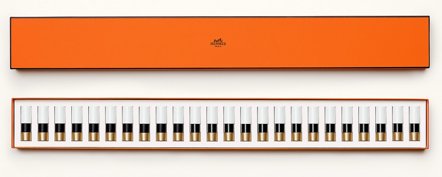
Here’s a bit of luxury to start off your week! (Yes, I backdated this post.) Hermès, historic French purveyor of fine leather goods and other accessories since 1837, debuted a lipstick line back in March. Once I saw the modern color-blocked tubes I knew some of them had to make their way into the Museum’s collection, so I picked up a few of the limited-edition ones and one from the permanent line. I’m not going to spend any time discussing the merits of the Birkin bag vs. the Kelly or anything else related to Hermès fashion and history, as there are any number of resources out there. Instead, I’ll talk about the house of Hermès in passing only as it relates to the lipstick.
I love the canvas pouch and signature orange box each are housed in. The tubes were created by Pierre Hardy, creative director of Hermès jewelry and shoes.
The caps are engraved with the ex-libris emblem chosen by Émile Maurice Hermès for his personal library in 1923. “The top curves inward a bit like a fingerprint, giving it a little softness…an anticipation of the gesture to come,” Hardy explains to Wallpaper magazine.
I adore the color combinations and the material is equally impressive. Though the tubes may resemble some sort of plastic, they are entirely free of it and are also refillable. The brushed metal on the tubes used for the permanent shades is a nod to Hermes’s “perma-brass” fixtures on their bags. I’ll let Wallpaper expand on the design: “Each lipstick tube is made of 15 different elements by partner workshops in France and Italy. Refillable, they are meant to be kept as precious objects, like jewels. The modern graphic design of the tubes contrasts with the classic ex-libris on the cap. The top half of the tube is white, or what Hardy calls ‘the image of purity and simplicity’. Hardy will play around more freely with the colour blocks of these tubes, finding ‘harmonies’ with each individual shade. For the first edition, an intense purple lipstick comes in a tube with bands of red and cornflower blue, while a coral shade is offset by emerald green. The overall effect is very Memphis Group…Prior to this, Hardy had no experience with beauty products, and neither, really, did Hermès. He says there were advantages in approaching the design with a blank slate. ‘I thought, let’s act as though nothing else existed. I will try to create the quintessence of an object that is feminine, pure, simple. One that is immediately desirable but will stand the test of time, and that can convey the Hermès style: luxury and sobriety.'”
A couple of points here: first, the very old idea of makeup containers as jewelry or art objects is obviously still going strong in 21st century. Second, I had to google the Memphis Group (they’re a design collective from the ’80s, FYI) but the resemblance in terms of color-blocking is striking.
Third, the article says that Hardy had not designed makeup before. This is not exactly true, as he collaborated with NARS on a collection back in 2013. Do you remember the adorable little shoe duster bags for the nail polish duos? I’m almost positive this charming design touch was Hardy’s idea.
In addition to makeup as jewelry, Hardy brings up another age-old idea: makeup as art, specifically painting. Regarding the lip pencil and brush he designed for Hermès in addition to the tubes, he remarks, “I studied visual arts, and these materials – brushes, pencils – resemble what we used back then. It is interesting to approach the question of femininity like a painter: what can we offer a woman so she can be an artist of her own beauty?”
Now let’s talk about the lipsticks themselves. Jérôme Touron, formerly of Dior and Chanel, was hired as the creative director of Rouge Hermès specifically to oversee the shade selection and textures. Each of the 24 colors (the number based on the house’s address at 24 Rue du Faubourg Saint Honoré) is inspired by the roughly 900 leather colors and over 75,000 silk swatches from the company’s archives. While it was difficult to narrow down the initial lineup, Touron enjoyed the “pure freedom” of digging through the archives. “It’s like a carré [square]; there is a profusion, an infinity of possibilities, and at the same time, a frame, that is clear and precise. Make-up works exactly the same way; there is an infinity of options in terms of colours, textures and types of application and at the same time it has to meet a certain function.” The matte Orange Boîte, shown below, is a direct reference to Hermès’s orange boxes, while Rouge H is from a color released in 1925 that I may have to buy. As Touron explains, “[Emile] introduced at the International Exhibition of Modern Decorative and Industrial Arts in Paris, with a truly pioneering spirit: he was the first to ask his tanners to create an exclusive ‘signature’ shade for leather. This colour immediately became a signature colour for Hermès because of its unique and singular hue: different (darker) from the Art Deco bright red of the time.”
The lipsticks are allegedly scented with a custom fragrance concocted by the brand’s perfumer Christine Nagel with notes of sandalwood, arnica and angelica, but I couldn’t detect any scent. (Hopefully I’m not developing COVID.) There are 10 with matte finishes and 14 with satin, representing the various finishes of leathers, Doblis suede for the mattes and calfskin for the satins. However, Elle magazine reports that the satin texture is inspired by the company’s silk scarves, so who knows.
Hermès lipsticks in Orange Boite, Rose Inoui, Violet Insensé and Corail Fou
Hermès plans on releasing limited edition shades every 6 months, so I purchased the three fall 2020 colors. I really will try not to buy all three each and every season because it might not be the best use of the Museum’s budget, but the color-blocking is just so irresistible (even if we have seen it on lipstick before). And as a collector there’s a compulsion to have them all.
Also, all of the shades of the limited-edition lipsticks are inspired by an 1855 book Touron refers to when creating colors: The Principles of Harmony and Contrast of Colours and Their Applications to the Arts by Michel-Eugène Chevreul (that’s a mouthful!)
Hermès fall 2020 lipsticks in Rose Ombré, Rose Nuit and Rose Pommette
I’m still scratching my head over what exactly Touron does. I thought for sure he was a makeup artist since most lines have a makeup artist involved, but apparently he is a “product developer” according to the Wall Street Journal. The article reports that the decision not to hire a makeup artist or celebrity face was intentional. “‘The idea of one makeup artist giving all the rules was not ours,’ says [President and CEO of Hermès Parfums] Agnes de Villers. Touron is a product developer. He used makeup artists to help him test and develop products, but no one is signing a product group or telling anyone how to wear anything. For [artistic director Pierre Alexis] Dumas, that approach infantilizes customers. ‘We’ve always relied on the good sense and intelligence of our clients,’ he says. There will be no Hermès ‘face of the season’ or step-by-step inserts with line drawings. As Dumas puts it: ‘Lipstick is not a status symbol, nor a sign of submission to an order, but an affirmation of the self.'” It’s certainly a unique approach and only time will tell whether it pays off.
I have to say I wasn’t impressed with Touron’s reasoning for starting with a lipstick or its meaning. “I think the lipstick is special because it has the ability to reveal personality in a few seconds, in a single gesture, in just one application. Instantly, it reveals the colour of the personality. In a way, it exemplifies our conception of beauty: to reveal, not to transform. Hence the desire to start the Hermès Beauty with a lipstick collection. Also, perhaps because a lipstick concentrates in a very small size, our whole approach to the object, the colour, the material and the gesture in other words, some of the great fundamentals of Hermès.” Eh. I wish he had been honest rather than trying to spin it into something more profound than what it is: good business sense. Nearly all major cosmetic lines start with one product and it’s usually lipstick because it’s the most profitable makeup item and a good way to test the waters. Lipstick is really a barometer to see how the line is received and whether there’s interest in a full collection. As for the “gesture” nonsense it’s really just the brand’s tagline of “beauty is a gesture”, and I also think makeup can absolutely be transformative, even as it’s “revealing” one’s true colors. I did, however, enjoy the beautiful boxed set he came up with for the holiday season and his description of the relationship between color and music. The Piano Box set contains all 24 permanent shades. “Laid out in a line with their black and white lacquering, the lipsticks looked just like piano keys…for me, colors are like musical notes; they can be combined to create harmonies and resonance. More fundamentally, color, like music, is at the same time a precise system—like a frame, and something free, artistic, and deeply emotional.” That could explain why there are so many music-themed makeup objects!
Anyway, what’s especially interesting is that nearly every article claims this is the first time Hermès released lipstick. That is not true and I have the photos to prove it. A very kind Museum supporter on Instagram sent me images of a previous lipstick by Hermès. She’s not sure exactly when they came out, but according to newspaper articles it debuted in early 2001 in the U.S., selling for $25. The Wall Street Journal cited earlier reports that artistic director Pierre Alexis Dumas had suggested lipstick back in 2000 but that the company turned out not to be ready for a full line. “‘I think I was the one who suggested to my father [Jean-Louis Dumas, the late chairman and creative director of the house] that we should register the name for lipstick.’ They didn’t do it then—instead just once making a single shade of red lipstick in limited edition. They needed to think it through some more.” However, this photo shows a number on the lipstick which implies there were more shades. Perhaps in Europe, where this online friend of mine is based, offered more colors and in the U.S. we only got one.
In looking at the older lipstick and comparing it to the 2020 version, I must say the new line is far superior design-wise than Hermès’s previous attempt at makeup. It makes sense, since Touron, Hardy, Nagel, Dumas, along with Bali Barret, director of Hermès Women, spent 3 years bringing the cosmetics line to fruition. There wasn’t nearly as much fanfare or press for the earlier release, which leads me to believe it was more of a quick money grab led primarily by their marketing department without any real thought put into it – one can tell top executives and designers were not too hands-on. I’m all for minimal style, but the slim, plain packaging reads as very uninspired and not at all distinct from other brands, nor does it really capture Hermès’s vision. This could also be the reason why the line failed within a year – I saw no mention of it after March 2002 – and why nearly all the coverage for the new line omits any reference to their earlier foray into cosmetics. In hindsight, the company may see it as a mistake and prefer that it stays buried in newspaper archives…unfortunately for them, beauty aficionados don’t forget!
Anyway, as with other luxury makeup, many people will want to know whether Hermès lipstick is worth shelling out a significant amount of money for. On the surface, $67-$72 is an absurd price for a single lipstick. But as I noted with Louboutin nail polish, you’re not just paying for the product; you’re paying for the Hermès name along with all of the thoughtful details outlined above, not to mention that they are more affordable than nearly any other Hermès item (the leather cases for the lipsticks start at $340). Having said that, there are plenty of other quality lipsticks to choose from if you’re not into forking over some 70 bucks for the name or packaging. Most reviews have indicated that Hermès performs well although not necessarily better than other high-end brands, so splurging on one (or several) because of the luxurious feel makes sense. But I don’t believe any of the ingredients or technology in the product by itself warrant the price tag – beeswax, shea butter and mulberry extract are not that special, after all. Bottom line: if you’re wondering whether it’s worth it to buy these, yes, but only if you’re really into all the luxurious bells and whistles, a collector or if you love the brand. Again, if you just want a lipstick that performs well and don’t care about the label, pretty orange boxes and colorful tubes, there are many comparable lipsticks out there.
To conclude, I’m really enjoying Rouge Hermès despite the fact that I haven’t swatched any of the lipsticks I purchased (although it is very tempting!) You know I admire attention to detail when it comes to makeup packaging and design, and these tick every box. I also think these tie into the company’s aristocratic history but look much more approachable than I was expecting. I always perceived Hermès as a sort of blue-blood, old-money type brand – I mean, they started as a company that made fancy leather horse saddles and harnesses for people wealthy enough to consider equestrianism a hobby – but the modern and colorful design of the lipsticks proves they may not be as stuffy as I thought. Still, I’d like to see more adventurous shades and textures, i.e. their Malachite green or a glitter finish. And obviously they need more diversity in their advertising. I can’t say I’ve seen any, ahem, mature-looking models or anyone resembling a gender besides cis women, so hopefully they’ll branch out a bit while still keeping true to the brand’s heritage. A full makeup line is planned to be in place by 2023, so fingers crossed we’ll see some other interesting limited edition items…maybe a Birkin-embossed highlighter or one of their scarf patterns printed on the outer cases. 😉
What do you think of Rouge Hermès? Would you or have you tried them?
Despite my art history background and general love of art, I am less than eloquent when writing about it. Nevertheless I will continue soldiering forward with the Museum's Makeup as Muse series, the latest installment of which focuses on the work of Gina Beavers in honor of her recent show at Marianne Boesky Gallery. Beavers' practice encompasses a variety of themes, but it's her paintings of makeup tutorials that I'll be exploring. Since I'm both tired and lazy this will be more of a summary of her work rather than offering any fresh insight and I'll be quoting the artist extensively along with some writers who have covered her art, so most of this will not be my own words.
Born in Athens and raised in Europe, Beavers is fascinated by the excess and consumerism of both American culture and social media. "I don't know how to talk about this existence without talking about consumption, and so I think that's the element in consuming other people's images. That's where that's embedded. We have to start with consumption if we're going to talk about who we are. That's the bedrock—especially as an American," she says. The purchase of a smart phone in 2010 is when Beavers' work began focusing on social media. "[Pre-smart phone] I would see things in the world and paint them! Post-smartphone my attention and observation seemed to go into my phone, into looking at and participating in social media apps, and all of the things that would arise there…Historically, painters have drawn inspiration from their world, for me it's just that a lot of my world is virtual [now]."
But why makeup, and specifically, makeup tutorials? There seem to be two main themes running through the artist's focus on these online instructions, the first being the relationship between painting and makeup. Beavers explains: "When I started with these paintings I was really thinking that this painting is looking at you while it is painting itself. It’s drawing and painting: it has pencils, it has brushes, and it’s trying to make itself appealing to the viewer. It’s about that parallel between a painting and what you expect from it as well as desire and attraction. It’s also interesting because the terms that makeup artists use on social media are painting terms. The way they talk about brushes or pigments sounds like painters talking shop." Makeup application as traditional painting is a theme that goes back centuries, but Beavers's work represents a fresh take on it. As Ellen Blumenstein wrote in an essay for Wall Street International: "Elements such as brushes, lipsticks or fingers, which are intended to reassure the viewers of the videos of the imitability of the make-up procedures, here allude to the active role of the painting – which does not just stare or make eyes at the viewer, but rather seems to paint itself with the accessories depicted – literally building a bridge extending out from the image…Beavers divests [the image] of its natural quality and uses painting as an analytical tool. The viewer is no longer looking at photographic tableaus composed of freeze-frames taken from make-up tutorials, but rather paintings about make-up tutorials, which present the aesthetic and formal parameters of this particular class of images, which exist exclusively on the net." The conflation of makeup and painting can also be perceived as a rumination on authorship and original sources. Beavers is remaking tutorials, but the tutorials themselves originated with individual bloggers and YouTubers. And given the viral, democratic nature of the Internet, it's nearly impossible to tell who did a particular tutorial first and whether tutorials covering the same material – say, lip art depicting Van Gogh's "Starry Night" – are direct copies of one artist's work or merely the phenomenon of many people having the same idea and sharing it online. Sometimes the online audience cannot distinguish between authentic content and advertising; Beavers's "Burger Eye" (2015), for example, is actually not recreated from a tutorial at all but an Instagram ad for Burger King (and the makeup artist who was hired to create it remains, as far as I know, uncredited).
Another theme is fashioning one's self through makeup, and how that self is projected online in multiple ways. Beavers explains: "I am interested in the ways existing online is performative, and the tremendous lengths people go to in constructing their online selves. Meme-makers, face-painters, people who make their hair into sculptures, are really a frontier of a new creative world…It’s interesting, as make-up has gotten bigger and bigger, I’ve realized what an important role it plays in helping people construct a self, particularly in trans and drag communities. I don’t normally wear a lot of make-up myself, but I like the idea of the process of applying make-up standing in for the process of self-determination, the idea of ‘making yourself’."
As for the artist's process, it's a laborious one. Beavers regularly combs Instagram, YouTube and other online sources and saves thousands of images on her phone. She then narrows down to a few based on both composition and the story they're trying to tell. "I'm arrested by images that have interesting formal qualities, color, composition but also a compelling narrative. I really like when an image is saying something that leaves me unsure of how it will translate to painting, like whether the meaning will change in the context of the history of painting," she says. "I always felt drawn to photos that had an interesting composition, whether for its color or depth or organization. But in order for me to want to paint it, it also had to have interesting content, like the image was communicating some reality beyond its composition that I related to in my life or that I thought spoke in some interesting way about culture." The act of painting for Beavers is physically demanding as well: she needs to start several series at the same time and go back and forth between paintings to allow the layers to dry. They have to lay flat to dry so she often ends up painting on the floor, and her recent switch to an even heavier acrylic caused a bout of carpal tunnel syndrome.
But it's precisely the thick quality of the paint that return some of the tactile nature of makeup application. This is not accidental; Beavers intentionally uses this technique as way to remind us of makeup's various textures and to ensure her paintings resemble paintings rather than a photorealistic recreation of the digital screen. "The depth of certain elements in the background of images has taught me a lot about seeing. I think I have learned that I enjoy setting up problems to solve, that it isn't enough for me to simply render a photo realistically, that I have to build up the acrylic deeply in order to interfere with the rendering of something too realistically," she explains. Sharon Mizota, writing for the LA Times, says it best: "Skin, lashes and lips are textured with rough, caked-on brushstrokes that mimic and exaggerate wrinkles and gloppy mascara. This treatment gives the subjects back some of the clunky physicality that the camera and the digital screen strip away. Beavers’ paintings, in some measure, undo the gloss of the photographic image."
Beavers also uses foam to further build up certain sections so that they bulge out towards the viewer, representing the desire to connect to others online. "Much of what people do online is to try to create connection, to reach out and meet people or talk to people. That is what the surfaces of my painting do in a really literal way, they are reaching off the linen into the viewer’s space," she says. This sculptural quality also points to the reality of the online world – it's not quite "real life" but it's not imaginary either, occupying a space in between. Beavers expands on her painting style representing the online space: "It’s interesting because flatness often comes up with screens, and I think historically the screen might have been read like that, reflecting a more passive relationship. That has changed with the advent of engagement and social media. What’s behind our screen is a whole living, breathing world, one that gives as much as it takes. I mean it is certainly as 'real' as anything else. I see the dimension as a way to reflect that world and the ways that world is reaching out to make a connection. Another aspect is that once these works are finished, they end up circulating back in the same online world and now have this heightened dimensionality – they cast their own shadow. They’re not a real person, or burger, or whatever, but they’re not a photo of it either, they’re something in between."
Let's dig a little more into what all this means in terms of makeup, the beauty industry and social media. Beavers' work can be viewed as a simultaneous critique and celebration of all three. Sharon Mizota again: "[The tutorial paintings] also pointedly mimic the act of putting on makeup, reminding us that it is something like sedimentation, built up layer by layer. There is no effortless glamour here, only sticky accretion. That quality itself feels like an indictment — of the beauty industry, of restrictive gender roles. But an element of playfulness and admiration lives in Beavers’ work. They speak of makeup as a site of creativity and self-transformation, and Instagram and other social media sites as democratizing forces in the spread of culture. To be sure, social media may be the spur for increasingly outré acts, which are often a form of bragging, but why shouldn’t a hamburger eye be as popular as a smoky eye? In translating these photographs into something more physical, Beavers asks us to consider these questions and exposes the duality of the makeup industry: The same business that strives to make us insecure also enables us to reinvent ourselves, not just in the image of the beautiful as it’s already defined, but in images of our own devising."
This ambiguity is particularly apparent in Beavers's 2015 exhibition, entitled Ambitchous, which incorporated beauty Instagrammers and YouTubers' makeup renditions of Disney villains alongside "good" characters. Blumenstein explains: "So it isn’t protagonists with positive connotations which are favoured by the artist, but unmistakably ambivalent characters who could undoubtedly lay claim to the neologism ambitchous, which is the name given to the exhibition. Like the original image material, this portmanteau of ‘ambitious’ and ‘bitchy’ is taken from social media and its creative vernacular, and is used, depending on the context, either in a derogatory fashion – for example for women who will do absolutely anything to get what they want – or positively re-interpreted as an expression of female self-affirmation. Beavers also applies this playful and strategic complication of seemingly unambiguous contexts of meaning to the statements contained in her paintings. It remains utterly impossible to determine whether they are critically exaggerating the conformist and consumerist beauty ideals of neo-capitalism, or ascribing emancipatory potential to the conscious and confident use of make-up."
More recently, Beavers has been using her own face as a canvas and making her own photos of them her source material, furthering her exploration of the self. "Staring at yourself or your lips for hours is pretty jarring. But I like it, because it creates this whole other level of self,” she says.
This shift also points to another dichotomy in Beavers's work: in recreating famous works of art on her face, she is both critiquing art history's traditional canon and appreciating it, referring to them as a sort of fan art. "I think a lot of the works that I have made that reference art history—like whether it's Van Gogh or whoever it is—have a duality where I really respect the artist and I'm influenced by them, and at the same time I'm making it my own and poking a little fun. And so, a lot of these pieces originated with the idea of fan art. You'll find all sorts of Starry Night images online that people have painted or sculpted or painted on their body. It comes out of that. And I just started to reach a point where I was searching things like 'Franz Kline body art,' and I wasn’t finding that, so I had to make my own. Then it started to get a little bit geekier. I have a piece in the show where I am painting a Lee Bontecou on my cheek, that's a kind of art world geeky thing—you have to really love art to get it."
Ultimately, Beavers perceives the intersection of makeup and social media as a force for good. While the specter of misinformation is always lurking, YouTube tutorials and the like allow anyone with internet access to learn how to do a smoky eye or a flawlessly lined lip. "I think for a lot of people social media is kind of like the weather. We don't have a lot of control of it, it just is. It gives and it takes away. There's no doubt that it has connected people in ways that are great and productive, allowing people to find communities and organize activism, it can also be a huge distraction…I approach looking at images there pretty distantly, more as a neutral documentarian, and I come down on the side of seeing social media as an incredibly useful, democratic tool in a lot of ways," she concludes.
On the other side of social media, Beavers is interested on how content creators help disseminate the idea of makeup as representing something larger and more meaningful than traditional notions of beauty. "I was super fascinated with makeup and all of the kinds of costume makeup and things you can find online that go away from a traditional beauty makeup and go towards something really wild and cool…I also had certain paintings in [a 2016] show that were much more about costume makeup, that were going away from beauty. That’s the thing that gives me hope. When I go through makeup hashtags on Instagram, there will be ten or twenty beauty eye makeup images and then one that’s painted with horror makeup. There are women out there doing completely weird things, right next to alluring ones." In the pandemic age, as people's relationships with makeup are changing, "weird" makeup is actually becoming less strange. Beavers' emphasis on experimental makeup is more timely than ever. I also think she's documenting the gradual way makeup is breaking free of the gender binary. She says: "I mean with makeup, and the whole conversation around femininity and makeup—I think for a long time when I was making makeup images, there were people that just thought, 'Oh, that's not for me,' because it's about makeup, it's feminine. But it’s interesting, the culture is shifting. I just saw the other day that Alexandria Ocasio-Cortez did a whole Instagram live where she was putting on her makeup and talking about how empowering makeup is for trans communities…some people see make-up as restrictive or frivolous, but drag performers show how it can be liberating and life-saving." Another point to consider in terms of gender is the close-up aspect of Beavers's paintings. With individual features (eyes, lips, nails) separated from the rest of the face and body and removed from their original context, they're neither masculine nor feminine, thereby reiterating that makeup is for any (or no) gender.
All I can say is, I love these paintings. Stylistically, they're right up my alley – big, colorful and mimicking makeup's tactile nature so much that I have a similar reaction to them as I do when seeing makeup testers in a store: I just want to dip my hands in them and smear them everywhere! I also enjoy the multiple themes and levels in her work. Beavers isn't commenting just on makeup in the digital age, but also self-representation online, shifting attitudes towards makeup's meaning, the relationship between painting and makeup, and Western art history.
What do you think of Beavers's paintings? If you like it I would highly recommend the monograph, which is lovely and fairly affordable at $40.
I’m doing the #Museum30 challenge on Twitter, and one of the recent prompts was “origin”. It got me thinking about the very first makeup museum. While I have no definitive answers, it seems the first cosmetics museum, at least in the U.S., dates back to the 1950s. And there were several others after that but before the Makeup Museum was established. So let’s take a quick peek into the origin of the makeup museum and the other spaces that have gone before (along with a a couple that came after).
In October of 1956 it was reported that the House of Cosmetics, a “cosmetics museum and gallery of fame as a historical repository and a tribute to the cosmetics industry”, would opening at the former Reed Company on Harrison Street in Newark, NY. It was financed and operated by Pitkin, a cosmetics manufacturer that distributed the Linda Lee line of cosmetics. Among other features, the museum would boast special sections for perfume, lipstick (“Lipstick Lane”) and powder (“Powder Puff Parade) , along with gigantic sculptures of a perfume bottle, lipstick and powder box on the roof that would light up at night. The collection consisted of objects donated from the public along with memorabilia from the Pitkin company archives. A perfume fountain at the entrance spouted a brand-new fragrance called Three Coins, created especially for the museum. Visitors would receive samples of the perfume.
House of Cosmetics Museum, Newark NY, December 1956
The odd thing about the House of Cosmetics is that it allegedly opened in December of 1956, but there is literally no mention of it after that. I could not for the life of me find any information on it following its grand opening, so I can only assume it wasn’t successful and quietly closed, perhaps because it was too commercial and focused mostly on Pitkin. The House of Cosmetics was not the vision of a passionate private collector, but that of the current president of Pitkin as a way to raise the company’s profile nationwide and celebrate the brand’s upcoming 50th anniversary in 1958. The space prominently featured current Pitkin products and it didn’t seem as though there were outside curators or historians involved, plus, only Pitkin employees served as tour guides. I know many argue that museums should be run like businesses, and it’s a conversation for another time, but I really do think that generally entrepreneurs should not be opening museums.
Fast forward to 1979* when the Pacific Cosmetics Museum, also known as the Museum of Cosmetics History, opened in Korea. While it was established by Pacific Chemicals founder Suh Seong Hwan as part of the company’s factory in Seoul, the collection reflects the passion and respect Hwan had for Korean cosmetics history.
With the help of museum director/curator Chun Wan-gil (Cheon Wan-kil), Hwan continued researching and building the collection, all the while becoming more interested in the cultural aspects of makeup rather than seeing them merely as a way to make money. Not only did Hwan support the museum, he funded research and publications related to Korean cosmetics history. According to AmorePacific biographer Han Mi-Ja, “Chun Wan-gil seemed truly to enjoy working for the museum. He poured all his energy and passion into helping Jangwon [Hwan] with it. As for Jangwon, he was amazed and thrilled to watch how the historic relics seemed to come to life after the hands of Chun Wan-gil touched them. With his guide, Jangwon was able to build his knowledge and awareness of the historic relics, and grew more committed to the cultural activities…Jangwon thought, learned, and discovered a lot while collecting historic relics, building a museum, and presenting the results of his devotion to the world. He was filled with a joy and sense of achievement, which were not the same as he had ever felt from his business.”
In 2009 the museum changed its name to Amorepacific Museum of Art (APMA) and showcases modern and contemporary art rather than cosmetics, although the website states that “it is an institution dedicated to the antiques and artifacts of cosmetics culture in Korea, as well as making a meaningful contribution to local community and education.” I really can’t tell whether makeup is actually on display there. Ditto for the Pola Museum – while it was established by a cosmetics company president in 1976 and has some makeup on display for specialexhibitions, I believe the museum focuses mostly on the founder’s personal art collection. So I don’t know if either of those really qualify as makeup museums now, but they were at least started that way.
Going back to the U.S., in 1984 the Max Factor Makeup Museum opened in Max Factor’s former studio at 1666 N. Highland Avenue in Hollywood, CA. Overseen by Bob Salvatore, a 23-year employee of Max Factor, the museum offered a veritable treasure trove of Max Factor objects and memorabilia. From then it’s not clear what exactly happened. Some articles state that the museum closed in 1992, some say 1996; I’m leaning towards 1996 as there are articles from 1995 advertising the museum at that location. In any case, a portion of the collection ended up at the Hollywood Entertainment Museum, which opened in October 1996 and was located at 7021 Hollywood Blvd. The collection remained there until 2004, when it landed at its original location, the old Max Factor studio. The famed Art Deco building had been turned into the Hollywood Museum in the summer of 2003. The Max Factor collection is still there so you can visit (well, maybe if the pandemic ever ends!)
During this time, Shiseido opened their corporate museum in Japan as a way to celebrate the company’s 120th anniversary in 1992. I’ve written about this one before so I won’t rehash it, but you can check out my post. A decade later, in 2002, an Alabama paper reported on the Avon Fan Club House of one Mira Dawson. Ms. Dawson was a top seller and avid collector of Avon memorabilia, even dressing like one of the company’s co-founders to greet visitors. She charged $2 for admission to her home, which functioned as the museum. Here’s to home-based museums!!
A year later, in November 2003 the Coreana Cosmetics Museum opened in Seoul. This was another one started by the company president; however, like the Pacific Cosmetics Museum, it seems to be far less profit-driven than the House of Cosmetics. The Coreana Cosmetics Museum showcases over 5,300 objects from all eras and seems to have curators and historians working there rather than relying on company salespeople. This tour from @travmagnet is fantastic!
Just a few years later, in 2006 the Beni Museum was established in Tokyo. I’ve posted about that previously too so I won’t go into it again, but you should really check it out as it’s fabulous. So that takes us to late 2007, when I registered the domain for the Makeup Museum. Interestingly, on Instagram I got to chatting with the previous owner of the domain! Oldschoolcosmetics had the idea of a makeup museum all the way back in the ’70s and registered the domain around 1995, but realized how difficult it was and ended up walking away from makeup entirely. Here’s what she had to say: “I first had the idea for a cosmetics museum in the 70s when I became really aware of makeup, brands and how quickly things disappeared from shelves. My dad had a museum background and my parents took me to museums on every vacation. I started to think seriously about it in the 90s and registered the domain then. There were no odd or new domains then, just .com, .org and .net. I don’t recall if I registered .com or .org or both, but definitely not .net. At the time there was a Max Factor exhibit in the LA area, and at least two active makeup schools there which specialized in special effects and Hollywood film work. I wasn’t as interested in that, but it became obvious that the industry was based in NY and LA, rent would be prohibitive, the industry giants could set up a museum faster than I could, would definitely do so after I started up, anything on display could be permanently ruined if there was a blackout or A/C malfunction, and the bulk of the work would be grant writing, networking and managerial. I abandoned the idea fairly quickly. Ignoring all other beauty like wigs, nails, skincare, fragrance, there was still too much for one building if you showed stage makeup, drag history, failed brands, etc. Back then there were less collabs, less brands, less releases a year, the world wide web was just starting and everything was still paper catalogs, in store displays, etc. Now a museum would have to cover cancel culture, influencers, indie brands, brand owners, many more foreign brands, etc. I used the domain for a private message board about makeup. I wanted to call it makeup mavens but someone had that name and a brand that used it. This was circa 1995? Eventually I got bored with the industry, the sheeple customers, products that disappointed, etc.”
So it was kind of a downer to hear, but that sort of brutal honesty is needed at times, plus it shows I’m not a total failure – it’s basically impossible to open a cosmetics museum without any investors or industry connections, or unless you’re independently wealthy. In any case, this person is enthusiastic about makeup again and supports the Makeup Museum. She has been extremely kind in talking with me about the challenges of opening a physical space and digitizing the collection, particularly as they relate to funding sources. She has given me quite a few excellent suggestions so hopefully I’ll be able to pursue them. Anyway, in August of 2008 I wrote my first blog post, so I usually consider that to be the Museum’s official birthday.
A little bit after the Makeup Museum was established, makeup artist René Koch opened his private collection of lipstick in Berlin to the public in 2009, naturally called the Lipstick Museum. This is still on my must-see list! Known as “Mr. Lipstick”, Koch was the head makeup artist for YSL for over 20 years and has amassed a spectacular collection of lipsticks and related memorabilia.
Finally, we have the London Cosmetics Museum, founded by makeup artist Xabier Celaya in 2015. Like the Makeup Museum, it’s an online-only pursuit for now. However, Xabier exhibits his collection at local universities, stores and cosmetology schools, and I’d be very surprised if he doesn’t have a public physical space shortly.
All of this goes to show there’s been an interest for many years in exhibiting and preserving makeup history and beauty culture. I certainly was not the first one to have the idea of a cosmetics museum, nor will I be the last – I know of several makeup artists who are actively trying to open their own spaces. However, if they follow in the footsteps of a certain other entity and claim to be the first, well, you know it’s a lie. 😉
I have so many other books I'd like to review but so little time, and this tome had been sadly collecting dust on my nightstand for ages, so here's a quick review for a quick read.* Lipstick: A Celebration of the World's Favorite Cosmetic by Jessica Pallingston was released in 1998, just a few months prior to Meg Cohen's Read My Lips: A Cultural History of Lipstick which I reviewed in 2015 and vowed to compare it to Pallingston's book shortly thereafter (in other words, I'm a mere 5 years overdue for that task. Sigh.) Anyway, I found the two books to be more or less the same in terms of content. This isn't necessarily a bad thing, but I think if you were looking for a basic history of lipstick you could choose one or the other and not feel like you're missing out.
The introduction left a bit to be desired, as it placed emphasis on lipstick as a tool to either "empower" women or lure men; there was no mention of playing with color as a means of self-expression. I also think, as I did with Cohen's intro, that the fetishization of lipstick and the overblown description of its alleged power were a bit much. Lipstick can be life-changing, yes, but proclamations like "Lipstick is a primal need" made me roll my eyes.
Like Cohen's book, the first chapter is a brief overview of the cultural significance of lipstick throughout history, starting with ancient times and ending with the 1990s. Not a bad summary, but since I've been doing this a long time there was little earth-shattering news. This isn't the author's fault, however, as the book was released over 20 years ago so this sort of information wasn't as ubiquitous as it is now. Containing the standard tidbits about ancient Greek prostitutes and the patriotic duty lipstick served during World War II, the chapter is a tidy summation of how lipstick was worn through the ages. But the section on the '90s penchant for brown lipstick nearly made my eyes pop out of my head, as I had never come across theories about why brown lipstick (and brown in general) was so popular. This will definitely inform my research for my '90s beauty history book!
Chapter 2 presents no fewer than 14 theories outlining why lipstick wields more impact than other cosmetics. I found them to be slightly lacking, as I believe the "lipstick as phallic object" or "painted lips mimicking sexual arousal" theories rather tired at this point, not to mention sexist. Ditto for the idea that children feel more protected if their mother leaves a lipstick print as they kiss them goodbye before school, lipstick application as oral fixation, or as a rite of passage for teenage girls. There was some truth to the theory about lipstick as a sort of armor or camouflage, but seeing no mention of how lipstick fits into the larger notion of makeup as a means of self-expression was disappointing. And I would have liked to see more about makeup's transformational power, but the only theory about lipstick as metamorphosis came in the form of fairy tales, i.e. one's wildest dreams come true through makeup and one will magically become "pretty" if they wear it: "When I put on lipstick I am as pretty as Cinderella" was one of the quotes included. (Why is the author quoting a literal 5 year-old?)
Chapter 3, appropriately titled Lipstick Freud, delves into pop psychology as Pallingston takes us through the various lipstick shapes that are the result of one's unique wear pattern (which obviously also depends on the shape of one's lips), along with what various application methods say about the user and something called lip reading. Much like astrology and palm reading, they're fun but not necessarily accurate or based on hard scientific data.
Chapter 4 was my favorite, as it provided a list of bite-sized anecdotes about lipstick as well as a lipstick-by-the-numbers section. I miss Allure's by-the-numbers feature tremendously and am dying to include something similar in exhibitions.
Chapter 5 gets into the nitty gritty of lipstick – the complete process of how it's produced and a lengthy list of ingredients, which is good information to have on hand. This chapter also includes sections on colors and names, both of which I believe warrant their own books. (There is actually an entire book on red lipstick, which I hope to review sometime this year.) You can definitely see how times have changed, since black and grey aren't mentioned at all and blue and green are discussed as having solely negative connotations of illness or death. These can be accurate, mind you, but as someone who has now fully embraced non-traditional lipstick colors (especially grey – I own no fewer than 9 shades), I found myself chuckling at the idea that blue or green lip colors used to be mostly associated with bad health. There are incredibly vibrant blue and green shades on the market these days – what could possibly be more a reminder of rebirth and growth than something like Menagerie's Juniper lipstick, for example, or capture the vitality of a hot summer day like MAC's Blue Bang? Anyway, while it was a nice read, it may have been good to include a section on different lipstick finishes and textures. But once again, this is really just part and parcel of this book being released in 1998, when liquid and glitter lipsticks weren't absolutely everywhere.
The naming section was notable for its inclusion of shade names from Renaissance England: apparently Beggar's Grey, Rat and Horseflesh were all listed as lipstick colors.
Chapter 6 gives some tips on how to navigate choosing and buying a lipstick in-store. With the advent of online shopping and swatches, this is largely obsolete and the advice itself was pretty basic. One unusual tip was to try swatching a lipstick on the inner wrist. I'm personally a fan of trying colors on fingertips since they are allegedly closer to your natural lip color, but if you want to find out how the color will look next to your overall facial skintone, the wrist is the place to swatch. Chapter 7 was more of the same, a list of lipstick application and color-coordination techniques that aren't anything you couldn't find online or in any beauty magazine.
Chapter 8 is probably the only chapter that is not in need of a major update, as it provides recipes for making your own lipstick that are still totally doable today. Even as technology and customization options evolve, there will always be a subset of the population who like to DIY their lipstick for various reasons – ingredient preferences, cost, or just because they like experimenting. Chapter 9 continued with recipes, but they were really intended more as a joke to show what people did throughout history to make lipstick. "From the medieval glamour guides, here's a recipe for making lipstick at home: Go outside. Get a root. Dry it. Pulverize it. Add some sheep fat and whiteners to get desired color. If you are upper class, go for a bright pink. If lower class, use a cheaper earth red. If you are having trouble being pale, and have the money to pay for it, get yourself bled. If you're alive during the Crusades, wait for the Crusaders to come back, as they'll bring some glamorous and exotic dyes, ointments and spices, and you'll be able to experience the makeup golden age of the Middle Ages." LOL.
Chapter 10 was a mishmash of suggestions for alternative uses of lipstick and a list of famous art history and pop culture lipstick moments. Most of the suggestions were good ideas, but some, like no. 21, made me cringe. Yikes.
But I did love all the artist references, for they included two I plan on writing about for Makeup as Muse (Rachel Lachowitz and Sylvie Fleury) and Claes Oldenburg's Lipstick (Ascending) on Caterpillar Tracks which I covered back in October. The final chapter (if you can even call it that, as it's only a page and a half) sings the praises of lipstick yet again, and honestly, probably wasn't necessary.
Overall, Lipstick is a nice book for those in need of a primer on lipstick, but if you're in the mood for something more academic or a thorough feminist analysis of lipstick, this is not it. As noted previously, if you're looking to purchase a book on lipstick history I would go with either this or Read My Lips, but I don't think both are necessary for a beauty library (unless you're like me, who obsessively hoards makeup books in addition to makeup itself). Lipstick has sound sources, although by now they are a bit dated and I believe are mostly the same as Cohen's. I will say that the advantage of Cohen's book over Pallington's is the inclusion of photos, which were non-existent in Lipstick. So it just depends on whether you want a glossier tome with more eye candy or one with less visual frills and more anecdotes, as the information in both is basically identical.
Have you read this one? I'm really hoping someone will write an updated cultural history of lipstick, as after reading this I think one is sorely needed.
*Another reason I chose to review this book first instead of the others I have planned is that I was recently interviewed by a journalist who is writing a brand spankin' new cultural history of lipstick, so hopefully in the next year or so we will have an updated version (and hopefully I will be quoted!) Stay tuned. 😉
Normally I’d wait a whole year and do a Ghosts of Christmas Makeup Past post to be more seasonally appropriate, but I simply couldn’t in the case of the amazing (mer-mazing?) Mikimoto holiday collection. As with the 2018 collection, the historic Japanese pearl and jewelry purveyor teamed up with an artist to create some incredibly whimsical underwater-themed packaging. Belgian artist and illustrator Brecht Evens had the honor of being Mikimoto’s second artist collaboration. I must admit I think I like his concept even more than the one by Emmanuel Pierre in 2018. If imagery of celebratory mermaids and assorted mer-critters having the ultimate holiday party doesn’t do anything for you, I question your humanity.
We’ll start with the palettes. The details on everything are staggeringly clever. And while the mishmash of characters and objects may initially seem haphazard, Evens’ messiness is actually entirely intentional. “When I draw the jumble of the city or I draw nature…errors, spots and little incongruities make it more realistic. Because when you’re in a space and you start to look around, you don’t take in the whole. You can’t. You don’t see the world around you like you see a postcard; it’s not organized that way. We’re moving, others are moving, and the eye makes constant choices, it decides what to interpret and what to identify. So at any given moment, there’s a lot of mess in there and, for me, this kind of mess has to stay in. It’s controlled; it’s never like I’m creating randomness. It’s just that incongruities seem to catch the eye better. They’re more natural and they latch onto the eye more realistically. Maybe I do play with a lot of stuff. But I only do it when it serves my narrative. It’s all part of calibrating things. When I use a lot of detail, it’s very calculated – I’m making sure it doesn’t obstruct anything essential.” The dozens of scenes may still be overwhelming for some, but I personally enjoyed picking apart all the individual vignettes and then seeing how they came together as a whole.
This is a particularly amusing exchange between two mer-folk and a nosy little fish. The addition of text is representative of Evens’ background in illustrated books and comics. The humor reminds me a little bit of Danny Sangra, the artist who designed Burberry’s spring 2018 palette.
I’m obsessed with this mer-kitty.
The scenes for the eyeshadow palette are equally spectacular. Sting rays take mer-children for a ride, while a sea elf peeks out from some seaweed to admire a blue-haired mermaid.
On the outer box a school of fish help another mermaid primp for a holiday party. She checks out her reflection in a seashell mirror held by two crabs.
I think the imagery on the sides of the skincare set was my favorite.
The set includes what appears to be a very fancy moisturizer (I didn’t want to open the sealed plastic) and what I believe are packets of face serum. Each one tells a snippet of the “First Snow of Pearls” tale. Unfortunately I couldn’t seem to locate the story at the Mikimoto website as I did last year, so I’m not really sure what it’s supposed to be about.
I love that the images are totally bizarre but also make perfect sense. The concept of a sea-dwelling Santa is absurd, but if one exists, of course his sleigh team would be seahorses instead of reindeer and his bag of presents shaped like a seashell. Ditto for the mermaid taking a ride on the jellyfish “bus”, pulling on its tentacles to signal her stop. While the underwater realm Evens created for Mikimoto is entirely imaginary, the usual rules still apply. As he puts it: “I do think I use visuals that might be dreamlike, or psychedelic, but I don’t think I use dream logic…you have to believe in the world you’re creating.”
There was also a lip gloss, the box for which shared the same illustrations as the skincare set.
Some lovely extras were included as gifts, like this silver toned box topped with a manta ray, a gold seashell cardholder and two cosmetic pouches. I noticed the powder brush was a bit scratchy, but 1. it was free and 2. I don’t intend on using it anyway.
Let’s learn a little more about the artist behind these fantastical scenes. The Belgian-born, Paris-based Brecht Evens (b.1986) studied illustration at Sint-Lucas Gent in Ghent, Belgium. Building on his country’s tradition and notoriety for comics, he focuses on these and illustrated books, but has also completed murals in Brussels and Antwerp, created fabrics for Cotélac, and collaborated with Louis Vuitton on a Paris travel book.
Stylistically, Evens is influenced by his mentors, illustrator Goele Dewanckel and cartoonist Randall Casaer. You can also see glimpses of Pieter Bruegel the Elder, M.C. Escher and Picasso. Take, for example, the resemblance between the artwork Evens created for French publisher Actes Sud and Bruegel’s Fight Between Carnival and Lent (1559). Both utilize a bird’s eye perspective and include dozens of different vignettes.
While Evens published several award-winning books early in his career, he is best known for more recent works Panther (2014) and The City of Belgium (Dutch and French versions released 2018; forthcoming editions in English in 2020). In terms of content, most of Evens’ narratives tend to be a little dark. Panther is about a young girl named Christine whose cat dies. Her mother also threatens suicide, drives away and never comes back. Panther arrives seemingly to be Christine’s friend and help her cope, but ends up being far more malicious than he appears. One reader called it a “apologism of pedophilia, zoophilia and incest”. Yikes.
The City of Belgium (titled Les Rigoles for its French audience and Het Amusement for Belgium) is actually part of the same universe as Evens’s 2009 work The Wrong Place, and the various versions of the book are meant to be connected. “I wanted something like a paperback copy of Balzac, a whole world that would be portable. But, instead of just one city, I wanted to make it a kind of European amalgam…the fun result would be for everyone to think it’s their city.”
The City of Belgium also reflects Evens’ struggle with bi-polar disorder and gradual recovery from a particularly bad episode. While not as unsettling as Panther, the book follows three characters having parallel urban adventures throughout a single evening, one of whom suffers from depression. Evens discusses how the book came to be and acknowledges the “heavy” themes alongside the humor. “The germ was just me coming back to life. A state of depression never carries any potential or interest. Then, once the interest starts returning – bit by bit – it’s like you’re back at zero. At that point, it’s just lines in old sketchbooks, dreams you have, something you happen to see sitting on a terrace. Because it’s so surprising to have ideas again, you notice every little thought and you get them down in a sketchbook…[in 2013 and 2014] things were so messed up; I couldn’t ever have considered such a massive project. The book is a product of peace having descended…the themes may be heavy, but I hope the treatment is light. Don’t forget to mention it’s full of gags and jokes!”
Evens appropriately chose a more lighthearted story for the Mikimoto collection while maintaining the concept of connected times and spaces. The characters and scenes appear disparate at first, but as you look more closely you can see that they’re all part of the same underwater universe – preparing for the holiday season and the First Snow of Pearls. If anyone is going to create a fanciful mermaid-laden paracosm or “expanded reality” as one reviewer put it, Evens is the perfect choice, as he had been making these sorts of “imaginary worlds” since he was a child. “Practically all I did was try to make imaginary worlds come to life, which meant: visible to other people, in comics, designs for buildings, fantasy world maps, board and card games, cassette tapes… No teaching, no explaining, no argument, just a portable world, bound together, with maybe a dust jacket around it or even some leather,” he says. He also did a fantastic job incorporating the pearls, which appear throughout all the scenes. My favorites are the fish helping construct a pearl garland and telling the lazy sea dog to wake up because it’s snowing pearls.
The illustrations were incredibly fun on their own, but the addition of Evens’ signature text provided another layer of humor.
“A lot of people, when they write dialogue, just go ‘A, B’, ‘A, B’, ‘A, B.’ They’ll have the characters neatly wait their turn. Whereas I don’t think our brains really work that way. In reality, it’s more of a constant traffic jam – even when we like each other and we’re interacting well. When we’re interacting less well, it’s more extreme,” he says. You can see the more realistic dialogue (at least, as “realistic” as this mermaid world can be) Evens was aiming for in this scene depicting crabs and fish wrapping holiday presents.
I have no information on how the Mikimoto collaboration came about. I summoned my courage and emailed Evens to see if he could shed any light. He politely declined to be interviewed, but I’m guessing that Mikimoto approached him as he indicated he does not know much about cosmetics. I believe these are new illustrations Evens created especially for the brand, but I find it odd he hasn’t included the collab on his website or IG page. I’m also assuming they were done using his usual handmade techniques. For The City of Belgium, he explains: “All the drawings were done on paper and I write by hand. So the creative parts are all computer-less. Where the computer comes in is for research; when I want things to be ‘right’ or inspired by actual stuff, then I’ll look something up… Ecoline [ink] dominates, but I use a mix. Now I have some different inks and, with the same brush, I’ll also pick up gouache to make it what I want. Or, I’ll mix it with real aquarelle. It all depends on what I’m searching for, what opacity or transparency I need to have. There will also be some pastels and, often, markers.” In looking closely at the lines and the way the colors overlap, it appears Evens did indeed draw everything by hand using a mix of markers and pastels on white paper.
So that about wraps it up. What do you think about this collection? What’s your favorite scene or character? I’d party any time with these mer-folks!