Fenty Beauty, the brand founded by musician Rihanna in 2017, had possibly its most adventurous releases in 2022. In August that year the company launched a set of 6 packets containing a mystery substance produced by cheeky Brooklyn art collective MSCHF (which I hope to cover eventually), and in December, a $500 crystal-studded lipstick case to celebrate the brand’s 5th anniversary. While I’ve been using Fenty since its inception – the matte foundation, cheek stix, and lipsticks are excellent – it’s the limited-edition products with special packaging that go into the Makeup Museum. However, having skipped this year’s holiday lineup, a collab with video game-inspired animated series Arcane, today I’m looking back at 2022’s Navy collection. Illustrated by L.A.-based cartoonist Obi, the Navy set is a nod to the nickname for Rihanna’s fan base, which in turn comes from one of her song lyrics, 2009’s “G4L”: “We’re an army / Better yet, a navy / Better yet, crazy”
Before we delve into the set, let’s take a peek at the work of the artist behind it. First generation Nigerian-American Obi Arisukwu was born and raised in Houston, Texas. Strongly influenced by cartoons and superheroes, particularly the Teenage Mutant Ninja Turtles, he began drawing at the age of 3. He earned a Bachelor’s degree in Visual Design and went on to become the lead graphic designer for ConocoPhillips, doing illustration on the side. After 4 years in the corporate world, however, he had enough. “When I was working at ConocoPhillips, I loved it at first. Then slowly and slowly, it became the same mundane pattern of going to work, being in a cubicle, and never being able to express my creativity. My talents weren’t being utilized the way they should have been. For instance, I was the head graphic designer there, but I was doing PowerPoint presentations. After a while it was kind of, “What am I here for? This is not really what I want to do. I really want to get into cartoons.’”
This was also a period of rapid growth for Instagram, where Obi would be inspired by other artists’ work as well as their ability to quickly cultivate large audiences. At the age of 30, he quit his job and moved back in with his parents to pursue illustration full-time. Obi acknowledges the first 6 months were difficult, as he had to learn to set up a business and earn clients, but ultimately his talent and perseverance paid off. “Living with my parents, they’re really great. They’ve always supported me and it’s like a really good Airbnb. It’s definitely tough because when you first quit and go on your own, you’re going to go through that period, that downfall, of where you’re not getting any business or no clientele because you’re still working on your service, still working on getting yourself out there. Then, for me, after like six months, I started getting a lot more projects. I really stopped doing graphic design work to focus more on illustrations. This is one of those things where you don’t give up.” Yay for supportive parents! (Side note: His mother’s only request was for Obi to buy her a Chanel bag after he had achieved success.)
In December 2017 Obi posted a comic strip loosely based on his life as a millennial. This proved enormously popular – it was the most engagement he had ever received on his Instagram posts – and he began posting a new comic each Friday. “The comic strip parodies real life situations like dating, friendships, politics, etc. Even though I’m the main character in the strips, I’ve taken on the role as the ‘every man’ so that the comic strips is relatable to everyone who reads it. [The strips were just the everyday things that we go through [as] millennials…Whatever it is and kind of making it to where people can just resonate,” he explains.
It’s a gentle humor that doesn’t stray into corny “dad joke” territory. I’m not too up to date on my comics and cartoons, but Obi’s work seems to be a breath of fresh air in an age of sarcastic, “edgy” or even offensive animated series (South Park, Family Guy) or the nonsensical (Aqua Teen Hunger Force and other Adult Swim programming). While I’m partial to the likes of Archer and Metalocalypse, I also appreciate Bob’s Burgers and Home Movies, or comics such as the Far Side. A light-hearted, softer type of humor is not a bad thing!
Obi continued with the comic but also drew Black pop cultural icons, athletes and other important figures. “There’s a lot of awesome things happening in the Black community, so I like to showcase that in my art,” he says. In 2018 Obi’s illustration of Childish Gambino from his “This Is America” video went viral, earning over 30,000 likes in 24 hours. Obi followed that up with another viral post featuring Will & Jaden Smith.
While these viral pieces may have led to the collaboration with Fenty and other opportunities, it was Obi’s “every man” comic that landed him his own animated series on HBO. The news was announced in early 2021, but it’s unclear as to when the show will actually debut. It will have the same vibe as his comic – a show about day-to-day life as a Black millennial man. Obi expands on his vision for the show as it pertains to race: “This cartoon is not just about me, it’s about society as a whole. It’s just kind of through the lens of a Black person. But it’s definitely a cartoon that everybody can watch…My biggest thing that I want to do when it comes to bringing diversity, especially with my Obi cartoon, is that I want to show the world that we live in as Black people, that’s not all about us getting shot by the police…we’re more than just victims all the time. I want to have four Black main characters who literally are just living life trying to make it in this world…OBI is the daily experiences we all can relate to, it’s just from the Black perspective. We always see us getting shot. We see slavery and racial injustice all the time. Sometimes we [Black people] need to escape from that. We’re more than the racial shit that happens to us. We have other things going on too. This cartoon will have moments where it does address being Black, but it’ll still have the comedy element to it. We’re more than our racial injustices…This show is about all the day-to-day, societal issues that go through as Black people that other races can relate to as well and laugh at with us.” This is a really important point that I think sometimes gets lost, especially in conversations regarding racial justice. Black people are more than their trauma and while it’s critical to acknowledge racism and work towards dismantling it, highlighting everyday life is also essential. Indeed, Obi rarely explores instances of racism, but when he does, it’s still done with the same humor.
Now, time for the makeup! The Navy set consists of a zipped canvas bag, a refillable lipstick in a limited edition blue case, a navy blue eyeliner and a cute little mirror. The lipstick shade is MVP, a classic red. (As I didn’t want to break the seal on the refill I don’t have pictures of it, but hopefully the stock photo will show you how pretty it is.)
I spent a good hour searching for photos of Rihanna as she is shown on the set – one with her hair down, green patterned sunglasses perched on her forehead, and lots of jewelry – and the other depicting her with Bantu knots, a green fur coat, white tee and blue cargo pants. Then I watched Obi’s Instagram video about the set and realized that, being an artist, he used his imagination to create these images rather than blindly copying her actual outfits. As someone who does not have any sort of creative flair, it didn’t occur to me that this would be his process! Anyway, there are a few images of Rihanna that can be seen in the video.
The collection was generally well-received, and the retail price of $58 for the set was quite reasonable given that it was adorned with original artwork and the practicality of the items included. Everyone can use a makeup bag, mirror, navy eyeliner and red lipstick, no?
However, some Instagrammers took issue with the depiction of Rihanna’s forehead. Between Fenty Beauty’s account and Obi’s, there were roughly 100 comments accusing Obi of making her forehead too large.
Normally I don’t address meritless criticism such as this – I try to “ignore the haters” as they say – but the reason I’m bringing this up is because I am massively confused. I think her forehead appears totally normal-sized. And while marketing teams sometimes slip up and let mistakes happen, even major ones, I would think that if it really was out of proportion the set wouldn’t have been allowed to be sold and Obi would have had to go back to the drawing board, literally. Beauty brands, particularly celebrity lines, fiercely protect the images of their founders and must show their them in the best possible light at all times.
This is just one of many things I’d like to chat with the artist about! I would have emailed Obi for an interview as he seems incredibly down to earth and approachable, but the week between Christmas and New Year’s isn’t really the best time to reach out to people, so in the end I decided not to. I am still wondering how the collab came about, what the process was like working with the company, if he got to meet or interact with Rihanna at all, and why he chose the images he did as inspiration when creating the artwork for the set. I’d also like to hear what’s happening with his HBO show as I am eager to watch it, and, of course, if he ever purchased a Chanel bag for his mom.
What do you think of Obi’s work and the Navy collection? I really enjoyed it and hope to see more collabs with Black artists. As I’ve pointed out, the cosmetics industry is seriously lagging behind in this regard. I do have one regret, which is not entering Obi’s giveaway contest – he provided signed sets to 5 lucky winners. Obviously I’d love to have a set personally signed by the artist. 😊
It's roughly 6 months past the Makeup Museum's official anniversary back in August of 2023, but it's still technically the 15th year of the Museum's existence so I forged ahead with a small exhibition, the theme of which is the 15 most important objects in the current collection. I originally thought of doing my favorite objects, but let's face it, it would have just been all novelties, mermaids, artist collabs, and food-themed items. It was very hard to narrow down, as all the Museum's objects are important for one reason or another, but there is a good representation. All of them were chosen based on their historical, cultural or artistic significance. I was also sort of hoping it could serve as a prototype or precursor to a larger exhibition that would be expanded to include makeup styles and trends, along with other super important pieces that aren't yet in the Makeup Museum's collection – perhaps a global history of makeup in 100 objects? In any case, happy 15th to the little museum that could!
As with using electronic versions of the labels vs. taking photos of them attached to the shelves, I am puzzled as to why it took me 15 years to figure out it's much easier (and safer for the objects) to take photos when the pieces aren't on the shelves. I also figured I didn't need to re-take photos of objects that already have photos for blog posts or Instagram, so they all look a little different. Ah well. Here we go!
Kohl tube – this was a tricky one! I purchased it on eBay from a seller in India, but I suspect the lettering on the cap is Arabic, not Hindi, so I'm wondering if it really was made in India. I tried running it through Google Translate for images but the translation didn't make any sense. Update, 4/22/2024: Nadja, the brilliant genius behind the best art history podcast ever, kindly translated this! It is indeed Arabic and the word is simply "Arab". Also, there is an illustration of the exact same design on p. 144 of Jolanda Bos' Paint It Black: A Biography of Kohl Containers. That one is in the Musée du Quai Branly and has an accession date of 1982, so we know this design goes back at least to the early 1980s. The provenance for that one is listed as Jordan. All in all I'm guessing the fish-tail design is pretty common throughout the Middle East and India.
Third row, left to right:
Eihodo brush:
Helena Rubinstein Mascara-Matic:
Overton's face powders:
This was a bonus object – since there are 16 shelves I figured I'd throw it in. Behold, the palette that started it all, which also serves as a reminder to check out the Stila girls exhibition. 🙂
Plus, I had to show off the lovely card the husband made since it reflects all the support he's given me and the Museum since it started – he is a hugely important part of the Museum's history! It reads: "Happy 15th anniversary to MuM, Ms. Curator! You are an incredible visionary and academic with your big juicy brain. I love you very much and I'm so proud of you and all your accomplishments." Too sweet.
I thought long and hard about including these very problematic objects. Ultimately they made it in, not despite their overt racism but because of it. The next installment of MM Musings is going to tackle how, or even if, the Makeup Museum should display these sorts of pieces.
Etude House x BT21 palette and lip tints:
Beauty Palette compact, one of my personal favorites. And I know I mentioned all the photos are different, but these are particularly special – as you might have noticed, they are done by a professional! The Beauty Palette was one of 10 objects selected for test shots with the photographer I've hired. Professional photos are a critical part of collection digitization, so consider this a little sneak peek of the process.
In addition to an exhibition, this post also includes an informal history of the Makeup Museum as told by me, the founder and curator. 🙂
Very infrequently I get asked about the impetus for starting the Makeup Museum, so I thought I'd expand a bit on how it began. As stated in the About section of the website, the Makeup Museum was first envisioned as a coffee table book in the early 2000s. It was to be devoted to pretty or uniquely designed contemporary makeup. But I originally became interested in makeup packaging a few years before, in October 1999, when I spotted a cute Stila girl palette at Nordstrom. From then on I began collecting as much as I could afford. Two other factors contributed to this interest in packaging: meeting my husband in 2000, a graphic designer who showed me that everyday objects could be works of art; and the rise of embossed powders and artist collaborations. Up until the early 2000s, embossing wasn't widely used, and if it was, it was fairly crude and not the elaborate designs that came to be. Blogs and forums like Makeupalley.com, whose users often commented that some piece of makeup or another was "too pretty to use", made me think that there should be someone preserving these objects as art, and I loved artist collabs – it's an affordable way of owning a piece of their work, or at least a reproduction. I thought pretty makeup would be a perfect idea for a coffee table book, but the idea of getting it published was overwhelming, and a friend of mine told me to start a blog instead as blogs were at their peak in 2005-2006. As I was mulling that idea over, another hit me like a bolt of lightning: why shouldn't makeup have its own museum? I wasn't even thinking about vastness and importance of makeup history, only the aesthetics of current makeup packaging, but I thought that alone was worthy enough of its own museum. Plus, there really wasn't any specialized museum just for cosmetics in the U.S. Sure, fashion and design museums had a few vintage pieces and there were perfume museums, but nothing only for makeup. I wanted people to look at makeup differently, to see it in a way they hadn't before – not as a mere commodity but mini works of wearable art. I also was dismayed (as I still am now) that the vast majority of folks didn't see makeup as being worthy of a museum. I made it my mission to change their minds.
You can't tell me this isn't art! These all feature the work of women artists.
There was also a personal angle. At the time, I was heartbroken over not getting into doctoral programs and feeling quite lost professionally. I'll spare the sad details, but for a lot of reasons I was not able to carry out the career plan I had in college, which was to be an art history professor or museum curator. My thinking was that if academia and museums didn't want me, I'd start my own thing and have some kind of outlet that wasn't the mind-numbing tedium of administrative work, a.k.a. my day job. Like running a marathon, the Makeup Museum was admittedly set up mostly out of spite, a big ole middle finger to all the rejection I had endured. And it would be a place to both feed my brain and promote the idea of a museum as something other than walls and a static bunch of objects behind glass. Perhaps it was the topic of my Master's thesis that subconsciously inspired me too. Starting a museum with no real experience or resources was very much in the rebellious, DIY punk spirit of Riot Grrrl.
Can't believe it's been 20 years!
In September 2007 I registered the domain for the Museum – only for the dot org, since at the time, it was basically unheard of to register multiple domains for the same company or organization. I wanted it to be very clear the Museum was intended as a nonprofit, not a business or any other sort of entity, so the dot com, dot net, etc. were not registered (a decision that would prove absolutely disastrous over 10 years later.) I then spent nearly a year teaching myself HTML in an attempt to create an online museum, only to surrender in the summer of 2008 and implement the earlier idea of a blog. The three main blogging platforms were WordPress, Typepad and Google Blogger. I made what is in hindsight another unfortunate decision to go with Typepad. While it has served decently over the years, it would have saved so much time and money if the blog had been hosted at WordPress!
Over time, I started understanding the importance of vintage pieces and makeup history more generally. While I enjoyed pulling together seasonal exhibitions featuring newer items, they were lacking in a lot of respects: they weren't very complex and left out quite a bit of important history. The Museum was receiving inquiries on vintage objects and I felt as though an organization focused on makeup had a responsibility to include these in its collection. Social media was eye-opening as well in that the Instagram photos with the most likes were of vintage objects. In terms of research, I noticed so many disciplines (especially art history, my first love – I still try to keep up with the developments within the field) were getting "de-colonized" or going "beyond the canon", and I thought, wouldn't it be great if the Museum could do the same for makeup? While fantastic resources on basic makeup history exist, there is a significant lack of material on lesser known topics, and it seems much of makeup's history hasn't been written yet. I wanted to fill in the gaps, to tell stories about makeup that haven't been told before. This feeling definitely aligned with the Museum's original mission, which was to encourage people think about makeup differently. From about 2012 through 2018 the Makeup Museum experienced a slow evolution from a hobby dedicated to showcasing the newest and prettiest makeup to a more serious endeavor, one that shares an alternative account of makeup history and tackles current topics not covered in-depth elsewhere – but without losing sight of makeup's playful side. During this time I moved the materials for another hobby, making beaded jewelry, from the living room to offsite storage to make room for the Museum's ever-growing collection. While I don't remember the year, I do recall thinking that it was somehow symbolic: the Makeup Museum was no longer another past-time like beading, but a much bigger goal to which I would need to devote literally all of my time outside of work. To execute the vision I had in my head, I needed to give up some other things in my life and make it the highest priority. I have no regrets or resentment; I made that decision willingly. But it was going to be a lot tougher than I anticipated.
Stratton mermaid compact with one of my handmade necklaces
A major turning point came during a life-changing 36 hours in March of 2019. Between approximately 11am on March 17 and 8:30pm March 18, my world basically imploded. Once again I will spare the details, but the rest of 2019 was easily the worst time of my life to date. I was at a crossroads: should I keep going with the Museum or do I throw in the towel? It was the first time I seriously considered packing up the Museum for good. But for reasons I still can't totally explain (outside of my own stubbornness and again, rage/spite) I decided to stay with it. And not only keep going, but make the Museum the best it can be despite all the obstacles and lack of resources.
Around 15 months after those fateful March days in 2019, the U.S. experienced a major racial reckoning. I realized the total lack of diversity and inclusiveness was not at all what I had envisioned for the Makeup Museum, and with that, I began researching ways to alleviate this massive blind spot as much as I could. I also began paying more attention to the other negative aspects of makeup and its history. I don't think I ever shied away from it, but I felt taking a deeper dive into the problematic side of both makeup and museums was critical to the Museum's mission of education and its new focus on helping to effect social change.
In the past 5 years the Makeup Museum became an official nonprofit organization, was awarded a grant, and registered its name as a trademark. And soon there will be a brand new website complete with a digitized collection. I also co-founded an international network for academics and researchers whose work centers on cosmetics. I like to think these achievements help prove the Museum's legitimacy to the naysayers and firmly establish makeup's place as a field of study. For the Makeup Museum specifically, they demonstrate the ability to go from an escapist fantasy and repository for pretty things to a hybrid organization that combines education and exhibitions with activism. My biggest hopes are for the Makeup Museum to re-conceptualize the traditional museum model and lead the way in new academic areas for cosmetics. Ultimately, I would love for the Museum to be a showcase for exhibitions and a soundly researched and comprehensive permanent collection, but also a gallery where makeup artists and other visual creatives can display their work, a research institute, a community center where people can engage in workshops and discussions about makeup, and a space for activism. I also dream of a "beauty pantry" of sorts, where people in need can come and take whatever they want. This post is long enough so I'll expand on these ideas later. 😉
If you're still reading, thank you for joining me on this journey through the Makeup Museum's evolution and I hope you enjoyed the 15th anniversary exhibition!
I am so honored to present at the Art Deco Society UK's winter event series! On Tuesday, March 14 at 7pm BST (3pm EST) join the Museum for "Makeup Moderne: Art Deco Influence in Cosmetics Design". Admittedly I knew very little about Art Deco so it's been quite the learning process, but I hope I deliver a good talk. Get your tickets here.
2022 was the year I realized that I shouldn't try to stick to any kind of schedule in terms of blogging or even exhibition openings. I need to assign target dates, but also try not to beat myself up too much when inevitably they are not met. No progress was made on many of the blog topics, exhibition ideas, and bigger initiatives from last year – for example, as predicted, the website is exactly the same. Nevertheless I want to keep soldiering forward.
In an effort to have slightly more realistic expectations and stay focused, this year I've made three categories of exhibition topics. The first group is the Museum's shortlist, topics that I think and that might be doable by myself. The second group consists of exhibitions that I think would have wide appeal but require co-curation, which, again, will be difficult as no payment can be offered at this time. The last category highlights the non-priority topics, i.e. ones that are good but not quite as immediate as the first group. If the title has no notes next to it, that means the description hasn't changed since last year.
Priority:
"Indies and Influencers: The Changing Makeup Landscape"
"Age Before Beauty: Teens and Makeup"
"Vanity Projects: Celebrity Makeup Brands"
"Color History Through Cosmetics: Blue"
"The Medium is the Message: Makeup as Art"- same themes as described in 2022, but I'd love to add a smaller gallery just for Makeup as Muse artists.
"Ancient Allure: Egyptomania in Makeup" – Tweaked the title from last year, and since I delivered a paper on this subject in October 2022, it might not take quite as much time to pull together an exhibition. Plus, I just discovered the Cleveland Museum of Art is opening an Egyptomania in fashion exhibition in the spring, so there's definitely interest.
"Just Desserts: Sweet Tooth Revisited" – I'd love for Sweet Tooth to return on its 10-year anniversary. A section on savory food would have to be added since bizarre food collabs reached a new level in 2022.
"Beauty Marked in Your Eyes: A History of '90s Makeup" - Nearly 10 years and still not much progress since I first got the idea in 2014, but I'm not giving up yet. I was thinking it might be better to try to work on individual segments than the entire history. So far, chapters include: the rise of makeup artist brands, the impact of the internet on cosmetics, the battle for the "multicultural" market of the early '90s, makeup in various subcultures/genres (grrrls, grunge, goth, hip-hop) and how these styles got co-opted by the mainstream beauty industry. The epilogue would be the transition to Y2k makeup and the impact of '9os makeup on today's makeup, including various comebacks.
"Design is a Good Idea: Innovations in Cosmetics Design and Packaging"
"Nothing to Hide: Makeup as Mask"
Here are the ones the Museum will need much help with. Who wants to be a volunteer curator?
"From Male Polish to Guyliner: A History of Men's Makeup"
"Queens: A History of Drag Makeup"
"Aliengelic: A Pat McGrath Retrospective"
"Ugly Makeup: A Revolution in Aesthetics"
Fashion x Makeup (still haven't thought of a decent title!)
"Working Beauty: Makeup Artistry as Profession" – I found myself pondering who the first makeup artist was (and I love the hilarious Makeup Artist Memes Instagram account), so perhaps a history of how the career of makeup artist came to fruition would be interesting.
"Mineral, Animal, Vegetable: 5,000 Years of Cosmetic Ingredients" – We really do put a lot of weird stuff on our faces in the name of beauty. This exhibition would explore the main ingredients used in makeup, along with the more questionable and downright dangerous ones from history.
And the last set, which are things I'm still debating or that need to wait a bit.
"From Mods and Hippies to Supervixens and Grrrls: '60s and '90s Makeup in Dialogue"
"Gilded Splendor: A History of Gold Makeup"
"Black and Blue: Punk Makeup, 1975-2000"
"Pandemic: Makeup in the Age of COVID-19" – As COVID case numbers remain high, this is getting tabled until it might actually be reasonably safe to go outside without a mask.
"Catch the Light: Glitter in Cosmetics from Ancient Times Through Today" "Wanderlust: Travel-Inspired Beauty"
"By Any Other Name: The Rose in Makeup"
"Lash Out! A History of Eyelash Beauty" – This one is new and while it might be boring, I am honestly sick of lipstick getting all the attention. There are so many books on it, why not have an extensive look at another makeup category? Thinking eyeliner, blush, highlighter and face powder might all be great options too.
Now for the blog posts. It's too much, but my brain is so eager to research and write!
MM Musings (1-2): In addition to museums as activists/agents of social change (which is coming soon!), I want to write about museum accessibility and revisit building a permanent collection and the issue of ethics in collecting. As the Museum evolved over the years to discuss makeup prior to 1900 and the cosmetic practices of Indigenous peoples, related objects have been on my collecting radar. But none of them have been purchased because their provenance remains questionable. This could also tie into the idea of using replicas of ancient artifacts as a more ethical way of displaying them. Oh, and I've been very inspired by the DMDA – a post exploring in-person events and activities would be really fun.
Makeup as Muse (1): Finally got around to Sylvie Fleury in 2022, so hopefully will be covering Janine Antoni, Rachel Lachowitz, Asa Jungnelius or Tomomi Nishizawa. But there were a couple of others I discovered in the past year, so those are possibilities too.
MM Mailbag (2): I only got one MM Mailbag post up in 2022. Two posts in 2023 would be ambitious, but I'd like to get them up as I think people searching for information find them helpful.
Vintage/brief histories (4-5): Mostly the same as last year, but I am sidetracked by newer ideas I had later in 2022, which are: ear makeup (the knee makeup article yielded a decent amount of website traffic), mouches and skin tone, true crime and makeup, a history of face gems, bindis (got a little obsessed with kumkum and bindi boxes), matching portraits on vintage compacts, the art of shibayama inlay, makeup for glasses wearers, spray (airbrush) makeup, Russian cosmetics during the communist era, guns and makeup, and Riot Grrrl makeup. Local (Baltimore/Maryland) beauty history might be interesting too. I also like the idea of an article on vices in makeup divided into 4 subjects: gambling/casinos, smoking/cigarettes, junk food and alcohol. Previous ideas included dolls and makeup, histories of early modern powder applicators, setting sprays and color-changing cosmetics, copycats, profiles of some more obscure makeup artists from the '60s through the '90s, and histories of defunct brands (a slew of celebrity lines, Diane von Furstenberg, Ralph Lauren, Tommy Hilfiger, Inoui ID, and revisit Stephane Marais), especially Black-owned brands like Marva Louis and Rose Morgan.
Artist collabs (5): The list is absolutely staggering. In 2022 alone there were the following collabs: Marleigh Culver for Laura Mercier, Steffi Lynn for Ulta, Robin Eisenberg for Urban Decay, Obi for Fenty, Katie Scott for Hourglass, Elie Top for Clé de Peau, Cho Gi Seok for RMK, Kazuki Hioki for Osaji, Caho for Blendberry, and Andy Paiko for Kanebo. There are tons of other collabs from previous years too, including Kelly Beeman for Laura Mercier, Charlotte Gestaut for Clé de Peau, Cecilia Carlstedt and Ethar Balkhair for Bobbi Brown, Masumi Ishida for Osaji, Åsa Ekström for Estée Lauder, El Seed for MAC, Connor Tingley for NARS, and the Shiseido Gallery compacts and lip balms. Not to mention I found a couple of Native American artists who made some beautiful pieces, and some other artists whose work appeared on vintage compacts (Raymond Peynet and Jean Cocteau, for starters.) The series on the artists whose work appears on Pat McGrath's packaging is better suited to the Aliengelic exhibition so that might be at the end of the queue for now.
Book reviews (2-5): The list is seriously out of control. Two more beauty books are coming out soon, plus I came across a couple I didn't know about previously.
Fashion: The collections of Dries van Noten, Off-White, and Marco Ribeiro for Pleasing are at the top of the list, along with a couple of vintage brands.
Color Connections (1-2): Slowed down a bit from the beginning of 2022, but still keeping up with them!
Miscellaneous: Kawaii collections like Kakao Friends, BTS, Sticky Monster Lab and others, along with newcomer Isamaya Beauty, a line by makeup artist Isamaya Ffrench. And I want to keep plugging away on Indigenous peoples' makeup and lesser-known LGTBQ+ histories. I'm finding the latter difficult to locate – the same figures and stories keep popping up, and I want to find others that haven't been shared much before. Finally, it's not even a fully formed idea, but I'm giving myself a crash course in material culture, so I'd like to write something about how that relates to makeup objects. Oh, and some reflections on the Makeup Museum in honor of its 15 year anniversary, which is coming up in August.
Tabled for now: history of colored mascara, how makeup language has evolved (for example, why we typically say "blush" now instead of "rouge" for cheek color, the idea of makeup as jewelry, day and night makeup, wear-to-work makeup from the 1970s-90s, profiles of Halston, Calvin Klein and Nina Ricci brands, BIPOC salespeople and customers in MLM companies, and makeup ad illustrators.
And finally, the books I can't seem to even start. Meh. New idea for this year is an edited volume of alternative makeup histories. I've seen many examples of "beyond the canon" in other fields and think a book like this is needed for makeup, and I think the Makeup Museum would be perfect to put out such a publication since it has always tried to tell the story of makeup in a different way and uncover hidden histories. Still need a title.
So, tell me: which of the topics from the first exhibition category and which blog posts do you want to see the most? And do you want to see exhibitions and blog posts or would you rather see a book finally get published and the website redone? It's a constant battle between regularly putting out content and devoting time to larger projects.
Hello! It's been so quiet on the blog because I've been prepping the Makeup Museum's latest exhibition. I am incredibly pleased and honored to announce that I was asked to organize an exhibition in conjunction with an academic conference! "I’m Your Venus: The Reception of Antiquity in Modern Cosmetic Advertising and Marketing", was hosted by Drs. Laurence Totelin (Cardiff University) and Jane Draycott (University of Glasgow) and "aims at better understanding the centrality of antiquity in the construction of modern standards of hygiene and beauty, as well as examining and critiquing the image of antiquity that emerges from the modern material. The conference seeks to explain the prominence of certain ancient figures, be they divine or human, in the modern cosmetic industry, and how these ancient figures are used to promote certain standards, such as whiteness or exoticism, thinness, femininity and masculinity, and youth." As you can imagine, over the years the Museum has amassed quite a few artifacts that fit the conference theme so naturally I jumped at the chance to organize an accompanying exhibition. Plus it was a good opportunity to really start planning the Egyptian exhibition. 🙂
The conference has come and gone (and I did a virtual walk-through of the exhibition!) but the program is still available here. There were so many wonderful presentations! I'm still adding objects here and there to the exhibition, but you can check it out at the Museum's special exhibition website here.
As always, I'd love to hear your thoughts and questions on this topic!
Today the Museum is featuring a flash-in-the-pan brand from the 1940s. Shem el Nessim was a very short-lived line, lasting only about 6 months during the second half of 1946. I couldn’t find much info, but one thing I can say is that it’s not related to the fragrance of the same name by British perfumer Grossmith. The collection consisted of a lipstick (six shades), lipstick set with 2 refills, face powder, and a face cream. All were advertised as being plated in 14kt gold.
Let’s talk about the cultural appropriation aspects first. Shem el Nessim appears to be an incorrect, or at least outdated, spelling of Sham el Nessim, a roughly 5,000 year old Egyptian festival/holiday that is celebrated the day after Orthodox Easter (which, this year is today…yes, I’ve been planning this post for a while). The day marks the beginning of spring and is accompanied by several traditions, including dyeing eggs and enjoying picnics and other outdoor activities. Shem el Nessim loosely translates to “smelling the breeze”. Why Grossmith spelled Shem with an “e” is beyond me, but it seems this new brand did too. And while Grossmith engaged in cultural appropriation to market this fragrance and others, they came relatively close to understanding the holiday and translating it correctly. The Shem el Nessim cosmetics line, meanwhile, claimed it was Arabic for “bloom of youth,” which is totally off. Also, the name of one of the three lipstick shades appears to be nonsense. “Garfoz” does not seem to be an actual word in any language.
Next, the face cream container is shaped like an “Aladdin lamp”?! No information turned up about the brand’s founder, but I’m going to go out on a limb and say that Shem el Nessim was started by a white American who wanted to capitalize on Western fantasies of the “exotic” Middle East. It’s certainly an eye-catching design for a face cream , but completely inappropriate for a brand with no roots in or discernible connection to Egyptian or Middle Eastern heritage. Not to mention that if the entire jar was filled, it would be cumbersome to dig out product from the pointy front part of it. What’s even weirder is the attempt to connect the ancient Middle East to modern-day Hollywood, where the company was headquartered (8874 Sunset Blvd, to be precise.)
In addition to using an existing product name, Shem el Nessim may have been looking at Amor Skin’s lamp-shaped face cream, which debuted in 1927. It seems Amor Skin’s lamp was originally a “Pompeiian” design, but by 1929 they were largely marketing it as an Aladdin Lamp.* Additionally, in the fall of 1946 Amor Skin heavily increased their advertising for the lamp and emphasized the Aladdin aspect, perhaps as a direct response to Shem el Nessim. Of course, the uptick in advertising may have been a simple coincidence, as Amor Skin had just returned to the market in the fall of 1946 after temporarily shutting down production during the war.
According to an October 1946 article in WWD, the collection, or at least the lamp, was allegedly designed by a “Viennese sculptor” named Peticolas. After a fairly exhaustive search, it seems this artist did not exist. There was a Sherry (Sherman) Peticolas who lived in L.A. and was active in the 1930s-40s, but as far as I know he was American, not Austrian. Additionally, his style was markedly different from the pieces in the Shem el Nessim line, and I couldn’t find a record of Peticolas designing cosmetics. (image from commons.wikimedia.org)
So while it’s certainly possible Peticolas was involved in the design, there’s no concrete evidence to confirm. As of July 1946 Shem el Nessim had hired advertising agency Klitten and Thomas, so I’m wondering if the claims about the meaning of Shem el Nessim and the Peticolas design in the ad copy were entirely their doing. In any case, there doesn’t seem to be any mention of Shem el Nessim after December 1946. I’m guessing Grossmith put a stop to the company very quickly, as the Shem el Nessim fragrance was most likely trademarked, and perhaps Amor Skin also told them to back off. Or it could have happened in the reverse: Shem el Nessim’s owner(s) were unaware of either the Grossmith fragrance or Amor Skin lamp when creating the line, quickly realized their missteps and abandoned the business. What’s interesting is that the Shem el Nessim Sales Co. did not seem to change names, they simply disappeared. Oh, if only all businesses that ripped off existing brand names (knowingly or not) would go away forever…the world would be much better off, yes? I also suspect the price points for a fledgling brand that was not an offshoot of a fashion/perfume house or other well-known entity were too high. A more established brand, or one started by a big fashion name or celebrity might have had better luck charging the 2022 equivalent of $110 for a lipstick. Per the ad copy, Shem el Nessim was intended to be “exclusive” and not mass market, but that may not have been a profitable tactic to start with.
Cultural appropriation and unoriginal name aside, the Shem el Nessim lipstick case remains a unique specimen of makeup design. The style recalls both classical busts and Surrealist art, with a dash of Camille Claudel in the graceful tilt of the head, dreamy, far-away expression and rendering of the hair. It could also be considered a more sophisticated and artistic precursor to the doll-shaped lipsticks that would prove popular some 15-20 years later.
Finally, while I haven’t seen actual photos of the other items, the lipstick looks to be the most elegant, albeit impractical, design – certainly more visually appealing than the powder urn (the poor woman looks decapitated) and lamp (overtly culturally appropriative and the figure’s silhouette and pose are a bit tacky).
Thoughts? If anyone can contribute any other information on this brand I’m all ears. 🙂
*While nearly all of the newspaper ads between 1946 and 1950 referred to the Amor Skin lamp as Aladdin’s, a handful of them along with the November 1946 issue of Drug and Cosmetic Industry used the previous Pompeiian description.
Took a while, but I'm pleased to finally talk about Mikimoto's gorgeous collection from holiday 2020. As with the holiday 2018 and 2019 collections, the company enlisted an artist to create the packaging. For the Twinkle Pearls lineup, Mikimoto collaborated with London-based illustrator (and southpaw!) Fee Greening.
Greening illustrated a charming zodiac theme using her signature dip pen, ink and watercolor process.
As with the 2018 collection, the moisturizer is housed in a luminous, iridescent sphere that imitates the brilliance of genuine pearls.
Strands of pearls border the zodiac design on the palette, while the blush is delicately embossed with stars and an oyster shell opened to reveal a shiny pearl.
Gemstones surround a rather regal goddess wearing an elaborate crown made of pearl strands affixed to an oyster shell in the center. The star motif and wave-like clouds in the background fuse the celestial and oceanic atmospheres.
The interior of the box depicts a disembodied hand festooned with pearl strands, while the goddess perches on a lion escorting her through the heavens.
Both the makeup pouch and travel case display more of the lovely illustrations as well as a quote. I'm assuming the latter is from Mikimoto.
Fee Greening (b. 1990) always wanted to draw. Seeing famous paintings in galleries on travels with her parents, she would try to replicate them at home, with much frustration. But she found the right medium when she received a dip pen and ink as a gift. "I used to go to galleries in London with my family and try to recreate oil paintings unsuccessfully with my crayons at home and get very frustrated," she says. "When I was around ten, someone in my family gave me a Murano glass dip pen from Venice. It took a long time to get used to it. For the first few years it was hard to get the ink to run off smoothly and it would often drip. Now I have developed a muscle memory of what angle to hold my pen and it no longer happens."
As evidenced by the above photo of Greening, intricate dip pen illustrations require a lot of time and attention to detail. The finished product is well worth it, however, for both artist and client. "It is a very slow process, the pen can only draw 1/2cm before you need to re-dip it. I also have to wait for it to dry for couple of minutes so I don’t smudge or drag my long hair across the wet ink. Although there are many wonderful aspects of living in a digital age, it has given us very short attention spans. I think we crave traditional analogue outlets to balance out our scrolling culture. A detailed drawing is not only precious because of its beauty but also because of the time dedicated to making it," she says.
Thematically, since childhood Greening has been fascinated by the common narratives within medieval, Renaissance and Gothic art. "I always had a flair for the dramatic as a child, and loved storytelling. I think that’s where my interest in Renaissance and Gothic art came from…There are so many great heroines and doomed love affairs depicted in those artistic eras that I was really drawn to. I think, even though I didn’t know it then, I was very interested in fate and divine will. Characters fated to unavoidable doomed love like Tristan and Iseult, characters answering a calling like Joan of Arc or characters whose decisions had so many repercussions like Pandora and Eve. Maybe it was something to do with coming of age." This interest is expressed through the fairy tale quality in Greening's work. Take, for example, the story she created for Gucci's Acqua di Fiori fragrance in 2018, which depicts half-human, half-flower girls "blossoming" into women. Greening explains, "I explored the perfume’s themes of female coming of age, friendship and metamorphosis, I wanted the girls to literally blossom into women. I looked specifically at mandrakes in medieval illuminated manuscripts. Mandrakes were said to be half human half plant and when pulled from the soil let out a high pitch scream. I wanted to create an idyllic floral world for the budding mandrakes to frolic in and transform into women. I’ve known my closest female friends since my late teens. Drawing these reminded me of our early years of friendship, lazing around barefoot in a sunny garden surrounded by flowers." The inclusion of butterflies completes the theme of transformation.
What's wonderful about Greening's Instagram feed, in addition to seeing work that's not on her website, is that it occasionally includes the artworks that inspire her. Here are some illustrations of mandrakes from medieval books, along with a detail of the mythical Daphne turning into a tree.
Indeed, the concepts of transformation and magic through the lens of medieval and Renaissance art – whether earthly pursuits such as astronomy and botany or mythical like mandrakes and alchemy – figure prominently in Greening's work. While she delights in the fanciful side ("if money was no object I would happily just draw demons and angels," she notes), ultimately her work centers on revealing the magic of natural processes and phenomena. "I enjoy looking for something hallowed and fantastical in every day life." A good example is the triptych Greening created for Martin Brudnizki's Linnaean spa project. The spa's namesake comes from Carl Linnaeus, a Swedish naturalist who developed a "flower clock" in 1748* by planting certain blooms that opened and closed at specific times of day. The center panel of Greening's triptych combines a joyful rendition of an original flower clock illustration with surrounding flora and fauna arranged symmetrically, reminiscent of those found in medieval manuscripts. While the flower clock is based on various scientific principles, Greening uncovers the wonder of this concept and reminds us of the magic hidden in nature. Who would ever think one could use flowers to tell time?! That sounds quite fantastical to me, like something from Alice in Wonderland.
The same periods in Western art history also influenced Greening's style. "I think my fascination with medieval and gothic styles comes from visiting churches and museums in Italy with my family when I was young," she says. After graduating from London's famed Central St. Martin's in 2012, she received a Master's degree in illustration from the Royal Academy of Arts in 2014. It was at the Academy that she further developed her aesthetic, diving into the plentiful examples of medieval manuscripts and alchemical drawings offered there. "There was such an extensive section [on them] in the library. I was already drawing similar themes and using dip pens, so the more research I did on the era the more it reinforced my style. I tend to use the same straight on perspective, heavily detailed borders, hand written text, natural color palette, botanical specimens and symbology. Alchemical drawings are detailed but laid out in very simple, ordered compositions which is something I try to emulate in my own work." These influences are especially apparent in Greening's capitalized letters, which emulate a modern, light-hearted spirit while distinctly retaining their medieval origins.
These plants fused with jewels and a print entitled "forget-me-not" embody the strange, somewhat surreal nature of alchemical drawings. Seemingly disparate elements floating in the ether – flowers, gems, insects, hands – are merged with text to form a dreamlike yet orderly space.
It's unclear how Mikimoto's partnership with Greening came about, but it's not surprising given her previous collaborations including beauty illustrations for Sisley. Perhaps the company observed Greening's love of pearls, shells and coral. Additionally, Mikimoto may have spoken to the artist's interests: pearls can be considered a symbol of metamorphosis or alchemy, as sand is transformed by oysters into a precious and beautiful material.
Once again, it's great to observe the images that rattle around in the artist's brain as she conceives of her drawings. Here are a few pearly details from Greening's IG page.
The selection of a zodiac theme is a bit unexpected for Mikimoto. Something that looked out towards the sea rather than skyward may have been more appropriate. However, it's obvious how much Greening enjoys illustrating the zodiac and other celestial motifs. It looks as though she slightly modified her Celestial design for Mikimoto to make it more fitting.
I love how she pays homage to and re-imagines some of the details from various 17th century illustrations in the collection for Mikimoto, such as the scrolls, stars and fine line work.
These next two zodiac designs from the 1600s have not popped up in Greening's Instagram feed, but I would be surprised if she hadn't looked to them for inspiration. I'm also certain she owns a copy of this book.
My only complaint about Greening's design is that mermaids were strangely absent. Given that the artist has incorporated them into previous commissions and even chose bathroom tiles with a mermaid pattern for her home, I'm a bit disappointed not to see them on the Mikimoto packaging. Plus, they would have aligned nicely with the mer-folk on Mikimoto's previous holiday collections. These invitations and the mermaids therein are inspired by medieval and Renaissance maps…
…especially the ladies in the invitation on the right below.
Absolutely adore these tiles. The mermaid comes from a volume called Solidonius Philosophus, published around 1710 (there appear to be a couple different versions.) The mermaid is depicted with the 4 elements.
Overall, while it wasn't a perfect match in my eyes, Greening did an excellent job for Mikimoto. I wish the company had come up with any sort of narrative as they did with the previous two holiday collections. While they weren't the most coherent – I think something was getting lost in translation – Mikimoto at least tried to tell a story invoking the magic of the holiday season and tying it back to pearls. Greening is a skilled storyteller so her talents were somewhat wasted in that regard. Nevertheless, it's a visually beautiful collection, and my inner art history geek greatly admires Greening's style and influences.
What do you think of this collection and Greening's work? If she ever makes a mermaid print I'm buying every single item!
On average, the Museum receives one inquiry a week. It doesn’t seem like much, but if it’s something that can’t be identified easily or a broad question about historic trends, they can take up quite a bit of time. Here are a handful of inquiries I worked on over the past year or so.
First, we have some questions about wartime makeup. One of the Museum’s Instagram followers asked about this lovely set she had purchased on eBay. She suggested it may have been a kit provided to service women during the war.
The following week, by pure coincidence, another person got in touch with an identical kit in red.
As it turns out, the hunch from the tan kit’s owner was spot-on: this is Elizabeth Arden’s service kit, which dates to about 1939-1956. I don’t think the company provided them for free, but it seems like the kit with Stop Red was recommended specifically for the women in the Auxiliary Fire Service in the UK, at least initially. A book called the Home Front Pocket Manual contains an excerpt from the Nov. 1939 issue of a British publication called Britannia and Eve, and it mentions the set.
The kit was sold in Canada starting around 1942 and continued to be sold there into the 1950s, but was advertised just as a regular travel kit for the “busy” woman, not service women. It also looks like the red leather was not available until 1942. In any case, it’s a compelling piece of wartime women’s history – kits were actually created to help women adhere to the “beauty is your duty” motto.
So this was mostly solved…except for the number that appeared on both kits. If anyone knows what “R.D. 1941” means please get in touch. The only possibly relevant thing I found was “Reserve Decoration” which is an award for the Royal Navy Reserve in the UK, but it doesn’t seem like that would be appropriate to put on this particular kit. Update, September 2024: a very kind reader wrote and explained that R.D. most likely referred to Registered Design. That makes sense!
Next up, a vintage enthusiast and YouTuber, Katie May, asked about the use of gravy browning as leg makeup during the war. As silk and nylons were scarce, liquid leg makeup was sold as a substitute for stockings.
But in the UK, where shortages were even more dire and cosmetics prohibitively expensive, more women tried to DIY liquid stockings through a number of substances. According to some sources, ladies tested out a bunch of things to mimic the look of stockings. Along with gravy browning, cocoa, wet sand, tea, iodine, walnut juice and brown shoe polish were all experimented with. Katie wanted to know how the gravy was applied and whether it was a widespread trend. I’m afraid I couldn’t turn up much concrete information given the limited access I have to resources, not to mention I know very little of where to begin looking for sources on WWII history in the UK. This BBC archive provides a brief 1st person mention of the stockings, but my findings consisted mostly of newspaper snippets and book excerpts, which may not be reliable and don’t provide exact figures as to how many women were actually partaking in the practice.
So it’s really difficult to say how widespread DIY leg makeup was, at least on a regular basis. It must have been so cumbersome to mix and apply, and it definitely was not waterproof. Even the expensive pre-made leg makeup sold by cosmetic companies were not necessarily waterproof formulas despite their advertising. The gravy browning in particular was rumored to attract dogs and flies.I can’t envision women applying it themselves or going to the leg makeup “bars” to have others apply it every day, but maybe they did. It was a very different time; one woman remarked that it was “embarrassing” to go without stockings, so perhaps the social stigma was strong enough to force women to try DIY alternatives, and the cosmetics shortage in the UK was a lot worse than in the U.S. As for face makeup, the same ideas apply – I’m skeptical of how widespread DIY makeup was, but it seems most women in the UK could not afford cosmetics during the war even if they were readily available (which, again, they weren’t…lots of shortages. While the UK government believed that cosmetics boosted morale so they didn’t completely stop producing makeup, it was still difficult to obtain.) I must point out that men enjoyed making fun of us silly, shallow women’s efforts to keep up with the constant societal expectation of beauty. And of course, they always had it worse. I can’t roll my eyes hard enough at these clippings.
In any case, some sources state that beetroot juice was substituted for lip makeup and blush, shoe polish or soot (!) for mascara, and starch for face powder (NOT flour, as proposed by the sexist windbag above). Some women melted down whatever was left of their existing lipsticks and mixed them with Vaseline to make a balm. The two sources I found to be most useful on DIY makeup were 1940s Fashion by Fiona Kay and A People’s War by Peter Lewis. Madeleine Marsh’s book Compacts and Cosmetics (p.124) and Geoffrey Jones’s Beauty Imagined (p. 136) also have brief mentions of DIY wartime makeup. Finally, I also recommended to Katie that she reach out to Kate Thompson, who has written several historical fiction novels about women who worked at the Yardley cosmetics factory in the UK during the war, and my understanding is that she’s done quite a bit of research into WWII makeup. Anyway, Katie bravely tried out the gravy browning and a bunch of other homemade wartime beauty substitutes! Kudos to her for re-creating these unusual and rather messy cosmetic practices.
Next, an antique store owner asked about some old cosmetics sales kits by the name of Velens that she had come across. I didn’t turn up much on the brand’s products, but here’s what I was able to find. The company was founded in 1930 by a Swedish ex-pat named Leo B. Selberg. Selberg had a background in chemistry and previously worked for Luzier, another cosmetics brand at the time. The Velen’s Educational Cosmetics name was copyrighted that same year, as well as something called “Paul Velen’s Color Harmony Chart”. As it turns out, a man by the name of Paul Velen (based in Kansas) had actually come up with all the formulas prior to Selberg’s involvement. The relationship between Selberg and Velen isn’t clear; however, from newspaper clippings it seems that before moving to Missouri, Selberg socialized frequently with an older brother of Paul, A.R. (Reuben) Velen, so I’m assuming they knew each other. Paul also had a degree in chemistry, although what inspired him to start a beauty business remains a mystery. Maybe Leo approached Paul about being the owner of the business while continuing to sell under the Velen name and keeping the formulas, but it doesn’t seem like either of them were too involved/hands on with the line. Selberg sold Velen’s in 1959 to a company called Greer and Associates, but I couldn’t find any mention of Velen’s Cosmetics after 1955 so it may have been on its last legs by that point anyway. Paul Velen died in May of 1969 at the age of 68; Selberg in 1979 at the age of 83. There was also a man named Albert Colborn who served briefly as Chairman of the Board of Velen’s Cosmetics from 1930-1933 and started his own beauty company called the Modernistic Beauty Service in 1933, but I couldn’t turn up much about him other than his obituary.
Anyway, the Velen’s line wasn’t used for training at beauty schools but rather for demonstrations in salons to sell to salon customers. In fact, it was almost exclusively sold in salons with some direct sales (door-to-door/traveling) agents, not in department or drug stores. The “educational” part of the name meant that beauty salon employees would “educate” their clientele on the best products for them and how to apply them. It looks like it was sold primarily in the Midwest and Texas, with some salons as far away as California and New Hampshire, which is why it’s a little surprising there aren’t more records or product photos. So this was quite a find and an interesting tidbit.
Skipping ahead to the late 1950s, the Museum received a few questions about Helena Rubinstein’s Mascara-Matic. First, someone sent in a box with some adorable packaging, which was released for the holiday season in 1958.
I couldn’t find a magazine ad, but there were a couple of newspaper ads. A year later Rubinstein released another holiday edition of Mascara-Matic with a Christmas ornament design on the box. As far as I know the “harlequin” style in the photos sent in to the Museum was only released in 1958, and it doesn’t seem like Rubinstein released any other holiday edition boxes of Mascara-Matic except for 1958 and 1959.
Then another person wrote in asking about the value of an original Helena Rubinstein Mascara-Matic, believing that the one she had found was from its first production run and worth a whopping £3,000 according to this Daily Mail article. It’s hard to say with certainty whether any Mascara-Matics are from the first run. Perhaps those had the patent number and everything after that was marked “waterproof” or did not have any markings around the middle. However, the one I purchased for the Museum has the patent number but also came with a refill, and refills were not sold until 1958, a year after the mascara’s debut. Even if the one the person had was original, it’s not clear where the figure of £3,000 comes from. The Museum does not do valuations, but I will say Mascara-Matics, either with patent numbers or marked “waterproof” typically sell for about $50 so I can’t see an original being worth 60 times more, unless there was proof it belonged to a celebrity or something like that. There was also a listing for one with a patent number at eBay – from what I can tell it was unsold with a starting bid of £49.95. If it was in fact sold, again, I can’t see it going for £3,000 even in mint condition.
Lastly, another vintage store owner inquired about a skincare kit sold by blender brand Osterizer. (There are larger photos of the jars at Etsy.)
Based on the coupon included in the photo and some newspaper ads it was sold between 1971 and 1975. It looked like quite the gimmick. There wasn’t a ton of information on it, but it seems Oster was trying to cash in on the “natural” cosmetics trend of the late ’60s/early ’70s and sold these kits for those who already had a blender and wanted to make their own organic skincare with fresh ingredients.
But who really needs brand name pink jars and labels for homemade cosmetics? One could go to any craft store and get their own supplies. And while Google didn’t exist back then, the recipes would have been pretty easy to find as well. I’m just a bit astounded at what they were trying to sell, as it really seems to be a cash grab. Anyway, it’s a fascinating bit of beauty history and definitely an expression of the era.
Which one of these were you most intrigued by? While I’m not the best at solving makeup mysteries I do enjoy receiving them, so please don’t hesitate to send any objects or questions to the Museum!
Here we go again! I was not nearly as productive on blog posts and exhibitions as I had hoped in 2021, but that was due to some behind-the-scenes things going on – namely, making the Museum a nonprofit organization, writing a land acknowledgment and developing a diversity report card (which is coming soon!) I must preface the following exhibition and blog topics by stating that there will be more behind-the-scenes things going on in 2022, so it will be even quieter than in 2021.
I won't bore you with the details, but I've made decisions about two major initiatives that have been rattling about for years: collections management software and overhauling the website. Since I can't hire a professional to help with either of these massive tasks, they will be very slow going and will require cutting back on blog posts and exhibitions (and honestly, I wouldn't be surprised if the website is exactly the same 12 months from now.) My goal is to curate one exhibition and however many blog posts I can manage – I'm hoping for 20-30, but even that seems very ambitious. So with that, let's take a peek at the topics I have brewing.
In an effort to narrow down the amount of exhibition ideas I have, last year I came up with a priority list of topics that might be doable in 1-5 years (if the Museum is still in existence) and a secondary list for ones that are not quite as high priority. The descriptions are basically the same as last year and I hope to think of better titles. Once again the husband came up with handy graphics. The first four are new ideas I came up with in the past few months, so feedback is greatly appreciated in terms of how they rank in relation to the others. Also, while I plan having people assist in specific parts of exhibitions, i.e. writing the introduction or an essay on one aspect of the topic, there are four exhibitions I absolutely can't take on mostly by myself. Whether they're a group effort or involve just one other person, co-curation is necessary. It will be difficult to get co-curators, however, given that it would be a volunteer (i.e. unpaid) effort. So while these exhibitions are included in the priority list, none of them will be the 2022 exhibition as it will take time to find funding or someone who will co-curate for free.
Priority:
"Indies and Influencers: The Changing Makeup Landscape" – I am so fascinated by the number of indie brands on the market as well as their creativity. Influencers are another fairly recent development and I think it would be interesting to see how these two major developments interact and also how they're shaping makeup history.
"Age Before Beauty: Teens and Makeup" – This is pretty straightforward. It would be a history of makeup marketed to teens, makeup advice for teens, and how past and current generations of teens view makeup. The segment on '90s prom makeup is already set. 😉
"Vanity Projects: Celebrity Makeup Brands" – Again, self-explanatory. You would be shocked how long celebrity endorsements and lines have been around.
I don't have a title for this one, but it would be similar to the big art x makeup exhibition/book. I think a deep dive into all the various connections between fashion and makeup is in order – from fashion brands launching makeup lines, designer collaborations and runway makeup to makeup as jewelry and a history of makeup/clothing color coordination, I'm aiming for a comprehensive look at the relationship between fashion and makeup.
"Aliengelic: Pat McGrath Retrospective" – I'd strongly prefer having a makeup artist co-curate with me. Alternate title instead of Aliengelic: "The Mother of Modern Makeup".
"Black and Blue: A History of Punk Makeup"
"Catch the Light: Glitter in Cosmetics from Ancient Times Through Today" – this one is just so enormous I still don't know where to start even though it's been on my radar for a couple years now.
"Color History Through Cosmetics: Blue" – I decided to scrap the gold-themed exhibition in exchange for blue. I discovered so many interesting things about blue makeup while pulling together some trivia on Instagram, there's definitely enough there for an exhibition. I'd also love to cover other colors.
"Ancient Allure: Egypt-Inspired Makeup and Beauty" – This one is still proving popular when I've polled on social media. My big issue is how to handle the cultural appropriation/racist aspects of it.
"Queens: A History of Drag Makeup" – Great topic but overwhelming. Need much help.
"Just Desserts: Sweet Tooth Revisited" – If the Museum is still around next year, Sweet Tooth will definitely make a triumphant return on its 10-year anniversary. I would also add a section on savory food themed makeup and possibly booze…some of the things I've seen are just bonkers and have to be included.
"Beauty Marked in Your Eyes: A History of '90s Makeup" – If you've been following this for a while you can see I tweaked the title from "She's All That". I was in the shower and listening to "Now They'll Sleep" by Belly, and the new exhibition title just hit me like lightning! You know I've been wanting to do a comprehensive exhibition and book since at least 2014, but just never seem to have the time. We'll see if I make any progress this year.
"Pandemic: Makeup in the Age of COVID-19" – Depressing but historically significant. I'll need to wait until (if) the pandemic is safely behind us, but I am gathering bits of what will surely become history now.
"Ugly Makeup: A Revolution in Aesthetics" – I still love Makeup Brutalism and her other effort Ugly Makeup Revolution. It would be amazing to have her curate with me. The exhibition would be a deep dive into how makeup is going beyond basic artistry and self-expression.
"Nothing to Hide: Makeup as Mask" – This was the other choice I included in the Twitter and Instagram polls. While respondents chose Egyptian-themed makeup over this one, the mask theme in makeup goes back centuries and would certainly make a rich topic, plus I could do a subsection on mask wearing's effects on makeup in the pandemic.
"From Male Polish to Guyliner: A History of Men's Makeup" – Would love for the author of Pretty Boys to co-curate!
Secondary list/things I'm not sure about:
"From Mods and Hippies to Supervixens and Grrrls: '60s and '90s Makeup in Dialogue" – In my opinion, cultural developments in both the late '60s and mid-1990s radically changed the beauty industry and gave birth to new ideas about how people view and wear makeup; there are many parallels between the two eras. I feel, however, that I'd need to do the '90s exhibition and book first so this would have to wait.
"Gilded Splendor: A History of Gold Makeup" – This is nice but the more I thought about it the more I didn't think it would be a priority.
"Design is a Good Idea: Innovations in Cosmetics Design and Packaging" – Another that I still like but not so much as to make it immediate. I do love the notion of including a huge section on novelty packaging.
"The Medium is the Message: Makeup as Art" – This will trace how makeup is marketed and conceived of as traditional fine art mediums, i.e painting and sculpture, artist collaborations for packaging (naturally) and also how art history is incorporated into makeup advertising and collections. Consider it a comprehensive discussion of this post while working in canonical artists whose work has appeared on makeup packaging. While the idea of makeup as fine art was the Museum's original raison d'etre, the expression of this has been overwhelmingly white. The artists used in vintage ads such Lancome's are white and even collections today don't collaborate with many BIPOC artists, especially Black ones.
"Wanderlust: Travel-Inspired Beauty" – honestly, this topic is sort of boring me now. But I figured I'd still keep it on the back burner.
"By Any Other Name: The Rose in Makeup and Beauty" – I pitched this idea to the FIT Museum as a small add-on to their "Ravishing" exhibition. They weren't interested and now that the exhibition has passed I'm tabling it for now.
And here are the blog posts.
MM Musings (1-2): Really want to write about museum accessibility and how museums can be agents of social change. Those topics are huge so it'll probably have to be one or the other.
MM Mailbag (2-3): The MM mailbag overflowed yet again in 2021 and they took a considerable amount of time to research and respond. We'll see what I can get around to sharing.
Vintage/brief histories (4-5): I still want to go ahead with histories of powder applicators, setting sprays and maybe colored mascara, color-changing cosmetics and how makeup language has evolved (for example, why we typically say "blush" now instead of "rouge" for cheek color.) The author of Cosmetics and Skin kindly suggested an article on copycats, i.e. how companies clearly ripped each other off and continue to do so today in terms of packaging, ad campaigns, etc. which is a great topic. I'm also interested in a history of Day of the Dead makeup, and the Museum's Revlon Futurama post got me thinking more about the idea of makeup as jewelry. I still need to finish the series of Dorothy Gray ads featuring portraits of well-to-do "society" ladies, and I'd like to pursue wear-to-work makeup from the 1970s-90s, histories of defunct brands (a bunch of celebrity lines, Diane von Furstenberg, Halston, Ralph Lauren, Benetton, Calvin Klein, Tommy Hilfiger, Nina Ricci and Inoui ID, and revisit Stephane Marais), especially Black-owned brands like Naomi Sims and Rose Morgan. I still want to write something about Black salespeople and customers in direct sales companies, i.e. Avon, Mary King by Watkins, Fuller, Artistry by Amway, etc. but given that it could be an entire book I'm not sure how much I'll be able to do on it. Finally, in 2021 I became quite fascinated with paper mache lipstick holders so hope to work up a history of those and other doll-inspired lipsticks in general, along with profiles of some more obscure makeup artists from the '60s through the '90s, and a feature on makeup ad illustrators. Whew!
Trends (1): Makeup brand merchandise and swag – another I STILL didn't cover in 2021 as planned. I'm also very interested in the video game trend in makeup, but I'm hoping this amazing person writes about it instead!
Artist collabs (5): Yes, still trying to catch up on some of 2020's holiday releases, including Fee Greening for Mikimoto and Cecilia Carlstedt for Bobbi Brown. There was also a beautiful surprise Japan-exclusive holiday collection from Clé de Peau, who teamed up with Charlotte Gastaut. There are tons of other collabs from previous years that I'm still thinking about, such as El Seed for MAC, Connor Tingley for NARS, the Shiseido Gallery compacts and lip balms, and a series on the artists whose work appears on Pat McGrath's packaging. There will a few surprises too. 😉
Book reviews (2-5): So. Many. Books. The speed reviews I did last year were fine, but I want to do more of these and also maybe return to more in-depth reviews.
Dream Teams (1-2): I really thought I would do at least one more of these in 2021, but I did exactly zero. I especially want to focus on BIPOC artists and flesh out the idea I had back in 2016 for a Rrose Sélavy-themed collection.
Color Connections (1-2): I returned to Color Connections last year with a vengeance, and made good on the idea to create an entire Instagram account for them. So expect a few here from time to time. 🙂
Miscellanous: a feature on new Chinese beauty brands and some kawaii collections like Kakao Friends and others. And of course, keep plugging away on individual bits and pieces for the '90s book.
Speaking of which, the book ideas are the same as last year. The first and second ones are the accompanying catalogs to their respective exhibitions. The last one is the coffee table book, which I'm tinkering with to make it more diverse.
So it looks like the Museum has its work cut out for it! What exhibitions and post topics are you most excited about?
I'm always so grateful when someone agrees to an interview with the Museum, and the one I'm featuring today is very special! You might remember the AstroLips lipstick line that was mentioned in the Museum's history of zodiac-themed makeup and how I was puzzled over not being able to find any information about it or its creator, makeup artist Scotty Ferrell. Well, as luck would have it, Scotty found the Museum's article and introduced himself and offered more information on the line. Naturally I wanted to hear as much as possible about it, along with Scotty himself! He kindly granted me an interview. Please read on to discover his work, his experience working with some of the biggest brands in the '90s and early 2000s, and his latest venture: an (actually useful!) beauty app.
MM: How did you get into makeup? What interested you about it?
SF: My fascination for cosmetics began when I got into trouble playing in my Mom’s makeup and opening all the small perfume bottles she had from Avon. I would get so excited when the Avon lady came over to visit and brought her big case of colors and potions. I was hooked. The mystery of all the pretty colors and glass containers captured my spirit.
MM: What was your experience working in makeup in the '90s? And what were the big trends/products? SF: The 1990’s really were amazing years for makeup. People were so excited to sit and learn about their makeup wanting to know how to apply eyeliner themselves and experiment with color. Quality makeup brushes and how to use them was so rewarding to work with people ready to discover and develop their own personal style. I had so much fun painting faces because the trends were really strong and each seasonal look was trying to top the next. I think the light lid and strong crease was all the rage because finally single eyeshadows were available in the artistry brands allowing for more experimentation. I loved when I started applying to my clients two different color liners top and bottom lash lines. Jewel tones in combination were really big during late 90’s.
The true smokey eye also came from this time period. The smokey eye really is buffing out the eyeliner on the lower lid and layering it with a dark shadow. But now today, anyone wearing eyeshadow says it’s a smokey eye when it’s not. I am not a big fan of the influencers because too much misinformation and lack of experience working with real people seems to be most popular. Influencers are pushing wrong information because they lack the makeup artistry experience applying makeup on people other than themselves. Too many influencers are promoting low quality products and wiz-bang techniques that do not wear or look professional. The legacy brands still have the some of the best tried and true products like Lancome’s Effacernes and Aquatique eye concealer/base, Elizabeth Arden Flawless finish cream foundation these products cannot be beat. Influencers are pushing the industry against quality products that cannot withstand a real photoshoots, catwalks under hot lights or outdoor weddings.
MM: Tell us about your alter ego, Gigi Romero, and how she inspired you to create the AstroLips line! SF: Say GiGi Romero to me and I light up and am romanced dreaming about the silver screen stars like Bette Davis, Ava Gardner, Sophia Loren just to name a few. GiGi Romero is my muse/ alter ego that channels the larger than life confidence and on-stage personality that celebrates their fans with great entertainment. Makeup delivers the fantasy to a tangible reality, a way to feel special because it’s fun to play dress-up. So when the brainstorm came over me about AstroLips with Lovespell, I thought of GiGi Romero conjuring up the colors and speaking directly with the cosmos to create the shades and stories belonging to each sun sign. AstroLips with Lovespell may still have a come back yet when GiGi Romero connects with the stars once again!
AstroLips shades, 2000. Images provided by Scotty Ferrell.
AstroLipLiners, 2001. Image provided by Scotty Ferrell.
MM: You had mentioned [in a previous correspondence] you had some stories about Smashbox, Trish McEvoy planners, etc. Can you expand on those? SF: Bill Parks, rest his loving soul, does not get the credit he deserves creating the Smashbox brand from scratch let alone me helping him launch the brand coast to coast. I consider the absence of acknowledging his contribution to Smashbox beyond shameful on the part of Estee Lauder and the great grandsons of Max Factor, Dean and Davis. The origin story begins with Bill Parks and me working for Trish McEvoy. Trish McEvoy held a big, big meeting with Nordstrom west coast to bring a next-level strategy for her Nordstrom counters putting Bill Parks in charge and me as at-counter National Artist to produce at the events. After this meeting show casing Bill Parks as a business superstar that he was, Nordstrom secretly invited just Bill to a clandestine behind the curtain meeting for Smashbox. Nordstrom was initially investing in the launch of Smashbox the artistry brand for Dean and Davis Factor, but knew it needed someone who actually understood selling color cosmetics. Bill agreed to their offer and left to be the creative head of Smashbox to create products, sell the products and be the personal face launching the line coast to coast. I stayed with Trish McEvoy for a couple more years seeing Bill grow the brand all on his own.
Smashbox postcard, ca. 1996
Bill actually worked to formulate the first cream eyeliner for that time because he knew the pitfalls from Trish’s eyeshadow liners and brush #11. How did Smashbox get on QVC? Well, let me tell you a story. Michael diCesare haircare and hair brushes were in several Nordstrom stores where he also met Bill Parks. They hit it off and whenever I saw Michael he would always ask me where’s Bill? Michael was already on QVC selling his products and asked Bill to do the makeup for his models. The rest is history once QVC met Bill Parks he began selling Smashbox to record heights on their channel. I joined Bill Parks in 1998 launching Smashbox into other retailers in addition to more Nordstrom doors. I trained Holly Mordini who later took Bill’s place on QVC after Bill passed away suddenly. I have many cherished memories and stories about my time with Trish and learning directly from her extremely talented hands and eye for color. Trish gave me the freedom, encouragement and confidence to become the best showman and artist I could be. Trish demanded us to all have a Franklin Planner and follow its system to set goals and exceed them. So after a big, big event in Dallas Neimans Northpark we all piled in this van we thought to go back to the hotel or wherever we were staying that night, but instead Trish had other plans. Somehow she kept telling the driver to continue to drive around, drive around while we all talked and Trish was in the groove to with her vision to send us her elite team back across the country opening counters, raising up important stores that needed an open to buy and who would stay in Dallas making sure we prevented any event returns or sold more than might come back to counter. A bunch of us, her elite team were frantically turning the pages to our Franklin Planners trying to make sure we got every word and detail correct coming from Trish. Suddenly, we all start talking about how organizing our makeup just like our Franklin Planners! I was already putting Face Essential shadows on palette boards to make it easier to paint at events. We all were competing for an edge to sell better and did our best with our brush rolls and our go-to favorites. It was decided that night that Trish had to go to Italy to get this new idea off the ground. The first set of pages were that same kind of plastic used for potted plants you get from the store. The brush bag of course had to be like Trish’s black Chanel bag that I did get to hold for her on one of our trips. The story about how Trish’s Planner came in to existence has changed over the years. Trish tells the story now moving up the timeline to when she was in Italy with her husband ordering the first version. The beginning year of the Planner was very exciting but took a lot of effort before we got better and better versions of the pages which had to be switched out several times for customers.
There is a very, very important story that I still to this day want to remind Trish personally. I am certain Trish does remember that Saks 5th Avenue almost sabotaged the Planner’s first Christmas. The part that Trish may have forgotten, and I would like to definitely remind her that I am the very person who sounded the alarm. I know exactly where I was and how I found out Saks 5th Ave was ready to go to the floor with their knock-off Planner. I was painting local models for a Saks 5th Ave Fashion show at the Intercontinental Hotel Miami. A Saks 5th Ave big-wig who flew down for the event also came back stage and was showing off what he knew that Saks “had a knock-off Planner in their warehouse ready to go on the Holiday Sales floor to under-cut Trish’s Planner 1 st Christmas.” I ran outside, on my very first cell, all the way outside and called the office demanding to speak with Trish directly. I said it was extremely urgent and that she had better get her lawyers on the phone to save the Planner! I called more than once even on a pay-phone in the lobby with every chance I could get until I was sure the message got through. Trish, if you're listening, my cell number is still the same!
MM: How would you say the cosmetics marketing landscape has changed since the late '90s? (e.g. the impact of the Internet/e-commerce/social media, etc.) And what stayed the same? Do you find it more or less difficult to sell makeup now? SF: After the 90’s, companies did change dramatically not wanting to support events. Not wanting to pay artists who knew the brand intimately and loved teaching customers how to wear new looks, how to apply their makeup providing live- action customer service. The focus became and still is selling one hit-product at a time. Click-bait selling beauty over the internet breaks down the expertise of professionals that know how to design personalized beauty regimens for individual customers. Brands and social beauty stars are ignoring that beauty products must work together to be successful helping people. It is a must to talk to customers and listen to their needs so their lifestyles fit the products that do work together and deliver the results people are after.
MM: You've explained about your new app, but please elaborate on it and what inspired you to create it. SF: This is the great segueway to my app. Face My Makeup app is reality based and is a digital version of how millions upon millions of makeup and skincare products were sold for years. Face My Makeup app is a digital face-chart but actually its true potential is personalized beauty’s next generation Face-cart that provides customer service and supports sales. I created Face My Makeup app directly from my experience selling on the road for Trish and BABOR. My customers would carry with them for years and tape to their mirrors the Face-charts I made for them with all the tips, tricks, colors, shades and multiple products that we chose together. Countless times a woman I helped years prior would find me again bringing her Face-chart and wanted a fresh new look. This love for the Face-chart and service it provides is so valuable and necessary for personalized beauty to be meaningful to make sense. Face My Makeup app has been received with open arms having over 5000 downloads from Google Play and the same amounts for iPhone app store. The elevator pitch that grabs people’s attention, “If you lost your makeup bag with all your favs, how many eClicks would it take for you to replace all your makeup? Would you remember all the names, shades and brands? Is there an eCommerce site that knows your Day Look products from your Night Look routine?” eCommerce, Mobile sales are obviously here to stay but what I know is must have companion is the Face-cart service from Face My Makeup app. (Disclaimer: The Makeup Museum is not endorsing/advertising the Face My Makeup app and has not been compensated in any way for mentioning it; its inclusion in this interview is merely for information-sharing purposes.)
Face My Makeup app overview. Image provided by Scotty Ferrell.
MM: What are some of your favorite makeup trends or looks? (Can be current, can be historical, whatever you want!) SF: Deep violet and emerald jewel tones playing off each other in the outer corner is to die for. I love an extended eyeliner that isn’t a cat eye but more Egyptian straight across with a softer edge. I think I still have a similar color story that I created for BABOR. A look I did paint on Jennifer Lopez on South Beach right after she made Selena. It was this beautiful tangerine and lime combination with shadows from Shu Uemura so super hot even though Jenny was less than nice.
MM: Anything else you'd like to add? SF: I just want to get back on the team and do the work in beauty that I continue to see is still so necessary to produce results. Talking, listening to customers providing them service with the skills and experience to back it up; I’m there. Customers are demanding these conversations but those in charge have never painted a single face, ran an event with 100s of people making sure everyone leaves happy. Anticipating people’s needs and following up with a menu of choices is what it takes to grow a business. Translating this process digitally is doable but only from professionals that have touched faces with honest and real experiences. I mean why is Bobbi Brown now on Jones Road? Huge shout outs to forgotten greats, Alexander De Markoff, Stagelight, Germaine Monteil, Stendahl, PAYOT, Shu Uemura, and my ultimate favorite closest to my heart, Fernand Aubry!
The highly coveted Shu Uemura ME 945 eyeshadow
Thank you so much, Scotty, for this wonderful history you've provided! It's incredibly illuminating to get a first-hand account of how the makeup industry and trends change (or don't), and I'm so pleased to hear more about my favorite era. The Face My Makeup app sounds great, but I hope we see more of Gigi's creations in the future too. 😉 MM'ers: any thoughts?
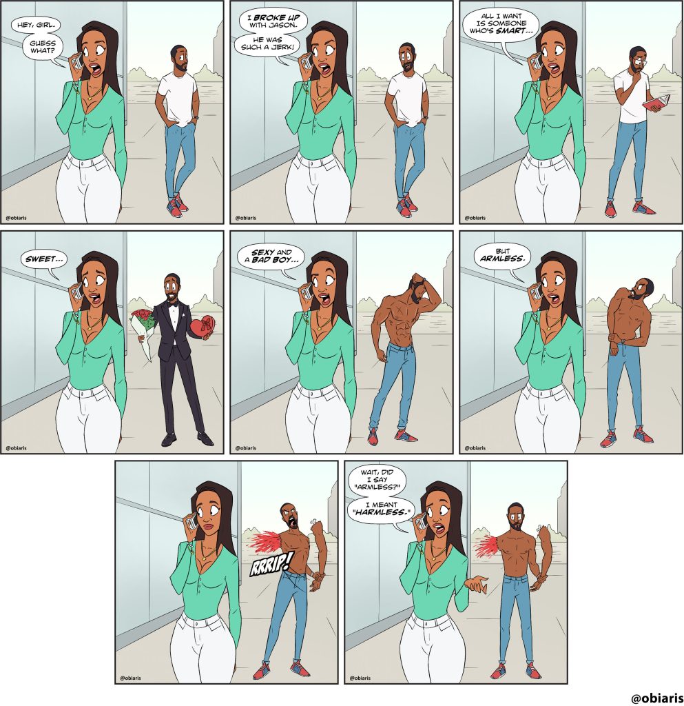
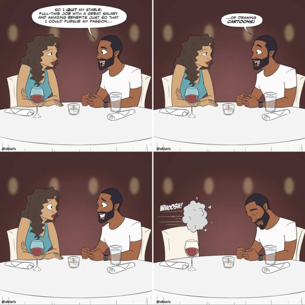
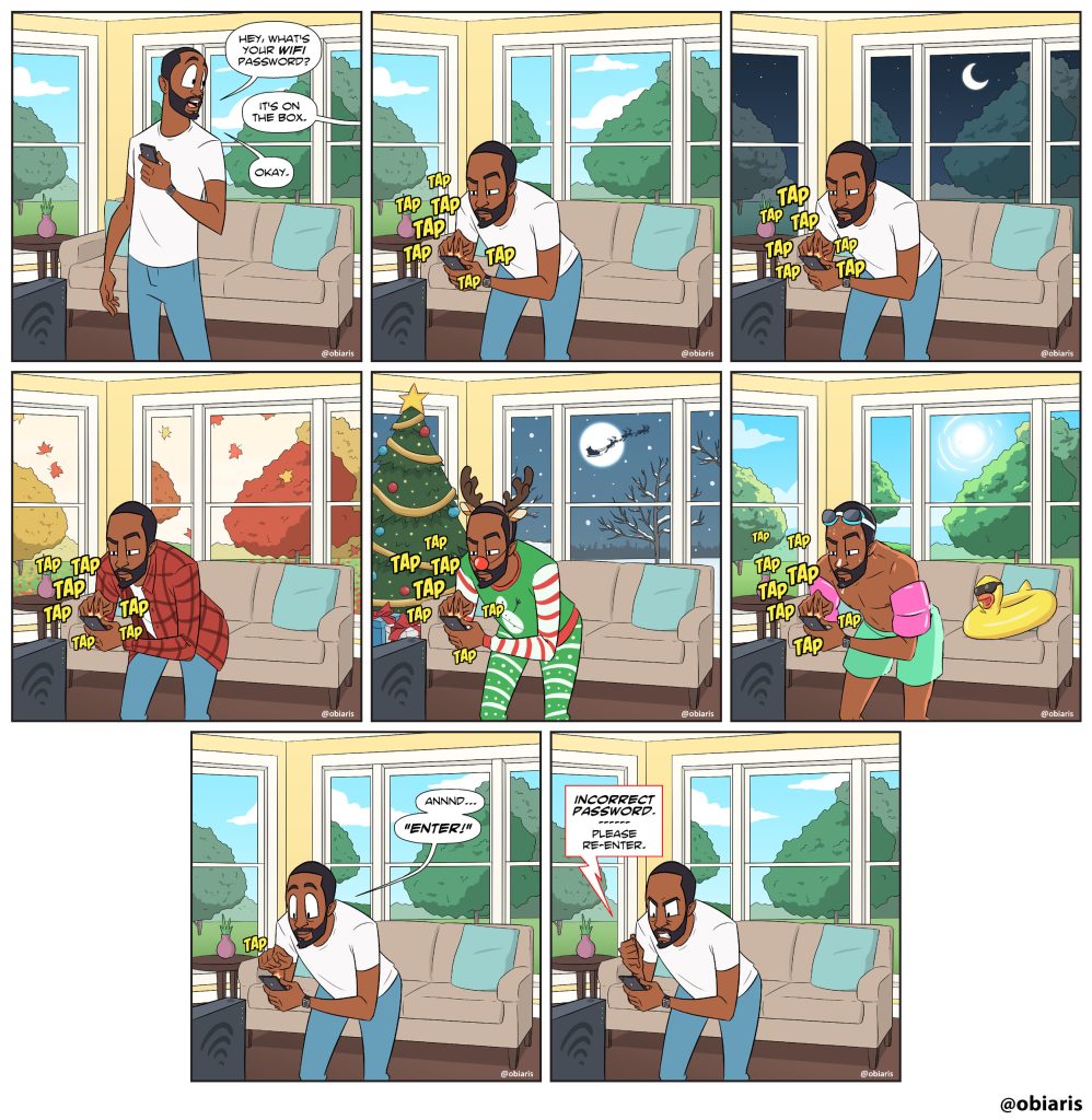
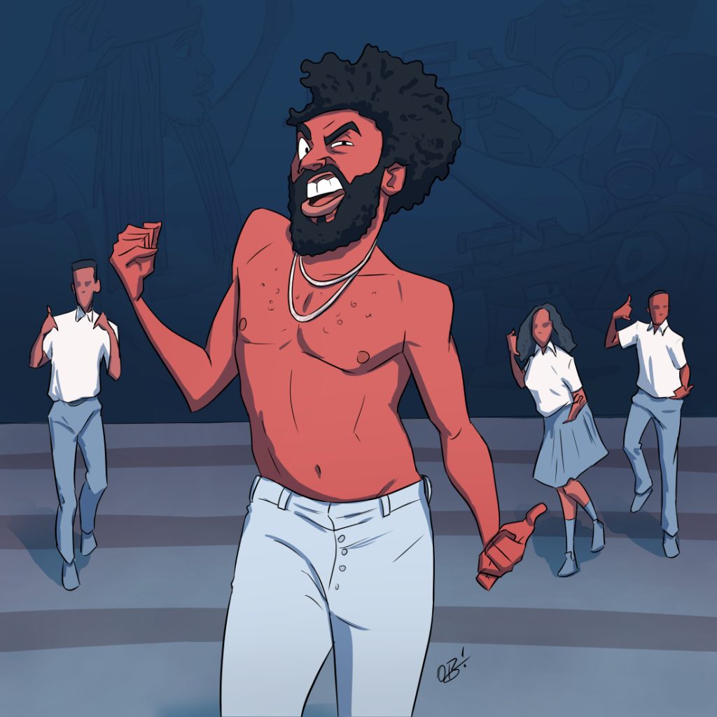
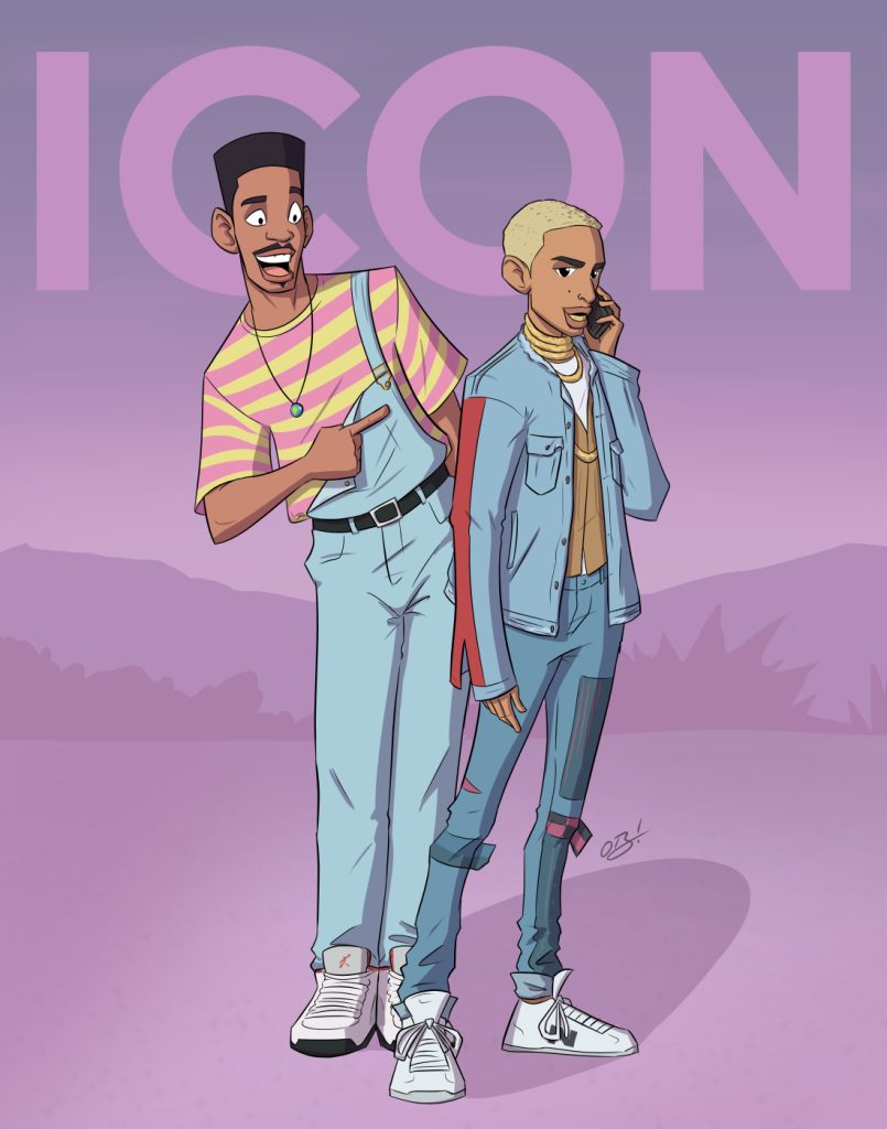
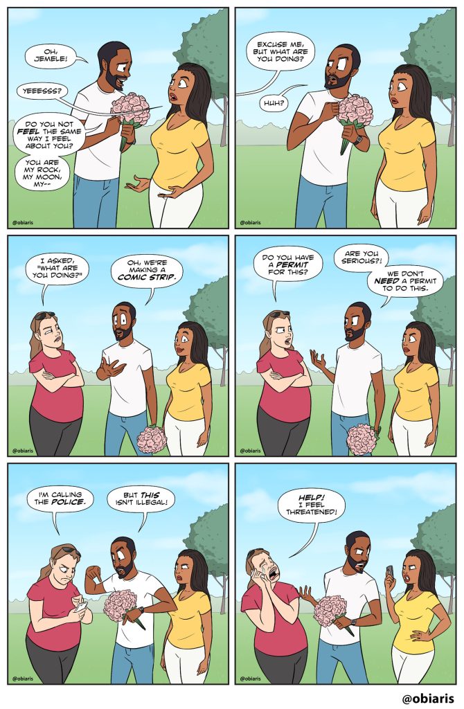 (images from obiaris.com)
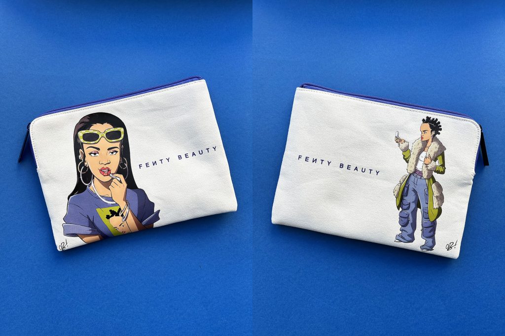
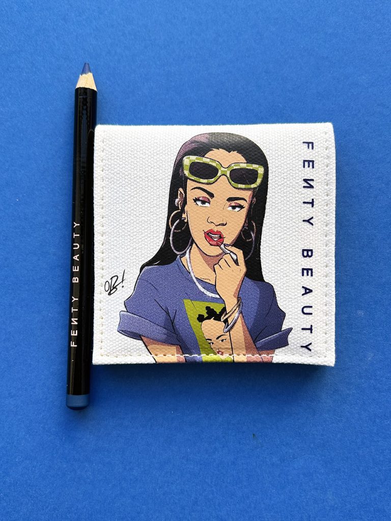
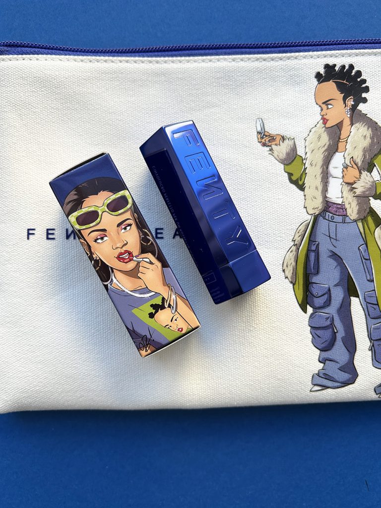
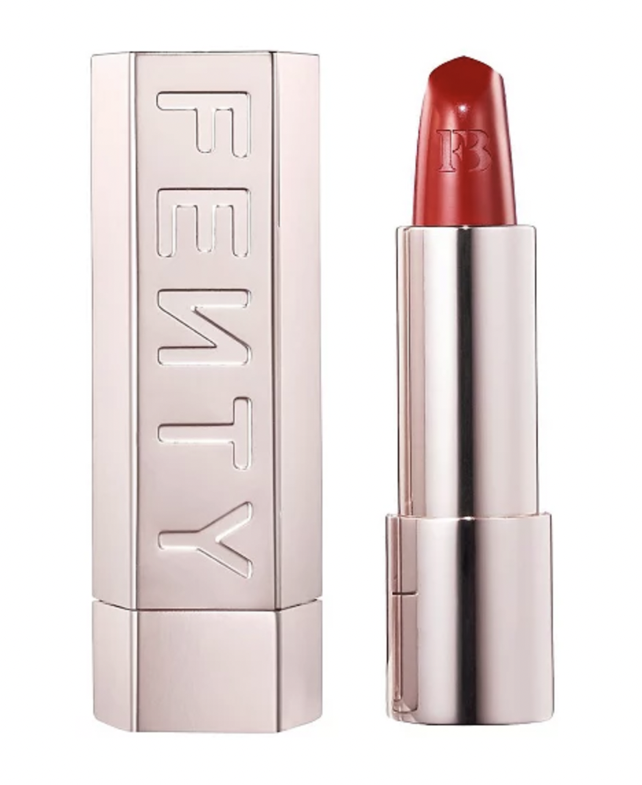
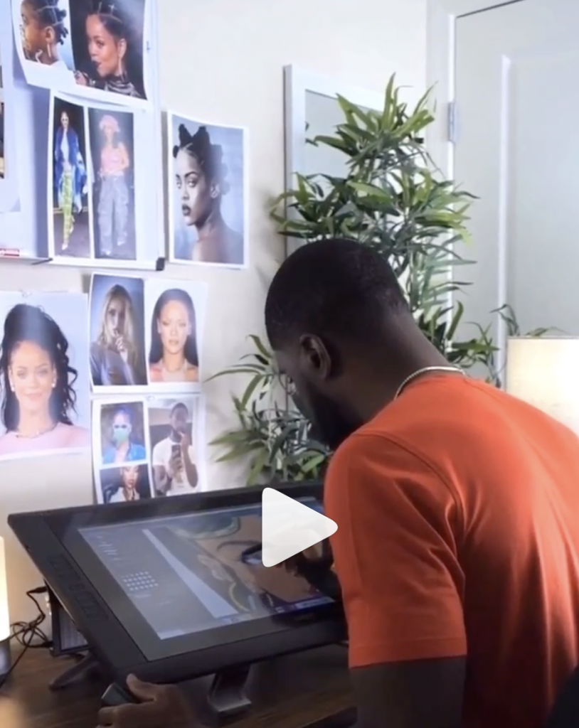
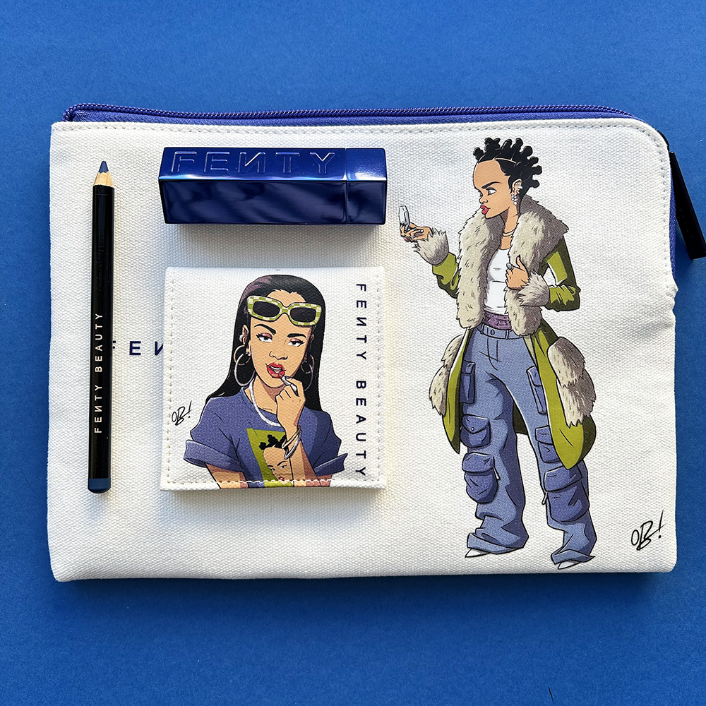
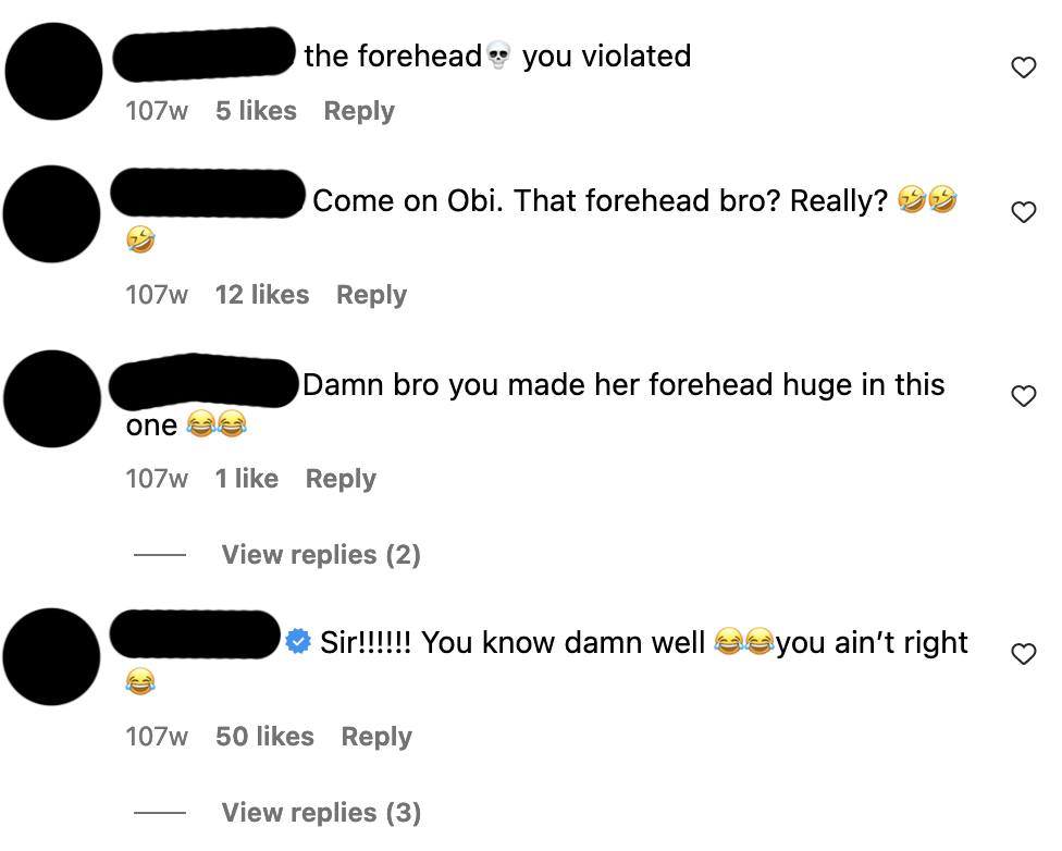


, ca. 1774")


, ca. 1480-1485")


")


