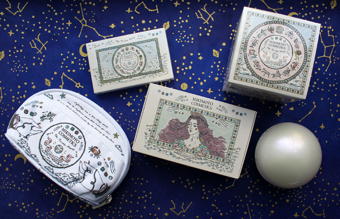
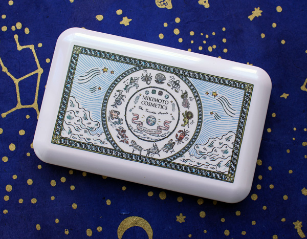
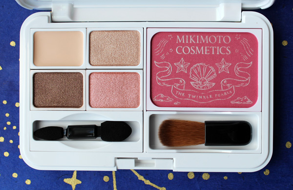
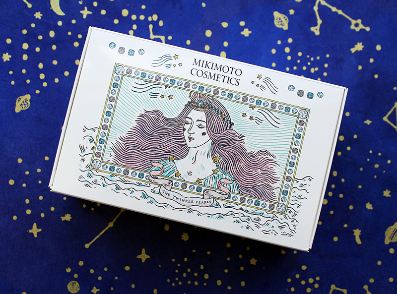
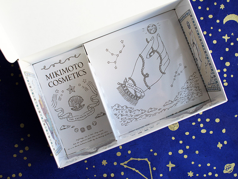
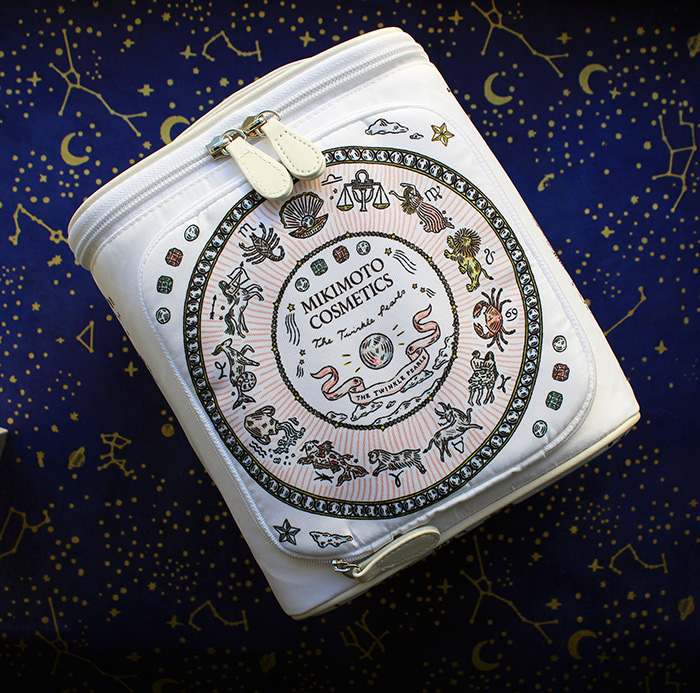
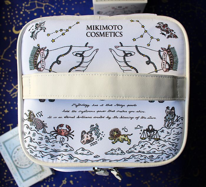
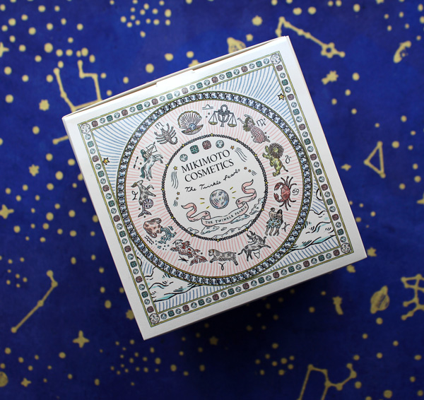
Took a while, but I'm pleased to finally talk about Mikimoto's gorgeous collection from holiday 2020. As with the holiday 2018 and 2019 collections, the company enlisted an artist to create the packaging. For the Twinkle Pearls lineup, Mikimoto collaborated with London-based illustrator (and southpaw!) Fee Greening.
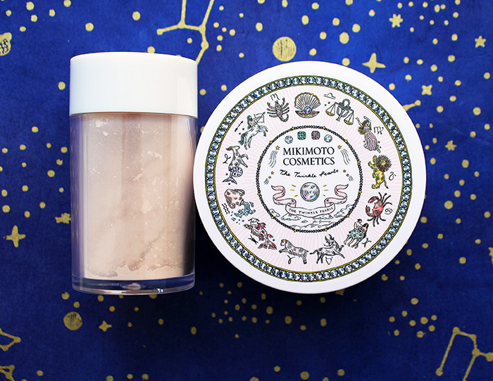
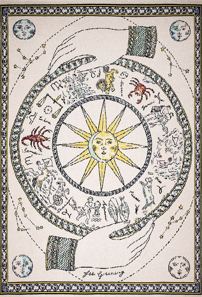
Greening illustrated a charming zodiac theme using her signature dip pen, ink and watercolor process.


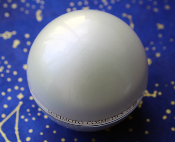
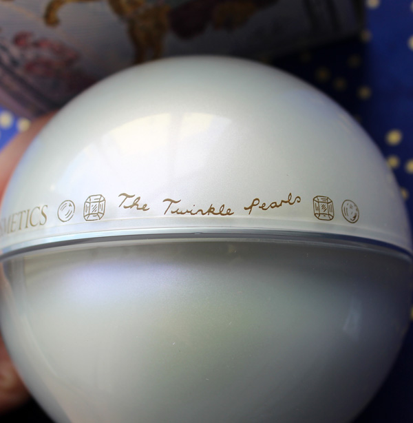
As with the 2018 collection, the moisturizer is housed in a luminous, iridescent sphere that imitates the brilliance of genuine pearls.


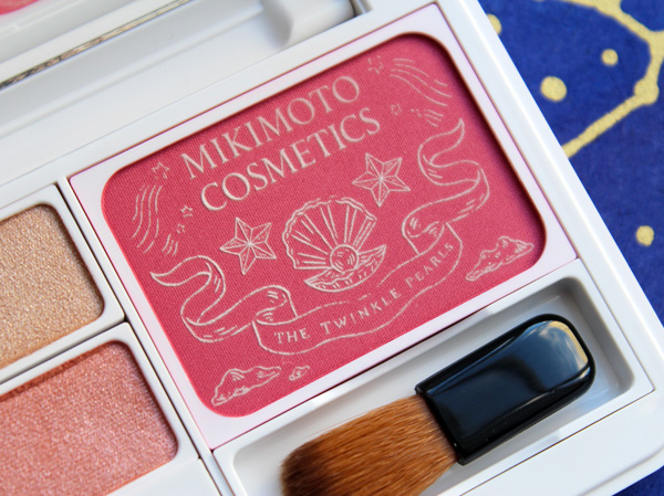
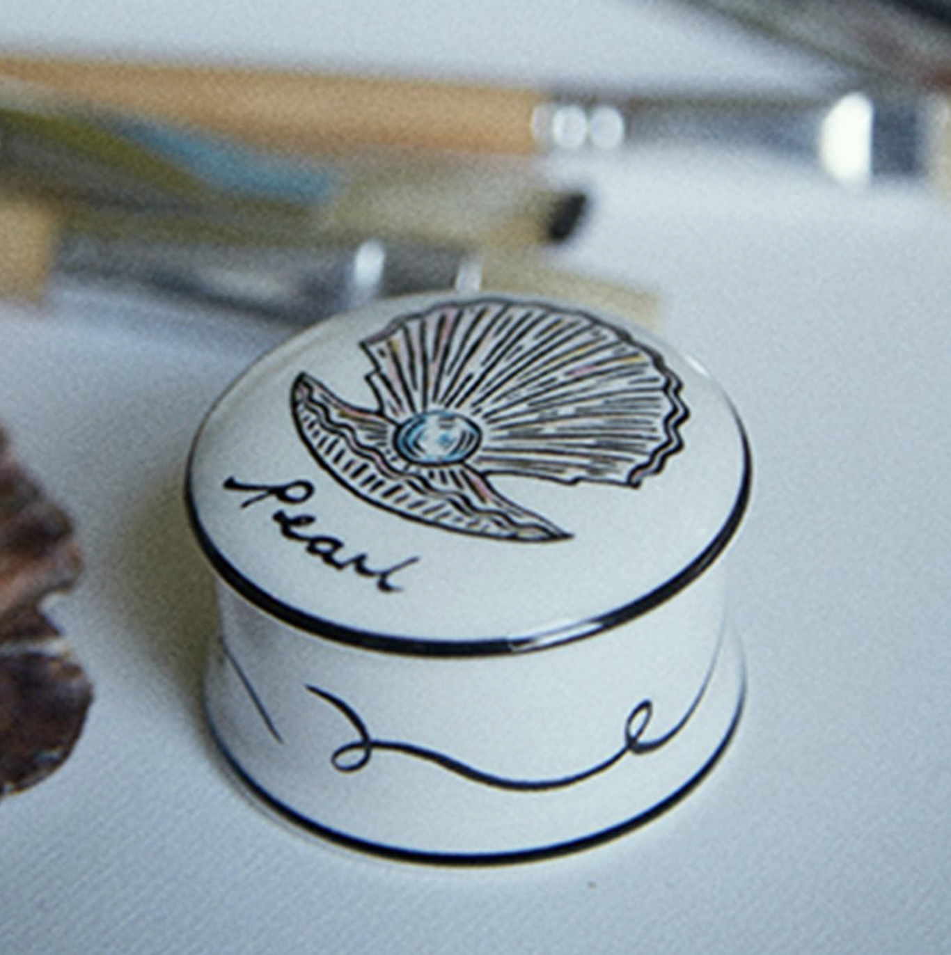
Strands of pearls border the zodiac design on the palette, while the blush is delicately embossed with stars and an oyster shell opened to reveal a shiny pearl.


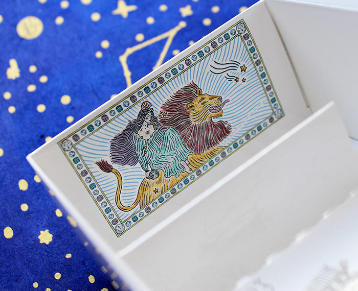
Gemstones surround a rather regal goddess wearing an elaborate crown made of pearl strands affixed to an oyster shell in the center. The star motif and wave-like clouds in the background fuse the celestial and oceanic atmospheres.

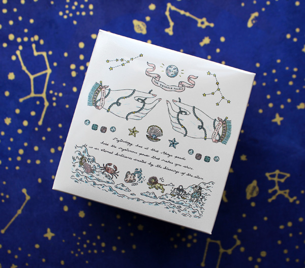
The interior of the box depicts a disembodied hand festooned with pearl strands, while the goddess perches on a lion escorting her through the heavens.


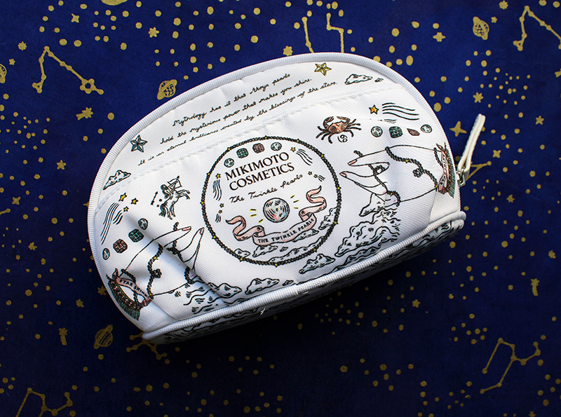
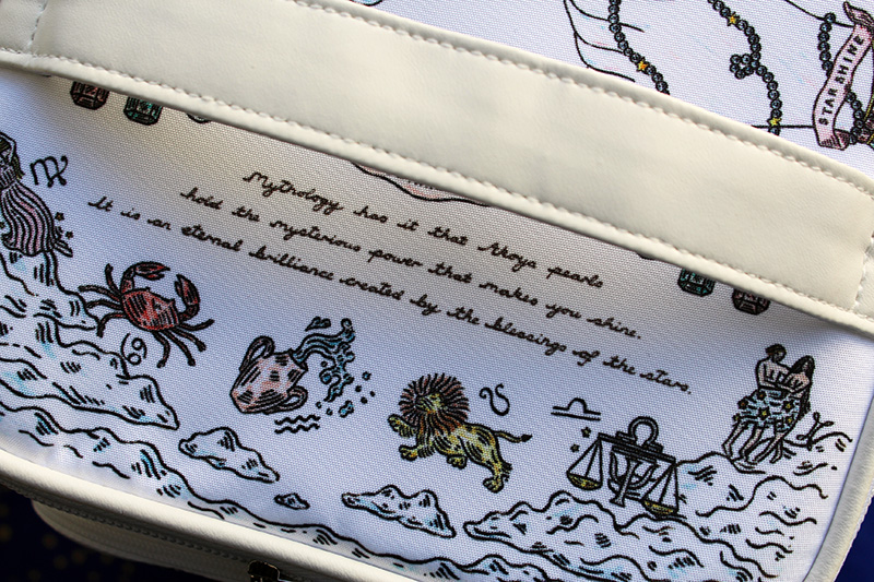
Both the makeup pouch and travel case display more of the lovely illustrations as well as a quote. I'm assuming the latter is from Mikimoto.


Fee Greening (b. 1990) always wanted to draw. Seeing famous paintings in galleries on travels with her parents, she would try to replicate them at home, with much frustration. But she found the right medium when she received a dip pen and ink as a gift. "I used to go to galleries in London with my family and try to recreate oil paintings unsuccessfully with my crayons at home and get very frustrated," she says. "When I was around ten, someone in my family gave me a Murano glass dip pen from Venice. It took a long time to get used to it. For the first few years it was hard to get the ink to run off smoothly and it would often drip. Now I have developed a muscle memory of what angle to hold my pen and it no longer happens."
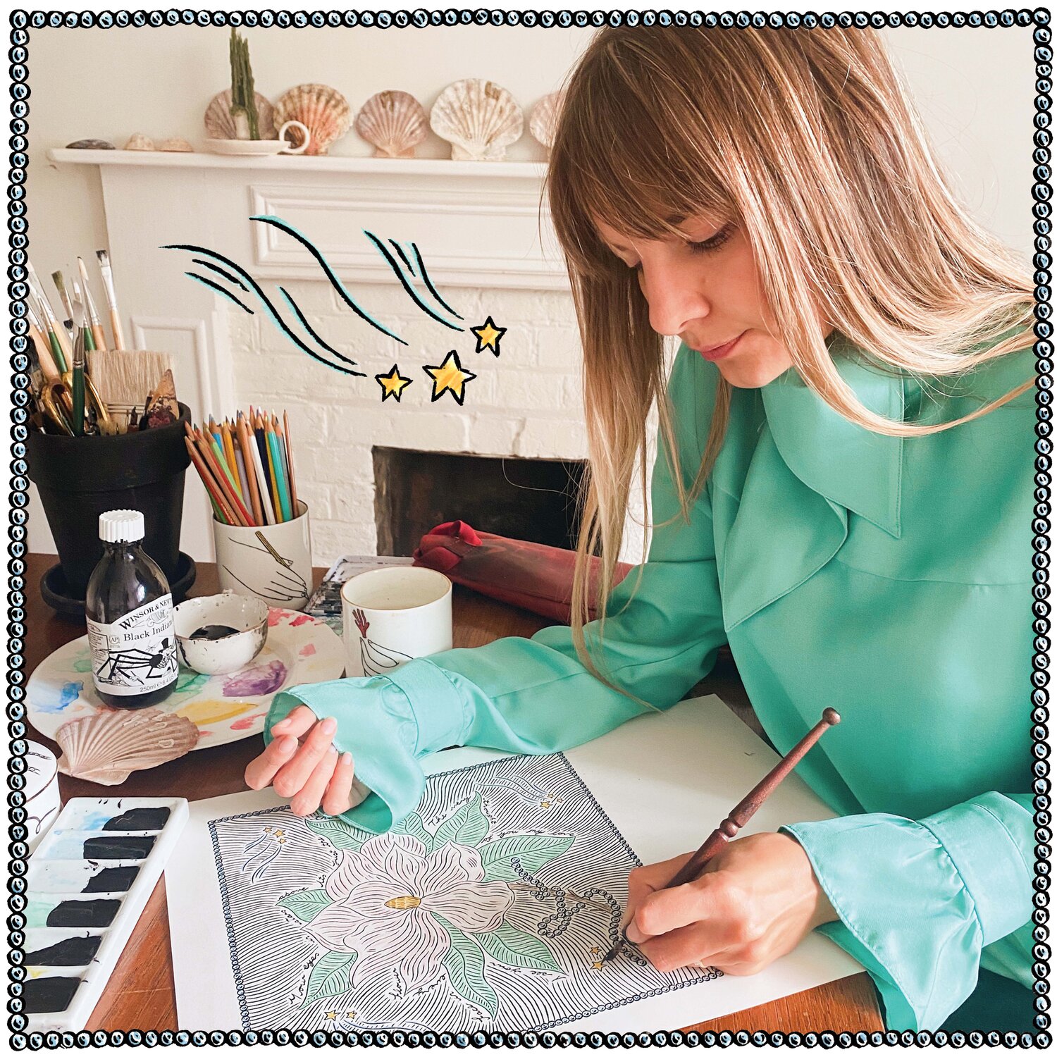
(image from feegreening.co.uk)
As evidenced by the above photo of Greening, intricate dip pen illustrations require a lot of time and attention to detail. The finished product is well worth it, however, for both artist and client. "It is a very slow process, the pen can only draw 1/2cm before you need to re-dip it. I also have to wait for it to dry for couple of minutes so I don’t smudge or drag my long hair across the wet ink. Although there are many wonderful aspects of living in a digital age, it has given us very short attention spans. I think we crave traditional analogue outlets to balance out our scrolling culture. A detailed drawing is not only precious because of its beauty but also because of the time dedicated to making it," she says.
Thematically, since childhood Greening has been fascinated by the common narratives within medieval, Renaissance and Gothic art. "I always had a flair for the dramatic as a child, and loved storytelling. I think that’s where my interest in Renaissance and Gothic art came from…There are so many great heroines and doomed love affairs depicted in those artistic eras that I was really drawn to. I think, even though I didn’t know it then, I was very interested in fate and divine will. Characters fated to unavoidable doomed love like Tristan and Iseult, characters answering a calling like Joan of Arc or characters whose decisions had so many repercussions like Pandora and Eve. Maybe it was something to do with coming of age." This interest is expressed through the fairy tale quality in Greening's work. Take, for example, the story she created for Gucci's Acqua di Fiori fragrance in 2018, which depicts half-human, half-flower girls "blossoming" into women. Greening explains, "I explored the perfume’s themes of female coming of age, friendship and metamorphosis, I wanted the girls to literally blossom into women. I looked specifically at mandrakes in medieval illuminated manuscripts. Mandrakes were said to be half human half plant and when pulled from the soil let out a high pitch scream. I wanted to create an idyllic floral world for the budding mandrakes to frolic in and transform into women. I’ve known my closest female friends since my late teens. Drawing these reminded me of our early years of friendship, lazing around barefoot in a sunny garden surrounded by flowers." The inclusion of butterflies completes the theme of transformation.
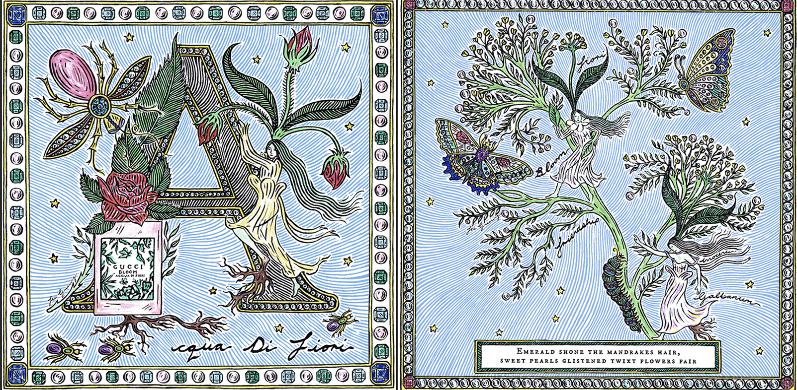
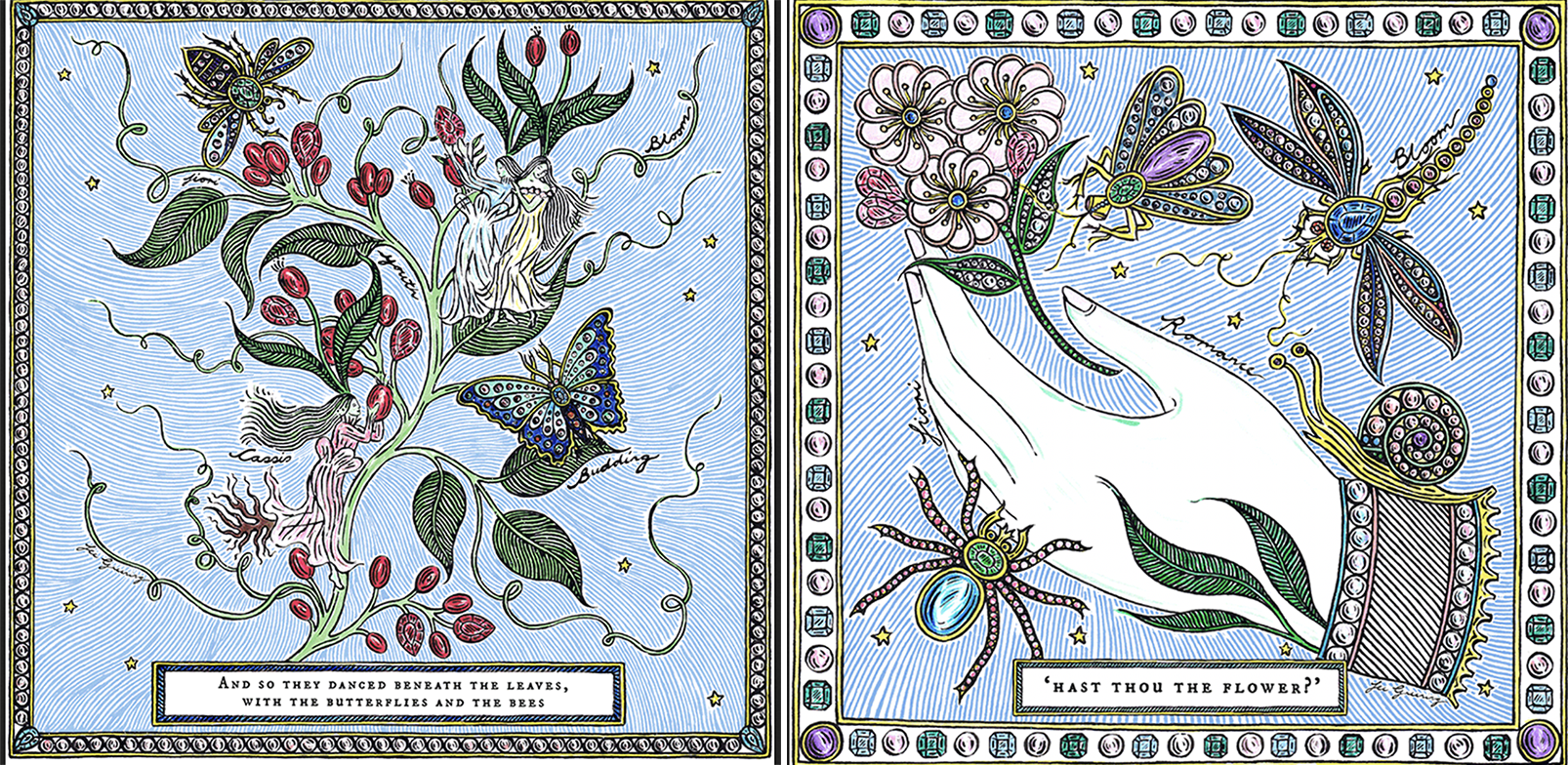 (images from acquadifiori.gucci.com)
What's wonderful about Greening's Instagram feed, in addition to seeing work that's not on her website, is that it occasionally includes the artworks that inspire her. Here are some illustrations of mandrakes from medieval books, along with a detail of the mythical Daphne turning into a tree.
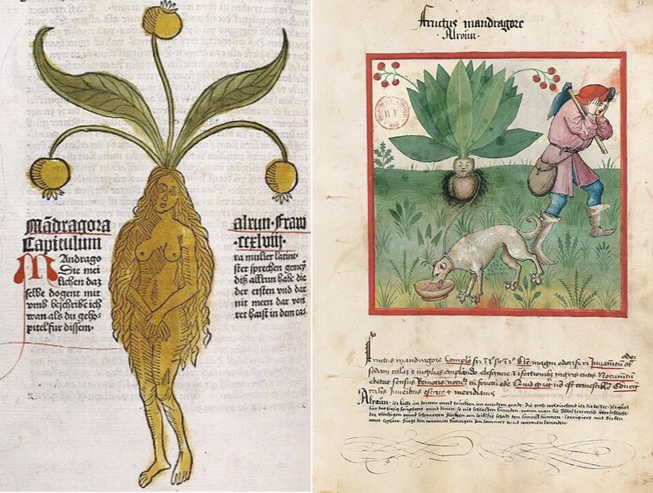
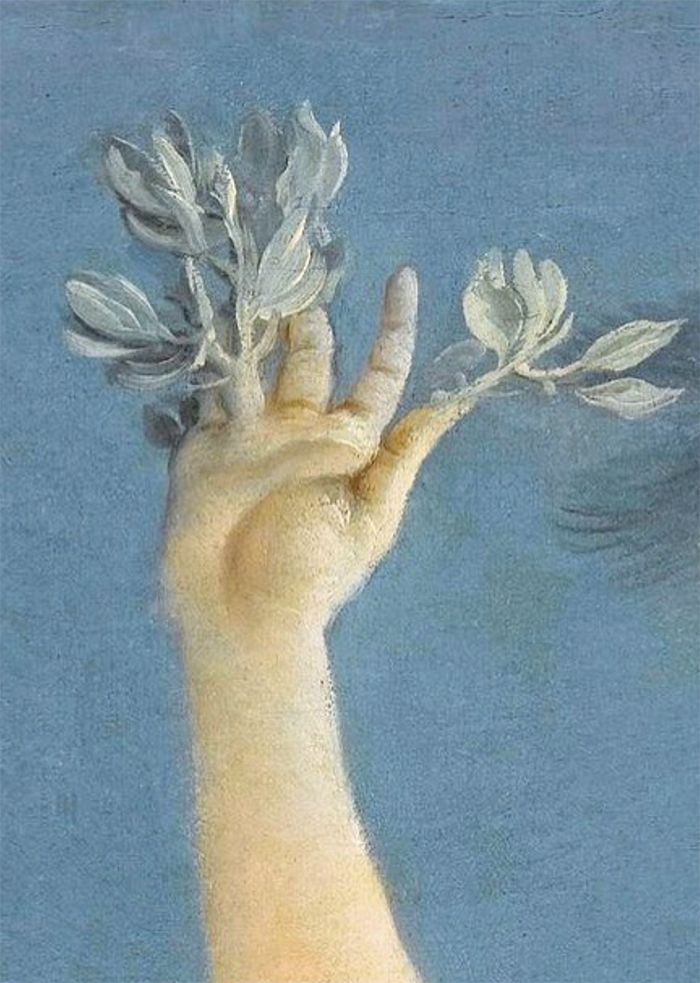
(image from @museelouvre)
Indeed, the concepts of transformation and magic through the lens of medieval and Renaissance art – whether earthly pursuits such as astronomy and botany or mythical like mandrakes and alchemy – figure prominently in Greening's work. While she delights in the fanciful side ("if money was no object I would happily just draw demons and angels," she notes), ultimately her work centers on revealing the magic of natural processes and phenomena. "I enjoy looking for something hallowed and fantastical in every day life." A good example is the triptych Greening created for Martin Brudnizki's Linnaean spa project. The spa's namesake comes from Carl Linnaeus, a Swedish naturalist who developed a "flower clock" in 1748* by planting certain blooms that opened and closed at specific times of day. The center panel of Greening's triptych combines a joyful rendition of an original flower clock illustration with surrounding flora and fauna arranged symmetrically, reminiscent of those found in medieval manuscripts. While the flower clock is based on various scientific principles, Greening uncovers the wonder of this concept and reminds us of the magic hidden in nature. Who would ever think one could use flowers to tell time?! That sounds quite fantastical to me, like something from Alice in Wonderland.
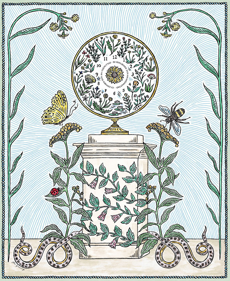
(image from feegreening.co.uk)
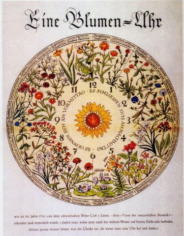
(image from pinterest)
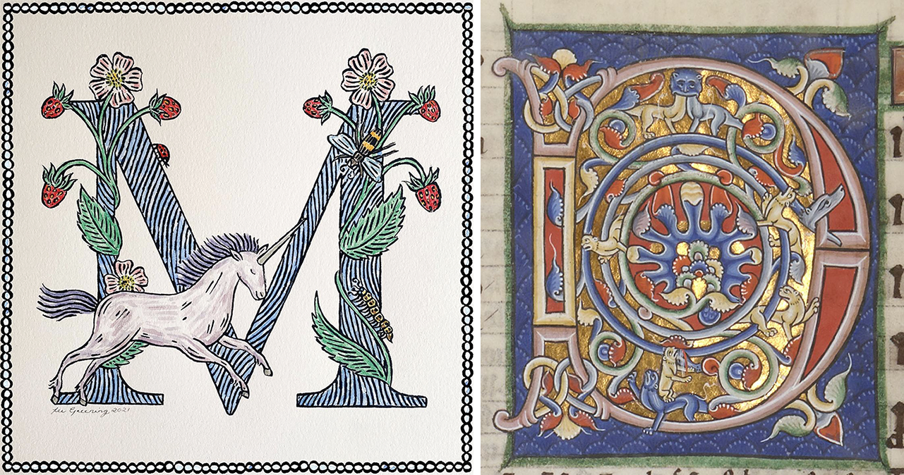
The same periods in Western art history also influenced Greening's style. "I think my fascination with medieval and gothic styles comes from visiting churches and museums in Italy with my family when I was young," she says. After graduating from London's famed Central St. Martin's in 2012, she received a Master's degree in illustration from the Royal Academy of Arts in 2014. It was at the Academy that she further developed her aesthetic, diving into the plentiful examples of medieval manuscripts and alchemical drawings offered there. "There was such an extensive section [on them] in the library. I was already drawing similar themes and using dip pens, so the more research I did on the era the more it reinforced my style. I tend to use the same straight on perspective, heavily detailed borders, hand written text, natural color palette, botanical specimens and symbology. Alchemical drawings are detailed but laid out in very simple, ordered compositions which is something I try to emulate in my own work." These influences are especially apparent in Greening's capitalized letters, which emulate a modern, light-hearted spirit while distinctly retaining their medieval origins.

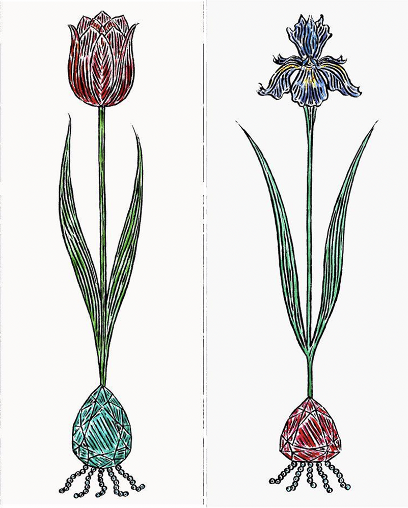
These plants fused with jewels and a print entitled "forget-me-not" embody the strange, somewhat surreal nature of alchemical drawings. Seemingly disparate elements floating in the ether – flowers, gems, insects, hands – are merged with text to form a dreamlike yet orderly space.

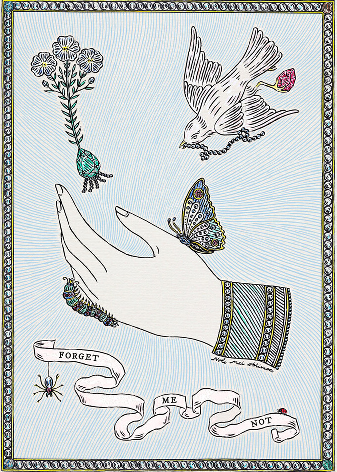
(images from @feegreening)
I chose a few images from alchemical texts that looked similar in terms of composition, text arrangement and motifs.
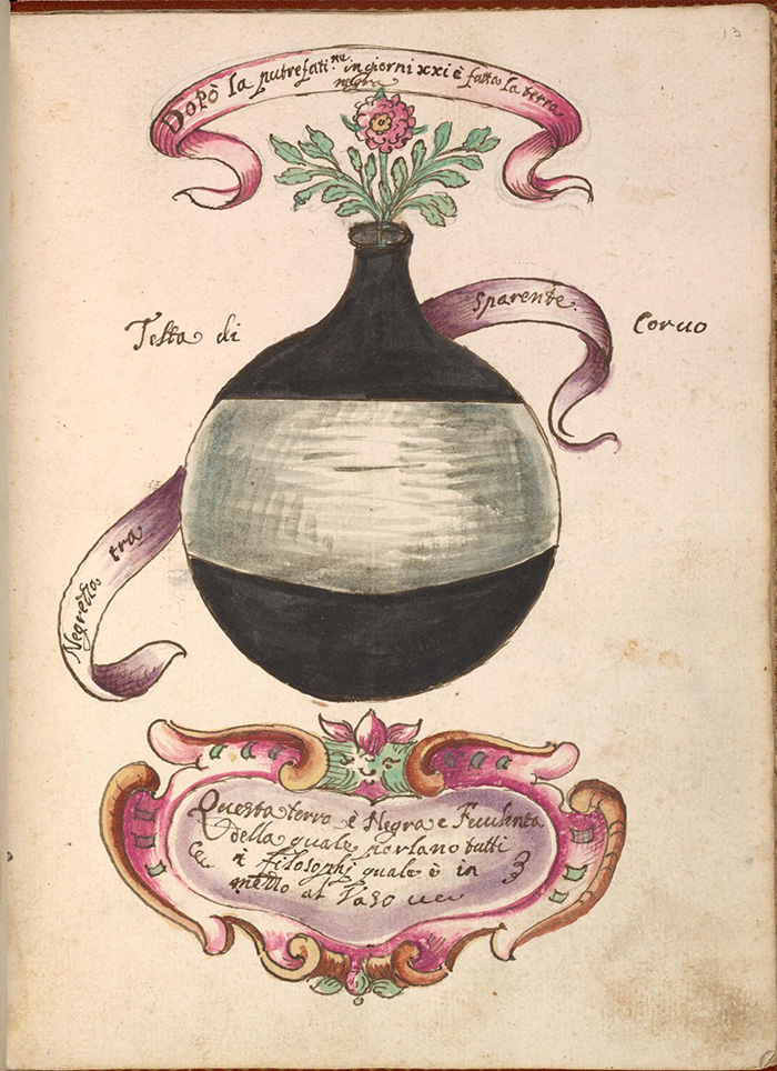 (image from archive.org)
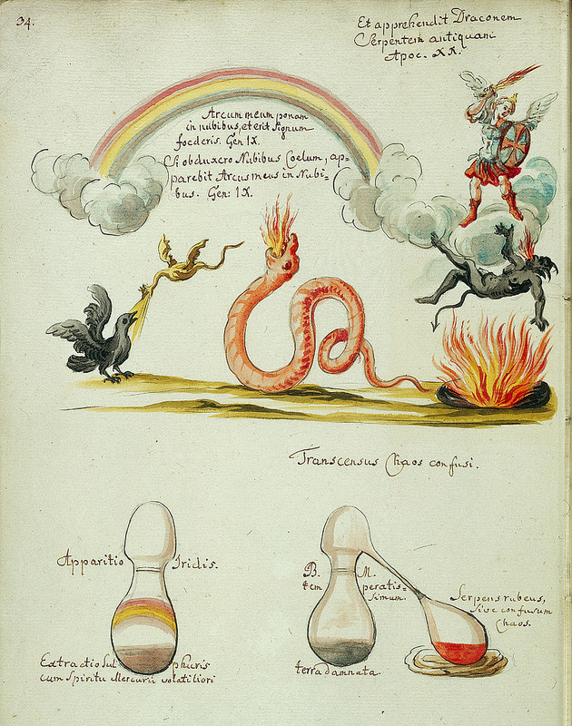
(image from wellcomecollection.org)
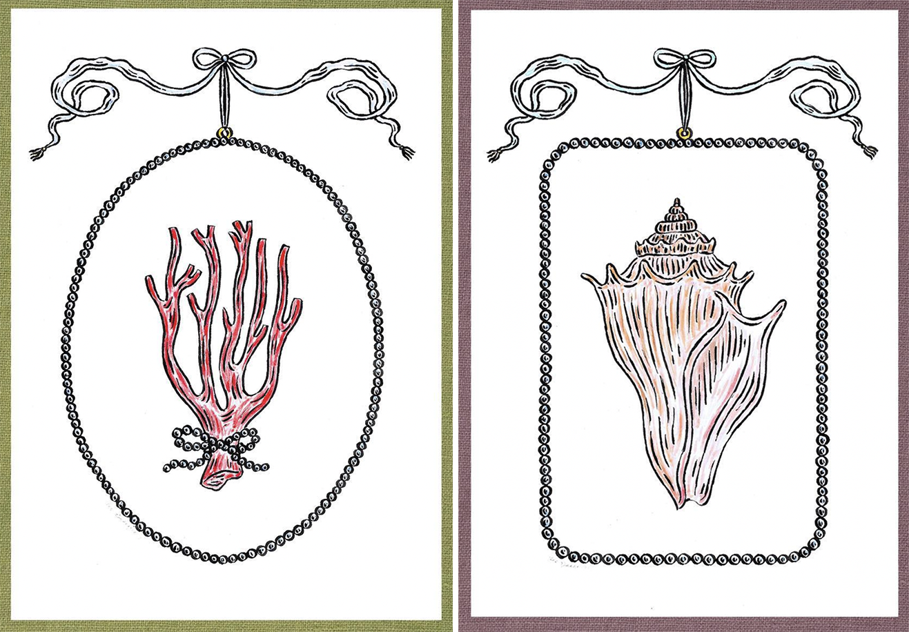
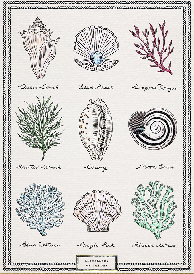
It's unclear how Mikimoto's partnership with Greening came about, but it's not surprising given her previous collaborations including beauty illustrations for Sisley. Perhaps the company observed Greening's love of pearls, shells and coral. Additionally, Mikimoto may have spoken to the artist's interests: pearls can be considered a symbol of metamorphosis or alchemy, as sand is transformed by oysters into a precious and beautiful material.


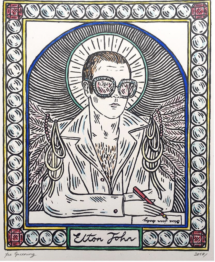
(images from @feegreening)
Once again, it's great to observe the images that rattle around in the artist's brain as she conceives of her drawings. Here are a few pearly details from Greening's IG page.
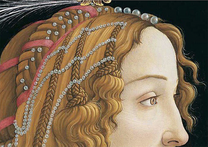
(image from conceptualfinearts.com)
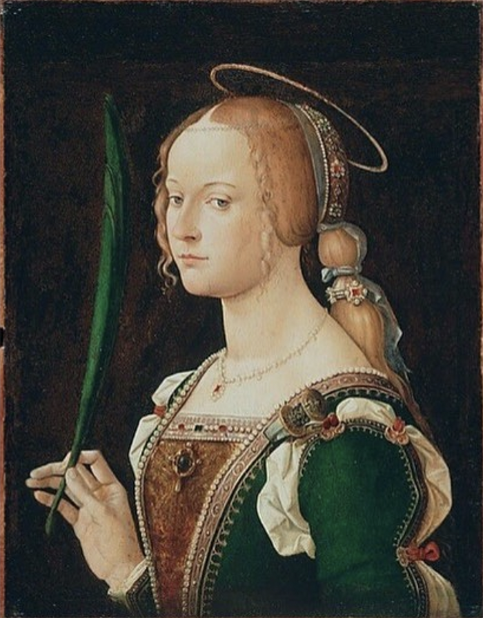
(image from artvee.com)
This one did not appear on her IG but I can see where her fascination with pearl borders comes from!
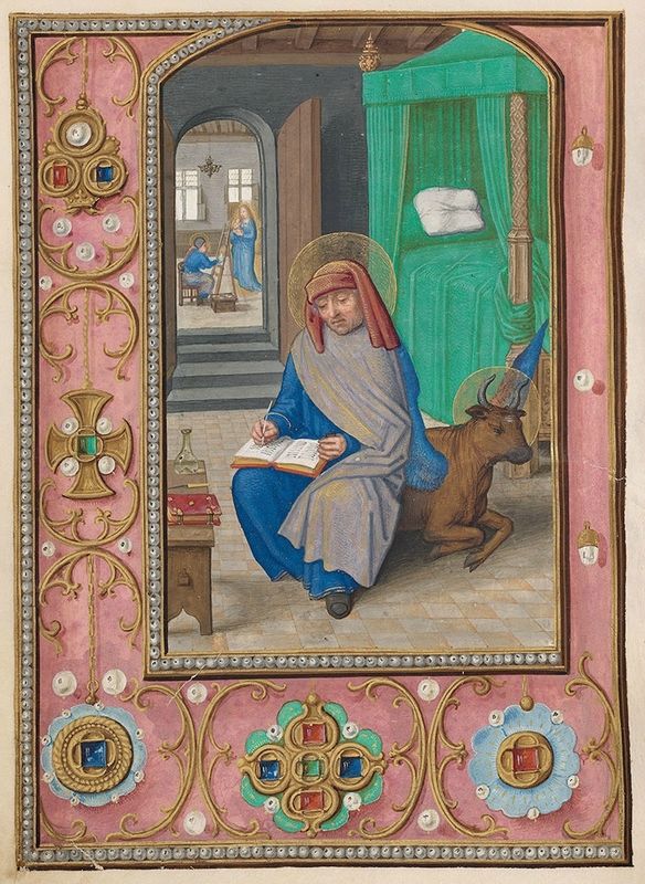
(image from themorgan.org)
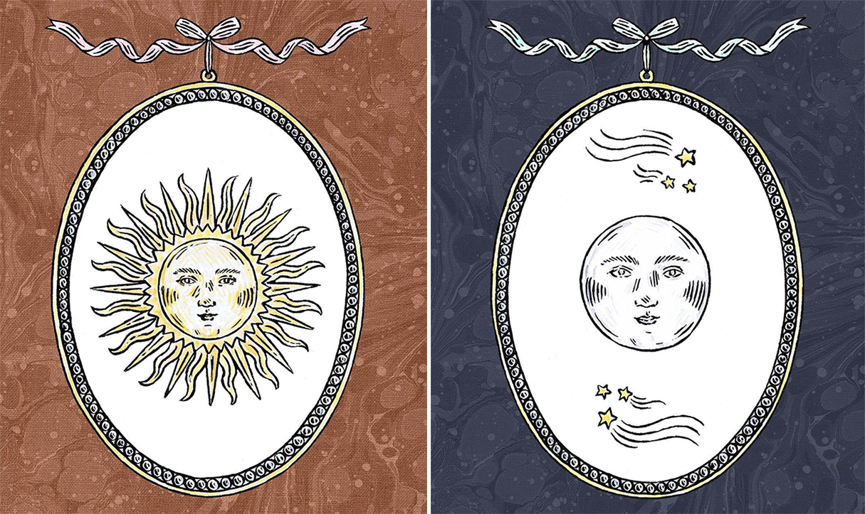
The selection of a zodiac theme is a bit unexpected for Mikimoto. Something that looked out towards the sea rather than skyward may have been more appropriate. However, it's obvious how much Greening enjoys illustrating the zodiac and other celestial motifs. It looks as though she slightly modified her Celestial design for Mikimoto to make it more fitting.

I love how she pays homage to and re-imagines some of the details from various 17th century illustrations in the collection for Mikimoto, such as the scrolls, stars and fine line work.

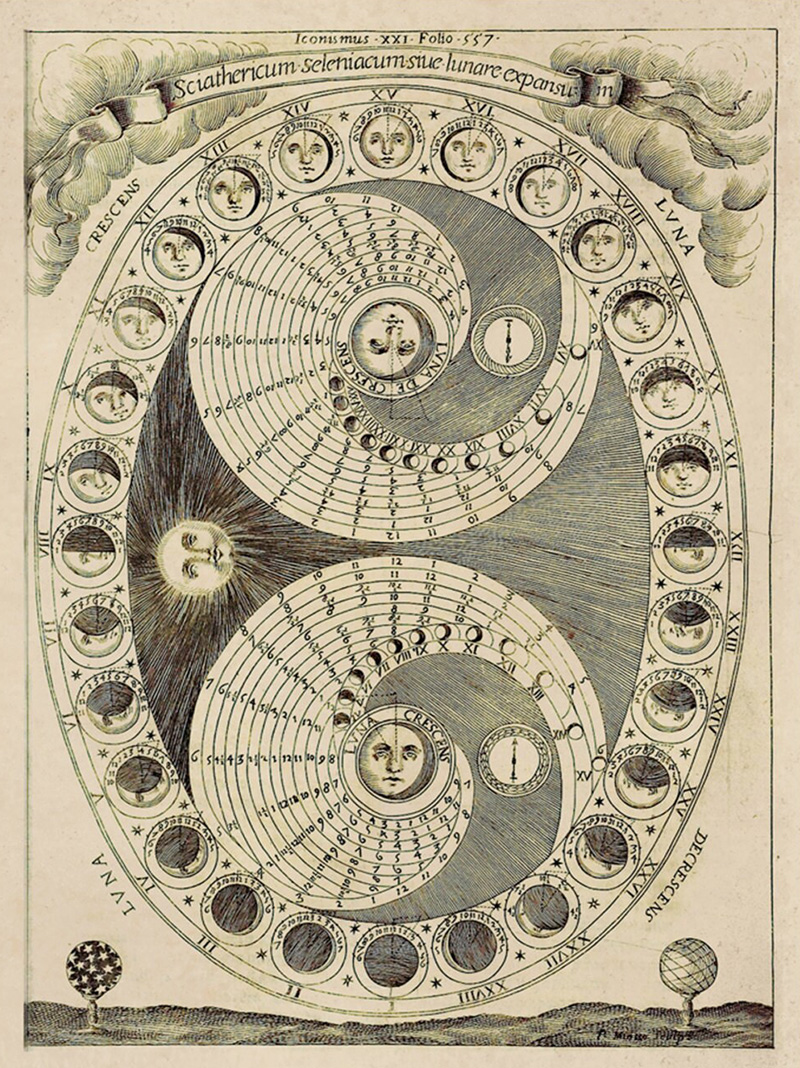
(image from wellcomecollection.org)
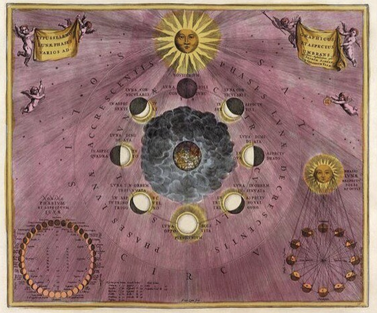
(image from design-is-fine.org)
These next two zodiac designs from the 1600s have not popped up in Greening's Instagram feed, but I would be surprised if she hadn't looked to them for inspiration. I'm also certain she owns a copy of this book.
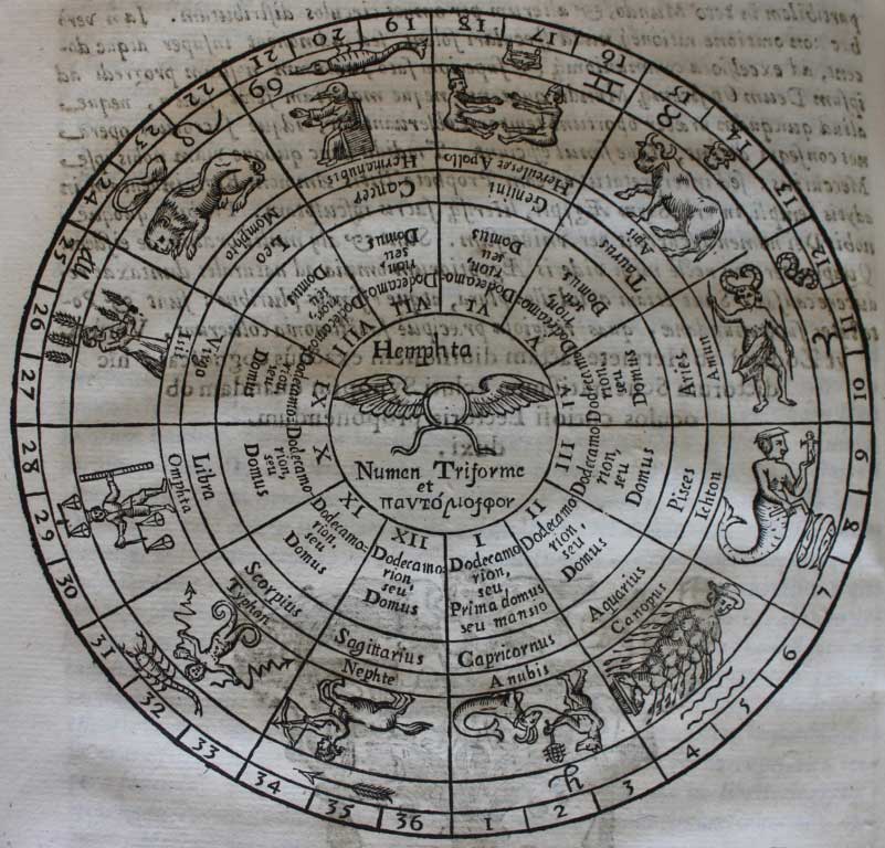
(image from mythicalcreatures.edwardworthlibrary.ie)
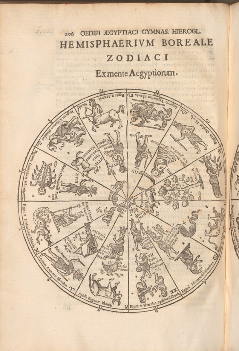 (image from library.cornell.edu)
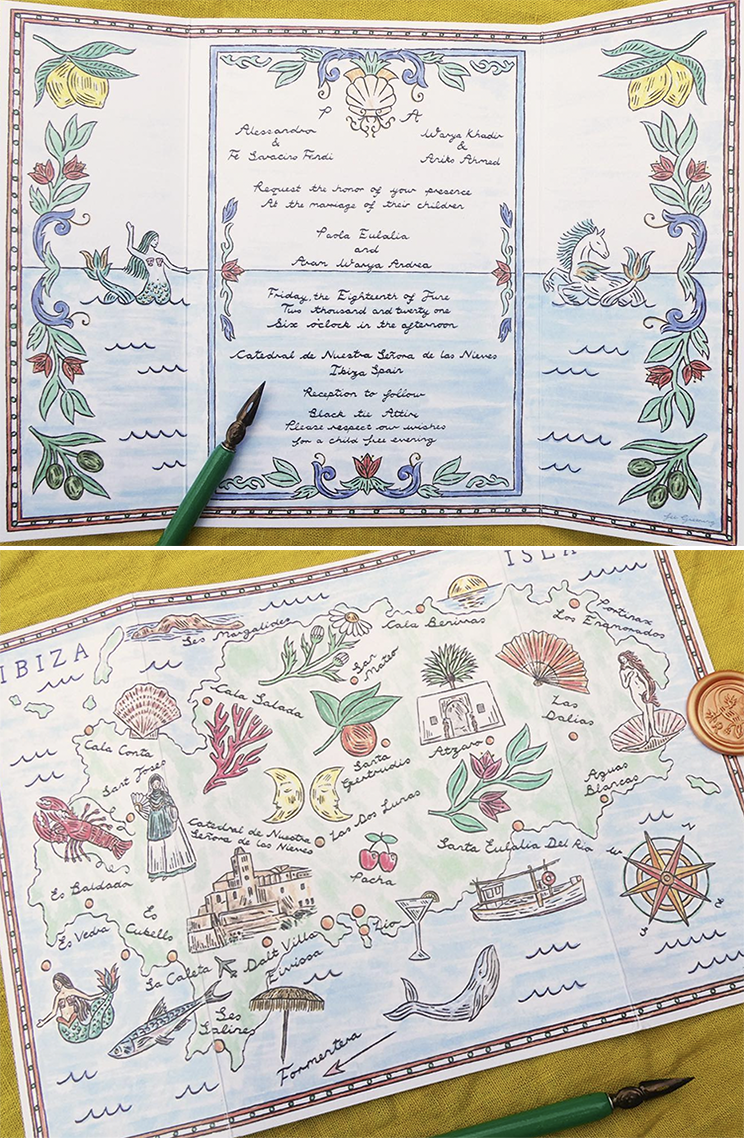
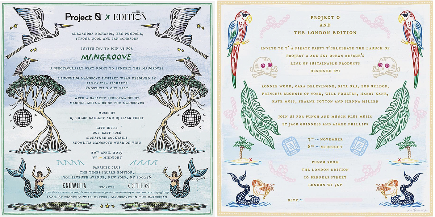
My only complaint about Greening's design is that mermaids were strangely absent. Given that the artist has incorporated them into previous commissions and even chose bathroom tiles with a mermaid pattern for her home, I'm a bit disappointed not to see them on the Mikimoto packaging. Plus, they would have aligned nicely with the mer-folk on Mikimoto's previous holiday collections. These invitations and the mermaids therein are inspired by medieval and Renaissance maps…

…especially the ladies in the invitation on the right below.

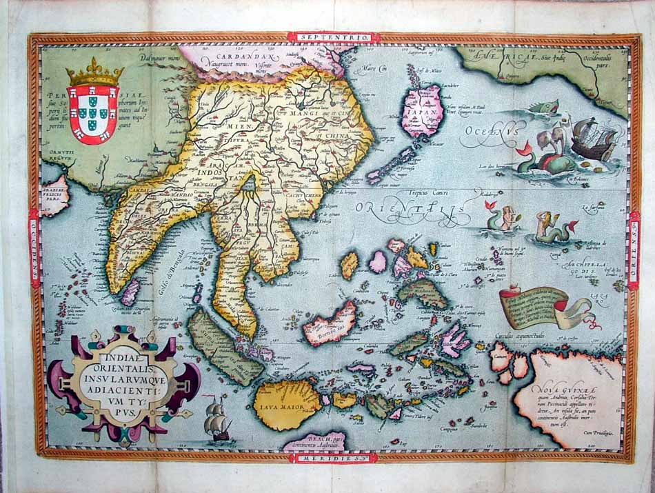 (images from @feegreening and columbia.edu)
Absolutely adore these tiles. The mermaid comes from a volume called Solidonius Philosophus, published around 1710 (there appear to be a couple different versions.) The mermaid is depicted with the 4 elements.
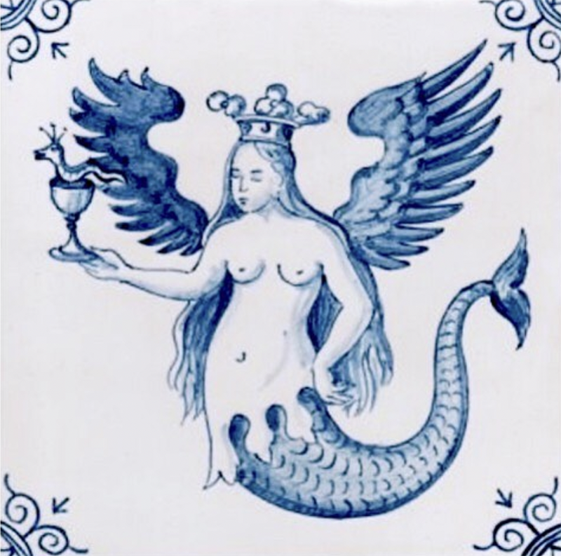
(image from @feegreening)
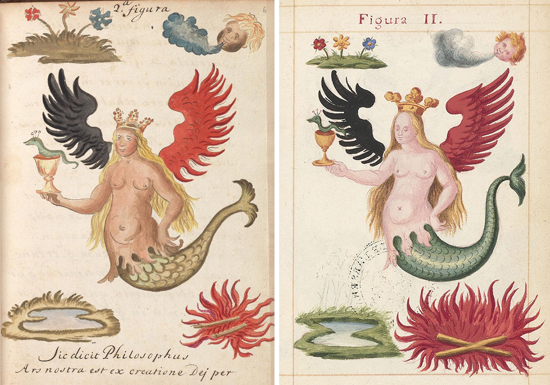 (images from collections.library.yale.edu and oraedes.fr)
Overall, while it wasn't a perfect match in my eyes, Greening did an excellent job for Mikimoto. I wish the company had come up with any sort of narrative as they did with the previous two holiday collections. While they weren't the most coherent – I think something was getting lost in translation – Mikimoto at least tried to tell a story invoking the magic of the holiday season and tying it back to pearls. Greening is a skilled storyteller so her talents were somewhat wasted in that regard. Nevertheless, it's a visually beautiful collection, and my inner art history geek greatly admires Greening's style and influences.
What do you think of this collection and Greening's work? If she ever makes a mermaid print I'm buying every single item!
*Linnaeus recorded the year he developed the clock as 1748 in his notes, which he published as the Philosophia Botanica in 1751.
Today the Museum celebrates Indigenous People’s Day with several beautiful collections from newcomer Prados Beauty. While I would like to examine the traditional cosmetic practices of Native Americans and other Indigenous people around the world1, I’m still debating whether that would do more harm than good, so I thought highlighting a new brand was the way to go.
Prados Beauty was established in 2018 by makeup artist and entrepreneur Cece Meadows, whose background inspired her to create the line. The oldest of four children, Meadows was raised in a small farm town in Arizona. “We didn’t have a lot, but we had each other. School was my safe haven, so I thrived there and ended up being the first in my family to graduate from college,” she says. Meadows excelled at a career in finance in her early ’20s, but suffered a cancer diagnosis at 27. The U.S. healthcare system being what is, insurance only covered a small portion of necessary care, and Meadows found herself broke and homeless shortly after going into remission. But her passion for makeup and drive to create a space for Indigenous people within the beauty sphere led to a cross-country move to cosmetology school in New York City. In 2018 Meadows became the first Native American makeup artist to head a show backstage for New York Fashion Week. She established Prados Beauty the same year and began selling the products online in 2019. “I grew up in a negative environment, but there was always a spark in me that wanted something better. As an adult, that has helped me get myself out of places when I’ve been stuck. I’ve always dreamed of owning my own cosmetics line. My passions are doing makeup and doing philanthropic work, so I figured out a way to make those two things go together.”
Meadows, who identifies as half Chicana, half Native American (Yaqui and Comanche), explains that the lack of representation in the beauty industry was a key factor in starting her own brand. “Growing up as a Xicana and Indigenous girl, I never saw representation of my people in an accurate light,” she says. “When I became a professional makeup artist and would show up in some of my traditional regalia to NYFW or professional photoshoot, I was shocked at the lack of education and awareness from models and designers of Indigenous people…It wasn’t until I was 30 years old that I saw an Indigenous woman in the public spotlight without being oversexualized. It was in 2015 when a First Nations Cree woman, Ashley Callingbull, was crowned Miss Universe in 2015. It was an emotional, yet exciting moment for me. I remember watching the crowning while holding my young son and thinking, ‘we not only have been robbed of our lands, our culture, our beauty, our stories and our people but now we have to compete for a crown that we have always worn.'”
For Meadows, starting her own beauty brand was a way to reclaim Native culture and make it visible within the industry. “I have watched companies and clothing brands appropriate our culture and designs for years and I wanted to take that back. I wanted to create a brand that was 100% inclusive, but highlighted the beauty and story of who we are today. Our brand is about being really proud of who we are and telling our story through makeup. In public schools, you, unfortunately, aren’t really taught the truth about the events that truly unfolded in the United States against Native Peoples. So when my people don’t see ourselves in the mainstream, we make our own way. We support our own, we hype up our own, we become this secret society of creativity and artistic talent that the world fails to see. But we see, we know, and the acknowledgment of our own becomes enough. Because I mean what else are we going to do? Disappear? Never. Our generation has become a fierce generation, filled with hunger and audacity to believe and know that we are worthy of conquering spaces we have been told for hundreds of years we didn’t belong in. This is why I created Prados.”

Accessibility and education of non-Native people were also priorities for Meadows. Individual products are priced around $40 and under. “It is always important for me to have affordable price points. One thing I remember growing up as a kid was not being able to afford things that I felt I needed to have as a budding makeup artist,” she says. Additionally, being an inclusive brand with an outward focus on Native American pride encourages customers to learn about Native people’s heritage, or at least be more mindful of it. Says Meadows, “Every time we gain a new follower, I get excited because it’s one more person who learns about our beautiful culture and our stories. [Prados] has inspired consumers to learn about Indigenous culture. They know that we’re not just a false Pocahontas story, and we can remind people that we’re more than a genocide in a history book. We’re still here.”

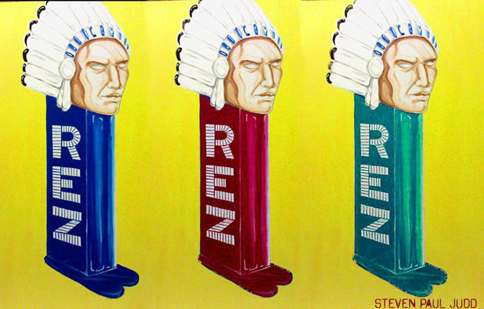
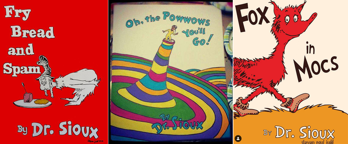
Meadows’ goals are identical to those of Steven Paul Judd, the Kiowa-Choctaw artist responsible for the designs on several Prados Beauty collections. Like Meadows, Judd noticed a dearth of authentic Native American figures across all areas of pop culture and understood the necessity in carving out a space for Native representation through art. “[I] make things that I want to see. So I like cool pop stuff, right? And I like movies and music, and I’m also Native American. I grew up on a reservation when I was a kid, went to an all-Native college. I like my Native stuff, obviously, but I still like things that other people like. I live in the same world that other people live in, and I just found that there wasn’t what I felt was cool, pop culture stuff made for me—stickers, toys, action figures—I didn’t feel like they were necessarily speaking to things that I saw or that my family saw, so I decided to do my best to try to make my own…Imagine growing up and in every movie, television show and ad featuring people who looked like you and your family, they were only shown in historical context. It would be like white people were only portrayed as Pilgrims. [The] only Native Americans I was able to see on TV were Iron Eyes Cody—he did those trash commercials, and he wasn’t even Native, he was Italian—and Ponch on Chips, but he wasn’t Native American, and we had Tonto, Jay Silverheels, on old reruns, but besides historical Westerns, I didn’t see any Natives anywhere in popular culture at all.”

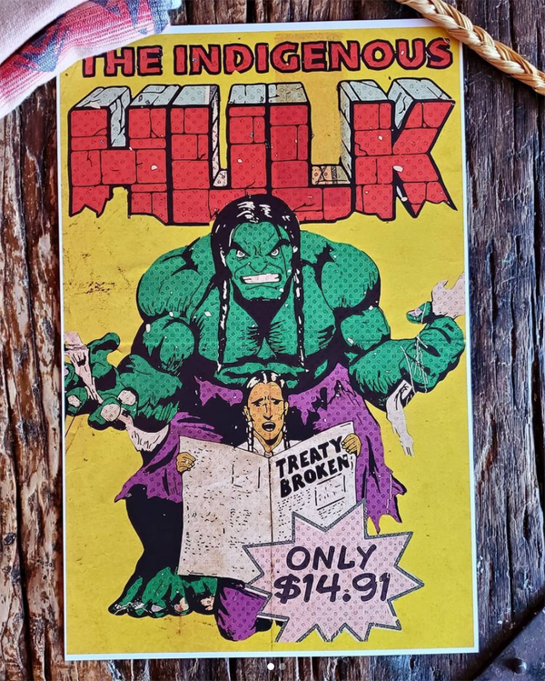
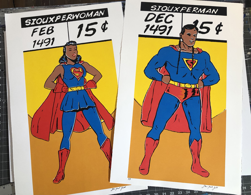
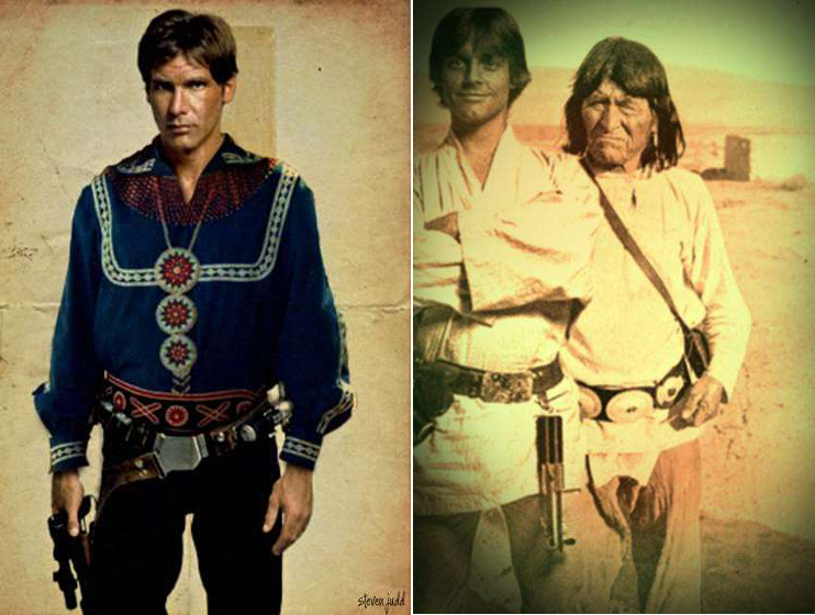
Judd is a prolific filmmaker and writer, but he is perhaps best known for his witty mashups of pop culture icons with Native American imagery. Everything from comics and toys to TV and movies are re-envisioned with Native historical figures and traditions. Ultimately, says Judd, “I wanted to make the stuff I never got to see as a kid.”


By giving cultural mainstays like Superman and The Incredible Hulk a Native American spin, Judd deftly upends the dominant narrative. The juxtaposition of Native Americans with easily recognizable cultural references, or the entire replacement of these figures with images of Native Americans and symbols results in an amusing yet profound commentary on the erasure of Native populations and offers a way for them to reclaim their space.

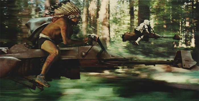
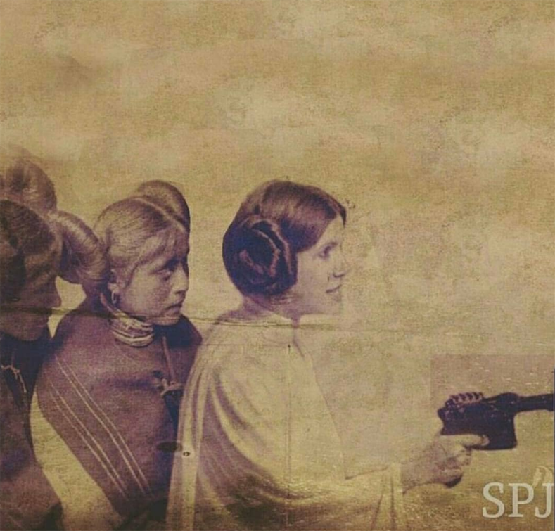
While most of Judd’s work appears lighthearted on the surface, there’s an underlying poignancy in some of his projects that makes the viewer think on a deeper level. Take, for example, his Star Wars series, which recast some of the characters as Native American, thereby creating a new narrative that represents the struggle for freedom among tribes. Judd also makes a point of showing the appropriation of Princess Leia’s iconic bun hairstyle, which most likely originated from photos of women from the Hopi tribe.


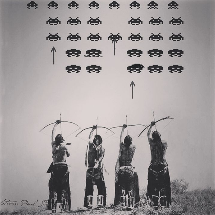
Judd’s take on the popular “Space Invaders” video game that was developed with graphic designer Elizabeth LaPensée, in which the players are Native Americans using bows and arrows to ward off an alien invasion, is also a bit weightier than the likes of the artist’s PowWow Rangers and Mindions. “You can read into it,” he explains, “someone is trying to invade where you are living, you know, peacefully. I tell people it’s the only time you’re allowed to play Indian and not get in trouble.” As this article neatly summarizes, the game “is archetypal of Judd’s work, which provocatively combines the ongoing history of subjugation of Native Americans (especially the violation of land treaties) with the mundanity and ephemera of day-to-day life. Judd’s work challenges stereotypes about Native Americans and dehistoricizes the atrocities of the past.”

What’s especially interesting about his love of pop culture is that Judd grew up in a home that was less than well-off financially, with no access to television until late childhood. His first encounter with TV was during a hospital stay. Judd’s work is also extraordinary considering he is entirely self-taught. For photographic imagery in particular, he quickly realized he would have to get acquainted with the proper techniques and software in order to make his ideas come to fruition. “Any of the graphic design stuff I’ve done, I learned how to do it on Photoshop…learning Photoshop is tedious, but I wanted to learn because I couldn’t get these ideas in my head. I couldn’t make them unless I learned. No one’s going to make a vintage boxing poster with Sitting Bull and Custer unless you make it yourself,” he states. And he’s right: I can think of zero Indigenous artists who are remixing cultural touchstones in this manner.
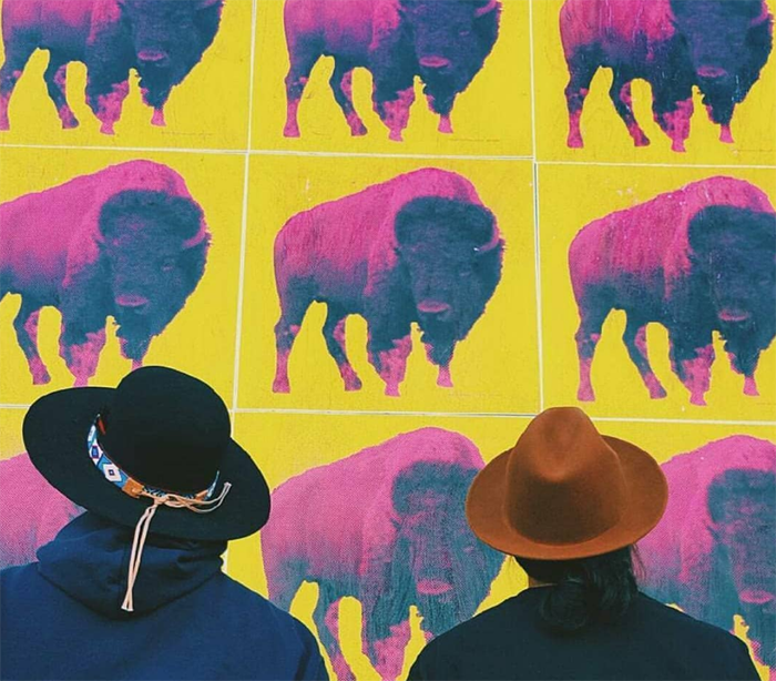
Judd’s unique re-imagining of pop culture references has drawn apt comparisons to Andy Warhol. Like the legendary pop artist, Judd cleverly skewers mainstream American culture, except instead of mindless consumerism Judd’s critique mostly focuses on the overwhelming lack of Native American figures and traditions. Judd is flattered by the comparison, calling himself “Andy Warrior-hol”, while simultaneously acknowledging that the American pop art tradition – including the deification of artists like Warhol – is largely devoid of Native voices. Case in point: a cheeky remix of Warhol’s famous cow wallpaper.

Judd’s emphasis on accessibility and education through art also parallel Meadows’ prioritization of these areas. While a recent painting of Judd’s sold for nearly $20,000, various websites offer stickers, t-shirts and other items showcasing his work at affordable prices. And like Prados Beauty, much of Judd’s oeuvre provides an approachable means of educating non-Native viewers. By framing it as “cool stuff” that the average 12 year-old would be interested in, Judd makes his history more palatable to non-Native Americans. “[I] want people to see the images and realize on their own that they had something to learn…Honestly, I’m creating art for my 12-year-old self. I wanted cool stuff, too – skateboards with Native imagery, action figures, sneakers – what 12-year old doesn’t? [But I want to] educate people on some things without talking down to them or yelling at them. They can laugh at it, like ‘Oh wait, did that really happen?’ and they can learn from it, starting from a humorous point,” he says. This is not to suggest that the atrocities committed against Indigenous populations should be made easily digestible for white people, but humor is one of many useful tools in learning difficult subject matter. Plus, as Meadows noted earlier, it demonstrates that the histories of marginalized groups are so much more than genocide and stereotypes.

(images from @stevenpauljudd)
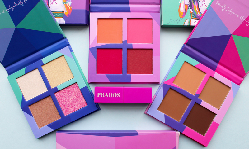
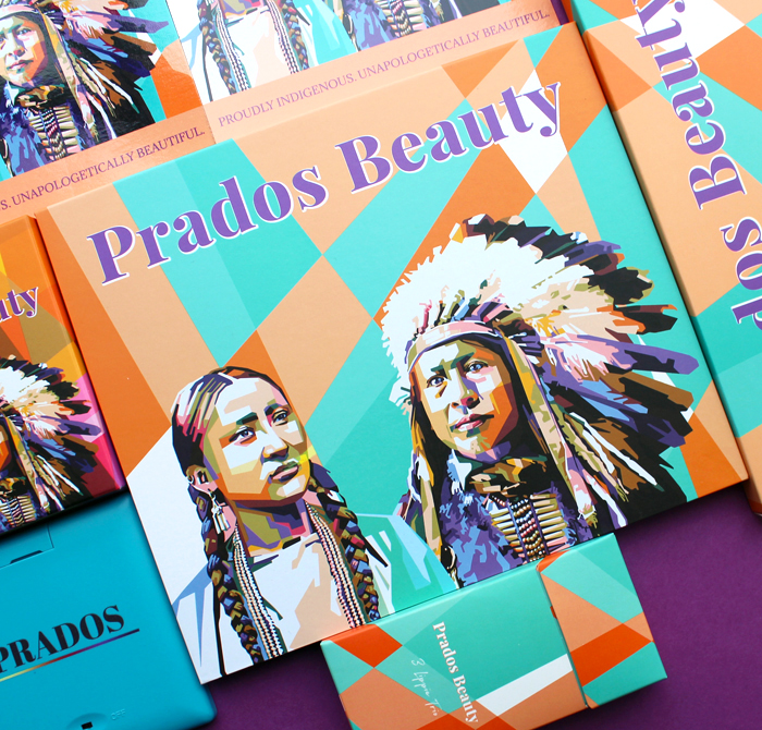
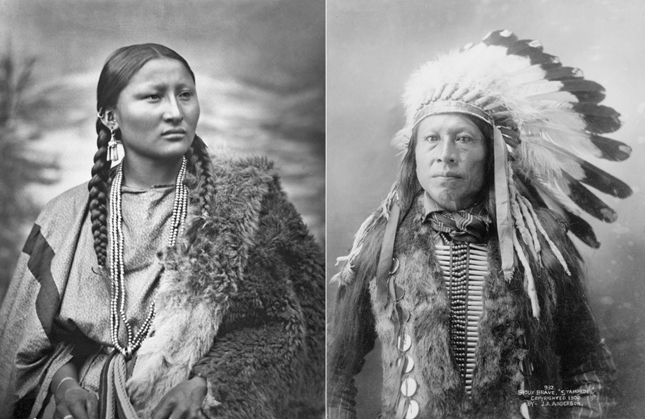
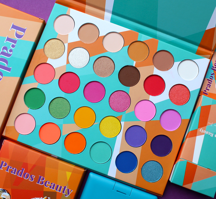
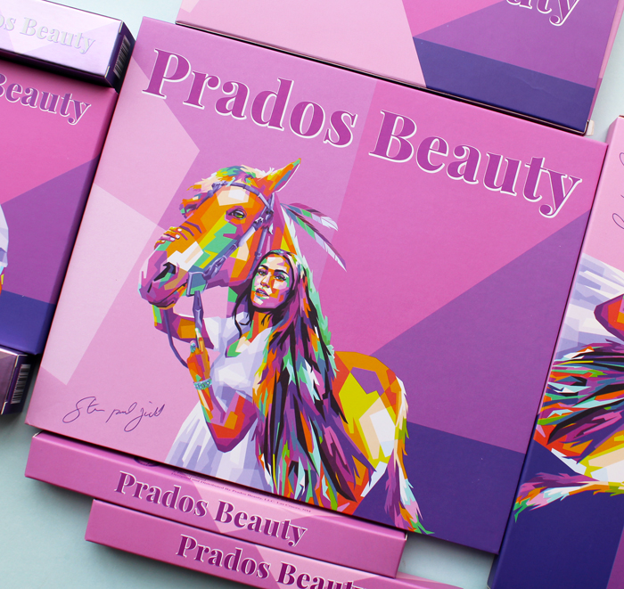
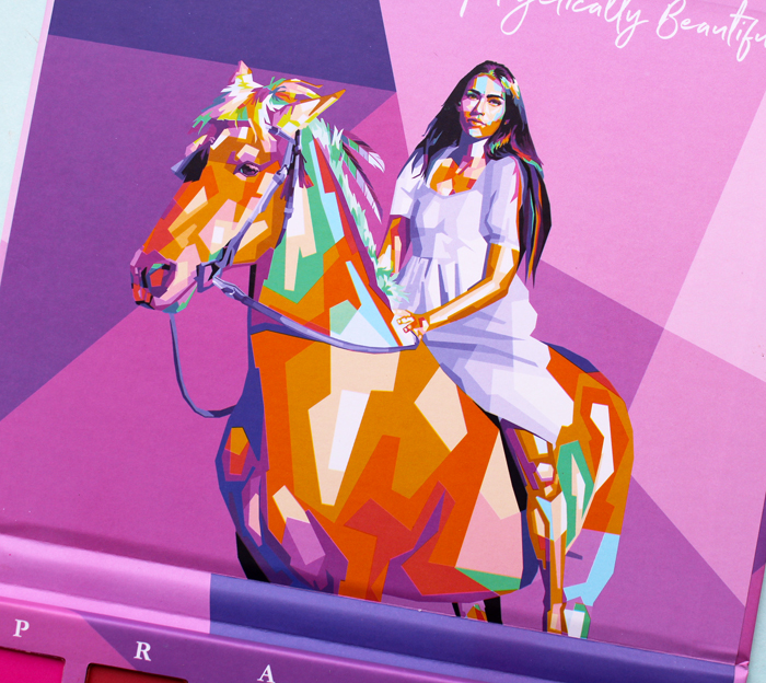
Given how the perspectives and missions of Judd and Meadows align so closely, an ongoing collaboration is no surprise. As Meadows remarks, “I feel like his art is a perfect fit for our brand because he takes everyday things like cartoons, television shows and movies we grew up watching, and indigenizes it. My boys love that poster I have hanging in their room because they identify with it. I feel like he always tries to create art that we can associate with and see ourselves in.” Prados Beauty approached Judd to create artwork for the packaging of a new eyeshadow palette in 2020. As Judd wanted the image to look modern and reflect the shades in the palette, he came up brightly colored, mosaic-like portraits of Pretty Nose and Stampede. I don’t know about you, but as soon as I laid eyes on them I had to look into their histories. Educating people through makeup and art absolutely works!

Pretty Nose was an Arapaho (some sources say Cheyenne) warrior chief who fought in the Battle of Little Bighorn in 1876. The Stampede portrait is based on a photo of a Dakota chief taken around 1900. Sadly there was not much more readily available information on either.
 (images from whitewolfpack.com and loc.gov)
The style is reminiscent of a work he created a little later for a display outside the Arthur Ashe Stadium at the 2021 U.S. Open. Judd explains the inspiration for the piece. “When most people think of Native Americans, they think of them as a monolith. But there are over 500 different tribes in the US alone. Each with their own unique culture. From their music and food to their songs and language. I wanted to do a mosaic, each beautiful color representing the many different tribes across the land.”
Once again, Judd’s vision lines up with that of Prados Beauty. A colorful mosaic is a way of bringing all the tribes together while recognizing their individuality. Says Meadows, “When I think of Indigenous beauty, I think of amplifying the voices of not just one particular tribe but all of us together. Using vibrant seeds of color like turquoise and yellow and orange helps accomplish that.”

Just last week, Prados released their new collection entitled Matriarch. According to the website: “For this collection we wanted to put together something beautiful, colorful and powerful! We wanted to honor all the matriarchs in our lives by showing up and showing out!” It’s a great theme as many Native American tribes were matriarchal and matrilineal.
I must disclose that I received the entire Matriarch PR box by mistake. It was meant to go a media contact, but somehow ended up at Museum headquarters. I was really looking forward to receiving what I had actually ordered, which was the Steven Paul Judd 2.0 palette, highlighter and collector’s box, so you can imagine my shock when I opened the package to see roughly triple the products I had ordered, with beautiful images on the packaging I didn’t recognize. I emailed customer service and offered to send it back (even though I didn’t want to, LOL), and within a few hours I received a reply from Cece Meadows herself! She generously allowed me to hang onto the whole box of goodies and, per the included instructions, requested that I not reveal anything until the collection officially dropped. It was all very exciting, for a second I felt like an influencer! I was absolutely flabbergasted that the Museum could keep everything. Plus, my original order arrived a day or two later.

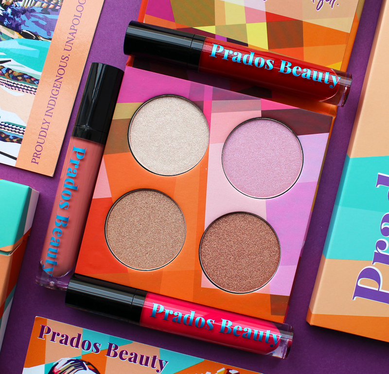
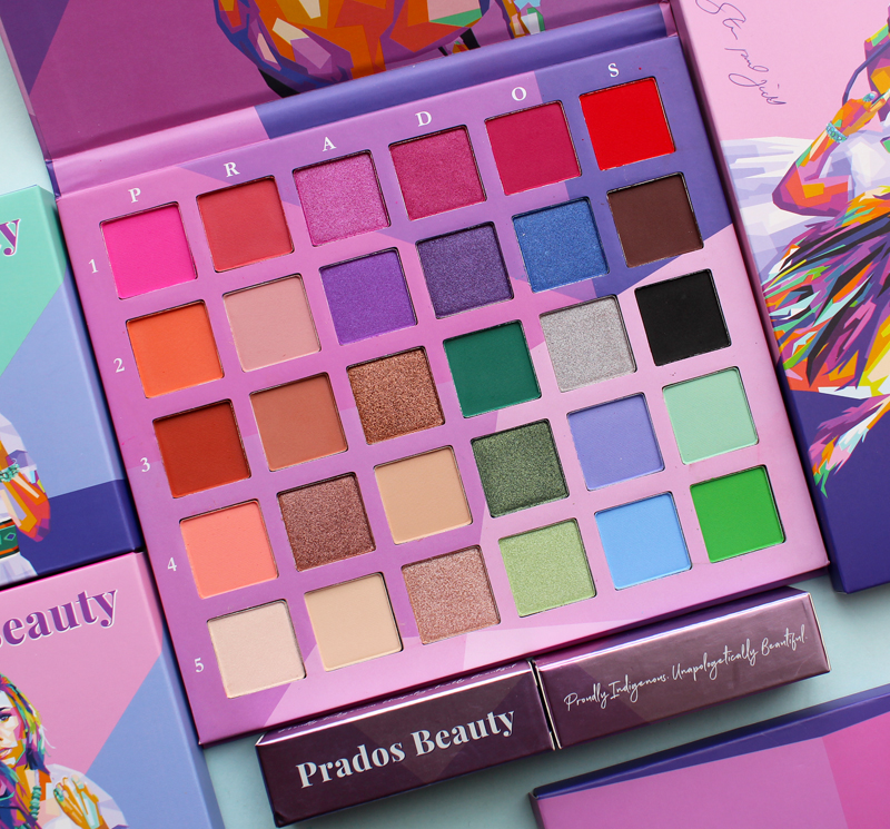
The collection includes an eyeshadow palette, three face palettes, 5 lipsticks, an eyeliner and eyelash glue, two sets of false eyelashes, and a cute little LED mirror.

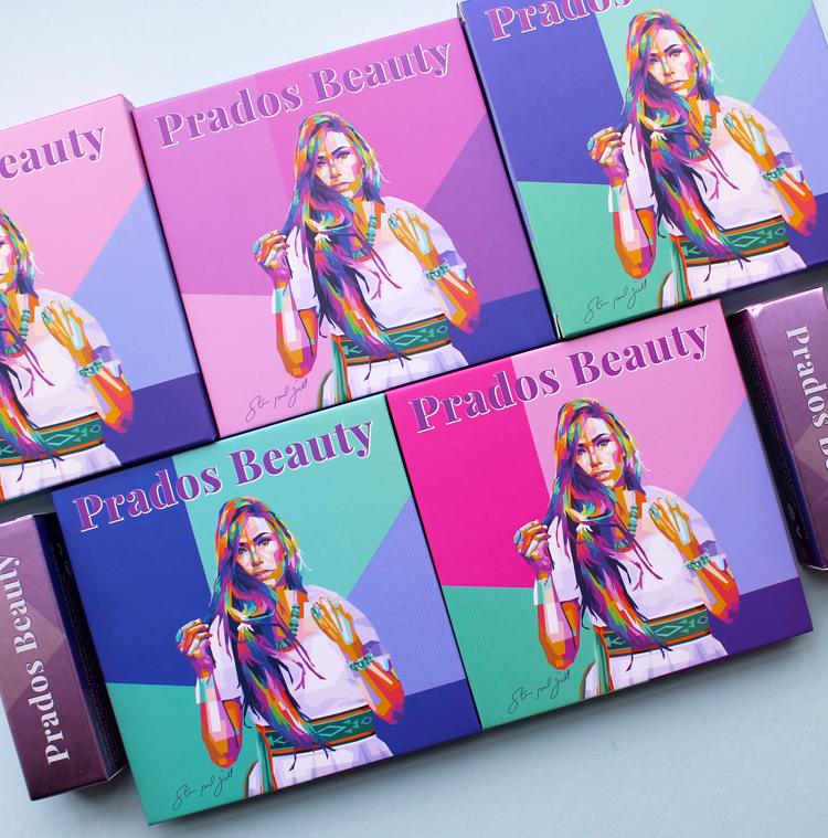
The imagery Judd created for the packaging for the Matriarch lineup is more varied than the previous collection. As a collector, I appreciate that different images were used on different products.


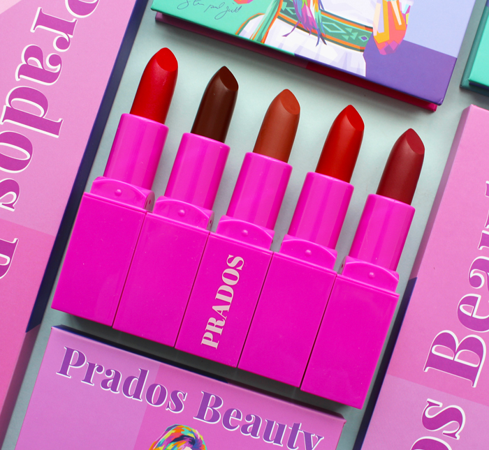
Aren’t these lipsticks delicious looking? Love the hot pink cases too. Another great thing about Prados is that a whopping 50% (yes, you read that correctly) of profits go to Indigenous communities and people in need, including veterans, single parents, and children with special needs. “Both personally and professionally, I remember every disappointment when I just needed support to get me through tough situations. So I always promised myself during my prayer times that if I ever found myself in a position where I could live comfortably and my family was taken care of, I was going to help people — especially right now during the pandemic. I have raised over $20K to purchase PPE for Native American communities all over the US, Mexico and Canada…In addition, we buy kids shoes for back-to-school season, clothes, jackets and school supplies. We pay rent for single moms, college tuition and living expenses. We even threw a baby shower last year,” says Meadows. She also recently launched the Prados Life Foundation to help facilitate donations.

Prados Beauty lipsticks from the Matriarch collection. Left to right: Jingle Dancer, Chola Vibez, Mirabella, Guerrera, Taos
I’m really enjoying Prados, and I’m not just saying that because they accidentally sent me an amazing PR box and allowed the Museum to hang onto it. After reading more about Meadows and her mission, this is definitely a company you can feel good about buying from, with gorgeous and inspired packaging to boot. I also love Judd’s work as it provides food for thought without being preachy, and well, you know how I much I adore fresh takes on traditional pop culture. If he referenced some ’90s TV shows or movies I would lose my mind. Finally, I can’t think of a better collaboration between a brand and an artist – these two were a match made in heaven. As someone who researches makeup and grew up on a steady diet of mainstream American TV/movies/etc., I can think of only a handful of Indigenous makeup brands, makeup artists, influencers and models, and the scarce portrayals of Indigenous people in pop culture were largely either stereotypes or downright racist.2 There is a dire need to make space for and raise the visibility of Native American and other Indigenous cultures, and both Meadows and Judd are doing a tremendous job helping to fill that void through their respective crafts.
What do you think?
1 While sometimes used this way, Indigenous is not totally interchangeable with Native American. Indigenous refers to those populations living together prior to European colonization. These populations exist outside the United States and on every continent, therefore, while Native Americans are Indigenous, not all Indigenous people are Native American. Check out this site for more information.
2A personal anecdote. The district in Pennsyltucky (excuse me, Pennsylvania) where I attended junior high and high school was named for a local Native American tribe that presumably white people had wiped out. The school’s mascot shares its name with a certain Washington football team. As a teenager it finally dawned on me just how awful it was, but any time I brought it up I was told that it wasn’t offensive in the slightest and that I was being “oversensitive”. As far as I know my former high school STILL thinks it’s okay to use it. Thank goodness for Meadows, Judd and shows like Reservation Dogs. It’s from the same brilliant people who brought us the hilarious What We Do in the Shadows, so definitely check it out.


 (images from acquadifiori.gucci.com)


 (image from archive.org)


 (image from library.cornell.edu)
 (images from @feegreening and columbia.edu)
 (images from collections.library.yale.edu and oraedes.fr)