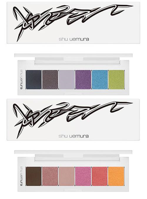
Shu's impressive holiday collection is already out, but I still wanted to cover their fall collection. I smell a graffiti-themed makeup exhibition brewing. ;) Between this collaboration and Urban Decay's France-exclusive collection back in the summer, not to mention previous collaborations with street artists/muralists (see here, here, here, here and here) it seems cosmetic companies have gone crazy for graffiti art.
For the Vision of Beauty: Haute Street collection, Shu teamed up with New York City-based artist Oyama Enrico Isamu Letter (that's a mouthful!), whose work adorns two palettes and a lip tint. I liked that his signature graffiti was reproduced in both his usual color scheme of black and white as well as purple and pink.
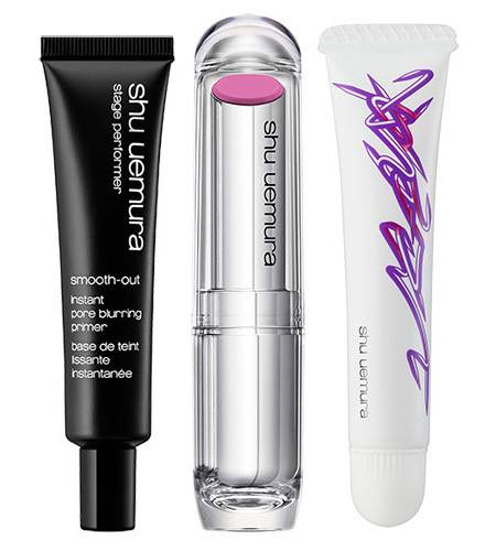
(images from chicprofile.com)
This video shows Oyama at work, and also explains Shu International Artistic Director Kakuyasu Uchiide's inspiration for the collection. He notes, "In street art, location plays a really important role. In makeup it is the same: makeup and face working together to make a statement." I agree that makeup application and graffiti present an interesting parallel that goes beyond the usual face-as-canvas narrative.
Born and raised in Tokyo, in the early 2000's Oyama developed a signature motif he calls Quick Turn Structure. He explains in his artist's statement: "Graffiti is an act of writing a name in the streets. In graffiti culture, this name composed of stylized letters represents writer’s alter ego. I remove letter shapes and decorative elements to extract only the sharp fluid line, which I consider otherwise can’t fully realize its dynamism. The line is called Quick Turn and I repeat it to generate an abstract motif. Instead of inventing a name for my own alter ego, I gave the motif a name, Quick Turn Structure. QTS is an interpretation of the visual language of graffiti culture in the context of contemporary art. What was previously a name that represents one's alter ego is transformed into plain yet tight visual objects. Lines slash back, spin and interlock. Facet-like surfaces contrasted in black and white produce three-dimensional depth. Those visual objects create a complex shape through their minimal yet spontaneous expansion. Its tightly knit structure multiplies by intrinsic order and keeps growing without hardening up. The way QTS generates is based not on a mathematical algorithm, nor a random improvisation, but on a methodology that was somatically gained through the experience of numerous practices performed on various media with different scales and materials. As it generates, the stoical process of drawing Quick Turn lines emerges as the motif, and it is built up into a piece of art. Then, soon afterwards, it starts to generate towards another, as if a piece were just a trace of a move that QTS left behind."
In reading this and looking at the Shu packaging I can definitely see the process. I'm not sure I necessarily agree that he's "removing" letter shapes so much as bending, straightening and interlocking them to create an abstract design, but I do like the combination of sharpness and fluidity – his designs remind me of bent nails. I think it would be pretty bad-ass to have one of his motifs in necklace form (like this), as I'm always fond of accessories that resemble hardware/weapons, i.e., safety pins, razor blades, barbed wire, etc.
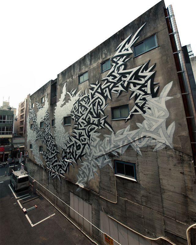
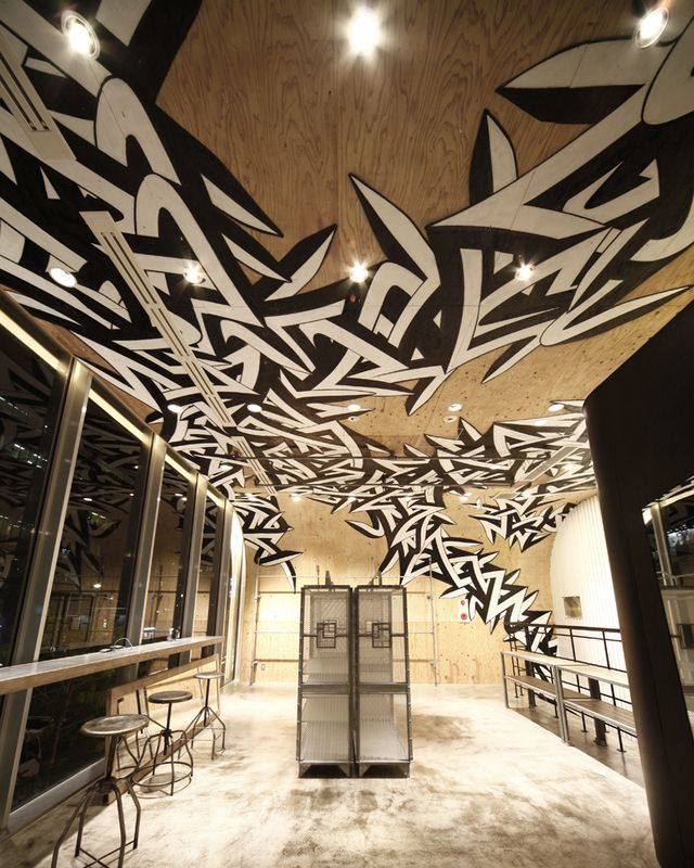
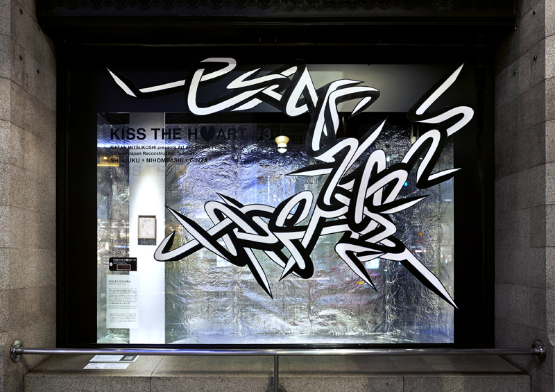
Anyway, one of the things I love about graffiti artist collabs is that it's always interesting to see their work in the original environment, and then determining whether it works on the smaller scale of makeup packaging. Here are some of Oyama's work on and inside various buildings and stores in Japan, along with a 2012 drawing.
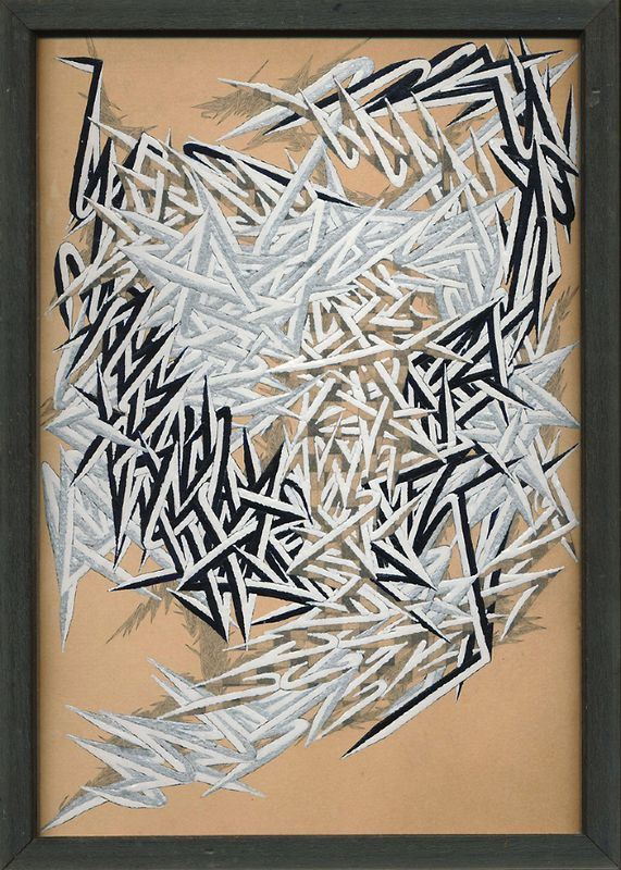
(images from enricoletter.net)
I think Oyama's style works well on the Shu packaging, but to my eye it sort of looks like this restaurant's logo, which I see nearly every day since it's right near my work building. Obviously the design on the Shu collection is much more imaginative, complex and high-art, but it does bear a slight resemblance.

(image from xsbaltimore.com)
So I'm not sure whether I want it for the Museum's collection. On the other hand, as I mentioned at the beginning of this post, it might make a nice addition to a graffiti-themed exhibition.
What do you think of this collection?
