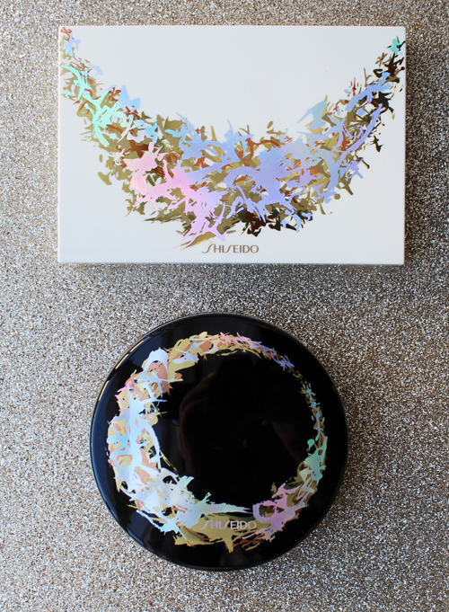
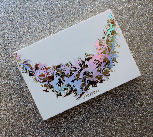
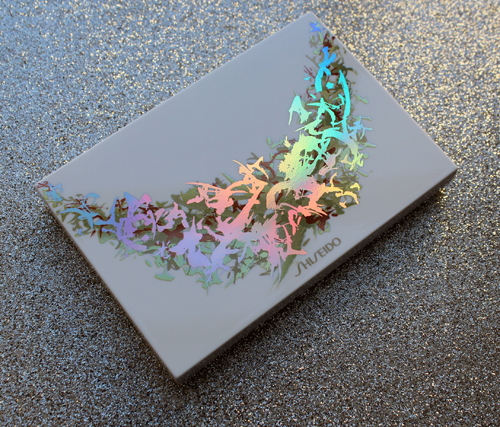
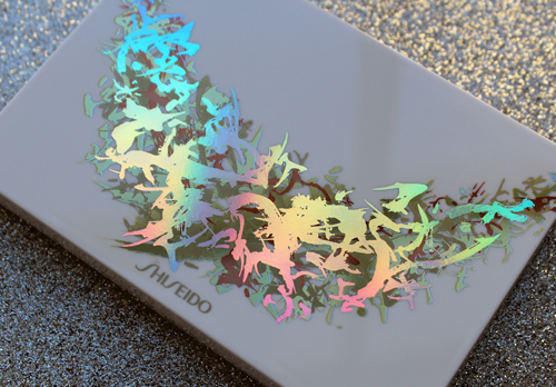
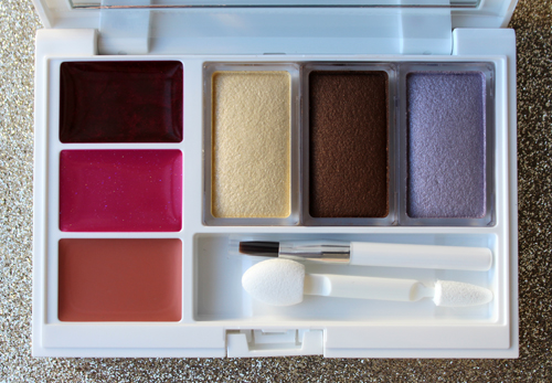
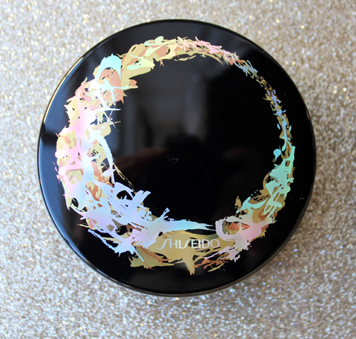
Today I'm sharing another shiny holiday 2017 release to brighten up this dreary winter day. Shiseido collaborated with the rather enigmatic Japanese calligraphy artist Sisyu to create some beautiful packaging for their Symphony of Light collection. Centered on the theme of light (or as it's known in Japanese, Hikari), Sisyu drew 21 versions of the Japanese character (光) to "express the way light brings out each person’s inner beauty differently," according to the website. The artist then intertwined and layered these characters to form a "luminous holiday garland". The finished design indeed resembles an intricate, iridescent garland draped across the palette and encircling the cushion compact.
I don't know whether Shiseido or Sisyu came up with the idea of a reflective rainbow effect, but it really enhances the light concept.
I couldn't resist couple more shots of the iridescent yumminess.
Here's the cushion compact. It was also available in white, and there were several other skincare items in the collection.
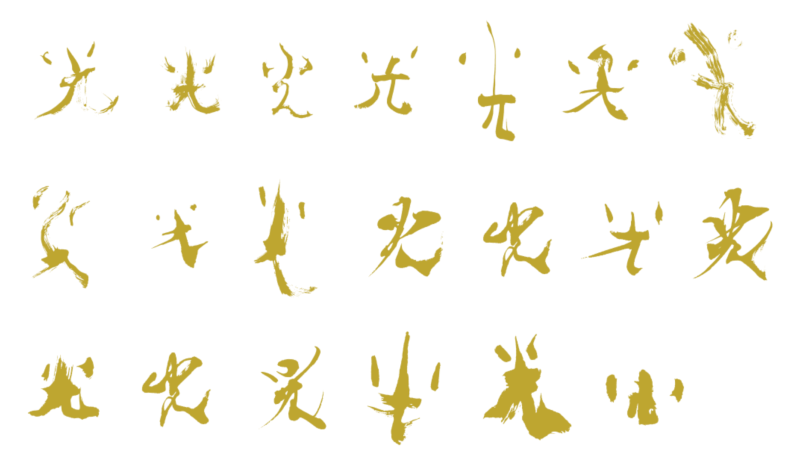
And here are the characters created by Sisyu that were interlaced on the packaging. I'm assuming the regular character for Hikari that these are based on isn't included, since I count only 20 and not 21 characters.
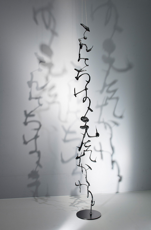
Let's learn a little about this very mysterious artist. Sisyu (whose alias comes from the words for "purple" and "boat"1) was born in Japan and began calligraphy when she was only six years old. She prefers to keep her real name and age under wraps, so about all we know is that she's currently a professor at Osaka University of Art. I also couldn't find any information about where/if she formally studied art, but it appears she has significant training in traditional calligraphy. What I do know is that Sisyu is a world-renowned artist who uses her background in more conventional methods of calligraphy to expand and modernize the this art form. Whether it's making iron and glass sculptures out of characters or digitally animating them on a gallery wall, Sisyu is bringing calligraphy into the 21st century in a variety of creative ways.
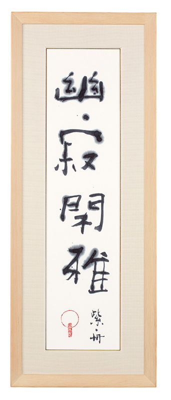
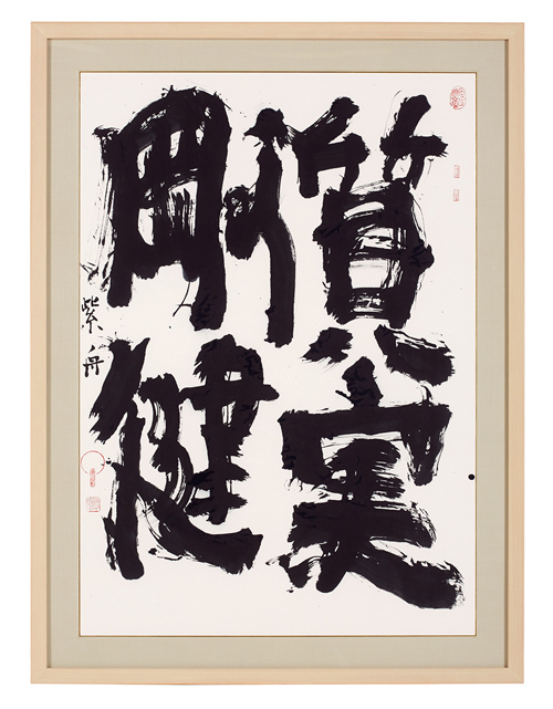
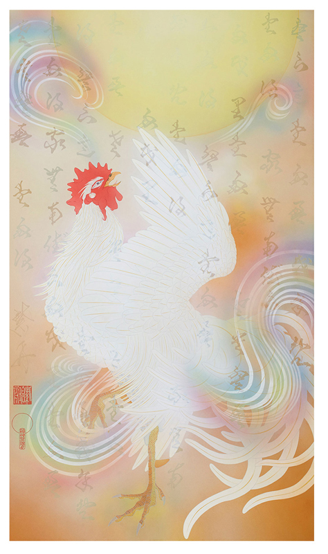
Traditional calligraphy done by hand is appealing to Sisyu for two reasons. First, it requires a high level of concentration and the ability to tune out everything else, a difficult feat in the digital age. Secondly, calligraphy acts as one of the oldest forms of self-expression – much can be revealed by studying how the characters are written (sort of like analyzing one's handwriting). Sisyu says, "The brush is not easy to control. It needs an intense level of concentration. When you are able to command the brush, you master that concentration, you are able to free yourself from anything that binds you down. You are able to focus yourself on just that moment in time…Just as the body and heart are connected, there is also a connection with what we write. You can tell things from it about the person who wrote it, like the proof of their existence, the emotions they were feeling, and so on." Here are a couple of the artist's more traditional pieces.
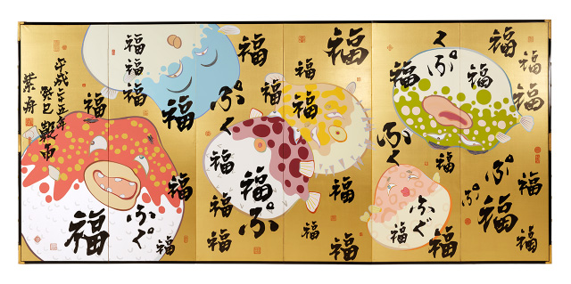
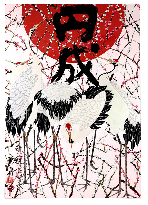
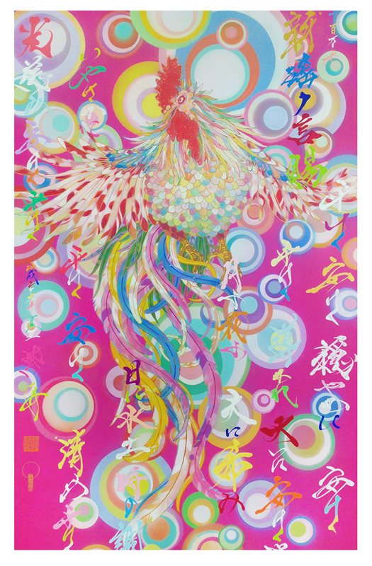
These more colorful ones combine characters with brightly colored images, a Japanese tradition that, as Sisyu notes in an interview, goes back thousands of years and is continued today in manga and anime.
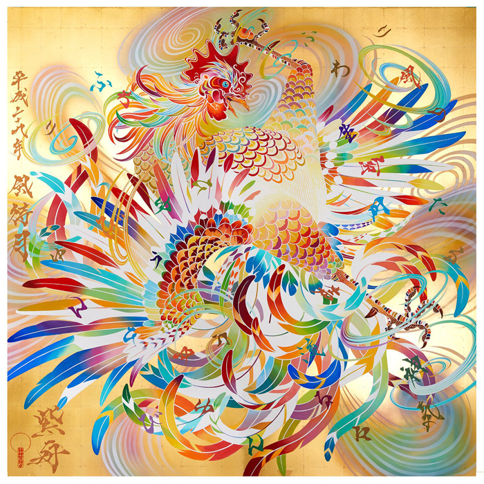
I apologize for the lack of titles on all of these. I tried Google Translate and as usual it generated nonsensical phrases. This one, for example, came up as "Wind Day Sun Chicken". Oof.
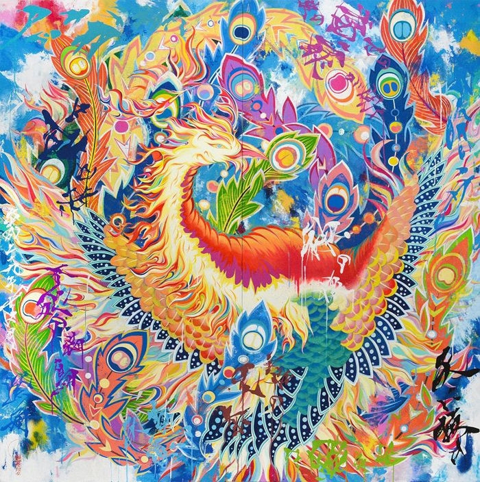
You know how I love bold color so my favorite pieces are in this 2017 series, which includes a phoenix and depictions of the traditional Japanese gods of wind and thunder/lightning. The vivid colors make them seem just a touch psychedelic.
When I went to look up the names for these two, I just saw that Fujin and Raijin were names of gods and then tried to test my visual comprehension skills to guess what they stood for just by looking at Sisyu's images. She makes ideas easy to understand, a point I'll return to later.
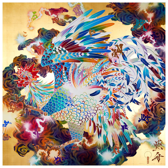 (images from e-sisyu.com)
While these examples demonstrate her skill in more traditional, albeit colorful calligraphy, Sisyu maintains that it's important to incorporate a digital component to make calligraphy more accessible to a younger crowd and to cultures outside Japan. It's also a way to represent both Japan's artistic heritage and leadership in technological advances. She explains, "When we were young, it was basically still an analogue world, right? But since then, digital has spread all over. One argument for why is that it’s just ones and zeros: Like kanji written on paper, its components or brushstrokes are hidden, allowing for expression that’s free from conventions. Things like age, origin and nationality don’t matter. In that same way, if I incorporate calligraphy into digital art, it makes it easy to approach and it might affect young people, or those from abroad, in a way traditional calligraphy doesn’t. Plus, more than anything, Japan is a country of culture and technology. I think combining those two elements is the best way to transmit Japan to the world. Until recently, Japan was very strong in terms of economics. But that’s no longer the case. In our age, in order to get people to take interest in Japan, we can use cultural power rather than economic power. That’s what my generation can do." These ideas are expanded upon in the interview below.
I thought one of the most interesting parts of the interview2 was her desire to give a modern twist to calligraphy by making it three-dimensional. "Instead of writing characters directly on the screen, I put sculptures about 50 cm from the screen, and they cast a shadow. The shadow collaborates with the screen. It's all about taking writing and calligraphy beyond tradition and beyond the page."
I'm blown away by these animations in which one touches a character on the wall and up pops a beautiful illustration of the meaning of that character. In this way Sisyu achieves what she set out to accomplish: making Japanese culture and calligraphy easier to understand via the use of digital technology. Above all, her work is driven by the need to communicate a specific idea across all cultures and ages. After showing her work at the Venice Biennale in 2005, she still felt it wasn't getting across. "Art expresses things. It crosses borders without the need for words. Why can't Sho-do [calligraphy] do the same? Is it because the language is Japanese? We sing songs in languages we don't understand. How can I get to that sort of level? I thought, okay, from now on I'm going to make art that gets across to people even if they don't know anything about traditional Japanese culture." This epiphany led her to create the calligraphy sculptures and utilize new technology that goes beyond paper and ink.
There wasn't much information on the process behind the Shiseido collection, but based on the very short ads I suspect the artist used a similar digital animation program to create the final design from the original hand-drawn characters.
In the video interview, Sisyu also discusses how she can make up to 500 versions of a single character to express its different meanings. I believe that the 21 versions of Hikari she created for Shiseido was her way of representing all different types of light – from the physical, such as stars and holiday lights – to the spiritual, as in positive energy. She says: "The holiday season is the peak time of the year when lights inspire people, and they are uppermost in people's minds. Light has significance—it illuminates and brightens people. The light collection expresses the image of lights that brightens up each and everyone of us in the world. Merciful light that illuminates everyone's road ahead. Soft, tiny, big, weak, strong, tender, or dazzling lights. Light that visibly and invisibly supports you. Light that makes your path to the future brilliant. I gathered light together, like a glimmering sunny spot, so that it may gently continue to be with you."
In sum, I think this was a gorgeous and thoughtful collection. Sisyu is an excellent match for Shiseido, as they both have a thorough understanding of the past and build upon it on to create a harmonious fusion of old and new. Sisyu adds digital and 3-D technology to calligraphy and Shiseido continuously revamps its most iconic products, but neither lose sight of the traditions and history from which they came. And like Shu Uemura, Shiseido is strongly committed to celebrating Japanese art and culture and sharing it worldwide. Sisyu, with her focus on communicating a message across all demographics, is perfectly suited to this task. She effortlessly translated the Japanese Hikari character to a more modern format that everyone can understand, and created a beautiful piece of art in the process. Even if you're not familiar with Japanese calligraphy and characters, you know the packaging symbolizes light.
What do you think? And have you ever attempted any sort of calligraphy?
1 Sisyu shares why she chose her pseudonym: "In Japan, purple is thought of as a very noble colour. It also refers to the character Murasaki in ‘The Tale of Genji’. Murasaki was exceptionally beautiful and beloved by her suitors. As for boat, it’s a character that’s been used in the names of many calligraphers and sumi-e (Japanese ink painting) artists throughout Japanese art history, so I adopted it as a part of that tradition."
2. Another interesting part of the interview was where she talks about her desire to create kanji for Hollywood movies. She was granted her wish in 2015 – Pixar hired her to make the kanji for Inside Out.


I love the holographic design, I’m a huge sucker for anything that flashes rainbows at my eyeballs! . You always put in so much research behind your posts, just wanted to let you know that it is much appreciated.
Also cackling a little at the Wind Day Sun Chicken. That is the most majestic 🐓 I have ever seen.
Hi Mimi! Thank you so much for taking the time to read and comment, especially while traveling! It looks like we’re powerless to resist shiny iridescent packaging. Glad you appreciate the research, even though I think it could use work. 😉 I know, that translation was crazy! I was trying to infer what it meant – sometimes you can sort of get the gist – and I honestly couldn’t make ANY sense out of it. At least it was funny though. 😀
Thanks so much again for stopping by and for the kind words!