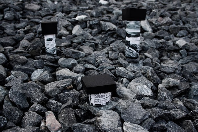
When you follow no fewer than 1,044 blogs, as I do, you're bound to come across loads of interesting stuff. Take, for example, this sleek masculine packaging for a hypothetical men's skincare line named Savages.
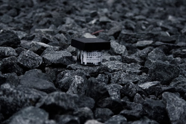
(images from packagingoftheworld.com)
According to the website where I found this, Packaging of the World, this is a student project for a ecofriendly, "biodynamic" brand. The description doesn't have a very good English translation, but you get the gist: "The packaging is based with the focus on nature. The nature is raw and full of contrast to reflect the inner strength of the man, and his contrast. It is black and white to appeal more to the man. The logo is a combination of sharp corners and rounded corners, to show the sharp edges of the man and the organic of the product, which is symbolized in the packaging by the round can and the square wooden lid."
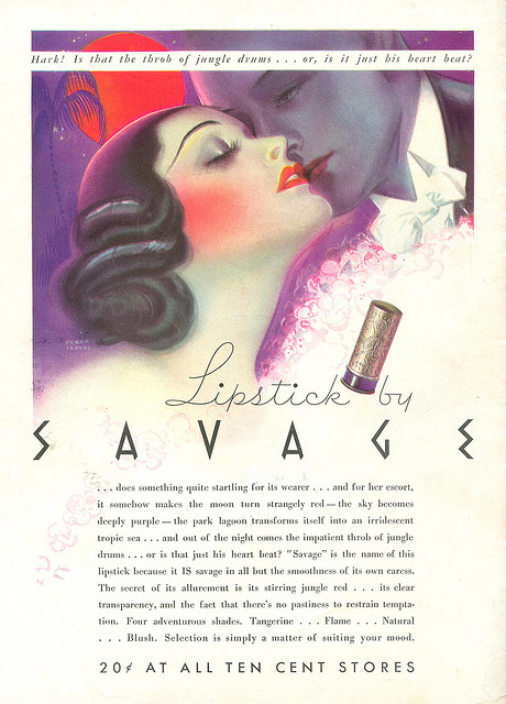
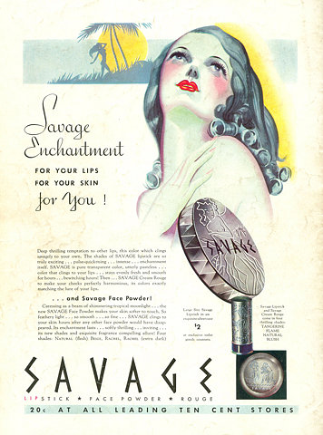
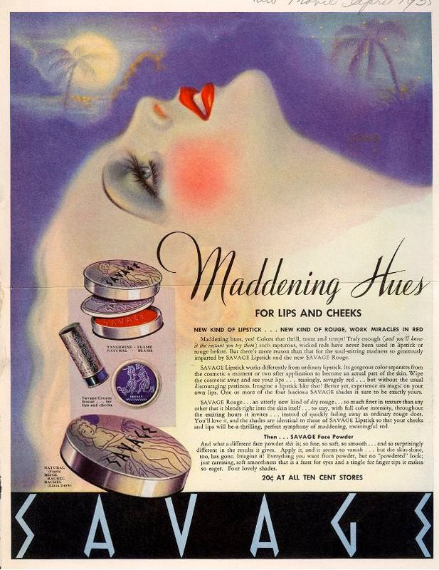
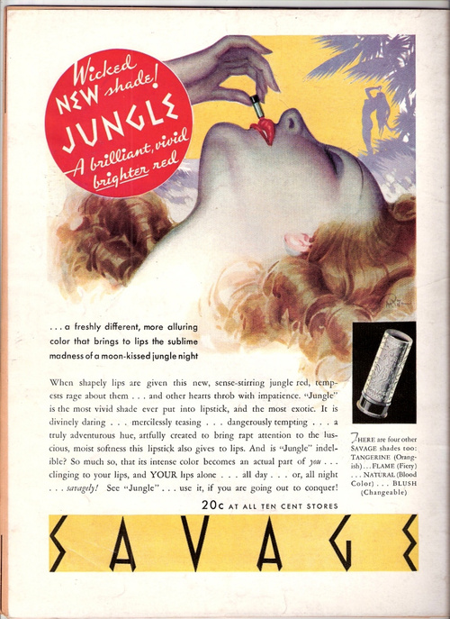
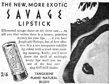
I think the packaging is well done, but what's most intriguing to me is how similar the font used for the Savages titling is that of a vintage lipstick brand called Savage.
(image from flickr.com)
(image via ffffound.com)
(image from lettersfromhomefront.com)
(image from questionableadvice.tumblr.com)
I asked the Makeup Museum's resident graphic designer to weigh in on the fonts used, as he can usually identify a font from a mile away. Unfortunately since he seldom gets to used "fun" fonts like these for his projects, he couldn't identify either with certainty. He maintains, however, that the one used for Savage lipstick is a variation on a typical Art Deco font.
I think it's worth noting how the company name and the typography, while comparable, were used to market to such incredibly different audiences: skincare for contemporary (and one would assume, "manly") men and 1930s women. But perhaps it makes sense, given that the copy of the Savage lipstick ads plays up the power one would supposedly have if she donned this particular lipstick. The woman who wears Savage lipstick, while extremely feminine, prefers a "wicked" shade of red and is "going out to conquer" with her "maddening hues". Similarly, Savages skincare refers to the "inner strength of the man" and the font's edges represent "the sharp edges of the man." It's also interesting how both brands evoke the environment and human nature – Savages skincare has organic ingredients, uses wooden blocks as caps, and is "full of contrast", emblematic of the human race, while Savage lipstick ads repeatedly reference the jungle and (offensively) humanity's "primitive" roots.
(image from honeyman.com.au)
Thoughts? Am I crazy for thinking there's any similarity between these two?
