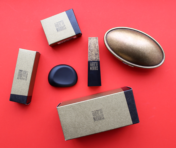
It's nice to see a makeup brand continue the long-standing tradition of collaborating with jewelry designers. The most recent partnership was between MAC and Robert Lee Morris, whose name I admittedly hadn't heard of until now.
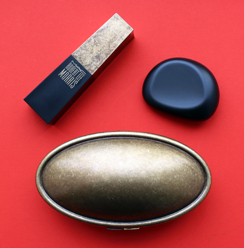
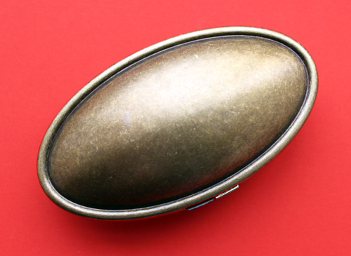
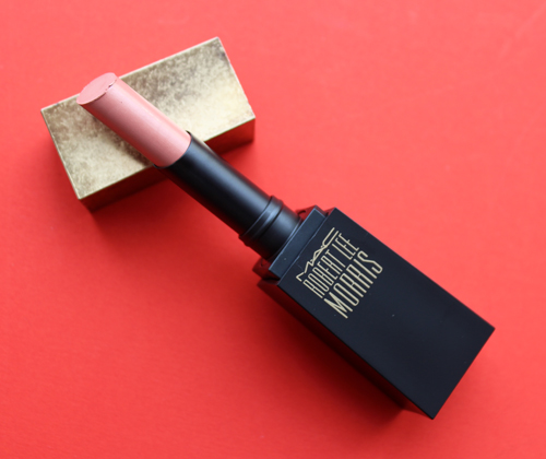
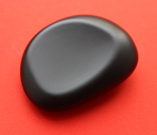
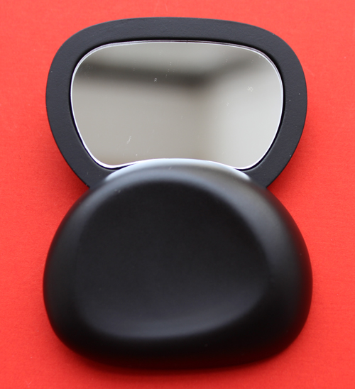
Says Morris, “I am thrilled to be working with MAC, as I believe this partnership exhibits a true coming together of beauty, art and design…The collaboration is an exciting moment for both brands, as we are both leaders in cutting edge imagery and enhance one another. I have always been fascinated by the personal ritual we all experience while grooming and getting dressed each day; and the tools we hold should be as luxurious as possible. My pure and iconic aesthetic seamlessly translates to the shapes and forms created for MAC, and I have designed the collection with an ultra-modern focus; sleek, architectural lines and dynamic, like my jewelry.” I'd say that's a fair description of what he came up with for MAC, particularly with the lipstick case, as it looks reminiscent of a modern skyscraper. The compact looks simultaneously futuristic and organic, sort of like a UFO crossed with an egg. I know that's a less-than-eloquent description, but arguably accurate.
The shape and finish on this mirror reminds me of a smooth pebble you'd find in a serene yet opulent koi pond.
If you purchased the mirror, know that it swivels open – I nearly broke mine trying to open it like a regular compact. #curatingfail
I'd prefer not attempting to trace Morris's entire career since he is quite prolific, but here's the condensed version. Born in Nuremberg, Germany in 1947, Morris was exposed to a variety of cultures on account of living in many different countries for his father's military career. Entirely self-taught, after graduating from Beloit College in Wisconsin in 1969, Morris began making jewelry on an artist commune he established with some friends. “Everyone on the farm made something different—pottery, sweaters, macramé…I decided to make jewelry. I got a book called How to Make Jewelry by Thomas Gentile, which was easy to follow with lots of pictures. I said to myself, I need a hammer and some wire, and I built a workshop in a tool shed. I would listen to Led Zeppelin’s first album and worked until two or three o’clock in the morning in total ecstasy.” Unfortunately, the farm burned down, and Morris moved to Vermont. He didn't have to wait long to be discovered, however, as in 1971 a gallery owner who wanted to display jewelry-as-art at her space, aptly named Sculpture to Wear, asked to showcase and sell his jewelry. By 1977 Morris had opened his own store in New York, and during the '80s became a favorite with both fashion designers (Calvin Klein, Michael Kors) and celebrities (Madonna, Jodie Foster) alike. Among his most memorable pieces were the result of his work with Donna Karan, whose black knitwear soon seemed incomplete without one of Morris' signature gold baubles.
 (image from 1stdibs.com)
I'll let Morris describe his style in his own words: "My original idea was to create a body of work for an imaginary futuristic society that was post-apocalyptic and that the pieces would be a combination of savagery with high-tech gadgetry. Today, I'm probably in the exact same place, but I'm also thinking about what kind of jewelry people would wear who aren't from this planet. What would you wear on deck in a spaceship? What would you wear with your Mylar spacesuit? And seeing how all beauty is based on sacred geometry, I'm fascinated with taking jumbled, tribal pieces and finding the sacred geometry that's there." Obviously I'm raising an eyebrow at the words "tribal" and "savagery", but they are apt in that Morris's earlier pieces definitely embody a romanticized notion of so-called "primitive" societies.
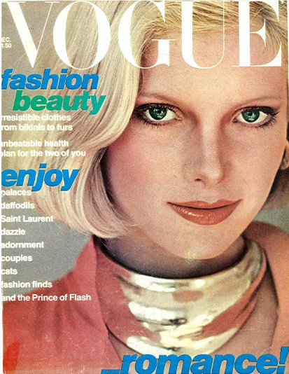
(image from stylewisetrendfoolish)
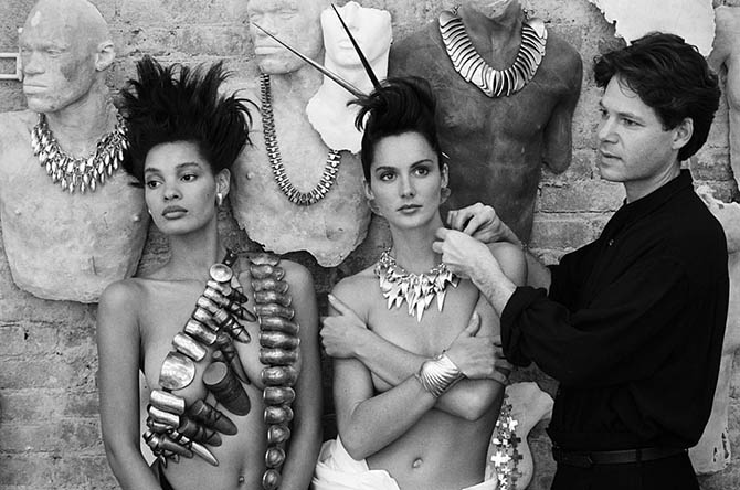 (image from gettyimages.com)
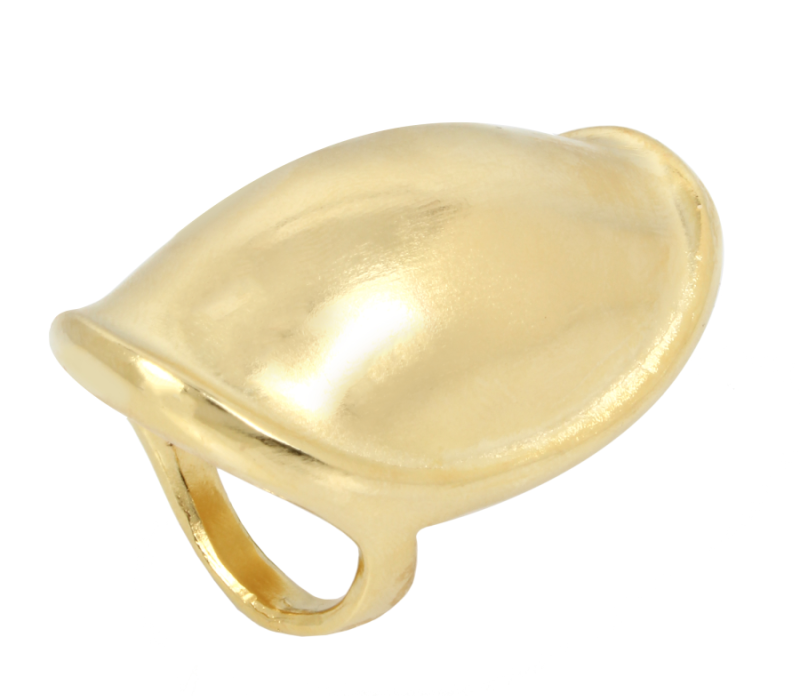
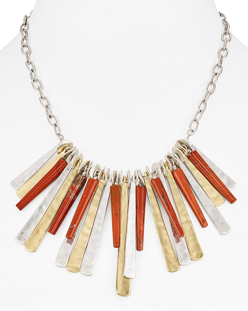
Indeed, one news article describes his work as a "mix of ancient/primitive with Flash Gordon" and notes that Morris enjoys traveling to "exotic outposts such as Peru and Kenya, where he draws inspiration from ancient cultures". Oy vey. I don't think it's inspiration so much as cultural appropriation, but fortunately Morris seems to have outgrown that style. Modern and sculptural with an organic quality to them, Morris's work nowadays seems to be more inspired by natural forms rather than appropriation of native peoples' body adornments. These pieces in particular resemble the more futuristic/architectural items from the MAC collection (the compact, lipstick and mirror, respectively).
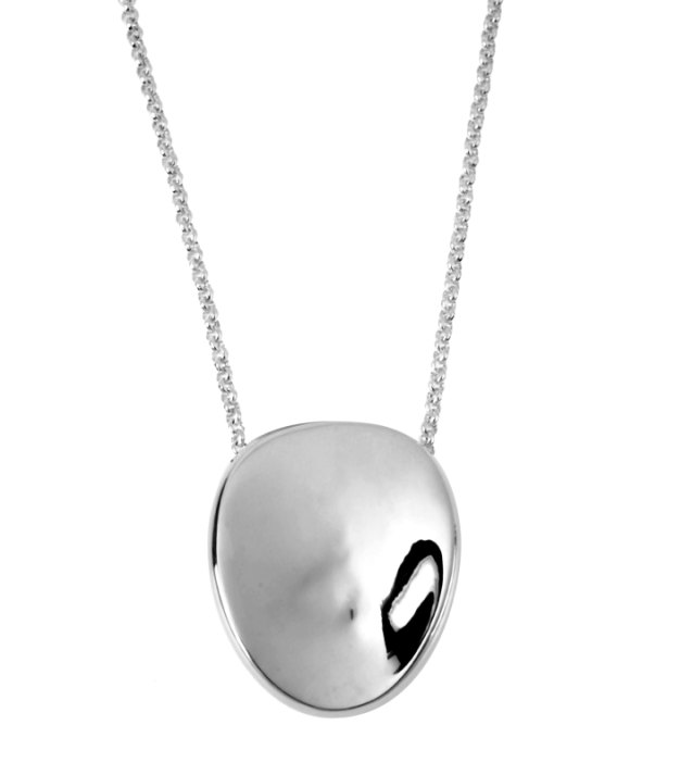
(images from robertleemorris.com and bloomingdales.com)
I have no idea why MAC decided to join forces with Morris now, but I do know it's not his first rodeo designing makeup: he created a refillable compact and lipstick case for Elizabeth Arden in 1992. Called Rituals of Color, the collection reflects Morris' fascination with spiritual rituals and how beauty routines can be elevated to their own sort of ritual through beautiful packaging. As this article shows, Morris was partially influenced by his mother's makeup routine and the importance of "presentation".
Indeed, the Elizabeth Arden collection provides a lot more context for the MAC lineup as the concept is essentially the same, just executed differently. "What women wear day in and day out becomes their statement of who they are, an extension of their identity. Designing both [jewelry and cosmetics] is a very intensively intimate process," he noted in October 1992, explaining further: "'I'm a symbolist," the designer says. "'I believe packaging is very much a part of the ceremony we all go through in the morning to put ourselves together. People need to form an environment to heighten the experience of the ritual. Those who want to treat themselves better need the product and packaging to be very much a part of their beauty psyche.'" The first two pieces in the line are a lipstick case and compact, designed 'to look and feel organic, with a natural-looking shell for what's inside, like a clam or mollusk's shell.'" Another article points out that he actually came up with the design in 1976: "Taking two discs, I noticed they sandwiched as a clam."
Both pieces are so fantastically '90s – as modern as they seemed back then, they look pretty dated now. Then again, I definitely appreciate a fashion relic from my favorite decade, and I'm enjoying the luxuriousness and nod to natural elements in both pieces. The compact does indeed look like a golden shell, while the lipstick case resembles a rather elegant bamboo twig.
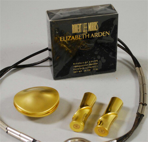
(image from skinnerinc.com)
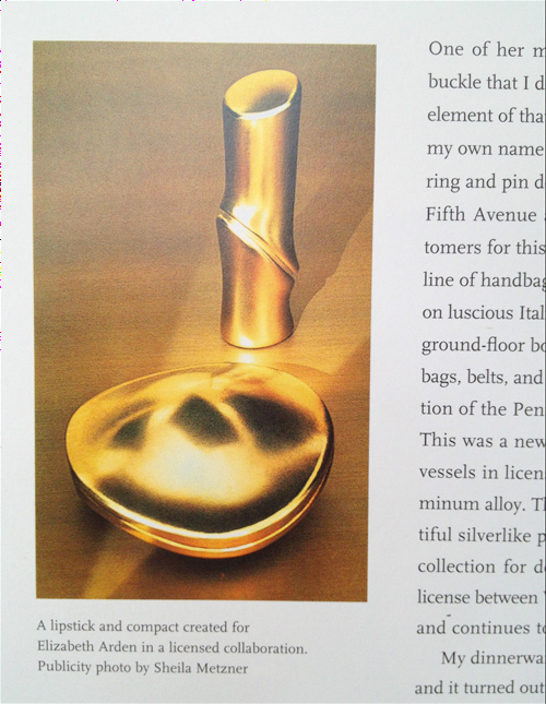
(image from ebay.com)
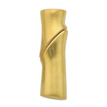
(image from doyle.com)
The idea of elevating a mundane task such as applying makeup through the design of the makeup itself – especially when that design is created by a jeweler – isn't new, but it's always fascinating to see what various jewelry artists come up with. In the case of Morris, it's particularly interesting since he's done two makeup collections spaced 25 years apart, so you can really see how his style has evolved. His approach is the same, but the pieces are quite different stylistically. I appreciate the Elizabeth Arden collection for being so representative of early '90s style, but I also like the more futuristic vibe and burnished gold finish of the items in the MAC collection.
Which iteration of Robert Lee Morris makeup do you prefer? And had you heard of him before now?
