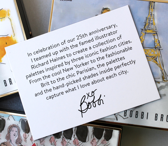
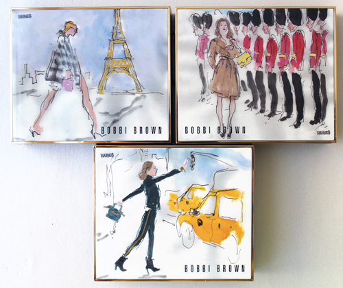
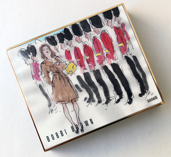
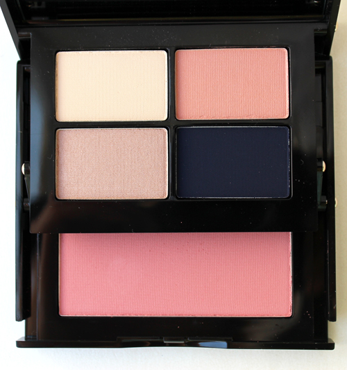
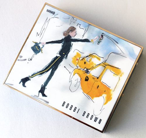
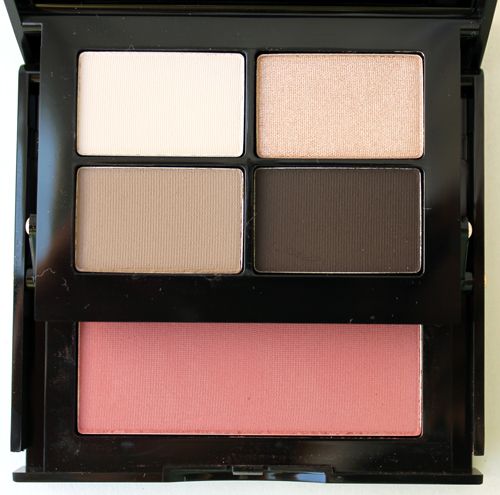
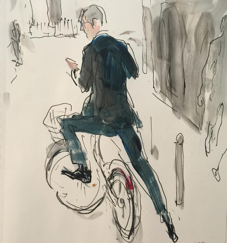
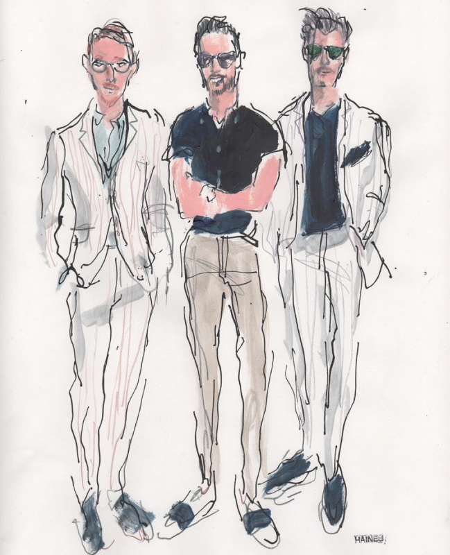
This was one of those collections I didn't think twice about, just pounced as soon as it was available at Neiman Marcus. As the insert above indicates, for the brand's 25th anniversary, Bobbi Brown collaborated with illustrator Richard Haines to create 3 palettes that represent 3 of the world's top fashion cities: Paris, London and New York.
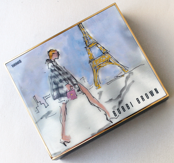
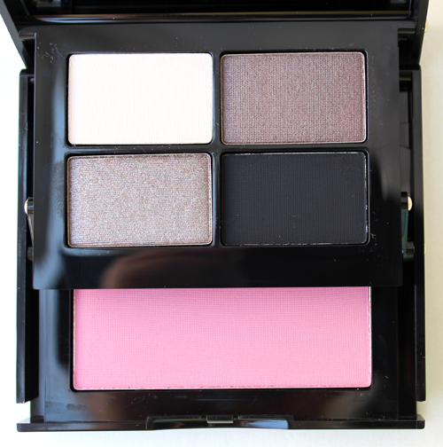
Here's Paris. The woman's outfit is great, but I particularly love the rendering of the Eiffel Tower.
London – the trench coat is perfection:
And here's New York. Those striped tuxedo pants look so familiar but I can't place them. However, I'm almost positive that's a Balenciaga City bag.
Now for a little background on Richard Haines. The New York-based artist started drawing at the tender age of 5. In an interview for Opening Ceremony's blog, he says, "Everyone else was drawing airplanes, and I was drawing wedding dresses…I stayed with my grandparents every summer, and my grandfather got The New York Times everyday. When I was about ten, I was looking through it and there was coverage of the Paris couture collections–this was like 1962 or 1963. They were all drawings. You know, there were no photographs because they didn't have the technology to send them back then. So it was all of these beautiful fashion illustrations of Givenchy and Dior, and they were so elegant. I remember thinking 'Oh my god, how can someone make these beautiful drawings with just a few lines and give out all that information?' That was kind of where the obsession started."
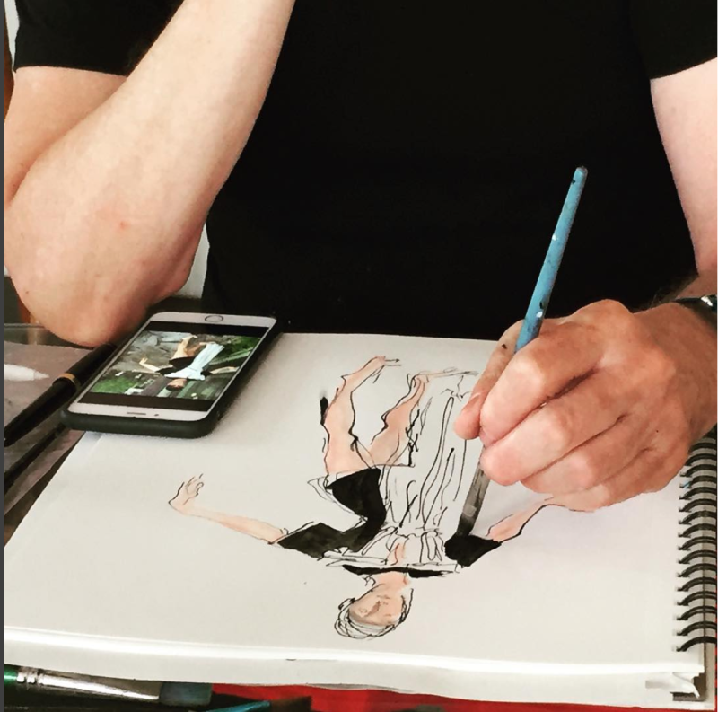
In scrolling through his Instagram, two things immediately jumped out. One, Haines is left-handed. You know how I'm fascinated with lefties!
Two, he's got a great sense of humor.
 (images from instagram.com)
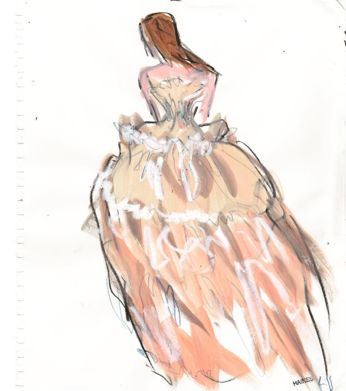
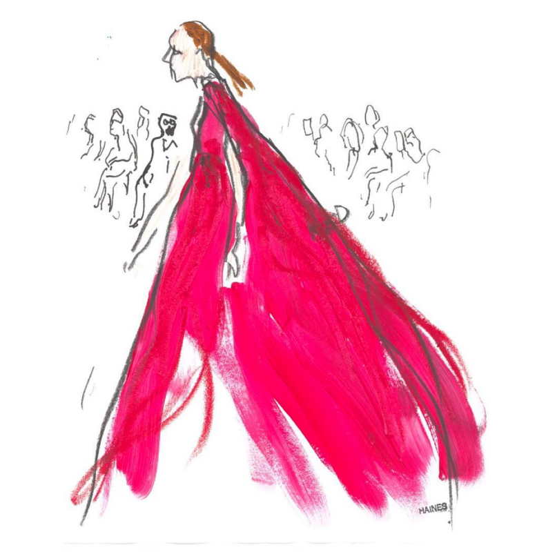
Naturally I kept scouring his account to find some favorites. Haines is a regular at the world's biggest fashion shows now, and he greatly enjoys the immediacy and energy of the runway: "Drawing at the shows is incredible—there is something about the intimacy of that moment. I find that, if someone asks me to do something after a show from photos, it’s never going to be the same, its never going to have that aliveness. There’s something about the energy of the model on a runway, what that designer is presenting, the kind of the vibe of the audience and that’s all in that drawing—or at least, I want it to be, that's the goal!" In looking at his work I can definitely see the bustling liveliness of the shows. The lines are almost haphazard, borderline sloppy, yet still form a cohesive and powerful image. For example, in the sketches Haines created for this year's couture shows at Paris Fashion Week, I was able to easily identify all of the clothing. At first glance the pieces look rather hastily, frenetically drawn, but ultimately the image comes together to perfectly capture the fleeting essence of fashion.
Here's a comparison to the actual dress.
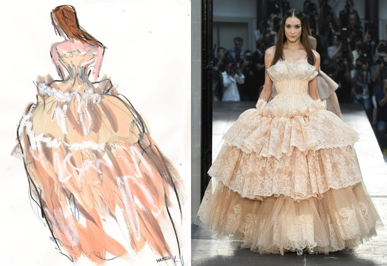 (images from instagram.com and vogue.com)
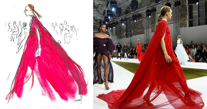 (images from instagram.com and fashiontimes.com)
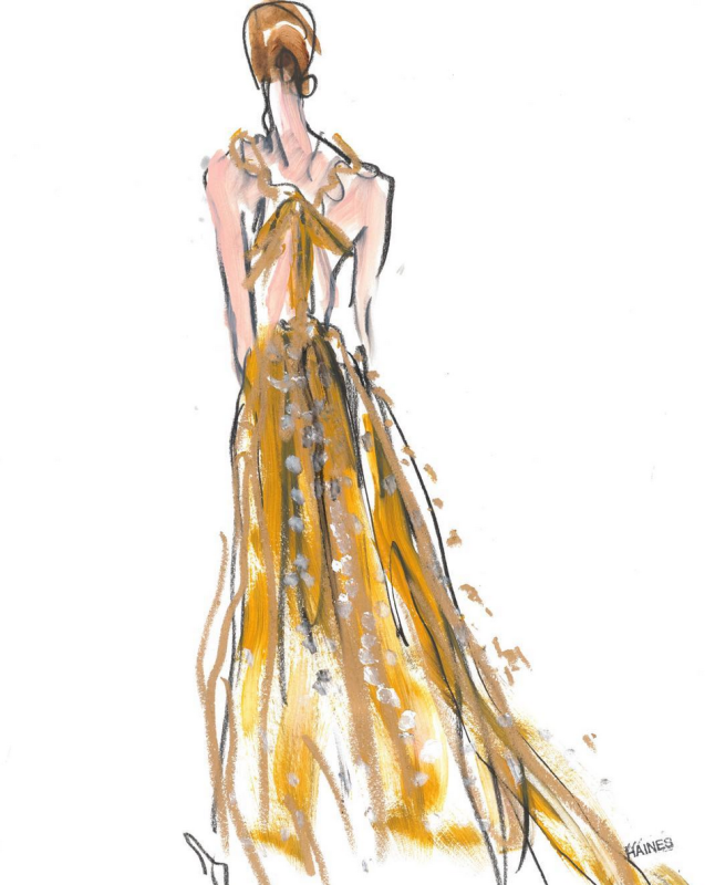 (image from instagram.com)
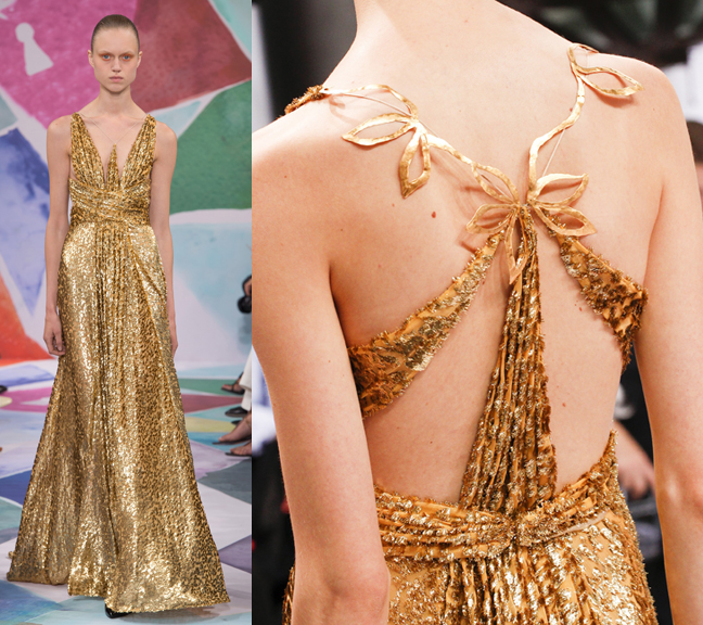 (images from vogue.com)
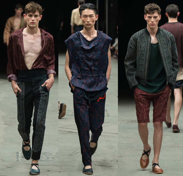
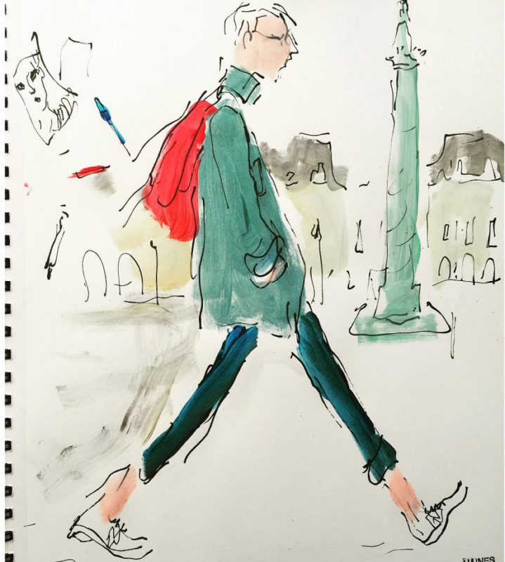
While Haines is a fixture at the front rows, it's street style that seems to intrigue him the most. In his mind, runway displays aren't that much different from the street – both involve people-watching, one of Haines's favorite activities. "I've realized I have a short attention span and fashion is perfect for that, because it's a continual feed of ideas, color, performance, beauty, and people. It's really exciting! I mean I really just love watching people, even just walking down the street here [in Bushwick]. I see these amazing kids and in its own way, it's a fashion show," he says.
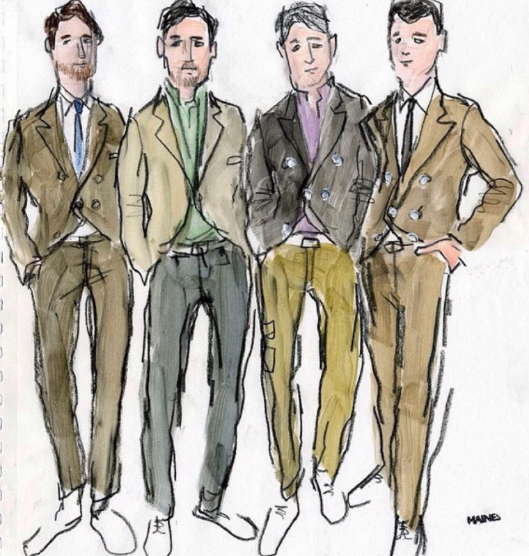
Haines focuses primarily on menswear, something that in my mind seems to be somewhat lacking from the oeuvre of most fashion illustrators. I love women's fashion, of course, but it's good to see the guys getting their due. Even though the Bobbi palettes only feature women, which makes sense since they're makeup, I still appreciate a collab with an artist who generally doesn't have such an emphasis on women's wear.
 (images from instagram.com)
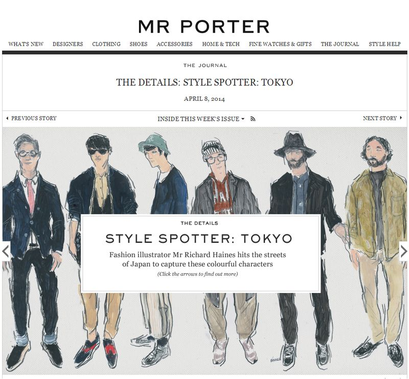
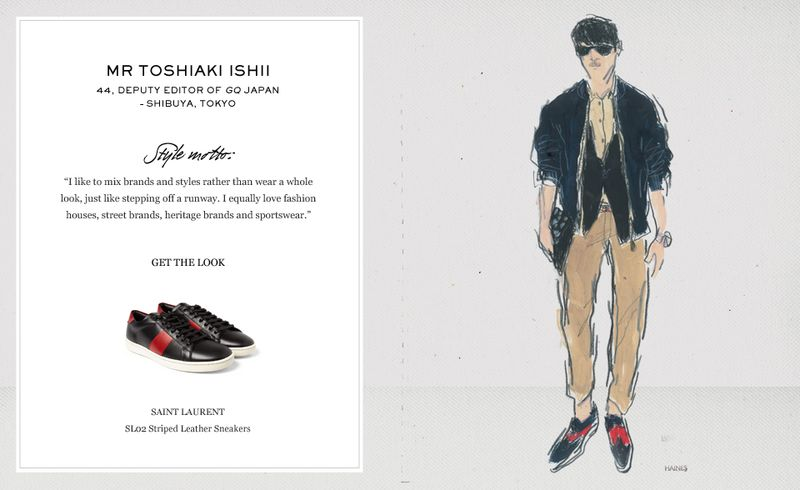
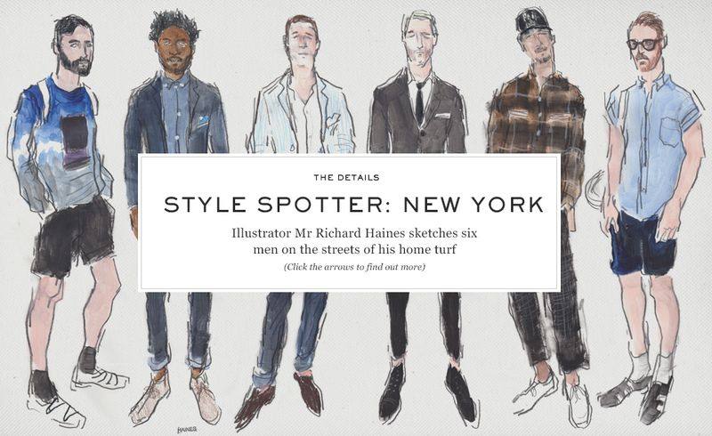
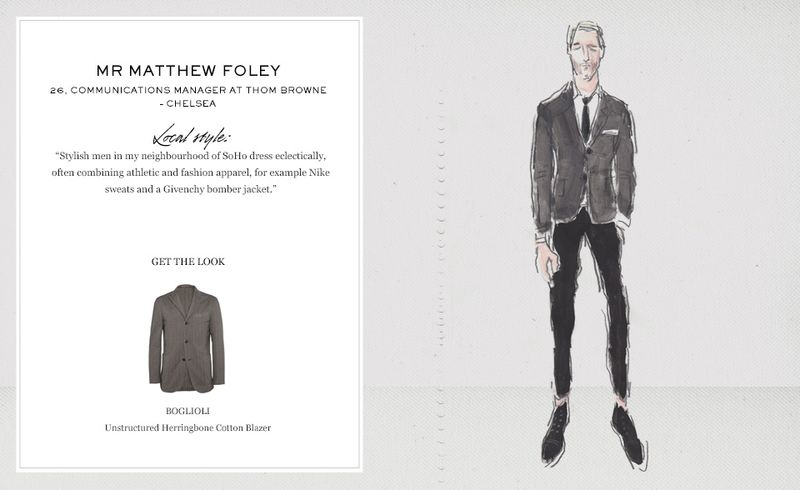
My favorite series is one he did for high-end men's fashion site Mr. Porter (the men's equivalent of net-a-porter.) Haines visited 6 different cities, interviewing and sketching the owners of his favorite looks. I like to think of these as a sort of precursor to the Bobbi Brown palettes. While these are actual people and the women on the palettes are more of a general representation of that city's style, the concept is similar.
 (images from blog.jedroot.com)
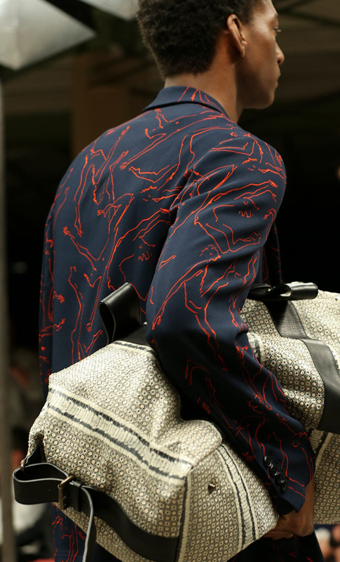
Haines also has several fashion collaborations under his belt. Not a surprise, since he was a designer himself for over 25 years before returning to his original passion for illustration. He tells Out, "I moved to New York thinking I wanted to be a fashion illustrator, but my style wasn’t really developed, and it wasn’t assertive, confident. There’s something apologetic about it, so I stopped doing it. That’s when I became a fashion designer for 25-30 years. By the time I started it again, I had the confidence to get behind it, and to really own my work — which was not that long ago. I think that’s when my style happened."
(images from vogue.com)
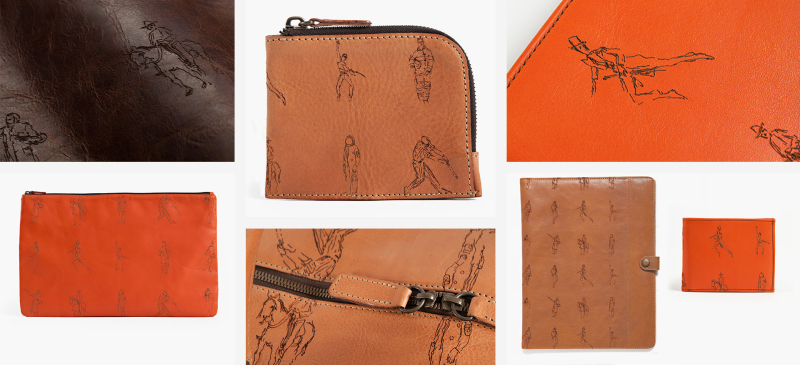
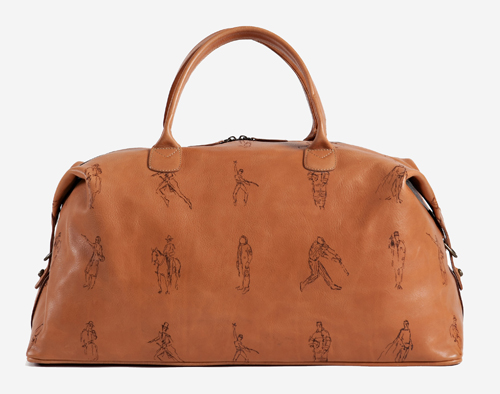
In addition to teaming up with Bobbi Brown, this fall Haines also collaborated with Moore & Giles for a collection of leather goods. I like the overall look of the illustrations. They're sporty – most of the men are engaged in some kind of athletic activity – but still refined and gentlemanly (especially the dude in the top hat and tails).
(images from mooreandgiles.com)
Overall, I like the slightly disheveled, immediate feel of Haines' work. While I do think it's a bit odd to have a collaboration between a makeup brand and a fashion illustrator whose main interest is menswear, Haines demonstrates he's equally adept at drawing well-dressed women as well as depicting a particular moment or atmosphere – perfect for capturing the individual, of-the-moment style of the world's most fashion-forward cities.
What do you think? I wonder how much Haines would charge to draw the husband…he is immensely fashionable and I'd love to see him wearing one of his best outfits in illustrated form. 🙂
