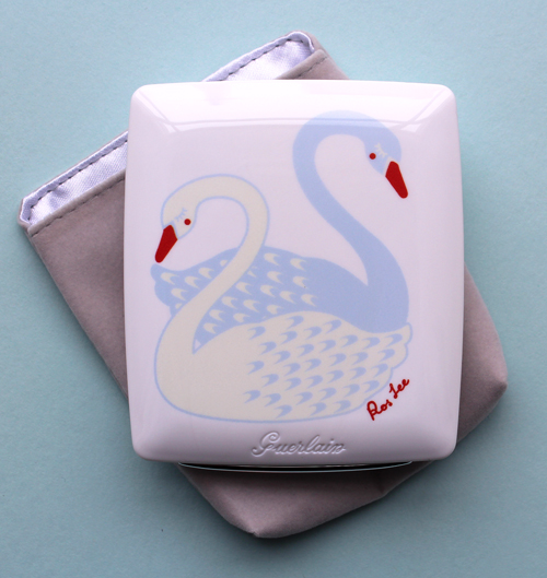
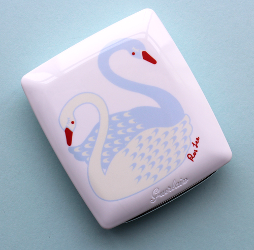
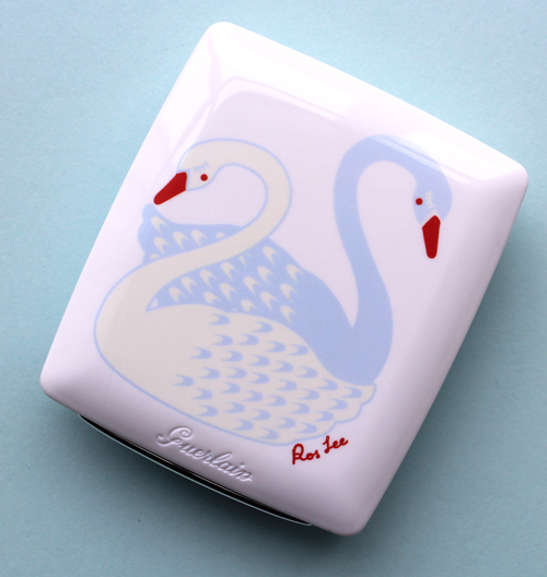
Easing back into blogging (and spring, hooray!) with this beautiful compact by Guerlain. In what I'm hoping is a never-ending series of artist collaborations, for their Parure Blanc compact this year the company teamed up with Ros Lee, founder of home decor brand Polkaros. We'll get to that in a second, but first, let's admire the delicate pair of swans gracing the compact.
I absolutely adore the white and pale baby blue hues of the swans, especially with the pops of vibrant orange-red on the their beaks, cheeks and Lee's signature. It almost looks like they're wearing blush! The reverse color scheme is genius as well – Lee's graphic design experience definitely shines here.
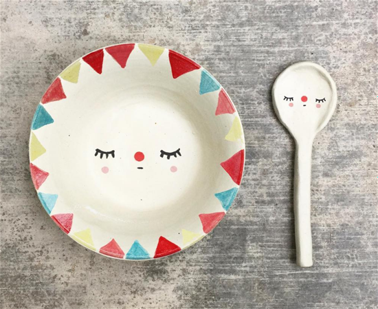
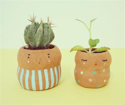
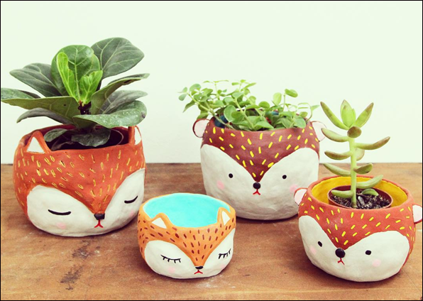
So who is Ros Lee and what is Polkaros? Lee comes from quite an interesting background, both personally and professionally. Born in Singapore into a family of potters, Lee developed a love of art early on and learned pottery skills from her father. After studying graphic design, in 2002 she visited Tokyo to take part in a design festival and was so taken with the city she decided to stay. In 2005 she won a National Arts Council Takashimaya Scholarship to study art and design there, and the following year entered the Joshibi University of Art and Design. Majoring in textile design, after graduating Lee landed a job at Tokyo's Accent Corporation as a lifestyle product designer. Five years later, Lee began working as a consultant/accessories designer for Clinique and decided to start her own line of home goods on the side, and Polkaros was born. Lee explains why she chose the name: "I hoped that the products I create would carry the same characteristics as the polkadot pattern – happy, cute, classic, timeless and simple. It always amazes me how you can find polkadots everywhere and in many different eras. This may be a bit overly ambitious but I wish that our products would add a bit of childlike fun in every household and last for decades…I find inspiration from old toys, folk art and ethnic cultures. I love to look at the motifs and colors from the past as they tell a story about a certain time and a different way of life." In looking at her work, I think Lee definitely achieved her goal. Everything from plates and utensils to vases and planters are brimming with playfulness without being juvenile. There's also a simplicity that echoes various forms of folk art – nothing fussy, just uncomplicated shapes that emphasize their handmade nature.
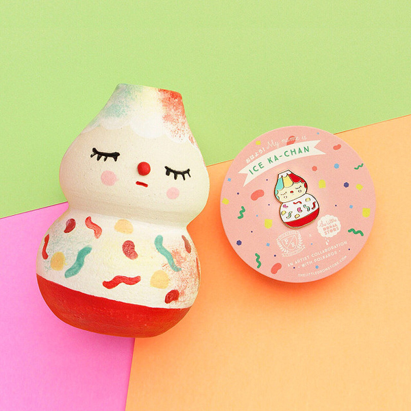
Two of my favorites are these dessert-inspired vases. This one is takes its cue from ice kachang, a Singaporean dessert with shaved ice, jelly beans and syrup.
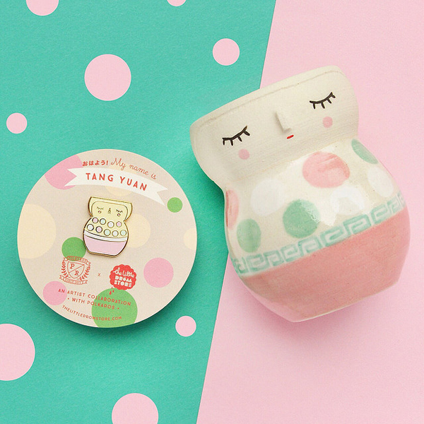
And this one is inspired by Lee's favorite childhood dessert, tang yuan.
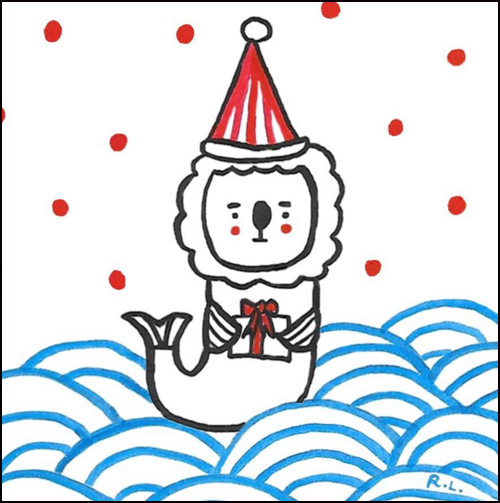
Of course, I'm smitten with this holiday mer-lion print, another nod to Lee's Singapore upbringing.
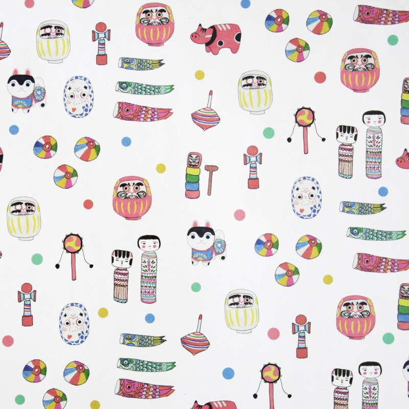
I also want to briefly highlight some other key elements of Polkaros's style. It's described as "a lifestyle brand that combines influences from Japanese traditional crafts with modern zakka goods." While I'm unfamiliar with the former – the only Japanese craft I know about is origami – "zakka" was totally foreign to me. I found that there are entire museum exhibitions devoted to the concept so a full history is well beyond the scope of this blog post, but in a nutshell, zakka is a way of adding beauty to mundane objects. This site describes it as a "celebration of humble, everyday objects that bring its users great satisfaction. Zakka aren’t antiques, they’re not expensive, they’re not flashy; they’re familiar and timeless." Needless to say I love this idea and, like hygge, I think I've been embodying it for years without realizing it – particularly when it comes to office supplies. (Anything to help me cope with the horror of work is welcome; I'm partial to pretty/funny post-it note pads.) As we've seen, Polkaros takes basic objects such as planters and utensils and makes them aesthetically pleasing through adding charming little faces and/or playful colors. As for Japanese craft traditions, they are also well-represented in Lee's work. Take, for example, this wrapping paper filled with craft motifs.
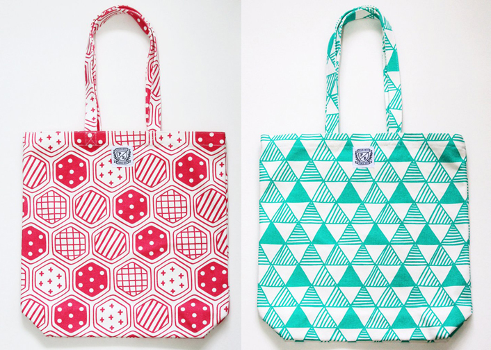
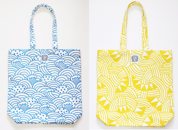
Or these tote bags bags, which are modern interpretations of traditional Japanese patterns. From the website, I learned that the one on the left is a Kikko tsunagi pattern, which is inspired by the hexagonal scales on a turtle shell, while the one on the right is Uroko-gara, "a scale pattern made of a combination of triangles that is believed to ward off evil."
Meanwhile, the blue pattern is a twist on seigaiha, a traditional blue wave pattern (and, incidentally, one we've seen on a Guerlain piece before), and the yellow one is inspired by Mizuhiki knots: "Mizuhiki is the art of knotting rice paper cord into a decorative element."
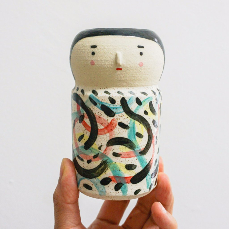
Then there are also these vases inspired by kokeshi dolls. Again, kokeshi is such a vast topic I couldn't possibly cover it all, but they are wooden Japanese dolls that originated in northern Japan and date back all the way to the Edo period (1600-1868). All of Polkaros' kokeshi are ceramic and have individual names and descriptions. This little guy is known as Riku, who "practices martial arts by day and paints at night."
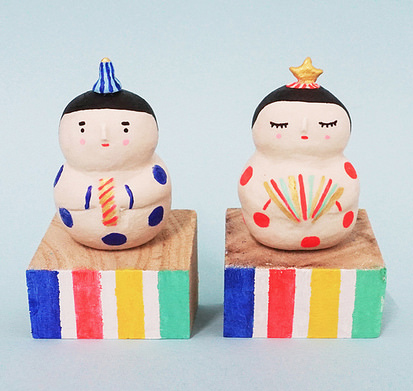
More recently, Lee created a beautiful collection for Hinamatsuri, a.k.a. "dolls' day" or "girls' day" in Japan that occurs annually on March 3. It's a truly fascinating celebration in which ornamental dolls representing the Emperor, Empress and various assistants and musicians are displayed in a rather elaborate setup of 6-7 platforms. Typically people display at least the Emperor and Empress, if not the full arrangement. These are Lee's representations of the royal couple.
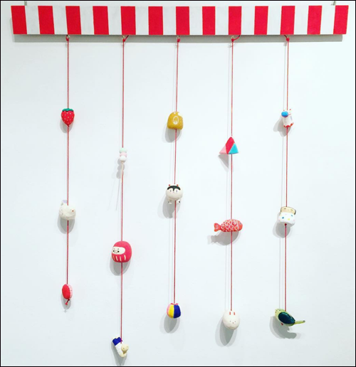
And this hanging piece is Lee's take on tsurushi-hina, a traditional decoration consisting of handmade dolls and other objects on strings.
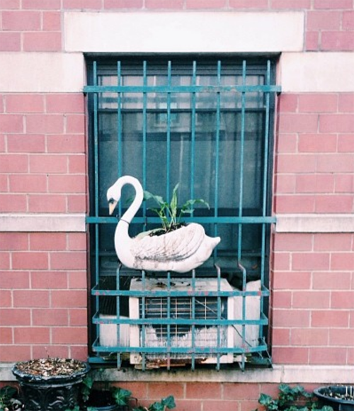
I'm impressed with Lee's vast knowledge of Japanese cultural traditions and how she infuses them with her signature modern, playful style. Getting back to the Guerlain collab, I'm not sure how it came about. Guerlain and Clinique are owned by different parent companies, so I doubt Lee's work for Clinique had anything to do with the partnership. I'm also a little puzzled about the swan motif. I love it, but am wondering where the inspiration came from and why it was chosen. I did a little sleuthing at Lee's lovely Instagram page and saw this photo from a trip to New York in 2014.
There was also this swan, with the same overall shape and similar facial design (look at that pop of color on the cheek!) from January 2016. It was captioned simply "a change of pace" (at least, that's what Google translate told me), and it is indeed a more sophisticated departure from Lee's usual style. So I'm guessing Lee does have a fondness for swans and I assume they were selected as a more elegant motif to better suit Guerlain's image.
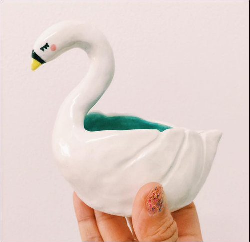
(images from instagram and polkaros.com)
While Polkaros's typical aesthetic is certainly delightful, it doesn't seem to align perfectly with the Guerlain brand. Once again, I'm impressed with how Lee modified her childlike approach while maintaining the sense of whimsy to fit the likes of a high-end French line.
Overall, this collab gets an A from the curator. (It would have been an A+ if the powder inside the compact had been embossed with the same swans.) Not only was I introduced to Polkaros's magical world, I learned a lot about traditional Japanese crafts and the concept of zakka, which I now plan on consciously incorporating a little more into my daily life.
What do you think? And do you prefer Przemek Sobocki's 2017 Guerlain compact over this one? They're apples and oranges to me – totally different styles but I love both equally.


What pretty products. I have a close friend who’s insanely attracted to swans. She’d love these. (I’m gonna tell her about the post.)
What pretty products. I have a close friend who’s insanely attracted to swans. She’d love these. (I’m gonna tell her about the post.)
Nice to see you back!
As a rower I do think that swans are a big pain in the oars. But Lee’s compact is delightful.
Nice to see you back!
As a rower I do think that swans are a big pain in the oars. But Lee’s compact is delightful.
Hi f! Thank you so much for sticking around and for reading! That’s so cool you row! I bet swans do get in the way though. And I wonder whether they’re mean like geese?! Anyway, thank you so much again for stopping by and commenting!
Hi f! Thank you so much for sticking around and for reading! That’s so cool you row! I bet swans do get in the way though. And I wonder whether they’re mean like geese?! Anyway, thank you so much again for stopping by and commenting!
Hello again! Thank you for still being here and reading! Tell your friend the compact is available here – pricey but so pretty!
https://www.bonboncosmetics.com/guerlain-parure-blanc-light-booster-compact-the-swan-by-ros-lee-case-refill-japan-exclusive-limited-edition/
Thank you so much again for stopping by and sharing the love! 🙂