My thoughts on Urban Decay's collaboration with Jean-Michel Basquiat (1960 – 1988) were very tough to gather for many reasons, which is why I'm just getting a post up well over a month after the collection's original release. It's always difficult to approach beauty collections featuring monumental artists such as Basquiat due to the enormous amount of resources, and while I feel the need to be thorough in exploring the artist's work, I don't wish to embarrass myself by pretending I'm an expert on their oeuvre (art history degree non-withstanding). This post was made harder to write by the fact that I had already touched a bit on Basquiat's work for Addiction's 2013 collection, so I really didn't have any idea on how to properly approach Urban Decay's collection as I didn't want to repeat myself but still felt I needed to provide some information. Finally, there was the issue of whether it was even appropriate to be using Basquiat's work for makeup packaging and to collaborate with the Urban Decay brand in particular. In the end, after a few very frustrating weeks of searching for journal articles at the library and consulting no fewer than 6 books on the artist (3 of which I purchased), I threw up my hands and decided to simply identify which specific paintings appeared on the makeup, giving a little background on them where I could. I'll go over the makeup first and briefly review the artworks that are on each item, then attempt to wrap my head around the mammoth controversy surrounding the collection. Get ready for a lot of quotes – I think only around 100 of the nearly 4,000 words here are my own, since my writing and analysis just weren't up to par with those of real art historians and I figured it was best to leave the heavy lifting to the experts.
I was so glad to nab the highly coveted vault, which included the entire collection save for the makeup bags. I really wanted this bag since it had another artwork that wasn't featured on any of the vault items, but it sold out within minutes and I'm sure not paying $99 for it on ebay.
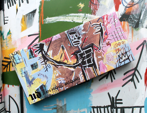
The outer packaging is adorned with the 1983 work Danny Rosen, while the inside features a reproduction of Untitled (The Return of the Central Figure) (1983). These same two works also appear on the lipsticks.
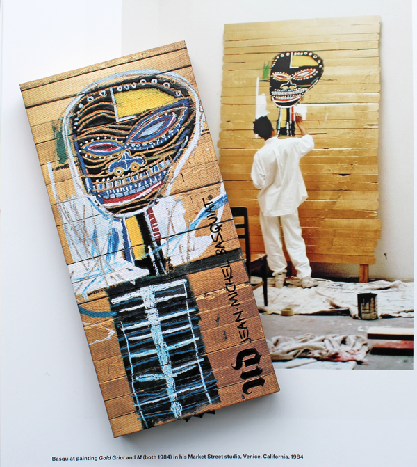
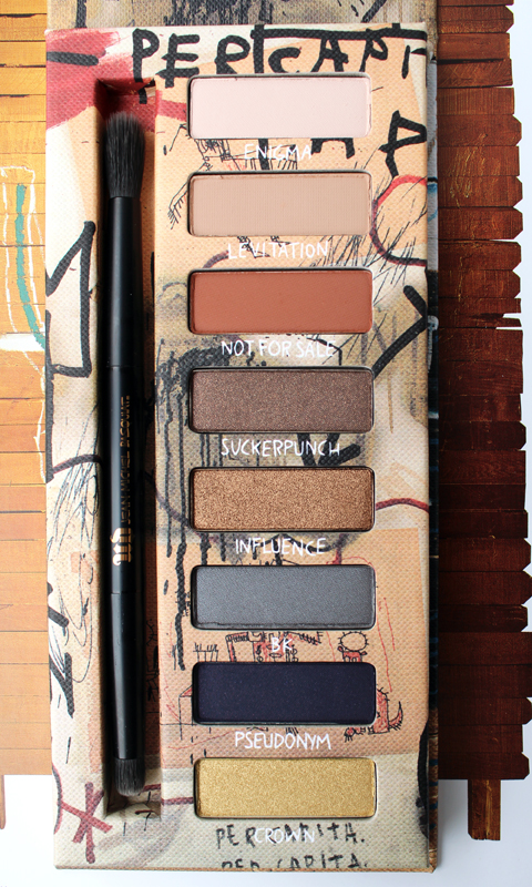
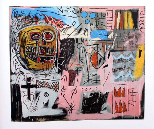
The inner lid of the vault box shows Gold Griot (1984), which is used for one of the eye shadow palettes.
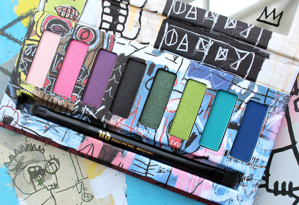
Interestingly, the painting on the interior of the Gold Griot palette is a completely different work. Basquiat painted several pieces entitled Per Capita, and the one that appears on the inside of the palette is from 1982. Unfortunately I was unable to find a decent photo of it online or in any books – only this tiny picture here. Hmmph.
I love how the individual shade names refer to the titles of some of Basquiat's other pieces.
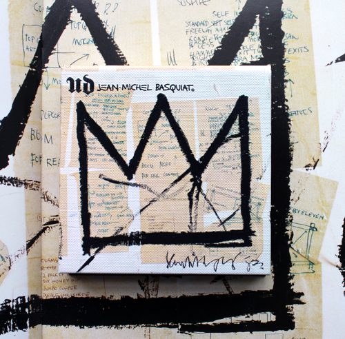
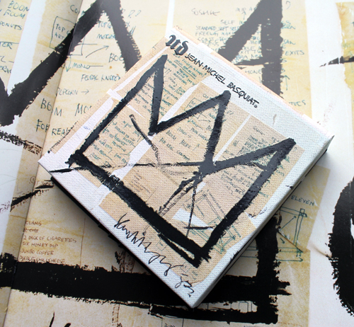
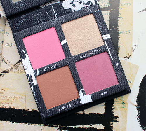
The blush palette depicts Untitled (Crown) from 1982.
The other eye shadow palette in the collection features Untitled (Tenant) from 1982.
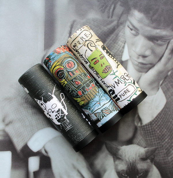
Finally, we have the lipsticks.
Now here are the original artworks. But first, in case you aren't familiar with Basquiat and don't feel like googling, I found this bio to be succinct yet accurate. The immediacy and freshness of his style are still striking nearly 30 years after his untimely death, and I don't think the themes in his work – racism, capitalist greed, the hypocrisy of the art world, among others – will ever be irrelevant. Just a few weeks ago one of his pieces shattered auction records, selling for a cool $110.5 million – more than any American artist.
Let's start with Danny Rosen, titled after one of Basquiat's friends. Here's an excerpt from an excellent essay on this piece, which I encourage you to read in full: "On a monumentally scaled vertical canvas, Basquiat plays out his own excited narrative using a visual language all his own. Colorful, mask-like faces, cryptic symbols, words and cyphers mix with various anatomical details, vegetation and ethnographical heads jostle with more cartoon-like renditions of the human face. Words appear–and are crossed out for extra emphasis–and then placed innocuously next to objects to which they bear no relation. Basquiat's outpouring of imagery is held together by an exploratory train of green vegetation that winds up through the arrangement, acting as a compositional device and pulling all the various elements together into one harmonious whole…Simultaneously both figurative and abstract, Basquiat's imagery and brushwork formulate a painting that interweaves the human form with a staccato rhythm of signs that convey a sense of the mental hurly-burly of modern urban living. The untamed energy of Danny Rosen provides a window onto the frenetic pulse of Basquiat's life and links his past as a graffitist with his new status as an established artist, presenting us with a raw and vivid impression of the urban world he inhabited."
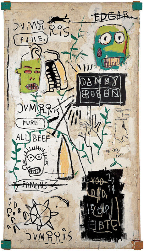
(image from christies.com)
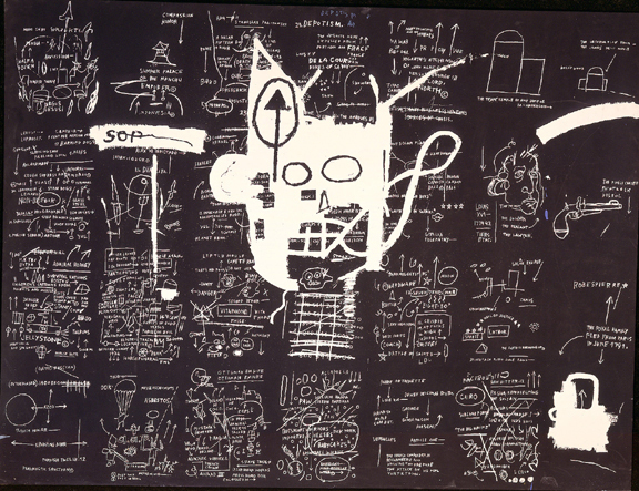
Moving on to 1983's Untitled (Return of the Central Figure), I learned that this piece is actually a silkscreen print, part of a series of 12. The medium may have been Warhol's influence on Basquiat, who quickly saw the potential of silkscreen as it related to his depiction of various dichotomies. As Fred Hoffman writes in his essay for Basquiat (p. 130): "Having worked closely with the artist in the production of his editioned silkscreens as well as his first unique paintings utilizing silkscreen-generated imagery, I became acutely aware of the extent of Basquiat’s concern for incorporating the dichotomy between black and white into both the content and the strategies of his artistic production. A primary example is the artist’s fraught self-transformation from black to white in the untitled silkscreen on canvas of 1983: in the original artwork, the artist depicted a black head set on top of a ground of texts and images; but the silkscreen reverses the positive imagery and texts, turning everything originally depicted in black into white, and everything white into black. Basquiat throughout his career focused on other suggestive dichotomies, including wealth versus poverty, integration versus segregation, and inner versus outer experience."
This work, I think, also is an excellent representation of how Basquiat essentially painted hip-hop. One of the best discussions I found on this was Franklin Sirmans' essay "In the Cypher: Basquiat and Hip-Hop Culture". "Basquiat's art – like the best hip-hop – takes apart and reassembles the work that came before it. That is to say, it dismantles its historical precedents by showing mastery over their techniques and styles, and put them to new uses, in which the new becomes the final product layered over the past…Basquiat's trademark lists of words spat in paint, visually stuttered, repeated and often crossed out, to be read as incantations with a pause for thought and breath: in other words, beats that control the flow of the composition." (p. 92-93) I'm normally drawn to more colorful art, but after reading that analysis I have to say my mind is blown looking at this.
The original was a collage of 28 drawings mounted on canvas.
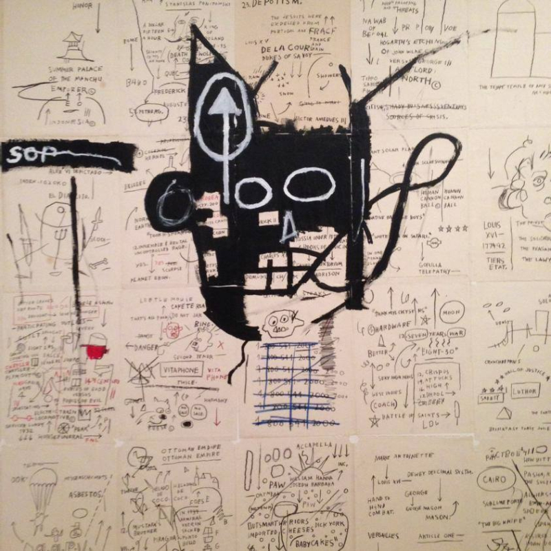 (images from theartstack.com and the Brooklyn Museum)
Gold Griot is also notable for its medium (wooden planks instead of canvas) as well as the subject matter. Eric Fretz explains in Jean-Michel Basquiat: A Biography (p.118-119): "The 'griot' is a West African storyteller: not just an entertainer but an important and respected figure who keeps a family's history and a community's traditions alive through storytelling…sports figures and jazz musicians had served as metaphors for the position of a black artist in Basquiat's earlier work. He was now extending his references back to Africa and comparing his work to the griot tradition." However, I'm more inclined to agree with Marc Mayer's deeper analysis of the griot in Basquiat's work, which proposes that the artist was poking fun at the "primitive" tradition within Western art as well as the American perception of Africa. "But then there are his emaciated, scarified, and almost extraterrestrial griots – a term for West African bards. Chilling fetishes, they exploit an American fantasy of an unrecorded ur-Africa of fear and sorcery. Flexible (page 140), for example, which belongs to a series of similar pictures is a frightening scarecrow of a painting that, judging from the number of its variations, probably amused the artist to no end." (Basquiat, p. 45).
 (image from wikiart.org)
Possibly the most recognized Basquiat motif is the crown. I discussed the meaning behind this in my previous post on the Addiction collection, but here's a succinct explanation, courtesy of Robert Farris Thompson in Jean-Michel Basquiat (p. 20): "This symbol comes straight out of the world of the graffiteros. When Mailer published 'The Faith of Graffiti' in 1974, the two most frequent names on the walls of New York City were 'King' and 'Cool.' Basquiat never lost that preoccupation with nobility. He wanted his stature properly appreciated as a kind of creative royalty. All of which runs parallel with other black Americans who in effect said, 'If you can't see the inherent nobility of our culture then, raising our assertion to a pitch, we will crown ourselves with an alternative hierarchy': thus Duke Ellington, Count Basie, Lady Day, and Nat King Cole."
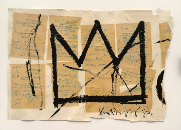 (image from the Brooklyn Museum)
Untitled (Tenant) was a tricky one to find. I didn't come across any decent photos of it online or in the books I looked through, so the best I could do was a screen shot taken from this 2011 documentary. Subject matter wise, I'm not exactly sure what it means, but my hunch is that it's one of the many figural "heroes" Basquiat was painting at the time. Dieter Buchhart explains in Basquiat: Now's the Time (p. 14-15): "Around [1981], Basquiat began to differentiate his depictions, turning towards full-body portraits, primarily of African-American men. He represents these men as boxers, sufferers, saints, angels and fighters. Their halos seem to oscillate between glorioles, laurel wreaths and crowns of thorns, and their weapons stretch from fists, teeth, baseball bats, spears, arrows and swords to brooms, buckets of water and angels' wings…Basquiat's African American men are usually not only read to struggle but also intent on resistance." The raised hands appear frequently in Basquiat's work, simultaneously representing the more general struggle for equality and resistance to white dominance – his pictures of boxers for example, portray figures with conflicted, and as noted earlier, often dichotomous, meanings. Coupled with the title of this piece, I think it may show a black squatter in a vacant home caught off guard by (presumably) white police, especially after reading this analysis by scholar Nathan Brown in his spot-on essay "The Irony of Anatomy: Basquiat's Poetics of Black Positionality": "And indeed the figure is also powerfully consonant with contemporary struggles against anti-black racism, in which the gesture of raised hands, ‘Hands Up Don’t Shoot’, expresses a conversion of black positionality – the position of the putative criminal confronted by the cops – into black power: the assertive action of resistance against the persistence of white supremacy in civil society. This conversion of position into power expresses a scathing political irony directed against the physical imperatives of oppression, the bodily postures and submissive attitudes it demands thrown back with avenging anger." And while Untitled (Tenant) was painted a full year before graffiti artist Michael Stewart was beaten to death by NYC police, an event that shook Basquiat to his core, the figure's pose seems to suggest impending police brutality.
This last one, which appears on one of the lipsticks, was even harder to find. I didn't see any pictures of it online; fortunately one of the books I bought had it. Untitled (1982) consists of a disembodied head – another often-used motif for the artist – surrounded by various scribbles and shapes including the famous crown. Interestingly this one does not have any discernible text. Much has been written about Basquiat's heads, which in some cases like the one below, are partial skulls. This one particular though got my attention – why is this one wearing a bowtie? The row of buttons beneath perhaps suggest that he's wearing a tuxedo, which is also the title of a well-known work.
Hoffman's interpretation of 1982's Untitled (Head) can be applied to this work as well. "Close inspection reveals that this head, unlike a skull, is alive and responsive to external stimuli; as such, it seems alert to our world while simultaneously allowing us to penetrate its psycho-spiritual recesses…Untitled (Head) depicts the left upper and lower teeth, possibly accounting for the work’s misinterpretation as a skull by some. But Untitled (Head) clearly also depicts functioning facial features as well: the left ear, both eyes, and the nose…the artist also reveals less tangible aspects of the head, such as the subtle neural pathways connecting the sense organs to their internal processor. This concern for sensory and cognitive activity negates the interpretation of the head as an inanimate skull. What this work ultimately captures is the fluidity between external and internal—the complex, living processes connecting seeing, hearing, smelling, and knowing…Untitled (Head) indicates that, from the outset, Basquiat was fascinated by greater realities than meet the eye. This work introduces the unique X-ray-like vision he brought to his subjects. His work appears to break down the dichotomy between the external and the internal, intuiting and revealing the innermost aspects of psychic life. In so doing, the artist extends the concern for spiritual truths advanced most notably by the Abstract Expressionists four decades earlier." However, I also think given how crazily wide the eyes are and the bared, partially red (bloody?) teeth, there's a sense of madness and/or monstrosity here too. The description in an essay for yet a different head-themed work, Head of Madman, is relevant for this piece. "Joining the pantheon of mad, deranged and overtly expressive figures engraved throughout the pages of art history, and their commanding visual references within popular culture, Head of Madman maintains a fine balance between control, spontaneity, menace and wit…Embarking on the grand tradition of illustrating extreme states of consciousness through artistic expression, Head of Madman captures the same emotional tension articulated in the Grotesque Heads of Leonardo da Vinci, the Black Paintings of Goya, Otto Dix's war-torn realism, Egon Schiele's erotically charged portraiture, and Francis Bacon's screaming Popes. And yet here, the artist seems to take his figure one step further. Slowly peeling away the skin of his forebears, Basquiat reveals a certain skeletal rawness, derived from the barrage of inner demons and personal struggles the artist was forced to cope with during his relatively short life…Head of Madman at once evokes Frankenstein's monster, coupled with an amalgamation of super villain traits, and combined with a certain mishmash of boldly heroic comic colors…Not irreducible to a single source of inspiration, Head of Madman is a unique infusion of history, biography and mass media imagery."
Now that I've briefly looked at the artworks, let's explore the controversies surrounding this collection. First up, was a collaboration with a brand like Urban Decay appropriate? On the surface, it would seem like a perfect fit given the grittiness of some of Basquiat's work and Urban Decay's mantra of "beauty with an edge". Basquiat sought to change the art world and rebelled against the way it functioned, and one could argue that Urban Decay set out to shake up the beauty industry by trying to normalize non-traditional colors (remember the original "Does pink make you puke?" campaign from the '90s?) So it would seem that Basquiat and Urban Decay would be aligned in spirit. Says David Stark, president of the firm managing the licensing of Basquiat's work: "When we think about a program we try and figure out who the right fit would be and vehicles that would be a good platform for us to get our message out. Urban Decay is a company we’ve known for several years. It took us a little bit of time to craft the program we eventually developed with them, but we did feel that as a brand Urban Decay is edgy and had an element of artistry and felt like a good fit." But as ArtNet points out, "One of Urban Decay’s marketing taglines reads 'UD beauty junkies…Addiction has its perks,' a less than ideal message to set against the artist’s life and legacy considering that he died at age 27 from a heroin overdose." This is quite true, especially when looking at some of their product names like Freebase and Junkie (I admit I own the latter). Still, if Basquiat's work was going to appear on any makeup brand, Urban Decay is the natural choice by a mile. And perhaps the collab could even encourage Urban Decay to change some of their product names to non-offensive ones eventually.
The second questionable decision was the selection of model Ruby Rose to front the Urban Decay campaign. Some were dismayed that a white woman was being used to promote the collection, and I'm inclined to agree. Stark addressed the issue: "I’ve seen some of that criticism. It wasn’t that we chose her because she was white or black, she was already selected by Urban Decay to be the spokesperson for their brand. As far as looking at Jean-Michel as an individual, people would very often try to pigeonhole him and call him a black artist and Jean-Michel would say: 'I’m not a black artist, I’m an artist.' He would say a lot of the protagonists in his work are black figures, and he would say, 'I didn’t see a lot of black figures in paintings,' so he would have his own subversive angle towards these things. In terms of an agenda as a black person or a black artist, it’s hard to attribute that to him. Even though he grew up in a middle-class black family, his family was Caribbean. They didn’t have the African-American experience. His heritage was Haitian and Puerto Rican. He had a very multicultural background." Uhhhh…I'd argue Basquiat DID have the "African-American experience" – it's not like strangers looking at him could know where his family was from; all they saw was a black man. This is to say nothing of the incredibly prominent African-American cultural references and figures that comprise so much of Basquiat's work. Stark's comment makes me wonder if he ever actually looked at Basquiat's paintings. Also, I understand his point about Rose already being the brand's model, but in this day and age, where non-white models are still so underrepresented, it just makes more sense to have a woman of color for this collection. Writing for BET, Lainey Sidell says, "We get that Urban Decay didn't do anything outright 'wrong' with using its normal spokesmodel in this campaign, but it begs a wider, more comprehensive discussion. Are creatives really doing all they can to level the playing field for POC models? With this Basquiat campaign, the answer is looking like no. Our hope is, by continually bringing attention to such decisions, change will come." I understand using a model who was already under contract, but I think Urban Decay could have made an exception for the Basquiat collection – using a model of color wouldn't have hurt.
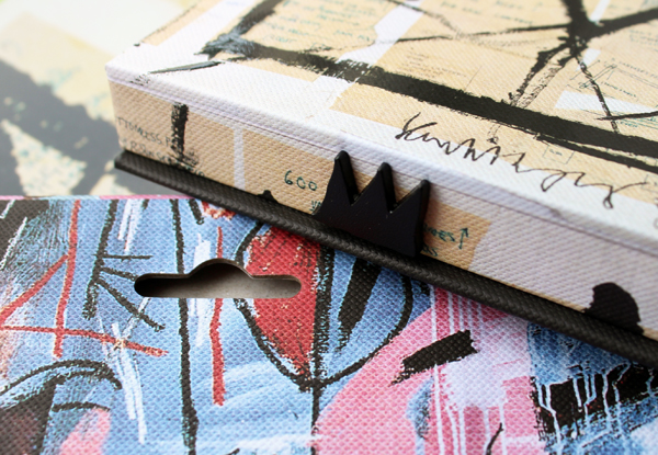
Finally, there's the continually difficult question that can never really have an answer: would Basquiat have approved of his work being used on makeup? Of course we'll never know, but I always like to explore the different sides. The artist's estate approached Urban Decay, not the other way around, so it's not like Urban Decay was chasing after them to make a buck. (I'm not sure how much that means, though, given what we've seen of Kahlo's estate, where it seems her niece is in fact after the sweet dinero.) Some say that Basquiat would be aghast at seeing his art slapped on makeup (or skateboards or dishes or watches) to make money, especially given the anti-consumerism, anti-commodification stance in his work and his own refusal to "sell out" as an artist. As writer Glenn O'Brien, who cast Basquiat in his 1981 film Downtown 81 remembers in Jean-Michel Basquiat: Now's The Time (p.178): "He wanted the big money, but that's because the big money was about respect. He wasn't in it for the money. He was in it for the audience." But O'Brien also points out that Basquiat was committed to making art accessible. "He didn't make work for collectors, dealers, curators or critics. He painted for the public. He didn't paint for those who would hold title to his pieces, but for all those who would see them." (p. 180, emphasis mine). What's better than the average person being able to hang a Basquiat on their wall at a price that's even lower than a print? Urban Decay made sure people could enjoy simply looking at the art in addition to the makeup by including cut-outs on the back of the palettes.
I'd also argue that Basquiat would be tickled at the wide appeal of his art and that it actually appeared on a makeup line that proved to be a quite lucrative deal. O'Brien once again: "I wish he could see his shows now – how they draw the crowds – and I know he'd like his prices. I remember him laughing at a painting he sold at the Fun Gallery show that he'd made in ten minutes. He had figured out his hourly rate was something like $15,000." To see millions of dollars being made off of his work appearing on makeup, I think, would have been greatly amusing to the artist.
At the end of the day, and this is probably my own bias since, you know, I've been running an online makeup museum featuring artist collabs for nearly 9 years, I'm all for makeup featuring artists because it helps spread their work to a wider audience. Even though I questioned Stark's other comments, I fully agree with his perspective on sharing art via makeup packaging: "We like the idea of introducing Basquiat to a new audience and a new generation. This is a way for us to get out in a very public way and engage people with his art and hopefully get them to do a little research and learn something about Basquiat. The other thing is, there are plenty of people, when it comes to beauty, who are not necessarily the museum-going audience. There may be a consumer from Urban Decay who never steps foot in a museum and this is a subversive way of getting Basquiat into different people’s eyeballs that they wouldn’t necessarily see otherwise. Basquiat was a great communicator and this is a way for that art to get out and communicate on a different plane." Again, I'm biased and obviously Stark is too, as the president of a company that makes money off of these types of collaborations, but I'm absolutely on board with this sentiment.
Okay, that was long! If you read my shallow ramblings this far, what are your thoughts? I don't think I did Basquiat justice, but I'm pleased I could at least identify all the works in the collection and aggregate some good analyses from people more adept than I am at writing about art.


