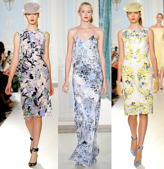
Flowers get a bad rap for being predictably present in every spring collection, but I can't complain, especially when they're as gorgeous as the ones gracing the packaging for NARS's collaboration with London-based fashion designer Erdem Moralioglu. I must say I haven't seen a beauty collection in a long time that so completely and cohesively represents a designer's work. I'll get to Erdem's line towards the end of this post so you can see for yourself just how perfectly the NARS collab encapsulates it, but I'm going to start off with the makeup. I'll relying heavily on interviews with Erdem, since, as usual, I find that the designer/artist's own words explain their vision better than I can (and I'm also lazy). Let's dive in!
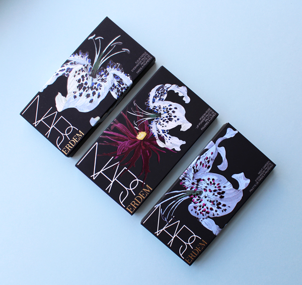
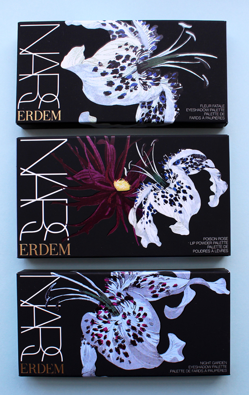
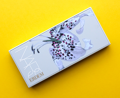
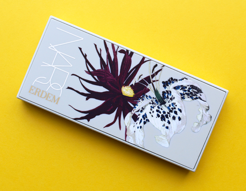
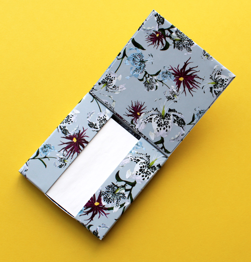
Both the boxes and the palettes themselves are covered in Erdem's signature juxtaposition of bold and delicate blooms. Specifically, he chose not his favorite flower (anemones) but dahlias and lilies, since "dahlias are fiery, and the lilies can be equated with beauty."
Erdem's vision for NARS stemmed partially from his love of exotic flowers, particularly this photo of actress Molly Ringwald taken by Sheila Metzner for Vanity Fair in 1984. "I was thinking about this idea of a strange flower and I wanted to create a range of makeup that had an ethereal and slightly surreal beauty to it."
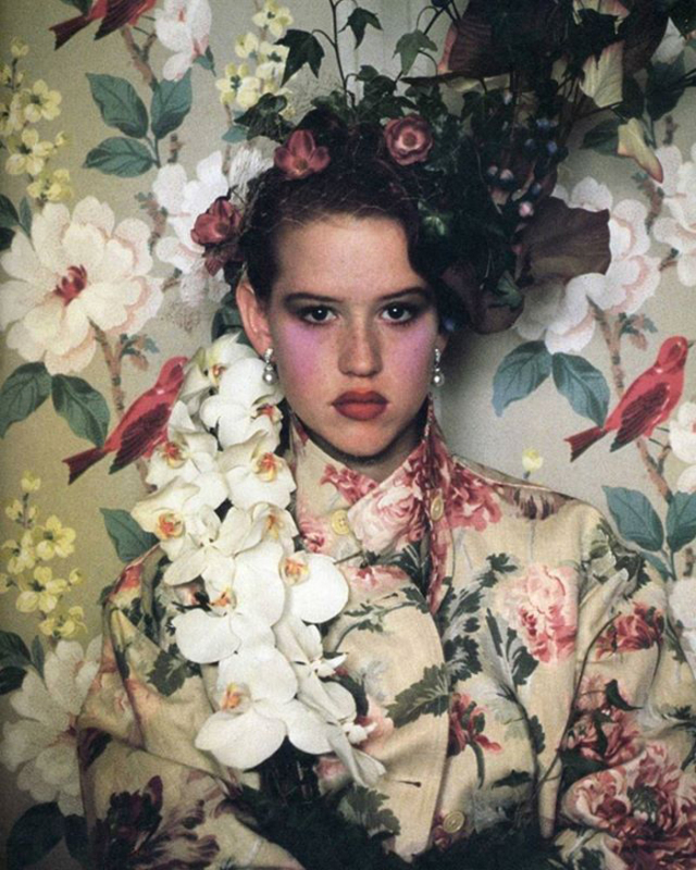 (image from thegloss.ie)
Erdem expands on the notion of a "strange flower" in several interviews. A key element was the idea of contradiction – how some flowers can be beautiful but deadly at the same time, and also the harmonization of flowers that bloom in different seasons. "I find myself looking at nature and seeing [contradiction]. For example: the black dahlia. There’s something about it that makes it beautiful, but at the same time it can be dangerous or poisonous. I find those contradictions in nature quite interesting, so that was my starting point for the name…At first it was kind of a working title when I was trying to gather all my thoughts as to what the collection was going to be, and then as it developed it became [Strange Flowers]. I liked this idea of contrast and tension, and I think a flower [has that]. For example, a rose is a symbol [of] softness and femininity and beauty, but then things like a black dahlia [has] a strangeness for a flower. I was interested in exploring the idea of a flower being quite complex and odd and dangerous and beautiful at the same time—the spectrum of it. The softness of certain colors and the oddness and exoticness of others." He adds that dividing flowers into the four seasons "helped guide me in terms of thinking about palette, and even thinking literally about certain plants that grow in certain times of the year and figuring out how certain colors could work with each other. Once those parameters were set in my mind I was very interested in exploring odder shades and new shades as well and that’s how all of these range of colors in the collection came about."
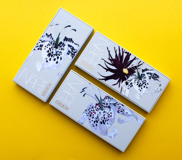
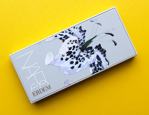
The packaging for the cases themselves was changed to a pale dusty blue, the same custom shade painted on the walls of the Erdem store in London. I pictured the blue packaging sitting in my blue Mayfair store and liked that image," he says.
My photos don't show it well, but the color is very close to the store walls.
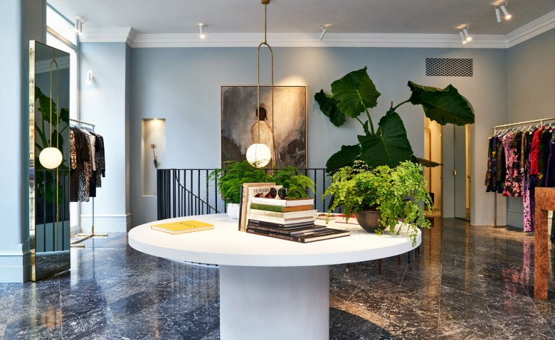 (image from 10magazine.com)
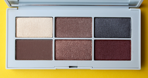
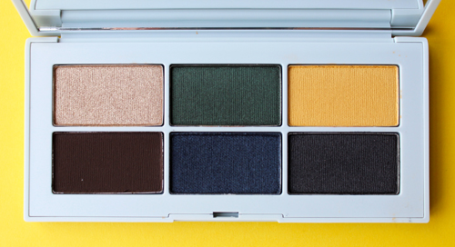
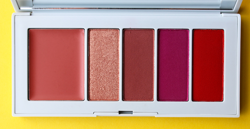
The idea of juxtaposing opposites was fully realized in the color selection for the collection. There are delicate pinks, such as the pale lavender Love Me Not blush, sitting along side dramatic dark blue and purple eyeshadows. "The idea of contrast runs through all of my work – the aspect of the feminine juxtaposed with something slightly dark, which is an extension of my aesthetic. The colour palette (of Strange Flowers) combines delicate colours, which may be more associated with the feminine, such as lilacs and blush (seen in the lipsticks and slightly pearlescent blusher), but contrasts them with more unexpected hues like yellow or deep burgundies (find more of these in the eyeshadow palettes, which are highly pigmented with a velvety-matte finish)." Different textures also highlighted Erdem's desire to express the notion of contradiction; the highly pigmented lip powder palette is a stark contrast to the sheer, weightless Carnal Carnation lipstick. "Developing these colors that were so saturated and then playing with sheerness and the idea of transparency and how certain pigments are completely opaque, but if you look at the rose on the lip palette powders, there’s so much pigment in it. Even the highlighting pencil has so much pigment in it, but something like the Carnal Carnation lipstick has that kind of sheerness to it, which is really beautiful.” In this way Erdem managed to create something for everyone. "I think my woman is a lot of different women, and she’s got a lot of different characters. I’ve worked with Nars for so many years (on my runway shows), and sometimes the makeup looks are very clean and fresh, and sometimes they are bold. It just depends on the mood of the collection."
The lip powder is one of the items inspired by one of Erdem's closest family members. "My earliest memory of makeup came from my mother. She never wore any makeup on her face, but before she would leave the house she would always put on a very specific shade of red lipstick, and then she could face the world. I remember as a 5-year-old creeping towards her bedroom and looking at her lipsticks and lipstick palettes. I remember thinking her lipstick brush was so fascinating. The ritual of it all was so interesting; there’s something incredibly powerful about it. The idea that you can put something on and immediately feel different."
The other family-inspired item was the blotting sheet compact, which drew on fond memories of his twin sister and her friends using blotting sheets in high school. "I loved how the paper felt and smelled – there was something so tactile about it…It was something that was particularly useful in the summer. And actually, in places like Singapore, I think blotting paper is such a practical thing. The idea of providing a matte base without any kind of makeup is really beautiful. It leaves you a lot of space to play with, such as creating a beautiful focus on the lip or eyes. I love the idea of how you can just keep it in your handbag and apply it whenever. It’s a really chic way of touching up your face without the idea of piling on any makeup…There’s something so beautiful about this idea that it wasn’t really makeup, but something you do just do to feel together. Considering this comes out in the spring, it felt like such a practical thing to include. It’s a tool to support everything else."
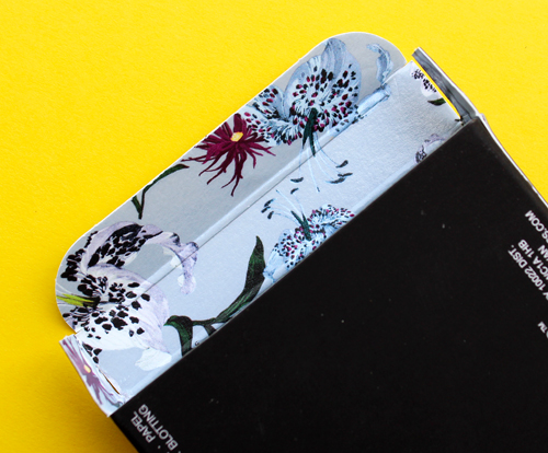
As for the rest of the packaging, it's filled with beautiful details. I love the print on the inside of the boxes.
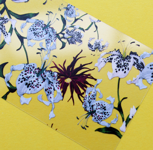
Even the plastic overlays are brimming with flowers.
As for how the collaboration came about, it was the usual fashion/makeup collab path: NARS has been working with Erdem on his runway shows since 2013, so it was a natural fit. In true NARS style, Erdem was given free reign to come up with the colors and even new products – the lip powder, blotting sheets and highlighter stick are all new for NARS, and they were innovations Erdem enjoyed coming up with. The process to develop the collection took two years and seemed to be truly a labor of love. "The Nars aesthetic is forward-thinking; it’s chic, it’s strong. I think François is such an extraordinary visionary. Nars is known for its innovation, and people go back to it again and again, which is a testament to their quality as well. They’re so open-minded to different products. I collaborated on every aspect of it, from working closely with the product developers for the new products to the colors and formulas of the lipsticks. We were allowed to do the campaign imagery from London, and I got to work with my favorite florist and photograph it. It was wonderful…The lip powders are something I’m really proud of, because that was something that didn’t exist in the Nars range. [It was] based on a look that was created for a fashion show that was done years ago. The color is so beautiful and intense. It took a long time, and it was a lot of back-and-forth."
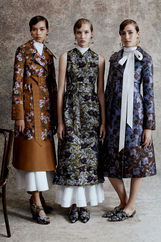
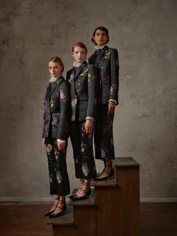
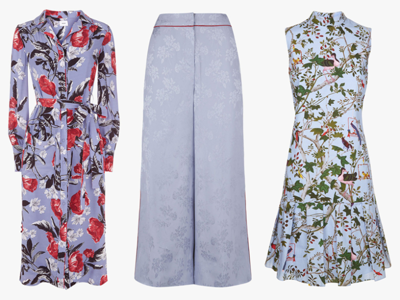
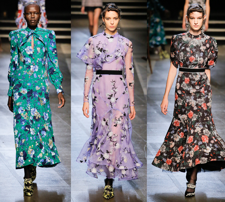
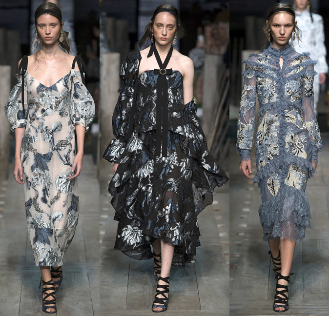
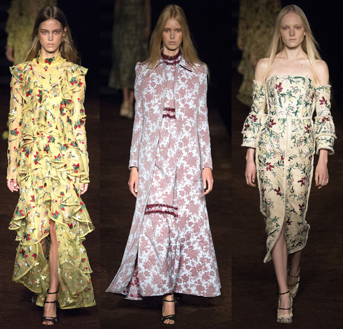
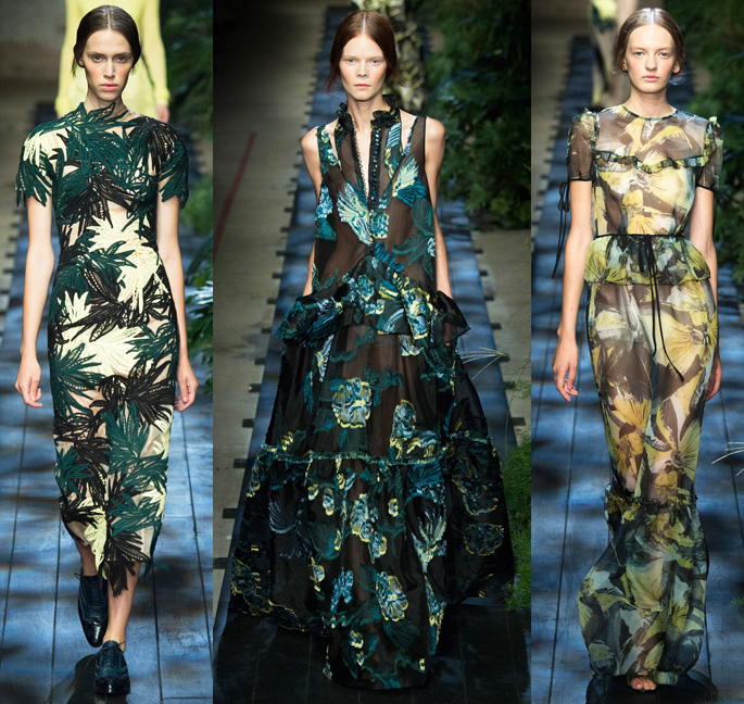
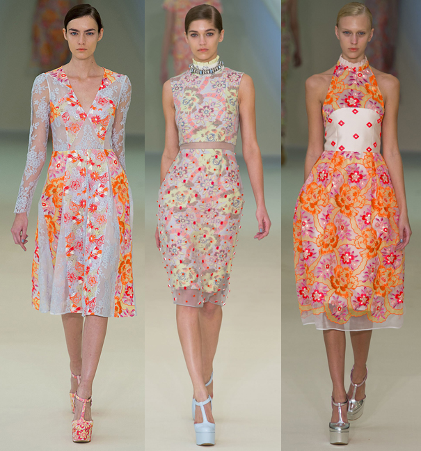
His earlier prints remind me quite a bit of Paul & Joe's, but with a completely different vibe.
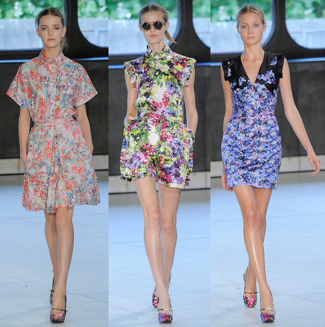 (images from vogue)
As with most designer collabs, looking at the clothing brings the makeup full circle to me. I bought the NARS collection because it was pretty but had no clue who Erdem was or what he was about. Even though I had a clearer sense upon reading the interviews with Erdem about the NARS collection, I wanted to see for myself whether the clothing tells a different story than what appeared in the makeup. I was pleased to see that it was indeed an accurate embodiment of Erdem's aesthetic. In fact, I'd say this is one of the best designer collaborations I've seen due to how thoroughly the spirit of Erdem was represented. His approach to fashion carried over seamlessly to the makeup, and every single shade and detail seemed meticulously planned to adhere to his vision: a study in contrasts.


