Welcome to the Makeup Museum's spring 2017 exhibition! As you may know, for the past few months I've been hopelessly under the spell of anything holographic/iridescent/prismatic, and I think this morphed into an obsession with all the colors of the rainbow. (Or it could be Desus and Mero's nightly rainbow feature seeping into my subconscious.) Duochrome makeup is obviously different than rainbow makeup – I see the former as having color-shifting principles, while the latter is vibrant yet static – but I'd argue that they're all on the same…spectrum. (Sorry, couldn't resist). What I mean is that merely colorful makeup is different than holographic, but they share similar qualities. Generally speaking, I was inspired by the broader notion of color play and the endless possibilities a variety of colors can provide. I've always loved vividly colorful makeup because as we'll see, over the years it's become synonymous with fun and self-expression, which is basically my makeup credo. From 6-hued rainbow highlighters and a set of primary colors to create unique shades to more subtle gradient palettes and sheer lipsticks, makeup that encompasses the whole spectrum allows for a great amount of experimentation. Even color correctors offer the opportunity to play. I wanted this exhibition to express the joy and creativity that a wide range of colors can bring, especially when viewed as a collective whole such as a rainbow.
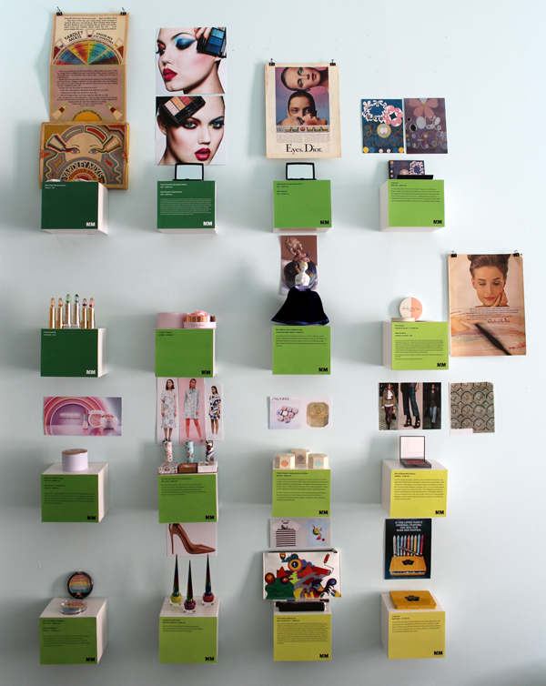
While I could have probably could have done an entire rainbow-themed exhibition, there were some new, non-rainbowy releases that were simply too good not to include, plus I thought they added a nice balance to all the color. Also, did you notice the labels? I got the idea to make them a gradient rather than all one shade, but my husband, super smarty pants that he is, chose the exact colors and how to arrange them. I think this is the first exhibition where I had to determine where everything was going prior to printing the labels. Usually I just print them out and figure out placement of the objects later since I can always move the labels around, but this time I had decide on placement first since moving things would mess up the gradation effect.
Let's take a closer peek, shall we?
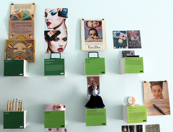
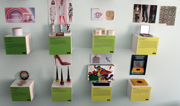
Top shelves, left to right.
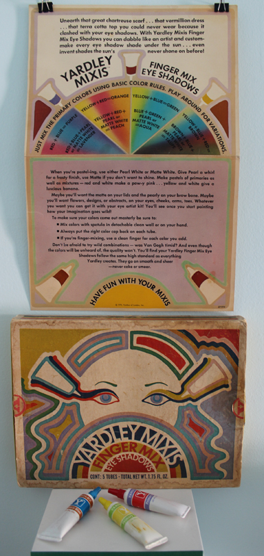
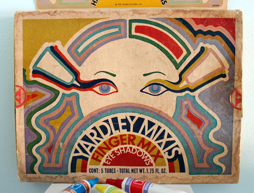
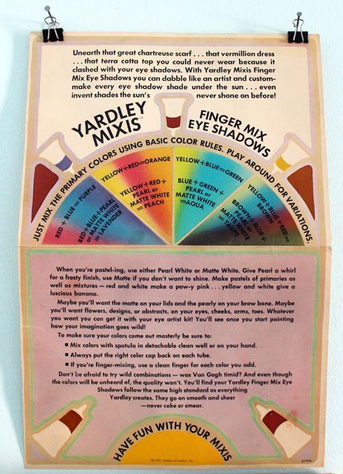
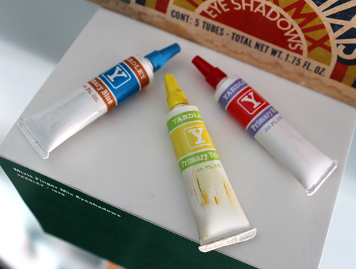
I spotted this 1970 Yardley set on ebay and knew it would be perfect.
The box isn't in the best shape but aren't the graphics so cool?!
I love that the insert encourages you to have fun and experiment. It's a stark contrast to actual ad for the product, which, underneath its seemingly feminist veneer, is horrifically ageist.
I tried cleaning up the tubes but I scrubbed too hard on the yellow one, which resulted in a few cracks. I forget these things are over 40 years old and that plastic doesn't necessarily remain durable for that amount of time.
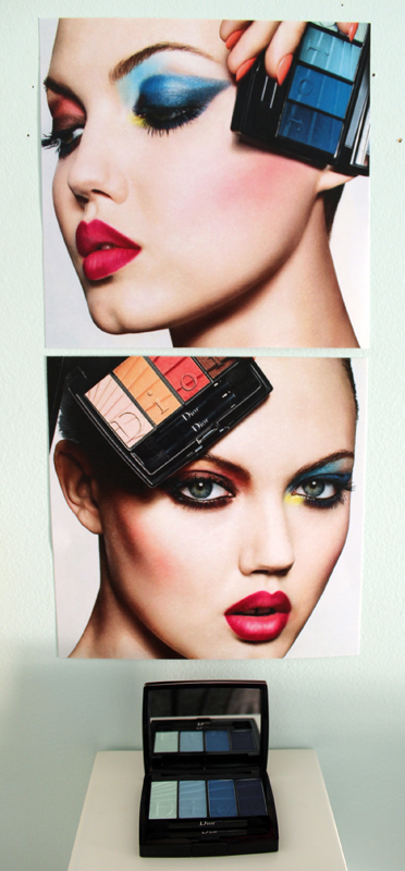
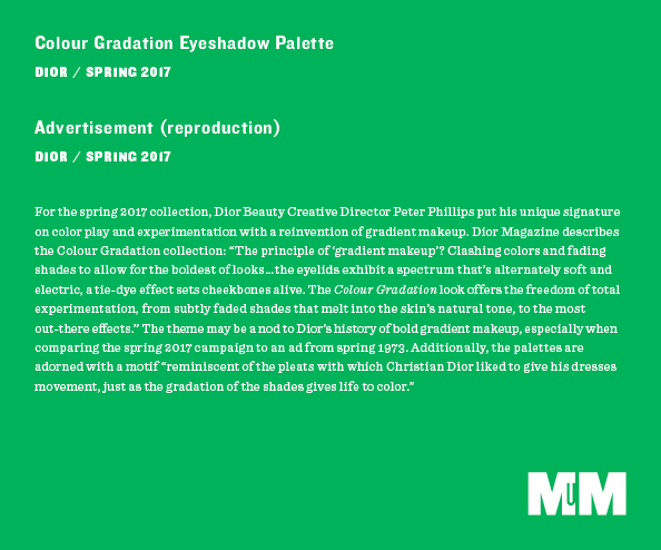
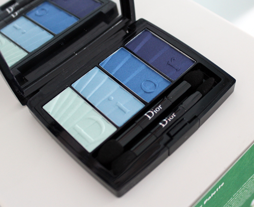
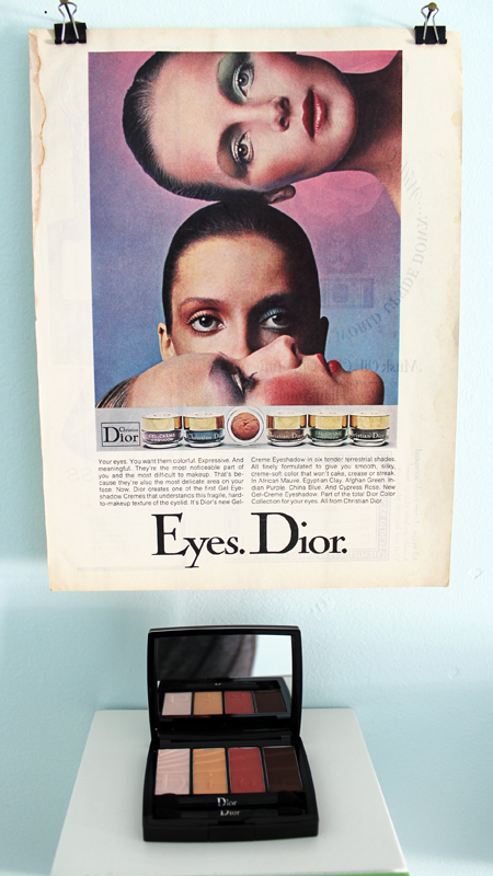
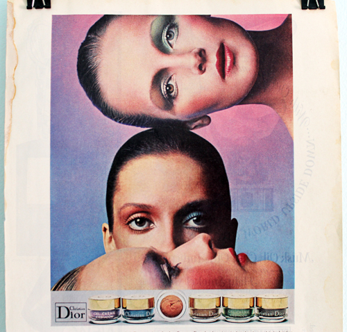
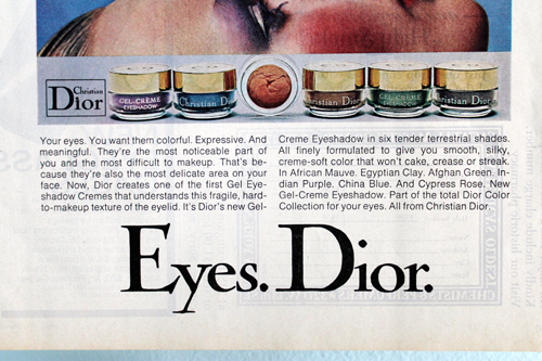
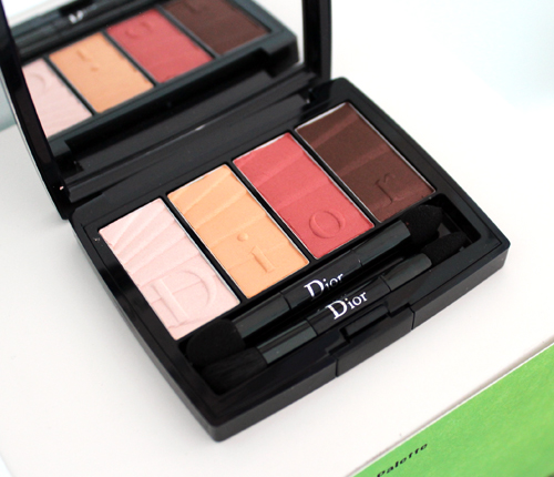
The similarity between the eye makeup for Dior's spring 2017 collection campaign and an ad from 1973 is striking.
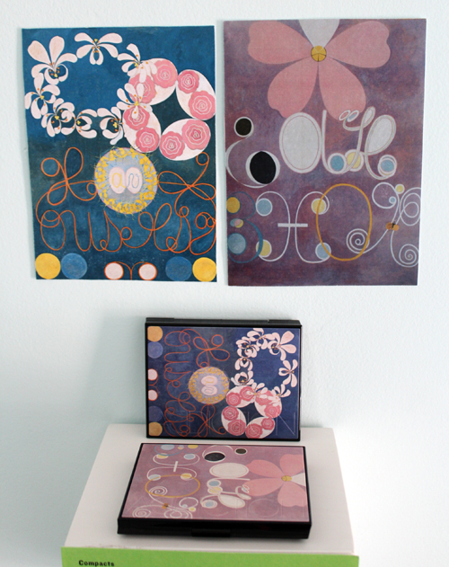
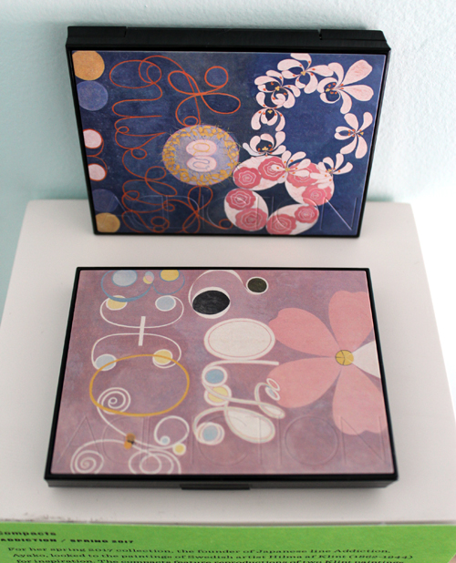
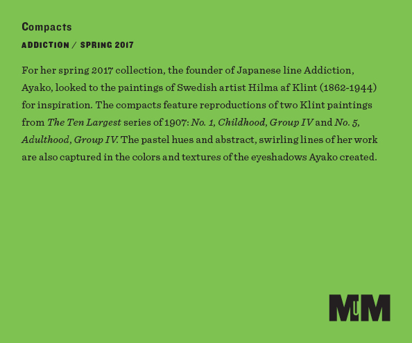
My heart skipped a beat when I saw that Addiction would be featuring the work of Swedish artist Hilma af Klint on their compacts this spring. Af Klint's work really spoke to me and I'm so happy Addiction helped spread the word about her.
Second row, left to right.
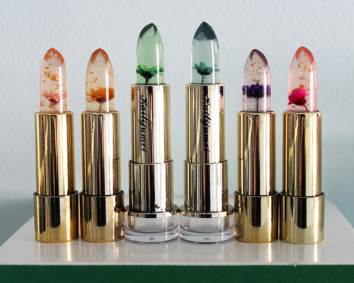
These lipsticks are so delectable!
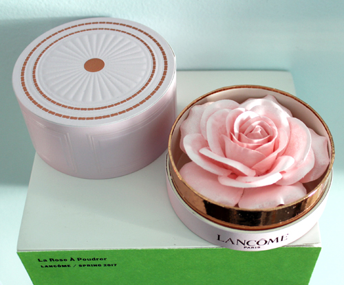
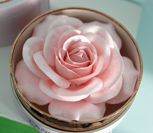
I know it's just a fake flower with highlighter dusted on top, but it still makes me swoon.
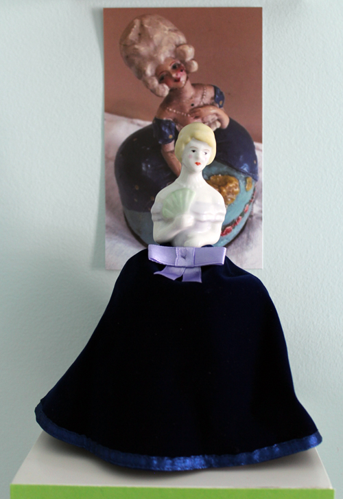
Still haven't figured out a name for this little lady.
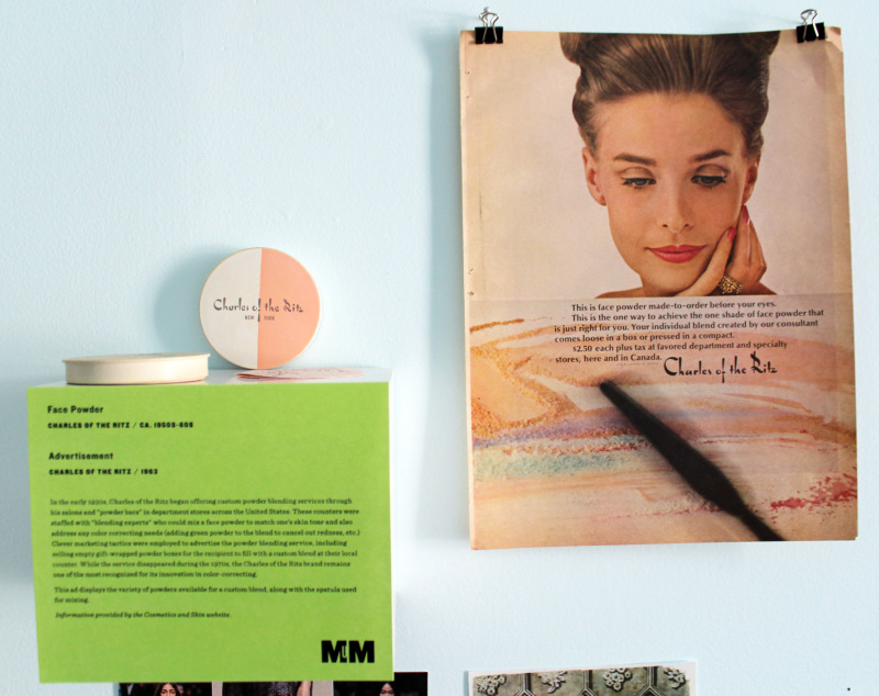
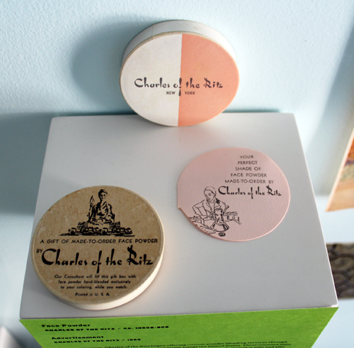
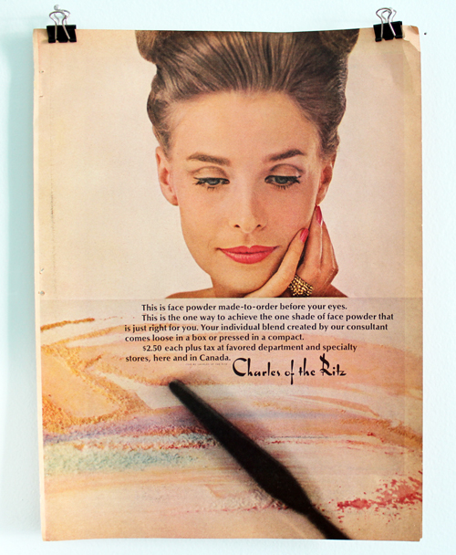
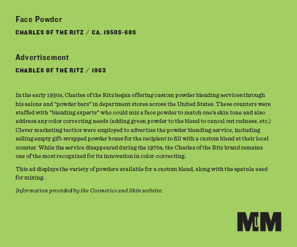
If you remember that popular video that was making the rounds a little while ago, it showed a Charles of the Ritz powder bar.
If I ever display this again I'll update the label. Turns out Charles of the Ritz tried to bring back the service in August of 1988, but I don't think it stuck around long. Perhaps they couldn't compete with the likes of Prescriptives, who was by that point leading the way in custom blending? (Sidenote: I'm tickled at how the article is written by Linda Wells, who was just 2 years shy of launching what would become the world's best-known beauty magazine, and how it also cites Bobbi Brown and refers to her as simply a "makeup artist." Little did they know that Bobbi's own line would be taking the makeup world by storm in another 3 years.)
Third row, left to right.
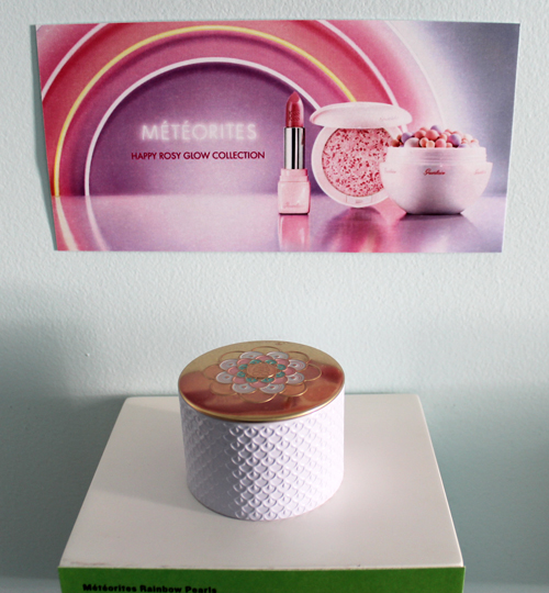
I'm not sure why Guerlain used a rainbow for this spring's campaign and not for their summer 2015 Rainbow Pearls, but they look good together.
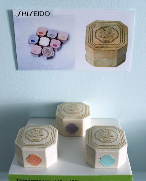
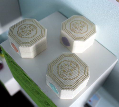
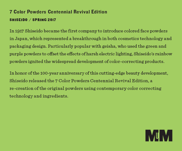
Shiseido 7 Color Powders Centennial set (well, part of it):
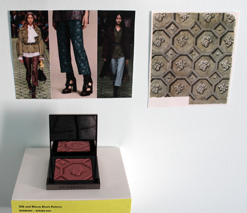
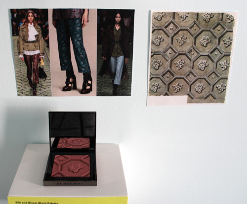
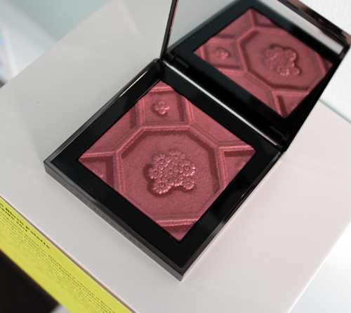
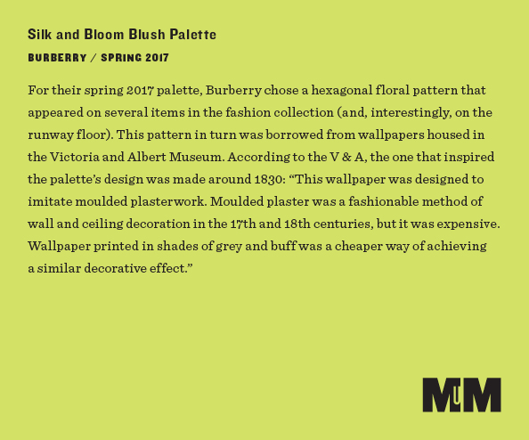
Burberry Silk and Bloom palette:
Bottom row, left to right.
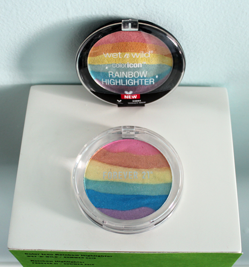
Rainbow highlighters…I just received word that the original was re-stocked so I will have to purchase it. 🙂
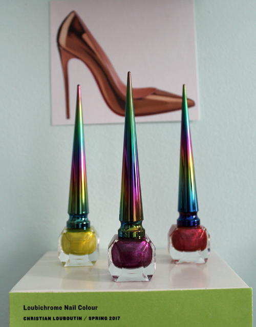
Loubichrome nail polishes:
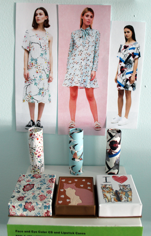
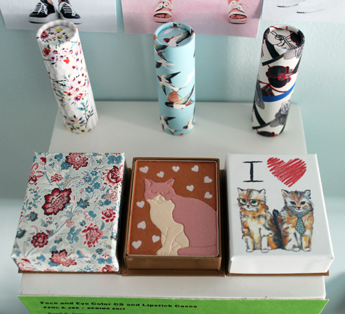
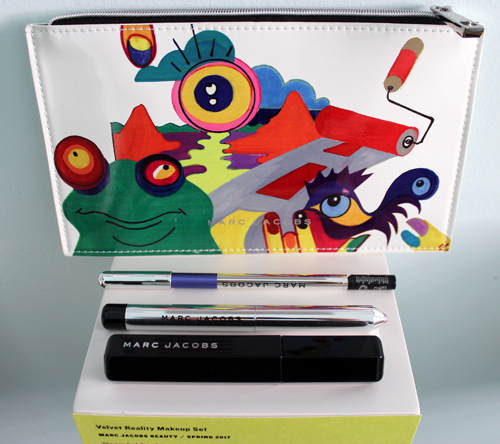
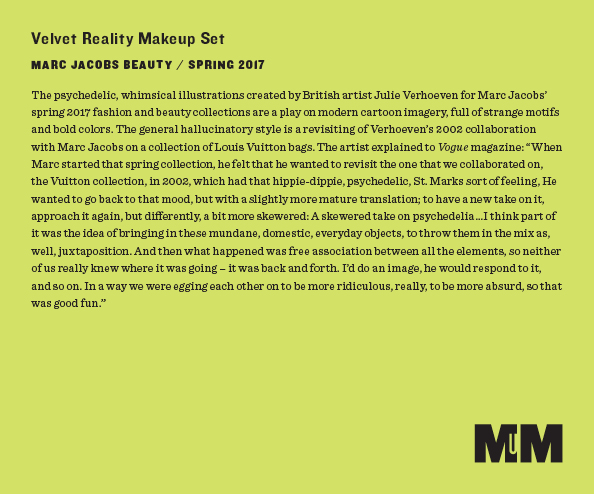
Interestingly, when I working on the label I came across a Vogue interview with Julie Verhoeven that was published after I had posted about these makeup sets. She clarified that Jacobs had specifically requested to revisit the imagery on the 2002 Louis Vuitton collection, so it wasn't a random decision to go with that style. As for the frog motif, which I am completely smitten with, it was most likely a nod to Jacobs' fondness for the animal (another recent interview with Verhoeven tipped me off.)
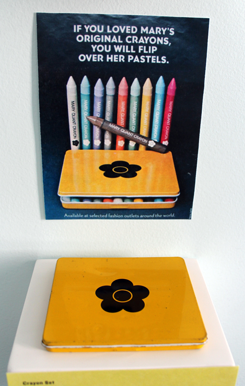
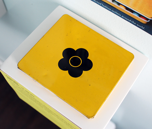
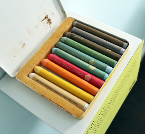
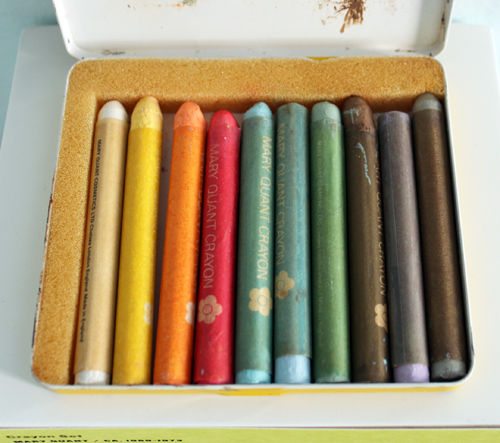
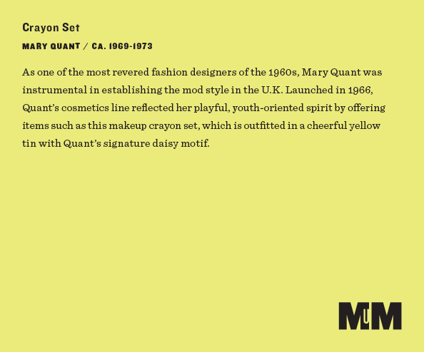
Ah! I was so excited when this set popped up on ebay I could hardly contain myself. This is probably the best representation of late '60s/early '70s beauty. It doesn't have the insert but overall it's in great condition. I don't know whether this particular set is specifically the pastel version mentioned in the ad (which is a printout of an original from 1973 – forgot to put that on the label, oops) or the regular non-pastel crayons, but I was overjoyed to finally get one into the Museum's collection.
In doing a little background research for this exhibition I came across some interesting things. I couldn't possibly pull together a comprehensive history of colorful/rainbow-inspired makeup, but here's a quick look back on some of the highlights. While color correcting powders existed early on in the modern beauty industry, it seems as though the more colorful side of makeup wasn't popularized until the early '60s. Ads for collections featuring a robust range of vibrant shades included words like "fun", "play" and "experiment", thereby associating color variety with happiness and creativity.
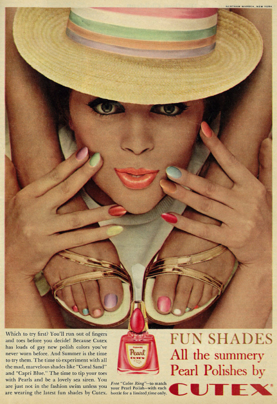 (image from flickr.com)
This was the earliest ad I could find that mentions a "rainbow" of shades.
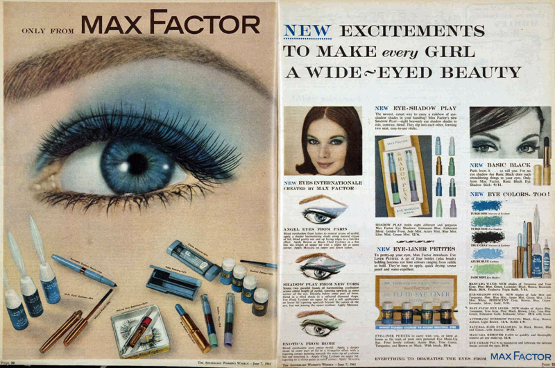 (image from hair-and-makeup-artist.com)
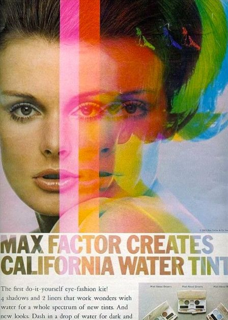
This 1967 ad not only depicts a spectrum of color, it encourages the wearer to create different looks by adding varying amounts of water to the pigments. I'm assuming you could adjust the opacity this way.
(image from pinterest.com)
While I love the Yardley Mixis set and the classic Mary Quant crayons, I think this brand is my favorite representation of late '60s beauty, at least in terms of advertising (you can see more here). It's so crazy and psychedelic…looking at this makes me want to dance around in a field with flowers in my hair, LOL. Sadly I was unable to track down any original makeup or ads from this line, which I believe was exclusive to Woolworth's in the UK.
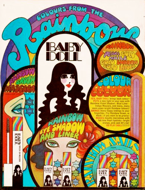
(image from sweetjanespopboutique.com)
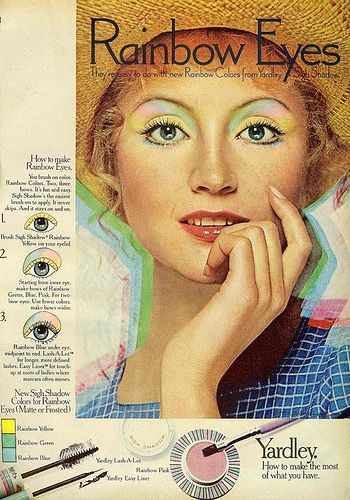
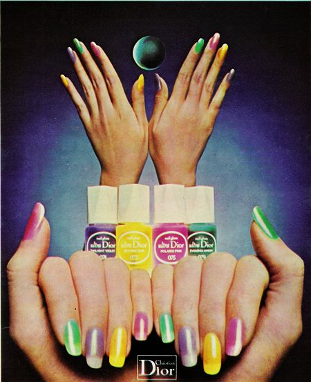
The demand for color didn't end with the '60s, as evidenced by these early '70s Yardley and Dior ads.
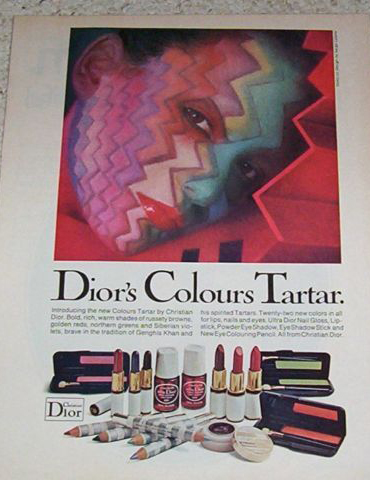
(images from ebay.com)
Once again, a variety of colors is linked to self-expression and fun.
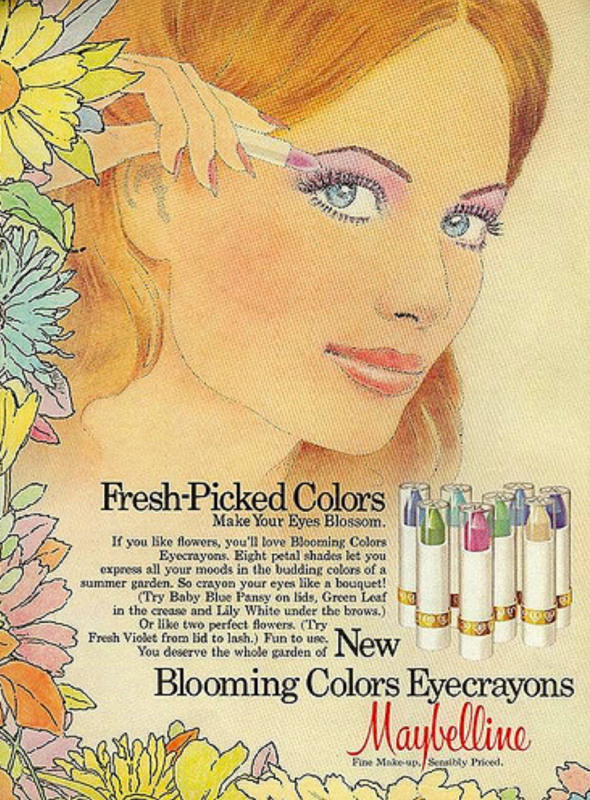 (image from flickr.com)
Dior kept the color game strong in the '80s. (There was a 1981 Elizabeth Arden collection entitled Rainbows, but it didn't really offer much of a shade range).
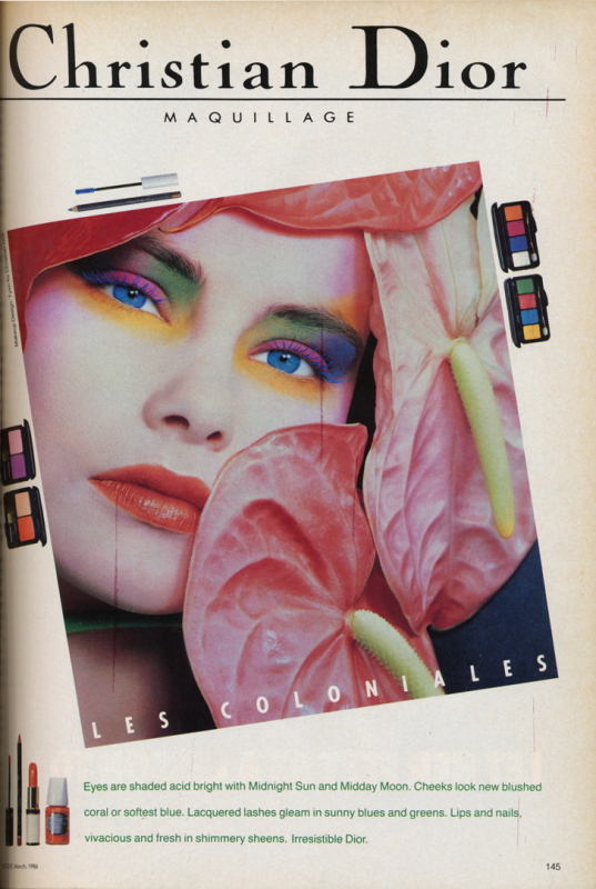 (image from sighswhispers.blogspot.com)
More recently, rainbow-inspired beauty has had its moments. The models at Peter Som's spring 2013 runway show sported pastel rainbow eye shadow, while later that year, Sephora's holiday collection brush set featured iridescent rainbow handles. For summer 2015 MAC released a collection with basically the same finish on the packaging, and come November, Smashbox's collaboration with artist Yago Hortal offered an eye-popping array of shades. I'd argue that 2016 was the tipping point for the rainbow beauty craze, with fashion designers leading the way. These runway looks helped set the stage for the likes of ColourPop's rainbow collection and Urban Decay's Full Spectrum palette, both released last year, along with MAC's Liptensity collection, which brought a whole new dimension to color perception. While it wasn't a rainbow-themed collection per se, Liptensity's "tetrachromatic" formulation ushered in a new way of thinking about and playing with makeup pigments in much the same way rainbow makeup did.
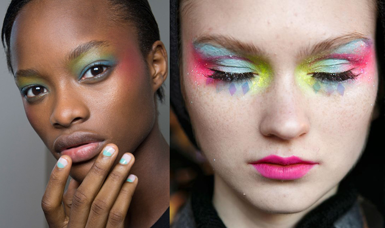
(images from makeupforlife.net and fashionising.com)
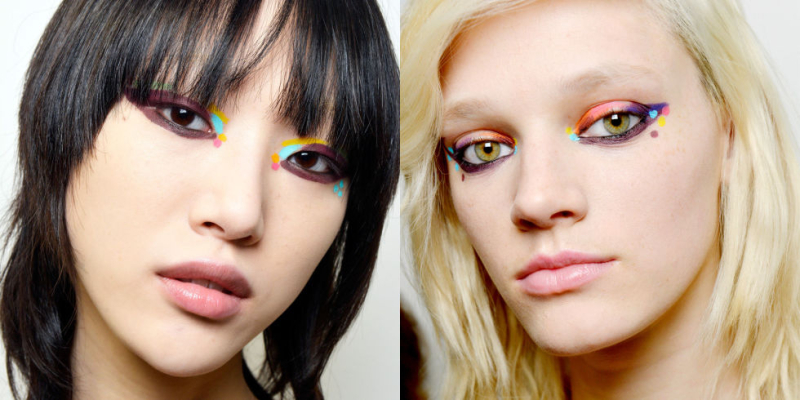 (image from harpersbazaar.com)
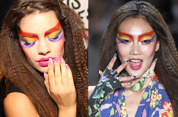 (images from wwd.com and seventeen.com)
It doesn't look like rainbow makeup is going anywhere soon, as evidenced by the stunning looks Pat McGrath created for Maison Margiela's fall 2017 show, along with products like MAC's Colour Rocker lipsticks and Kat Von D's Pastel Goth palette. Even Sephora's typography got a rainbow makeover. (While the gradient rainbow style was used more to convey holographic makeup/highlighters, it represents exactly what I meant earlier – rainbow makeup and holographic makeup may be distant cousins, but they definitely belong to the same family).
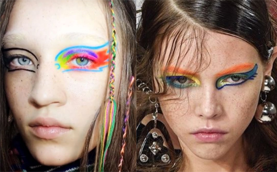 (images from instagram.com)
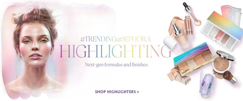 (image from sephora.com)
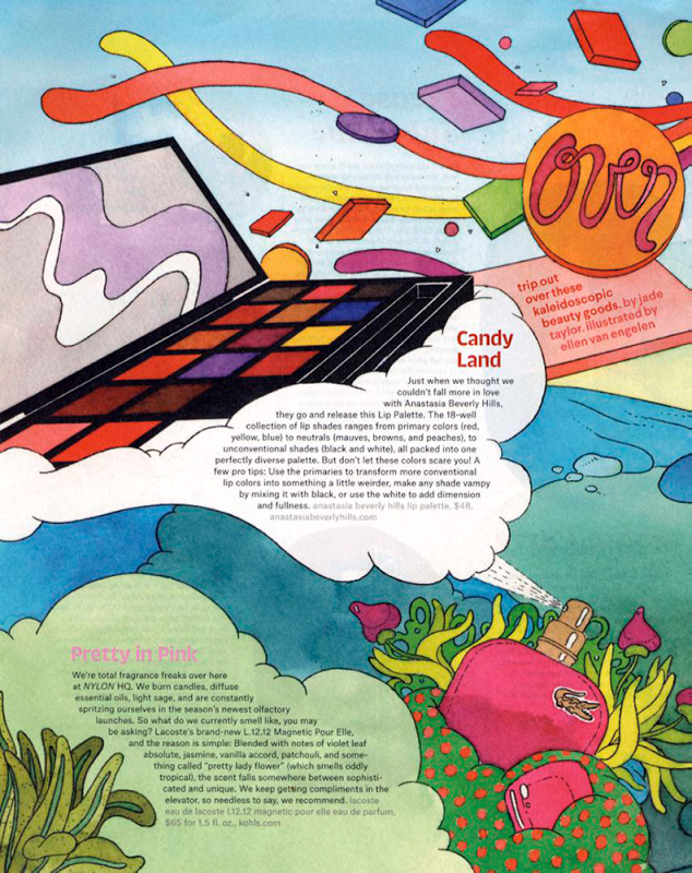
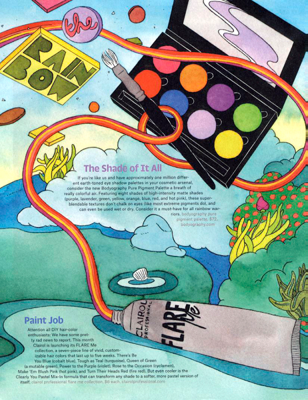
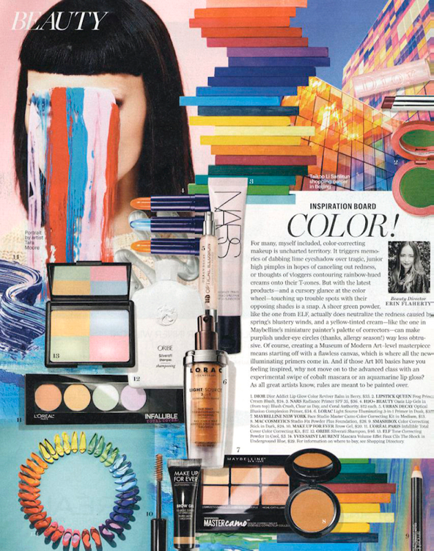
Then there are these magazine features from the March 2017 issues. (Yes, I still tear out magazine pages. Yes, I'm aware there's Pinterest and that we live in a digital world.)
That was long! Phew, I'm tired. Actually I'm not, since looking at a bunch of different colors together energizes me. As a matter of fact, I tend to get a little overstimulated, which is why I do most of my makeup shopping online – in-store browsing at all those colors displayed on the counters is very bad for my wallet.
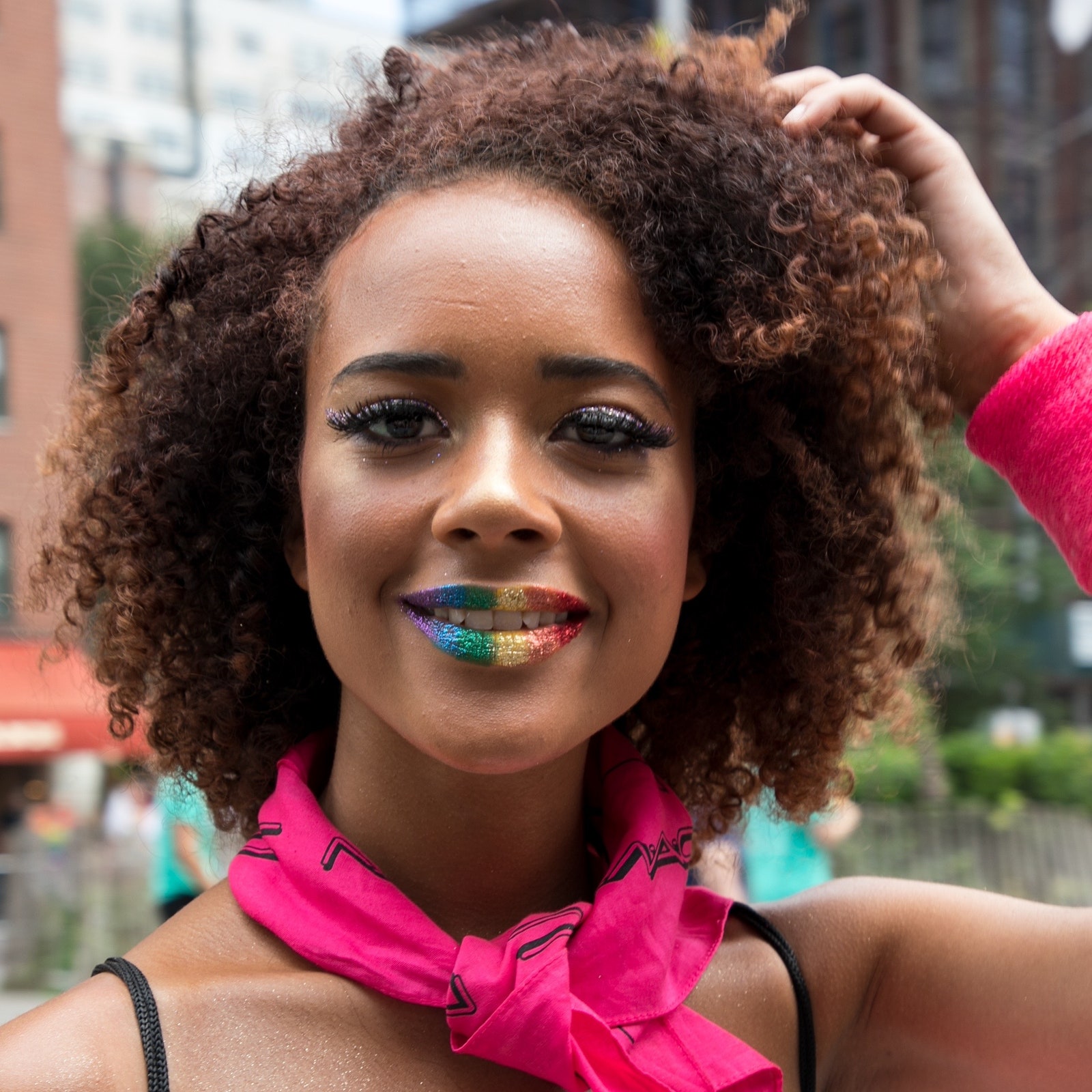
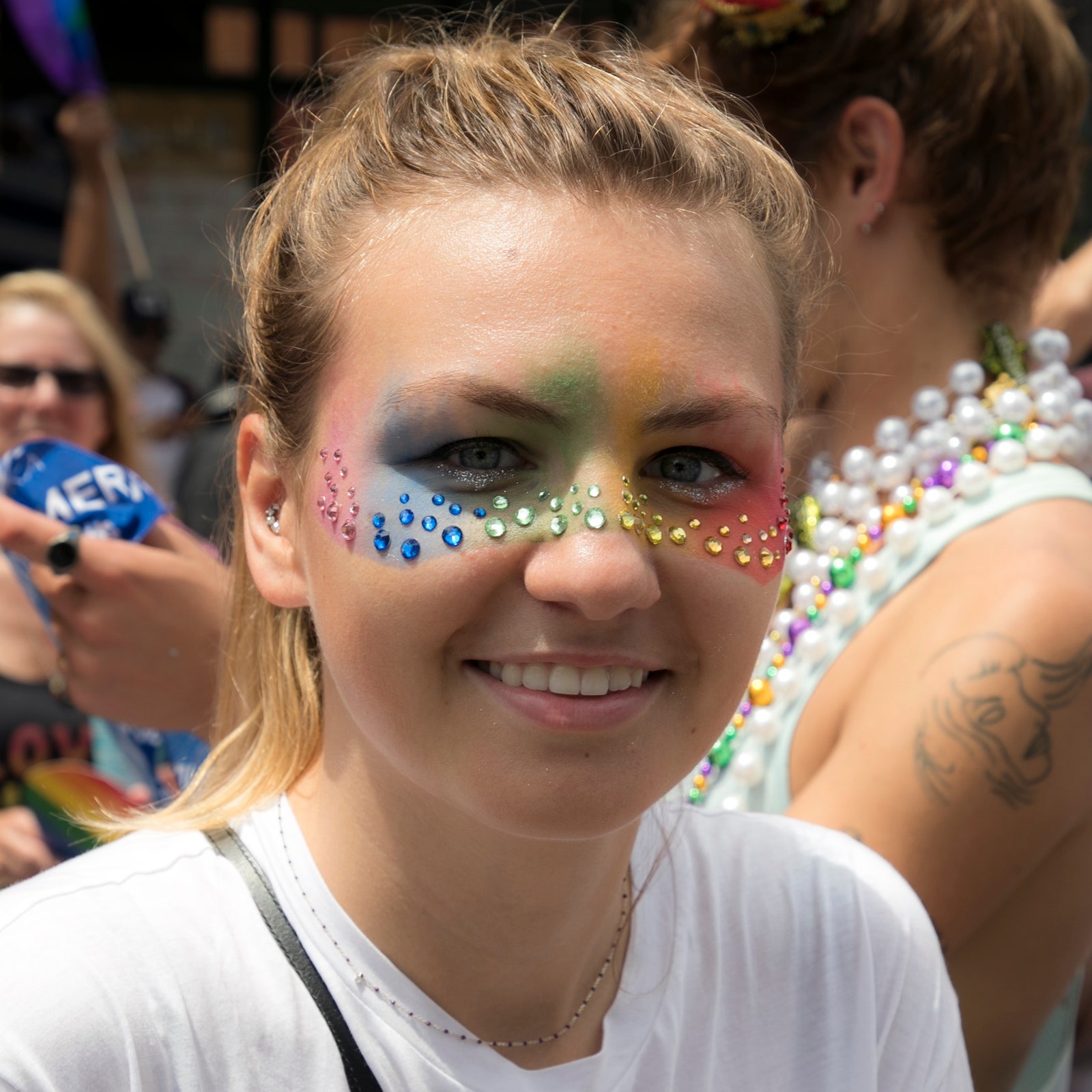
Update, 4/3/2020: I realized I never addressed rainbow makeup as it pertains to the LGBTQIA+ community. In addition to rainbow makeup's role as a way for people to explore more colorful cosmetic options, it also functions as an important extension of the rainbow symbolism created by and for the community over 40 years ago. One questionable trend, however, has been the rise of companies slapping rainbow packaging on some of their regular line items in order to "celebrate" (co-opt?) Pride month. By and large, it’s a positive development as the products raise visibility for LGBTQIA+ rights and most of them donate the sale proceeds from these items to various charities. They also call attention to makeup’s significance for the LGBTQIA+ movement, both past and present. On the other hand, sometimes it feels like a shameless cash grab with the main focus being the product instead of meaningful action or change. If you’re on the market for new makeup and want to feel good knowing that your purchase helps a marginalized population, go for it – no one should be embarrassed to buy them. I personally cannot get enough of rainbow packaging and purchased several items just for the colorful designs on the boxes. But the motivations of some of these companies are questionable, i.e. are they really committed to the cause or just once a year when they put rainbows on their packaging and call it a day? One thing is for certain though: although the Museum is committed to LGBTQIA+ rights year round, I look forward to the rainbow looks Pride month brings (and obviously I think people should feel free to wear rainbow makeup year round as well.) Pride looks exemplify the raison d’etre of rainbow makeup by demonstrating the joy playing with color can bring and the freedom to wear it.
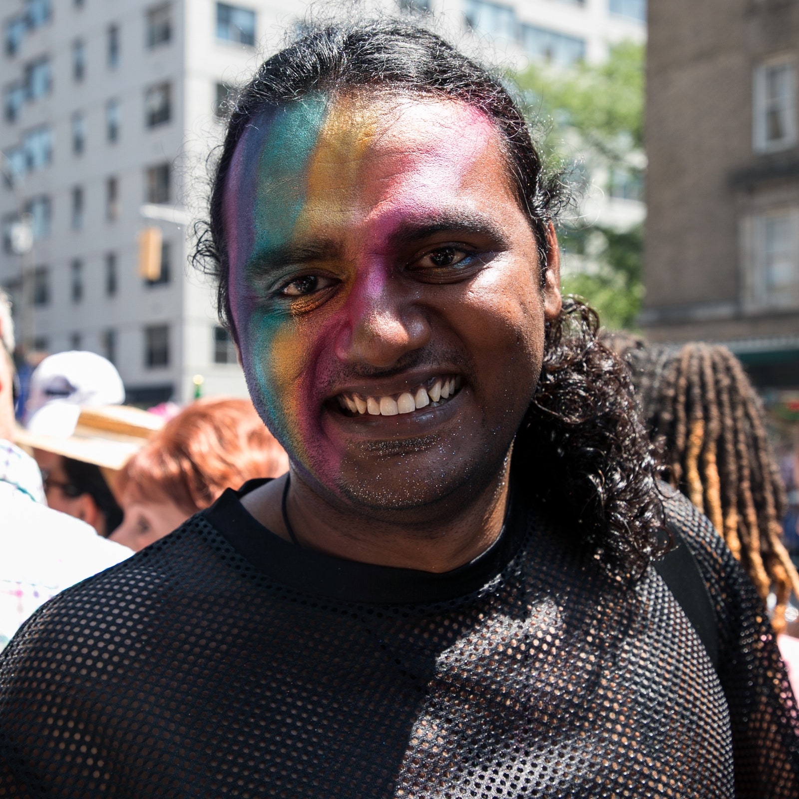
(images from allure.com)
I hope you enjoyed the exhibition and that you'll play with color this season, either by wearing shades so bright they hurt your eyes or simply giving color correctors a go (and everything in between). Just have fun!


Gorgeous! Great exhibition theme for spring 🙂
Gorgeous! Great exhibition theme for spring 🙂
Hi Justine! So glad you enjoyed it! Thanks so much for stopping by!
Hi Justine! So glad you enjoyed it! Thanks so much for stopping by!