Makeup Museum (MM) Musings is a series that examines a broad range of museum topics as they relate to the collecting of cosmetics, along with my vision for a "real", physical Makeup Museum. These posts help me think through how I'd run things if the Museum was an actual organization, as well as examine the ways it's currently functioning. I also hope that these posts make everyone see that the idea of a museum devoted to cosmetics isn't so crazy after all – it can be done!
Today I'll be discussing what the permanent collection might look like if the Makeup Museum occupied a physical space (special exhibitions will be covered in the next installment of MM Musings.) Exhibition design is, of course, a behemoth topic and I don't expect to thoroughly describe every aspect of it as it applies to a beauty museum, but I thought I'd at least scratch the surface.
In looking at various museums and exhibitions online, it occurred to me that it's easier to start with what I don't want rather than what would be ideal. The following pictures are examples of displays that I personally don't find appropriate for beauty objects. I'm not slighting the hard work that went into these whatsoever, it's just that they will help me remember specifically what I hope to avoid in setting up a permanent display.
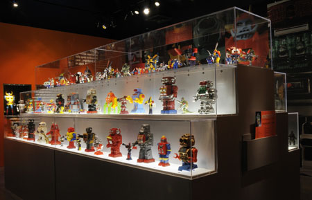
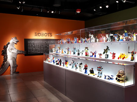
First up is labeling. I have discovered I'm a little very picky when it comes to communicating the information about each object. For the first example, while I love how neatly arranged all the objects are in rows in this 2008 robot exhibition, I can't see any labels. I can only assume they're in at the feet of each robot, but what about the ones on the top shelf? How is a visitor supposed to know what they're looking at? Obviously robots but I would want to know the name, year, and any other interesting facts.
(images from new.pentagram.com)
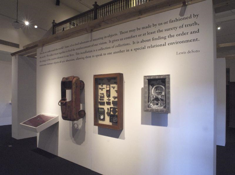
Even worse would be tons of objects crammed into one case with no labels. At least the above exhibition was arranged in an orderly fashion.
(image from whitehotmagazine.com)
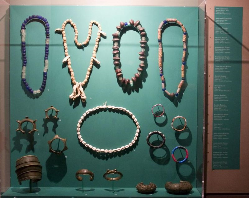
I also don't belive that tiny numbers corresponding to the objects really count as labels. I loathe having to hunt for information. This labeling system doesn't engage visitors, it just frustrates them (or at least me). I'm more likely to walk away from a display if I can't readily view the information about each object. I know it doesn't require a lot of thought to match up the objects to the number. But it is an extra step, and given that I'm anxious to see as much as possible when I go to a museum, I hate wasting even one precious second having to look up an object I want to know more about.
(image from photos.hodgman.org)
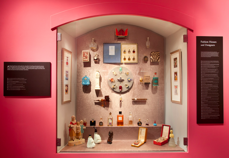
(image from fairyfiligree.blogspot.com)
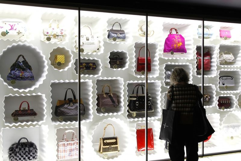
Even if the numbers are a good size, like in this 2012 Louis Vuitton Marc Jacobs exhibition, I still don't like not having all the information right near the object. It needs to be front and center.
(image from ibtimes.co.uk)
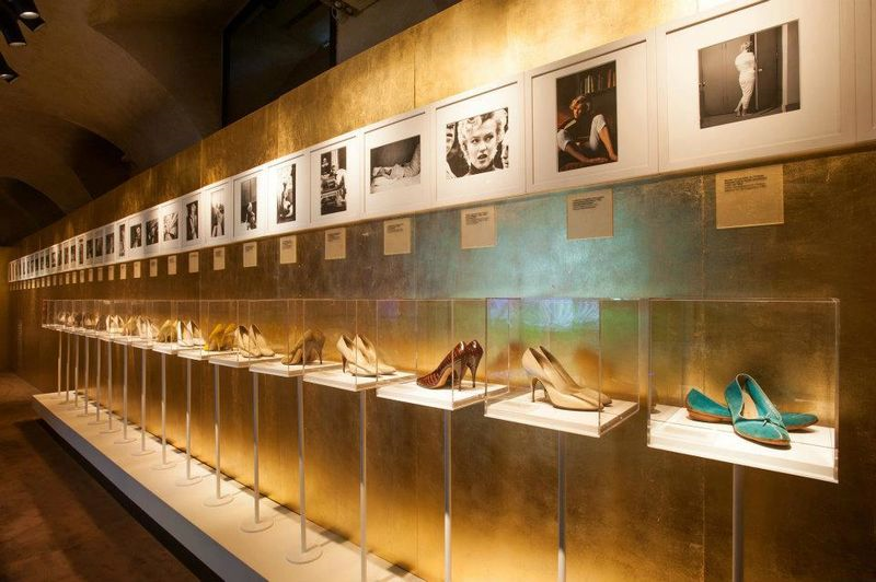
Second, I don't want a repetitive display. Below is a special exhibition devoted to Marilyn Monroe at the Salvatore Ferragamo Museum in Italy (Monroe was quite a loyal Ferragamo customer). This is a subject I'm definitely interested in, but I can already feel my eyes glazing over looking at that very long row of vitrines all set up exactly the same.
(image from dazeddigital.com)
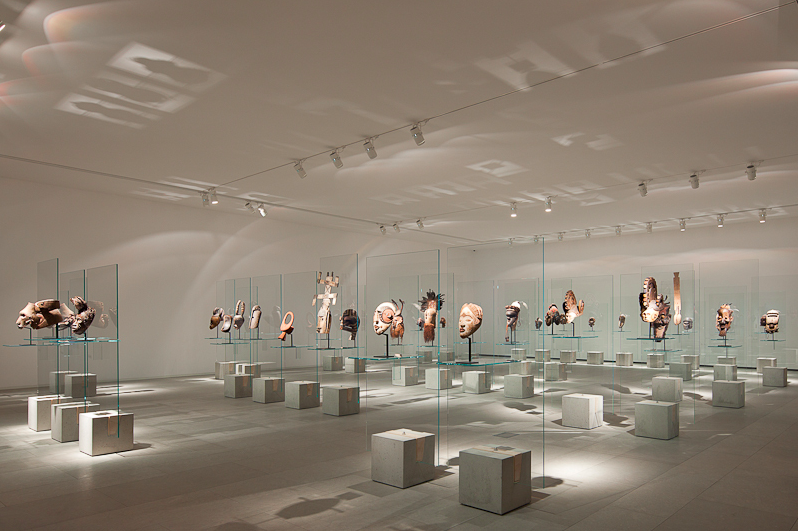
Similarly, I like a good collection of (African?) masks as well as anyone, but I find this layout doesn't do them justice. One after the other against clear glass atop a concrete base strips them of their individuality.
(image from archdaily.com)
Now that I've shown some examples of what I don't want, let's look at some that I could see working for a beauty museum. I adore the design of Harrod's Perfume Diaries exhibition from 2010 and would love to have something similar as a permanent display. Everything is arranged chronologically, and the well-lit cases have niches for each item as well as individual labels. The white curved walls provide a modern, open airiness – something else I don't want is for the Makeup Museum is for visitors to feel like they're in some creepy old weirdo's cramped basement.
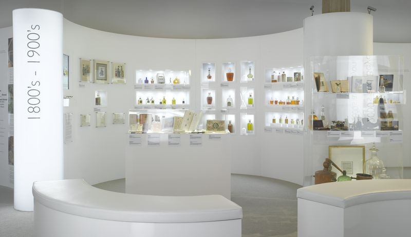
(image from thewomensroom.typepad.com)
Along those lines, I liked how the ads and objects were arranged in this perfume bottle exhibition. As you know, I frequently include ads in my exhibitions and I think this is a great way to do it. Again, I thought the crisp white backdrop worked really well – white would be a very effective surrounding for colorful makeup items.
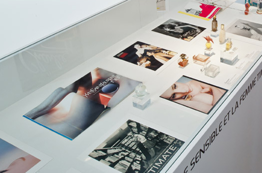
(image from belepok.com)
It's no surprise that the exhibition displays that appeal most to me are for perfumes, since, after all, makeup objects aren't all that far off either in theme or size.
While this was a shallow dive into the vasts depths of collections display, I think it was very helpful for me to weed through and determine the basic aspects that I would want in permanent displays at the Makeup Museum, which are: 1. clear, easy-to-find labeling for every object; 2. differentiated areas or displays so that the objects' uniqueness can be emphasized; and 3. an open floor plan with lots of light.
Can you envision something similar to the perfume displays shown here for a physical Makeup Museum? And more generally, do you have any museum display pet peeves?
