Over the years I've become much more aware of brands sold outside the U.S., but this holiday season I discovered yet another new-to-me brand based in Japan. Mikimoto is a historic purveyor of fine pearls and jewelry, founded in 1899 by Kokichi Mikimoto, the first person to successfully create cultured pearls. The cosmetics line was established in 1970 and as far as I know is not available for sale in the States. When a fellow collector alerted me to their holiday lineup, a collaboration with French illustrator Emmanuel Pierre, I took one look and knew it belonged in the Museum. The appropriately themed Wish on a Pearl collection playfully celebrates Mikimoto's heritage thanks to the delightfully strange collages by Pierre.
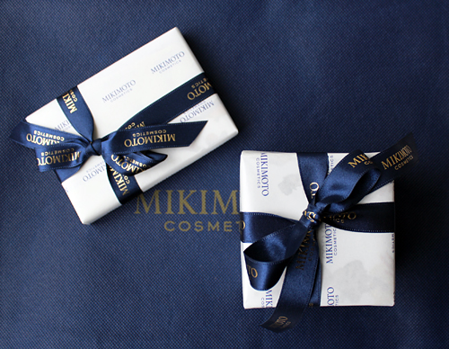
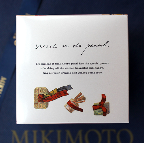
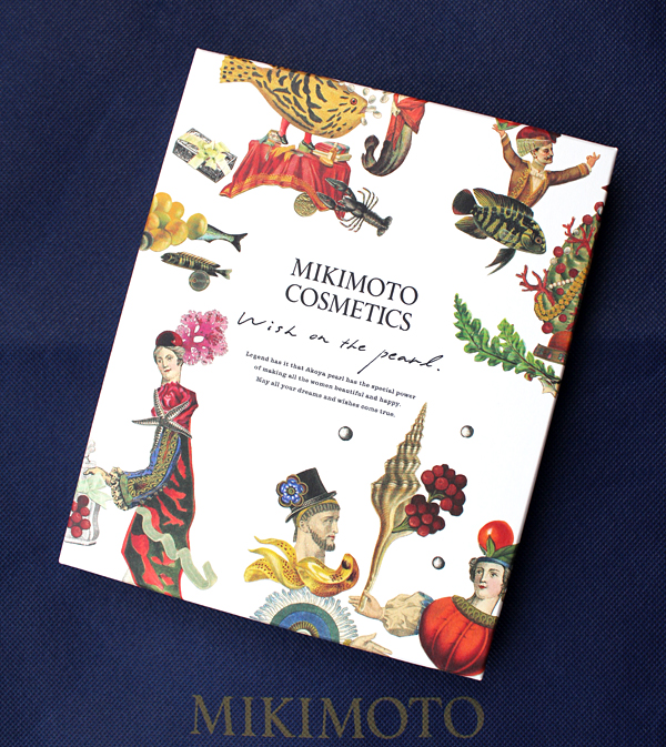
Can we just take a second to appreciate how beautifully the two key pieces from the collection were wrapped?! A sturdy blue tote bag was also included. This sophisticated wrapping is a refined contrast to the unbridled weirdness that lies inside. Get ready, it's gonna be a wild ride!
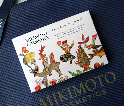
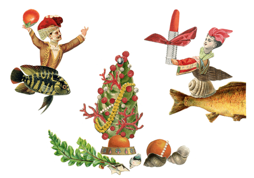
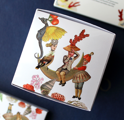
The eyeshadow palette has a bizarre scene depicting a winged seahorse, several figures whose lower halves consist of a bird, fish and shells, and a cheeky little boy gleefully picking his nose and wearing a hat made of coral. He sits atop a crescent moon, which is being hugged by a girl-jellyfish hybrid. My favorite character is the lady on the right holding a lipstick above a Christmas tree decorated with coral and pearls.
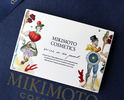
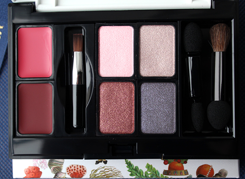
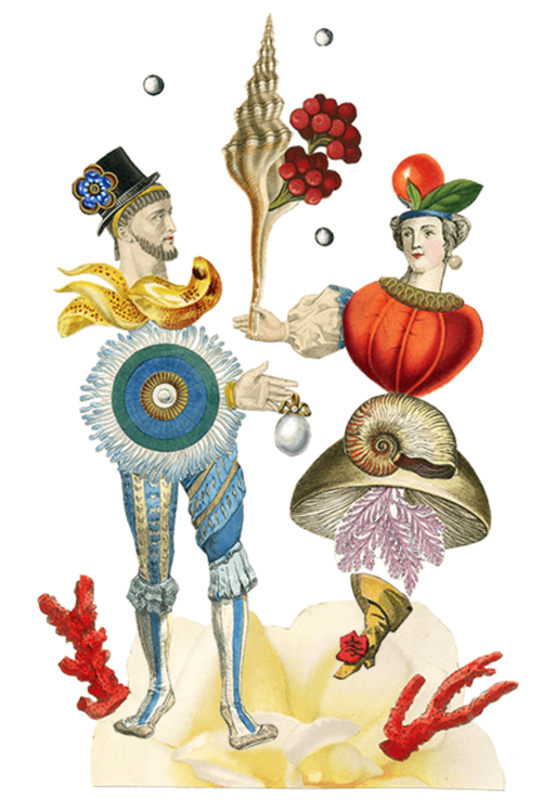
The palette itself has equally peculiar figures: another half-seashell, half-woman wearing a hat adorned with a tomato and holding a spiral shell sprouting berry sprigs, and a man dressed in 17th century (?) garb with a mandela blooming around his waist.
After spending a solid week looking at these images and others by Pierre, I still couldn't make any sense out of them so I asked my fellow former art history major husband what he thought. He seemed to think they had a slight fairy tale or children's book vibe, and as it turns out, he was spot on (of course). The Mikimoto cosmetics site provides a little bedtime Christmas story for the characters represented on the packaging. As always, Google Translate doesn't help clear things up, but at least I found that there was a brief narrative behind the collection. The first section is called "In the Sea" and is accompanied by one of the images from the palette box. The text reads, "Christmas soon. The pearl sparkled in the sea, It seems to be a star hitting the night sky. Fish, shells, starfish, too. I'm counseling gifts. sand of star. A stone mirror. Coral lipstick. One from a gorgeous conversation. The girl is crying. 'You lost the pearl you kept.'"
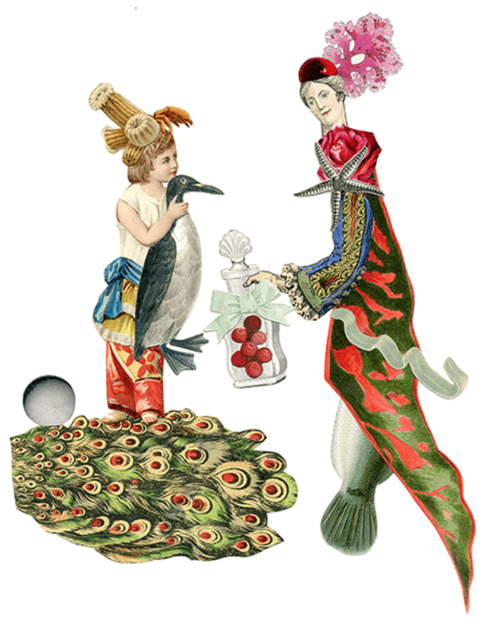
The next segment is called "The Shining Night" (which, from when I can deduce, signifies Christmas Eve in this story) and introduces a mermaid. "A pale girl. The mermaid that can not be left alone, Pearls I owned I will give it to the girl. That night, The mermaid woke up with a bright light. The pearls decorated in the Coral Forest raise the moonlight, It seems as if it melted all over. A young man appears from over there. The two danced together." The mermaid on the right appears on the box for the stationery set, which I'll show in a minute.
The final section is entitled "On Christmas Day" and features the couple from the palette: "The next morning. Mermaid is a night event I noticed that it was not a dream. That young man came over. In his hands the pearl that should have given the girl shine. Mermaid's skin looks like a pearl. It was glossy and transparent. This is transmitted from long ago. The sea Christmas story."
(images from mikimoto-cosme.com)
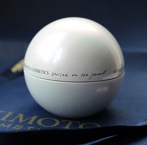
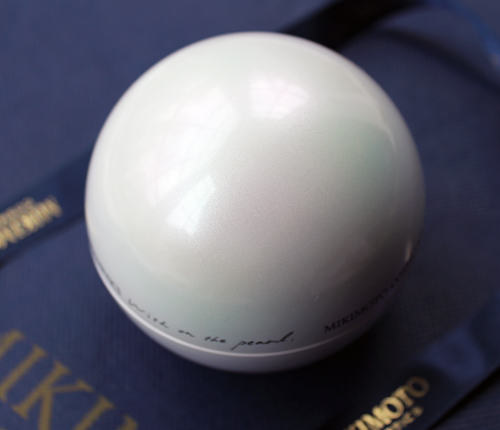
I can't say I understood any of that, but I do like the overall sea theme and mention of a mermaid. I'm guessing it's a story about giving the gift of pearl essence for Christmas and how its luster makes one's skin luminous and dewy like a mermaid's? Anyway, there's no mention of the blonde bird lady or little boy, but they do appear again on the face powder box. The powder itself is encased in a pearl-shaped container with an iridescent finish. My photos can't even approximate its beauty. (The palette also has this finish but I couldn't seem to capture it there either.)
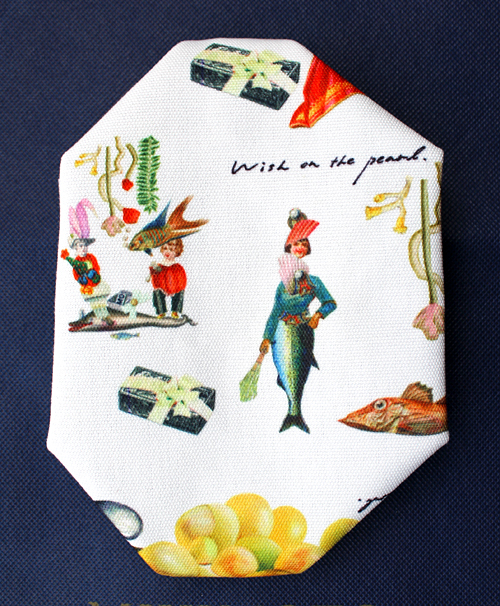
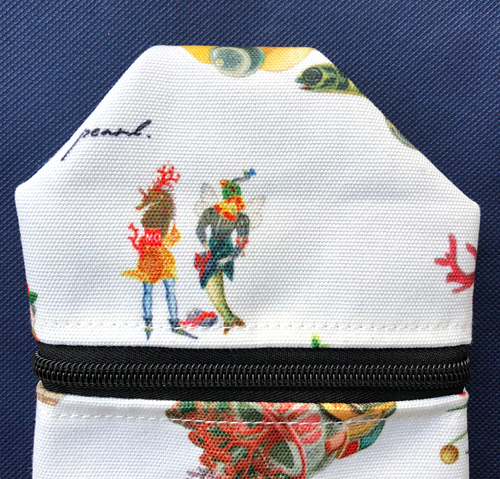
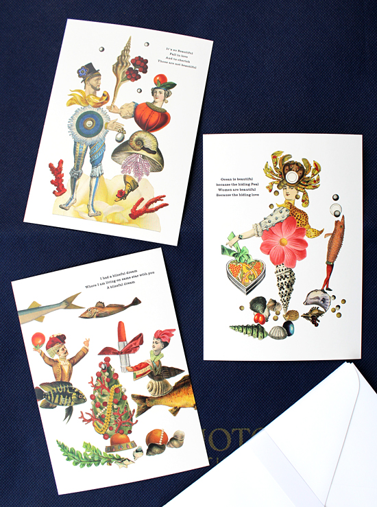
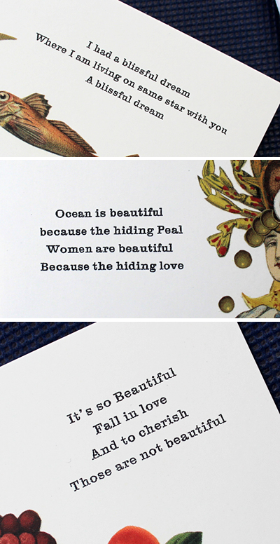
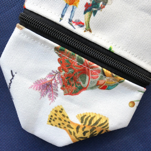
There was also a little makeup bag and a set of note cards which came free with the purchase of both makeup items. A brush set and train case were additional gifts-with-purchase, but I was too late to get my hands on them.
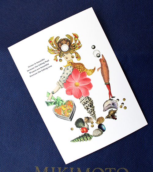
Two of the three postcard designs are the same as those on the makeup, while the third shows a half shell/half woman wearing a hat made out of a crab and holding a heart-shaped gift box. Additional shells and pearls are scattered towards her "foot".
The poems on the cards offer no explanation for the images nor do they seem to align with the narrative from the website, but obviously Pierre continued with ocean/shell/sea creature motifs to tie in to the pearl theme.
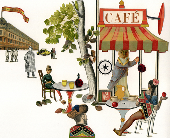
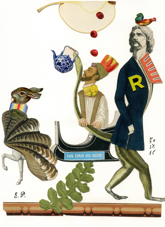
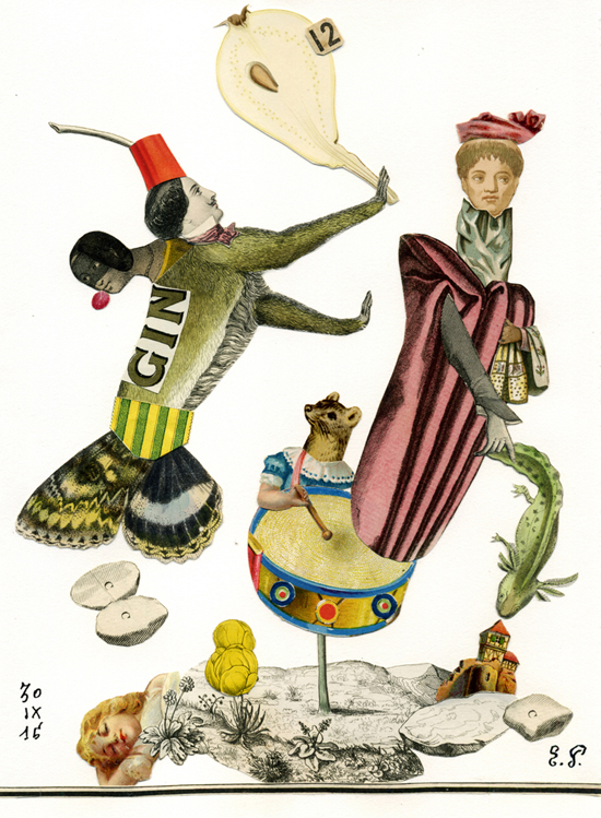
At first glance, Emmanuel Pierre (b. 1958) seemed like an odd choice for a collaboration with a fairly traditional company like Mikimoto. It wasn't until I noticed his work for the likes of Hermès and the New Yorker that it started to seem like a good fit. Still, I find his work to be incredibly strange. It's one of those "the more you look at it, the weirder it gets" styles. And that's a great thing for me, given my love for all things offbeat and oddball. I couldn't find any interviews with the artist and my art history training is failing me yet again so I can't give a thorough or even remotely accurate analysis of Pierre's work, but I will say I think it has a slight Dada feel to it given the emphasis on collages and absurdist imagery and text. These characteristics provide a different flavor than Surrealism, whose bizarre scenes tended to be rooted in an attempt to represent the unconscious. Pierre's oeuvre also lacks the occasionally unsettling or menacing vibes of Surrealism; I find it more whimsical and humorous than creepy, and the Dadaists were well-known for their sense of humor and quick wit. To put it briefly, I'm thinking more Duchamp than Dali when I look at Pierre's work. So let's take a peek, shall we?
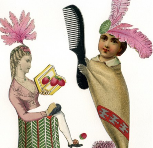
While Pierre certainly proves his mettle at conventional illustration styles, it's his collages – fantastical scenes depicting figures dressed in anachronistic clothing and oddly combined with a range of objects and animals – where I think he truly excels. Take, for example, these ladies engaged in some sort of strawberry/comb exchange…and did you notice the kitty paws on the woman on the right?
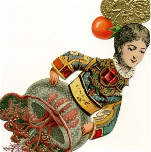
And this jellyfish lady made me smile. You can see the lower portion of her bell on the makeup bag.
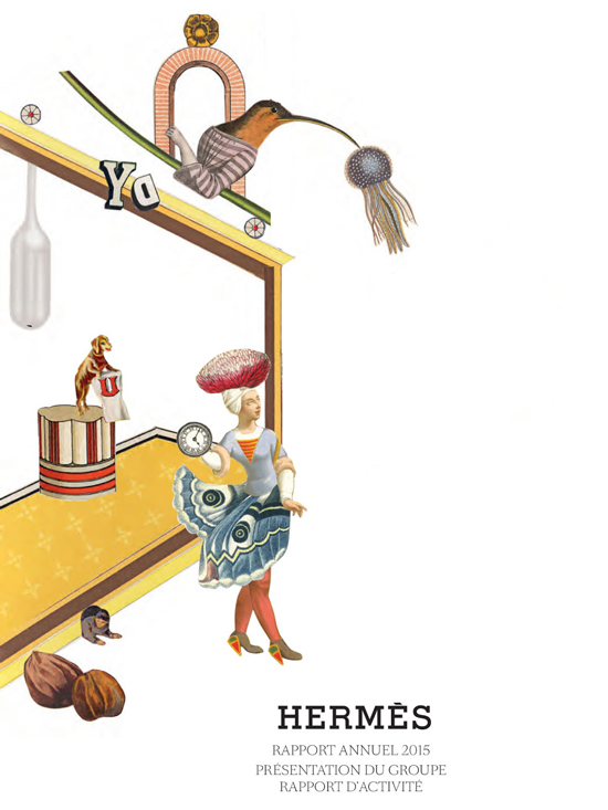
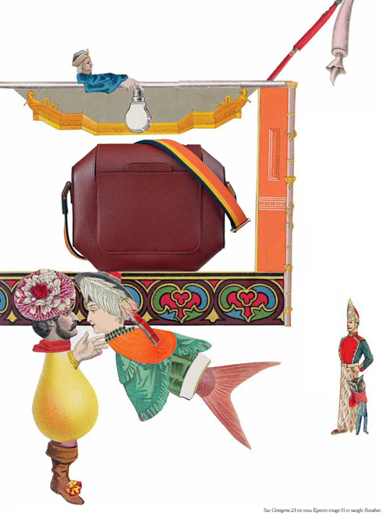
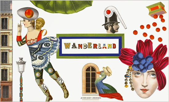
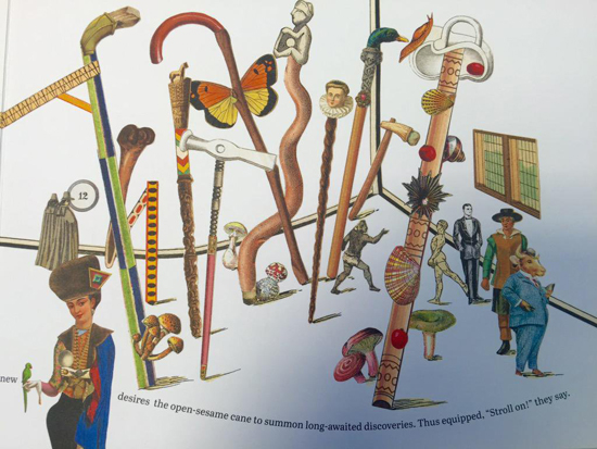
Here are the very clever 2015 annual report and Wanderland exhibition catalogue he designed for Hermès.
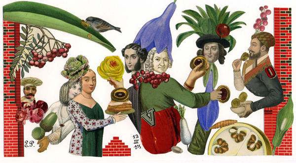
These illustrations for World of Interiors magazine show that, while Pierre's choice of motifs seem totally out of left field at first, they actually make sense in that they always express the topic they're accompanying. As with the Mikimoto collection, the artist brings together fanciful images to form a cohesive theme that represents whatever subject he's working on – in this case, the food, tea kettle and brick chimneys signal home decor.
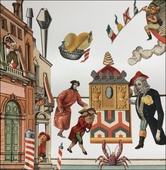
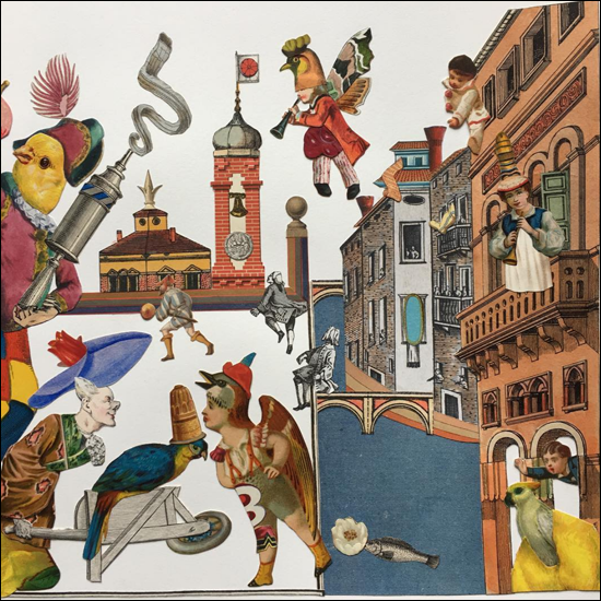
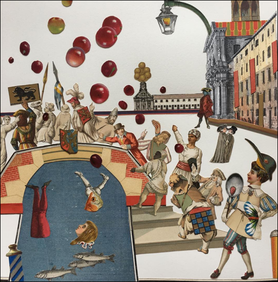
The husband's earlier observation about the fairy tale quality of Pierre's work made me wonder whether he's illustrated children's books. Sure enough, he completed a book for kids on the Carnival of Venice. The strange masks and costumes can be downright scary for little ones (and, um, even for grownups such as myself), but Pierre's skillful, whimsical touch ensures nothing but fun through the canals and streets of Venice during the festivities.
(images from @emmanuelpierre_illustrateur, emmanuelpierre.fr, and tiphaine-illustration.com)
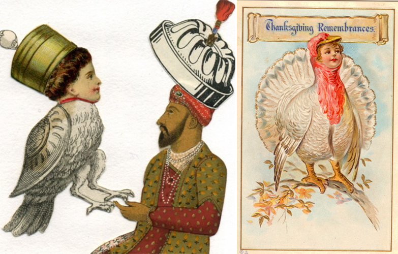
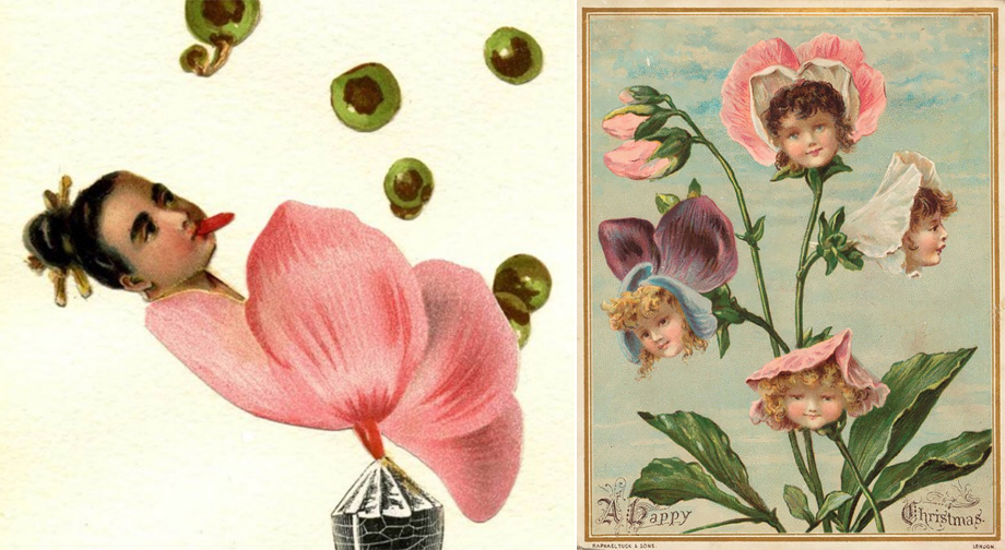
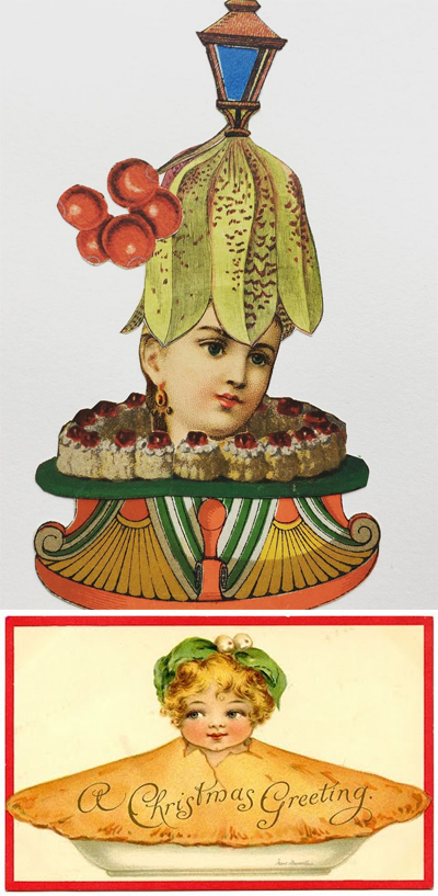
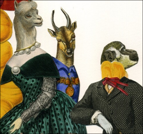
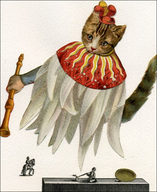
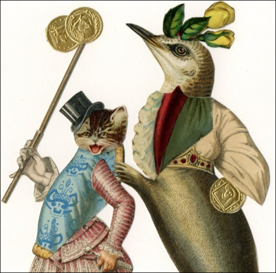
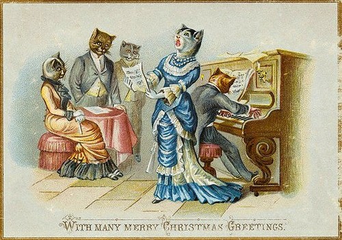
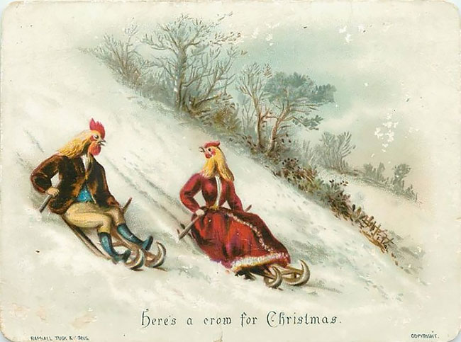
I also wonder whether Pierre is influenced at all by late 19th century greeting cards. The human-animal-object hybrids and anthropomorphic figures are reminding me of the more bizarre scenes sometimes found in Victorian holiday cards. Compare a few side by side (Pierre's work on the left/top, antique cards on the right/bottom).
Here are some examples of the animal-humans (human-animals?). The first three are by Pierre, the next three are from the late 1800s.
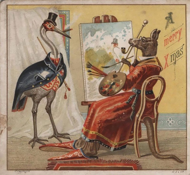
(images from @emmanuelpierre_illustrateur and designyoutrust.com)
Those turn-of-the-century folks had some weird tastes, I can tell you that! (Their imagery also goes a lot darker and creepier than you would expect, especially for what are supposed to be joyous occasions.) These also have me questioning whether Pierre comes up with his own vintage styles for these collages or if he uses authentic vintage sources, i.e. does he come up with all these characters and then draw everything by hand or does he somehow trace or cut out pieces from vintage magazines and other ephemera? I'm very curious about his process.
Getting back to the Mikimoto collection, I'm still wondering how the collaboration came about and why the company selected Pierre. I guess they wanted some charming French flair for their holiday lineup, which is a good choice. I love more modern illustration styles, but for the holidays I find myself craving more quaint, vintage styles since I get so nostalgic. In any case, I'm assuming as with his other clients Pierre created the images used on the packaging especially for the Mikimoto collection, although he never revealed it when he shared them back in April on his Instagram. I have many unanswered questions, but overall I enjoyed the collection. As you know I'm obsessed with mermaids and their underwater lairs, so weird half-seashell/fish people are right up my alley!
What do you think? What's your favorite image from Pierre's work that I've shown here?


