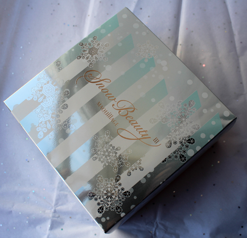
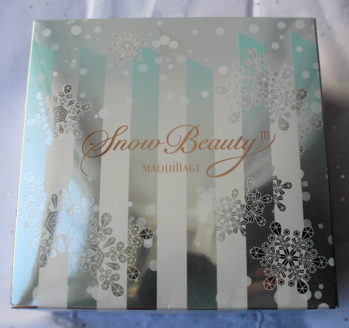
I loved Maquillage’s Snow Beauty compact from last year so much that getting my hands on the 2016 version was a top priority. Even the outer box is gorgeous.
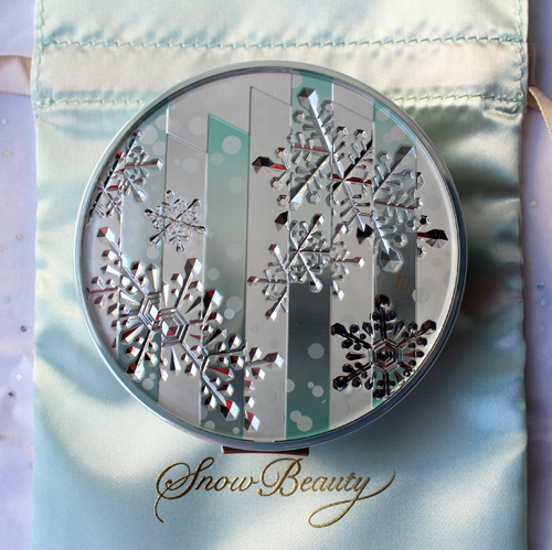
The theme for each year’s design is inspired by images of snow in a particular city. Last year’s took its cue from Helsinki, and this year’s inspiration comes from the Big Apple. From the Maquillage website: “The concept for 2016 version is ‘Diamond Dust’ dancing in New York. It keeps flying freely being fluttered by breath of the energetic city. Only shining snow from the skyscraper’s window that confines the sky began to dance, and the moment the shining snow runs about in a big city was cut to the compact design.”
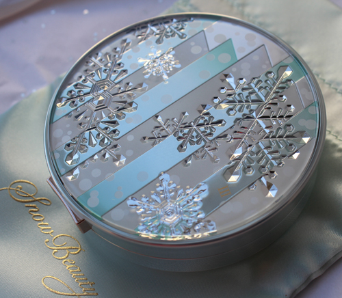
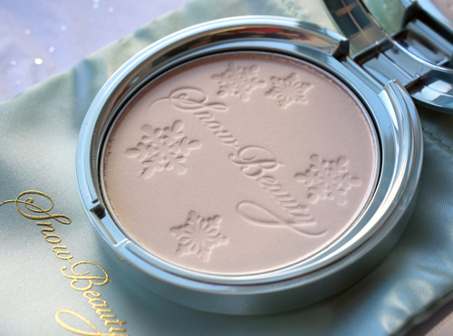
At first glance the etching didn’t really remind me of buildings – it had kind of an abstract, almost Art Deco feel – but once I saw the rest of the design it was a little more recognizable. The snowflakes are also cut off in places to look as though they’re falling in between and behind the “buildings”. This touch, coupled with the smaller dots of snow, produces an excellent likeness of a snowy cityscape. It’s an elegant, if idealized, recreation of one’s perspective if they looked up at skyscrapers during a snowstorm. Nothing in particular about the design really screams New York to me, but it’s just so darn pretty I’m willing to overlook that.
I like that they changed the design on the powder itself ever so slightly from last year’s.
I also love that the company put together a short film to further enhance the compact’s theme. And fortunately this year it was subtitled so I was able to follow along (well, sort of.)
Despite the subtitles I’m still not 100% sure what was going on, but it seems that the architecture student experiences a renaissance of sorts through the encouragement she receives from the train conductor. In a dream, he quite literally turns her world upside down and presents her with the compact as a keepsake to remind her of what she can achieve. At least, that’s how I interpreted it.
Overall, Maquillage’s 2016 Snow Beauty compact is a lovely little addition to the Museum’s collection and will be one of the star pieces in the holiday exhibition. It would have been nice to see a slightly more literal New York-inspired design, but I still think it’s better thought out than last year’s.
What do you think?



Wow! I’m not usually impressed by boxes and packaging but these are beautiful.
Wow! I’m not usually impressed by boxes and packaging but these are beautiful.
Haha, I’m the opposite – I’m a total sucker for packaging! Hence, the Museum. 😉 Glad you liked this compact and thanks so much for stopping by!
Haha, I’m the opposite – I’m a total sucker for packaging! Hence, the Museum. 😉 Glad you liked this compact and thanks so much for stopping by!
These are so beautiful! I hope to be able to get one of these at some point.
These are so beautiful! I hope to be able to get one of these at some point.
Hi Jennie! I know, they’re so pretty. I just wish I was aware of these the first year they came out, as my collection is incomplete. 😛 Thanks so much for commenting!!
Hi Jennie! I know, they’re so pretty. I just wish I was aware of these the first year they came out, as my collection is incomplete. 😛 Thanks so much for commenting!!