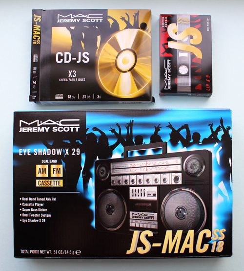
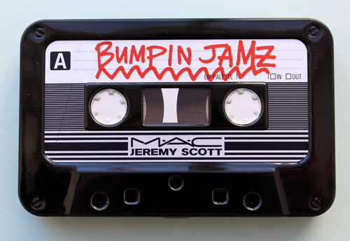
I was supposed to write a post rounding up all the delectable Chinese New Year goodies, but not all of the ones I ordered arrived. I didn't want to write it without having everything in hand so instead, I thought I'd celebrate the packaging design mastery that is the MAC Jeremy Scott collection. You might remember Scott's teddy bear-themed Moschino/Sephora collab from last year, but the MAC collection is under the designer's own name, and dare I say, even more amazing design-wise than the "beary" cute goodness served up by the Sephora collection. This is especially true for those of us who grew up with mix tapes and CDs – as a child of the '80s and a teen/young adult in the '90s, the nostalgia is quite strong with this collection.
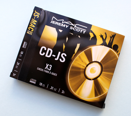
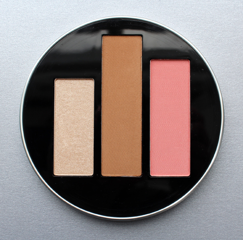
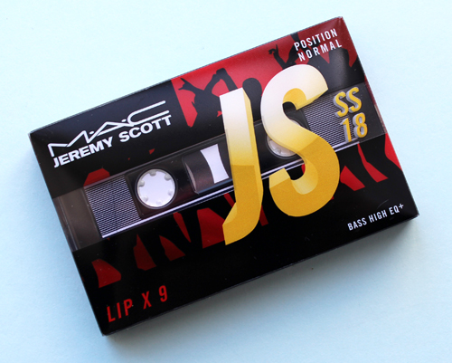
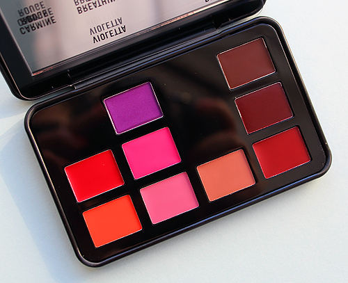
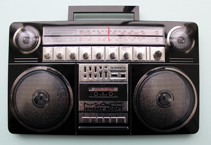
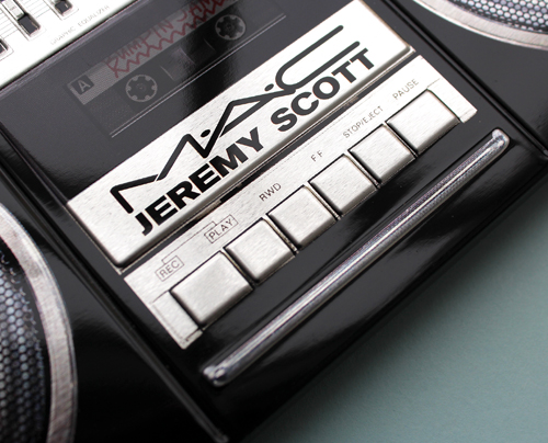
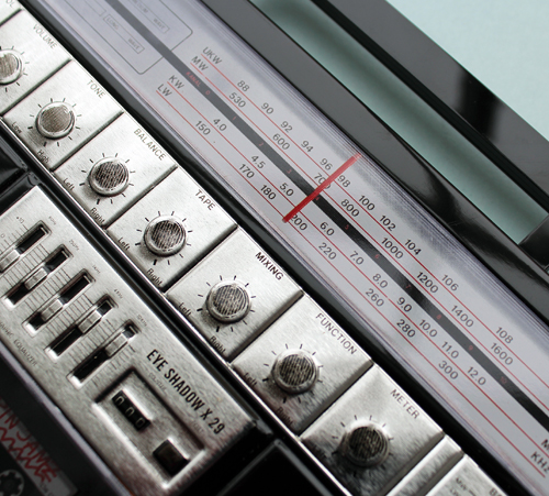
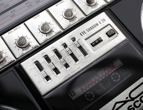
Scott wanted it to look like "something you'd buy at Best Buy" and that's exactly what it resembles. Every last detail on each of the three pieces (CD, cassette tape and boom box) make them look like the real deal. As a matter of fact, I left them sitting on the kitchen counter for a couple days before taking photos and every time I walked by they threw me for a loop. I couldn't remember whether I was supposed to be making a mix tape or CD for someone, or thought maybe the husband is making one for me, as he did early on in our courtship. It was sort of like being in a time warp.
The collection is obviously inspired by music and the fact that Scott remains one of the top designers for the world's leading pop stars. It also reflects his perspective on the similarities between music and makeup . He explains to British Vogue: "Music plays a huge part in getting me into the mood, whether that be music from certain time period, or something aggressive or something that sounds ethereal – it envelops me and gets my mind in a certain frame for creating. Often when I’m designing clothes for my girls like Katy Perry, Rihanna, Miley Cyrus, either for a tour or for a red carpet event, I will play their songs and channel their spirit. Or when I miss them, I play their music and they’re with me, they’re chatting in their room. Music carries the essence of somebody. That’s why we fall in love so hard with musicians, they’re connecting with our hearts on such a visceral level…I’m fascinated by music and how you can change the mood of a whole room just by changing the song. Music fills the air and wraps itself around you. To me, that’s a similar quality to what make-up can do – both have such a transformative quality. You can wear a plain white T-shirt and scruffy jeans, but put on a bold lip and there’s a whole different feeling. Make-up can overpower the apparel. I wanted this collection imagery to show different inspiring moments in music, including a boom box, cassette players and CDs, and really play on the frivolity of a night out as well as make-up and music’s transformative power."
MAC originally approached Scott two years ago for a collaboration, since they've been doing the makeup for his runway shows for years. The reason it took so long for it to come to fruition was in fact the design aspect. I can absolutely believe it would take years to create makeup packaging that 100% mimics the technology we used back in the day to listen to music. Scott notes the importance of the packaging to him and his hopes that one would display it. "Any time you have special molds for compacts and cases, that takes a super long time. I wanted the compacts to be a living thing — maybe after you’ve used all of the makeup, you still want to keep it because it’s an object. I think it can be repurposed and sit on your shelf."
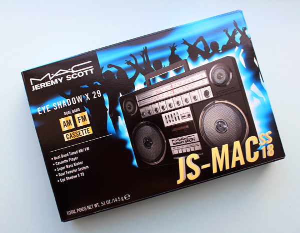
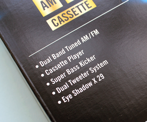
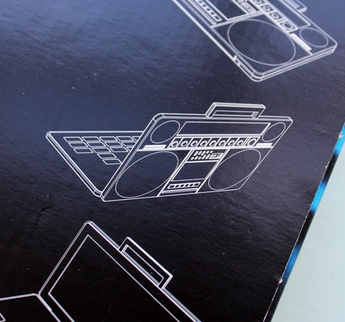
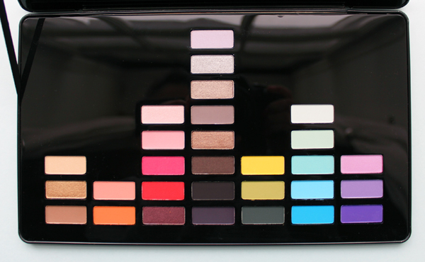
The coup de grace in the collection (and the most divisive among makeup enthusiasts, as we'll see shortly) is the boom box eye shadow palette containing 29 shades. It's simply filled with breath-taking details, from the box to the outer case to the interior of the palette. I'm wondering whether MAC did all of these in-house or worked with an outside design firm. Either way, the collection is beyond creative and unique, and I hope whoever came up with the designs gets an award.
While many shared my favorable opinion of this collection, there was a handful of detractors who outright abhorred the eye shadow palette. Some commenters claimed that the overall gigantic size of the palette made it clunky and inelegant, but it was the inside that seemed to make people the most hostile. Many took issue with the "waste of space" necessary to achieve the equalizer effect. Here are a few rather harsh comments:
- "That wasted space is making me sick."
- "All I can think about is the other eyeshadows that could of been in that palette…"
- "What a complete over production of excess packaging. Poor Earth."
- "It looks like they forgot to add the rest of the shadows in the palette. I mean I get the concept but it shouldn't be for makeup…don't these companies realize consumers don't care about that stuff we care about cost effectiveness and getting as much as you can for your money when you're purchasing these products."
- "Why are we being sold half empty products? The packaging is a joke."
- My OCD is kicking in full force."
- "What incredibly wasteful packaging. Plastic destroys our environment people. At least HALF of the packaging on a couple of these products could have been done without. It’s a shame how complacent people are about environmental destruction… and all for what? Eyeshadow."
The collection also seemed to dredge up the age-old discussion of buying makeup just for the packaging. I'm cringing from this Reddit post: "So the New eyeshadow palette is half empty because of the equalizer design/Sound waves. And I saw someone on IG saying that she bought it, was never going to use it, But just had to buy it because of the packaging. This palette costs 75$! I hear so many on youtube talking about packaging and how they are gonna buy something just because it looks cute/beautiful/whatever, and I don't understand how that can be enough of a reasoning. Makeup is (in my eyes) not decor But something to be used. So my question is, can anyone explain Why packaging is enough of a reason to buy something, What you do with the makeup that you don't use But is pretty or just give your overall thoughts on gimmicky packaging and limited edition “collectors items”? 🙂 I'm sorry if I Sound super judgy, I just dont get Why you would buy something only for the packaging, name, brand or theme if you know you don't like the colours or wont/cant use it."
It seems my decade-long attempt to get people to understand that collecting makeup with interesting/beautiful packaging is just fine, and even worthwhile from a historical perspective, has gone unnoticed. It's disheartening to say the least, as many respondents chimed in with how they appreciate nice packaging but would never buy makeup just for the packaging alone and not use it; apparently it's "mindlessly consumerist" and "dumb". One of the positive things in that Reddit post is that the OP noted that she sees "so many" on YouTube purchasing makeup just because it's pretty, without any intent of using it. So maybe more people are getting into the notion that appreciating makeup as an art object in and of itself is an acceptable pursuit. Still, I'm tired of people being judgmental about collecting makeup. (I'm also sick of these same people claiming not be judgmental by adding drivel such as "to each their own" or "whatever, it's not my money" to their disparaging comment, as if that makes their statement non-judgmental. Please. It's like someone texting "fuck you" with a smiley face emoji – doesn't make it any less obnoxious). I mean, no one's forcing them to buy things just for the packaging, so what do they care if other people do? There's no harm in companies making whimsical packaging or in people buying it. I don't want to continue rehashing my stance on makeup collectibles and why they are museum-worthy, but you can read it here. In the case of the Jeremy Scott collection and the issue of waste, it's annoying to see people complain about what they perceive to be excessive packaging. I guess if you only look at makeup solely as a utilitarian item, you're narrow minded and have no imagination that's fine, but I don't think it's right to be holier-than-thou and pontificate about the environmental impact of certain items when they were designed to be collector's pieces. I wonder whether these people complain as much about this for other objects or only makeup. I'm also betting that the vast majority of people who bought the collection aren't necessarily going to throw the items in a landfill when they're done using them – as Scott suggested, they are more than likely to keep them as display pieces. Finally, I think in the case of this particular palette, it's actually a decent value – at $75 for 29 colors, it comes out to about $2.60 per shadow. (Alas, the quality was dismal, but that's not what I'm focusing on, obviously).
The other packaging-related thought I have rattling about in my head that is that the collection still has not sold out. On the release date (February 8), I woke myself up around every half hour starting at midnight so that I could have a chance of nabbing the collection before it sold out, which I was sure it would do in seconds. Instead, over 2 weeks later all three pieces are still widely available at various retailers. I'm wondering whether it has something to do with the packaging – not because wasted space issue, but because it's not appealing to a younger crowd. You would think the bright colors would be a natural draw for a youthful demographic, but CDs, tapes and boom boxes probably don't have the same nostalgic impact on, I'd say, anyone under 25, so the packaging might have missed the mark with a good portion of MAC's target audience. I'm having this vision of a group of teens/early 20-somethings walking by the MAC counter and being genuinely confused as to what they're looking at ("What's THAT supposed to be?"), since they were raised in the digital age where music largely doesn't exist in these sorts of physical formats anymore. Indeed, I'm not the only one who thinks this might be the reason behind the non-sellout status of the collection. I also think one commenter's musing that the collection might have been more palatable to the youth if it had included a record-shaped compact is hilarious – maybe those teenage hipsters who listen to records would have bought it.
- "Love it!! Only people who grew up with this stuff will get it."
- "i need this!!! as an 80s 90s lover i must have this"
- "i was born 79..i'm so happy all you guys don't want it..that means it will be around for 2 weeks. i thought it would sell out..but i forgot a lot of these people are so young the probably never had a real boom box. Maybe if the palette was a record the kids would be more interested in it."
- "Such beautiful collectors items. Millennials born in the 80's can appreciate this I think. The new generation Z peeps… Not so much."
- "The packaging is everything and calling me. #90sgirl"
Final thoughts: it might be the nostalgia talking, but obviously I think the collection was worth every penny due to the incredible packaging. The design is also a perfect reflection of Jeremy Scott since it's just as fun and over-the-top as he is. Even without his name on every piece you could most likely tell it was his collection. While I'm dismayed at how some people criticized the packaging of the eye shadow palette with no legitimate reason, I'm heartened by my fellow xennials who recognized and appreciated just how faithfully every detail of the music technology we grew up with was replicated. The only thing I would have done differently is add a Walkman palette to the mix – I was positively glued to mine in the '90s and still miss it to this day.
What do you think?



Lol reddit can be so judgmental some times when it comes to releases. I take their opinion with a grain of salt because they usually trash talk everything I like. I consider myself a smaller makeup collector and I do use most of my items, but I do love them to have pretty packaging. I don’t see anything wrong with that. Yeah, I don’t like my products to be super bulky but that Jeremy Scott palette looks more like a collector’s piece so it doesn’t bother me that much.
Lol reddit can be so judgmental some times when it comes to releases. I take their opinion with a grain of salt because they usually trash talk everything I like. I consider myself a smaller makeup collector and I do use most of my items, but I do love them to have pretty packaging. I don’t see anything wrong with that. Yeah, I don’t like my products to be super bulky but that Jeremy Scott palette looks more like a collector’s piece so it doesn’t bother me that much.
Hi sweets! I don’t frequent Reddit, but it is interesting on occasion to see what some of their commenters say. I just googled MAC Jeremy Scott packaging and up popped that thread. Sorry they’re also critical of stuff you like! But as you wisely stated, it’s important to take it with a grain of salt. Appreciators of great packaging, unite! 😀
Thanks so much for stopping by the blog, I always appreciate your comments and insights. 🙂
I’m doing exactly just that – buying just for the packaging. I adore the designs from this collection and fell in love with the stereo waves motif.
The world need some fun than just pragmatics/economics. There are so many beauties that worth just sitting there and untouched, they are masterpieces or even artefacts to me.
Then there’s the BS talk about value – there’s 29 eyeshadows in there, can’t they do the math at all. If they’re talking pragmatics (makeup is to be used, but not looked at), why don’t they spend on makeup at all? They can go bare-faced.
Whatever they say – there’s still long waitlist for Chanel and Dior LE items, and they sell out in less than half a day.
And then there’s also an identity theme tied around with this collection – absolutely so. I’m a millennial and identify with this collection so well, the fact that Jeremy Scott is paying homage to the 80s/90s is. such. love.
I went “OMG I need to have this” and clicked buy thinking it’ll sell out.
Yes a Walkman would be a great addition!! Maybe a CD player as well (apart from the BoomBox). Anything of that kind.
Those people need to learn to differentiate what is a collector item and what is daily use.
Hi Jenni! I co-sign your sentiments 100%! I’m so glad you loved this collection as much as I did. I just wish I could get more people to see the aesthetic value of makeup beyond its utilitarian function, or at least, not have them be so negative and judgmental about it! I guess haters are gonna hate, but that means more for us? 😀
Thank you so much for stopping by and I hope you’re lovingly gazing at the pieces you bought!!
I love the packaging a lot but I also want to use the makeup… so I passed on this because I didn’t like the quality! The makeup that I buy to display more than I use is very thematic (cherry blossoms) so this was a pass for me. At the price points I feel like Mac SHOULD have had better quality product inside, especially considering their brand identity… but the boom box is still amazing!
I love the packaging a lot but I also want to use the makeup… so I passed on this because I didn’t like the quality! The makeup that I buy to display more than I use is very thematic (cherry blossoms) so this was a pass for me. At the price points I feel like Mac SHOULD have had better quality product inside, especially considering their brand identity… but the boom box is still amazing!
Hi Justine! Yeah, it’s a real shame the quality wasn’t there – would have been a slam dunk for most people! I wanna see your whole cherry blossom makeup collection, I bet it’s beautiful!
Also, on a completely different note, it occurred to me that I might have been getting you confused with someone else or thinking you were two different people – this could explain why I didn’t have your blog in my Feedly feed…I’m so embarrassed! I have added it so now will not miss any of your posts. In any case, thank you so much for reading and commenting!!
I think there are actually two Justine’s haha. I’ll add a Sakura to mine 🙂 I just started blogging again after your post – I stopped because I felt like I bought stuff just to say I might blog about it… and now I just enjoy,babbling about the makeup I use because I like it! Even if no one reads it.
I think there are actually two Justine’s haha. I’ll add a Sakura to mine 🙂 I just started blogging again after your post – I stopped because I felt like I bought stuff just to say I might blog about it… and now I just enjoy,babbling about the makeup I use because I like it! Even if no one reads it.
Late to this post, but I gotta say, wow, love the packaging for this collection, especially the attention to detail! <3 I'm in my early 20s, but my parents still had a lot of cassette tapes and a cassette player around when I was a kid, so this is pretty cool to see haha.
"I also think one commenter's musing that the collection might have been more palatable to the youth if it had included a record-shaped compact is hilarious - maybe those teenage hipsters who listen to records would have bought it" - I do agree that among my age group, records are far more popular than CDs or cassette tapes though, so maybe record-shaped compacts would have made the collection more popular to young people.
Hi Gabi! That’s really interesting that more young people are listening to records! (I own several but no record player!) It’s true, maybe record shaped packaging would have lured them in…they should check out Paul & Joe’s spring collection in that case!
Thank you so much for reading and commenting!!