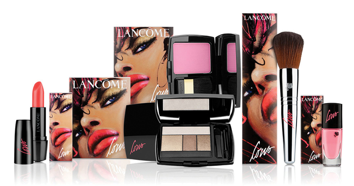
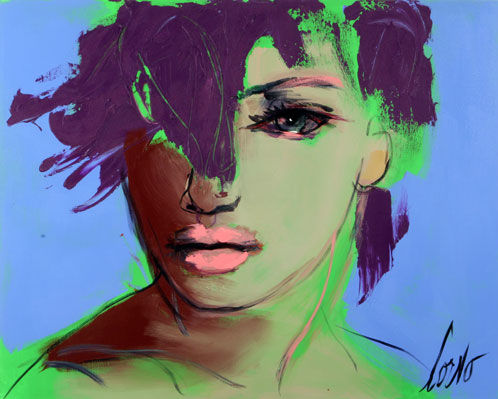
Lancôme's fall collection is just around the corner, but I wanted to talk about thieir Canadian-exclusive summer collection featuring a collaboration with Quebec-born artist Joanne Corno. Lancôme makeup artist Lora Spiga worked with Corno to create a collection based on the artist's use of bold, vibrant color, but one that was still wearable and in keeping with the season's trends. Spiga explained to News Canada, "Corno and I wanted to integrate the same kind of vibrancy in the looks as there is in her paintings, but in a very practical manner, in order to create beauty looks that would translate well into everyday life."
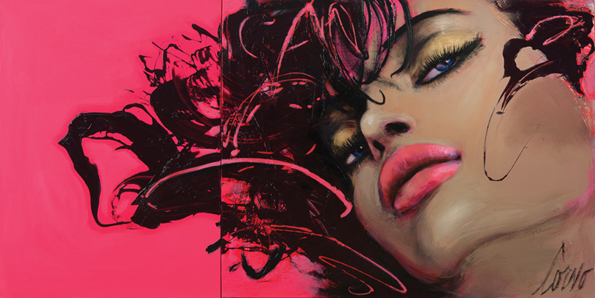
Here is the painting Corno made specifically for the outer packaging for the collection. The colors were perfectly translated into a collection containing bright pinks, seen in the background and on the woman's lips, but also some understated neutrals, as in the woman's eye shadow. (For reviews and swatches of the products, Beautezine has the scoop).
Why Corno for Lancôme? Julie Tremblay, Communications Manager for Lancôme Canada, noted, “Corno’s art is all about colour, energy and femininty, it is it precisely these qualities that inspired Lancôme to collaborate with this great Canadian talent."
An interview with Music Is Art shed some light on Corno's style and use of color. Said the artist, "I like to define myself as an urban expressionist. That is actually the headline of my blog. I always find it hard to describe my work to strangers. You kind of have to see it. I do figurative paintings with bold color mixes. Movement, energy and light are at the core of every single one of my paintings. That’s how you recognize my style…As much as I love vibrant, fluorescent colors, I also like to work with yellowish grey, earthy shades – I call them my potato shades. I love working on contrasts. I usually create color mixes with shades that have nothing to do with each other – one that’s completely off, another that’s excessively flashy. I think color is one of my trademarks in my work."
Let's take a peek at some of her paintings, which definitely fit what she described in the interview.
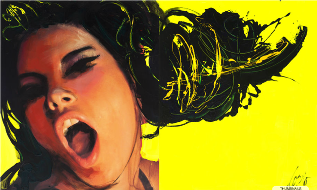
Face on Yellow with Black Hair, 2012:
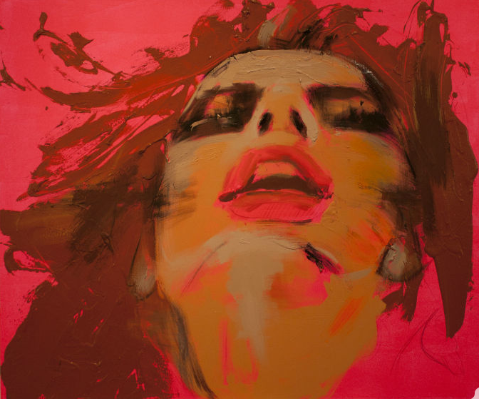
I was unable to find titles or dates for these next two, but they are representative of Corno's signature use of bright colors as well as hues that don't necessarily go together.
I'm really liking these paintings – to my eye, they're an interesting cross between fashion illustration and painterly, expressionist portraiture. Plus, color fiend that I am, I love the bright and crazy shades. I would have bought some of the Lancôme pieces for the Museum, but I didn't like that Corno's work appeared only on the outer paper packaging rather than the cases themselves, plus since it's Canada-exlusive it means it will be difficult to track it down here in the States.
What do you think, both of Corno's work and the Lancôme collection?


