I have to admit that the packaging for this collection didn't immediately set off my curadar (curating radar), but given the frenzy over K-beauty over the past 2 or so years, coupled with the fact that Kye is an important up-and-coming fashion designer, I figured it would be a worthy addition to the Museum. And you know I can't resist Shu's limited-edition cleansing oils. 😉
Kathleen Kye was born in the U.S., raised in Seoul and attended London's Central Saint Martins. Her clothing line, which was launched in 2011, is notable not just for its edgy, high-fashion streetwear aesthetic, but also for its focus on unisex design.
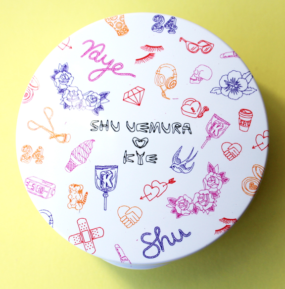
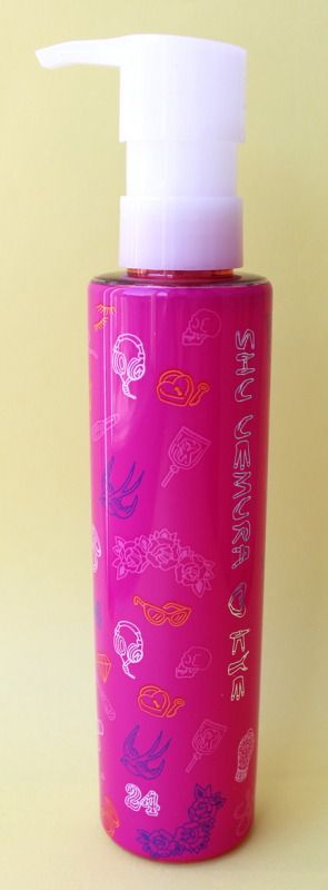
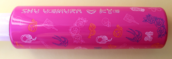
The pattern on the Shu collection incorporates a seemingly random group of motifs along with Kye's signature. Uh-oh, I thought – is this just a bunch of stuff Kye slapped on there without any thought?
Nope! I was thrilled to see that the pattern wasn't just an arbitrary scattering of icons that the designer happened to throw on there. Shu featured this handy dandy little chart explaining the meaning behind most of them.
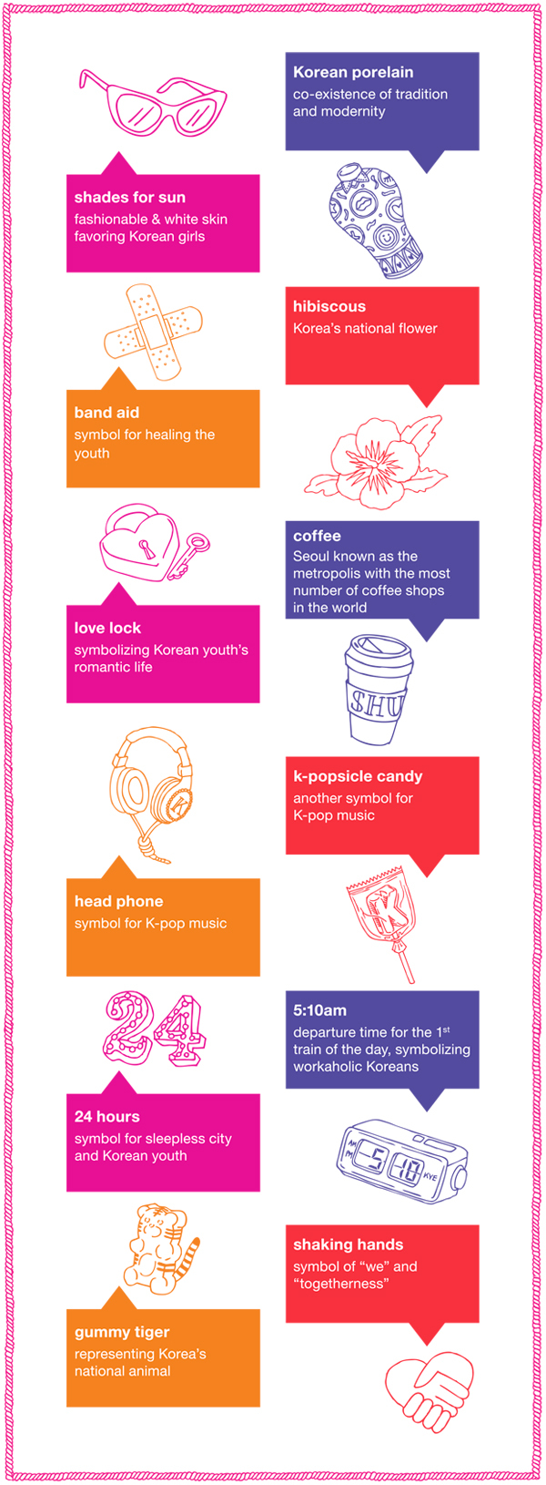 (image from shuuemura-usa.com)
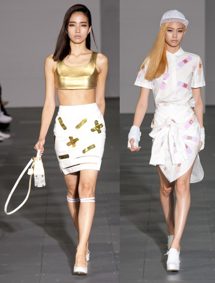
Some of the symbols were also borrowed from previous fashion collections, such as the band-aid (from spring 2014):
And the tattoo-inspired (to my eye anyway), spring 2013 print, where I'm assuming the bird, skulls and roses came from.
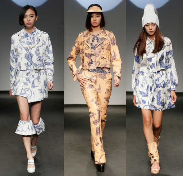 (images from kyefashion.com)
Kye tells Vogue, "I try to take some serious themes and issues to something light and beautiful." I'd also add fun and modern to that description. The symbols pay homage to Korea's history but also demonstrate a playful twist. I particularly love the representation of the country's national animal in gummy form. Kye also shows her understanding not just of Korea's heritage but also the present cultural climate for the country's bustling youth through the "24" and the alarm clock symbols.
Overall, while this isn't my favorite Shu collab, I think Kye is the perfect designer to team up with to celebrate Korea's youth culture and the influence it's having on the rest of the world. And I always appreciate when the artist puts some actual thought into what they're making for the cosmetic brand they're collaborating with rather than either blindly copying old designs or slapping on whatever is appealing to them at the moment.
What do you think?


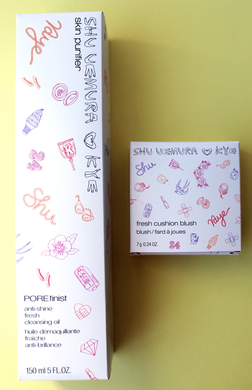
Shu Uemura has a cushion foundation available in Asia and not in the states. I was hoping it’d be part of this collection, since I’ve been wanting to try it, but no such luck. I was a bit disappointed with the collection, to be honest. I expected more from a K-beauty collab.
Shu Uemura has a cushion foundation available in Asia and not in the states. I was hoping it’d be part of this collection, since I’ve been wanting to try it, but no such luck. I was a bit disappointed with the collection, to be honest. I expected more from a K-beauty collab.
Yeah, it wasn’t my favorite either. And I feel like the products could have been more innovative – cushions are still fairly new but have now become ubiquitous, and I feel like K-beauty always has weird new things to try (peel-off lip balm, etc.) so they could have done more with this.
Thanks for stopping by!!