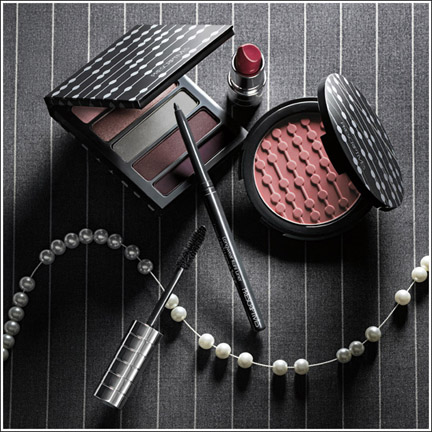
Prescriptives just debuted their menswear-inspired fall lineup. The Curator, sadly, is disappointed. It's a great idea but poorly executed. With all the cool patterns they could have done on the packaging, they chose to go with a rather bland design which I'm assuming is supposed to be reminiscent of the strand of pearls pictured in the ad. Why not a herringbone pattern on the powder? Or maybe use tweed? (I'm remembering Stila's tweed-covered palettes from a few seasons back.) At the very least they could have incorporated a pinstripe on the packaging or actual makeup rather than just in the ad. I was hoping that the Rose blushes from this past spring would lead to more interesting designs, but unfortunately Prescriptives isn't quite up to the challenge just yet.


The title of the post cracks me up – it’s awesome 🙂
The title of the post cracks me up – it’s awesome 🙂