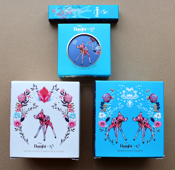
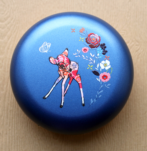
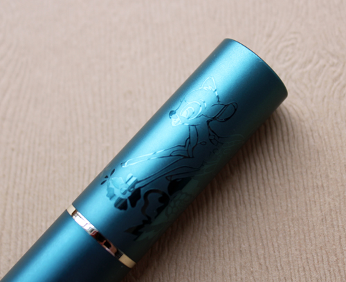
I have no idea how I missed this adorable collection when it was released last fall, but I'm glad I managed to track it down. Since there are so many Disney collaborations I tend to be fairly selective as to which ones to purchase for the Museum, but I thought this Bambi collection from Korean brand Isa Knox was special enough to be worthy. 🙂
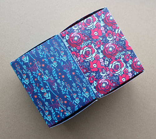
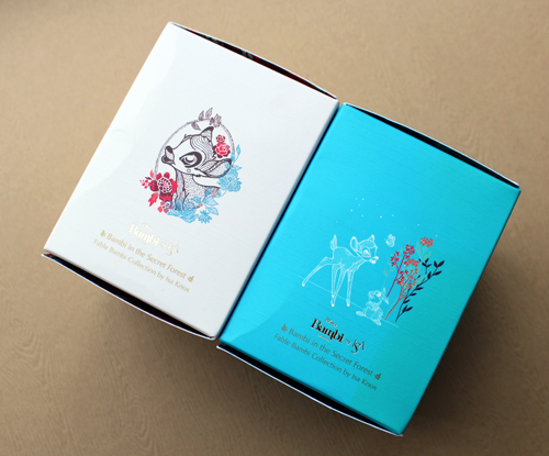
The outer packaging alone is lovely. The sides of the boxes have delightful floral prints and Bambi illustrations.
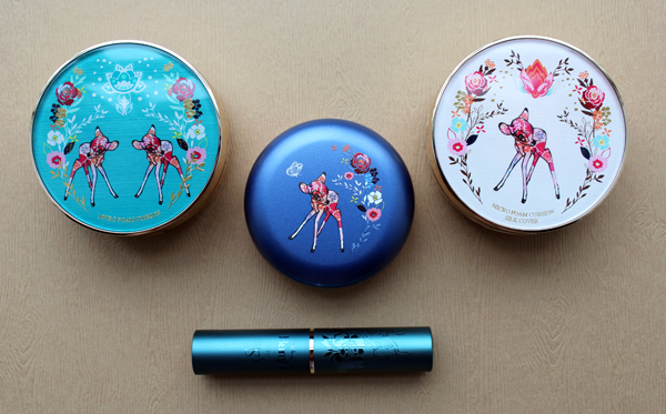
More pretty floral patterns abound on the compacts themselves, and Bambi's brown fur gets a vibrant, overlapping watercolor makeover.
Butterfly!!
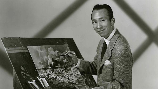
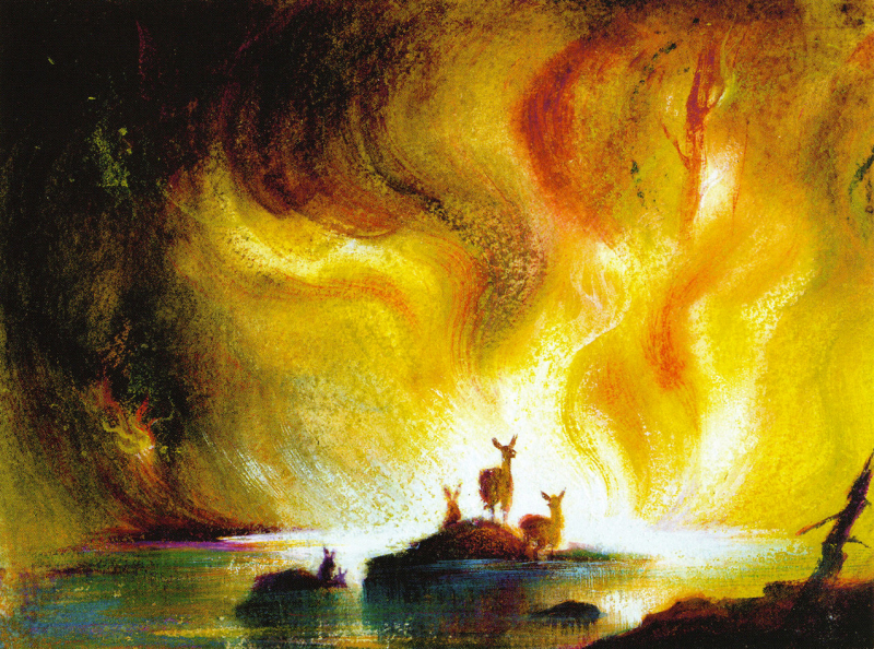
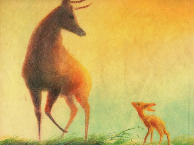
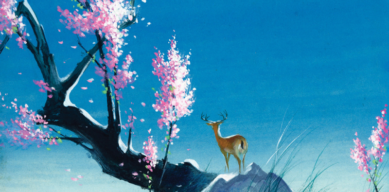
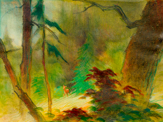
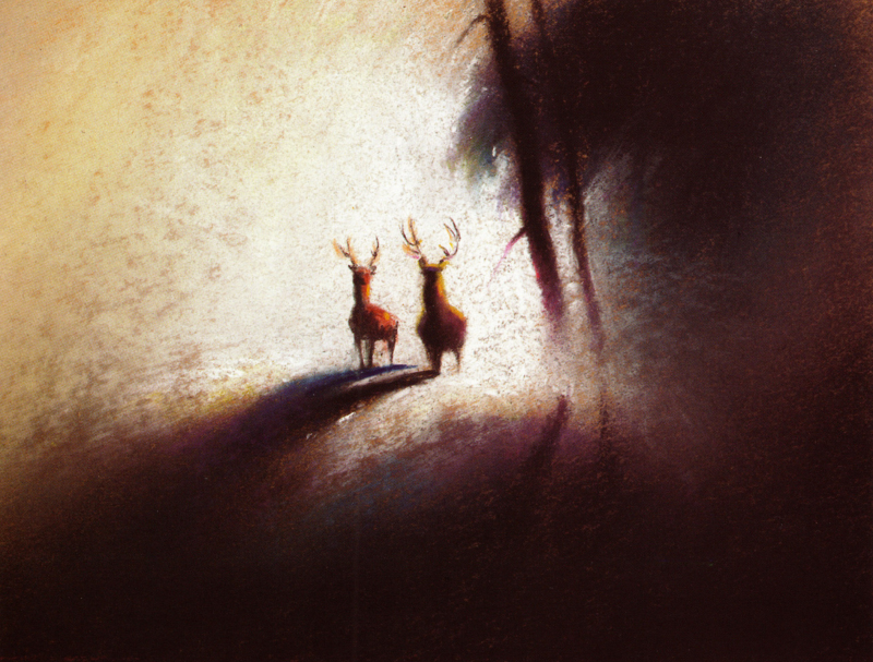
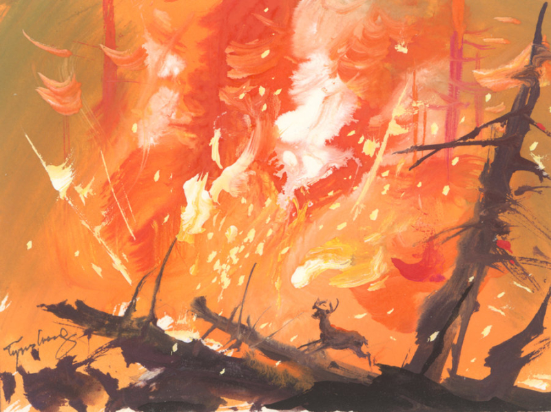
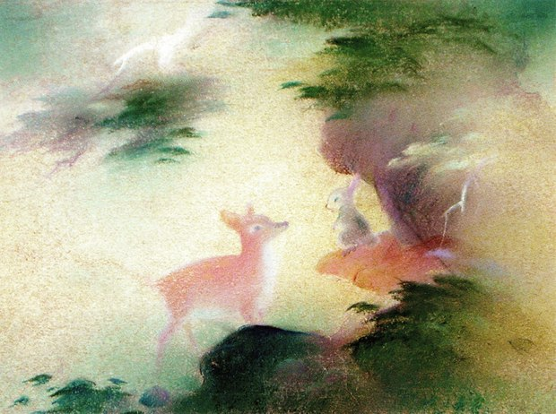
I'm not much of a Disney buff, but I do follow a lot of art blogs, which is how I came across the story of artist Tyrus Wong (1910-2016). Wong went largely unrecognized for his groundbreaking work on Disney's Bambi until the early aughts, but I'm glad he finally got his due, since his style was instrumental in setting the film's tone and atmosphere and also created an entirely new direction for Disney. I thought it would be fun to look at the Isa collection within the context of the original Bambi art.
Wong was born in China and came to the U.S. when he was nine (Tyrus is an Americanized version of "Tai Yow" that a teacher assigned him in elementary school). His father, taking note of his son's interest in drawing, taught him calligraphy every night using a brush dipped in water and "painting" characters on newspapers, as they couldn't afford ink or drawing paper. A junior high teacher noticed Wong's artistic skill and arranged a scholarship for him to attend the Otis College of Art and Design in Los Angeles, where he studied both Western art and the landscape paintings of the Song Dynasty (A.D. 960-1279). Wong graduated in the early '30s and showed his work in exhibitions throughout the country. In 1938 he got a job at Disney as an “in-betweener" drawing the thousands of frames that occur in between the main animation sequences. I didn't know this, but "in-between" animation is incredibly dull and repetitive – it's basically assembly-line production. When Wong found out Disney would be adapting Felix Salten's 1923 book into a film, he jumped at the opportunity to showcase his work.
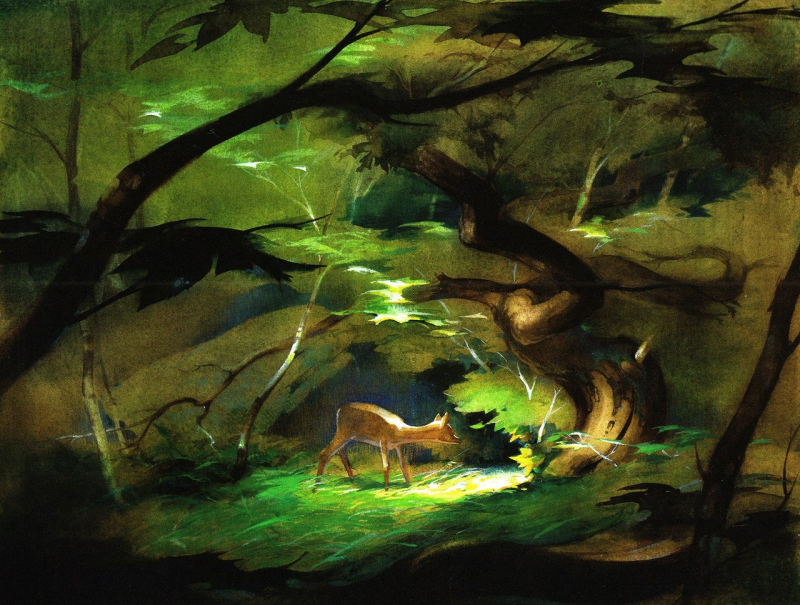
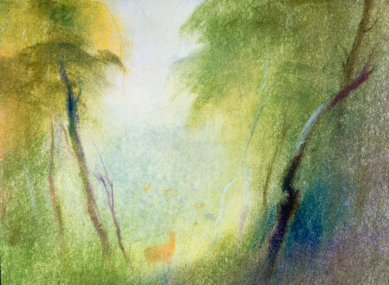
"I said, 'Gee, this is all outdoor scenery…I said, gee, I'm a landscape painter. This will be great!'" Wong recalled in a video used in a 2013 exhibition of his work at San Francisco's Walt Disney Family Museum. Using pastels and watercolors as well as inspiration from the Song dynasty landscape paintings, Wong sketched out a few samples with emphasis on the play between light and shadow rather than meticulously drawing each leaf and branch. As you can see, it's more of a pared-down, Impressionist approach that evokes the forest rather than being a literal representation. "I tried to keep it very, very simple and create the atmosphere, the feeling of the forest,” Wong said. Adds Michael Labrie, director of collections and exhibitions at the Disney Family Museum, "He visualized the forest as being ethereal…the sketches were more of an impression of the forest."
Wong was definitely in the right place at the right time: Disney realized that the ornate style used for the forest scenes in their 1937 feature Snow White, despite the success of the film, could not be carried over to Bambi. The highly detailed leaves and trees were overwhelming, basically camouflaging Bambi and the other animals. Wong's approach not only was perfect for the film's subject matter, but also presented a strikingly different direction for animated films. “Walt Disney went crazy over them,” notes John Canemaker, who wrote about Wong in his 1996 book. “He said, ‘I love this indefinite quality, the mysterious quality of the forest.’” Adds chief creative officer for Walt Disney and Pixar Animation Studios John Lasseter, "This sophistication of expression was a gigantic leap forward for the medium."
Here's short video with a few more paintings and commentary both from Wong himself and other people who worked on the film. (There's another video here but I couldn't figure out how to embed it into this post. Sigh.)
After his time at Disney, Wong produced illustrations for live-action movies at Warner Brothers. In his later years he continued painting and also branched out into kite-making. His story is very inspirational, as he was a poor immigrant who worked incredibly hard to overcome not only poverty, but also endured the rampant racism against Chinese people to become an acclaimed artist.
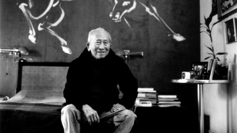 (images from cartoonbrew.com and thisiscolossal.com)
Getting back to the Isa collection, I still think it's a solid addition to the Museum (and will look excellent in the fall 2017 exhibition so keep your eyes peeled!), but now a part of me wishes they had used Wong's paintings for the packaging. As a matter of fact, I'd love to see more companies use original sketches rather than the finished Disney designs. The only time we've seen the preliminary artwork for a Disney collaboration, at least to my knowledge, is with MAC's Venemous Villains.
Anyway, what do you think?


