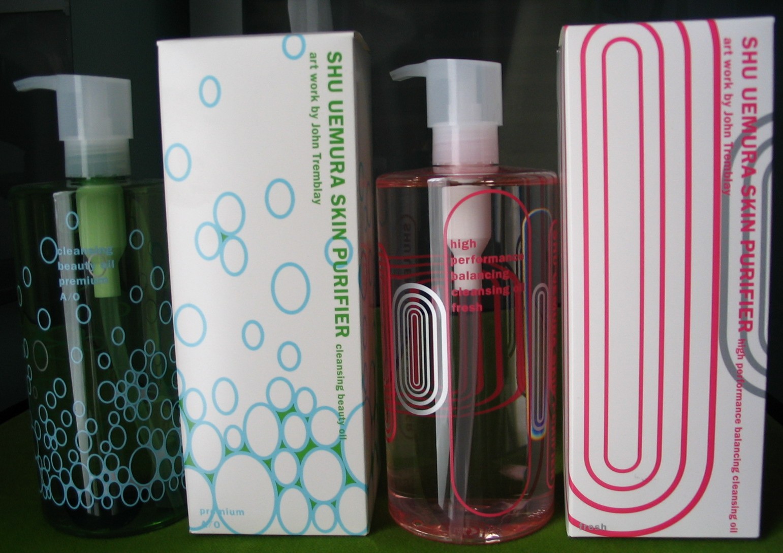
I was digging through the Museum archives today for some more things for the Fall exhibition (coming soon, once I can get around to it!) and thought I'd feature these pretty cleansing oils from Shu's 2006 fall collection. The company teamed up with New York-based artist John Tremblay, who created designs for each bottle based on their particular qualities, meant to interact with the contents of the bottle. "Shu Uemura brand manager Tina Tinio said, 'This year’s collection is more sophisticated and subtle; to be able to appreciate the design, you have to see how it interacts with the oil.'" While that statement makes it seem like Tremblay came up with these designs specifically for Shu, but in my opinion, they're essentially the same as his previous work.
We'll start with the Premium and Fresh oils:
The bubbles in the green oil and ovals in the pink oil are very similar to two works by Tremblay, Tourist Trap from 2006:
And Infinity Trial, 2003:
According to this Malaysian news article, for the Premium oil, "The blue ovals representing oxygen found in the water and sky, ascending from the bottom to the top of the green oil bottle, signifying the buoyancy of life and the power of nature while the silver colour used signifies the energy of light reflecting off a shiny surface", while the Fresh oil bottle "features pink and metallic silver concentric ovals inspired by the shape of an air pocket in the bottle when the bottle is tilted on its side. The various sizes and layers of the ovals enable you to play with the bottle to fit the air pockets inside the ovals and to view the ovals on the other side of the bottle through the empty oval, as if gazing into future from a window." Interesting concept but I'm not sold. I guess the only thought Tremblay had to put into these particular designs was determining which of his earlier work would be most suitable for each oil.
Here are the Enriched and Regular oils:
The wavy oval on the Enriched bottle is similar to this work (unfortunately the image came from of a catalogue and there was no name or date on the page where it appeared):
The Star article says that the Enriched oil "has seductive flow motion emblems in pink and yellow inspired by the flow of oil", and the Classic "features the design of olive and yellow ovals in varying sizes, inspired by the psychedelic 60s. The overlapping ovals expanding from one side to the other create geometric exchange constantly morphing when viewed through the transparent golden oil."
While the designs are rip-offs, somewhat, of Tremblay's earlier work, the way the company spun it such that they seemed to be created just for the qualities of the oils is pretty ingenious. If nothing else, some of the proceeds went to RxArt, a charity devoted to arts healing. And, of course, Shu made me recognize an interesting artist that I probably never would have discovered otherwise.


