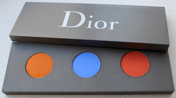
I come across the strangest things when I'm researching vintage makeup. I was looking up items for the summer exhibition and spotted this 1948 Coty ad.
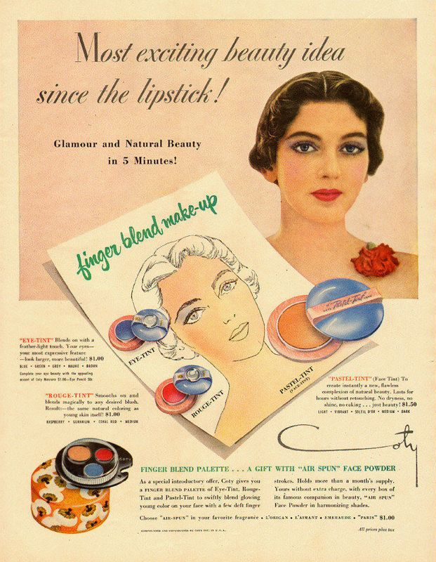 (image from ebay.com)
It's fairly unremarkable…until I noticed the colors in the palette shown on the lower left of the ad are incredibly similar to Dior's Les Tablettes de Bastet palette designed by artist Vincent Beaurin in 2013. They're not identical, but both palettes contain a warm golden terracotta shade, a cool medium blue and a bold red.
You can read all about Beaurin's rather complex reasoning behind the colors he chose in my post on the palette. Coty, on the other hand, has a much simpler explanation. The ad indicates that blue is for eye shadow, the red for blush, and the golden tint is for foundation. I doubt that one shade suited all complexions and the red blush and blue eye shadow most likely looked incredibly garish when worn together, but then again, as I noted previously, Beaurin's colors aren't exactly easy to work with either.
Do you see a color resemblance between the two palettes?
