I thought today would be appropriate to share some over the top headwear in makeup ads since the upcoming Easter holiday reminded me of Easter bonnets. I was also inspired by the recently released MAC/Philip Treacy collection, which I'll get to shortly. I invite you check out some strange forms of headwear in beauty ads, both vintage and contemporary. Because I'm still a little wiped out from a short but jam-packed trip to Rome, I won't be providing very much commentary nor will I explore the significance of crazy head adornments in advertising, but I hope you enjoy these regardless. 🙂
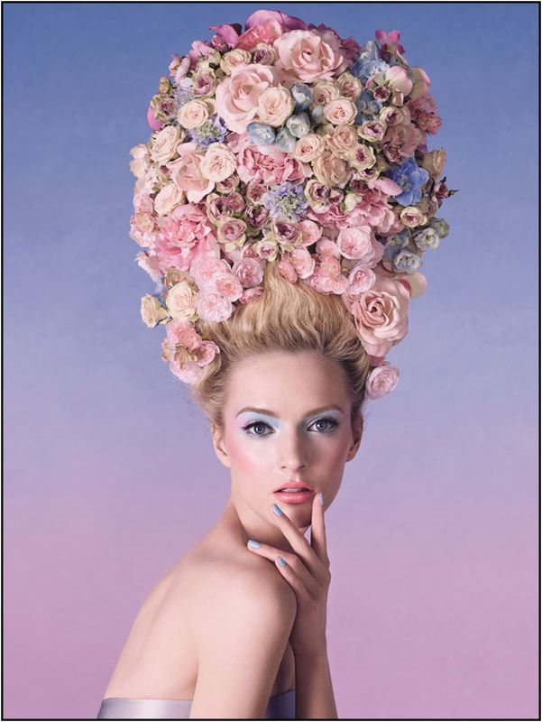
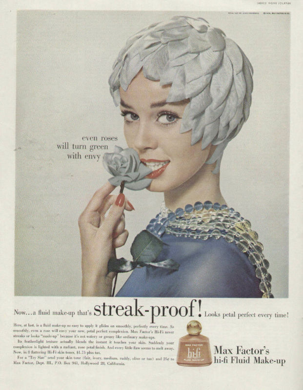
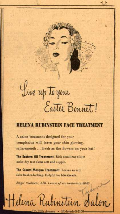
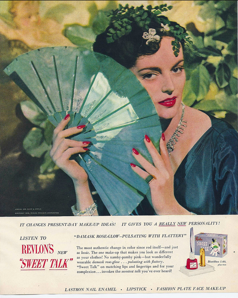
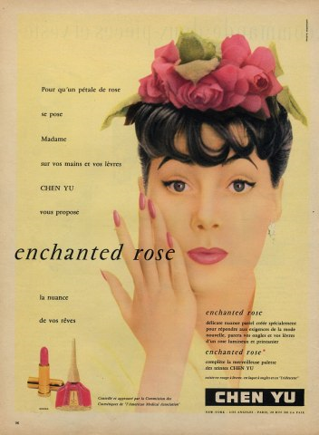
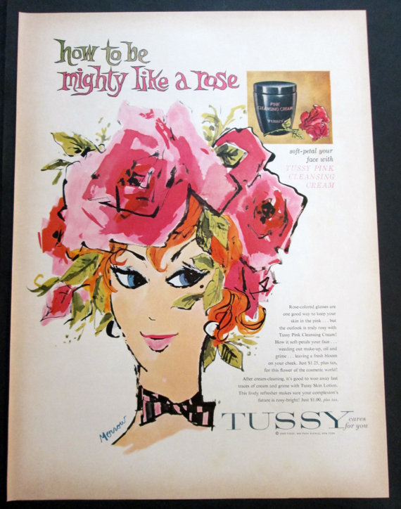
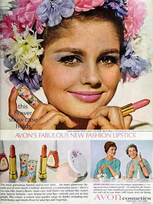
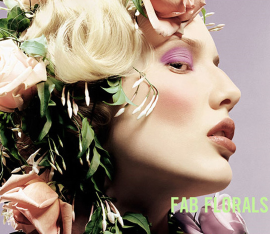
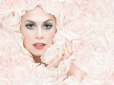
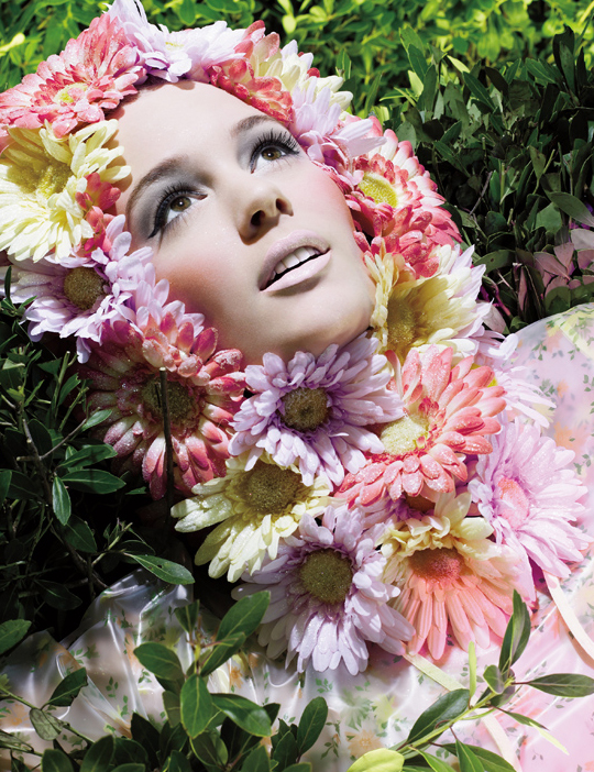
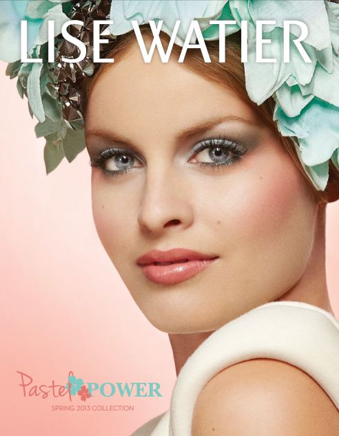
First up: flowers. Obviously, featuring florals in a cosmetics ad isn't too out of left field, but there are definitely some more avant-garde ads out there that go way beyond a basic floral crown or one bloom tucked behind the model's ear.
(image from flickr.com)
(image from hprints.com)
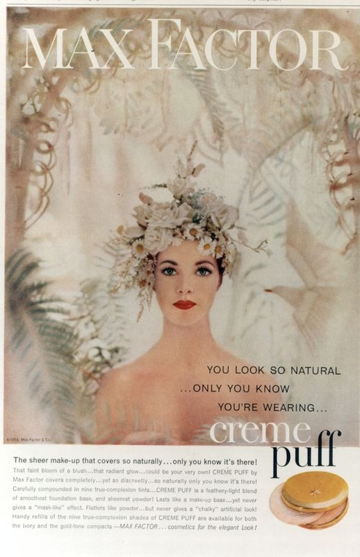
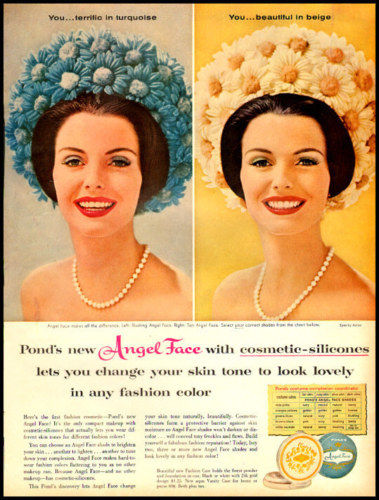
I found it hilarious that this ad is for "natural" looking makeup because, you know, nothing goes better with a natural look than an overly elaborate floral arrangement sitting on your head. Too funny.
(image from amodelrecommends.com)
(image from etsy.com)
(image from ebay.com)
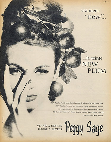
This one is actually fruit and not flowers but I thought it was worth including. Mmm…tasty plum crown.
(image from hprints.com)
You might remember this one from last year's spring exhibition.
(image from flickr.com)
(image from hprints.com)
(image from temptalia.com)
(image from beautyeditor.ca)
(image from temptalia.com)
(image from macnunu.blogspot.com)
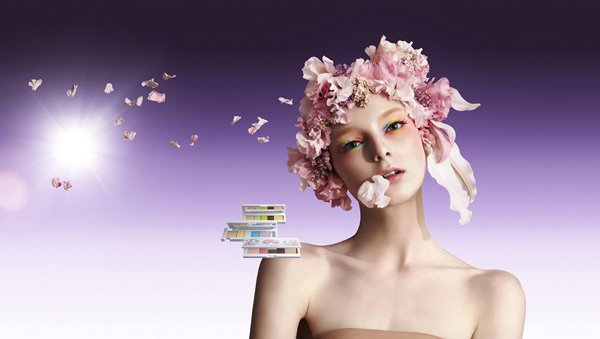
(image from chicprofile.com)
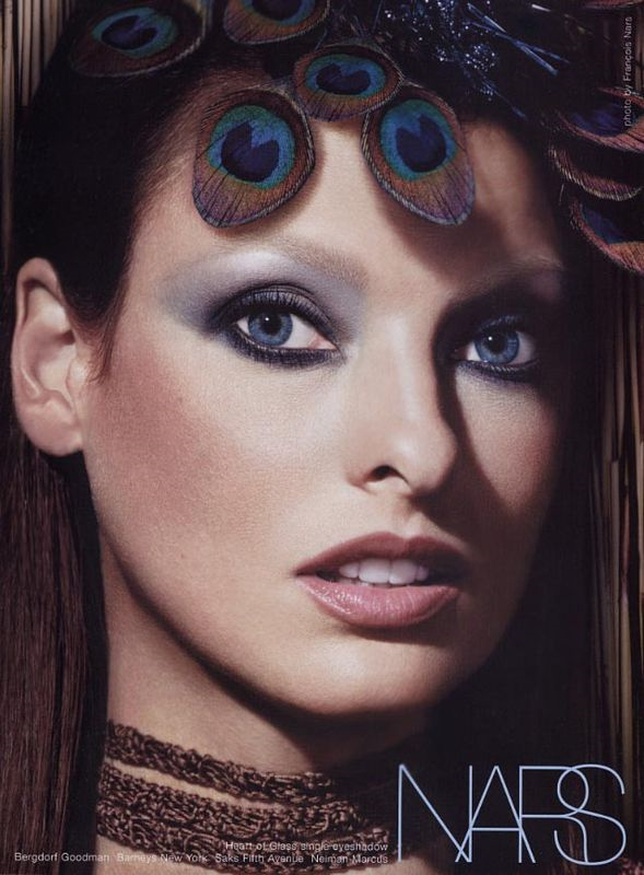
Now let's get into the slightly weirder ones, shall we? From feathers to birds' nests to lampshades, marketing directors seem to love putting random stuff on ladies' heads to sell cosmetics.
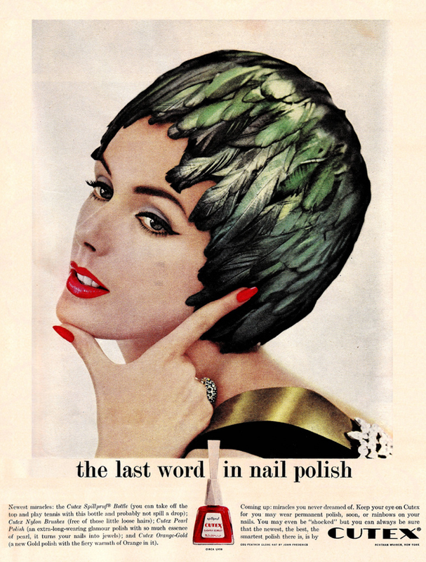
(image from flickr.com)
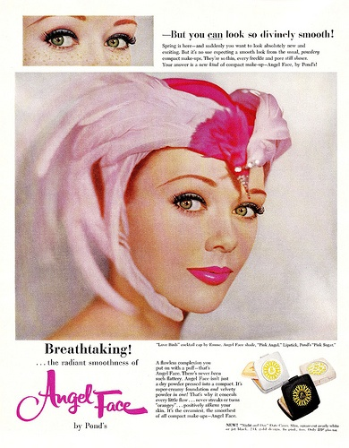
(image from vintage-ads.livejournal.com)
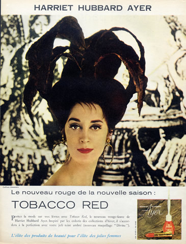
(image from hprints.com)
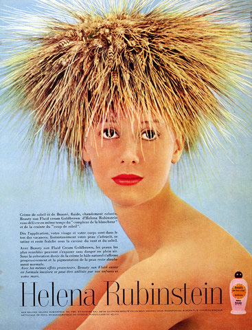
(image from hprints.com)
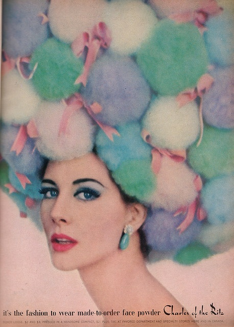
(image from pinterest.com)
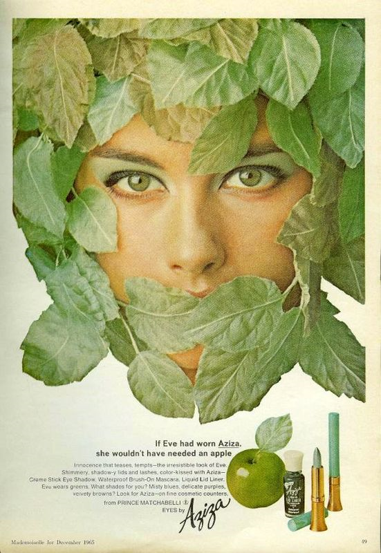
(image from popsugar.com)
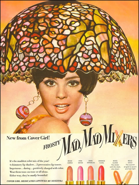
(image from pinterest.com)
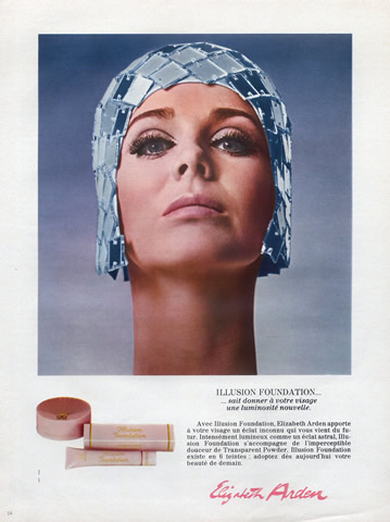
(image from hprints.com)
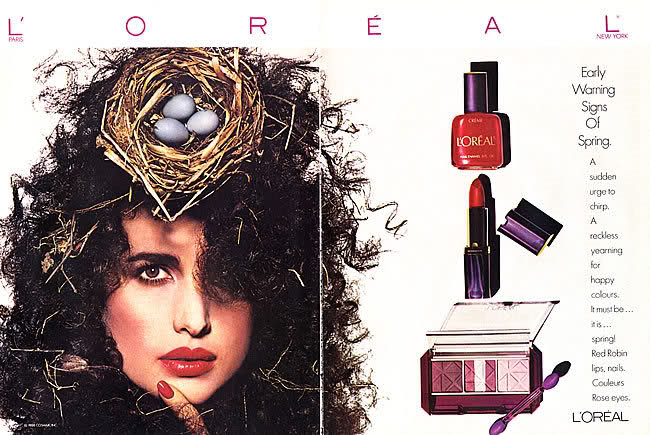
(image from bellazon.com)
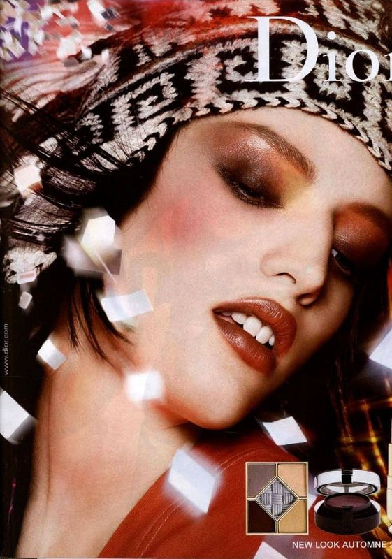
(image from pinterest.com)
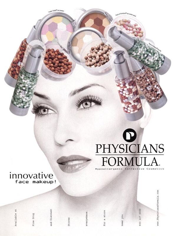
(images from bellazon.com)
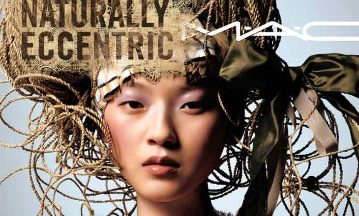
(image from asianmodelsblog.blogspot.com)
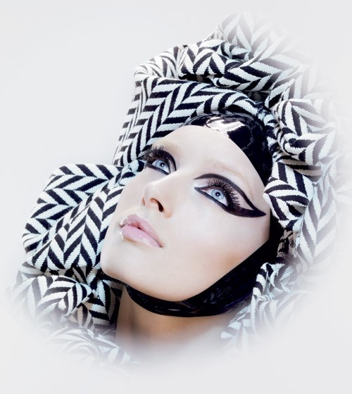
(image from nitrolicious.com)
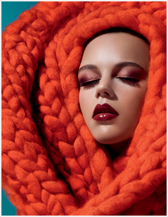
(image from nitrolicious.com)
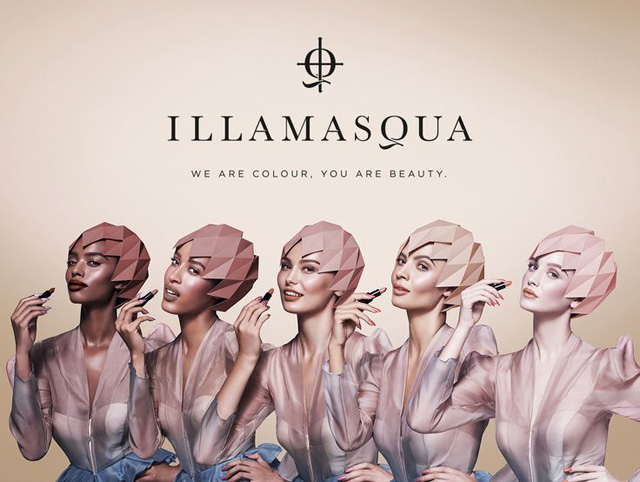
Illamasqua liked these bizarre diamond-paneled caps so much they used them in 2 campaigns.
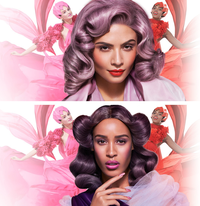
(image from makeup4all.com)
(image from chicprofile.com)
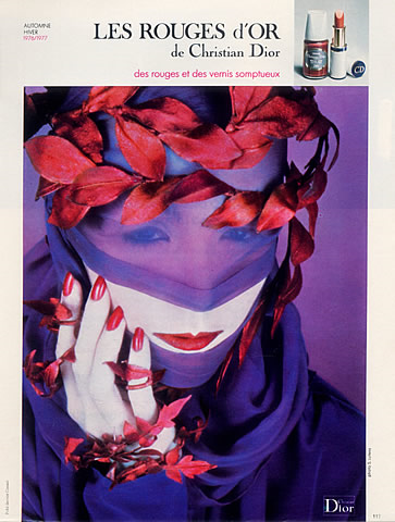
Which one is your favorite? For me, Dior's spring 2014 ad is pretty spectacular, but in terms of sheer weirdness, the Charles of the Ritz ad with all those poofs takes the cake in my opinion.
