 (images from basquiat.com and bakedinny.com)
(Note: I want to preface this post by saying that my references are a bit uneven – sometimes I include links, sometimes footnotes. This is due to the enormous amount of information on the artist. My inability to include everything on him and highlight only the sources I was able to access and that I thought were relevant has led to the need to use several forms of citation. I hope that since this is a blog post and not a formal academic paper I will not be under much scrutiny.)
The works of Jean-Michel Basquiat (1960-1988) have been garnering much attention in the art world recently. The Gagosian Gallery saw record attendance for their Basquiat show earlier this year, while one of his paintings fetched $48 million at a Christie's auction in May. There's even a Broadway musical about him in production. This rekindled interest may be part and parcel of a larger cultural trend: a revisiting of Manhattan's grittiness in the late 70s and early 80s and the burgeoning underground movements therein. Punk's fashion roots were examined by the Metropolitan Museum of Art's Chaos to Couture exhibition and proved to be significant inspiration for many designers' fall 2013 collections. Graffiti is also having a moment: in addition to the Basquiat collection, MAC has teamed up with contemporary graffiti artist Indie 184, while Smashbox collaborated with Curtis Kulig for their spring 2013 collection. Basquiat both represented and helped defined that era in New York City when punk, hip-hop and graffiti were blossoming.
Fittingly, for their summer 2013 collection Japanese department store brand Addiction released several palettes featuring three of Basquiat's paintings. While the website doesn't fully explain how the collaboration came about or what spurred the brand's founder to pursue it, it is right on trend.
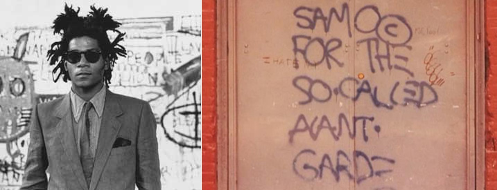
Basquiat, born to a Haitian-American father and Puerto Rican-American mother in Brooklyn, moved away from home at the age of 15. At 17 he was tagging buildings under the name SAMO, an abbreviated version of "same old shit". Soon after he shifted his method to paint on canvas while still retaining some of his urban style. By the time he was 21, his work was one of the most highly sought-after both domestically and internationally. (Read an excellent bio here.)
As for this collaboration, I managed to pick up two of the three limited-edition palettes: Mudd Club and Black or White.
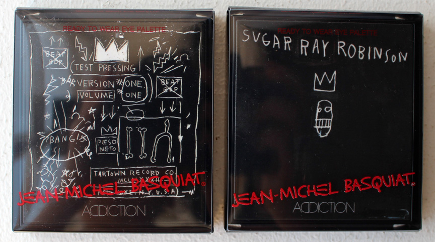
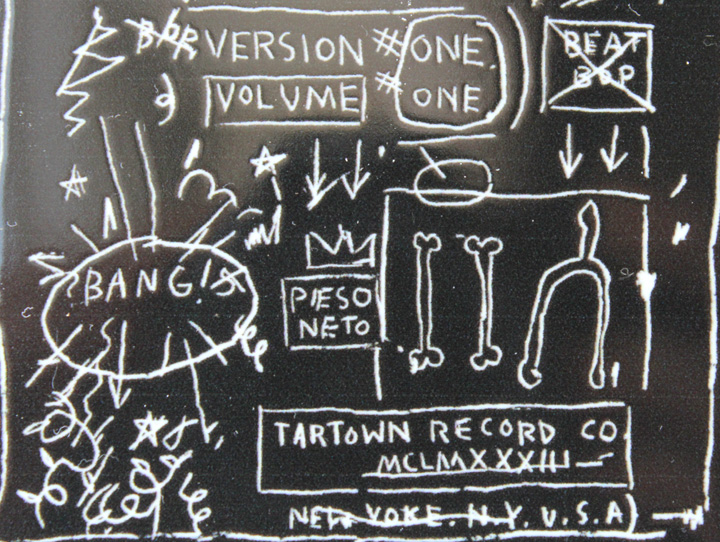
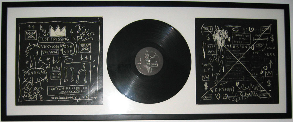
Mudd Club, named after the club Basquiat frequented in his late teens and early 20s with his band The Grays, has for its outer casing the design Basquiat produced for his only musical recording entitled Beat Bop. A reference to his lifelong love of jazz, the album cover displays many of Basquiat's signature motifs: a crown, text (some of which is crossed out), and bones. LACMA's Curator of Contemporary Art Franklin Sirmans describes the cover and song: "…[I]t was the subject of bebop that found reasonance most
particularly in paintings like Trumpet, Max Roach, Now's the Time, and
Horn Players…focusing on the bebop generation of artist, also a
subject Basquiat and Fab [Five Freddy] tangled on, these paintings give visuality
to the aural invention of the master jazz players. Not coincidentally,
Basquiat named his one musical recording 'Beat Bop'…[it's] a
nightmarish conversation piece, spat, chanted and incanted by
Rammellzee…over the dense and often nasal rhymes is a deep, moody,
industrial soundscape of brooding rhythms and disjointed melodies. It
is a New York City filled with poverty, violence, and apathy across
class lines. Yet…the song bears witness to the rumblings,
underground, of a creative flowering the likes of which New York City
may never see again."1 You can listen to the track here.
Here is a copy of the original album:
(image from ikonltd.com)
And the Mudd Club palette:
"I cross out words so you will see them more; the fact that they are
obscured makes you want to read them."2 – Basquiat
I will discuss Basquiat's crown symbol later, but for now I want to focus on his use of words in his paintings. He was, in short, a master at combining text and images. Since I can't do it justice I will leave it to National Gallery of Canada Director and CEO Marc Mayer to illuminate Basquiat's genius at this. "In purely plastic terms, Basquiat integrated text into his pictorial
project more successfully than any other artist of his generation,
perhaps because of the harmonious affinity of written and drawn marks
produced by a single hand…they recall the scat singing of his beloved
jazz, except in recognizable words (and paint). And yet they announce
themselves to be, and even feel like, real information. Quite a few of
Basquiat's paintings and a great many of his drawings are thick with
words that appear related to each other logically, but that never choose
to progress beyond the state of raw expression and teasing suggestion."3
The bones on the right are repeated throughout many of Basquiat's work, stemming from the copy of Gray's Anatomy he received as a child while he recovered from a car accident (his aforementioned band is also named for this tome). Some scholars see the bones as a preoccupation with death; others view them as a reference to the Maasai peoples' use of bones in their art.
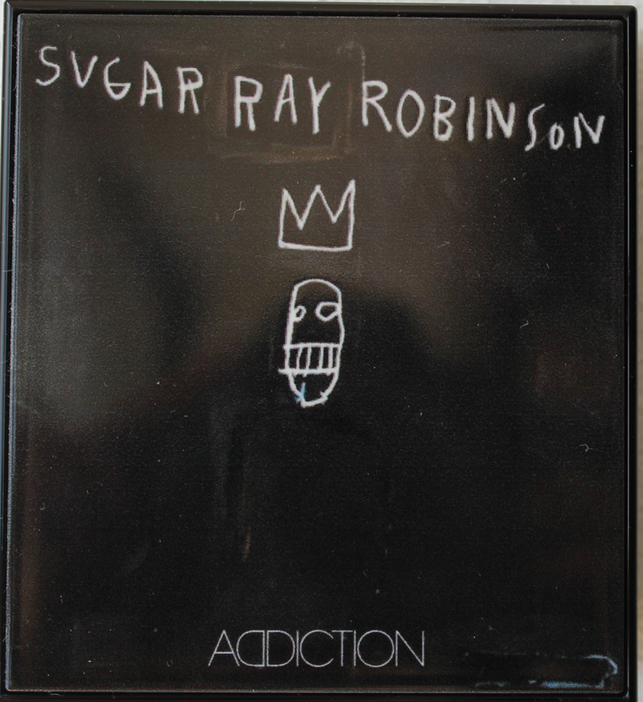
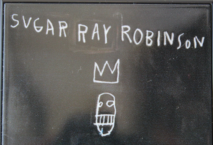
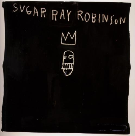
Let's move on to the Black or White palette, which has Basquiat's 1982 work Sugar Ray Robinson as its design.
Here's the painting:
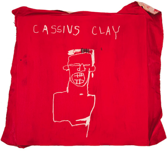
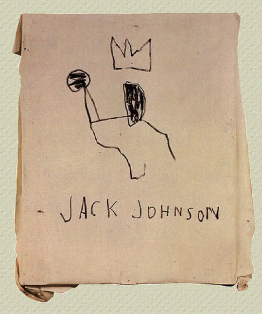
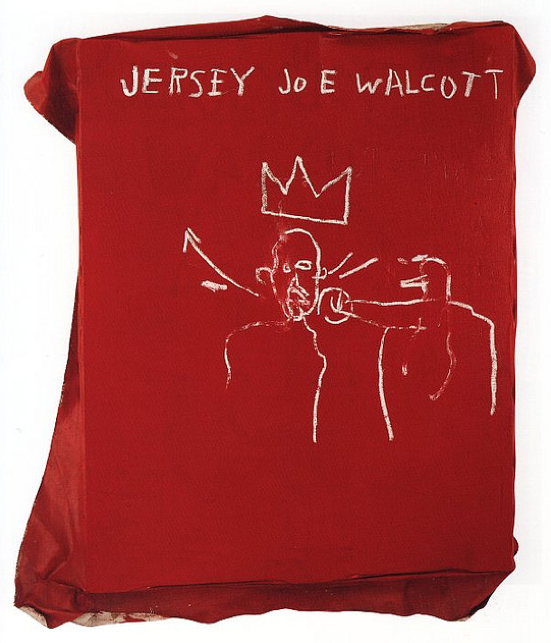
Like jazz, pugilists were a consistent theme in Basquiat's work. That same year he paid homage to Cassius Clay:
Jack Johnson:
And "Jersey Joe" Walcott:
(images from mantlethought.org)
Finally, the one palette I wasn't fast enough to buy before it sold out was Soda Lunch, which features Basquiat's Pez Dispenser (1984):

(image from cosme.net)

(image from tumblr.com)
I was a little confused by both the subject and the title, until I read this: "Basquiat's production in the mid-1980 displays a pronounced
emergence of Pop icons, reminiscent of the early 1960s work of Roy
Lichtenstein, Larry Rivers, and Andy Warhol – all of whom featured comic
book heroes, cartoon characters, popular celebrities, and references to
art history, anatomy, and money in their paintings. Basquiat primarily
emphasized the symbols of childhood and juvenile popular culture, and
his works contain hundreds of words derived from comics, cartoon
characters, advertisements, junk food, and joke tricks."4 Thus, the cartoonish dinosaur coupled with a title that refers to perhaps the fundamental symbol of childhood – a pocket-sized candy dispenser in the shape of comic book heroes, cartoon characters or other child-friendly figures – point to the artist's fascination with these attributes.
All three of the works chosen for the palettes incorporate Basquiat's signature crown. While used repeatedly in his works, this motif doesn't take on the same meaning in each – there are many different interpretations based on what else is going on in the painting. The most common explanations are that Basquiat used the crown to identify his heroes, which makes sense when viewing the works that pay homage to Sugar Ray and other famous black figures5, or that he is crowning himself as king given the crown's visual similarity to the dreadlocks he often wore gathered on the top of his head. Perhaps the most compelling theory is that the crown suggests a sort of supremacy over the earthly realm. "The preponderance of halo
or crown-like imagery in Basquiat’s oeuvre asserts a spiritual aspect to
the work, but the specific meaning of this symbolism thus far remains
largely unexplained. It should be kept in mind that his use of such
symbolism changed over time. By 1982, Basquiat had more or less replaced
the halo with a personalized, even trademark, image of a three-pointed
crown. The crown often accompanied a figure but occasionally appeared on
its own throughout the remainder of the artist’s career. The intent
behind this symbol is revealed in the 1982 silkscreen on canvas called
Tuxedo, in which a crown is the culminating image atop tiers
of texts and images alluding to diverse political, historical, social,
and cultural events. The crown hovering over manifestations of the
temporal/phenomenal world signifies a 'going beyond,' or transcendence,
as suggested by the numerous ladders and arrows leading up to it." (source).
My final thoughts: While I do wish there was a little more background provided at Addiction's website about the collaboration, I'm really impressed with this collection since the three works chosen are a good representation of Basquiat's work as a whole. I also think that the choice of artist was excellent – not obscure but not as well-known as, say, Monet. As with the NARS Andy Warhol collection, I wonder what Basquiat would have thought of his images appearing on cosmetics. I find it unnerving and sad, however, that given the artist's untimely death at the age of 27 from a heroin overdose, one of his few posthumous retail collaborations is with a company named Addiction. I had such a hard time naming this post – "Basquiat for Addiction" seemed to be in very poor taste!
What do you think? Are you familiar with Basquiat and if so, did you like the pieces chosen for the collection?
References
1Franklin Sirmans, "In the Cipher: Basquiat and Hip-Hop Culture," in Basquiat, ed. Marc Mayer (New York: Merrell, 2010), 100.
2 Quoted in Basquiat, ed. Rudy Chiappini (Milan: Skira, 2005), 120.
3 Marc Mayer, ed., Basquiat, (New York: Merrell, 2010), 54. For more on Basquiat's use of text, see the essay "Word
Hunger: Basquiat and Leonardo" by Jeffrey Hoffeld in Basquiat, ed. Rudy Chiappini (Milan: Skira, 2005), 87-103.
4 Richard Marshall, "Jean Michel Basquiat:
Speaking in Tongues," Basquiat, ed. Rudy Chiapipni (Milan: Skira, 2005), 60. For a firsthand account of collab with Warhol, see "Jean-Michel
Basquiat, Francesco Clemente and Andy Warhol: Collaborations" by Bruno
Bischofberger in the same book. For a discussion of Pez Dispenser, see this article.
5 "Basquiat's canon revolves around single heroic figures: athletes,
prophets, warriors, cops, musicians, kings, and the artist himself. In
these images the head is often a central focus, topped by crowns, hats,
and halos. In this way the intellect is emphasized, lifted up to
notice, privileged over the body and physicality that these figures –
black men – commonly represent in the world. With this action the
artist reveals creativity, genius, and spiritual power." Kellie Jones, "Lost in Translation: Jean-Michel in the (Re)Mix," Basquiat, ed. Marc Mayer (New York: Merrell, 2010), 171.


