 I didn't think that interior designer Marcel Wanders' collection for MAC was all that interesting until I read this National Post article. Sure, it was design-y and sleek and more or less what I'd expect, but was there any real thought put into it? As it turns out, there did indeed seem to be a concept, at least for the colors involved and why Wanders wanted to foray into makeup design. He was inspired by the works of Vermeer.
“'I was looking at a painting by Vermeer,” Wanders says. “The colours and the textures and the light, and the women. I thought of Vermeer’s brushes, I thought that he is painting the picture the way that women are painting themselves with makeup. I thought it was a very beautiful idea, and I wanted to explore that.' Though Wanders didn’t design the actual cosmetics, he directed their creation and the M.A.C & Marcel Wanders collection takes colour cues from Vermeer. Powders are pale, like the women in the Flemish master’s paintings; lipsticks are either pearlescent or dark, reflecting both the ladies’ complexions and their charcoal-suffused surroundings. The cases he created are the same dark shade as the background of Vermeer’s Girl with a Pearl Earring. Gesina, Catharina, Gertruyd — he named pieces of the collection after women from Vermeer’s world."
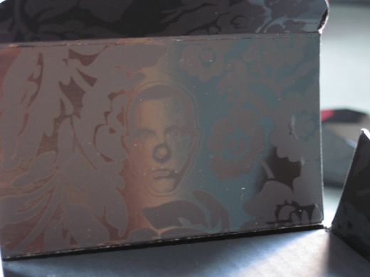
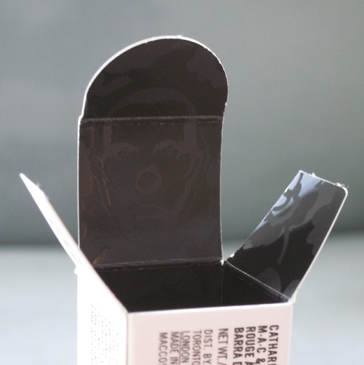
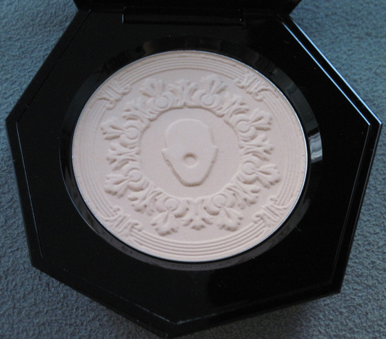
Nicely done. We have the inspiration of not one but two Dutch artists in this collection! What really struck me about the collection was that Wanders really knew how to brand it and make these HIS pieces. It was supposed to be a collaboration with MAC, but I feel like his imprint was much stronger than when MAC teamed up with other designers. Case in point: his visage, complete with iconic gold clown nose, on the inner packaging:
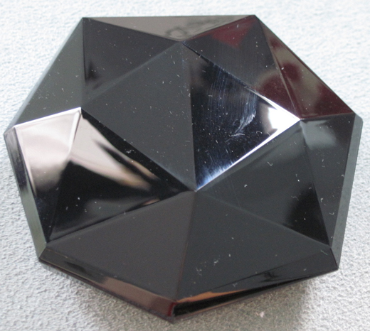
Here's the so-called "mystery powder." The real mystery about this, in my humble opinion, is why a black shiny plastic was chosen for a face compact. It's just going to get all finger-printy! Not the smartest move considering this was conceived by a world-class designer.
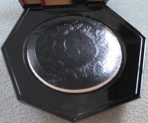
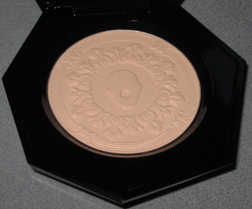
Again, the same clown-face imprint on both the puff and the powder itself:
With flash:
Incidentally, the refill powder that came with the compact also has the same imprint. I was glad MAC didn't cheap out on that. 🙂
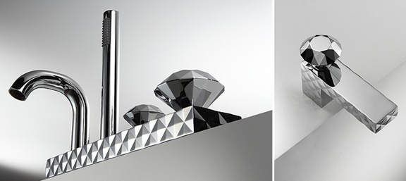
I didn't really see a lot of influence from his other work in this compact. The closest thing I found was the "Bonomi" series of bathroom fixtures:
However, the flowery scrollwork is definitely in keeping with his designs:
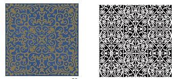
(images from marcelwanders.com)
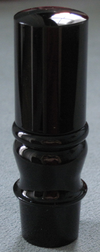
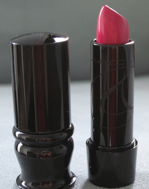
Now for the lipstick – I got Catharina.
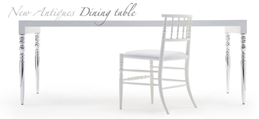
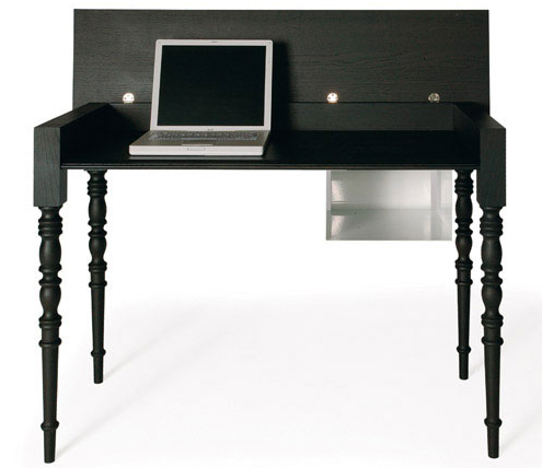
I love how the shape mimics the legs of many of Wanders' furniture.
New Antiques Low Chair:
Two-Tops table:
Finally, a funny side note: I was staring at the above table at Wanders' website thinking about how familiar it looked, and not because the table legs look just like the MAC lipsticks. I felt like I had seen that table a million times. I asked my designer husband if he knew anything about Marcel Wanders because the table at the website looked so familiar…and he had a good laugh explaining that the reason it looks so familiar is that we OWN said table.
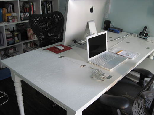
It's in our home office and has been there for years. It's where I blog, for crying out loud! How did I not realize it was the same table?! My descent into senility continues. 😛


