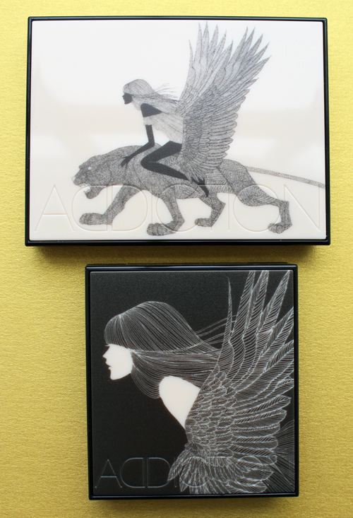
Japanese illustrator Hiroshi Tanabe is back in the makeup packaging game! You might remember the lovely flower fairies he created for RMK's 15th anniversary palettes back in 2012. Five years later Tanabe has returned to team up with Addiction, which is quickly becoming one of my favorite brands for their stunning artist collaborations.
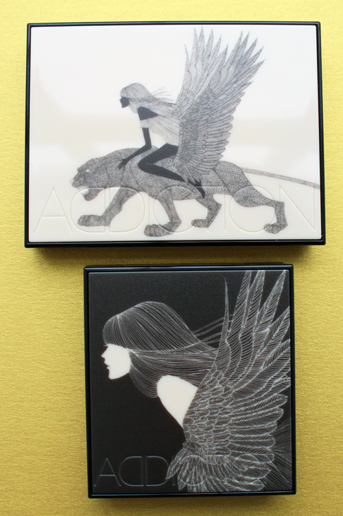
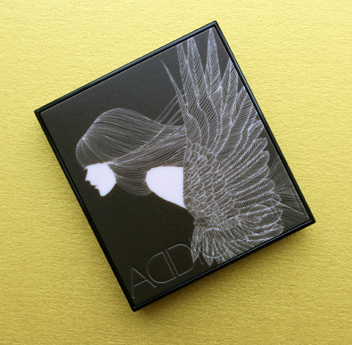
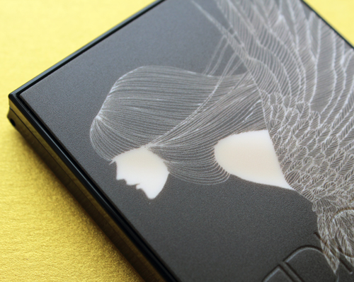
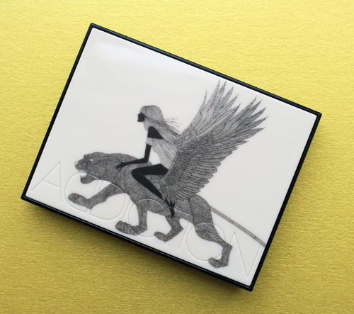
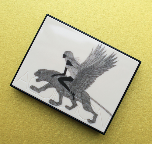
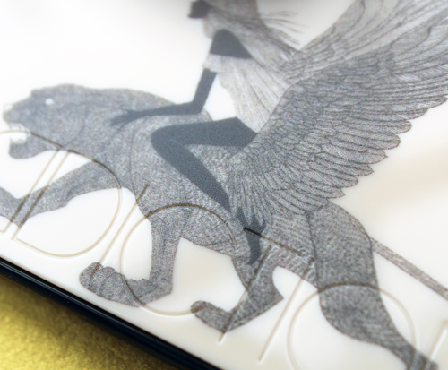
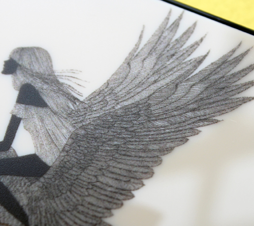
For Addiction's winter 2017 collection, entitled Vanilla Break, Tanabe came up with two designs: a close-up of a woman in profile swathed in her feathery wings, and another winged woman clad in a nightgown atop a winged tiger. I love how the minimal black and white color scheme are the reverse of one another.
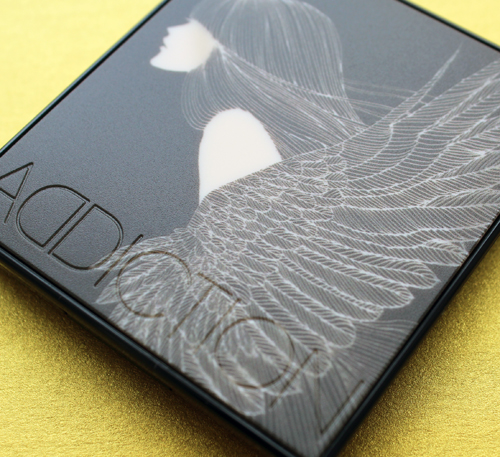
I'm obsessed with the rendering of the feathers…so crisp yet delicate.
Because I'm both lazy and in a rush (what else is new?), here is a brief artist bio courtesy of British Vogue (a full one is available at the artist's website): "Born in Kanagawa, Japan, Hiroshi Tanabe graduated from Tama Art College with a degree in Graphic Design. In 1990 he went to study at the Accademia Di Brella in Milan and focused on fine art and sculpture. He began focusing on illustration while studying in Italy. His first project was a T-shirt design for a night-club in Milan. Hiroshi's unique and vibrant illustrations mirror the graphic line work of traditional Japanese woodcuts. His illustrations have evolved into more refined and layered drawings throughout his career. Though constantly changing, his works marry old-world beauty and modernity in a way that is thoroughly fresh." Tanabe has done a countless number of ad campaigns for the biggest names in fashion as well as a slew of top publications, including Anna Sui, Pucci, Bergdorf Goodman, Harper's Bazaar, and The New Yorker.
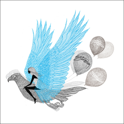
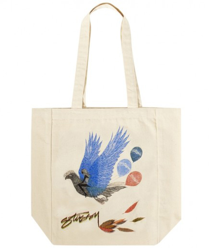
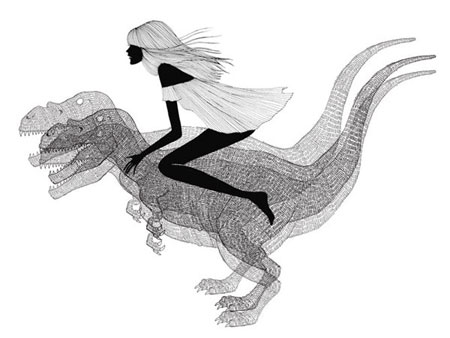
I was curious to see whether Tanabe had previously done anything similar to the Addiction designs, and it turns out his illustrations of feathers and women shown riding a variety of fanciful creatures don't represent a new direction for the artist. Take, for example, the designs he created for a collaboration with Stussy in 2012 and Gap Red in 2009.
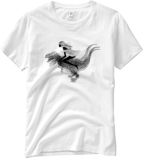
(image from thefashionisto.com)
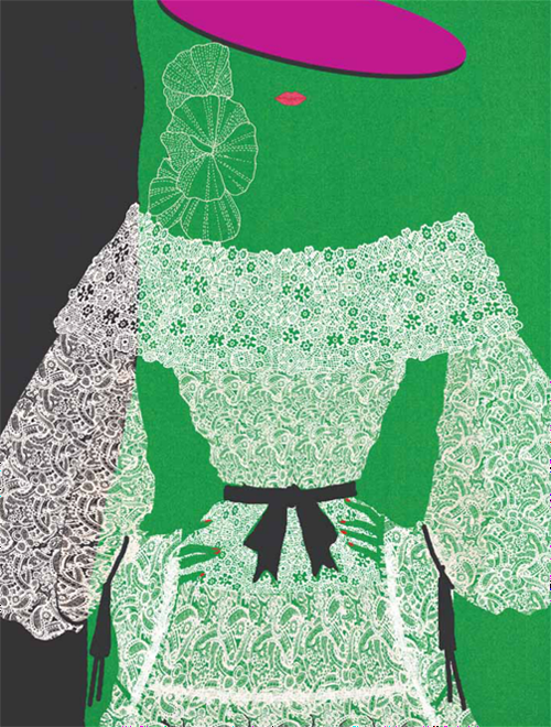
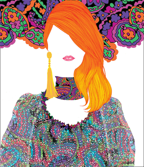
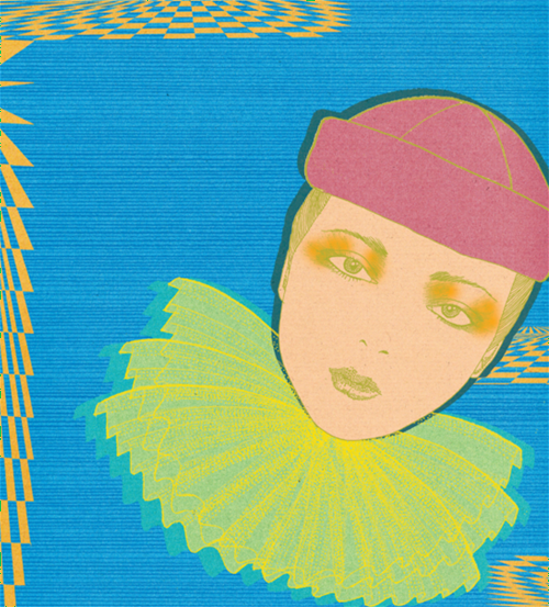
I thought I'd take a quick peek to see what Tanabe has been up to since the RMK collab. Feast your eyes on these beautiful editorial illustrations for Saint Laurent and W Magazine.
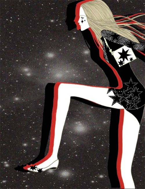
This star-studded illustration combines a dress by Anthony Vaccarello, Roger Vivier shoes and bag, and starry makeup by Giamba, all taken from the fall 2015 runways.
Just for fun I thought I'd include the actual items for this one, since you could say I was starstruck. (I know you love my bad word play).
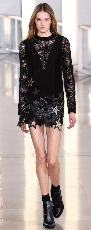
(image from vogue.com)
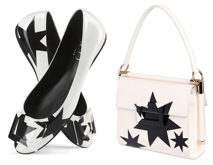
(images from lyst.com)
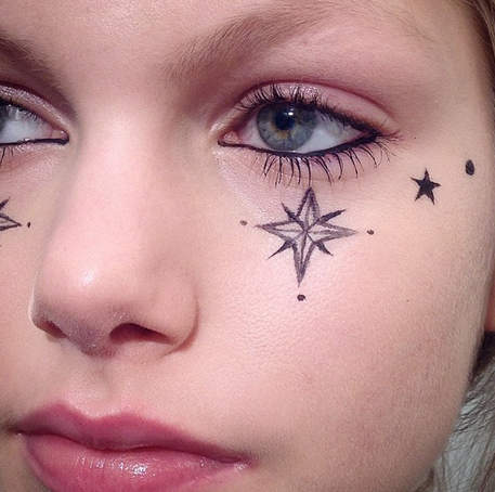
(image from thegloss.com)
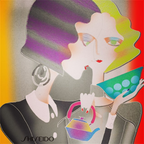
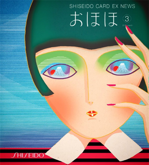
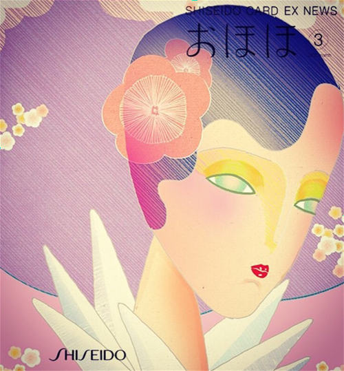
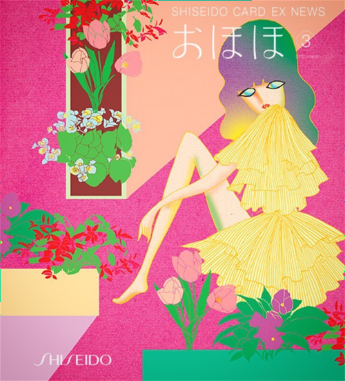
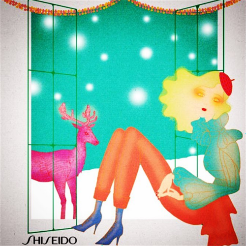
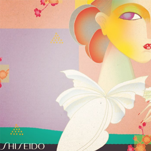
But my favorite work by Tanabe in the past 5 years are his illustrations for Shiseido. These are a fairly different style for him, in my opinion. I'm seeing more Art Deco lines reminiscent of Shiseido's early advertising rather than the woodcut-esque, fine-line work we normally see from him. In fact, the more I look at them the more I'm convinced they're a modern spin on Shiseido's ads from the 1920s and '30s.
Aren't the colors to die for? So vibrant but not garish or harsh – just the right amount of saturation to be pleasing to the eye rather than overwhelming it. And you would think of a combination of hot pink, lime green and dashes of bold red, as shown in the ad below, would clash, but Tanabe's careful design keeps them in harmonious balance.
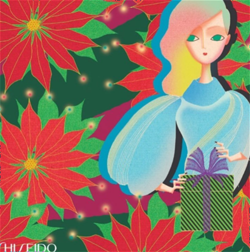
Here are a few to get you into the holiday spirit.
Okay, these are actually from 2011…but who cares?! They're gorgeous. And a little '80s.
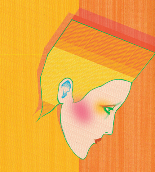
(images from instagram)
As for the Addiction collab, once again I have no idea how it came about or how the particular images were chosen. I'm assuming the company approached Tanabe and they went from there, but I'd still like to know why they selected these designs for the palettes. Given Tanabe's background in fashion and makeup advertising, I was a little surprised they didn't choose something more along the lines of the illustrations he did for, say, Clinique. I mean, I can't say I see the connection between makeup and a winged woman riding a tiger. Then again, it's a pretty cool image nevertheless, and the art that appears on makeup packaging doesn't have to be beauty-related in the slightest. And that's part of the fun of artist collabs! Initially I was also kind of hoping for something a lot more colorful along the lines of the Shiseido ads, but Addiction isn't really known for bold color. All the collections I've seen, even the spring 2017 collection which contained many colorful pastels, feature more muted shades. Vanilla Break in particular is about a "subtle beige-hued monotone", according to the website. So I think it's appropriate that Tanabe kept it simple color-wise. Plus, you wouldn't want to do the same illustration style for two different makeup brands – for the Shiseido ads, Tanabe is paying homage to the company's own early advertising. It's so distinctly Shiseido that it simply wouldn't work for a different brand.
All in all, I was pleased with this collab. And maybe I'll get up the courage to ask Tanabe himself what his inspiration was for the images on this collection as well as the upcoming spring 2018 Addiction collection. 😉
What do you think? If you're really smitten, there are two books of Tanabe's work for you to drool over. 🙂
