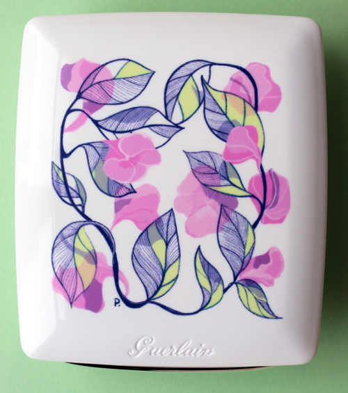
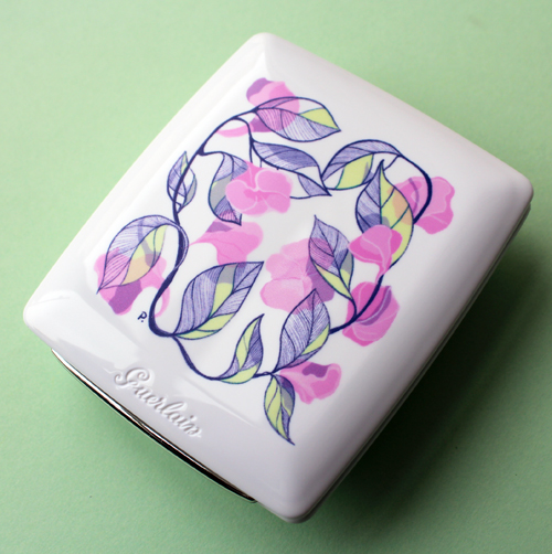
I spotted this Japan-exclusive Guerlain compact on Instagram and was afraid I wouldn't be able to snag it, but fortunately one of my trusty international sellers got it in stock. The beautiful floral pattern is the work of Polish-born, Tokyo-based artist Przemek Sobocki. I find the navy blue outline to perfectly complement the mix of spring green, pale lavender and an array of pinks, especially set against that pristine white background. The delicate lines within the leaves lend a realistic, vivid touch.
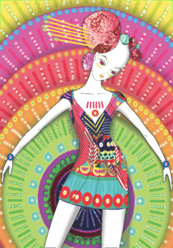
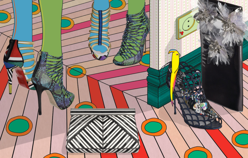
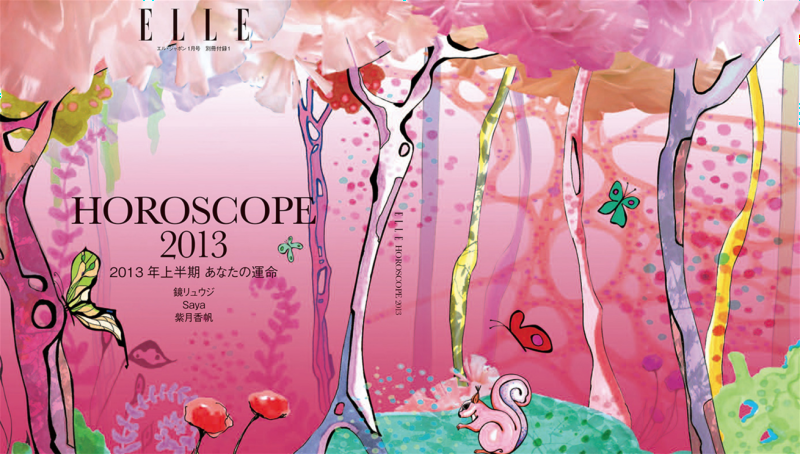
I really wish I had more information about how the collaboration with Guerlain came to be, but in lieu of that I thought I'd take a look at some of the artist's other work. Sobocki specializes in whimsical, colorful fashion illustrations in a range of areas, from print (magazine features, ads, etc.) and animated shorts and to store displays and packaging. Of his sources for inspiration and overall style, he says, "Mostly, I am inspired by cinema and books, and I really like 'reality' with a twist – basically 'magical realism' – I think our lives are not only about what we can see or hear or touch or taste, etc., they are also about the reality 'between the lines.' I am very interested in that part of life and of telling stories in this way; to evoke the feeling of suspense.”
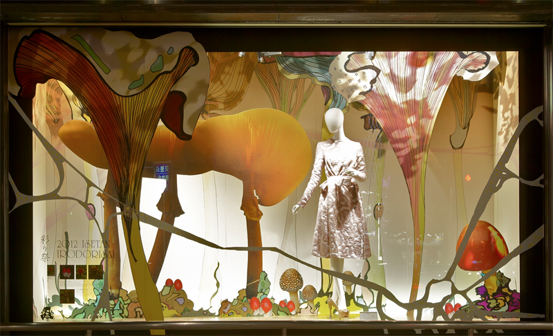
Some of my favorites include these amazing store displays for Japan's famous Isetan department store.
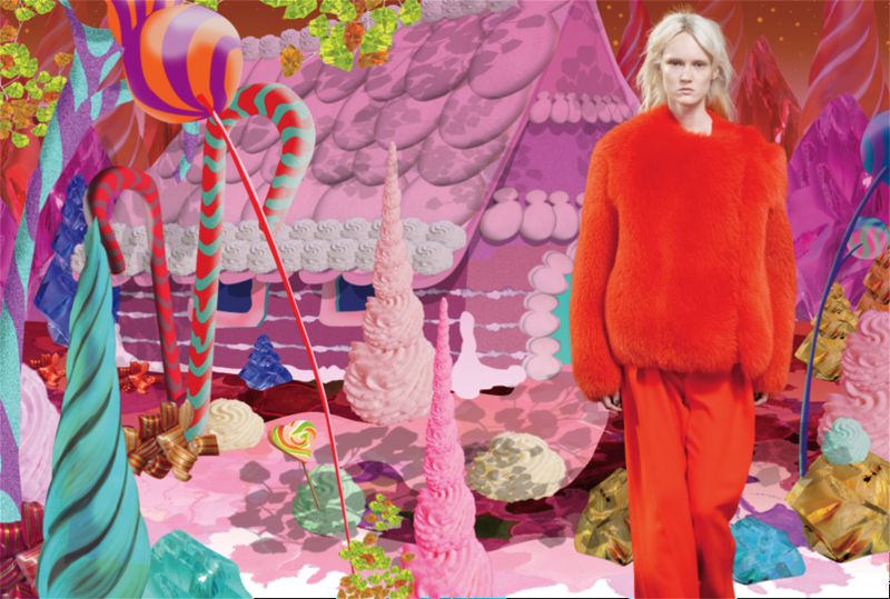
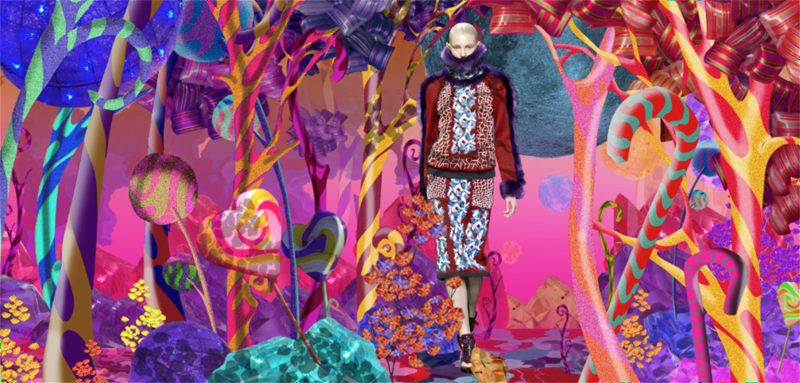
Another favorite of mine is the "candyland" Sobocki created for online high-end clothing retailer Farfetch – reminds me a little of Will Cotton's pieces.
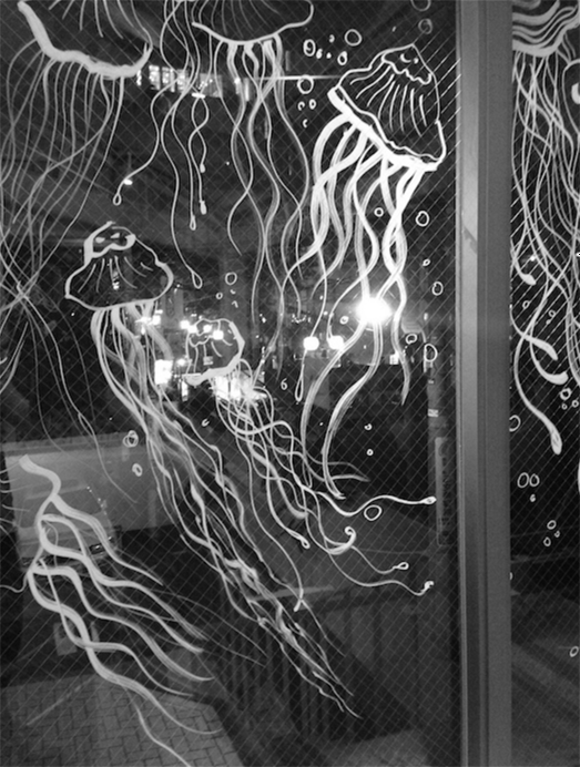
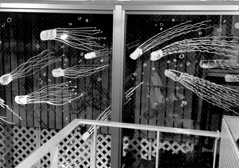
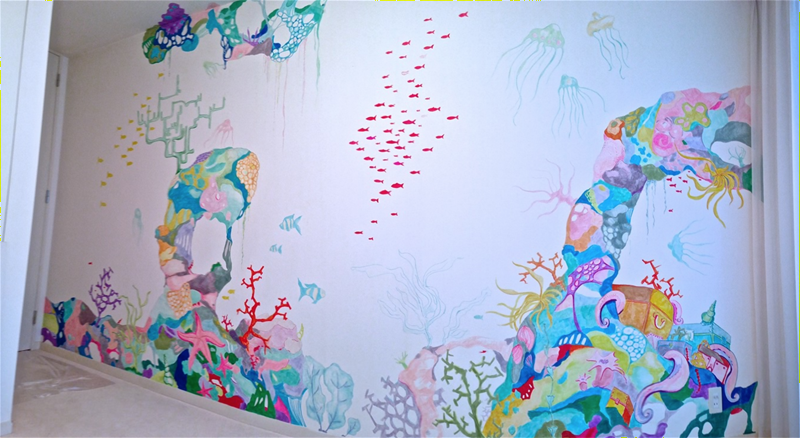
One thing I found interesting about Sobocki's work is that it's primarily a Western style with just a touch of Asian flair. After opening two exhibitions in Japan, Sobocki knew he was ready to take the plunge into living there; however, he's not as influenced stylistically by Japanese culture as by his native European roots. It's there, but in his words, not "obvious": "I feel very comfortable here so the cultural differences [weren't] really much of a problem…there is definitely influence from Oriental culture. But I guess it's not as obvious as [that of other artists] who live in Asia. I'm still very inspired by European culture but I absolutely love Asian cinema – so the influence is there for sure!" I feel as though these jellyfish decorating the windows of a Tokyo salon, along with the underwater scene Sobocki created for a child's bedroom, look a little more Asian – they remind me a tiny bit of the scenes you'd find on Japanese wood block prints.
Just for fun, I had to include his rendering of the famous Copenhagen mermaid statue for a Farfetch campaign. 😉
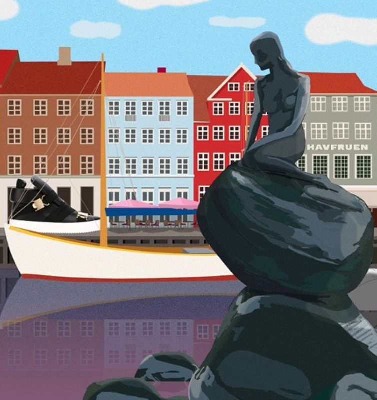 (images from sobocki.com and instagram)
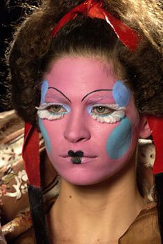
While his clients are primarily fashion brands, Sobocki is no stranger to beauty-related illustration. I adore his interpretation of several looks created by the ultra-talented Pat McGrath for Dior.
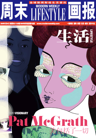
(image from sobocki.com)
Here's the actual makeup.
A few more:
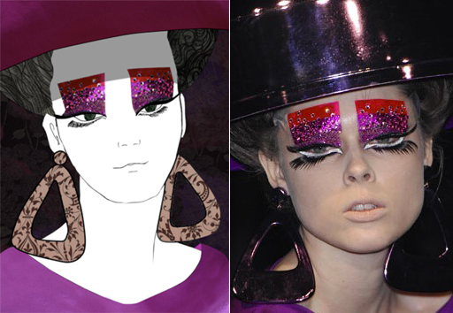 (images from sobocki.com and papermag.com)
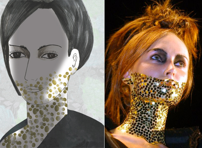
(images from sobocki.com and pinterest)
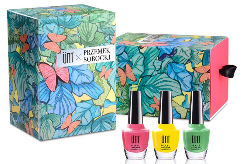
There was also this collaboration for a nail polish set.
 (image from sobocki.com)
Despite his extensive portfolio of store displays and advertising campaigns, Sobocki maintains that illustration is his preferred medium because of the artistic freedom it provides. "[Illustrators] can show things differently. They are not bound by the physical limitations of their environment or the models in the same way that a photographer might be. Instead, an illustration artist can bend the rules a bit and really explore the concept behind the clothes," he explains.
Overall, while I would have liked to see more information about how the Guerlain collaboration happened and the inspiration behind the compact's illustration, it's definitely Museum-worthy. I must remember to include it in next year's spring exhibition, since it arrived too late for inclusion in this year's.
Thoughts?


