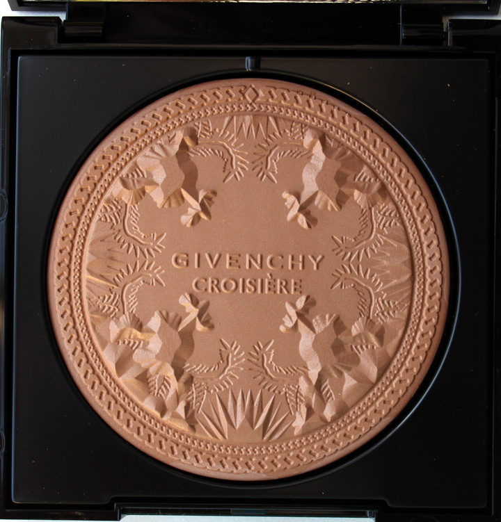
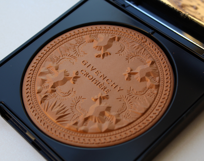
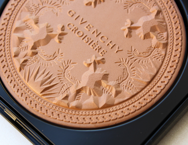
I feel as though every summer cosmetic companies up their design game when it comes to bronzers. Givenchy hopped on the too-pretty-to-use bronzer bandwagon this year with its Terre Exotique Healthy Glow Powder. I didn't even know what the pattern was when I first looked at it; all I knew was that it was a must-have for the Makeup Museum.
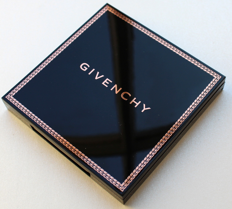
This little treasure comes outfitted in a sleek black case with a coppery chain detail.
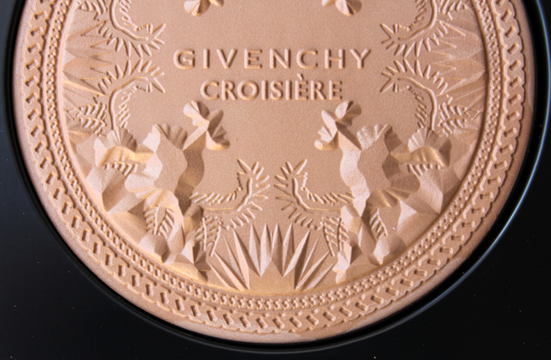
My first impression of the design was that it looked vaguely organic – leaves of some kind, but I had no idea what the raised portions of the patten were.
I figured the pattern had its origins in Givenchy's fashion, as it seemed too intricate to be something that was designed solely for this bronzer. Low and behold it appeared, quite colorfully, in the 2012 resort collection.
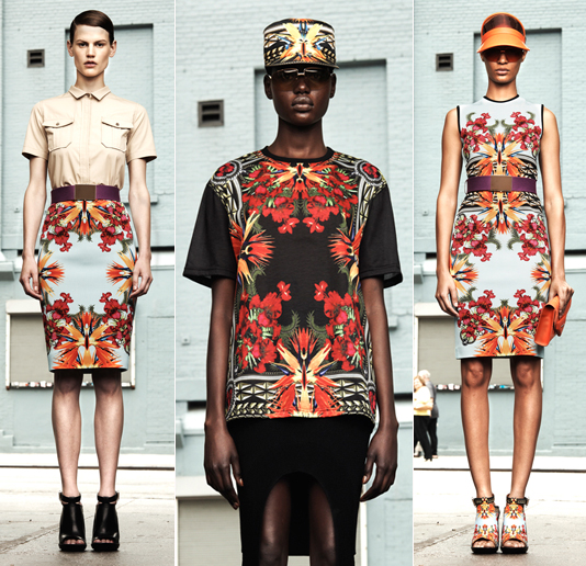
(images from style.com)
Here's a better image of the print. An abbreviated version appears in the bronzer – only the central part of the pattern (outer leaves of the irises and bird of paradise flowers) and some chains were used.
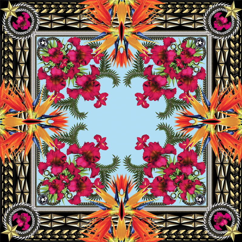
(image from artesoul.tumblr.com)
Givenchy designer Riccardo Tisci was so taken by the blooms of Hawaii for his 2012 resort collection that the above print appeared on nearly every piece that came down the runway. But the body-conscious silhouettes gave a hard edge to the brightly colored pattern. As one critic remarked, "flora has never looked more urban or street."
Indeed, the print was also used for the packaging on the Jay-Z/Kanye West album Watch the Throne (Tisci has previously designed the cover for their H.A.M. album in 2010.)
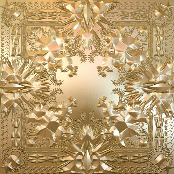
(image from rollingstone.com)
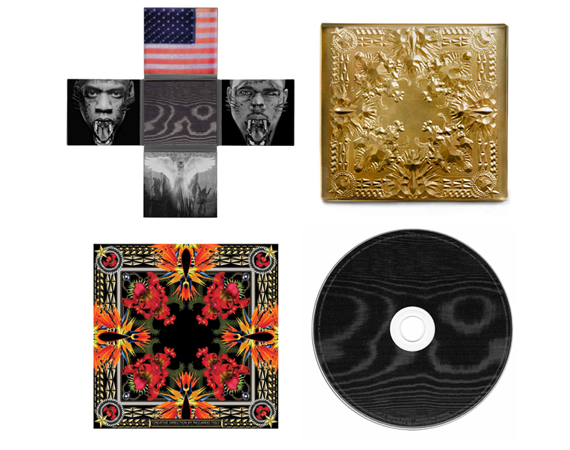
(image from freshnessmag.com)
It's still a mystery to me as to why this pattern ended up on the bronzer this year rather than in 2012 or even 2013. Was Givenchy running out of ideas and figured this would work well? Or is it that it's just a fabulous print and the company wants to get as much mileage out of it as possible?
In any case, I think the bronzer is quite lovely, even though it may have worked slightly better if it had multiple colors or at least outlines of the flowers. I'm glad I found the print on which it's based because you can't initially tell what it is in the pan – it didn't immediately read irises and birds of paradise to me, just symmetrical, pretty shapes. After seeing the original design you can better recognize the tropical flowers and see how appropriate the pattern is for summer.
What do you think?


