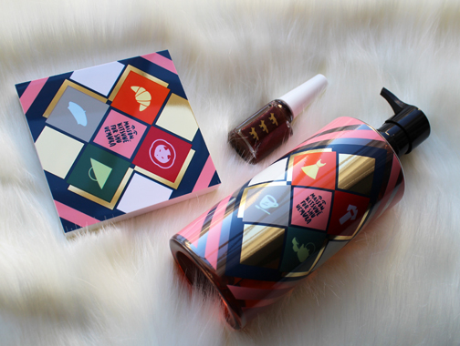
For their holiday 2015 collection, Shu collaborated with hip French fashion label Maison Kitsuné for an "East meets West" theme. I had heard of the line before but it wasn't really on my radar. However, as with all makeup collabs, I get more interested in the artist or designer once I see their work on the packaging.
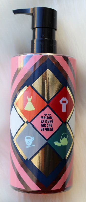
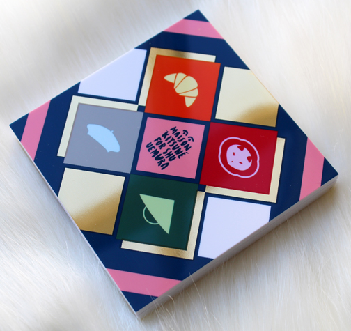
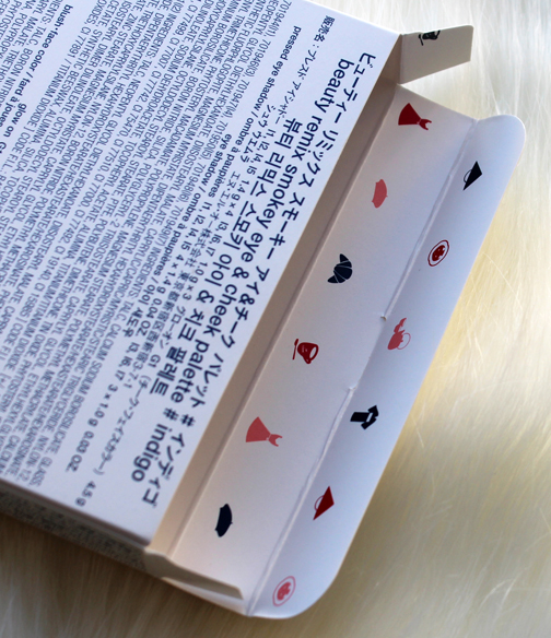
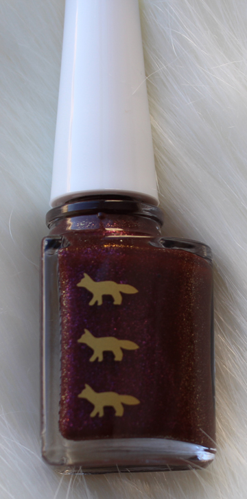
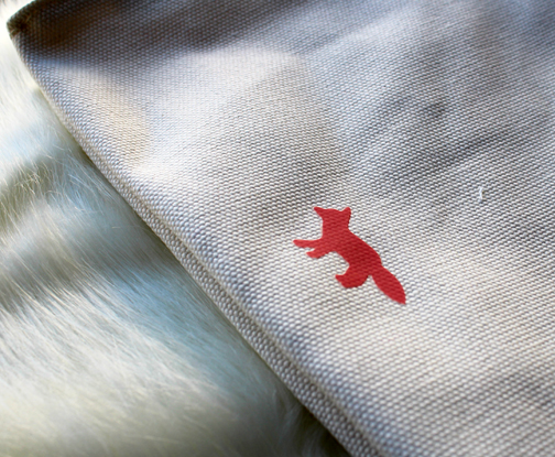
I picked up the Indigo palette, Plum Glitz nail polish and the cleansing oil. The packaging is adorned with an equal mix of Parisian and Japanese motifs to represent the East/West concept – a beret vs. a straw hat, coffee vs. green tea, a flouncy dress vs. a kimono, etc. And of course the brand's little fox logo makes an appearance too (kitsuné means fox).
I tried to up my photography game by using this very soft faux fur blanket as a backdrop…not sure how successful that was but I can tell you that blanket is ridiculously comfortable! I encourage everyone to buy one.
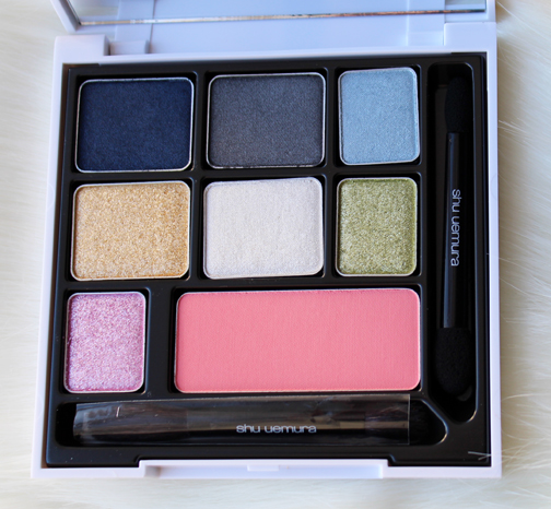
You know I love when the patterns continue on the inside of the boxes!
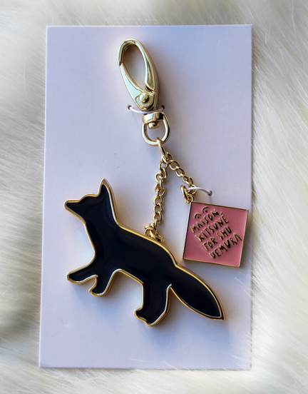
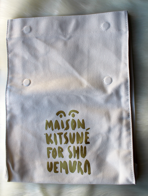
Because I'm such a good customer I got both a free key chain and tote bag – too cute!
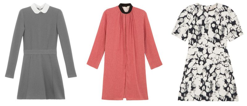
Let's take a quick peek at some of Maison Kitsuné's fashion, shall we? The line was founded in 2002 by Gildas Loaëc and Masaya Kuroki, who seek to blend contemporary Parisian and Tokyo style. From the website: "Maison Kitsuné men and women recognize this perfect balance between tradition and modernity, comfort and simplicity, chic and laid-back. While the 'classics' are constantly reinvented, giving the collections a sense of timelessness, the daring mix of colours, prints and materials anchor them firmly in the zeitgeist. With a passion for all things beautiful and a keen eye for detail and finish, the house has a unique savoir-faire."
Their work reminds me of Paul & Joe, only a little less twee and shot through with a slight Tokyo vibe.

(images from shop.kitsune.fr)
Getting back to the Shu collection, I believe the designs on the packaging were made specifically for the collection, as I couldn't find any reference to them in Maison Kitsuné's fashion pieces. I like that they didn't just recycle something they've done a lot in the past but rather developed an original creation that also clearly represented what Maison Kitsuné is about: a playful yet sophisticated combination of Paris and Tokyo fashion. From a purely aesthetic perspective, I enjoyed the variety of motifs against the colorful geometric background, and that different items had different patterns. For example, the Indigo palette and the cleansing oil have a different set of emblems, while the nail polish stayed simple by featuring only the fox logo. Overall, I thought Maison Kitsuné did a great job in adjusting their fashion concept to fit cosmetic packaging – you know it's theirs but not because they slapped on a bunch of prints from previous collections. I think they perfectly answered the question of how one would depict a marriage of Parisian and Japanese styles.
What do you think?


