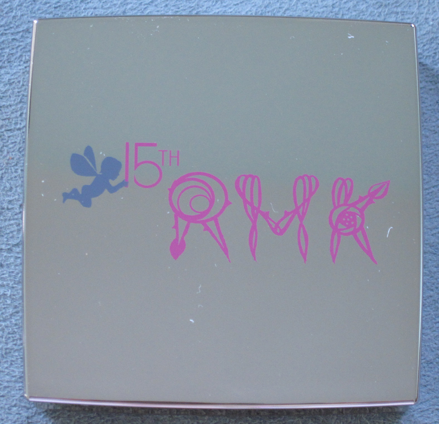
Japanese brand RMK is celebrating its 15th anniversary this year, and in honor of that milestone the company released two quite adorable palettes.
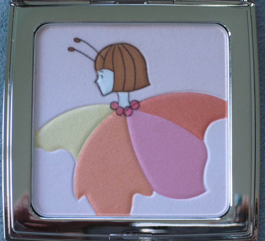
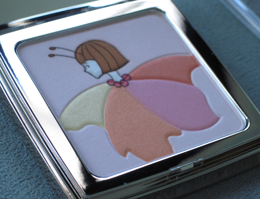
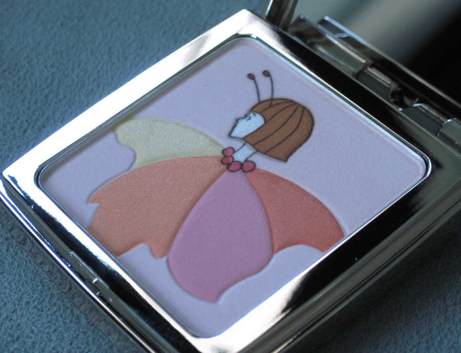
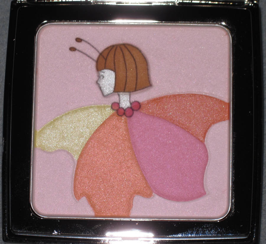
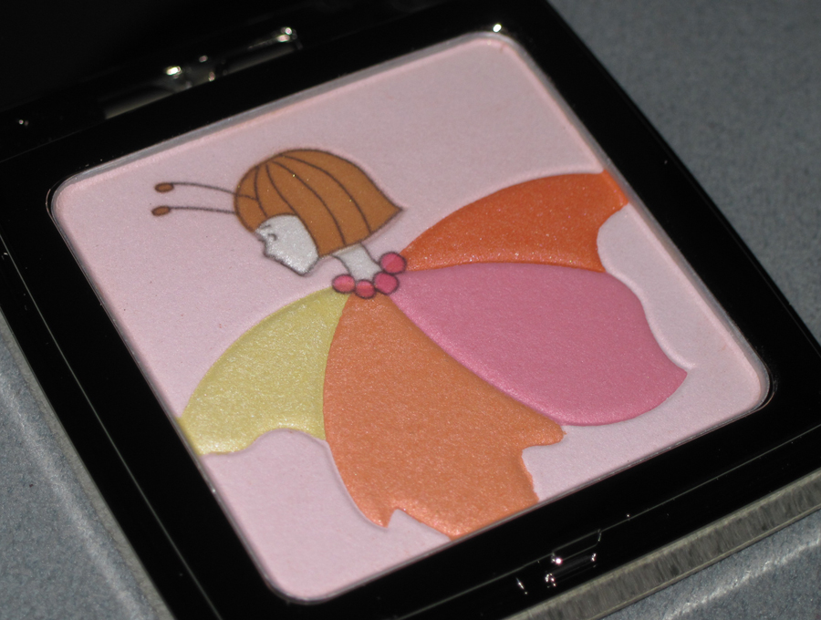
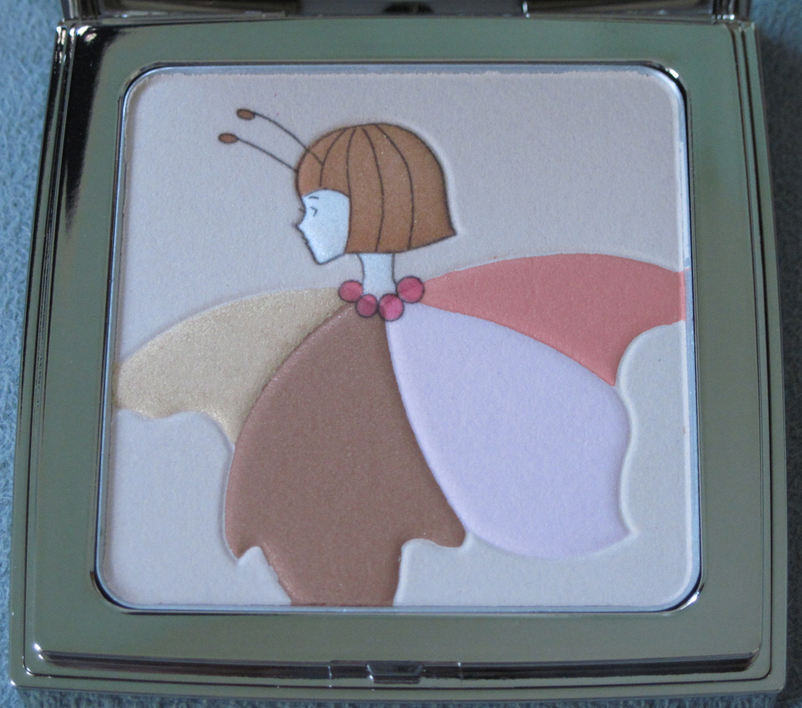
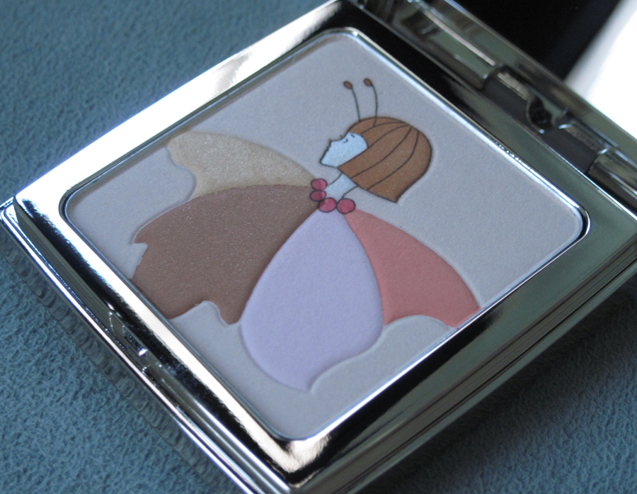
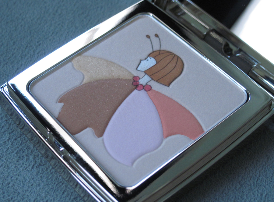
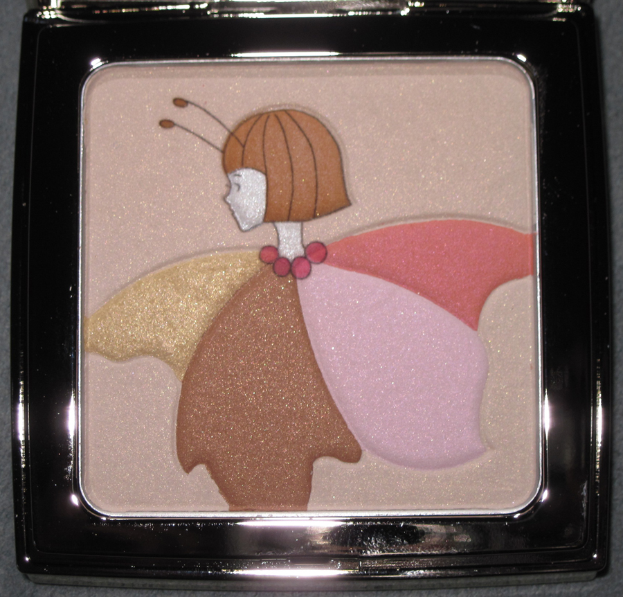
The palettes each have a "flower fairy" designed by illustrator Hiroshi Tanabe. They're shown in profile with antennae sprouting from their bobbed haircuts, sporting round-beaded necklaces and clad in wavy, pastel petals.
Here is Pink Coral (01):
With flash:
And here's Brown Beige (02):
With flash:
There was also a tote bag available as a gift with purchase, but I wasn't able to get my hands on it.
Now that we've seen the cute flower fairies, let's take a look at some of Tanabe's other work. Starting out as a graphic designer, Tanabe branched out into illustration early in his career. He is known for clean lines and flat, two-dimensional planes of color that take their cue from traditional Japanese wood cuts.
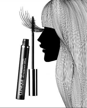
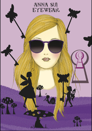
Tanabe's commercial designs include these ads for Bergdorf Goodman, Clinique, and Anna Sui (which is more or less identical to the illustration on the RMK bag – if I were RMK I'd be mad that he used the same design!):
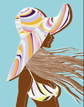
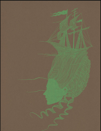
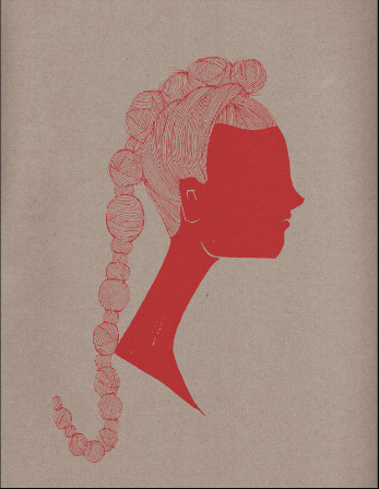
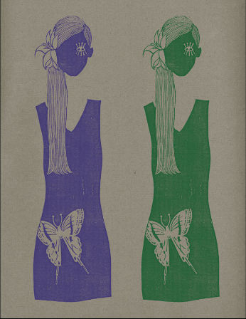
In looking at the artist's website, what stood out to me is how often the women are shown in profile. And if she is facing the viewer, more often than not her visage is somehow obscured or mostly erased – sometimes there's a single eye, but usually we can't see the whole face. The feminist in me isn't sure what to make of that. Here are some examples.
Pucci ad, 2002:
From his Marie Antoinette series:
From his book, Blue Mode:
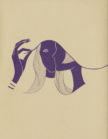
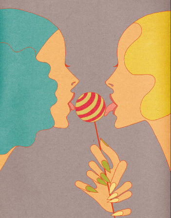
Getting back to the RMK palettes, I think this work is the most similar – the graceful, undulating lines of the hair echo the wavy petals the fairies wear, while the whisper of an eyelash peeks out from the faces of these girls as well as the fairies.
Candy, 2010:
(images from hiroshitanabe.com)
While a fairy motif can arguably be a little bit juvenile/twee (see the PixiGlow collection for Target), I think in this case Tanabe's modern style prevented these palettes from striking a childish chord. The lines are simple and feminine, elevating the fairies from cartoons to more real, woman-like figures while still maintaining a sense of whimsy and playfulness. I am curious to know why a fairy was chosen to represent the company's 15-year anniversary, however.
What do you think? Do you think Tanabe and his fairy illustrations were a good choice for RMK's 15th anniversary palettes?
