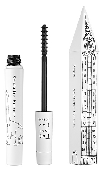
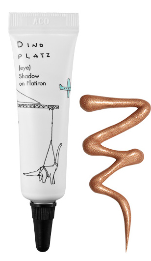
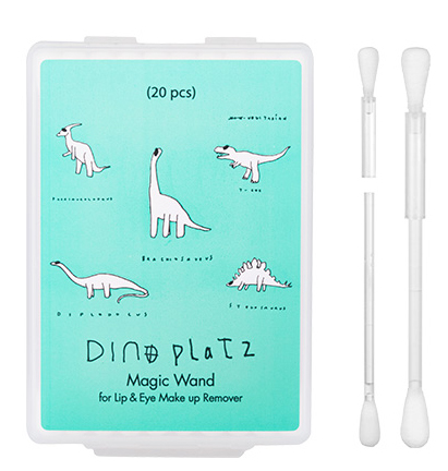
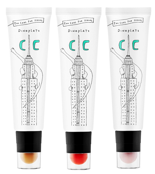
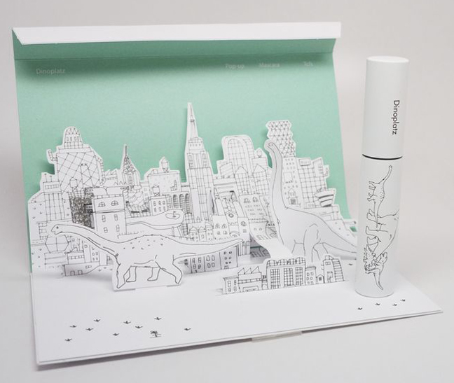
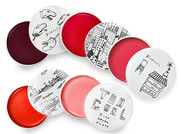
Today I wanted to share two relatively noteworthy finds I've recently come across, one extremely adorable and the other…not so much. The first is Korean brand Too Cool for School's Dinoplatz range. Too Cool for School is a trendy, youth-oriented brand (intended for 16-25 year-olds), and their Dinoplatz collection features a broad variety of products for their target demographic, all outfitted in quirky illustrations of dinosaurs that occasionally appear to be running amok in New York City. The range has been around for a while so why I'm only finding out about it now is a mystery, especially since the packaging won a Dieline award in 2013 and I've been following The Dieline for years. Anyway, let's get to the goods.
(image from pinterest.com)
The illustration style is intentionally somewhat crude, which I think is perfect for teenagers – the drawings remind me of the doodles you'd make in the margins of your notebook when you were bored during class.
(images from toocoolforschool.com)
There are tons of Dinoplatz items available from reliable sellers on E-bay, so if you simply must own a CC cream with an illustration of a dinosaur scaling the Empire State Building, you still have a chance! I think I see some of these items ending up in the Museum's collection in the near future. 😉
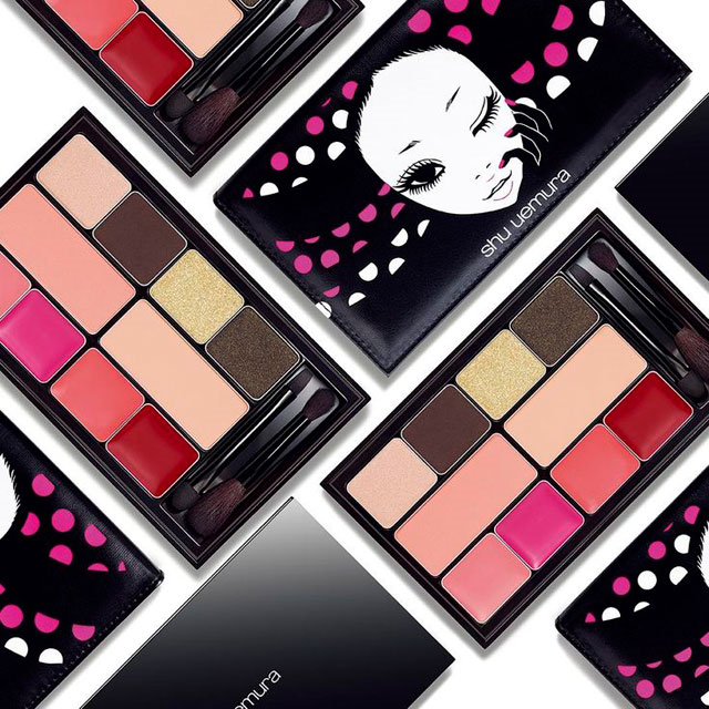
The second, considerably less cute item I wanted to highlight today is Shu Uemura's Tokyo Doll palette, which I discovered at Chic Profile. According to the information there, the Tokyo Doll palette is a highly exclusive item which will most likely be available for sale only at Asian travel retailers, i.e. duty-free shops, later this summer. I think I'm okay with not getting my hands on it. If I know Shu, I bet there was an outside artist involved in the design which sort of makes me want to go after it, but honestly, I'm a little freaked out by this.
(image from chicprofile.com)
Maybe it's just because I find dolls to be creepy in general so the name of the palette is throwing me off, but I'm finding this to be rather strange. The oversize eyes would actually look cute (or harmless at the very least), but combined with the egg-shaped head and the slits for nostrils, the face as a whole is a little disconcerting. She looks quite alien-like, and her little grin doesn't help matters. I also don't like how her fingers curl around her face. The proportions look off – that pinky finger seems way longer than it should be and reminds me of a tentacle.
What do you think of these two? And which is scarier in your opinion, Shu's Mon Shu girl or this new Tokyo Doll?
