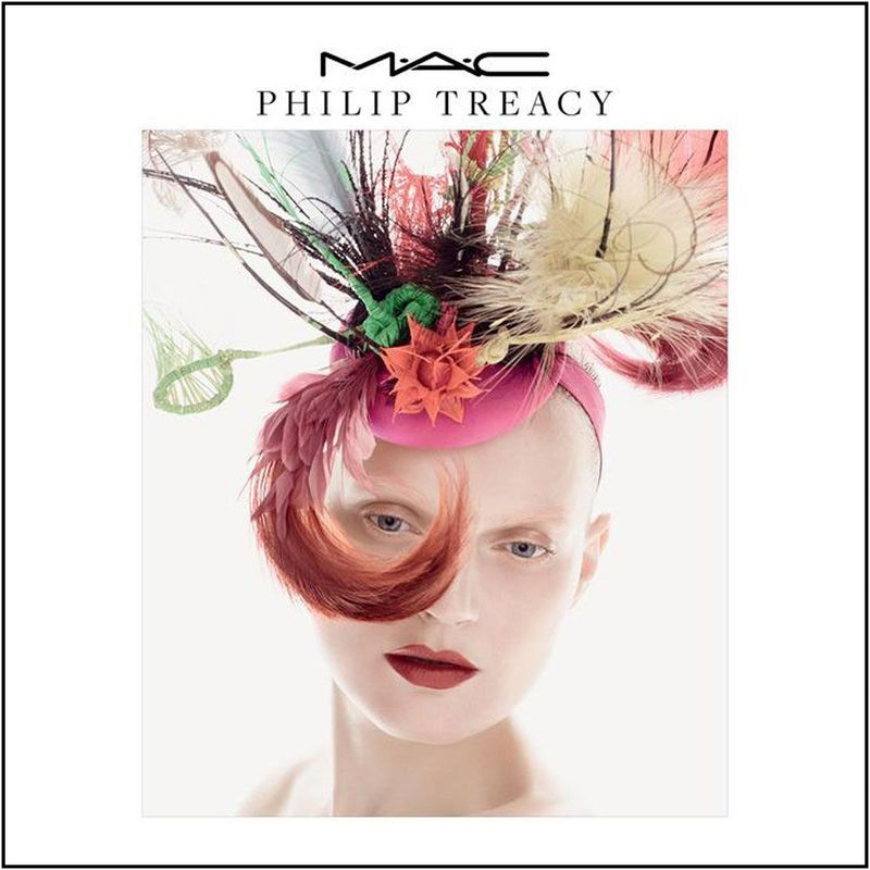
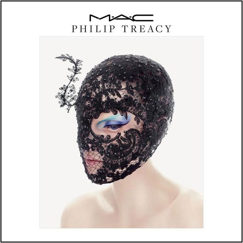
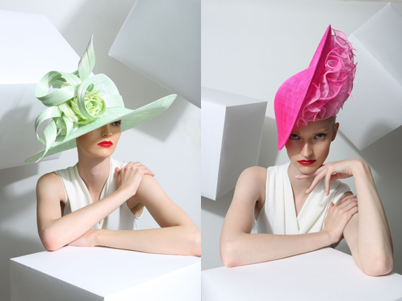
For their latest fashion collaboration MAC teamed up with British milliner Philip Treacy to create a small collection based on the designer's renowned hats, a natural choice as MAC has worked with Treacy for over 20 years on his runway shows. The collection is divided into three parts to reflect the three chosen designs, with each one focused on a different part of the face (lips, eyes and cheeks): "A kind of futuristic Hollywood, one is all about color and the other is a kind of Gothic, modern future," Treacy notes.
This feathery number inspired the bright lipsticks in red and pink, while the black lace one served as a muse for the bold blue eye liners.
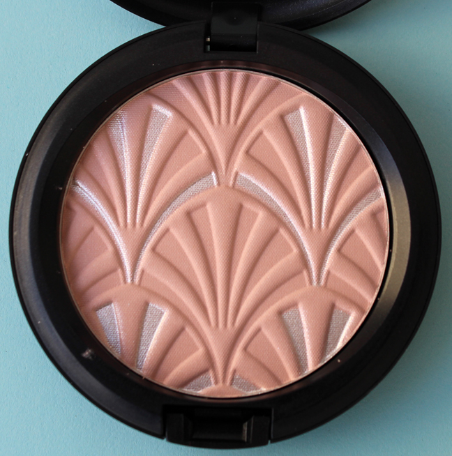
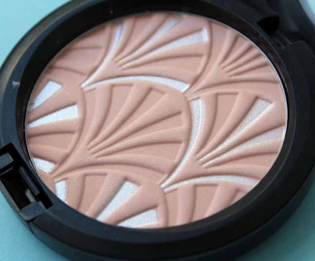
I think the most interesting one is this silvery arched hat, which I'm assuming is the "futuristic Hollywood" Treacy mentioned. He explains, "It comes from an image of Greta Garbo in a movie called Mata Hari, so I just ordered it to be made up a bit more 21st-century."
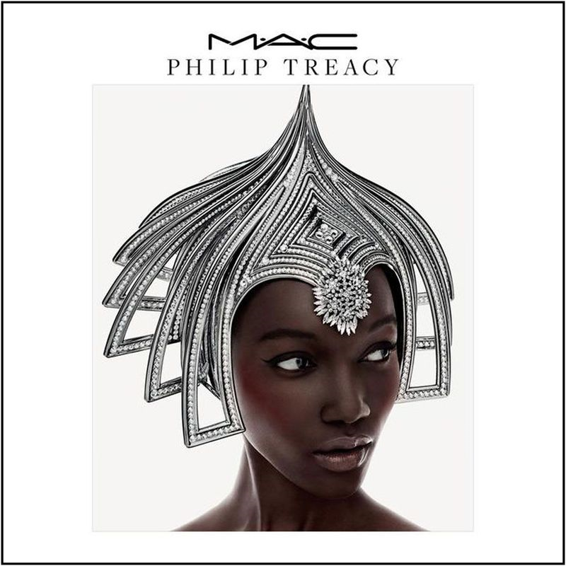
(images from allurabeauty.com)
The modified version of the design appears on two highlighting powders. I picked up Blush Pink.
Treacy's outlandish designs are probably best recognized on celebrities, most notably British royalty:
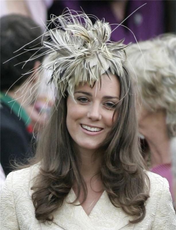
(image from starstyle.com)
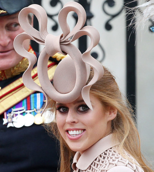 (image from fashionbite.co.uk)
And let's not forget Lady Gaga. I believe she is the only pop star who can truly pull off his creations. Seriously, is this not a fashion-music match made in heaven?
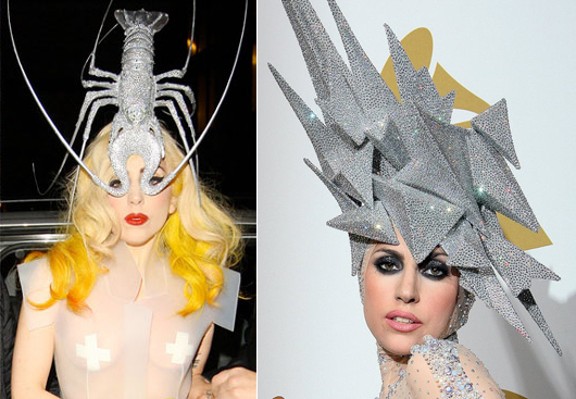
(images from abc.net.au)
Just for fun I decided to take a peek at Treacy's spring 2015 collection. These were my favorites – I imagine putting one of these on would be like wearing a garden on your head.
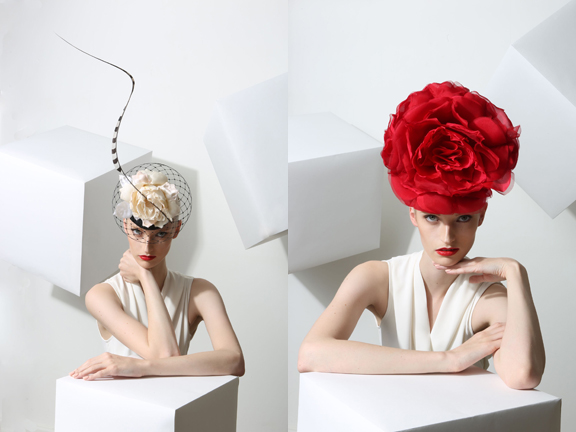
(images from philiptreacy.co.uk)
Getting back to the MAC collection, Treacy says the colors are a direct representation of his aesthetic. He also recognizes the joy a shiny new makeup bauble can bring. "It’s what Phillip Treacy make-up could look like – it’s about color, exuberance and beauty…you can transform yourself with beautiful make-up. It is an enhancer; people buy a lipstick to cheer themselves up. It’s about having fun with what you’ve got."
While I do think this was a well-edited and thought-out collection in terms of colors, I would have liked to see more design-wise. There was a huge opportunity here to recreate some of Treacy's designs in powder form, and I feel it was squandered. The highlight powder is nice but it doesn't necessarily scream "couture millinery" – unless you saw the accompanying promo image, it looks like just another pattern. And while I don't think copying a design exactly as it appears in fashion is always the solution, I think it would have been ideal in this case. (See Dior's Lady Dior palette as a good example of a literal representation of one of their most iconic pieces.) So I was a little let down by this collection, as I don't think it fully captured the range of Treacy's work from a design perspective.
What do you think?
