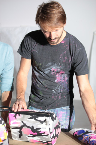
 Ah, another beauty from Dior. This time, instead of going back into the archives (Tailleur Bar and Mitzah palettes) or mixing old and new (Lady Dior palette) the company collaborated with German abstact artist Anselm Reyle to create a fresh, contemporary twist on classic Dior style. The collaboration is also a nod to Dior's original aspiration of owning an art gallery.
The collection was unveiled with much fanfare at Art Basel Miami back in November, where Dior had a pop-up shop showcasing the goods. Before I get to the palette, let's take a look at how elaborate the launch was and the other items in the collection.
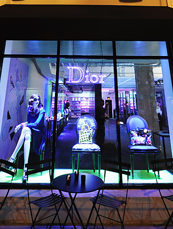
Here's the pop-up store:
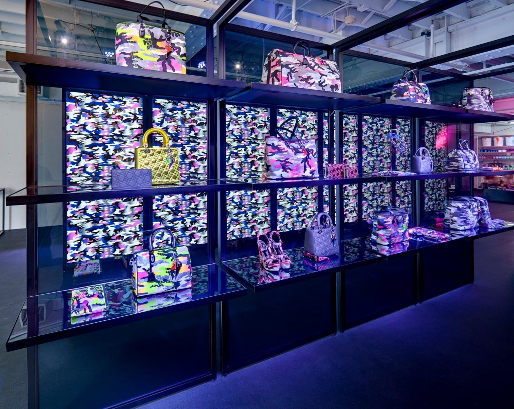
(image from fashionstylexxx.com)
They even pimped out a food truck in Reyle's print created especially for the collection:

(images from jesuswassize0.com)
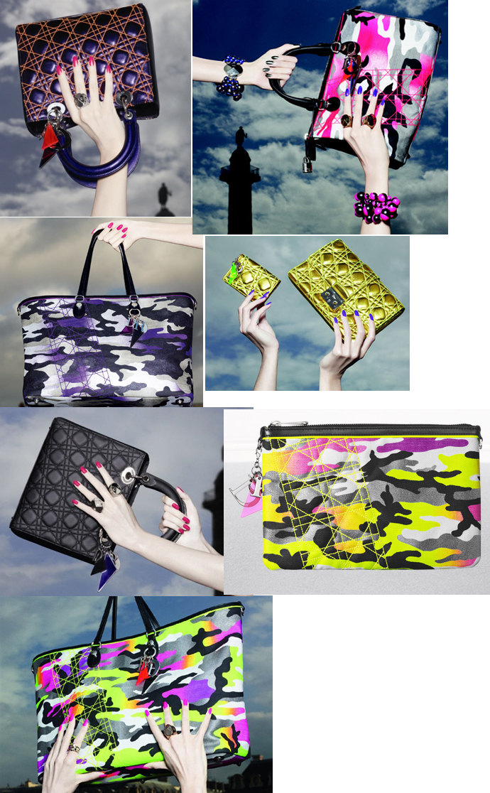
The highlights of the collection were most certainly the bags. Decked out in variations of Reyle's custom print, they formed an electric array of totes, satchels and clutches.
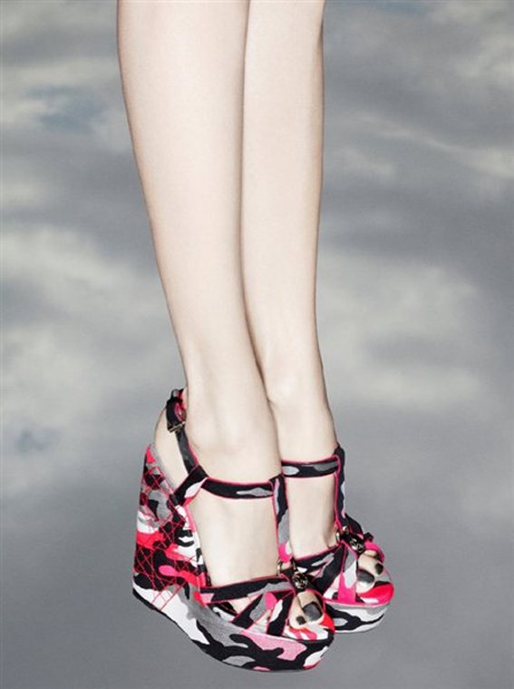
My favorite item from the collection (besides the palette, of course) was this pair of wedges. Wouldn't these be fun for summer?
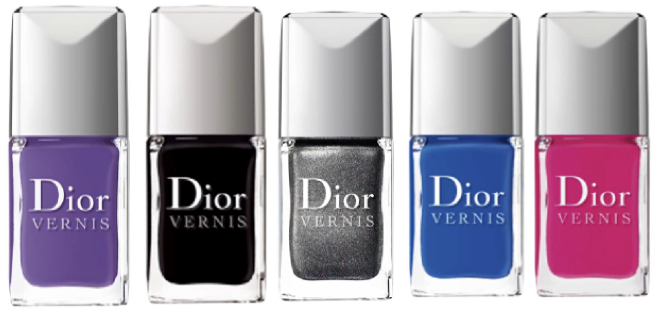
The palette wasn't the only beauty item, however: there is also a range of nail polishes.
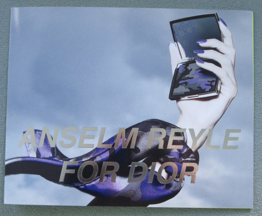
Finally, the palette. Here is the front of the booklet that came with it:
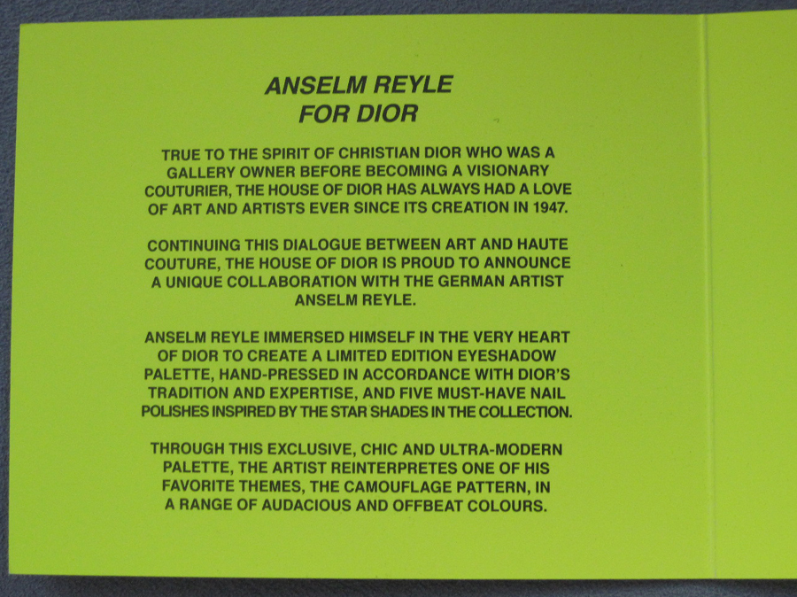
The interior of the booklet in an eye-popping florescent green:
The velvet interior of the box, complete with satin purple ribbon:
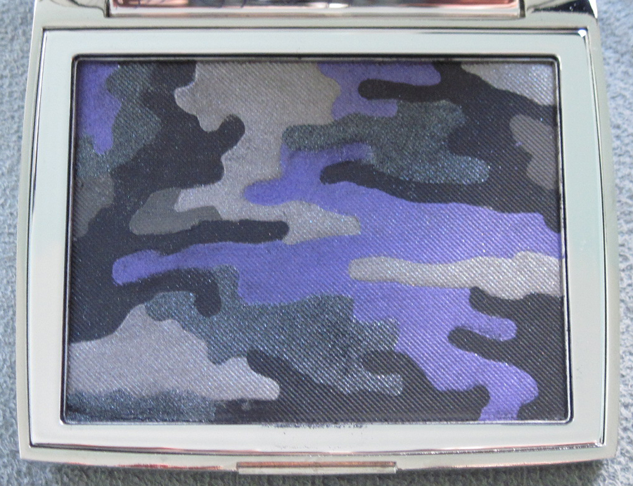
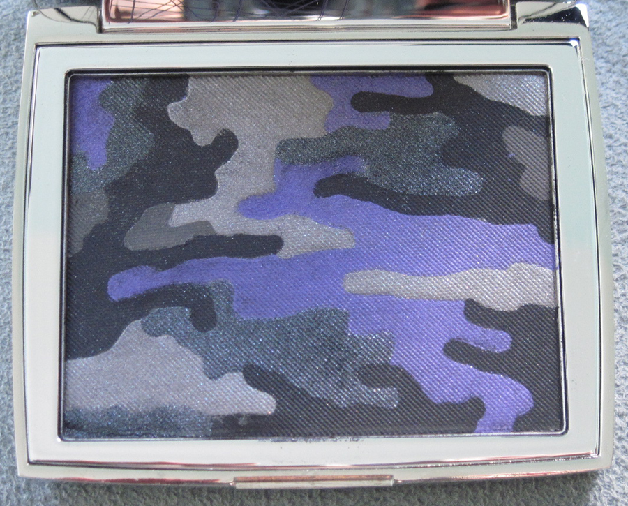
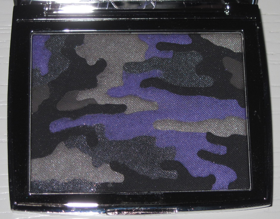
The palette itself:
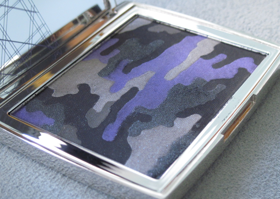
With flash:
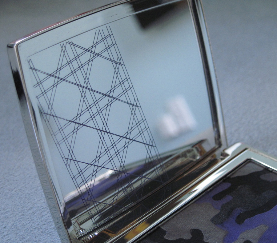
Reyle's tilted twist on Dior's classic cannage pattern:
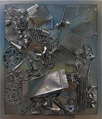
This description from the Tate summarizes Reyle's style: "Reyle 'samples' familiar motifs from art history – particularly Modernist painting and Abstract Expressionism – and brings them up to date; as he puts it, 'taking a stereotype in order to breathe new life into it'. Reyle's paintings echo various (and sometimes contrary) abstract painting styles of the past: gestural smears, hard-edge stripes or poured and dripped paint, bringing to mind the work of artists such as Karl Otto Götz, Kenneth Noland, Jackson Pollock and Barnett Newman…In his sculptural works, Reyle takes objects like wagon wheels, haycarts or 1970s ceramic vases and lamps and imbues them with new life – giving them shiny surfaces, startling neon shades or coloured lighting."
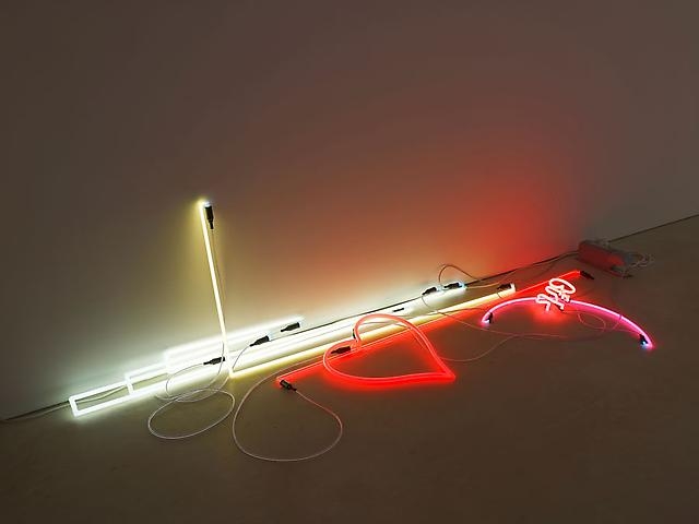
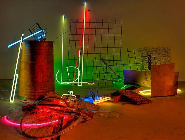
I suspect Dior approached Reyle because he's known for his use of neon – a 2012 trend the fashion house was complicit in setting – and also to make their classic, ladylike bags and other accessories fresh and edgy ("breathe new life into it"). It's worth pointing out that Reyle doesn't just use bright colors in paintings; many of his found-object work utilizes neon lights, as in Arise (2010):
And an untitled work from the same year:
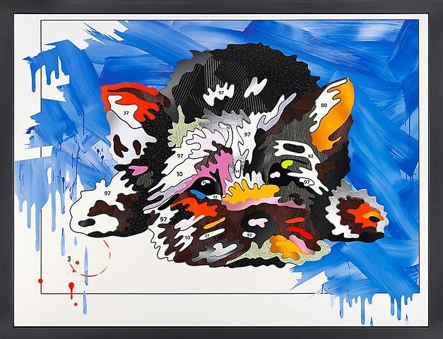
In an interview with Dazed Digital, Reyle discusses how he infused the collection with his signature style. "I tilted the Cannage which may be considered as a kind of intervention and deconstruction of the well-known and most classical signature of Dior. In my art, I also often take found things as a starting point that are further developed, modified and brought into a new context. Similar to this, the camouflage pattern is a motif which I already used for my material paintings instead of the typical support of a white canvas. For me it’s interesting to see how it has been adapted by the pop world from its military background and how it then loses the original meaning. It remains a kind of empty phrase. Usually the camouflage hides something, but here it’s the opposite – it is very visible because of the signal neon colours… I am interested in combinations that seem to be dissonant at first sight." Indeed, between the tilted cannage pattern and the drippy, almost psychedelic camouflage pattern, the palette does reflect the artist's interest in making radical changes to traditional motifs. To my eye, the pattern is a continuation of paintings like this:
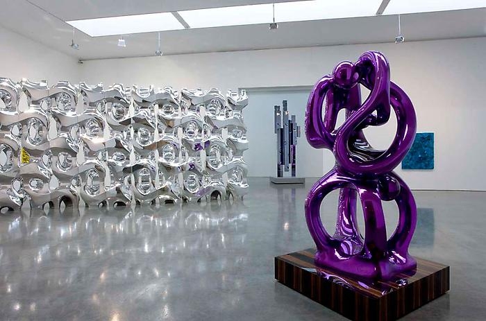
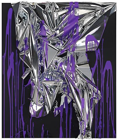
Additionally, it's no surprise that purple and dark grey were chosen for the palette, as they are prominently featured in the artist's work (not to mention that they make for a great eye shadow combination that works well on most women):
Monochrome Age, 2010:
Mystic Silver, 2011:
And this untitled work from 2010 actually uses both colors together:
Overall, I think Dior was spot-on in choosing this artist and I think Reyle, in turn, did a fabulous job of reinterpreting and modernizing Dior's accessories while still making them accessible and wearable. What do you think?
