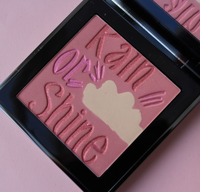
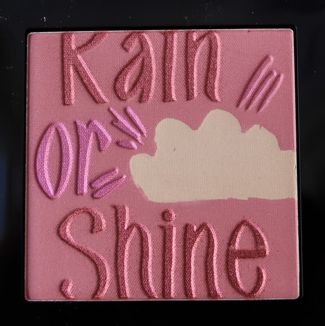
I thought I'd try to brighten up this grey dreary Monday by sharing a very cute palette from Burberry.
The palette's design was taken from a sweater and hand-painted bag from the Burberry Prorsum spring 2015 collection.
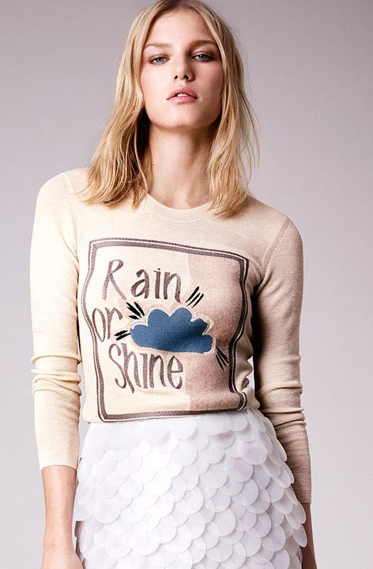
(image from us.burberry.com)
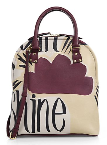
(image from saksfifthavenue.com)
One of the inspirations behind Burberry's spring 2015 collection was vintage book covers, which is evident in both the "rain or shine" sweater and some other pieces that came down the runway.
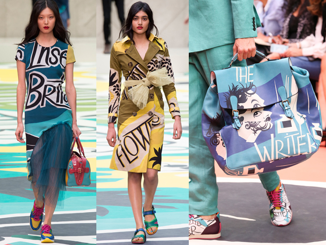
(images from style.com)
In doing a quick image search for vintage book cover illustrations I could definitely see their influence in the Burberry collection, particularly the work of George Salter. I'm not sure why Burberry decided to go in this direction for spring (plus, using vintage book covers as fashion inspiration isn't a new idea) but I'm happy to see literary themes any time of year. 🙂
Getting back to the palette, I think the design works equally well on clothes and makeup. I also liked that this was a change of pace for Burberry beauty. I usually think of their makeup as being refined and sophisticated but at times it can get a little stuffy – they don't have a ton of what I'd consider "fun" (read: loud) colors and textures. I was pleased to see them let their hair down and be a bit more relaxed and playful with this palette.
What do you think?


I do like the tutorials Wendy Rowe did for the Burberry YT channel. Have you seen them?
I do like the tutorials Wendy Rowe did for the Burberry YT channel. Have you seen them?
No! I should check them out…I basically never watch tutorials as I get frustrated – I feel like I never have my makeup turn out as well even though I follow all the steps very carefully!
No! I should check them out…I basically never watch tutorials as I get frustrated – I feel like I never have my makeup turn out as well even though I follow all the steps very carefully!