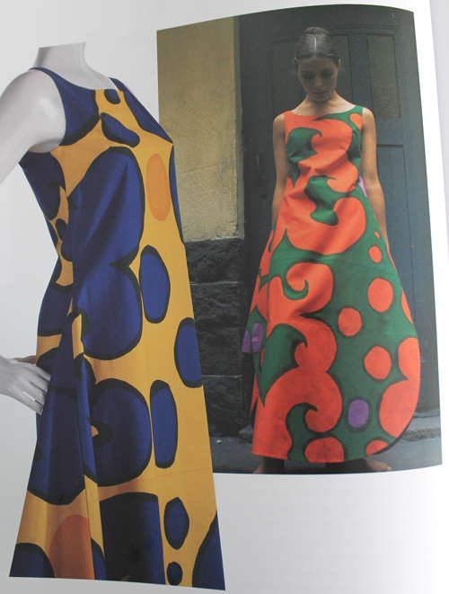
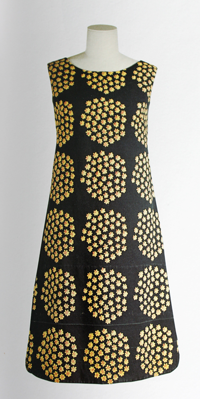
"There must be freedom of movement. If one feels like running, there must be freedom to run; if sitting, there must be freedom to sit." – Annika Rimala
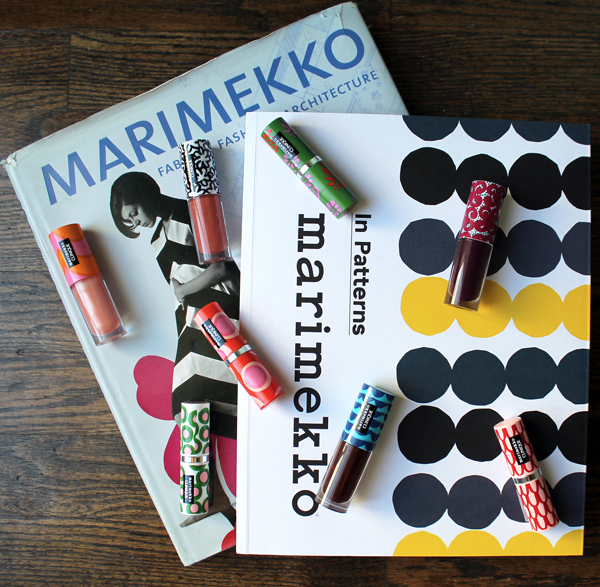
This collection was released way back in early spring, but I kept putting off writing about it because the thought of trying to condense the entire history of iconic Finnish design house Marimekko made me want to cry. Fortunately, I no longer feel that obligation since Clinique mercifully chose patterns that were the work of a single Marimekko designer: Annika Rimala (1936-2014). So I will be focusing just on Rimala and the 10 designs that were selected for the Clinique collection. While I still felt the urge to educate myself a little further beyond what I could find online, hence the purchase of two books on Marimekko, I won't be attempting to rehash their nearly 70-year history and aesthetic. Suffice it to say that Marimekko's output is beloved the world over, having been celebrated in numerous museum exhibitions and appearing in countless collaborations with other brands. It can also conceivably be recognized as the world's first lifestyle brand.
I'm still not sure why Clinique decided to team up with Marimekko. The rather generic and bland quotes in the press release didn't shed any light either. "'Marimekko was created to bring colour and happiness into people's everyday lives. Sharing the same joyful approach to life, we're thrilled to partner with Clinique to offer something surprising and exciting to customers around the world,' says Päivi Paltola, Marimekko's Chief Marketing Officer. 'This collection captures the quintessential modern aesthetic of Marimekko and the bright vibrancy of Clinique to inspire and empower women by bringing the joy of possibilities to her every day,' says Jane Lauder, Clinique Global Brand President. 'The prints chosen for the collection represent some of the most recognizable and celebrated Marimekko designs of all time. They capture the craftsmanship behind Marimekko's art of print making: utilizing overlays of colour and surprising colour combinations to create impactful designs,' says Minna Kemell-Kutvonen who is in charge of Marimekko's print design." I couldn't find any concrete reason for their partnership (why Clinique? Why Rimala? Why now?) but I was still delighted to see the work of such a legendary design house on makeup packaging. And while it's not the first time Marimekko has appeared on cosmetics (see Avon's 2008 collection), I thought it was very nicely done.
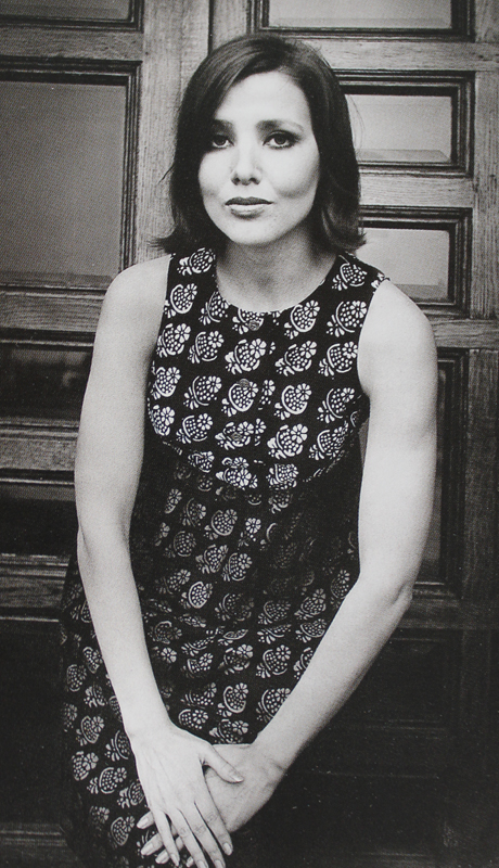
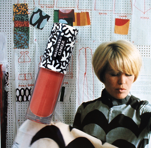
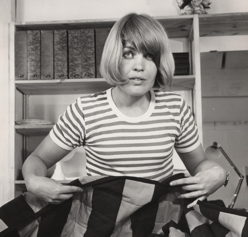
Let's meet Annika Rimala and her designs, shall we? Rimala originally studied graphic design at the Institute of Industrial Arts in Helsinki. In 1959, upon a recommendation from a neighbor who worked at Marimekko, Rimala applied for a job with the company and worked in their children's clothing store Muksula. Just a year later she became one of their chief fashion designers, a role she held until 1982 when she left to start her own business.
(image from marimekko)
Rimala not only played a pioneering role in establishing the company in their early years as a global purveyor of timeless, versatile prints, but also helped put Marimekko on the map as a leading fashion house. Rimala carefully ensured her prints worked in a variety of scales while also finding her own individual voice as a designer. As the biography in Marimekko: Fabrics, Fashion and Architecture states: "According to Rimala herself it was difficult at first to find her own direction, because [previous Marimekko designer] Vuokko Nurmesniemi's influence was so strong, even after her departure in 1960…Rimala's first fabrics were small-patterned and 'quiet,' but as she grew more confident she increased the scale and chose stronger colors. The first collection was followed by a series of lively designs, whose colors and forms were inspired by the era's youth culture…whether the patterns were free-form, checked, or striped, an essential feature of Rimala's clothes was variation in scale…her working method began by testing the practicality of a pattern in black and white. Color was added only when she was certain that the pattern and dress form were compatible. It was important that they form a structural whole" (p. 299). What I found most interesting about Rimala's style is its egalitarian (dare I say feminist?) bend, i.e. it was designed for women's freedom both intellectually and physically, which aligned with Marimekko's vision at the time. "From its inception Marimekko had provided clothes for independent, educated women who kept a watchful eye on the mood of the times, irrespective of age. The Marimekko woman liked to be portrayed as an academic and an independent professional. Marimekko offered clothes that were different. Even if these designs were sold in large numbers, the women who wore Marimekko believed they were asserting their own sense of independence…[In the late '60s] Rimala increased the volume of the dresses, favoring spaciousness and comfort, especially at the sleeves and shoulders. Rimala began the debate on fashion versus function, or ergonomic design in clothing, which intensified at the end of the decade. In her view clothes needed to be designed so that it was possible to move freely in them – to run, jump and sit," notes Ritta Anttikoski in Fabrics, Fashion and Architecture (p. 97-99).*
Here are the 10 patterns that were selected for the Clinique collection, in rough chronological order. I tried to find both vintage and contemporary examples of these prints. Again, you'll see how well they work in the '60s as well as today and in a variety of mediums.
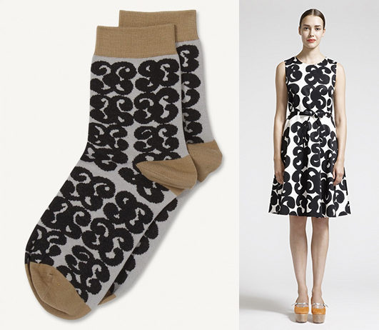
First up is the Tarha (garden) pattern from 1963.
(images from rubylane, finnstyle and finnishdesign)
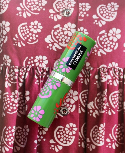
Next up is Hedelmäkori (fruit basket) from 1964.
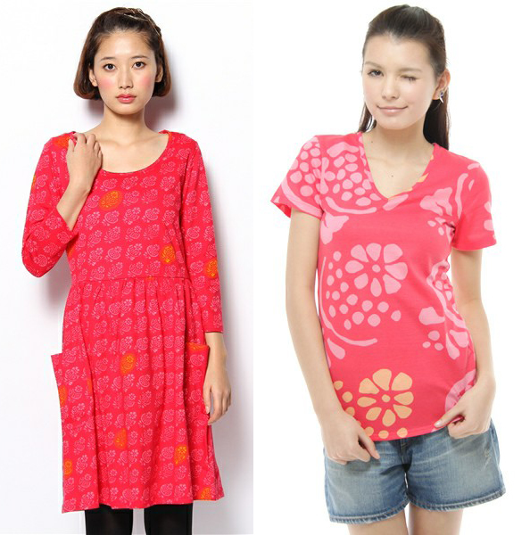 (images from wear.jp)
Here's Kukka (flower) from 1965.
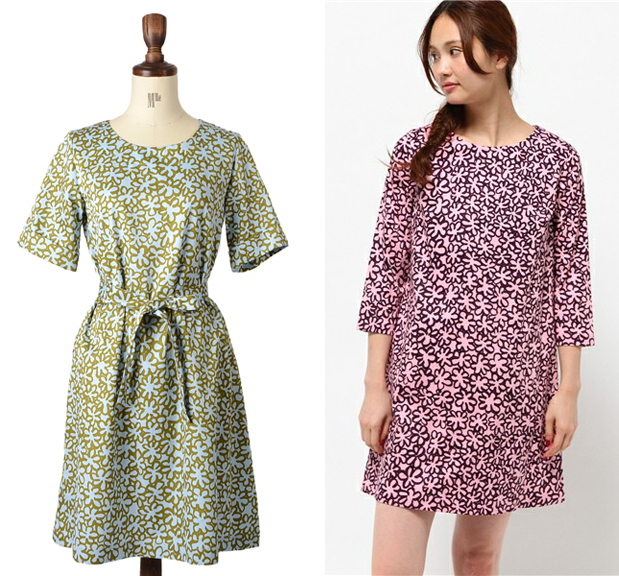
(images from wear.jp and global.rakuten.com)
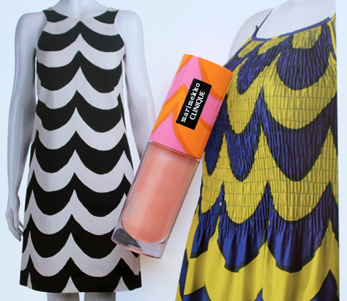
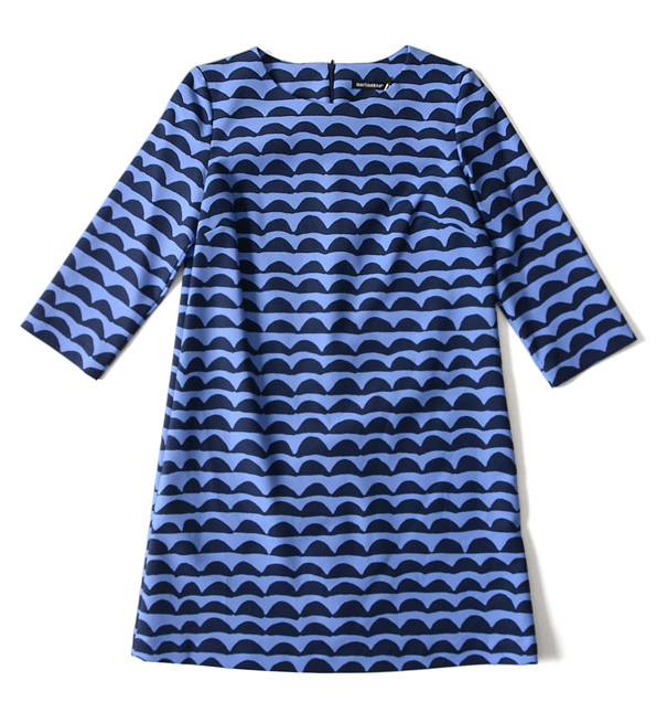
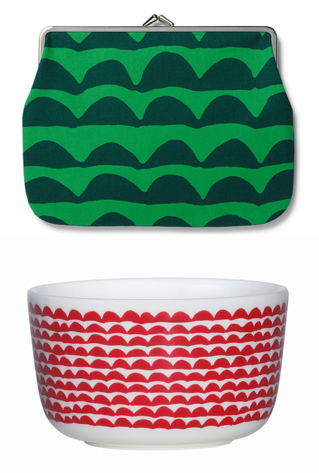
As the Marimekko website points out, Rimala's graphic design training is especially apparent in the Laine (wave) print from 1965.
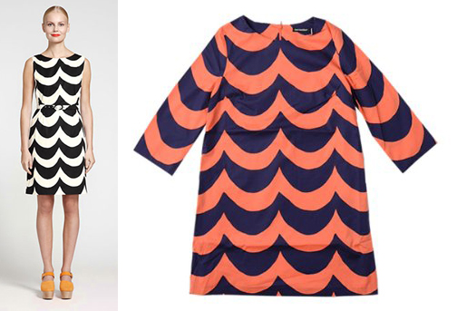 (images from finnstyle.com and amazon.co.jp)
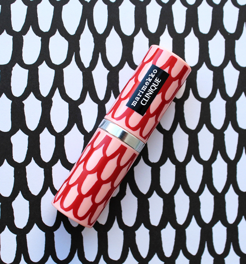
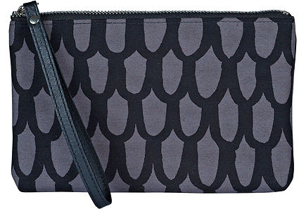
The Pikku Suomu (small fish scale) from 1965 worked equally well as the larger version (Isu Suomu).
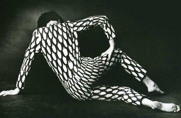 (image from makedesignedobjects.com)
This contemporary dress and bag prove that while silhouettes might have changed, the print holds up beautifully after over 50 years.
(images from pinterest and sokos.fi)
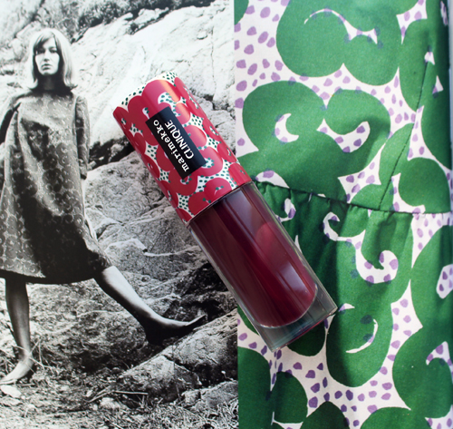
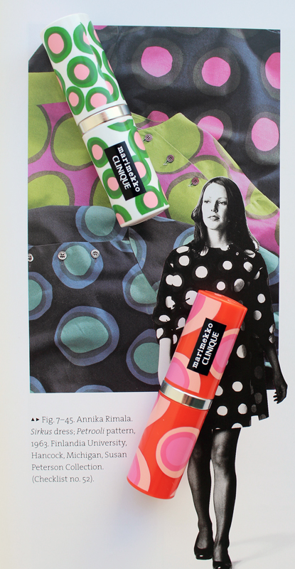
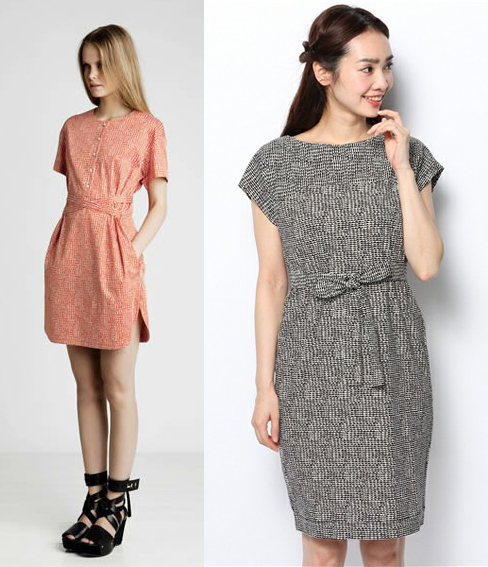
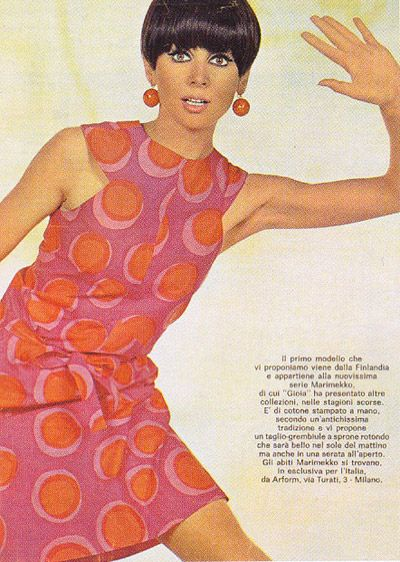
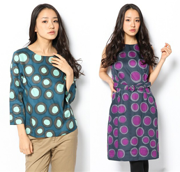
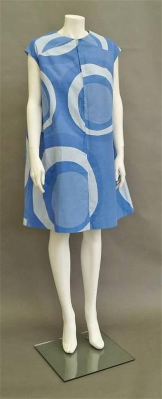
I honestly thought these next two, Petrooli (paraffin/oil) and Klaava (tails) were the same, but I was wrong. Petrooli debuted in 1963, while Klaava was introduced in 1967.
(image from pinterest)
 (images from wear.jp and sumally.com)
If I'm not mistaken it appears the Klaava print is a blown-up version of Petrooli.
(image from auctions.roseberys.co.uk)
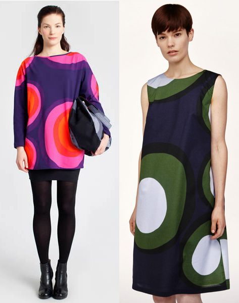
(images from marimekko and wear.jp)
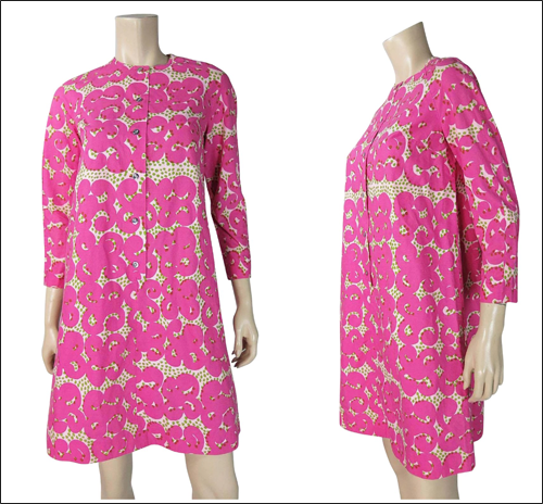
A trip to Mexico inspired the Papajo (papaya) pattern, which Rimala designed in 1968. "Carvings found in Maya temples gave her the idea for the Papajo pattern."
(images from finnstyle.com and global.rakuten.com)
Now for the two patterns I neglected to buy, not originally realizing that there were 10 distinct patterns. Whoops. Here's Keidas (Oasis) from 1967.
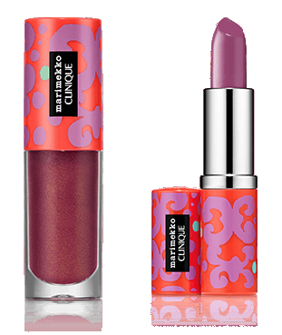
(images from clinique)
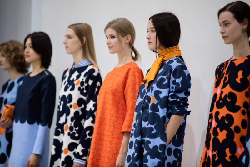
(image from marimekko)
I swear the Puketti (bouquet) print from 1965 didn't make it onto any of the Clinique products except for the bags in this Macy's gift with purchase.

(image from 247moms.com)
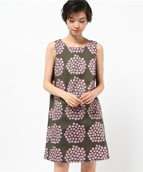
(image from wear.jp)
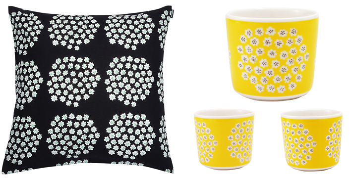
(images from cloudberryliving.co.uk and cms.whiterabbitexpress.com)
On the one hand, I'm glad Clinique limited their pattern choices to ten. This was an appropriate number to get a good sense of Rimala's work without the collection getting too huge. On the other hand, Rimala had so many amazing designs, it's a shame more weren't chosen. For example, the Tasaraita (even stripe) pattern, which she introduced in 1968, is one of her best-known and represented a completely new and unique way of thinking about fashion so I'm still scratching my head as to why it didn't make the cut. "In the late 1960s Rimala began to take an increased interest in design for everyday life. The denim streetwear that had become common led her to conceive a product that would suit anyone, regardless of age, sex, or size, that would be timeless, and that could be worn anywhere and at any time. In addition, its price would be modest. The result, Rimala's Tasaraita (even stripe) cotton jersey, became one of Marimekko's widely sold products." (Marimekko: Fabrics, Fashion and Architecture, p. 299).
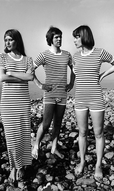
(image from mtv.fi)
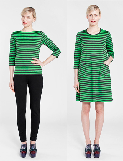
(images from finnstyle.com)
In any case, while I love the work of other Marimekko designers, I have to concede it was a smart move on Clinique and Marimekko's part to select just one designer. There's no way each one could be well-represented given their prolific work throughout the years – how could you possibly narrow it down to just 1-2 patterns from each?
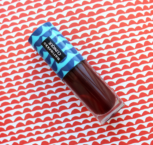
Overall I was pretty impressed with this collection. I would have liked to see a more elegant version of Avon's embossed Marimekko powders using Rimala's designs, but putting the prints the lipstick and gloss packaging worked well. As we've seen, it's virtually impossible to make Rimala's patterns look bad, as they were specifically designed to be adapted for any size and medium. And of course I'd like to know why they chose Rimala out of all the other Marimekko designers and why this collaboration was happening now, but I guess I can't be too picky. 🙂
What do you think of this collection? Which is your favorite print? I adored all but I think Laine is my favorite.
*Catering to an "educated" customer sounds remarkably classist, so Marimekko made sure to update this in their book In Patterns (p.11): "Long before the term target group even existed, the company oriented its products to a certain group – intelligent and well-educated women. And what woman wouldn't want to count herself among those who are visible, strong, and influential, those who point the way. Nowadays at Marimekko we no longer think about the customer's level of education but rather about her character." While I believe this is merely lip service delivered by the marketing department, at least Marimekko recognizes that their old way of thinking about their desired demographic isn't acceptable now.


