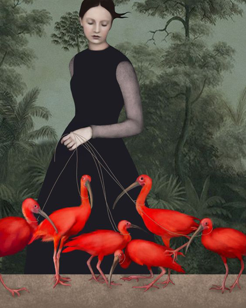
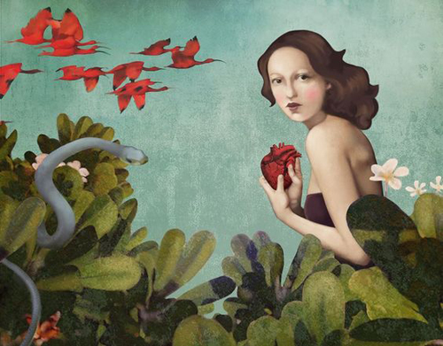
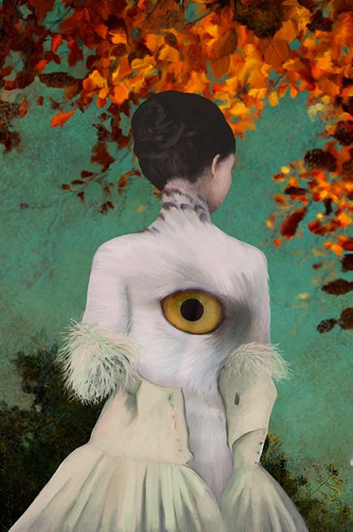
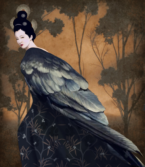
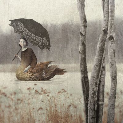
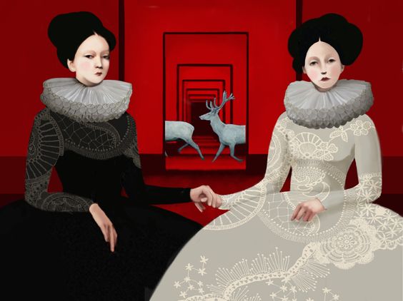
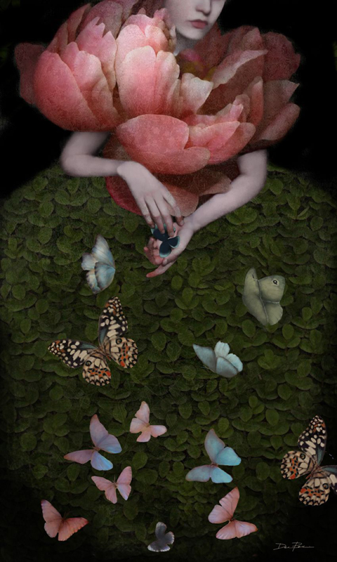
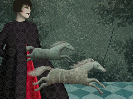
Over the past few years I've really been enjoying Clé de Peau's artist collaborations for their holiday collections. They select artists with very different styles but ones that somehow always do an amazing job representing the brand's vision and aesthetic. This year the company partnered with Italian surrealist illustrator Daria Petrilli, who, as you will see, is as mysterious as her dreamlike artwork.
According to this interview with the Shiseido team responsible for the collection, Clé de Peau's makeup director Lucia Pieroni selected an Alice in Wonderland theme, or a "winter fairyland" per the translation of the French "féeries d'hiver". Consisting of pale pinks and greys contrasting with bold berry and a dash of soft shimmer, the color scheme is meant to evoke a winter tea party in an English garden. It was packaging designer Kaori Nagata who suggested collaborating with Petrilli and who translated her beautiful illustrations to equally gorgeous boxes and palette cases. Simply put, the team was "mesmerized by [Petrilli's] talent." They were also searching for an artist who could elevate a theme usually intended for children and create a grown-up version of Wonderland to match the style (and price tag) of a high-end line. As Shiseido rep Saiko Kawahara notes, "Brands of low to mid price range create many products that are 'adorable,' but I think that is precisely why it is necessary to add some refinement, such as 'a grown-up joke' or 'spicy playfulness,' when a prestige brand attempts to create an 'adorable' product." Indeed, while Disney-fied versions of Alice worked well on mid-end brands like Beyond, Paul & Joe and Urban Decay, I don't think they'd be appropriate for Clé de Peau. And I don't mean that in a snooty way either – that style just wouldn't be a good fit for the brand.
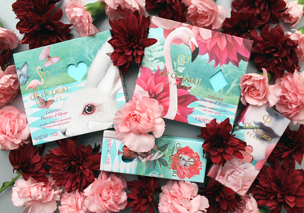
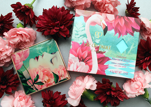
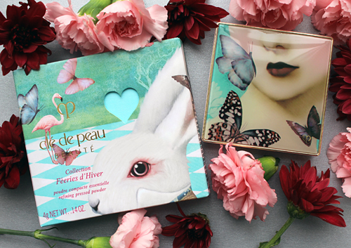
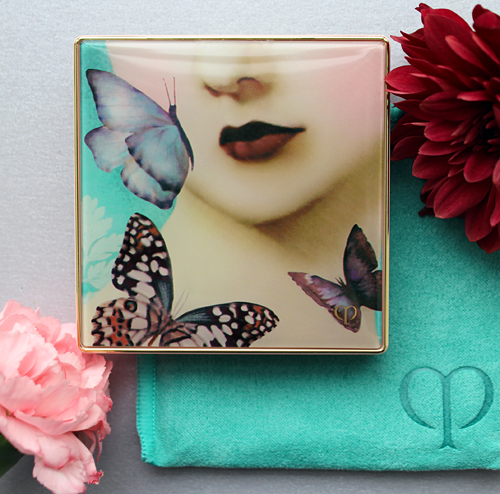
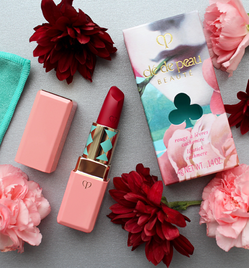
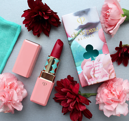
Now let's get to the goodies! I picked up the eye shadow quad, pressed powder, stick highlighter, and one of the lipsticks. I think the colors for the makeup itself are lovely, but what really blew me away is the mix of aqua, light pink and fuchsia with hints of coral and deep wine throughout the packaging.
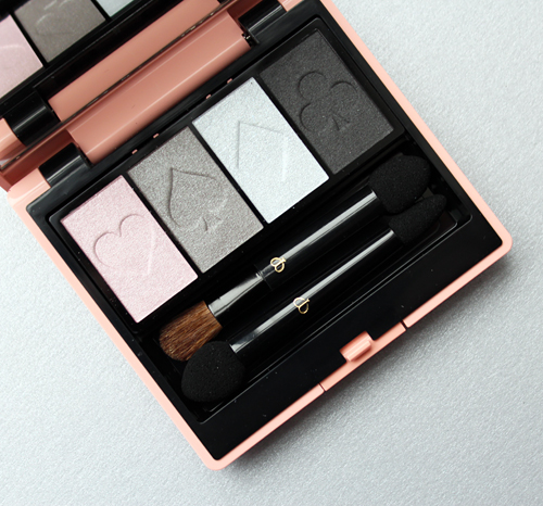
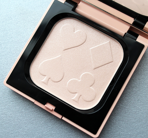
The playing card embossing is a stroke of genius.
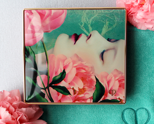
I adore all the packaging, but the white rabbit peeking out of the box for the powder highlighter and the woman's rosy cheeks and chic dark lips on the outer case are possibly my favorites out of the collection.
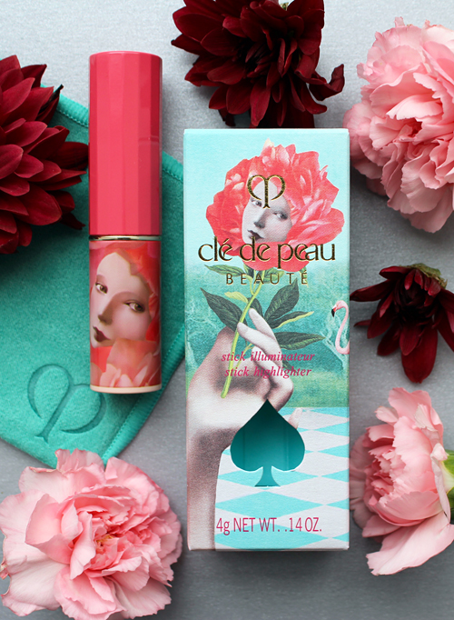
I'm also very fond of this flower lady, as she embodies the talking/singing flower garden Alice encounters. (That was my favorite scene when I was little!)
In addition to the key, checkerboard and playing card motifs, the names for each product were also carefully chosen to align with the Alice theme. This lipstick, for example, is called Paint Me (the other is Follow Me), an homage to both painting the queen's roses red and the "eat me/drink me" signs in Lewis Carroll's classic book. Meanwhile, the eyeshadow quad is named Tea Party, the pressed powder Pink Push Me, and the stick highlighter Light Me.
The company even came up with an ad featuring a poem for each item. The animations are looking a little Monty Python to me, but that's probably just because I've been re-watching it on Netflix the past few weeks. It's still pretty cute.
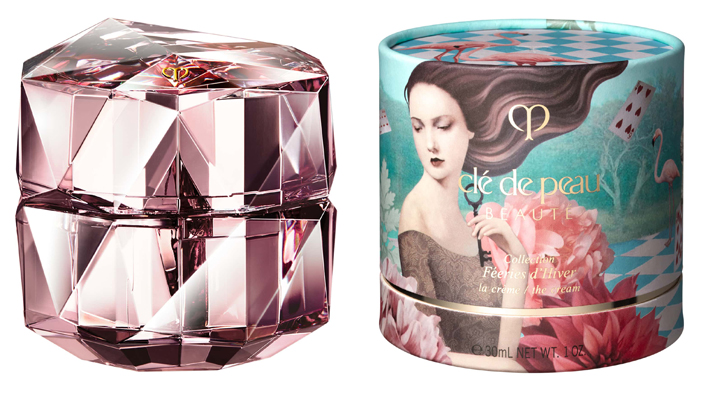
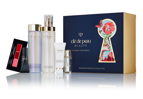
The moisturizer is the one piece I did not buy, as I couldn't justify the $535 (!) price tag for just the outer packaging. Even if the jar itself was decorated I still couldn't have bought it – too rich for my blood. Still, it's beautiful, and the keyhole cut out, along with the cut-outs on the other boxes, emphasize a connection to the entire Clé de Peau brand. Says Ayumi Nishimoto, another member of Shiseido's creative team, "Not only does this tie in with the holiday concept ('open the door to the extraordinary'), it is also brilliantly linked to Clé de Peau Beauté’s tagline, 'unlock the power of your radiance.'" Indeed, "clé" is French for key, so this detail creates complete cohesion across the holiday collection and Clé de Peau line. Now that's what I call synergy!
Apologies for the lackluster photo, it was the only one I could find of the cutout.
The keys were also used on the skincare sets, none of which I purchased but still covet.
Finally, there were some very nice gift boxes and bags featuring different images, which were offered with the purchase of any two items from the holiday collection at the Clé de Peau website. Since I eagerly bought the collection as soon as it became available at Neiman Marcus (so I could use my store card and also get 10% cash back via Ebates), I missed this as well. I might hunt for one on ebay.
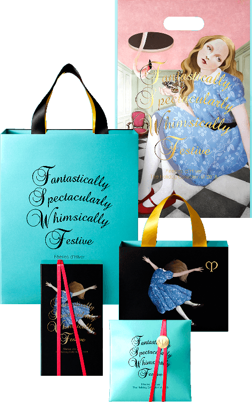
(images from cledepeau-beaute.com)
As for the worldwide marketing of the collection, both online and in-store advertising were simply dazzling. The advertising and design team created a truly magical video where Petrilli's illustrations spring to life. Unlike the ad above, this one features much more sophisticated animations and cutting-edge 360 degree technology so that the viewer feels totally immersed in Wonderland. Nishimoto and fellow team member Satoko Tomizawa explain: "As global campaigns are launched in various countries around the world, it is necessary to create something that is highly versatile and universal. This time, we took on a new challenge of making not just a campaign video, but also a 360-degree video that anyone, anywhere, can experience through their smartphones. Viewers can enjoy more of the wonderland that we have created. While remaining respectful of Daria’s illustrations, we paid special attention to giving the campaign videos a sense of worldliness unique to 3D animation. We asked the production studio Shirogumi, Inc. to produce the CGI for the story of a rabbit jumping through keyholes and traveling through wonderland."
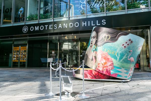
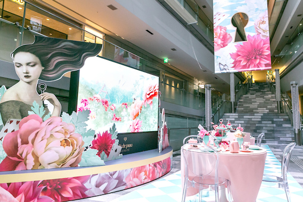
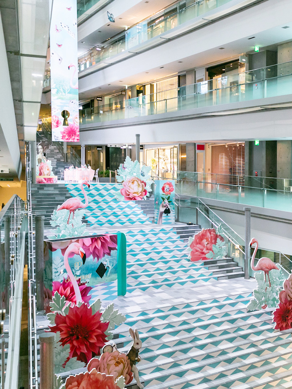
Additionally, I must say the set up at their Omotesando Hills location in Tokyo was spectacular, rivaling the decor used for Kathe Fraga's breathtaking collection last year. Tomizawa states that the collection theme allowed the company to show a more whimsical side of the brand and push the boundaries of not only packaging but also store design. "We created a spatial experience, where visitors could enter as the mysterious wonderland as if their bodies had shrunk small. Not only was the Clé de Peau Beauté Store in Omotesando Hills in holiday mode, but entire complex invited visitors to experience wonderland. Large banners hung from ceiling to the floor, blownup packaging made their appearances in the staircase, a mysterious tea party setting along with the 360-degree video was on display. It was the first time that the holiday collection was featured in such a large-scale event. Inspired by the packaging design, we were able to expand on many playful ideas for digital and spatial design. Through this wonderland we were able to show a more imaginative, playful side of the prestige brand." I would have loved to visit this magical setup!
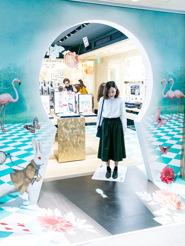
(images from shiseidogroup.com)
Now that we've covered the collection, let's delve into the world of the highly secretive Daria Petrilli. Born in 1970 in Rome, she graduated with an MA in Communication and Design at the Università La Sapienza, then moved to London and completed a degree in Experimental Illustration at the London College of Communication, a school within the prestigious University of the Arts London. Petrilli has been commissioned for magazines (most recently, her work accompanied a rather depressing piece about suicide in Oprah Magazine), children's books and has had several solo exhibitions. Her illustrations also served as one of the inspirations for fashion label Delpozo's fall 2016 collection. However, it seems that Petrilli prefers to remain out of the spotlight. She has no website, Tumblr or Instagram. The only social media platform she uses is Pinterest, and she uses it to highlight "illustrations made for my personal joy, without bosses, and even publishers …only for my pleasure." She has granted only two interviews and her work has been discussed in just two brief articles that I was able to find online, and they're either in Italian or badly translated, so I'm not sure how much of it I'll be able to use. As we know, relying on Google more often than not results in nonsensical translations, but I will try to decipher everything as best I can. It's a shame she's not as willing to put herself out there as much as some artists are, because I'm dying to know her thoughts on working with Clé de Peau and her own approach to makeup. The few photos I was able to find of Petrilli show her seemingly barefaced save for one.
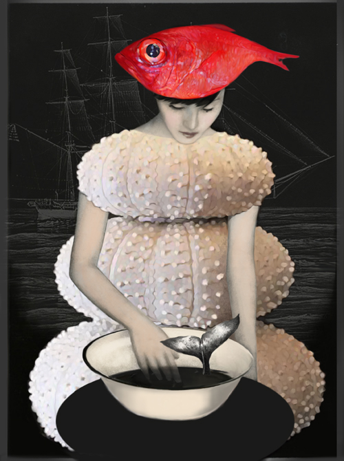
Anyway, onto her work. I won't pretend that I can explain it or provide any real insight, but here's a brief description. Many of Petrilli's illustrations depict ethereal, brooding women occupying dreamlike landscapes and interiors, often with animals. As with other Surrealist imagery, the scenes are odd and even a little unsettling at times. Most of the women appear melancholy and isolated; they seem to be alone even when other figures are included. Perhaps one is meant to be the real self and other figures/animals are a projection of her innermost thoughts and feelings, or in true Surrealist style, a representation of the unconscious mind. These women contrast with those in the Clé de Peau collection, who seem to be peacefully relaxing within the magical realm of Wonderland.
While she started out painting, admiring the Renaissance frescoes of her native Rome and using the techniques of the Old Masters, Petrilli found that digital illustration best suited her interest in creating surreal images. She describes how her artistic journey and search for her personal style was shaped by her upbringing in Rome as well as the birth of her daughter: "Ever since I was a child I lost myself in the images of illustrated books and I was completely fascinated…Taking a course of classical studies and helped by the fact that I live in a city, Rome, immersed in antiquities and ancient splendor I have always had a passion for the history of art, with a predilection for certain representation and historical periods including one on all the surrealism…I was helped by the birth of my daughter, to keep up with her or put aside my commercial work, and I found myself spending a lot of time alone me and my computer. Prior to that I drew and painted especially with the classical techniques especially acrylic, oil, watercolor, pencils, and I used the digital as a compendium…I began to realize that I could convey in a fast and effective manner the ideas that came to me all the time. And I began to compose images like this for my simple pleasure of them without a purpose or aim at something…Digital manipulation was the element that allowed me to give it life, mixing, overlapping and painting my creations and have become increasingly personal." In looking at her work, it's hard to believe these images are created digitally. I could easily mistake them for paintings given how seamlessly the individual elements, strange though they might be, are combined. When I think of digital art my mind immediately jumps to collages. Not that there's anything wrong with that – I love me a good collage – but I imagine them to resemble cutouts jumbled together rather than the smoothness of paintings. In the illustration below, for example, I feel as though I can practically see brushstrokes on the fish, and the transparency of the women's fingers also appear to have been rendered in paint.
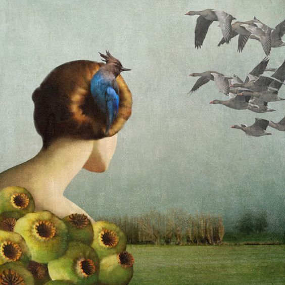
Petrilli is particularly enamored by birds because "their eyes fascinate me for that sense of primordial concern emanating", or translated another way, "To me they communicate a sense of primordial restlessness.” Whatever the meaning of that may be, here are some of my favorite avian-themed works by the artist.
Stylistically, I'm seeing many different artistic influences in Petrilli's work. Her appreciation for the Renaissance art she grew up with is exemplified in a variety of ways, such as the clothing her characters wear, use of perspective and generally muted background colors. This one in particular reminds me of two Renaissance paintings: da Vinci's Lady with an Ermine (both the woman's hairstyle and the position of her hands holding the bird look similar) and Piero della Francesca's Montefeltro Altarpiece, which has a pendant egg suspended in the background. (Obviously there are entire books on symbolism in Renaissance and Surrealist art so attempting to go into more detail on my humble little blog would be a fruitless effort, but you can start with these two if you're so inclined. There's also a veritable goldmine of books on women and surrealism, which are relevant given Petrilli's focus on portraying women.)
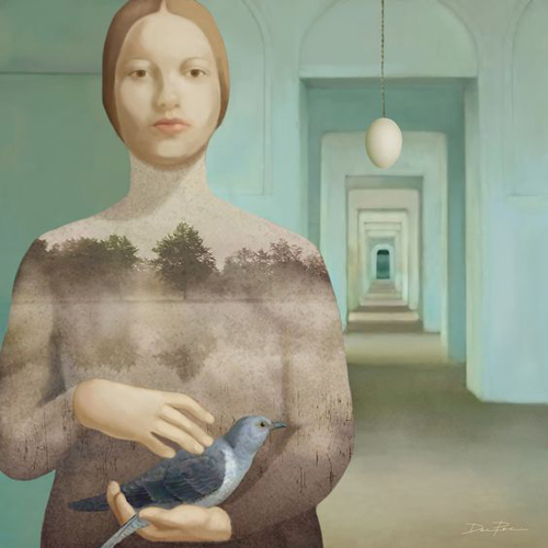
(images from pinterest)
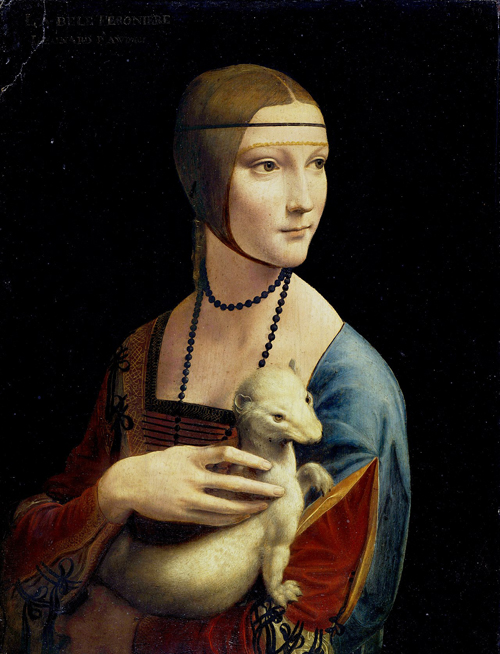
(image from wikipedia.org)
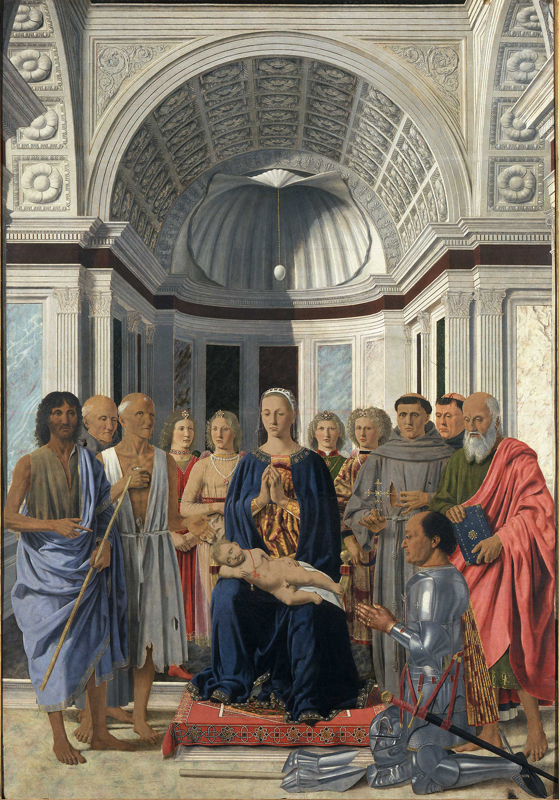
(image from pinacotecabrera.org)
Other surrealist artists may have influenced Petrilli. In Hypnosis Double, the way the women are posed call to mind Frida Kahlo's Two Fridas. And while the deer seem unharmed, perhaps they're a nod to The Wounded Deer.
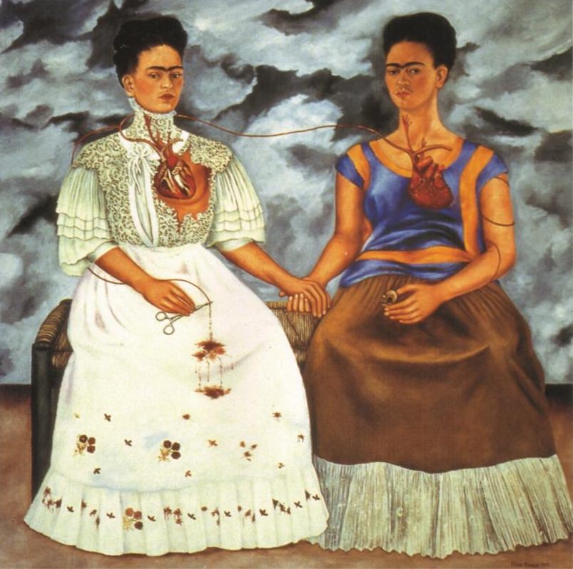
(image from fridakahlo.org)
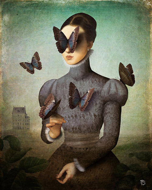
I'm also seeing a resemblance between Petrilli's work and that of contemporary Surrealist Christian Schloe. As a matter of fact, doing an image search I thought some of his works were Petrilli's.
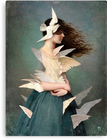
(images from facebook)
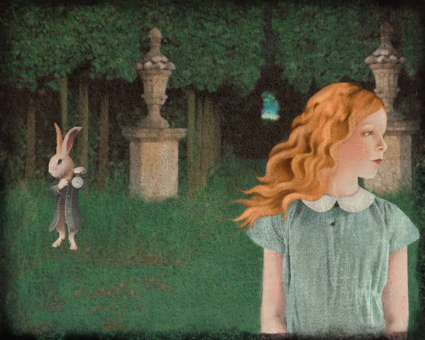
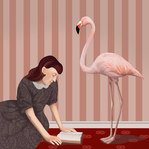
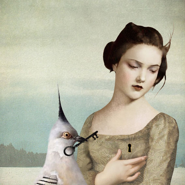
Despite these similarities, I'm not implying Petrilli's work is in any way derivative. Her content and style are unique and deeply personal; the way in which she weaves together a variety of art history styles and techniques breathes new life into digital illustration and reflects her own individual artistic upbringing and training. Another reason I think Clé de Peau made an excellent decision to commission her for an Alice in Wonderland inspired collection is that Petrilli has explored it before. Below is Alice's Dream, along with other works that have the same motifs as the Clé de Peau collection: flamingos, keys, butterflies, flower-women hybrids, and a checker-printed floor. Again, I'm sure there are hidden meanings in these but that's just way too much ground to cover here.
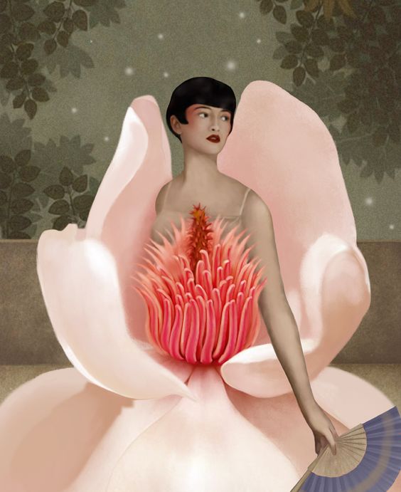
(images from pinterest)
In conclusion, I'm massively impressed with both Petrilli's work and the Clé de Peau collection. This year the company took a chance by exploring a more whimsical theme and succeeded thanks to Petrilli's imagery, which is a far more refined and elegant representation of Alice in Wonderland than any other makeup collection I've seen. As I mentioned earlier, I absolutely adore the cutesy treatment used by other brands since it reminds me of my childhood, but this was a nice change of pace and obviously suits a luxury brand like Clé de Peau much better. I just wish I could have heard a little more from Petrilli's perspective about working on the collection.
What do you think? What's your favorite illustration out of these?


