In honor of Piet Mondrian's birthday yesterday (albeit in 1872) I'm sharing these pretties from Yves Saint Laurent.

(image from neimanmarcus.com)
In 1965 Yves Saint Laurent created a jersey shift dress inspired by the work of Mondrian. The Met summarizes this fashion landmark nicely: "As the sack dress evolved in the 1960s into the modified form of the shift, Saint Laurent realized that the planarity of the dress was an ideal field for color blocks. Knowing the flat planes of the 1960s canvases achieved by contemporary artists in the lineage of Mondrian, Saint Laurent made the historical case for the artistic sensibility of his time. Yet he also demonstrated a feat of dressmaking, setting in each block of jersey, piecing in order to create the semblance of the Mondrian order and to accommodate the body imperceptibly by hiding all the shaping in the grid of seams." Here is the dress and what I'm guessing was the particular painting that inspired it, completed in 1930.

(images from metmuseum.org and actlab.utexas.edu)
What I love about the palettes is that they took an original fashion concept from Yves Saint Laurent and made them wearable. Obviously red, yellow and blue are not the most versatile colors to wear on your face, so the palettes provide a nice variation on the YSL-Mondrian theme. These are definitely on my wishlist, but at $54 a pop I don't think I'll be getting them any time soon since the spring collections have depleted Museum funds. Someday I'll get them!
I wasn't so impressed when I saw this fall palette from YSL. An initial made into bronzer/highlighter seemed pretty boring. But then the "stitching" on the Y itself caught my eye and I thought, maybe this Y has shown up on a dress or bag.

And indeed it has! Obviously the one with the metal studs is my fave out of these 4:

images from splendidcity.com, pursepage.com, purseblog.com, mymanybags.com
YSL Beauty doesn't normally come out with such literal interpretations of the company's fashion, so this was a nice little surprise. Plus the website's statement that the stitching gives the "allure of a true handbag
accessory" reminds me a bit of Chanel's tactic of putting their interlocking C's on their makeup – if you can't afford a bag with the Chanel logo, you can at least have a lipstick palette with it!
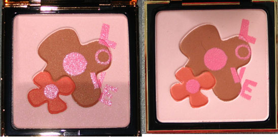
Since I was a bit disappointed with YSL's spring 2009 offerings, I thought I'd take a look back at last year's spring palette. The description from Neiman Marcus: "To celebrate the 30th anniversary of YSL make-up, Yves Saint Laurent has created this collector powder for face and cheeks. Directly
inspired from the greetings card Mr. Saint Laurent drew and sent in
1992, it is a perfect tribute to love and flowers." Indeed.
Unfortunately I cannot seem to locate a picture of the original greeting card he sent, so I have to assume that this is the design that was used for it. I suspect I could find the image in this book, which contains a collection of YSL's greeting cards, but I haven't gotten a chance to buy it yet!
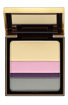
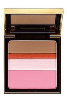
The spring 2009 collection for YSL included these so-called "collector palettes for the eyes/complexion", featuring stripes of color that can be mixed and matched to "turn your look into a work of art". "Contemporary art inspires this year’s Spring Look. An explosion of
vivid colours, graphic lines and sensorial textures reveal a strikingly
modern interpretation of beauty," says the YSL website.


(photos from nordstrom.com)
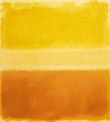
I'm not really sure what the company intended these to look like – they remind me a bit of a Rothko, (one of the curator's favorite artists) but the edges of the colors are obviously neater and lack the fading that Rothko's "color fields" have:

(Mark Rothko, Yellow and Gold, 1956, image from worldgallery.co.uk)
Still, that looks like the inspiration for the palettes, no? In my opinion, it's modern visual art and not the the YSL clothing lineup for the spring 2009 season that was the jumping-off point for these palettes. The ready-to-wear collection, created by Stefano Pilati, had an "East-meets-West" feel to it and had nothing to do with modern art. One of the questions I always try to answer in Couture Monday is whether the company intended their makeup collections to correspond to the season's clothing. Usually this is not the case, as the cosmetics division of a couture house is completely separate from the actual clothing and run by totally different people. With these palettes YSL follows that pattern. And while I'm pleased the palettes look Rothko-esque, it's still a fairly vague suggestion with no clear relation to a particular artist or genre. Another somewhat disappointing release for spring!
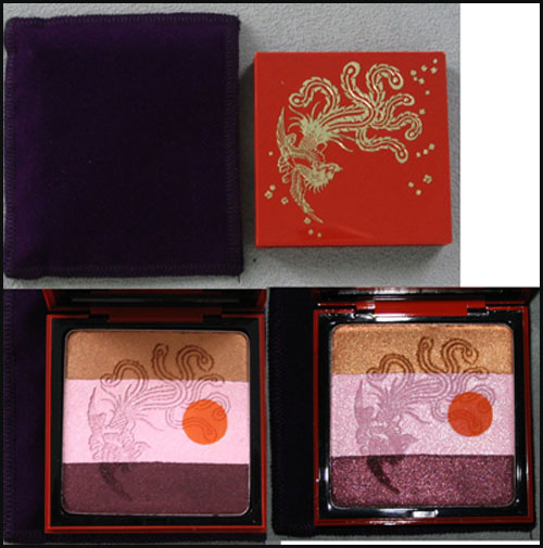
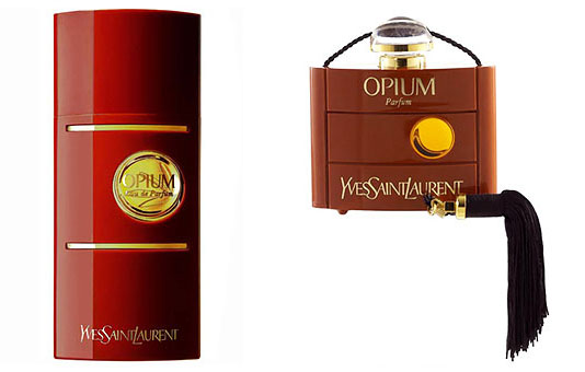
In honor of the 30th anniversary of YSL's Opium1 fragrance, the company released a limited-edition bottle and palette in the fall of 2007. The palette features a red lacquered case with an exquisite phoenix and floral details.

While I'm not really sure what the reddish orange dot on the interior is supposed to represent, it could just be referring to the circle on the fragrance bottles themselves:

(photos from yslbeautyus.com)
The iconography of the phoenix is a little strange – maybe it's meant to represent the "rebirth" of the fragrance, but truthfully I can't find any concrete explanation of why the company went with a phoenix.
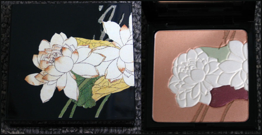
In any case, I can understand why they would have released this to go with the fragrance's anniversary, but that doesn't quite explain why they came out with a limited-edition Opium fragrance bottle and a palette featuring a matching design in the fall of 2006.
Both the bottle and the palette are adorned with a beautiful lotus flower, because, according to the company, the bloom represents “purity and splendour." That's all well and good, but I think it would have been more interesting if they included a flower whose scent is one of the notes in the perfume, or if they wanted to be really adventurous, a poppy flower.1 ;) Plus I'm not sure what "purity and splendour" have to do with the fragrance considering the Sephora description for it:
"Rarely in the history of fragrance has a creation embodied such enchantment, mystery, magic, and exoticism…Opium symbolizes Yves Saint Laurent's fascination with the Orient and his unique understanding of a woman's hidden emotions and inexplicable passions." I think in this case though, "Orient" refers to China, since the company introduced many China-inspired fragrances in recent years.
Over all, both of these palettes represent the designer's "fascination with the Orient" and the spirit of the Opium fragrance – I like that the same image was used for both the perfume bottles and palettes. And they're simply gorgeous to look at!
1Allure reported that there was an entire museum exhibition devoted to the 30th anniversary of Opium in Paris, complete with a faux opium den. The curator is most upset she was not able to attend!
2 For a perfume blogger's perspective on the fragrance, click here.
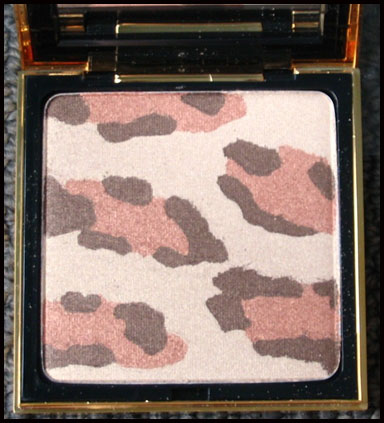
Today I'm taking a look back at Yves Saint Laurent's Fauve palette from the fall 2005 collection. It's a square compact filled with a shimmery leopard-print powder.

Fauve translates to "large feline" or "predator" in French so it's a fitting name, but I was curious as to why the company named it that instead of going with plain old leopard. So I asked City Girl, Brooklyn-based author of a very informative blog on city lifestyle (and whose first language is French!) if she could shed some light on this. According to her, the French have several words for this kind of creature: guepard, panthere and léopard. She hypothesized that since léopard is not usually used in the fashion sense, and Cartier has a "panthere" collection, and "fauve" is more encompassing than guepard, it made the most sense for YSL to name the palette fauve. Interesting, no?
Now let's look into why YSL chose a leopard print. The copy for the palette said that the palette was "inspired by one
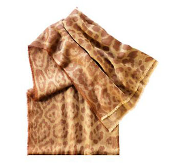
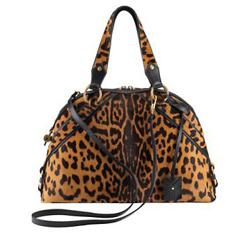
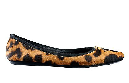
of the most distinctive fashion features of the legendary design house." While I don't think the use of leopard print is the number-one icon of YSL, the company does utilize it frequently (and wisely, I would say) on accessories:


(photos from ysl.com/us)
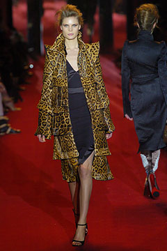
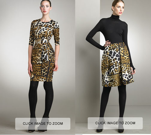
Although sometimes the brand ventures out and uses it on clothing:

(photo from style.com)

(photos from bergdorfgoodman.com – note that you can't actually click to zoom…these are screenshots and I didn't want to cut off the model's feet so I didn't crop out that part.)
Judging from these, I'd say it's appropriate for YSL to use the leopard print on a compact – it definitely goes with the fashion the company produces (even though Yves stepped down in 2002). Plus, in my opinion even in compact form there's something about leopard print that makes the wearer feel powerful, a bit dangerous and definitely wild. Call it the Fauve effect.
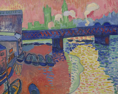
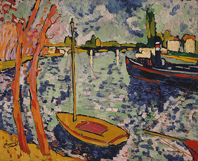
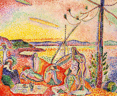
Speaking of which, now it's time for a little art lesson! The palette's name brings to mind one my favorite (though short-lived) art movements: fauvism. Starting around 1905 and led by Henri Matisse, fauvism was characterized by an unfettered use of intense colors, strong brushwork, and a flat, almost 2-d approach to the picture plane. Fauvism got its name from an art critic who, upon seeing the colorful work of this group mixed in with a conventional, Renaissance-type sculpture, exclaimed, "Donatello au milieu des fauves!"1
Some examples:
Andre Derain's Charing Cross Bridge, London (1906)

(photo from National Gallery of Art)
Maurice de Vlaminck's The River Seine at Chatou (1906)

(photo from Metropolitan Museum of Art)
Luxe, Calme et Volupté (1904-1905) by Matisse – the title is taken from an 1857 poem by Baudelaire.1

(photo from wikipedia)
So what can we conclude from all this? Perhaps it's that in makeup as in art, the wild beast within us sometimes cannot be tamed. ;)
1 Arnason, H.H. and Marla F. Prather. History of Modern Art, 4th edition. (New York: Harry N. Abrams, 1998) p. 132. For more comments on the title, see this essay.
2 Arnason, p. 131. For further reading: Whitfield, Sarah. Fauvism. (Thames and Hudson, 1996.) You can also check out this online exhibit of Fauvism at the National Gallery.


