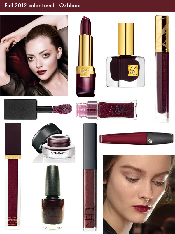
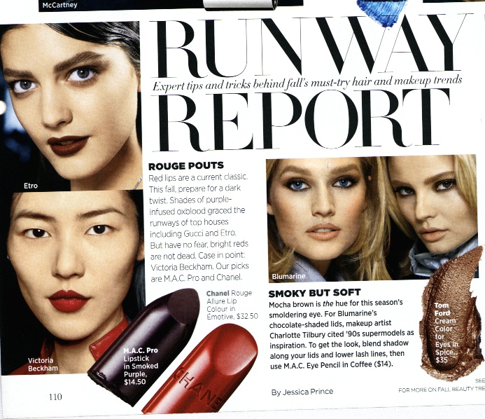
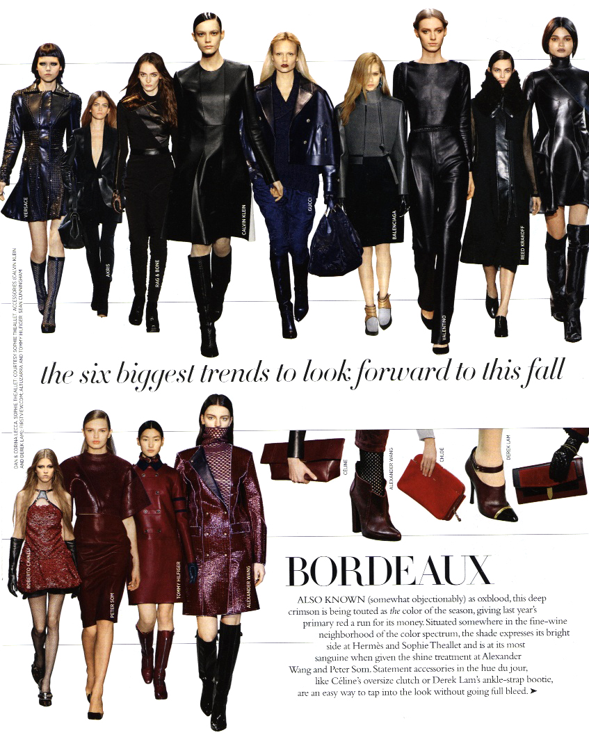
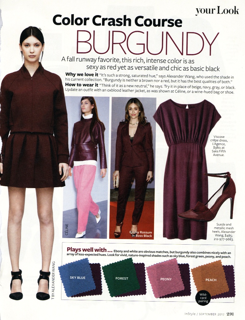
I consider myself fairly savvy when it comes to identifying exact colors, but I must say this fall's big color threw me for a loop. Oxblood is hard to define, at least for me. It's not quite maroon, not quite plum, and I have trouble telling the difference between this shade, burgundy and bordeaux. In any case, it's nice to see a new twist on the usual reds for fall, plus it feels like a more glamourous, wearable take on the black or nearly black goth lip trend from 2008.

Top: Clé de Peau fall 2012 promo ad, Estée Lauder Black Cassis lipstick, Black Iris nail polish and Chaotic Currant lip gloss from their Violet Underground collection
Middle: Smashbox Image Factory lip gloss in Chic
Bottom: Tom Ford fall 2012 lip gloss in Naivete, OPI Every Month is Oktoberfest nail polish, MAC Dark Diversion gel eye liner from their Styleseeker collection, NARS fall 2012 lip gloss in Rouge Tribal, Lancome Creme de Mat liquid lipstick in Potion d'Amour, a model at Rochas fall 2012 show
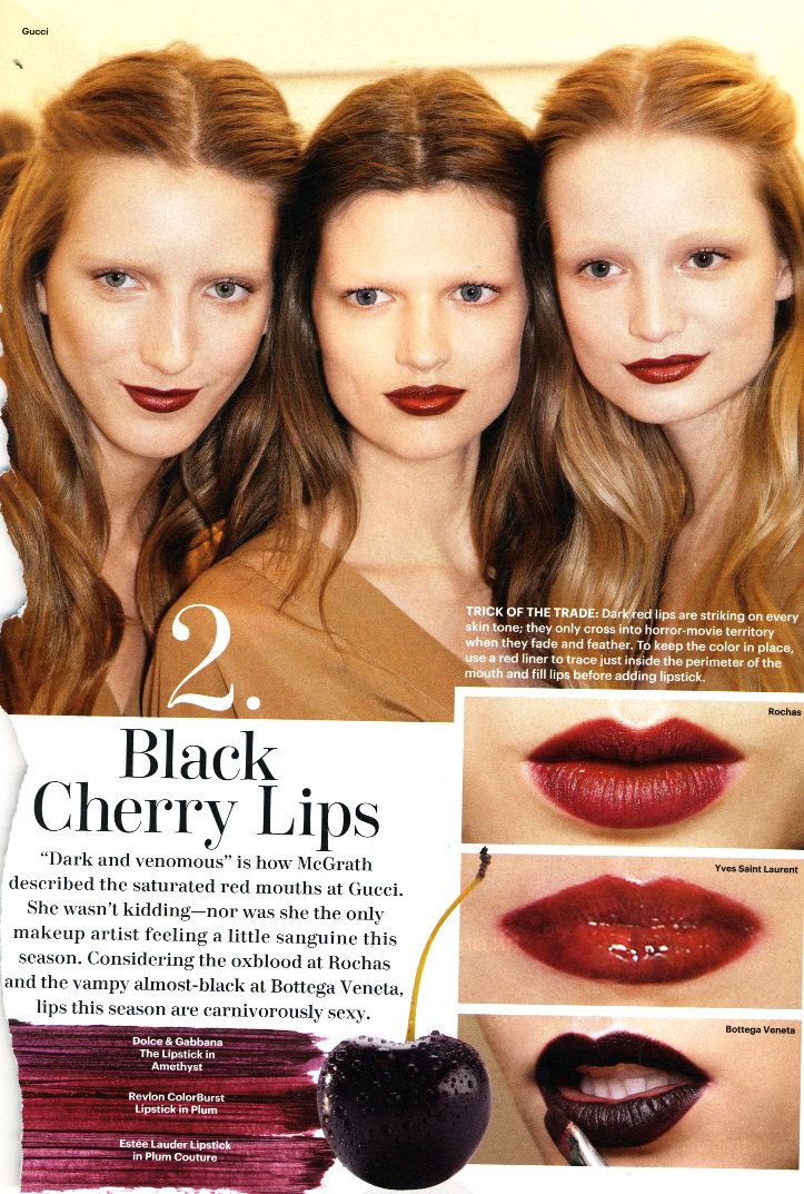
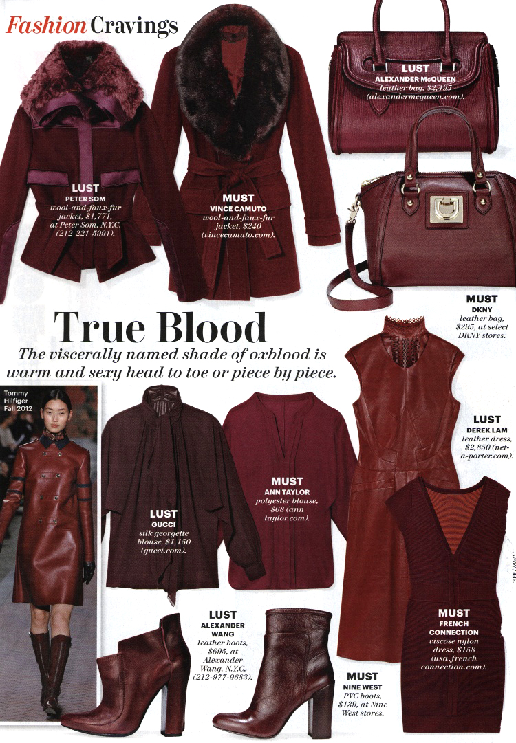
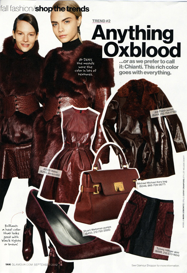
I'm still wondering what the difference is between oxblood and burgundy, but magazines seem to have no trouble identifying it – these examples all refer to the season's It color as oxblood.
Allure, July 2012:

Allure, September 2012:

Glamour, September 2012:

Harper's Bazaar, June/July 2012:


InStyle uses burgundy and oxblood interchangeably, so maybe they are the same?

So, will you be rocking dark lips and/or nails? And to your eye, is there a difference between burgundy, wine and oxblood? If so, how are these shades different?
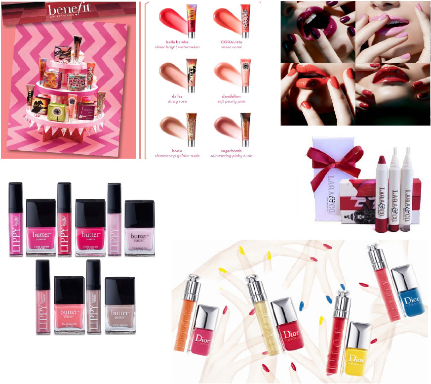
Matching lip and nail colors seems rather passé, but that didn't stop MAC and Butter London from introducing collections centering on this trend. MAC's Fashion Sets include nail polish, lipstick and lip gloss all in the same shade, while Butter London came out with lip glosses in the same shades of some of their best-selling nail polishes. Additionally, Dior's Summer Mix collection provides coordinating shades for nails and lips (rather than out and out matching), and recently Laqa and Co. expanded into lip pencils to go with their pen-form nail polishes. And it's not just nails and lips that are getting the twin treatment – Benefit will be releasing lip glosses in the same shades as their blushes.
(Click to enlarge)

(Clockwise from top left: Benefit lip glosses via makeup4all.com, MAC Fashion Sets via spoiltblog, Laqa & Co. gift set, Dior Summer Mix via blog.marionnaud.ch, Butter London Lippy lip gloss and nail polishes via trendfashionstyle.org)
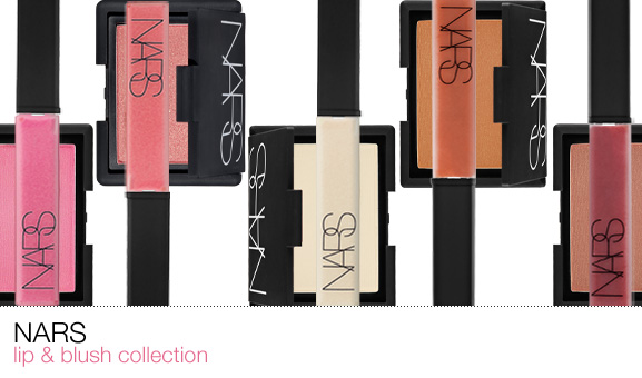
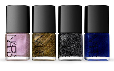
Is this concept really new though? Perhaps the idea of coordinating your lip and nail colors is, but companies have been building on popular shades for years by releasing the same colors in different items. Take, for example, NARS, which released lip glosses to match some of the line's blushes in 2010, and more recently, nail polishes based on their glittery "Night Series" eye shadows:

(image from frappelattes.com)

(image from beautyblitz.com)
And of course, there's also Stila's famous Kitten eye shadow, which the company has spun into a multitude of products, including lip gloss, highlighter, cream eye shadow and glitter eye liner (NARS did the same with their hugely popular Orgasm blush). So is this really a trend or just a way for companies to make more money without having to invent new colors?
I am intrigued by the idea of matching lip and nail color – since I was always wary of being too "matchy-matchy" and dated, I've never tried it. Now that it seems to be having a moment, I may give it a shot.
What do you think of this trend, and will you be partaking? And do you like when companies release the same shade in different products?
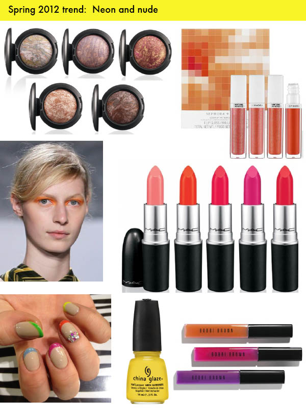
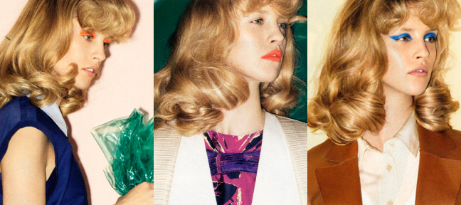
Neon! (And neutrals). Okay, so neither of those are specific colors, but the combination is definitely everywhere this season. The idea is to use a pop of neon on lids or lips and keep the rest of the face simple and natural-looking (so you don't look like a circus performer). Of course, if you're too timid to use neon on your face, you can always look to nail polish for a little jolt.

Clockwise, from top left: MAC Mineral Skinfinishes and blushes from the Naturally collection; Pantone + Sephora Tangerine Tango lip glosses; lipsticks from MAC's collection with Iris Apfel; Bobbi Brown lip glosses from the Neons and Nudes collection; China Glaze Sunshine Pop from the Electropop collection; neon and nude nails (via The Hairpin); a model at Richard Chai's spring 2012 show (via Lucky Magazine).
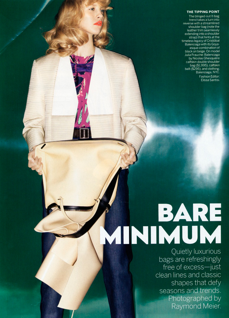
I also found some great examples of the trend in Vogue's February issue.


Here are just the heads so you can really focus on the makeup:

I'm really liking this trend – bold and bright, but wearable (definitely on weekends, at least), since the neon is balanced by an otherwise neutral face. I for one am itching for a fuchsia lipstick and some of Sephora's Tangerine Tango polishes and lip glosses. I might also try a crazy blue eyeshadow too.
What say you? Will you be partaking in neons and neutrals?
Oh, and happy spring! (Silly me, I thought it was tomorrow!)
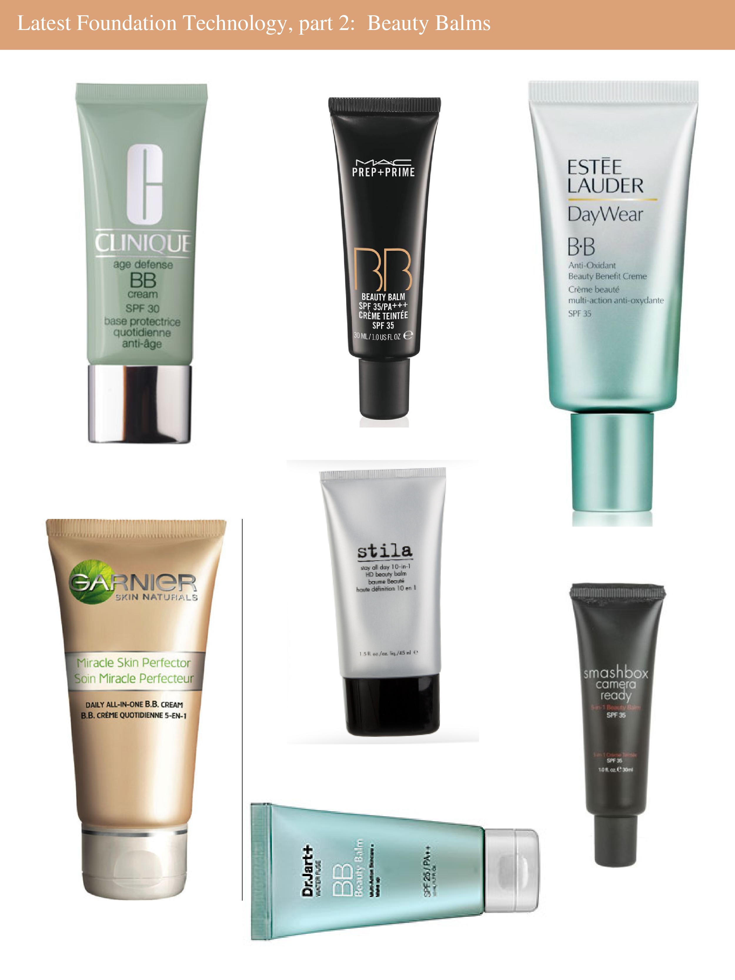
Last week I wrote about the latest and greatest in foundations. For part 2, this week I'm focusing on BB (beauty benefit) creams (also known just as beauty balms), which are, thus far, the biggest cosmetic trend of 2012. But what exactly is a BB cream? Basically it's a very lightweight foundation that also provides benefits for your skin, including moisturizers and sunscreen. They don't all offer the same things though, as Fashionista points out: "BB creams can do any or all of the following, depending on which one you choose: hydrate like a moisturizer; fight acne and aging like a specialized treatment; nourish like a serum; brighten like a toner; smooth skin texture like a primer; cover blemishes like a concealer; even out your skin tone like a sheer foundation; refine fine lines and wrinkles like an eye cream; add luminosity like a highlighter; and protect against UVA/UVB rays like a sunscreen." Sounds great, right?
The first BB cream was invented in the 50s by a German dermatologist who wanted something that would help heal her patients' skin and protect it from the sun after chemical peels but that also would hide redness. These creams have been all the rage in Asia for years but only now have swept through North America. Last year Sephora introduced Dr. Jart's BB cream (a bestseller in Korea) and MAC released a beauty balm, and this year we see even more BB creams from Estée Lauder, Clinique, Smashbox, Garnier and Stila.

It's hard for me to believe one product can do all the things these claim to, plus I rather enjoy taking the time to apply my regimen of moisturizer, sunscreen, primer, and foundation. However, if you're pressed for time or simply don't want to be bothered layering on various products, these BB creams could be perfect for you. What do you think? Have you tried or will you be trying out a BB cream?
It's been a REALLY long time since I discussed the latest technological advances in makeup, and with a spate of new foundations on the way I thought I'd round them up to see what makes them different. Today's post will focus on foundations, which, mind you, are distinct from beauty balms/beauty benefit creams – those will form part 2 of the latest in face makeup technology.
As we know, the goal of foundation is to improve the look of the complexion – even out skin tone and hide imperfections and blemishes. These new foundations, however, go further by promising not only to improve the overall appearance of your skin, but make you look noticeably younger by reducing the appearance of lines and wrinkles, while providing an invisible, second-skin finish.
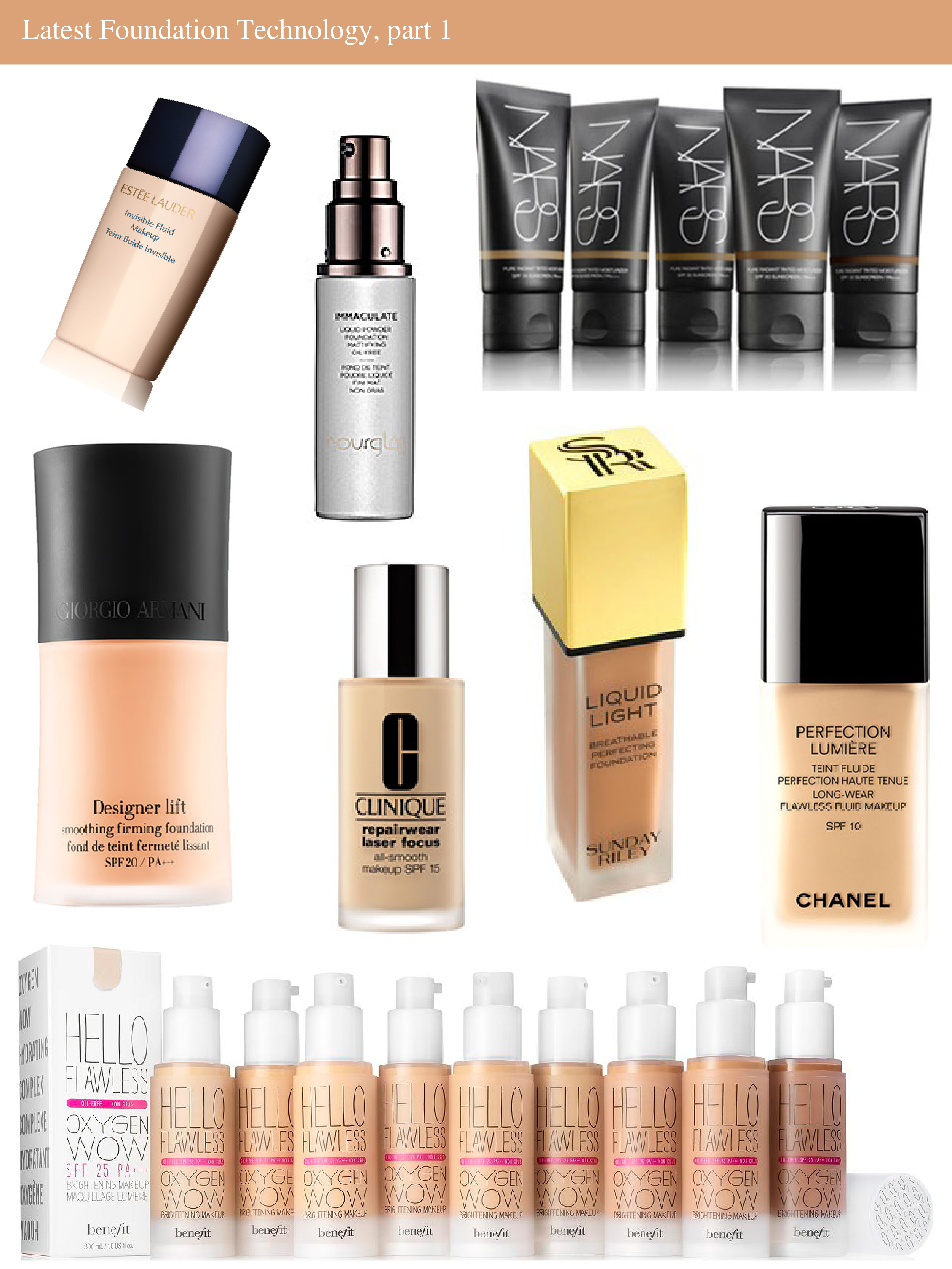
Now onto the products. The second half of 2011 saw the release of Chanel's Perfection Lumière Foundation and Armani's Designer Lift foundations. Perfection Lumière supposedly provides "seamless blendability for a naturally flawless effect", while Designer Lift claims that it "restores up to 10 years of luminosity, firms lines up to 87% and firms skin by 73% for 12 hours of lifting action. "
This year several new formulas have been or will be introduced: Hourglass Immaculate Liquid Powder Foundation, Benefit Hello Flawless Oxygen Wow Foundation, Sunday Riley Crème Radiance Breathable Ageless Foundation, Estée Lauder Invisible Fluid Foundation, and NARS Pure Radiance Tinted Moisturizer.

While all of these foundations contain different ingredients and have varying amounts of coverage, they all tout anti-aging benefits and a finish that feels like your own skin. According to Sephora, Hourglass Immaculate Liquid Powder Foundation has "clinical levels of two antiaging ingredients to create a youthful glow" and offers a "long-lasting, flawless finish". There's also this notion of "breathable", of getting oxygen to the skin. Sunday Riley's foundations – both the Crème Radiance and Liquid Light – even boast the word "breathable" in their names, while Benefit's Hello Flawless Oxygen Wow contains a "specially developed blend of vitamins, minerals and a peptide that allows skin to accept more oxygen, giving cells the energy to function at their best." In turn, "oxygen helps stimulate cell metabolism and boosts cell turnover, promoting the appearance of healthy, youthful-looking skin". And Estée Lauder Invisible Fluid Foundation actually contains air.
Some also include exotic ingredients. The Hourglass foundation is infused with "Phytostem Edelweiss, an active derived from a rare Alpine plant, slows collagen degradation and reduces wrinkle depth by 15% after 20 days of use. Lavandox, an ingredient extracted from Spanish lavender, reduces the appearance of wrinkles by 11% after 24 hours of application and inhibits muscle contractions that lead to the development of fine lines and wrinkles." According to Barney's, Sunday Riley Crème Radiance Foundation is a "powerhouse formula enhanced with radiance-boosting, redness-fighting probiotics, peptides, magnolia bark, and tonka bean." NARS' new tinted moisturizers contain kopara, an ingredient from French Polynesia that is said to encourage skin cell renewal.
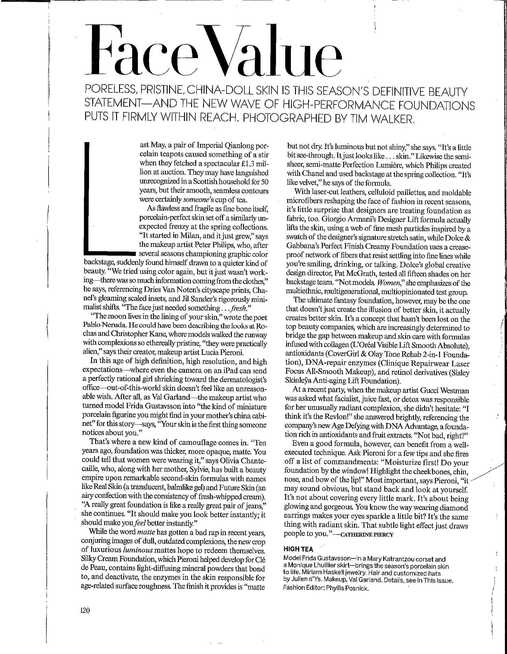
Clear skin is always in, but this piece in the January issue of Vogue explains the how and why behind cosmetics companies' rush to trot out high-tech foundations that promise flawless, younger-looking skin.

"In this age of high definition, high resolution, and high expectations – where even the camera on the iPad can send a perfectly rational girl shrieking toward the dermatologist's office – out-of-this-world skin doesn't seem like an unreasonable wish." I personally think it's both consumers and companies combined that make the demand for these new foundations.
Have you tried any of these newer foundations/are you planning to? I'm intrigued by many of them but only if they're mattifying – the Hourglass Liquid Powder in particular sounds very promisng for my oily skin!
No, I'm not doing "11 for 2011", but I do want to take a look back on the year and highlight the things that stood out most to me.
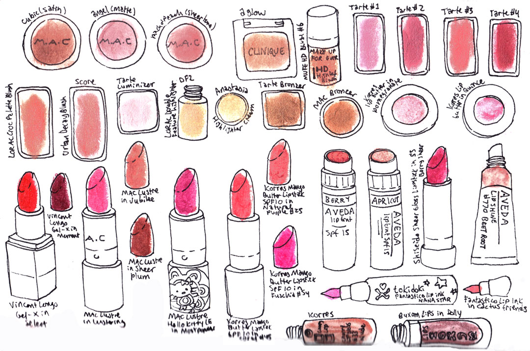
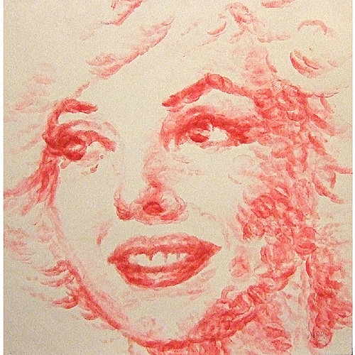
I was pleased to see more connections between makeup and art this year. We had both drawings of makeup as well as portraits created with lipstick and other products:


images from bellasugar.com
And a perfume bottle exhibition means makeup can't be far behind!
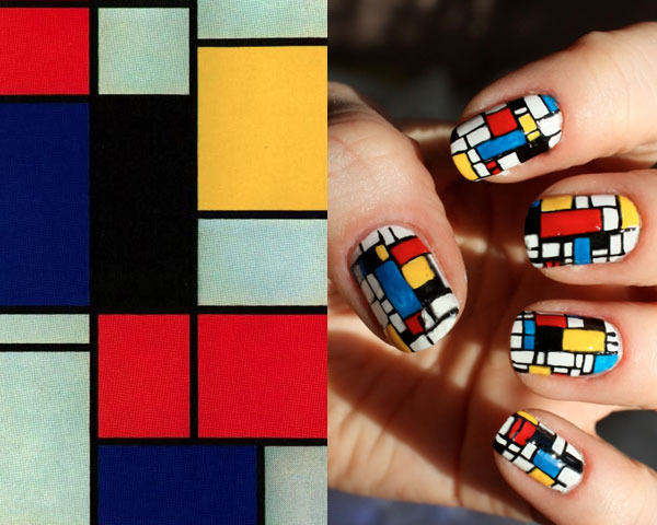
Now for some trends. 2011 was most definitely the year of the crazy nails. From high art-inspired…

(image from beautylish.com)
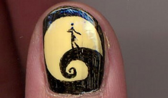
…to reproducing pop culture, nails were the big accessory.

(image from thegloss.com)
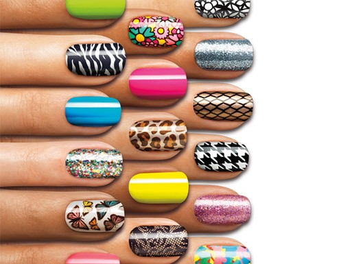
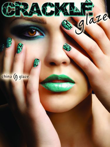
On the slightly less wild side, Sally Hansen debuted nail decals to allow easy application of designs, while a host of companies (OPI, China Glaze) introduced "crackle" nail polishes.

image from chic-steals.com

(image from chicprofile.com)
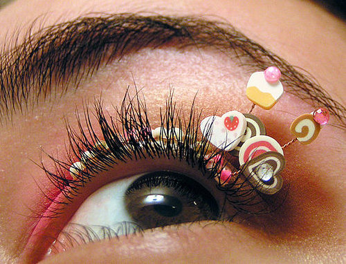
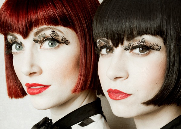
It was also the year of the crazy eyelashes - from shells and paper to Lancôme's creepy "Doll Lashes" mascara, lashes were subjected to variety of enhancements.

(image from bellasugar.com)

(image from thegloss.com)

(image from lancome-usa.com)
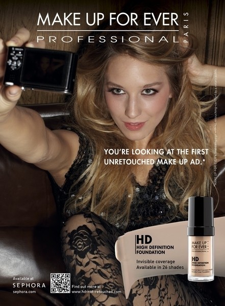
In terms of advertising, Makeup Forever met consumers' demands for non-Photoshopped models and produced the allegedly first un-retouched ad for their High Definition Foundation. Problem was that the model was so perfect she didn't need to be retouched anyway – it makes very little sense to advertise foundation on a young model that has flawless skin already.
 (image from huffingtonpost.com)
Fortunately the conversation isn't over, as towards the end of 2011 Jezebel reported that companies may be forced to stop using Photoshop for cosmetic ads.
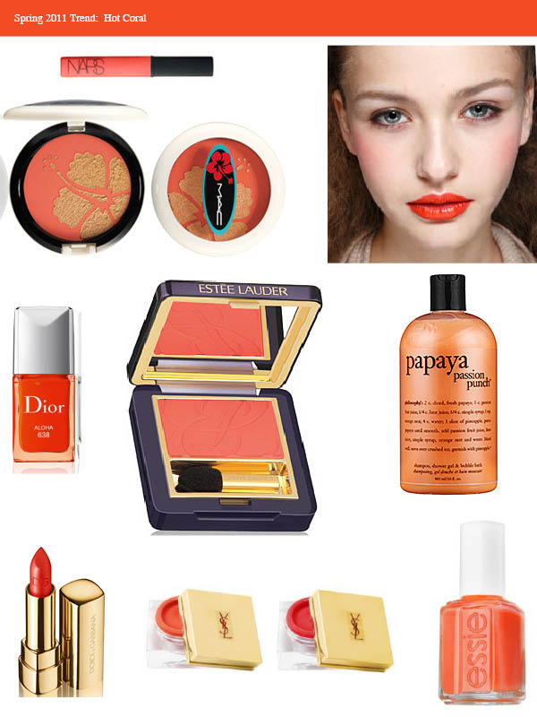
On the color front, coral swept past bronze as the spring and summer's go-to color…
…while fall brought on the blues.
There are so many more items from the year that caught my eye, but I'll leave you with this: the weirdest/most morbid 2011 beauty award goes to Illamasqua, for offering funeral makeup services.
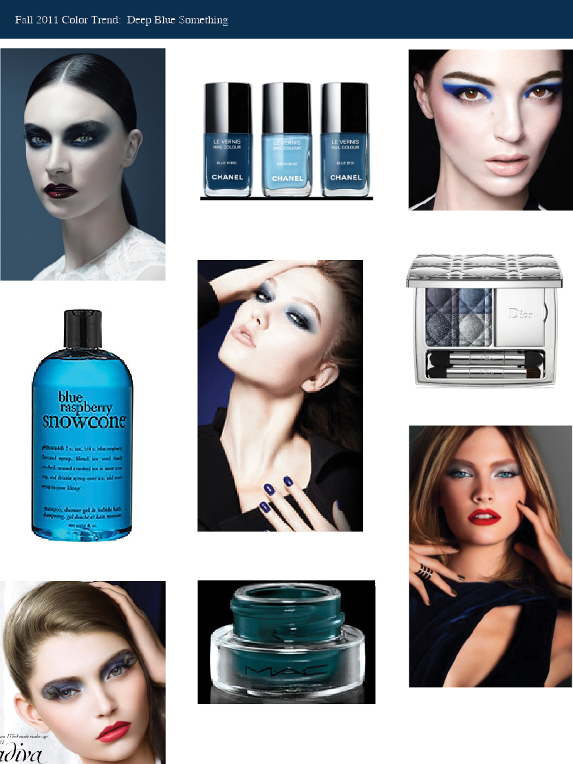
In honor of the first day of autumn tomorrow (and the fact that I am wearing Chanel Blue Rebel nail polish) I thought I'd post about this season's "It" color (you can see previous ones here and here.) Looks like blue is the new black!

Images and where I got 'em, from top left: Givenchy Les Ombres de Lune promo (ourvanity.com); Chanel Les Jeans de Chanel nail polishes (blog.neimanmarcus.com); Nars Fall 2011 collection promo (narscosmetics.com); Philosophy Blue Raspberry Snowcone shower gel (sephora.com); Dior Blue Tie collection promo (dior.com); Dior Blue Tie palette (dior.com); Shu Novadiva promo (shuuemura-usa.com); MAC Midnight Blues Fluidline (maccosmetics.com); Estee Lauder Modern Mercury promo (beauty411.net).
Will you be singing the blues as the temperatures drop?
Forget going for the bronze – the reigning trend of spring and summer 2011 is coral. From pale melon to sizzling reddish-orange, this hue is everywhere! Here's my little collage detailing the trend: NARS Wonder lipgloss, MAC My Paradise blush, a model backstage at the Marc Jacobs spring 2011 show, Dior Aloha nail polish, Estée Lauder Orange Crush eye shadow, Philosophy Papaya Passion Punch 3 in 1, Dolce & Gabbana lipstick, YSL Créme de Blush in Bright Coral and Rouge Passion, and Essie Brazilliant nail polish.

(images from narscosmetics.com, nitrolicious.com, refinery29.com, dior.com, esteelauder.com, sephora.com, fashionison.com, yslbeautyus.com, essie.com)
Yellow nail polish is huge this season as well. Since yellow is the Curator's favorite color, I have already procured Chanel Mimosa and Lippmann Yellow Brick Road, but I'm also anxiously awaiting Yves Saint Laurent's Electric Yellow.
Will you be partaking in these bold-colored trends?
 If vibrating mascaras were the big beauty tech breakthrough of 2008, spinning mascara wands are the 2011 version. Bourjois Volume Fast and Perfect Mascara, which will be released in May, features a rotating wand that promises to coat each and every lash to give perfect volume and definition. You can watch a video of how it works here.
(image from beautyandthedirt.com)
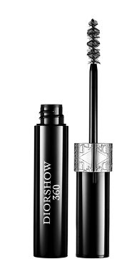
 Meanwhile, Dior introduced a spinning version of the ever popular DiorShow mascara, called DiorShow 360. This product allegedly "mimics a makeup artist's application technique for a perfect 360-degree lash-styling effect…this mascara features a spinning brush that rotates in both directions to adapt to every need, whether you're left or right-handed or you want to pump up the upper or lower lashes."
As with vibrating mascaras, I'm skeptical these would actually work better than a traditional non-moving wand. Still, I think these have more validity than the vibrating ones – I think that the motion could in fact yield better results than a manual wand.
I remember with the vibrating mascaras the mass fear of poking one's eyes out. Does a rotating wand present the same threat? Hard to say.
(image from sephora.com)
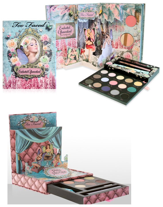
Some recent collections have gotten me wondering about why makeup companies have been doing packaging that would appeal more to little girls than to women (or even teenagers.) It started with Too-Faced's 2010 holiday collection called Enchanted Wonderland, which included 2 pop-up palettes featuring the girlie trifecta of fairies, flowers and tons of pink.

(images from talkingmakeup.com and beautifulwithbrains.com)
I have nothing against pop-up palettes – I love Urban Decay's Alice in Wonderland and NYC palettes – but it seems that Too-Faced took it just a step too far by making theirs fairy-themed, or at least, didn't execute it in such a way to make it seem sophisticated the way Urban Decay did. The palettes look more like something that my 2 year-old niece would be drawn to rather than an adult.
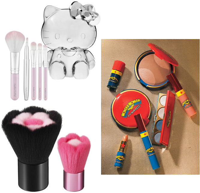
After this collection, I started noticing a spate of odd, "little girl"-type cosmetics. I've already discussed the packaging for Tarina Tarantino and MAC Wonder Woman, but Sephora has introduced the Hello Kitty line, along with a set of flower-shaped brushes.

(images from sephora.com and nordstrom.com)
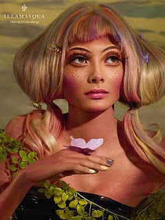
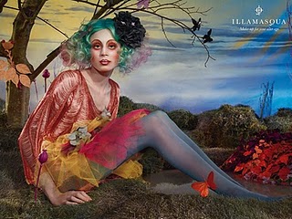
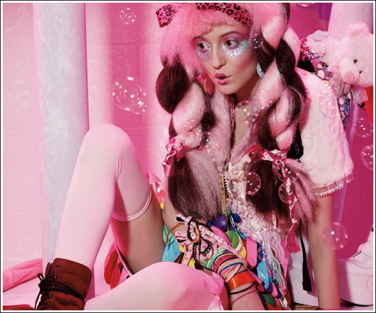
Finally, the new ad campaigns for Illmasqua's Toxic Nature and MAC's Quite Cute collection feature women whose clothing and accessories definitely have little-girl elements to them (butterflies, pigtails and exaggerated tutus for Illmasqua, stuffed animals and bubbles for MAC):


Not only does MAC present a sort of overgrown tween in the image, it revels in the theme. According to the ad copy, Quite Cute is "a style ride that combines postage-stamp-sized puppies with pixie swizzle-stick fashion and butterfly kisses for cute boys and even cuter shoes!" I have a vicious sweet tooth but that's too saccharine even for me!

(images from illmasqua.com and temptalia.com)
Now, I have defended more kiddie-esque makeup and collaborations, such as various Disney, Barbie and Alice in Wonderland collections. And I love stuffed animals – the entire Museum staff is composed of plushies! It's okay for grown-ups to take comfort in and enjoy the delights of childhood on occasion. But I feel as though the line between sweetly childlike and just plain immature needs to be drawn somewhere. With this kind of packaging and advertising, are companies encouraging the infantilization of women? Or possibly the sexualization of little girls? (Tutus aside in the Illmasqua ads, some of the models are wearing fishnets and heels.) I don't think anyone can say for sure. I do know that I am slightly confused as to what makes certain ads and packaging that are centered around kid-friendly themes feel more acceptable than others. Good: MAC's Hello Kitty line. Bad: The regular Hello Kitty line. Maybe it's simply a matter of personal taste.
What do you think? Are these designs playfully whimsical or painfully juvenile? And if the latter, do you think it encourages a societal view of women as children or is it totally harmless?
