Valentine's Day is almost over, but I'm still going to put up a V-day Museum smackdown! It's the perfect antidote to all those cutesy cards and stale chocolate.

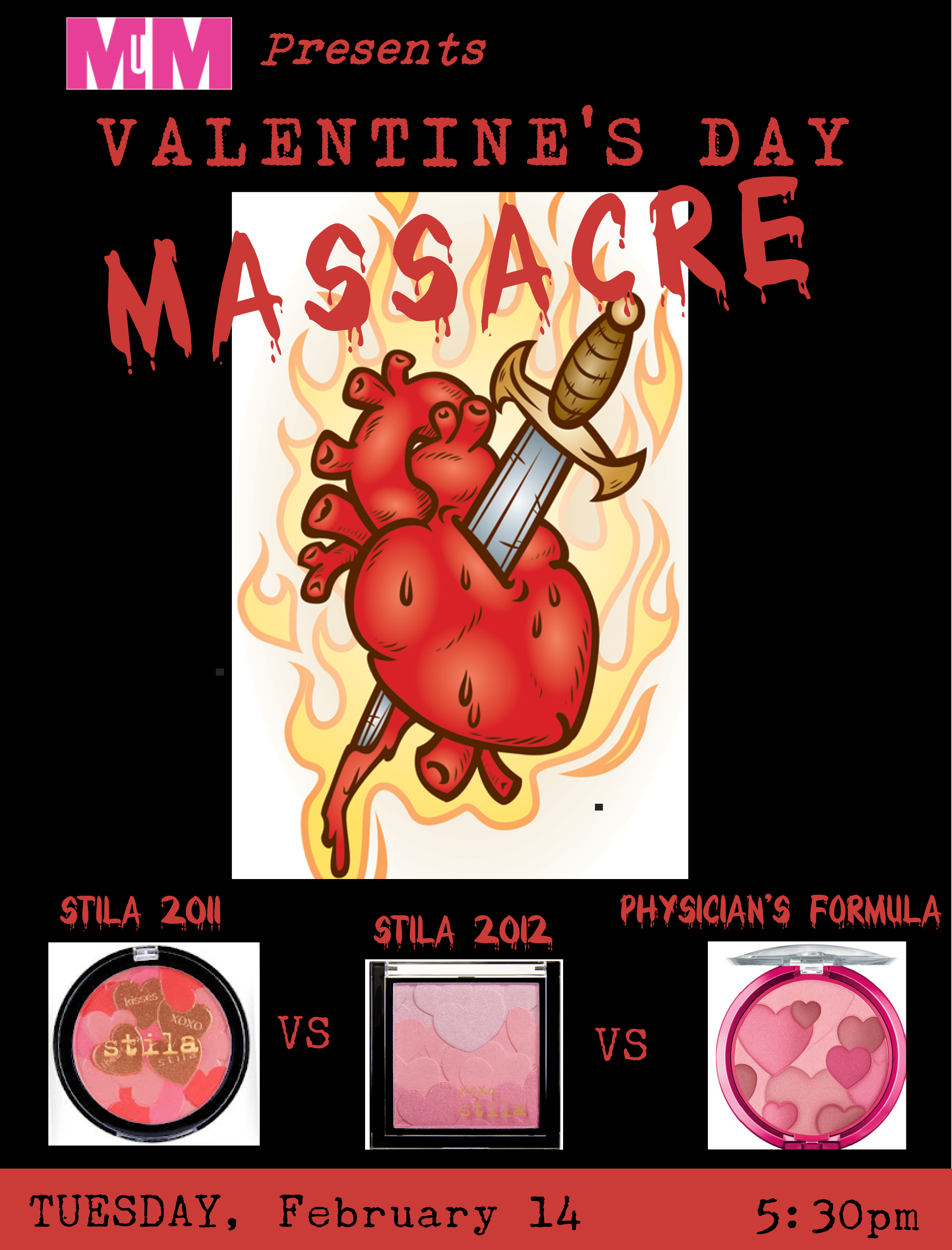
What makes this smackdown different from previous ones is that three (instead of 2) valiant items will be fighting for the champion title. (Insert "three-way" joke here).
LET'S GET READY TO RRRRRRRRUMBLE!! *ding*
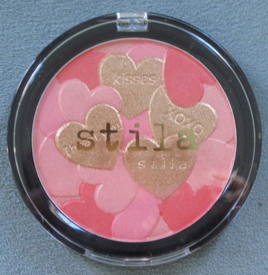
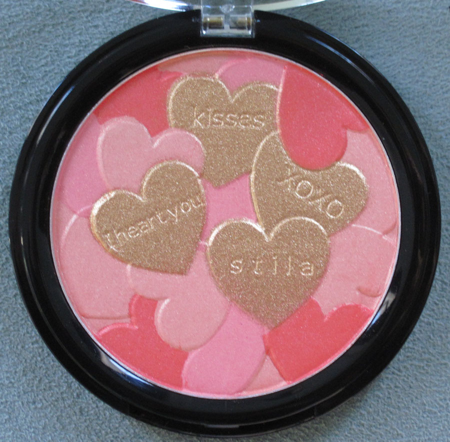
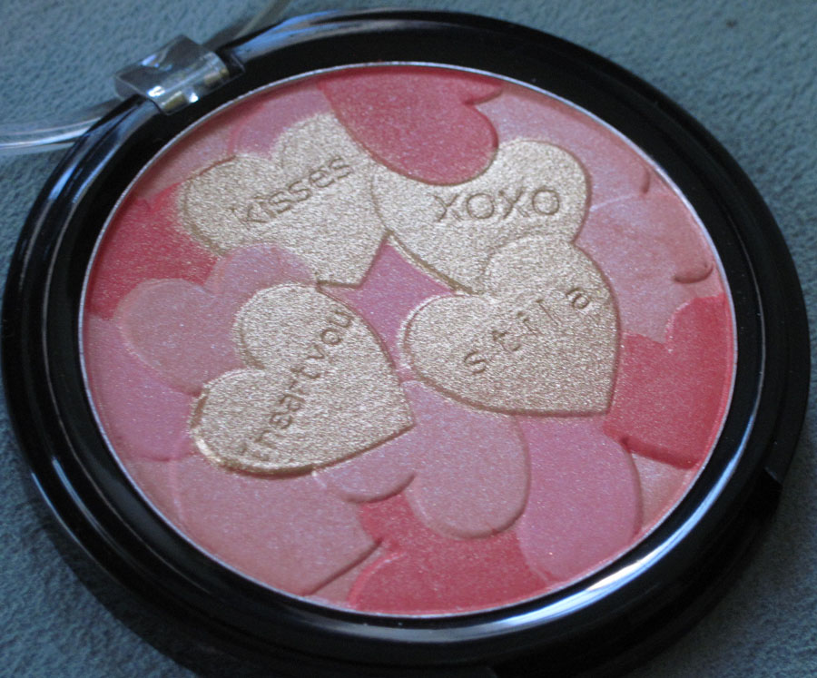
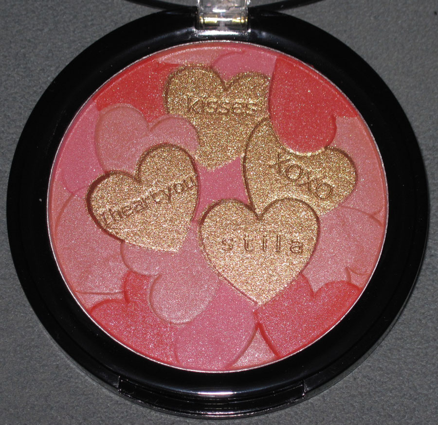
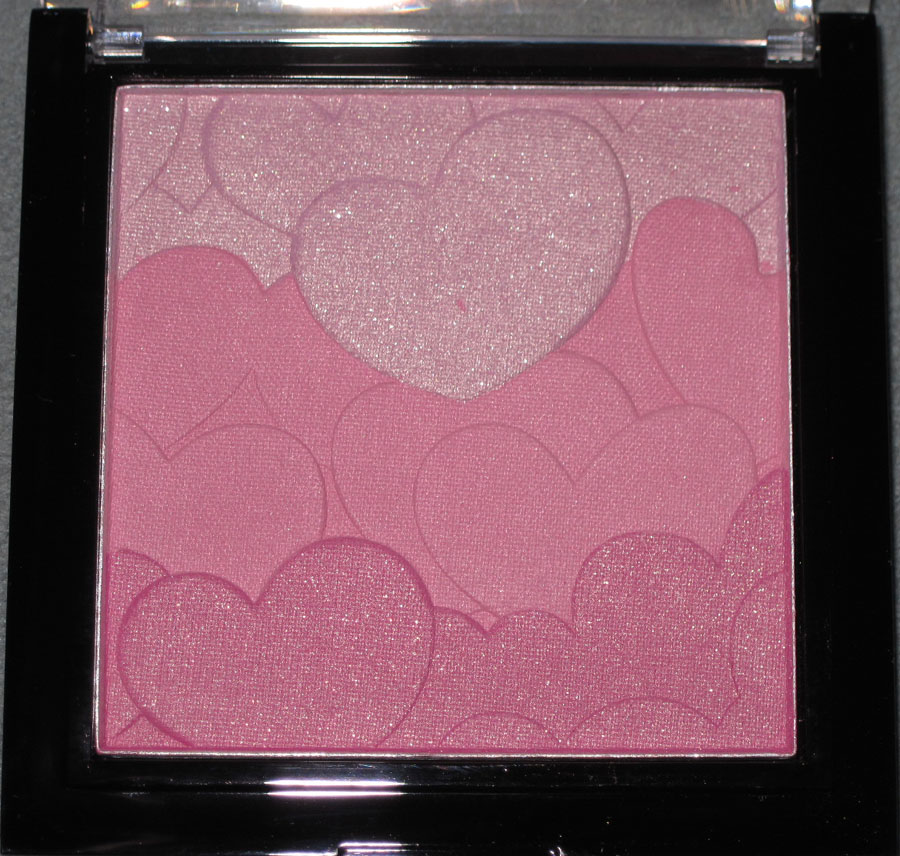
First up we have Stila's Make Me Blush palette from 2011. Make Me Blush's overlapping hearts include some gilded ones that mimic candy hearts. Stila cleverly put the company name in the middle of one.


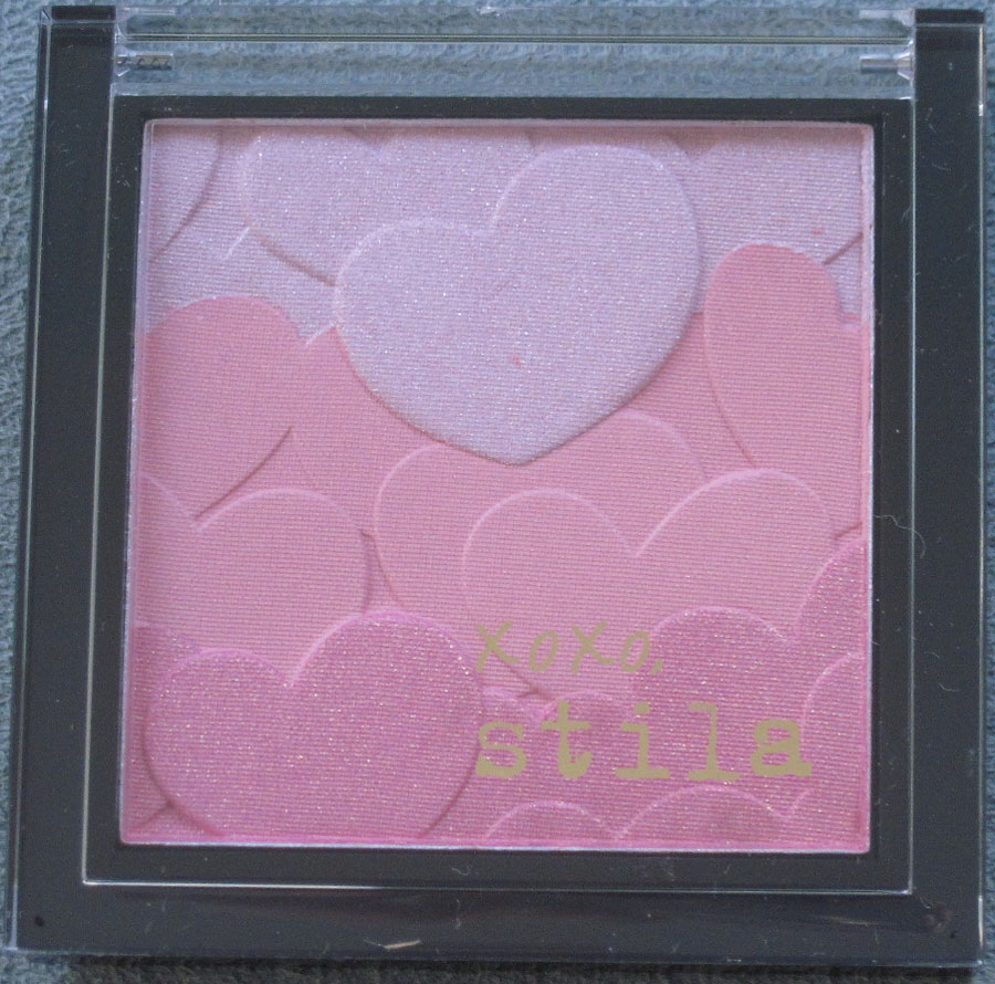
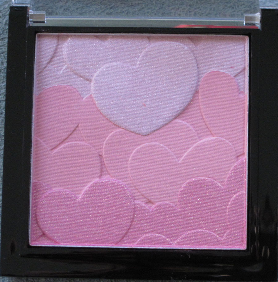
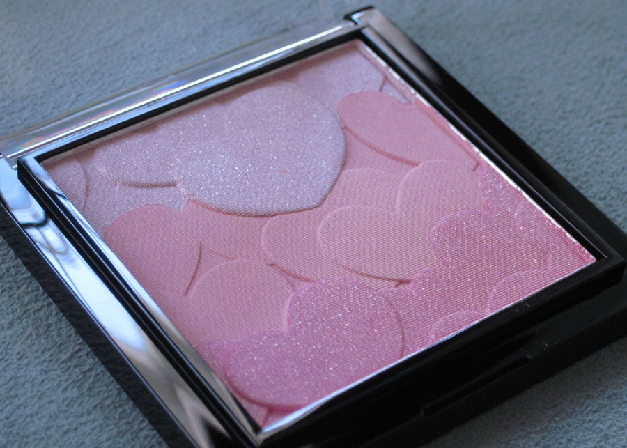
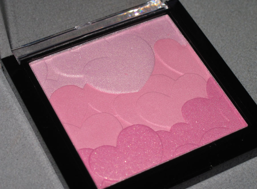
Our next warrior is Stila Love at First Blush palette from 2012. Like its 2011 predecessor, this palette features overlapping hearts, but sets itself apart by a square shape and gradiated shades of pale lavender, pink and rose.


With flash:


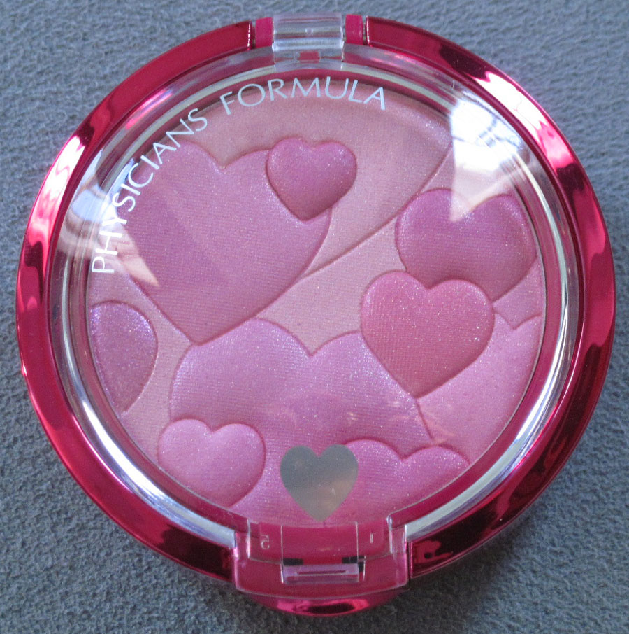
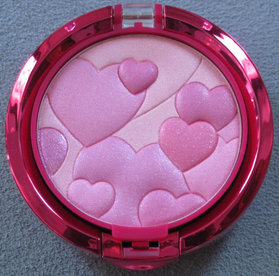
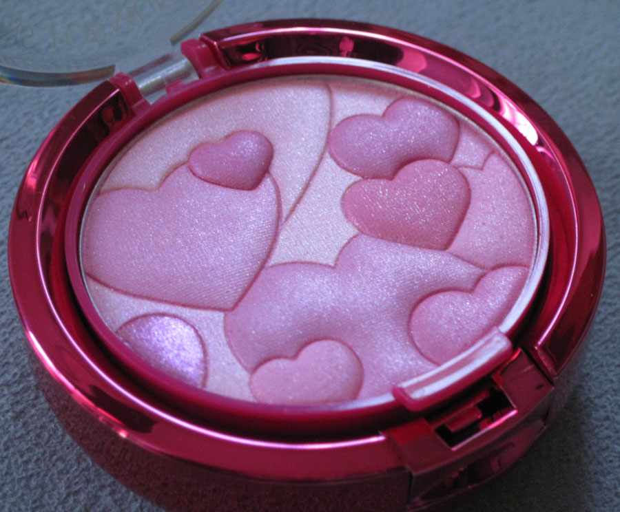
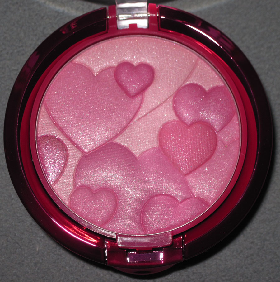
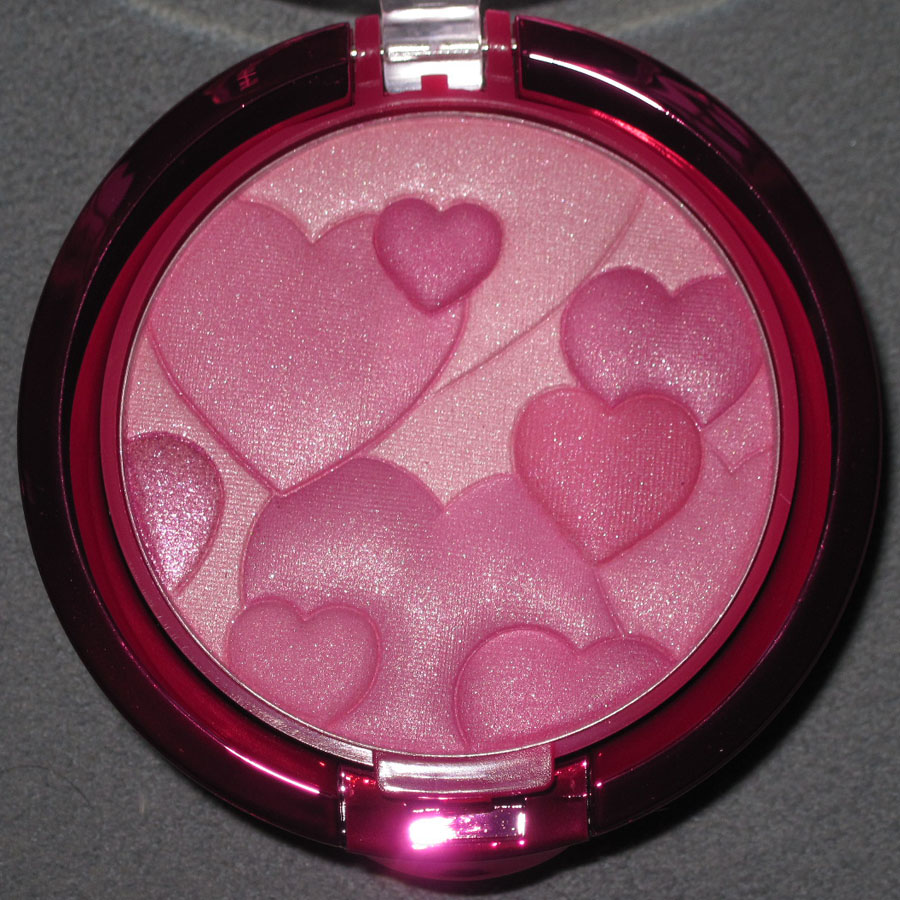
Our third competitor hails from the drugstore. Physician's Formula Happy Booster blush boasts a pink metallic outer case and a plethora of pillowy hearts.


With flash:


So which one captures your heart and comes out on top in the Museum's Valentine's Day Massacre? Will Physician's Formula's fluffy-hearted, shiny pink offering conquer Stila's palettes? Will old-timer Make Me Blush, with its sprinkling of gold hearts, dominate its newer competitors? Or will Love at First Blush's trendy yet subtle ombre shades vanquish its two foes? Tell me in the comments!
As you may have noticed, leopard print, while always a classic, is particularly huge this season (especially for accessories). So it's appropriate for Dior to have released this beautiful palette as part of their Mitzah Bricard collection, which pays homage to Dior's muse/creative consultant and her love of leopard print. The collection is available exclusively at Sephora in the U.S., having been released previously in other parts of the world. You can check out their blog post on it, but here is the background from Dior's website:
"Christian Dior admired his beloved muse, Mitzah Bricard, as much for her refined and distinguished taste as for her mysterious personality that inspired him throughout his career. Legend has it that Mitzah used to wear a panther print chiffon scarf at her wrist to hide a scar. Fascinated by her elegance, Mr Dior decided to include this magnificent Jungle motif in his collections from 1947 onwards. 'Madame Bricard is one of the rare people for whom elegance is their sole reason for living,' Christian Dior." Two things I find interesting: 1. is leopard print the same thing as panther? 2. the whole leopard/panther print that Dior included in his designs was based on this woman's way of concealing a scar. I wonder if he would have been as intrigued by this print otherwise.
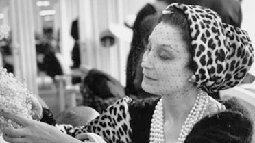
Here is Mme Bricard. She is quite stylish, mais non?

(image from dior.com)
Now that we've covered the history behind the collection, let's get on to the most exquisite piece of it, the eye shadow palette.


With flash:

I'm not really sure how or why Dior is coming out with all these very inspired pieces, but I'm loving it! And I must admit this lovely palette in particular was one of the reasons I caved on some beautiful Christian Louboutin leopard-print pumps back in the summer (eek!) But why stop at shoes? In in honor of the current craze over leopard print, it's time to have an old-fashioned palette smackdown. It's gonna be a rumble in the jungle, Makeup Museum style!

Hopefully you remember the the Dolce and Gabbana Animalier bronzer released earlier this year. If not, here are some pics.


So looking at those vs. the Dior Mitzah palette, who wins the battle of the leopard print? Will the history and glamour behind Dior's offering, along with its bigger size, crush D & G? Or does the Animalier bronzer, with it modern spirit, sex appeal, and shimmer have the edge? Let me know in the comments!
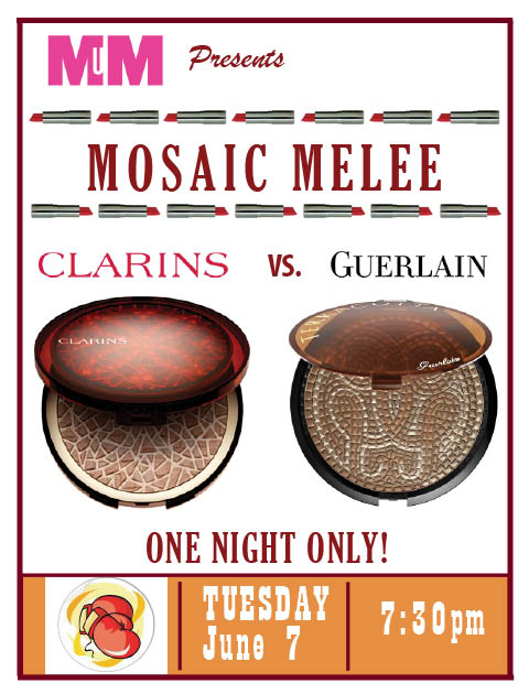
Oooh, two makeup brands coming out with mosaic-inspired bronzers. You know what that means!! Ding ding! Time for an old-fashioned makeup design SMACKDOWN! Awwww yeah, it's ON! (We are way overdue – the last MM battle took place in 2009!)

In the first corner we have Clarins Mosaique bronzing powder. As the item still hasn't appeared on the Clarins website, I was fortunate to have found the description at Addictedtolipstick.
"Mosaic, a timeless decorative motif, has crossed the ages to reach us in all its beautiful splendour. As an ornament of Roman baths, frescoes in the elegant homes of ancient Pompeii or the sumptuous decoration of Byzantine basilicas… the mosaic has been a major, refined art in all Western civilizations. This summer, Clarins has taken its inspiration from the rich forms and colours in the mosaic universe to offer a vibrant make-up collection full of sun and vitality."
Wow. Clarins certainly talks a big game, but can it deliver?
In the other corner, weighing in at a whopping .98 oz and measuring nearly 5 inches across (since it's meant for both face and body) we have Guerlain Terracotta Mosaic bronzer. This one is so confident in its design it doesn't even have a detailed description like Clarins. However, it also lacks a connection to the previous Guerlain summer release (the Inca collection) – I'm not sure why they would come out with a mosaic bronzer which has basically nothing to do with the rest of the summer collection.
Now, since budget constraints precluded me from buying these two items, you can look at the stock photos in my oh-so-cool poster above (I know you're all jealous of my mad design skillz), or you can check out real-life pics of Clarins here and Guerlain here. Go ahead, I'll wait.
So…who wins the Mosaic Melee?? Is it our fearless Guerlain, who has a lot more experience with limited editions and whose sheer gigantic size obliterates all other bronzers? Or is it the quiet underdog Clarins, who makes up for its small stature with a prettier, more detailed outer case? Let me know in the comments section!

Yesterday's post reminded me that last year (a year ago today, actually!) I pitted Dior's and Armani's holiday palettes against each other since both prominently featured crystals to see who did a better design with them. This year both companies offered up more crystal-laden goodies, so it's time for another crystal smackdown!
LET'S GET READY TO RUMMMMBLLLLE!
The competition is much stiffer than last year. In the right corner we have Dior's Crystal Boreale pendant. In 2008 Dior's crystals weren't even real Swarovski, but this year the company clearly upped the ante by placing no less than 52 Swarovski crystals on the pendant, 4 of which are the "aurora boreale" iridescent crystals Swarovski created in 1955 exclusively for Dior.

In the other corner we have Armani's "Black Lace" palette which features the usual clear Swarovski crystals but also black crystals, all arranged in a lovely circular pattern. The pattern is echoed in the highlighter contained within. Armani's has several weaknesses, however: the crystals are off-center and there is no interesting story behind the design.


So who do you think did crystals better? Will Armani's elaborate (if ill-placed) pattern beat Dior's seemingly haphazard crystal cluster? Or will Dior's prismatic gems, complete with historic backstory, trounce Armani's misguided "Black Lace" design? Determine the winner by posting in the comments section!
Time for a good old-fashioned palette smackdown! Two makeup companies are duking it out to see who can come up with the best use of crystals on their holiday offerings.
LET'S GET READY TO RUMBBBBLLLLE!!
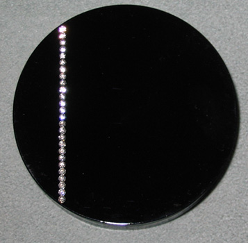
In the right corner we have Armani's crystal palette, featuring a single vertical line of Swarovski crystals:
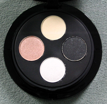
And the interior of the palette:

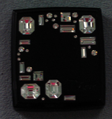
In the other corner we have Dior's Night Diamond powder, which has much bigger crystals, but that cannot boast the Swarovski name:

So who do you think did crystals better? Will Armani's simple, understated design beat out the flashier use of faux gems by Dior? Or will Dior's more geometric pattern, ingeniously borrowed from a pair of the company's sunglasses, crush his competitor? You can determine the winner – cast your vote in the comments section!
