Mum.macaron.smackdown.poster.2pp

I'm kicking off summer with a very sweet smackdown!  Because it involves macarons (or as MM staff calls them, "fancy French cookies"), I've selected the Museum's education specialist, Cookie Dreamer Babo, to serve as referee.  I also needed to keep an eye on him and the others to make sure they didn't eat the makeup as I was taking pictures.  😉

LM Ladurée vs. Lancome

"What have we here?"

Given LM LadurĂ©e's fight with BĂ©same, you can guarantee that she's one of the feistier combatants the Museum has had in the ring despite being a relative newcomer to the makeup world.  But more importantly, the current battle is not the first time LM LadurĂ©e has squared off against LancĂŽme…and now it's time to see which of these venerable French brands wins their second bout.  Let's get ready to rummmmbbbblllllle!  *ding ding*

LM Laduree vs. Lancome

LM LadurĂ©e gets off to a strong start with eyeshadows and cheek colors encased in illustrated macaron packaging a variety of delightful shades.  While they are mini sized – although not with a mini price tag, mind you, which is why there are only 3 compared to LancĂŽme's quartet – LM LadurĂ©e's prowess lies in the details.

LM Ladurée summer 2018

LM Ladurée summer 2018

Blammo!  That's the sound of the adorable border of macarons on the side of each box delivering a sharp upper cut to LancĂŽme.

LM Ladurée summer 2018

In addition to macarons, there are what appears to be profiteroles in the lineup.  LM LadurĂ©e is really bringing the heat! 

LM Ladurée summer 2018

LM Ladurée summer 2018

Finally, each color is embossed with LM Ladurée signature "merveilleuse" silhouette.

LM Ladurée summer 2018

But what LancĂŽme lacks in detail it makes up for in size and authenticity.  This blush set comes in a cheerful patterned box with two generously sized cushion blushes and two macaron-shaped application sponges. 

LancĂŽme Le Teint Macaron set

Ka-pow!  LancĂŽme's very realistic packaging packs a strong left hook to LM LadurĂ©e's daintier collection.

LancĂŽme Le Teint Macaron set

Looks like LM LadurĂ©e is getting a tad bit overcome with the size and durability of LancĂŽme.  While the sponges are soft, the plastic packaging of the blushes is way sturdier than LM LadurĂ©e's cardboard. 

LancĂŽme Le Teint Macaron set

LancĂŽme Le Teint Macaron set

LM LadurĂ©e is down!  Cookie Dreamer Babo is giving the count…six, seven…no, WAIT!  There's been a breaking development!  LM LadurĂ©e is getting up and retaliating with quite the unexpected weapon: a beautiful face powder shaped like an elaborate pink cake, complete with delectable embossing.

LM Ladurée summer 2018

LM Ladurée summer 2018

Another development! LancĂŽme just called for a timeout and claimed LM LadurĂ©e was fighting dirty since the cake is much bigger than the other items, but Referee Cookie Dreamer said it's fair play because it looks so tasty.  Not sure I agree with his rationale, but Babos aren't known for being bright and he is the referee, so back at it they go.

LM Ladurée summer 2018

We have a fight for the ages on our hands!  Will LancĂŽme's incredibly realistic and more economical set come out on top?  Or will LM LadurĂ©e's attention to detail and last-minute cake surprise triumph over her fellow French foe?  Tell me in the comments!

Save

Save

Save

Mum.11-2016.smackdown.poster

In the spirit of Black Friday, which we celebrate in the U.S. by trampling each other to score cheap TVs and the latest must-have children's toy, I thought I'd put these ladies in the ole MM boxing ring to duke it out.  I found it pretty interesting that two companies decided to release vintage-inspired brush holders for the holiday season.  At first glance, they don't seem so different – both are from similarly sized brands, blonde with perfect cherry-red pouts and dainty pearl necklaces, but as we'll see each have their own unique secret weapons.

Bésame and LM Ladurée brush holders

It's gonna be intense, so…let's get ready to rummmmbbbblllllle!  *ding ding*

"Step off, bitch!"  "Make me, whore!"

In one corner of the ring we have the BĂ©same brush holder.  With her bouncy ponytail that also acts as a handle and makeup straight from the 1940s, this girl packs a strong punch. BĂ©same is also available at Sephora, which could be seen as an advantage over her opponent.

BĂ©same brush holder

BĂ©same brush holder

But LM LadurĂ©e won't be pushed around so easily.  She boasts an equally jaunty hair style with a striped bow, but her thick black eyeliner proves she's not playing around.  Her eyes seem to be closed, making her face (in my opinion) less creepy than BĂ©same's somewhat lifeless stare.  LM LadurĂ©e is only available in the U.S. through international sellers, making it more difficult to track down.  However, this could be also be an asset in that hard-to-find items can be seen as more special than readily available ones.

LM Ladurée brush holder

While both appear to be made from ceramic, there are significant differences:  BĂ©same's shine and heftier weight pits her directly against LM LadurĂ©e's featherweight feel and matte finish.  BĂ©same may be bigger and stronger, but what LM LadurĂ©e lacks in brawn she makes up for in agility.  

Bésame and LM Ladurée brush holders

And while the size disparity doesn't seem that big at first, adding brushes is the true size test.  As you can see, BĂ©same edges out LM LadurĂ©e in terms of storage space.

Bésame and LM Ladurée brush holders

I predicted this was going to be a particularly intense smackdown, and I was right.  Things are getting ugly!  LM LadurĂ©e has seized BĂ©same's ponytail and is ferociously yanking her head around.  BĂ©same swiftly retaliated by tearing off LM LadurĂ©e's hair tie.  Well, as long as they're not going for their jewelry I guess it's fair game.  Oh, I take that back!  They have now ripped off each other's necklaces…I just hope LM LadurĂ©e doesn't reach for BĂ©same's earrings.  Hoooooo boy!  Someone's gonna get KO'ed soon, so in these final moments, tell me who you think wins.  Will BĂ©same's larger size and ergonomic shape take down LM LadurĂ©e?  Or will LM LadurĂ©e's international status, more subtle matte finish and lightweight feel allow her to cleverly maneuver past BĂ©same's blows?

Save

Balloon.smackdown.poster.3pp

Two French brands wanted to go up, up and away this spring with some balloon-themed offerings…but only one will make it to the stratosphere.  Let's get ready to rummmmbbbblllllle!  *ding ding*

On one side of the ring we have LancĂŽme My Parisian Pastels Shimmer Cube.  A trĂšs cute girl wearing a pink top, polka dotted skirt and pink shoes sets out for a stroll with her dog on the rooftops of Paris.  The bunch of colorful balloons she holds seem ready to take flight, all set to join the others floating in the distance. I'm not sure who was responsible for the illustration (I don't think it's Kerrie Hess, whom LancĂŽme worked with previously) but it's so perfectly Parisian. 

LancĂŽme spring 2016 shimmer cube

The metal tin is tough enough to withstand any blows from its opponent.

LancĂŽme spring 2016 shimmer cube

Even the dog has a pink collar!  LancĂŽme deals a strong right hook (bite?) with this detail.

LancĂŽme spring 2016 shimmer cube

Les Merveilleuses LadurĂ©e's spring palette, however, isn't getting knocked down so easily.  LadurĂ©e retaliates with a lovely palette adorned with vintage-inspired illustrations of hot air balloons peacefully drifting against a pale blue sky.  The purple ribbon, while delicate and silky, is actually a practical addition as it functions to keep the palette closed.

LM Ladurée spring 2016 palette

While LancĂŽme's illustration may have been completed by an actual artist and LadurĂ©e's balloons resemble the results you'd get if you searched "vintage hot air balloon wallpaper" (seriously, try it), we don't know the name of the LancĂŽme artist; therefore, the illustration's power is somewhat diminished.  Plus, LadurĂ©e at least attempted customization of their slightly generic, clip-art-esque dirigibles.  The details on the larger balloons, like the large script "M" and the signature cameos that are featured on nearly all products in the makeup line, pummel LancĂŽme's rather plain versions. 

LM Ladurée spring 2016 palette

The inside of the palette features more delightful balloon illustrations and an elegant layout overall, in stark contrast to the interior of the LancĂŽme tin, which looks painfully similar to children's crayons or chalk.

LM Ladurée spring 2016 palette

But wait!  LancĂŽme reveals a secret weapon to hold off their adversary: a truly magical ad for their spring collection.  This is a huge turn of events!  LadurĂ©e has no such campaign for their spring lineup.

Lancome spring 2016 promo

LancĂŽme's sturdy metal case, chic Parisienne, and surprise attack with a whimsical promo all prove they've got the capacity to flatten their rival.  But despite this, LM LadurĂ©e's larger size, dainty yet resilient ribbon, and variety of balloon designs full of vintage charm may still send LancĂŽme down for the count.   Which one will be deflated…er, defeated?  Tell me in the comments!  (Also tell me whether you think either of these designs surpass Guerlain's Poudre aux Ballons, or this excellent 2013 ad.)


Save

Mum.fall.fracas.smackdown.poster.2pp

Fall leaves can be pretty…but also lethal.  This year multiple brands adopted a foliage theme in advertising and packaging.  So instead of the usual one-on-one match, I had no choice but to create a bracketed competition.  Chanel will be squaring off with Dolce & Gabbana for the best leafy ads, while Catrice will fight Laura Geller to see which one has the most tantalizing foliage design.  The winners of each of those rounds will then duke it out to see who has the top leaf motif in all the (makeup) land.  Settle in folks, this is gonna be epic!

Let's get ready to rummmmbbbblllllle!  *ding ding*

In the right corner we've got some luscious promos for the Les Automnales de Chanel collection.  Chanel's strength lies not only in the very orderly yet artful arrangements of plants and makeup, but also in the variety of the types of botanicals.  Can D & G withstand the onslaught of leaves, flowers, berries and twigs in perfect fall hues?

Chanel fall 2015 makeup

Chanel fall 2015 makeup

  Chanel fall 2015 makeup

Chanel fall 2015 makeup
(images from fashionisers.com)

Well, let's see.  In the other corner is D & G, whose fall collection promos depict an unexpected melange of red, purple and rose leaves that match the makeup.  Will this unnatural and bold color scheme catch Chanel off guard?  Or are the images too repetitive to pack a good punch?

Dolce & Gabbana fall 2015 makeup

Dolce & Gabbana fall 2015 makeup

Dolce & Gabbana fall 2015 makeup

Dolce & Gabbana fall 2015 makeup

In the next ring, we have Catrice's "Fallosophy" 2015 collection up against Laura Geller's Italian Garden set.  Catrice throws a sharp right hook with eye shadows, nail polishes and lipsticks all featuring a sleek leaf illustration.

Catrice fall 2015

Catrice fall 2015

Catrice fall 2015
(images from chicprofile.com)

Laura Geller's Italian Garden set, a QVC exclusive, contains only one item with a leaf design. 

Laura Geller Italian Garden set

However, what the collection lacks in number it makes up for in the palette's color and detail.  Interlocking leaves in a variety of rich fall colors return a powerful blow to Catrice's monochrome foliage.

Laura Geller - Italian Garden palette
(images from qvc.com)

Who are your bracket picks and the final winner?  Tell me in the comments!

Ad.assault.smackdown.poster.1pp

I meant to get to this back in the fall but it unfortunately fell by the wayside.  A few months ago both Chanel and Dior revamped their permanent lines of eye shadow palettes – Chanel revised new quads and Dior, their 5 Couleurs.  With these new palettes came new advertising campaigns, and I couldn't help but notice the striking similarity between the ads.  (I do wonder whether the timing of Peter Philips's deflection from Chanel to Dior had something to do with the strong resemblance between them.)  Plus there's a good balance between the brands, as they're both couture houses.  So…

Let's get ready to rummmmbbbblllllle!  *ding ding*

In the first corner we have Chanel's ad that appeared in every fashion magazine I subscribe to.  Grandstanding with what is possibly the prettiest quad from the new lineup, Tisse Venitien, Chanel flexes its muscles with an array of rich greens and a shimmery champagne.  (Full disclosure:  I own this quad and love it.)

Chanel ad-2014

In the other corner we've got Dior's answer to Chanel, a postcard I received in the mail.  While this ad wasn't as ubiquitous as Chanel's (and I personally didn't find the colors in the palette they chose to be as appealing as Chanel's) its power lies in a better view of both the nail polish on the hand holding the palette as well as the eye shadows themselves.

Dior-ad-2014

Dior delivers another blow to Chanel through pure experience – this ain't Dior's first rodeo!  Check out this ad from their fall 2011 campaign.

Dior fall 2011 ad
(image from talknerdy2me.org)

Dior has clearly perfected the eye shadow palette/nails/reflection imagery.  But Chanel's not completely down just yet.  The "Eyes Redefined" tagline strikes back at Dior's obvious and bland "New 5 Couleurs".  And the dark nail polish Chanel displays is so much more chic than that flat brownish-red Dior has going on.  The two are truly neck and neck – Chanel's color scheme beautifully matches the model's eyes, while Dior's burgundy and gold shades are heavenly on their blue-eyed model.  (Hey, why no model with brown eyes?  Ahem.)

So who wins this Ad Assault?  Will Dior's more subtle campaign and clear view of the new colors triumph over Chanel's seemingly-everywhere advertising and less visible palette?  Or will Chanel's color choice and overall design pummel its rival to a pulp?  Tell me in the comments!

Daisy.smackdown.04-15-2014.3pp

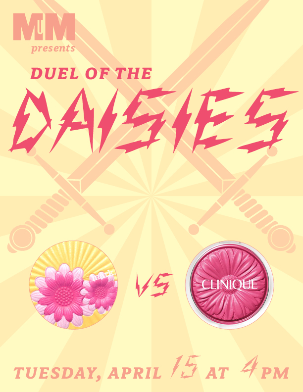
I knew I wanted Clinique's very happy-looking Cheek Pops from the moment I saw them a few months ago.  Little did I know that Mark had an equally exuberant daisy-inspired design up their sleeve.  And you know what that means:  time for a spring smackdown!! 

Let's get ready to rummmmbbbblllllle!  *ding ding*

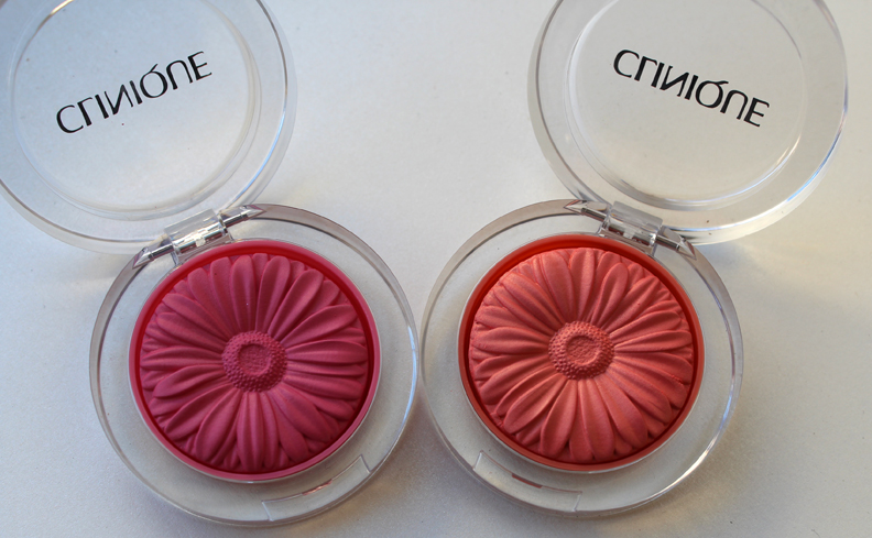
In the right corner we've got some dainty yet fierce flower blushes from Clinique.  Available in four bright shades, they're intended to give your cheeks a fresh pop of color (hence the Cheek Pop moniker).  I've chosen two contenders, Berry Pop and Peach Pop, to battle the palette from Mark.

Clinique-cheek-pops-spring2014

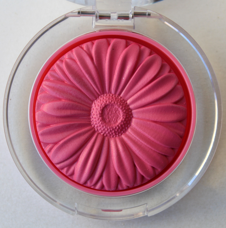
Unlike a real daisy the whole flower is the same color, but the versimilitude in the shape of the petals and dotted center delivers a powerful blow to its opponent…

Clinique-berry-pop

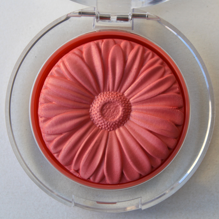
…not to mention that the colors are spot-on matches for real gerberas.

Clinique-peach-pop

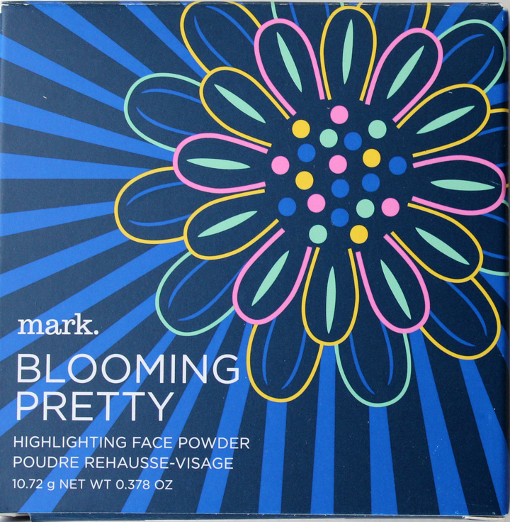
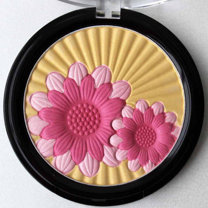
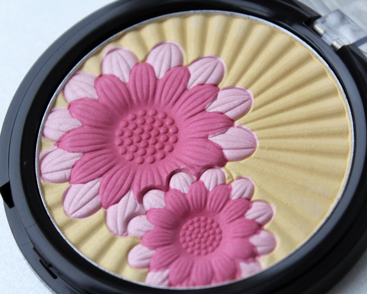
In the other corner we've got Mark Blooming Pretty highlighting powder.  While it's not 100% certain that the flowers shown are daisies (the website describes them as "embossed blooms"), they were indubitably close enough to go up against Clinique.   The Blooming Pretty palette's strength partially lies in its outer box, whose blue background offsets the pink and yellow of the flowers nicely…and ruthlessly pummels Clinique, who offers no such pretty outer boxes with their Cheek Pops.

Mark-blooming-pretty

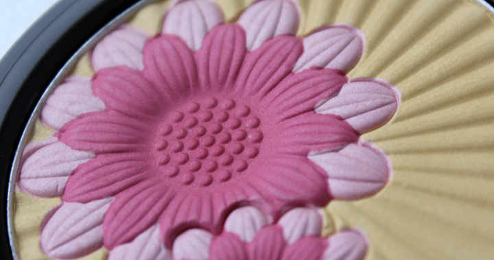
The multiple rows of petals are two-toned, unlike Clinique's monochromatic scheme, but these are more stylized and look less like real flowers.  Looks like Mark's lead may be slipping just a bit.

Mark-blooming-pretty-palette

Mark-blooming-pretty-palette-2014

But wait!   The cheerfulness of the sunny golden rays behind the flowers is rallying to spar with Clinique's joyously vivid shades.

Mark-blooming-pretty-detail

So who wins this daisy duel?  Do the Blooming Pretty palette's larger size, pretty blue box and multi-hued flowers annihilate Clinique's Cheek Pops?  Or do the Cheek Pops' simpler, more realistic design and bold colors come out on top?  Tell me in the comments!
Minnie.mouse.smackdown.poster.3pp

Thanks to the husband for the awesome poster!

Peace on earth?  Screw that!  It's time for an old-fashioned Makeup Museum Smackdown!!

This season, both Korean drugstore champ Etude House and the ever-kooky Anna Sui collaborated with Disney for Minnie Mouse-themed collections.   Now they're going to duke it out in an epic Rodent Riot to see who did it the best.

Let's get ready to rummmmbbbblllllle!  *ding ding*

In the right corner, we have a strong lineup from Anna Sui.  The collection includes nail polish, lip balm and a tin with an eye shadow palette and lipstick.  There are two versions of the tins – punk fiend that I am, I selected the red-hot Rock Song set over the purple Romantic Serenade set.

Anna-sui-minnie-2013

Anna-sui-minnie-tin

KAPOW!  Anna Sui throws a solid first punch with the adorable details on the sides of the tin.

Anna-sui-minnie-mouse-tin-side

A bow-shaped palette echoes Minnie's hair accessory of choice, and is decorated with the reverse of the pattern found on the tin.

Anna-sui-minnie-mouse-palette

Anna-sui-minnie-palette-open

Borrowing a move from Paul & Joe's playbook, the lipstick is shaped just like Minnie's head, and she's even winking!  BOOM.

Anna-sui-minnie-lipstick

The Anna Sui collection still has a few tricks up its sleeve with a sparkly red nail polish with a Minnie-shaped cap and a lip balm with a Christmas-appropriate holly design.

Anna-sui-minnie-balm-polish

But Etude House is in it for the long haul and won't be taken down easily.  Their collection features nail polish and several blushes and highlighters in more Minnie-esque colors than their foe.

Etude-house-minnie-2013

The uncomplicated black-and-white sketches of Minnie against a background of her signature dots deliver a sharp right hook to Anna Sui's more complex illustration of the famous mouse.

Etude-house-minnie-mouse-highlighters

WHOA!  The Minnie imprint on the powders themselves gets a good jab in at the Anna Sui collection, which left the eyeshadow powder unadorned.

Etude-house-minnie-highlighters-open

Etude-house-minnie-mouse-purple-highlighter

Etude-house-purple-minnie-highlighter

Etude-house-minnie-mouse-pink-purple

The nail polish cap features a classic mouse-ears print…

Etude-house-minnie-nail-polish

…while the bow-shaped glitter in the polish strikes another blow.

Etude-house-minnie-polish-detail

So who will emerge victorious?  Will high-end Anna Sui edge out a little-known (stateside, anyway) drugstore brand?  Or can the simpler design and precious color palette of Etude House's collection defeat the more substantial Anna Sui lineup?  Tell me in the comments!

As much as I liked pulling together heart-adorned cosmetics for yesterday's post, I maintain the belief that Valentine's Day is stupid (except that it does give me an excuse to eat an entire box of chocolates by myself).  Therefore I am continuing the Valentine's Day Massacre tradition I started last year.  2013's smackdown is gonna be a bloody, bodice-ripping good time!

Valentines.2013.poster.1pp

Clash of the Corsets is ON!   Let's get ready to rummmmbbbblllllle!  *ding ding*

In the right corner we have historic brand Avon with an eye shadow quartet in flirty, sexy hues of cream and purple.  Outlined in hot pink and black, the compact flaunts its power and sex appeal with a ruffle-trimmed corset that can barely keep the shadow contained. 

IMG_8470

IMG_8471

With flash:

IMG_8474

In the other corner we have drugstore mainstay Physician's Formula Sexy Booster bronzer.  Unlike its foe Avon, the corset shape is imprinted into the powder itself rather than being outlined in plastic.  Packaged in a red fishnet stocking design complete with high heel silver charm dangling sexily on the side, this shimmery bronzer promises to provide a "hot and sultry" glow.

Physicans-formula

IMG_8480

IMG_8482

With flash:

IMG_8484

So who wins the Clash of the Corsets?  Does Avon have the upper hand due to its bigger size and wider color range?  Or will Physician's Formula overwhelm its opponent with its fishnet pattern and bronzey shimmer?  Tell me in the comments!

Butterflies were a popular theme for the spring/summer 2012 season.  I was going to do a squaring off just of Paul & Joe's highlighting powder and Pop Beauty's blush/bronzer combo, but couldn't resist adding Mark's All the Highlights palette to the mix.  As with the Valentine's Day Massacre, we have three instead of two worthy opponents in the ring for the Battle of the Butterflies. 

Butterfly.poster.1pp

Let's get ready to rummmmbbbblllllle!  *ding ding*

First up, we have Pop Beauty Sunblossom Blush Bronzer featuring a simple butterfly silhouette.  What it lacks in detail it makes up for in size, measuring a good five inches across.

Pop.sunblossom1

Pop.sunblossom.side2

Next we have Paul & Joe's Highlighting powder.  Paul & Joe put a unique spin on the butterfly by placing it offset within the palette and including overlapping wings in the background.  And of course, let's not forget how prettily the green outline and dots complement the green outer packaging.

IMG_5895

IMG_5898

Our third contender is a sneaky little surprise from Mark for their spring collection.  This palette features a shimmery purple butterfly with a swirl design on its wings against a background of raised cartoony flowers.  Its vibrancy plays well off the softer pastel hues (cream, pale pink and lavender) of the flowers.

IMG_6020

IMG_6021

So who wins the Battle of the Butterflies?  Does Pop Beauty's butterfly have the upper hand due to its size and simplicity?  Will Paul & Joe's harmonious combination of pink and green vanquish the other two?  Or will the shimmer and square shape of the Mark palette obliterate old favorite Paul & Joe and manage to defeat a palette nearly twice its size?  Tell me in the comments!

p.s. Since I was so short on time the husband the designed the kick-ass poster, so a big thanks goes to him.  🙂

Sephora introduced their Prisma Chrome eye shadows a couple months ago, and today MAC's In Extra Dimension collection dropped.  In honor of the fact that the deisgns on both are comparable I decided to have them square off in the ole Makeup Museum ring.

Mac.vs.sephora.3dsmackdown

Woohoo!!!  Let's get ready to rrrrrummblllllle!!  *ding ding*

In the first corner we have Sephora's Prisma Chrome eye shadows.  Available in eight shades, these limited-edition shadows feature a wavy pattern that actually dips down in the middle.  Trippy!

Sephora_collection

Sephora.prisma.chrome
(images from sephora.com)

According to the website, "Prisma Chrome brings together the best features of baked, powder, and cream shadows. Its revolutionary effect captures light perfectly, delivering a prismatic effect with an unbelievably smooth and true color finish…Pure pigments deliver the truest color imaginable and a highly polished finish. Its unique mica technology provides intense luminosity and a velvety texture that glides over the skin."  That scrumptious description is a strong start for this underdog brand.

In the other corner we have heavyweight MAC's In Extra Dimension collection, which boasts not just eye shadows (10 of them) but three highlighting powders known as Skinfinishes.  The design also features a wavy pattern like Sephora's but one that ends somewhat awkwardly in a point halfway up the compact. Can the addition of the brand's logo repeating above the wave make up for that flaw?

MAC-Extra-Dimension-
(image from bellasugar.com.au)

Also like Sephora's Prisma Chrome shadows, MAC In Extra Dimension brings a "new liquid-powder formula with prismatic reflections that sculpts, highlights and models the face" to the fore.  So not only the design but the formulas themselves are similar between these two foes.  They are truly neck-and-neck!

But someone has to win.  Ungainly wave aside, does the brute strength of MAC's larger collection and brand recognition have the upper hand?  Or does Sephora's oh-so-tantalizing product description and multi-dimensional center dip clinch the battle?   Tell me in the comments!