As you may know, I have a love/hate relationship with Instagram. On the one hand it's usually the first place I spot new collections so it helps keep me head of the curve; on the other hand, occasionally I see things I want for the Museum and can't acquire. So when I saw this lovely Thailand-exclusive collection from Shiseido on their feed, I was overcome with sadness since I figured there was no way I could get my hands on it. Just to exhaust my options I emailed my personal shopper in Japan to see if he had any contacts in Thailand, and lo and behold he put me in touch with someone who was able to get it for me! I now present the Princess Hanayaka collection, a collaboration with Her Royal Highness Sirivannavari Nariratana, princess of Thailand. The "Hanayaka" moniker apparently means “the lady with joyfulness and beauty of a princess.”
Sirivannavari graduated with a major in Fashion & Textile at the Fine and Applied Art department of Chulalongkorn University in her native Thailand, then earned her MA at the Ecole de la Chambre Syndicale De La Couture Parisienne. She launched her own clothing line in 2005, which quickly became a favorite among Thai's elite and includes ready-to-wear, couture and accessories. A makeup collaboration was the next logical step. While the likes of Vogue and Glamour think otherwise, I have to say I personally think the fashion line is little more than a pet project for Sirivannavari. However, I admit the packaging for the Shiseido collaboration is beautiful, and given that it took two years to come to fruition, I believe the princess put some serious effort into it.
I purchased the full collection, which came in a gorgeous printed box.
The inside was lined in velvet with compartments for each of the 4 pieces. I felt so special and fancy opening it, it's the kind of thing I imagine other beauty bloggers get as a PR item.
The color story of the makeup itself was driven by a desire for versatility to accommodate, you know, all your princess needs. I'm kidding, of course – it does sound like Sirivannavari tried to ensure the collection would have something for everyone, and in looking at the makeup there's a nice range of textures and shades. “For this collection, my intention is to create the beauty products that are compact, easy and convenient to apply. The colors in the palette must be beautiful and highly flexible for various combinations of mix and match for different occasions, from daytime natural look to nighttime glamour. One palette can be applied for eyes, cheeks, and lips makeup while the texture of the cosmetics must make it easy for different color combinations. I chose all the color schemes and different shades for this collection myself based on what color combinations I think will best bring out women’s beauty," Sirivannavari explains. This vision, she adds, aligns perfectly with Shiseido's. "[I've] always wanted to create beauty products that can fully answer the needs of women in Asia. This is also what Shiseido wants as a premium makeup brand that understands the needs of Asian women well. That’s how our collaboration started. I’m delighted that we both share the same intentions, which is to create what will enable the beauty of women in Asia to glow from inside and out naturally.” Once she had the color story down, she used them as reference point for the packaging. "I then used [the] colors to work with the graphics and drawings inspired by previous Sirivannavari collections to design the packaging. The drawings of rice ears, bees, and lovebirds are used as the main designs. When combined with a Japanese touch, the lines and feels become perfect for the packaging designs of this collection."
The main motifs on the packaging were borrowed from several recent collections and combined to form some truly beautiful prints. Here are some closeup shots of the shopping bag and lip collection box so you can see the details a little better. I found the outer cases of the palettes very hard to photograph, so I think the bag and box work better in terms of getting a good look at the designs. The embroidered wheat sheaves and bees on the palettes were key elements in the spring/summer 2015 collection. Sirivannavari used her study of Napoleon-era uniforms as the jumping off point for the collection. "This latest collection began with the review of my dissertation I did at the Ecole De La Chambre Syndicale De La Couture Parisienne, which was about the Napoleonic uniforms. As I was looking at my works, I had the idea to turn the sketches to reality with a modern touch and add some Neoclassic and Roman details into the collection. For example, there is embroidery of motifs such as the ear of rice, bee, olive wreath, leopard and stars. Traditionally, these symbols signify all great meanings."
The origami-esque birds also figured prominently in the spring 2015 collection.
The vibrant floral prints found throughout the packaging are best exemplified by the spring 2016 collection, which was inspired by the gardens of Versailles as well as the work of Monet and Renoir.
Finally, the constellations and star patterns, which are the highlight of the eyeshadow palette, come from the spring 2017 collection.
In looking at Sirivannavari's other work (which was relatively hard to find given that the website still appears to be under construction) I don't think she's particularly groundbreaking as a designer, and if she wasn't a young, attractive member of a royal family I doubt she'd make it very far in the cutthroat world of fashion. Not to mention that she doesn't have to worry financially if her line fails or if she doesn't feel like working on it, which explains why she took a few breaks since she established it over a decade ago. Having said all that, I think she did an admirable job with the Shiseido collaboration. The various prints and motifs she uses in her fashion pieces translated well to makeup packaging and were a good fit for the Shiseido brand. Additionally, I think it was a wise choice to mainly use her signature delicate yet colorful floral prints instead of, say, the darker themes that dominated her spring 2014 collection. The fact that the Shiseido lineup was so exclusive is also very appealing to collectors like me, although it would have been nice to see it around the globe so that everyone could purchase it if they wanted. Then again, I'm not surprised a collection designed by a princess with seemingly little understanding of how regular people live would be accessible only to a few. I guess you could say I'm a bit conflicted with this one.
What do you think about this collection? What's your favorite print or item?
Yet again I find myself completely entranced by another artist collab this holiday season. For their 2018 holiday collection, Shiseido teamed up with Japanese artist collective Ribbonesia. Like last year's partnership with Sisyu, the product lineup is fairly small, consisting of two cushion compacts, puff, lipstick set and Shiseido's famous Ultimune serum. I skipped the lipstick since the packaging design wasn't as interesting as the cushions and the serum since I try to avoid spending precious Museum dollars on skincare rather than makeup. The chosen theme for the collaboration was "beauty is a gift", and according to this site, "[uses] satin to express the bud of life in nature and the red string of fate that connects people." Mmmkay. Unfortunately I couldn't really dig up much more information on how the collab came about or the particular designs on the makeup. I will say that they are beyond festive. Folding, looping, swirling shiny ribbons that form bows, flowers and even birds evoke a joyous holiday complete with beautifully wrapped presents. The color scheme is also seasonally appropriate: red and gold with hints of green, blue and pink are reminiscent of the multicolored strands of lights adorning a Christmas tree.
So who is Ribbonesia? The group consists of artist Baku Maeda and creative director Toru Yoshikawa. Maeda, who originally started out as an illustrator, began experimenting with ribbon designs in 2008. Given their success, in 2010 he and Yoshikawa officially established Ribbonesia. Maeda has a lifelong fascination with origami, so manipulating ribbon to make elaborate shapes came naturally. (In fact, given Maeda's focus on animals, his designs remind me a bit of origami artist Hoang Tien Quyet, who I featured in this Guerlain post.) Maybe it's because the Jen Stark/Smashbox collab is still fresh in my head, but elements of Ribbonesia's work sound similar: specifically, taking a fairly simple, flat material and creating very intricate and three-dimensional pieces entirely by hand. Says Maeda, "Wrapping ribbons are everywhere, but they are purely decorative: familiar but unessential. We wanted to put it to use. It’s like three-dimensional painting: each twist is a brushstroke. The reflectiveness of ribbon and the way it reacts to light gives it a new face and new impressions at different angles, creating this wonderful energy. Of course, it can be tricky to use – you can’t make any shape you want. You have to work with the physics of the fabric, because it has its own tension and character. But that’s what makes it so interesting…growing up in Japan, I was always playing with paper and making origami. I think that has influenced the way I use my hands. I like tactile art: translating a flat illustration into a 3D object and forming flat ribbon into something with body." I can only imagine how long each piece takes; it doesn't sound like Maeda uses any kind of advanced technology or shortcuts to make the shapes he does. And like Stark's work, each piece shifts as viewers walk around it, albeit in different ways.
I have to point out that it takes considerable skill to be able to go from 2D to 3D. One of the menial tasks I'm required to perform on occasion at my miserable job is assembling bankers' boxes. It usually takes me about 20 minutes and several tries before I get it right. Needless to say, I'm always amazed by how artists can bend and fold various materials to create recognizable forms, and beautiful ones at that.
Another similarity between Ribbonesia and Jen Stark is the focus on the complexity of natural forms and making it more visible. While Maeda's work is more literal and doesn't delve as deeply into mathematical concepts, the two artists share a love of bringing overlooked natural phenomena to the surface. "I look to nature for inspiration – animals, flowers, the seas and ocean. The movement of ribbon feels very organic, and the natural world is full of wonders. A lot of our art highlights the little things that you know are there but didn’t notice before," explains Maeda. In addition to Ribbonesia, Maeda's other work (see his "leaf beasts" and "bit leaves" series) demonstrates his passion for emphasizing the often-missed parts of nature and transforming the mundane into something new and different. “I do not consider myself a designer but as someone trying to create something that has never been seen before."
There were so many breathtaking designs in Ribbonesia's oeuvre that I had a significant amount of trouble narrowing down and organizing the images I wanted to feature in this post. In the end I decided to go in rough chronological order, as I think it shows the evolution of Ribbonesia's work. These whimsical animal brooches are fairly early on in Ribbonesia's history, around 2011 or so. Once again, the idea of taking some ribbon and making a sculpture out of it blows my mind. In addition to any sort of box, I can't fold a nice gift bow to save my life – hell, I can barely tie my shoes, and you can see my sad attempt at styling ribbon in my photos above – so while these are less intricate than Maeda's future creations, I'm still in awe. Yes, these are the "simple" designs. This particular image comes from a book of Ribbonesia's early work. If only I had known about it before writing this post, I would have bought it since books are my favorite background for blog photos. (The Ribbonesia scarf I obtained is pretty sweet though – the story of how I managed to get that will be in a later post.)
As you can see, Ribbonesia began producing more complex designs. I'm particularly fond of these Chinese zodiac critters.
By 2013 Ribbonesia had reached new heights, literally and figuratively, with a series of incredibly elaborate headdresses. I'm struck by the various patterns formed by intertwining different ribbon colors, such as the ears of the goat (?) on the left and the middle section of the piece on the right.
In 2015 Ribbonesia launched a forest-themed exhibition. It was an absolutely magical wonderland that depicted a variety of flora and fauna in all sizes and colors.
I appreciate the strands of ribbons hanging down as garlands, as they heighten the energy and dynamism of the sculptures. In their natural, basic state, they also serve as a reminder of how a simple material can be transformed into something magnificent.
A year later, Ribbonesia created a series called Eternal Cosmos. When combined with titles like "Gift from God", the works' flowers and animals appear slightly less playful and perhaps linked to the spiritual realm. This connection is an avenue Ribbonesia seeks to explore: "Ribbonesia focuses on natural shapes because we see an essential beauty in every regularity and complexity within the natural world, its necessity, and how it functions as a whole. Normally beauty appears in nature as the ‘result’ of natural habitats being reborn over and over again. Ribbon forms are also the ‘result’ of elastic and tensile forces ‘working with each other’. This unexpected beauty is almost a ‘property of the gods’. Ribbonesia experiences this encounter between beauty and a universal nature, out into the cosmos, and beyond."
While the floral inspired piece above is beautiful, it's the sea creatures that captured my heart. Crabs, squid, jellyfish and an octopus swim alongside sand dollars, shells and even coral. These perfectly rendered seascapes are a testament to Maeda's incredible talent and creativity.
I know I'm repeating myself but I could sit there with a pile of ribbon for a hundred years and never figure out how to make anything that would remotely resemble an animal, let alone one with this kind of detail – look at the suckers!
Last year Ribbonesia continued showcasing their work at an exhibition in Tokyo entitled Murmur. I'm not exactly sure what this one was about, but the works are stunning.
Naturally, Ribbonesia caught the attention of various companies eager to collaborate. In 2014 Ribbonesia was charged with designing the windows and interior spaces for Hong Kong department store Lane Crawford.
This endeavor was followed up in 2017 with a holiday display for the Shibuya location of Japanese department store Seibu.
In light of these collaborations, it's no surprise Shiseido wanted to work with Ribbonesia. While I liked the collection and obviously adore Ribbonesia's work, I'm not entirely sure it's the best fit for makeup or clothing. Given the emphasis on three-dimensional contours, I feel that the magic of these ribbon sculptures is a bit diminished when applied to a 2d surface. I'm not sure how a makeup collection could have been designed to maintain the texture and shapes of intricately folded ribbon, but seeing the designs on a flat cushion compact doesn't have quite the same impact as viewing a sculpture. Maybe they could have gone the MAC Shiny Pretty Things route and embossed a bow or two onto a highlighter or blush to have some semblance of a 3d effect, or even somehow have ribbons affixed to the outer cases. Having said that, I always appreciate an artist collab, especially when it's an artist I'm not familiar with, as it introduces me to a whole new body of work. In this case I was delighted to learn that such a thing as ribbon art exists. And the colors and designs are perfect for the holiday season. I just wish I had more information about how the collection came to be and if the designs were created by Ribbonesia especially for Shiseido.
What do you think of Ribbonesia and the collection? Are you good at wrapping gifts?
Today I'm sharing another shiny holiday 2017 release to brighten up this dreary winter day. Shiseido collaborated with the rather enigmatic Japanese calligraphy artist Sisyu to create some beautiful packaging for their Symphony of Light collection. Centered on the theme of light (or as it's known in Japanese, Hikari), Sisyu drew 21 versions of the Japanese character (光) to "express the way light brings out each person’s inner beauty differently," according to the website. The artist then intertwined and layered these characters to form a "luminous holiday garland". The finished design indeed resembles an intricate, iridescent garland draped across the palette and encircling the cushion compact.
I don't know whether Shiseido or Sisyu came up with the idea of a reflective rainbow effect, but it really enhances the light concept.
I couldn't resist couple more shots of the iridescent yumminess.
Here's the cushion compact. It was also available in white, and there were several other skincare items in the collection.
And here are the characters created by Sisyu that were interlaced on the packaging. I'm assuming the regular character for Hikari that these are based on isn't included, since I count only 20 and not 21 characters.
Let's learn a little about this very mysterious artist. Sisyu (whose alias comes from the words for "purple" and "boat"1) was born in Japan and began calligraphy when she was only six years old. She prefers to keep her real name and age under wraps, so about all we know is that she's currently a professor at Osaka University of Art. I also couldn't find any information about where/if she formally studied art, but it appears she has significant training in traditional calligraphy. What I do know is that Sisyu is a world-renowned artist who uses her background in more conventional methods of calligraphy to expand and modernize the this art form. Whether it's making iron and glass sculptures out of characters or digitally animating them on a gallery wall, Sisyu is bringing calligraphy into the 21st century in a variety of creative ways.
Traditional calligraphy done by hand is appealing to Sisyu for two reasons. First, it requires a high level of concentration and the ability to tune out everything else, a difficult feat in the digital age. Secondly, calligraphy acts as one of the oldest forms of self-expression – much can be revealed by studying how the characters are written (sort of like analyzing one's handwriting). Sisyu says, "The brush is not easy to control. It needs an intense level of concentration. When you are able to command the brush, you master that concentration, you are able to free yourself from anything that binds you down. You are able to focus yourself on just that moment in time…Just as the body and heart are connected, there is also a connection with what we write. You can tell things from it about the person who wrote it, like the proof of their existence, the emotions they were feeling, and so on." Here are a couple of the artist's more traditional pieces.
These more colorful ones combine characters with brightly colored images, a Japanese tradition that, as Sisyu notes in an interview, goes back thousands of years and is continued today in manga and anime.
I apologize for the lack of titles on all of these. I tried Google Translate and as usual it generated nonsensical phrases. This one, for example, came up as "Wind Day Sun Chicken". Oof.
You know how I love bold color so my favorite pieces are in this 2017 series, which includes a phoenix and depictions of the traditional Japanese gods of wind and thunder/lightning. The vivid colors make them seem just a touch psychedelic.
When I went to look up the names for these two, I just saw that Fujin and Raijin were names of gods and then tried to test my visual comprehension skills to guess what they stood for just by looking at Sisyu's images. She makes ideas easy to understand, a point I'll return to later.
While these examples demonstrate her skill in more traditional, albeit colorful calligraphy, Sisyu maintains that it's important to incorporate a digital component to make calligraphy more accessible to a younger crowd and to cultures outside Japan. It's also a way to represent both Japan's artistic heritage and leadership in technological advances. She explains, "When we were young, it was basically still an analogue world, right? But since then, digital has spread all over. One argument for why is that it’s just ones and zeros: Like kanji written on paper, its components or brushstrokes are hidden, allowing for expression that’s free from conventions. Things like age, origin and nationality don’t matter. In that same way, if I incorporate calligraphy into digital art, it makes it easy to approach and it might affect young people, or those from abroad, in a way traditional calligraphy doesn’t. Plus, more than anything, Japan is a country of culture and technology. I think combining those two elements is the best way to transmit Japan to the world. Until recently, Japan was very strong in terms of economics. But that’s no longer the case. In our age, in order to get people to take interest in Japan, we can use cultural power rather than economic power. That’s what my generation can do." These ideas are expanded upon in the interview below.
I thought one of the most interesting parts of the interview2 was her desire to give a modern twist to calligraphy by making it three-dimensional. "Instead of writing characters directly on the screen, I put sculptures about 50 cm from the screen, and they cast a shadow. The shadow collaborates with the screen. It's all about taking writing and calligraphy beyond tradition and beyond the page."
I'm blown away by these animations in which one touches a character on the wall and up pops a beautiful illustration of the meaning of that character. In this way Sisyu achieves what she set out to accomplish: making Japanese culture and calligraphy easier to understand via the use of digital technology. Above all, her work is driven by the need to communicate a specific idea across all cultures and ages. After showing her work at the Venice Biennale in 2005, she still felt it wasn't getting across. "Art expresses things. It crosses borders without the need for words. Why can't Sho-do [calligraphy] do the same? Is it because the language is Japanese? We sing songs in languages we don't understand. How can I get to that sort of level? I thought, okay, from now on I'm going to make art that gets across to people even if they don't know anything about traditional Japanese culture." This epiphany led her to create the calligraphy sculptures and utilize new technology that goes beyond paper and ink.
There wasn't much information on the process behind the Shiseido collection, but based on the very short ads I suspect the artist used a similar digital animation program to create the final design from the original hand-drawn characters.
In the video interview, Sisyu also discusses how she can make up to 500 versions of a single character to express its different meanings. I believe that the 21 versions of Hikari she created for Shiseido was her way of representing all different types of light – from the physical, such as stars and holiday lights – to the spiritual, as in positive energy. She says: "The holiday season is the peak time of the year when lights inspire people, and they are uppermost in people's minds. Light has significance—it illuminates and brightens people. The light collection expresses the image of lights that brightens up each and everyone of us in the world. Merciful light that illuminates everyone's road ahead. Soft, tiny, big, weak, strong, tender, or dazzling lights. Light that visibly and invisibly supports you. Light that makes your path to the future brilliant. I gathered light together, like a glimmering sunny spot, so that it may gently continue to be with you."
In sum, I think this was a gorgeous and thoughtful collection. Sisyu is an excellent match for Shiseido, as they both have a thorough understanding of the past and build upon it on to create a harmonious fusion of old and new. Sisyu adds digital and 3-D technology to calligraphy and Shiseido continuously revamps its most iconic products, but neither lose sight of the traditions and history from which they came. And like Shu Uemura, Shiseido is strongly committed to celebrating Japanese art and culture and sharing it worldwide. Sisyu, with her focus on communicating a message across all demographics, is perfectly suited to this task. She effortlessly translated the Japanese Hikari character to a more modern format that everyone can understand, and created a beautiful piece of art in the process. Even if you're not familiar with Japanese calligraphy and characters, you know the packaging symbolizes light.
What do you think? And have you ever attempted any sort of calligraphy?
1 Sisyu shares why she chose her pseudonym: "In Japan, purple is thought of as a very noble colour. It also refers to the character Murasaki in ‘The Tale of Genji’. Murasaki was exceptionally beautiful and beloved by her suitors. As for boat, it’s a character that’s been used in the names of many calligraphers and sumi-e (Japanese ink painting) artists throughout Japanese art history, so I adopted it as a part of that tradition."
2. Another interesting part of the interview was where she talks about her desire to create kanji for Hollywood movies. She was granted her wish in 2015 – Pixar hired her to make the kanji for Inside Out.
Save
Save
Save
Well well well, what have we here?
To be honest, I really have no idea. All I know is that when I searched for vintage Shiseido on Ebay, I came up with a spate of white porcelain animal figurines. Some other things: 1. they represent the animals from the Chinese zodiac; 2. there were a few different designs of each animal; 3. I went into a frenzy trying to collect all of them (unsuccessfully), and; 4. they were produced, or at least sourced, by a company named the Connor Group for Shiseido. What I'm struggling with is why they were made and for whom they were intended. I'm also not certain about the exact dates of the various versions, since some of the sellers listed them as being from the '70s, others from the '80s, and still more were made in the '90s, according to accompanying paperwork.
I'll go in the order of the zodiac, starting with the rat. Cute, no? Given the shiny finish (more on that soon) I'm assuming it's from 1972 or 1984, but it's impossible to say.
Next is the ox, from either 1973 or 1985.
Here's a different version of the ox, which I think might be from the '90s. I was able to save this image from the Ebay listing but unfortunately someone snatched up the figurine itself a while ago.
Tigers! This one came with a fold-out that made things even more confusing.
The style of the figurine is consistent with ones that are from the '90s, which we'll see later in this post, but the paper it came with clearly indicates it's from 1974. Plus, there's no mention of Shiseido anywhere, not in the letter or even on the figurine – the other ones with the shiny finish have "Shiseido Japan" printed on them. The seller also included the original shipping box it came in to the U.S. from Japan, but there were no clues there either.
The horse is also tricky. This one could be from 1978, given that this Ebay seller has another style. (I have one of them on the way to me). I got so desperate for answers I actually asked the seller if they had any other information. No answer yet.
This goat (or ram) is from 1991, according to the foldout it came with. But it's in a similar style to the tiger that's allegedly from 1974, and also has the same non-shiny finish and no Shiseido name printed on it. See why I'm frustrated?!
Poor little guy has a tiny chip on his nose.
Another version of the goat/ram, which was also sold before I could get my hands on it…no clue as to when it's from.
The monkey is also perplexing. This one is apparently from 1992.
And here's a different version, from the same Etsy seller who had the rabbit for sale, so maybe this one is from 1980?
And finally, a little piggy, ostensibly from 1995.
Sadly, I don't think I'll ever solve the mystery behind these figurines. I emailed both Shiseido and the Connor Group for more insight and was quite disappointed at not hearing a word from Shiseido. You would think a company that is so committed to preserving their history would be interested in hearing from someone who is equally passionate about it and get back to me. I don't think it's a matter of them not having any information either – again, since they have a whole museum and are clearly dedicated to recording all aspects of the company, I just know someone there knows something about these figurines! I bet all the paperwork related to them is sitting in a basement in Shiseido's headquarters, but no one can be bothered to do a little digging. I did get a reply from the Connor Group but they had no idea what these were and asked for more information. So I sent pictures of both the figurines and letter that came with the tiger and never heard back. Sigh. My best guess is that these were either gifts to employees or gifts for Camellia Club members – in researching the rainbow powders, I learned that the latter group had access to exclusiveShiseidoitems (um, how awesome are these Erté dishes?!) However, most of the Camellia Club gifts are labeledas such, whereas there is no such notation on the figurines or the papers they came with. Shiseido also seems to collaborate with companies for other non-makeup items, like this anniversary plate produced by Noritake, so maybe the figurines were just some random item they had for sale. Still, it drives me crazy that I don't have a definitive answer.
At least the plushies are enjoying playing with their new friends!
Do you have any idea as to why Shiseido made these figurines? And which one was your favorite?
Save
While color correcting seems like a new trend, my experience as a self-taught makeup historian tells me that it probably existed decades ago. However, I had no idea that color correcting was in effect as early as 1917, when Japanese company Shiseido introduced their "rainbow" face powders. In honor of the 100-year anniversary of this cutting-edge beauty development, Shiseido released the 7 Color Powders Centennial Revival Edition (that's a mouthful!), which is essentially a re-creation of the original powders using contemporary color correcting technology and ingredients. The powders come in a gorgeous keepsake box adorned with concentric metallic rainbow lines. I am very fortunate to have such a kind and generous husband who procured this set for me for Christmas. 🙂
Does anyone know what this means?
I always get positively giddy over a numbered edition. In the eyes of a collector, numbering makes the item seem really special…even if there are 9,000 of them produced!
The box design is nearly identical to the original. Shiseido was ahead of its time back then not just for product innovation but also for packaging. Chapter 3 of an excellent dissertation entitled "Imperial Designs:" Fashion, Cosmetics, and Cultural Identity in Japan, 1931-1943" by Rebecca Nickerson sheds light on the design process. In 1915 Shiseido's founder, Fukuhara Arinobu, unofficially passed ownership of the company to his son, Fukuhara Shinzo, who had been traveling domestically and abroad to study art and photography for a number of years prior. The younger Fukuhara used his passion for art and aesthetics to form an official cosmetics division for the company and in 1916, he appointed a design team consisting mostly of artist friends he had met during his travels to create sophisticated, appealing packaging for all of Shiseido's products. The creation of such a group, focused on cohesive design and marketing, was cutting-edge for the time. Their artistic skill proved quite effective: "The design team came up with unique packaging for the face powder. Each of the seven colors was in its own original eight-sided, white satin box, and the lids were embossed with two concentric gold lines and Shiseido's camellia logo. Above the logo were the words 'poudre de riz', the French term for face powder, and below it in Roman letters, 'Shiseido, Tokyo'. The package design was simple yet sophisticated and conveyed a sense of the foreign, which was exactly what Fukuhara wanted consumers to associate with the Shiseido brand. This was Shiseido's second attempt to introduce Western face powders to Japanese consumers. While most women could not afford or had little interest in Western face powders in 1906, by 1917 consumption was on the rise and greater numbers of women were eager to embrace this new trend in beauty culture. The flood of modern Western culture, Hollywood films, and a general enthusiasm for 'Americanism' also increased demand for modern fashion and cosmetics. Shiseido was one of a number of companies to introduce similar face powders around this time, and the 'Rainbow Face Powder' succeeded in making Shiseido a visible player in the cosmetics market." (p. 103).
I was so hesitant to try to peel off one of the seals to open the box, but I managed to do so without ripping it.
For comparison's sake, here are photos of the original powders and you can see more pictures of them from the Shiseido Museum here. I think the only differences are that the new revival ones are covered in a fabric material whereas the old boxes seem to be made from cardboard (I don't think it was satin), and the camellia logo is at the top of the powder covering in the revival versions – the originals don't seem to have the logo on the inside. I'm guessing the old ones didn't have the color-coded seals on the boxes either.
Anyway, why were these so groundbreaking? Well, besides the design, colored face powder didn't really exist back then. I've mentioned this excellent paper from art historian (ahem) Gennifer Weisenfeld before, but here's another excerpt explaining why these were a breakthrough: "Tinted face powders were exceedingly rare in prewar Japan and Shiseido pioneered them early on with a series of colors under the brand name Poudre de Riz. The female entertainers (geisha) who worked in nearby Shinbashi and who were loyal Shiseido customers particularly liked the green and purple powder colors because they were thought to flatter the complexion under electric lighting." Not only did these powders have color correcting ability in less than ideal lighting conditions, Shiseido maintains they were a way for women to "match their face powder shade to their attire." This was in keeping with the shift towards more Western styles and a desire for more natural looking makeup. "Gradually, as Japanese cosmetic practices changed over time and moved toward a greater naturalism, the traditional thick white cosmetic foundation (o-shiroi) ceased to be used for daily wear." Finally, the rainbow powders, quite simply, were among the first steps in customized makeup that encompassed a much wider range of colors than were available previously. This in turn allowed Shiseido to reach a significantly greater portion of the cosmetics market, since the colors could be mixed to suit one's skin tone. Says Jessica Guerra, author of "Consumerism, Commodification and Beauty: Shiseido and the Rise of Japanese Beauty Culture" (another fantastic scholarly piece!), "Through different combinations of the seven provided colors, consumers could create their own shades and color palettes. Understandably, this would mean increased international appeal and marketability as racially diverse consumers could purchase Seven Colors Face Powder and create their own personalized shades based on preference." (p. 29). Indeed, even today Shiseido touts the customization ability of the revival powders, noting that they also give one "the freedom to experiment and create the most beautiful finish for your skin."
Shiseido hadn't completely abandoned the idea of reviving their rainbow powders until now. I couldn't read this whole article because it's behind a paywall (thanks, jerks), but apparently in late 2001 the company released a rainbow powder available only to their Camellia Club members: "Shiseido has resurrected a face powder-Rainbow Face Powder-that debuted in 1917 but in a way geared to the woman of the 21st century. The debut product featured seven colors-white, yellow, flesh, rose, peony, green, and purple-instead of the typical white to offer women the shade that best enhanced their facial features and to create an appearance more suited to the increasingly popular Western-style fashions. Renamed La Poudre Ruisselant, the face powder is sold in specially designed container with lids shaped like a camellia blossom-the symbol of Shiseido." I tried my darndest to find a photo of this "specially designed container" but only turned up a picture of the refill.
While I couldn't find a photo, I do think it's interesting to note that Shiseido tried revamping their rainbow powders previously. Maybe in 2001 the makeup world at large wasn't yet receptive to color correcting and that's why Shiseido offered the Ruisselante powder to only a handful of consumers. But as color correcting has been all the rage for the past couple of years, now is a great time to re-introduce these to the public, not to mention the fact that it syncs perfectly with the 100th anniversary of the products' debut. I love how they updated the packaging too – very similar to the original but just enough details to make it modern and special enough to commemorate the anniversary. I'm still drooling over the shiny rainbow on the box, and the numbering…well, that's like collector's catnip.
What do you think of this set? Do you color correct at all? I do but with liquid or cream concealer rather than powder. 🙂
Save
Save
I spotted this palette way back in the fall at British Beauty Blogger and knew I had to get my hands on it. Shiseido teamed up with Japanese fashion designer Yohji Yamamoto to create their Festive Camellia palette for the holiday 2015 season. As you might know, Shiseido's symbol is the camellia flower, and they asked Yamamoto to come up with a palette design that portrayed both the significance of the camellia for the company's history and the designer's unique aesthetic. Yamamoto explains, "The camellia flower is always beautiful… at the moment when it blossoms with its greatest energy, and even at the moment when it dies. It does not die away by losing its petals like other flowers, but instead ends its life in its full blossom and form. By depicting this beautiful camellia, filled with dignity and vitality until the end of its life, I have related the camellia's most beautiful moments to those of a woman."
As with the MAC Guo Pei collection, the palette is encased in fabric. I'm not sure how well that would hold up in one's makeup bag, but it's lovely nonetheless. According to the Shiseido website, it's silk: "By getting the full cooperation of Y's creative support, silk has been used on the palette just like it is used in Y's clothes; and it has been specially printed in Kyoto."
If you look at the leaf on the upper left, you'll see a green beetle – I have to admit I didn't even notice the little guy hiding there until I read the palette's description!
Here's a detail of the fabric.
The camellia-inspired colors were chosen by long-time Shiseido adviser and makeup artist extraordinaire Dick Page, who named each color individually.
Top row: Snow and Velvet
Middle row: Japonica, Winter Rose, and Petal
Bottom color: Heart
The palette came with a little brush set.
I was slightly disappointed that the pattern didn't line up on the brush set tube.
Despite Yohji Yamamoto having runway shows since 1981 (he established his line in 1972) I wasn't familiar with the name at all. So I played one of my favorite games and set about exploring his work and seeing whether the palette is a good representation of it. There is definitely a resemblance to Yamamoto's overall design – not one season in particular, but his general emphasis on asymmetry and deconstruction. Obviously designers have to know how to manipulate fabric, but this is one area where Yamamoto truly excels. Gathering, folding, wrapping and pleating fabric to create one-of-a-kind silhouettes is another hallmark of his work. He says, "Fabric is everything. Often I tell my pattern makers, "Just listen to the material. What is it going to say? Just wait. Probably the material will tell you something." He's like the fabric whisperer. 🙂
As for the palette, I was definitely seeing how Yamamoto's shapes influenced the design. The hems on these dresses from the spring 2013 collection, for example, remind me of the asymmetrical corner of the palette as well as the mirror:
And the floral print is reminiscent of those that appeared in his fall 2014 show, with the same voluminous, detailed petals.
Once again, a cosmetics company plucks a designer from the high fashion world that I wouldn't have otherwise known about and allows me to have a little piece of couture in makeup form. I can honestly say that Yamamoto is like nothing I've ever seen, and he did an excellent job translating his work into the palette (although I think a black background instead of purple might have been a better choice, given how ubiquitous it is in all of his collections.)
What do you think?
Once again I have no recollection of what I was searching for when I unearthed this post featuring 25 exquisite vintage Shiseido ads over at a lovely illustration blog called 50 Watts, but oh, what a find. I picked out a few of my favorites but you really need to check out all of the ads, as they are truly amazing.
I'd give my eye teeth to acquire either this ad or the products featured in it.
Such an ethereal scene…they really don't make illustrated ads like this anymore!
These last two from the '50s take quite a modern, graphic turn.
As you may know, Shiseido has its own museum, so it's not totally surprising that someone was able to get these images. However, even with such a well-preserved history, I was absolutely floored to see an 84-page essay on Shiseido's advertising in the early 20th century, which is linked in the post at 50 Watts. Gennifer Weisenfeld, a professor at Duke, authored "Selling Shiseido: Cosmetics Advertising and Design in Early 20th Century Japan" for MIT's Visualizing Cultures curriculum (which sounds seriously awesome). Because I'm a dork I printed out the whole thing so I can make notes on it as I read. I'm only about halfway through – over 1200 subscriptions in Feedly takes up most of my reading time – but so far it's amazing so do check it out. You also need to set aside an hour or so to take a gander at the image galleries, which include a staggering amount of even more ads, plus images of old stores and gifts from the Camellia Club. And if you want to get really nerdy, you can download the handouts from the course. Enjoy…and remember, as I've been saying for years, there's a place for beauty in academia and museums. This is the best proof I've come across in a while. 🙂
Save
Here's another museum to which I must make make a pilgrimage! In lieu of actually visiting, I've selected a few highlights from their collections. (Sorry the pictures are so small – not sure why they have such teeny pics).
Here is one of the original bottles of their best-selling skin treatment Euderline from 1897, along with a bottle of their camellia perfume from 1917. "The name Euderline was also novel for the time, taken from Greek words meaning 'good' (eu) and 'skin' (derma). The 'red wine' appearance of the lotion earned it the nickname 'Shiseido red water' among users."
Rainbow Face Color Powders (1917) were cutting-edge for their time, while the design on the box of the Modern Face Color Powders (1932) is a good representation of both fashionable young city ladies and the company's pre-war aesthetic. The Rainbow powders were among the first face powders to come in colors other than white, including yellow, rose, green and purple, to allow women to match their powder to their clothing. The Modern Face Color Powder box was designed by Yamana Ayao, and shows "a beautiful harmony of Art Nouveau and Art Deco elements."
The one on the left was desgined by Yabe Sue in 1925 and perfectly represents the Art Nouveau style, and the one on the right is from 1930 and depicts two women, one clad in an elaborate 18th-century French-looking frock and the other in a traditional Japanese kimono. The meaning is unclear – is there a rivalry going on between East and West or is Shiseido showing their attempt to bridge the gap between their customers living in those two spheres?
These next two are from 1938 and 1961. The earlier one, designed by Yamamoto Takeo, looks vaguely surreal to me with the woman's profile seemingly floating amongst Magritte-esque clouds. But according to the website, "the poster is from the period around the 1930s when Shiseido's chain stores began using display windows. The Shiseido designers from this period were successful in creating images of feminine beauty that anticipated the changing times, and contributed greatly to bolstering the Shiseido image. The later one was designed by Mizuno Takashi and is from the company's first "campaign-style promotion" for a new line called Candy Tone.
Some other highlights of the permanent collection include an entire wall showing the evolution of the brand's packaging:
And a display showing how the typeface and camellia logos also changed over time:
Something else that I love about this museum (and something that I try to do with the Makeup Museum) is the launching of special exhibitions. In 2009 the museum showed "The Pleasures of Colors: Shiseido Paint Sets" which looked at the crayons, paints and other art implements the company produced for a brief period in the late 1950s. But these weren't makeup items aimed at women – these were art sets intended for children in order to introduce them to drawing and painting. "These included a string of ground-breaking new products that helped to guide Japan's new art education, and many featured charming packaging that encouraged children to try their hands at pictorial art. This exhibition highlights how well these colors have retained their bright appeal over time, and explores how they contributed to a next generation of education in Japan."
The current special exhibition is devoted to lipstick called "The Excitement of Lipstick: Color, Form, Spirit." Here's the description from the website: "Lipstick can be considered the most striking and important element of women's makeup. Even just a little bit of lip coloring can lend an “adult” sophistication to the face of a child, bring an air of specialness to an otherwise ordinary day, give rise to numerous and various female expressions, and even embolden the spirit. This exhibition, with its display spaces reminiscent of show windows, presents these appealing aspects of lipstick in various visual and entertaining ways.
The exhibition is organized around three themes—Lipstick Colors, Lipstick Shapes, and Lipstick & Spirit—and will focus on the beauty of lipstick itself while exploring some of the unseen relationships women have with this essential of the makeup kit. It will also include some hands-on displays where visitors can explore the enjoyment of lipstick experientially, including a corner for trying on various lipstick shades and computerized tablet stations where visitors can simulate applying their own makeup." (Note to self: steal this idea.)
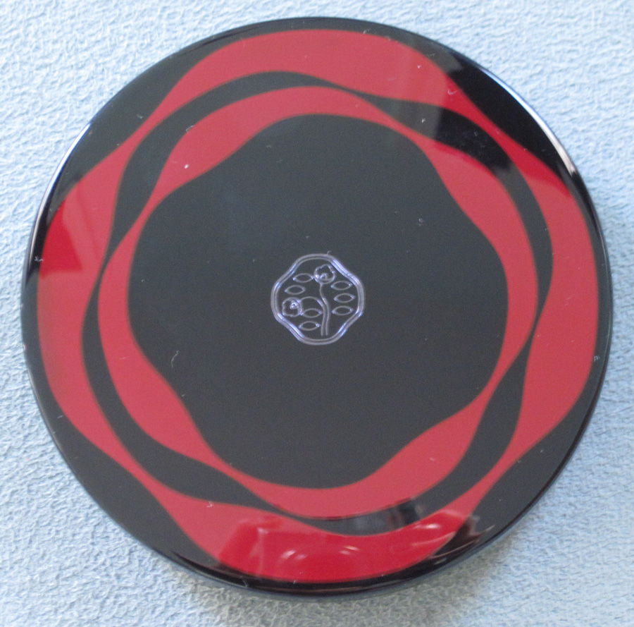
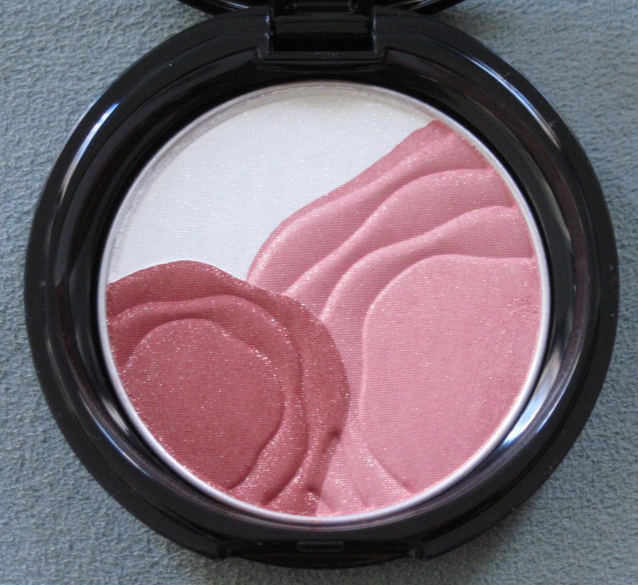
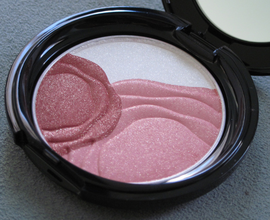
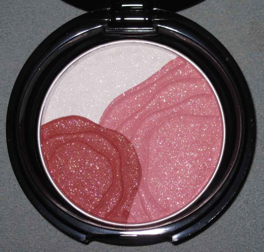
Shiseido's been rolling out new products and doing lots of events in honor of their 140th anniversary this year. To add to the celebration, the company released this lovely camellia highlighting/blush compact.
With flash:
The Shiseido Corporate Museum (more on that tomorrow) hosted an exhibition on the company's use of the camellia. "In 1915, Shiseido's first president Shinzo Fukuhara replaced the hawk emblem trademark used by the company's original pharmacy business with a camellia blossom. Ever since, this camellia trademark has been closely and fondly associated with Shiseido as a company. What does the camellia mean for the Japanese people? What does it mean for Shiseido? As the camellias came into bloom to welcome Shiseido's 140th anniversary this year, the year's first planned exhibition considered the history of the Japanese people's relationship with the camellia, and looked back on the history of the company's camellia-related products and designs using the camellia motif." I would have given my right arm to see this exhibition, but Japan is a long way off for a quick museum visit! Fortunately, at their website Shiseido fills us in a little bit as to the meaning of the flower for their brand. "When the company was known as a pharmacy, its trademark was a brave hawk, but when it shifted its focus to cosmetics, it was thought that the stern image of a hawk was unsuitable. It is said that the camellia was chosen because the best-selling product was Koyu Hanatsubaki (hair oil; Hanatsubaki is Japanese for camellia). At that time, trademarks in Japan were typically traditional patterns from ancient family crests, but the Western design of the camellia mark was a great novelty. The camellia trademark was designed by the company's first president, Shinzo Fukuhara. The original nine camellia leaves were reduced to seven by the Design Department staff. In 1918 its design was near today's, and in 1919 the trademark was registered. Many small changes have been made since, and in 1974 the present design was decided on."
Additionally, there was once something called the Camellia Club – a membership service for loyal Shiseido customers that was launched in 1937. Club members received exclusive pamphlets and invitations to beauty classes. The biggest spenders received commemorative gifts – I'm thinking this is sort of like Sephora's VIB program in which customers can become "VIBs" after spending $350 in a given year. "The first year's gift was an art deco metal vanity case, the following year's was a Nishijin handbag, and in following years continued with ceramic sash clips and other luxurious items." While I enjoy the more modern perks of today's membership programs (free samples, discount codes, etc.), receiving keepsakes from the company sounds great to a collector like me.
Stay tuned for more on the history of Shiseido tomorrow, when I will highlight some pieces from their museum.